Data in LabKey Server is viewed in grids. The underlying data table, list, or dataset stored in the database contains more information than is shown in any given grid view. This topic will help you learn the basics of using grids in LabKey to view and work with any kind of tabular data.
Anatomy of a Data Grid
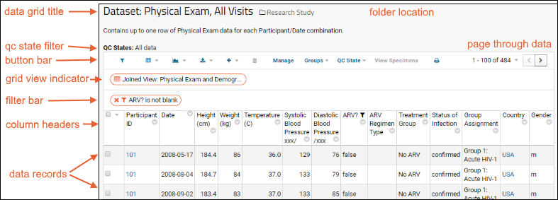
The following image shows a typical data grid.

- Data grid title: The name of the data grid.
- QC State filter: Within a LabKey study, when one or more dataset QC states are defined, the button bar will include a menu for filtering among them. The current status of that filter is shown above the grid.
- Folder location: The folder location. Click to navigate to the home page of the folder.
- Grid view indicator: Shows which view, or perspective, on the data is being shown. Custom views are created to show a joined set of tables or highlight particular columns in the data. Every dataset has a "default" view that can also be customized if desired.
- Filter bar: When filters are applied, they appear here. Click the X to remove a filter. When more than one is present, a Clear all button is also shown.
- Button bar: Shows the different tools that can be applied to your data. A triangle indicates a menu of options.
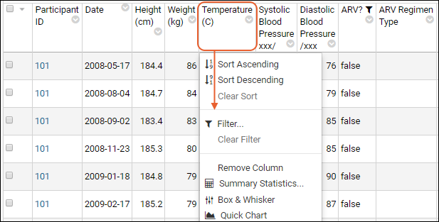
- Column headers: Click a column header for a list of options.
- Data records: Displays the data as a 2-dimensional table of rows and columns.
- Page through data: Control how much data is shown per page and step through pages.
Column Header Options

See an
interactive example grid on labkey.org.
Button Bar
The button bar tools available may vary with different types of data grid. Study datasets can provide additional functionality, such as filtering by cohort, that are not available to lists. Assays and proteomics data grids provide many additional features.
Hover over icon buttons to see a tooltip with the text name of the option. Common buttons and menus include:
- (Filter): Click to open a panel for filtering by participant groups and cohorts.
- (Grid Views): Pull-down menu for creating, selecting, and managing various grid views of this data.
- (Charts/Reports): Pull-down menu for creating and selecting charts and reports.
- (Export): Export the data grid as a spreadsheet, text, or in various scripting formats.
- (Insert Data): Insert a new single row, or bulk import data.
- (Delete): Delete one or more rows selected by checkbox. This option is disabled when no rows are selected.
- Design/Manage: with appropriate permissions, change the structure and behavior of the given list ("Design") or dataset ("Manage").
- Groups: Select which cohorts, participant groups, or treatment groups to show. Also includes options to manage cohorts and create new participant groups.
- Print: Generate a printable version of the dataset in your browser.
Page Through Data
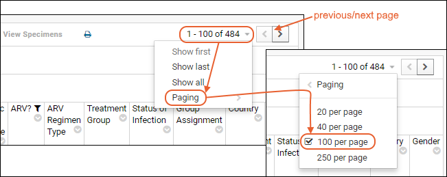
In the upper right corner, you will see how your grid is currently paginated. In the above example, there are 484 rows in the dataset and they are shown 100 to a "page", so the first page is rows 1-100 of 484. To step through pages, in this case 100 records at a time, click the arrow buttons. To adjust paging, hover over the row count message (here "1-100 of 484") and it will become a button. Click to open the menu:
- Show First/Show Last: Jump to the first or last page of data.
- Show All: Show all rows in one page.
- Click Paging to see the currently selected number of rows per page. Notice the > caret indicating there is a submenu to open. On the paging submenu, click another option to change pagination.

Examples
The following links show different views of a single data grid:
Related Topics
 See an interactive example grid on labkey.org.