2. Chart the Data |
2024-04-26 |
Colleagues can create and export their own visualizations
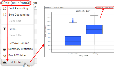
of the data. Authorized users can share these visualizations with selected colleagues.If you already know how you want to visualize results, you can easily tailor a custom plot. If you aren't sure, LabKey can make a "best guess" to get you started. A "quick chart" is an example of this "best guess" for a single column of data.

What is the Range of CD4+ Values?
- Click CD4+ (cells/mm3) and select Quick Chart. (Click your browser's Back button to return to this page.)

- Hover over the box plots for the exact quartile ranges.
- Note that you can refine the plot in several ways by clicking Chart Type and Chart Layout.
Exclude and Rechart
- Quick charts respect your data filters. Exclude values with a filter and see the results by making another quick chart.