New UI and Button Bars

LabKey Support Forum
New UI and Button Bars Ben Bimber  2018-01-03 09:30
Status: Closed
 
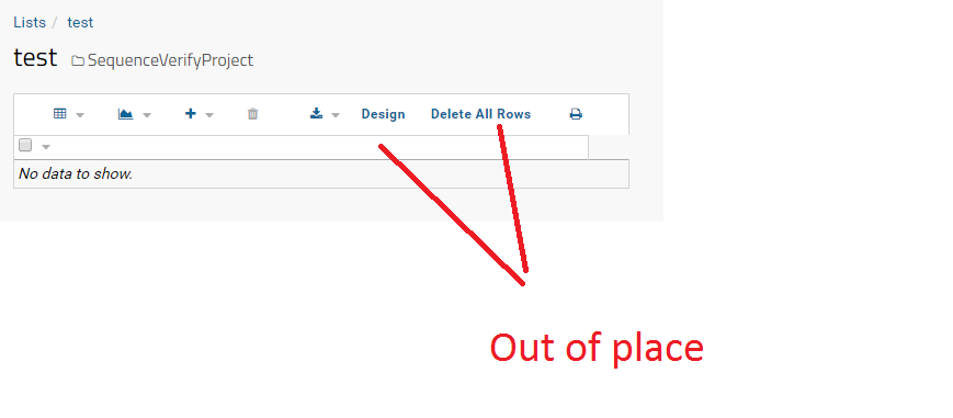
A little more UI feedback: I like what you've done w/ the button bars in terms of switching from text to icons. it's a lot cleaner. however, any table with a mixture of text and icon buttons really looks bad now. as an example, a new vanilla list has this (attached).

As a couple of you know, I proposed that LK support a standard 'More' button (perhaps '...' as the icon). This button opens a menu, showing extra buttons/actions. This would make it easy to make these extra buttons accessible without clutter and also be a pretty low-effort way to avoid clutter with these text-only buttons (finding a reasonable icon for everything is higher effort). You essentially had this feature a release or two ago but then removed it...
 
 
Jon (LabKey DevOps) responded:  2018-01-03 10:04
Hi Ben,

Thanks for the feedback! I've passed it off to the UX team.

It looks like we didn't get that attachment you mentioned. Can you re-attach it to the post?

Regards,

Jon
 
Ben Bimber responded:  2018-01-03 10:24
Sure - this is just a vanilla newly created list. LK has many other similar examples of grids (either written by LabKey or built by clients in their modules), where buttons are tacked onto the core set. I really like the switch to icons, but it seems half-baked to have most grids with a mixture. I keep harping on this issue because the '...' / More button is such a simple way to simultaneously improve multiple issues w/ grids across LabKey...