| Chart / Graphical display of Cohorts that change during a study | cnathe | 2022-12-15 07:56 |
| Status: Active | ||
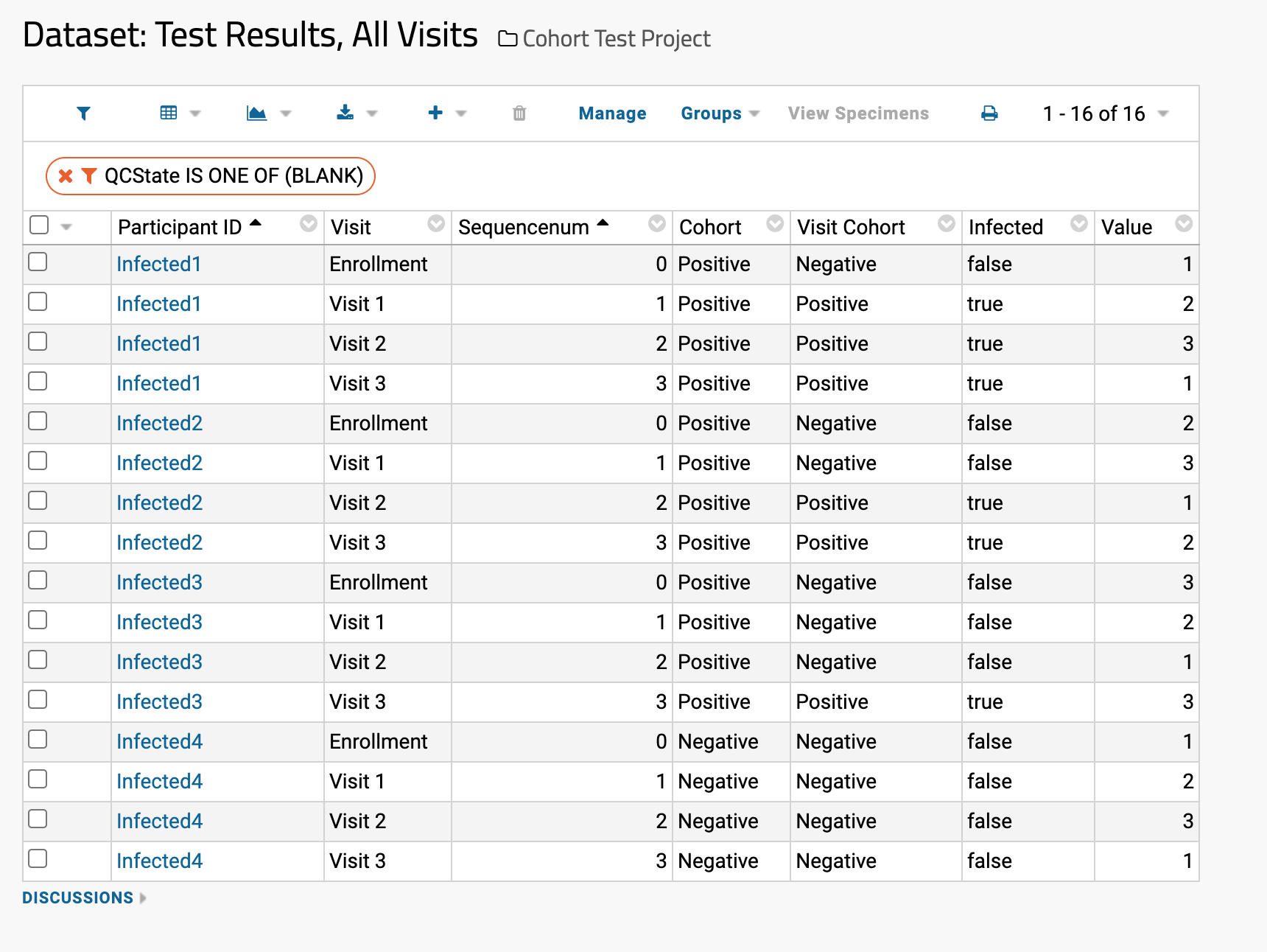
Richard, I assume you are using the "Cohort Assignment > Advanced" mode which uses a dataset automatic participant cohort assignment via a study dataset to track changing cohorts mid-study. https://www.labkey.org/Documentation/wiki-page.view?name=manageCohorts If so, you can definitely view the "cohort for a given participant at any given visit within the study" in a grid view by pulling in the "Visit Cohort" column via the ParticipantVisit/Cohort lookup. See the attached screenshot as an example which uses fake data to show the difference in a grid view of the participants current cohort vs the cohort at a given visit. As per your question about the graphical / chart view of this data, what chart type are you creating? If you are using the study Time chart, you are correct that we currently only support using the participant current cohort in the data grouping variable. However, if you add that "Visit Cohort" column to your saved view of a dataset, you should be able to use that variable in the other chart types (i.e. Line, Scatter, etc.). Thanks, Cory |
||
 Screen Shot 2022-12-15 at 9.50.42 AM.png