This topic describes how to navigate grids of data in LabKey Sample Manager, and how to filter, search, and sort your data.
- Grid Menus
- Work with Data Grids
- Data Entry and Edit Grids
- Export
Column Header Menus
Click the column header in a grid to access the column header menu:
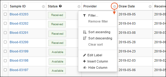
- Filter: Click to add or edit filters; by default the current column is selected in the popup.
- Remove filter: Remove the filter on this column.
- Sort ascending
- Sort descending
- Clear sort: Remove the sort on this column.
- Edit Label: Edit the display label for this column.
- Insert Column: Select a new column to add to the grid.
- Hide Column: Hide this column from the grid.
You can also drag and drop column headers to new positions in the grid. Learn about creating custom grids in this topic:
Column Headers: Field Name and Tooltip
Hover over the column header in a grid to see the full field name. In the case of different labels, or ancestry lookups (or both shown here), it can be helpful to see the actual underlying name of the field:

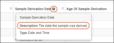
If the field includes a
Description, or other explanatory information, you will see a
next to the name. Hover for a tooltip displaying more about the field.
Scroll Large Grids
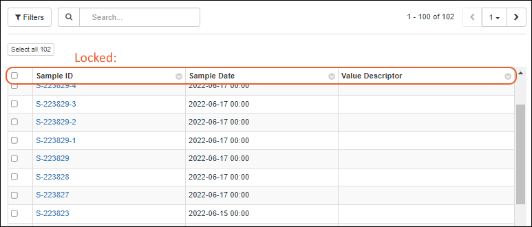
When scrolling a grid horizontally, the leftmost column, typically the SampleID, will remain 'locked' or visible on the left, making it easy to understand which sample the visible fields are referring to.

When the data grid is long enough to scroll vertically, such as when using a long 'page size' the column headers will remain visible at the top.
Sample Grid Menus
Sample grid menus highlight the most common sample actions and group them by category:

- Add:
- Edit:
- Derive:
- Assay:
- Picklists:
- Jobs:
- Storage:
- Reports:
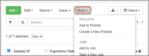
Some menu options require row selection(s) and will be grayed out when no samples are selected. When the browser window is narrower, some menus will be collapsed under
More, with sections for each category:
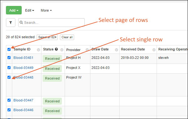
Select Rows
In LabKey Sample Manager, data is shown in grids, with a column of checkboxes on the left for selecting each individual row. Check the box in the header row to select all rows on the
current page.
Once you've selected a page of rows, you will see buttons to select all the rows, or clear those already checked.
Page Through Data
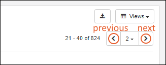
Large sets of data are displayed on a paged grid. In the upper right, you see which rows you are viewing (here 1-20 of 824). Buttons give you the following control:
- and : Step one page forward or back.
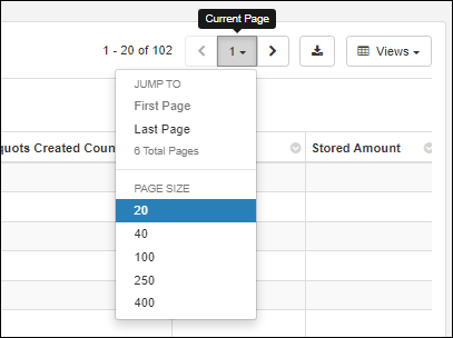
- The page number you are on is shown with a dropdown menu.
- You can jump to the first page or last page and see a count for the total number of pages.
- You can also change the pagination. Options for number of rows per page: 20, 40, 100, 250, 400.
Customized paging settings for a grid will be maintained if you click away and later return.
Filter
Use the
Filter option on any column header menu, or click the
button above the grid to open the filter panel.

Select the column you want to filter on the left, then for any column, you can select one or two filtering expressions on the
Filter tab. If your first filtering expression cannot be further filtered (such as "Is Blank") you will not see the second filter option.
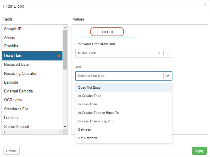
Some filtering options ("Equals One Of", "Contains One Of", etc.) accept a list of values to be compared. Use a new line or semi-colon to separate the values you provide. A maximum of 200 values can be provided.
For columns with a limited set of values, you can use checkboxes on the
Choose Values tab to select the desired values.
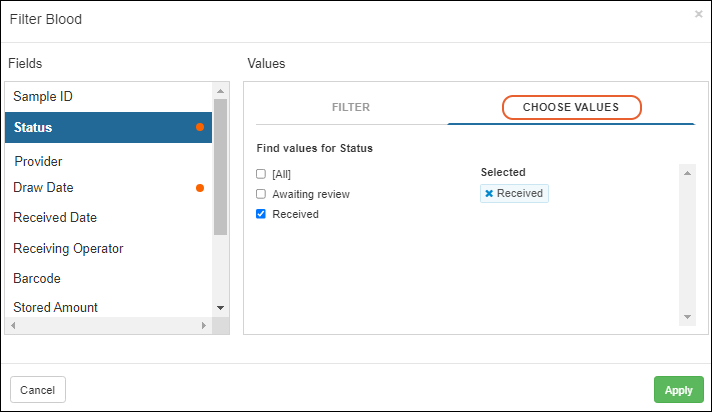
You'll see a filter icon in the header when a column filter is applied, as well as a "lozenge" for each filter above the grid.
- Filter settings for a grid will be maintained if you click away and later return to the same grid.
- When you hover over a lozenge, the filter icon will become an X you can click to delete that filter.
- Click Remove all to remove all the filters.

Sort by Column Value
In each header, click the
to sort the grid by the values in that column. Select either ascending or descending sort.

Once you have sorted a column, an indicator icon (
or
) will be added to the column header.
- Sort settings for a grid will be maintained if you click away and later return.
Search Grid
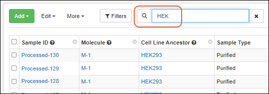
Enter your search terms in the
Search box above the grid to search the text fields in the grid. Click the X to clear the search terms.
Multi-Tabbed Sample Grids
When a grid could contain samples of multiple types, such as on a picklist or the
View All Samples grid, you'll see a separate tab for each
Sample Type as well as an
All Samples tab showing only properties common to all types, including the Sample ID, Status, and Storage information. There is a limited set of actions available on this tab that can be used for samples of multiple types, as shown in the first image below. Each individual sample type tab has the full set of grid actions, as shown in the second image.
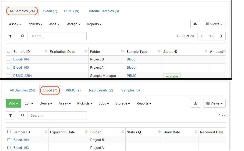
When there is only one type of sample in the grid, it will open on the specific
Sample Type tab. When there are several, it will open on the
All Samples tab, as shown above.
Editable Grids
Editable grids can be found throughout the application for entering and editing data for Samples, Sources, Assays, etc.
See an example of using editable grids here.
When using an editable grid, you can make use of the following options:
- When a field cannot be edited, such as the Folder field shown below, it will be shown grayed-out.
- For a Sample or Source grid, if user-defined names are allowed, the Sample ID (or Source ID) values are editable in a grid.
- All rows in the grid must be from folders where user-defined names are allowed, otherwise IDs will be read-only and grayed-out.
- Note that you cannot "swap" the names of two samples in the grid, as only new unique names are allowed. To make a swap, use a temporary intermediate name.
- Any field that offers a selection menu (Sample Status, Text Choice, list lookups), will be shown with a .
- Type ahead to narrow the choices and click or tab to select the highlighted value.
- For example, the Status field in the image below shows an open menu.
- Hover over the for the Status column to see a legend of available statuses.
- Some validation, such as confirming data is of the expected type, will be performed as you enter values, giving you an immediate indication of errors.
- When a Sample or Source field has identifying fields set, they will be shown in the dropdowns. An exception is that when editing Assay Results, the additional fields for Samples will only be shown when the assay is set to map to a specific Sample Type.
- Fields that support multi-select, like sources and parents, will show any existing selection as well as allow you to select more from the dropdown.
- The Tutorial Labs field below already contains one value, and you can add an additional value as appropriate.

Editable grids provide
"locking" of the sample ID column and column headers, so that it's easier to tell which cell is currently being edited.
Drag to Populate Columns
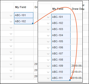
Entering a first value (or row of values), then using the 'drag handle' to apply them to multiple rows is a convenient way to populate a grid.
For a Text field, if you type some text in one field, then select it and grab the "cell-drag handle" in the lower right of the cell, you can drag to repeat it in the remaining cells.

Selecting a set of values and dragging down will repeat the section, including for lookup field selections.

For an Integer or Decimal number, enter two or more values, then select the series you want and drag the handle through the cells you want to fill with the same sequence. For example, below you see two versions of a Number column, one with a single-incrementing integer (1,2 -> 3,4,5) and a decimal incrementing by 2.1 (2.1, 4.2 -> 6.3, 8.4, 10.5).

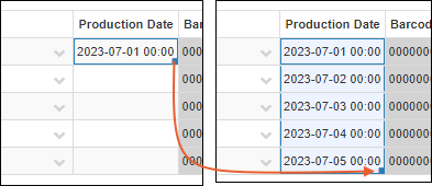
Date and DateTime fields will also be incremented if you populate one row, then drag, the remaining rows will be one day later.
If your field contains a text prefix with an incrementing number, dragging a section will populate the rest of the column continuing the prefixed-number series.
Cut/Paste to Duplicate Cells
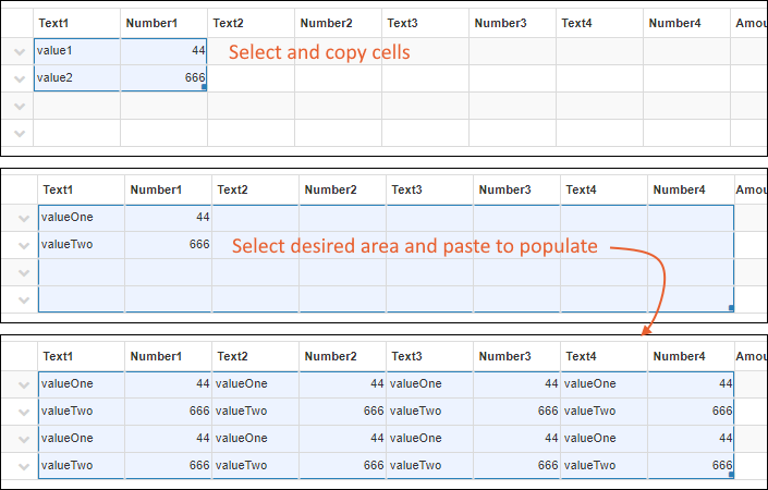
Pasting from a grid of cells, such as 2x2, into a 2x2 area will copy the grid as expected. Pasting into a larger area, such as 4x8, will replicate the pasted grid in the other cells as shown below. The target area may (but does not need to) include the originally selected cells.
Export Data
To export the data in a grid, click the
(Export) button and select the format for export:
- CSV
- Excel: Learn about exporting a multi-tabbed grid below.
- TSV
- If BarTender label printing is configured, you can also export and print labels and templates from this menu.

Notice the menu indicates whether you are exporting rows you have selected or the entire grid. To export the full grid, select no rows.
Multi-Tab Excel Exports
When you export from a
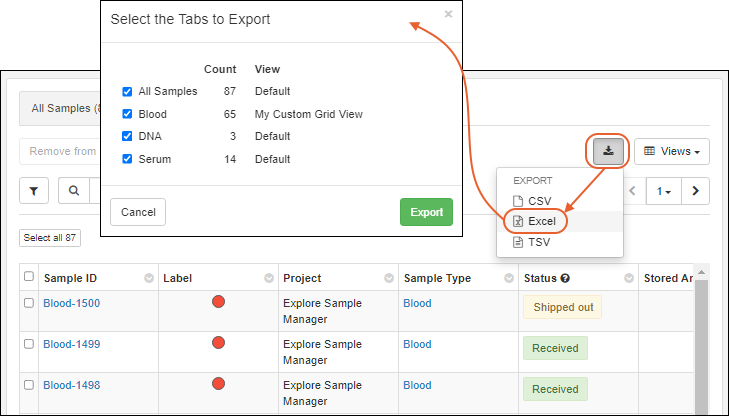
grid that contains multiple tabs, such as one containing samples of different types as shown below, the exported Excel file can also include multiple tabs (sheets). Select
> Excel, then in the popup, you will see the per-tab
Count and which
View will be used for each tab. Check the boxes for the tabs you want included in the export and click
Export.
Storage Map Exports
When viewing samples in a storage location, you can also export a
Storage Map for sharing or offline use. Learn more here:
Related Topics

 When there is only one type of sample in the grid, it will open on the specific Sample Type tab. When there are several, it will open on the All Samples tab, as shown above.
 Editable grids provide "locking" of the sample ID column and column headers, so that it's easier to tell which cell is currently being edited.