Create a Box Plot
- Navigate to the data grid you want to visualize.
- Select Charts > Create Chart to open the editor. Click Box.
- The columns eligible for charting from your current grid view are listed.
- Select the column to use on the Y axis and drag it to the Y Axis box.
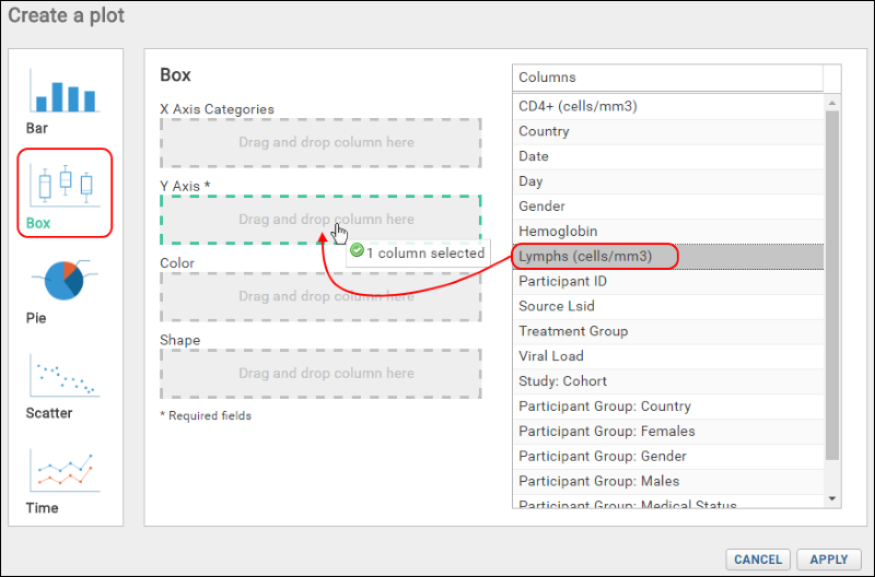
Only the Y Axis field is required to create a basic single-box plot, but there are additional options.
- Select another column (here "Study:Cohort") and choose how to use this column:
- X Axis Categories: Create a plot with multiple boxes along the x-axis, one per value in the selected column.
- Color: Display values in the plot with a different color for each column value. Useful when displaying all points or displaying outliers as points.
- Shape: Change the shape of points based on the value in the selected column.
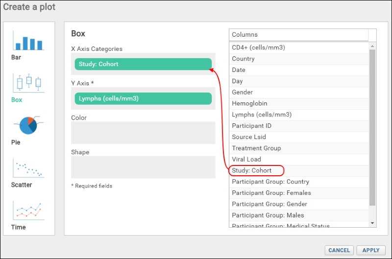
- Here we make it the X-Axis Category and click Apply to see a box plot for each cohort.
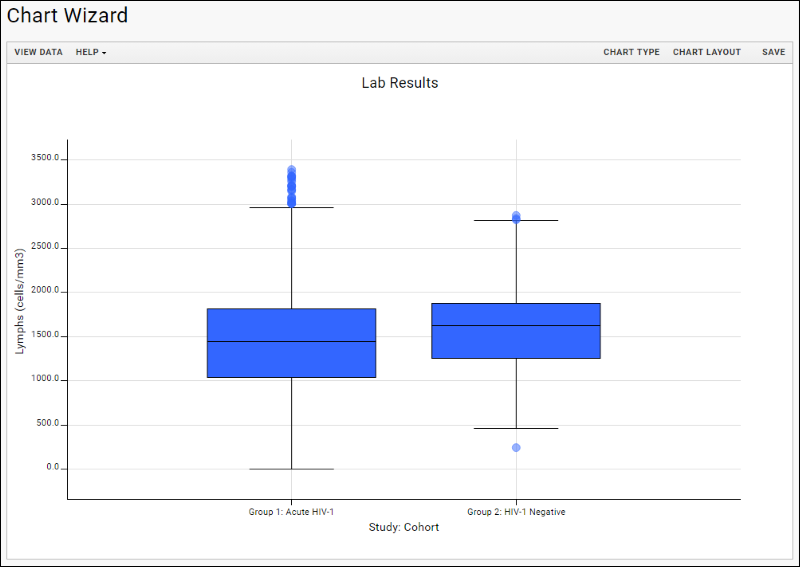
- Click View Data to see, filter, or export the underlying data.
- Click View Chart to return. If you applied any filters, you would see them immediately reflected in the plot.
- Customize your visualization using the Chart Type and Chart Layout links in the upper right.
- Chart Type reopens the creation dialog allowing you to:
- Change any column selection (hover and click the X to delete the current election). You can also drag and drop columns between selection boxes to change positions.
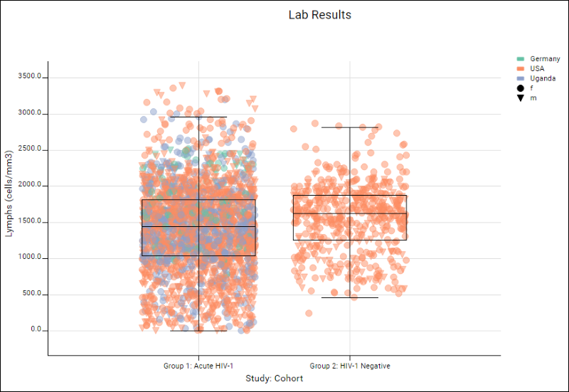
- Add new columns, such as to group points by color or shape. Here we've chosen "Country" and "Gender", respectively.
- Click Apply to see your changes and switch dialogs.
- Chart Layout offers options to change the look of your chart, including the option to show all data as points and jitter those points to make the color and shape distinctions we chose clearer.
- Click Apply to update the chart with the selected changes.
Here we see a plot with all data shown as points, jittered to spread them out colors vary by country and points are shaped based on gender. Notice the legend in the upper right. You may also notice that the outline of the overall box plot has not changed from the basic fill version shown above. This enhanced chart is giving additional information without losing the big picture of the basic plot.
- Chart Layout offers the ability to change the look and feel of your chart.
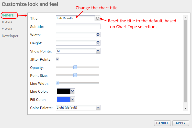
- There are 4 tabs:
- General:
- Provide a Title to show above your plot. By default, the dataset name is used, and you can return to this default at an time by clicking the refresh icon.
- Provide a Subtitle to show below the title.
- Specify the width and height.
- Elect whether to display single points for all data, only for outliers, or not at all.
- Check the box to jitter points.
- You can also customize the colors, opacity, width and fill for points or lines.
- X-Axis/Y-Axis:
- Change the display labels for the axes (notice this does not change which columns provide the data).
- Choose log or linear scale for the Y-axis, and if desired, apply a Range - the default is automatic. Select manual and specify the range if desired.
- Developer: Only available to users that are members of the "Site Developers" permission group.
- Provide a JavaScript function that will be called when a data point in the chart is clicked.
- Click Apply to update the chart with the selected changes.
- When your chart is ready, click Save.
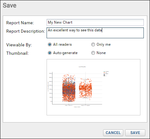
- Name the plot, enter a description (optional), and choose whether to make it viewable by others. You will also see the default thumbnail which has been auto-generated. You can elect None. As with other charts, you can later attach a custom thumbnail if desired.
Once you have created a box plot, it will appear in the
Data Browser and on the charts menu for the source dataset. You can manage metadata about it as described in
Manage Reports and Charts.
Export Chart
Hover over the chart to reveal export option buttons in the upper right corner:
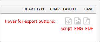
Export your completed chart by clicking an option:
- Script: pop up a window displaying the JavaScript for the chart which you can then copy and paste into a wiki. See Export Chart as JavaScript for a tutorial on this feature.
- PNG: create a PNG image.
- PDF: generate a PDF file.
Rules Used to Render the Box Plot
The following rules are used to render the box plot. Hover over a box to see a pop-up.
- Min/Max are the highest and lowest data points still within 1.5 of the interquartile range.
- Q1 marks the lower quartile boundary.
- Q2 marks the median.
- Q3 marks the upper quartile boundary.
- Values outside of the range are considered outliers and are rendered as dots by default. The options and grouping menus offer you control of whether and how single dots are shown.
Video
Related Topics