Time charts provide rich time-based visualizations for datasets and are available in LabKey study folders. In a time chart, the X-axis shows a calculated time interval or visit series, while the Y-axis shows one or more numerical measures of your choice. With a time chart you can:
- Individually select which study participants, cohorts, or groups appear in the chart.
- Refine your chart by defining data dimensions and groupings.
- Export an image of your chart to a PDF or PNG file.
- Export your chart to Javascript (for developers only).
Note: In a visit-based study, visits are a way of measuring sequential data gathering. To create a time chart of visit based data, you must first
create an explicit ordering of visits in your study. In a continuous study, there are no calculated intervals for measures used for generating time charts.
Create a Time Chart
- Navigate to the dataset, view, or query of interest. Time charts are only available in study folders.
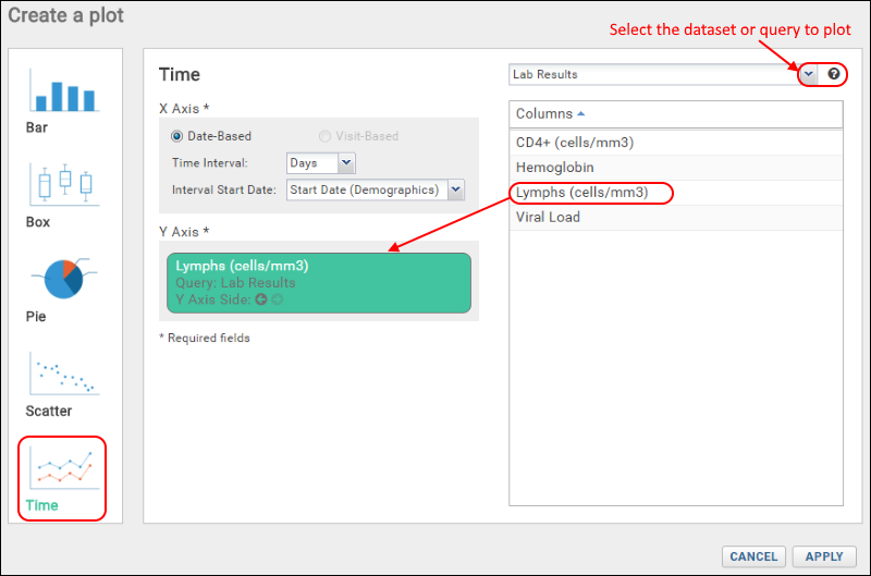
- Select Charts > Create Chart. Click Time.
- Whether the X-axis is date based or visit-based is determined by the study type. For a date-based study:
- Choose the Time Interval to plot: Days, Weeks, Months, Years.
- Select the desired Interval Start Date from the drop down menu. All eligible date fields are listed.
- At the top of the right panel is a drop down from which you select the desired dataset or query. Time charts are only supported for datasets/queries in the "study" schema which include columns designated as 'measures' for plotting. Queries must also include both the 'ParticipantId' and 'ParticipantVisit columns to be listed here.
- The list of columns designated as measures available in the selected dataset or query is shown in the Columns panel. Drag the desired selection to the Y-Axis box.
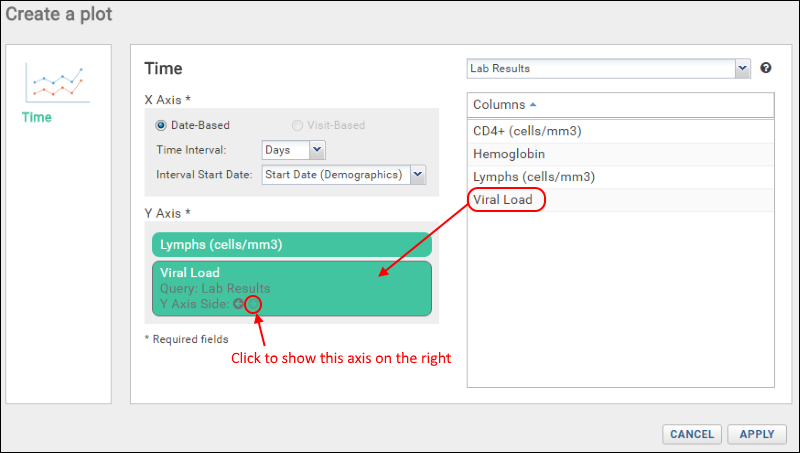
- By default the axis will be shown on the left; click the right arrow to switch sides.
- Click Apply.
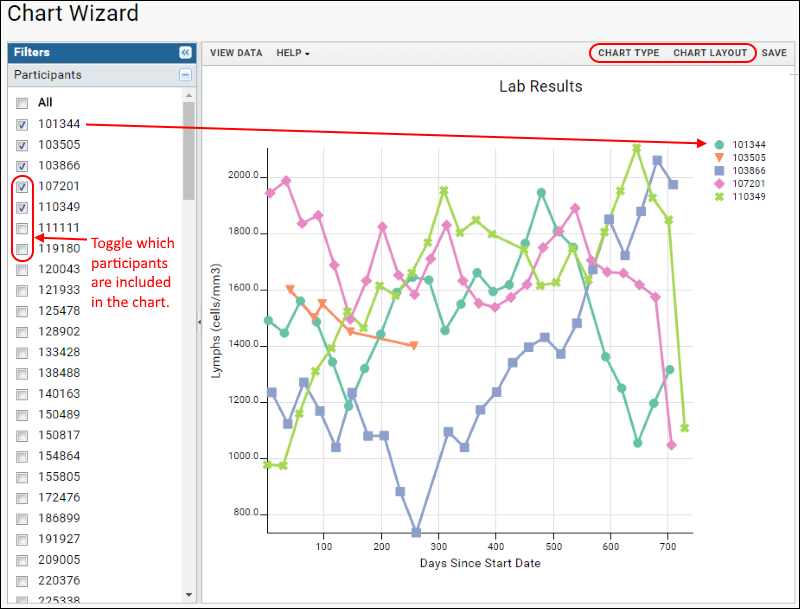
- The time chart will be displayed.
- Use the checkboxes in the Filters panel on the left:
- Click a label to select only that participant.
- Click a checkbox to add or remove that participant from the chart.
- Click View Data to see the underlying data.
- Click View Chart(s) to return.
- Customize your visualization using the Chart Type and Chart Layout links in the upper right.
- Chart Type reopens the creation dialog allowing you to:
- Change the X Axis options for time interval and start date.
- Change the Y Axis to plot a different measure, or plot multiple measures at once. Time charts are unique in allowing cross-query plotting. You can select measures from different datasets or queries within the same study to show on the same time chart.
- Remove the existing selection by hovering and clicking the X. Replace with another measure.
- Add a second measure by dragging another column from the list into the Y-Axis box.
- For each measure you can specify whether to show the Y-axis for it on the left or right.
- Open and close information panels about time chart measures by clicking on them.
- Click Apply to update the chart with the selected changes.
- Chart Layout offers the ability to change the look and feel of your chart.

There are at least 4 tabs:
- On the General tab:
- Provide a Title to show above your chart. By default, the dataset name is used.
- Specify the width and height.
- You can also customize the line width, and elect whether to hide data points along the line.
- Number of Charts: Choose whether to show all data on one chart, or separate by group, or by measure.
- Subject Selection: By default, you select participants from the filter panel. Select Participant Groups to enable charting of data by groups and cohorts using the same checkbox filter panel. Choose at least one charting option for groups:
- Show Individual Lines: show plot lines for individual participant members of the selected groups.
- Show Mean: plot the mean value for each participant group selected. Use the pull down to select whether to include range bars when showing mean. Options are: "None, Std Dev, or Std Err".
- On the X-Axis tab:
- Customize the Label shown on the X-axis. Note that changing this text will not change the interval or range plotted. Use the Chart Type settings to change what is plotted.
- Specify a range of X values to plot, or use the default automatic setting.
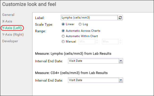
- There will be one Y-Axis tab for each side of the plot if you have elected to use both the left and right Y-axes. For each side:
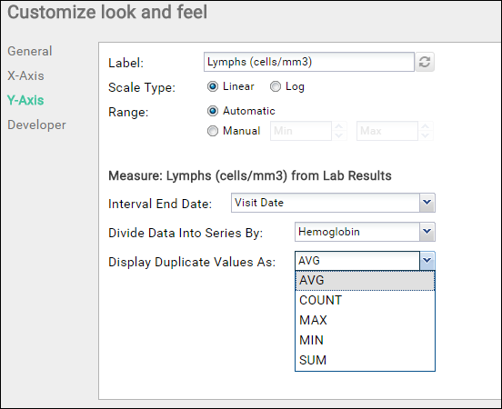
- Customize the Label shown on that Y-axis. Note that changing this text will not change the measure or range plotted.
- Select whether to use a linear or log scale on this axis.
- Range: Options are:
- Automatic across charts
- Automatic within chart
- Manual (specify min and max values)
- For each Measure using that Y-axis, you can choose an Interval End Date. The pulldown menu includes eligible date columns from the source dataset or query.
- On the Developer tab, users with developer access can provide a JavaScript function that will be called when a data point in the chart is clicked.
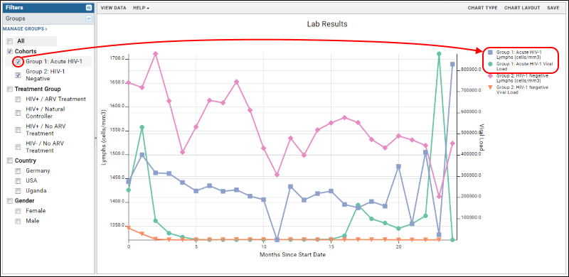
- Click Apply to update the chart with the selected changes. In this example, we now plot data by participant group. Note that the filter panel now allows you to plot trends for cohorts and other groups. This example shows a plot combining trends for two measures, lymphs and viral load, for two study cohorts.
- When your chart is ready, click Save.
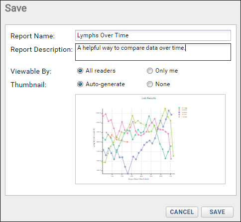
- Name the chart, enter a description (optional), and choose whether to make it viewable by others. You will also see the default thumbnail which has been auto-generated, and can choose whether to use it. As with other charts, you can later attach a custom thumbnail if desired.
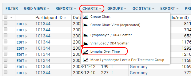
Once you have created a time chart, it will appear in the
Data Browser and on the charts menu for the source dataset.
Data Dimensions
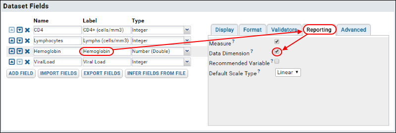
By adding dimensions for a selected measure, you can further refine the timechart. You can group data for a measure on any column in your dataset that is defined as a "data dimension". To define a column as a data dimension:
- Open a grid view of the dataset of interest.
- Click Manage.
- Click Edit Definition.
- In the Dataset Fields section, select a column.
- Select the Reporting tab.
- Place a checkmark next to Data Dimension.

To use the data dimension in a time chart:
- Click View Data to return to your grid view.
- Create a new time chart, or select one from the Charts menu and click Edit.
- Click Chart Layout.
- Select the Y-Axis tab.
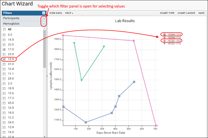
- The pulldown menu for Divide Data Into Series By will include the dimensions you have defined.
- Select how you would like duplicate values displayed. Options: Average, Count, Max, Min, Sum.
- Click Apply.
- A new section appears in the filters panel where you can select specific values of the new data dimension to further refine your chart.
Export Chart
Hover over the chart to reveal export option buttons in the upper right corner:
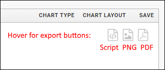
Export your completed chart by clicking an option:
- Script: pop up a window displaying the JavaScript for the chart which you can then copy and paste into a wiki. See Export Chart as JavaScript for a tutorial on this feature.
- PNG: create a PNG image.
- PDF: generate a PDF file.
Related Topics
