In this step we will ask more questions about our data, in particular:
- How do mean CD4 levels vary for different individuals over time?
- How do mean CD4 levels vary for different groups/cohorts over time?
To answer these questions, we will create a time chart.
Create a Time Chart
- Click the tab Clinical and Assay Data.
- In the Data Views web part, click Lab Results.
- Select Charts > Create Chart. Click Time on the left.
- Drag CD4+ (cells/mm3) from the column list on the right into the Y Axis box.
- Click Apply.
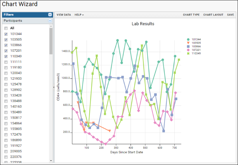
- You will see a time chart like the following:

- In the left hand Filters panel, you can select individual participants to include in the chart. Clicking any value label will select only the given participant, checking/unchecking the box allows you to toggle participants on and off the chart. Note that our sample data may include participants with incomplete data for whom lines will not be drawn.
- Include any four participants and click Save.
- Name the chart: "CD4 Levels, Individual Participants", and click Save.
Visualize Performance of Participant Groups
In this step we will create a chart comparing the CD4 levels for different treatment groups.
- Click Edit, then click Chart Layout.
- Under Subject Selection, choose Participant Groups and confirm that the box for Show Mean is checked and the pulldown is set to None.
- Click Apply.
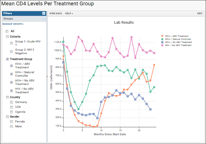
- The filters panel now shows checkboxes for participant groups you can select among.
- Check Treatment Group and uncheck any other categories that were selected by default (Cohorts). Depending on the width of your browser window, the chart may be very crowded at this stage.
- Click Chart Type.
- In the X Axis box, change the Time Interval to "Months".
- Click Apply. Fewer data points make the chart simpler.
- The X-axis label may still read "Days Since Start Date" - to change it, click Chart Layout, select the X-Axis tab, and edit the X-axis label to read Months instead of Days. Click Apply.
- Click Save As, name the report "Mean CD4 Levels Per Treatment Group", and click Save.
- You now have a chart comparing the mean CD4+ levels of the different treatment groups over time.

Add More Data to the Chart
- Click Edit, then Chart Type.
- Drag another interesting data measure, like Lymphs, to the Y Axis box. Notice that a second panel is created; the original Y axis selection is not replaced.
- Click the right-pointing arrow to switch the Y Axis Side to the right for this measure. Notice as well that the measure lists the query from which it came. You could use the pulldown above the column name listing to select a different query from which to join a different column.
- Click Apply. The new chart will have a second set of lines for each treatment group using the second measure.
- Click Save As and save your new version of this chart as "CD4 and Lymph Levels Per Treatment Group".
- Refine your chart exploring the menus and options available for time charts.
- If at any time you find yourself elsewhere in the study, you can find your chart again by clicking the Clinical and Assay Data tab and then selecting the chart name. Click Edit to make further changes.
See if you can discover any relationships or trends in our sample data.
Related Resources
The following articles describe TrialShare, a collaborative application for managing multiple cohort studies, based on LabKey Server.
- Participant-Level Data and the New Frontier in Trial Transparency (NEJM)
- Efficacy of Remission-Induction Regimens for ANCA-Associated Vasculitis (NEJM)

