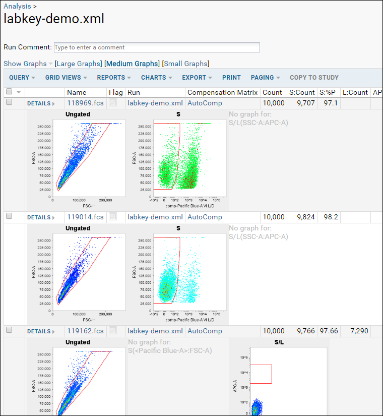
In this step we will examine our data graphs. Graphs are selected within the grid customizer, but not shown by default.
Review Graphs
- From the Flow Dashboard, click Analysis then labkey-demo.xml to return to the grid.
- Select Show Graphs > Inline.

- The inline graphs are rendered. Note: for large datasets, it may take some time for all graphs to render. Some metrics may not have graphs. See a similar online example.

- Note that graph size options are available at the top of the data table.
- Click on any graph image to make it pop forward in a larger format.
- See thumbnail graphs in columns by selecting Show Graphs > Thumbnail.
- Hide graphs by selecting Show Graphs > None.
Review Other Visualizations
The following pages provide other views and visualizations of the flow data.
- Scroll down to the bottom of the labkey-demo.xml page.
- Click Show Compensation to view the compensation matrix. (Compensation Matrix (similar online example))
- Go back to labkey-demo.xml.
- Click Experiment Run Graph and then choose the tab Graph Detail View to see a graphical version of the pipeline process.
- Note that if you don't have dot installed locally, this graph may not display. See a similar online example here.
