Use the file repository as a
launching point for applying different tools to the data, especially "structured" data that can be imported to the database, for example, tabular spreadsheet data. Using the repository as a launching point, you can:
- Create visualizations and SQL queries of selected data.
- Import assay runs to an analysis dashboard.
- Run an analysis on a genetic sequence file.
- Pass the file to an R script sequence you define.
In the steps below, we will import data to use with analysis and visualization tools.
Import Data for Visualization
First, import some file you want to visualize. You can pick a file of interest to you, or follow this walkthrough using the sample file provided. When you "import" a file into LabKey Server, you
add its contents to the database. This makes the data available to a wide variety of analysis/integration tools and dashboard environments inside LabKey Server. In the steps below we will import some data of interest and visualize it using an assay analysis dashboard.
- In the Files web part, open the folder DataForImport.
- Select the file Lab Results.xls
- Click Import Data.
- Select Create New General Assay Design.

- Click Import.
- Enter a Name, for example "Preliminary Lab Data".
- Select the current folder as the Location.
- Notice the import preview area below. Let's assume the inferred columns are correct and accept all defaults.
- Click Begin Import, then Next to accept the default batch properties, then Save and Finish.
- When the import completes, you see the list of runs, consisting of the one file we just imported.
- To make it easier to access this data later, we can add a web part to show it:
- Click the Start Page tab.
- At the lower left of the screen, click <Select Web Part>, select Query, and click Add.
- Web Part Title: Enter "Preliminary Data" or whatever you would like the title to be.
- Schema: Select "assay.General.Preliminary Lab Data" (or whatever you named your assay when you defined it above).
- Click "Show the contents of a specific query and view."
- Query: Select "Data."
- Leave the default settings for View and the other remaining options.
- Click Submit.
- Scroll down to see your new data grid.
Create a Box Plot
- Explore the new Preliminary Data web part (or whatever name you gave your web part).
- Select Charts > Create Chart. Click Box.
- Drag the column "Cohort" to the X Axis Grouping box.
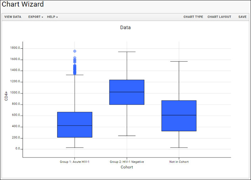
- Drag the column "CD4+" to the Y Axis box.
- Click Apply and you will see a box and whisker plot for the CD4+ levels of each cohort.

- Explore more chart options via the Chart Type and Chart Layout buttons. You can also return to the data grid and explore more visualization options on the Reports menu.
