[
Video Overview: Column Visualizations ]
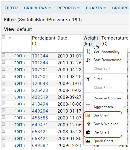
Click a column header to see a list of Column Visualizations, small visualizations that apply to a single column. When selected, the visualization is added to the top of the data grid. Multiple visualizations can be added at a time.
Visualizations will be updated to reflect updates to the underlying data and to any filters added to the data grid.
Column Visualizations are persisted within a
saved custom view. When you come back to the saved view, the Column Visualizations will appear again.
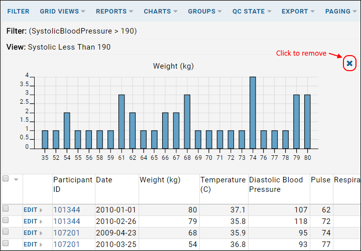
To remove a chart, hover over the chart and click the 'X' in the upper right corner.
Available visualization types are determined by whether the column is a
Measure and/or a Dimension.
- The box plot option is shown for any column marked as a Measure.
- The bar and pie chart options are shown for any column marked as a Dimension.
Column visualizations are simplified versions of standalone charts of the same types. Click any chart to open it within the plot editor which allows you to make many additional customizations and save it as a new standalone chart.
Bar Chart
A histogram of the Weight column.

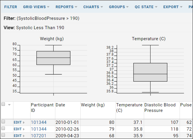
Box and Whisker Plot
A basic box plot report. You can include several column visualizations above a grid simultaneously.

Pie Chart
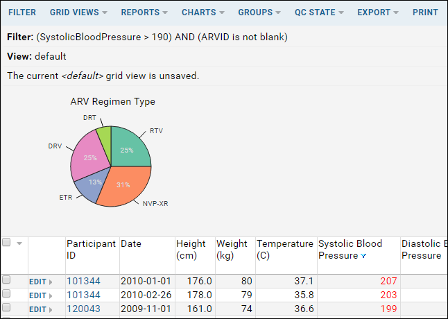
A pie chart showing prevalence of ARV Regimen types.
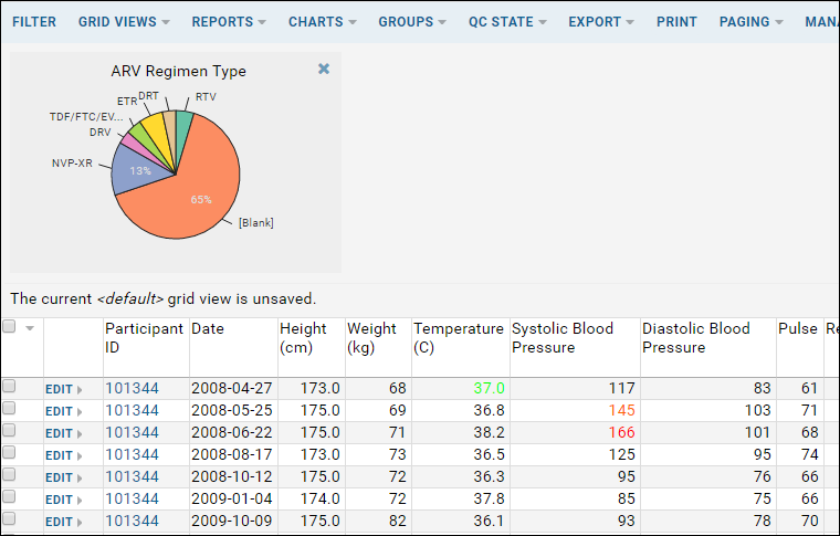
Filters are also applied to the visualizations displayed. If you filter to hide 'blank' ARV treatment types, the pie chart will update.
Related Topics
 To remove a chart, hover over the chart and click the 'X' in the upper right corner.Available visualization types are determined by whether the column is a Measure and/or a Dimension.
