These legacy chart views are no longer under active development. For current versions of these features, see:
Types of Charts
Chart Views are a legacy chart type and let you create several types of graphs for visualizing datasets.
Time and Scatter Plots. LabKey provides two types of plots:
time plots and
scatter plots. A time plot traces the evolution of a particular measurement over time while a scatter plot displays a series of points to visualize relationships between measurements. Chart Views can contain both time plots and scatter plots on a single page.
Participant Charts. Ordinary charts display all selected measurements for all participants on a single plot.
Participant charts display participant data on a series of separate charts. One chart for one participant is displayed at a time. When a Chart View is composed of participant charts, users can step through the Chart View participant-by-participant to see charts for each individual. Both time plots and scatter plots can be displayed as participant charts.
Create a Chart
To create a new chart, you first need to navigate to a
dataset grid view, typically by clicking on the name of a dataset on the Study Portal page. You can create charts for subsets of data by first
Filtering Data or creating a
Custom Grid View.
Create Chart View
To open the chart designer, on the dataset grid view, click
Charts > Create Chart View.
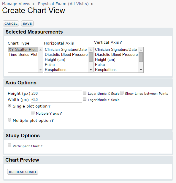
The chart designer lets you can choose whether to create a time plot or a scatter plot.
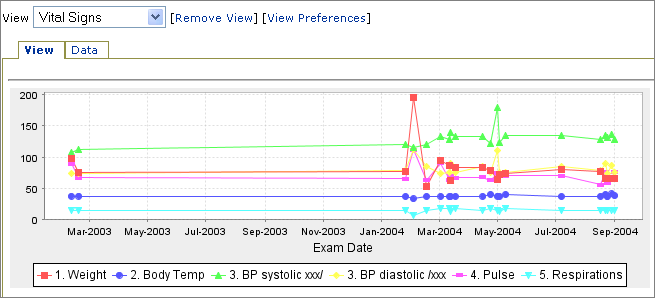
Time Plots. A time plot charts one or more measures (on the Y axis) over time (on the X axis). Lines connect time measurements.
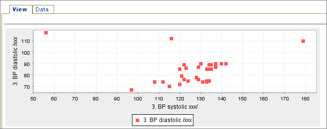
Scatter Plots. A scatter plot charts one or more numeric measures (on the Y axis) against a second numeric measure (on the X axis).
Horizontal Axis: Time Plots. If you have selected a time plot, you will choose a measure of time for the X measurement. The fields displayed in the list for the X measurement are the dataset fields of type Date/Time.
Horizontal Axis: Scatter Plots If you choose a scatter plot, you can select any measurement included in your dataset as the X vector.
Vertical Axis. Choose a Y measurement to plot against your chosen X. Note that you can select multiple values by holding down the
Ctrl key.
Axis Options. You can also choose whether the axes are logarithmic, set the height and width of the plot in pixels.
If you select
Single plot option, then a single chart will be created, where multiple y-values are plotted against one set of x-values all on the same x- and y-axes, as shown below.

If you check the
Multiple Y axis checkbox, then a separate metric will be provided for each Y-axis (see below). If left unchecked, a single metric will be provided (see above).

If you select
Multiple plot option, then multiple charts will be created, one chart for each set of vertical measurements.

Select
Refresh Chart to preview the chart(s) to be created.
One Chart for All Participants
Select the
Participant Chart checkbox to create one chart for each participant instead of graphing all participants' data records on a single chart. If you leave it unchecked, you will see a chart that graphs data for all participants at once.
Time Plot. A time plot that shows "Vital Signs" recorded over time:
 Scatter Plot.
 A scatter plot that graphs "Diastolic vs. Systolic Blood Pressure":
Multiple Charts, One for Each Participant
If you select the
Subject Chart checkbox, you will see each participant's records graphed separately. You can navigate through the participants in the dataset, displaying the chart as it is plotted for each participant. In the images below, note the
Previous Participant and
Next Participant links.
Time Plot. The same data used to create the "Vital Signs" time plot displayed above produces participant plots like this:
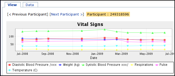
For an example of a set of participant charts like the screenshot above, see the following set of charts in the Demo Study:
Vital Signs.
Scatter Plot. The same data used to create the "Diastolic vs. Systolic Blood Pressure" scatter plot shown earlier can be used to produce participant plots like this:
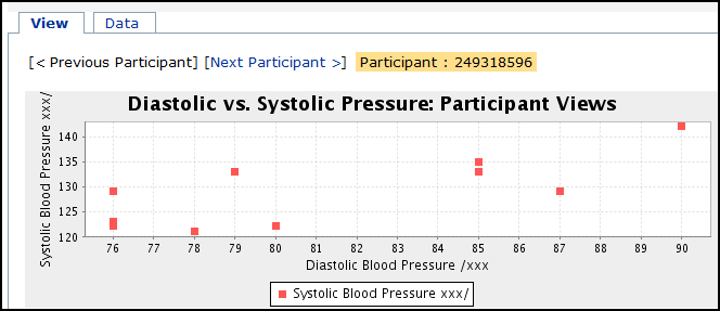
For an example of a set of participant charts like the screenshot above, see the following set of charts in the Demo Study:
Participant Views: Diastolic/Systolic.
Save. The "Save" button, located at the top of the chart designer page, takes you to the
Save Chart View dialog. Specify a name for the Chart View and select the appropriate dataset from the drop-down menu (labeled with
Add as a Custom View for:). By default, the chart view is associated with the dataset used to create it.
Access Chart View. Your newly-created Chart View can be accessed through the
Charts drop-down menu on the dataset's
grid view. It will also appear on the Clinical and Assay Data tab.
Creating an Embedded Chart
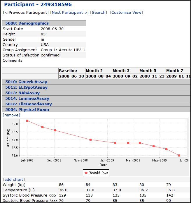
You can create a chart that is embedded within a dataset. Click on a participant ID in a
dataset grid view to display data as a Participant View. Next, expand the dataset of interest and by clicking on its name. Click the
Add chart link to display the chart designer. Create a time plot or scatter plot as described above, click
Refresh Chart to preview, then click
Save to create the chart.
In the future, when you go to a Participant View (by clicking on a participantID in a dataset grid view), you will see this chart plotted for each participant when you scroll through participants using the
Previous Participant and
Next Participant links.
This example shows a time plot for one participant:

Related Topic: Enrollment Report
An
Enrollment Report is a specialized report available in a visit based study which plots participant enrollment in a study using visit date information provided in a given dataset.
 If you check the Multiple Y axis checkbox, then a separate metric will be provided for each Y-axis (see below). If left unchecked, a single metric will be provided (see above).
 If you select Multiple plot option, then multiple charts will be created, one chart for each set of vertical measurements.
 Select Refresh Chart to preview the chart(s) to be created.
 Scatter Plot. A scatter plot that graphs "Diastolic vs. Systolic Blood Pressure":
 For an example of a set of participant charts like the screenshot above, see the following set of charts in the Demo Study: Vital Signs.Scatter Plot. The same data used to create the "Diastolic vs. Systolic Blood Pressure" scatter plot shown earlier can be used to produce participant plots like this:
 For an example of a set of participant charts like the screenshot above, see the following set of charts in the Demo Study: Participant Views: Diastolic/Systolic.Save. The "Save" button, located at the top of the chart designer page, takes you to the Save Chart View dialog. Specify a name for the Chart View and select the appropriate dataset from the drop-down menu (labeled with Add as a Custom View for:). By default, the chart view is associated with the dataset used to create it.Access Chart View. Your newly-created Chart View can be accessed through the Charts drop-down menu on the dataset's grid view. It will also appear on the Clinical and Assay Data tab.
