Create a Scatter Plot
The
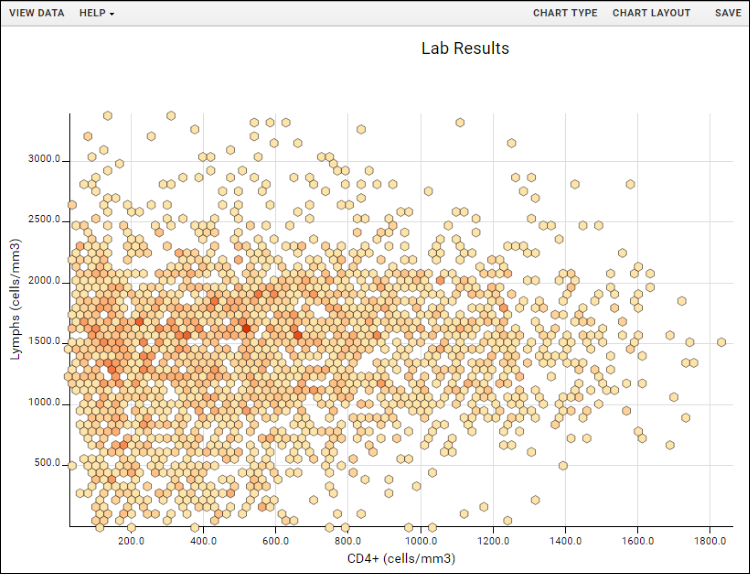
Chart Layout button offers the ability to change the look and feel of your chart. For example, very large datasets are easier to interpret as heatmaps, grouped by density (also known as point binning).

There are four tabs:
- General:
- Provide a title to display on the plot. The default is the name of the source data grid.
- Provide a subtitle to display under the title.
- Specify a width and height.
- Choose whether to jitter points.
- Control the point size and opacity, as well as choose the default color palette. Options: Light (default), Dark, and Alternate. The array of colors is shown under the selection.
- Group By Density: Select either "Always" or "When number of data points exceeds 10,000."
- Grouped Data Shape: Choose either hexagons or squares.
- Density Color Palette: Options are blue & white, heat (yellow/orange/red), or select a single color from the dropdown to show in graded levels. These palettes override the default color palette and other point options in the left column.
- X-Axis/Y-Axis:
- Change the display labels for the axis (notice this does not change which column provides the data).
- Choose log or linear scale for the Y-axis, and specify a range if desired.
- Developer: Only available to users that are members of the "Site Developers" permission group.
- Provide a JavaScript function that will be called when a data point in the chart is clicked.
- Click Chart Layout and change Group By Density to "Always".
- Select Heat as the Density Color Palette and leave the default Hexagon shape selected
- Click Apply to update the chart with the selected changes.

- Notice that when binning is active, a warning message will appear reading: "The number of individual points exceeds the limit set in the Chart Layout options. The data will be displayed according to point density in a heat map." Click Dismiss to remove that message from the display.
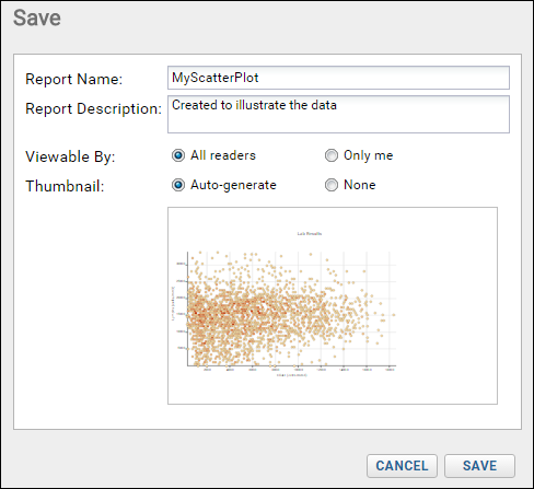
- When your chart is finished, click Save.

- Name the chart, enter a description (optional), and choose whether to make it viewable by others. You will also see the default thumbnail which has been auto-generated, and can choose whether to use it. As with other charts, you can later attach a custom thumbnail if desired.
Once you have saved a scatter plot, it will appear in the
Data Browser and on the charts menu for the source dataset. You can manage metadata about it as described in
Manage Reports and Charts.
Export Chart
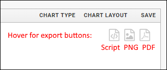
Hover over the chart to reveal export option buttons in the upper right corner:

Export your completed chart by clicking an option:
- Script: pop up a window displaying the JavaScript for the chart which you can then copy and paste into a wiki. See Export Chart as JavaScript for a tutorial on this feature.
- PNG: create a PNG image.
- PDF: generate a PDF file.
Video
Related Topics
