Now that you have imported the Demographic and Clinical datasets, and told the server which columns hold the Participant and Time information, you can start to take advantage of the integrated data. In this step we will (1) create a quick visualization of the CD4 levels, (2) create a data grid that brings together columns from two tables that were previously in separated Excel spreadsheets, and (3) we will compare how the cohorts perform against one another on a key measure.
Quick Chart: CD4 Levels by Cohort
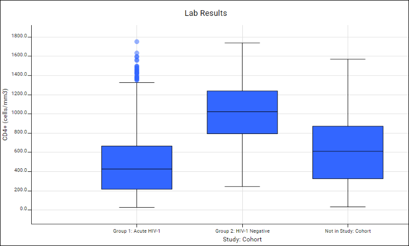
We would expect that the CD4 levels for the two cohorts would differ: the HIV+ group should have overall lower CD4 levels compared to the HIV- group. Below we will confirm this using a quick visualization.
- Click the Clinical and Assay Data tab.
- Click the Lab Results dataset.
- Click the column CD4+ (cells/mm3) and select Quick Chart.
- LabKey Server will make a "best guess" visualization of the CD4 column. It puts the CD4 values on the Y axis, and puts the Cohorts on the X axis, assuming that you want to compare the CD4 values against the most important category in the study: the cohorts. The plot confirms that CD4 levels are lower for the Acute HIV-1 group. Notice there is a third box plotted for participants not assigned to either cohort in the study.

- Click Save, name the chart "CD4+ by Cohort", and click Save.
- Click the Clinical and Assay Data tab. Notice that the chart has been added to the list.
Custom Grid Views: Joined Tables
It would also be interesting to see how the CD4+ and Viral Load measures compare against one another. To do this, we will combine data from two different datasets: Lab Results and HIV Test Results.
- Click the Clinical and Assay Data tab.
- Click the Lab Results dataset.
- Select Grid Views > Customize Grid.
- This brings you to the grid customization panel, where you can pull in columns from other tables to form joined grids.
- In the Available Fields panel, scroll down and open the node Datasets. Never mind that Datasets is greyed out -- this only means that you cannot select it directly, but you can select the columns it contains.
- Open the node HIV Test Results and select (place a checkmark next to) Viral Load Quantified (copies/ml). This indicates that you wish to add the Viral Load Quantified column to the current dataset, the Lab Results dataset.
- Click Save.
- In the Save Custom Grid dialog, select Named and enter Lab Results with Viral Load. Click Save.
You now have a data grid containing columns from both the Lab Results and the HIV Test Result table. Next, you can visualize the CD4 levels against the Viral Load levels.
- On the joined grid select Charts > Create Chart and click Scatter.
- For the X axis, select CD4 by dragging it from the list of columns on the right into the appropriate box.
- For the Y axis, select Viral Load Quantified.
- Click Apply.
- Next render the Y axis with a log scale to get a better view.
- Click Chart Layout and click "Y axis" on the left.
- Select log, and click Apply.

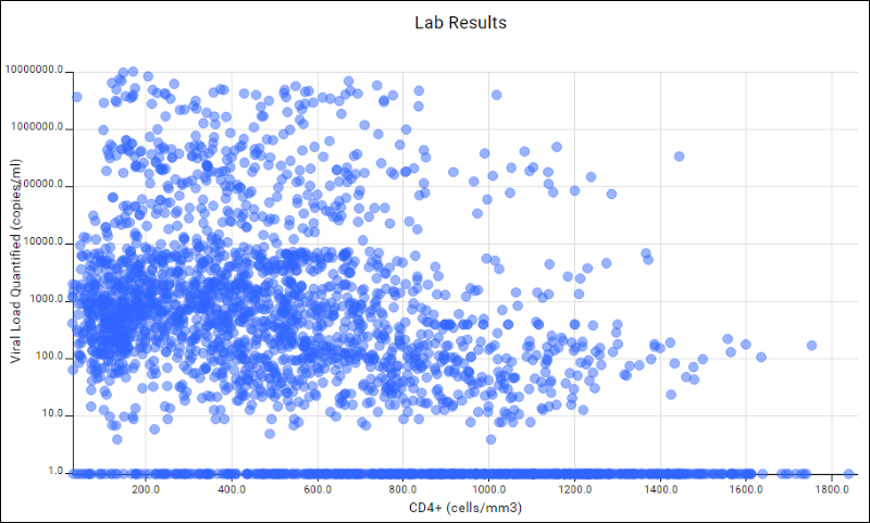
- The resulting scatter plot gives you a sense that the two measures are in inverse relationship to one another, which you would expect. To refine the chart, you could click View Data, filter the viral load quantified column to only show rows for values that are greater than 0, and click View Chart to return to the chart which is immediately filtered to reflect your change.
- Click Save, give it the name "Viral Load / CD4 Scatter Plot", and click Save.
Time-based Reports
Next let's get a sense of how the cohorts perform over the course of the study. Below we will create a chart that shows the cohorts CD4 levels over the course of the study. This is a two step process: first we need to tell the server which columns are "measures", that is, which columns are available on the Y axis of a time-based chart; (2) then we will create the chart.
- Click the Clinical and Assay Data tab.
- Click the Lab Results dataset.
- Click Manage in the header bar of the grid, then click Edit Definition.
- Scroll down to the Dataset Fields and click inside the text box containing CD4.
- Notice the tabs that appear to the right. Select the Reporting tab, and check the box next to Measure.
- Click Save.
- Now we are ready to make a time-chart on the CD4 levels.
- Click View Data.
- On the Lab Results dataset, select Charts > Create Chart.
- Click Time.
- Drag the CD4+ column (the only column marked as a measure) to the Y Axis box.
- Click Apply.
- The server initially renders a time chart of the CD4 levels for the first 5 individual participants in the study.
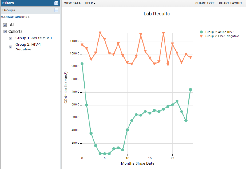
- To see how the cohorts compare, click Chart Layout, select Participant Groups and click Apply.There are now two lines, one for each cohort.
- To simplify the chart, click Chart Type and change the Time Interval to Months, and click Apply.
- The resulting visualization shows a clear performance difference between the two cohorts over time.
- Save the report under the name: "CD4 Levels over Time".

Next Steps
This tutorial has given you a quick tour of LabKey Server's data integration features. There are many features that we haven't looked at, including:
- Custom participant groups. You can create groups that are independent of the cohorts and compare these groups against one another. For example, it would be natural to compare those receiving ARV treatment against those not receiving ARV treatment. For details see Participant Groups.
- Assay data. We have yet to add any assay data to our study. For details on adding assay data to a study, see Tutorial: Design a General Purpose Assay Type (GPAT). You can treat this assay tutorial as a continuation of this tutorial: simply use the same study repository and continue on to the assay tutorial.
- R reports. You can build R reports directly on top of the integrated study data. For details see R Reports. For an example see our online demo study.
