A bar plot is a visualization comparing measurements of numeric values across categories. The relative size of the bar indicates the relationship between the variable for groups like cohorts in a study.
Create a Bar Chart
- Navigate to the data grid you want to visualize.
- Select (Charts) > Create Chart to open the editor. Click Bar (it is selected by default).
- The columns eligible for charting from your current grid view are listed.
- Select the column of data to use for separating the data into bars and drag it to the X Axis Categories box.

- Only the X Axis Categories field is required to create a basic bar chart. By default, the height of the bar shows the count of rows matching each value in the chosen category. In this case the number of participants from each country.
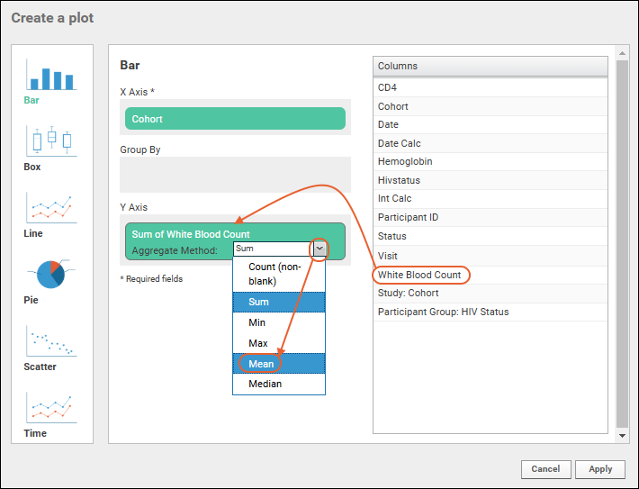
- To use a different metric for bar height, select another column and drag it to the box for the Y Axis column. Notice that you can select the aggregate method to use. By default, SUM is selected and the label reads "Sum of [field name]". Here we change to "Mean"; the Y Axis label will update automatically.
Bar Chart Customizations
- To remove various values from your chart, such as if your data includes a large number of "blank" values:
- Click View Data.
- Click the relevant column header, then select Filter.
- Click the checkbox for "Blank" to deselect it.
- Click OK in the popup.
- Click View Chart to return to the chart which is re-calculated without the data you filtered out.
To make a grouped bar chart, we'll add data from another column.
- Click Chart Type to reopen the creation dialog.
- Drag a column to the Split Categories By selection box.

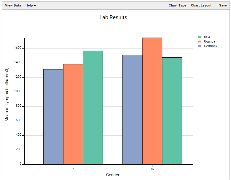
- Click Apply to see grouped bars. The "Split" category is now shown along the X axis with a colored bar for each value in the "X Axis Categories" selection chosen earlier. A legend shows the color map.
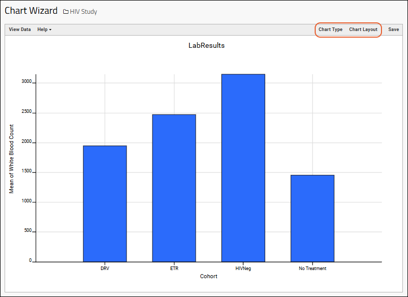
- Further customize your visualization using the Chart Type and Chart Layout links in the upper right.
- Chart Type reopens the creation dialog allowing you to:
- Change the "X Axis Categories" column (hover and click the X to delete the current election).
- Remove or change the Y Axis metric, the "Split Categories By" column, or the aggregation method.
- You can also drag and drop columns between selection boxes to change how each is used.
- Note that you can also click another chart type on the left to switch how you visualize the data with the same axes when practical.
- Click Apply to update the chart with the selected changes.
Change Layout
- Chart Layout offers the ability to change the look and feel of your chart.
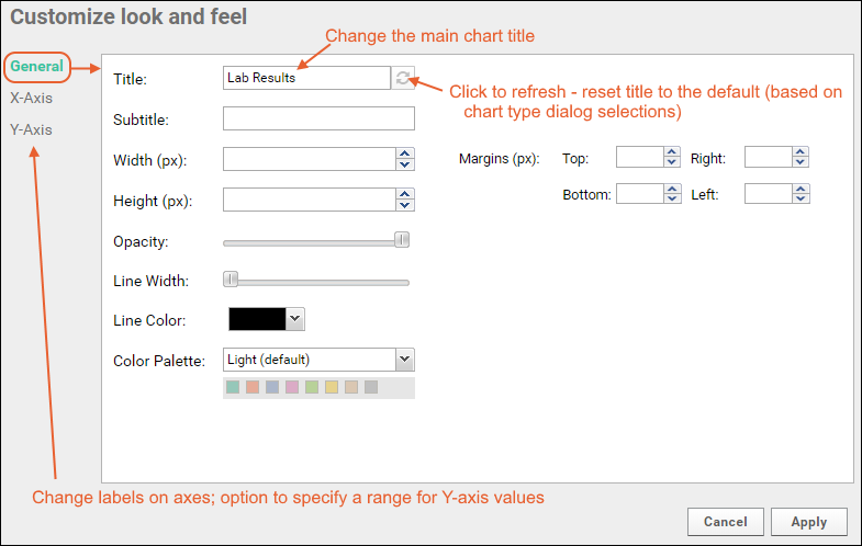
There are 3 tabs:
- General:
- Provide a Title to show above your chart. By default, the dataset name is used; at any time you can return to this default by clicking the (refresh) icon for the field.
- Provide a Subtitle to print under the chart title.
- Specify the width and height.
- You can also customize the opacity, line width, and line color for the bars.
- Select one of three palettes for bar fill colors: Light, Dark, or Alternate. The array of colors is shown.
- Margins (px): If the default chart margins cause axis labels to overlap, or you want to adjust them for other reasons, you can specify them explicitly in pixels. Specify any one or all of the top, bottom, left, and right margins. See an example here.
- X-Axis/Y-Axis:
- Label: Change the display labels for the axis (notice this does not change which column provides the data). Click the icon to restore the original label based on the column name.
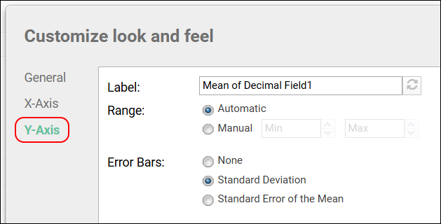
- For the Y-axis, the Range shown can also be specified - the default is Automatic across charts. Select Automatic Within Chart to have the range based only on this chart. You can also select Manual and specify the min and max values directly.
- When the Aggregate Method is set to Mean, the Error Bars options are: None, Standard Deviation, Standard Error of the Mean

- Click Apply to update the chart with the selected changes.
Save and Export Charts
- When your chart is ready, click Save.
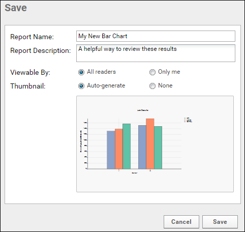
- Name the chart, enter a description (optional), and choose whether to make it viewable by others. You will also see the default thumbnail which has been auto-generated, and can choose whether to use it. As with other charts, you can later attach a custom thumbnail if desired.
Once you have created a bar chart, it will appear in the
Data Browser and on the
(charts) menu for the source dataset. You can manage metadata about it as described in
Manage Data Views.
Export Chart
Hover over the chart to reveal export option buttons in the upper right corner:

Export your completed chart by clicking an option:
- PDF: generate a PDF file.
- PNG: create a PNG image.
- Script: pop up a window displaying the JavaScript for the chart which you can then copy and paste into a wiki. See Tutorial: Visualizations in JavaScript for a tutorial on this feature.
Videos
Related Topics

