Now that your datasets have been aligned with participant and time information, and cohort information has been extracted, you can start to take advantage of the integrated data. In this step you will create grids and visualizations based on the aligned data.
Visualize Cohort Performance
LabKey makes it easy to incorporate cohort categories into visualizations. To see this, we will create a visualization that compares blood cell counts across the cohort groups.
- Click the Clinical and Assay Data tab and click the Lab Results dataset.
- Click the header for the CD4 column and select Quick Chart.
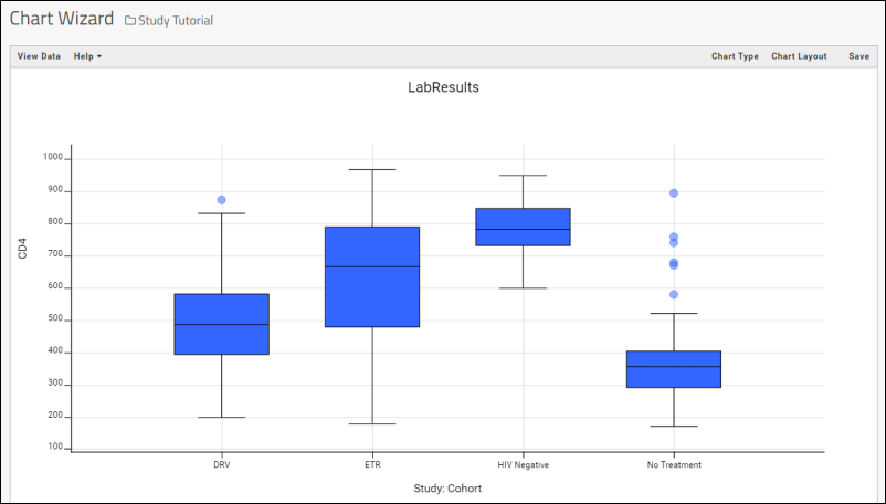
- LabKey Server will make a "best guess" visualization of the column. In this case, a box plot which shows the distribution of values, organized by cohort groups:

- Notice that you are now in the main plot editor and could change the chart type and layout as you like.
- Optionally, you can click Save, name the plot "CD4 Counts by Cohort", and click Save.
- If you save this chart, click the Clinical and Assay Data tab. Notice that the chart has been added to the list.
Create Data Grids from Combined Datasets
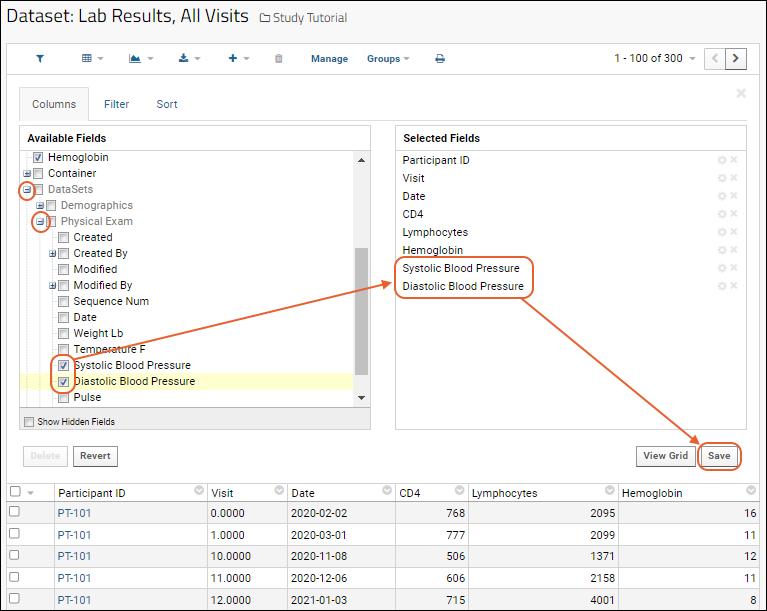
What if you want to compare two measurements that are in different datasets? For example, is there a relationship between CD4 cell counts (from the "Lab Results" spreadsheet) the blood pressure measurements (from the "Physical Exam" spreadsheet)? Now that the spreadsheets have been imported to the LabKey study as datasets, we can easily create a combined, or joined view, of the two.
Plot Combined Data
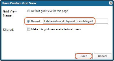
- Confirm you are viewing the combined grid view named "Lab Results and Physical Exam Merged".
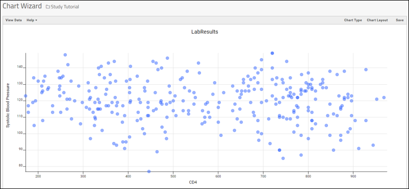
- Select (Charts) > Create Chart. This opens the chart designer where you can create and customize many types of charts. The Bar plot type is selected by default.
- In the left panel, click Scatter.
- For the X Axis, select CD4 by dragging it from the list of columns on the right into the box. This column came from the "Lab Results" dataset.
- For the Y axis, select Systolic Blood Pressure. This column came from the "Physical Exam" dataset.
- Click Apply.

- Click Save, name the report "CD4+ Counts vs. Blood Pressure", and click Save in the popup.
- Your chart will now be added to the Clinical and Assay Data tab.

Plot Trends Over Time
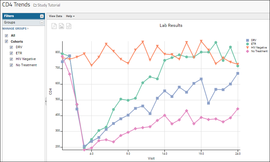
A key part of longitudinal study research is identifying trends in data over time. In this example, we will create a chart that shows cell counts for the cohorts over the course of the study.
- Click the Clinical and Assay Data tab.
- Click the Lab Results dataset.
- Select (Charts) > Create Chart.
- Click Time.
- Notice there are no columns to plot.
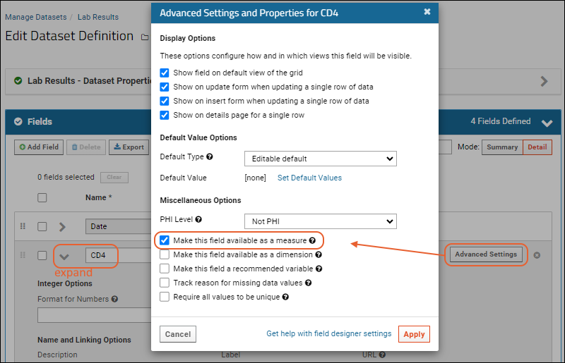
Time charts require that columns used have been explicitly marked as "measures". To do so we edit the dataset definition:
- Click Cancel to leave the plot editor and return to the grid for Lab Results.
- Click Manage in the header bar of the grid, then click Edit Definition.
- Click the Fields section to open it.
- Expand the CD4 field.
- Click Advanced Settings.
- In the popup, check the box for Make this field available as a measure.

- To increase your charting options, repeat for the other 2 numeric fields (Lymphocytes and Hemoglobin).
- Click Apply, then Save.
Now we are ready to plot cell counts on a time chart.
- Click View Data to return to the "Lab Results" data grid.
- Select (Charts) > Create Chart.
- Click Time again. Notice now that the columns you marked as measures are listed on the right.
- Choose Visit-based for the X Axis field.
- Drag the CD4 column to the Y Axis box.
- Click Apply.
By default, the time chart plots for the first 5 individual participants in the data grid. To instead compare trends in the
cohorts:
- Click Chart Layout where you can customize the look and feel of a chart.
- Change the Subject Selection to Participant Groups.
- Click Apply.
There are now four lines, one for each cohort. Now we see a clear trend (in our fictional data) where CD4 levels in the HIV negative cohort generally stay flat over time, while the other cohorts vary over the 24 months studied.
- Click Save.
- Name your time chart "CD4 Trends" and click Save in the popup.

Congratulations
You have completed the tutorial! See below for related topics and tutorials.
Next Steps
This tutorial has given you a quick tour of LabKey Server's data integration features. There are many features that we haven't looked at, including:
- Custom participant groups. You can create groups that are independent of the cohorts and compare these groups against one another. For example, it would be natural to compare those receiving ARV treatment against those not receiving ARV treatment. For details see Participant Groups.
- Assay data. We have yet to add any assay data to our study. For details on adding assay data to a study, see Tutorial: Import Experimental / Assay Data. You can treat this assay tutorial as a continuation of this tutorial: simply use the same study repository and continue on to the assay tutorial.
- R reports. You can build R reports directly on top of the integrated study data. For details see R Reports.
