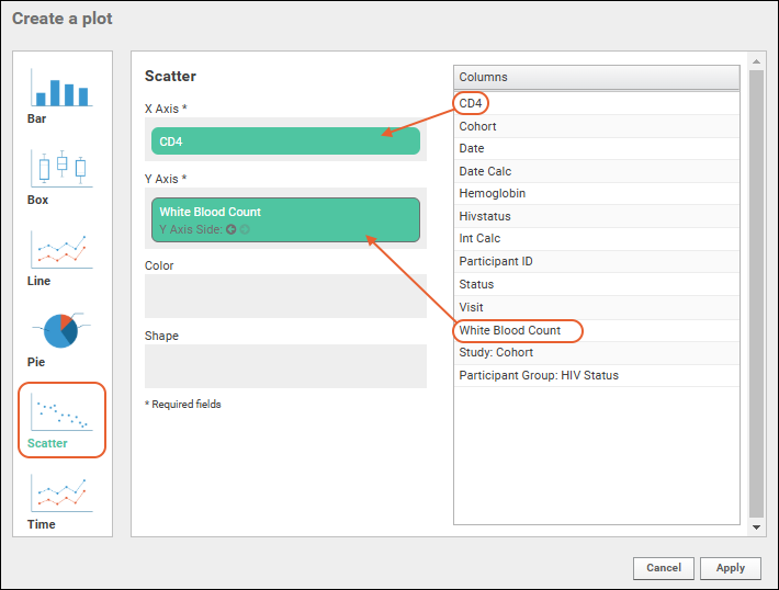
Scatter plots represent the relationship between two different numeric measurements. Each dot is positioned based on the value of the values selected for the X and Y axes.
Create a Scatter Plot
Change Layout
The
Chart Layout button offers the ability to change the look and feel of your chart.
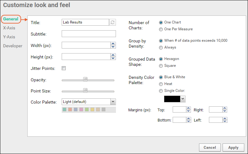
There are four tabs:
- General:
- Provide a title to display on the plot. The default is the name of the source data grid.
- Provide a subtitle to display under the title.
- Specify a width and height.
- Choose whether to jitter points.
- Control the point size and opacity, as well as choose the default color palette. Options: Light (default), Dark, and Alternate. The array of colors is shown under the selection.
- Number of Charts: Select either "One Chart" or "One Per Measure".
- Group By Density: Select either "Always" or "When number of data points exceeds 10,000."
- Grouped Data Shape: Choose either hexagons or squares.
- Density Color Palette: Options are blue & white, heat (yellow/orange/red), or select a single color from the dropdown to show in graded levels. These palettes override the default color palette and other point options in the left column.
- Margins (px): If the default chart margins cause axis labels to overlap, or you want to adjust them for other reasons, you can specify them explicitly in pixels. Specify any one or all of the top, bottom, left, and right margins. See an example here.
- X-Axis/Y-Axis:
- Label: Change the display labels for the axis (notice this does not change which column provides the data). Click the icon to restore the original label based on the column name.
- Scale Type: Choose log or linear scale for each axis.
- Range: Let the range be determined automatically or specify a manual range (min/max values) for each axis.
- Developer: Only available to users that have the "Platform Developers" site role.
- A developer can provide a JavaScript function that will be called when a data point in the chart is clicked.
- Provide Source and click Enable to enable it.
- Click the Help tab for more information on the parameters available to such a function.
- Learn more in this topic.
Add Second Y Axis
You can add more data to a scatter plot by selecting a second Y axis column. Reopen a chart for editing, click
Chart Type, then drag another column to the Y Axis field. The two selected fields will both have panels. On each you can select the side for the Y Axis using the
arrow icons.
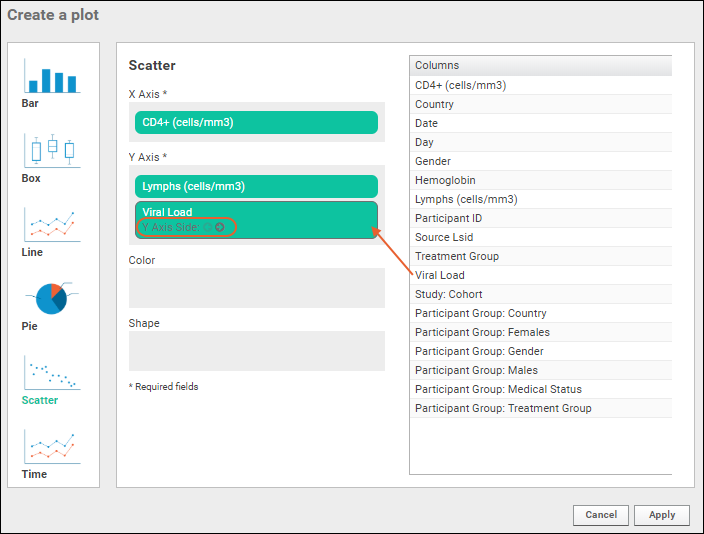
For this example, we've removed the color and shape columns to make it easier to see the two axes in the plot. Click
Apply.
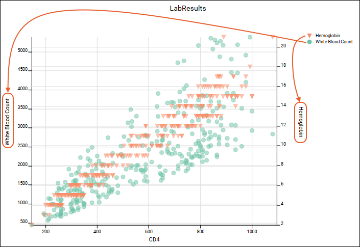
If you use the
Chart View > Number of Charts > One Per Measure, you will see two separate charts, still respecting the Y Axis sides you set.
Example: Heat Map
Displaying a scatter plot as a heatmap is done by changing the layout of a chart. Very large datasets are easier to interpret as heatmaps, grouped by density (also known as point binning).
- Click Chart Layout and change Group By Density to "Always".
- Select Heat as the Density Color Palette and leave the default Hexagon shape selected
- Click Apply to update the chart with the selected changes. Shown here, the number of charts was reset to one, and only a single Y axis is included.
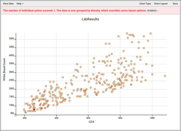
- Notice that when binning is active, a warning message will appear reading: "The number of individual points exceeds XX. The data is now grouped by density which overrides some layout options." XX will be either 10,000 or 1, if you selected "Always" as we did. Click Dismiss to remove that message from the plot display.
Save and Export Plots
- When your plot is finished, click Save.
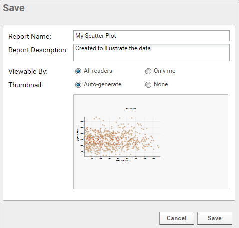
- Name the plot, enter a description (optional), and choose whether to make it viewable by others. You will also see the default thumbnail which has been auto-generated, and can choose whether to use it. As with other charts, you can later attach a custom thumbnail if desired.
Once you have saved a scatter plot, it will appear in the
Data Browser and on the
(charts) menu for the source dataset. You can manage metadata about it as described in
Manage Data Views.
Export Plot
Hover over the chart to reveal export option buttons in the upper right corner:

Export your completed chart by clicking an option:
- PDF: generate a PDF file.
- PNG: create a PNG image.
- Script: pop up a window displaying the JavaScript for the chart which you can then copy and paste into a wiki. See Tutorial: Visualizations in JavaScript for a tutorial on this feature.
Video
Related Topics
