The scripts on this page take the analysis techniques introduced in
R Reports: Access LabKey Data one step further, still using the Physical Exam sample dataset. This page covers a few more strategies for finding means, then shows how to graph these results and display least-squares regression lines.
Find Mean Values for Each Participant
Finding the mean value for physiological measurements for each participant across all visits can be done in various ways. Here, we cover three alternative methods.
For all methods, we use "na.rm=TRUE" as an argument to aggregate in order to ignore null values when we calculate means.
| Description | Code |
|---|
| Aggregate each physiological measurement for each participant across all visits; produces an aggregated list with two columns for participantid. |
data_means <- aggregate(labkey.data, list(ParticipantID =
  labkey.data$participantid), mean, na.rm = TRUE);
data_means; |
| Aggregate only the pulse column and display two columns: one listing participantIDs and the other listing mean values of the pulse column for each participant | aggregate(list(Pulse = labkey.data$pulse),
list(ParticipantID = labkey.data$participantid), mean, na.rm = TRUE); |
| Again, aggregate only the pulse column, but here results are displayed as rows instead of two columns. | participantid_factor <- factor(labkey.data$participantid);
pulse_means <- tapply(labkey.data$pulse, participantid_factor,
mean, na.rm = TRUE);
pulse_means; |
Create Single Plots
Next we use R to create plots of some other physiological measurements included in our sample data.
All scripts in this section use the Cairo package. To convert these scripts to use the png() function instead, eliminate the call "library(Cairo)", change the function name "Cairo" to "png," change the "file" argument to "filename," and eliminate the "type="png"" argument entirely.
Scatter Plot of All Diastolic vs All Systolic Blood Pressures
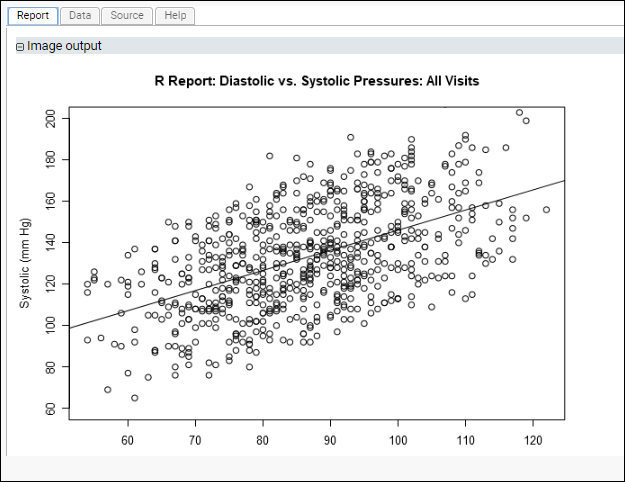
This script plots diastolic vs. systolic blood pressures without regard for participantIDs. It specifies the "ylim" parameter for plot() to ensure that the axes used for this graph match the next graph's axes, easing interpretation.
library(Cairo);
Cairo(file="${imgout:diastol_v_systol_figure.png}", type="png");
plot(labkey.data$diastolicbloodpressure, labkey.data$systolicbloodpressure,
  main="R Report: Diastolic vs. Systolic Pressures: All Visits",
  ylab="Systolic (mm Hg)", xlab="Diastolic (mm Hg)", ylim =c(60, 200));
abline(lsfit(labkey.data$diastolicbloodpressure, labkey.data$systolicbloodpressure));
dev.off();
The generated plot, where the identity of participants is ignored, might look like this:

Scatter Plot of Mean Diastolic vs Mean Systolic Blood Pressure for Each Participant
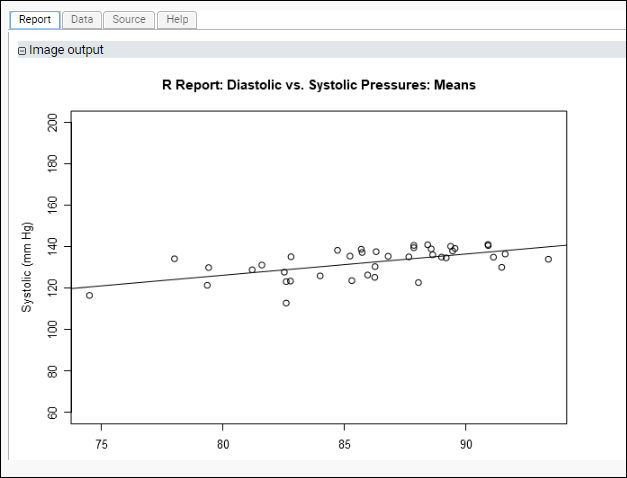
This script plots the mean diastolic and systolic blood pressure readings for each participant across all visits. To do this, we use "data_means," the mean value for each physiological measurement we calculated earlier on a participant-by-participant basis.
data_means <- aggregate(labkey.data, list(ParticipantID =
  labkey.data$participantid), mean, na.rm = TRUE);
library(Cairo);
Cairo(file="${imgout:diastol_v_systol_means_figure.png}", type="png");
plot(data_means$diastolicbloodpressure, data_means$systolicbloodpressure,
  main="R Report: Diastolic vs. Systolic Pressures: Means",
  ylab="Systolic (mm Hg)", xlab="Diastolic (mm Hg)", ylim =c(60, 200));
abline(lsfit(data_means$diastolicbloodpressure, data_means$systolicbloodpressure));
dev.off();
This time, the plotted regression line for diastolic vs. systolic pressures shows a non-zero slope. Looking at our data on a participant-by-participant basis provides insights that might be obscured when looking at all measurements in aggregate.

Create Multiple Plots
There are two ways to get multiple images to appear in the report produced by a single script.
Single Plot Per Report Section
The first and simplest method of putting multiple plots in the same report places separate graphs in separate sections of your report. Use separate pairs of device on/off calls (e.g., png() and dev.off()) for each plot you want to create. You have to make sure that the {imgout:} parameters are unique. Here's a simple example:
png(filename="${imgout:labkeyl_png}");
plot(c(rep(25,100), 26:75), c(1:100, rep(1, 50)), ylab= "L", xlab="LabKey",
   xlim= c(0, 100), ylim=c(0, 100), main="LabKey in R: Report Section 1");
dev.off();

png(filename="${imgout:labkey2_png}");
plot(c(rep(25,100), 26:75), c(1:100, rep(1, 50)), ylab= "L", xlab="LabKey",
  xlim= c(0, 100), ylim=c(0, 100), main="LabKey in R: Report Section 2");
dev.off();
Multiple Plots Per Report Section
There are various ways to place multiple plots in a single section of a report. Two examples are given here, the first using par() and the second using layout().
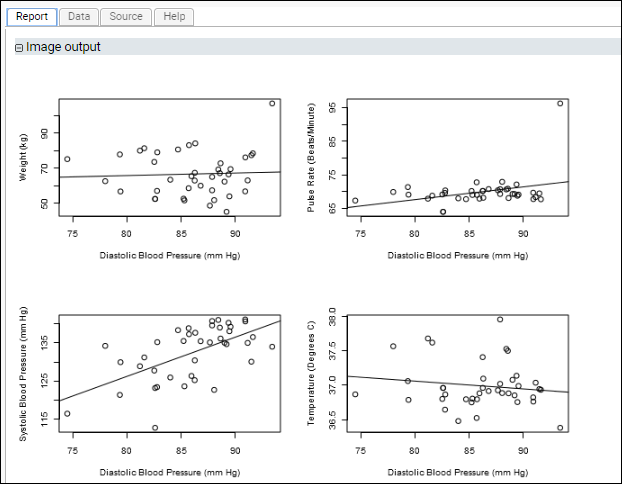
Example: Four Plots in a Single Section: Using par()This script demonstrates how to put multiple plots on one figure to create a regression panel layout. It uses standard R libraries for the arrangement of plots, and Cairo for creation of the plot image itself. It creates a single graphics file but partitions the ‘surface’ of the image into multiple sections using the
mfrow and mfcol arguments to par().
library(Cairo);
data_means <- aggregate(labkey.data, list(ParticipantID =
  labkey.data$participantid), mean, na.rm = TRUE);
Cairo(file="${imgout:multiplot.png}", type="png")
op <- par(mfcol = c(2, 2)) # 2 x 2 pictures on one plot
c11 <- plot(data_means$diastolicbloodpressure, data_means$weight, ,
  xlab="Diastolic Blood Pressure (mm Hg)", ylab="Weight (kg)",
  mfg=c(1, 1))
abline(lsfit(data_means$diastolicbloodpressure, data_means$weight))
c21 <- plot(data_means$diastolicbloodpressure, data_means$systolicbloodpressure, ,
  xlab="Diastolic Blood Pressure (mm Hg)",
  ylab="Systolic Blood Pressure (mm Hg)", mfg= c(2, 1))
abline(lsfit(data_means$diastolicbloodpressure, data_means$systolicbloodpressure))
c21 <- plot(data_means$diastolicbloodpressure, data_means$pulse, ,
  xlab="Diastolic Blood Pressure (mm Hg)",
  ylab="Pulse Rate (Beats/Minute)", mfg= c(1, 2))
abline(lsfit(data_means$diastolicbloodpressure, data_means$pulse))
c21 <- plot(data_means$diastolicbloodpressure, data_means$temp, ,
  xlab="Diastolic Blood Pressure (mm Hg)",
  ylab="Temperature (Degrees C)", mfg= c(2, 2))
abline(lsfit(data_means$diastolicbloodpressure, data_means$temp))
par(op); #Restore graphics parameters
dev.off();
 Example: Three Plots in a Single Section: Using layout()
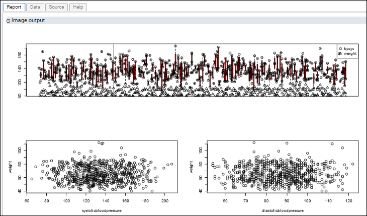
This script uses the standard R libraries to display multiple plots in the same section of a report. It uses the layout() command to arrange multiple plots on a single graphics surface that is displayed in one section of the script's report.
The first plot shows blood pressure and weight progressing over time for all participants. The lower scatter plots graph blood pressure (diastolic and systolic) against weight.
library(Cairo);
Cairo(file="${imgout:a}", width=900, type="png");
layout(matrix(c(3,1,3,2), nrow=2));
plot(weight ~ systolicbloodpressure, data=labkey.data);
plot(weight ~ diastolicbloodpressure, data=labkey.data);
plot(labkey.data$date, labkey.data$systolicbloodpressure, xaxt="n",
  col="red", type="n", pch=1);
points(systolicbloodpressure ~ date, data=labkey.data, pch=1, bg="light blue");
points(weight ~ date, data=labkey.data, pch=2, bg="light blue");
abline(v=labkey.data$date[3]);
legend("topright", legend=c("bpsys", "weight"), pch=c(1,2));
dev.off();

Related Topics