The Panorama QC folder is designed to help labs perform QC of their instruments and reagents over time. Runs are uploaded using the data pipeline or imported directly from Skyline. QC Plots, covered in this topic, give a visual illustration of performance over time that can make data validation easier and more reliable.
QC Plots Web Part
A given molecule will have many potential precursors. You want to choose the one that gives a robust, consistent signal. In practice, for a given set of instrumentation, you'll wind up being able to best measure certain charge states, and hence, certain precursors of a given molecule.
The
QC Plots web part shows one graph per precursor by default. The web part header allows you to specify a number of options, including selecting one or more
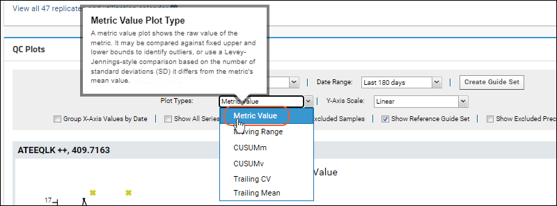
Plot Types to include. Hover over a plot name on the dropdown menu to learn more about it.
QC Plot Types
- Metric Value: (Default) A metric value plot shows the raw value of the metric. It may be compared against fixed upper and lower bounds to identify outliers, or use a Levey-Jennings-style comparison based on the number of standard deviations (SD) it differs from the metric's mean value.
- Moving Range (MR): Plots the moving range over time to monitor process variation for individual observations by using the sequential differences between two successive values as a measure of dispersion.
- CUSUMm: A CUSUM plot is a time-weighted control plot that displays the cumulative sums of the deviations of each sample value from the target value. CUSUMm (mean CUSUM) plots two types of CUSUM statistics: one for positive mean shifts and the other for negative mean shifts.
- CUSUMv: A CUSUM plot is a time-weighted control plot that displays the cumulative sums of the deviations of each sample value from the target value. The CUSUMv (variability or scale CUSUM) plots two types of CUSUM statistics: one for positive variability shifts and the other for negative variability shifts. Variability is a transformed standardized normal quantity which is sensitive to variability changes.
- Trailing CV: A Trailing Coefficient of Variation plot shows the moving average of percent coefficient of variation for the previous N runs, as defined by the user. It is useful for finding long-term trends otherwise disguised by fluctuations caused by outliers.
- Trailing Mean: A Trailing Mean plot shows the moving average of the previous N runs, as defined by the user. It is useful for finding long-term trends otherwise disguised by fluctuations caused by outliers.
QC Plot Features
Select the
metric to plot using the pulldown menu in the web part header. Set other plot options to control the display of plots in the web part.

- Metric: Select the desired metric from the pulldown. Learn more below.
- Date Range: Default is "Last 180 Days", relative to the most recent sample in the folder (as opposed to relative to "today"). Other options range from last 7 days to the last year, or you can choose "all dates" or specify a custom date range.
- Click the Create Guide Set button to create a guide set.
- Plot Types: Select one or more options on the dropdown menu for plot types to show. Options outlined above.
- Y-Axis Scale: Options: linear, log, percent of mean, or standard deviations. Not all are applicable to every plot type. See below.
- Group X-Axis Values by Date: Check this box to scale acquisition times based on the actual dates. When this box is not checked, acquisition times are spaced equally, and multiple acquisitions for the same date will be shown as distinct points.
- Show All Series in Single Plot: Check this box to show all fragments in one plot.
- Show Excluded Samples: Check to include points for samples you've excluded from your plot(s) as outliers or for other reasons. Excluded points will be shown as open circles.
- Show Reference Guide Set: Always include the guide set in the plot, even if it is outside the range that would otherwise be shown.
- Show Excluded Precursors: Check to include precursors (peptides or small molecules) that are marked as in the "Excluded group". By default all are in the "Included group". Note that the "Excluded group" is not related to sample exclusions.
Hover Details
Hovering over a point in the graph will open a tool tip with additional information about that data point. When the plot includes multiple precursors, such as when the "Show all series in a single plot" box is checked, the plot will also be 'filtered' to show only the line(s) associated with that precursor.
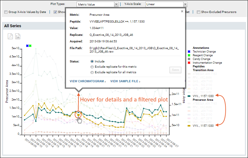
From the hover tooltip, you can click to view either the chromatogram or sample file for this point. In the
Status section of the tooltip, you can select an exclusion option if needed, such as for an outlier data point. Elect either of the following options to do so:
- Exclude replicate for this metric
- Exclude replicate for all metrics
Outliers and Exclusions
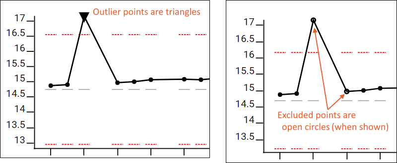
Outlier points, those outside the set metric thresholds, are shown as a triangle on plots, where other points use a circle.
Excluded samples are left out of the guide set range calculations and QC outlier counts for the QC summary panel and Pareto plots. When excluded points are included in the plots, such as by checking the box "Show excluded samples", they will be shown as an open circle on the plot, where included points are solid.
Outlier samples can also be excluded from QC by setting an "ignore_in_QC" replicate annotation to "true" within Skyline. This will cause the sample to be excluded for all metrics.
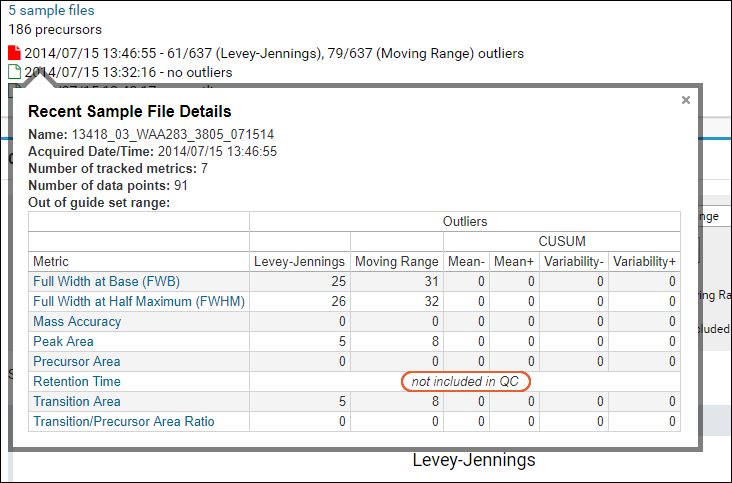
When a whole metric has been excluded for a given sample, the QC dashboard hover information will note "not included in QC".
Note that when using the
Trailing CV or Trailing Mean plot type(s), and checking the
Show Excluded Samples box, the trailing calculation will include the excluded samples. Data dots on the trailing plot will be a solid dot in this case, as the trailing calculation is not an excluded point causing the 'open circle' styling.
Plots with Large Numbers of Points
When the plot includes with a large number of data points per series, individual points would be too bunched together to make finding the one you are looking for practical to hover over.
- The trend line for plots showing over 300 points will not render the individual points.
- Hovering over the line will show the message that narrowing the date range might let you see individual data points.

Filter by Replicate Annotations
If the Skyline document you imported included
replicate annotations, you will have the option to filter your plots using the
Filter: Replicate Annotations drop down that will be present.

Check the box(es) for the annotation(s) to select and click
Apply. Selected annotations will be listed in the panel.

Click
Clear to remove the filtering.
Y-Axis Scale Options
All plot types support the selection of
Linear or Log scale for the Y-axis. The type selected will be shown along the left sidebar, including a units label for non-CUSUM plots. This labelling does not apply to Transition/Precursor Area plots which use other labelling on the dual Y-axes.
For Metric Value and Moving Range plots, you can also normalize the plots using two additional Y-axis scale types.
Note that if you select these scales for CUSUM plots, a linear scale is used instead.
- Percent of Mean:
- The mean is considered as 100% and other values are plotted above or below based on the percent over or under the mean they are.
- Value plotted as (value/mean) * 100%.
- Metric Value plots will shown the bounds of +/- three standard deviations over and under the mean.
- Moving Range plots will include upper and lower limits as a percent of mean, showing the variability.
- Standard Deviations:
- The mean is plotted as zero on the Y-axis. Values are plotted based on the difference from the mean as a ratio with the standard deviation.
- Metric Value plots include standard deviation bars of +/- three standard deviations.
For example, this plot of Retention Time has been normalized to percent of mean.
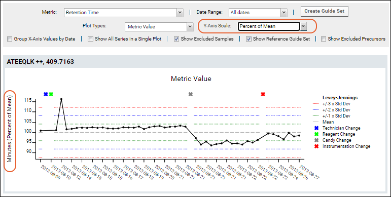
The range shown along the Y-axis is based on the variance of the values. This means the size of the range will be dynamic to fit all normalized data points. Metric Value plots include a default guide set to cover the entire plot when viewing a single series in a single plot.
Metrics
Administrators have the ability to control which metrics are available for plotting, as described in this topic:
By default, each type of plot can be shown for the following metrics:
Isotopologue Metrics
There are several isotopologue metrics that will be available when there is data they can use:
- Isotopologue Accuracy
- Isotopologue LOD: Limit of Detection
- Isotopologue LOQ: Limit of Quantitation
- Isotopologue Regression RSquared: Correlation coefficient calculated from the calibration curve
Isotopologues are molecules that differ from each other solely by their isotopic composition. They are valuable in mass spectrometry because it’s possible to create variants of the same peptide with different masses. These isotopologues can then be added at different concentrations in a single sample, allowing for a calibration curve for a peptide in a single sample (and therefore single run of the mass spec). Other common calibration curve approaches require separate samples for each concentration of a single peptide.
Researchers can use these isotopologue samples for QC and system suitability purposes. By monitoring the limit of quantitation (LOQ), limit of detection (LOD), and other metrics, a researcher can gain insight into the performance of the instrument and the dynamic range it’s accurately measuring. Commercial kits, such as the
Pierce™ LC-MS/MS System Suitability Standard (7 x 5 Mix) are an easy way to implement this kind of monitoring.
Skyline provides the ability to populate attributes on data elements like precursors and peptides with calculated values. The isotopologue metrics are used in conjunction with AutoQC to provide automated system suitability monitoring in Panorama. Panorama QC will look for the following calculated annotations on the Precursor Results elements. The name of each annotation must match exactly:
- PrecursorAccuracy, populated from Precursor Quantification > Precursor Accuracy
- RSquared, populated from Peptide Result > Replicate Calibration Curve > Replicate R Squared
- LOD, populated from Peptide Result > Batch Figures of Merit > Batch Limit of Detection
- LOQ, populated from Peptide Result > Batch Figures of Merit > Batch Limit of Quantification
When present in the Skyline document, Panorama will import these values as annotations on a PrecursorChromInfo data element (captured in the targetedms.precursorchrominfo table during import) with the names “LOD”, “LOQ”, “PrecursorAccuracy”, and “RSquared”.
Example data from the 7x5 kit is available on PanoramaWeb , as is a
template Skyline document for analyzing raw data files from the kit.
Run-Scoped Metrics
Metrics that are not tied to an individual molecule can be tracked and plotted using metrics that produce a single value for the entire run. The built-in metric "TIC Area" (Total Ion Chromatogram Area) shows an example of such a run-scoped metric.
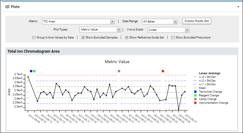
When viewing run-scoped metrics, the "Show all Series in a Single Plot" option is not available since there is only one series to show.
Transition & Precursor Areas
Both
Transition Area and
Precursor Area can be plotted. To show both precursor and fragment values in the same plot, select the metric option
Transition & Precursor Areas. Hover over a point on either line to confirm which axis it belongs to.
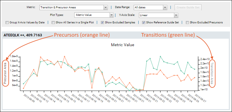
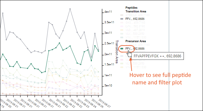
The plot is more complex when all fragments are shown. Use the legend for reference, noting that long peptide names are abbreviated.

Hover over a truncated name to see the full peptide name, as well as the plot filtered to show only lines associated with that peptide.
Set Default View
When an administrator has customized the
QC Plots web part and metrics settings for a container, they have the option to save these settings as a default view for all other users visiting this folder. From the
menu, select
Save as Default View.

Users viewing the plots will now see the admin-defined default plot configuration settings, unless they have
customized their own view of plots in this container. Users can start from the default and make changes as they work, coming back to their own settings when the return.
All users also have the option to
Revert to Default View at any time. If no admin-customized default view is available, the original default settings will be applied.

Export
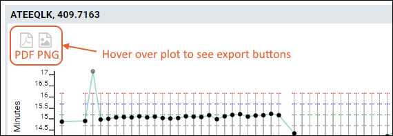
You can export any of the plots by hovering to expose the buttons, then clicking the icon for:
- PNG: Export to a PNG image file.
- PDF: Export as a PDF document.
Small Molecule Data
The same Metric Value, MR, CUSUM, and Pareto plot features apply to both proteomics (peptide/protein) data and small molecule data. Data from both types may be layered together on the same plot when displaying plots including all fragments. Counts of outliers and sample files include both types of data.
When visualizing small molecule data, you are more likely to encounter warnings if the number of precursors exceeds the count that can be usefully displayed. This screenshot shows an example plot with small molecule data.
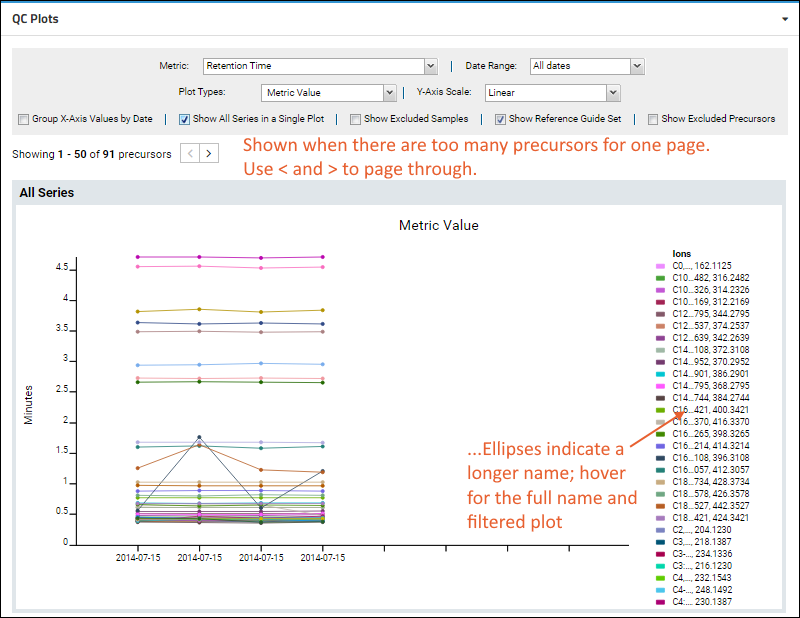
Note that the legend for this illegibly-dense plot does not list all 50 precursors. You can narrow what the plot displays by
marking uninteresting small molecules as in the "Excluded group" to hide them.
QC Metric Settings Persistence
Once any user has configured a useful set of metrics and ways of viewing your plots, they will be persisted. The next time that user visits this folder and the plots on this dashboard, they will see the same metric they were most recently viewing with the same settings they were using.
Related Topics

 From the hover tooltip, you can click to view either the chromatogram or sample file for this point. In the Status section of the tooltip, you can select an exclusion option if needed, such as for an outlier data point. Elect either of the following options to do so:
 When viewing run-scoped metrics, the "Show all Series in a Single Plot" option is not available since there is only one series to show.