You can use the Participant Chart checkbox in the
R Report Builder to create charts that display your R report results on a participant-by-participant basis.
If you wish to create a participant chart in a test environment, install the
example study and use it as a development sandbox.
Create and View Simple Participant Charts
- In the example study, open the PhysicalExam dataset.
- Select (Charts/Reports) > Create R Report.
- On the Source tab, begin with a script that shows data for all participants. Paste the following in place of the default content.
png(filename="${imgout:a}", width=900);
plot(labkey.data$systolicbp, labkey.data$date);
dev.off();
- Click the Report tab to view the scatter plot data for all participants.
- Return to the Source tab.
- Scroll down and click the triangle to open the Study Options section.
- Check Participant Chart.
- Click Save.
- Name your report "Participant Systolic" or another name you choose.
The participant chart option subsets the data that is handed to an R script by filtering on a participant ID. You can later step through per participant charts using this option. The labkey.data dataframe may contain one, or more rows of data depending on the content of the dataset you are working with. Next, reopen the R report:
- Return to the data grid of the "PhysicalExam" dataset.
- Select (Charts/Reports) > Participant Systolic (or the name you gave your report).
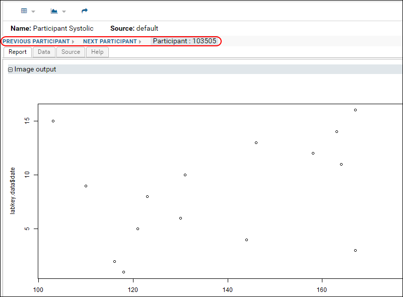
- Click Previous Participant.
- You will see Next Participant and Previous Participant links that let you step through charts for each participant:

Advanced Example: Create Participant Charts Using Lattice
You can create a panel of charts for participants using the
lattice package. If you select the participant chart option on the source tab, you will be able to see each participant's panel individually when you select the report from your data grid.
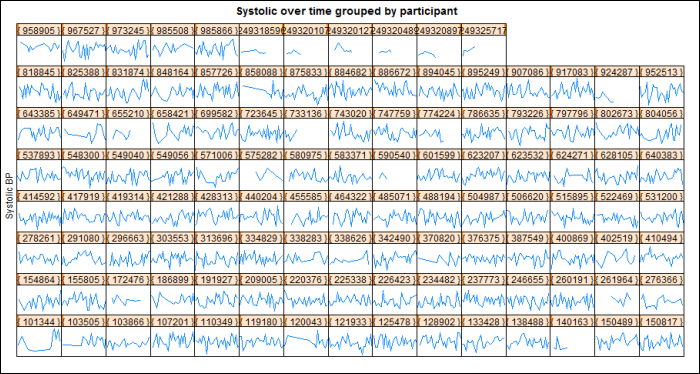
The following script produces lattice graphs for each participant showing systolic blood pressure over time:
library(lattice);
png(filename="${imgout:a}", width=900);
plot.new();
xyplot(systolicbp ~ date| participantid, data=labkey.data,
  type="a", scales=list(draw=FALSE));
update(trellis.last.object(),
  strip = strip.custom(strip.names = FALSE, strip.levels = TRUE),
  main = "Systolic over time grouped by participant",
  ylab="Systolic BP", xlab="");
dev.off();

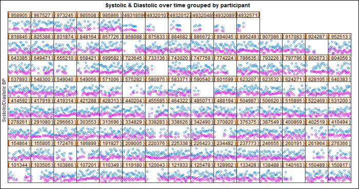
The following script produces lattice graphics for each participant showing systolic and diastolic blood pressure over time (points instead of lines):
library(lattice);
png(filename="${imgout:b}", width=900);
plot.new();

xyplot(systolicbp + diastolicbp ~ date | participantid,
  data=labkey.data, type="p", scales=list(draw=FALSE));
update(trellis.last.object(),
  strip = strip.custom(strip.names = FALSE, strip.levels = TRUE),
  main = "Systolic & Diastolic over time grouped by participant",
  ylab="Systolic/Diastolic BP", xlab="");
dev.off();

After you save these two R reports with descriptive names, you can go back and review individual graphs participant-by-participant. Use the
(Reports) menu available on your data grid.
Related Topics