Table of Contents |
guest 2026-06-26 |
Release Notes SDMS 26.7 (Upcoming Release)
Documentation Home
Upcoming Features
Getting Started
Try it Now: Data Grids
Trial Servers
Explore LabKey Server with a trial in LabKey Cloud
Introduction to LabKey Server: Trial
Exploring LabKey Collaboration
Exploring Laboratory Data
Exploring LabKey Studies
Exploring LabKey Security
Exploring Project Creation
Extending Your Trial
LabKey Server trial in LabKey Cloud
Design Your Own Study
Install LabKey for Evaluation
Tutorials
Set Up for Tutorials: Trial
Set Up for Tutorials: Non-Trial
Navigation and UI Basics
LabKey Server Editions
Training
LabKey Server SDMS
Introduction to LabKey Server
Navigate the Server
Data Basics
LabKey MCP Server (Model Context Protocol)
LabKey Data Structures
Preparing Data for Import
Field Editor
Field Types and Properties
Text Choice Fields
Lookup Fields
Calculated Columns / Fields
URL Field Property
Conditional Formats
String Expression Format Functions
Date & Number Display Formats
Protecting PHI Data
Data Grids
Data Grids: Basics
Import Data
Sort Data
Filter Data
Filtering Expressions
Column Summary Statistics
Customize Grid Views
Saved Filters and Sorts
Select Rows
Export Data Grid
Participant Details View
Query Scope: Filter by Folder
Reports and Charts
Jupyter Reports
Report Web Part: Display a Report or Chart
Data Views Browser
Query Snapshots
Attachment Reports
Link Reports
Participant Reports
Query Reports
Manage Data Views
Manage Study Notifications
Manage Categories
Manage Thumbnail Images
Measure and Dimension Columns
Visualizations
Bar Charts
Box Plots
Line Plots
Pie Charts
Scatter Plots
Time Charts
Column Visualizations
Quick Charts
Integrate with Tableau
Lists
Tutorial: Lists
Step 1: Set Up List Tutorial
Step 2: Create a Joined Grid
Step 3: Add a URL Property
Create Lists
Edit a List Design
Populate a List
Manage Lists
Export/Import a List Archive
R Reports
R Report Builder
Saved R Reports
R Reports: Access LabKey Data
Multi-Panel R Plots
Lattice Plots
Participant Charts in R
R Reports with knitr
Premium Resource: Show Plotly Graph in R Report
Input/Output Substitutions Reference
Tutorial: Query LabKey Server from RStudio
FAQs for LabKey R Reports
Premium RStudio Integration
Connect to RStudio
Set Up Docker with TLS
Connect to RStudio Workbench
Set Up RStudio Workbench
Edit R Reports in RStudio
Export Data to RStudio
Advanced Initialization of RStudio
SQL Queries
LabKey SQL Tutorial
SQL Query Browser
Create a SQL Query
Edit SQL Query Source
LabKey SQL Reference
Lookups: SQL Syntax
LabKey SQL Utility Functions
Query Metadata
Query Metadata: Examples
Edit Query Properties
Trace Query Dependencies
Query Web Part
LabKey SQL Examples
JOIN Queries
Pivot Queries
Queries Across Folders
Parameterized SQL Queries
More LabKey SQL Examples
Premium Resource: Show Calculated Values in a Grid
Linked Schemas and Tables
Controlling Data Scope
Ontology Integration
Load Ontologies
Concept Annotations
Ontology Column Filtering
Ontology Lookup
Ontology SQL
Data Quality Control
Quality Control Trend Reports
Define QC Trend Report
Use QC Trend Reports
QC Trend Report Guide Sets
Search
Search Administration
Integration with Spotfire
Premium Resource: Embed Spotfire Visualizations
Integration with AWS Glue
Premium Resource: Bulk Editing
Assay Data
Tutorial: Import Experimental / Assay Data
Step 1: Assay Tutorial Setup
Step 2: Infer an Assay Design from Spreadsheet Data
Step 3: Import Assay Data
Step 4: Visualize Assay Results
Step 5: Collect Experimental Metadata
Tutorial: Assay Data Validation
Assay Administrator Guide
Set Up Folder For Assays
Design a New Assay
Assay Design Properties
Design a Plate-Based Assay
Customize Plate Templates
Specialty Plate-Based Assays
Participant/Visit Resolver Field
Manage an Assay Design
Export/Import Assay Design
Assay QC States: Admin Guide
Improve Data Entry Consistency & Accuracy
Assay Transform Script
Link Assay Data into a Study
Link-To-Study History
Assay Feature Matrix
Assay User Guide
Import Assay Runs
Multi-File Assay Runs
Work with Assay Runs
Assay QC States: User Guide
Exclude Assay Data
Re-import Assay Runs
Export Assay Data
Assay Terminology
ELISA Assay
Tutorial: ELISA Assay
ELISA Run Details View
ELISA Assay Reference
Enhanced ELISA Assay Support
ELISpot Assay
Tutorial: ELISpot Assay Tutorial
Import ELISpot Data
Review ELISpot Data
ELISpot Properties and Fields
Flow Cytometry
Flow Cytometry Overview
LabKey Flow Module
Set Up a Flow Folder
Tutorial: Explore a Flow Workspace
Step 1: Customize Your Grid View
Step 2: Examine Graphs
Step 3: Examine Well Details
Step 4: Export Flow Data
Step 5: Flow Quality Control
Tutorial: Set Flow Background
Import a Flow Workspace and Analysis
Edit Keywords
Add Sample Descriptions
Add Statistics to FCS Queries
Flow Module Schema
Analysis Archive Format
Add Flow Data to a Study
FCS keyword utility
FluoroSpot Assay
Luminex
Luminex Assay Tutorial Level I
Set Up Luminex Tutorial Folder
Step 1: Create a New Luminex Assay Design
Step 2: Import Luminex Run Data
Step 3: Exclude Analytes for QC
Step 4: Import Multi-File Runs
Step 5: Link Luminex Data to Study
Luminex Assay Tutorial Level II
Step 1: Import Lists and Assay Archives
Step 2: Configure R, Packages and Script
Step 3: Import Luminex Runs
Step 4: View 4pl Curve Fits
Step 5: Track Analyte Quality Over Time
Step 6: Use Guide Sets for QC
Step 7: Compare Standard Curves Across Runs
Track Single-Point Controls in Levey-Jennings Plots
Luminex Calculations
Luminex QC Reports and Flags
Luminex Reference
Review Luminex Assay Design
Luminex Properties
Luminex File Formats
Review Well Roles
Luminex Conversions
Customize Luminex Assay for Script
Review Fields for Script
Troubleshoot Luminex Transform Scripts and Curve Fit Results
Mass Spectrometry
NAb (Neutralizing Antibody) Assays
Tutorial: NAb Assay
Step 1: Create a NAb Assay Design
Step 2: Import NAb Assay Data
Step 3: View High-Throughput NAb Data
Step 4: Explore NAb Graph Options
Work with Low-Throughput NAb Data
Use NAb Data Identifiers
NAb Assay QC
Work with Multiple Viruses per Plate
NAb Plate File Formats
Customize NAb Plate Template
NAb Assay Reference
Assay Request Tracker
Premium Resource: Using the Assay Request Tracker
Premium Resource: Assay Request Tracker Administration
Experiment Framework
Experiment Terminology
Experiment Runs
Run Groups
Experiment Lineage Graphs
Provenance Module: Run Builder
Life Science Identifiers (LSIDs)
LSID Substitution Templates
Record Lab Workflow
Tutorial: Lab Workflow Folder
Step 1: Create the User Interface
Step 2: Import Lab Data
Step 3: Create a Lookup from Assay Data to Samples
Step 4: Using and Extending the Lab Workspace
Reagent Module
Samples
Create Sample Type
Sample Naming Patterns
Aliquot Naming Patterns
Add Samples
Premium Resource: Split Large Sample Upload
Manage Sample Types and Samples
Link Assay Data to Samples
Link Sample Data to Study
Sample Parents: Derivation and Lineage
Sample Types: Examples
Barcode Fields
Data Classes
Create Data Class
Studies
Tutorial: Longitudinal Studies
Step 1: Study Dashboards
Step 2: Study Reports
Step 3: Compare Participant Performance
Tutorial: Set Up a New Study
Step 1: Create Study Framework
Step 2: Import Datasets
Step 3: Identify Cohorts
Step 4: Integrate and Visualize Data
Install an Example Study
Study User Guide
Study Navigation
Cohorts
Participant Groups
Dataset QC States: User Guide
Study Administrator Guide
Study Management
Study Properties
Manage Datasets
Manage Visits or Timepoints
Study Schedule
Manage Locations
Manage Cohorts
Manage Participants
Participant Aliases
Manage Study Security
Configure Permissions for Reports & Views
Securing Portions of a Dataset (Row and Column Level Security)
Dataset QC States: Admin Guide
Study Demo Mode
Create a Study
Create and Populate Datasets
Import Data to a Dataset
Import From a Dataset Archive
Dataset Properties
Study: Reserved and Special Fields
Dataset System Fields
Tutorial: Inferring Datasets from Excel and TSV Files
Visits and Dates
Create Visits Manually
Edit Visits or Timepoints
Import Visit Map
Import Visit Names / Aliases
Continuous Studies
Study Visits and Timepoints FAQ
Export/Import/Reload a Study
Export a Study
Import a Study
Reload a Study
Study Object Files and Formats
Publish a Study
Publish a Study: Protected Health Information / PHI
Refresh Data in Published Studies
Cohort Blinding
Shared Datasets and Timepoints
How is Study Data Stored in LabKey Server?
Premium Resource: LabKey Data Finder
Electronic Health Records (EHR)
Premium Resource: EHR: Animal History
Premium Resource: EHR: Animal Search
Premium Resource: EHR: Data Entry
Premium Resource: EHR: Data Entry Development
Premium Resource: EHR: Lookups
Premium Resource: EHR: Genetics Algorithms
Premium Resource: EHR: Administration
Premium Resource: EHR: Connect to Sample Manager
Premium Resource: EHR: Billing Module
Premium Resource: EHR: Define Billing Rates and Fees
Premium Resource: EHR: Preview Billing Reports
Premium Resource: EHR: Perform Billing Run
Premium Resource: EHR: Historical Billing Data
Premium Resource: EHR: Compliance and Training Folder
Premium Resource: EHR: Trigger Scripts
Structured Narrative Datasets
SND: Packages
SND: Categories
SND: Super-packages
SND: Projects
SND: Events
SND: QC and Security
SND: APIs
SND: Event Triggers
SND: Development
Extending SND Tables
XML Import of Packages
Specimen Tracking (Legacy)
Panorama: Targeted Mass Spectrometry
Configure Panorama Folder
Panorama Data Import
Panorama Experimental Data Folder
Panorama: Skyline Document Management
Panorama: Skyline Replicates View
Panorama: Protein/Molecule List Details
Panorama: Skyline Lists
Panorama: Skyline Annotation Data
Panorama: Skyline Audit Log
Panorama: Calibration Curves
Panorama: Figures of Merit and Pharmacokinetics (PK)
Panorama: Instruments Summary and QC Links
Working with Small Molecule Targets
Panorama: Heat Maps
Panorama Multi-Attribute Method Folder
Panorama MAM Reports
Panorama: Crosslinked Peptides
Panorama Chromatogram Library Folder
Using Chromatogram Libraries
Panorama: Reproducibility Report
Panorama QC Folders
Panorama QC Dashboard
Panorama: Instrument Utilization Calendar
Panorama QC Plots
Panorama QC Plot Types
Panorama QC Annotations
Panorama: Pareto Plots
Panorama: iRT Metrics
Panorama: Configure QC Metrics
Panorama: Outlier Notifications
Panorama QC Guide Sets
Panorama: Chromatograms
Panorama and Sample Management
Collaboration
Files
Tutorial: File Repository
Step 1: Set Up a File Repository
Step 2: File Repository Administration
Step 3: Search the Repository
Step 4: Import Data from the Repository
Using the Files Repository
View and Share Files
Controlling File Display via the URL
Import Data from Files
Linking Assays with Images and Other Files
Linking Data Records to Image Files
File Metadata
File Administrator Guide
Files Web Part Administration
File Root Options
Troubleshoot Pipeline and Files
File Terminology
Transfer Files with WebDAV
S3 Cloud Data Storage
AWS Identity Credentials
Configure Cloud Storage
Use Files from Cloud Storage
Cloud Storage for File Watchers
Messages
Use Message Boards
Configure Message Boards
Wikis
Create a Wiki
Wiki Admin Guide
Manage Wiki Pages
Copy Wiki Pages
Wiki User Guide
Wiki Syntax
Wiki Syntax: Macros
Markdown Syntax
Special Wiki Pages
Embed Live Content in HTML Pages
Examples: Embedded Web Parts
Web Part Configuration Properties
Add Images to a Wiki
Issue/Bug Tracking
Tutorial: Issue Tracking
Using the Issue Tracker
Issue Tracker: Administration
Electronic Data Capture (EDC)
Tutorial: Survey Designer, Step 1
Tutorial: Survey Customization, Step 2
Survey Designer: Reference
Survey Designer: Examples
REDCap Survey Data Integration
Medidata / CDISC ODM Integration
CDISC ODM XML Integration
Adjudication Module
Contact Information
How to Cite LabKey Server
Development
Set Up a Development Machine
Gradle Build Overview
Build LabKey from Source
Build from Source (or Not)
Customize the Build
Node.js Build Dependency
Git Ignore Configurations
Build Offline
Gradle Cleaning
Gradle Properties
Gradle: How to Add Modules
Gradle: Declare Dependencies
Gradle Tips and Tricks
Premium Resource: Artifactory Set Up
Premium Resource: NPMRC Authentication File
Create Production Builds
Set up OSX for LabKey Development
Troubleshoot Development Machines
Premium Resource: IntelliJ Reference
Run in Development Mode
LabKey Client APIs
API Resources
JavaScript API
Tutorial: Create Applications with the JavaScript API
Step 1: Create Request Form
Step 2: Confirmation Page
Step 3: R Histogram (Optional)
Step 4: Summary Report For Managers
Repackaging the App as a Module
Tutorial: Use URLs to Pass Data and Filter Grids
Choose Parameters
Show Filtered Grid
Tutorial: Visualizations in JavaScript
Step 1: Export Chart as JavaScript
Step 2: Embed the Script in a Wiki
Modify the Exported Chart Script
Display the Chart with Minimal UI
JavaScript API Examples
Premium Resource: JavaScript Security API Examples
JavaScript Reports
Export Data Grid as a Script
Premium Resource: Custom Participant View
Example: Master-Detail Pages
Custom Button Bars
Premium Resource: Invoke JavaScript from Custom Buttons
Premium Resource: Custom Buttons for Large Grids
Premium Resource: Type-Ahead Entry Forms
Premium Resource: Sample Status Demo
Insert into Audit Table via API
Programming the File Repository
Vocabulary Domains
Declare Dependencies
Using ExtJS with LabKey
Naming & Documenting JavaScript APIs
How to Generate JSDoc
JsDoc Annotation Guidelines
Naming Conventions for JavaScript APIs
Java API
LabKey JDBC Driver
Integration with DBVisualizer
Security Bulk Update via API
Perl API
Python API
Premium Resource: Python API Demo
Premium Resource: Download a File with Python
Rlabkey Package
Troubleshoot Rlabkey
Premium Resource: Example Code for QC Reporting
SAS Client API Library
SAS Setup
SAS Macros
SAS Demos
HTTP Interface
Examples: Controller Actions / API Test Page
Example: Access APIs from Perl
External Tool Access
API Keys
External ODBC and JDBC Connections
ODBC: Configure Windows Access
ODBC: Configure OSX/Mac Access
ODBC: External Tool Connections
ODBC: Using SQL Server Reporting Service (SSRS)
Compliant Access via Session Key
Develop Modules
Tutorial: Hello World Module
Map of Module Files
Module Loading Using the Server UI
Module Editing Using the Server UI
Example Modules
Tutorial: File Based Module Resources
Module Directories Setup
Module Query Views
Module SQL Queries
Module R Reports
Module HTML and Web Parts
Modules: JavaScript Libraries
Modules: Assay Types
Assay Custom Domains
Assay Custom Details View
Loading Custom Views
Example Assay JavaScript Objects
Assay Query Metadata
Customize Batch Save Behavior
SQL Scripts for Module-Based Assays
Transform Scripts
Example Workflow: Develop a Transformation Script
Example Transformation Scripts (perl)
Transformation Scripts in R
Transformation Scripts in Java
Transformation Scripts for Module-based Assays
Premium Resource: Python Transformation Script
Premium Resource: Create Samples with Transformation Script
Run Properties Reference
Transformation Script Substitution Syntax
Warnings in Transformation Scripts
Modules: Folder Types
Modules: Query Metadata
Modules: Report Metadata
Modules: Custom Header
Modules: Custom Banner
Modules: Custom Footer
Modules: SQL Scripts
Modules: SQL Script Conventions
Modules: Domain Templates
Java Modules
Module Architecture
Tutorial: Hello World Java Module
LabKey Containers
Implementing Actions and Views
Implementing API Actions
Integrating with the Pipeline Module
Integrating with the Experiment API
Using SQL in Java Modules
Database Development Guide
HotSwapping Java classes
Modules: Custom Login Page
Modules: Custom Site Welcome Page
ETL: Extract Transform Load
Tutorial: Extract-Transform-Load (ETL)
ETL Tutorial: Set Up
ETL Tutorial: Run an ETL Process
ETL Tutorial: Create a New ETL Process
ETL: User Interface
ETL: Create a New ETL
ETL: Planning
ETL: Attributes
ETL: Target Options
ETL: Column Mapping
ETL: Transform Types and Tasks
ETL: Manage Remote Connections
ETL: Filter Strategies
ETL: Schedules
ETL: Transactions
ETL: Queuing ETL Processes
ETL: Stored Procedures
ETL: Stored Procedures in PostgreSQL
ETL: Check For Work From a Stored Procedure
ETL: Logs and Error Handling
ETL: Examples
ETL: Module Structure
Premium Resource: ETL Best Practices
Deploy Modules to a Production Server
Main Credits Page
Module Properties
module.properties Reference
Common Development Tasks
Premium Resource: Content Security Policy Development Best Practices
Trigger Scripts
Script Pipeline: Running Scripts in Sequence
LabKey URLs
URL Actions
How To Find schemaName, queryName & viewName
LabKey/Rserve Setup Guide
Web Application Security
Cross-Site Request Forgery (CSRF) Protection
Premium Resource: Fetching CSRF Token
Premium Resource: Changes in JSONObject Behavior
Profiler Settings
Using loginApi.api
Use IntelliJ for XML File Editing
Premium Resource: Manual Index Creation
Premium Resource: LabKey Coding Standards and Practices
Premium Resource: Best Practices for Writing Automated Tests
Premium Resource: Server Encoding
Premium Resource: ReactJS Development Resources
Premium Resource: Feature Branch Workflow
Premium Resource: Develop with Git
Premium Resource: Git Branch Naming
Premium Resource: Issue Pull Request
LabKey Open Source Project
Release Schedule
Previous Releases
Previous Release Details
Branch Policy
Testing and Code Quality Workflow
Run Automated Tests
Tracking LabKey Issues
Security Issue Evaluation Policy
Submit Contributions
CSS Design Guidelines
Documentation Style Guide
Check In to the Source Project
Developer Reference
Administration
Tutorial: Security
Step 1: Configure Permissions
Step 2: Test Security with Impersonation
Step 3: Audit User Activity
Step 4: Handle Protected Health Information (PHI)
Projects and Folders
Project and Folder Basics
Site Structure: Best Practices
Folder Types
Project and Folder Settings
Create a Project or Folder
Manage Projects and Folders
Enable a Module in a Folder
Export / Import a Folder
Export and Import Permission Settings
Manage Email Notifications
Establish Terms of Use
Workbooks
Shared Project
Build User Interface
Premium Resource: Custom Home Page Examples
Page Admin Mode
Add Web Parts
Manage Web Parts
Web Part Inventory
Use Tabs
Add Custom Menus
Web Parts: Permissions Required to View
Security
Best Practices for System Security
Configure Permissions
Security Groups
Site Groups
Project Groups
Security Roles Reference
Role/Permissions Matrix
Administrator Permissions Matrix
Matrix of Report, Chart, and Grid Permissions
Privileged Roles
Developer Roles
Premium Resource: Add a Custom Security Role
User Accounts
My Account
Add Users
Manage Users
Manage Project Users
Premium Resource: Limit Active Users
Authentication
Configure Database Authentication
Passwords
Password Reset
Configure LDAP Authentication
Configure SAML Authentication
Configure CAS Authentication
Configure CAS Identity Provider
Configure Duo Two-Factor Authentication
Configure TOTP Two-Factor Authentication
Create a netrc file
Virus Checking
Test Security Settings by Impersonation
Premium Resource: Best Practices for Security Scanning
Compliance
Compliance: Overview
Compliance: Checklist
Compliance: Settings
Compliance: Setting PHI Levels on Fields
Compliance: Terms of Use
Compliance: Security Roles
Compliance: Configure PHI Data Handling
Compliance: Logging
Compliance: PHI Report
Electronic Signatures / Sign Data
GDPR Compliance
Project Locking and Review Workflow
Admin Console
Site Settings
Usage/Exception Reporting
Look and Feel Settings
Page Elements
Web Site Theme
Email Template Customization
Optional, Deprecated, or Experimental Features
Manage Missing Value Indicators / Out of Range Values
Short URLs
System Maintenance
Configure Scripting Engines
Configure Docker Host
External Hosts
LDAP User/Group Synchronization
Proxy Servlets
Premium Resource: Plotly Dash Demo
Audit Log / Audit Site Activity
SQL Query Logging
Site HTTP Access Logs
Audit Log Maintenance
Postgres Activity
Export Diagnostic Information
Actions Diagnostics
Cache Statistics
Loggers
Memory Usage
Query Performance
Site/Container Validation
Data Processing Pipeline
Set a Pipeline Override
Pipeline Protocols
File Watchers
Create a File Watcher
File Watcher Tasks
File Watchers for Script Pipelines
File Watcher: File Name Patterns
File Watcher Examples
Premium Resource: Run Pipelines in Parallel
Enterprise Pipeline with ActiveMQ
ActiveMQ JMS Queue
Configure the Pipeline with ActiveMQ
Configure Remote Pipeline Server
Troubleshoot the Enterprise Pipeline
Install LabKey
Supported Technologies
Install on Linux
Set Application Properties
Premium Resource: Install on Windows
Common Install Tasks
Service File Customizations
Use HTTPS with LabKey
Content Security Policy
SMTP Configuration
Install and Set Up R
Configure an R Docker Engine
Control Startup Behavior
Server Startup Properties
ExtraWebapp Resources
Sending Email from Non-LabKey Domains
Deploying an AWS Web Application Firewall
Troubleshoot Installation and Configuration
Troubleshoot: Error Messages
Collect Debugging Information
Example Hardware/Software Configurations
Premium Resource: Reference Architecture / System Requirements
LabKey Modules
Upgrade LabKey
Upgrade on Linux
Upgrade on Windows
Premium Resource: Upgrade JDK on AWS Ubuntu Servers
LabKey Releases and Upgrade Support Policy
External Schemas and Data Sources
External PostgreSQL Data Sources
External Microsoft SQL Server Data Sources
External MySQL Data Sources
External Oracle Data Sources
External SAS/SHARE Data Sources
External Redshift Data Sources
External Snowflake Data Sources
Premium Feature: Use Microsoft SQL Server
GROUP_CONCAT Install
PremiumStats Install
ETL: Stored Procedures in MS SQL Server
Backup and Maintenance
Backup Guidelines
An Example Backup Plan
Example Scripts for Backup Scenarios
Restore from Backup
Premium Resource: Change the Encryption Key
Use a Staging Server
Troubleshoot LabKey Server
Premium Resources
Product Selection Menu
LabKey Support Portals
Premium Resource: Training Materials
Premium Edition Required
Community Resources
LabKey Terminology/Glossary
FAQ: Frequently Asked Questions
System Integration: Instruments and Software
Demos
Videos
Project Highlight: FDA MyStudies Mobile App
LabKey Webinar Resources
Tech Talk: Custom File-Based Modules
Collaborative DataSpace: User Guide
DataSpace: Learn About
DataSpace: Find Subjects
DataSpace: Plot Data
DataSpace: View Data Grid
DataSpace: Monoclonal Antibodies
Documentation Archive
Biologics LIMS
Release Notes: Biologics LIMS
Release Notes 25.11 (November 2025)
Release Notes 25.7 (July 2025)
Release Notes 25.3 (March 2025)
Release Notes 24.11 (November 2024)
Release Notes 24.7 (July 2024)
Release Notes 24.3 (March 2024)
What's New in 24.3
Release Notes: 23.11 (November 2023)
What's New in 23.11
Release Notes: 23.7 (July 2023)
What's New in 23.7
Release Notes: 23.3 (March 2023)
What's New in 23.3
Release Notes: 22.11 (November 2022)
What's New in 22.11
Release Notes 22.7 (July 2022)
What's New in 22.7
Release Notes 22.3 (March 2022)
What's New in 22.3
Release Notes 21.11 (November 2021)
What's New in 21.11
Release Notes 21.7 (July 2021)
What's New in 21.7
Release Notes 21.3 (March 2021)
What's New in 21.3
Release Notes 20.11 (November 2020)
What's New in 20.11
Release Notes 20.7
What's New in 20.7
Release Notes 20.3
What's New in 20.3
Release Notes 19.3
What's New in 19.3
Release Notes: 19.2
What's New in 19.2
Release Notes 19.1
What's New in 19.1.x
Release Notes 18.3
What's New in 18.3
Release Notes 18.2
What's New in 18.2
Release Notes 18.1
What's New in 18.1
Release Notes 17.3
Release Notes 17.2
Deprecated Docs - Admin-visible only
Release Notes: SDMS 26.3
- LabKey Server SDMS
- Distribution Changes and Upgrade Notes
- Client APIs and Development Notes
- Other LabKey Products:
LabKey Server SDMS
Premium Edition Feature Updates
- MCP Server - Enables users to ask questions about domains and data structures, providing a new way to explore and understand how data is organized within the system. (docs)
- Audit Log Maintenance feature has been moved from the Professional to the Starter edition. (docs)
- Support for non-default S3 endpoints, such as required for GovCloud. (docs)
- Improved Lineage Querying: search the lineage object for all ancestors and descendants. (docs)
Community Edition Updates
- Ability to add indexes to columns in the field editor to improve filtering and query performance.
- Audit coverage for Grid Views.
- The role "Impersonating Troubleshooter" can now impersonate Users and Groups.
- To provide more targeted troubleshooting access, the role "See Audit Log Events" is now assignable for individual projects and folders.
- To make for easier configuration, the list of Allowed External Redirect Hosts now supports wildcards.
- Database materialized views are now supported in external data sources.
- HTML comments in Markdown are no longer displayed as visible text.
- Underlying database tables with very long names in Microsoft SQL Server may be shortened in some cases. Clients who query Microsoft SQL Server tables directly may need to update their scripts.
- The Flag data type has been removed as an option in user-defined tables. Existing Flag data type fields are migrated to Text at upgrade time.
- Site Administrators can now see all views, both shared and private, using the page query-manageViews.view. (Available in 25.11 as well)
- The core.Containers table can now show all active modules in each folder.
- The "Delete All Rows" button has been removed from List grids.
- New option to open grid links in a new tab
- "Attachments" query actions report attachment counts by parent type with ability to drill into details: name, folder, size, parent info, etc.
Distribution Changes and Upgrade Notes
- Java Upgrade: An upgrade from Java 17 to Java 25 is required.
- If you are upgrading on Windows, take note of the steps for upgrading the service here.
- Support for PostgreSQL 13.x has been removed. (docs)
Deprecated Features
- Support for a legacy query that unions all the event tables together into a single query has been removed.
- Support for unescaping backslash characters when importing text files has been removed.
- Dataset import files are no longer saved in the file root of the study's folder. The dataset import history page has also been adjusted to no longer offer the ability to download these data files. Administrators should delete existing import files if there are any concerns that they may contain sensitive data. (Changed in 25.11 as well.)
- LabKey now always generates container-first URLs. The related deprecated feature flag has been removed.
- Custom R report sharing has been deprecated.
Client APIs and Development Notes
- ${containerFilterName} has been added as a substitution marker in URL properties. (docs)
- URL parameter to bypass CSP log deduplication (bypassCspDedupe=true)
- API calls default to detailed audit behavior
- Client APIs can query and update samples using the RowId value; using the LSID value is no longer required.
- Workflow related tables have been moved from the sampleManagement schema to the workflow schema. (introduced in version 26.1)
- Using the CAS Identity Provider (IdP) now requires every service's host to be added to the Allowed External Redirect Hosts page.
Sample Manager
The Sample Manager Release Notes list features by monthly version and product edition.LabKey LIMS
The LabKey LIMS Release Notes list features in addition to those in the Professional Edition of LabKey Sample Manager.Biologics LIMS
The Biologics LIMS Release Notes list features in addition to those in LabKey LIMS.Panorama
- QC folder annotations can be shared across folders when they're tracking the same instrument
- Option to use "delta from mean" as the y-axis in QC folder metric plots
Previous Release Notes: Version 25.11
Release Notes SDMS 26.7 (Upcoming Release)
LabKey SDMS: Premium Edition Features
- MCP Server - Provides new ways to explore your data using intelligent agents. (docs)
- Support for SQL Server 2025 as an external data source. (docs)
- Support for sending email via Exchange Online using Microsoft Graph Protocol API for authentication.
- Calculated Column Expression Assistant - Describe the calculation you need in plain language and let AI generate the LabKey SQL expression for you. (docs)
LabKey SDMS: Community Edition Features
- Experiment diagrams have been enlarged and rendering has been improved.
- Multi-value text column (MVTC) fields now include additional quotes in audit log entries to accurately represent the stored values in the database. This applies across all data types.
- New built-in queries collect all Reports, Custom Views, Custom Queries on the site, giving administrators improved control over these resources. Available via the Schema Browser and all standard query access mechanisms, these queries expose key metadata and support filtering, sorting, and deletion of unneeded objects.
- The CAS identity provider now supports the renew=true option of the login endpoint.
- "Limit Login Attempts" has been moved to the Community Edition. (docs)
Distribution Changes and Upgrade Notes
- Graphviz/DOT executables are no longer used by LabKey, are no longer included in distributions, and can be uninstalled from existing deployments.
- Third-party modules should remove 'vcsTag' from any manually maintained 'module.xml' files. Modules containing this property will cause errors at startup.
- Inactive users now have no permissions. Any ETL or file watcher configured to run as an inactive user will start to fail; update these configurations to use an active user.
Deprecated Features
- under construction
Client APIs and Development Notes
- The 'getUsersWithPermissions()' Java method no longer supports the 'inactive' or 'includeInactive' flags; inactive users now have no permissions.
Other Release Notes
Documentation Home
Release Notes
Getting Started
- Try it Now: Data Grids
- Install the Community Edition to get started with your own data.
- Explore key feature areas:
- Explore Longitudinal Studies: HIV Disease Progression
- Explore Assay Data Analysis: T Cell Culture - Media Comparison
- Contact Us for a Custom Demo or Trial: The best way to get started is to let us know your research goals and team needs. Request a customized demo to see how we can help.
LabKey SDMS Documentation
LabKey LIMS Suite Documentation
Premium Resources
- Premium Resources: Premium documentation, example code, and best practices.
More Resources
Upcoming Features
Upcoming Features
Releases we are currently working on:
Recent Documentation Updates
Getting Started
- Try LabKey Now
- Learn more about Sample Manager
- Learn more about Biologics LIMS
- Learn even more, then contact us for a custom demo or trial
Topics
More LabKey Solutions
Try it Now: Data Grids
- Securely share your data with colleagues through interactive grid views
- Collaboratively build and explore interactive visualizations
- Drill down into de-identified data for study participants
- Combine related datasets using data integration tools
Begin the Data Grid Tutorial
Trial Servers
LabKey Server Trial
LabKey Server Trial instances contain a core subset of features, and sample content to help get you started. Upload your own data, try tutorials, and even create a custom site tailored to your research and share it with colleagues. Your trial lasts 30 days and we're ready to help you with next steps toward incorporating LabKey Server into your research projects.Start here: Explore LabKey Server with a trial in LabKey CloudSample Manager Trial
Try the core features of LabKey Sample Manager using our example data and adding your own. Your trial lasts 30 days and we're ready to help you with next steps.Start here: Get Started with Sample ManagerBiologics LIMS Trial
Try the core features of LabKey Biologics LIMS using our example data and tutorial walkthroughs. Your trial lasts 30 days and we're ready to help you with next steps toward incorporating LabKey Biologics into your work.Start here: https://www.labkey.org/limshelp/wiki-page.view?name=biotrialExplore LabKey Server with a trial in LabKey Cloud
To get started using LabKey Server and understanding the core functionality, contact us about your research needs and goals. Upon request we will set up a LabKey Cloud-based trial of LabKey Server for you.
You'll receive an email with details about getting started and logging in.
Trial server instances contain a subset of features, and some basic content to get you started. Upload your own data, try tutorials, and even create a custom site tailored to your research and share it with colleagues. Your trial lasts 30 days and we're ready to help you with next steps toward incorporating LabKey Server into your research projects.
Tours & Tutorials
Step by step introductions to key functionality of LabKey Server.
Introduction to LabKey Server: Trial
Welcome to LabKey Server!
- Navigation and User Interface
- Security Model
- Tools for Working Together
- Tools for Data Analysis
- Tools for Research Studies
- What's Next?
Navigation and User Interface
Projects and Folders
The project and folder hierarchy is like a directory tree and forms the basic organizing structure inside LabKey Server. Everything you create or configure in LabKey Server is located in some folder. Projects are the top level folders, with all the same behavior, plus some additional configuration options; they typically represent a separate team or research effort.The Home project is a special project. On your Trial server, it contains the main welcome banner. To return to the home project at any time, click the LabKey logo in the upper left corner.The project menu is on the left end of the menu bar and includes the display name of the current project. Hover over the project menu to see the available projects, and folders within them. Click any project or folder name to navigate there.Any project or folder with subfolders will show / buttons for expanding and contracting the list shown. If you are in a subfolder, there will be a clickable 'breadcrumb' trail at the top of the menu for quickly moving up the hierarchy. The menu will scroll when there are enough items, with the current location visible and expanded by default.
 The project menu always displays the name of the current project, even when you are in a folder or subfolder. A link with the Folder Name is shown near the top of page views like the following, offering easy one click return to the main page of the folder.
 For more about projects, folders, and navigation, see Project and Folder Basics.
Tabs
Using tabs within a folder can give you new "pages" of user interface to help organize content. For an example of tabs in action, see the Research Study within the Example Project. When your browser window is too narrow to display tabs arrayed across the screen, they will be collapsed into a pulldown menu showing the current tab name and a (chevron). Click the name of the tab on this menu to navigate to it.
 For more about adding and customizing tabs, see Use Tabs.
Web Parts
Web parts are user interface panels that can be shown on any folder page or tab. Each web part provides some type of interaction for users with underlying data or other content. There is a main "wide" column on the left and narrower column on the right. Each column supports a different set of web parts. By combining and reordering these web parts, an administrator can tailor the layout to the needs of the users.For a hands-on example to try right now, explore the Collaboration Workspace project on your Trial Server.To learn more, see Add Web Parts and Manage Web Parts. For a list of the types of web parts available in a full installation of LabKey Server, see the Web Part Inventory.
Header Menus
 In the upper right, icon menus offer:
- : Click to open a site-wide search box.
- : Shown only to Admins: Administrative options available to users granted such access. See below.
- username: Login and security options; help links to documentation.
 Admin MenuThe "first user" of this trial site will always be an administrator and have access to the menu. If that user adds others, they may or may not have the same menu of options available, depending on permissions granted to them.
- Site >: Settings that pertain to the entire site.
- Admin Console: In this Trial edition of LabKey Server, some fields are not configurable and may be shown as read-only. See Admin Console for details about options available in the full installation of LabKey.
- Site Users, Groups, Permissions: Site-level security settings.
- Create Project: Creates a new project (top-level folder) on the server.
- Folder >: Settings for the current folder.
- Permissions: Security configuration for the current folder.
- Management: General configuration for the current folder.
- Project Users and Settings: General configuration for the current project.
- Page Admin Mode: Used to change page layout and add or remove UI elements.
- Manage Views, Lists, Assays: Configuration for common data containers.
- Manage Hosted Server Account: Return to the site from which you launched this trial server.
- Go To Module >: Home pages for the currently enabled modules.
Security Model
LabKey Server has a group and role-based security model. Whether an individual is authorized to see a resource or perform an action is checked dynamically based on the groups they belong to and roles (permissions) granted to them. Learn more here: Security. Try a walkthrough using your Trial Server here: Exploring LabKey SecurityTools for Working Together
Collaborating with teams within a single lab or around the world is made easier when you share resources and information in an online workspace.- Message Boards: Post announcements and carry on threaded discussions. Learn more here.
- Issue Trackers: Track issues, bugs, or other workflow tasks (like assay requests) by customizing an issue tracker. LabKey uses issue trackers to manage development issues and client requests. Learn more here.
- Wikis: Documents written in HTML, Markdown, Wiki syntax, or plain text; they can include images, links, and live content from data tables. You're reading a Wiki page right now. Learn more here.
- File Repositories: Upload and selectively share files and spreadsheets of data; connect with custom import methods. You can see an example here. Learn more here.
To learn more and try these tools for yourself, navigate to the Example Project > Collaboration Workspace folder of your Trial Server in one browser window, and open the topic Exploring LabKey Collaboration in another.
Tools for Data Analysis
Biomedical research data comes in many forms, shapes, and sizes. LabKey integrates directly with many types of instruments and software systems and with customization can support any type of tabular data.
- Uploading Data: From dragging and dropping single spreadsheets to connecting a data pipeline to an outside location for incoming data, your options are as varied as your data. Learn about the options here: Import Data.
- LabKey Data Grids: LabKey data grids show a configurable view of the underlying database table. To learn more, try a quick online tour of data grids.
- Interpreting Instrument Data: Using assay designs and pipeline protocols, you can direct LabKey Server to correctly interpret complex instrument data during import. Learn more here: Assay Data.
- Statistics and Queries: Add summary statistics to your data grids and write SQL queries within the UI. Learn more here: Column Summary Statistics and SQL Queries.
- Visualizations: Create easy charts and plots backed by live data. Learn more here: Visualizations.
- Reporting: Generate reports and query snapshots of your data. Use R, JavaScript, and LabKey plotting APIs to present your data in many ways. Learn more here: Reports and Charts.
To tour some example content and try these tools, navigate to the Example Project > Laboratory Data folder of your Trial Server in one browser window, and open the topic Exploring Laboratory Data in another.
Tools for Research Studies
Study folders organize research data about participants over time. There are many different ways to configure and use LabKey studies. Learn more here: Studies.- Study Schedules and Navigation: Dashboards for seeing at a glance what work is completed and what is scheduled helps coordinators manage research data collection. Learn more here: Study Navigation.
- Participant and Date Alignment: By aligning all of your data based on the participant and date information, you can integrate and compare otherwise disparate test results. Explore the breadth of data for a single study subject, or view trends across cohorts of similar subjects. Learn more here: Study User Guide.
- Publishing and Sharing: Select who should see which parts of your study data and analysis. Choose how to publish results, including many options for obscuring and protecting PHI (protected health information) and aggregating results. Learn more here: Study Administrator Guide and Publish a Study: Protected Health Information / PHI.
To learn more and try these tools, navigate to the Example Project > Research Study folder of your Trial Server in one browser window, and open the topic Exploring LabKey Studies in another.
What's Next?
Explore the example content on your Trial Server using one of these walkthroughs. Find out more about what a full installation of LabKey Server can do by reading documentation here:Exploring LabKey Collaboration
Tour
The "Collaboration Workspace" folder in the "Example Project" shows three web parts on its main dashboard. Web parts are user interface panels and can be customized in many ways.- 1. Learn About LabKey Collaboration Folders: a panel of descriptive information (not part of a default Collaboration folder).
- 2. Messages: show conversations or announcements in a messages web part
- 3. Task Tracker: LabKey's issue tracker tools can be tailored to a variety of uses.
 To help show some of the collaborative options, this project also includes a few sample users with different roles. You can see a message from the "team lead" and there is also a task called "Get Started" listed as a "Todo".
Try It Now
Messages
A message board is a basic tool for communication; LabKey Message Boards can be customized to many use cases: from announcements to developer support and discussion.- Notice the first message, "Hello World".
- Click View Message or Respond below it.
- Click Respond.
- Enter any text you like in the Body field. If you also change the Title, your response will have a new title but the main message thread will retain the existing title.
- Notice that you can select other options for how your body text is rendered. Options: Plain Text, HTML, Markdown, or Wiki syntax.
- Notice you could attach a file if you like.
- Click Submit.

- You are now viewing the message thread. Notice links to edit or delete. Since you an administrator on this server, you can edit messages others wrote, which would not be true for most users.
- You may have also received an email when you posted your response. By default, you are subscribed to any messages you create or comment on. Click unsubscribe to see how you would reset your preferences if you don't want to receive these emails.
- Click the Collaboration Workspace link near the top of the page to return to the main folder dashboard. These links are shown any time you are viewing a page within a folder.
- Notice that on the main folder dashboard, the message board does not show the text of your reply, but just the note "(1 response)".

- Click New to create a new message.
- You will see the same input fields as when replying; enter some text and click Submit.
- When you return to the main folder dashboard, you will see your new message.

- An administrator can control many display aspects of message boards, including the level of detail, order of messages, and even what "Messages" are called.
- The (triangle) menu in the upper right corner includes several options for customizing.

- New: Create a new message.
- View List: See the message board in list format.
- Admin: Change things like display order, what messages are called, security, and what options users have when adding messages.
- Email: Control when and how email notifications are sent about messages on this board.
- Customize: Select whether this web part shows the "full" information about the message, as shown in our example, or just a simple preview.
Task Tracker
LabKey provides flexible tools for tracking tasks with multiple steps done by various team members. Generically referred to as "issue trackers" the example project includes a simple "Task Tracker".The basic life cycle of any task or issue moves through three states:- Open: someone decides something needs to be done; various steps and reassignments can happen, including prioritization and reassignments
- Resolved: someone does the thing
- Closed: the orginal requestor confirms the solution is correct
- Navigate to the Collaboration Workspace.
- Scroll down to the Task Tracker and click the title of the task, Get Started to open the detail view.
- The status, assignment, priority, and other information are shown here. You can see that the team leader opened this task and added the first step: assign this task to yourself.

- Click Update. Used when you are not "resolving" the issue, merely changing assignment or adding extra information.

- Select your username from the Assigned To pulldown.
- You could also change other information and provide an optional comment about your update.
- Click Save.
- Note: You may receive an email when you do this. Email preferences are configurable. Learn more here.
- The task is now assigned to you. You can see the sequence of changes growing below the current issue properties.

- Click Collaboration Workspace to return to the main page.
- Notice the task is assigned to you now.
- Click New Task to create a new task.
- Enter your choice of title, notice that the default status "Open" cannot be changed, but you can change the priority, and enter other information. Note that setting the priority field is required.
- Assign the task to the "lab technician" user.
- Click Save to open the new issue.
- When you return to the task list on the Collaboration Workspace page, you will see it listed as issue 2.
 To show how the resolution process works, use the fact that you are an administrator and can use impersonation to take on another user's identity. Learn more here.
- Select (Your Username) > Impersonate > User.
- Choose "lab_technician" and click Impersonate. You are now seeing the page as the lab technician would. For example, you no longer have access to administrator options on the messages web part.
- Click the title of the new task you assigned to the lab technician to open it.
- Click Resolve.
- Notice that by default, the resolved task will be assigned to the original user who opened it - in this case you!
- The default value for the Resolution field is "Fixed", but you can select other options if appropriate.
- Enter a comment saying you've completed the task, then click Save.
- Click Stop Impersonating.
- Open the task again and close it as yourself.
- Enter a few more tasks to have more data for viewing.
- When finished, return to the Collaboration Workspace main page.
- Search the contents by ID number or search term using the search box.
- Sort and filter the list of tasks using the header menu for any column. Learn more here.
- Create custom grid views (ways to view tasks), such as "All assigned to me" or "All priority 1 issues for the current milestone". Use (Grid Views) > Customize Grid and add filters and sorts here. Learn more here.
- You could also customize the grid to expose other columns if helpful, such as the name of the user who originally opened the issue. Learn more here.
What Else Can I Do?
Add New Web Parts
Web parts are panels of user interface that display content to your users. As an administrator, you can customize what is shown on the page by using page admin mode. To add a new web part to any folder page:- Select > Page Admin Mode. Note that if you do not see this option, make sure you are logged in as an administrator and not impersonating another user.

- Notice that <Select Web Part> pulldown menus appear at the bottom of the page. There is a wider "main" column on the left and a narrow column on the right; each column supports a different set of web parts.
- Note: If both pulldown menus are stacked on the right, make your browser slightly wider to show them on separate sides.

- Select the type of web part you want to create on the desired side. For example, to create a main panel wiki like the welcome panel shown in the Collaboration Workspace folder, select Wiki on the left.
- Click Add.
- The new web part will be added at the bottom of the column. While you are in Page Admin Mode, you can reposition it on the page using the (triangle) menu in the web part header. Move up or down as desired.

- Click Exit Admin Mode in the upper right.
Add a Wiki
Wiki documents provide an easy way to display content. They can contain any text or visual information and be formatted in HTML, Markdown, Wiki syntax, or plain text by using "Wiki" format but not including formatting syntax. To create our first wiki, we use a wiki web part.- Add a Wiki web part on the left side of the page. If you followed the instructions above, you already did so.
- Click Create a new wiki page. Note that if a page named "default" already exists in the folder, the new web part will display it. In this case, create a new one by selecting New from the (triangle) menu in the header of the web part.

- The Name must be unique in the folder.
- The Title is displayed at the top of the page.
- Choosing a Parent page lets you organize many wikis into a hierarchy. The table of contents on the right of the page you are reading now shows many examples.
- Enter the Body of the wiki. To change what formatting is used, use the Convert to... button in the upper right. A short guide to the formatting you select is shown at the bottom of the edit page.
- Notice that you can attach files and elect whether to show them listed at the bottom of the wiki page.
- Click Save & Close.
- Scroll down to see your new wiki web part.

- To reopen for editing, click the (pencil) icon.
Add a List
A list is a simple table of data. For example, you might store a list of labs you work with.- Select > Manage Lists.
- You will see a number of preexisting lists related to the task tracker.
- Click Create New List.
- Name: Enter a short name (such as "labs"). It must be unique in the folder.
- Review the list properties available; for this first example, leave them unchanged.

- Click the Fields section header to open it.
- Click Manually Define Fields.
- In the Name box of the first field, enter "LabName" (no spaces) to create a key column for our list. Leave the data type "Text".
- After doing this, you can set the Key Field Name in the blue panel. Select LabName from the dropdown (the field you just added).

- Use the icon to expand the field and see the options available. Even more can be found by clicking Advanced Settings.
- Click Add Field and enter the name of each additional column you want in your list. In this example, we have added an address and contact person, both text fields. Notice the "Primary Key" field is specifed in the field details for LabName; it cannot be deleted and you cannot change its data type.

- Click Save to create the "labs" list. You will see it in the grid of "Available Lists".
- Click the list name ("labs") in the grid. There is no data to show.
- Select (Insert data) > Insert new row.
- Enter any values you like.
- Click Submit.
- Repeat the process to add a few more rows.

- Click the Collaboration Workspace link to return to the main folder page.
- Add a List - Single web part on the left side of the page.
- Give it the title you like, and select the new list you just created.
- Click Submit.
 Now your collaboration workspace shows quick contact information on the front page.
Add a File Repository
- Add a Files web part on the left side of the page.
- Drag and drop files and folders into the window to upload them.

- Each file can then be downloaded by other users of the collaboration workspace.
More Tutorials
Other tutorials using "Collaboration" folders that you can run on your LabKey Trial Server: To avoid overwriting this Example Project content with new tutorial content, you could create a new "Tutorials" project to work in. See Exploring Project Creation for a walkthrough.Explore More on your LabKey Trial Server
Exploring Laboratory Data
Tour
The "Laboratory Data" folder is an Assay folder. You'll see four web parts in our example:- 1. Learn About LabKey Assay Folders: a panel of descriptive information (not part of a default Assay folder).
- 2. Assay List: a list of assays defined in the folder. Here we have "Blood Test Data."
- 3. Blood Test Data Results: A query web part showing a grid of data.
- 4. Files: a file repository where you can browse files in this container or upload new ones.
 The folder includes a simple assay design created from the "Standard Assay Type" representing some blood test results. A single run (spreadsheet) of data has been imported using it. Continue below to try out the assay tools.
Try It Now
This section helps you try some key features of working with laboratory data.- Assay List: Browse and use assay designs for data and metadata
- Understand Assay Designs: Review how assay designs are defined and customized
- Blood Test Data Results: Reviewing and analyzing data in grids
- Files: Uploading and importing files
Assay List
Using an Assay List web part, you can browse existing assay designs and as an administrator, add new ones. An assay design tells the server how to interpret uploaded data. Click the name of the design in this web part to see the run(s) that have been uploaded.- Click the name Blood Test Data in the Assay List to see the "Runs" imported using it.

- In this case, a single run (spreadsheet) "BloodTest_Run1.xls" has been imported. Click the Assay ID (in this case the file name) to see the results.

 To see the upload process, we can simulate importing the existing run. We will cancel the import before any reimporting actually happens.
- Click Re-Import Run above the grid.
- The first page shows:
- Assay Properties: These are fixed properties, like the assay design name, that are read only for all imports using this design.
- Batch Properties: These properties will apply to a set of files uploaded together. For example, here they include specifying how the data is identified (the Participant/Visit setting) and selecting a target study to use if any data is to be copied. Select /Example Project/Research Study (Research Study).

- Click Next.
- On the next page, notice the batch properties are now read only.
- Below them are Run Properties to specify; these could be entered differently for each run in the assay, such as the "Assay ID". If not provided, the name of the file is used, as in our example.
- Here you also provide the data from the assay run, either by uploading a data file (or reusing the one we already uploaded) or entering your own new data.
- Click Show Expected Data Fields. You will see the list of fields expected to be in the spreadsheet. When you design the assay, you specify the name, type, and other properties of expected columns.

- Click Download Spreadsheet Template to generate a blank template spreadsheet. It will be named "data_<datetimestamp>.xls". You could open and populate it in Excel, then upload it to this server as a new run. Save this template file and use it when you get to the Files section below.

- Since we are just reviewing the process right now, click Cancel after reviewing this page.

Understand Assay Designs
Next, review what the assay design itself looks like. You need to be an administrator to perform this step.- From the Blood Test Data Runs page, select Manage Assay Design > Edit assay design to open it.
 The sections correspond to how a user will set properties as they import a run. Click each section heading to open it.
- Assay Properties: Values that do not vary per run or batch.
- Batch Fields: Values set once for each batch of runs.
- Run Fields: Values set per run; in this case none are defined, but as you saw when importing the file, some built in things like "Assay ID" are defined per run.
- Results Fields: This is the heart of the assay design and where you would identify what columns (fields) are expected in the spreadsheet, what their data type is and whether they are required.

- Click the for a row to see or set other properties of each column. With this panel open, click Advanced Settings for even more settings and properties, including things like whether a value can be used as a "measure" in reporting, as shown here for the WBC field. Learn more about using the field editor in this topic: Field Editor.

- Review the contents of this page, but make no changes and click Cancel.
- Return to the main folder page by clicking the Laboratory Data link near the top of the page.
Blood Test Data Results
The assay results are displayed in a web part on the main page. Click the Laboratory Data link if you navigated away, then scroll down. Explore some general features of LabKey data grids using this web part:Column Header Menus: Each column header has a menu of options to apply to the grid based on the values in that column.
Sort:
- Click the header of the WBC column and select Sort Descending.
- Notice the (sort) icon that appears in the column header.

Filter:
- Click the header of the Participant ID column and select Filter... to open a popup.
- Use the checkboxes to "Choose Values". For this example, uncheck the box for "202".
- The "Choose Values is only available when there are a limited number of distinct values.
- Switching to the "Choose Filters" tab in this popup would let you use filter expressions instead.

- Click OK to apply the filter.
- Notice the (filter) icon shown in the column header. There is also a new entry in the filter panel above the grid - you can clear this filter by clicking the for the "Participant <> 202" filter.
Summary Statistics:
- Click the header of the MCV column and select Summary Statistics... to open a popup.
- Select the statistics you would like to show (the values are previewed in the popup.)
- Premium Feature: Many summary statistics shown are only available with premium editions of LabKey Server. Learn more here.
- In this case, Mean and Standard Deviation might be the most interesting. Click Apply.

- Notice the new row at the bottom of the grid showing the statistics we selected for this column.
The view of the grid now includes a sort, a filter, and a summary statistic.
 Notice the message "This grid view has been modified" was added when you added the summary statistic. The grid you are now seeing is not the original default. You have not changed anything about the underlying imported data table, merely how you see it in this grid.
Saving: To save this changed grid view, making it persistent and sharable with others, follow these steps:
- Click Save next to the grid modification message.

- Select Named and give the new grid a name (such as "Grid with Statistics").
- Check the box for "Make this grid view available to all users."
- Click Save.
- Notice that the grid now has Grid With Statistics shown above it.
- To switch between grid views, use the (Grid Views) menu in the grid header. Switch between "default" and "Grid With Statistics" to see the difference.

- Return to the "default" view before proceeding with this walkthrough.
- Column Visualizations: Each column header menu has a set of visualizations available that can be displayed directly in the grid view. Options vary based on the data type. For example, from the "WBC" column header menu, choose Box and Whisker.

- Quick Charts: Choose Quick Chart from the header menu of any column to see a quick best guess visualization of the data from that column. The default is typically a box and whisker plot.

- While similar to the column chart above, this chart creates a stand alone chart that is named and saved separately from the grid view.
- It also opens in the "Chart Wizard", described next, which offers many customization options.
- Note that a chart like this is backed by the "live" data in the source table. If you change the underlying data (either by editing or by adding additional rows to the table) the chart will also update automatically.
- Plot Editor: More types of charts and many more configuration options are available using the common plot editor, the "Chart Wizard".
- If you are already viewing a plot, you can change the plot type immediately by clicking Edit and then Chart Type.
- If you navigated elsewhere, you can open the plot editor by returning to the grid view and selecting (Charts) > Create Chart above the grid.
- Select the type of chart you want using the options along the left edge.
 Learn more about creating and customizing each chart type in the documentation. You can experiment with this small data set or use the more complex data when Exploring LabKey Studies.
Files
The Files web part lists the single assay run as well as the log file from when it was uploaded.To explore the abilities of the file browser, we'll create some new assay data to import. You can also click here to download ours if you want your data to match our screenshots without creating your own: data_run2.xls- Open the template you downloaded earlier. It is an Excel file named "data_<datetimestamp>.xls"
- Enter some values. Some participant ID values to use are 101, 202, 303, 404, 505, and 606, though any integer values will be accepted. You can ignore the VisitID column and enter any dates you like. The WBC and MCV columns are integers, HGB is a double. The more rows of data you enter, the more "new" results you will have available to "analyze."
- Save the spreadsheet with the name "data_run2.xls" if you want to match our instructions.
- Click here to download ours if you want your data to match our screenshots: data_run2.xls
- Return to the Example Project > Laboratory Data folder.
- Drag and drop the "data_run2.xls" file into the Files web part to upload it.

- Select it using the checkbox and click Import Data.
- Scroll down to find the "Import Text or Excel Assay" category.
- Select Use Blood Test Data - the assay design we predefined. Notice you also have the option to create a new "Standard" assay design instead if you wanted to change the way it is imported.
- Click Import.

- You will see the Assay Properties and be able to enter Batch Properties; select "Example Project/Research Study" as the Target Study.
- Click Next.
- On the Run Properties and Data File page, notice your "data_run2.xls" file listed as the Run Data. You don't need to make any changes on this page.
- Click Save and Finish.
- Now you will see the runs grid, with your new run added to our original sample.

- Click the file name to see the data you created.
- Notice the (Grid Views) menu includes the custom grid view "Grid with Statistics" we created earlier - select it.
- Notice the grid also shows a filter "Run = 2" (the specific run number may vary) because you clicked the run name to view only results from that run. Click the for the filter to delete it.
- You now see the combined results from both runs.

- If you saved any visualizations earlier using the original spreadsheet of data, view them now from the (Charts/Reports) menu, and notice they have been updated to include your additional data.
What Else Can I Do?
- Define a New Assay for a data spreadsheet of your own.
- Understand Link to Study, which was done already for our sample spreadsheet
Define a New Assay
LabKey can help you create a new assay design from a spreadsheet of your own. Choose something with a few columns of different types, or simply add a few more columns to the "data_run2.xls" spreadsheet you used earlier. If you have existing instrument data that is in tabular format, you can also use that to complete this walkthrough.- Navigate to the main page of the Laboratory Data folder.
- Drag and drop your "mydata.xls" file to the Files web part.
- Select the file and click Import Data.

- In the popup, choose "Create New Standard Assay Design" and click Import.
- Give your new assay design a Name, such as "MyData".
- Notice the default Location is the current project. Select instead the "Current Folder (Laboratory Data)".
- The Columns for Assay Data section shows the columns imported from your spreadsheet and the data types the server has inferred from the contents of the first few rows of your spreadsheet.
- If you see a column here that you do not want to import, simply uncheck it. If you want to edit column properties, you can do that using the (triangle) button next to the column name.

- You can change the inferred data types as necessary. For example, if you have a column that happens to contain whole number values, the server will infer it is of type "Integer". If you want it to be "Number (Double)" instead, select that type after clicking the (caret) button next to the type. If a column happens to be empty in the first few rows, the server will guess "Text (String)" but you can change that as well.
- Column Mapping below these inferrals is where you would map things like Participant ID and Date information. For instance, if you have a column called "When" that contains the date information, you can tell the server that here. It is not required that you provide mappings at all.

- When you are satisfied with how the server will interpret your spreadsheet, scroll back up and click Begin Import.
- You will be simultaneously creating the assay design (for this and future uses) and importing this single run. Enter batch properties if needed, then click Next.
- Enter run properties if needed, including an Assay ID if you want to use a name other than your file name.
- Click Show Expected Data Fields to review how your data will be structured. Notice that if you didn't provide mappings, new columns will be created for Specimen, Participant, Visit ID, and Date.
- Click Save and Finish.
- You now see your new run in a grid, and the new assay design has been created.

- Click the filename (in the Assay ID column) to see your data.
- Click column headers to sort, filter, or create quick visualizations.
- Select Manage Assay Design > Edit assay design to review the assay design.
- Click Laboratory Data to return to the main folder page.
- Notice your new assay design is listed in the Assay List.

- You can now upload and import additional spreadsheets with the same structure using it. When you import .xls files in the future, your own assay design will be one of the options for importing it.

Understand Link to Study
You may have noticed the Linked to Research Study column in the Blood Test Data Results web part. The sample assay design includes linking data automatically to the Example Project/Research Study folder on your Trial Server."Linking" data to a study does not copy or move the data. What is created is a dynamic link so that the assay data can be integrated with other data in the study about the same participants. When data changes in the original container, the "linked" set in the study is also updated.Click the View Link to Study History link in the Blood Test Data Results web part. You will see at least one link event from the original import when our sample data was loaded and linked during the startup of your server (shown as being created by the "team lead"). If you followed the above steps and uploaded a second "data_run2.xls" spreadsheet, that will also be listed, created and linked by you.
- Click View Results to see the result rows.
- Click one of the links in the Linked to Research Study column. You see what appears to be the same grid of data, but notice by checking the project menu or looking at the URL that you are now in the "Research Study" folder. You will also see the tabs present in a study folder.

- Click the Clinical and Assay Data tab.
- Under Assay Data you will see the "Blood Test Data" linked dataset. In the topic Exploring LabKey Studies we will explore how that data can now be connected to other participant information.

- Using the project menu, return to the Laboratory Data folder.

More Tutorials
Other tutorials using "Assay" folders that you can run on your LabKey Trial Server: To avoid overwriting this Example Project content with new tutorial content, you could create a new "Tutorials" project to work in. See Exploring Project Creation for a walkthrough.Explore More on your LabKey Trial Server
Exploring LabKey Studies
Tour
The "Research Study" folder contains a simple fictional study. There are 5 tabs in the default LabKey study folder; the main landing page is the Overview tab where you will see three web parts:- 1. Learn About LabKey Study Folders: a panel of descriptive information (not part of a default Study folder)
- 2. Study Data Tools: commonly used tools and settings.
- 3. Study Overview: displays study properties and quick links to study navigation and management options.
 A study has five tabs by default. Each encapsulates functions within the study making it easier to find what you need. Click the tab name to navigate to it. Returning to the Research Study folder returns you to the Overview tab.Participants: View and filter the participant list by cohort; search for information about individuals.
 Clinical and Assay Data: Review data and visualizations available; create new joined grids, charts, charts and reports.
 The Data Views web part lists several datasets, joined views, and reports and charts.
- Hover over a name to see a preview and some metadata about it.
- Click a name or use the (Details) link to open an item.
- The Access column indicates whether special permissions have been set for an item. Remember that only users granted "Read" access to this folder can see any content here, so seeing "public" means only that it is shared with all folder users. Other options are "private" (only visible to the creator) and custom (shared with specific individuals). See Configure Permissions for Reports & Views for more information.
- Demographic datasets contain a single row per participant for the entire study.
- Clinical datasets can contain many rows per participant, but only one per participant and date combination.
- Assay datasets, typically results from instrument tests, can contain many rows per participant and date.

Try It Now
This example study includes a simplified research scenario. Let's explore some key feature areas on each tab:- Change Study Properties
- Track Overall Progress
- View Participant Data: Get the picture for a specific study subject.
- Integrate Data Aligned by Participant and Date: Aggregate cross-study information to see broader trends.
- Customize Visualizations and Reports
- Manage Your Study
Display Study Properties
The Study Overview web part shows properties and introductory information about your study.- Click the Overview tab.
- Click the (pencil) icon on the Study Overview web part.
- Review and change study properties:

- Label: By default, the folder name, here "Research Study," is used. You can edit to make it more descriptive, such as "HIV Study".
- Investigator: Enter your own name to personalize this example.
- Grant/Species: If you enter the grant name and/or species under study, they will be displayed. These fields also enable searches across many study folders to locate related research. Enter a grant name to see how it is shown.
- Description/Render Type: Our example shows some simple HTML formatted text. You can include as much or as little information here as you like. Select a different Render Type to use Markdown, Wiki syntax, or just plain text.
- Protocol Documents: Attach documents if you like - links to download will be included in the web part.
- Timepoint Type: Studies can use several methods of tracking time; this decision is fixed at the time of study creation and cannot be modified here. See Visits and Dates to learn more.
- Start/End Date: See and change the timeframe of your study if necessary. Note that participants can also have individual start dates. Changing the start date for a study in progress should be done with caution.
- Subject Noun: By default, study subjects are called "participants" but you can change that here to "subject," "mouse," "yeast," or whatever noun you choose. Try changing these nouns to "Subject" and "Subjects".
- Subject Column Name: Enter the name of the column in your datasets that contains IDs for your study subjects. You do not need to change this field to match the subject nouns you use.
- When finished, click Submit and see how this information is displayed. Notice the "Participants" tab name is changed.

- Reopen the editor and change the subject noun back to "Participant[s]" to restore the original tab and tool names for this walkthrough.
Track Overall Progress
- Return to the Overview tab if you navigated away.
- Click the Study Navigator link or the small graphic in the Study Overview web part.
- The Study Navigator shows you at a glance how much data is available in your study and when it was collected.
- Rows represent datasets, columns represent timepoints.

- Use the Participant's current cohort dropdown to see collection by cohort.
- Use the checkboxes to switch between seeing counts of participants or rows or both.
- Click the number at the intersection of any row and column to see the data. For example, Lab Results in month two look like this:

View Participant Data
Within a study you can dive deep for all the information about a single participant of interest.- Click the Participants tab.
- If you know the participant ID, you can use the search box to find their information.
- The Participant List can be quickly filtered using the checkboxes on the left.
- Use the Filter box to narrow the list if you know part of the participant ID.
- Hover over a label to see the group member IDs shown in bold. Click a label to select only that filter option in that category. Here we see there are 8 participants enrolled receiving ARV treatment.

- Click any participant ID to see all the study data about that participant.
- The details of any dataset can be expanded/collapsed using the and icons.

- Click the Search For link above the report to search the entire site for other information about that participant. In this case, you will also see results from the "Laboratory Data" folder in this project.

Integrate Data Aligned by Participant and Date
Study datasets can be combined to give a broad picture of trends within groups over time.- Click the Clinical and Assay Data tab.
- There are three primary datasets here: Demographics, Physical Exam, and Lab Results.
- Click "Joined View: Physical Exam and Demographics" to open an integrated custom grid.
- Select (Grid Views) > Customize Grid.
- Scroll down on the Available Fields side to Datasets and click the to expand it. Listed are the two other datasets.
- Expand the "Demographics" node by clicking the .

- Scroll down and notice the checked fields like Country and Group Assignment which appear in our joined view.
- Scroll down on the Selected Fields side to see these fields shown.
- You can use checkboxes to add more fields to what is shown in the grid, drag and drop to rearrange columns in your view, and use the and icons for selected fields to edit display titles or delete them from the view.
- Click View Data when finished to see your changes.

- Notice the message indicating you have unsaved changes. Click Revert to discard them.
Customize Visualizations and Reports
In Exploring Laboratory Data we show you how to create charts and plots based on single columns or tables. With the integration of diverse data in a study, you can easily create visualization and reports across many tables, backed by live data. Our example study includes a few examples.- On the Clinical and Assay Data tab, click Bar Chart: Blood Pressure by Cohort and Treatment.
- Here we see plotted a measure from the "Physical Exam" dataset (Systolic Blood Pressure) against cohort and treatment group data from the "Demographics" dataset.

- Click Edit in the upper right to open the plot for editing.
- Click Chart Type to open the chart wizard.

- Columns on the right can be dragged and dropped into the plot attribute boxes in the middle.
- Select a different plot type using the options to the left. The plot editor will make a best effort to retain plot attribute column selections, though not all attributes apply to each chart type.
- Click Box.
- Notice that the X and Y axis selections are preserved.
- Drag the column "Study: Cohort" to the "Color" box.
- Drag the column "Gender" to the "Shape" box.

- Click Apply to see the new box plot. At present, only the outliers make use of the color and shape selections.

- Click Chart Layout.
- Give the plot a new title, like "Systolic - Box Plot"
- Change Show Points to All.
- Check the box to Jitter Points; otherwise points will be shown in a single column.
- Scroll down to see the controls for plot line and fill colors.
- Choose a different Color Palette from which the point colors will be selected. Shown here, "Dark".

- Click Apply to see the revised box plot.

- Click Save As to save this as a new visualization and preserve the original bar chart.
- Give the new report a name and click Save in the popup.
Manage Your Study
On the Manage tab, you can control many aspects of your study. For example, click Manage Cohorts to review how cohorts were assigned and what the other options are:
- Assignment Mode: Cohorts can be simple (fixed) or advanced, meaning they can change during the study.
- Assignment Type: You can manually assign participants to cohorts, or have assignments made automatically based on a dataset.
- Automatic Participant/Cohort Assignment: Choose the dataset and column to use for assigning cohorts.
- You can experiment by changing which column is used to define cohorts: For instance, choose "Country" and click Update Assignments.
- Notice the new entries under Defined Cohorts and new assignments in the Participant-Cohort Assignments web part.
- Click the Participants tab.
- Now you see under Cohorts that both the original cohorts and new ones are listed. Using the hover behavior, notice that the original "Group 1 and Group 2" cohorts are now empty and participants can quickly be filtered by country.
- Go back in your browser window or click the Manage tab and Manage Cohorts to return to the cohort page.
- Under Defined Cohorts you can click Delete Unused, then return to the Participants tab to see they are gone.
- Click the Clinical and Assay Data tab. Click Bar Chart: Blood Pressure by Cohort and Treatment and you will see it has been automatically updated to reflect the new cohort division by country.
- Return the original cohorts before moving on:
- On the Manage tab, click Manage Cohorts.
- Restore the original assignments based on the Demographics/Group Assignment field.
- Click Update Assignments.
- Under Defined Cohorts, click Delete Unused.
What Else Can I Do?
Manage Dataset Security
Access to read and edit information in folders is generally controlled by the LabKey role based security model. Within a study, you gain the additional option of dataset level security.- On the Manage tab, click Manage Security.
- Review the Study Security Type: Datasets can be read-only or editable, under either type of security:
- Basic security: folder permissions determine access to all datasets
- Custom security: folder permissions can be set by dataset for each group with folder access
- Change the type to Custom security with editable datasets. Notice the warning message that this can change who can view and modify data.
- Click Update Type.
- When you change to using 'custom' security, two additional web parts are added to the page:
- Study Security: Use radio buttons to grant access to groups. Click Update after changing. In the screenshot below, we're changing the "Study Team" and "Example Team Members" groups to "Per Dataset" permissions.

- Per Dataset Permissions: Once any group is given per-dataset permissions using the radio buttons, you will have the option to individually set permission levels for each group for each dataset.
- Click Save when finished, or to revert to the configuration before this step, set all for "Example Team Members" to read, and set all for "Study Team" to edit.

Learn About Protecting PHI
When displaying or exporting data, Protected Health Information (PHI) that could be used to identify an individual can be protected in several ways.Alternate Participant IDs and AliasesIf you want to share data without revealing participant IDs, you can use a system of alternates or aliases so that you can still show a consistent ID for any set of data, but it is not the actual participant ID.- On the Manage tab, click Manage Alternate Participant IDs and Aliases.
- Alternate participant IDs allow you to use a consistent prefix and randomized set of the number of digits you choose.
- Dates are also offset by a random amount for each participant. Visit-date information could potentially isolate the individual, so this option obscures that without losing the elapsed time between visits which might be relevant to your study.
- Participant Aliases lets you specify a dataset containing specific aliases to use. For instance, you might use a shared set of aliases across all studies to connect related results without positively identifying individuals.
- Restricted: The most sensitive information not shared with unauthorized users, even those authorized for Full PHI.
- Full PHI: Only shared when users have permission to see all PHI. The user can see everything except restricted information.
- Limited PHI: Some information that is less sensitive can be visible here.
- Not PHI: All readers can see this information.
- On the Clinical and Assay Data tab, open the dataset of interest. Here we use the Demographics dataset.
- Above the grid, click Manage.

- Click Edit Definition.

- Click the Fields section to open it.
- Find the field of interest, here "Status of Infection."
- Click the to expand it.
- Click Advanced Settings.
- In the popup, you will see the current/default PHI Level: "Not PHI".
- Make another selection from the dropdown to change; in this example, we choose "Full PHI".

- Click Apply.
- Adjust PHI levels for as many fields as necessary.
- Scroll down and click Save.
- Click View Data to return to the dataset.
- From the Manage tab, click Export Study.
- On the export page, notice one of the Options is Include PHI Columns. Select what you want included in your export:
- Restricted, Full, and Limited PHI (default): Include all columns.
- Full and Limited PHI: Exclude only the Restricted PHI columns.
- Limited PHI: Exclude the Full PHI and Restricted columns.
- Uncheck the checkbox to exclude all PHI columns.
- If you marked the demographics column as "Full PHI" above, select "Limited PHI"to exclude it. You can also simply uncheck the Include PHI Columns checkbox.
- Click Export.
- Examine the downloaded archive and observe that the file named "ARCHIVE_NAME.folder.zip/study/datasets/dataset5001.tsv" does not include the data you marked as PHI.
Publish the Study
Publishing a LabKey study allows you to select all or part of your results and create a new published version.- Click the Manage tab.
- Click Publish Study (at the bottom).
- The Publish Study Wizard will guide you through selecting what to publish.
- By default, the new study will be called "New Study" and placed in a subdirectory of the current study folder.
- Select the participants, datasets, timepoints, and other objects to include. On the Datasets step, you can elect to have the study refresh data if you like, either manually or nightly.
- The last page of the publish wizard offers Publish Options including obscuring information that could identify individuals and opting for the level of PHI you want to publish.
- Click Finish at the end of the wizard to create the new study folder with the selected information.
 Explore the new study, now available on the projects menu.
More Tutorials
Other tutorials using "Study" folders that you can run on your LabKey Trial Server: To avoid overwriting this Example Project content with new tutorial content, you could create a new "Tutorials" project to work in. See Exploring Project Creation for a walkthrough.Explore More on your LabKey Trial Server
Exploring LabKey Security
Tour
Our Example Project contains three subfolders, intended for different groups of users:- Collaboration Workspace: The entire team communicates here and shares project-wide information.
- Laboratory Data: A lab team performs tests and uploads data here, perhaps performing basic quality control.
- Research Study: A team of researchers is exploring a hypothesis about HIV.
Project Groups
Groups at the project level allow you to subdivide your project team into functional subgroups and grant permissions on resources to the group as a whole in each folder and subfolder. While it is possible to assign permissions individually to each user, it can become unwieldy to maintain in a larger system.- Navigate to the Example Project. You can be in any subfolder.
- Select > Folder > Permissions.
- Click the tab Project Groups.

- There are 5 predefined project groups. See at a glance how many members are in each.
- Click the name to see the membership. Click Example Team Members and see the list of all our example users.

- Click Done in the popup.
- Click the Lab Team to see that the two members are the team lead and the lab technician.
- Click the Study Team to see that the two members are the team lead and the study researcher.
Permission Roles
Permission roles grant different types of access to a resource. Read, Edit, and Admin are typical examples; there are many more permission roles available in LabKey Server. Learn more here.- If you navigated away after the previous section, select > Folder > Permissions.
- Click the Permissions tab.
- In the left column list of folders, you will see the entire project hierarchy. The folder you are viewing is shown in bold. Click Example Project to see the permissions in the project itself.

- The "Admin Team" is both project and folder administrator, and the "Example Team Members" group are Editors in the project container.
- Click Collaboration Workspace and notice that the "Example Team Members" are editors here, too.
- Click Laboratory Data. In this folder, the "Lab Team" group has editor permissions, and the "Example Team Members" group only has reader permission.
- Note that when users are members of multiple groups, like in the case of our sample "lab_technician@local.test", they hold the sum of permissions granted through the groups they belong to. This lab_technician has read access with example team membership, but also editor access because of lab team membership, so that user will be able to edit contents here.
- To see the user membership of any group, click the group name in the permissions UI.
- To see all permissions granted to a given user, click the Permissions link in the group membership popup.

- This example lab technician can edit content in the example project, the collaboration workspace folder, and the laboratory data folder. They can read but not edit content in the research study folder.
- Close any popups, then click Cancel to exit the permissions editing UI.
Try It Now
Impersonation
Using impersonation, an admin can see what another user would be able to see and do on the server.- Navigate to the Example Project/Research Study folder using the project menu.
- Notice that as yourself, the application admin on this server, you can see a (pencil) icon in the header of the Study Overview web part. You would click it to edit study properties. You also see the Manage tab.
- Select (User) > Impersonate > User.

- Select "lab_technician@local.test" from the dropdown and click Impersonate.
- Now you are seeing the content as the lab technician would: with permission to read but not edit, as we saw when reviewing permissions above.
- Notice the (pencil) icon and Manage tabs are no longer visible. You also no longer have some of the original options on the menu in the header.
- Click Stop Impersonating to return to your own "identity".
Impersonate a Group
Impersonation of a group can help you better understand permissions and access. In particular, when configuring access and deciding what groups should include which users, group impersonation can be very helpful.- Navigate to the Example Project/Research Study folder, if you navigated away.
- Select (User) > Impersonate > Group.
- Choose the "Study Team" and click Impersonate.
- Hover over the project menu and notice that the only folder in "Example Project" that members of the "Study Team" can read is this "Research Study" folder.

- Click Stop Impersonating.
- To see an error, select (User) > Impersonate > Group, choose the "Lab Team" and click Impersonate. This group does not have access to this folder, so the error "User does not have permission to perform this operation" is shown.
- Click Stop Impersonating.
Impersonate a Role
You can also directly impersonate roles like "Reader" and "Submitter" to see what access those roles provide.To learn more about impersonation, see Test Security Settings by Impersonation.Audit Logging
Actions on LabKey Server are extensively logged for audit and security review purposes. Impersonation is among the events logged. Before you complete this step, be sure you have stopped impersonating.- Select > Site > Admin Console.
- Under Management, click Audit Log.
- Using the pulldown, select User Events.

- You will see the impersonation events you just performed. Notice that for impersonations of individual users, these are paired events - both the action taken by the user to impersonate, and the action performed "on" the user who was impersonated.
- Explore other audit logs to see other kinds of events tracked by the server.
What Else Can I Do?
The Security Tutorial walks you through more security features. You can create a new project for tutorials on your trial server, then run the security tutorial there.Learn More
Explore More on your LabKey Trial Server
Exploring Project Creation
Create a Project
To open the project creation wizard you can:- Click the "Create" button on the Trial Server home page.
- OR: Select > Site > Create Project.
- OR: Click the "Create Project" icon at the bottom of the project menu as shown:
 The project creation wizard includes three steps.
- Give the project a Name and choose the folder type.
- Configure users and permissions (or accept the defaults and change them later).
- Choose optional project settings (or configure them later).
- Select > Site > Create Project.
- Step 1: Create Project:
- Enter the Name: "Tutorials". Project names must be unique on the server.
- Leave the box checked to use this as the display title. If you unchecked it, you could enter a different display title.
- Folder Type: Leave the default selection of "Collaboration". Other folder types available on your server are listed; hover to learn more about any type. Click Folder Help for the list of folder types available in a full LabKey installation.

- Click Next.
- Step 2: Users / Permissions: Choose the initial security configuration. As the admin, you can also change it later.
- The default option "My User Only" lets you set up the project before inviting additional users.
- The other option "Copy From Existing Project" is a helpful shortcut when creating new projects to match an existing one.
- Leave "My User Only" selected and click Next.

- Step 3: Project Settings:
- On a LabKey Trial Server, you cannot Choose File Location, so this option is grayed out.
- Advanced Settings are listed here for convenience, but you do not need to set anything here.
- Simply click Finish to create your new project.

- You'll now see the landing page of your new project and can start adding content.
Add Some Content
Let's customize the landing page and make it easier to use.- In the Wiki web part, click Create a new wiki page to display in this web part.
- Leave the Name as "default"
- Enter the Title "Welcome"
- In the body field, enter: "Feel free to make a new subfolder and run a tutorial in it."
- Click Save & Close.

- Customize the page layout:
- Select > Page Admin Mode.
- In the web part header menu for your new "Welcome" wiki, select (triangle) > Move Up.
- In the web part header menu for both "Messages" and "Pages", select (triangle) > Remove From Page.

- Click Exit Admin Mode.
Subfolders Web Part
Most LabKey tutorials begin with creation of a new subfolder of a specific type, which you can add by clicking Create New Subfolder here. There are no subfolders to display yet, but once you add a few, this web part will look something like this, giving you a one click way to return to a tutorial folder later.
Tutorials for your LabKey Trial Server
Try one of these:- Tutorial: Security
- Tutorial: File Repository
- Tutorial: Import Experimental / Assay Data
- Tutorial: Longitudinal Studies
Share With Others
Now that you have created a new project and learned more about LabKey Server, consider sharing with a colleague. To invite someone to explore the Trial Server you created, simply add them as a new user:- Select > Site > Site Users.
- Click Add Users above the grid of existing site users.
- Enter one or more email addresses, each on it's own line.
- If you want to grant the new user(s) the same permissions on the server as another user, such as yourself, check the box for Clone permissions from user: and enter the user ID. See what permissions will be cloned by clicking Permissions.
- To grant different permissions to the new user, do not check this box, simply click Add Users and configure permission settings for each project and folder individually.
- Notification email will be sent inviting the new user unless you uncheck this option. You can also see this email by clicking the here link in the UI that will appear.
- Click Done.
- You will see the new user(s) listed in the grid. Click the Permissions link for each one in turn and see the permissions that were granted. To change these in any given project or folder, navigate to it and use > Folder > Permissions. See Configure Permissions for more information.
What Else Can I Do?
Change the Color Scheme
The color scheme, or theme, is a good way to customize the look of a given project. To see what the other themes look like, see Web Site Theme.To change what your Tutorials project looks like:- Navigate to the Tutorials project, or any subfolder of it.
- Select > Folder > Project Settings.
- Under Theme, select another option.
- Scroll down and click Save.
- Return to the folder and see the new look.
- Switch to the home project (click the LabKey logo in the upper left) and see the site default still applies there.
- To restore the original look, return to the Tutorials project and reset the "Leaf" theme.
What's Next?
You can create more new projects and folders on your LabKey Trial Server to mock up how it might work for your specific solution. Many features available in a full LabKey installation are not shown in the trial version; you can learn more in our documentation.Feel free to contact us and we can help you determine if LabKey is the right fit for your research.Extending Your Trial
- From within your trial server, select > Manage Hosted Server Account.
- Click Extend.
Related Topics
LabKey Server trial in LabKey Cloud
Learn the Basics
Try these step by step topics to get started.- Introduction to LabKey Server
- Exploring LabKey Collaboration
- Exploring Laboratory Data
- Exploring LabKey Studies
- Exploring LabKey Security
- Exploring Project Creation
Explore More...
Premium Features
Your 30 day trial includes several premium features. See them in action prior to subscribing:Data Analysis Options
Try built-in data analysis options, including:- Tutorial: NAb Assay
- Tutorial: ELISA Assay
- Flow Cytometry
- Proteomics
- Panorama: Targeted Mass Spectrometry
Development with LabKey Server
Design Your Own Study
Plan Your Study Framework
You may already have data you plan to upload. If not, we will provide example files to get you started.Identify your Study Subjects
The subjects being studied, "participants" by default, can be humans, animals, trees, cells, or anything else you want to track.Look at a dataset you plan to use. How are subjects under study identified. What column holds identifying information?Decide How To Track Time
Time Based: Some studies track time using dates. The date of each data collection is entered and the study is configured to break these into month-long timepoints, labeled as "Month 1", "Month 2" etc.Visit Based: You can also track time in a visit-by-visit manner. If the elapsed time between events is not relevant but you have a fixed sequence of visit events, a visit-based study may be appropriate. Visits are identified by sequence numbers.Continuous: A continuous study is used when there is no strong concept of visits or fixed buckets of time. Data is entered and tracked by date without using timepoints.Security
Identify your security requirements and how you plan to use the data in your study. Who will need access to what data. Will you want to be able to assign access 'per dataset' or is folder level security sufficient?When you select your Security Mode, use basic if folder-level is sufficient and "custom" otherwise. Decide if you want datasets to be editable by any non-admins after import. Learn more about study security in this topic: Manage Study SecurityCreate Your Study
- Once your trial server has been created, you will receive an email notification with a direct link to it.
- Click the Create Project button on the home page.
- Enter Name "Tutorials", leave the default folder type and click Next, then Next and then Finish to create the new project with all the default settings.
- In the new project, click Create New Subfolder.
- Enter the Name you want. In our example, it is named "My New Study".
- Select the folder type Study and click Next.
- Click Finish to create the folder.
- Click Create Study.
- Under Look and Feel Properties:
- Study Label: Notice your folder name has the word "Study" added; you can edit to remove redundancy here if you like.
- Subject Noun (Singular and Plural): If you want to use a word other than "Participant/Participants" in the user interface, enter other nouns here.
- Subject Column Name: Look at the heading in your dataset for the column containing identifiers. Edit this field to match that column.
- Under Visit/Timepoint Tracking:
- Select the type of time tracking you will use. Dates, Assigned Visits, or Continuous.
- If needed for your selection, enter Start Date and/or Default Timepoint Duration.
- Under Security:
- Select whether to use basic or custom security and whether to make datasets editable or read-only.
- To maximize the configurability of this study, choose Custom security with editable datasets.
- Click Create Study.
- You will now be on the Manage tab of your own new study. This tab exists in the read-only exploration study we provided, but you cannot see it there. It is visible only to administrators.
Upload Your Data
Add Demographic Data
Begin with your demographic dataset. Every study is required to have one, and it contains one row per study participant (or subject). It does not have to be named "Demographics.xls", and you do not have to name your dataset "Demographics"; that is just the convention used in LabKey examples and tutorials.- On the Manage tab of your new study, click Manage Datasets.
- Click Create New Dataset.
- Give the dataset a short name (such as "Demographics"). This name does not have to match your filename.
- Under Data Row Uniqueness, select Participants Only (demographic data).
- Click the Fields section to open it.
- Drag your demographic data spreadsheet into the Import or infer fields from file target area.
- The column names and data types will be inferred. You can change types or columns as needed.
- In the Column Mapping section, be sure that your mappings are as intended: Participant (or Subject) column and either "Date" for date-based or "Sequence Num" for visit-based studies.
- Note: All your study data is assumed to have these two columns.
- Notice the Import data from this file upon dataset creation? section is enabled and preview the first few lines of your data.
- Click Save to create and populate the dataset.
- Click View Data to see it in a grid.
Add More Datasets
Repeat the above process for the other data from your study, except under Data Row Uniqueness, non-demographic datasets will use the default Participants and Visits. For example, you might have some sort of Lab Results for a set of subjects. Each row in a dataset like this will have one row per participant and visit/date combination. This enables studying results over time.- Select Manage > Manage Datasets > Create New Dataset.
- Name each dataset, select the data row uniqueness, upload the file, confirm the fields, and import.
Join your Data
With only two datasets, one demographic, you can begin to integrate your data.- Click the Clinical and Assay Data tab.
- Click the name of a non-demographic dataset, such as one containing "Lab Results". You will see your data.
- Select (Grid Views) > Customize Grid.
- You will see a Datasets node under Available Fields.
- Click the to expand it.
- Click the for the Demographics dataset.
- Check one or more boxes to add Demographics columns to your grid view.
- Click View Grid to see the joined view. Save to save it either as the default or as a named grid view.
Related Topics
Install LabKey for Evaluation
LabKey Server Trial
LabKey Server Trial instances contain a core subset of features, and sample content to help get you started. Upload your own data, try tutorials, and even create a custom site tailored to your research and share it with colleagues. Your trial lasts 30 days and we're ready to help you with next steps toward incorporating LabKey Server into your research projects.
Start here: Explore LabKey Server with a trial in LabKey Cloud
Sample Manager Trial
Try the core features of LabKey Sample Manager using our example data and adding your own. Your trial lasts 30 days and we're ready to help you with next steps.
Start here: Get Started with Sample Manager
Biologics LIMS Trial
Try the core features of LabKey Biologics LIMS using our example data and tutorial walkthroughs. Your trial lasts 30 days and we're ready to help you with next steps toward incorporating LabKey Biologics into your work.
Start here: https://www.labkey.org/limshelp/wiki-page.view?name=biotrial
Tutorials
Tutorials provide a "hands on" introduction to the core features of LabKey Server, giving step-by-step instructions for building solutions to common problems. They are listed roughly from simple to more complex, and you can pick and choose only those that interest you.
In order to run any tutorial, you will need:
- An account on a running LabKey Server.
- A project where you can create a new folder. If you don't have one, contact us about setting up a free trial .
- Familiarity with some basics of navigating and using LabKey Server.
If you are using a free trial of LabKey Server, this video will show you around:
 This icon indicates whether the tutorial can be completed on a trial server.
New User Tutorials
Study Tutorials
Assay Tutorials
Developer Tutorials
Biologics Tutorials
Set Up for Tutorials: Trial
LabKey Trial Server
To run the LabKey Tutorials, you need three things:1. An account on a running LabKey Server instance. After contacting us about your specific research needs and goals, we may set up a LabKey Trial Server for you: 2. A basic familiarity with navigation, folder creation, and utilities like web parts. Use this topic alongside your trial instance: 3. A tutorial workspace project where you are an administrator and can create new folders.- On the home page of your trial server, click Create.
- Enter the Name "Tutorials".
- If you plan to share this trial server with other users, consider using "Tutorials-Username" so you can each have your own workspace.
- Leave the default folder type selection, "Collaboration," and click Next.
- Leave the default permission selection, "My User Only," and click Next.
- Skip the advanced settings and click Finish.
- (Optional): To enhance this project, you can add some custom content making it easier to use.
Finished
Congratulations, you can now begin running tutorials in this workspace on your trial server.I'm Ready for the Tutorial List
Set Up for Tutorials: Non-Trial
- An account on a running LabKey Server instance.
- A tutorial workspace project on that server where you are an administrator and can create new folders.
- A basic familiarity with navigation, folder creation, and utilities like web parts.
Existing Installations
1. & 2. If your organization is already using LabKey Server, contact your administrator about obtaining access as an administrator to a project or folder to use. For example, they might create and assign you a "Tutorials-username" project or subfolder. They will provide you the account information for signing in, and the URL of the location to use.Full Local Installation
1. If none of the above are suitable, you may need to complete a full manual installation of LabKey Server. Detailed instructions are provided here: 2. You will be the site administrator on your own local server. To create a tutorials project:- Select > Site > Create Project.
- Enter the name "Tutorials" and choose folder type "Collaboration".
- Accept all project wizard defaults.
Finished
Congratulations, you can now log in, navigate to your workspace, and begin running tutorials.Learn More
I'm Ready for the Tutorial List
Navigation and UI Basics
Welcome to LabKey Server!
This topic helps you get started using LabKey Server, understanding the basics of navigation and the user interface.Projects and Folders
The project and folder hierarchy is like a directory tree and forms the basic organizing structure inside LabKey Server. Everything you create or configure in LabKey Server is located in some folder. Projects are the top level folders, with all the same behavior, plus some additional configuration options; they typically represent a separate team or research effort.The Home project is a special project. It is the default landing page when users log in and cannot be deleted. You can customize the content here to suit your needs. To return to the home project at any time, click the LabKey logo in the upper left corner.The project menu is on the left end of the menu bar and includes the display name of the current project. Hover over the project menu to see the available projects, and folders within them. Click any project or folder name to navigate there.Any project or folder with subfolders will show / buttons for expanding and contracting the list shown. If you are in a subfolder, there will be a clickable 'breadcrumb' trail at the top of the menu for quickly moving up the hierarchy. The menu will scroll when there are enough items, with the current location visible and expanded by default.
 The project menu always displays the name of the current project, even when you are in a folder or subfolder. A link with the Folder Name is shown near the top of page views like the following, offering easy one click return to the main page of the folder.
 For more about projects, folders, and navigation, see Project and Folder Basics.
Tabs
Using tabs within a folder can give you new "pages" of user interface to help organize content. LabKey study folders use tabs as shown here: When your browser window is too narrow to display tabs arrayed across the screen, they will be collapsed into a pulldown menu showing the current tab name and a (chevron). Click the name of the tab on this menu to navigate to it.
 For more about adding and customizing tabs, see Use Tabs.
Web Parts
Web parts are user interface panels that can be shown on any folder page or tab. Each web part provides some type of interaction for users with underlying data or other content. There is a main "wide" column on the left and narrower column on the right. Each column supports a different set of web parts. By combining and reordering these web parts, an administrator can tailor the layout to the needs of the users.To learn more, see Add Web Parts and Manage Web Parts. For a list of the types of web parts available in a full installation of LabKey Server, see the Web Part Inventory.
Header Menus and URLs
 In the upper right, icon menus offer:
- (Search): Click to open a site-wide search box
- (Admin/Settings): Shown only to Admins: Administrative options available to users granted such access. See Admin Console for details about options available.
- (User): Login and security options; help links to documentation and support options.

Watch the URL at the top of the page as you navigate LabKey Server and explore features on your server. Many elements are encoded in the URL and programmatic access via building URLs is possible with APIs. Learn more here: LabKey URLs.
Security Model
LabKey Server has a group and role-based security model. Whether an individual is authorized to see a resource or perform an action is checked dynamically based on the groups they belong to and roles (permissions) granted to them. Learn more here: Security.What's Next?
LabKey Server Editions
LabKey Server Editions
- Community Edition: Free to download and use forever. Best suited for technical enthusiasts and evaluators in non-mission-critical environments. LabKey provides documentation and you can request help using the support menu link on this page.
- Premium Editions: Paid subscriptions that provide additional functionality and resources to help teams optimize workflows, manage complex projects, and explore multi-dimensional data. Premium Editions also include professional support services for the long-term success of your informatics solutions.
Topics
Training
User and Administrator Training
LabKey's user and administrator training course, LabKey Fundamentals, is included with Premium Editions of LabKey Server. It provides an introduction to the following topics:- LabKey Server Basics: Explains the basic anatomy/architecture of the server and its moving parts. It outlines the basic structures of folders and data containers, and the modules that process requests and craft responses. Best practices for configuring folders is included. The role of Administrators is also described.
- Security: Describes LabKey Server's role-based security model--and how to use it to protect your data resources. General folder-level security is described, as well as special security topics, such as dataset-level security and Protected Health Information (PHI) features. Practical security information is provided, such as how to set up user accounts, assigning groups and roles, best practices, and testing security configurations using impersonation.
- Collaboration: Explains how to use the Wiki, Issues, and Messages modules. Branding and controlling the look-and-feel of your server are also covered.
- Data Storage: Files and Database: Explains the two basic ways that LabKey Server can hold data: (1) as files and (2) as records in a database. Topics include: full-text search, converting tabular data files into database tables, special features of the LabKey database (such as 'lookups'), the role of SQL queries, adding other databases as external data sources.
- Instrument Data: Explains how LabKey Server models and captures instrument-derived data, including how to create a new assay "design" from scratch, or how to use a prepared assay design. Special assay topics are covered, such as transform scripts, creating new assay design templates ("types") from simple configuration files, and how to replace the default assay user interface.
- Clinical/Research Study Data Management: Explains how to integrate heterogeneous data, such as instrument, clinical, and demographic data, especially in the context of longitudinal/cohort studies.
- Reports: Explains the various ways to craft reports on your data, including R reports, JavaScript reports, and built-in visualizations, such as Time Charts, Box Plots, and Scatter Plots.
- Samples: Explains how to manage sample data and link it to assay and clinical data.
- Advanced Topics: A high-level overview of how to extend LabKey Server. The Starter Edition includes support for users writing custom SQL, R scripts, and ETLs. The Professional Edition provides support for users extending LabKey Server with JavaScript/HTML client applications, user-created file modules.
Developer Training
LabKey's developer training is included in the Professional and Enterprise Editions of LabKey Server. It is tailored to your project's specific needs and can cover:- Server-to-server integrations
- Client APIs
- Assay transform scripts
- Remote pipeline processing servers
- Custom LabKey-based pipelines
- Module development assistance
Related Topics
Learn more about premium editions
LabKey Server SDMS
Introduction
Solutions
Introduction to LabKey Server
What is LabKey Server?
LabKey Server's features can be grouped into three main areas:1. Data Repository
LabKey Server lets you bring data together from multiple sources into one repository. These sources can be physically separated in different systems, such as data in Excel spreadsheets, different databases, REDCap, etc. Or the data sources can be separated "morphologically", having different shapes. For example, patient questionnaires, instrument-derived assay data, medical histories, and sample inventories all have different data shapes, with different columns names and different data types. LabKey Server can bring all of this data together to form one integrated whole that you can browse and analyze together.2. Data Showcase
LabKey Server lets you securely present and highlight data over the web. You can present different profiles of your data to different audiences. One profile can be shown to the general public with no restrictions, while another profile can be privately shared with selected individual colleagues. LabKey Server lets you collaborate with geographically separated teams, or with your own internal team members. In short, LabKey Server lets you create different relationships between data and audiences, where some data is for general viewing, other data is for peer review, and yet other data is for group editing and development.3. Electronic Laboratory
LabKey Server provides many options for analyzing and inquiring into data. Like a physical lab that inquires into materials and natural systems, LabKey Server makes data itself the object of inquiry. This side of LabKey Server helps you craft reports and visualizations, confirm hypotheses, and generally provide new insights into your data, insights that wouldn't be possible when the data is separated in different systems and invisible to other collaborators.The LabKey Server Platform
LabKey Server is a software platform, as opposed to an application. Applications have fixed use cases targeted on a relatively narrow set of problems. As a platform, LabKey Server is different: it has no fixed use cases, instead it provides a broad range of tools that you configure to build your own solutions. In this respect, LabKey Server is more like a car parts warehouse and not like any particular car. Building solutions with LabKey Server is like building new cars using the car parts provided. To build new solutions you assemble and connect different panels and analytic tools to create data dashboards and workflows.The following illustration shows how LabKey Server takes in different varieties of data, transforms into reports and insights, and presents them to different audiences.
How Does LabKey Server Work?
LabKey Server is a web server, and all web servers are request-response machines: they take in requests over the web (typically as URLs through a web browser) and then craft responses which are displayed to the user.Modules
Modules are the main functionaries in the server. Modules interpret requests, craft responses, contain all of the web parts, and application logic. The responses can take many different forms:- a web page in a browser
- an interactive grid of data
- a report or visualization of underlying data
- a file download
- a long-running calculation or algorithm

User Interface
You configure your own user interface by adding panels, aka "web parts", each with a specific purpose in mind. Some example web parts:- The Wiki web part displays text and images to explain your research goals and provide context for your audience. (The topic you are reading right now is displayed in a Wiki web part.)
- The Files web part provides an area to upload, download, and share files will colleagues.
- The Query web part displays interactive grids of data.
- The Report web part displays the results of an R or JS based visualization.

Folders and Projects
Folders are the "blank canvases" of LabKey Server, the workspaces where you organize dashboards and web parts. Folders are also important in terms of securing your data, since you grant access to audience members on a folder-by-folder basis. Projects are top level folders: they function like folders, but have a wider scope. Projects also form the center of configuration inside the server, since any setting made inside a project cascades into the sub-folders by default.Security
LabKey uses "role-based" security to control who has access to data. You assign roles, or "powers", to each user who visits your server. Their role determines how much they can see and do with the data. The available roles include: Administrator (they can see and do everything), Editors, Readers, Submitters, and others. Security is very flexible in LabKey Server. Any security configuration you can imagine can be realized: whether you want only a few select individual to see your data, or if you want the whole world to see your data.The server also has extensive audit logs built. The audit logs record:- Who has logged in and when
- Changes to a data record
- Queries performed against the database
- Server configuration changes
- File upload and dowload events
- And many other activities
The Basic Workflow: From Data Import to Reports
To build solutions with LabKey Server, follow this basic workflow: import or synchronize your data, apply analysis tools and build reports on top of the data, and finally share your results with different audiences. Along the way you will add different web parts and modules as needed. To learn the basic steps, start with the tutorials, which provide step-by-step instructions for using the basic building blocks available in the server.Ready to See More?
- You don't need to download or install anything to try a few basic features right now: Try it Now: Data Grids.
- Learn about navigating the server: Navigate the Server
- Learn about the user interface: Build User Interface
- Request a customized demo
Navigate the Server
- Main Header Menus
- Product Selection Menu (Premium Feature)
- Project and Folder Menu
- Navigation
- Context Sensitive Help
Main Header Menus
The project menu is on the left end of the menu bar and includes the display name of the current project. In the upper right, icon menus offer:
- - Search: Click to open a site-wide search box
- - Product Selection: (Premium Feature) Click to switch between products available on your server.
- - Admin/Settings: Administrative options available to users granted such access.
- - User: Login and security options; context-sensitive help.
Product Selection Menu (Premium Feature)
LabKey offers several products, all of which may be integrated on a single Premium Edition of LabKey Server. When more than one application is installed on your server, you can use the menu to switch between them in a given container. Learn more in this topic: Product Selection Menu
Project and Folder Menu
Hover over the project menu to see the available projects and folders within them. Note that only locations in which you have at least "Read" access are shown. If you have access to a subfolder, but not to the parent, the name of the parent folder or project will still be included on the menu for reference.Any project or folder with subfolders will show and buttons for expanding and contracting the list shown. The menu will scroll when there are enough items, and the current location will be visible and expanded by default.
- - Permalink URL: Click for a permalink to the current location.
- Administrators have additional options shown in the bottom row of this menu.
Navigation
Click the name of any project or folder in the menu to navigate to that location. When you are in a folder or subfolder, you will see a "breadcrumb" path at the top of the projects menu, making it easy to step back up one or more levels. Note that if you have access to a subfolder, but not to one or more of its parent folders, the parent folder(s) will be still be displayed in the menu (and on the breadcrumb path) but those locations will not be clickable links. Notice that from within a folder or subfolder, the project menu still displays the name of the project. A link with the Folder Name is shown next to the title offering easy one click return to the main page of the folder.
Context Sensitive Help
Click the icon in the upper right to open the user menu. Options for help include:- Support: Options for asking questions or learning more about whichever LabKey product you are using.
- LabKey Documentation: Navigates directly to the relevant documentation for the product you are using. In some cases, you'll see specific documentation to the feature area you are viewing when you click.

Related Topics
- Project and Folder Basics - Administrator options for projects and folders
- Product Selection Menu
- Add Custom Menus
Data Basics
Topics
- LabKey Data Structures
- Preparing Data for Import
- Field Editor
- Data Grids
- Reports and Charts
- Visualizations
- Lists
- R Reports
- Premium RStudio Integration
- SQL Queries
- Linked Schemas and Tables
- Controlling Data Scope
- Data Quality Control
- Search
 A scatter plot visualization of the same data:
Related Topics
LabKey MCP Server (Model Context Protocol)
MCP Server Set Up
Set up an MCP-driven development environment for working with LabKey Server.Enable the MCP Server
- Go to Gear > Site > Admin Console.
- Click Optional Features.
- Place a checkmark next to Enable MCP Server. (You do not need to press a confirmation button--simply adding the checkmark is sufficient to enable the server.)
Configure Your Desktop App or IDE
Note that browser agents can't typically connect to MCP servers. Users need a desktop client application such as Claude Code CLI, Gemini CLI, OpenAI Codex, or an IDE such as IntelliJ and VS Code with appropriate extensions added, to interact with LabKey’s MCP. Some vendors restrict the use of MCPs via their desktop apps. For example, some require "developer mode" to configure MCPs and limit certain subscription levels to read-only interactions.To configure your application to connect to the MCP server: create a file named .mcp.json in your project directory with the following contents:{
"mcpServers": {
"labkey": {
"type": "http",
"url": "https://MY_SERVER/mcp",
"headers": {
"apikey": "MY_API_KEY"
}
}
}
}- Replace MY_SERVER with your server URL.
- Replace MY_API_KEY with your LabKey API key.
Using the MCP Server
Once connected, an AI agent can help you explore your LabKey data, write scripts, and build queries -- all by chatting in plain language.What You Can Do
The MCP server lets an AI assistant:- Browse your data -- discover what schemas, tables, and columns exist in any folder
- Help write scripts -- generate Python or R code to retrieve and analyze your data
- Write and check SQL -- draft LabKey SQL queries and validate them before you run them
- Build file-based modules -- help you create queries, views, reports, and web parts
Getting Started
Every session starts the same way: tell the AI which folder (container) you want to work in. A container path looks like MyProject/MyFolder. If you are not sure of the path, ask the AI to list available folders for you.From there, describe what you want to do in plain language. For example:- "Show me what tables are in the study schema."
- "Write a Python script to pull all samples created this month."
- "Help me write a SQL query that joins Samples to Results."
- "Create a file-based module with a custom grid view."
Common Workflows
- Explore your data: "What schemas and tables are available in this folder?"
- Write a Python script: "Write a Python script to retrieve all rows from the Samples table."
- Write an R script: "Write an R script to pull data from the assay results table."
- Write or fix a SQL query: "Help me write a LabKey SQL query to count samples by type."
- Build a module: "Help me create a file-based module with a custom query and grid view."
Tips
- Start with the folder. The AI needs a container path before it can do anything. If you skip this, it will ask you for one.
- Scripts need authentication. Generated Python and R scripts connect to LabKey using a .netrc (Mac/Linux) or _netrc (Windows) credentials file. The AI can walk you through setting this up.
- Read-only API keys are safer. Only provide Editor and Administrator access when necessary. If you only need to read data, use an API key from a Reader-only account.
LabKey Data Structures
- Where Should My Data Go?
- Universal Table Features
- Lists
- Assays
- Datasets
- Custom Queries
- Sample Types
- DataClasses
- Domains
- Domain (Data Structure) Names
- File Import Column Names (aka Parent/Source aliases)
- Field Names with Special Characters
- Vocabulary Domain
- External Schemas
- Linked Schemas
Where Should My Data Go?
The primary deciding factors when selecting a data structure will be the nature of the data being stored and how it will be used. Information about lab samples should likely be stored as a sample type. Information about participants/subjects/animals over time should be stored as datasets in a study folder. Less structured data may import into LabKey Server faster than highly constrained data, but integration may be more difficult. If you do not require extensive data integration or specialized tools, a more lightweight data structure, such as a list, may suit your needs.The types of LabKey Server data structures appropriate for your work depend on the research scenarios you wish to support. As a few examples:- Management of Simple Tabular Data. Lists are a quick, flexible way to manage ordinary tables of data, such as lists of reagents.
- Integration of Data by Time and Participant for Analysis. Study datasets support the collection, storage, integration, and analysis of information about participants or subjects over time.
- Analysis of Complex Instrument Data. Assays help you to describe complex data received from instruments, generate standardized forms for data collection, and query, analyze and visualize collected data.
Universal Table Features
Most LabKey data structures support the following features:- Interactive, Online Grids
- Data Validation
- Visualizations
- SQL Queries
- Lookup Fields
Lists
Lists are the simplest and least constrained data type. They are generic, in the sense that the server does not make any assumptions about the kind of data they contain. Lists are not entirely freeform; they are still tabular data and have primary keys, but they do not require participant IDs or time/visit information. There are many ways to visualize and integrate list data, but some specific applications will require additional constraints.Lists data can be imported in bulk as part of a TSV, or as part of a folder, study, or list archive. Lists also allow row-level insert/update/delete.Lists are scoped to a single folder, and its child workbooks (if any).Assays
Assays capture data from individual experiment runs, which usually correspond to an output file from some sort of instrument. Assays have an inherent batch-run-results hierarchy. They are more structured than lists, and support a variety of specialized structures to fit specific applications. Participant IDs and time information are required.Specific assay types are available, which correspond to particular instruments and offer defaults specific to use of the given assay instrument. Results schema can range from a single, fixed table to many interrelated tables. All assay types allow administrators to configure fields at the run and batch level. Some assay types allow further customization at other levels. For instance, the Luminex assay type allows admins to customize fields at the analyte level and the results level. There is also a general purpose assay type, which allows administrators to completely customize the set of result fields.Usually assay data is imported from a single data file at a time, into a corresponding run. Some assay types allow for API import as well, or have customized multi-file import pathways. Assays result data may also be integrated into a study by aligning participant and time information, or by sample id.Assay designs are scoped to the container in which they are defined. To share assay designs among folders or subfolders, define them in the parent folder or project, or to make them available site-wide, define them in the Shared project. Run and result data can be stored in any folder in which the design is in scope.Datasets
Clinical Datasets are designed to capture the variable characteristics of an organism over time, like blood pressure, mood, weight, and cholesterol levels. Anything you measure at multiple points in time will fit well in a Clinical Dataset.Datasets are always part of a study. They have two required fields:- ParticipantId (this name may vary) - Holds the unique identifier for the study subject.
- Date or Visit (the name may vary) - Either a calendar date or a number.
- Demographic: Zero or one row for each subject. For example, each participant has only one enrollment date.
- “Standard”/"Clinical": Can have multiple rows per subject, but zero or one row for each subject/timepoint combination. For example, each participant has exactly one weight measurement at each visit.
- “Extra key”/"Assay": can have multiple rows for each subject/timepoint combination, but have an additional field providing uniqueness of the subject/timepoint/arbitrary field combination. For example, many tests might be run each a blood sample collected for each participant at each visit.
Custom Queries
A custom query is effectively a non-materialized view in a standard database. It consists of LabKey SQL, which is exposed as a separate, read-only query/table. Every time the data in a custom query is used, it will be re-queried from the database.In order to run the query, the current user must have access to the underlying tables it is querying against.Custom queries can be created through the web interface in the schema browser, or supplied as part of a module.Sample Types
Sample types allow administrators to create multiple sets of samples in the same folder, which each have a different set of customizable fields.Sample types are created by pasting in a TSV of data and identifying one, two, or three fields that comprise the primary key. Subsequent updates can be made via TSV pasting (with options for how to handle samples that already exist in the set), or via row-level inserts/updates/deletes.Sample types support the notion of one or more parent sample fields. When present, this data will be used to create an experiment run that links the parent and child samples to establish a derivation/lineage history. Samples can also have "parents" of other dataclasses, such as a "Laboratory" data class indicating where the sample was collected.One sample type per folder can be marked as the “active” set. Its set of columns will be shown in Customize Grid when doing a lookup to a sample table. Downstream assay results can be linked to the originating sample type via a "Name" field -- for details see Samples.Sample types are resolved based on the name. The order of searching for the matching sample type is: the current folder, the current project, and then the Shared project. See Shared Project.DataClasses
DataClasses can be used to capture complex lineage and derivation information, for example, the derivations used in bio-engineering systems. Examples include:- Reagents
- Gene Sequences
- Proteins
- Protein Expression Systems
- Vectors (used to deliver Gene Sequences into a cell)
- Constructs (= Vectors + Gene Sequences)
- Cell Lines
Similarities with Sample Types
A DataClass is similar to a Sample Type or a List, in that it has a custom domain. DataClasses are built on top of the exp.Data table, much like Sample Types are built on the exp.Materials table. Using the analogy syntax:SampleType : exp.Material :: DataClass : exp.Data
Domains
A domain is a collection of fields. Lists, Datasets, SampleTypes, DataClasses, and the Assay Batch, Run, and Result tables are backed by an LabKey internal datatype known as a Domain. A Domain has:- a name
- a kind (e.g. "List" or "SampleType")
- an ordered set of fields along with their properties.
Domain/Data Structure Names
Data structures (Domains) like Sample Types, Source Types, Assay Designs, etc. must have unique names and avoid specific special characters, particularly if they are to be used in naming patterns or API calls. Names must follow these rules:- Must not be blank
- Must start with a letter or a number character.
- Must contain only valid unicode characters. (no control characters)
- May not contain any of these characters:
<>[]{};,`"~!@#$%^*=|?\ - May not contain 'tab', 'new line', or 'return' characters.
- May not contain space followed by dash followed by a character.
- i.e. these are allowed: "a - b" or "a-b" or "a–-b"
- these are not allowed: "a -b", "a –-b"
AliquotedFrom
~DataInputs
DataInputs
Inputs
~MaterialInputs
MaterialInputs
batchRandomId
containerPath
contextPath
sampleCount
rootSampleCount
dailySampleCount
dataRegionName
genId
monthlySampleCount
now
queryName
randomId
schemaName
schemaPath
selectionKey
weeklySampleCount
withCounter
yearlySampleCount
folderPrefix
:passThrough
:htmlEncode
:jsString
:urlEncode
:encodeURIComponent
:encodeURI
:first
:rest
:last
:trim
:date
:dailySampleCount
:weeklySampleCount
:yearlySampleCount
:monthlySampleCount
:defaultValue
:minValue
:number
:prefix
:suffix
:join
:withCounter
File Import Column Names (aka Parent/Source aliases)
- Must not contain any of the following characters:
/:<>$[]{};,`"~!@#$%^*=|?\
Field Names with Special Characters
While field names themselves are allowed to contain special characters, it is best practice to have "database legal" names without them and use the special characters you want to show users in the field label.You can find a list of all the field names using the "exp.Fields" table in the query browser. View data, use the grid folder filter to set the desired scope, then filter the Special Characters column for "true".External Schemas
External schemas allow an administrator to expose the data in a "physical" database schema through the web interface, and programmatically via APIs. They assume that some external process has created the schemas and tables, and that the server has been configured to connect to the database.Administrators have the option of exposing the data as read-only, or as insert/update/delete. The server will auto-populate standard fields like Modified, ModifiedBy, Created, CreatedBy, and Container for all rows that it inserts or updates. The standard bulk option (TSV, etc) import options are supported.External schemas are scoped to a single folder. If an exposed table has a "Container" column, it will be filtered to only show rows whose values match the EntityId of the folder.The server can connect to a variety of external databases, including Oracle, MySQL, SAS, Postgres, and SQLServer. The schemas can also be housed in the standard LabKey Server database.The server does not support cross-database joins. It can do lookups (based on single-column foreign keys learned via JDBC metadata, or on XML metadata configuration) only within a single database though, regardless of whether it’s the standard LabKey Server database or not.Learn more in this topic:Linked Schemas
Linked schemas allow you to expose data in a target folder that is backed by some other data in a different source folder. These linked schemas are always read-only.This provides a mechanism for showing different subsets of the source data in a different folder, where the user might not have permission (or need) to see everything else available in the source folder.The linked schema configuration, set up by an administrator, can include filters such that only a portion of the data in the source schema/table is exposed in the target.Learn more in this topic:Related Topics
Preparing Data for Import
- Design Choices: Column Names and Field Types
- Choose Column Data Types
- Avoid Mixed Data Types in a Column
- Avoid Special Characters in Column Names
- Data Column Aliasing
- Import to Unrecognized Fields
- Data Format Considerations
- Handling Backslash Characters
- Clinical Dataset Details
- Demographic Dataset Details
- Date Parsing Considerations
- Use Import Templates
- Import Options: Add, Update, and Merge Data
- Data Import Previews
- OOXML Documents Not Supported
Design Choices: Column Names and Field Types
Choose Column Data Types
When deciding how to import your data, consider the data type of columns to match your current and future needs. Considerations include:- Available Types: Review the list at the top of this topic.
- Type Conversions are possible after data is entered, but only within certain compatibilities. See the table of available type changes here.
- Number type notes:
- Integer: A 4-byte signed integer that can hold values ranging -2,147,483,648 to +2,147,483,647.
- Decimal (Floating Point): An 8-byte double precision floating point number that can hold very large and very small values. Values can range approximately 1E-307 to 1E+308 with a precision of at least 15 digits. As with most standard floating point representations, some values cannot be converted exactly and are stored as approximations. It is often helpful to set on Decimal fields a display format that specifies a fixed or maximum number of decimal places to avoid displaying approximate values.
General Advice: Avoid Mixed Data Types in a Column
LabKey tables (Lists, Datasets, etc.) are implemented as database tables. So your data should be prepared for insertion into a database. Most importantly, each column should conform to a database data type, such as Text, Integer, Decimal, etc. Mixed data in a column will be rejected when you try to upload it. WrongThe following table mixes Boolean and String data in a single column.| ParticipantId | Preexisting Condition |
|---|---|
| P-100 | True, Edema |
| P-200 | False |
| P-300 | True, Anemia |
| ParticipantId | Preexisting Condition | Condition Name |
|---|---|---|
| P-100 | True | Edema |
| P-200 | False | |
| P-300 | True | Anemia |
General Advice: Avoid Special Characters in Column Names
Column names should avoid special characters such as !, @, #, $, etc. We also recommend using underscores instead of spaces, newlines, and any other "separator" characters. Column names should contain only letters, numbers, spaces, and underscores; and should begin only with a letter or underscore. WrongThe following table has special characters in the column names.| Participant # | Preexisting Condition? |
|---|---|
| P-100 | True |
| P-200 | False |
| P-300 | True |
| Participant_Number | Preexisting_Condition |
|---|---|
| P-100 | True |
| P-200 | False |
| P-300 | True |
Data Column Aliasing
Use data column aliasing to work with non-conforming data, meaning the provided data has different columns names or different value ids for the same underlying thing. Examples include:- A lab provides assay data which uses different participant ids than those used in your study. Using different participant ids is often desirable and intentional, as it provides a layer of PHI protection for the lab and the study.
- Learn more here: Participant Aliases
- Excel files have different column names for the same data, for example some files have the column "Immune Rating" and other have the column "Immune Score". You can define an arbitrary number of these import aliases to map to the same column in LabKey.
- Learn more here: Import Aliases
- The source files have a variety of names for the same visit id, for example, "M1", "Milestone #1", and "Visit 1".
- Learn more here: Import Visit Names / Aliases
Import to Unrecognized Fields
When importing data, if there are unrecognized fields in your spreadsheet, meaning fields that are not included in the data structure definition, they will be ignored. In some situations, such as when importing sample data, you will see a warning banner explaining that this is happening:
Data Format Considerations
Handling Backslash Characters
If you have a TSV or CSV file that contains backslashes in any text field, the upload will likely ignore the backslash and either substitute it for another value or ignore it completely. This occurs because the server treats backslashes as escape characters, for example, \n will insert a new line, \t will insert a tab, etc.To import text fields that contain backslashes, wrap the values in quotes, either by manual edit or by changing the save settings in your editor. For example:Test\123
"Test\123"Clinical Dataset Details
Datasets are intended to capture measurements events on some subject, like a blood pressure measurement or a viral count at some point it time. So datasets are required to have two columns:- a subject id
- a time point (either in the form of a date or a number)
| ParticipantId | Date | SystolicBloodPressure |
|---|---|---|
| P-100 | 1/1/2000 | 120 |
| P-100 | 1/1/2000 | 105 |
| P-100 | 2/2/2000 | 110 |
| P-200 | 1/1/2000 | 90 |
| P-200 | 2/2/2000 | 95 |
| ParticipantId | Date | SystolicBloodPressure |
|---|---|---|
| P-100 | 1/1/2000 | 120 |
| P-100 | 2/2/2000 | 110 |
| P-200 | 1/1/2000 | 90 |
| P-200 | 2/2/2000 | 95 |
Demographic Dataset Details
Demographic datasets have all of the constraints of clinical datasets, plus one more: a given subject identifier cannot appear twice in a demographic dataset. WrongThe following demographic dataset has a duplicate subject id.| ParticipantId | Date | Gender |
|---|---|---|
| P-100 | 1/1/2000 | M |
| P-100 | 1/1/2000 | M |
| P-200 | 1/1/2000 | F |
| P-300 | 1/1/2000 | F |
| P-400 | 1/1/2000 | M |
| ParticipantId | Date | Gender |
|---|---|---|
| P-100 | 1/1/2000 | M |
| P-200 | 1/1/2000 | F |
| P-300 | 1/1/2000 | F |
| P-400 | 1/1/2000 | M |
Date Parsing Considerations
Whether to parse user-entered or imported date values as Month-Day-Year (as typical in the U.S.) or Day-Month-Year (as typical outside the U.S.) is set at the site level. For example, 11/7/2020 is either July 11 or November 7; a value like 11/15/2020 is only valid Month-Day-Year (US parsing).If you attempt to import date values with the "wrong" format, they will be interpreted as strings, so you will see errors similar to ""Could not convert value '11/15/20' (String) for Timestamp field 'FieldName'."Use Import Templates
For the most reliable method of importing data, first obtain a template for the data you are importing. Most data structures will include a Download Template button when you select any bulk import method, such as importing from a file. Use the downloaded template as a basis for your import file. It will include all possible columns and will exclude unnecessary ones. You may not need to populate every column of the template when you import data.
Learn more about Sample Manager here
Import Options: Add, Update and Merge Data
When bulk importing data (via > Import bulk data) the default Import Option is Add rows, for adding new rows only. If you include data for existing rows, the import will fail. To update data for existing rows, select the option to Update rows. Note that update is not supported for Lists with auto-incrementing integer keys or Datasets with system-managed third keys.
 If you want to merge existing data updates with new rows, select Update rows, then check the box to Allow new rows during update. Note that merge is not supported for Lists with auto-incrementing integer keys or Datasets with system-managed third keys.
 Learn more about updating and merging data in these topics:
- Populate a List
- Import Data to a Dataset
- Update and Merge Data in Sample Manager, LIMS, or Biologics
Data Import Previews
In some contexts, such as creating a list definition and populating it at the same time and importing samples from file into Sample Manager or LabKey Biologics, you will see a few lines "previewing" the data you are importing.These data previews shown in the user interface do not apply field formatting from either the source spreadsheet or the destination data structure.In particular, when you are importing Date and DateTime fields, they are always previewed in ISO format (yyyy-MM-dd hh:mm) regardless of source or destination formatting. The Excel format setting is used to infer that this is a date column, but is not carried into the previewer or the imported data.For example, if you are looking at a spreadsheet in Excel, you may see the value with specific date formatting applied, but this is not how Excel actually stores the date value in the field. In the image below, the same 'DrawDate' value is shown with different Excel formatting applied. Date values are a numeric offset from a built-in start date. To see the underlying value stored, you can view the cell in Excel with 'General' formatting applied (as shown in the fourth line of the image below), though note that 'General' formatted cells will not be interpreted as date fields by LabKey. LabKey uses any 'Date' formatting to determine that the field is of type 'DateTime', but then all date values are shown in ISO format in the data previewer, i.e. here "2022-03-10 00:00". After import, display format settings on LabKey Server will be used to display the value as you intend.
OOXML Documents Not Supported
Excel files saved in the "Strict Open XML Spreadsheet" format will generate an .xlsx file, however this format is not supported by POI, the library LabKey uses for parsing .xlsx files. When you attempt to import this format into LabKey, you will see the error:There was a problem loading the data file. Unable to open file as an Excel document. "Strict Open XML Spreadsheet" versions of .xlsx files are not supported.Related Topics
Field Editor
Topics:
- Open the Field Editor
- Default System Fields for Sample Types and Data Classes
- Create Custom Fields
- Edit Fields
- Edit Field Properties and Options: Expand field details.
- Type Specific Formatting Options are covered in the topic: Field Types and Properties
- Name and Linking Options
- Conditional Formatting and Validation Options
- Advanced Settings
- View Fields in Summary Mode
- Export Sets of Fields (Domains)
Open the Field Editor
How you open the field editor depends on the type of data structure you are editing.| Data Structure | Open for Editing Fields |
|---|---|
| List | Open the list and click Design in the grid header |
| Dataset | In the grid header, click Manage, then Edit Definition, then the Fields section |
| Assay Design | Select Manage Assay Design > Edit Assay Design, then click the relevant Fields section |
| Sample Type | Click the name of the type and then Edit Type |
| Data Class | Click the name of the class and then Edit |
| Study Properties | Go to the Manage tab and click Edit Additional Properties |
| Specimen Properties | Under Specimen Repository Settings, click Edit Specimen/Vial/Specimen Event Fields |
| User Properties | Go to > Site > Site Users and click Change User Properties |
| Issue Definitions | Viewing the issue list, click Admin |
| Query Metadata | Go to > Go To Module > Query, select the desired schema and query, then click Edit Metadata |
- In a folder where you can practice new features, select > Manage Lists.
- Click Create New List.
- Give the list a name and click the Fields section to open it.
Default System Fields for Sample Types and Data Classes
Both Sample Types and Data Classes show Default System Fields at the top of the Fields panel. Other data types do not show this section.- Some system fields, such as Name cannot be disabled and are always required. Checkboxes are inactive when you cannot edit them.
- Other fields, including the MaterialExpDate (Expiration Date) column for Sample Types, can be adjusted using checkboxes, similar to the Description field for Data Classes, shown below.
- Enabled: Uncheck the box in this column to disable a field. This does not prevent the field from being created, and the name is still reserved, but it will not be shown to users.
- Note that if you disable a field, the data in it is not deleted, you could later re-enable the field and recover any past data.
- Required: Check this box to make a field required.
 Click the to collapse this section and move on to any Custom Fields as for any data type.
Create Custom Fields
- Open your data structure for editing.
- For Sample Types and Data Classes you will see a collapsible panel of Default System Fields. Click the to collapse it for now.
- Decide how you want to define your first custom fields:
- Import or infer fields from file: The supported formats are shown below the upload panel.
- Manually Define Fields: Click the button to open the manual field editor.

Import or Infer Fields from File
- When the set of fields is empty, you can import (or infer) new fields from a file.
- The range of file formats supported depends on the data structure. Some can infer fields from a data file; all support import from a JSON file that contains only the field definitions.
- When a JSON file is imported, all valid properties for the given fields will be applied. See below.
- Click to select or drag and drop a file of an accepted format into the panel.
- The fields inferred from the file will be shown in the manual field editor, where you may fine tune them or save them as is.
- Note that if your file includes columns for reserved fields, they will not be shown as inferred. Reserved field names vary by data structure and will always be created for you.
Manually Define Fields
- After clicking Manually Define Fields, the panel will change to show the manual field editor. In some data structures, you'll see a banner about selecting a key or associating with samples, but for this walkthrough of field editing, these options are ignored.
- Depending on the type of data structure, and whether you started by importing some fields, you may see a first "blank" field ready to be defined.
- If not, click Add Field to add one.

- Give the field a Name. If you enter a field name with a space in it, or other special character, you will see a warning. It is best practice to use only letters, numbers and underscores in the actual name of a field. You can use the Label property to define how to show this field name to users.
- SQL queries, R scripts, and other code are easiest to write when field names only contain combination of letters, numbers, and underscores, and start with a letter or underscore.
- If you include a dot . in your field name, you may see unexpected behavior since that syntax is also used as a separator for describing a lookup field. Specifically, participant views will not show values for fields where the name includes a .
- Use the drop down menu to select the Data Type.
- The data types available vary based on the data structure. Learn which structures support which types here.
- Each data type can have a different collection of properties you can set.
- Once you have saved fields, you can only make limited changes to the type.
- You can use the checkbox if you want to make it required that that field have a value in every row.

- Continue to add any new fields you need - one for each column of your data.
- Learn more about field types and property settings below.
- Click Save to save and exit the editor.
Edit Fields
To edit fields, reopen the editor and make the changes you need. If you attempt to navigate away with unsaved changes you will have the opportunity to save or discard them. When you are finished making changes, click Save.Once you have saved a field or set of fields, you can change the name and most options and other settings. However, you can only make limited changes to the type of a field. Learn about specific type changes in this section.Rearrange Fields
To change field order, drag and drop the rows using the six-block handle on the left.
Delete Fields
To remove one field, click the on the right. It is available in both the collapsed and expanded view of each field and will turn red when you hover.To delete one or more, use the selection checkboxes to select the fields you want to delete. You can use the box at the top of the column to select all fields, and once any are selected you will also see a Clear button. Click Delete to delete the selected fields. You will be asked to confirm the deletion and reminded that all data in a deleted field will be deleted as well. Deleting a field cannot be undone.Click Save when finished.
Edit Field Properties and Options
Each field has a data type and can have additional properties defined. The properties available vary based on the field type. Learn more in this topic: Field Types and PropertiesTo open the properties for a field, click the icon (it will become a handle for closing the panel). For example, the panel for a text field looks like: Fields of all types have:
Most field types have a section for Type-specific Field Options: The details of these options as well as the specific kinds of conditional formatting and validation available for each field type are covered in the topic: Field Types and Properties.
Fields of all types have:
Most field types have a section for Type-specific Field Options: The details of these options as well as the specific kinds of conditional formatting and validation available for each field type are covered in the topic: Field Types and Properties.
Name and Linking Options
All types of fields allow you to set the following properties:- Description: An optional text description. This will appear in the hover text for the field you define. XML schema name: description.
- Label: Different text to display in column headers for the field. This label may contain spaces. The default label is the Field Name with camelCasing indicating separate words. For example, the field "firstName" would by default be labelled "First Name". If you wanted to show the user "Given Name" for this field instead, you would add that string in the Label field.
- Import Aliases: Define alternate field names to be used when importing from a file to this field. This option offers additional flexibility of recognizing an arbitrary number of source data names to map to the same column of data in LabKey. Multiple aliases may be separated by spaces or commas. To define an alias that contains spaces, use double-quotes (") around it.
- URL: Use this property to change the display of the field value within a data grid into a link. Multiple formats are supported, which allow ways to easily substitute and link to other locations in LabKey. The ${ } syntax may be used to substitute another field's value into the URL. Learn more about using URL Formatting Options.
- Ontology Concept: (Premium Feature) In premium editions of LabKey Server, you can specify an ontology concept this field represents. Learn more in this topic: Concept Annotations
Conditional Formatting and Validation Options
Most field types offer conditional formatting. String-based fields offer regular expression validation. Number-based fields offer range expression validation. Learn about options supported for each type of field here.Create Conditional Format Criteria
Conditional formats change how data is displayed depending on the value of the data. Learn more in this topic: To add a conditional format for a field where it is supported:- Click Add Format to open the conditional format editor popup.

- Specify one or two Filter Type and Filter Value pairs.
- Select Display Options for how to show fields that meet the formatting criteria:
- Bold
- Italic
- Strikethrough
- Text/Fill Colors: Choose from the picker (or type into the #000000 area) to specify a color to use for either or both the text and fill.

- You will see a cell of Preview Text for a quick check of how the colors will look.
- Add an additional format to the same field by clicking Add Formatting. A second panel will be added to the popup.
- When you are finished defining your conditional formats, click Apply.
Create Regular Expression Validator
- Click Add Regex to open the popup.

- Enter the Regular Expression that this field's value will be evaluated against.
- All regular expressions must be compatible with Java regular expressions as implemented in the Pattern class.
- You can test your expression using a regex interpreter, such as https://regex101.com/.
- Description: Optional description.
- Error Message: Enter the error message to be shown to the user when the value fails this validation.
- Check the box for Fail validation when pattern matches field value in order to reverse the validation: With this box unchecked (the default) the pattern must match the expression. With this box checked, the pattern may not match.
- Name: Enter a name to identify this validator.
- You can use Add Regex Validator to add a second condition. The first panel will close and show the validator name you gave. You can reopen that panel using the (pencil) icon.
- Click Apply when your regex validators for this field are complete.
- Click Save.
Create Range Expression Validator
- Click Add Range to open the popup.

- Enter the First Condition that this field's value will be evaluated against. Select a comparison operator and enter a value.
- Optionally enter a Second Condition.
- Description: Optional description.
- Error Message: Enter the error message to be shown to the user when the value fails this validation.
- Name: Enter a name to identify this validator.
- You can use Add Range Validator to add a second condition. The first panel will close and show the validator name you gave. You can reopen that panel using the (pencil) icon.
- Click Apply when your range validators for this field are complete.
- Click Save.
Advanced Settings for Fields
Open the editing panel for any field and click Advanced Settings to access even more options:
- Display Options: Use the checkboxes to control how and in which contexts this field will be available.
- Show field on default view of the grid
- Show on update form when updating a single row of data
- Show on insert form when updating a single row of data
- Show on details page for a single row
- Default Value Options: Automatically supply default values when a user is entering information. Not available for Sample Type fields or for Assay Result fields.
- Default Type: How the default value for the field is determined. Options:
- Last entered: (Default) If a default value is provided (see below), it will be entered and editable for the user's first use of the form. During subsequent uploads, the user will see their last entered value.
- Editable default: An editable default value will be entered for the user. The default value will be the same for every user for every upload.
- Fixed value: Provides a fixed default value that cannot be edited.
- Default Value: Click Set Default Values to set default values for all the fields in this section.
- Default values are scoped to the individual folder. In cases where field definitions are shared, you can manually edit the URL to set default values in the specific project or folder.
- Note that setting default values will navigate you to a new page. Save any other edits to fields before leaving the field editor.
- Miscellaneous Options:
- PHI Level: Use the drop down to set the Protected Health Information (PHI) level of data in this field. Note that setting a field as containing PHI does not automatically provide any protection of that data.
- Learn more in this topic: Protecting PHI Data
- (Premium Feature) Learn about using PHI Levels to mask data in the user interface in this topic: Compliance: Setting PHI Levels on Fields
- Exclude from "Participant Date Shifting" on export/publication: (Date fields only) If the option to shift/randomize participant date information is selected during study folder export or publishing of a study, do not shift the dates in this field. Use caution when protecting PHI to ensure you do not exempt fields you intend to shift.
- Make this field available as a measure: Check the box for fields that contain data to be used for charting and other analysis. These are typically numeric results. Learn more about using Measures and Dimensions for analysis.
- Make this field available as a dimension: (Not available for Date fields) Check the box for fields to be used as 'categories' in a chart. Dimensions define logical groupings of measures and are typically non-numerical, but may include numeric type fields. Learn more about using Measures and Dimensions for analysis.
- Make this field a recommended variable: Check the box to indicate that this is an important variable. These variables will be displayed as recommended when creating new participant reports.
- Track reason for missing data values: Check this box to enable the field to hold special values to indicate data that has failed review or was originally missing. Administrators can set custom Missing Value indicators at the site and folder levels. Learn more about using Missing Value Indicators.
- Require all values to be unique: Check this box to add a uniqueness constraint to this field. You can only set this property if the data currently in the field is unique. Supported for Lists, Datasets, Sample Types, and Data Classes.
View Fields in Summary Mode
In the upper right of the field editor, the Mode selection lets you choose:- Detail: You can open individual field panels to edit details.
- Summary: A summary of set values is shown; limited editing is possible in this mode.
 In Summary Mode, you see a grid of fields and properties, and a simplified interface. Scroll for more columns. Instead of having to expand panels to see things like whether there is a URL or formatting associated with a given field, the summary grid makes it easier to scan and search large sets of fields at once.You can add new fields, delete selected fields, and export fields while in summary mode.
Export Sets of Fields (Domains)
Once you have defined a set of fields (domain) that you want to be able to save or reuse, you can export some or all of the fields by clicking (Export). If you have selected a subset of fields, only the selected fields will be exported. If you have not selected fields (or have selected all fields) all fields will be included in the export. A Fields_*.fields.json file describing your fields as a set of key/value pairs will be downloaded. All properties that can be set for a field in the user interface will be included in the exported file contents. For example, the basic text field named "FirstField" we show above looks like:
 [
{
"conditionalFormats": [],
"defaultValueType": "FIXED_EDITABLE",
"dimension": false,
"excludeFromShifting": false,
"hidden": false,
"lookupContainer": null,
"lookupQuery": null,
"lookupSchema": null,
"measure": false,
"mvEnabled": false,
"name": "FirstField",
"propertyValidators": [],
"recommendedVariable": false,
"required": false,
"scale": 4000,
"shownInDetailsView": true,
"shownInInsertView": true,
"shownInUpdateView": true,
"isPrimaryKey": false,
"lockType": "NotLocked"
}
]
Related Topics
Field Types and Properties
- Field Types Available by Data Structure
- Changes Allowed by Field Type
- Validators Available by Field Type
- Type Specific Properties and Options
- Text, Multi-Line Text, and Flag Options
- Text Choice Field Options
- Boolean Options
- Integer and Decimal Options
- Date, Time, and Date Time Options
- Calculation (Premium Feature)
- File and Attachment Options
- Choose Download or View in Browser for Files and Attachments
- Inline Thumbnails for Files and Attachments
- Bulk Import into the File Field Type
- User Options
- Subject/Participant Options
- Lookup Options
- Sample Options
- Ontology Lookup Options (Premium Feature)
- Visit Date/Visit ID/Visit Label Options
- Unique ID Options (Premium Feature)
- SMILES Field (Biologics Feature)
Field Types Available by Data Structure
Fields come in different types, each intended to hold a different kind of data. Once defined, there are only limited ways you can change a field's type, based on the ability to convert existing data to the new type. To change a field type, you may need to delete and recreate it, reimporting any data.The following table show which fields are available in which kind of table/data structure. Notice that Datasets do not support Attachment fields. For a workaround technique, see Linking Data Records to Image Files.| Field Type | Dataset | List | Sample Type | Assay Design | Data Class |
|---|---|---|---|---|---|
| Text (String) | Yes | Yes | Yes | Yes | Yes |
| Text Choice | Yes | Yes | Yes | Yes | Yes |
| Multi-Line Text | Yes | Yes | Yes | Yes | Yes |
| Boolean | Yes | Yes | Yes | Yes | Yes |
| Integer | Yes | Yes | Yes | Yes | Yes |
| Decimal (Floating Point) | Yes | Yes | Yes | Yes | Yes |
| DateTime | Yes | Yes | Yes | Yes | Yes |
| Date | Yes | Yes | Yes | Yes | Yes |
| Time | Yes | Yes | Yes | Yes | Yes |
| Calculation | Yes | Yes | Yes | Yes | Yes |
| Flag | Yes | Yes | Yes | Yes | Yes |
| File | Yes | No | Yes | Yes | No |
| Attachment | No (workaround) | Yes | No | No | Yes |
| User | Yes | Yes | Yes | Yes | Yes |
| Subject/Participant(String) | Yes | Yes | Yes | Yes | Yes |
| Lookup | Yes | Yes | Yes | Yes | Yes |
| Sample | Yes | Yes | Yes | Yes | Yes |
| Ontology Lookup | Yes | Yes | Yes | Yes | Yes |
| Visit Date/Visit ID/Visit Label | No | No | Yes | No | No |
| Unique ID | No | No | Yes | No | No |
Changes Allowed by Field Type
Once defined, there are only limited ways you can change a field's data type, based on the ability to safely convert existing data to the new type. This table lists the changes supported (not all types are available in all data structures and contexts):| Current Type | May Be Changed To: |
|---|---|
| Text (String) | Text Choice, Multi-line Text, Flag, Lookup, Ontology Lookup, Subject/Participant |
| Text Choice | Text, Multi-Line Text, Flag, Lookup, Ontology Lookup, Subject/Participant |
| Multi-Line Text | Text, Text Choice, Flag, Subject/Participant |
| Boolean | Text, Multi-Line Text |
| Integer | Decimal, Lookup, Text, Multi-Line Text, Sample, User |
| Decimal (Floating Point) | Text, Multi-Line Text |
| DateTime | Text, Multi-Line Text, Visit Date, Date (the time portion is dropped), Time (the date portion is dropped) |
| Date | Text, Multi-line Text, Visit Date, DateTime |
| Time | Text, Multi-line Text |
| Calculation | Cannot be changed |
| Flag | Text, Text Choice, Multi-Line Text, Lookup, Ontology Lookup, Subject/Participant |
| File | Text, Multi-Line Text |
| Attachment | Text, Multi-Line Text |
| User | Integer, Decimal, Lookup, Text, Multi-Line Text, Sample |
| Subject/Participant(String) | Flag, Lookup, Text, Text Choice, Multi-Line Text, Ontology Lookup |
| Lookup | Text, Multi-Line Text, Integer, Sample, User |
| Sample | Text, Multi-Line Text, Integer, Decimal, Lookup, User |
| Ontology Lookup | Text, Text Choice, Multi-Line Text, Flag, Lookup, Subject/Participant |
| Visit Date | Text, Multi-Line Text, Date Time |
| Visit ID | Text, Multi-Line Text, Decimal |
| Visit Label | Text, Text Choice, Multi-Line Text, Lookup, Ontology Lookup, Subject/Participant |
| Unique ID | Flag, Lookup, Multi-Line Text, Ontology Lookup, Subject/Participant, Text, Text Choice |
Validators Available by Field Type
This table summarizes which formatting and validators are available for each type of field.| Field Type | Conditional Formatting | Regex Validators | Range Validators |
|---|---|---|---|
| Text (String) | Yes | Yes | No |
| Text Choice | Yes | No | No |
| Multi-Line Text | Yes | Yes | No |
| Boolean | Yes | No | No |
| Integer | Yes | No | Yes |
| Decimal (Floating Point) | Yes | No | Yes |
| DateTime | Yes | No | Yes |
| Date | Yes | No | Yes |
| Time | Yes | No | No |
| Calculation | Yes | No | No |
| Flag | Yes | Yes | No |
| File | Yes | No | No |
| Attachment | Yes | No | No |
| User | Yes | No | Yes |
| Subject/Participant(String) | Yes | Yes | No |
| Lookup | Yes | No | Yes |
| Sample | Yes | No | No |
| Ontology Lookup | Yes | Yes | No |
| Visit Date/Visit ID/Visit Label | Yes | No | No |
| Unique ID | Yes | No | No |
Type-Specific Properties and Options
The basic properties and validation available for different types of fields are covered in the main field editor topic. Details for specific types of fields are covered here.Text, Multi-Line Text, and Flag Options
Fields of type Text, Multi-Line Text, and Flag have the same set of properties and formats available:
- Text Options/Multi-line Text Field Options/Flag Options: Maximum Text Length. Sets the maximum character count for the field. Options are:
- Unlimited. Learn more below.
- No longer than ___ characters: provide a value in the box. The default is 4000.
- Name and Linking Options
- Conditional Formatting and Validation Options: Conditional formats and regular expression validators.
- UNLIMITED is good if:
- You need to store large text (like, a paragraph or more)
- You don’t need to index the column
- You will not join on the contents of this column
- Examples: blog comments, wiki pages, etc.
- No longer than... (i.e. not-UNLIMITED) is good if:
- You're storing smaller strings
- You'll want them indexed, i.e. you plan to search on string values
- You want to do a sql select or join on the text in this column
- Examples would be usernames, filenames, etc.
Text Choice Options
A Text Choice field lets you define a set of values that will be presented to the user as a dropdown list. This is similar to a lookup field, but does not require a separate list created outside the field editor. Click Add Values to open a panel where you can add the choices for this field.
- Text Choice Options:
- Add and manage the set of Drop-down values offered for this field.
- Details are available here: Text Choice Fields
- Name and Linking Options
- Conditional Formatting Options: Conditional formats are available.
Boolean Options

- Boolean Field Options: Format for Boolean Values: Use boolean formatting to specify the text to show when a value is true and false. Text can optionally be shown for null values. For example, "Yes;No;Blank" would output "Yes" if the value is true, "No" if false, and "Blank" for a null value.
- Name and Linking Options
- Conditional Formatting and Validation Options: Conditional formats are available.
Integer and Decimal Options
Integer and Decimal fields share similar number formatting options, shown below. When considering which type to choose, keep in mind the following behavior:- Integer: A 4-byte signed integer that can hold values ranging -2,147,483,648 to +2,147,483,647.
- Decimal (Floating Point): An 8-byte double precision floating point number that can hold very large and very small values. Values can range approximately 1E-307 to 1E+308 with a precision of at least 15 digits. As with most standard floating point representations, some values cannot be converted exactly and are stored as approximations. It is often helpful to set on Decimal fields a display format that specifies a fixed or maximum number of decimal places to avoid displaying approximate values.

- Integer Options/Decimal Options:
- Format for Numbers: To control how a number value is displayed, provide a string format compatible with the Java class DecimalFormat. Learn more about using Number formats in LabKey.
- Default Scale Type: Choose Linear or Log.
- Name and Linking Options
- Conditional Formatting and Validation Options: Conditional formats and range validators are available.
Date, Time, and Date Time Options
Three different field types are available for many types of data structure, letting you choose how best to represent the data needed.- Date Time: Both date and time are included in the field. Fields of this type can be changed to either "Date-only" or "Time-only" fields, though this change will drop the data in the other part of the stored value.
- Date: Only the date is included. Fields of this type can be changed to be "Date Time" fields.
- Time: Only the time portion is represented. Fields of this type cannot be changed to be either "Date" or "Date Time" fields.

- Date and Time Options:
- Use Default: Check the box to use the default format set for this folder.
- Format for Date Times: Uncheck the default box to enable a drop down where you can select the specific format to use for dates/times in this field. Learn more about using Date and Time formats in LabKey.
- Name and Linking Options
- Conditional Formatting and Validation Options: Conditional formats are available for all three types of date time fields. Range validators are available for "Date" and "Date Time" but not for "Time" fields.
Calculation (Premium Feature)
Calculation fields are available with the Professional and Enterprise Editions of LabKey Server, the Professional Edition of Sample Manager, LabKey LIMS, and Biologics LIMS.A calculation field lets you include SQL expressions using values in other fields in the same row to provide calculated values. For details see Calculated Columns / Fields.File and Attachment Options
File and Attachment fields are only available in specific scenarios, and have display, thumbnail, and storage differences. For both types of field, you can configure the behavior when a link is clicked, so that the file or attachment either downloads or is shown in the browser.
- Name and Linking Options
- Conditional Formatting and Validation Options: Conditional formats are available.
- File
- The File field type is only available for certain types of table, including datasets, assay designs, and sample types.
- When a file has been uploaded into this field, it displays a link to the file; for image files, an inline thumbnail is shown.
- The uploaded file is stored in the file repository, in the assaydata folder in the case of an assay.
- For Standard Assays, the File field presents special behavior for image files; for details see Linking Assays with Images and Other Files.
- If you are using a pipeline override, note that it will override any file root setting, so the "file repository" in this case will be under your pipeline override location.
- Attachment
- The Attachment field type is similar to File, but only available for lists and data classes (including Sources for samples).
- This type allows you to attach documents to individual records in a list or data class.
- For instance, an image could be associated with a given row of data in an attachment field, and would show an inline thumbnail.
- The attachment is not uploaded into the file repository, but is stored as a BLOB field in the database.
- By default, the maximum attachment size is 50MB, but this can be changed in the Admin Console using the setting Maximum file size, in bytes, to allow in database BLOBs. See Site Settings.
Choose Download or View in Browser for Files and Attachments
For both File and Attachment fields, you can set the behavior when the link is clicked from within the LabKey Server interface. Choose Show in Browser or Download. Note that this setting will not control the behavior of attachments and files in Sample Manager or Biologics LIMS.
Inline Thumbnails for Files and Attachments
When a field of type File or Attachment is an image, such as a .png or .jpg file, the cell in the data grid will display a thumbnail of the image. Hovering reveals a larger version. When you export a grid containing these inline images to Excel, the thumbnails remain associated with the cell itself.
Bulk Import into the File Field Type
You can bulk import data into the File field type in LabKey Server, provided that the files/images are already uploaded to the File Repository, or the pipeline override location if one is set. For example suppose you already have a set of images in the File Repository, as shown below. You can load these images into a File field, if you refer to the images by their full server path in the File Repository. For example, the following shows how an assay upload might refer to these images by their full server path:
| ImageName | ImageFile |
|---|---|
| 10001.png | http://localhost:8080/labkey/_webdav/Tutorials/List%20Tutorial/%40files/NIMH/Images/10001.png |
| 10002.png | http://localhost:8080/labkey/_webdav/Tutorials/List%20Tutorial/%40files/NIMH/Images/10002.png |
| 10003.png | http://localhost:8080/labkey/_webdav/Tutorials/List%20Tutorial/%40files/NIMH/Images/10003.png |
| 10004.png | http://localhost:8080/labkey/_webdav/Tutorials/List%20Tutorial/%40files/NIMH/Images/10004.png |

User Options
Fields of this type point to registered users of the LabKey Server system, found in the table core.Users and scoped to the current container (folder).
- Name and Linking Options
- Conditional Formatting and Validation Options: Conditional formats and range validators.
Subject/Participant Options
This field type is only available for Study datasets and for Sample Types that will be linked to study data. The Subject/Participant ID is a concept URI, containing metadata about the field. It is used in assay and study folders to identify the subject ID field. There is no special built-in behavior associated with this type. It is treated as a string field, without the formatting options available for text fields.
- Name and Linking Options
- Conditional Formatting and Validation Options: Conditional formats and regular expression validators.
Lookup Options
You can populate a field with data via lookup into another table. This is similar to the text choice field, but offers additional flexibility and longer lists of options.Open the details panel and select the folder, schema, and table where the data values will be found. Users adding data for this field will see a dropdown populated with that list of values. Typing ahead will scroll the list to the matching value. When the number of available values exceeds 10,000, the field will be shown as a text entry field.Use the checkbox to control whether the user entered value will need to match an existing value in the lookup target.
- Lookup Definition Options:
- Select the Target Folder, Schema, and Table from which to look up the value. Once selected, the value will appear in the top row of the field description as a direct link to the looked-up table.
- Lookup Validator: Ensure Value Exists in Lookup Target. Check the box to require that any value is present in the lookup's target table or query.
- Name and Linking Options
- Conditional Formatting Options: Conditional formats are available.
<fk>
<fkDbSchema>lists</fkDbSchema>
<fkTable>Languages</fkTable>
<fkColumnName>LanguageId</fkColumnName>
</fk>
Sample Options

- Sample Options: Select where to look up samples for this field.
- Note that this lookup will only be able to reference samples in the current container.
- You can choose All Samples to reference any sample in the container, or select a specific sample type to filter by.
- This selection will be used to validate and link incoming data, populate lists for data entry, etc.
- Name and Linking Options
- Conditional Formatting Options: Conditional formats are available.
Ontology Lookup Options (Premium Feature)
When the Ontology module is loaded, the Ontology Lookup field type connects user input with preferred vocabulary lookup into loaded ontologies.
- Ontology Lookup Options: Learn more about configuring and using these fields here:
- Name and Linking Options
- In addition, Concept Annotations are available with the Ontology module.
- Conditional Formatting and Validation Options: Conditional formats and regular expression validators.
Visit Date/Visit ID/Visit Label Options
Integration of Sample Types with Study data is supported using Visit Date, Visit ID, and Visit Label field types provide time alignment, in conjunction with a Subject/Participant field providing participant alignment. Learn more in this topic: Link Sample Data to Study
- Name and Linking Options
- Conditional Formatting Options: Conditional formats are available.
Unique ID Options (Premium Feature)
A field of type "Unique ID" is read-only and used to house barcode values generated by LabKey for Samples. Learn more in this topic: Barcode Fields
- Name and Linking Options
- Conditional Formatting Options: Conditional formats are available.
Related Topics
Text Choice Fields
- Create and Populate a Text Choice Field
- Manage Text Choices
- Use a Text Choice Field
- Change Between Text and Text Choice Field Types
- Importing Text Choices: A Shortcut
Create and Populate a Text Choice Field
Open the field editor for your data structure, and locate or add a field of type Text Choice.Click Add Values to open a panel where you can add the choices for this field. Choices may be multi-word. Enter each value on a new line and click Apply.
Manage Text Choices
Once a text choice field contains a set of values, the field summary panel will show at least the first few values for quick reference. Expand the field details to see and edit this list.
- Add Values lets you add more options.
- Delete a value by selecting, then clicking Delete.
- You cannot delete in-use or locked values
- Select a value in the text choice options to edit it. For example, you might change the spelling or phrasing without needing to edit existing rows.
- Click Apply to save your change to this value. You will see a message indicating updates to existing rows will be made.

- Click Save for the data structure when finished editing text choices.
In-Use and Locked Text Choices
Any values that are already in use in the data will be marked with a icon indicating that they cannot be deleted, but the text of the value may be edited. Values that are in-use for any read-only data (i.e. assay data that cannot be edited) will be marked with a icon indicating that they cannot be deleted or edited.
PHI Considerations
When a text choice field is marked as PHI, the usual export and publish study options will be applied to data in the field. However, users who are able to access the field editor will be able to see all of the text choices available, though without any row associations. If you are also using the compliance features letting you hide PHI from unauthorized users, this could create unintended visibility of values that should be obscured.For more complete protection of protected health information, use a lookup to a protected list instead.Use a Text Choice Field
When a user inserts into or edits the value of the Text Choice field, they can select one of the choices, or leave it blank if it is not marked as a required field. Typing ahead will narrow longer lists of choices. Entering free text is not supported. New choices can only be added within the field definition.
Change Between Text and Text Choice Field Types
Fields of the Text and Text Choice types can be switched to the other type without loss of data. Such changes have a few behaviors of note:- If you change a Text Choice field to Text, you will lose any values on the list of options for the field that are not in use.
- If you change a Text field to Text Choice, all distinct values in that column will be added to the values list for the field. This option creates a handy shortcut for when you are creating new data structures including text choice fields.
Importing Text Choices: A Shortcut
If you have an existing spreadsheet of data (such as for a list or dataset) and want a given field to become a text choice field, you have two options.- The more difficult is to create the data structure with the field of type Text Choice, and then copy and paste all the distinct values from the dataset into the drop-down options for the field, then import your data.
- An easier option is to first create the structure and import the data selecting Text as the type for the field you want to be a dropdown. Once imported, edit the data structure to change the type of that field to Text Choice. All distinct values from the column will be added to the list of value options for you.
Related Topics
Lookup Fields
Set Up a Lookup Field
Suppose you want to display values from the Languages list, such as the translator information, alongside other data from the Demographics dataset. You would add a lookup field to the Demographics dataset that used values from the Languages list. To join these tables, an administrator adds a lookup field to the Demographics dataset definition using this interface:
- Go to the dataset or list where you want to show the data from the other source. Here, Demographics.
- Click Manage, then Edit Definition.
- Click Fields.
- Expand the field you want to be a lookup (here "language").
- If the field you want doesn't already exist, click Add Field to add it.
- From the dropdown under Data Type, select Lookup.
- In the Lookup Definition Options, select the Target Folder, Schema, and Table to use. For example, the lists schema and the Languages table, as shown below.

- Scroll down and click Save.
- In either the expanded or collapsed view, you can click the name of the target of the lookup to open it directly.

- The lookup field is now available for grid views and SQL queries on the Demographics table.

Create a Joined Grid View
Once you have connected tables with a lookup, you can create joined grids merging information from any of the columns of both tables. For example, a grid showing which translators are needed for each cohort would make it possible to schedule their time efficiently. Note that the original "Language" column itself need not be shown.- Go to the "Demographics" data grid.
- Select (Grid Views) > Customize Grid.
- Click the to expand the lookup target and see the fields it contains. (It will become a as shown below.)
- Select the fields you want to display using checkboxes.

- Save the grid view.
Default Display Field
For lookup fields where the target table has an integer primary key, the server will use the first text field it encounters as the default display field. For example, suppose the Language field is an integer lookup to the Languages table, as below. In this case, the server uses Language Name as the default display field because it is the first text field it finds in the looked up table. You can see this in the details of the lookup field shown in the example above. The names "English", etc., are displayed even though the lookup is to an integer key.
Display Alternate Fields
To display other fields from the looked up table, go to (Grid Views) > Customize View, expand the lookup field, and select the fields you want to display.You can also use query metadata to achieve the same result: see Query Metadata: ExamplesSuppress Linking
By default the display value in a lookup field links to the target table. To suppress the links, and instead display the value/data as bare text, edit the XML metadata on the target table. For example, if you are looking up to MyList, add <tableUrl></tableUrl> to its metadata, as follows. This will suppress linking on any table that has a lookup into MyList.<tables xmlns="http://labkey.org/data/xml">
<table tableName="MyList" tableDbType="NOT_IN_DB">
<tableUrl></tableUrl>
<columns>
</columns>
</table>
</tables>
Import to Lookup Fields
When users enter a single row of data, they will select the desired value from a dropdown menu. For data bulk imported from file or using copy/paste, additional options can ensure that data is as expected.Ensure Value Exists in Lookup Target
When you are importing data into a table that includes a lookup field, you can have the system enforce the lookup values, i.e. any imported values must appear in the target table. An error will be displayed whenever you attempt to import a value that is not in the lookup's target table if this enforcement is enabled for that field. Otherwise, new values are allowed and may result in broken lookups.To set up enforcement:- Go to the field editor of the dataset or list with the lookup field.
- Select the lookup in the Fields section.
- Expand it.
- Under Lookup Validator, check the box for Ensure Value Exists in Lookup Target.

- Click Save.
Import Lookups By Alternate Key
When importing data that includes lookup values, you can set them to be resolved by values other than the target's primary key (when the target table includes other columns that contain unique values, i.e. alternate keys). For example, tables in the "samples" schema (representing Samples) use the RowId field as their primary key, but their Name field is guaranteed to be unique as well. Imported data can use either the primary key value (RowId) or the unique column value (Name).When alternate key lookup is enabled and a value is provided that could be either a valid alternate key or a valid primary key, i.e. the key fields are of the same type, the system will first attempt to resolve by the alternate key. Only if the alternate key does not match will a match by primary key be attempted.For bulk import by copy paste or from a file, you can use a checkbox to Import Lookups by Alternate Key. API calls can also set this flag. In python, for example, you can include in a call to import_rows a line like:import_lookup_by_alternate_key: bool = False,
Lookup Resolution During Import
The specifics of how lookup values are resolved during import, update, or merge depends on what data is provided, whether validation is enabled, and whether the alternate-key lookup is enabled. The specific behavior is as follows:If the imported data includes values from the primary key column, then:- If lookup validation is not enabled:
- A valid primary key value will succeed.
- An invalid primary key value that is of the same type as the primary key will succeed and the result will be a broken lookup.
- An invalid primary key that is of a different type will fail with an error about being unable to make the necessary type conversion.
- If lookup validation is enabled:
- A valid primary key value will succeed.
- An invalid primary key of the proper type will fail with an error about the value not being present in the target.
- An invalid primary key of the incorrect type will fail with an error about being unable to make the necessary type conversion.
- If lookup validation is not enabled:
- A valid alternate key value will succeed, matching with the alternate key (if it could match with either the alternate or primary key).
- A valid primary key value will succeed (only if the value is not already matched as a valid alternate key).
- An invalid alternate key value of a different type than the primary key will fail with an error about the value not being found in the current context.
- An invalid alternate key value that matches a primary key value will succeed, matching to the primary key.
- An invalid alternate key that looks to be the same type as the primary key but does not match any value will succeed, resulting in a broken lookup.
- If lookup validation is enabled:
- A valid alternate key value will succeed, matching with an alternate key if it could match either an alternate or the primary key.
- A valid primary key value will succeed.
- An invalid alternate key value of a different type than the primary key value will fail with an error. Note that this error will occur before calling any trigger script.
- An invalid alternate key value that matches a primary key value will succeed
- An invalid alternate key value that looks to be the same type as the primary key but does not match any actual primary key will fail with an error about the value not being present for the given field.
- When lookup validation is enabled:
- A valid alternate key value will succeed, matching with an alternate key if it could match either an alternate or the primary key.
- A valid primary key value will succeed.
- An invalid alternate key value of a different type than the primary key value will pass the original value to the pre-import trigger task (if any).
- An invalid alternate key value that matches a primary key value will succeed and match the primary key.
- An invalid alternate key value that looks to be the same type as the primary key but does not match any actual primary key will pass a null value to the pre-import trigger task (if any).
Related Topics
- Filtered Lookups - Control the values shown in a lookup dropdown.
- Improve Data Entry Consistency & Accuracy
- Customize Grid Views
- Lookups: SQL Syntax
- Link Assay Data to Samples
- Field Types and Properties
- Data Quality Control
Calculated Columns / Fields
| Operation | Example |
|---|---|
| Addition | numericField1 + numericField2 |
| Subtraction | numericField1 - numericField2 |
| Multiplication | numericField1 * numericField2 |
| Division by value known never to be zero | numericField1 / nonZeroField1 |
| Division by value that might be zero | CASE WHEN numericField2 <> 0 THEN (numericField1 / numericField2 * 100) ELSE NULL END |
| Subtraction of dates/datetimes (ex: difference in days) | TIMESTAMPDIFF('SQL_TSI_DAY', CURDATE(), MaterialExpDate) |
| Relative date (ex: 1 week later) | TIMESTAMPADD('SQL_TSI_WEEK', 1, dateField) |
| Conditional calculation based on another field | CASE WHEN FreezeThawCount < 2 THEN 'Viable' ELSE 'Questionable' END |
| Conditional calculation based on a text match | CASE WHEN ColorField = 'Blue' THEN 'Abnormal' ELSE 'Normal' END |
| Text value for every row (ex: to use with a URL property) | 'clickMe' |
| Text concatenation (use fields and/or strings) | City || ', ' || State |
| Addition when field name includes special characters | "Numeric Field Name" + "Field/Name & More" |
 Once you've provided the expression, use Click to validate to confirm that your expression is valid.
 The data type of your expression will be calculated. In some cases, you may want to use casts to influence this type determination. For example, if you divide two integer values, the result will also be of type integer and yield unexpected and apparently "truncated" results.Once the type of the calculation is determined, you'll see additional formatting options for the calculated type of the field. Shown above, date and time options.
Expression AI Assistant
If your LabKey deployment is configured with an AI model, you can use the Expression Assistant to help write SQL for your calculation. Click Get help from AI in the calculation panel to open the assistant. Describe what you want to calculate, and apply the generated SQL directly to your field.

Related Topics
URL Field Property
- Link Format Types
- Substitution Syntax
- Built In Substitution Markers
- Link Display Text
- URL Encoding Options
- Linking To Other Tables
Link Format Types
Several link format types for URL property are supported: local, relative, and full path links on the server as well as external links. Learn more about the context, controller, action, and path elements of LabKey URLs in this topic: LabKey URLs.Local Links
To link to content in the current LabKey folder, use the controller and action name, but no path information.<controller>-<action>
wiki-page.view?name=${PageName}Relative Links
To point to resources in subfolders of the current folder, prepend the local link format with path information, using the . (dot) for the current location:./<subfoldername/><controller>-<action>
./${SubFolder}/wiki-page.view?name=${PageName}Full Path Links on the Same Server
A full path link points to a resource on the current LabKey Server, useful for:- linking commmon resources in shared team folders
- when the URL is a WebDAV link to a file that has been uploaded to the current server
/home/myresources/subfolder/wiki-page.view?name=${Name}External Links
To link to a resource on an external server or any website, include the full URL link. If the external location is another labkey server, the same path, controller, and action path information will apply:http://server/path/page.html?id=${Param}Substitution Syntax
If you would like to have a data grid contain a link including an element from elsewhere in the row, the ${ } substitution syntax may be used. This syntax inserts a named field's value into the URL. For example, in a set of experimental data where one column contains a Gene Symbol, a researcher might wish to quickly compare her results with the information in The Gene Ontology. Generating a URL for the GO website with the Gene Symbol as a parameter will give the researcher an efficient way to "click through" from any row to the correct gene.An example URL (in this case for the BRCA gene) might look like:http://amigo.geneontology.org/amigo/search/ontology?q=brcaSince the search_query parameter value is the only part of the URL that changes in each row of the table, the researcher can set the URL property on the GeneSymbol field to use a substitution marker like this:http://amigo.geneontology.org/amigo/search/ontology?q=${GeneSymbol} Once defined, the researcher would simply click on "BRCA" in the correct column to be linked to the URL with the search_query parameter applied.Multiple such substitution markers can be used in a single URL property string, and the field referenced by the markers can be any field within the query.Substitutions are allowed in any part of the URL, either in the main path, or in the query string. For example, here are two different formats for creating links to an article in wikipedia, here using a "CompanyName" field value:- as part of the path:
- as a parameter value:
Built-in Substitution Markers
The following substitutions markers are built-in and available for any query/dataset. They help you determine the context of the current query.| Marker | Description | Example Value |
|---|---|---|
| ${containerFilterName} | The name of the current container filter, if any | CurrentAndSubfolders |
| ${containerPath} | The folder path, starting with the project | /home/myfolderpath |
| ${contextPath} | The Tomcat context path | /labkey |
| ${dataRegionName} | The data region for the current query | Dataset |
| ${queryName} | The name of the current query | Physical Exam |
| ${schemaName} | The schema where the current query lives | study |
| ${schemaPath} | The schema path of the current query | assay.General.MyAssayDesign |
| ${selectionKey} | Unique string used by selection APIs as a key when storing or retrieving the selected items for a grid | $study$Physical Exam$$Dataset |
Link Display Text
The display text of the link created from a URL property is just the value of the current record in the field which contains the URL property. So in the Gene Ontology example, since the URL property is defined on the Gene_Symbol field, the gene symbol serves as both the text of the link and the value of the search_query parameter in the link address. In many cases you may want to have a constant display text for the link on every row. This text could indicate where the link goes, which would be especially useful if you want multiple such links on each row.In the example above, suppose the researcher wants to be able to look up the gene symbol in both Gene Ontology and EntrezGene. Rather than defining the URL Property on the Gene_Symbol field itself, it would be easier to understand if two new fields were added to the query, with the value in the fields being the same for every record, namely "[GO]" and "[Entrez]". Then set the URL property on these two new fields tofor the GOlink field:http://amigo.geneontology.org/cgi-bin/amigo/search.cgi?search_query=${Gene_Symbol}&action=new-searchhttp://www.ncbi.nlm.nih.gov/gene/?term=${Gene_Symbol} Note that if the two new columns are added to the underlying list, dataset, or schema table directly, the link text values would need to be entered for every existing record. Changing the link text would also be tedious. A better approach is to wrap the list in a query that adds the two fields as constant expressions. For this example, the query might look like:
SELECT TestResults.SampleID,
TestResults.TestRun,
TestResults.Gene_Symbol,
TestResults.ResultValueN,
'[GO]' AS GOlink,
'[Entrez]' AS Entrezlink
FROM TestResults

URL Encoding Options
You can specify the type of URL encoding for a substitution marker, in case the default behavior doesn't work for the URLs needed. This flexibility makes it possible to have one column display the text and a second column can contain the entire href value, or only a part of the href. The fields referenced by the ${ } substitution markers might contain any sort of text, including special characters such as question marks, equal signs, and ampersands. If these values are copied straight into the link address, the resulting address would be interpreted incorrectly. To avoid this problem, LabKey Server encodes text values before copying them into the URL. In encoding, characters such as ? are replaced by their character code %3F. By default, LabKey encodes all special character values except '/' from substitution markers. If you know that a field referenced by a substitution marker needs no encoding (because it has already been encoded, perhaps) or needs different encoding rules, inside the ${ } syntax, you can specify encoding options as described in the topic String Expression Format Functions.Links Without the URL Property
If the data field value contains an entire url starting with an address type designator (http:, https:, etc), then the field value is displayed as a link with the entire value as both the address and the display text. This special case could be useful for queries where the query author could create a URL as an expression column. There is no control over the display text when creating URLs this way.Linking To Other Tables
To link two tables, so that records in one table link to filtered views of the other, start with a filtered grid view of the target table, filtering on the target fields of interest. For example, the following URL filters on the fields "WellLocation" and "WellType":/mystudy/study-dataset.view?datasetId=5018&Dataset.WellLocation~eq=AA&Dataset.WellType~eq=XX
/mystudy/study-dataset.view?datasetId=5018&Dataset.WellLocation~eq=${WellLocation}&Dataset.WellType~eq=${WellType}Related Topics
- LabKey URLs
- Web Part Configuration Properties
- Linking Data Records to Image Files
- Query Metadata: Examples: Includes having a URL open in a new tab and displaying a thumbnail image for your URL link.
Conditional Formats
- Specify a Conditional Format
- Example: Conditional Formats for Body Temperature
- View Conditional Formats in LIMS Products
Specify a Conditional Format
To specify a conditional format, open the field editor, and click to expand the field of interest. Under Create Conditional Format Criteria, click Add Format. In the popup, identify the condition(s) under which you want the conditional format applied. Specifying a condition is similar to specifying a filter. You need to include a First Condition. If you specify a second one, both will be AND-ed together to determine whether a single conditional format is displayed.Only the value that is being formatted is available for the condition checks. That is, you cannot use the value in column A to apply a conditional format to column B.Next, you can specify Display Options, meaning how the field should be formatted when that condition is met.
 Display options are:
- Bold
- Italic
- Strikethrough
- Colors: Select Text and/or Fill colors. Click a block to choose it, or type to enter a hex value or RGB values. You'll see a box of preview text on the right.
 Click Apply to close the popup, then Save.
When you view the table, you'll see your formatting applied.
Click Apply to close the popup, then Save.
When you view the table, you'll see your formatting applied.
Multiple Conditional Formats
Multiple conditional formats are supported in a single column. Before applying the format, you can click Add Formatting to add another. Once you have saved an active format, use Edit Formats to reopen the popup and click Add Formatting to specify another conditional format. This additional condition can have a different type of display applied. Each format you define will be in a panel within the popup and can be edited separately.If a value fulfills multiple conditions, then the first condition satisfied is applied, and conditions lower on the list are ignored.For example, suppose you have specified two conditional formats on one field:
- If the value is 40 degrees or greater, then display in bold text.
- If the value is 38 degrees or greater, then display in italic text.
Example: Conditional Formats for Temperature
In the following example, values out of the normal human body temperature range are highlighted with color if too high and shown in italics if too low. In this example, we use the Physical Exam dataset that is included with the importable example study.- In a grid view of the Physical Exam dataset, click Manage.
- Click Edit Definition.
- Select a field (such as temperature in this example), expand it, and click Add Format under "Create Conditional Format Criteria".
- For First Condition, choose "Is Greater Than", enter 37.8.
- Check Bold.
- From the Fill Color drop down, choose orange for this example.
- This format option is shown above.
- Click Add Formatting in the popup before clicking Apply.
- For First Condition of this second format, choose "Is Less Than", enter 36.1.
- Check the box for Italics.
- Choose a blue Fill Color.

- Click Apply, then Save.
- Click View Data to return to the data grid.
 When you hover over a formatted value in the LabKey Server interface, a pop up dialog will appear explaining the rule behind the format. Note that these popups are not available in the LIMS products.
View Conditional Formats in LIMS Products
In LabKey LIMS and Biologics LIMS, you use the same mechanism to set formatting as described above. Instead of filling the entire cell, background colors are displayed as a lozenge as shown here. The conditional formatting is also shown in individual details views for an entity:
Related Topics
- For dates, strings must be compatible with the Java Class SimpleDateFormat
- For decimals, integers, users, strings must be compatible with the Java class DecimalFormat
String Expression Format Functions
Reference
The following string formatters can be used when building URLs, or creating naming patterns for samples, sources and members of other DataClasses.
| Name | Synonym | Input Type | Description | Example | |
|---|---|---|---|---|---|
| General | |||||
| defaultValue(string) | any | Use the string argument value as the replacement value if the token is not present or is the empty string. | ${field:defaultValue('missing')} | ||
| passThrough | none | any | Don't perform any formatting. | ${field:passThrough} | |
| URL Encoding | |||||
| encodeURI | uri | string | URL encode all special characters except ',/?:@&=+$#' like JavaScript encodeURI() | ${field:encodeURI} | |
| encodeURIComponent | uricomponent | string | URL uncode all special characters like JavaScript encodeURIComponent() | ${field:encodeURIComponent} | |
| htmlEncode | html | string | HTML encode | ${field:htmlEncode} | |
| jsString | string | Escape carrage return, linefeed, and <>"' characters and surround with a single quotes | ${field:jsString} | ||
| urlEncode | path | string | URL encode each path part preserving path separator | ${field:urlEncode} | |
| String | |||||
| join(string) | collection | Combine a collection of values together separated by the string argument | ${field:join('/'):encodeURI} | ||
| prefix(string) | string, collection | Prepend a string argument if the value is non-null and non-empty | ${field:prefix('-')} | ||
| suffix(string) | string, collection | Append a string argument if the value is non-null and non-empty | ${field:suffix('-')} | ||
| trim | string | Remove any leading or trailing whitespace | ${field:trim} | ||
| Date | |||||
| date(string) | date | Format a date using a format string or one of the constants from Java's DateTimeFormatter. If no format value is provided, the default format is 'BASIC_ISO_DATE' | ${field:date}, ${field:date('yyyy-MM-dd')} | ||
| Number | |||||
| number | format | Format a number using Java's DecimalFormat | ${field:number('0000')} | ||
| Array | |||||
| first | collection | Take the first value from a collection | ${field:first:defaultValue('X')} | ||
| rest | collection | Drop the first item from a collection | ${field:rest:join('_')} | ||
| last | collection | Drop all items from the collection except the last | ${field:last:suffix('!')} |
Examples
| Function | Applied to... | Result |
| ${Column1:defaultValue('MissingValue')} | null | MissingValue |
| ${Array1:join('/')} | [apple, orange, pear] | apple/orange/pear |
| ${Array1:first} | [apple, orange, pear] | apple |
| ${Array1:first:defaultValue('X')} | [(null), orange, pear] | X |
Date & Number Display Formats
- Overview
- Set Site-Wide Display Formats
- Set Project Display Formats
- Set Folder Display Formats
- Set Formats on a Per-Field Basis
- Date, Time and DateTime Display Format Options
- Number Format Strings
Overview
You can customize how dates, times, datetimes, and numbers are displayed on a field-by-field basis, or set these formats on a folder-level, project-level or site-wide basis. The server decides which format to use for a particular field by looking first at the properties for that field. If no display format is set at the field-level, it checks the container tree, starting with the folder then up the folder hierarchy to the site level. In detail, decision process goes as follows:- The server checks to see if there is a field-level format set on the field itself. If it finds a field-specific format, it uses that format. If no format is found, it looks to the folder-level format. (To set a field-specific format, see Set Formats on a Per-Field Basis.)
- If a folder-level format is found, it uses that format. If no folder-level format is found, it looks in the parent folder, then that parent's parent folder, etc. until the project level is reached and it looks there. (To set a folder-level default format, see Set Folder Display Formats)
- If a project-level format is found, it uses that format. If no project-level format is found, it looks to the site-level format. (To set a project-level default format, see Set Project Display Formats.)
- To set the site-level format, see Set Formats Globally (Site-Level). Note that if no site-level format is specified, the server will default to these formats:
- Date format: yyyy-MM-dd
- Time format: HH:mm
Set Site-Wide Display Formats
An admin can set formats at the site level by managing look and feel settings.- Select > Site > Admin Console.
- Under Configuration, click Look and Feel Settings.
- Scroll down to Customize date, time, and number display formats.

- Select desired formats for date, date-time, and time-only fields.
- Enter desired format for number fields.
- Click Save.
Set Project Display Formats
An admin can standardize display formats at the project level so they display consistently in the intended scope, which does not need to be consistent with site-wide settings.- Navigate to the target project.
- Select > Folder > Project Settings.
- On the Properties tab, scroll down to Customize date, time, and number display formats.
- Check the "Inherited" checkbox to use the site-wide default, or uncheck to set project-specific formats:
- Select desired formats for date, date-time, and time-only fields.
- Enter desired format for number fields.
- Click Save.
Set Folder Display Formats
An admin can standardize display formats at the folder level so they display consistently in the intended scope, which does not need to be consistent with either project or site settings.- Navigate to the target folder.
- Select > Folder > Management.
- Click the Formats tab.
- Check the "Inherited" checkbox to use the project-wide format, or uncheck to set folder-specific formats:
- Select desired formats for date, date-time, and time-only fields.
- Enter desired format for number fields.

- Click Save.
Set Formats on a Per-Field Basis
To do this, you edit the properties of the field.- Open the data fields for editing; the method depends on the type. See: Field Editor.
- Expand the field you want to edit.
- Date, time, and datetime fields include a Use Default checkbox, and if unchecked you can use the Format for Date Times selectors to choose among supported date and time formats just for this field.

- Number fields include a Format for Numbers box. Enter the desired format string.
- Click Save.
Date, Time, and DateTime Display Formats
Date, Time, and DateTime display formats are selected from a set of standard options, giving you flexibility for how users will see these values. DateTime fields combine one of each format, with the option of choosing "<none>" as the Time portion.Date formats available:| Format Selected | Display Result |
|---|---|
| yyyy-MM-dd | 2024-08-14 |
| yyyy-MMM-dd | 2024-Aug-14 |
| yyyy-MM | 2024-08 |
| dd-MM-yyyy | 14-08-2024 |
| dd-MMM-yyyy | 14-Aug-2024 |
| dd-MMM-yy | 14-Aug-24 |
| ddMMMyyyy | 14Aug2024 |
| ddMMMyy | 14Aug24 |
| MM/dd/yyyy | 08/14/2024 |
| MM-dd-yyyy | 08-14-2024 |
| MMMM dd yyyy | August 14 2024 |
| Format Selected | Display Results |
|---|---|
| HH:mm:ss | 13:45:15 |
| HH:mm | 13:45 |
| HH:mm:ss.SSS | 13:45:15.000 |
| hh:mm a | 01:45 PM |
Number Format Strings
Format strings for Number (Double) fields must be compatible with the format that the java class DecimalFormat accepts. A valid DecimalFormat is a pattern specifying a prefix, numeric part, and suffix. For more information see the Java documentation. The following table has an abbreviated guide to pattern symbols:| Symbol | Location | Localized? | Meaning |
|---|---|---|---|
| 0 | Number | Yes | Digit |
| # | Number | Yes | Digit, zero shows as absent |
| . | Number | Yes | Decimal separator or monetary decimal separator |
| - | Number | Yes | Minus sign |
| , | Number | Yes | Grouping separator |
| E | Number | Yes | Exponent for scientific notation, for example: 0.#E0 |
Examples
The following examples apply to Number (Double) fields.| Format String | Display Result |
|---|---|
| <no string> | 85.0 |
| 0 | 85 |
| 000 | 085 |
| .00 | 85.00 |
| 000.000 | 085.000 |
| 000,000 | 085,000 |
| -000,000 | -085,000 |
| 0.#E0 | 8.5E1 |
Related Topics
Protecting PHI Data
- Mark Column at PHI Level
- Export Without PHI
- Publish Study without PHI
- Issues List and Limited PHI: A special display behavior for issues lists.
- Use PHI Levels to Control UI Visibility of Data (Premium Feature)
Mark Column at PHI Level
There are four levels of PHI setting available:- Restricted PHI: Most protected
- Full PHI
- Limited PHI: Least protected
- Not PHI (Default): Not protected
- Open the Field Editor for the data structure you are marking.
- Click the Fields section if it is not already open.
- Expand the field you want to mark.
- Click Advanced Settings.
- From the PHI Level dropdown, select the level at which to mark the field. Shown here, the "country" field is being marked as "Limited PHI".

- Click Apply.
- Continue to mark other fields in the same data structure as needed.
- Click Save when finished.
Some Columns Cannot be Marked as PHI
There are certain fields which cannot be annotated as PHI because to do so would interfere with system actions like study alignment and usability. For example, the ParticipantID in a study cannot be marked as containing PHI.Instead, in order to protect Participant identifiers that are considered PHI, you can:- Create new participantIDs unrelated to the originals and provide an additional text column for the "PHI" identifiers, marking that other column as PHI.
- Use alias IDs to map an outside "PHI" identifier to an internal alias
- Assign alternate 'randomly assigned' IDs at study export or publication time
- Use "demo mode" when showing users around a study where you want the ParticipantID to be obscured
Export Without PHI
When you export a folder or study, you can select the level(s) of PHI to include. By default, all columns are included, so to exclude any columns, you must make a selection as follows.- Select > Folder > Management.
- Click the Export tab.
- Select the objects you want to export.
- Under Options, choose which levels of PHI you want to include.
- Note that assay data does not support PHI field settings and if selected, all data will be included if selected, regardless of the PHI level you select here.
- Uncheck the Include PHI Columns box to exclude all columns marked as PHI.

- Click Export.
Publish Study without PHI
When you publish a study, you create a copy in a new folder, using a wizard to select the desired study components. On the Publish Options panel, you can select the PHI you want to include. The default is to publish with all columns.- In a study, click the Manage tab.
- Click Publish Study.
- Complete the study wizard selecting the desired components.
- On the Publish Options panel, under Include PHI Columns, select the desired levels to include.

- Click Finish.
Issues List and Limited PHI
An issue tracking list ordinarily shows all fields to all users. If you would like to have certain fields only available to users with permission to insert or update issues (Submitter, Editor, or Admins), you can set fields to "Limited PHI".For example, a development bug tracker could have a "Limited PHI" field indicating the estimated work needed to resolve it. This field would then be hidden from readers of the list of known issues but visible to the group planning to fix them.Learn more about customizing issue trackers in this topic: Issue Tracker: AdministrationUse PHI Levels to Control UI Visibility of Data
Learn more about premium editions
Related Topics
Data Grids

Data Grid Topics
- Data Grids: Basics - Learn the basic anatomy of a data grid.
- Import Data
- Sort Data
- Filter Data
- Column Summary Statistics
- Customize Grid Views - Create custom grid views for your data.
- Lookup Fields
- Saved Filters and Sorts
- Select Rows - Select individual data records and groups of records.
- Export Data Grid - Export your grid data to Excel files, text files, and scripts.
- Export Data Grid as a Script - Export your data to an R, SAS or JavaScript script.
- Customize Participant Views - Use a specialized form of data grid found in LabKey Studies.
- Query Scope: Filter by Folder - Control which data folders are included in a grid view.
Related Topics
Data Grids: Basics
Anatomy of a Data Grid
The following image shows a typical data grid.
- Data grid title: The name of the data grid.
- QC State filter: Within a LabKey study, when one or more dataset QC states are defined, the button bar will include a menu for filtering among them. The current status of that filter is shown above the grid.
- Folder location: The folder location. Click to navigate to the home page of the folder.
- Grid view indicator: Shows which view, or perspective, on the data is being shown. Custom views are created to show a joined set of tables or highlight particular columns in the data. Every dataset has a "default" view that can also be customized if desired.
- Filter bar: When filters are applied, they appear here. Click the X to remove a filter. When more than one is present, a Clear all button is also shown.
- Button bar: Shows the different tools that can be applied to your data. A triangle indicates a menu of options.
- Column headers: Click a column header for a list of options.
- Data records: Displays the data as a 2-dimensional table of rows and columns.
- Page through data: Control how much data is shown per page and step through pages.
Column Header Options
- Sort and Filter
- Remove the Column
- Summary Statistics: Click for options available for the given column.
- Column Visualizations: Depending on the type of data, different kinds of single column visualizations can be shown above the grid.
- Quick Charts
 See an interactive example grid on labkey.org.
Button Bar
The button bar tools available may vary with different types of data grid. Study datasets can provide additional functionality, such as filtering by cohort, that are not available to lists. Assays and proteomics data grids provide many additional features.Hover over icon buttons to see a tooltip with the text name of the option. Common buttons and menus include:- (Filter): Click to open a panel for filtering by participant groups and cohorts.
- (Grid Views): Pull-down menu for creating, selecting, and managing various grid views of this data.
- (Charts/Reports): Pull-down menu for creating and selecting charts and reports.
- (Export): Export the data grid as a spreadsheet, text, or in various scripting formats.
- (Insert Data): Insert a new single row, or bulk import data.
- (Delete): Delete one or more rows selected by checkbox. This option is disabled when no rows are selected.
- Design/Manage: with appropriate permissions, change the structure and behavior of the given list ("Design") or dataset ("Manage").
- Groups: Select which cohorts, participant groups, or treatment groups to show. Also includes options to manage cohorts and create new participant groups.
- Print: Generate a printable version of the dataset in your browser.
Page Through Data
In the upper right corner, you will see how your grid is currently paginated. In the above example, there are 484 rows in the dataset and they are shown 100 to a "page", so the first page is rows 1-100 of 484. To step through pages, in this case 100 records at a time, click the arrow buttons. To adjust paging, hover over the row count message (here "1-100 of 484") and it will become a button. Click to open the menu:- Show First/Show Last: Jump to the first or last page of data.
- Show All: Show all rows in one page.
- Click Paging to see the currently selected number of rows per page. Notice the > caret indicating there is a submenu to open. On the paging submenu, click another option to change pagination.

Examples
The following links show different views of a single data grid:- Grid View: PhysicalExam: default grid
- Joined View: Clinical Datasets Merged
- Chart: Lymphocytes vs. CD4 Cell Counts
- Participant Details: Expand "PhysicalExam" to see data for this specific participant
Related Topics
Import Data
Sort Data
Sort Data in a Grid
To sort data in a grid view, click on the header for a column name. Choose either:- Sort Ascending: Show the rows with lowest values (or first values alphabetically) for this column at the top of the grid.
- Sort Descending: Show the rows with the highest values at the top.
 Once you have sorted your dataset using a particular column, a triangle icon will appear in the column header: for an ascending sort or for a descending sort.
 You can sort a grid view using multiple columns at a time as shown above. Sorts are applied in the order they are added, so the most recent sort will show as the primary way the grid is sorted. For example, to sort by date, with same-date results sorted by temperature, you would first sort on temperature, then on date.Note that LabKey sorting is case-sensitive.
Clear Sorts
To remove a sort on an individual column, click the column caption and select Clear Sort.Advanced: Understand Sorting URLs
The sort specifications are included on the page URL. You can modify the URL directly to change the sorted columns, the order in which they are sorted, and the direction of the sort. For example, the following URL sorts the Physical Exam grid first by ascending ParticipantId, and then by descending Temp_C:Note that the minus ('-') sign in front of the Temp_C column indicates that the sort on that column is performed in descending order. No sign is required for an ascending sort, but it is acceptable to explicitly specify the plus ('+') sign in the URL.The %2C hexadecimal code that separates the column names represents the URL encoding symbol for a comma.Related Topics
Filter Data
Filter Column Values
- Click on a column name and select Filter.

Filter by Value
In many cases, the filter popup will open on the Choose Values tab by default. Here, you can directly select one or more individual values using checkboxes. Click on a label to select only a single value, add or remove additional values by clicking on checkboxes. This option is not the default in a few circumstances:
- When there are more than 250 unique values in the column, the default option will be Choose Filters. Use filtering expressions to filter. Depending on the datatype of the column, you may still be able to select the Choose Values tab, on which you will see a truncated list of the first 250 values.
- When compliance logging is enabled and the column contains PHI, you cannot filter by value, but must use Choose Filters instead.
Filtering Expressions
Filtering expressions available in dropdowns vary by datatype and context. Possible filters include, but are not limited to:- Presence or absence of a value for that row
- Equality or inequality
- Comparison operators
- Membership or lack of membership in a named semicolon separated set
- Starts with and contains operators for strings
- Between (inclusive) or Not Between (exclusive) two comma separated values
- Equals/contains one of (or does not equal/contain one of) a provided list that can be semicolon or new line separated.
- Switch to the Choose Filters tab, if available.
- Specify a filtering expression (such as "Is Greater Than"), and value (such as "57") and click OK.

 When there are multiple active filters, you can remove them individually or use the link to Clear All that will be shown.
- Leading spaces on strings are not stripped. For example, consider a list filter like Between (inclusive) which takes two comma-separated terms. If you enter range values as "first, second", rows with the value "second" (without the leading space) will be excluded. Enter "first,second" to include such rows.
- LabKey filtering is case-sensitive.
Filter Value Variables
Using filter value variables can help you use context-sensitive information in a filter. For example, use the variable "~me~" (including the tildes) on columns showing user names from the core.Users table to filter based on the current logged in user. Additional filter value variables are available that will not work in the grid header menu, but will work in the grid view customizer or in the URL. For example, relative dates can be specified using filter values like "-7d" (7 days ago) or "5d" (5 days from now) in a saved named grid view. Learn more here: Saved Filters and Sorts
Persistent Filters
Some filters on some types of data are persistent (or "sticky") and will remain applied on subsequent views of the same data. For example, some types of assays have persistent filters for convenience; these are listed in the active filter bar above the grid.Use Faceted Filtering
When applying multiple filters to a data grid, the options shown as available in the filter popup will respect prior filters. For example, if you first filter our sample demographics dataset by "Country" and select only "Uganda", then if you open a second filter on "Primary Language" you will see only "French" and "English" as options - our sample data includes no patients from Uganda who speak German or Spanish. The purpose is to simplify the process of filtering by presenting only valid filter choices. This also helps you avoid unintentionally empty results.Understand Filter URLs
Filtering specifications can be included on the page URL. A few examples follow.This URL filters the example "PhysicalExam" dataset to show only rows where weight is greater than 80kg. The column name, the filter operator, and the criterion value are all specified as URL parameters. The dataset is specified by ID, "5003" in this case:https://www.labkey.org/home/Demos/HIV%20Study%20Tutorial/study-dataset.view?datasetId=5003&Dataset.weight_kg~gt=80
https://www.labkey.org/home/Demos/HIV%20Study%20Tutorial/study-dataset.view?datasetId=5003&Dataset.ParticipantId~in=PT-101%3BPT-102&Dataset.date~dateeq=2020-02-02
https://www.labkey.org/home/Demos/HIV%20Study%20Tutorial/study-dataset.view?.lastFilter=trueStudy: Filter by Participant Group
Within a study dataset, you may also filter a data grid by participant group. Click the (Filter) icon above the grid to open the filter panel. Select checkboxes in this panel to further filter your data. Note that filters are cumulatively applied and listed in the active filter bar above the data grid.
Related Topics
Filtering Expressions
| Expression | Arguments | Example Usage | Description |
|---|---|---|---|
| Has Any Value | Returns all values, including null | ||
| Is Blank | Returns blank values | ||
| Is Not Blank | Returns non-blank values | ||
| Equals | 1 | Returns values matching the value provided | |
| Does Not Equal | 1 | Returns non-matching values | |
| Is Greater Than | 1 | Returns values greater than the provided value | |
| Is Less Than | 1 | Returns values less than the provided value | |
| Is Greater Than or Equal To | 1 | Returns values greater than or equal to the provided value | |
| Is Less Than or Equal To | 1 | Returns values less than or equal to the provided value | |
| Contains | 1 | Returns values containing a provided value | |
| Does Not Contain | 1 | Returns values not containing the provided value | |
| Starts With | 1 | Returns values which start with the provided value | |
| Does Not Start With | 1 | Returns values which do not start with the provided value | |
| Between, Inclusive | 2, comma separated | -4,4 | Returns values between or matching two comma separated values provided |
| Not Between, Exclusive | 2, comma separated | -4,4 | Returns values which are not between and do not match two comma separated values provided |
| Equals One Of | 1 or more values, either semicolon or new line separated | a;b;c a b c | Returns values matching any one of the values provided |
| Does Not Equal Any Of | 1 or more values, either semicolon or new line separated | a;b;c a b c | Returns values not matching a provided list |
| Contains One Of | 1 or more values, either semicolon or new line separated | a;b;c a b c | Returns values which contain any one of a provided list |
| Does Not Contain Any Of | 1 or more values, either semicolon or new line separated | a;b;c a b c | Returns values which do not contain any of a provided list |
| Is In Subtree | 1 | (Premium Feature) Returns values that are in the ontology hierarchy 'below' the selected concept | |
| Is Not In Subtree | 1 | (Premium Feature) Returns values that are not in the ontology hierarchy 'below' the selected concept |
Boolean Filtering Expressions
Expressions available for data of type boolean (true/false values):- Has Any Value
- Is Blank
- Is Not Blank
- Equals
- Does Not Equal
Date Filtering Expressions
Date and DateTime data can be filtered with the following expressions:- Has Any Value
- Is Blank
- Is Not Blank
- Equals
- Does Not Equal
- Is Greater Than
- Is Less Than
- Is Greater Than or Equal To
- Is Less Than or Equal To
Numeric Filtering Expressions
Expressions available for data of any numeric type, including integers and double-precision numbers:- Has Any Value
- Is Blank
- Is Not Blank
- Equals
- Does Not Equal
- Is Greater Than
- Is Less Than
- Is Greater Than or Equal To
- Is Less Than or Equal To
- Between, Inclusive
- Not Between, Exclusive
- Equals One Of
- Does Not Equal Any Of
String Filtering Expressions
String type data, including text and multi-line text data, can be filtered using the following expressions:- Has Any Value
- Is Blank
- Is Not Blank
- Equals
- Does Not Equal
- Is Greater Than
- Is Less Than
- Is Greater Than or Equal To
- Is Less Than or Equal To
- Contains
- Does Not Contain
- Starts With
- Does Not Start With
- Between, Inclusive
- Not Between, Exclusive
- Equals One Of
- Does Not Equal Any Of
- Contains One Of
- Does Not Contain Any Of
Related Topics
- Filter Data
- Ontology Column Filtering (Premium Feature)
Column Summary Statistics
Add Summary Statistics to a Column
- Click a column header, then select Summary Statistics.

- The popup will list all available statistics for the given column, including their values for the selected column.
- Check the box for all statistics you would like to display.

- Click Apply. The statistics will be shown at the bottom of the column.

Display Multiple Statistics
Multiple summary statistics can be shown at one time for a column and each column can have it's own set. Here is a compound set of statistics on another dataset:
Statistics Available
The list of statistics available vary based on the edition of LabKey Server you are running, and on the column datatype. Not all functions are available for all column types, only meaningful aggregates are offered. For instance, boolean columns show only the count fields; date columns do not include sums or means. Calculations ignore blank values, but note that values of 0 or "unknown" are not blank values.All calculations use the current grid view and any filters you have applied. Remember that the grid view may be shown across several pages. Column summary statistics are for the dataset as a whole, not just the current page being viewed. The number of digits displayed is governed by the number format set for the container, which defaults to rounding to the thousandths place.Summary statistics available in the Community edition include:- Count (non-blank): The number of values in the column that are not blank, i.e. the total number of rows for which there is data available.
- Sum: The sum of the values in the column.
- Mean: The mean, or average, value of the column.
- Minimum: The lowest value.
- Maximum: The highest value.
- Count (blank): The number of blank values.
- Count (distinct): The number of distinct values.
- Median: Orders the values in the column, then finds the midpoint. When there are an even number of values, the two values at the midpoint are averaged to obtain a single value.
- Median Absolute Deviation (MAD): The median of the set of absolute deviations of each value from the median.
- Standard Deviation (of mean): For each value, take the difference between the value and the mean, then square it. Average the squared deviations to find the variance. The standard deviation is the square root of the variance.
- Standard Error (of mean): The standard deviation divided by the square of the number of values.
- Quartiles:
- Lower (Q1) is the midpoint between the minimum value and the median value.
- Upper (Q3) is the midpoint between the median value and the maximum value. Both Q1 and Q3 are shown.
- Interquartile Range: The number of values between Q3 and Q1 in the ordered list. Q3-Q1.
Save Summary Statistics with Grid View
Once you have added summary statistics to a grid view, you can use (Grid Views) > Customize Grid to save the grid with these statistics displayed. For example, this grid in our example study shows a set of statistics on several columns (scroll to the bottom): For example, this grid in our example study includes both column visualizations and summary statistics:Related Topics
Customize Grid Views
- Customize a Grid View
- Adjust Columns Displayed
- Add Columns
- Expand Nodes to Find More Fields
- Add All Columns from a Node
- Reorder Columns
- Change Column Display Name
- Remove Columns
- Save Grid Views
- Save Filtered and Sorted Grids
- Include Column Visualizations and Summary Statistics
- Reset the Default Grid View
- Views Web Part
- Inheritance: Making Custom Grids Available in Child Folders
- Troubleshooting
Customize a Grid View
To customize a grid, open it, then select (Grid Views) > Customize Grid.The tabs let you control: You can close the grid view customizer by clicking the X in the upper right.Adjust Columns Displayed
On the Columns tab of the grid view customizer, control the fields included in your grid and how they are displayed in columns:
- Available Fields: Lists the fields available in the given data structure.
- Selected Fields: Shows the list of fields currently selected for display in the grid.
- Delete: Deletes the current grid view. You cannot delete the default grid view.
- Revert: Returns the grid to its state before you customized it.
- View Grid: Click to preview your changes.
- Save: Click to save your changes as the default view or as a new named grid.
Add Columns
- To add a column to the grid, check the box for it in the Available Fields pane.
- The field will be added to the Selected Fields pane.
- This is shown for the "Hemoglobin" field in the above image.
Expand Nodes to Find More Fields
When the underlying table includes elements that reference other tables, they will be represented as an expandable node in the Available Fields panel. For example:- Fields defined to lookup values in other tables, such as the built in "Created By" shown above. In that case to show more information from the Users table.
- In a study, there is built in alignment around participant and visit information; see the "Participant Visit" node.
- In a study, all the other datasets are automatically joined through a special field named "Datasets". Expand it to see all other datasets that can be joined to this one. Combining datasets in this way is the equivalent of a SQL SELECT query with one or more inner joins.
- Click and buttons to expand/collapse nodes revealing columns from other datasets and lookups.
- Greyed out items cannot be displayed themselves, but can be expanded to find fields to display.

Add All Columns for a Node
If you want to add all the columns in a given node, hold down shift when you click the checkbox for the top of the node. This will select (or unselect) all the columns in that node. Note that this will only add one "layer" of the columns under a node. It also does not apply to any grayed out "special" nodes like the "Datasets" node in a study.
Reorder Columns
To reorder the columns, drag and drop the fields in the Selected Fields pane. Columns will appear left to right as they are listed top to bottom. Changing the display order for a grid view does not change the underlying data table.
Change Column Display Name
Hover over any field in the Selected Fields panel to see a popup with more information about the key and datatype of that field, as well as a description if one has been added.To change the column display title, click the (Edit title) icon. Enter the new title and click OK. Note that this does not change the underlying field name, only how it is displayed in the grid.
Remove Columns
To remove a column, hover over the field in the Selected Fields pane, and click (Remove column) as shown in the image above.Removing a column from a grid view does not remove the field from the dataset or delete any data.
Save Grid Views
When you are satisfied with your grid, click Save. You can save your version as the default grid view, or as a new named grid view.- Click Save.
 In the popup, select:
- Grid View Name:
- "Default grid view for this page": Save as the grid view named "Default".
- "Named": Select this option and enter a title for your new grid view. This name cannot be "Default" and if you use the same name as an existing grid view, your new version will overwrite the previous grid by that name.
- Shared: By default a customized grid is private to you. If you have the "Editor" role or "Shared View Editor" role (or higher) in the current folder, you can make a grid available to all users by checking the box Make this grid view available to all users.
- Inherit: If present, check the box to make this grid view available in child folders.

 In a study, named grid views will be shown in the Data Views webpart when "Queries" are included. Learn more in this topic: databrowser
Save Filtered and Sorted Grids
You can further refine your saved grid views by including saved filters and sorts with the column configuration you select. You can define filters and sorts directly in the view customizer, or get started from the user interface using column menu filters and sorts.Learn about saving filters and sorts with custom grid views in this topic:- Select (Grid Views) > Customize Grid.
- Click the Filters tab.
- Clear the Row ID filter by clicking the 'X' on it's line.
- Click Save, confirm Default grid view for this page is selected.
- Click Save again.
Include Column Visualizations and Summary Statistics
When you save a default or named grid, any Column Visualizations or Summary Statistics in the current view of the grid will be saved as well. This lets you include quick graphical and statistical information when a user first views the data.For example, this grid in our example study includes both column visualizations and summary statistics:Reset the Default Grid View
Every data structure has a grid view named "Default" but it does not have to be the default shown to users who view the structure.- To set the default view to another named grid view, select (Grid Views) > Set Default.
- The current default view will be shown in bold.
- Click Select for the grid you prefer from the list available. The newly selected on will now be bold.
- Click Done.
Revert to the Original Default Grid View
- To revert any customizations to the default grid view, open it using (Grid Views) > Default.
- Select (Grid Views) > Customize Grid.
- Click the Revert button.
Views Web Part
To create a web part listing all the customized views in your folder, an administrator can create an additional web part:- Enter > Page Admin Mode
- In the lower left, select Views from the Select Web Part menu.
- Click Add.
- The web part will show saved grid views, reports, and charts sorted by categories you assign. Here we see the new grid view we just created.

Inheritance: Making Custom Grids Available in Child Folders
In some cases, listed in the table below, custom grids can be "inherited" or made available in child folders. This generally applies to cases like queries that can be run in different containers, not to data structures that are scoped to a single folder. Check the box to Make this grid view available in child folders. The following table types support grid view inheritance:
| Table Type | Supports Inheritance into Child Folders? |
|---|---|
| Query | Yes (Also see Edit Query Properties) |
| Linked Queries | Yes (Also see Edit Query Properties) |
| Lists | No |
| Datasets | No |
| Query Snapshots | No |
| Assay Data | Yes |
| Sample Types | Yes |
| Data Classes | Yes |
Troubleshooting
Why Can't I Add a Certain Column?
In a study, why can't I customize my grid to show a particular field from another dataset?Background: To customize your grid view of a dataset by adding columns from another dataset, it must be possible to join the two datasets. The columns used for a dataset's key influence how this dataset can be joined to other tables. Certain datasets have more than one key column (in other words, a "compound key"). In a study, there are three types of datasets, distinguished by how you set Data Row Uniqueness when you create the dataset:- Demographic datasets use only the Participants column as a key. This means that only one row can be associated with each participant in such a dataset.
- Clinical (or standard) datasets use Participant/Visit (or Timepoint) pairs as a compound key. This means that there can be many rows per participant, but only one per participant at each visit or date.
- Datasets with an additional key field including assay or sample data linked into the study. In these compound key datasets, each participant can have multiple rows associated with each individual visit; these are uniquely differentiated by another column key, such as a rowID.
Show CreatedBy and/or ModifiedBy Fields to Users
In LabKey data structures, there are built in lookups to store information about the users who create and modify each row. You can add this data to a customized grid by selecting/expanding the CreatedBy and/or ModifiedBy fields and checking the desired information.However, the default lookup for such fields is to the core.SiteUsers table, which is accessible only to site administrators; others see only the row for their own account. If you wish to be able to display information about other users to a non-admin user, you need to customize the lookup to point to the core.Users table instead. That table has the same columns but holds only rows for the users in the current project, restricting how much information is shared about site-wide usage to non-admins. From the schema descriptions:- core.SiteUsers: Contains all users who have accounts on the server regardless of whether they are members of the current project or not. The data in this table are available only to site administrators. All other users see only the row for their own account.
- core.Users: Contains all users who are members of the current project. The data in this table are available only to users who are signed-in (not guests). Guests see no rows. Signed-in users see the columns UserId, EntityId, and DisplayName. Users granted the 'See User and Group Details' role see all standard and custom columns.
- Open > Go To Module > Query.
- If you don't have access to this menu option, you would need higher permissions to make this change.
- Select the schema and table of interest.
- Click Edit Metadata.
- Scroll down and click Edit Source.
- Add the following to the </columns> section:
<column columnName="CreatedBy">
<fk>
<fkDbSchema>core</fkDbSchema>
<fkTable>Users</fkTable>
<fkColumnName>UserId</fkColumnName>
</fk>
</column> - Click Save & Finish.
How do I recover from a broken view?
It is possible to get into a state where you have a "broken" view, and the interface can't return you to the editor to correct the problem. You may see a message like:View has errors
org.postgresql.util.PSQLException: … details of error
- It may work to log out and back in again, particularly if the broken view has not been saved.
- Depending on your permissions, you may be able to access the view manager by URL to delete the broken view. The Folder Administrator role (or higher) is required. Navigate to the container and edit the URL to replace "/project-begin.view?" with: This will open a troubleshooting page where admins can delete or edit customized views. On this page you will see grid views that have been edited and saved, including a line with no "View Name" if the Default grid has been edited and saved. If you delete this row, your grid will 'revert' any edits and restore the original Default grid.
/query-manageViews.view?
- If you are still having issues with the Default view on a grid, try accessing a URL like the following, replacing <my_schema> and <my_table> with the appropriate values:
/query-executeQuery.view?schemaName=<my_schema>&query.queryName=<my_table>
Customize Grid and Other Menus Unresponsive
If you find grid menus to be unresponsive in a LabKey Study dataset, i.e. you can see the menus drop down but clicking options do not have any effect, double check that there are no apostrophes (single quote marks) in the definition of any cohorts defined in that study.Learn more here.Related Topics
- Saved Filters and Sorts
- Column Summary Statistics: Add Summary Statistics to display with columns.
Saved Filters and Sorts
- Define a Saved Sort
- Define a Saved Filter
- Apply View Filter: Apply and clear all saved sorts and filters
- Interactions Among Filters and Sorts
Define a Saved Sort
- Navigate to the grid you'd like to modify.
- Select (Grid Views) > Customize Grid
- Click the Sort tab.
- Check a box in the Available Fields panel to add a sort on that field.
- In the Selected Sorts panel, specify whether the sort order should be ascending or descending for each sort applied.
- Click Save.

- You may save as a new named grid view or as the default.
- If you have sufficient permissions, you will also have the option to make it available to all users.
- In the grid view with the saved sort applied above, sort on a second column, in this example we chose 'Lymphs'.
- Open (Grid Views) > Customize Grid.
- Click the Sort tab. Note that it shows (2), meaning two sorts are now defined. Until you save the grid view with this additional sort included, it will remain temporary, as sorts usually are.

- Drag and drop if you want to change the order in which sorts are applied.
- Remember to Save your grid to save the additional sort.
Define a Saved Filter
The process for defining saved filters is very similar. You can filter locally first or directly define saved filters.- An important advantage of using the saved filters interface is that when filtering locally, you are limited to two filters on a given column. Saved filters may include any number of separate filtering expressions for a given column, which are all ANDed together.
- Another advantage is that there are some additional filtering expressions available here that are not available in the column header filter dialog.
- For example, you can filter by relative dates using -#d syntax (# days ago) or #d (# days from now) using the grid customizer but not using the column header.
- Select (Grid Views) > Customize Grid.
- Click the Filter tab.
- In the left panel, check boxes for the column(s) on which you want to filter.
- Drag and drop filters in the right panel to change the filtering order.
- In the right panel, specify filtering expressions for each selected column. Use pulldowns and value entry fields to set expressions, add more using the (Add) buttons.
- Use the buttons to delete individual filtering expressions.

- Save the grid, selecting whether to make it available to other users.
Apply Grid Filter
When viewing a data grid, you can enable and disable all saved filters and sorts using the Apply Grid Filter checkbox in the (Grid Views) menu. All defined filters and sorts are applied at once using this checkbox - you cannot pick and choose which to apply. If this menu option is not available, no saved filters or sorts have been defined. Note that clearing the saved filters and sorts by unchecking this box does not change how they are saved, it only clears them for the current user and session.
Interactions Among Filters and Sorts
Users can still perform their own sorting and filtering as usual when looking at a grid that already has a saved sort or filter applied.- Sorting: Sorting a grid view while you are looking at it overrides any saved sort order. In other words, the saved sort can control how the data is first presented to the user, but the user can re-sort any way they wish.
- Filtering: Filtering a grid view which has one or more saved filters results in combining the sets of filters with an AND. That is, new local filters happen on the already-filtered data. This can result in unexpected results for the user in cases where the saved filter(s) exclude data that they are expecting to see. Note that these saved filters are not listed in the filters bar above the data grid, but they can all be disabled by unchecking the (Grid Views) > Apply View Filter checkbox.
Related Topics
Select Rows
Select Rows on the Current Page of Data
- To select any single row, click the checkbox at the left side of the row.
- To unselect the row, uncheck the same checkbox.

- The box at the top of the checkbox column allows you to select or unselect all rows on the current page at once.

Select Rows on Multiple Pages
Using the and buttons in the top right of the grid, you can page forward and back in your data and select as many rows as you like, singly or by page, using the same checkbox selection methods as on a single page. The selection message will update showing the total tally of selected rows.To change the number of rows per page, select the row count message ("1 - 100 of 677" in the above screencap) to open a menu. Select Paging and make another selection for rows per page. See Page Through Data for more.Selection Buttons
Selecting the box at the top of the checkbox column also adds a bar above your grid which indicates the number of rows selected on the current page and additional selection buttons.
- Select All Selectable Rows: Select all rows in the dataset, regardless of pagination.
- Select None: Unselect all currently selected rows.
- Show All: Show all rows as one "page" to simplify sorting and selection.
- Show Selected: Show only the rows that are selected in a single page grid.
- Show Unselected: Show only the rows that are not selected in a single page grid.
Related Topics
- Paging Through Data
- GetData API - Select data using the client API.
Export Data Grid
Learn more about premium editions
(Export) Menu
- Click the (Export) button above any grid view to open the export panel.
- Use tabs to choose between Excel, Text and Script exports, each of which carries a number of appropriate options for that type.
 After selecting your options, decribed below, and clicking the Export button, you will briefly see visual feedback that the export is in progress:
Export Column Headers
Both Excel and Text exports allow you to choose whether Column Headers are exported with the data, and if so, what format is used. Options:- None: Export the data table with no column headers.
- Caption: (Default) Include a column header row using the currently displayed column captions as headers.
- Field Key: Use the column name with FieldKey encoding. While less display friendly, these keys are unambiguous and canonical and will ensure clean export and import of data into the same dataset.

Export Selected Rows
If you select one or more rows using the checkboxes on the left, you will activate the Export Selected Rows checkbox in either Excel or Text export mode. When selected, your exported Excel file will only include the selected rows. Uncheck the box to export all rows. For additional information about selecting rows, see Select Rows.Filter Data Before Export
Another way to export a subset of data records is to filter the grid view before you export it.- Filter Data. Clicking a column header in a grid will open a dialog box that lets you filter and exclude certain types of data.
- Create or select a Custom Grid View. Custom Grids let you store a selected subset as a named grid view.
- View Data From One Visit. You can use the Study Navigator to view the grid of data records for a particular visit for a particular dataset. From the Study Navigator, click on the number at the intersection of the desired visit column and dataset row.
Export to Excel
When you export your data grid to Excel, you can use features within that software to access, sort and present the data as required. If your data grid includes inline images they will be exported in the cell in which they appear in the grid.Export to Text
Select Text tab to export the data grid in a text format. Select tab, comma, colon, or semicolon from the Separator pulldown and single or double from the Quote pulldown. The extension of your exported text file will correspond to the separator you have selected, i.e. "tsv" for tab separators.LabKey Server uses the UTF-8 character encoding when exporting text files.
Export to Script
You can export the current grid to script code that can be used to access the data from any of the supported client libraries. See Export Data Grid as a Script.The option to generate a Stable URL for the grid is also included on the (Export) > Script tab.Related Topics
- Export Assay Data - Additional export options are available for assay data.
- Export Data Grid as a Script
- Manage an Assay Design - Export assay designs in an XML format.
- Tutorial: Visualizations in JavaScript
Learn more about premium editions
Participant Details View
- Participant Details View
- Add Charts
- Customize Participant Details View
- Example 1: Align Column of Values
- Example 2: Tabbed Participant Details View (Premium Resource)
- Troubleshooting
Participant Details View
The participant details view lists all of the datasets that contain data for the current participant, as shown in the image below.
- Previous/Next Participant: Page through participants. Note that this option is only provided when you navigate from a dataset listing other participants. Viewing a single participant from the Participants tab does not include these options.
- button: Expand dataset details.
- button: Collapse dataset details
Add Charts
Expand dataset details by clicking the or name of the dataset of interest. Click Add Chart to add a visualization to the participant view details. The dropdown will show the charts defined for this dataset. After you select a chart from the dropdown, click the Submit button that will appear.Once you create a chart for one participant in a participant view, the same chart is displayed for every participant, with that participant's data.
 You can add multiple charts per dataset, or different charts for each dataset. To define new charts to use in participant views, use the plot editor.
Customize Participant Details View
You can alter the HTML used to create the default participant details page and save alternative ways to display the data using the Customize View link.- You can make small styling or other adjustments to the "default" script. An example is below
- You can leverage the LabKey APIs to tailor your custom page.
- You can also add the participant.html file via a module. Learn more about file based modules in this webinar: Tech Talk: Custom File-Based Modules
 Click Save to refresh and see the preview below your script. Click Save and Finish when finished.
Example 1: Align Column of Values
In the standard participant view, the column of values for expanded demographics datasets will be centered over the grid of visits for the clinical datasets. In some cases, this will cause the demographic field values to be outside the visible page. To change where they appear, you can add the following to the standard participant details view (under the closing </script> tag):<style>
.labkey-data-region tr td:first-child {width: 300px}
</style>
Example 2: Tabbed Participant View (Premium Resource)
Another way a developer can customize the participant view is by using HTML with JavaScript to present a tabbed view of participant data. Click the tabs to see the data for a single participant in each category of datasets; step through to see data for other participants.
Learn more about premium editions
Troubleshooting
If you see field names but no values in the default participant view, particularly for demographic datasets, check to be sure that your field names do not include special characters. If you want to present fields to users with special characters in the names, you can use the "Label" of the field to do so.Related Topics
Query Scope: Filter by Folder
- all data on the site
- all data for a project
- only data located in particular folders
- in some cases, combinations of data including /Shared project data
- Folder Filters in Grid Interface
- Folder Filters in the JavaScript API
- Folder Filters with the JDBC Driver
- Container Filter in LabKey SQL
Folder Filters in Grid Interface
To filter by folder through the user interface:- Select (Grid Views) > Filter by Folder.
- Choose one of the options:
- Current folder
- Current folder and subfolders
- All folders (on the site)

- Current folder, project, and Shared project
Folder Filters in the JavaScript API
The LabKey API provides developers with even finer grained control over the scope.The containerFilter config property is available on many methods on such as LABKEY.Query.selectRows, provides fine-grained control over which folders are accessed through the query.For example, executeSQL allows you to use the containerFilter parameter to run custom queries across data from multiple folders at once. A query might (for example) show the count of NAb runs available in each lab’s subfolder if folders are organized by lab.Possible values for the containerFilter are:- allFolders
- current
- currentAndFirstChildren
- currentAndParents
- currentAndSubfolders
- currentPlusProject
- currentPlusProjectAndShared
Folder Filters with the JDBC Driver
The LabKey JDBC Driver also supports the containerFilter parameter for scoping queries by folder. Learn more in this topic:Container Filter in LabKey SQL
Within a LabKey SQL FROM clause, you can include a containerFilter to control scope of an individual table within the query. Learn more in this topic:Related Topics
- Controlling Data Scope - Other ways to control data scope in LabKey Server.
Reports and Charts
Built-in Chart and Report Types
Basic visualization types available to non-administrative users from the (Charts) > Create Chart menu and directly from data grid column headers are described in this topic: Additional visualization and report types:- Query Snapshots
- JavaScript Reports
- R Reports
- Attachment Reports
- Link Reports
- Participant Reports
- Query Reports
Display Visualizations
Reports and visualizations can be displayed and managed as part of a folder, project or study.- Report Web Part: Display a Report or Chart - Add a report or chart to a project or folder page.
- Data Views Browser - Display the reports, charts, and data grids available.
Manage Visualizations
- Manage Data Views - Customize the way reports, charts and grids are listed.
- Manage Categories - Define and use grouping categories.
- Manage Thumbnail Images - Customize thumbnails and mini-icons associated with visualizations.
- Tutorial: Visualizations in JavaScript - Export a report or chart as JavaScript for further modification or insertion in a wiki.
- Matrix of Report, Chart, and Grid Permissions
- Measure and Dimension Columns
External Visualization Tools (Premium Integrations)
LabKey Server can serve as the data store for external reporting and visualization tools such as RStudio, Tableau, Access, Excel, etc. See the following topics for details.- ODBC: External Tool Connections
- LabKey JDBC Driver
- Integration with Spotfire
- Premium RStudio Integration
Related Topics
- External ODBC and JDBC Connections
- Declare Dependencies: When rendering visualizations directly via JavaScript, explicitly declare the dependency on LABKEY.vis
- JavaScript API: LABKEY.vis.Plot
Jupyter Reports
- Obtain Remote URL for Jupyter Notebooks
- Add Jupyter Report Engine on LabKey Server
- Obtain Report .ipynb from Jupyter Notebooks
- Create Jupyter Report on LabKey Server
- Export Jupyter Report from LabKey Server
Jupyter Notebooks URL
The Jupyter scripting configuration requires the URL of the service endpoint. Depending on where your Jupyter service is running, it could be something like "http://localhost:3031/" or "http://service-prefix-jupyter.srvc.int.jupyter:3031"Add Jupyter Report Engine on LabKey Server
- Select > Site > Admin Console.
- Under Configuration, click Views and Scripting.
- Select Add > New Jupyter Report Engine. In the popup, you'll see the default options and can adjust them if needed.

- Language: Python
- Language Version: optional
- File extension: ipynb (don't include the . before the extension)
- Remote URL: enter it here
- Enabled: checked

Obtain Report .ipynb from Jupyter Notebooks
Within Jupyter Notebooks, you can now open and author your report. You can use the LabKey Python API to access data and craft the report you want. One way to get started is to export the desired data in a python script form that you can use to obtain that data via API. Use this script as the basis for your Jupyter Notebook report.When ready, you'll "export" the report by simply saving it as an .ipynb file. To save to a location where you can easily find it for importing to LabKey, choose 'Save As' and specify the desired location.
Create Jupyter Report on LabKey Server
From any data grid, or from the Data Views web part, you can add a new Jupyter Report. You'll see a popup asking if you want to:
Import From File
Click Import From File in the popup and browse to select the .ipynb file to open. You'll see your report text on the Source tab of the Jupyter Report Builder. Click Save to save this report on LabKey. Enter a report name and click OK. Now your report will be accessible from the menu.
Start with Blank Report
The blank report option offers a basic wrapper for building your report.
Jupyter Report Builder
The Report Builder offers tabs for:- Report: See the report.
- Data: View the data on which the report is based.
- Source: Script source, including Save and Cancel for the report. Options are also available here:
- Make this report available to all users
- Show source tab to all users
- Make this report available in child folders
- Help: Details about the report configuration options available.
Help Tab - Report Config Properties
When a Jupyter Report is executed, a config file is generated and populated with properties that may be useful to report authors in their script code. The file is written in JSON to : report_config.json. A helper utility : ReportConfig.py is included in the nbconfig image. The class contains functions that will parse the generated file and return configured properties to your script. An example of the code you could use in your script:from ReportConfig import get_report_api_wrapper, get_report_data, get_report_parameters
print(get_report_data())
print(get_report_parameters())
{
"baseUrl": "http://localhost:8080",
"contextPath": "/labkey",
"scriptName": "myReport.ipynb",
"containerPath": "/my studies/demo",
"parameters": [
[
"pageId",
"study.DATA_ANALYSIS"
],
[
"reportType",
"ReportService.ipynbReport"
],
[
"redirectUrl",
"/labkey/my%20studies/demo/project-begin.view?pageId=study.DATA_ANALYSIS"
],
[
"reportId",
"DB:155"
]
],
"version": 1
}Export Jupyter Report from LabKey Server
The Jupyter report in LabKey can also be exported as an .ipynb file for use elsewhere. Open the report, choose the Source tab, and under Jupyter Report Options, click Export.Related Topics
Report Web Part: Display a Report or Chart
- Display a saved report or chart using the Report web part. This topic covers this option.
- Embed a visualization in a wiki page by following the instructions in Embed Live Content in HTML Pages. See also Web Part Configuration Properties.
- Export a visualization as JavaScript for inclusion in another HTML document. See Tutorial: Visualizations in JavaScript.
- Use the LabKey JavaScript APIs to display reports and views.
Display a Single Report
To display a report on a page:- Enter > Page Admin Mode.
- Click Add Web Part in the lower left, select Report, and click Add.
- On the Customize Report page, enter the following parameters:
- Web Part Title: This is the title that will be displayed in the web part.
- Report or Chart: Select the report or chart to display.
- Show Tabs: Some reports may be rendered with multiple tabs showing.
- Visible Report Sections: Some reports contain multiple sections, such as: images, text, console output. If a list is offered, you can select which section(s) to display by selecting them. If you are displaying an R Report, the sections are identified by the section names from the source script.

- Click Submit.

Change Report Web Part Settings
You can reopen the Customize Report page later to change the name or how it appears.- Select Customize from the (triangle) menu.

- Click Submit.
- Show Tabs: Some reports may be rendered with multiple tabs showing. Select this option to only show the primary view.
- Visible Report Sections: Some reports contain multiple sections such as: images, text, console output. For these you can select which section(s) to display by selecting them from the list.
Related Topics
Data Views Browser
- Add and Manage Content
- Toggle Edit Mode
- Data Views Web Part Options
- Customize the Data Views Browser
- Show/Hide View Types
 By default, the Data Views web part lists all the custom grid views, reports, etc. you have permission to read. If you would like to view only the subset of items you created yourself, click the Mine checkbox in the upper right.
Add and Manage Content
Users with sufficient permission can add new content and make some changes using the menu in the corner of the web part. Administrators have additional options, detailed below.
- Add Report: Click for a submenu of report types to add.
- Add Chart: Use the plot editor to add new visualizations.
- Manage Views: Manage reports and custom grids, including the option to delete multiple items at once. Your permissions will determine your options on this page.
- Manage Notifications: Subscribe to receive notifications of report and dataset changes.
Toggle Edit Mode
Users with Editor (or higher) permissions can edit metadata about items in the databrowser.- Click the pencil icon in the web part border to toggle edit mode. Individual pencil icons show which items have metadata you can edit here.
- When active, click the pencil icon for the desired item.

- Edit Properties, such as status, author, visibility to others, etc.
- If you want to move the item to a different section of the web part, select a different Category.
- If there are associated thumbnails and mini-icons, you can customize them from the Images tab. See Manage Thumbnail Images for more information.
- Click Save.
Data Views Web Part Options
An administrator adds the Data Views web part to a page:- Enter > Page Admin Mode.
- Select Data Views from the <Select Web Part> pulldown in the lower left.
- Click Add.

- Manage Datasets: Create and manage study datasets.
- Manage Queries: Open the query schema browser.
- Customize: Customize this web part.
- Permissions: Control what permissions a user must have to see this web part.
- Move Up/Down: Change the sequence of web parts on the page. (Only available when an admin is in page admin mode).
- Remove From Page: No longer show this web part - note that the underlying data is not affected by removing the web part. (Only available when an admin is in page admin mode).
- Hide Frame - remove the header and border of the web part. (Only available when an admin is in page admin mode).
Customize the Data Views Browser
Administrators can also customize display parameters within the web part. You can change the following:
- Name: the heading of the web part (the default is "Data Views").
- Display Height: adjust the size of the web part. Options:
- Default (dynamic): by default, the data views browser is dynamically sized to fit the number of items displayed, up to a maximum of 700px.
- Custom: enter the desired web part height. Must be between 200 and 3000 pixels.
- Sort: select an option:
- By Display Order: (Default) The order items are returned from the database.
- Alphabetical: Alphabetize items within categories; categories are explicitly ordered.
- View Types: Check or uncheck boxes to control which items will be displayed. Details are below.
- Visible Columns: Check and uncheck boxes to control which columns appear in the web part.
- Manage Categories: Click to define and use categories and subcategories for grouping.
- To close the Customize box, select Save or Cancel.
Show/Hide View Types
In the Customize panel, you can check or uncheck the View Types to control what is displayed.- Datasets: All study datasets, unless the Visibility property is set to Hidden.
- Queries: Customized named grid views on any dataset.
- Note that SQL queries defined in the UI or included in modules are not included when this option is checked.
- A named grid view created on a Hidden dataset will still show up in the data views browser when "queries" are shown.
- Named grid views are categorized with the dataset they were created from.
- You can also create a custom XML-based query view in a file-based module using a .qview.xml file. To show it in the Data Views web part, use the showInDataViews property and enable the module in the study where you want to use it.
- Queries (inherited): This category will show grid views defined in a parent container with the inherited box checked.
- Reports: All reports in the container.
- To show a query in the data views web part, you can create a Query Report to do so.
- It is good practice to name such a report the same as the query and include details in the description field for later retrieval.
Related Topics
Query Snapshots
- Study datasets
- Linked datasets from assays and sample types
- Some user-defined SQL queries
Create a Query Snapshot
- Go to the query, grid, or dataset you wish to snapshot.
- Select (Charts/Reports) > Create Query Snapshot.

- Name the snapshot (the default name appends the word "Snapshot" to the name of the grid you are viewing).
- Specify Manual or Automatic Refresh. For automatic refresh, select the frequency from the dropdown. When data changes, the snapshot will be updated within the selected interval of time. Options:
- 30 seconds
- 1 minute
- 5 minutes
- 10 minutes
- 30 minutes
- 1 hour
- 2 hours
- If you want to edit the properties or fields in the snapshot, click Edit Dataset Definition to use the Dataset Designer before creating your snapshot.
- Be sure to save (or cancel) your changes in the dataset designer to return to the snapshot creation UI.
- Click Create Snapshot.

View a Query Snapshot
Once a query snapshot has been created it is available in the data browser and at > Manage Study > Manage Datasets.Edit a Query Snapshot
The fields for a query snapshot, as well as the refresh policy and frequency can be edited starting from the grid view.- Select (Grid Views) > Edit Snapshot.

- You can see the name and query source here, but cannot edit them.
- If you want to edit the fields in the snapshot, (such as to change a column label, etc.) click Edit Dataset Definition to use the Dataset Designer. You cannot change the snapshot name itself. Be sure to save (or cancel) your changes in the dataset designer to return to the snapshot creation UI.
- Change the Snapshot Refresh settings as needed.

- Click Update Snapshot to manually refresh the data now.
- Click Save to save changes to refresh settings.
- Click Done to exit the edit interface.
- Delete Snapshot
- Show History: See the history of this snapshot.
- Edit Dataset Definition: Edit fields and their properties for this snapshot. Note that you must either save or cancel your changes in the dataset designer in order to return to the snapshot editor.
Troubleshooting
If a snapshot with the desired name already exists, you may see an error similar to:ERROR ExceptionUtil 2022-05-13T16:28:45,322 ps-jsse-nio-8443-exec-10 : Additional exception info:
org.postgresql.util.PSQLException: ERROR: duplicate key value violates unique constraint "uq_querydef"
Detail: Key (container, schema, name)=(78b1db6c-60cb-1035-a43f-28cd6c37c23c, study, Query_Snapshot_Name) already exists.
Related Topics
Attachment Reports
Add an Attachment Report
To upload an attachment report, follow these steps:- Create the desired report and save it to your local machine.
- Open the (triangle) menu in the Data Views web part.
- Select Add Report > Attachment Report.
- Provide the name, date, etc. for the report.
- Upload the report from your local machine (or point to a document already on the server).

Related Topics
Link Reports
Create a Link Report
- Open the (triangle) menu in the Data Views web part.
- Select Add Report > Link Report.
- Complete the form. Link to an external or internal resource. For example, link to an external website or to a page within the same LabKey Server.

- Your link report will appear in the Data Browser.

Related Topics
Participant Reports
Create a Participant Report
- In a study, select > Manage Views.
- Choose Add Report > Participant Report.
- Click Choose Measures, select one or more measures, then click Select.
- Note that if any fields have been set as "recommended variables" using the field editor, they will be listed first in the section for that dataset or query on the list of measures.
- Enter a Report Name and optional Report Description.
- Select whether this report will be Viewable By all readers or only yourself.

- When you first create a report, you will be in "edit mode" and can change your set of chosen measures. Below the selection panel, you will see partial results.
- Toggle the edit panel by clicking the (pencil) icon at the top of the report to see more results; you may reopen it at any time to further edit or save the report.
- Click the Filter Report (chevron) button to open the filter panel to refine which participants appear in the report.

- Select desired filters using the radio buttons and checkboxes. You may hide the filter panel with the , or if you click the X to close it entirely, a Filter Report link will appear on the report menu bar.
- Click the Transpose button to flip the columns and rows in the generated tables, so that columns are displayed as rows and vice versa, as shown below.

- When you have created the report you want, click Save.
- Your new report will appear in the Data Views.
Export to Excel File
- Select Export > To Excel.
Add the Participant Report as a Web Part
- Enter > Page Admin Mode.
- Select Report from the <Select Web Part>, select Report.
- Name the web part, and select the participant report you created above.
- Click Submit.
- Click Exit Admin Mode.
Related Topics
Query Reports
Create a Query Report
- Select > Manage Views.
- Select Add Report > Query Report.
- Name (Required): The report name.
- Consider naming the report for the query (or grid view) it is "reporting" to make it clearer to the user.
- Author: Select from all project users listed in the dropdown.
- Status: Choose one of "None, Draft, Final, Locked, Unlocked".
- Data Cut Date: Specify a date if desired.
- Category: If you are creating a report in a study, you can select an existing category.
- Description: Optional text description.
- Consider including details like the origin of the report (schema/query/view) so that you can easily search for them later.
- Shared: Check the box if you want to share this report with other users.
- Schema (Required): The schema containing the desired query. This choice will populate the Query dropdown.
- Query (Required): Select a query from those in the selected schema. This will populate the View dropdown.
- View: If there are multiple views defined on the selected query, you'll be able to choose one here.

- Click Save when finished.
Use and Share Query Reports
Your report is now available for display in a web part or wiki, or sharing with others. Query Reports can be assigned report-specific permissions in a study following the instructions in this topic.In a study, your report will appear in the Data Views web part under the selected category (or as "Uncategorized"). If you want to hide a Query Report from this web part, you can edit the view metadata to set visibility to "Hidden".Manage Query Reports
Metadata including the name, visibility, data cut date, category and description of a Query Report can all be edited through the manage views interface.To see the details of the schema, query, and view used to create the report, you can view the Report Debug Information page. Navigate to the report itself, you will see a URL like the following, where ### is the id number for your report:/reports-renderQueryReport.view?reportId=db%3A###
/reports-reportInfo.view?reportId=db%3A###

Related Topics
Manage Data Views
- Manage Views
- View Details
- Edit View Metadata
- Reorder Views and Reports
- Delete Views and Reports
- Manage Study Notifications
Manage Views
Select > Manage Views in any folder. From the Data Views web part, you can also select it from the (triangle) pulldown menu. The Manage Views page displays all the views, queries, and reports available within a folder. This page allows editing of metadata as well as deletion of multiple items in one action.
- A row of links are provided for adding, managing, and deleting views and attributes like categories and notifications.
- Filter by typing part of the name, category, type, author, etc. in the box above the grid.
- By default you will see all queries and reports you can edit. If you want to view only items you created yourself, click the Mine checkbox in the upper right.
- Hover over the name of an item on the list to see a few details, including the type, creator, status, and an optional thumbnail.
- Click on the name to open the item.
- Click a Details link to see more metadata details.
- Notice the icons to the right of charts, reports, and named grids. Click to edit the metadata for the item.
- When managing views within a study, you can click an active link in the Access column to customize permissions for the given visualization. "Public" in this column refers to the item being readable by users with at least Read access to the container, not to the public at large unless that is separately configured. For details see Configure Permissions for Reports & Views.

View Details
Hover over a row to view the source and type of a visualization, with a customizable thumbnail image. Clicking the Details icon for a report or chart opens the Report Details page with the full list of current metadata. The details icon for a query or named view will open the view itself.
Modification Dates
There are two modification dates associated with each report, allowing you to differentiate between report property and content changes:- Modified: the date the report was last modified.
- Name, description, author, category, thumbnail image, etc.
- Content Modified: the date the content of the report was modified.
- Underlying script, attachment, link, chart settings, etc.
- Attachment Report:
- Report type (local vs. server) changed
- Server file path updated
- New file attached
- Box Plot, Scatter Plot, Time Chart:
- Report configuration change (measure selection, grouping, display, etc.)
- Link Report:
- URL changed
- Script Reports including JavaScript and R Reports:
- Change to the report code (JavaScript, R, etc.)
- Flow Reports (Positivity and QC):
- Change to any of the filter values
Edit View Metadata
Click the pencil icon next to any row to edit metadata to provide additional information about when, how, and why the view or report was created. You can also customize how the item is displayed in the data views panel.View Properties
- Modify the Name and Description fields.
- Select Author, Status, and Category from pulldown lists of valid values. For more about categories, see Manage Categories.
- Choose a Data Cut Date from the calendar.
- Check whether to share this report with all users with access to the folder.
- Click Save.
 The Images tab is where you modify thumbnails and mini-icons used for the report.You could also delete this visualization from the Properties tab by clicking Delete. This action is confirmed before the view is actually deleted.
View Thumbnails and Mini-icons
When a visualization is created, a default thumbnail is auto-generated and a mini-icon based on the report type is associated with it. You can see and update these on the Images tab. Learn more about using and customizing these images in this topic:Reorder Reports and Charts
To rearrange the display order of reports and charts, click Reorder Reports and Charts. Users without administrator permissions will not see this button or be able to access this feature.Click the heading "Reports and Charts" to toggle searching ascending or decending alphabetically. You can also drag and drop to arrange in any order. When the organization is correct, click Done.
Delete Views and Reports
Select any row by clicking an area that is not a link. You can use Shift and Ctrl to multi-select several rows at once. Then click Delete Selected. You will be prompted to confirm the list of the items that will be deleted.
Manage Study Notifications
Users can subscribe to a daily digest of changes to reports and datasets in a study. Learn more in this topic: Manage Study NotificationsRelated Topics
Manage Study Notifications
- Manage Study Notifications
- Subscribe By Category
- Subscribe By Dataset
- Notification Triggers
- Customize Notification Email
Manage Study Notifications
- Select Manage Notifications from the (triangle) menu in the Data Views web part.
- You can also select > Manage Views then click Manage Notifications.

- Select the desired options:
- None. (Default)
- All changes: Your daily digest will list changes and additions to all reports and datasets in this study.
- By category: Your daily digest will list changes and additions to reports and datasets in the subscribed categories.
- By dataset: Your daily digest will list changes and additions to subscribed datasets. Note that reports for those datasets are not included in this option.
- Click Save.
Subscribe by Category
You can subscribe to notifications of changes to both reports and datasets by grouping them into categories of interest. If you want to allow subscription to notifications for a single report, create a singleton subcategory for it.Select the By Category option, then click checkboxes under Subscribe for the categories and subcategories you want to receive notifications about.
Subscribe by Dataset
To subscribe only to notifications about specific datasets, select the By dataset option and use checkboxes to subscribe to the datasets of interest. Note that reports based on these datasets are not included when you subscribe by dataset.
Notification Triggers
The following table describes which data view types and which changes trigger notifications:| Data Insert/Update/Delete | Design Change | Sharing Status Change | Category Change | Display Order Change | |
|---|---|---|---|---|---|
| Datasets (including linked Datasets) | Yes | Yes | Yes | Yes | Yes |
| Query Snapshot | Yes (Notification occurs when the snapshot is refreshed) | Yes | Yes | Yes | Yes |
| Report (R, JavaScript, etc.) | No | Yes | Yes | Yes | Yes |
| Chart (Bar, Box Plot, etc.) | No | Yes | Yes | Yes | Yes |
- Changes to both the design and the underlying data will trigger notifications.
- Reports must be both visible and shared to trigger notifications.
- Only changes to the definition or design of the report, such as changes to the R or JS code, will trigger notifications.
Customize Email Notification
By default, the notification includes the list of updated reports and/or datasets including links to each one. The email notification does not describe the nature of the change, only that some change has occurred.The template for these notifications may be customized at the site-level, as described in Email Template Customization.Related Topics
Manage Categories
- Define Categories
- Assign Items to Categories
- Hide a Category
- Categorize Linked Assay and Sample Data
Define Categories
Manage Categories Interface
- In your study, select > Manage Views.
- Click Manage Categories to open the categories pop-up.
 To see subcategories, select a category in the popup. Click New Subcategory to add new ones. Drag and drop to reorder. Click Done in the category popup when finished.
Dataset Designer Interface
During creation or edit of a dataset definition, you can add new categories by typing the new category into the Category box. Click Create option "[ENTERED_NAME]" to create the category and assign the current dataset to it.
Assign Items to Categories
To assign datasets, reports, charts, etc to categories and subcategories, click the (pencil) icon on the manage views page, or in "edit" mode of the data browser. The Category menu will list all available categories and subcategories. Make your choice and click Save. To assign datasets to categories, use the Category field on the dataset properties page. Existing categories will be shown on the dropdown.
Hide a Category
Categories are only shown in the data browser or dataset properties designer when there are items assigned to them. Assigning all items to a different category or marking them unassigned will hide the category. You can also mark each item assigned inside of it as "hidden". See Data Views Browser.Categorize Linked Assay and Sample Data
When you link assay or sample data into a study, a corresponding Dataset is created (or appended to if it already exists).During the manual link to study process, or when you add auto-linking to the definition of the assay or sample type, you can Specify Linked Dataset Category.
- If the study dataset you are linking to already exists and already has a category assignment, this setting will not override the previous categorization. You can manually change the dataset's category directly.
- If you are creating a new linked dataset, it will be added to the category you specify.
- If the category does not exist, it will be created.
- Leave blank to use the default "Uncategorized" category. You can manually assign or change a category later.
Related Topics
- Dataset Tagging: Another way to enable easy retrieval of a related group of datasets based on a keyword tag.
- Data Views Browser
Manage Thumbnail Images
View and Customize Thumbnails and Mini-icons
- Enter Edit Mode by clicking the pencil icon in the data views browser or on the manage views page.
- Click the pencil icon for any visualization to open the window for editing metadata.
- Click the Images tab. The current thumbnail and mini-icon are displayed, along with the option to upload different ones from your local machine.
- A thumbnail image will be scaled to 250 pixels high.
- A mini-icon will be scaled to 18x18 pixels.

- The trash can button will delete the default generated thumbnail image, replacing it with a generic image.
- If you have customized the thumbnail, the trash can button, deletes it and returns the default, generated thumbnail image.
- Click Save to save any changes you make.
Extract Thumbnails from Documents
An Attachment Report is created by uploading an external document. Some documents can have embedded thumbnails included, and LabKey Server can in some cases extract those thumbnails to associate with the attachment report.The external application, such as Word, Excel, or PowerPoint, must have the "Save Thumbnail" option set to save the thumbnail of the first page as an extractable jpeg image. When the Open Office XML format file (.docx, .pptx, .xlsx) for an attachment report contains such an image, LabKey Server will extract it from the uploaded file and use it as the thumbnail.Images in older binary formats (.doc, .ppt, .xls) and other image formats, such as EMF or WMF, will not be extracted; instead the attachment report will use the default auto-generated thumbnail image.Related Topics
Measure and Dimension Columns
Definitions:
- Dimension: "dimension" means a column of non-numerical categories that can be included in a chart, such as for grouping into box plots or bar charts. Cohort and country are examples of dimensions.
- Measure: A column with numerical data. Instrument readings, viral loads, and weight are all examples of measures.
Mark a Column as a Measure or Dimension
Use the Field Editor, Advanced Settings to mark columns. The method for opening the field editor varies based on the data structure type, detailed in the topic: Field Editor.- Open the field editor.
- Expand the field you want to mark.
- Click Advanced Settings.
- Check the box or boxes desired:
- "Make this field available as a measure"
- "Make this field available as a dimension"

- Click Apply, then Finish to save the changes.
Turn On/Off Restricting Charting to Measures and Dimensions
Note that you must have administrator permissions to change these settings. You can control this option at the site or project level.- To locate this control at the site level:
- Select > Site > Admin Console.
- Under Configuration, click Look and Feel Settings.
- To locate this control at the project level:
- Select > Folder > Project Settings.
- Confirm that you are viewing the Properties tab (it opens by default).
- Scroll down to Restrict charting columns by measure and dimension flags.

- Check or uncheck the box as desired.
- Click Save.
Related Topics
Visualizations
Visualizations
 You can visualize, analyze and display data using a range of plotting and reporting tools. The right kind of image can illuminate scientific insights in your results far more easily than words and numbers alone. The topics in this section describe how to create different kinds of chart using the common plot editor.
Plot Editor
When viewing a data grid, select (Charts) > Create Chart menu to open the plot editor and create new:- Bar Charts
- Box Plots
- Line Plots
- Pie Charts
- Scatter Plots
- Time Charts: Available only in study datasets and queries.
Column Visualizations
To generate a quick visualization on a given column in a dataset, select an option from the column header:Open Saved Visualizations
Once created and saved, visualizations will be re-generated by re-running their associated scripts on live data. You can access saved visualizations either through the (Reports or Charts) pulldown menu on the associated data grid, or directly by clicking on the name in the Data Views web part.

Related Topics
- Reports and Charts: Additional report and chart types, plus options for managing visualizations.
- R Reports
- JavaScript Reports
- System Integration: Instruments and Software
Bar Charts
Create a Bar Chart
- Navigate to the data grid you want to visualize.
- Select (Charts) > Create Chart to open the editor. Click Bar (it is selected by default).
- The columns eligible for charting from your current grid view are listed.
- If you want to plot using a column that is not visible here, return to the data grid and use (Grid Views) > Customize Grid to add it.
- If your server is configured to restrict charting to columns marked as "measures" or "dimensions", you will only be able to use columns with those designations.
- Select the column of data to use for separating the data into bars and drag it to the X Axis Categories box.

- Only the X Axis Categories field is required to create a basic bar chart. By default, the height of the bar shows the count of rows matching each value in the chosen category. In this case the number of participants from each country.
- To use a different metric for bar height, select another column and drag it to the box for the Y Axis column. Notice that you can select the aggregate method to use. By default, SUM is selected and the label reads "Sum of [field name]". Here we change to "Mean"; the Y Axis label will update automatically.

- Click Apply.

Bar Chart Customizations
- To remove various values from your chart, such as if your data includes a large number of "blank" values:
- Click View Data.
- Click the relevant column header, then select Filter.
- Click the checkbox for "Blank" to deselect it.
- Click OK in the popup.
- Click View Chart to return to the chart which is re-calculated without the data you filtered out.
- Click Chart Type to reopen the creation dialog.
- Drag a column to the Split Categories By selection box.

- Click Apply to see grouped bars. The "Split" category is now shown along the X axis with a colored bar for each value in the "X Axis Categories" selection chosen earlier. A legend shows the color map.

- Further customize your visualization using the Chart Type and Chart Layout links in the upper right.
- Chart Type reopens the creation dialog allowing you to:
- Change the "X Axis Categories" column (hover and click the X to delete the current election).
- Remove or change the Y Axis metric, the "Split Categories By" column, or the aggregation method.
- You can also drag and drop columns between selection boxes to change how each is used.
- Note that you can also click another chart type on the left to switch how you visualize the data with the same axes when practical.
- Click Apply to update the chart with the selected changes.
Change Layout
- Chart Layout offers the ability to change the look and feel of your chart.
 There are 3 tabs:
- General:
- Provide a Title to show above your chart. By default, the dataset name is used; at any time you can return to this default by clicking the (refresh) icon for the field.
- Provide a Subtitle to print under the chart title.
- Specify the width and height.
- You can also customize the opacity, line width, and line color for the bars.
- Select one of three palettes for bar fill colors: Light, Dark, or Alternate. The array of colors is shown.
- Margins (px): If the default chart margins cause axis labels to overlap, or you want to adjust them for other reasons, you can specify them explicitly in pixels. Specify any one or all of the top, bottom, left, and right margins. See an example here.
- X-Axis/Y-Axis:
- Label: Change the display labels for the axis (notice this does not change which column provides the data). Click the icon to restore the original label based on the column name.
- For the Y-axis, the Range shown can also be specified - the default is Automatic across charts. Select Automatic Within Chart to have the range based only on this chart. You can also select Manual and specify the min and max values directly.
- When the Aggregate Method is set to Mean, the Error Bars options are: None, Standard Deviation, Standard Error of the Mean

- Click Apply to update the chart with the selected changes.
Save and Export Charts
- When your chart is ready, click Save.

- Name the chart, enter a description (optional), and choose whether to make it viewable by others. You will also see the default thumbnail which has been auto-generated, and can choose whether to use it. As with other charts, you can later attach a custom thumbnail if desired.
Export Chart
Hover over the chart to reveal export option buttons in the upper right corner: Export your completed chart by clicking an option:
- PDF: generate a PDF file.
- PNG: create a PNG image.
- Script: pop up a window displaying the JavaScript for the chart which you can then copy and paste into a wiki. See Tutorial: Visualizations in JavaScript for a tutorial on this feature.
Videos
- Video Overview: Bar Charts (16.3)
- Video: Using the Chart Designer (16.3)
Related Topics
Box Plots
- Create a Box Plot
- Box Plot Customizations
- Change Layout
- Save and Export Plots
- Rules Used to Render the Box Plot
- Developer Extensions
Create a Box Plot
- Navigate to the data grid you want to visualize.
- Select (Charts) > Create Chart to open the editor. Click Box.
- The columns eligible for charting from your current grid view are listed.
- If you want to plot using a column that is not visible here, return to the data grid and use (Grid Views) > Customize Grid to add it.
- If your server is configured to restrict charting to columns marked as "measures" or "dimensions", you will only be able to use columns with those designations.
- Select the column to use on the Y axis and drag it to the Y Axis box.
 Only the Y Axis field is required to create a basic single-box plot, but there are additional options.
- Select another column and choose how to use this column:
- X Axis Categories: Create a plot with multiple boxes along the x-axis, one per value in the selected column.
- Color: Display values in the plot with a different color for each column value. Useful when displaying all points or displaying outliers as points.
- Shape: Change the shape of points based on the value in the selected column. 5 different shapes are available.
- Here we make it the X-Axis Category and click Apply to see a box plot for each cohort.

- Click View Data to see, filter, or export the underlying data.
- Click View Chart to return. If you applied any filters, you would see them immediately reflected in the plot.
Box Plot Customizations
- Customize your visualization using the Chart Type and Chart Layout links in the upper right.
- Chart Type reopens the creation dialog allowing you to:
- Change any column selection (hover and click the X to delete the current election). You can also drag and drop columns between selection boxes to change positions.
- Add new columns, such as to group points by color and shape. Don't forget to change the layout as described below to fully see these changes.
- Click Apply to see your changes and switch dialogs.
- Chart Layout offers options to change the look of your chart, including these changes to make our color and shape distinctions clearer:
- Set Show Points to All AND:
- Check Jitter Points to spread the points out horizontally.
- Click Apply to update the chart with the selected changes.
- Below we see a plot with all data shown as points, jittered to spread them out and show the different colors and shapes of points. Notice the legend in the upper right. Hover over any point for details about it.
- You may also notice that the outline of the overall box plot has not changed from the basic fill version shown above. This enhanced chart is giving additional information without losing the big picture of the basic plot.

Change Layout
- Chart Layout offers the ability to change the look and feel of your chart.
 There are 4 tabs:
- General:
- Provide a Title to show above your plot. By default, the dataset name is used, and you can return to this default at an time by clicking the refresh icon.
- Provide a Subtitle to show below the title.
- Specify the width and height.
- Elect whether to display single points for all data, only for outliers, or not at all.
- Check the box to jitter points.
- You can also customize the colors, opacity, width and fill for points or lines.
- Margins (px): If the default chart margins cause axis labels to overlap, or you want to adjust them for other reasons, you can specify them explicitly in pixels. Specify any one or all of the top, bottom, left, and right margins. See an example here.
- X-Axis:
- Label: Change the display label for the X axis (notice this does not change which column provides the data). Click the icon to restore the original label based on the column name.
- Y-Axis:
- Label: Change the display label for the Y axis as for the X axis.
- Scale Type: Choose log or linear scale for the Y axis.
- Range: Let the range be determined automatically or specify a manual range (min/max values) for the Y axis.
- Developer: Only available to users that have the "Platform Developers" site role.
- A developer can provide a JavaScript function that will be called when a data point in the chart is clicked.
- Provide Source and click Enable to enable it.
- Click the Help tab for more information on the parameters available to such a function.
- Learn more below.
Save and Export Plots
- When your chart is ready, click Save.

- Name the plot, enter a description (optional), and choose whether to make it viewable by others. You will also see the default thumbnail which has been auto-generated. You can elect None. As with other charts, you can later attach a custom thumbnail if desired.
Export Chart
Hover over the chart to reveal export option buttons in the upper right corner: Export your completed chart by clicking an option:
- PDF: generate a PDF file.
- PNG: create a PNG image.
- Script: pop up a window displaying the JavaScript for the chart which you can then copy and paste into a wiki. See Tutorial: Visualizations in JavaScript for a tutorial on this feature.
Rules Used to Render the Box Plot
The following rules are used to render the box plot. Hover over a box to see a pop-up.- Min/Max are the highest and lowest data points still within 1.5 of the interquartile range.
- Q1 marks the lower quartile boundary.
- Q2 marks the median.
- Q3 marks the upper quartile boundary.
- Values outside of the range are considered outliers and are rendered as dots by default. The options and grouping menus offer you control of whether and how single dots are shown.
Developer Extensions
Developers (users with the "Platform Developers" role) can extend plots that display points to run a JavaScript function when a point is clicked. For example, it might show a widget of additional information about the specific data that point represents. Supported for box plots, scatter plots, line plots, and time charts.To use this function, open the Chart Layout editor and click the Developer tab. Provide Source in the window provided, click Enable, then click Save to close the panel.Click the Help tab to see the following information on the parameters available to such a function.Your code should define a single function to be called when a data point in the chart is clicked. The function will be called with the following parameters:- data: the set of data values for the selected data point. Example:
{
YAxisMeasure: {displayValue: "250", value: 250},
XAxisMeasure: {displayValue: "0.45", value: 0.45000},
ColorMeasure: {value: "Color Value 1"},
PointMeasure: {value: "Point Value 1"}
} - measureInfo: the schema name, query name, and measure names selected for the plot. Example:
{
schemaName: "study",
queryName: "Dataset1",
yAxis: "YAxisMeasure",
xAxis: "XAxisMeasure",
colorName: "ColorMeasure",
pointName: "PointMeasure"
} - clickEvent: information from the browser about the click event (i.e. target, position, etc.)
Video
Related Topics
Line Plots
- Create a Line Plot
- Line Plot Customizations
- Add a Second Y Axis
- Change Layout
- Trendline Options (Premium Feature)
- Save and Export Plots
Create a Line Plot
- Navigate to the data grid you want to visualize. We will use the Lab Results dataset from the example study for this walkthrough.
- Select (Charts) > Create Chart. Click Line.
- The columns eligible for charting from your current grid view are listed.
- If you want to plot using a column that is not visible here, return to the data grid and use (Grid Views) > Customize Grid to add it.
- If your server is configured to restrict charting to columns marked as "measures" or "dimensions", you will only be able to use columns with those designations.
- Select the X Axis column by drag and drop, here "Date".
- Select the Y Axis column by drag and drop, here "White Blood Count".
- Leave the other fields unset/at their defaults for now.

- Only the X and Y Axes are required to create a basic line plot. Other options will be explored below.
- Click Apply to see the basic plot.

Line Plot Customizations
Customize your visualization using the Chart Type and Chart Layout links in the upper right.- Chart Type reopens the creation dialog allowing you to:
- Change the X or Y Axis column (hover and click the X to delete the current selection).
- Select a Series column (optional). The series measure is used to split the data into one line per distinct value in the column.
- Users of Premium Editions can change the type of Trendline if desired. Learn more below.
- Note that you can also click another chart type on the left to switch how you visualize the data with the same axes when practical.
- For this walkthrough, drag "Participant ID" to the Series box.
- Click Apply.

- Click View Data to see and filter the underlying data.
- Click the ParticipantID column header and select Filter.
- Click the "All" checkbox in the popup to unselect all values. Then, check the boxes for the first 3 participants.
- Click OK.
- Click View Chart to return. Now there are 3 lines showing values for the 3 participants.

Add a Second Y Axis
To plot more data, you can add a second Y axis and display it on the right.- Click Chart Type to reopen the editor.
- Drag the "CD4" column to the Y Axis box. Notice it becomes a second panel and does not replace the prior selection (Lymphs).
- Click the (circle arrow) to set the Y Axis Side for this measure to be on the right.

- Click Apply.

- You can see the trend line for each measure for each cohort in a single plot.
Change Chart Layout
The Chart Layout button offers the ability to change the look and feel of your chart. There are four tabs:
- General:
- Provide a title to display on the plot. The default is the name of the source data grid.
- Provide a subtitle to display under the title.
- Specify a width and height.
- Control the point size and opacity, as well as choose the default color, if no "Series" column is set.
- Control the line width.
- Hide Data Points: Check this box to display a simple line instead of showing shaped points for each value.
- Number of Charts: Select whether to show a single chart, or a chart per measure, when multiple measures are defined.
- Margins (px): If the default chart margins cause axis labels to overlap, or you want to adjust them for other reasons, you can specify them explicitly in pixels. Specify any one or all of the top, bottom, left, and right margins here.
- X-Axis:
- Label: Change the display label for the X axis (notice this does not change which column provides the data). Click the icon to restore the original label based on the column name.
- Y-Axis:
- Label: Change the display label for the Y axis as for the X axis.
- Scale Type: Choose log or linear scale for the Y axis.
- Range: For the Y-axis, the default is Automatic across charts. Select Automatic Within Chart to have the range based only on this chart. You can also select Manual and specify the min and max values directly.
- Aggregate Method: options are None, Sum, Min, Max, Mean, Median
- Error Bars: options are None, Standard Deviation, Standard Error of the Mean

- Developer: Only available to users that have the "Platform Developers" site role.
- A developer can provide a JavaScript function that will be called when a data point in the chart is clicked.
- Provide Source and click Enable to enable it.
- Click the Help tab for more information on the parameters available to such a function.
- Learn more in this topic.
Adjust Chart Margins
When there are enough values on an axis that the values overlap the label, or if you want to adjust the margins of your chart for any reason, you can use the chart layout settings to set them. In our example, the date display is too long for the default margin (and overlaps the label) so before publishing, we can improve the look.- Observe the example chart where the date displays overlap the label "Date".

- Open the chart for editing, then click Chart Layout.
- Scroll down and set the bottom margin to 85 in this example.
- You can also adjust the other margins as needed.
- Note that plot defaults and the length of labels can both vary, so the specific setting your plot will need may not be 85.
- Click Apply.

- Click Save to save with the revised margin settings.
Trendline Options (Premium Feature)
The trendline shown in a line plot defaults to being point-to-point, and is adjustable to other options in some situations. Trendline options are available in Premium Editions when creating a line plot in the LabKey Server interface, and conditionally available in the LabKey LIMS and Biologics LIMS products when a numeric field is selected for the X axis.Reopen the Chart Type editor to see if the option is available and select the desired trendline if so. Any data can use the first three basic types. The non-linear trendline options are only available for tables and queries in the assay schema.- Point-to-Point (default)
- Linear Regression
- Polynomial
- Nonlinear 3PL
- Nonlinear 3PL (Alternate)
- Nonlinear 4PL
- Nonlinear 4PL (Alternate)
- Nonlinear 5PL
 The same data presented with four different trendline options:
- When a trendline type is selected it will apply to each distinct series, or all data points if no series variable is selected.
- Nonlinear trendline options will conditionally show asymptote min/max inputs, when available.
- Hovering over a trendline will show the stats and curve fit parameters.
- Saving a line chart with a trendline type set will retain that selection and show on render of the chart.
Save and Export Plots
- When your plot is finished, click Save.

- Name the chart, enter a description (optional), and choose whether to make it viewable by others. You will also see the default thumbnail which has been auto-generated, and can choose whether to use it. As with other charts, you can later attach a custom thumbnail if desired.
Export Chart
Hover over the chart to reveal export option buttons in the upper right corner: Export your completed chart by clicking an option:
- PDF: generate a PDF file.
- PNG: create a PNG image.
- Script: pop up a window displaying the JavaScript for the chart which you can then copy and paste into a wiki. See Tutorial: Visualizations in JavaScript for a tutorial on this feature.
Related Topics
Pie Charts
Create a Pie Chart
- Navigate to the data grid you want to visualize.
- Select (Charts) > Create Chart to open the editor. Click Pie.
- The columns eligible for charting from your current grid view are listed.
- If you want to plot using a column that is not visible here, return to the data grid and use (Grid Views) > Customize Grid to add it.
- If your server is configured to restrict charting to columns marked as "measures" or "dimensions", you will only be able to use columns with those designations.
- Select the column to visualize and drag it to the Categories box.

- Click Apply. The size of the pie wedges will reflect the count of rows for each unique value in the column selected.

- Click View Data to see, filter, or export the underlying data.
- Click View Chart to return. If you applied any filters, you would see them immediately reflected in the chart.
Pie Chart Customizations
- Customize your visualization using the Chart Type and Chart Layout links in the upper right.
- Chart Type reopens the creation dialog allowing you to:
- Change the Categories column selection.
- Note that you can also click another chart type on the left to switch how you visualize the data using the same selected columns when practical.
- Click Apply to update the chart with the selected changes.
Change Layout
- Chart Layout offers the ability to change the look and feel of your chart.

- Customize any or all of the following options:
- Provide a Title to show above your chart. By default, the dataset name is used.
- Provide a Subtitle. By default, the categories column name is used. Note that changing this label does not change which column is used for wedge categories.
- Specify the width and height.
- Select a color palette. Options include Light, Dark, and Alternate. Mini squares showing the selected palette are displayed.
- Customizing the radii of the pie chart allows you to size the graph and if desired, include a hollow center space.
- Elect whether to show percentages within the wedges, the display color for them, and whether to hide those annotations when wedges are narrow. The default is to hide percentages when they are under 5%.
- Use the Gradient % slider and color to create a shaded look.
- Click Apply to update the chart with the selected changes.

Save and Export Charts
- When your chart is ready, click Save.

- Name the chart, enter a description (optional), and choose whether to make it viewable by others. You will also see the default thumbnail which has been auto-generated, and can choose whether to use it. As with other charts, you can later attach a custom thumbnail if desired.
Export Chart
Hover over the chart to reveal export option buttons in the upper right corner: Export your completed chart by clicking an option:
- PDF: generate a PDF file.
- PNG: create a PNG image.
- Script: pop up a window displaying the JavaScript for the chart which you can then copy and paste into a wiki. See Tutorial: Visualizations in JavaScript for a tutorial on this feature.
Videos
- Video Overview: Pie Charts (16.3)
- Video: Using the Chart Designer (16.3)
Related Topics
Scatter Plots
Create a Scatter Plot
- Navigate to the data grid you want to visualize.
- Select (Charts) > Create Chart. Click Scatter.
- The columns eligible for charting from your current grid view are listed.
- If you want to plot using a column that is not visible here, return to the data grid and use (Grid Views) > Customize Grid to add it.
- If your server is configured to restrict charting to columns marked as "measures" or "dimensions", you will only be able to use columns with those designations.
- Select the X Axis column by drag and drop.
- Select the Y Axis column by drag and drop.

- Only the X and Y Axes are required to create a basic scatter plot. Other options will be explored below.
- Click Apply to see the basic plot.

- Click View Data to see, filter, or export the underlying data.
- Click View Chart to return. If you applied any filters, you would see them immediately reflected in the plot.
- Customize your visualization using the Chart Type and Chart Layout links in the upper right.
- Chart Type reopens the creation dialog allowing you to:
- Change the X or Y Axis column (hover and click the X to delete the current selection).
- Add a second Y Axis column (see below) to show more data.
- Optionally select columns for grouping of points by color or shape.
- Note that you can also click another chart type on the left to switch how you visualize the data with the same axes and color/shape groupings when practical.
- Click Apply to update the chart with the selected changes.
- Here we see the same scatter plot data, with colors varying by cohort and points shaped based on treatment group. Notice the key in the upper right.

Change Layout
The Chart Layout button offers the ability to change the look and feel of your chart. There are four tabs:
- General:
- Provide a title to display on the plot. The default is the name of the source data grid.
- Provide a subtitle to display under the title.
- Specify a width and height.
- Choose whether to jitter points.
- Control the point size and opacity, as well as choose the default color palette. Options: Light (default), Dark, and Alternate. The array of colors is shown under the selection.
- Number of Charts: Select either "One Chart" or "One Per Measure".
- Group By Density: Select either "Always" or "When number of data points exceeds 10,000."
- Grouped Data Shape: Choose either hexagons or squares.
- Density Color Palette: Options are blue & white, heat (yellow/orange/red), or select a single color from the dropdown to show in graded levels. These palettes override the default color palette and other point options in the left column.
- Margins (px): If the default chart margins cause axis labels to overlap, or you want to adjust them for other reasons, you can specify them explicitly in pixels. Specify any one or all of the top, bottom, left, and right margins. See an example here.
- X-Axis/Y-Axis:
- Label: Change the display labels for the axis (notice this does not change which column provides the data). Click the icon to restore the original label based on the column name.
- Scale Type: Choose log or linear scale for each axis.
- Range: Let the range be determined automatically or specify a manual range (min/max values) for each axis.
- Developer: Only available to users that have the "Platform Developers" site role.
- A developer can provide a JavaScript function that will be called when a data point in the chart is clicked.
- Provide Source and click Enable to enable it.
- Click the Help tab for more information on the parameters available to such a function.
- Learn more in this topic.
Add Second Y Axis
You can add more data to a scatter plot by selecting a second Y axis column. Reopen a chart for editing, click Chart Type, then drag another column to the Y Axis field. The two selected fields will both have panels. On each you can select the side for the Y Axis using the arrow icons. For this example, we've removed the color and shape columns to make it easier to see the two axes in the plot. Click Apply.
 If you use the Chart View > Number of Charts > One Per Measure, you will see two separate charts, still respecting the Y Axis sides you set.
Example: Heat Map
Displaying a scatter plot as a heatmap is done by changing the layout of a chart. Very large datasets are easier to interpret as heatmaps, grouped by density (also known as point binning).- Click Chart Layout and change Group By Density to "Always".
- Select Heat as the Density Color Palette and leave the default Hexagon shape selected
- Click Apply to update the chart with the selected changes. Shown here, the number of charts was reset to one, and only a single Y axis is included.

- Notice that when binning is active, a warning message will appear reading: "The number of individual points exceeds XX. The data is now grouped by density which overrides some layout options." XX will be either 10,000 or 1, if you selected "Always" as we did. Click Dismiss to remove that message from the plot display.
Save and Export Plots
- When your plot is finished, click Save.

- Name the plot, enter a description (optional), and choose whether to make it viewable by others. You will also see the default thumbnail which has been auto-generated, and can choose whether to use it. As with other charts, you can later attach a custom thumbnail if desired.
Export Plot
Hover over the chart to reveal export option buttons in the upper right corner: Export your completed chart by clicking an option:
- PDF: generate a PDF file.
- PNG: create a PNG image.
- Script: pop up a window displaying the JavaScript for the chart which you can then copy and paste into a wiki. See Tutorial: Visualizations in JavaScript for a tutorial on this feature.
Video
Related Topics
Time Charts
- Individually select which study participants, cohorts, or groups appear in the chart.
- Refine your chart by defining data dimensions and groupings.
- Export an image of your chart to a PDF or PNG file.
- Export your chart to Javascript (for developers only).
Create a Time Chart
- Navigate to the dataset, view, or query of interest in your study. In this example, we use the Lab Results dataset in the example study.
- Select (Charts) > Create Chart. Click Time.
- Whether the X-axis is date based or visit-based is determined by the study type. For a date-based study:
- Choose the Time Interval to plot: Days, Weeks, Months, Years.
- Select the desired Interval Start Date from the pulldown menu. All eligible date fields are listed.
- At the top of the right panel is a drop down from which you select the desired dataset or query. Time charts are only supported for datasets/queries in the "study" schema which include columns designated as 'measures' for plotting. Queries must also include both the 'ParticipantId' and 'ParticipantVisit' columns to be listed here.
- The list of columns designated as measures available in the selected dataset or query is shown in the Columns panel. Drag the desired selection to the Y-Axis box.
- By default the axis will be shown on the left; click the right arrow to switch sides.

- Click Apply.
- The time chart will be displayed.
- Use the checkboxes in the Filters panel on the left:
- Click a label to select only that participant.
- Click a checkbox to add or remove that participant from the chart.

- Click View Data to see the underlying data.
- Click View Chart(s) to return.
Time Chart Customizations
- Customize your visualization using the Chart Type and Chart Layout links in the upper right.
- Chart Type reopens the creation dialog allowing you to:
- Change the X Axis options for time interval and start date.
- Change the Y Axis to plot a different measure, or plot multiple measures at once. Time charts are unique in allowing cross-query plotting. You can select measures from different datasets or queries within the same study to show on the same time chart.
- Remove the existing selection by hovering and clicking the X. Replace with another measure.
- Add a second measure by dragging another column from the list into the Y-Axis box.
- For each measure you can specify whether to show the Y-axis for it on the left or right.
- Open and close information panels about time chart measures by clicking on them.

- Click Apply to update the chart with the selected changes.
Change Layout
- Chart Layout offers the ability to change the look and feel of your chart.
 There are at least 4 tabs:
- On the General tab:
- Provide a Title to show above your chart. By default, the dataset name is used.
- Specify the width and height of the plot.
- Use the slider to customize the Line Width.
- Check the boxes if you want to either Hide Trend Line or Hide Data Points to get the appearance you prefer. When you check either box, the other option becomes unavailable.
- Number of Charts: Choose whether to show all data on one chart, or separate by group, or by measure.
- Subject Selection: By default, you select participants from the filter panel. Select Participant Groups to enable charting of data by groups and cohorts using the same checkbox filter panel. Choose at least one charting option for groups:
- Show Individual Lines: show plot lines for individual participant members of the selected groups.
- Show Mean: plot the mean value for each participant group selected. Use the pull down to select whether to include range bars when showing mean. Options are: "None, Std Dev, or Std Err".
- On the X-Axis tab:
- Label: Change the display label shown on the X-axis. Note that changing this text will not change the interval or range plotted. Use the Chart Type settings to change what is plotted.
- Range: Let the range be determined automatically or specify a manual range (min/max values).
- There will be one Y-Axis tab for each side of the plot if you have elected to use both the left and right Y-axes. For each side:
- Label Change the display labels for this Y-axis. Note that changing this text will not change what is plotted. Click the icon to restore the original label based on the column name.
- Scale Type: Choose log or linear scale for each axis.
- Range: Let the range be determined automatically or specify a manual range (min/max values) for each axis.
- For each Measure using that Y-axis:
- Choose an Interval End Date. The pulldown menu includes eligible date columns from the source dataset or query.
- Choose a column if you want to Divide Data Into Series by another measure.
- When dividing data into series, choose how to display duplicate values (AVG, COUNT, MAX, MIN, or SUM).

- Developer: Only available to users that have the "Platform Developers" site role.
- A developer can provide a JavaScript function that will be called when a data point in the chart is clicked.
- Provide Source and click Enable to enable it.
- Click the Help tab for more information on the parameters available to such a function.
- Learn more in this topic.
- Click Apply to update the chart with the selected changes. In this example, we now plot data by participant group. Note that the filter panel now allows you to plot trends for cohorts and other groups. This example shows a plot combining trends for two measures, lymphs and viral load, for two study cohorts.

Save Chart
- When your chart is ready, click Save.
- Name the chart, enter a description (optional), and choose whether to make it viewable by others. You will also see the default thumbnail which has been auto-generated, and can choose whether to use it. As with other charts, you can later attach a custom thumbnail if desired.

- Click Save.

Data Dimensions
By adding dimensions for a selected measure, you can further refine the timechart. You can group data for a measure on any column in your dataset that is defined as a "data dimension". To define a column as a data dimension:- Open a grid view of the dataset of interest.
- Click Manage.
- Click Edit Definition.
- Click the Fields section to open it.
- Expand the field of interest.
- Click Advanced Settings.
- Place a checkmark next to Make this field available as a dimension.

- Click Apply.
- Click Save.
- Click View Data to return to your grid view.
- Create a new time chart, or select one from the (Charts) menu and click Edit.
- Click Chart Layout.
- Select the Y-Axis tab for the side of the plot you are interested in (if both are present.
- The pulldown menu for Divide Data Into Series By will include the dimensions you have defined.
- Select how you would like duplicate values displayed. Options: Average, Count, Max, Min, Sum.

- Click Apply.
- A new section appears in the filters panel where you can select specific values of the new data dimension to further refine your chart.

Export Chart
Hover over the chart to reveal export option buttons in the upper right corner: Export your completed chart by clicking an option:
- PDF: generate a PDF file.
- PNG: create a PNG image.
- Script: pop up a window displaying the JavaScript for the chart which you can then copy and paste into a wiki. See Tutorial: Visualizations in JavaScript for a tutorial on this feature.
Related Topics
Column Visualizations
- Bar Chart - Histogram displayed above the grid.
- Box & Whisker - Distribution box displayed above the grid.
- Pie Chart - Pie chart displayed above the grid.
 Visualizations are always 'live', reflecting updates to the underlying data and any filters added to the data grid.To remove a chart, hover over the chart and click the 'X' in the upper right corner.Available visualization types are determined by datatype as well as whether the column is a Measure and/or a Dimension.
- The box plot option is shown for any column marked as a Measure.
- The bar and pie chart options are shown for any column marked as a Dimension.
Bar Chart
A histogram of the Weight column.
Box and Whisker Plot
A basic box plot report. You can include several column visualizations above a grid simultaneously.
Pie Chart
A pie chart showing prevalence of ARV Regimen types. Filters are also applied to the visualizations displayed. If you filter to exclude 'blank' ARV treatment types, the pie chart will update.
Related Topics
Quick Charts
Create a Quick Chart
- Navigate to a data grid you wish to visualize.
- Click a column header and select Quick Chart.
Refine the Chart
You can then alter and refine the chart in the following ways:- View Data: Toggle to the data grid, potentially to apply filters to the underlying data. Filters are reflected in the plot upon re-rendering.
- Export: Export the chart as a PDF, PNG, or Script.
- Help: Documentation links.
- Chart Type: Click to open the plot editor. You can change the plot type to any of the following and the options for chart layout settings will update accordingly. In the plot editor, you can also incorporate data from other columns.
- Chart Layout: Click to customize the look and feel of your chart; options available vary based on the chart type. See individual chart type pages for a descriptions of options.
- Save: Click to open the save dialog.
Related Topics
Integrate with Tableau
Configure LabKey
LabKey must first be configured to accept external analytics integrations using an ODBC connection. At all times, LabKey security settings govern who can see which data; any user must have at least the Reader role to access data from Tableau.Learn more about setting up the ODBC connection in LabKey in these topics:Configure Tableau
Once configured, load LabKey data into Tableau following the instructions in this section:Use LabKey Data in Tableau
Within Tableau, once you have loaded the data table you wish to use, you can see the available measures and dimensions listed. Incorporate them into the visualizations by dragging and dropping. Instructions for using Tableau Desktop can be found on their website.In this example, the Physical Exam and Demographics joined view is being used to create a plot showing the CD4 levels over time for two Treatment Groups, those treated and not treated with ARV regimens. Tableau also offers the ability to easily create trend lines. Here an otherwise cluttered scatter plot is made clearer using trend lines:
 You can build a wide variety of visualizations and dashboards in Tableau.
Video Demonstration
This video covers the ways in which LabKey Server and Tableau Desktop are great partners for creating powerful visualizations.Related Topics
Lists
- As a data analysis tool for spreadsheet data and other tabular-format files, such as TSVs and CSVs.
- As a place to store and edit data entered by users via forms or editable grids
- To define vocabularies, which can be used to constrain choices during completion of fields in data entry forms
- As read-only resources that users can search, filter, sort, and export
Topics
List Web Parts
You need to be an administrator to create and manage lists. You can directly access the list manager by selecting > Manage Lists. To make the set of lists visible to other users, and create a one click shortcut for admins to manage lists, add a Lists web part to your project or folder.Lists Web Part
- Enter > Page Admin Mode.
- Choose Lists from the <Select Web Part> pulldown at the bottom of the page.
- Click Add.

- Click Exit Admin Mode.
List-Single Web Part
To display the contents of a single list, add a List - Single web part, name it and choose the list and view to display.
Tutorial: Lists
- Lookups can help you display names instead of code numbers, present options to users adding data, and interconnect tables.
- Joins help you view and present data from related lists together in shared grids without duplicating information.
- URL properties can be used to filter a grid view of a list OR help you link directly to information stored elsewhere.
Tutorial Steps
First Step
Step 1: Set Up List Tutorial
Set Up
- Log in to your server and navigate to your "Tutorials" project. Create it if necessary.
- If you don't already have a server to work on where you can create projects, start here.
- If you don't know how to create projects and folders, review this topic.
- Create a new subfolder named "List Tutorial". Accept all defaults.
- In Page Admin Mode, add a Lists web part on the left.
- (Optional): You may simplify the page by removing the other web parts included by default before you exit page admin mode.
Create a New List
When you create a new list, you define the properties and structure of your table.- In the Lists web part, click Manage Lists.
- Click Create New List.
- In the List Properties panel, name the list "Technicians".
- Under Allow these Actions, notice that Delete, Upload, Export & Print are all allowed by default.
- You could adjust things like how your list would be indexed on the Advanced Settings popup. Leave these settings at their defaults for now.

- Click the Fields section to expand it.
- You can import, infer, or manually define fields for your list. For simplicity, click to download this .json file and drop it into the upload window.
- You'll see the set of fields that define the columns in your list.
- In the blue banner, you must select a field to use as the primary key. Using the name could be non-unique, and even badge numbers might be reassigned, so select Auto integer key from the dropdown and notice that a "Key" field is added to your list.

- Click Save.
- You'll see the empty "frame" for your new list with column names but "No data to show."
- Now the "Technicians" list will appear in the Lists web part when you return to the main folder page.
Populate a List
You can populate a list one row at a time or in bulk by importing a file (or copying and pasting the data).- If you returned to the List Tutorial main page, click the Technicians list name to reopen the empty frame.
- Click (Insert data) and select Insert new row.
- Enter your own name, make up a "Department" and use any number as your badge number.
- Click Submit.
- Your list now has one row.
- Download this file: Technicians.xls
- Click (Insert data) and select Import bulk data.
- Click the Upload file panel to open it, then click Browse (or Choose File) and choose the "Technicians.xls" file you downloaded.
- Alternately, you could open the file and copy paste the contents (including the headers) into the copy/paste text panel instead.
- Click Submit.
Import a List Archive
A list archive can be exported from existing LabKey lists in a folder, or manually constructed following the format. It provides a bulk method for creating and populating sets of lists.- Click here to download the Tutorial.lists.zip archive. Do not unzip it.
- Select > Manage Lists.
- Click Import List Archive.
- Click Choose File and select Tutorial.lists.zip from where you downloaded it.
- Click Import List Archive.
Related Topics
Start Over | Next Step (2 of 3)
Step 2: Create a Joined Grid
Connect Lists with a Lookup
- Click the Technicians list from the Lists web part.

- Click Design to open the list design for editing.
- Click the Fields section to open it.
- For the Department field, click the Text selector and choose the Data Type Lookup.

- The details panel for the field will expand. Under Lookup Definition Options:
- Leave the Target Folder set to the current folder.
- Set the Target Schema to "lists".
- On the Target Table dropdown, select "Departments (String)".

- Click Save.
 Now the list shows the values in the Department column as links. If you entered something not on the list, it will not be linked, but instead be plain text surrounded by brackets.Click one of the links to see the "looked up" value from the Departments list. Here you will see the fields from the "Departments" list: The contact name and phone number.
Create a Joined Grid
What if you want to present the details without your user having to click through? You can easily "join" these two lists as follows.- Select > Manage Lists.
- Click Technicians.
- Select (Grid Views) > Customize Grid.
- In the Available Fields panel, notice the field Department now shows an (expansion) icon. Click it.
- Place checkmarks next to the Contact Name and Contact Phone fields (to add them to the Selected Fields panel).
- Click View Grid.
- Now you see two additional columns in the grid view.

- Above the grid, click Save.
- In the Save Custom Grid View popup menu, select Named and name this view DepartmentJoinedView.
- Click Save in the popup.
Use the Lookup to Assist Input
Another reason you might use a lookup field is to help your users enter data.- Hover over the row you created first (with your own name).
- Click the (pencil) icon that will appear.

- Notice that instead of the original text box, the entry for "Department" is now done with a dropdown.
- You may also notice that you are only editing fields for the local list - while the grid showed contact fields from the department list, you cannot edit those here.

- Select a value and click Submit.
Previous Step | Next Step (3 of 3)
Step 3: Add a URL Property
Create Links to Filtered Results
It can be handy to generate an active filtering link in a list (or any grid of data). For example, here we use a URL property to turn the values in the Department column into links to a filtered subset of the data. When you click one value, you get a grid showing only rows where that column has the same value.- If you navigated away from the Technicians list, reopen it.
- When you click a value in the "Department" column, notice that you currently go to the contact details. Go back to the Technicians list.
- Click the column header Department to open the menu, then select Filter....
- Click the label Executive to select only that single value.
- Click OK to see the subset of rows.
- Notice the URL in your browser, which might look something like this - the full path and your list ID number may vary, but the filter you applied (Department = Executive) is encoded at the end.
http://localhost:8080/labkey/Tutorials/List%20Tutorial/list-grid.view?listId=277&query.Department~eq=Executive
- Clear the filter using the in the filter bar, or by clicking the column header Department and then clicking Clear Filter.
- Click Design.
- Click the Fields section to expand it.
- Scroll down and expand the Department field.
- Copy and paste this value into the URL field:
/list-grid.view?name=Technicians&query.Department~eq=${Department}- This URL starts with "/" indicating it is local to this container.
- The filter portion of this URL replaces "Executive" with the substitution string "${Department}", meaning the value of the Department column. (If we were to specify "Executive", clicking any Department link in the list would filter the list to only show the executives!)
- The "listId" portion of the URL has been replaced with "name=Technicians." This allows the URL to work even if exported to another container where the listId might be different.
- Scroll down and click Save.
- Click Documentation in any row and you will see the list filtered to display only rows for that value.
Create Links to Outside Resources
A column value can also become a link to a resource outside the list, and even outside the server. All the values in a column could link to a fixed destination (such as to a protocol document or company web page) or you can make row-specific links to files where a portion of the link URL matches a value in the row such as the Badge Number in this example.For this example, we've stored some images on our support site, so that you can try out syntax for using both a full URL to reference a non-local destination AND the use of a field value in the URL. In this case, images are stored as <badge number>.png; in actual use you might have locally stored slide images or other files of interest named by subjectId or another column in your data.Open this link in a new browser window: You can directly edit the URL, substituting the other badge IDs used in the Technicians list you loaded (701, 1802, etc) where you see 104 in the above.Here is a generalized version, using substitution syntax for the URL property, for use in the list design.https://www.labkey.org/files/home/Demos/ListDemo/sendFile.view?fileName=%40files%2F${Badge}.png&renderAs=IMAGE- Click the List Tutorial link near the top of the page, then click the Technicians list in the Lists web part.
- Click Design.
- Click the Fields section to expand it.
- Expand the Badge field.
- Into the URL property for this field, paste the generalized version of the link shown above.
- Click Save.
- Observe that clicking one of the Badge Number values will open the image with the same name.
- If you edit your own row to set your badge number to "1234" you will have an image as well. Otherwise clicking a value for which there is no pre-loaded image will raise an error.
Congratulations
You've now completed the list tutorial. Learn more about lists and customizing the URL property in the related topics.Related Topics
Previous Step
Create Lists
- Create New List and Set Basic Properties
- Define List Fields and Set Primary Key
- Shortcut: Infer Fields and Populate List from a Spreadsheet
Create New List and Set Basic Properties
- In the project or folder where you want the list, select > Manage Lists.
- Click Create New List.
- Name the list, i.e. "Technicians" in this example.
- The name must be unique, must start with a letter or number character, and cannot contain special characters or some reserved substrings listed here.
- If the name is taken by another list in the container, project, or /Shared project, you'll see an error and need to choose another name. You may also want to use that shared definition instead of creating a new list definition.
- Adding a Description is optional, but can give other users more information about the purpose of this list.

- Use the checkboxes to decide whether to Allow these Actions for the list:
- Delete
- Upload
- Export & Print
- Continue to define fields and other settings before clicking Save.
Set Advanced Properties
- Click Advanced Settings to set more properties (listed below the image).

- Default Display Field: Once some fields have been defined, use this dropdown to select the field that should be displayed by default when this list is used as a lookup target.
- There is also an AUTO option that will use the first string field or the primary key if there are no string fields.
- Search Indexing Options (by default, no options are selected):
- Index entire list as a single document
- Index each item as a separate document
- Index file attachments
- Learn more about indexing options here: Edit a List Design
- Click Apply when finished.
Define List Fields and Set Primary Key
The fields in the list define which columns will be included. There must be a primary key column to uniquely identify the rows. The key can either be an integer or text field included with your data, OR you can have the system generate an auto-incrementing integer key that will always be unique. Note that if you select the auto-incrementing integer key, you will not have the ability to merge list data.You have three choices for defining fields:Manually Define Fields
- Click the Fields section to open the panel.
- If you want to infer fields from a file, skip to the next section.
- Click Manually Define Fields (under the drag and drop region).
- Key Field Name:
- If you want to use an automatically incrementing integer key, select Auto integer key. You can rename the default Key field that will be added.
- If you want to use a different field (of Integer or Text type), first define the fields, then select from this dropdown.
- Use Add Field to add the fields for your list.
- Specify the Name and Data Type for each column.
- Check the Required box to make providing a value for that field mandatory.
- Open a field to define additional properties using the expansion icon.
- Remove a field if necessary by clicking the .
- Details about adding fields and editing their properties can be found in this topic: Field Editor.

- Scroll down and click Save when you are finished.
Infer Fields from a File
Instead of creating the list fields one-by-one you can infer the list design from the column headers of a sample spreadsheet. When you first click the Fields section, the default option is to import or infer fields. Note that inferring fields is only offered during initial list creation and cannot be done when editing a list design later. If you start manually defining fields and decide to infer instead, delete the manually defined fields and you will see the inferral option return. Note that you cannot delete an auto integer key field and will need to restart list creation from scratch if you have manually chosen that key type already.- Click here to download this file: Technicians.xls
- Select > Manage Lists and click Create New List.
- Name the list, i.e. "Technicians2" so you can compare it to the list created above.
- Click the Fields section to open it.
- Drag and drop the downloaded "Technicians.xls" file into the target area.

- The fields will be inferred and added automatically.
- Note that if your file includes columns for reserved fields, they will not be shown as inferred. Reserved fields will always be created for you.
- Select the Key Field Name - in this case, select Auto integer key to add a new field to provide our unique key.

- If you need to make changes or edit properties of these fields, follow the instructions above or in the topic: Field Editor.
- In particular, if your field names include any special characters (including spaces) you should adjust the inferral to give the field a more 'basic' name and move the original name to the Label and Import Aliases field properties. For example, if your data includes a field named "CD4+ (cells/mm3)", you would put that string in both Label and Import Aliases but name the field "CD4" for best results.
- Below the fields section, you will see Import data from this file upon list creation?
- By default the contents of the spreadsheet you used for inferral will be imported to this list when you click Save.
- If you do not want to do that, uncheck the box.

- Scroll down and click Save.
- Click "Technicians2" to see that the field names and types are inferred forming the header row, but no data was imported from the spreadsheet.
Export/Import Field Definitions
In the top bar of the list of fields, you see an Export button. You can click to export field definitions in a JSON format file. This file can be used to create the same field definitions in another list, either as is or with changes made offline.To import a JSON file of field definitions, use the infer from file method, selecting the .fields.json file instead of a data-bearing file. Note that importing or inferring fields will overwrite any existing fields; it is intended only for new list creation.You'll find an example of using this option in the first step of the List TutorialLearn more about exporting and importing sets of fields in this topic: Field EditorShortcut: Infer Fields and Populate a List from a Spreadsheet
If you want to both infer the fields to design the list and populate the new list with the data from the spreadsheet, follow the inferral of fields process above, but leave the box checked in the Import Data section as shown below. The first three rows are shown in the preview.
- Click Save and the entire spreadsheet of data will be imported as the list is created.
Related Topics
- Field Editor
- Edit a List Design: Make changes to a list design.
- Populate a List: Once you have created a list, add data to it.
- Manage Lists
- Export/Import a List Archive
Edit a List Design
List Properties
The list properties contain metadata about the list and enable various actions including export and search.The properties of the Technicians list in the List Tutorial Demo look like this:
- Name: The displayed name of the list.
- The name must be unique, must start with a letter or number character, and cannot contain special characters or some reserved substrings listed here.
- Description: An optional description of the list.
- Allow these Actions: These checkboxes determine what actions are allowed for the list. All are checked by default.
- Delete
- Upload
- Export and Print
- Click Advanced Settings to see additional properties in a popup:
- Default Display Field: Identifies the field (i.e., the column of data) that is used when other lists or datasets do lookups into this list. You can think of this as the "lookup display column." Select a specific column from the dropdown or leave the default "<AUTO>" selection, which will use the first non-lookup string column and if there are no string fields, use the primary key.
- Search Indexing Options. Determines how the list data, metadata, and attachments are indexed for full-text searching. Details are below.
List Fields
Click the Fields section to add, delete or edit the fields of your list. Click the to edit details and properties for each field. Learn more in the topic: Field Editor.Example. The field editor for the Technicians list in the List Tutorial Demo looks like this:
Customize the Order of List Fields
By default, the order of fields in the default grid is used to order the fields in insert, edit and details for a list. All fields that are not in the default grid are appended to the end. To see the current order, click Insert New for an existing list.To change the order of fields, drag and drop them in the list field editor using the six-block handle on the left. You can also modify the default grid for viewing columns in different orders. Learn more in the topic: Customize Grid Views.List Metadata and Hidden Fields
In addition to the fields you define, there is list metadata associated with every list. To see and edit it, use the schema browser. Select > Go To Module > Query. Click lists and then select the specific list. Click Edit Metadata.List metadata includes the following fields in addition to any user defined fields.| Name | Datatype | Description |
|---|---|---|
| Created | date/time | When the list was created |
| CreatedBy | int (user) | The user who created the list |
| Modified | date/time | When the list was last modified |
| ModifiedBy | int (user) | The user who modified the list |
| container (Folder) | lookup | The folder or project where the list is defined |
| lastIndexed | date/time | When the list was last indexed |
| EntityId | text | A unique identifier for this list |
| Name | Datatype | Description |
|---|---|---|
| Last Indexed | date/time | When this list was last indexed. |
| Key | int | The key field (if not already shown). |
| Entity Id | text | The unique identifier for the list itself. |
Full-Text Search Indexing
You can control how your list is indexed for search depending on your needs. Choose one or more of the options on the Advanced List Settings popup under the Search Indexing Options section. Clicking the for the first two options adds additional options in the popup:- Index entire list as a single document means that the list as a whole will appear as a search result.
- Index each item as a separate document means that each item in the list will appear as a separate search result.
- Index file attachments: Indexes the contents of documents uploaded to attachment fields.
Index entire list as a single document

- Document Title: Any text you want displayed and indexed as the search result title. There are no substitution parameters available for this title. Leave the field blank to use the default title.
- Select one option for the metadata/data:
- Include both metadata and data: Not recommended for large lists with frequent updates, since updating any item will cause re-indexing of the entire list.
- Include data only: Not recommended for large lists with frequent updates, since updating any item will cause re-indexing of the entire list.
- Include metadata only (name and description of list and fields). (Default)
- Select one option for indexing of PHI (protected health information):
- Index all non-PHI text fields
- Index all non-PHI fields (text, number, date, and boolean)
- Index using custom template: Choose the exact set of fields to index and enter them as a template in the box when you select this option. Use substitution syntax like, for example: ${Department} ${Badge} ${Name}.
Index each item as a separate document

- Document Title: Any text you want displayed and indexed as the search result title (ex. ListName - ${Key} ${value}). Leave the field blank to use the default title.
- Select one option for indexing of PHI (protected health information):
- Index all non-PHI text fields
- Index all non-PHI fields (text, number, date, and boolean)
- Index using custom template: Choose the exact set of fields to index and enter them as a template in the box when you select this option. Use substitution syntax like, for example: ${Department} ${Badge} ${Name}.
Related Topics
Populate a List
Insert Single Rows
One option for simple lists is to add a single row at a time:- Select (Insert data) > Insert new row.

- Enter the values for each column in the list.

- Click Submit.
Import Bulk Data
You can also import multiple rows at once by uploading a file or copy/pasting text. To ensure the format is compatible, particularly for complex lists, you can first download a template, then populate it with your data prior to upload.Copy/Paste Text
- Select (Insert data) > Import bulk data.
- Click Download Template to obtain a template for your list that you can fill out.
- Because this example list has an incrementing-integer key, you won't see the update and merge options available for some lists.
- Copy and paste the spreadsheet contents into the text box, including the header row. Using our "Technicians" list example, you can copy and paste this spreadsheet:
| Name | Department | Badge |
|---|---|---|
| Abraham Lincoln | Executive | 104 |
| Homer | Documentation | 701 |
| Marie Curie | Radiology | 88 |

- Check the box if you want to Import Lookups by Alternate Key.
- Click Submit.
- The pasted rows will be added to the list.
Upload File
Another way to upload data is to directly upload an .xlsx, .xls, .csv, or .txt file containing data.- Again select (Insert data) > Import bulk data.
- Using Download Template to create the file you will populate can ensure the format will match.
- Click the Upload file (.xlsx, .xls, .csv., .txt) section heading to open it.
- Because this example list has an incrementing-integer key, you won't see the update and merge options available for some lists.
- Use Browse or Choose File to select the File to Import.
- Check the box if you want to Import Lookups by Alternate Key.
- Click Submit.

Update or Merge List Data
If your list has an integer or text key, you have the option to merge list data during bulk import. Both the copy/paste and file import options let you select whether you want to Add rows or Update rows (optionally checking Allow new rows for a data merge). Update and merge options are not available for lists with an auto-incrementing integer key. These lists always create a new row (and increment the key) during import, so you cannot include matching keys in your imported data.
View the List
Your list is now populated. You can see the contents of the list by clicking on the name of the list in the Lists web part. An example: Hovering over a row will reveal icon buttons in the first column:
- : Edit the list item details.
- : View details about the list item.
Edit List Rows
Click the icon to edit a row in a list. You'll see entry fields as when you insert a row, populated with the current values. Make changes as needed and click submit.Changes to lists are audited under List Events in the main audit log. You can also see the history for a specific list by selecting > Manage Lists and clicking View History for the list in question. Learn more here: Manage Lists.Related Topics
Manage Lists
- Manage Lists: Manage all the lists in a given folder.
- Shared List Definitions
- Manage a Specific List
- Add Additional Indices
- View History
Manage Lists
An example list management page from a study folder:
- (Grid Views): Customize how this grid of lists is displayed and create custom grid views.
- (Charts/Reports): Add a chart or report about the set of lists.
- (Delete): Select one or more lists using the checkboxes to activate deletion. Both the data and the list design are removed permanently from your server.
- (Export): Export to Excel, Text, Script, or RStudio (when configured).
- Create New List
- Import List Archive
- Export List Archive: Select one or more lists using the checkboxes and export as an archive.
- (Print): Print the grid of lists.
Shared List Definitions
The definition of a list can be in a local folder, in the parent project, or in the "/Shared" project. In any given folder, if you select (Grid Views) > Folder Filter, you can choose the set of lists to show. By default, the grid folder filter will show lists in the "Current Folder, Project, and Shared Project".Folder filter options for List definitions:- Current folder
- Current folder and subfolders
- Current folder, project, and Shared project (Default)
- All folders
- Current folder (Default)
- Current folder, subfolders, and Shared project
- Current folder, project, and Shared project
- All folders

Manage a Specific List
Actions for each list shown in the grid:- Design: Click to view or edit the design, i.e. the set of fields and properties that define the list, including allowable actions and indexing. Learn more in this topic: Edit a List Design.
- View History: See a record of all list events and design changes.
- Click the Name of the list to see all contents of the list shown as a grid. Options offered for each list include:
- (Grid Views): Create custom grid views of this list.
- (Charts/Reports): Create charts or reports of the data in this list.
- (Insert data): Single row or bulk insert into the list.
- (Delete): Select one or more rows to delete.
- (Export): Export the list to Excel, text, or script.
- Click Design to see and edit the set of fields and properties that define the list.
- Click Delete All Rows to empty the data from the list without actually deleting the list structure itself.
- (Print): Print the list data.
Add Additional Indices
In addition to the primary key, you can define another field in a list as a key or index, i.e. requiring unique values. Use the field editor Advanced Settings for the field and check the box to Require all values to be unique.Learn more about premium editions
View History
From the > Manage Lists page, click View History for any list to see a summary of audit events for that particular list. You'll see both:- List Events: Change to the content of the list.
- List Design Changes: Changes to the structure of the list.

Related Topics
Export/Import a List Archive
Export
To export lists in a folder to a list archive, you must have administrator permission to all selected lists. On the Manage Lists page, you may see lists from the parent project as well as the /Shared project.- In the folder that contains lists of interest, select > Manage Lists.
- Use the checkboxes to select the lists of interest.
- If you want to export all lists in the current container, filter the Folder column to show only the local lists, or use > Folder Filter > Current Folder.
- Check the box at the top of the column to select all currently shown lists.
- Click Export List Archive.
- All selected lists are exported into a zip archive.
Import
To import a list archive:- In the folder where you would like to import the list archive, select > Manage Lists.
- Select Import List Archive.
- Click Choose File or Browse and select the .zip file that contains your list archive.
- Click Import List Archive.
- You will see the imported lists included on the Available Lists page.
Auto-Incrementing Key Considerations
Exporting a list with an auto-increment key may result in different key values on import. If you have lookup lists make sure they use an integer or string key instead of an auto-increment key.Related Topics
R Reports
Topics
- Tutorial: Query LabKey Server from RStudio - Query data on LabKey Server and analyze in RStudio.
- R Report Builder - Create R reports on data using interactive source and preview panes
- Saved R Reports - Work with pre-existing R reports
- R Reports: Access LabKey Data - Access data using "labkey.data"
- Multi-Panel R Plots - Create multiple plots using R
- Lattice Plots - Use the "Lattice" R package
- Participant Charts in R - Work with participant data in R
- R Reports with knitr - Use the "knitr" R package to create visualizations that include markdown or HTML
- Input/Output Substitutions Reference - Input and output parameters; implicit variables
- FAQs for LabKey R Reports - R Reports: Frequently asked questions
Related Topics
- Rlabkey Package - The LabKey R API
- Script Pipeline: Running Scripts in Sequence - Run a sequence of R and other scripts, managed by the processing pipeline
- Premium RStudio Integration - In Premium Editions of LabKey Server, you can integrate with RStudio or RStudio Workbench
Learn more about premium editions
R Report Builder
- Create an R Report from a Data Grid
- Create an R Report Independent of any Data Grid
- Review the R Report Builder
- Example
- Add or Suppress Console Output
Create an R Report from a Data Grid
R reports are ordinarily associated with individual data grids. Choose the dataset of interest and further filter the grid as needed. Only the portion of the dataset visible within this data grid become part of the analyzed dataset.To use the sample dataset we describe in this tutorial, please Tutorial: Set Up a New Study if you have not already done so. Alternately, you may simply add the PhysicalExam.xls demo dataset to an existing study for completing the tutorial. You may also work with your own dataset, in which case steps and screencaps will differ.- View the "Physical Exam" dataset in a LabKey study.
- If you want to filter the dataset and thus select a subset or rearrangement of fields, select or create a custom grid view.
- Select (Charts/Reports) > Create R Report.
Create an R Report Independent of any Data Grid
R reports do not necessarily need to be associated with individual data grids. You can also create an R report that is independent of any grid:- Select > Manage Views.
- Select Add Report > R Report.
Review the R Report Builder
The R report builder opens on the Source tab which looks like this. Enter the R script for execution or editing into the Script Source box. Notice the options available below the source entry panel, describe below.
Report Tab
When you select the Report tab, you'll see the resulting graphics and console output for your R report. If the pipeline option is not selected, the script will be run in batch mode on the server.Data Tab
Select the data tab to see the data on which your R report is based. This can be a helpful resource as you write or refine your script.Source Tab
When your script is complete and report is satisfactory, return to the Source tab, scroll down, and click Save to save both the script and the report you generated.A saved report will look similar to the results in the design view tab, minus the help text. Reports are saved on the LabKey Server, not on your local file system. They can be accessed through the Reports drop-down menu on the grid view of you dataset, or directly from the Data Views web part.The script used to create a saved report becomes available to source() in future scripts. Saved scripts are listed under the “Shared Scripts” section of the LabKey R report builder.Help Tab
This Syntax Reference list provides a quick summary of the substitution parameters for LabKey R. See Input/Output Substitutions Reference for further details.Additional Options
On the Source Tab you can expand additional option sections. Not all options are available to all users, based on permission roles granted.Options- Make this report available to all users: Enables other users to see your R report and source() its associated script if they have sufficient permissions. Only those with read privileges to the dataset can see your new report based on it.
- Show source tab to all users: This option is available if the report itself is shared.
- Make this report available in child folders: Make your report available in data grids in child folders where the schema and table are the same as this data grid.
- Run this report in the background as a pipeline job: Execute your script asynchronously using LabKey's Pipeline module. If you have a big job, running it on a background thread will allow you to continue interacting with your server during execution.
- Select None, HTML, or Markdown processing of HTML source
- For Markdown, you can also opt to Use advanced rmarkdown output_options.
- Check the box to provide customized output_options to be used.
- If unchecked, rmarkdown will use the default output format:
html_document(keep_md=TRUE, self_contained=FALSE, fig_caption=TRUE, theme=NULL, css=NULL, smart=TRUE, highlight='default') - Add a semi-colon delimited list of JavaScript, CSS, or library dependencies if needed.
- Choose to auto-generate a default thumbnail if desired. You can later edit the thumbnail or attach a custom image. See Manage Views.
- Once you save an R report, its associated script becomes available to execute using source(“<Script Name>.R”) in future scripts.
- Check the box next to the appropriate script to make it available for execution in this script.
- Participant Chart: A participant chart shows measures for only one participant at a time. Select the participant chart checkbox if you would like this chart to be available for review participant-by-participant.
- Automatically cache this report for faster reloading: Check to enable.
Example
Regardless of where you have accessed the R report builder, you can create a first R report which is data independent. This sample was adapted from the R help files.- Paste the following into the Source tab of the R report builder.
options(echo=TRUE);
# Execute 100 Bernoulli trials;
coin_flip_results = sample(c(0,1), 100, replace = TRUE);
coin_flip_results;
mean(coin_flip_results);
- Click the Report tab to run the source and see your results, in this case the coin flip outcomes.
Add or Suppress Console Output
The options covered below can be included directly in your R report. There are also options related to console output in the scripting configuration for your R engine.Echo to Console
By default, most R commands do not generate output to the console as part of your script. To enable output to console, use the following line at the start of your scripts:options(echo=TRUE);
Suppress Console Output
To suppress output to the console, hiding it from users viewing the script, first remove the echo statement shown above. You can also include sink to redirect any outputs to 'nowhere' for all or part of your script.To suppress output, on Linux/Mac/Unix, use:sink("/dev/null")sink("NUL")sink()
Related Topics
Saved R Reports
Performance Note
Once saved, reports are generated by re-running their associated scripts on live data. This ensures users always have the most current views, but it also requires computational resources each time the view is opened. If your script is computationally intensive, you can set it to run in the background so that it does not overwhelm your server when selected for viewing. Learn more in this topic: R Report Builder.Edit an R Report Script
Open your saved R report by clicking the name in the data views web part or by selecting it from the (Charts and Reports) menu above the data grid on which it is based. This opens the R report builder interface on the Data tab. Select the Source tab to edit the script and manage sharing and other options. Click Save when finished.
Share an R Report
Saved R Reports can be kept private to the author, or shared with other users, either with all users of the folder, or individually with specific users. Under Options in the R report builder, use the Make this report available to all users checkbox to control how the report is shared.- If the box is checked, the report will be available to any users with "Read" access (or higher) in the folder. This access level is called "public" though that does not mean shared with the general public (unless they otherwise have "Read" access).
- If the box is unchecked, the report is "private" to the creator, but can still be explicitly shared with other individual users who have access to the folder.
- An otherwise "private" report that has been shared with individual users or groups has the access level "custom".
- Open an R Report, from the Data Views web part, and click (Share Report).

- Enter the Recipients, one per line.
- The default Message Subject and Message Body are shown. Both can be customized as needed.
- The Message Link is shown; you can click Preview Link to see what the recipient will see.

- Click Submit to share the report. You will be taken to the permissions page.
- On the Report and View Permissions page, you can see which groups and users already had access to the report.
- Note that you will not see the individuals you are sharing the report with unless the access level of it was "custom" or "private" prior to sharing it now.

- Click Save.
Delete an R Report
You can delete a saved report by first clicking the pencil icon at the top of the Data Views web part, then click the pencil to the left of the report name. In the popup window, click Delete. You can also multi-select R reports for deletion on the Manage Views page.Note that deleting a report eliminates its associated script from the "Shared Scripts" list in the R report interface. Make sure that you don’t delete a script that is called (sourced) by other scripts you need.Related Topics
R Reports: Access LabKey Data
- Access Your Data as "labkey.data"
- Use Pre-existing Scripts
- Create Functions in R
- Access Data in Another Dataset (Select Rows)
- Access URL Parameters and Data Filters
- Write Result File to File Repository
Access Your Data as "labkey.data"
LabKey Server automatically reads your chosen dataset into a data frame called labkey.data using Input Substitution.A data frame can be visualized as a list with unique row names and columns of consistent lengths. Column names are converted to all lower case, spaces or slashes are replaced with underscores, and some special characters are replaced with words (i.e. "CD4+" becomes "cd4_plus_"). You can see the column names for the built in labkey.data frame by calling:options(echo=TRUE);
names(labkey.data);
labkey.data$<column name>
Use Pre-existing R Scripts
To use a pre-existing R script with LabKey data, try the following procedure:- Open the R Report Builder:
- Open the dataset of interest ("Physical Exam" for example).
- Select > Create R Report.
- Paste the script into the Source tab.
- Identify the LabKey data columns that you want to be represented by the script, and load those columns into vectors. The following loads the Systolic Blood Pressure and Diastolic Blood Pressure columns into the vectors x and y:
x <- labkey.data$diastolicbp;
y <- labkey.data$systolicbp;
png(filename="${imgout:myscatterplot}", width = 650, height = 480);
plot(x,
y,
main="Scatterplot Example",
xlab="X Axis ",
ylab="Y Axis",
pch=19);
abline(lm(y~x), col="red") # regression line (y~x);
- Click the Report tab to see the result:

Find Simple Means
Once you have loaded your data, you can perform statistical analyses using the functions/algorithms in R and its associated packages. For example, calculate the mean Pulse for all participants.options(echo=TRUE);
names(labkey.data);
labkey.data$pulse;
a <- mean(labkey.data$pulse, na.rm= TRUE);
a;
Find Means for Each Participant
The following simple script finds the average values of a variety of physiological measurements for each study participant.# Get means for each participant over multiple visits;
options(echo=TRUE);
participant_means <- aggregate(labkey.data, list(ParticipantID = labkey.data$participantid), mean, na.rm = TRUE);
participant_means;
Create Functions in R
This script shows an example of how functions can be created and called in LabKey R scripts. Before you can run this script, the Cairo package must be installed on your server. See Install and Set Up R for instructions.Note that the second line of this script creates a "data" copy of the input file, but removes all participant records that contain an NA entry. NA entries are common in study datasets and can complicate display results.library(Cairo);
data= na.omit(labkey.data);
chart <- function(data)
{
plot(data$pulse, data$pulse);
};
filter <- function(value)
{
sub <- subset(labkey.data, labkey.data$participantid == value);
#print("the number of rows for participant id: ")
#print(value)
#print("is : ")
#print(sub)
chart(sub)
}
names(labkey.data);
Cairo(file="${imgout:a}", type="png");
layout(matrix(c(1:4), 2, 2, byrow=TRUE));
strand1 <- labkey.data[,1];
for (i in strand1)
{
#print(i)
value <- i
filter(value)
};
dev.off();
Access Data in Another Dataset (Select Rows)
You can use the Rlabkey library's selectRows to specify the data to load into an R data frame, including labkey.data, or a frame named something else you choose.For example, if you use the following, you will load some example fictional data from our public demonstration site that will work with the above examples.library(Rlabkey)
labkey.data <- labkey.selectRows(
baseUrl="https://www.labkey.org",
folderPath="/home/Demos/HIV Study Tutorial/",
schemaName="study",
queryName="PhysicalExam",
viewName="",
colNameOpt="rname"
)
Convert Column Names to Valid R Names
Include colNameOpt="rname" to have the selectRows call provide "R-friendly" column names. This converts column names to lower case and replaces spaces or slashes with underscores. Note that this may be different from the built in column name transformations in the built in labkey.data frame. The built in frame also substitutes words for some special characters, i.e. "CD4+" becomes "cd4_plus_", so during report development you'll want to check using names(labkey.data); to be sure your report references the expected names.Learn more in the Rlabkey Documentation.Select Specific Columns
Use the colSelect option with to specify the set of columns you want to add to your dataframe. Make sure there are no spaces between the commas and column names.In this example, we load some fictional example data, selecting only a few columns of interest.library(Rlabkey)
labkey.data <- labkey.selectRows(
baseUrl="https://www.labkey.org",
folderPath="/home/Demos/HIV Study Tutorial/",
schemaName="study",
queryName="Demographics",
viewName="",
colSelect="ParticipantId,date,cohort,height,Language",
colFilter=NULL,
containerFilter=NULL,
colNameOpt="rname"
)
Display Lookup Target Columns
If you load the above example, and then execute: labkey.data$language; you will see all the data in the "Language" column.library(Rlabkey)
labkey.data <- labkey.selectRows(
baseUrl="https://www.labkey.org",
folderPath="/home/Demos/HIV Study Tutorial/",
schemaName="study",
queryName="Demographics",
viewName="",
colSelect="ParticipantId,date,cohort,height,Language,Language/LanguageName,Language/TranslatorName,Language/TranslatorPhone",
colFilter=NULL,
containerFilter=NULL,
colNameOpt="rname"
)
Access URL Parameters and Data Filters
While you are developing your report, you can acquire any URL parameters as well as any filters applied on the Data tab by using labkey.url.params.For example, if you filter the "systolicBP" column to values over 100, then use:print(labkey.url.params}
$`Dataset.systolicBP~gt`
[1] "100"
Write Result File to File Repository
The following report, when run, creates a result file in the server's file repository. Note that fileSystemPath is an absolute file path. To get the absolute path, see Using the Files Repository.fileSystemPath = "/labkey/labkey/MyProject/Subfolder/@files/"
filePath = paste0(fileSystemPath, "test.tsv");
write.table(labkey.data, file = filePath, append = FALSE, sep = "t", qmethod = "double", col.names=NA);
print(paste0("Success: ", filePath));
Related Topics
Multi-Panel R Plots
Find Mean Values for Each Participant
Finding the mean value for physiological measurements for each participant across all visits can be done in various ways. Here, we cover three alternative methods.For all methods, we use "na.rm=TRUE" as an argument to aggregate in order to ignore null values when we calculate means.| Description | Code |
|---|---|
| Aggregate each physiological measurement for each participant across all visits; produces an aggregated list with two columns for participantid. | data_means <- aggregate(labkey.data, list(ParticipantID = |
| Aggregate only the pulse column and display two columns: one listing participantIDs and the other listing mean values of the pulse column for each participant | aggregate(list(Pulse = labkey.data$pulse), |
| Again, aggregate only the pulse column, but here results are displayed as rows instead of two columns. | participantid_factor <- factor(labkey.data$participantid); |
Create Single Plots
Next we use R to create plots of some other physiological measurements included in our sample data.Scatter Plot of All Diastolic vs All Systolic Blood Pressures
This script plots diastolic vs. systolic blood pressures without regard for participantIDs. It specifies the "ylim" parameter for plot() to ensure that the axes used for this graph match the next graph's axes, easing interpretation.library(Cairo);
Cairo(file="${imgout:diastol_v_systol_figure.png}", type="png");
plot(labkey.data$diastolicbloodpressure, labkey.data$systolicbloodpressure,
main="R Report: Diastolic vs. Systolic Pressures: All Visits",
ylab="Systolic (mm Hg)", xlab="Diastolic (mm Hg)", ylim =c(60, 200));
abline(lsfit(labkey.data$diastolicbloodpressure, labkey.data$systolicbloodpressure));
dev.off();

Scatter Plot of Mean Diastolic vs Mean Systolic Blood Pressure for Each Participant
This script plots the mean diastolic and systolic blood pressure readings for each participant across all visits. To do this, we use "data_means," the mean value for each physiological measurement we calculated earlier on a participant-by-participant basis.data_means <- aggregate(labkey.data, list(ParticipantID =
labkey.data$participantid), mean, na.rm = TRUE);
library(Cairo);
Cairo(file="${imgout:diastol_v_systol_means_figure.png}", type="png");
plot(data_means$diastolicbloodpressure, data_means$systolicbloodpressure,
main="R Report: Diastolic vs. Systolic Pressures: Means",
ylab="Systolic (mm Hg)", xlab="Diastolic (mm Hg)", ylim =c(60, 200));
abline(lsfit(data_means$diastolicbloodpressure, data_means$systolicbloodpressure));
dev.off();

Create Multiple Plots
There are two ways to get multiple images to appear in the report produced by a single script.Single Plot Per Report Section
The first and simplest method of putting multiple plots in the same report places separate graphs in separate sections of your report. Use separate pairs of device on/off calls (e.g., png() and dev.off()) for each plot you want to create. You have to make sure that the {imgout:} parameters are unique. Here's a simple example:png(filename="${imgout:labkeyl_png}");
plot(c(rep(25,100), 26:75), c(1:100, rep(1, 50)), ylab= "L", xlab="LabKey",
xlim= c(0, 100), ylim=c(0, 100), main="LabKey in R: Report Section 1");
dev.off();
png(filename="${imgout:labkey2_png}");
plot(c(rep(25,100), 26:75), c(1:100, rep(1, 50)), ylab= "L", xlab="LabKey",
xlim= c(0, 100), ylim=c(0, 100), main="LabKey in R: Report Section 2");
dev.off();
Multiple Plots Per Report Section
There are various ways to place multiple plots in a single section of a report. Two examples are given here, the first using par() and the second using layout().Example: Four Plots in a Single Section: Using par()This script demonstrates how to put multiple plots on one figure to create a regression panel layout. It uses standard R libraries for the arrangement of plots, and Cairo for creation of the plot image itself. It creates a single graphics file but partitions the ‘surface’ of the image into multiple sections using the mfrow and mfcol arguments to par().library(Cairo);
data_means <- aggregate(labkey.data, list(ParticipantID =
labkey.data$participantid), mean, na.rm = TRUE);
Cairo(file="${imgout:multiplot.png}", type="png")
op <- par(mfcol = c(2, 2)) # 2 x 2 pictures on one plot
c11 <- plot(data_means$diastolicbloodpressure, data_means$weight, ,
xlab="Diastolic Blood Pressure (mm Hg)", ylab="Weight (kg)",
mfg=c(1, 1))
abline(lsfit(data_means$diastolicbloodpressure, data_means$weight))
c21 <- plot(data_means$diastolicbloodpressure, data_means$systolicbloodpressure, ,
xlab="Diastolic Blood Pressure (mm Hg)",
ylab="Systolic Blood Pressure (mm Hg)", mfg= c(2, 1))
abline(lsfit(data_means$diastolicbloodpressure, data_means$systolicbloodpressure))
c21 <- plot(data_means$diastolicbloodpressure, data_means$pulse, ,
xlab="Diastolic Blood Pressure (mm Hg)",
ylab="Pulse Rate (Beats/Minute)", mfg= c(1, 2))
abline(lsfit(data_means$diastolicbloodpressure, data_means$pulse))
c21 <- plot(data_means$diastolicbloodpressure, data_means$temp, ,
xlab="Diastolic Blood Pressure (mm Hg)",
ylab="Temperature (Degrees C)", mfg= c(2, 2))
abline(lsfit(data_means$diastolicbloodpressure, data_means$temp))
par(op); #Restore graphics parameters
dev.off();
 Example: Three Plots in a Single Section: Using layout()This script uses the standard R libraries to display multiple plots in the same section of a report. It uses the layout() command to arrange multiple plots on a single graphics surface that is displayed in one section of the script's report.The first plot shows blood pressure and weight progressing over time for all participants. The lower scatter plots graph blood pressure (diastolic and systolic) against weight.
library(Cairo);
Cairo(file="${imgout:a}", width=900, type="png");
layout(matrix(c(3,1,3,2), nrow=2));
plot(weight ~ systolicbloodpressure, data=labkey.data);
plot(weight ~ diastolicbloodpressure, data=labkey.data);
plot(labkey.data$date, labkey.data$systolicbloodpressure, xaxt="n",
col="red", type="n", pch=1);
points(systolicbloodpressure ~ date, data=labkey.data, pch=1, bg="light blue");
points(weight ~ date, data=labkey.data, pch=2, bg="light blue");
abline(v=labkey.data$date[3]);
legend("topright", legend=c("bpsys", "weight"), pch=c(1,2));
dev.off();

Related Topics
Lattice Plots
library("lattice");Display a Volcano
The Lattice Documentation on CRAN provides a Volcano script to demonstrate the power of Lattice. The script below has been modified to work on LabKey R:library("lattice");
p1 <- wireframe(volcano, shade = TRUE, aspect = c(61/87, 0.4),
light.source = c(10,0,10), zlab=list(rot=90, label="Up"),
ylab= "North", xlab="East", main="The Lattice Volcano");
g <- expand.grid(x = 1:10, y = 5:15, gr = 1:2);
g$z <- log((g$x^g$g + g$y^2) * g$gr);
p2 <- wireframe(z ~ x * y, data = g, groups = gr,
scales = list(arrows = FALSE),
drape = TRUE, colorkey = TRUE,
screen = list(z = 30, x = -60));
png(filename="${imgout:a}", width=500);
print(p1);
dev.off();
png(filename="${imgout:b}", width=500);
print(p2);
dev.off();

Related Topics
Participant Charts in R
Create and View Simple Participant Charts
- In the example study, open the PhysicalExam dataset.
- Select (Charts/Reports) > Create R Report.
- On the Source tab, begin with a script that shows data for all participants. Paste the following in place of the default content.
png(filename="${imgout:a}", width=900);
plot(labkey.data$systolicbp, labkey.data$date);
dev.off();
- Click the Report tab to view the scatter plot data for all participants.
- Return to the Source tab.
- Scroll down and click the triangle to open the Study Options section.
- Check Participant Chart.
- Click Save.
- Name your report "Participant Systolic" or another name you choose.
- Return to the data grid of the "PhysicalExam" dataset.
- Select (Charts/Reports) > Participant Systolic (or the name you gave your report).
- Click Previous Participant.
- You will see Next Participant and Previous Participant links that let you step through charts for each participant:

Advanced Example: Create Participant Charts Using Lattice
You can create a panel of charts for participants using the lattice package. If you select the participant chart option on the source tab, you will be able to see each participant's panel individually when you select the report from your data grid.The following script produces lattice graphs for each participant showing systolic blood pressure over time:library(lattice);
png(filename="${imgout:a}", width=900);
plot.new();
xyplot(systolicbp ~ date| participantid, data=labkey.data,
type="a", scales=list(draw=FALSE));
update(trellis.last.object(),
strip = strip.custom(strip.names = FALSE, strip.levels = TRUE),
main = "Systolic over time grouped by participant",
ylab="Systolic BP", xlab="");
dev.off();
 The following script produces lattice graphics for each participant showing systolic and diastolic blood pressure over time (points instead of lines):
library(lattice);
png(filename="${imgout:b}", width=900);
plot.new();
xyplot(systolicbp + diastolicbp ~ date | participantid,
data=labkey.data, type="p", scales=list(draw=FALSE));
update(trellis.last.object(),
strip = strip.custom(strip.names = FALSE, strip.levels = TRUE),
main = "Systolic & Diastolic over time grouped by participant",
ylab="Systolic/Diastolic BP", xlab="");
dev.off();
 After you save these two R reports with descriptive names, you can go back and review individual graphs participant-by-participant. Use the (Reports) menu available on your data grid.
Related Topics
R Reports with knitr
Topics
- Install R and knitr
- Develop knitr Reports
- R/knitr Scripts in Modules
- Declaring Script Dependencies
- HTML Example
- Markdown v2
- Markdown v1 Example
Install R and knitr
- If you haven't already installed R, follow these instructions: Install R.
- Open the R graphical user interface. On Windows, a typical location would be: C:\Program Files\R\R-3.0.2\bin\i386\Rgui.exe
- Select Packages > Install package(s).... Select a mirror site, and select the knitr package.
- OR enter the following: install.packages('knitr', dependencies=TRUE)
- Select a mirror site and wait for the knitr installation to complete.
Develop knitr Reports
- Go to the dataset you wish to visualize.
- Select (Charts/Reports) > Create R Report.
- On the Source tab, enter your HTML or Markdown page with knitr code. (Scroll down for example pages.)
- Specify which source to process with knitr. Under knitr Options, select HTML or Markdown.
- If you use Markdown, you can select whether to specify additional advanced rmarkdown output_options with pandoc.

- Select the Report tab to see the results.
Advanced Markdown Options
If you are using rmarkdown v2 and check the box to "Use advanced rmarkdown output_options (pandoc only)", you can enter a list of param=value pairs in the box provided. Enter the bolded portion of the following example, which will be enclosed in an "output_options=list()" call.param1=value1,
param2=value2
)
- css: Specify a custom stylesheet to use.
- fig_width and fig_height: Control the size of figures included.
- fig_caption: Control whether figures are captioned.
- highlight: Specify a syntax highlighting style, such as pygments, monochrome, haddock, or default. NULL will prevent syntax highlighting.
- theme: Specify the Bootstrap theme to apply to the page.
- toc: Set to TRUE to include a table of contents.
- toc_float: Set to TRUE to float the table of contents to the left.
html_document(
keep_md=TRUE,
self_contained=FALSE,
fig_caption=TRUE,
theme=NULL,
css=NULL,
smart=TRUE,
highlight="default")
R/knitr Scripts in Modules
R script knitr reports are also available as custom module reports. The script file must have either a .rhtml or .rmd extension, for HTML or markdown documents, respectively. For a file-based module, place the .rhtml/.rmd file in the same location as .r files, as shown below. For module details, see Map of Module Files.MODULE_NAME
reports/
schemas/
SCHEMA_NAME/
QUERY_NAME/
MyRScript.r -- R report
MyRScript.rhtml -- R/knitr report
MyRScript.rmd -- R/knitr report
Declaring Script Dependencies
To fully utilize the report designer (called the "R Report Builder" in the LabKey user interface), you can declare JavaScript or CSS dependencies for knitr reports. This ensures that the dependencies are downloaded before R scripts are run on the "reports" tab in the designer. If these dependencies are not specified then any JavaScript in the knitr report may not run correctly in the context of the script designer. Note that reports that are run in the context of the Reports web part will still render correctly without needing to explicitly define dependencies.Reports can either be created via the LabKey Server UI in the report designer directly or included as files in a module. Reports created in the UI are editable via the Source tab of the designer. Open Knitr Options to see a text box where a semi-colon delimited list of dependencies can be entered. Dependencies can be external (via HTTP) or local references relative to the labkeyWebapp path on the server. In addition, the name of a client library may be used. If the reference does not have a .js or .css extension then it will be assumed to be a client library (somelibrary.lib.xml). The .lib.xml extension is not required. Like local references, the path to the client library is relative to the labkeyWebapp path.File based reports in a module cannot be edited in the designer although the "source" tab will display them. However you can still add a dependencies list via the report's metadata file. Dependencies can be added to these reports by including a <dependencies> section underneath the <R> element. A sample metadata file:<?xml version="1.0" encoding="UTF-8"?>
<ReportDescriptor xmlns="http://labkey.org/query/xml">
<label>My Knitr Report</label>
<description>Relies on dependencies to display in the designer correctly.</description>
<reportType>
<R>
<dependencies>
<dependency path="http://external.com/jquery/jquery-1.9.0.min.js"/>
<dependency path="knitr/local.js"/>
<dependency path="knitr/local.css"/>
</dependencies>
</R>
</reportType>
</ReportDescriptor>
HTML Example
To use this example:- Install the R package ggplot2
- Install the Demo Study.
- Create an R report on the dataset "Physical Exam"
- Copy and paste the knitr code below into the Source tab of the R Report Builder.
- Scroll down to the Knitr Options node, open the node, and select HTML.
- Click the Report tab to see the knitr report.
<table>
<tr>
<td align='center'>
<h2>Scatter Plot: Blood Pressure</h2>
<!--begin.rcode echo=FALSE, warning=FALSE
library(ggplot2);
opts_chunk$set(fig.width=10, fig.height=6)
end.rcode-->
<!--begin.rcode blood-pressure-scatter, warning=FALSE, message=FALSE, echo=FALSE, fig.align='center'
qplot(labkey.data$diastolicbp, labkey.data$systolicbp,
main="Diastolic vs. Systolic Pressures: All Visits",
ylab="Systolic (mm Hg)", xlab="Diastolic (mm Hg)", ylim =c(60, 200), xlim=c(60,120), color=labkey.data$temp);
end.rcode-->
</td>
<td align='center'>
<h2>Scatter Plot: Body Temp vs. Body Weight</h2>
<!--begin.rcode temp-weight-scatter, warning=FALSE, message=FALSE, echo=FALSE, fig.align='center'
qplot(labkey.data$temp, labkey.data$weight,
main="Body Temp vs. Body Weight: All Visits",
xlab="Body Temp (C)", ylab="Body Weight (kg)", xlim=c(35,40), color=labkey.data$height);
end.rcode-->
</td>
</tr>
</table>

Markdown v2
Administrators can enable Markdown v2 when enlisting an R engine through the Views and Scripting Configuration page. When enabled, Markdown v2 will be used when rendering knitr R reports. If not enabled, Markdown v1 is used to execute the reports. Independent installation is required of the following:
- rmarkdown R package (http://rmarkdown.rstudio.com/)
- Pandoc binary (http://pandoc.org/installing.html)
- any other package dependencies on the same server as the R engine
Markdown v1 Example
# Scatter Plot: Blood Pressure
# The chart below shows data from all participants
```{r setup, echo=FALSE}
# set global chunk options: images will be 7x5 inches
opts_chunk$set(fig.width=7, fig.height=5)
```
```{r graphic1, echo=FALSE}
plot(labkey.data$diastolicbp, labkey.data$systolicbp,
main="Diastolic vs. Systolic Pressures: All Visits",
ylab="Systolic (mm Hg)", xlab="Diastolic (mm Hg)", ylim =c(60, 200));
abline(lsfit(labkey.data$diastolicbp, labkey.data$systolicbp));
```
Another example
# Scatter Plot: Body Temp vs. Body Weight
# The chart below shows data from all participants.
```{r graphic2, echo=FALSE}
plot(labkey.data$temp, labkey.data$weight,
main="Temp vs. Weight",
xlab="Body Temp (C)", ylab="Body Weight (kg)", xlim=c(35,40));
```

Related Topics
Learn more about premium editions
Premium Resource: Show Plotly Graph in R Report
Input/Output Substitutions Reference
Input and Output Substitution Parameters
| Valid Substitutions: | |
|---|---|
| input_data: <name> | The input datset, a tab-delimited table. LabKey Server automatically reads your input dataset (a tab-delimited table) into the data frame called labkey.data. If you desire tighter control over the method of data upload, you can perform the data table upload yourself. The 'input data:' prefix indicates that the data file for the grid and the <name> substitution can be set to any non-empty value:
# ${labkey.data:inputTsv} |
| imgout: <name> | An image output file (such as jpg, png, etc.) that will be displayed as a Section of a View on LabKey Server. The 'imgout:' prefix indicates that the output file is an image and the <name> substitution identifies the unique image produced after you call dev.off(). The following script displays a .png image in a View: # ${imgout:labkey1.png} |
| tsvout: <name> | A TSV text file that is displayed on LabKey Server as a section within a report. No downloadable file is created. For example: # ${tsvout:tsvfile} |
| txtout: <name> | A text file that is displayed on LabKey Server as a section within a report. No downloadable file is created. For example: # ${txtout:tsvfile} |
| pdfout: <name> | A PDF output file that can be downloaded from LabKey Server. The 'pdfout:' prefix indicates that he expected output is a pdf file. The <name> substitution identifies the unique file produced after you call dev.off().# ${pdfout:labkey1.pdf} |
| psout: <name> | A postscript output file that can be downloaded from LabKey Server. The 'psout:' prefix indicates that the expected output is a postscript file. The <name> substitution identifies the unique file produced after you call dev.off().# ${psout:labkeyl.eps} |
| fileout: <name> | A file output that can be downloaded from LabKey Server, and may be of any file type. For example, use fileout in the place of tsvout to allow users to download a TSV instead of seeing it within the page:# ${fileout:tsvfile} |
| htmlout: <name> | A text file that is displayed on LabKey Server as a section within a View. The output is different from the txtout: replacement in that no html escaping is done. This is useful when you have a report that produces html output. No downloadable file is created: txt <- paste("<i>Click on the link to visit LabKey:</i> |
| svgout: <name> | An svg file that is displayed on LabKey Server as a section within a View. htmlout can be used to render svg outputs as well, however, using svgout will generate a more appropriate thumbnail image for the report. No downloadable file is created:# ${svgout:output.svg} |
Implicit Variables
Each R script contains implicit variables that are inserted before your source script. Implicit variables are R data types and may contain information that can be used by the source script.| Implicit variables: | |
|---|---|
| labkey.data | The data frame into which the input dataset is automatically read. The code to generate the data frame is:# ${input_data:inputFileTsv} |
| labkey.url.path | The path portion of the current URL which omits the base context path, action and URL parameters. The path portion of the URL: http://localhost:8080/home/test/study-begin.view would be: /home/test/ |
| labkey.url.base | The base portion of the current URL. The base portion of the URL: http://localhost:8080/home/test/study-begin.view would be: http://localhost:8080/ |
| labkey.url.params | The list of parameters on the current URL and in any data filters that have been applied. The parameters are represented as a list of key / value pairs. |
| labkey.user.email | The email address of the current user |
Using Regular Expressions with Replacement Token Names
Sometimes it can be useful to have flexibility when binding token names to replacement parameters. This can be the case when a script generates file artifacts but does not know the file names in advance. Using the syntax: regex() in the place of a token name (where LabKey server controls the token name to file mapping) will result the following actions:- Any script generated files not mapped to a replacement will be evaluated against the file's name using the regex.
- If a file matches the regex, it will be assigned to the replacement and rendered accordingly.
| <replacement>:regex(<expression>) | The following example will find all files generated by the script with the extension : '.gct'. If any are found they will be assigned and rendered to the replacement parameter (in this case as a download link).//#${fileout:regex(.*?(\.gct))} |
|---|
Cairo or GDD Packages
You may need to use the Cairo or GDD graphics packages in the place of jpeg() and png() if your LabKey Server runs on a "headless" Unix server. You will need to make sure that the appropriate package is installed in R and loaded by your script before calling either of these functions.GDD() and Cairo() Examples. If you are using GDD or Cairo, you might use the following scripts instead:library(Cairo);
Cairo(file="${imgout:labkeyl_cairo.png}", type="png");
plot(c(rep(25,100), 26:75), c(1:100, rep(1, 50)), ylab= "L", xlab="LabKey",
xlim= c(0, 100), ylim=c(0, 100), main="LabKey in R");
dev.off();

library(GDD);
GDD(file="${imgout:labkeyl_gdd.jpg}", type="jpeg");
plot(c(rep(25,100), 26:75), c(1:100, rep(1, 50)), ylab= "L", xlab="LabKey",
xlim= c(0, 100), ylim=c(0, 100), main="LabKey in R");
dev.off();

Additional Reference
- Documentation and tutorials about the R language can be found at the R Project website
- Rlabkey package documentation: Data exchange between R and LabKey Server
Tutorial: Query LabKey Server from RStudio
- Install RStudio
- Install Rlabkey Package
- Query Public Data
- Handling Login/Authentication
- Query Non-Public Data
Install RStudio
- If necessary, install R version 3.0.1 or later. If you already have R installed, you can skip this step.
- If necessary, install RStudio Desktop on your local machine. If you already have RStudio installed, you can skip this step.
Install Rlabkey Package
- Open RStudio.
- On the Console enter the following:
install.packages("Rlabkey")- Follow any prompts to complete the installation.
Query Public Data
- In this step, we will query some publicly accessible example data. We will also have the server auto-generate the query for us.
- Go to the PhysicalExam dataset at: https://www.labkey.org/home/Demos/HIV%20Study%20Tutorial/study-dataset.view?datasetId=5003
- Above the data grid, click Export and select the Script tab.
- Select the R radio button.
- Finally click Create Script.

- This will auto-generate the R code that queries the Physical Exam data:
library(Rlabkey)
# Select rows into a data frame called 'labkey.data'
labkey.data <- labkey.selectRows(
baseUrl="https://www.labkey.org",
folderPath="/home/Demos/HIV Study Tutorial",
schemaName="study",
queryName="PhysicalExam",
viewName="",
colSelect="ParticipantId,ParticipantVisit/Visit,date,weight_kg,temperature_C,systolicBP,diastolicBP,pulse",
colFilter=NULL,
containerFilter=NULL,
colNameOpt="rname"
)
- Copy this code to your clipboard.
- Go to RStudio, paste the code into the Console tab, and press the Enter key.
- The query results will be displayed on the 'labkey.data' tab.
- Enter the following line into the Console to visualize the data.
plot(labkey.data$systolicbp, labkey.data$diastolicbp)
- Note that the auto-generated code will include any filters applied to the grid. For example, if you filter Physical Exam for records where temperature is greater than 37, then the auto-generated code will include a colFilter property as below:
library(Rlabkey)
# Select rows into a data frame called 'labkey.data'
labkey.data <- labkey.selectRows(
baseUrl="https://www.labkey.org",
folderPath="/home/Demos/HIV Study Tutorial",
schemaName="study",
queryName="PhysicalExam",
viewName="",
colSelect="ParticipantId,ParticipantVisit/Visit,date,weight_kg,temperature_C,systolicBP,diastolicBP,pulse",
colFilter=makeFilter(c("temperature_C", "GREATER_THAN", "37")),
containerFilter=NULL,
colNameOpt="rname"
)
Handling Login/Authentication
- To query non-public data, that is, data that requires a login/authentication step to access, you have three options:
- Set up a netrc file.
- OR
- Acquire an API key.
- OR
- Include user credentials directly in the R code using labkey.setDefaults().
Query Non-Public Data
Once you have set up authentication for RStudio, the process of querying is the same as above:- Go to the desired data grid. Apply filters if necessary.
- Generate the R code using Export > Script > R > Create Script.
- Use that code in RStudio.
Related Topics
FAQs for LabKey R Reports
Overview
This page aims to answer common questions about configuring and using the LabKey Server interface for creating R Reports. Remember, an administrator must install and configure R on LabKey Server before users can create and run R scripts on live datasets.Topics:- library(), help() and data() don’t work
- plot() doesn’t work
- jpeg() and png() don’t work
- Does my report reflect live, updated data?
- Output is not printed when I source() a file or use a function
- Scripts pasted from documentation don't work in the LabKey R Script Builder
- LabKey Server becomes very, very slow when scripts execute
- Does R create security risks?
- Any good sources for advice on R scripting?
1. library(), help() and data() don’t work
LabKey Server runs R scripts in batch mode. Thus, on Windows machines it does not display the pop-up windows you would ordinarily see in R’s interpreted/interactive mode. Some functions that produce pop-ups (e.g., library()) have alternatives that output to the console. Some functions (e.g., help() and some forms of data()) do not.Windows Workaround #1: Use alternatives that output to the consolelibrary(): The library() command has a console-output alternative. To see which packages your administrator has made available, use the following:installed.packages()[,0]
2. plot() doesn’t work
Did you open a graphics device before calling plot()?LabKey Server executes R scripts in batch mode. Thus, LabKey R never automatically opens an appropriate graphics device for output, as would R when running in interpreted/interactive mode. You’ll need to open the appropriate device yourself. For onscreen output that becomes part of a report, use jpeg() or png() (or their alternatives, Cairo(), GDD() and bitmap()). In order to output a graphic as a separate file, use pdf() or postscript().Did you call dev.off() after plotting?You need to call dev.off() when you’re done plotting to make sure the plot object gets printed to the open device.3. jpeg() and png() don’t work
R is likely running in a headless Unix server. On a headless Unix server, R does not have access to the appropriate X11 drivers for the jpeg() and png() functions. Your admin can install a display buffer on your server to avoid this problem. Otherwise, in each script you will need to load the appropriate package to create these file formats via other functions (e.g., GDD or Cairo).4. Does my report reflect live, updated data?
Yes. In general, LabKey always re-runs your saved script before displaying its associated report. Your script operates on live, updated data, so its plots and tables reflect fresh data.In study folders, you can set a flag for any script that prevents the script from being re-run unless changes have occurred. This flag can save time when scripts are time-intensive or datasets are large making processing slow. When this flag is set, LabKey will only re-run the R script if:- The flag is cleared OR
- The dataset associated with the script has changed OR
- Any of the attributes associated with the script are changed (script source, options etc.)
5. Output is not printed when I source() a file or use a function
The R FAQ explains:When you use… functions interactively at the command line, the result is automatically printed...In source() or inside your own functions you will need an explicit print() statement.When a command is executed as part of a file that is sourced, the command is evaluated but its results are not ordinarily printed. For example, if you call source(scriptname.R) and scriptname.R calls installed.packages()[,0] , the installed.packages()[,0] command is evaluated, but its results are not ordinarily printed. The same thing would happen if you called installed.packages()[,0] from inside a function you define in your R script.You can force sourced scripts to print the results of the functions they call. The R FAQ explains:
If you type `1+1' or `summary(glm(y~x+z, family=binomial))' at the command line the returned value is automatically printed (unless it is invisible()). In other circumstances, such as in a source()'ed file or inside a function, it isn't printed unless you specifically print it.To print the value 1+1, use
print(1+1);
source("1plus1.R", echo=TRUE);6. Scripts pasted from documentation don't work in the LabKey R report builder
If you receive an error like this:Error: syntax error, unexpected SYMBOL, expecting 'n' or ';'
in "library(Cairo) labkey.data"
Execution halted
7. LabKey Server becomes very, very slow when scripts execute
You are probably running long, computationally intensive scripts. To avoid a slowdown, run your script in the background via the LabKey pipeline. See R Report Builder for details on how to execute scripts via the pipeline.8. Does R Create Security Risks?
Allowing the use of R scripts/reports on a server can be a security risk. A developer could write a script that could read or write any file stored in any SiteRoot, fileroot or pipeline root despite the LabKey security settings for that file.A user must have at least the Author role as well as either the Platform Developer or Trusted Analyst role to write a R script or report to be used on the server.R should not be used on a "shared server", that is, a server where users with admin/developer privileges in one project do not have permissions on other projects. Running R on the server could pose a security threat if the user attempts to access the server command line directly. The main way to execute a system command in R is via the 'system(<system call>)' method that is part of the R core package. The threat is due to the permission level of a script being run by the server possibly giving unwanted elevated permissions to the user.Administrators should investigate sandboxing their R configuration as a software management strategy to reduce these risks. Note that the LabKey Server will not enforce or confirm such sandboxing, but offers the admin a way of announcing that an R configuration is safe.9. Any good sources for advice on R scripting?
R Graphics Basics: Plot area, mar (margins), oma (outer margin area), mfrow, mfcol (multiple figures)- Provides good advice how to make plots look spiffy
- This powerpoint provides nice visuals for explaining various graphics parameters in R
- Lectures and labs cover the range - from introductory R to advanced genomic analysis
10. Graphics File Formats
If you don’t know which graphics file format to use for your plots, this link can help you narrow down your options..png and .gif
Graphics shared over the web do best in png when they contain regions of monotones with hard edges (e.g., typical line graphs). The .gif format also works well in such scenarios, but it is not supported in the default R installation because of patent issues. The GDD package allows you to create gifs in R..jpeg
Pictures with gradually varying tones (e.g., photographs) are successfully packaged in the jpeg format for use on the web..pdf and .ps or .eps
Use pdf or postscript when you aim to output a graph that can be accessed in isolation from your R report.Premium RStudio Integration
- RStudio:
- A single-user RStudio server running locally.
- Follow the instructions in this topic to configure and launch RStudio: Connect to RStudio
- RStudio Workbench (previously RStudio Server Pro):
- If you have an RStudio Workbench license, you can run multiple sessions per user, and multiple versions of R.
- First, the RStudio Workbench server must be set up and configured correctly, as described in this topic: Set Up RStudio Workbench
- Then, integrate RStudio Workbench with LabKey following this topic: Connect to RStudio Workbench
Related Topics
Connect to RStudio
- Install Docker
- Connect Using UNIX SOCKET or TCP
- Build the LabKey/RStudio Image
- Enable Session Keys
- Check Base Server URL
- Configure Docker
- Configure RStudio
- Enable RStudio in Folders
Install Docker
Docker is available for Windows 10, MacOS, and a variety of Linux platforms. The Docker installation documentation is available here: Follow the instructions for installation on your platform.- On Windows, we recommend "Docker Desktop for Windows".
- On OSX, "Docker Toolbox" is known to work.
Connect Using UNIX SOCKET or TCP
Depending on your platform and server mode, you have several connection options:Connect using UNIX SOCKET
On Mac and Linux, you can connect directly via the docker socket, usually atunix:///var/run/docker.sockConnect using TCP - Developer mode
If you are developing or testing locally, you can skip setting up TLS if both of the following are true:- Use port 2375 instead of 2376
- Run with devmode=true
Connect using TCP and TLS - Production mode
In production you must set up TLS if you are connecting over the network, and you may also want to set it up for certain kinds of development. Set up TLS following these steps:- See https://docs.docker.com/engine/security/https/
- An example TLS and certificate configuration for LabKey Server is available in this companion topic:
- After certificates are set up, find the values of the following environment variables. You will use these values in the Configure Docker step below. (On Linux run 'env | grep DOCKER'.)
- DOCKER_CERT_PATH
- DOCKER_HOST
- On an Ubuntu system modify the "/etc/default/docker" file to include the following:
DOCKER_TLS_VERIFY=1
DOCKER_HOST=tcp://$HOST:2376
DOCKER_CERT_PATH=<YOUR_CERT_PATH>
DOCKER_OPTS="--dns 8.8.8.8 --tlsverify --tlscacert=$DOCKER_CERT_PATH/ca.pem --tlscert=$DOCKER_CERT_PATH/server-cert.pem --tlskey=$DOCKER_CERT_PATH/server-key.pem -H=0.0.0.0:2376"
Build the LabKey/RStudio Image
- Clone the docker-rstudio repository from github: https://github.com/LabKey/docker-rstudio (This is not a module and should not be cloned into your LabKey server enlistment.)
- cd to the rstudio-base directory:
cd docker-rstudio/images/labkey/rstudio-base
- Build the image from the source files.
- On Linux:
./make
- On Windows
make.bat
- Test by running the following:
docker run labkey/rstudio-base
docker run -e PASSWORD=<Your_Session_Key> -p 8787:8787 labkey/rstudio-base
- Check console output for errors.
- Ctrl-C to get to return to the command prompt once you see the 'done' message.
- Stop this test container by running:
docker stop labkey/rstudio-base
Enable Session Keys
Your server must be configured to accept session keys in order for token authentication to RStudio to work. One time access codes will be generated for you.- Follow the instructions at Compliant Access via Session Key.
Check Base Server URL
- Go to > Site > Admin Console.
- Under Configuration, click Site Settings.
- The Base Server URL cannot be localhost. For a local development machine, you can substitute your machine's actual IP address (obtain via ipconfig) in this entry.
- Note that you may have to log out of "localhost" and log in to the actual IP address to use RStudio from a local server.
Configure Docker
For details, see Configure Docker Host.- If you have successfully created the Docker image, it will be listed under Docker Volumes.
- When configuring Docker for RStudio, you can skip the prerequisite check for user home directories.
- The configuration page will show a list of existing volumes and corresponding user emails. The email field is blank if the volume doesn't correspond to an existing user.
Configure RStudio
- Go to > Site > Admin Console.
- Under Premium Features click RStudio Settings.

- Select Use Docker Based RStudio.
 Configure the fields as appropriate for your environment, then click Save.
- Image Configuration
- Docker Image Name: Enter the Docker image name to use for RStudio. Default is 'labkey/rstudio', which includes Rlabkey.
- Port: Enter port the RStudio Server will listen on inside Docker. Default is 8787.
- Mount Volume: Enter the volume inside the Docker container to mount as the RStudio user's home directory. Default is '/home/rstudio'.
- Host library directory (read-only): Optional read-only mount point at /usr/lib/R/library.
- Additional mount: host/container directories (read-only): Optional read-only mount points.
- User for Containers: Optional user to use for running containers inside docker.
- AppArmor Profile: Provide if needed.
- Local IP address for LabKey Server: Set to the IP address of the LabKey Server from within your docker container. This may be left blank if the normal DNS lookup works.
- Rstudio User Configuration:
- User: User name for rstudio user. Should be 'rstudio' unless container is in rootless mode in which case it should be 'root'.
- User ID: UserId to use for rstudio user (probably same as the userid of the tomcat service).
- Group: Login group for the Rstudio user
- Group ID: Login group ID.
- Additional Group: Additional security group for rstudio user
- Additional Group ID: Additional security group ID
- Rootless Mode: Check the box to run the docker container in 'rootless mode'. When this is checked, the user field above should be 'root'.
- Resource Configuration: Customize defaults if needed.
- Max User Count: Default is 10.
- Stop Container Timeouts (in hours)": Default is 1.0. Click to Stop Now.
- Delete Container Timeouts (in hours)": Default is 120.0. Click to Delete Now.
- RStudio initialization configuration:
- Initialize Schema Viewer
- Reload on R Session Restart
Enable RStudio in Folders
The modules docker and rstudio must be enabled in each folder where you want RStudio to be available. Select > Folder > Management, select the Folder Type tab and make sure both modules are checked in the right column. Click Update Folder to save any changes.Once RStudio is enabled, you can use the instructions in these topics to edit reports and export data:Related Topics
Set Up Docker with TLS
- Installation Instructions for Docker Daemon
- Install the Docker Daemon
- Create TLS Certificates
- Change Docker Daemon Configuration
- Changes to RServe Instance to Support RStudio Usage
- Install AppArmor Configuration to be used by Docker Containers
- Install New Firewall Rules
- Changes to Web Server Instance to Support RStudio Usage
- Use port 2375 instead of 2376
- Run with devmode=true
Installation Instructions for Docker Daemon
First, identify where the server will run the Docker Daemon on the Test Environment.The Docker documentation includes the following recommendation: "...if you run Docker on a server, it is recommended to run exclusively Docker in the server, and move all other services within containers controlled by Docker. Of course, it is fine to keep your favorite admin tools (probably at least an SSH server), as well as existing monitoring/supervision processes (e.g., NRPE, collectd, etc)."The options available include:- Create a New Instance in the Test Environment for the Docker Daemon. This option is preferred in an ideal world, as it is the most secure and follows all Docker best practices. If a runaway RStudio process were to overwhelm the instance's resources it would not affect Rserve and the Web Server processes and thus the other applications would continue to function properly.
- Install and Run the Docker Daemon on the Rserve instance. This allows quick installation and configuration of Docker in the Test Environment.
- Install and Run the Docker Daemon on the Web Server.
- If during the testing, we begin to see resource contention between RStudio and Rserve processes, we can change the Docker Daemon configuration to limit resources used by RStudio or request a new instance to run Docker.
- If a runaway RStudio process overwhelms the instance's resources it will not affect the Web Server processes and thus the other applications will continue to function properly.
Install the Docker Daemon
Install the Docker Daemon on the Rserve instance by running the following commands:sudo apt-get update
sudo apt-get install apt-transport-https ca-certificates
sudo apt-key adv --keyserver hkp://p80.pool.sks-keyservers.net:80 --recv-keys 58118E89F3A912897C070ADBF76221572C52609D
sudo vi /etc/apt/sources.list.d/docker.list
[Added]
deb https://apt.dockerproject.org/repo ubuntu-trusty main
sudo apt-get update
sudo apt-get purge lxc-docker
sudo apt-get install linux-image-extra-$(uname -r) linux-image-extra-virtual
sudo apt-get install docker-engine
Create TLS Certificates
The TLS certificates are used by the LabKey Server to authenticate to the Docker Daemon process.Create the directory that will hold the CA certificate/key and the Client certificate/key. You can use a different directory if you want than the one shown below. This is the value of "DOCKER_CERT_PATH":sudo su -
mkdir -p /labkey/apps/ssl
chmod 700 /labkey/apps/ssl
Create the Certificate Authority private key and certificate
Create the CA key CA certificate. Configure the certificate to expire in 10 years.openssl genrsa -out /labkey/apps/ssl/ca-key.pem 4096
openssl req -x509 -new -nodes -key /labkey/apps/ssl/ca-key.pem -days 3650 -out /labkey/apps/ssl/ca.pem -subj '/CN=docker-CA'
vi /labkey/apps/ssl/openssl.cnf
[added]
[req]
req_extensions = v3_req
distinguished_name = req_distinguished_name
[req_distinguished_name]
[ v3_req]
basicConstraints = CA:FALSE
keyUsage = nonRepudiation, digitalSignature, keyEncipherment
extendedKeyUsage = serverAuth, clientAuth
Create the Client TLS certificate
Create the client certificates and key. The client certificate will be good for 10 years.openssl genrsa -out /labkey/apps/ssl/client-key.pem 4096
openssl req -new -key /labkey/apps/ssl/client-key.pem -out /labkey/apps/ssl/client-cert.csr -subj '/CN=docker-client' -config /labkey/apps/ssl/openssl.cnf
openssl x509 -req -in /labkey/apps/ssl/client-cert.csr -CA /labkey/apps/ssl/ca.pem -CAkey /labkey/apps/ssl/ca-key.pem -CAcreateserial -out /labkey/apps/ssl/client-cert.pem -days 3650 -extensions v3_req -extfile /labkey/apps/ssl/openssl.cnf
Create the TLS certificates to be used by the Docker Daemon
Create the directory from which the docker process will read the TLS certificate and key files.mkdir /etc/docker/ssl
chmod 700 /etc/docker/ssl/
cp /labkey/apps/ssl/ca.pem /etc/docker/ssl
vi /etc/docker/ssl/openssl.cnf
[added]
[req]
req_extensions = v3_req
distinguished_name = req_distinguished_name
[req_distinguished_name]
[ v3_req ]
basicConstraints = CA:FALSE
keyUsage = nonRepudiation, digitalSignature, keyEncipherment
extendedKeyUsage = serverAuth, clientAuth
subjectAltName = @alt_names
[alt_names]
DNS.1 = yourtestweb | yourprodweb
DNS.2 = yourtestrserve | yourprodrserve
IP.1 = 127.0.0.1
IP.2 = 10.0.0.87 | 10.10.0.37
openssl genrsa -out /etc/docker/ssl/daemon-key.pem 4096
openssl req -new -key /etc/docker/ssl/daemon-key.pem -out /etc/docker/ssl/daemon-cert.csr -subj '/CN=docker-daemon' -config /etc/docker/ssl/openssl.cnf
openssl x509 -req -in /etc/docker/ssl/daemon-cert.csr -CA /etc/docker/ssl/ca.pem -CAkey /labkey/apps/ssl/ca-key.pem -CAcreateserial -out /etc/docker/ssl/daemon-cert.pem -days 3650 -extensions v3_req -extfile /etc/docker/ssl/openssl.cnf
chmod 600 /etc/docker/ssl/*
Change Docker Daemon Configuration
Note: Values for Test and Production are shown separated by "|" pipes. Keep only the option needed.Change the Docker Daemon to use your preferred configuration. The changes are:- Daemon will listen Linux socket at "/var/run/docker.sock" and "tcp://10.0.1.204 | 10.10.1.74:2376"
- Use TLS certificates on the TCP socket for encryption and authentication
- Turn off inter-container communication
- Set default limits on container usage and enable userland-proxy
/etc/docker/daemon.json
vi /etc/docker/daemon.json
[added]
{
"icc": false,
"tls": true,
"tlsverify": true,
"tlscacert": "/etc/docker/ssl/ca.pem",
"tlscert": "/etc/docker/ssl/daemon-cert.pem",
"tlskey": "/etc/docker/ssl/daemon-key.pem",
"userland-proxy": false,
"default-ulimit": "nofile=50:100",
"hosts": ["unix:///var/run/docker.sock", "tcp://10.0.1.204 | 10.10.1.74:2376"]
}
service docker start
docker info
Containers: 0
Running: 0
Paused: 0
Stopped: 0
Images: 0
Server Version: 1.12.1
Storage Driver: aufs
Root Dir: /var/lib/docker/aufs
Backing Filesystem: extfs
Dirs: 0
Dirperm1 Supported: false
Logging Driver: json-file
Cgroup Driver: cgroupfs
Plugins:
Volume: local
Network: host overlay bridge null
Swarm: inactive
Runtimes: runc
Default Runtime: runc
Security Options: apparmor
Kernel Version: 3.13.0-92-generic
Operating System: Ubuntu 14.04.4 LTS
OSType: linux
Architecture: x86_64
CPUs: 1
Total Memory: 489.9 MiB
Name: myubuntu
ID: WK6X:HLMO:K5IQ:MENK:ALKP:JN4Q:ALYL:32UC:Q2OD:ZNFG:XLZJ:4KPA
Docker Root Dir: /var/lib/docker
Debug Mode (client): false
Debug Mode (server): false
Registry: https://index.docker.io/v1/
WARNING: No swap limit support
Insecure Registries:
127.0.0.0/8
docker -H 10.0.1.204 | 10.10.1.74:2376 --tls --tlscert=/labkey/apps/ssl/client-cert.pem --tlskey=/labkey/apps/ssl/client-key.pem ps -a
CONTAINER ID IMAGE COMMAND CREATED STATUS PORTS NAMES
Install AppArmor Configuration to be used by Docker Containers
Create new custom profile named "docker-labkey-myserver".vi /etc/apparmor.d/docker-labkey-myserver
[added]
#include <tunables/global>
profile docker-labkey-myserver flags=(attach_disconnected,mediate_deleted) {
#include <abstractions/base>
network inet tcp,
network inet udp,
deny network inet icmp,
deny network raw,
deny network packet,
capability,
file,
umount,
deny @{PROC}/* w, # deny write for all files directly in /proc (not in a subdir)
# deny write to files not in /proc/<number>/** or /proc/sys/**
deny @{PROC}/{[^1-9],[^1-9][^0-9],[^1-9s][^0-9y][^0-9s],[^1-9][^0-9][^0-9][^0-9]*}/** w,
deny @{PROC}/sys/[^k]** w, # deny /proc/sys except /proc/sys/k* (effectively /proc/sys/kernel)
deny @{PROC}/sys/kernel/{?,??,[^s][^h][^m]**} w, # deny everything except shm* in /proc/sys/kernel/
deny @{PROC}/sysrq-trigger rwklx,
deny @{PROC}/mem rwklx,
deny @{PROC}/kmem rwklx,
deny @{PROC}/kcore rwklx,
deny mount,
deny /sys/[^f]*/** wklx,
deny /sys/f[^s]*/** wklx,
deny /sys/fs/[^c]*/** wklx,
deny /sys/fs/c[^g]*/** wklx,
deny /sys/fs/cg[^r]*/** wklx,
deny /sys/firmware/efi/efivars/** rwklx,
deny /sys/kernel/security/** rwklx,
# suppress ptrace denials when using 'docker ps' or using 'ps' inside a container
ptrace (trace,read) peer=docker-labkey-myserver,
# Rules added by LabKey to deny running executables and accessing files
deny /bin/dash mrwklx,
deny /bin/bash mrwklx,
deny /bin/sh mrwklx,
deny /usr/bin/top mrwklx,
deny /usr/bin/apt* mrwklx,
deny /usr/bin/dpkg mrwklx,
deny /bin/** wl,
deny /boot/** wl,
deny /dev/[^null]** wl,
deny /lib/** wl,
deny /lib64/** wl,
deny /media/** wl,
deny /mnt/** wl,
deny /opt/** wl,
deny /proc/** wl,
deny /root/** wl,
deny /sbin/** wl,
deny /srv/** wl,
deny /sys/** wl,
deny /usr/[^local]** wl,
deny /teamcity/** rwklx,
deny /labkey/** rwklx,
deny /share/files/** rwklx,
}
apparmor_parser -r -W /etc/apparmor.d/docker-labkey-myserver
docker run --security-opt "apparmor=docker-labkey-myserver" -i -t ubuntu /bin/bash--security-opt "apparmor=docker-labkey-myserver"Install New Firewall Rules
Install file containing new firewall rules to block certain connections from running containers Note: Values for Test and Production are shown separated by "|" pipes. Keep only the option needed.mkdir /etc/iptables.d
vi /etc/iptables.d/docker-containers
[added]
*filter
:INPUT ACCEPT
:FORWARD ACCEPT
:OUTPUT ACCEPT
-A INPUT -i eth0 -p tcp --destination-port 2376 -s 10.0.0.87 | 10.10.0.37/32 -j ACCEPT
-A INPUT -i docker0 -p tcp --destination-port 2376 -s 172.17.0.0/16 -j REJECT
-A INPUT -p tcp --destination-port 2376 -j REJECT
-A INPUT -i docker0 -p tcp --destination-port 6312 -s 172.17.0.0/16 -j REJECT
-A INPUT -i docker0 -p tcp --destination-port 22 -s 172.17.0.0/16 -j REJECT
-A INPUT -i docker0 -p tcp --destination-port 111 -s 172.17.0.0/16 -j REJECT
-A INPUT -i docker0 -p udp --destination-port 111 -s 172.17.0.0/16 -j REJECT
-A INPUT -i docker0 -p tcp --destination-port 1110 -s 172.17.0.0/16 -j REJECT
-A INPUT -i docker0 -p udp --destination-port 1110 -s 172.17.0.0/16 -j REJECT
-A INPUT -i docker0 -p tcp --destination-port 2049 -s 172.17.0.0/16 -j REJECT
-A INPUT -i docker0 -p udp --destination-port 2049 -s 172.17.0.0/16 -j REJECT
-A INPUT -i docker0 -p tcp --destination-port 4045 -s 172.17.0.0/16 -j REJECT
-A INPUT -i docker0 -p udp --destination-port 4045 -s 172.17.0.0/16 -j REJECT
-I DOCKER 1 -i eth0 ! -s 10.0.0.87/32 -j DROP
-I FORWARD 1 -i docker0 -p tcp --destination-port 80 -j ACCEPT
-I FORWARD 2 -i docker0 -p tcp --destination-port 443 -j ACCEPT
-I FORWARD 3 -i docker0 -p tcp --destination-port 53 -j ACCEPT
-I FORWARD 4 -i docker0 -p upd --destination-port 53 -j ACCEPT
-I FORWARD 5 -i docker0 -m conntrack --ctstate ESTABLISHED,RELATED -j ACCEPT
-I FORWARD 6 -i docker0 -j REJECT
COMMIT
Create the Systemd Configuration
Install 'systemd', then create the systemd configuration file to ensure iptables rules are applied at startup. For more details see: https://docs.docker.com/config/daemon/systemd/# Create a systemd drop-in directory for the docker service
mkdir /etc/systemd/system/docker.service.d
# create a service file at
# vi /etc/systemd/system/docker.service.d/iptables.conf
# cp below
[Unit]
Description = Load iptables firewall changes
[Service]
ExecStartPost=/sbin/iptables-restore --noflush /etc/iptables.d/docker-containers
# flush changes
systemctl daemon-reload
# restart docker
systemctl restart docker
# check that iptables.conf was run
systemctl status docker.service
# check iptables
iptables -L
initctl reload-configuration
initctl start iptables.service
Changes to RServe Instance to Support RStudio Usage
In order to support file sharing between the RStudio process and the LabKey Server we will need to:- Create new user accounts on Rserve instance
- Create new groups on Rserve instance
- Modify permission on the /share/users directory
Add new groups and user accounts Rserve instance
Create the new group named "labkey-docker" this group is created to facilate the file sharing.sudo groupadd -g 6000 labkey-docker
sudo useradd -u 6005 -m -G labkey-docker rstudio
Create the directory which will hold the Home Directory Fileroots used by each server
We will use acls to ensure that newly created files/directories have the correct permissions. The ACLs only need to be set on the Rserve operating system. They do not need to specified or changed on the container.These ACLs should only be specified on the LabKey Server Home Directory FileRoot. Never set these ACLs on any other directory on the Rserve. Sharing files between the docker host and container should only be done in the LabKey Server Home Directory FileRoot.Install required package:sudo apt-get install acl
- Tomcat server is being run by the user "myserver"
- LabKey Server Home Directory FileRoot is located at "/share/users"
setfacl -R -m u:myserver:rwx /share/users
setfacl -Rd -m u:myserver:rwx /share/users
setfacl -Rd -m u:rstudio:rwx /share/users
setfacl -Rd -m g:labkey-docker:rwx /share/users
Changes to Web Server Instance to Support RStudio Usage
In order to support file sharing between the RStudio process and the LabKey Server we will need to:- Create new user accounts on Rserve instance
- Create new groups on Rserve instance
- Ensure the NFS share "/share" is mounted with "acl" option.
Add new groups and user accounts Rserve instance
Create the new group named "labkey-docker" to facilitate file sharing.sudo groupadd -g 6000 labkey-docker
sudo useradd -u 6005 -m -G labkey-docker rstudio
Related Topics
Connect to RStudio Workbench
- Prerequisite: Set Up RStudio Workbench
- Configure RStudio Workbench in the Admin Console
- Launch RStudio Workbench
Prerequisite: Set Up RStudio Workbench
To set up RStudio Workbench to connect to LabKey, follow the instructions and guidance in this topic: Once RStudio Workbench is correctly configured, the RStudio Workbench Admin should provide you with:- The absolute URL of RStudio Workbench
- The Security Token customized to authenticate LabKey. Default is 'X-RStudio-Username'
Version Compatibility
LabKey Server version 25.11 has been confirmed to work with RStudio Workbench version 2026.01.0.Configure RStudio Workbench in the Admin Console
- Select > Site > Admin Console.
- Under Configuration, click Site Settings.
- Set the Base Server URL (i.e. not "localhost").
- Click Save.
- Click Settings
- Under Premium Features, click RStudio Settings.

- Select Use RStudio Workbench.
 Enter the Configuration values:
- RStudio Workbench URL: The absolute URL of RStudio Workbench.
- Authentication: Select either Email or Other User Attribute:
- Email: Provide the User Email Suffix: Used for LabKey to RStudio Workbench user mapping. The RStudio Workbench user name is derived from removing this suffix (Ex. "@labkey.com") from the user's LabKey Server email address.
- Other User Attribute: For example, LDAP authentication settings can be configured to retrieve user attributes at authentication time. Provide the Attribute Name for this option.
- Security Token: The HTTP header name that RStudio is configured to use to indicate the authenticated user. Default is 'X-RStudio-Username'.
- Initialize Schema Viewer: Check the box to enable the viewing of the LabKey schema from within RStudio. See Advanced Initialization of RStudio for more information.
- Click Test RStudio Workbench to confirm a working connection.
- Click Save to save.
Testing RStudio Workbench Connection
Before saving, you can use Test RStudio Workbench to confirm the connection and security token. When successful the message will read:RStudio Workbench server connection test succeeded. Launch RStudio to verify $rStudioUserName$ is a valid RStudio user.
- An error response may indicate the incorrect URL for RStudio Workbench was entered, or that URL is unreachable. Try reaching the URL in a browser window outside of LabKey.
- A warning response may be due to an invalid security token.
Launch RStudio Workbench
- Select > Developer Links > RStudio Server.

 Now you can use RStudio Workbench to edit R reports and export data. Learn more in these topics:
Related Topics
Set Up RStudio Workbench
- Environment Setup
- R Language Setup
- Install RStudio Workbench
- Configure RStudio Workbench Proxy
- (Optional) Add RStudio Workbench Users
- Troubleshooting
Environment Setup
AWS Notes
- If you're setting this server up in AWS, you will want to set it up in a public subnet in the same VPC as the destination server. It will need a public-facing IP/EIP.
- For AWS, the following ports need to be open, inbound and outbound, for this install to work in AWS. Set your security group/NACLs accordingly:
- 80
- 443
- 1080 (license server)
- 8787 (initial connection)
- 1024-65535 (license server)
Linux and Ubuntu Setup
If your RStudio Workbench host machine is running an OS other than Linux/Ubuntu, you can configure a VM to provide a local Linux environment in which you can run Ubuntu. If your host is Linux running Ubuntu, you can skip this section.Steps to set up Ubuntu on a non Linux host OS:- VM: Use Virtual Box to set up a local Linux environment.
- Linux: Install Linux OS in that VM
- Ubuntu: Download and install the latest Ubuntu (version 12.04 or higher is required) in the VM.
- Configure VM network so that VM has an IP and can be accessed by the host. For example: VM > Settings > Network > Attached To > Bridged Adapter
R Language Setup (for Ubuntu)
Use the following steps to set up R for Ubuntu. For other versions of linux, follow the instructions here instead: http://docs.rstudio.com/ide/server-pro/index.html#installation1. Configure CRAN Repository. Add the following entry to your /etc/apt/sources.list file, substituting the correct name for your Ubuntu version where this example uses 'xenial' (the name for 16.x):deb https://cran.cnr.berkeley.edu/bin/linux/ubuntu xenial/$ gksudo gedit /etc/apt/sources.list
$ chmod 777 /etc/apt/sources.list
apt-get update
apt-key adv --keyserver hkp://keyserver.ubuntu.com:80 --recv-keys E084DAB9
sudo apt-get install r-base
- If a library is to be used by RStudio as a system library (instead of a user library), run with 'lib' set as shown here:
$ sudo R
> install.packages("Rlabkey", lib="/usr/local/lib/R/site-library")
> q() - If a library has dependencies:
> install.packages("package", lib="/usr/local/lib/R/site-library", dependencies=TRUE)
> q()
> sudo apt-get install libssl-dev
> sudo apt-get install libcurl4-openssl-dev
Install RStudio Workbench
1. Download and install RStudio Workbench as instructed when you purchased it. For demo purposes, you can use the free 45 day trial license and download from the RStudio download page.$ sudo apt-get install gdebi-core
wget https://download2.rstudio.org/rstudio-server-pro-1.1.447-amd64.deb
(nb: this URL may not be current. Check the RStudio download page for latest version)
gdebi rstudio-server-pro-1.1.447-amd64.deb (substitute current version)
$ sudo rstudio-server license-manager activate ACTIVATION_KEY
- Create a ubuntu user:
useradd -m -s /bin/bash username
passwd username - Get Ubuntu’s ip address by:
$ ifconfig
- In VM browser, go to localhost:8787, or ip:8787
- You should be on the RStudio Workbench login page, login using your ubuntu login
Configure RStudio Workbench Proxy
The RStudio Workbench administrator must enable proxy authentication on RStudio Workbench to use LabKey Server as the authenticator. The following steps will configure the proxy. See below for the details that must then be used when configuring LabKey Server to use this proxy. Note that this option is not supported for RStudio Server Open source and only works for RStudio Workbench.1. You will need to create an SSL cert:- openssl req -newkey rsa:2048 -nodes -keyout key.pem -x509 -days 3650 -out certificate.pem
- Copy the key.pem file to /etc/ssl/private/
- Copy the certificate.pem file to /etc/ssl/certs
- Edit /etc/rstudio/rstudio-server.conf and add the following lines:
ssl-enabled=1
ssl-certificate=/etc/ssl/certs/cert.pem
ssl-certificate-key=/etc/ssl/private/key.pem - rstudio-server stop
- rstudio-server start
auth-proxy=1
auth-proxy-sign-in-url=https://YOUR_SERVER_NAME/rstudio-startPro.view?method=LAUNCH
$sudo rstudio-server restart
- Log in.
- sudo su -
- keytool -import -keystore /usr/lib/jvm/jdk1.8.0_151/jre/lib/security/cacerts -alias <RStudio hostname, but not the FQDN> -file <whatever you named the saved cert>.crt (nb: you will be prompted for a password; ask Ops for it)
- service tomcat_lk restart
$sudo sh -c "echo 'X-RStudio-Username' > /etc/rstudio/secure-proxy-user-header"
$sudo chmod 0600 /etc/rstudio/secure-proxy-user-header
Information to Pass to LabKey Administrator
To configure LabKey Server to connect to RStudio Workbench, the admin will need:- The absolute URL of RStudio Workbench
- The Security Token customized above
(Optional) Add RStudio Workbench Users
LabKey users are mapped to RStudio users by removing the configured "email suffix". For example: LabKey user XYZ@email.com is mapped to RStudio user name XYZAdding RStudio Workbench Users
RStudio Workbench uses Linux’s PAM authentication so any users accounts configured for Linux will be able to access RStudio Workbench. Users can be added for RStudio by the adduser Linux command.The following commands add a user “rstudio1” to Linux (and hence RStudio Workbench).$ sudo useradd -m -d /home/rstudio1 rstudio1
$ sudo passwd rstudio1
Verify Access
Verify access to RStudio Workbench for the newly added user:Go to ip:8787, enter user and pw for the newly created user, verify the user can be logged in to RStudio successfully.Troubleshoot for permission denied error on login:- Run pamtester to rule out PAM issue
$ sudo pamtester --verbose rstudio <username> authenticate acct_mgmt
- Try adding the following line to /etc/sssd/sssd.conf (you may need to install sssd):
ad_gpo_map_service = +rstudio
- Did you create the user with a specified home directory?
- Make sure you didn’t configure the RStudio Workbench server to limit user access by user group (the default is to allow all; check /etc/rstudio/rserver.conf), or if so make sure your user is added to an allowed group.
Troubleshooting
After making any change to the RStudio Workbench config, always run the following for the change to take effect:$sudo rstudio-server restart
Related Topics
Edit R Reports in RStudio
- Edit an existing R report (shown below).
- Create a new report from a grid by selecting (Charts/Reports) > Create R Report.
- From the Data Views web part, select Add Report > R Report.
- Open the R Report Builder.
- Click the Source tab and notice at the bottom there is an Edit in RStudio button.
- Note: do not include slash characters (/) in your R report name.

- When you click Edit in RStudio, you will see a popup giving the information that your report is now open for editing in RStudio. Click Go To RStudio to see it.
 This may be in a hidden browser window or tab. This popup will remain in the current browser until you complete work in RStudio and click Edit in LabKey to return to the LabKey report editor.
Edit in RStudio
When you open a report to edit in RStudio, the editor interface will open. After making your changes, click the Save button (circled). Changes will be saved to LabKey.
Edit in RStudio Workbench
When you are using RStudio Workbench, if you have multiple sessions running, you will land on the home page. Select the session of interest and edit your report there. Remember to save your report in RStudio Workbench before returning to the LabKey Server browser window and clicking Edit in LabKey.
Related Topics
Export Data to RStudio
- Configure RStudio and enable it in a container locally OR
- Configure LabKey Server to connect to RStudio Workbench running within your organization
Export to RStudio
- Select Export > RStudio. If you don't see this option, your server is not set up to use either RStudio or RStudio Workbench.
- Enter a Variable Name and click Export to RStudio.

- This will launch RStudio with your data loaded into the named variable.

Exporting to RStudio Workbench
When you are using RStudio Workbench and have multiple sessions running, when you click Export to RStudio you will first see your dashboard of open sessions. Select the session to which to export the data.
Related Topics
Advanced Initialization of RStudio
- Configuration
- Use the LabKey Schema within RStudio
- Use LabKey Data with RStudio Shiny Apps
- Extend Initialization
Configuration
Follow the steps for configuring LabKey to access your RStudio or RStudio Workbench instance following the instructions in one of these topics: On the Configure RStudio page for either type of integration, scroll down and confirm that the box for Initialize Schema Viewer is checked.
Use the LabKey Schema within RStudio
The RStudio viewer will now allow you to browse the LabKey schema. Select a project from the menu circled in this screenshot, then select a folder to see the schema it contains, and a schema to see the queries it contains.
Use LabKey Data with RStudio Shiny Apps
Once you have integrated either RStudio or RStudio Workbench with LabKey Server, you can create Shiny reports in RStudio that present LabKey data. This example shows an RStudio Shiny app giving user control of a live visualization of viral load over time.
Extend Initialization
An RStudio system administrator can add or overwrite variables and settings during initialization by including an R function in the Rprofile.site file which calls the hidden/named function "labkey.rstudio.extend". When performing this initialization, a one time "requestId" is used, rather than a more persistent api key.As an example, the following code introduces a simple call of this function which will print a 'Welcome' message (ignoring the self-signed certificate):## define labkey.rstudio.extend function here, which will be called on RStudio R session initialization
# ## Example:
# labkey.rstudio.extend <- function() cat("nWelcome, LabKey user!nn")
library("Rlabkey")
labkey.acceptSelfSignedCerts()

Related Topics
SQL Queries
- Create filtered grid views of data.
- Join data from different tables.
- Group data and compute aggregates for each group.
- Add a calculated column to a query.
- Format how data is displayed using query metadata.
- Create staging tables for building reports.
- An intuitive table-joining syntax called lookups. Lookups use a convenient syntax of the form "Table.ForeignKey.FieldFromForeignTable" to achieve what would normally require a JOIN in SQL. For details see LabKey SQL Reference.
- Parameterized SQL statements. Pass parameters to a SQL query via a JavaScript API.
Topics
- LabKey SQL Tutorial - Create a SQL Query
- SQL Query Browser - A dashboard for all things SQL-related, such as database schemas, tables, columns, and queries
- Create a SQL Query - How to create a database query and view the results
- Edit SQL Query Source - How to use the SQL source editor
- LabKey SQL Reference - SQL syntax and reference
- Lookups: SQL Syntax - SQL syntax for lookups
- LabKey SQL Utility Functions - moduleProperty and javaConstant
- Query Metadata - Control how your query is displayed using metadata
- Query Web Part - How to show query results in your project
Examples
- JOIN Queries
- LabKey SQL Examples
- Calculated Columns / Fields - Set a calculated column query
- Pivot Queries - Reshape a table and aggregate data
- Queries Across Folders
- Parameterized SQL Queries - Work with parameterized SQL
- More LabKey SQL Examples - Sample SQL queries
Related Topics
- External Schemas and Data Sources - Connect to external database resources
- Lookup Fields - Use LabKey's graphical user interface to setup lookup columns joining tables
- Customize Grid Views - Use LabKey's graphical user interface to create joined grid views
- Linked Schemas and Tables - Control data visibility by linking schemas from different folders
- Modules: SQL Scripts - Manage SQL scripts inside of custom modules
- XML Schema Reference
LabKey SQL Tutorial
SQL Resources
LabKey Server provides a number of mechanisms to simplify SQL syntax, covered in the topics linked here:- LabKey SQL: LabKey SQL is a SQL dialect that translates your queries into the native syntax of the SQL database underlying your server.
- Lookups: Lookups join tables together using an intuitive syntax.
- Query Metadata: Add additional properties to a query using metadata xml files, such as: column captions, relationships to other tables or queries, data formatting, and links.
Create a SQL Query
In this example, we will create a query based on the Users table in the core schema.- Select > Go To Module > Query.
- Learn more about using the query schema browser here: SQL Query Browser.
- Open the core schema in the left hand pane and select the Users table.
- Click the button Create New Query (in the top menu bar). This tells LabKey Server to create a query, and when you have selected a table first, by default it will be based on that table.
- On the New Query page:
- Provide a name for the query (in the field "What do you want to call the new query?"). Here we use "UsersQuery" though if that name is taken, you can use something else.
- Confirm that the Users table is selected (in the field "Which query/table do you want this new query to be based on?")
- Click Create and Edit Source.

- LabKey Server will provide a "starter query" of the Users table: a basic SELECT statement for all of the fields in the table; essentially a duplicate of the original table, but giving you more editability. Typically, you would modify this "starter query" to fit your needs, changing the columns selected, adding WHERE clauses, JOINs to other tables, or substituting an entirely new SQL statement. For now, save the "starter query" unchanged.

- Click Save & Finish.
- The results of the query are displayed in a data grid, similar to the below, showing the users in your system.
- Click core Schema to return to the query browser view of this schema.

- Notice that your new query appears on the list alphabetically with an icon indicating it is a user-defined query.
Query Metadata
Like the original table, each query has accompanying XML that defines properties, or metadata, for the query. In this step we will add properties to the query by editing the accompanying XML. In particular we will:- Change the data type of the UserId column, making it a lookup into the Users table. By showing a clickable name instead of an integer value, we can make this column more human-readable and simultaneously connect it to more useful information.
- Modify the way it is displayed in the grid. We will accomplish this by editing the XML directly.
- Click Edit Metadata.

- On the UserId row, click in the Data Type column where it shows the value Integer
- From the dropdown, select User. This will create a lookup between your query and the Users table.
- Click Apply.

- Scroll down, click View Data, and click Yes, Save in the popup to confirm your changes.

- Notice that the values in the User Id column are no longer integers, but text links with the user's display name shown instead of the previous integer value.
- This reflects the fact that User Id is now a lookup into the Users table.
- The display column for a lookup is (by default) the first text value in the target table. The actual integer value is unchanged. If you wish, you can expose the "User Id" column to check (use the grid customizer).
- Click a value in the User Id column to see the corresponding record in the Users table.
- Click core Schema to return to the Query Browser.
- Click Edit Source and then select the XML Metadata tab.
- The XML metadata will appear in a text editor. Notice the XML between the <fk>...</fk> tags. This tells LabKey Server to create a lookup (aka, a "foreign key") to the Users table in the core schema.
- Next we will modify the XML directly to hide the "Display Name" column in our query. We don't need this column any longer because the User Id column already displays this information.
- Add the following XML to the document, directly after the </column> tag (i.e directly before the ending </columns> tag). Each <column> tag in this section can customize a different column.
<column columnName="DisplayName">
<isHidden>true</isHidden>
</column>
- Click the Data tab to see the results without leaving the query editor (or saving the change you made).
- Notice that the Display Name column is no longer shown.
- Click the XML Metadata tab and now add the following XML immediately after the column section for hiding the display name. This section will display the Email column values in red.
<column columnName="Email">
<conditionalFormats>
<conditionalFormat>
<filters>
<filter operator="isnonblank"/>
</filters>
<textColor>FF0000</textColor>
</conditionalFormat>
</conditionalFormats>
</column>
- Click the Data tab to see the change.
- Return to the Source tab to click Save & Finish.
Related Topics
SQL Query Browser
- Browse the tables and queries
- Add new SQL queries
- Discover table/query relationships to help write new queries
- Define external schemas to access new data
- Generate scripts for bulk insertion of data into a new schema
Topics
- Browse and Navigate the Schema
- Built-In Tables vs. Module-Defined Queries vs. User-Defined Queries
- All Columns vs. Columns in the Default Grid View
- Validate Queries
- View Raw Schema and Table Metadata
Browse and Navigate the Schema
Authorized users can open the Query Schema Browser via one of these pathways:- > Go To Module > Query
- > Developer Links > Schema Browser
 Schemas live in a particular container (project or folder) on LabKey Server, but can be marked as inheritable, in which case they are accessible in child folders. Learn more about controlling schema heritability in child folders in this topic:Query Metadata
Built-In Tables vs. Module-Defined Queries vs. User-Defined Queries
Click the name of a schema to see the queries and tables it contains. User-defined, module-defined, and built-in queries are listed alphabetically, each category represented by a different icon. Checkboxes in the lower left can be used to control the set shown, making it easier to find a desired item on a long list.- Show Hidden Schemas and Queries
- Show User-Defined Queries
- Show Module-Defined Queries
- Show Built-In Tables: Hard tables that are defined in the database, either by a user, module, or in code, but is not a query or in one of the above categories.

All Columns vs. Columns in the Default Grid View
You can browse columns by clicking on a particular table or query. The image below shows the column names of a user-defined query. In the Professional and Enterprise Editions of LabKey Server, you will also see a Dependency Report here. For a particular table or query, the browser shows two separate lists of columns:
- All columns in this table: the top section shows all of the columns in the table/query.
- Columns in your default view of this query: Your default grid view of the table/query may not contain all of the columns present in the table. It also may contain additional "columns" when there are lookups (or foreign keys) defined in the default view. See Step 1: Customize Your Grid View to learn about changing the contents of the "default" view.

Validate Queries
When you upgrade to a new version of LabKey, change hardware, or database software, you may want to validate your SQL queries. You can perform a validation check of your SQL queries by pressing the Validate Queries button, on the top row of buttons in the Query Schema Browser.Validation runs against all queries in the current folder and checks to see if the SQL queries parse and execute without errors.- To validate entire projects, initiate the scan from the project level and select Validate subfolders.

- Check Include system queries for a much more comprehensive scan of internal system queries. Note that many warnings raised by this validation will be benign (such as queries against internal tables that are not exposed to end users).
- Check Validate metadata and views box for a more thorough validation of both query metadata and saved views, including warnings of potentially invalid conditions, like autoincrement columns set userEditable=true, errors like invalid column names, or case errors which would cause problems for case-sensitive js. Again, many warnings raised in this scan will be benign.
Export Query Validation Results
Once query validation has been run, you can click Export to download the results, making it easier to parse and search. The exported Excel file lists the container, type (Error or Warning), Query, and Discrepancy for each item in the list.
View Raw Schema and Table Metadata
Links to View Raw Schema Metadata are provided for each schema, including linked and external schemas, giving you an easy way to confirm expected datasource, scope, and tables. Links to View Raw Table Metadata are provided for each built in table, giving details including indices, key details, and extended column properties.
Related Topics
Create a SQL Query
Create a Custom SQL Query
- Select > Go To Module > Query.
- From the schema list, select the schema that includes your data table of interest.
- Optionally select the table on which you want to base the new query.
- Click Create New Query.
- In the field What do you want to call the new query?, enter a name for your new query.
- Select the base query/table under Which query/table do you want this new query to be based on?.
- Click Create and Edit Source.

- LabKey Server will generate a default SQL query for the selected table.

- Table and column names including spaces must be quoted. For readability you can specify a 'nickname' for the table ("PE" shown above) and use it in the query.
- Click the Data tab to see the results (so far just the original table).
- Return to the Source tab and click Save & Finish to save your query.
SELECT PE.ParticipantID,
ROUND(AVG(PE.Temperature), 1) AS AverageTemp
FROM "Physical Exam" PE
GROUP BY PE.ParticipantID
Related Topics
Edit SQL Query Source
- Go to > Go To Module > Query.
- Using the navigation tree on the left, browse to the target query and then click Edit Source.

- The SQL source appears in the source editor.

- Select the Data tab or click Execute Query to see the results.

- Return to the Source tab to make your desired changes.
- Clicking Save will check for syntax errors. If any are found, correct them and click Save again.
- Return to the Data tab or click Execute Query again to see the revised results.
- Click Save & Finish to save your changes when complete.
Related Topics
- LabKey SQL Examples
- More LabKey SQL Examples
- SQL Queries
- Query Metadata: Edit query metadata on the XML Metadata tab.
LabKey SQL Reference
LabKey SQL
LabKey SQL is a SQL dialect that supports (1) most standard SQL functionality and (2) provides extended functionality that is unique to LabKey, including:
- Security. Before execution, all SQL queries are checked against the user's security roles/permissions.
- Lookup columns. Lookup columns use an intuitive syntax to access data in other tables to achieve what would normally require a JOIN statement. For example: "SomeTable.ForeignKey.FieldFromForeignTable" The special lookup column "Datasets" is injected into each study dataset and provides a syntax shortcut when joining the current dataset to another dataset that has compatible join keys. See example usage.
- Cross-folder querying. Queries can be scoped to folders broader than the current folder and can draw from tables in folders other than the current folder. See Cross-Folder Queries.
- Parameterized SQL statements. The PARAMETERS keyword lets you define parameters for a query. An associated API gives you control over the parameterized query from JavaScript code. See Parameterized SQL Queries.
- Pivot tables. The PIVOT...BY and PIVOT...IN expressions provide a syntax for creating pivot tables. See Pivot Queries.
- User-related functions. USERID() and ISMEMBEROF(groupid) let you control query visibility based on the user's group membership.
- Ontology-related functions. (Premium Feature) Access preferred terms and ontology concepts from SQL queries. See Ontology SQL.
- Lineage-related functions. (Premium Feature) Access ancestors and descendants of samples and data class entities. See Lineage SQL Queries.
- Annotations. Override some column metadata using SQL annotations. See Use SQL Annotations.
Reference Tables:
- Keywords
- Constants
- Operators
- Operator Order of Precedence
- Aggregate Functions - General
- SQL Functions - General
- General Syntax
Keywords
| Keyword | Description |
| AS |
Aliases can be explicitly named using the AS keyword. Note that the AS
keyword is optional: the following select clauses both create an alias
called "Name":
SELECT LCASE(FirstName) AS Name Implicit aliases are automatically generated for expressions in the SELECT list. In the query below, an output column named "Expression1" is automatically created for the expression "LCASE(FirstName)": SELECT LCASE(FirstName) |
| ASCENDING, ASC | Return ORDER BY results in ascending value order. See the ORDER BY section for troubleshooting notes. ORDER BY Weight ASC |
| CAST(AS) |
CAST(R.d AS VARCHAR)
Defined valid datatype keywords which can be used as cast/convert targets, and to what java.sql.Types name each keyword maps. Keywords are case-insensitive. BIGINT Examples: CAST(TimeCreated AS DATE) CAST(WEEK(i.date) as INTEGER) as WeekOfYear, Precision and scale are supported when casting to NUMERIC. Example: CAST($Num AS NUMERIC(10,2)) |
| DESCENDING, DESC | Return ORDER BY results in descending value order. See the ORDER BY section for troubleshooting notes. ORDER BY Weight DESC |
| DISTINCT | Return distinct, non duplicate, values. SELECT DISTINCT Country FROM Demographics |
| EXISTS | Returns a Boolean value based on a subquery. Returns TRUE if at least one
row is returned from the subquery. The following example returns any plasma samples which have been assayed with a score greater than 80%. Assume that ImmuneScores.Data.SpecimenId is a lookup field (aka foreign key) to Plasma.Name.; SELECT Plasma.Name FROM Plasma WHERE EXISTS (SELECT * FROM assay.General.ImmuneScores.Data WHERE SpecimenId = Plasma.Name AND ScorePercent > .8) |
| FALSE | |
| FROM |
The FROM clause in LabKey SQL must contain at least one table. It can also
contain JOINs to other tables. Commas are supported in the FROM clause: FROM TableA, TableB WHERE TableA.x = TableB.x Nested joins are supported in the FROM clause: FROM TableA LEFT JOIN (TableB INNER JOIN TableC ON ...) ON... To refer to tables in LabKey folders other than the current folder, see Cross-Folder Queries. |
| GROUP BY |
Used with aggregate functions to group the results. Defines the "for
each" or "per". The example below returns the number of records "for
each" participant:
SELECT ParticipantId, COUNT(Created) "Number of
Records" |
| HAVING | Used with aggregate functions to limit the results. The following
example returns participants with 10 or more records in the Physical Exam
table: SELECT ParticipantId, COUNT(Created) "Number of Records" FROM "Physical Exam" GROUP BY ParticipantId HAVING COUNT(Created) > 10 HAVING can be used without a GROUP BY clause, in which case all selected rows are treated as a single group for aggregation purposes. |
| JOIN, RIGHT JOIN, LEFT JOIN, FULL JOIN, CROSS JOIN |
Example: SELECT * FROM "Physical Exam" FULL JOIN "Lab Results" ON "Physical Exam".ParticipantId = "Lab Results".ParticipantId |
| LIMIT |
Limits the number or records returned by the query. The following
example returns the 10 most recent records:
SELECT * |
| NULLIF(A,B) | Returns NULL if A=B, otherwise returns A. |
| ORDER BY |
One option for sorting query results. It may produce unexpected results when dataregions or views also have sorting applied, or when using an expression in the ORDER BY clause, including an expression like table.columnName. If you can instead use a sort on the custom view or via, the API, those methods are preferred (see Troubleshooting note below).
For best ORDER BY results, be sure to a) SELECT the columns on which you are sorting, b) sort on the SELECT column, not on an expression. To sort on an expression, include the expression in the SELECT (hidden if desired) and sort by the alias of the expression. For example: SELECT A, B, A+B AS C @hidden ... ORDER BY C ...is preferable to: SELECT A, B ... ORDER BY A+B Use ORDER BY with LIMIT to improve performance: SELECT ParticipantID, Height_cm AS Height FROM "Physical Exam" ORDER BY Height DESC LIMIT 5 Troubleshooting: "Why is the ORDER BY clause not working as expected?" 1. Check to ensure you are sorting by a SELECT column (preferred) or an alias of an expression. Syntax like including the table name (i.e. ...ORDER BY table.columnName ASC) is an expression and should be aliased in the SELECT statement instead (i.e. SELECT table.columnName AS C ... ORDER BY C 2. When authoring queries in LabKey SQL, the query is typically processed as
a subquery within a parent query. This parent query may apply it's own
sorting overriding the ORDER BY clause in the subquery. This parent "view layer" provides
default behavior like pagination, lookups, etc. but may also unexpectedly apply an additional sort. |
| PARAMETERS |
Queries can declare parameters using the PARAMETERS keyword. Default values
data types are supported as shown below:
PARAMETERS (X INTEGER DEFAULT 37) Parameter names will override any unqualified table column with the same name. Use a table qualification to disambiguate. In the example below, R.X refers to the column while X refers to the parameter: PARAMETERS(X INTEGER DEFAULT 5) Supported data types for parameters are: BIGINT, BIT, CHAR, DECIMAL, DOUBLE, FLOAT, INTEGER, LONGVARCHAR, NUMERIC, REAL, SMALLINT, TIMESTAMP, TINYINT, VARCHAR Numeric parameters can include precision and scale: PARAMETERS($NUM NUMERIC(10,2)) Parameter values can be passed via JavaScript API calls to the query. For details see Parameterized SQL Queries. |
| PIVOT/PIVOT...BY/PIVOT...IN | Re-visualize a table by rotating or "pivoting" a portion of it, essentially promoting cell data to column headers. See Pivot Queries for details and examples. |
| SELECT |
SELECT queries are the only type of query that can currently be written in
LabKey SQL. Sub-selects are allowed both as an expression, and in the
FROM clause.
Aliases are automatically generated for expressions after SELECT. In the query below, an output column named "Expression1" is automatically generated for the expression "LCASE(FirstName)": SELECT LCASE(FirstName) FROM... |
| TRUE | |
| UNION, UNION ALL | The UNION clause is the same as standard SQL. LabKey SQL supports UNION in subqueries. |
| VALUES ... AS | A subset of VALUES syntax is supported. Generate a "constant table" by
providing a parenthesized list of expressions for each row in the table.
The lists must all have the same number of elements and corresponding
entries must have compatible data types. For example:
VALUES (1, 'one'), (2, 'two'), (3, 'three') AS t; You must provide the alias for the result ("AS t" in the above), aliasing column names is not supported. The column names will be 'column1', 'column2', etc. |
| WHERE | Filter the results for certain values. Example: SELECT * FROM "Physical Exam" WHERE YEAR(Date) = 2010 |
| WITH |
Define a "common table expression" which functions like a subquery or inline view table. Especially useful for recursive queries. Usage Notes: If there are UNION clauses that do not reference the common table expression (CTE) itself, the server interprets them as normal UNIONs. The first subclause of a UNION may not reference the CTE. The CTE may only be referenced once in a FROM clause or JOIN clauses within the UNION. There may be multiple CTEs defined in the WITH. Each may reference the previous CTEs in the WITH. No column specifications are allowed in the WITH (as some SQL versions allow). Exception Behavior: Testing indicates that PostgreSQL does not provide an exception to LabKey Server for a non-ending, recursive CTE query. This can cause the LabKey Server to wait indefinitely for the query to complete. A non-recursive example: WITH AllDemo AS
(
SELECT *
FROM "/Studies/Study A/".study.Demographics
UNION
SELECT *
FROM "/Studies/Study B/".study.Demographics
)
SELECT ParticipantId from AllDemo
A recursive example: In a table that holds parent/child information, this query returns all of the children and grandchildren (recursively down the generations), for a given "Source" parent. PARAMETERS
(
Source VARCHAR DEFAULT NULL
)
WITH Derivations AS
(
-- Anchor Query. User enters a 'Source' parent
SELECT Item, Parent
FROM Items
WHERE Parent = Source
UNION ALL
-- Recursive Query. Get the children, grandchildren, ... of the source parent
SELECT i.Item, i.Parent
FROM Items i INNER JOIN Derivations p
ON i.Parent = p.Item
)
SELECT * FROM Derivations
|
Constants
The following constant values can be used in LabKey SQL queries.
| Constant | Description |
| CAST('Infinity' AS DOUBLE) | Represents positive infinity. |
| CAST('-Infinity' AS DOUBLE) | Represents negative infinity. |
| CAST('NaN' AS DOUBLE) | Represents "Not a number". |
| TRUE | Boolean value. |
| FALSE | Boolean value. |
Operators
| Operator | Description |
| String Operators | Note that strings are delimited with single quotes. Double quotes are used for column and table names containing spaces. |
| || | String concatenation. For example: SELECT ParticipantId, City || ', ' || State AS CityOfOrigin FROM Demographics If any argument is null, the || operator will return a null string. To handle this, use COALESCE with an empty string as it's second argument, so that the other || arguments will be returned: City || ', ' || COALESCE (State, '') |
| LIKE | Pattern matching. The entire string must match the given pattern. Ex: LIKE 'W%'. |
| NOT LIKE | Negative pattern matching. Will return values that do not match a given pattern. Ex: NOT LIKE 'W%' |
| Arithmetic Operators | |
| + | Add |
| - | Subtract |
| * | Multiply |
| / | Divide |
| Comparison operators | |
| = | Equals |
| != | Does not equal |
| <> | Does not equal |
| > | Is greater than |
| < | Is less than |
| >= | Is greater than or equal to |
| <= | Is less than or equal to |
| IS NULL | Is NULL |
| IS NOT NULL | Is NOT NULL |
| BETWEEN | Between two values, inclusive. Values can be numbers, strings or dates. |
| IN | Example: WHERE City IN ('Seattle', 'Portland') |
| NOT IN | Example: WHERE City NOT IN ('Seattle', 'Portland') |
| Bitwise Operators | |
| & | Bitwise AND |
| | | Bitwise OR |
| ^ | Bitwise exclusive OR |
| Logical Operators | |
| AND | Logical AND |
| OR | Logical OR |
| NOT | Example: WHERE NOT Country='USA' |
Operator Order of Precedence
| Order of Precedence | Operators |
| 1 | - (unary) , + (unary), CASE |
| 2 | *, / (multiplication, division) |
| 3 | +, -, & (binary plus, binary
minus) |
| 4 | & (bitwise and) |
| 5 | ^ (bitwise xor) |
| 6 | | (bitwise or) |
| 7 | || (concatenation) |
| 8 | <, >, <=, >=, IN, NOT IN, BETWEEN, NOT BETWEEN, LIKE, NOT LIKE |
| 9 | =, IS, IS NOT, <>, != |
| 10 | NOT |
| 11 | AND |
| 12 | OR |
Aggregate Functions - General
| Function | Description |
| COUNT | The special syntax COUNT(*) is supported as of LabKey v9.2. |
| MIN | Minimum |
| MAX | Maximum |
| AVG | Average |
| SUM | Sum |
| GROUP_CONCAT | An aggregate function, much like MAX, MIN, AVG, COUNT, etc. It can be used
wherever the standard aggregate functions can be used, and is subject to the
same grouping rules. It will return a string value which is comma-separated list
of all of the values for that grouping. A custom separator, instead of the
default comma, can be specified. Learn more here.
The example below specifies a semi-colon as the separator: SELECT Participant, GROUP_CONCAT(DISTINCT Category, ';') AS CATEGORIES FROM SomeSchema.SomeTable To use a line-break as the separator, use the following: SELECT Participant, GROUP_CONCAT(DISTINCT Category, chr(10)) AS CATEGORIES FROM SomeSchema.SomeTable |
| stddev(expression) | Standard deviation |
| stddev_pop(expression) | Population standard deviation of the input values. |
| variance(expression) | Historical alias for var_samp. |
| var_pop(expression) | Population variance of the input values (square of the population standard deviation). |
| median(expression) | The 50th percentile of the values submitted. |
Aggregate Functions - PostgreSQL Only
| Function | Description |
| bool_and(expression) | Aggregates boolean values. Returns true if all values are true and false if any are false. |
| bool_or(expression) | Aggregates boolean values. Returns true if any values are true and false if all are false. |
| bit_and(expression) | Returns the bitwise AND of all non-null input values, or null if none. |
| bit_or(expression) | Returns the bitwise OR of all non-null input values, or null if none. |
| every(expression) | Equivalent to bool_and(). Returns true if all values are true and false if any are false. |
| corr(Y,X) | Correlation coefficient. |
| covar_pop(Y,X) | Population covariance. |
| covar_samp(Y,X) | Sample covariance. |
| regr_avgx(Y,X) | Average of the independent variable: (SUM(X)/N). |
| regr_avgy(Y,X) | Average of the dependent variable: (SUM(Y)/N). |
| regr_count(Y,X) | Number of non-null input rows. |
| regr_intercept(Y,X) | Y-intercept of the least-squares-fit linear equation determined by the (X,Y) pairs. |
| regr_r2(Y,X) | Square of the correlation coefficient. |
| regr_slope(Y,X) | Slope of the least-squares-fit linear equation determined by the (X,Y) pairs. |
| regr_sxx(Y,X) | Sum of squares of the independent variable. |
| regr_sxy(Y,X) | Sum of products of independent times dependent variable. |
| regr_syy(Y,X) | Sum of squares of the dependent variable. |
| stddev_samp(expression) | Sample standard deviation of the input values. |
| var_samp(expression) | Sample variance of the input values (square of the sample standard deviation). |
SQL Functions - General
Many of these functions are similar to standard SQL functions -- see the JBDC escape syntax documentation.
| Function | Description |
| abs(value) | Returns the absolute value. |
| acos(value) | Returns the arc cosine. |
| age(date1, date2) |
Supplies the difference in age between the two dates, calculated in years. |
| age(date1, date2, interval) |
The interval indicates the unit of age measurement, either SQL_TSI_MONTH or SQL_TSI_YEAR. |
| age_in_months(date1, date2) | Behavior is undefined if date2 is before date1. |
| age_in_years(date1, date2) | Behavior is undefined if date2 is before date1. |
| asin(value) | Returns the arc sine. |
| atan(value) | Returns the arc tangent. |
| atan2(value1, value2) | Returns the arctangent of the quotient of two values. |
| case |
CASE can be used to test various conditions and return various results based on the test. You can use either simple CASE or searched CASE syntax. In the following examples "value#" indicates a value to match against, where "test#" indicates a boolean expression to evaluate. In the "searched" syntax, the first test expression that evaluates to true will determine which result is returned. Note that the LabKey SQL parser sometimes requires the use of additional parentheses within the statement. Example: SELECT "StudentName", |
| ceiling(value) | Rounds the value up. |
| coalesce(value1,...,valueN) | Returns the first non-null value in the argument list. Use to set default values for display. |
| concat(value1,value2) | Concatenates two values. |
| contextPath() | Returns the context path starting with “/” (e.g. “/labkey”). Returns the empty string if there is no current context path. (Returns VARCHAR.) |
| cos(radians) | Returns the cosine. |
| cot(radians) | Returns the cotangent. |
| curdate() | Returns the current date. |
| curtime() | Returns the current time |
| dayofmonth(date) | Returns the day of the month (1-31) for a given date. |
| dayofweek(date) | Returns the day of the week (1-7) for a given date. (Sun=1 and Sat=7) |
| dayofyear(date) | Returns the day of the year (1-365) for a given date. |
| degrees(radians) | Returns degrees based on the given radians. |
| exp(n) | Returns Euler's number e raised to the nth power. e = 2.71828183 |
| floor(value) | Rounds down to the nearest integer. |
| folderName() | LabKey SQL extension function. Returns the name of the current folder, without beginning or trailing "/". (Returns VARCHAR.) |
| folderPath() | LabKey SQL extension function. Returns the current folder path (starts with “/”, but does not end with “/”). The root returns “/”. (Returns VARCHAR.) |
| greatest(a, b, c, ...) |
Returns the greatest value from the list expressions provided. Any number
of expressions may be used. The expressions must have the same data type,
which will also be the type of the result. The LEAST() function is similar,
but returns the smallest value from the list of expressions. GREATEST() and
LEAST() are not implemented for SAS databases.
When NULL values appear in the list of expressions, different database
implementations as follows: Example: SELECT greatest(score_1, score_2, score_3) As HIGH_SCORE |
| hour(time) | Returns the hour for a given date/time. |
| ifdefined(column_name) | IFDEFINED(NAME) allows queries to reference columns that may not be present on a table. Without using IFDEFINED(), LabKey will raise a SQL parse error if the column cannot be resolved. Using IFDEFINED(), a column that cannot be resolved is treated as a NULL value. The IFDEFINED() syntax is useful for writing queries over PIVOT queries or assay tables where columns may be added or removed by an administrator. |
| ifnull(testValue, defaultValue) | If testValue is null, returns the defaultValue. Example: IFNULL(Units,0) |
| isequal | LabKey SQL extension function. ISEQUAL(a,b) is equivalent to (a=b OR (a IS NULL AND b IS NULL)) |
| ismemberof(groupid) | LabKey SQL extension function. Returns true if the current user is a member of the specified group. |
| javaConstant(fieldName) | LabKey SQL extension function. Provides access to public static final variable values. For details see LabKey SQL Utility Functions. |
| lcase(string) | Convert all characters of a string to lower case. |
| least(a, b, c, ...) | Returns the smallest value from the list expressions provided. For more details, see greatest() above. |
| left(string, integer) | Returns the left side of the string, to the given number of characters. Example: SELECT LEFT('STRINGVALUE',3) returns 'STR' |
| length(string) | Returns the length of the given string. |
| locate(substring, string) locate(substring, string, startIndex) | Returns the location of the first occurrence of substring within string. startIndex provides a starting position to begin the search. |
| log(n) | Returns the natural logarithm of n. |
| log10(n) | Base base 10 logarithm on n. |
| lower(string) | Convert all characters of a string to lower case. |
| ltrim(string) | Trims white space characters from the left side of the string. For example: LTRIM(' Trim String') |
| minute(time) | Returns the minute value for the given time. |
| mod(dividend, divider) | Returns the remainder of the division of dividend by divider. |
| moduleProperty(module name, property name) |
LabKey SQL extension function. Returns a module property, based on the module and property names. For details see LabKey SQL Utility Functions. |
| month(date) | Returns the month value (1-12) of the given date. |
| monthname(date) | Return the month name of the given date. |
| now() | Returns the system date and time. |
| overlaps |
LabKey SQL extension
function. Supported only when PostgreSQL is installed as the
primary database. SELECT OVERLAPS (START1, END1, START2, END2) AS COLUMN1 FROM MYTABLE The LabKey SQL syntax above is translated into the following PostgreSQL syntax: SELECT (START1, END1) OVERLAPS (START2, END2) AS COLUMN1 FROM MYTABLE |
| pi() | Returns the value of pi;. |
| power(base, exponent) | Returns the base raised to the power of the exponent. For example, power(10,2) returns 100. |
| quarter(date) | Returns the yearly quarter for the given date where the 1st quarter = Jan 1-Mar 31, 2nd quarter = Apr 1-Jun 30, 3rd quarter = Jul 1-Sep 30, 4th quarter = Oct 1-Dec 31 |
| radians(degrees) | Returns the radians for the given degrees. |
| rand(), rand(seed) | Returns a random number between 0 and 1. |
| repeat(string, count) | Returns the string repeated the given number of times. SELECT REPEAT('Hello',2) returns 'HelloHello'. |
| round(value, precision) | Rounds the value to the specified number of decimal places. ROUND(43.3432,2) returns 43.34 |
| rtrim(string) | Trims white space characters from the right side of the string. For example: RTRIM('Trim String ') |
| second(time) | Returns the second value for the given time. |
| sign(value) | Returns the sign, positive or negative, for the given value. |
| sin(value) | Returns the sine for the given value. |
| startswith(string, prefix) | Tests to see if the string starts with the specified prefix. For example, STARTSWITH('12345','2') returns FALSE. |
| sqrt(value) | Returns the square root of the value. |
| substring(string, start, length) | Returns a portion of the string as specified by the start location (1-based) and length (number of characters). For example, substring('SomeString', 1,2) returns the string 'So'. |
| tan(value) |
Returns the tangent of the value. |
| timestampadd(interval, number_to_add, timestamp) |
Adds an interval to the given timestamp value. The interval value must be surrounded by quotes. Possible values for interval: SQL_TSI_FRAC_SECOND Example: TIMESTAMPADD('SQL_TSI_QUARTER', 1, "Physical Exam".date) AS NextExam |
| timestampdiff(interval, timestamp1, timestamp2) |
Finds the difference between two timestamp values at a specified interval. The interval must be surrounded by quotes. Example: TIMESTAMPDIFF('SQL_TSI_DAY', SpecimenEvent.StorageDate, SpecimenEvent.ShipDate) Note that PostgreSQL does not support the following intervals: SQL_TSI_FRAC_SECOND As a workaround, use the 'age' functions defined above. |
| truncate(numeric value, precision) | Truncates the numeric value to the precision
specified. This is an arithmetic truncation, not a string truncation. TRUNCATE(123.4567,1) returns 123.4 TRUNCATE(123.4567,2) returns 123.45 TRUNCATE(123.4567,-1) returns 120.0 May require an explict CAST into NUMERIC, as LabKey SQL does not check data types for function arguments. SELECT PhysicalExam.Temperature, TRUNCATE(CAST(Temperature AS NUMERIC),1) as truncTemperature FROM PhysicalExam |
| ucase(string), upper(string) | Converts all characters to upper case. |
| userid() | LabKey SQL extension function. Returns the userid, an integer, of the logged in user. |
| username() | LabKey SQL extension function. Returns the current user display name. VARCHAR |
| version() | LabKey SQL extension function. Returns the current schema version of the core module as a NUMERIC with four decimal places. For example: 20.0070 |
| week(date) | Returns the week value (1-52) of the given date. |
| year(date) | Return the year of the given date. Assuming the system date is March 4 2023, then YEAR(NOW()) return 2023. |
SQL Functions - PostgreSQL Specific
LabKey SQL supports the following PostgreSQL functions.
See the PostgreSQL
docs for usage details.
| PostgreSQL Function | Docs |
| ascii(value) | Returns the ASCII code of the first character of value. |
| btrim(value, trimchars) |
Removes characters in trimchars from the start and end of
string. trimchars defaults to white space. BTRIM(' trim ') returns TRIM BTRIM('abbatrimabtrimabba', 'ab') returns trimabtrim |
|
character_length(value), char_length(value) |
Returns the number of characters in value. |
| chr(integer_code) | Returns the character with the given integer_code. CHR(70) returns F |
| concat_ws(sep text, val1 "any" [, val2 "any" [,...]]) -> text |
Concatenates all but the first argument, with separators. The first argument is used as the separator string, and should not be NULL. Other NULL arguments are ignored. See the PostgreSQL docs. concat_ws(',', 'abcde', 2, NULL, 22) → abcde,2,22 |
| decode(text, format) |
See the PostgreSQL docs. |
| encode(binary, format) |
See the PostgreSQL docs. |
| is_distinct_from(a, b) OR is_not_distinct_from(a, b) |
Not equal (or equal), treating null like an ordinary value. |
| initcap(string) | Converts the first character of each separate word in string to uppercase and the rest to lowercase. |
| lpad(string, int, fillchars) |
Pads string to length int by prepending characters fillchars. |
| md5(text) | Returns the hex MD5 value of text. |
| octet_length(string) | Returns the number of bytes in string. |
| overlaps | See above for syntax details. |
| quote_ident(string) | Returns string quoted for use as an identifier in an SQL statement. |
| quote_literal(string) | Returns string quoted for use as a string literal in an SQL statement. |
| regexp_replace | See PostgreSQL docs for details: reference doc, example doc |
| repeat(string, int) | Repeats string the specified number of times. |
| replace(string, matchString, replaceString) |
Searches string for matchString and replaces occurrences with replaceString. |
| rpad(string, int, fillchars) |
Pads string to length int by postpending characters fillchars. |
| similar_to(A,B,C) | String pattern matching using SQL regular expressions. 'A' similar to 'B' escape 'C'. See the PostgreSQL docs. |
| split_part(string, delimiter, int) |
Splits string on
delimiter and returns fragment number int
(starting the count from 1). SPLIT_PART('mississippi', 'i', 4) returns 'pp'. |
| string_to_array | See Array Functions in the PostgreSQL docs. |
| strpos(string, substring) |
Returns the position of substring in string. (Count starts from 1.) |
| substr(string, fromPosition, charCount) |
Extracts the number of characters specified by charCount from string starting at position fromPosition. SUBSTR('char_sequence', 5, 2) returns '_s' |
| to_ascii(string, encoding) |
Convert string to ASCII from another encoding. |
| to_hex(int) | Converts int to its hex representation. |
| translate(text, fromText, toText) |
Characters in string matching a character in the fromString set are replaced by the corresponding character in toString. |
| to_char | See Data Type Formatting Functions in the PostgreSQL docs. |
| to_date(textdate, format) |
See Data Type Formatting Functions in the PostgreSQL docs. |
| to_timestamp | See Data Type Formatting Functions in the PostgreSQL docs. |
| to_number | See Data Type Formatting Functions in the PostgreSQL docs. |
| unnest | See Array Functions in the PostgreSQL docs. |
JSON and JSONB Operators and Functions
LabKey SQL supports the following PostgreSQL JSON and JSONB operators and functions. Note that LabKey SQL does not natively understand arrays and some other features, but it may still be possible to use the functions that expect them.
See the PostgreSQL docs for usage details.
| PostgreSQL Operators and Functions | Docs |
| ->, ->>, #>, #>>, @>, <@, ?, ?|, ?&, ||, -, #- | LabKey SQL supports these operators via a pass-through function, json_op. The function's first argument is the operator's first operand. The first second is the operator, passed as a string constant. The function's third argument is the second operand. For example, this Postgres SQL expression:
a_jsonb_column --> 2 can be represented in LabKey SQL as:
json_op(a_jsonb_column, '-->', 2) |
| parse_json, parse_jsonb | Casts a text value to a parsed JSON or JSONB data type. For example,
'{"a":1, "b":null}'::jsonbCAST('{"a":1, "b":null}' AS JSONB)parse_jsonb('{"a":1, "b":null}') |
| to_json, to_jsonb | Converts a value to the JSON or JSONB data type. Will treat a text value as a single JSON string value |
| array_to_json | Converts an array value to the JSON data type. |
| row_to_json | Converts a scalar (simple value) row to JSON. Note that LabKey SQL does not support the version of this function that will convert an entire table to JSON. Consider using "to_jsonb()" instead. |
| json_build_array, jsonb_build_array | Build a JSON array from the arguments |
| json_build_object, jsonb_build_object | Build a JSON object from the arguments |
| json_object, jsonb_object | Build a JSON object from a text array |
| json_array_length, jsonb_array_length | Return the length of the outermost JSON array |
| json_each, jsonb_each | Expand the outermost JSON object into key/value pairs. Note that LabKey SQL does not support the table version of this function. Usage as a scalar function like this is supported: SELECT json_each('{"a":"foo", "b":"bar"}') AS Value
|
| json_each_text, jsonb_each_text | Expand the outermost JSON object into key/value pairs into text. Note that LabKey SQL does not support the table version of this function. Usage as a scalar function (similar to json_each) is supported. |
| json_extract_path, jsonb_extract_path | Return the JSON value referenced by the path |
| json_extract_path_text, jsonb_extract_path_text | Return the JSON value referenced by the path as text |
| json_object_keys, jsonb_object_keys | Return the keys of the outermost JSON object |
| json_array_elements, jsonb_array_elements | Expand a JSON array into a set of values |
| json_array_elements_text, jsonb_array_elements_text | Expand a JSON array into a set of text values |
| json_typeof, jsonb_typeof | Return the type of the outermost JSON object |
| json_strip_nulls, jsonb_strip_nulls | Remove all null values from a JSON object |
| jsonb_insert | Insert a value within a JSON object at a given path |
| jsonb_pretty | Format a JSON object as indented text |
| jsonb_set | Set the value within a JSON object for a given path. Strict, i.e. returns NULL on NULL input. |
| jsonb_set_lax | Set the value within a JSON object for a given path. Not strict; expects third argument to specify how to treat NULL input (one of 'raise_exception', 'use_json_null', 'delete_key', or 'return_target'). |
| jsonb_path_exists, jsonb_path_exists_tz | Checks whether the JSON path returns any item for the specified JSON value. The "_tz" variant is timezone aware. |
| jsonb_path_match, jsonb_path_match_tz | Returns the result of a JSON path predicate check for the specified JSON value. The "_tz" variant is timezone aware. |
| jsonb_path_query, jsonb_path_query_tz | Returns all JSON items returned by the JSON path for the specified JSON value. The "_tz" variant is timezone aware. |
| jsonb_path_query_array, jsonb_path_query_array_tz | Returns as an array, all JSON items returned by the JSON path for the specified JSON value. The "_tz" variant is timezone aware. |
| jsonb_path_query_first, jsonb_path_query_first_tz | Returns the first JSON item returned by the JSON path for the specified JSON value. The "_tz" variant is timezone aware. |
General Syntax
| Syntax Item | Description |
| Case Sensitivity | Schema names, table names, column names, SQL keywords, function names are case-insensitive in LabKey SQL. |
| Comments |
Comments that use the standard SQL syntax can be included in queries. '--'
starts a line comment. Also, '/* */' can surround a comment block:
-- line comment 1 |
| Identifiers | Identifiers in LabKey SQL may be quoted using double quotes. (Double quotes
within an identifier are escaped with a second double quote.) SELECT "Physical Exam".* ... |
| Lookups |
Lookups columns reference data in other tables. In SQL terms, they
are foreign key columns. See Lookups for details on creating lookup columns. Lookups
use a convenient syntax of the form
"Table.ForeignKey.FieldFromForeignTable" to achieve what would normally
require a JOIN in SQL. Example:
Issues.AssignedTo.DisplayName |
| String Literals |
String literals are quoted with single quotes ('). Within a single quoted
string, a single quote is escaped with another single quote.
|
| Date/Time Literals |
Date and Timestamp (Date&Time) literals can be specified using the JDBC escape syntax {ts '2001-02-03 04:05:06'} {d '2001-02-03'} |
Related Topics
Lookups: SQL Syntax
- Lookup SQL Syntax
- Examples
- Discover Lookup Column Names
- Adding Lookups to Table/List Definitions
- Creating a Lookup to a Non-Primary-Key Field
Lookup SQL Syntax
Lookups have the general form:Table.ForeignKey.FieldFromForeignTable
Examples
A lookup effectively creates a join between the two tables. You can follow this join to show columns in the looked-up table. For instance if "tableA" has a "Name", plus a field "mylookup" that is a lookup to "tableB" and "tableB" has a column called "something", you can use this syntax:SELECT tableA.Name,
tableA.mylookup.something,
FROM tableA
SELECT *
FROM tableA
WHERE mylookup.something = 'A01'
Datasets Lookup
The following query uses the "Datasets" special column that is present in every study dataset table to lookup values in the Demographics table (another dataset in the same study), joining them to the PhysicalExam table.SELECT PhysicalExam.ParticipantId,
PhysicalExam.date,
PhysicalExam.Height_cm,
Datasets.Demographics.Gender AS GenderLookup,
FROM PhysicalExam
SELECT PhysicalExam.ParticipantId,
PhysicalExam.date,
PhysicalExam.Height_cm,
Demographics.Gender AS GenderLookup
FROM PhysicalExam
INNER JOIN Demographics ON PhysicalExam.ParticipantId = Demographics.ParticipantId
Lookup From a List
The following expressions show the Demographics table looking up values in the Languages table.SELECT Demographics.ParticipantId,
Demographics.StartDate,
Demographics.Language.LanguageName,
Demographics.Language.TranslatorName,
Demographics.Language.TranslatorPhone
FROM Demographics
SELECT Demographics.ParticipantId,
Demographics.StartDate,
Languages.LanguageName,
Languages.TranslatorName,
Languages.TranslatorPhone
FROM Demographics LEFT OUTER JOIN lists.Languages
ON Demographics.Language = Languages.LanguageId;
Lookup User Last Name
The following lookup expression shows the Issues table looking up data in the Users table, retrieving the Last Name.Issues.UserID.LastName
Discover Lookup Column Names
To discover lookup relationships between tables:- Go to > Go To Module > Query.
- Select a schema and table of interest.
- Browse lookup fields by clicking the icon next to a column name which has a lookup table listed.
- In the image below, the column study.Demographics.Language looks up the lists.Languages table joining on the column LanguageId.
- Available columns in the Languages table are listed (in the red box). To reference these columns in a SQL query, use the lookup syntax: Demographics.Language."col_in_lookup_table", i.e. Demographics.Language.TranslatorName, Demographics.Language.TranslatorPhone, etc.

Adding Lookups to Table/List Definitions
Before lookup columns can be used, they need to be added to the definition of a dataset/list/query. The process of setting up lookup relationships in the field editor is described here: Lookup Fields.Creating a Lookup to a Non-Primary-Key Field
When you select a schema, all tables with a primary key of the type matching the field you are defining are listed by default. If you want to create a lookup to a column that is not the primary key, you must first be certain that it is unique (i.e. could be a key), then take an additional step to mark the desired lookup field as a key.You also use the steps below to expose a custom SQL query as the target of a lookup.- First create a simple query to wrap your list:
SELECT * FROM list.MyList
- You could also add additional filtering, joins, or group by clauses as needed.
- Next, annotate the query with XML metadata to mark the desired target column as "isKeyField". On the XML Metadata tab of the query editor, enter:
<tables xmlns="http://labkey.org/data/xml">
<table tableName="MyList" tableDbType="NOT_IN_DB">
<columns>
<column columnName="TargetColumn">
<isKeyField>true</isKeyField>
</column>
</columns>
</table>
</tables> - Save your query, and when you create lookups from other tables, your wrapped list will appear as a valid target.
Related Topics
LabKey SQL Utility Functions
moduleProperty(MODULE_NAME, PROPERTY_NAME)
Returns a module property, based on the module and property names. Arguments are strings, so use single quotes not double.moduleProperty values can be used in place of a string literal in a query, or to supply a container path for Queries Across Folders.ExamplesmoduleProperty('EHR','EHRStudyContainer')SELECT *
FROM Site.{substitutePath moduleProperty('EHR','EHRStudyContainer')}.study.myQuery
javaConstant(FULLY_QUALIFIED_CLASS_AND_FIELD_NAME)
Provides access to public static final variable values. The argument value should be a string.Fields must be either be on classes in the java.lang package, or tagged with the org.labkey.api.query.Queryable annotation to indicate they allow access through this mechanism. All values will be returned as if they are of type VARCHAR, and will be coerced as needed. Other fields types are not supported.ExamplesjavaConstant('java.lang.Integer.MAX_VALUE')
javaConstant('org.labkey.mymodule.MyConstants.MYFIELD')public class MyConstants
{
@Queryable
public static final String MYFIELD = "some value";
}
Related Topics
Query Metadata
- Column titles and data display formatting
- Add URLs to data in cells or lookups to other tables
- Add custom buttons that navigate to other pages or call JavaScript methods, or disable the standard buttons
- Color coding for values that fall within a numeric range
- Create an alias field, a duplicate of an existing field to which you can apply independent metadata properties
Topics
You can edit or add to this metadata using a variety of options:- Edit Metadata Using the User Interface
- Edit Metadata XML Source
- XML Metadata Filters
- Use SQL Annotations to Apply Metadata
- Alias Fields
- Troubleshooting
Edit Metadata Using the User Interface
The metadata editor offers a subset of the features available in the field editor and works in the same way offering fields with properties, configuration options, and advanced settings.- Open the schema browser via > Go To Module > Query.
- Select an individual schema and query/table in the browser and click Edit Metadata.
- Edit the fields to adjust labels and other properties.
- Note that there are some settings that cannot be edited via metadata override and are thus inactive in the field editor.
- You also cannot delete fields here, so will not see the icon.
- Expand a field with .

- To change a column's displayed title, edit the Label property.
- In the image above, the displayed text for the column has been changed to include special characters that could cause issues if used in the field name.
- You can directly Edit Source from this interface.
- Click Reset to Default to discard any changes.
- You can also Alias Field and View Data from here.
- Click Save when finished.
Edit Metadata XML Source
The other way to specify and edit query metadata is directly in the source editor.- Open the schema browser via > Go To Module > Query.
- Select an individual schema and query/table in the browser and click Edit Metadata.
- Click Edit Source to open the source editor.
- The Source tab shows the SQL query; for built in tables, it is read-only.
- Select the XML Metadata tab (if it not already open).

- Edit as desired.
- Click the Data tab to test your syntax and see the results.
- Return to the XML Metadata tab and click Save & Finish when finished.
XML Metadata Filters
The filtering expressions available for use in XML metadata are listed below.| XML operator | Description |
|---|---|
| eq | Equals |
| dateeq | Equals for date fields |
| dateneq | Does not equal, for date fields |
| datelt | Less than, for date fields |
| datelte | Less than or equal to, for date fields |
| dategt | Greater than, for date fields |
| dategte | Greater than or equal to, for date fields |
| neq | Does not equal |
| neqornull | Does not equal or is null |
| isblank | Is blank |
| isnonblank | Is not blank |
| gt | Greater than |
| lt | Less than |
| gte | Greater than or equal to |
| lte | Less than or equal to |
| between | Between two provided values |
| notbetween | Not between two provided values |
| contains | Contains a provided substring |
| doesnotcontain | Does not contain a provided substring |
| doesnotstartwith | Does not start with a provided substring |
| startswith | Starts with a provided substring |
| in | Equals one of a list you provide |
| hasmvvalue | Has a missing value |
| nomvvalue | Does not have a missing value |
| inornull | Either equals one of a list you provide or is null |
| notin | Does not equal any of a list you provide |
| notinornull | Does not equal any of a list you provide or is null |
| containsoneof | Contains one of a list of substrings you provide |
| containsnoneof | Does not contain any of the list of substrings you provide |
| memberof | Is a member of a provided user group |
| exp:childof | Is a child of |
| exp:lineageof | Is in the lineage of |
| exp:parentof | Is a parent of |
| concept:subclassof | Ontology module: Is a subclass of a provided concept |
| concept:insubtree | Ontology module: Is in the subtree under a provided concept |
| concept:notinsubtree | Ontology module: Is not in the subtree under a provided concept |
| q | Provide a search string; matches will be returned. |
| where | Evaluating a provided expression returns true. |
| inexpancestorsof | See Lineage SQL Queries. |
| inexpdescendantsof | See Lineage SQL Queries. |
Use SQL Annotations to Apply Metadata
You can directly specify some column metadata using annotations in your SQL statements, instead of having to separately add metadata via XML. These annotations are case-insensitive and can be used with or without a preceding space, i.e. both "ratio@HIDDEN" and "ratio @hidden" would be valid versions of the first example.@hidden is the same as specifying XML <isHidden>true</isHidden>SELECT ratio @hidden, log(ratio) as log_ratio
SELECT modifiedby, modifiedby AS userid @nolookup
SELECT ModifiedBy @title='Previous Editor'
SELECT ModifiedBy as PreviousEditor @preservetitle
SELECT 10/7.0 AS Num @Format='0.00'
Alias Fields
Alias fields are wrapped duplicates of an existing field in a query, to which you can apply independent metadata properties.You can use alias fields to display the same data in alternative ways, or alternative data, such as mapped values or id numbers. Used in conjunction with lookup fields, an alias field lets you display different columns from a target table. To create an alias field:- Click Alias Field on the Edit Metadata page.

- In the popup dialog box, select a field to wrap and click Ok.

- A wrapped version of the field will be added to the field list.
- You can make changes to relabel or add properties as needed.
- Notice that the details column indicates which column is wrapped by this alias.
 You can also apply independent XML metadata to this wrapped field, such as lookups and joins to other queries.
Troubleshooting
In cases where the XSD for a given type includes a <sequence> element, the order in which you specify elements matters. If you have elements out of order, you may see an error suggesting that you need instead whatever the "next" expected element could be.Learn more with the example in this topic:Related Topics
Query Metadata: Examples
- Auditing Level
- Conditional Formatting
- Include Row Selection Checkboxes
- Hide a Field from Users
- Show/Hide Columns on Insert and/or Update
- Use a Format String for Display
- Set Range Validation
- Use a Text Expression for Display
- Set a Display Width for a Column
- Display Columns in Specific Order in Entry Forms
- Set PHI Level
- URL to Open in New Tab
- URL Thumbnail Display
- Suppress URL and Details Links
- Join a Query to a Table
- Lookup to a Custom SQL Query (Mark a Key Field)
- Lookup Display Column
- Lookup to Query in Another Folder
- Filtered Lookups
- Lookup Sort Order
- Multi-value Foreign Keys (Lookups)
Auditing Level
Set the level of detail recorded in the audit log, especially the Query Update Events. The example below sets auditing to "DETAILED" on the Physical Exam table.<tables xmlns="http://labkey.org/data/xml">
<table tableName="Physical Exam" tableDbType="NOT_IN_DB">
<auditLogging>DETAILED</auditLogging>
<columns>
...
</columns>
</table>
</tables>
Conditional Formatting
Conditional formats can be specified (1) in the field editor interface (the table definition) and/or (2) as part of a table's metadata XML. When specified in both places, the metadata XML takes precedence over the table definition.In the metadata XML, it is important that the <filters> element is placed first within the <conditionalFormat> element. Modifiers to apply to that filter result, such as bold, italics, and colors must follow the <filters> element.The following adds a yellow background color to any cells showing a "Pulse" value greater than 72.<tables xmlns="http://labkey.org/data/xml">
<table tableName="Physical Exam" tableDbType="NOT_IN_DB">
<columns>
<column columnName="Pulse">
<columnTitle>Pulse</columnTitle>
<conditionalFormats>
<conditionalFormat>
<filters>
<filter operator="gt" value="72" />
</filters>
<backgroundColor>FFFF00</backgroundColor>
</conditionalFormat>
</conditionalFormats>
</column>
</table>
</tables>
- Conditional Formats
- XML elements available for conditional formats
- tableInfo.xsd - The XSD/XML source for table metadata.
Include Row Selection Checkboxes
To include row selection checkboxes in a query, include this:<tables xmlns="http://labkey.org/data/xml">
<table tableName="Demographics" tableDbType="NOT_IN_DB">
<columns>
<column columnName="RowId">
<isKeyField>true</isKeyField>
</column>
</columns>
</table>
</tables>
Hide a Field From Users
If you want to hide a field from users, such as in the grid customizer, the following XML metadata will hide the "Date" column:<tables xmlns="http://labkey.org/data/xml">
<table tableName="TestDataset" tableDbType="NOT_IN_DB">
<columns>
<column columnName="date">
<isHidden>true</isHidden>
</column>
</columns>
</table>
</tables>
Show/Hide Columns on Insert and/or Update
You can control the visibility of columns when users insert and/or update into your queries using syntax like the following:<tables xmlns="http://labkey.org/data/xml">
<table tableName="MyTableName" tableDbType="NOT_IN_DB">
<columns>
<column columnName="ReadOnlyColumn">
<shownInInsertView>false</shownInInsertView>
<shownInUpdateView>false</shownInUpdateView>
</column>
</columns>
</table>
</tables>
<isHidden>true</isHidden>
<isUserEditable>false</isUserEditable>
Use a Format String for Display
The stored value in your data field may not be how you wish to display that value to users. For example, you might want to show DateTime values as only the "Date" portion, or numbers with a specified number of decimal places. These options can be set on a folder- or site-wide basis, or using the field editor in the user interface as well as within the query metadata as described here.Use a <formatString> in your XML to display a column value in a specific format. They are supported for SQL metadata, dataset import/export and list import/export. The formatString is a template that specifies how to format a value from the column on display output (or on export if the corresponding excelFormatString and tsvFormatString values are not set).Use formats specific to the field type:- Date: DateFormat
- Number: DecimalFormat
- Boolean: Values can be formatted using a template of the form positive;negative;null, where "positive" is the string to display when true, "negative" is the string to display when false, and "null" is the string to display when null.
<tables xmlns="http://labkey.org/data/xml">
<table tableName="formattingDemo" tableDbType="NOT_IN_DB">
<columns>
<column columnName="DateFieldName">
<formatString>Date</formatString>
</column>
<column columnName="NumberFieldName">
<formatString>####.##</formatString>
</column>
<column columnName="BooleanFieldName">
<formatString>Oui;Non;Nulle</formatString>
</column>
</columns>
</table>
</tables>

Set Range Validation
Set the allowable range for the sequenceNum field to be:Greater than or equal to 4and
Less than 89
<tables xmlns="http://labkey.org/data/xml">
<table tableName="aaa" tableDbType="NOT_IN_DB">
<columns>
<column columnName="sequenceNum">
<validators>
<validator>
<name>Sequence Num out of range</name>
<description>The seqeuence number is ridiculous</description>
<typeURI>urn:lsid:labkey.com:PropertyValidator:range</typeURI>
<expression><![CDATA[~gte=0&~lt=89]]></expression>
<errorMessage>That's out of range!</errorMessage>
</validator>
</validators>
</column>
</columns>
</table>
</tables>
Use a Text Expression for Display
The stored value in your data field may not be how you wish to present that data to users. For example, you might store a "completeness" value but want to show the user a bit more context about that value. Expressions are constructed similar to sample naming patterns using substitution syntax. You can pull in additional values from the row of data as well and use date and number formatting patterns.For example, if you wanted to store a weight value in decimal, but display in sentence form you might something like the following XML for that column:<column columnName="weight">
<textExpression>${ParticipantID} weighed ${weight} Kg in ${Date:date('MMMM')}.</textExpression>
</column>
| ParticipantID | Date | Weight | (Not shown, the stored value for "Weight" column) |
|---|---|---|---|
| PT-111 | 2021-08-15 | PT-111 weighed 69.1 Kg in August. | 69.1 |
| PT-107 | 2021-04-25 | PT-107 weighed 63.2 Kg in April. | 63.2 |
| PT-108 | 2020-06-21 | PT-108 weighed 81.9 Kg in June. | 81.9 |
Set a Display Width for a Column
If you want to specify a value for the display width of one of your columns (regardless of the display length of the data in the field) use syntax like the following. This will make the Description column display 400 pixels wide:<column columnName="Description">
<displayWidth>400</displayWidth>
</column>
Display Columns in Specific Order in Entry Forms
The default display order of columns in a data entry form is generally based on the underlying order of columns in the database. If you want to present columns in a specific order to users entering data, you can rearrange the user-defined fields using the field editor. If there are built in fields that 'precede' the user-defined ones, you can use the useColumnOrder table attribute. When set to true, columns listed in the XML definition will be presented first, in the order in which they appear in the XML. Any columns not specified in the XML will be listed last in the default order.For example, this XML would customize the entry form for a "Lab Results" dataset to list the ViralLoad and CD4 columns first, followed by the 'standard' study columns like Participant and Timepoint. Additional XML customizations can be applied to the ordered columns, but are not required.<tables xmlns="http://labkey.org/data/xml">
<table tableName="Lab Results" tableDbType="NOT_IN_DB" useColumnOrder="true">
<columns>
<column columnName="ViralLoad"/>
<column columnName="CD4"/>
</columns>
</table>
</tables>
Set PHI Level
As an alternative to using the UI, you can assign a PHI level to a column in the schema definition XML file. In the example below, the column DeathOrLastContactDate has been marked as "Limited":<column columnName="DeathOrLastContactDate">
<formatString>Date</formatString>
<phi>Limited</phi>
</column>
- NotPHI
- Limited
- PHI
- Restricted
URL to Open in New Tab
A field can use a URL property to open a target URL when the value is clicked. To make this target open in a new tab, use the following syntax to set the target="_blank" attribute. In this example, the link URL has been set using the UI for the "City" column:<column columnName="City">
<urlTarget>_blank</urlTarget>
</column>
URL Thumbnail Display
Using query metadata provided in a module, you can display images with optional custom thumbnails in a data grid.For example, if you have a store of PNG images and want to display them in a grid, you can put them in a fixed location and refer to them from the grid by URL. The column type in the grid would be a text string, but the grid would display the image. Further, you could provide separate custom thumbnails instead of the miniature version LabKey would generate by default.The module code would use a displayColumnFactory similar to this example, where the properties are defined below.<column columnName="image">
<displayColumnFactory>
<className>org.labkey.api.data.URLDisplayColumn$Factory</className>
<properties>
<property name="thumbnailImageWidth">55px</property>
<property name="thumbnailImageUrl">_webdav/my%20studies/%40files/${image}</property>
<property name="popupImageUrl">_webdav/my%20studies/%40files/${popup}</property>
<property name="popupImageWidth">250px</property>
</properties>
</displayColumnFactory>
<url>/labkey/_webdav/my%20studies/%40files/${popup}</url>
</column>
- thumbnailImageUrl (optional) - The URL string expression for the image that will be displayed inline in the grid. If the string expression evaluates to null, the column URL will be used instead. Defaults to the column URL.
- thumbnailImageWidth (optional) - The size of the image that will be displayed in the grid. If the property is present but the value is empty (or “native”), no css scaling will be applied to the image. Defaults to “32px”.
- thumbnailImageHeight (optional) - The image height
- popupImageHeight (optional) - The image height
- popupImageUrl (optional) - The URL string expression for the popup image that is displayed on mouse over. If not provided, the thumbnail image URL will be used if the thumbnail image is not displayed at native resolution, otherwise the column URL will be used.
- popupImageWidth (optional) - The size of the popup image that will be displayed. If the property is present but the value is empty (or “native”), no css scaling will be applied to the image. Defaults to “300px”.

Suppress URL and Details Links
Each row in a data grid displays two links to a details page. To suppress these links, add an empty tableURL element <tableUrl/> to the table XML metadata. You can also use this option to suppress linking on a table that looks up into this one.
<tables xmlns="http://labkey.org/data/xml">
<table tableName="Technicians" tableDbType="NOT_IN_DB">
<tableUrl></tableUrl>
<columns>
</columns>
</table>
</tables>
Join a Query to a Table
If you have a query providing calculations for a table, you can add a field alias to the table, then use that to join in your query. In this example, the query "BMI Query" is providing calculations. We added an alias of the "lsid" field, named it "BMI" and then added this metadata XML making that field a foreign key (fk) to the "BMI Query".<tables xmlns="http://labkey.org/data/xml">
<table tableName="Physical Exam" tableDbType="NOT_IN_DB">
<columns>
<column columnName="BMI" wrappedColumnName="lsid">
<fk>
<fkDbSchema>study</fkDbSchema>
<fkTable>BMI Query</fkTable>
<fkColumnName>LSID</fkColumnName>
</fk>
</column>
</columns>
</table>
</tables>
 Because these fields are calculated from other data in the system, you will not see them when inserting (or editing) your table.
Learn more about premium editions
Lookup to a Custom SQL Query (Mark a Key Field)
If you want to create a lookup to a SQL Query that you have written, first annotate a column in the query as the primary key field, for example:<tables xmlns="http://labkey.org/data/xml">
<table tableName="MyQuery" tableDbType="NOT_IN_DB">
<columns>
<column columnName="MyIdColumn">
<isKeyField>true</isKeyField>
</column>
</columns>
</table>
</tables>
Lookup Display Column
By default, a lookup will display the first non-primary-key text column in the lookup target. This may result in unexpected results, depending on the structure of your lookup target. To control which display column is used, supply the fkDisplayColumnName directly in the XML metadata for the table where you want it displayed:<tables xmlns="http://labkey.org/data/xml">
<table tableName="Demographics" tableDbType="NOT_IN_DB">
<columns>
<column columnName="PrimaryPhysician">
<fk>
<fkDisplayColumnName>DesiredDisplayColumnName</fkDisplayColumnName>
<fkTable>ListName</fkTable>
<fkDbSchema>lists</fkDbSchema>
</fk>
</column>
</columns>
</table>
</tables>
Lookup to Query in Another Folder
If the target query is in another container, you can use the <fkFolderPath> to specify another path on the same server as in this example:<tables xmlns="http://labkey.org/data/xml">
<table tableName="Demographics" tableDbType="NOT_IN_DB">
<columns>
<column columnName="PrimaryPhysician">
<fk>
<fkFolderPath>/ProjectName/FolderName</fkFolderPath>
<fkTable>ListName</fkTable>
<fkDbSchema>lists</fkDbSchema>
</fk>
</column>
</columns>
</table>
</tables>
Filtered Lookups
If you want to filter a lookup column during an insert or update operation, you can do so using XML metadata.For example, consider a list of instruments shared across many departments, each one associated with a specific type of assay (such as elispot) and marked as either in use or not. If your department wants an input form to draw from this shared list, but avoid having an endless menu of irrelevant instruments, you can limit insert choices for an "Instrument" column to only those for the 'elispot' assay that are currently in use by using a filterGroup:<column columnName="Instrument">
<fk>
<fkColumnName>key</fkColumnName>
<fkTable>sharedInstrumentList</fkTable>
<fkDbSchema>lists</fkDbSchema>
<filters>
<filterGroup>
<filter column="assay" value="elispot" operator="eq"/>
<filter column="inuse" value="true" operator="eq"/>
</filterGroup>
</filters>
</fk>
</column>
<column columnName="Instrument">
<fk>
<fkColumnName>key</fkColumnName>
<fkTable>sharedInstrumentList</fkTable>
<fkDbSchema>lists</fkDbSchema>
<filters>
<filterGroup operation="insert">
<filter column="assay" value="elispot" operator="eq"/>
<filter column="inuse" value="true" operator="eq"/>
</filterGroup>
<filterGroup operation="update">
<filter column="inuse" value="true" operator="eq"/>
</filterGroup>
</filters>
</fk>
</column>
Lookup Sort Order
When you include a lookup, the values presented to the user will be sorted by the lookup's display column by default. If you want to present them to the user in a different order, you can choose another column to use for sorting the values.For example, consider a simple list with these values, in this example it is named "CustomSortedList":| theDisplay | theOrder |
|---|---|
| a | 4 |
| b | 2 |
| c | 1 |
| d | 3 |
<tables xmlns="http://labkey.org/data/xml">
<table tableName="CustomSortedList" tableDbType="NOT_IN_DB">
<columns>
<column columnName="theDisplay">
<sortColumn>theOrder</sortColumn>
</column>
</columns>
</table>
</tables>

| theDisplay | theOrder |
|---|---|
| c | 1 |
| b | 2 |
| d | 3 |
| a | 4 |
Multi-Value Foreign Keys (Lookups)
LabKey has basic support for multi-value foreign keys. The multi-valued column renders as a comma separated list in the grid and as a JSON array when using the client API. To set up a multi-value foreign key you need a source table, a junction table, and a target value table. The junction table needs to have a foreign key pointing at the source table and another pointing at the target value table. For example, you can create a Reagent DataClass table as the source, a ReagentSpecies List as the junction table, and a Species List as the lookup target table. Once the tables have been created, edit the metadata XML of the source table to add a new wrapped column over the primary key of the source table and create a lookup that targets the junction table. The wrapped column has a foreign key with these characteristics:
- Annotated as multi-valued (<fkMultiValued>junction</fkMultiValued>).
- Points to the junction table's column with a foreign key back to the source table (fkColumnName).
- Indicates which foreign key of the junction table should be followed to the target value table (fkJunctionLookup).
- This example shows the wrappedColumnName "Key", which is the default used for a list. If you are wrapping a column in a DataClass, the wrappedColumnName will be "RowId".
<tables xmlns="http://labkey.org/data/xml">
<table tableName="Book" tableDbType="NOT_IN_DB">
<columns>
<column columnName="Authors" wrappedColumnName="Key">
<isHidden>false</isHidden>
<isUserEditable>true</isUserEditable>
<shownInInsertView>true</shownInInsertView>
<shownInUpdateView>true</shownInUpdateView>
<fk>
<fkDbSchema>lists</fkDbSchema>
<fkTable>BookAuthorJunction</fkTable>
<fkColumnName>BookId</fkColumnName>
<fkMultiValued>junction</fkMultiValued>
<fkJunctionLookup>AuthorId</fkJunctionLookup>
</fk>
</column>
</columns>
</table>
</tables>
LABKEY.Query.selectRows({
schemaName: 'lists',
queryName: 'Book',
requiredVersion: 17.1
});{
"schemaName" : [ "lists" ],
"queryName" : "Book",
"metaData" : {
"id" : "Key",
"fields" : [ {
"fieldKey" : [ "Key" ]
}, {
"fieldKey" : [ "Name" ]
}, {
"fieldKey" : [ "Authors" ],
"lookup" : {
"keyColumn" : "Key",
"displayColumn" : "AuthorId/Name",
"junctionLookup" : "AuthorId",
"queryName" : "Author",
"schemaName" : [ "lists" ],
"multiValued" : "junction"
}
} ]
},
"rows" : [ {
"data" : {
"Key" : { "value" : 1 },
"Authors" : [ {
"value" : 1, "displayValue" : "Terry Pratchett"
}, {
"value" : 2, "displayValue" : "Neil Gaiman"
} ],
"Name" : { "value" : "Good Omens" }
}
}, {
"data" : {
"Key" : { "value" : 2 },
"Authors" : [ {
"value" : 3, "displayValue" : "Stephen King"
}, {
"value" : 4, "displayValue" : "Peter Straub"
} ],
"Name" : { "value" : "The Talisman" }
}
} ],
"rowCount" : 2
}Downloadable Examples
- kinship.query.xml
- Disables the standard insert, update, and delete buttons/links with the empty <insertUrl /> and other tags.
- Configures lookups on a couple of columns and hides the RowId column in some views.
- Adds a custom button "More Actions" with a child menu item "Limit To Animals In Selection" that calls a JavaScript method provided in a referenced .js file.
- Data.query.xml
- Configures columns with custom formatting for some numeric columns, and color coding for the QCFlag column.
- Adds multiple menu options under the "More Actions" button at the end of the button bar.
- Formulations.query.xml
- Sends users to custom URLs for the insert, update, and grid views.
- Retains some of the default buttons on the grid, and adds a "Delete Formulations" button between the "Paging" and "Print" buttons.
- encounter_participants.query.xml
- AssignmentOverlaps.query.xml
- Aliquots.query.xml & performCellSort.html
- Adds a button to the Sample Types web part. When the user selects samples and clicks the button, the page performCallSort.html is shown, where the user can review the selected records before exporting the records to an Excel file.
- To use this sample, place Aliquots.query.xml in a module's ./resources/queries/Samples directory. Rename Aliquots.query.xml it to match your sample type's name. Edit the tableName attribute in the Aliquots.query.xml to match your sample type's name. Replace the MODULE_NAME placeholder with the name of your module. Place the HTML file in your module's ./resources/views directory. Edit the queryName config parameter to match the sample type's name.
Related Topics
Edit Query Properties
Edit Properties
- Go to the Schema Browser: > Go To Module > Query
- Select the schema and query/table of interest and then click Edit Properties.
- The Edit query properties page will appear, for example:

Available Query Properties
Name: This value appears as the title of the query/table in the Schema Browser, data grids, etc.Description: Text entered here will be shown with your query in the Schema Browser.Available in child folders: Queries live in a particular folder on LabKey Server, but can be marked as inheritable by setting this property to 'yes'. Note that the query will only be available in child folders containing the matching base schema and table.Hidden from the user: If you set this field to 'yes', then the query will no longer appear in the Schema Browser, or other lists of available queries. It will still appear on the list of available base queries when you create a new query.Related Topics
Trace Query Dependencies
View Query Dependencies
To see the Dependency Report, select > Go To Module > Query and select the schema and table or query of interest.Shown below, the "AverageTemp + Physical Exam" query depends on both the table "Physical Exam" and another query, "AverageTempPerParticipant". Notice the different icon indicators. In turn, this query was used to base another query "Physical Exam + TempDelta" shown under Dependents. If there are no dependencies for the query, this section will not be shown.
Lookups in Dependency Reports
The Dependency Report also includes lookups between tables and queries. For example, if in a study, the "Demographics" dataset has a lookup into the "Languages" list, this relationship will be included in both Dependency Reports:
Trace Cross-Folder Query Dependencies
- Select > Go To Module > Query.
- Click Cross Folder Dependencies.

- Select the scope of the analysis:
- Site Level: Perform analysis across all folders and projects on the server.
- Current Project Level: Perform analysis within the current project and all subfolders of it.

- Click Start Analysis.
Related Topics
Query Web Part
- A list of all queries in a particular schema
- A specific query or grid view
Add a Query Web Part
- Navigate to where you want to display the query.
- Enter > Page Admin Mode.
- Click Select Web Part drop-down menu at the bottom left of the page, select “Query” and click Add.
 Provide the necessary information:
- Web Part Title: Enter the title for the web part, which need not match the query name.
- Schema: Pull down to select from available schema.
- Query and View: Choose whether to:
- Show the list of queries in this schema, or
- Show the contents of a specific query and view. When this option is selected, the following are enabled:
- Query: Choose the query to display.
- View: By default, the default grid will be shown; pull down if you want to select a custom grid view.
- Allow user to choose query?: If you select "Yes", the web part will allow the user to change which query is displayed. Only queries the user has permission to see will be available.
- Allow user to choose view?: If you select "Yes", the web part will allow the user to change which grid view is displayed. Only grid views the user has permission to see will be available.
- Button bar position: Select whether to display web part buttons at the top of the grid. Options: Top, None.
- Click Submit.
- Click Exit Admin Mode.
List of All Queries
When you select the list of queries in the schema, the web part will provide a clickable list of all queries the user has access to view.
Show Specific Query and View
The web part for a specific query and view will show the grid in a web part similar to the following. If you selected the option to allow the user to select other queries (or views) you will see additional menus:
Related Topics
- Manage Web Parts
- Web Parts: Permissions Required to View: Control which users can see your web part.
LabKey SQL Examples
- JOIN Queries
- Calculated Columns / Fields
- Pivot Queries
- Queries Across Folders
- Parameterized SQL Queries
- Override Column Metadata with SQL Annotations
- More examples:
- Query Columns with Duplicate Names
- "Datasets" Special Column in Studies
- Use "GROUP BY" for Calculations
- Join a Calculated Column to Another Query
- Calculate a Column Using Other Calculated Columns
- Filter Calculated Column to Make Outliers Stand Out
- Use "SIMILAR_TO"
- Match Unknown Number of Spaces
- Round a Number and Cast to Text
- Efficient Use of "GROUP BY"
- "COALESCE" Same-named Columns
JOIN Queries
- JOIN Columns from Different Tables
- Combine Tables with FULL OUTER JOIN
- CROSS JOIN
- JOIN Queries Across Schema
- JOIN Queries Across Folders
JOIN Columns from Different Tables
Use JOIN to combine columns from different tables.The following query combines columns from the Physical Exam and Demographics tables.SELECT PhysicalExam.ParticipantId,
PhysicalExam.weight_kg,
Demographics.Gender,
Demographics.Height
FROM PhysicalExam INNER JOIN Demographics ON PhysicalExam.ParticipantId = Demographics.ParticipantId
Handle Query/Table Names with Spaces
When a table or query name has spaces in it, use "double quotes" around it in your query. For example, if the table name "Physical Exam" had a space in it, the above example would look like:SELECT "Physical Exam".ParticipantId,
"Physical Exam".weight_kg,
Demographics.Gender,
Demographics.Height
FROM "Physical Exam" INNER JOIN Demographics ON "Physical Exam".ParticipantId = Demographics.ParticipantId
Handle Duplicate Column Names
When joining two tables that have some column names in common, the duplicates will be disambiguated by appending "_1", "_2" to the joined column names as needed. The first time the column name is seen in the results, no number is appended.See an example here: More LabKey SQL ExamplesCombine Tables with FULL OUTER JOIN
The following example shows how to join all rows from two datasets (ViralLoad and ImmuneScore), so that the columns RNACopies and Measure1 can be compared or visualized. In this example, we handle the duplicate column names (ParticipantId and VisitID) using CASE/WHEN statements, though given the join is always on these two columns matching, we could also just select from either table directly.SELECT
CASE
WHEN ViralLoad.ParticipantId IS NULL THEN ImmuneScore.ParticipantId
WHEN ViralLoad.ParticipantId IS NOT NULL THEN ViralLoad.ParticipantId
END AS
ParticipantId,
CASE
WHEN ViralLoad.VisitID IS NULL THEN ImmuneScore.VisitID
WHEN ViralLoad.VisitID IS NOT NULL THEN ViralLoad.VisitID
END AS
VisitID,
ViralLoad.RNACopies,
ImmuneScore.Measure1,
FROM ViralLoad
FULL OUTER JOIN ImmuneScore ON
ViralLoad.ParticipantId = ImmuneScore.ParticipantId AND ViralLoad.VisitID = ImmuneScore.VisitID
CROSS JOIN
Cross joins give you all possible combinations between two different tables (or queries).For example, suppose you have two tables Things and Items:| Thing |
|---|
| A |
| B |
| Item |
|---|
| 1 |
| 2 |
| Thing | Item |
|---|---|
| A | 1 |
| A | 2 |
| B | 1 |
| B | 2 |
SELECT Things.Name AS Thing,
Items.Name AS Item
FROM Items
CROSS JOIN Things
JOIN Queries Across Schema
You can join tables from two different schemas in the same data source by using the syntax "JOIN <SCHEMA>.<TABLE>" to refer to the table in another schema.| ParticipantId | Language | Gender |
|---|---|---|
| PT-101 | English | M |
| PT-102 | French | F |
| PT-103 | German | F |
| LanguageName | TranslatorName | TranslatorPhone |
|---|---|---|
| English | Monica Payson | (206) 234-4321 |
| French | Etiene Anson | 206 898-4444 |
| German | Gundula Prokst | (444) 333-5555 |
SELECT Demographics.ParticipantId,
Demographics.Language,
Languages.TranslatorName,
Languages.TranslatorPhone,
Demographics.Gender
FROM Demographics
JOIN lists.Languages ON Demographics.Language=Languages.LanguageName
| ParticipantId | Language | TranslatorName | TranslatorPhone | Gender |
|---|---|---|---|---|
| PT-101 | English | Monica Payson | (206) 234-4321 | M |
| PT-102 | French | Etiene Anson | 206 898-4444 | F |
| PT-103 | German | Gundula Prokst | (444) 333-5555 | F |
JOIN Queries Across Folders
You can join queries from two different containers by adding the server path to the syntax in your JOIN statement. For example, if you had a project named "Other" containing a folder named "Folder" you could use a list in it from another folder by following this example:SELECT Demographics.ParticipantId,
Demographics.Language,
Languages.TranslatorName,
Languages."PhoneNumber",
FROM Demographics
JOIN "/Other/Folder".lists.Languages ON Demographics.Language=Languages.Language
Related Topics
Pivot Queries
- Create Query
- Syntax for PIVOT Query
- PIVOT...BY...IN Syntax
- Grouped Headers
- "Summary" Columns
- Options for Pivoting by Two Columns
- Examples
Create Query
To try this yourself, you can download this sample file and import it as a Standard assay type. Remember your assay design name; we use "PivotDemo" below. Create a new SQL query and edit its source.- Select > Go To Module > Query.
- Select a schema. In our example, we used the assay schema, specifically "assay.General.PivotDemo" in our example.
- Click Create New Query.
- Name it and confirm the correct query/table is selected. For our assay, we chose "Data" (the assay results).
- Click Create and Edit Source.
Syntax for PIVOT...BY Query
A PIVOT query is essentially a SELECT specifying which columns you want and how to PIVOT and GROUP them. To write a pivot query, follow these steps.(1) Start with a base SELECT query.SELECT ParticipantID, Date, RunName, M1
FROM Data
 (2) Identify the data cells you want to pivot and how. In this example, we focus on the values in the RunName column, to separate M1 values for each.(3) Select an aggregating function to handle any non-unique data, even if you do not expect to need it. MAX, MIN, AVG, and SUM are possibilities. Here we have only one row for each participant/date/run combination, so all would produce the same result, but in other data you might have several sets with multiple values. When aggregating, we can also give the column a new name, here MaxM1.(4) Identify columns which remain the same to determine the GROUP BY clause.
SELECT ParticipantId, Date, RunName, Max(M1) as MaxM1
FROM Data
GROUP BY ParticipantId, Date, RunName
SELECT ParticipantId, Date, RunName, Max(M1) as MaxM1
FROM Data
GROUP BY ParticipantId, Date, RunName
PIVOT MaxM1 by RunName

PIVOT...BY...IN Syntax
You can focus on particular values using an IN clause to identify specific columns (i.e. distinct rows in the original data) to use in the pivot.(6) In our example from above, perhaps we want to see only data from two of the runs:SELECT ParticipantId, Date, RunName, Max(M1) as MaxM1
FROM Data
GROUP BY ParticipantId, Date, RunName
PIVOT MaxM1 by RunName IN ('Run1', 'Run2')
PIVOT...IN using Sub-SELECT
If you won't know the specific column names for an IN clause (i.e. the distinct row values in the original data) at the time of writing your query, you can also use a sub-SELECT statement in the IN clause. You could either pull the column names from a separate list, a simpler query, or as in this simple query, from values in the same table you will pivot. For example:SELECT Language, Gender, MAX(Height) AS H
FROM Demographics
GROUP BY Language, Gender
PIVOT H By Gender IN (SELECT DISTINCT Gender FROM Demographics)
Grouped Headers
You can add additional aggregators and present two pivoted columns, here we show both an minimum and a maximum M1 value for each participant/date/run combination. In this case they are the same, but the pattern can be applied to varying data.SELECT ParticipantId, Date, RunName, Min(M1) as MinM1, Max(M1) as MaxM1
FROM Data
GROUP BY ParticipantId, Date, RunName
PIVOT MinM1, MaxM1 by RunName IN ('Run1', 'Run2')

"Summary" Columns
"Summary" columns are those columns not included in the group-by or pivoted list. When generating the pivot, these summary columns are aggregated as follows:- a COUNT or SUM aggregate summary column is wrapped with SUM
- a MIN or MAX is wrapped with a MIN or MAX
SELECT
-- group by columns
AssignedTo,
Type,
-- summary columns. Turned into a SUM over the COUNT(*)
COUNT(*) AS Total,
-- pivoted columns
SUM(CASE WHEN Status = 'open' THEN 1 ELSE 0 END) AS "Open",
SUM(CASE WHEN Status = 'resolved' THEN 1 ELSE 0 END) AS Resolved
FROM issues.Issues
WHERE Status != 'closed'
GROUP BY AssignedTo, Type
PIVOT "Open", Resolved BY Type IN ('Defect', 'Performance', 'To Do')
Options for Pivoting by Two Columns
Two levels of PIVOT are not supported, however some options for structuring your query may give you the behavior you need. In this scenario, you have experiment data and want to pivot by both peak intensity (not known up front) and sample condition.The closest option is to concatenate the two values together and pivot on that "calculated" column.SELECT
Run.Batch,
Run.Sample,
COUNT(*) AS ResultsCount,
Run.SampleCondition || ' ' || PeakLabel AS ConditionPeak,
AVG(Data.PercTimeCorrArea) AS AvgPercTimeCorrArea,
FROM Data
GROUP BY Run.Batch, Run.Sample, Run.SampleCondition || ' ' || PeakLabel
PIVOT AvgPercTimeCorrArea BY ConditionPeak
SELECT
NR.*,
RED.*
FROM (
SELECT
Run.Batch AS NR_Batch,
Run.Sample AS NR_Sample,
--Run.SampleCondition,
PeakLabel,
AVG(Data.PercTimeCorrArea) AS NR_AvgPercTimeCorrArea,
FROM Data
WHERE Run.SampleCondition = 'NR'
GROUP BY Run.Batch, Run.Sample, Run.SampleCondition, PeakLabel
PIVOT NR_AvgPercTimeCorrArea BY PeakLabel
) NR
INNER JOIN (
SELECT
Run.Batch AS RED_Batch,
Run.Sample AS RED_Sample,
--Run.SampleCondition,
PeakLabel,
AVG(Data.PercTimeCorrArea) AS RED_AvgPercTimeCorrArea,
FROM Data
WHERE Run.SampleCondition = 'RED'
GROUP BY Run.Batch, Run.Sample, Run.SampleCondition, PeakLabel
PIVOT RED_AvgPercTimeCorrArea BY PeakLabel
) RED
ON NR.NR_Batch = RED.RED_Batch AND NR.NR_Sample = RED.RED_Sample
Examples
Example 1 - Open issues by priority for each area
Another practical application of a pivot query is to display a list of how many issues of each priority are open for each feature area.SELECT Issues.Area, Issues.Priority, Count(Issues.IssueId)
AS CountOfIssues
FROM Issues
GROUP BY Issues.Area, Issues.Priority
PIVOT CountOfIssues BY Priority IN (1,2,3,4)
Example 2 - Open issues by type grouped by who they are assigned to
SELECT
-- Group By columns
AssignedTo,
Type,
-- Summary columns. Turned into a SUM over the COUNT(*)
COUNT(*) AS Total,
-- Pivoted columns
SUM(CASE WHEN Status = 'open' THEN 1 ELSE 0 END) AS "Open",
SUM(CASE WHEN Status = 'resolved' THEN 1 ELSE 0 END) AS Resolved
FROM issues.Issues
WHERE Status != 'closed'
GROUP BY AssignedTo, Type
PIVOT "Open", Resolved BY Type IN ('Defect', 'Performance', 'To Do')
Example 3 - Luminex assay fluorescence intensity by analyte
SELECT ParticipantId, date, Analyte,
Count(Analyte) AS NumberOfValues,
AVG(FI) AS AverageFI,
MAX(FI) AS MaxFI
FROM "Luminex Assay 100"
GROUP BY ParticipantID, date, Analyte
PIVOT AverageFI, MaxFI BY Analyte
Example 4 - Support tickets by priority and status
SELECT SupportTickets.Client AS Client, SupportTickets.Status AS Status,
COUNT(CASE WHEN SupportTickets.Priority = 1 THEN SupportTickets.Status END) AS Pri1,
COUNT(CASE WHEN SupportTickets.Priority = 2 THEN SupportTickets.Status END) AS Pri2,
COUNT(CASE WHEN SupportTickets.Priority = 3 THEN SupportTickets.Status END) AS Pri3,
COUNT(CASE WHEN SupportTickets.Priority = 4 THEN SupportTickets.Status END) AS Pri4,
FROM SupportTickets
WHERE SupportTickets.Created >= (curdate() - 7)
GROUP BY SupportTickets.Client, SupportTickets.Status
PIVOT Pri1, Pri2, Pri3, Pri4 BY Status
Related Topics
Queries Across Folders
- Cross-Folder Queries
- Cross-Project Queries
- Use ContainerFilter in SQL
- Use Module Properties
- Fields With Dependencies
Cross-Folder Queries
You can perform cross-folder queries by identifying the folder that contains the data of interest during specification of the dataset. The path of the dataset is composed of the following components, strung together with a period between each item:- Project - This is literally the word Project, which is a virtual schema and resolves to the current folder's project.
- Path to the folder containing the dataset, surrounded by quotes. This path is relative to the current project. So a dataset located in the Home > Tutorials > Demo subfolder would be referenced using "Tutorials/Demo/".
- Schema name - In the example below, this is study
- Dataset name - Surrounded by quotes if there are spaces in the name. In the example below, this is "Physical Exam"
SELECT "Physical Exam".ParticipantID, ROUND(AVG("Physical Exam".Temp_C), 1) AS AverageTemp
FROM "Physical Exam"
GROUP BY "Physical Exam".ParticipantID
Project."Tutorials/Demo/".study."Physical Exam"
SELECT "Physical Exam".ParticipantID, ROUND(AVG("Physical Exam".Temp_C), 1) AS AverageTemp
FROM Project."Tutorials/Demo/".study."Physical Exam"
GROUP BY "Physical Exam".ParticipantID
Cross-Project Queries
You can perform cross-project queries using the full path for the project and folders that contain the dataset of interest. To indicate that a query is going across projects, use a full path, starting with a slash. The syntax is "/<FULL FOLDER PATH>".<SCHEMA>.<QUERY>- Full path to the folder containing the dataset, surrounded by quotes. This lets you access an arbitrary folder, not just a folder in the current project. You can use a leading / slash in the quoted path to indicate starting at the site level. You can also use the virtual schema "Site." to lead your path, as shown below in the module property example. For example, a dataset located in the Tutorials > Demo subfolder would be referenced from another project using "/Tutorials/Demo/".
- Schema name - In the example below, this is study
- Dataset name - Surrounded by quotes if there are spaces in the name. In the example below, this is "Physical Exam"
"/Tutorials/Demo/".study."Physical Exam"
SELECT "Physical Exam".ParticipantID, ROUND(AVG("Physical Exam".Temp_C), 1) AS AverageTemp
FROM "/Tutorials/Demo/".study."Physical Exam"
GROUP BY "Physical Exam".ParticipantID
SELECT Demographics.ParticipantId,
Demographics.Language,
Languages.TranslatorName,
Languages."PhoneNumber",
FROM Demographics
JOIN "/Other/Folder".lists.Languages ON Demographics.Language=Languages.Language
Use ContainerFilter in SQL
You can annotate individual tables in the FROM clause with an optional container filter if you want to restrict or expand the scope of the individual table in a larger query. For example, this would allow an issues report to specify that the query should use CurrentAndSubfolder without having to create a corresponding custom view. Further, the defined container filter can not be overridden by a custom view.The syntax for this is:SELECT * FROM Issues [ContainerFilter='CurrentAndSubfolders']
Use Module Properties
You can specify the path for a cross-folder or cross-project query using a module property, allowing you to define a query to apply to a different path or dataset target in each container. For example, if you define the module property "DatasetPathModuleProp" in the module "MyCustomModule", the syntax to use would be:SELECT
source.ParticipantId
FROM Site.{moduleProperty('MyCustomModule', 'DatasetPathModuleProp')}.study.source
Fields with Dependencies
A few LabKey fields/columns have dependencies. To use a field with dependencies in a custom SQL query, you must explicitly include supporting fields.To use Assay ID in a query, you must include the run's RowId and Protocol columns. You must also use these exact names for the dependent fields. RowId and Protocol provide the Assay ID column with data for building its URL.If you do not include the RowId and Protocol columns, you will see an error for the Run Assay ID field. The error looks something like this:"KF-07-15: Error: no protocol or run found in result set."Related Topics
Parameterized SQL Queries
Example Parameterized SQL Query
The following SQL query defines two parameters, MinTemp and MinWeight:PARAMETERS
(
MinTemp DECIMAL DEFAULT 37,
MinWeight DECIMAL DEFAULT 90
)
SELECT PhysicalExam.ParticipantId,
PhysicalExam.date,
PhysicalExam.weight_kg,
PhysicalExam.temperature_C
FROM PhysicalExam
WHERE temperature_C >= MinTemp and weight_kg >= MinWeight
Example Using the URL to Pass Parameter Values
To pass a parameter value to the query on the URL use the syntax:&query.param.PARAMETER_NAME=VALUE
Example API Call to the Parameterized Query
You can pass in parameter values via the JavaScript API, as shown below:<div id="div1"></div>
<script type="text/javascript" nonce="<%=scriptNonce%>">
function init() {
var qwp1 = new LABKEY.QueryWebPart({
renderTo: 'div1',
title: "Parameterized Query Example",
schemaName: 'study',
queryName: 'ParameterizedQuery',
parameters: {'MinTemp': '36', 'MinWeight': '90'}
});
}
</script>
query.param.MinTemp=36&query.param.MinWeight=90
User Interface for Parameterized SQL Queries
You can also pass in values using a built-in user interface. When you view a parameterized query in LabKey Server, a form is automatically generated, where you can enter values for each parameter.- Go to the Schema Browser: > Go To Module > Query.
- On the lower left corner, select Show Hidden Schemas and Queries. (Parameterized queries are hidden by default.)
- Locate and select the parameterized query.
- Click View Data.
- You will be presented with a form, where you can enter values for the parameters:

ETLs and Parameterized SQL Queries
You can also use parameterized SQL queries as the source queries for ETLs. Pass parameter values from the ETL into the source query from inside the ETL's config XML file. For details see ETL: Examples.Related Topics
- LabKey SQL Reference - Reference documentation for the PARAMETERS keyword
- LABKEY.QueryWebPart
- LABKEY.Query
- Passing Parameters from an ETL
More LabKey SQL Examples
- Query Columns with Duplicate Names
- "Datasets" Special Column in Studies
- Use "GROUP BY" for Calculations
- Join a Calculated Column to Another Query
- Calculate a Column Using Other Calculated Columns
- Filter Calculated Column to Make Outliers Stand Out
- Use "SIMILAR_TO"
- Match Unknown Number of Spaces
- Round a Number and Cast to Text
- Efficient Use of "GROUP BY"
- "COALESCE" Same-named Columns
- JOIN Queries
- Calculated Columns / Fields
- Pivot Queries
- Queries Across Folders
- Parameterized SQL Queries
- Override Column Metadata with SQL Annotations
Query Columns with Duplicate Names
When joining two tables that have some column names in common, the duplicates will be disambiguated by appending "_1", "_2" to the joined column names as needed. The first time the column name is seen in the results, no number is appended.For example, the results for this query would include columns named "EntityId", etc. from c1, and "EntityId_1", etc. from c2:SELECT * FROM core.Containers c1 INNER JOIN core.Containers c2 ON
c1.parent = c2.entityid
"Datasets" Special Column in Studies
SQL queries based on study datasets can make use of the special column "Datasets", which gives access to all datasets in the current study.For example, the following query on the PhysicalExam dataset uses the "Datasets" special column to pull in data from the Demographics dataset. You can use this query in the tutorial example study.SELECT PhysicalExam.ParticipantId,
PhysicalExam.Weight_kg,
PhysicalExam.Datasets.Demographics.Height,
PhysicalExam.Datasets.Demographics.Country
FROM PhysicalExam
SELECT PhysicalExam.ParticipantId,
PhysicalExam.Weight_kg,
Demographics.Height,
Demographics.Country
FROM PhysicalExam
JOIN Demographics
ON PhysicalExam.ParticipantId = Demographics.ParticipantId
Use "GROUP BY" for Calculations
The GROUP BY function is useful when you wish to perform a calculation on a table that contains many types of items, but keep the calculations separate for each type of item. You can use GROUP BY to perform an average such that only rows that are marked as the same type are grouped together for the average.For example, what if you wish to determine an average for each participant in a large study dataset that spans many participants and many visits. Simply averaging a column of interest across the entire dataset would produce a mean for all participants at once, not each participant. Using GROUP BY allows you to determine a mean for each participant individually.GROUP BY Example: Average Temp Per Participant
The GROUP BY function can be used on the PhysicalExam dataset to determine the average temperature for each participant across all of his/her visits.To set up this query, follow the basic steps described in the Create a SQL Query example to create a new query based on the PhysicalExam table in the study schema. Name this new query "AverageTempPerParticipant."SELECT PhysicalExam.ParticipantID,
ROUND(AVG(PhysicalExam.temperature_c), 1) AS AverageTemp,
FROM PhysicalExam
GROUP BY PhysicalExam.ParticipantID
 See also the Efficient Use of "GROUP BY" section below.
JOIN a Calculated Column to Another Query
The JOIN function can be used to combine data in multiple queries. In our example, we can use JOIN to append our newly-calculated, per-participant averages to the PhysicalExam dataset and create a new, combined query.First, create a new query based on the "PhysicalExam" table in the study schema. Call this query "PhysicalExam + AverageTemp" and edit the SQL to look like:SELECT PhysicalExam.ParticipantId,
PhysicalExam.date,
PhysicalExam.weight_kg,
PhysicalExam.temperature_C,
PhysicalExam.systolicBP,
PhysicalExam.diastolicBP,
PhysicalExam.pulse,
AverageTempPerParticipant.AverageTemp
FROM PhysicalExam
INNER JOIN AverageTempPerParticipant
ON PhysicalExam.ParticipantID=AverageTempPerParticipant.ParticipantID

Learn more about premium editions
Calculate a Column Using Other Calculated Columns
We next use our calculated columns as the basis for creating yet another calculated column that provides greater insight into our dataset.This column will be the difference between a participant's temperature at a particular visit and the average temperature for all of his/her visits. This "TempDelta" statistic will let us look at deviations from the mean and identify outlier visits for further investigation.Steps:- Create a new query named "PhysicalExam + TempDelta" and base it on the "PhysicalExam + AverageTemp" query we just created above.
- Paste the following SQL:
SELECT "PhysicalExam + AverageTemp".ParticipantId,
"PhysicalExam + AverageTemp".date,
"PhysicalExam + AverageTemp".weight_kg,
"PhysicalExam + AverageTemp".temperature_c,
"PhysicalExam + AverageTemp".systolicBP,
"PhysicalExam + AverageTemp".diastolicBP,
"PhysicalExam + AverageTemp".pulse,
"PhysicalExam + AverageTemp".AverageTemp,
ROUND(("PhysicalExam + AverageTemp".temperature_c-
"PhysicalExam + AverageTemp".AverageTemp), 1) AS TempDelta
FROM "PhysicalExam + AverageTemp" - Provide a longer display name for the new column by pasting this content on the XML Metadata tab.
<tables xmlns="http://labkey.org/data/xml">
<table tableName="PhysicalExam + TempDelta" tableDbType="NOT_IN_DB">
<columns>
<column columnName="TempDelta">
<columnTitle>Temperature Difference From Average</columnTitle>
</column>
</columns>
</table>
</tables>

Filter Calculated Column to Make Outliers Stand Out
It can be handy to filter your results such that outlying values stand out. This is simple to do in a LabKey grid using the column header filtering options.Using the query above ("PhysicalExam + TempDelta"), we want to show the visits in which a participant's temperature was unusually high for them, possibly indicating a fever. We filter the calculated "Temperature Difference From Average" column for all values greater than 1.5. Just click on the column header, select Filter. Choose "Is Greater Than" and type "1.0" in the popup, then click OK.This leaves us with a list of all visits where a participant's temperature was more than 1 degree C above the participant's mean temperature at all his/her visits. Notice the total number of filtered records is displayed above the grid.
Use "SIMILAR_TO"
String pattern matching can be done using similar_to. The syntax is similar_to(A,B,C): A similar to B escape C. The escape clause is optional.- 'A' is the string (or field name) to compare
- 'B' is the pattern to match against
- 'C' is the escape character (typically a backslash) used before characters that would otherwise be parsed as statement syntax, including but not limited to "%", "(", ",".
SELECT Name from MyList
WHERE similar_to (Name, 'AB%')
WHERE similar_to (Name, '\%B%', '\')
Match Unknown Number of Spaces
If you have data where there might be an arbitrary number of spaces between terms that you want to match in a pattern string, use SIMILAR_TO with a space followed by + to match an unknown number of spaces. For example, suppose you wanted to find entries in a list like this, but didn't know how many spaces were between the term and the open parentheses "(".- Thing (one)
- Thing (two - with two spaces)
- Thing to ignore
- Thing (three)
WHERE similar_to(value, 'Thing +\(%', '\')
Round a Number and Cast to Text
If your query involves both rounding a numeric value (such as to 1 or two digits following the decimal place) and also casting that value to text, the CAST to VARCHAR will "undo" the rounding adding extra digits to your text value. Instead, use to_char. Where 'myNumber' is a numeric value, pass the formatting to use as the second parameter. to_char will also round the value to the specified number of digits:to_char(myNumber,'99999D0')
Efficient Use of "GROUP BY"
In some use cases, it can seem logical to have a long GROUP BY list. This can be problematic when the tables are large, and there may be a better way to write such queries both for performance and for readability. As a general rule, keeping GROUP BY clauses short is best practice for more efficient queries.As an example, imagine you have customer and order tables. You want to get all of the customer's info plus the date for their most recent order.You could write something like:SELECT c.FirstName, c.LastName, c.Address1, c.Address2, c.City, c.State, c.Zip, MAX(o.Date) AS MostRecentOrder
FROM
Customer c LEFT JOIN Order o ON c.Id = o.CustomerId
GROUP BY c.FirstName, c.LastName, c.Address1, c.Address2, c.City, c.State, c.Zip
SELECT c.FirstName, c.LastName, c.Address1, c.Address2, c.City, c.State, c.Zip, (SELECT MAX(o.Date) FROM Order o WHERE c.Id = o.CustomerId) AS MostRecentOrder
FROM
Customer c
SELECT c.FirstName, c.LastName, c.Address1, c.Address2, c.City, c.State, c.Zip, o.MostRecentOrder, o.FirstOrder
FROM
Customer c LEFT JOIN (SELECT CustomerId, MAX(Date) AS MostRecentOrder), MIN(Date) AS FirstOrder FROM Order GROUP BY CustomerId) o ON c.Id = o.CustomerId
"COALESCE" Same-named Columns
If you have multiple data structures that are similar in having some of the "same" fields, but stored in distinct structures, you cannot directly join these fields in a query, but provided they are of the same type, you can use COALESCE to 'fold' them together.For example, say you have two Sample Types, "Blood" and "Plasma" and each has a "MAIN_ID" field and a "Date" field. You want to print a grid to be used to make an inventory list for a mixed box of samples. You can add samples of both types to a list (keyed on the "Name" field of each sample), such as a Picklist in Sample Manager or Biologics. Any multi-Sample Type grid will include fields common to all Sample Types on one tab, but this is limited to built in fields that the system has internally aligned. In this example, we're adding additional fields but the system does not have a way of knowing that they are "related".You could print a multi-sheet Excel file from a picklist, separating the fields for the two types from within the application. In order to create a "combined" grid showing the corresponding values of these Sample Type-specific fields in one place, you could use "COALESCE" to combine the different table columns into one:SELECT PrintThisBox.SampleID,
PrintThisBox.SampleId.SampleSet.Name As "Sample Type",
COALESCE(Blood.MAIN_ID, Plasma.MAIN_ID, 'None') AS MAIN_ID,
COALESCE(Blood.Date, Plasma.Date) AS "Sample Date"
FROM PrintThisBox
LEFT JOIN samples.Blood on PrintThisBox.SampleId.Name = Blood.Name
LEFT JOIN samples.Plasma on PrintThisBox.SampleId.Name = Plasma.Name
Related Topics
Premium Resource: Show Calculated Values in a Grid
Linked Schemas and Tables
- Usage Scenario
- Security Considerations
- Create a Linked Schema
- Metadata Filters
- Handling Attachment Fields
- Schema Template
- Troubleshooting Linked Schemas
Usage Scenario
Linked schemas are especially useful when you want to reveal some data in a folder without granting access to the whole folder. For example, suppose you have the following data in a single folder A. Some data is intended to be private, some is intended for the general public, and some is intended for specific audiences:- Private data to be shown only to members of your team.
- Client data and tailored views to be shown to individual clients.
- Public data to be shown on a portal page.
Security Considerations
The nature of a linked schema is to provide access to tables and queries in another folder which likely has different permissions than the current folder.Permissions: A linked schema always grants the standard "Reader" role in the target folder to every user who can access the schema. Site Administrators who configure a linked schema must be extremely careful, since they are effectively bypassing folder and dataset security for the tables/queries that are linked. In addition, since the "Reader" role is granted in only the target folder itself, a linked schema can't be used to execute a "cross-container" query, a custom query that references other folders. If multiple containers must be accessed then multiple linked schemas will need to be configured or an alternative mechanism such as an ETL will need to be employed. Linked schemas also can't be used to access data that is protected with PHI annotations.Lookup behavior: Lookups are removed from the source tables and queries when they are exposed in the linked schema. This prevents traversing a table in a linked schema beyond what has been explicitly allowed by the linked schema creator.URLs: URLs are also removed from the source tables. The insert, update, and delete URLs are removed because the linked schema is considered read-only. The details URL and URL properties on columns are removed because the URL would rarely work in the linked schema container. If desired, the lookups and URLs can be added back in the linked schema metadata xml. To carry over any attachment field links in the source table, first copy the metadata that enables the links in the source table and paste it into the analogous field in the linked schema table. See below for an example.Create a Linked Schema
A user must have the "Site Administrator" role to create a linked schema.To create a linked schema in folder B that reveals data from folder A:- Navigate to folder B.
- Select > Go To Module > Query.
- Click Schema Administration.
- Under Linked Schemas, click New Linked Schema and specify the schema properties:
- Schema Name: Provide a name for the new schema.
- Source Container: Select the source folder that holds the originating schema (folder A).
- Schema Template: Select a named schema template in a module. (Optional.)
- Source Schema: Select the name of the originating schema in folder A.
- Published Tables: To link/publish all of the tables and queries, make no selection. To link/publish a subset of tables, use checkboxes in the multi-select dropdown.
- Metadata: Provide metadata filters for additional refinement. (Optional.)
Metadata Filters
You can add metadata xml that filters the data or modifies how it is displayed on the page.In the following example, a filter is applied to the table Location such that a record is shown only when InUse is true.<tables xmlns="http://labkey.org/data/xml" xmlns:cv="http://labkey.org/data/xml/queryCustomView">
<filters name="public-filter">
<cv:filter column="InUse" operator="eq" value="true"/>
</filters>
<table tableName="Location" tableDbType="NOT_IN_DB">
<filters ref="public-filter"/>
</table>
</tables>
- XML Metadata Filtering Expressions: Note that some filter types (such as "equals-one-of") use different names here (in this case "in").
- XML schema documentation.
Handling Attachment Fields
Attachment fields in the source table are not automatically carried over into the target schema, but you can activate attachment fields by providing a metadata override. For example, the XML below activates an attachment field called "AttachedDoc" in the list called "SourceList", which is in the domain/folder called "/labkey/SourceFolder". The URL must contain the listId (shown here = 1), the entityId, and the name of the file.<tables xmlns="http://labkey.org/data/xml">
<table tableName="SourceList" tableDbType="NOT_IN_DB">
<columns>
<column columnName="AttachedDoc">
<url>/labkey/SourceFolder/list-download.view?listId=1&entityId=${EntityId}&name=${AttachedDoc}</url>
</column>
</columns>
</table>
</tables>
Schema Template
Default values can be saved as a "schema template" -- by overriding parts of the template, you can change:- the source schema (for example, while keeping the tables and metadata the same).
- the metadata (for example, to set up different filters for each client).
myModuleA/resources/schemas/ClientA.template.xml
<templateSchema xmlns="http://labkey.org/data/xml/externalSchema"
xmlns:dat="http://labkey.org/data/xml"
xmlns:cv="http://labkey.org/data/xml/queryCustomView"
sourceSchemaName="assay.General.Custom Assay">
<tables>
<tableName>Data</tableName>
</tables>
<metadata>
<dat:tables>
<dat:filters name="client-filter">
<cv:filter column="Client" operator="eq" value="A Client"/>
</dat:filters>
<dat:table tableName="Data" tableDbType="NOT_IN_DB">
<dat:filters ref="client-filter"/>
</dat:table>
</dat:tables>
</metadata>
</templateSchema>
- Go to the source folder and select > Folder > Management.
- Select the Folder Type tab.
- Under Modules, check the box next to your module.
- Click Update Folder.
 For example, you can create a schema for Client B by (1) creating a new linked schema based on the template for Client A and (2) overriding the metadata xml, as shown below:
 Once you've clicked override, the link will change to read Revert to template value giving you that option.
Troubleshooting Linked Schemas
Linked schemas will be evaluated with the permissions of the user who originally created them. If that user is later deleted from the system, or their permissions change, the schema may no longer work correctly. Symptoms may be errors in queries, the disappearance of the linked schema from the schema browser (while it still appears on the schema administration page) and other issues.There are two ways to fix this:- Recreate the linked schema with the same name as a validated user. An easy way to do this is to rename the 'broken' schema, then create a new one with the original name, using the 'broken' one as a guide.
- Directly access the database and find the query.ExternalSchema table row for this specific linked schema. Replace the 'CreatedBy' user value from the deleted user to a validated user. Clear Caches and Refresh after making this change.
Related Topics
Controlling Data Scope
- Queries
- Linked Schemas
- Lookups and Reports
- Published Studies
- Assays and Instrument Data
- Sample Types
- Collaboration Tools
- Files
- Security
Queries
SQL queries have access to every container, allowing you to pull in data from anywhere on the server. For details see Queries Across Folders.Queries can also be made available in child folders: see Edit Query Properties.Custom Grids based on queries can also be made available in child folders: see Customize Grid Views.Folder Filters can expand the scope of a query to range over different containers: see Query Scope: Filter by Folder.Linked Schemas
Linked schemas let you pull in data from an existing LabKey schema in a different folder. The linked schema may expose some or all of the tables and queries from the source schema. The linked tables and queries may be filtered such that only a subset of the rows and/or columns are available. Linked schemas are unique in that they can give users access to data they would not otherwise have permission to see. All the other approaches described here require the user to have permission to the container in which the data really lives. For details see Linked Schemas and Tables.Custom Grids based on linked schema queries can also be made available in child folders: see Customize Grid Views.Lookups and Reports
Lookup columns let you pull in data from one table into another. For example, setting up a lookup to a list or dataset as the common source for shared content, can simplify data entry and improve consistency. Lookups can target any container on the site. See Lookup Fields.R Reports can be made available in child folders. For details see: Saved R Reports.Studies
When you create a published study, LabKey Server creates a new folder (a child folder of the original study folder) and copies snapshots of selected data into it, assembling the data in the form of a new study.Publishing a study is primarily intended for presenting your results to a new audience. For details see Publish a Study.Sharing datasets and timepoints across multiple studies is an experimental feature. See Shared Datasets and Timepoints.Assay Data
To give an assay design project-wide scope, create the design at the project level instead of specifying the subfolder. Project-level assay designs are available in every folder and subfolder of the project.For site-wide access, create the assay design in the Shared project.Assay data can also be made available in child folders: see Customize Grid Views.Assay runs and results can be linked to any study folder on the site (to which the linking user has permission). See Link Assay Data into a Study.Sample Types
Create a Sample Type in the Shared project to have access to it site-wide, or create it in the project for access in that project's subfolders. See Samples.Sample data can be linked to any study folder on the site (to which the linking user has permission). See Link Sample Data to Study.Collaboration Tools
Wiki pages defined in a given container can be reused and displayed in any other container on the server. For details see: Wiki Admin Guide.If you create an Issue Tracker definition in the Shared project, it will be available site wide. Created in the project, it will be available in all folders in the project.Files
Folders store and access files on the file system via the file root. The default root is specific to the container, but if desired, multiple containers can be configured to use the same set of files from the file system using a custom pipeline root. See File Root Options.Using a Premium Edition of LabKey Server you can also configure one or more file watchers to monitor such a shared location for data files of interest.Security
Scoping access to data through security groups and permissions is another way to control availability to your data. Set up site or project groups for your users, and choosing when to use inheritance of permissions in subfolders gives you many options for managing access. You can also expose only a selected subset of your data broadly, while protecting PHI for example, using row and column level permissions as outlined here:Related Topics
Ontology Integration
Ontology Module
The ontology module enables reporting and using controlled vocabularies. Many such vocabularies are in active use in different research communities. Some examples:- NCIT (NCI Thesaurus): A reference terminology and biomedical ontology
- LOINC (Logical Observation Identifiers Names and Codes): Codes for each test, measurement, or observation that has a clinically different meaning
- SNOMED_CT (Systemized Nomenclature of Medicine - Clinical Terms): A standardized multilingual vocabulary of clinical terminology used for electronic exchange of health information
- MSH (Medical Subject Headings): Used for indexing, cataloging, and searching for health related information
- Find more examples in the National Library of Medicine metathesaurus
Generate Ontology Archive
The first step is to generate an ontology archive that can be loaded into LabKey. A set of python scripts is provided on GitHub to help you accomplish this. The python script is designed to accept OWL, NCI, and GO files, but support is not universal for all files of these types. Contact your Account Manager to get started and for help with individual files.Once generated, the archive will contain individual text files:- concepts.txt: (Required) The preferred terms and their codes for this ontology. The standard vocabulary.
- hierarchy.txt: (Recommended) The hierarchy among these standard terms, expressed in levels and paths to the codes. This can be used to group related items.
- synonyms.txt: An expected set of local or reported terms that might be used in addition to the preferred term, mapping them to the code so that they are treated as the same concept.
Load and Use Ontologies
To learn about loading ontologies onto your LabKey Server and enabling their use in folders, see this topic: Load OntologiesOnce an ontology has been loaded and the module enabled in your folder, the field editor will include new options and you can use ontology information in your SQL queries.Concept Annotations
Concept annotations let you link columns in your data to concepts in your ontology. The field editor will include an option to associate the column with a specific concept. For example, a "medication" column might map to a "NCIT:ST1000016" concept code used in a centralized invoicing system.Learn more in this topic: Concept AnnotationsOntology Lookup Fields
The field editor also includes an Ontology Lookup data type. This field type encompasses three related fields, helping you take an input value and look up both the preferred term and the code used in the ontology.Learn more in this topic: Ontology LookupOntologies in SQL
New LabKey SQL syntax allows you to incorporate ontology hierarchy and synonyms into your queries.Learn more in this topic: Ontology SQLRelated Topics
Load Ontologies
Load Ontologies
One or more ontology vocabularies can be loaded onto your server. Ontologies are stored in the "Shared" folder where they are accessible site-wide. You may load ontologies from any location on the server.- Select > Go To Module > More Modules > Ontology.
- You will see any ontologies already loaded.
- Click Add LabKey Archive (.Zip) to add a new one.
- Enter:
- Name: (Required)
- Abbreviation: (Required) This should be a short unique string used to identify this ontology. This value can't be changed later.
- Description: (Optional)

- Click Create.
- On the next page, use Browse or Choose File to locate your archive.
- Ontology zip archives include the files: concepts.txt, hierarchy.txt, synonyms.txt

- Click Upload.
- Note that if you access the Ontology module from a folder other than /Shared, you will see "defined in folder /SHARED" instead of the manage links shown below. Click /Shared in that message to go to the manage UI described in the next section.
Manage Ontologies
In the Ontologies module in the /Shared project, you will see all available ontologies on the list.
- Click Browse to see the concepts loaded for this ontology. See Concept Annotations.
- Click Re-Import to upload an archive for the ontology in that row.
- Click Delete to remove this ontology.
- Click Browse Concepts to see the concepts loaded for any ontology.
- Click Add LabKey Archive (.Zip) to add another.
Enable Ontologies in Folders
To use the controlled vocabularies in your data, enable the Ontology module in the folders where you want to be able to use them.- Navigate to the container where you want to use the ontology.
- Select > Folder > Management and click the Folder Type tab.
- Check the box to enable the Ontology module.
- Click Update Folder.
Related Topics
Concept Annotations
Browse Concepts
Reach the grid of ontologies available by selecting > Go To Module > More Modules > Ontology.- Click Browse Concepts below the grid to see the concepts, codes, and synonyms loaded for any ontology.
- On the next page, select the ontology to browse.
- Note that you can shortcut this step by viewing ontologies in the "Shared" project, then clicking Browse for a specific row in the grid.

- Type into the search bar to immediately locate terms. See details below.
- Scroll to find terms of interest, click to expand them.
- Details about the selected item on the left are shown to the right.
- The Code is in a shaded box, including the ontology prefix.
- Any Synonyms will be listed below.
- Click Show Path or the Path Information tab to see the hierarchy of concepts that lead to the selection. See details below

Search Concepts
Instead of manually scrolling and expanding the ontology hierarchy, you can type into the search box to immediately locate and jump to concepts containing that term. The search is specific to the current ontology; you will not see results from other ontologies. As soon as you have typed a term of at least three characters, the search results will populate in a clickable dropdown. Only full word matches are included. You'll see both concepts and their codes. Click to see the details for any search result. Note that search results will disappear if you move the cursor (focus) outside the search box, but will return when you focus there again.Search terms will not autocomplete any suggestions as you type or detect any 'stem' words, i.e. searching for "foot" will not find "feet".
Path Information
When you click Show Path you will see the hierarchy that leads to your current selection. Click the Path Information for a more complete picture of the same concept, including any Alternate Paths that may exist to the selection.
Add Concept Annotation
- Open the field editor where you want to use concept annotations. This might mean editing the design of a list or the definition of a dataset.
- Expand the field of interest.
- Under Name and Linking Options, click Select Concept.
- In the popup, select the ontology to use. If only one is loaded, you will skip this step.

- In the popup, browse the ontology to find the concept to use.
- Use the searching and browsing options to locate the concept you want.
- Click it in the left panel to see the code (and any synonyms) on the right.

- Click Apply.
- You'll see the concept annotation setting in the field details.

- Save your changes.
View Concept Annotations
In the data grid, hovering over a column header will now show the Concept Annotation set for this field.
Edit Concept Annotation
To change the concept annotation for a field, reopen the field in the field editor, click Concept Annotation, make a different selection, and click Apply.Related Topics
Ontology Column Filtering
- Supported Expressions
- Find By Tree
- Subtree Filter Expressions
- Single Concept Filter Expressions
- Set of Concept Filter Expressions
Supported Filtering Expressions
Fields of type "Ontology Lookup" can be filtered using the following set of filtering expressions:- Has Any Value
- Is Blank
- Is Not Blank
- Equals
- Does Not Equal
- Equals One Of
- Does Not Equal Any Of
- Is In Subtree
- Is Not In Subtree
Find By Tree
To use the ontology tree browser, click the header for a column of type "Ontology Lookup" and select Filter.... You cannot use this filtering on the "import" or "label" fields related to your lookup, only the "code" value, shown here as "Medication Code".Select the Choose Filters tab, then select a concept using the Find <Column Name> By Tree link. The browser is similar to the concept browser. You can scroll or type into the "Search" bar to find the concept you want. Click the concept to see it within the hierarchy, with parent and first children expanded.
 When you locate the concept you want, hover to reveal a filter icon. Click it to place the concept, with code, in the filter box. when using the subtree filter expressions you'll see the path to the selected concept. Shown below, we'll filter for concepts in the subtree under "Analgesic Agent".
 Click Close Browser when finished. If needed, you can add another filter before saving by clicking OK.
Subtree Filter Expressions
The example above shows how a subtree filter value is displayed. Notice the slashes indicating the hierarchy path to the selected concept.- Is In Subtree: The filter will return values from the column that are in the subtree below the selected concept.
- Is Not In Subtree: The filter will return values from the column that are in the subtree below the selected concept.

Single Concept Filter Expressions
When using the Equals or Does Not Equal filtering expressions, browse the tree as above and click the filter icon. The code will be shown in the box.
Set of Concepts Filter Expressions
The filter expressions Equals One Of and Does Not Equal Any Of support multiselection of as many ontology concepts as necessary. Click the filter icons to build up a set in the box, the appropriate separator will be inserted.
Related Topics
Ontology Lookup
- Ontology Lookup Data Type
- Lookup Rules
- Usage Example
- Concept Picker for Insert/Update with Type-ahead
- Initialize Expected Vocabulary
Ontology Lookup Data Type
Once an ontology has been loaded and the module enabled in your folder, the field editor will include an Ontology Lookup data type for all column types. Any column may be defined to use the standard vocabularies available in a selected ontology source.There can be up to three related fields in the data structure. The naming does not need to match these conventions, but it can be helpful to clarify which columns contain which elements:- columnName_code: The ontology standard code, a string which can either be provided or retrieved from the ontology. This column is configured as an Ontology Lookup and may have one or both of the following related columns:
- columnName_import: (Optional) The reported, or locally used term that could be imported with the data. If no code is provided, the ontology lookup mechanism will seek a unique code value (and label) matching this term.
- columnName_label: (Optional) The preferred or standard term retrieved from the ontology. This field is read-only and set by the ontology lookup mechanism as a user-readable supplement to the code value.
Lookup Rules
On data import (or update), the following ontology lookup actions will occur:- If only an "*_import" value is provided, the "*_label" and "*_code" will be populated automatically if found in the ontology as a concept or synonym.
- Note that a code value can be provided as the "*_import" value and will be a successful lookup, provided it is included in the ontology as a synonym for itself.
- If the provided "*_import" happens to match a concept "*_label", it will be shown in both columns: retained as the "*_import" and populated by the lookup as the "*_label".
- If only a code value is provided directly in the "*_code" column, the label will be populated from the ontology. (No "*_import" value will be populated.)
- Note that when the code value is provided in the "*_code" column, it must be prefixed with the ontology abbreviation. Ex: "NCI:c17113", not just "c17113".
- If both an "*_import" and "*_code" value are provided (even if null), the "*_code" is controlling. Note that this means that if there is a "*_code" column in your data, it must contain a valid code value, otherwise the "null" value of this column will "overrule" the lookup of any "_import" value provided. This means:
- For data insert or bulk update, you should include either the "*_code" column or the "*_import" column, but not both, unless the "*_code" is always populated.
- For data update in the grid, providing an "*_import value will not look up the corresponding code; the "*_code" column is present (and null during the update), so will override the lookup.
Usage Example
For example, if you had a dataset containing a disease diagnosis, and wanted to map to the preferred label and code values from a loaded ontology, you could follow these steps:- Create three fields for your "columnName", in this case "Disease", with the field suffixes and types as follows:
| Field Name | Data Type | |
|---|---|---|
| Disease_import | Text | The term imported for this disease, which might be a synonym or could be the preferred term. |
| Disease_label | Text | The standard term retrieved from the ontology. |
| Disease_code | Ontology Lookup | Will display the standard code from the ontology and provides the interconnection |

- Expand the "columnName_code" field.
- Under Ontology Lookup Options:
- Choose an Ontology: The loaded ontologies are all available here. Select which to use for this field.
- Choose an Import Field: Select the "columnName_import" field you defined, here "Disease_import"
- Choose a Label Field: Select the "columnName_label" field you defined.

- Save.

Concept Picker for Insert/Update with Type-ahead
When an Ontology Lookup field, i.e. the "*_code" field, is included in the insert or update form, you will see a "Search [Ontology Name]" placeholder. Type ahead (at least three characters, and full words for narrower lists) to quickly browse for codes that match a desired term. You'll see both the terms and codes in a dropdown menu. Click to select the desired concept from the list. You'll see the code in the entry box and a tooltip with the preferred label on the right.
 Alternately, you can use the Find [column name] By Tree link to browse the full Ontology to find a desired code. Shown below, "Medication Code" is the Ontology Lookup, so the link to click reads Find Medication Code By Tree.
 Use the search bar or scroll to find the concept to insert. As you browse the ontology concepts you can see the paths and synonyms for a selected concept to help you make the correct selection. If the field has been initialized to an expected concept, the browser will auto scroll to it.
 Click Apply to make your selection. You'll see the code in the entry box and a tooltip with the preferred label on the right as in the typeahead case above.
Initialize Expected Vocabulary
For the Ontology Lookup field, you choose an Ontology to reference, plus optional Import Field, and Label Field. In addition you can initialize the lookup field with an Expected Vocabulary making it easier for users to enter the expected value(s).- Open the field editor, then expand the Ontology Lookup field.
- Select the Ontology to use (if it is not already selected).
- Click Expected Vocabulary to open the concept picker.

- Search or scroll to find the concept of interest. Shown here "Facial Nerve Palsy" or "NCIT:C26769".

- Click Apply.
- The selected concept is now shown in the expanded field details.

- Save these changes.
- Now when you use the concept picker for insert/update, it will select your concept of choice by default.
- Note that this does not restrict the ultimate selection made by the user, it just starts their browsing in the section of the ontology you chose.

Related Topics
Ontology SQL
Ontology Usage in SQL
The following functions and annotations are available:- Functions:
- IsSubClassOf(conceptX, conceptParent): Is X a subclass of Parent?
- IsInSubTree(conceptX, ConceptPath(..)): Is X in the subtree specified?
- ConceptPath([conceptHierarchy], conceptParent): Select this unique hierarchy path so that I can find X in it using "isInSubTree".
- table.findColumn([columnProperties]): Find a desired column by concept, conceptURI, name, propertyURI, obsolete name.
- Annotation:
- @concept=[CODE]: Used to reference ontology concepts in column metadata.
IsSubClassOf
Usage:IsSubClassOf(conceptX, conceptParent)
- Returns true if conceptX is a direct or indirect subclass of conceptParent.
IsInSubtree
Usage:IsInSubtree(conceptX, ConceptPath(conceptA,conceptB,conceptParent))
- Returns true if conceptX is contained in a subtree rooted at the unique path that contains .../conceptA/conceptB/conceptParent/.
- If there is no such unique path the method returns false.
- If there is such a unique path, but conceptX is not in this tree the method returns false.
ConceptPath
Usage:ConceptPath(conceptA,conceptB,...,conceptParent)
- This method takes one or more arguments, and returns the unique hierarchy path that contains the provided concepts in sequence (no gaps). The return value comes from the ontology.hierarchy.path column.
- This method will return null if no such path is found, or if more than one path is found.
- Note that the hierarchy paths may not be user readable at all, and may be more likely to change than the concept codes which are very stable. So this usage is preferable to trying to use hierarchy paths directly.
@concept
The @concept annotation can be used to override the metadata of the column with a concept annotation.Usage:SELECT 'Something' as "Finding" @concept=C3367 FROM T WHERE ...table.findColumn
To find a column in a given table by concept, conceptURI, name, propertyuri, or obsolete name , use findColumn on your table:table.findColumn([columnProperties])
SELECT
MyTable.findColumn(@concept='ONT:123')
FROM Project.MyStudy.study.MyTable
Examples
In these examples, we use a fictional ontology nicknamed "ONT". A value like "ONT:123" might be one of the codes in the ontology meaning "Pharma", for example. All SQL values are just string literals of the concept code, including a readable name in a comment in these examples is for clarity.Here, "ONT:123" (Pharma) appears in the hierarchy tree once as a root term; "ONT:382" (Ibuprofen, for example) appears twice in the hierarchy 'below' Pharma, and has a further child: "ONT:350" (Oral form ibuprofen). Other codes are omitted for readability:ONT:123 (Pharma) / biologic product / Analgesic / Anti-inflammatory preparations / Non-steroidal anti-inflammatory agent / ONT:382 (Ibuprofen) / ONT:350 (Oral form ibuprofen)
ONT:123 (Pharma) / biologic product / Analgesic / Non-opioid analgesics / Non-steroidal anti-inflammatory agent / ONT:382 (Ibuprofen) / ONT:350 (Oral form ibuprofen)
IsSubClassOf('ONT:382' /* Ibuprofen */, 'ONT:123' /* Pharma */)
IsInSubtree('ONT:382' /* Ibuprofen */, ConceptPath('ONT:123' /* Pharma */)IsSubClassOf('ONT:350' /* Oral form ibuprofen */, 'ONT:382' /* Ibuprofen */)
IsInSubtree('ONT:350' /* Oral form ibuprofen */, ConceptPath('ONT:382' /* Ibuprofen */)IsInSubtree('ONT:350' /* Oral form ibuprofen */, ConceptPath('ONT:322' /* Non-opioid analgesics */, 'ONT:164' /* Non-steroidal anti-inflammatory agent */, 'ONT:382' /* Ibuprofen */)Related Topics
Data Quality Control
| Lists | Study Datasets | Assay Designs | Sample Type | Data Class | |
|---|---|---|---|---|---|
| Type Checks | yes | yes | yes | yes | yes |
| Text Choice Dropdowns for Data Entry | yes | yes | yes | yes | yes |
| Regular Expression Validators | yes | yes | yes | yes | yes |
| Range Validators | yes | yes | yes | yes | yes |
| Missing Value Indicators | yes | yes | yes | yes | yes |
| Out of Range Value Indicators | yes | yes | |||
| Row-level Data Audit | yes | yes | yes | yes | yes |
| Validate Lookups on Import | yes | yes | yes | yes | yes |
| Trigger Scripts | yes | yes | yes | yes | yes |
| QC Trend Reports | yes | yes | some | ||
| Dataset QC States: User Guide | yes | ||||
| Dataset QC States: Admin Guide | yes | ||||
| Validate Metadata Entry | yes | ||||
| Improve Data Entry Consistency & Accuracy | yes | ||||
| Programmatically Transform Data on Import | yes | ||||
| Assay QC States: User Guide | yes (General Assays) | ||||
| Assay QC States: Admin Guide | yes (General Assays) |
Related Topics
Other Options
Additional quality control options are available for specific use cases.Luminex
Quality Control Trend Reports
Topics:
Example Report

Define QC Trend Report
- Options for Defining QC Trend Reports
- Define QC Trend Report
- Edit QC Trend Reports
- Delete QC Trend Reports
- Share Reports with Other Users
Options for Defining QC Trend Reports
Open the UI for defining the QC trend report in one of three ways.Option 1. Associate with a Standard or File-based Assay
If you will be running your QC Trend Reports over assay data, you can define them from the assay grid header menu. This option is supported for either the Standard Assay, or a file-based assay. Associate QC Trend Reports with assays as follows:- Select > Manage Assays.
- In the Assay List, click the name of your assay.
- Select Manage Assay Design > Create QC trend report.

Option 2. Use for Other Types of Data
You can also define a QC Trend Report from the (Charts) menu of a data grid:- Open the (Charts and Reports) menu.
- Select Create QC Trend Report.

Option 3. Define in Schema Browser
If neither of the above options is suitable, you can also manually define the report in the schema browser as follows:- Select > Go To Module > Query.
- Choose the "qctrendreport" schema.
- Select the "QCTrendReport" query (it will be alphabetized with any existing QC trend reports).
- Click View Data.

- You'll see a listing of existing QC trend reports.
- Click (Insert New Row).
Define QC Trend Report
QC Trend reports are defined using a two-panel wizard.
Details
Provide the name and other details.- Enter a Label, which must be unique to the folder.
- Select a Schema from the dropdown. This will populate the "Query" dropdown. If you started this report from a grid of data, the schema and query will be prepopulated with defaults.
- Select the Query within the selected schema.
- Select the View from any defined on that query.
- If the Report should be associated with a specific Assay, select it here.
- When attached to an assay, the report will be available via the "View QC Trend Report" menu in assay data headers.
- If the assay design is defined in the "/Shared" project, you will also see this report available in other containers where the assay design is used.
- Check the Shared box to share the report with other users granted access to this folder. See the Shared Reports section below for details.
- Click Next to continue.
Configuration
Select columns to use in the trend report:
- Date: Choose among columns of type "Date" in the selected query and view. Used for sorting and joining rows in the report and with guide sets.
- X-Axis Label: This column will be used for the tick mark display along the x-axis.
- Graph Parameter(s): Select one or more columns to be used for grouping/filtering in the trend report. They will be shown in the UI in the order selected here.
- When a user is generating a report, values selected for the first parameter will limit the values available for subsequent parameter(s) to only combinations that are valid.
- Metric(s): Define the metrics to be tracked by the trend report. Options are the columns of type "Numeric", i.e. integers and floating point numbers.
- Note: If the site or project has enabled the option Restrict charting columns by measure and dimension flags, then only numeric columns which are also marked as measures in the domain definition will be listed.
- Click Save.
Defining Metrics
To define a metric for use in a QC trend report:- Edit the desired field in the table definition.
- Select the field to use as a metric.
- For assays, there are both "Run" fields and "Data" fields. Metrics should be defined in the Run Fields section.
- Click the section to open it.
- Expand the desired field (shown here "Metric1").
- Click Advanced Settings.
- Check the box for Make this field available as a measure.
- Click Apply and then Save.
 Learn more about setting measures and dimensions here.
Edit QC Trend Reports
To edit a QC trend report, first open the grid for the report. For reports associated with assays, the report grid will be available on the View QC Trend Reports menu for that assay.- To edit, click the (Configure) icon above the report grid.

- Select > Go To Module > Query.
- Choose the "qctrendreport" schema.
- Select the "QCTrendReport" query.
- Note that each QC Trend Report you have defined will be represented by a folder, each of which contains another "QCTrendReport" query. You want the top level "QCTrendReport" query.
- Click View Data to see a list of the existing queries in the Label column.
- Click the Label for your QC Trend report to open the report grid.
- Use the (Configure) icon to edit.
Delete QC Trend Reports
To delete a QC trend report, click the (delete) icon above the report grid.Share Reports with Other Users
When you define a QC Trend report, you will be able to see it on the (Charts and Reports) menu for the appropriate dataset, or on the View QC Trend Report menu above assay run data. To make the report available to others, check the Shared box.The following table shows the container permission roles required to perform various tasks on a shared vs. non-shared report.| Role(s) | Can view? | Can create? | Can update? | Can share? | Can set as assay report? | Can delete? |
|---|---|---|---|---|---|---|
| Reader | private + shared | yes | private | no | no | private |
| Reader + Assay Designer | private + shared | yes | private | no | yes | private |
| Author | private + shared | yes | private | no | no | private |
| Author + Assay Designer | private + shared | yes | private | no | yes | private |
| Editor | private + shared | yes | private + shared non-assay | yes | no | private + shared non-assay |
| Editor + Assay Designer | private + shared | yes | private + shared | yes | yes | private + shared |
| Admin | private + shared | yes | private + shared | yes | yes | private + shared |
Related Topics
Use QC Trend Reports
- Use QC Trend Reporting with Assays
- Use QC Trend Reports with Other Data
- QC Plot Options
- QC Plot Types
Use QC Trend Reporting with Assays
When using a QC trend report associated with an assay design, you'll be able to open the assay results and select View QC Trend Report > View [the name of your report] to access it. The trend report shows the specified metrics in a grid.
- Click View Graph to select among the graph parameters you specified in your report.
- The value selected for the each parameter will limit the values available for subsequent parameter(s) to only combinations that are valid. For example, if the first parameter were "US State" and the second "City", only cities in the selected state would be listed.
- Click View Report.
 The content of the report depends on how it was defined. As an example, this report shows a Levey-Jennings plot.
 Choose other Graph Parameters and click View Report to alter the report shown.
Use QC Trend Reporting with Other Data
When the QC Trend report is not associated with an assay, you will access it from the (Charts and Reports) menu for the table or query from which you created it. You'll select among the graph parameters you specified in your report, with only valid combinations shown once you've started selecting parameters. For example, if the first parameter were "US State" and the second "City", only cities in the selected state would be listed. Click View Report as for an assay based report.
QC Plot Options
 Within the trend report, select various Plot Options:
- Metric: Select among metrics provided in your configuration.
- Y-Axis Scale:
- Linear
- Log
- Percent of Mean: (not supported in CUSUM plots) A guide set must be defined to use this Y-axis scale. Values are plotted as the percent of mean from the guide set.
- Standard Deviations: (not supported in CUSUM plots) A guide set must be defined to use this Y-axis scale. Values are plotted as standard deviations according to values in the guide set.
- Show Trend Line: Uncheck the box to remove the line if desired.
- Plot Size: Use the pulldown to select a size:
- Large - 1500x450
- Default - 1000x300
- QC Plot Type: Select among plot types provided using checkboxes.
QC Plot Types
Use checkboxes to select among plot types:- Levey-Jennings: Visualize and analyze trends and outliers.
- Moving Range: Monitor process variation by using the sequential differences between values.
- CUSUMm: Mean Cumulative Sum: Plots both positive and negative shifts in the mean cumulative sum of deviation for monitoring change detection.
- CUSUMv: Variability or Scale Cumulative Sum: Plots both positive and negative shifts in the variability of the given metric.
 Multiple plots are stacked and labelled for clarity, as shown above. The legend clarifies which line is positive (dashed) and negative (solid) in each CUSUM plot.
Related Topics
QC Trend Report Guide Sets
Add Guide Sets to QC Trend Reports
For each combination of graph parameters, you can define guide sets for tracking performance over time. To define a guide set, click Create New. Guide sets are defined based on specified values per metric (i.e. mean and standard deviation). You specify the start date. If there is an existing guide set with a start date earlier than the one you provide for the new set, the end date of the old set will be set accordingly. Guide sets are displayed in the QC Trend Report graph as bar lines: the center is the mean, and 3 standard deviations above and below are marked. Any outliers are shown with a colored highlight and listed under Tracking Data as outliers for the specific metric/run combination.
 There can be more than one guide set defined and in use simultaneously. Shown above, there are two: a previous set applied to Run01 and Run02, and the most recent guide set which is applied to runs 3 and 4. Outliers are shown in red and at the far right of the Tracking Data column, there are columns indicating these outliers for each metric. Notice that whether a point is an outlier or not is determined based on the guide set applied to that run, not necessarily the most recent guide set. In the above illustration, the point for run01.xls would not be an outlier under the most recent guide set, but is under the earlier guide set which is applied to run1.
Edit Guide Sets
You can edit the most recently defined guide set, which is identified under the plot area, directly from the user interface by clicking Edit. The interface is the same as for new guide set creation: Change or enter the desired values in the Mean and Std Dev boxes, then click Submit to save your changes.To edit any other guide sets, click Edit/Delete Related Guide Sets. This page will open in a new browser tab (allowing you to return to the report itself without reentering the parameters.
 Hover over the row of interest to expose the icons, then click the (pencil) icon to edit that guide set. The format for editing older guide sets is less graphical, but by modifying the JSON in the Configuration field, you can still make the same changes to the Mean and Std Dev settings for the metrics.
 Click Submit to save your changes. Reopen to the report to view the newly changed guide set.
Delete Guide Sets
To delete a guide set, click Edit/Delete Related Guide Sets to open the list. Select the row to delete and click the (delete) icon. Deleting a guide set cannot be undone.View Multiple Guide Sets
When more than one guide set is defined, you can review them by clicking the link View Related Guide Sets under the plot. The guide sets are listed with start dates, and end dates if applicable, as well as the mean and standard deviation settings for each metric.
Related Topics
Search
- Search Terms and Operators
- Content Searched
- Scoping
- Advanced Search Options
- Search URL Parameters
- Example: Participant Search
Search Terms and Operators
To search, enter terms (search words) and operators (search modifiers) in the search box using the following guidelines:Terms- The words or phrases you enter are searched as if they have "OR" between them by default. This means results returned will include at least one of the terms.
- Example: a search for NAb assay returns all pages that contain at least one of the terms "NAb" and "assay". Pages that contain both will appear higher in the results than pages that contain just one of the terms.
- Double quotes around phrases indicate that they must be searched as exact phrases instead of as individual terms.
- Example: Searching the quoted phrase "NAb assay" returns only pages that include this two word phrase.
- AND: Use the AND operator to limit results to pages with both terms.
- Example: NAb AND assay returns all pages that contain the term both the term "NAb" and the term "assay", in any order.
- +: A search term preceded by the + operator must appear on returned pages.
- Example: NAb +assay returns pages that must contain the term "assay" and may contain the term "NAb".
- NOT: Use NOT before a search term that must not appear on returned pages.
- Example: NAb NOT assay returns pages that contain the term "NAb" but do not contain the term "assay".
- -: Use like the NOT operator; a term preceded by - must not appear on returned pages.
- Example: NAb -assay returns all pages that contain the term "NAb" but do not contain the term "assay".
- Searching for "Sample-11" will find the sample named Sample-11.
- Searching for Sample-11 without the quotes will return results that contain "Sample" and not "11", i.e. may not find the desired sample, depending on whether it also contains "11" as a string, and will return unintended results that do not match "Sample-11".
- Capitalization is ignored.
- Parentheses can be used to group terms.
- Extraction of root words, also known as stemming, is performed at indexing and query time. As a result, searching for "study", "studies", "studying", or "studied" will yield identical results.
- Wild card searches
- Use the question mark (?) for single character wild card searches. For example, searching for "s?ed" will return both "seed" and "shed".
- Use the asterisk character (*) for multiple character wild card searches. For example, searching for "s*ed" will return both "seed" and "speed".
- Wild card searches cannot be used as the start of the search string. For example, "TestSearch*" is supported, but "*TestSearch" is not.
- Note that stemming (defined above) creates indexes only for root words, so wild card searches must include the root word to yield the intended results.
Content Searched
Data types and sources. The LabKey indexer inventories most data types on your server:- Study protocol documents and study descriptions.
- Study dataset metadata (study labels; dataset names, labels, and descriptions; columns names, labels, and descriptions; lab/site labels)
- Assay metadata (assay type, description, name, filenames, etc.)
- List metadata and/or data, including attached documents. You have precise control of which parts of a list are indexed. For details see Edit a List Design.
- Schema metadata, including external schema
- Data Classes, including Registry and Media entities in Biologics and Source Types in Sample Manager (name, description of both the class and class members are searchable)
- Participant IDs
- Wiki pages and attachments
- Messages and attachments
- Issues
- Files
- Automatically includes the contents of all file directories. File directories are where uploaded files are stored by default for each folder on your server. See also: File Terminology
- By default, does not include the contents of pipeline override folders (@pipeline folders). The contents of these folders are only indexed when you set the indexing checkbox for the pipeline override that created them. Files are only stored in pipeline override folders when you have set a pipeline override and thus set up a non-default storage location for uploaded files.
- Folder names, path elements, and descriptions. A separate "Folders" list is provided in search results. This list includes only folders that have your search term in their metadata, not folders where your search term appears in content such as wiki pages.
Scoping
The search box in the header bar searches across the entire site. Search boxes within particular folders search only within that particular container by default. They can optionally be set by an admin to search subfolders within that container.Using advanced search options allows users to broaden or narrow a search.Search results are always limited to content the user has permission to view.Advanced Search Options
Change the scope to search and type of results to return using advanced search options. First perform a search, then click advanced options. Select a Scope to scope your search to the contents of the entire site, the contents of the current project, the contents of the current folder without it sub-folders, or the contents of the current folder including its sub-folders.Choose one or more Categories to narrow your search to only certain result types. For example, if you select Files and Wikis you will no longer see datasets or messages in your results.Choose a Sort for search results. Options are: relevance, created, modified, and folder path. Check the box to reverse the direction of the sort in your results.
Search URL Parameters
You can define search parameters directly in the URL, for example, the following searches for the term "HIV" in the current folder:https://<MyServer>/<MyProject>/<MyFolder>/search-search.view?q=HIV&scope=Folder
?q=HIV+DC4&category=File+Wiki
?q="HIV+count"| URL Parameter | Description | Possible Values |
|---|---|---|
| q | The term or phrase to search for. | Any string. |
| category | Determines which sorts of content to search. | File, Wiki, Dataset, Issue, Subject, List, Assay, Message |
| scope | Determines which areas of the server to search. | Project, Folder, FolderAndSubfolders. No value specified searches the entire site. |
| showAdvanced | When the search results are returned, determines whether the advanced options pane is displayed. | true, false |
Example: Participant Search
It's easy to see all of the data available for a particular individual across all studies on a LabKey Server -- just enter the participant ID into the search bar. The appropriate participant page, attachments, and other documents that mention this participant will be shown. You will only see materials you are authorized to view.Related Topics
- Lucene Search Syntax : Additional query syntax that can be used for wildcard searches, fuzzy searches, proximity searches, term boosting, etc.
- Search Administration
Search Administration
- Full-Text Search Configuration
- Audit Log
- Set Up Folder-Specific Search Boxes
- List and External Schema Metadata
- Include/Exclude a Folder from Site-Wide Search
- Exclude a File/Directory from Search Indexing
- Export Index Contents
- Troubleshoot Search Indexing
Full-Text Search Configuration
The Full-Text Search Configuration page allows you to configure the index and review statistics about your index.- Go to > Site > Admin Console.
- In the Management section, click Full-text search.

Index Configuration
Setting the Path. You can change the directory that stores the index by entering a new path and clicking Set Path. The default location is:<LABKEY_HOME>/files/@labkey_full_text_index
- The path can include substitution tokens, such as the server GUID or version.
- Hover over the ? to see a full list of available tokens and usage examples.
- You'll see what the path would resolve to (i.e. current values of any substitution tokens will be shown).
- Specifying a non-default index path and/or using substitution tokens is especially useful if you are running multiple LabKey deployments on the same machine, because it allows each LabKey deployment to use a unique index.
- Changing the location of the index requires re-indexing all data, which may affect performance.
- When the index is created, the server GUID is written into it so that on later restarts, the server can detect whether the index at the provided path was created for itself or for another server. If the GUID does not match, the server will delete and reindex.
- Developers who want to avoid this reindexing on a local machine can do so by using substitution tokens in the index path.
- Be sure to place your @labkey_full_text_index on a drive with sufficient space.
- We recommend never placing the search index on an NFS drive or AWS EFS. Learn more here and here.
- Start/Pause Crawler. The crawler, or document indexer, continually inventories your site when running. You might pause it to diagnose issues with memory or performance.
- Delete Index. You can delete the entire index for your server. Please do this with caution because rebuilding the index can be slow.
- Directory Type. This setting lets you can change the search indexing directory type. The setting marked "Default (MMapDirectory)" allows the underlying search library to choose the directory implementation (based on operating system and 32-bit vs. 64-bit). The other options override the default heuristic and hard-code a specific directory implementation. These are provided in case the "Default" setting causes problems on a specific deployment. Use the default type unless you see a problem with search. Contact LabKey for assistance if full-text indexing or searching seems to have difficulty with the default setting.
- Indexed File Size Limit: The default setting is 100 MB. Files larger than the limit set on this page will not be indexed. You can change this cap, but this is generally not recommended. Increasing it will result in additional memory usage; if you increase beyond 100MB, we recommend you also increase your heap size to be 4GB or larger. The size of xlsx files is limited to 1/5 the total file size limit set (i.e. defaults to 20MB).
Index Statistics
This section provides information on the documents that have been indexed by the system, plus identifies the limits that have been set for the indexer by the LabKey team. These limits are used to manage index size and search precision. For example, you will see the "Maximum Size" of files that will be scanned by the indexer; the maximum size allows the system to avoid indexing exceptionally large files. Indexing large files will increase the index size without adding much (if any) value to searches.Search Statistics
Lists the average time in milliseconds for each phase of searching the index, from creating the query to processing hits.
Audit Log
To see the search audit log:- Go to > Site > Admin Console.
- In the Management section, click Audit Log.
- Choose the Search option in the pulldown menu.
Set Up Folder-Specific Search Boxes
By default, a site-wide search box is included in the LabKey header. You can add additional search boxes to individual projects or folders and choose how they are scoped.- Add a Search web part to either column on the page.
- This search will only search the container where you created it.
- To also include subfolders, select Customize from the (triangle) menu and check the box to "Search subfolders".
List and External Schema Metadata
By default, the search index includes metadata for lists and external schemas (including table names, table descriptions, column names, column labels, and column descriptions).You can control indexing of List metadata when creating or editing a list definition under Advanced List Settings > Search Indexing Options. Learn more here: Edit a List DesignYou can turn off indexing of external schema metadata by unchecking the checkbox Index Schema Meta Data when creating or editing an external schema definition. Learn more here: External Schemas and Data SourcesInclude/Exclude a Folder from Search
You may want to exclude the contents of certain folders from searches. For example, you may not want archived folders or work in progress to appear in search results.- Navigate to the folder and select > Folder > Management.
- Click the Search tab.
- Uncheck the checkbox Include this folder's contents in multi-folder search results.
- Click Save.
Exclude a File/Directory from Search Indexing
LabKey generally indexes the file system directories associated with projects and folders, i.e. the contents of the @files and other filesets. Some file and directory patterns are ignored (skipped during indexing), including:- Contents of directories named ".Trash" or ".svn"
- Files with names that start with "."
- Anything on a path that includes "no_crawl"
- Contents of any directory containing a file named ".nocrawl"
- On postgres contents of a directory containing a file named "PG_VERSION"
Export Index Contents
To export the contents of the search index:- Go to > Site > Admin Console.
- Under Management click Full-Text Search.
- At the bottom of the panel Index Statistics click Export Index Contents.
- You can export the index in either Excel or TXT file formats.
Troubleshoot Search Indexing
Search Index not Initialized
When the search index cannot be found or properly initialized, you may see an error similar to the following. The <ERROR> can vary here, for example "Module Upgrade : Error: Unable to initialize search index." or "SearchService:index : Error: Unable to initialize search index."ERROR LuceneSearchServiceImpl <DATE> <ERROR> Unable to initialize search index. Search will be disabled and new documents will not be indexed for searching until this is corrected and the server is restarted.
- If you know the path is incorrect, and there is a path to where the .tip file resides provided, you can correct the Path to full-text search index and try again.
- You can also Delete the current index and start the crawler again, essentially re-indexing all of your data. This option may take time but will run in the background, so can complete while you do other work on the server.
Search Index Corrupted (write.lock file)
If the labkey-errors.log includes an error like:org.apache.lucene.store.LockObtainFailedException: Lock held by this virtual machine: <FULL_PATH_TO>files@labkey_full_text_indexwrite.lockThreads Hang During Search
If you experience threads hanging during search operation, check to ensure that your search index is NOT on an NFS filesystem or on AWS EFS. These filesystems should never be used for a full-text search index.No Search Results When Expected
If you encounter unexpected search results, particularly a lack of any results when matches are known, you may need to rebuild the search index. This situation may occur in particular on a development machine where you routinely pause the crawler.To rebuild the index, pause the crawler (if running), delete the index, and restart the crawler to and rebuild it.Related Topics
Integration with Spotfire
Set Up
To configure Spotfire to use the LabKey JDBC driver, do the following:- Obtain the LabKey JDBC driver jar from your server.
- Copy the LabKey JDBC driver jar to the appropriate location on the Spotfire Server.
- Starting with Spotfire Server 10.3, the driver should be placed in the following directory, to ensure that the files are handled properly by the Spotfire Server Upgrade Tool:
<tibco-server-install>/tomcat/custom-ext/
- On earlier versions of Spotfire, you may have placed the driver in the directory:
<tibco-server-install>/tomcat/lib/
- If files are placed in this "lib" (or another) directory, then you will have to manually move them during an upgrade.
- For any version, if you encounter problems such as "The information link cannot be loaded from the server", trying the other folder location may resolve the problem.
- Launch the Spotfire Server Configuration Tool.
- Click the Configuration tab.
- On the lefthand pane click DataSource Templates.
- Add a new LabKey data source using the following template. Learn about the connection-url-pattern below.
<jdbc-type-settings>
<type-name>LabKey</type-name>
<driver>org.labkey.jdbc.LabKeyDriver</driver>
<connection-url-pattern>jdbc:labkey:https://HOST:PORT/CONTEXT_PATH</connection-url-pattern>
<ping-command></ping-command>
<use-ansi-join>true</use-ansi-join>
<connection-properties>
<connection-property>
<key>rootIsCatalog</key>
<value>true</value>
</connection-property>
</connection-properties>
</jdbc-type-settings>
- Adding the JDBC driver and Data Source Template
- TIBCO Spotfire® JDBC Data Access Connectivity Details
connection-url-pattern
The connection URL pattern includes your HOST and PORT, as well as a CONTEXT_PATH if needed (uncommon). The folder path on LabKey Server will be appended to this connection URL pattern.For example, the connection URL line might look like:<connection-url-pattern>jdbc:labkey:https://www.labkey.org/</connection-url-pattern>
Applying Folder Filters
To control what folders and subfolders of data will be queried, limiting (or expanding) the scope of data included in Spotfire visualizations, apply a container filter. Include a <connection-property> key-value pair in your XML configuration similar to this:<connection-property>
<key>containerFilter</key>
<value>CurrentAndSubfolders</value>
</connection-property>
- Current (Default)
- CurrentAndSubfolders
- CurrentPlusProject
- CurrentAndParents
- CurrentPlusProjectAndShared
- AllFolders
Using LabKey Data
- In the Spotfire Information Designer add a data source of type 'labkey'. Once you have successfully added the driver above, 'labkey' will be available in the Type dropdown.
- You must also provide a Connection URL, Username, and Password. See an example screen shot below.

- Now you will be able to see the LabKey Server folder hierarchy and exposed schemas.

Logging
In your Spotfire Server, you can add additional logging at these levels:- org.labkey.jdbc.level = FINE (Provides java.util.logging levels)
- org.labkey.jdbc.level = DEBUG (Provides log4j or slf4j logging levels)
<Logger name="org.labkey.jdbc.level" level="DEBUG"/>
Troubleshooting
If you have difficulties connecting to LabKey from Spotfire, first check the installation instructions in this topic and in LabKey JDBC Driver to ensure the properties and settings are configured correctly.Additional troubleshooting steps:- Confirm that the user account connecting from Spotfire can independently access the desired resources on LabKey Server directly.
- Try accessing the same resources from Spotfire using a user account with site administrator access. If this works and the intended user does not, you may need to temporarily increase the account's permissions, or obtain an updated JDBC driver.
- Check the ViewServlet and HTTP access logs for errors.
- Review the Spotfire Server logs for errors.
- Try setting DEBUG logging on org.labkey.api.data.ConnectionWrapper and retrying the connection.
Related Topics
Learn more about premium editions
Premium Resource: Embed Spotfire Visualizations
Related Topics
Integration with AWS Glue
- Prerequisites
- Overview of AWS Glue Setup
- Create JDBC Connection
- Create a Target "Database"
- AWS Glue Crawler
- Run the Crawler
- Set Up ETL
Prerequisites
The connectors module must be deployed on your LabKey Server, and External Tool Connections must be enabled and accepting connections.Overview of AWS Glue Setup
Your AWS Glue jobs need to run from a private subnet that is allowed to connect to your data sources (Intranet or Internet) via a NAT Gateway.- Create a VPC and set a tag name to help identify the resources being provisioned.
- Create a NAT Gateway to let your Glue jobs connect to the outside world.
- Identify a security group that allows all incoming and outgoing connections. It may be automatically created for you.
- Create an IAM role with AWS Service as the Trusted Entity Type and select Glue from the "Use Cases for Other AWS Services" drop down. It should have the permission policies "AWSGlueServiceRole" and "AmazonS3FullAccess".
Create JDBC Connection
From the main AWS Glue landing page, set up the Connection (under Data Catalog).- Name: Enter a unique name.
- Connection Type: Choose JDBC.

- JDBC URL: Use the appropriate hostname, port, and container path based on your server's External Tool Connections configuration. Users can check the proper settings via the (username) > External Tool Access menu. It will start with: For example:
jdbc:postgresql:
jdbc:postgresql:odbc.labkey.com:5437/home/subfolder
- Fill in your credentials. API keys are supported.
- In the Network Options section:
- Choose the VPC you are using, its private subnet, and a security group that allows incoming and outgoing traffic. In this UI, you'll only see the uniqueID for the resources, so cross-reference with the VPC section of the AWS Console.
Create a Target "Database"
The target database is where data lands when doing an ETL or a schema crawl.- From the AWS Glue main console, click the Databases link under the Data Catalog menu.
- Click Add Database.
- The Name you provide must be all lower case.
- Click Create Database.
AWS Glue Crawler
A crawler connects to a data source and examines its available schemas and tables, making them available to create ETL jobs.- From the AWS Glue landing page, click Crawlers under Data Catalog.
- Click Create Crawler.
- Give it a Name and click Next.
- Select the "Not yet" option for whether the data is already mapped to Glue tables.
- Click Add a Data Source.
- Data Source: Choose "JDBC" and select the Connection you created earlier.
- Include Path: Point it at the desired container (exposed as a database)/schema/table. For example, to tell it to crawl all tables in the /Home project's core schema, use "home/core/%". Because the crawler uses slashes to separate the database/schema/table names, use a backslash to separate LabKey folders if you are not targeting a top-level project. For example, "home
subfolder/core/%" will reference the /home/subfolder folder. - Click Add a JDBC Data Source.
- Click Next.
- Choose the IAM role you created earlier. The list of roles should be filtered to just those that have Glue permissions.
- Click Next.
- Choose the target database that you created earlier. Leave the Frequency set to "On demand".
- Click Next.
- Review your selections, then click Create Crawler.
Run the Crawler
If you just created the crawler, you'll be on its details page. If not, go to the AWS Glue console main menu, click the Crawlers link under the Data Catalog section, and click on your crawler.Click Run Crawler in the upper right.You can confirm that it visits the tables in the target schema by checking the Cloudwatch logs.Create an ETL Job
First, create an S3 Bucket to hold the files that Glue creates. Make sure it is created in the same AWS region as your VPC.- Go to the main S3 Console and click Create Bucket.
- Give it a name and either accept other default values or provide values as appropriate.
- Click Create Bucket.
- Go back to the main Glue page.
- Click Jobs under the Data Integration and ETL heading.
- Keep it simple by using the "Visual with a source and target" option.
- Choose "PostgreSQL" as the source type and Amazon S3 as the target.
- Click Create.

- Click on the first node, labeled as "PostgreSQL table".
- Under the Node Properties tab on the right, choose "Data Catalog table" as the JDBC source.
- Select your "database" from the dropdown and then a table within it.
- Click on the middle node, ApplyMapping.
- Under the Transform tab on the right, it should show all of the columns in the table.
- Click on the final step in the flowchart, S3 Bucket.
- Select the Data Target Properties - S3 tab on the right.
- Choose your preferred output format.
- Click Browse S3. You should see the bucket you created. Select it, but don't click into it, because it will be empty unless you created a directory structure separately.
- In the header, rename the job from "Untitled job" to your desired name.
- Under the Job details table, choose the AIM Role you created.
- Click Save, then click Run.
Related Topics
Premium Resource: Bulk Editing
Assay Data
- Handling large amounts of data, generated repeatedly and over time.
- Tracking both data and metadata.
- Cleaning, validation, transformation of assay/experimental data.
- Integration with other types of related data, such as clinical data.
- Publishing and sharing selected data in a secure way with collaborators.
Standard Assays
Standard assays are the most flexible choice for working with experimental data. For each assay design, you customize the format for mapping your experimental results.All common assay file types are supported:- Excel formats (.xls, .xlsx)
- Tab or Comma Separated Values (.csv, .tsv)
- Text files
- Protein sequencing formats (.fna, .fasta)
Standard Assay Topics
- Tutorial: Import Experimental / Assay Data
- Tutorial: Assay Data Validation
- Assay Administrator Guide
- Assay User Guide
- Assay Terminology
Specialty Assays
A developer can create a specialized "module-based" or "file-based" assay type that provides additional functionality. When created and deployed, these assay types will be available as Specialty Assays when you create a new assay design.- Modules: Assay Types
- More specialty assays are available with Premium Editions of LabKey Server. Learn more below.
More Instrument Data Topics
Support for data from other types of instruments is supported in specific modules outside the assay system:- Flow Cytometry - Import flow cytometry probe/sample values from FlowJo.
- Mass Spectrometry - Import mass spectrometry data files, including MzXML.
- Experiment Framework
Instrument-specific Specialty Assays (Premium Feature)
In Premium Editions, LabKey also offers many instrument-specific assay types, including NAb, ELISpot, ELISA, Luminex, etc. built in to LabKey Server. See the full list below and contact your Account Manager if you would like to add any of these assays to your premium edition.These Specialty Assays pre-configure commonly used structures and metadata fields, and many support special built-in dashboards and reports. Specialty assays are also highly-flexible and configurable by the user, so you can extend the reach of any available type to fit your needs.Specialty Assay Types
LabKey assay tools simplify complex laboratory workflows and incorporate custom analytics and quality control and trending tools for specific instrument types. Supported types include:- ELISA - Imports raw data from BioTek Microplate readers.
- ELISpot - Imports raw data files from CTL, Zeiss, and AID instruments.
- Fluorospot - Similar to ELISpot, but the detection mechanism uses fluorophores instead of enzymes.
- Luminex - Imports data in the multi-sheet BioPlex Excel file format.
- NAb (Neutralizing Antibody) Assays - Imports results from high- or low-throughput neutralizing antibody assays.
Tutorial: Import Experimental / Assay Data
- Capture the experiment data in LabKey Server using a new Assay Design.
- Import the data to the server.
- Visualize the data.
Tutorial Steps
- Step 1: Assay Tutorial Setup
- Step 2: Infer an Assay Design from Spreadsheet Data
- Step 3: Import Assay Data
- Step 4: Visualize Assay Results
- Step 5: Collect Experimental Metadata
First Step (1 of 5)
Step 1: Assay Tutorial Setup
Obtain Assay Data Files
- Download these four files which contain the sample data:
- Open one of the files and review the column names. These columns will become fields in our Assay Design.
Create a Working Folder
- Log in to your server and navigate to your Tutorials project. Create it if necessary.
- If you don't already have a server to work on where you can create projects, start here.
- If you don't know how to create projects and folders, review this topic.
- Create a new subfolder named Assay Tutorial. Choose the folder type Assay and accept all other defaults.
Upload Assay Data Files
- In your "Assay Tutorial" folder, add a Files web part on the left.
- If you don't know how to add web parts, learn how at this link.
- Drag and drop the four Excel files (CellCulture_001.xls, ...) into the target area of the Files web part.
- When the upload is complete, you will see the four files listed in the File Repository.

Start Over | Next Step (2 of 5)
Step 2: Infer an Assay Design from Spreadsheet Data
Create a New Assay Design by Inference
- In the Files web part, check the box for "CellCulture_001.xls".
- Click Import Data.

- In the Import Data popup, locate the Text or Excel Assay section, select Create New Standard Assay Design and click Import.
- This will kick off the inference wizard.

- Enter the Name: "Cell Culture"
- You can click the Fields sections to see what was inferred and make changes if needed. For this tutorial, accept the inferrals.
- When creating your own assay designs by inferral, use the guidance in this section, particularly if your data fields contain any special characters (including spaces). Using "database-legal" names without special characters is highly recommended. You can use labels to show users column names including special characters.

- Click Save.
- The Assay Design has now been created and saved.
- You are directed to the first page of the data import wizard.
- On the "Data Import: Batch Properties" page, click Cancel.
- This quits the data import wizard without importing the file you used for inferral. We will import all four files in one batch in the next step of the tutorial.

- Click Assay Tutorial near the top of the page to return to the main folder page. You will now see Cell Culture on the assay list.

Previous Step | Next Step (3 of 5)
Step 3: Import Assay Data
Import Multiple Files into the Assay Design
- If necessary, return to the main page by clicking the Assay Tutorial link near the top of the page.
- In the Files web part, check the boxes for the four files, each of which represents a single run.
- CellCulture_001.xls
- CellCulture_002.xls
- CellCulture_003.xls
- CellCulture_004.xls
- Click Import Data.

- In the pop up dialog, select Use Cell Culture (if necessary -- it may already be selected by default). This is the assay design you just created.

- Click Import.
- This will queue up all four files for import into the Assay Design.
- You will be navigated to the assay data import wizard. The wizard proceeds through different phases: first collecting properties that you want to attach to the whole "batch" of files, and the remainder collecting properties on each individual file you are importing.
- See the final step of the tutorial for more information on using Batch properties.
- On the Batch Properties page, make no changes, and click Next.

- The import wizard will now be on the "Run Properties and Data File" page, which captures any properties that you want to attach individually to the first file being imported (i.e., CellCulture_001.xls). See the final step of the tutorial for more information on using Run properties.
- Notice the Batch Properties are shown in a read-only panel for reference.
- Run Data: Notice the file being imported: "CellCulture_001.xls". The properties you just entered will be attached to this file.
- On the Run Properties and Data File page, make no changes and click Save and Import Another Run.

- Repeat for the next two files in the queue.


- For the final file, click Save and Finish. (Notice the "Save and Import Another Run" button is gone.)

- Once all of the files have been imported, you will be navigated to the Cell Culture Runs grid.

Previous Step | Next Step (4 of 5)
Step 4: Visualize Assay Results
Assay Results
The Results grid shows the assay data originally encoded in the Excel files, now captured by the Assay Design. In this step, we navigate to the results and create a visualization based on the data.- On the Cell Culture Runs grid, select all rows and click Show Results.

- You are taken to the Cell Culture Results grid.
- It will show a run number filter, which you can hide by clicking the 'X'.
Column Visualizations
- To add two visualizations to the top of the grid:
- Click the column header Total Cell Count and select Box and Whisker.

- Click the column header Media and select Pie Chart.

Media Performance Compared
To create a visualization of cell growth over time, we use a chart that combines data from several columns.- Above the grid, click (Charts/Reports) and select Create Chart.

- In the popup dialog, click Line in the panel of chart types.
- Drag-and-drop columns into the form as follows:
- X Axis - Culture Day
- Y Axis - Total Cell Count
- Series - Media
- Trendline - Leave the default "Point-to-Point" selected.

- The following line chart is created, comparing the performance of the different media.

- You can reopen the plot editor by clicking Chart Type.
- You can create various other types of plots here if you like.
- Experiment with trendline and using other fields for the axes and series if you like.
- Experiment with changing the look and labeling of the chart by clicking Chart Layout.
- When finished, you can either Save this chart for use in a dashboard
- OR
- Cancel by clicking Assay Tutorial to return to the main folder page.
Previous Step | Next Step (5 of 5)
Step 5: Collect Experimental Metadata
- who ran the experiment
- what lab processed the samples, and other provenance factors
- the ambient temperature and humidity in the lab
- analytes and reagents used
- titration values
- the experimental protocol used and modifications to the protocol
- instrument settings and configuration
- participant ids and visit numbers
- project name and/or funding sources
- etc.
- Batch Fields - These fields attach to groups of imported files as a whole. For example, you might attach a project name, "Project A", to a whole batch of files to group them together.
- Run Fields - These fields are attached to individual files, or "runs", of data. For example, you might attach an instrument operator name or the instrument settings to an individual data file to be used as a quality control differentiator or as a factor in subsequent analyses.
Add a Run Metadata Field
- Click Assay Tutorial to return to the main page.
- In in the Assay List panel, click Cell Culture.
- Select Manage Assay Design > Edit Assay Design.
- If you defined the assay in the project, a popup dialog appears saying "This assay is defined in the /Tutorials folder. Would you still like to edit it?" Click OK to proceed to the editor.
- In the General Assay Designer, the section Assay Properties is open by default, but you can collapse it by clicking the .
- Scroll down and click the Run Fields section to open it.

- Click Manually Define Fields.
- One empty field is provided for you.
- Enter the Name: "ProcessingLab" (without spaces).
- Click Save.

- Click Assay Tutorial to return to the main folder page.
Collect Metadata During Import
Adding a Run field has the effect of modifying the import wizard, providing an opportunity to collect the name of the processing lab for the file.- To see this in action, import new data into the Assay Design:
- Download these two example files:
- Upload them to the server using drag-and-drop into the Files panel (like you did in Step 1 of this tutorial).
- Select the two new files using the checkboxes and click Import Data (like Step 3).
- In the popup, select "Use Cell Culture" if it is not selected by default and click Import.
- Click through the import wizard as previously, except this time enter values in the new Processing Lab field, such as "Jones Lab" or "Smith Lab".

- Now you have a differentiator to compare results in your analyses and visualizations.

Congratulations
You have completed the Assay Tutorial and learned to import and analyze experiment results using LabKey assay tools. Next, explore some of the following features:- Tutorial: Assay Data Validation - Constrain data input and validate data during import.
- Assay Data - Create an instrument-specific assay design.
- Link Assay Data into a Study - More detail about the Link-to-Study process.
- Data Grids
- Visualizations
- Study Administrator Guide
Previous Step
Tutorial: Assay Data Validation
- Required fields: prevent operators from skipping critical entries
- Regular expressions: validate entered text against a pattern
- Range validators: catch import of runs containing obviously out of range data
Create an Assay Design
- In this tutorial, we modify the Assay Design created in the tutorial Tutorial: Import Experimental / Assay Data.
- If you wish to follow along exactly, execute the steps in the above tutorial before proceeding.
Set Up Validation
Here we add some validation to our GenericAssay design by modifying it. Remember that the assay design is like a map describing how to import and store data. When we change the map, any run data imported using the old design may no longer pass validation.Since the assay design was created at the project level, and could be in use by other subfolders, let's make a copy in the current folder to modify.- Navigate to the Assay Tutorial folder.
- In the Assay List web part, click Cell Culture.
- Select Manage Assay Design > Copy assay design.
- Click Copy to Current Folder (or click the current folder name on the list).
- You will see the assay designer, with the same content as your original assay design.
- Enter the Name: "Cell Culture Modified".
Required Fields
By default, any new field you add to an assay design is optional. If you wish, you can make one or more fields required, so that if an operator skips an entry, the upload fails.- Click the Run Fields section.
- For the ProcessingLab field, check the Required checkbox.

- Click Save.
Regular Expressions
Using a regular expression (RegEx) to check entered text is a flexible form of validation. You could compare text to an expected pattern, or in this example, we can check that special characters like angle brackets are not included in an email address (as could happen in a cut and paste of an email address from a contact list).- Click Cell Culture Modified in the Assay List.
- Reopen Manage Assay Design > Edit assay design.
- Click the Batch Fields section.
- Click Add Field and enter the name "OperatorEmail" (no spaces).
- Expand the field details.

- Under Conditional Formatting and Validation Options, click Add Regex.
- Enter the following parameters:
- Regular Expression: .*[<>].*
- Note that regex patterns are matched on the entire string submitted, so including ".*" delimiters and enclosing the pattern with [ ] (square brackets) will find the regex pattern within any longer string.
- Description: Ensure no angle brackets.
- Error Message: An email address cannot contain the "<" or ">" characters.
- Check the box for Fail validation when pattern matches field value. Otherwise, you would be requiring that emails contained the offending characters.
- Name: BracketCheck
- Click Apply.

Range Validators
By checking that a given numeric value falls within a given range, you can catch some bad runs at the very beginning of the import process.- Click Results Fields to open the section.
- Find and expand the CultureDay field.
- Under Conditional Formatting and Validation Options, click Add Range.
- Enter the following parameters:
- First Condition: Select Is Greater Than: 0
- Second Condition: Select Is Less Than or Equal To: 10
- Error Message: Valid Culture Day values are between 1 and 10.
- Name: DayValidRange

- Click Apply.
- Scroll down and click Save when finished editing the assay design.
Observe Validation in Action
To see how data validation would screen for these issues, we'll intentionally upload some "bad" data which will fail the validation steps we just added.- Click Assay Tutorial to return to the main folder page.
- Download this data file:
- Drag it into the Files web part, then select it.
- Click Import Data.
- Select Use Cell Culture Modified and click Import.
- Paste in "John Doe <john.doe@email.com>" as the OperatorEmail. Leave other entries at their defaults.
- Click Next.
- Observe the next red error message: "Value 'John Doe <john.doe@email.com>' for field 'OperatorEmail' is invalid. An email address cannot contain the "<" or ">" characters.
- Correct the email address entry to read only "john.doe@email.com".
- Click Next again and you will proceed, no longer seeing the error.
- Enter an Assay ID for the run, such as "BadRun".
- Don't provide a Processing Lab value this time.
- Click Save and Finish.
- Observe the red error text: "ProcessingLab is required and must be of type String."
- Enter a value and click Save and Finish again.
- Observe error message: "Value '-2' for field 'CultureDay' is invalid. Valid Culture Day values are between 1 and 10." The invalid CultureDay value is included in the spreadsheet being imported, so the only way to clear this particular error would be to edit/save/reimport the spreadsheet.
Related Topics
- Data Quality Control
- Improve Data Entry Consistency & Accuracy
- Validating Lookups: Enforcing Lookup Values on Import
- Validators (Field-Level): Required, Regular Expression, and Range Validation
Assay Administrator Guide
Tutorial
- Tutorial: Import Experimental / Assay Data: Get started with a standard assay inferred from some spreadsheet data.
Organize Assay Workspaces
Customize Assay Tools
- Assay Feature Matrix
- Design a New Assay
- Design a Plate-Based Assay
- Participant/Visit Resolver Field
- Manage an Assay Design
- Assay Transform Script
Improve User Experience
- Assay QC States: Admin Guide (Premium Feature)
- Improve Data Entry Consistency & Accuracy
- Set Default Values
Publish and Share Results
Related Topics
Set Up Folder For Assays
- Set Up an Assay Folder
- Assay List Web Part
- Other Assay Web Parts
- Integrate with Study - Directly or by Linking
Set Up an Assay Folder
An administrator can set up a folder with the necessary web parts for assay/instrument data. You can either use the Assay folder type directly, or add the web parts to another folder type with tools you will use, such as Study.- Assay folder: Creating an Assay folder allows you to set up a staging area for assays, separate from other types of data. To integrate with Study data, you would create a different folder for the study.
- Study folder: Creating a Study folder and adding assay web parts places all assay and study data in one place. If you do not care about separating assay data, you can choose this option.
Assay List Web Part
Users can access the Assay List by selecting > Manage Assays. You can make it more convenient by adding the Assay List web part to your folder. The Assay List is the starting place for defining or using assays available here. It lists assays defined in any of the following places:
- Current folder
- Current project
- The Shared project, where assays are placed to be shared site wide. Learn more here.
Other Assay Web Parts
Additional assay web parts can be added to a folder to display information for specific assays:- Assay Batches: Displays a list of batches for a specific assay.
- Assay Runs: Displays a list of runs for a specific assay.
- Assay Results: Displays a list of results for a specific assay.
- Files: While not exclusive to assays, providing a file browser can be useful. Learn more in this topic: Using the Files Repository.
Integrate with Study - Directly or by Linking
You can link quality-controlled assay results into a study when these results are ready for broader sharing and integration with other data types. The target study can exist in the same folder as your assay list or in a separate one. Assay results will be linked into a study and appear as datasets.If you plan to publish your assay data to a study, create or customize a study-type folder. You can include a specific study to which you want to link approved data in your assay design.If you want to avoid creating a separate study folder you may also enable study-features in an existing assay-type folder:- Select > Folder > Management.
- Choose the Folder Type tab.
- Select Study and click Update.
Related Topics
Design a New Assay
- Create an Assay Design
- Assay Fields
- Assay Types
- Standard Assay (Recommended)
- Specialty Assays (Premium Feature or Developer-Defined)
- Other Ways to Create Assay Designs
Create an Assay Design
When you create an assay design, you start from an assay type (usually "Standard"), give it a unique name, and then customize the defaults to fit your specific requirements.- Click New Assay Design in the Assay List web part (or via > Manage Assays).
- By default, you will be on the Standard Assay tab.
- If you are using a Premium Edition and want to create an instrument-specific design, click the Specialty Assays tab and select the desired format. For more details, see below
- Select the Assay Location: This determines where the assay design is available.
- You can scope your design to the current folder, the current project, or place it in the Shared project to make it available site wide. Note that if you are in a subfolder of a Biologics or Sample Manager project, assays will always be created at the project level.
- Click Choose Standard Assay.

Define Assay Properties
Assay properties are set once for all uses of the design. For example, whether runs/results are editable and whether to enable setting of QC states.Review details about these properties in this topic: Assay Design Properties- Enter Assay Properties:
- Enter a unique Name: the name is always required and while it may be changed after the design is created, it must remain unique.
- The name must start with a letter or number character, and cannot contain special characters or some reserved substrings listed here.

- Learn about these properties in this topic: Assay Design Properties
- Continue to review and adjust assay fields as described below before clicking Save.
Assay Fields
Each assay design consists of sets of fields, each capturing the contents of some individual column of uploaded assay data or metadata about it. Results/data fields can each have properties such as:- The data type
- Whether a value is required
- How to validate values and/or how to interpret special values
- How to display the resulting data and use it in reporting
- Batch: A setting applies to an entire batch of runs (or files) uploaded at once. Example: the email of the person uploading the data.
- Run: A setting applies to all the data in a single run, but may vary between them. Example: An instrument setting at the time of the run.
- Results/Data: A setting applies only to a single row. Example: the ID of the participant each row of data is about.
- Additional Categories: Some assay designs will include sections for plate data, analyte information, or other details.
- Click each Fields section to open it.
- You can see the number of fields defined in the header bar for each section.
- Review the predefined fields, add any new ones, and make any changes needed.
- Before any fields have been added to a given section, you have the option to import field definitions from a prepared JSON file. Otherwise, click Manually Define Fields.
- Click Add Field to add a new field.
- Drag and drop to rearrange fields using the handles on the left.
- If you need to remove a field, click the .
- Open the settings and properties panel for fields using the (expansion) icon.
- Learn more about editing properties of fields in this topic: Field Editor

- Click Save when finished. Your new assay is now listed in the Assay List web part.
Assay Types
Assay designs are based on assay types, which are "templates" corresponding to a specific instrument or assay process.Standard Assay (Recommended)
The most flexible type of assay is the "Standard Assay" (previously referred to as a "general purpose assay type" or GPAT). This type includes a minimal set of built in properties and supports a variety of extensions including:- Assay QC states and reporting
- Plate support
Specialty Assays (Premium Feature or Developer-Defined)
Instrument-specific assay types pre-define many fields and properties appropriate for the particular instrument, which can be further refined as needed. If a developer has defined a custom module-based assay, it will also be listed on this tab. This does not require a premium edition, but does involve file-based module development. Learn more here.Properties for several of the built-in specialty types available with Premium Editions are outlined in these topics: When creating a specialty assay, you will click the Specialty Assays tab and select the desired type from the Use Instrument Specific Data Format dropdown. You will set the location as for a standard assay and then click Choose [TYPE] Assay to define properties as described [above.
Other Ways to Create Assay Designs
Use an Existing Assay Design as a Template
You can also create a new assay design by copying from an existing design that is closer to your needs than any of the built in types. See Manage an Assay Design.Infer an Assay Design from Spreadsheet Data
Another way to create an assay design is to infer it from a sample spreadsheet, then edit to change the fields and properties as needed.- Upload the sample spreadsheet to the file browser in the desired folder.
- Select it and click Import Data.
- In the popup, select the option you want, usually Create New Standard Assay Design.
- Provide a name and adjust the information inferred from the file if needed.
- In particular, if your field names include any special characters (including spaces) you should use the assay designer to adjust the inferral to give the field a more 'basic' name move the original name to the Label and Import Aliases field properties. For example, if your data includes a field named "CD4+ (cells/mm3)", you would put that string in both Label and Import Aliases but name the field "CD4" for best results.
- Click Save and you will be taken to the first step of importing the data. You may Cancel at this point to save the new design without actually importing the data.
Use an Assay Design Exported in a XAR Archive
Assay designs are included in XAR archives. To import an assay design from a XAR file, review this topic: Export/Import Assay Design.Related Topics
Assay Design Properties
- Assay Properties
- Basic Properties
- Editing Settings
- Import Settings
- Transform Script Options (For Developers)
- Link to Study Settings
- Batch Fields
- Run Fields
- Results Fields
- Files and Attachments
Assay Properties
Assay properties describe attributes of an assay design that are common to all runs and batches imported using it. Every assay design must have a unique Name; other properties are optional and depend on the needs of the group using it. When you define an assay, the first panel includes properties in the following categories:Basic Properties
- Name (Required): Text. Each assay design must have a unique name.
- The name must be unique, must start with a letter or number character, and cannot contain special characters or some reserved substrings listed here.
- Description: Optional text with a more verbose description.
- QC States: (Premium Feature/Available in Standard assays) Check to enable defining and using assay QC states for this assay design.
Editing Settings
By default, assay data cannot be edited after import into LabKey Server. It's often the case that the instrument generates the final, authoritative form of the data, which should not be changed after the fact. In cases where you want to allow authorized users to change assay run information or result data after import to the server, you can use these settings:- Editable Runs: If enabled, users with sufficient permissions can edit values at the run level after the initial import is complete. These changes will be audited.
- Editable Results: If enabled, users with sufficient permissions can edit and delete at the individual results row level after the initial import is complete.
- These changes will be audited.
- Displaying the Created/CreatedBy/Modified/ModifiedBy fields in the grid view of results can help track any editing changes.
- Note that new result rows cannot be added to existing runs.
Import Settings
- Import in Background: If enabled, assay imports will be processed as jobs in the data pipeline. If there are any errors during import, they can be viewed from the log file for that job.
Transform Script Options (For Developers)
Users with the "Platform Developer" role (and Site Administrators) will have additional options in the Import Settings section for using transform scripts with their assay designs. Transform scripts run before the assay data is imported and can reshape the data file to match the expected import format. Learn more in this topic: Transform Scripts.- Transform Scripts:
- Click Add Script to either directly upload a script file (via select or drag and drop) to the "@scripts" subdirectory of the file root, or you can also enter the full path to the transform script file located elsewhere.
- For each script, you can select whether it is run on import, on edit, or both.
- Multiple scripts can be attached to an assay design. They will run in the order specified.
- Disassociate a script from an assay using > Remove Path; this does not delete the file.
- Use Manage Script Files to access the "@scripts" location where you can delete or update script files.
- Save Script Data for Debugging: Typically transform and validation data files are deleted on script completion. For debug purposes, it can be helpful to be able to view the files generated by the server that are passed to the script. If this checkbox is checked, files will be saved to a subfolder named: "TransformAndValidationFiles", located in under the file root of the folder.
Link to Study Settings
- Auto-link Data to Study: If a target study is selected, then when new runs are imported, data rows are automatically linked to the specified target study (if they include subject and visit/date information). Learn more here: Link Assay Data into a Study
- Linked Dataset Category: Specify the desired category for the Assay Dataset that will be created (or appended to) in the target study when rows are linked. Learn more here: Manage Categories.
Batch Fields
The user is prompted for batch properties once for each set of runs during import. The batch is a convenience to let users set properties once and import many runs using the same suite of properties. Typically, batch properties are properties that rarely change. Default properties:- Participant Visit Resolver This field records the method used to associate the assay with participant/visit pairs. The user chooses a method of association during the assay import process. See also Participant/Visit Resolver Field.
- TargetStudy. If this assay data is linked to a study, it will go to this study. This is the only pre-defined Batch property field for Standard Assays. It is optional, but including it simplifies the link-to-study process. Alternatively, you can create a property with the same name and type at the run level so you can then publish each run to a different study. Note that "TargetStudy" is a special property which is handled differently than other properties.
Run Fields
Run properties are set once for all data records imported as part of a given run. An example run property might be the ID of the instrument or the operator performing the upload.No default run properties are defined for Standard Assays.Results Fields
Results fields (also can be called data properties) apply to individual rows within the imported run.The pre-defined Results Fields fields for Standard Assays are:- SpecimenID
- ParticipantID
- VisitID
- Date
Files and Attachments
Assay designs support associating a given row of data with a file using either a run field or results field of one of these types:- File: A field that creates a link to a file. The file will be stored in the file root on the server, and will be associated with an assay result.
- Attachment: A field that will associate an image file with a row of data in a list.
Related Topics
For assay-specific properties and fields see the following pages:Design a Plate-Based Assay
Topics
- Specialty Plate-Based Assays
- Enzyme-Linked Immunosorbent Assay (ELISA)
- Enzyme-Linked Immunosorbent Spot Assay (ELISpot)
- Neutralizing Antibody Assays (NAb)
Learn more about premium editions
Customize Plate Templates
- View Plate Template Options
- Plate Template Editor
- Create a Plate Template
- Use Well Groups
- Create and Edit Well Groups
- Define Well Group Properties
- View Warnings
View Plate Template Options
- Select > Manage Assays (or click Manage Assays in the Assay List web part) to see the list of currently defined assays.
- Click Configure Plate Templates to open the Plate Templates page.
 All plate templates currently defined (if any) are listed, along with the type and how many usages of each. For each, you can:
- Edit: Open this template in the plate template editor.
- Note that you cannot edit a template after it has been used to import data.
- Edit a copy: This option opens a copy of the template for editing, leaving the original unchanged.
- Copy to another folder: Click, then select the target folder.
- Delete: Only available if more than one template is defined. Once any templates are defined, you cannot delete all of them.
 From the Plate Templates page you can also create a new template from any one of the available built-in types.
- Select the desired type from the dropdown below the currently defined templates.
- Click Create.
Learn more about premium editions
Plate Template Editor
The Plate Template editor lets you lay out the design of your experiment by associating plate wells with experimental groups. An individual cell might be associated with multiple groups of different types, such as different viruses applied to both controls and specimens. This walkthrough uses the 96-well Standard template as a representative example with some predefined groups.Each tab in the plate template editor can define a different set of groups, properties, and layouts to meet your experiment needs.When you wish to save your changes, you can click Save and continue to edit. When you have finished editing, click Save & Close to exit the template editor.Create a Plate Template
- Select > Manage Assays.
- Click Configure Plate Templates.
- Select "New 96 Well (8x12) Standard blank template" from the dropdown.
- Click Create.
- Enter a unique Template Name. This is required even if you make no changes to the default layout.

- Click Save and complete the template as described below.
Use Well Groups
Plate templates can have multiple tabs for different "layers" on the plate, or aspects of your layout. Shown in the Standard example here are Control and Sample. In premium editions, some Specialty plate templates have additional layers.Below the grid, you will see any well groups defined. Color coding distinguishes them on the layout. Colors are assigned arbitrarily and will be unique for every group in a template but cannot be individually set or changed.- On the Control tab of the Standard blank template, you have predefined well groups for "Positive" and "Negative" controls.
- You could add additional control well groups following the steps below.
- Select one of these well-groups and click (or "paint" by dragging) to identify the wells where those controls will be on your plate.
- Shown here we have column 1 as the Negative control and column 2 as the Positive control.

Create and Edit Well Groups
On the Sample tab, there are no predefined well groups for the Standard blank template. Add additional groups by entering a group name in the New box and clicking Create. For example, you might want to have 5 different samples tested on each plate. You can add each group individually: Or add multiple groups at once by clicking Create Multiple.... You can create as many groups as you like sharing a common name root. In this example, 5 "Sample" groups are created:
 Select any well group by clicking the name below the grid. Once a group is selected you can:
- Select wells belonging to the group
- Delete the group
- Rename the group
- Define properties for the group
 The Up, Down, Left, and Right buttons can be used to shift the entire layout if desired.
Define and Use Well Group Properties
In the section on the right, click the Well Group Properties tab to see any currently defined properties for this group. You can enter a value, use the to delete, or click to Add a new property. For example, some assays assume that samples get more dilute as you move up or left across the plate, others reverse this direction. Adding a well group property named 'ReverseDilutionDirection' will support controlling this default behavior. Enter the value 'true' to reverse this default behavior for a given well group.
View Warnings
If any Warnings exist, for example, if you identify a single well as belonging to both a sample and control group, the tab label will be red with an indication of how many warnings exist. Click the tab to see the warnings.
Related Topics
- Design a Plate-Based Assay
- Specialty Plate-Based Assays (Premium Feature)
Specialty Plate-Based Assays
- Create Plate Template
- Design Specialty Plate-Based Assays
- Enzyme-Linked Immunosorbent Assay (ELISA)
- Enzyme-Linked Immunosorbent Spot Assay (ELISpot)
- Neutralizing Antibody Assays (NAb)
- Use Specialty Plate-Based Assays
Create Plate Template
For each assay, you will first define a plate template. The general instructions for working with Standard plate templates are described in this topic. In a Premium Edition where Specialty Assays are defined, the list of options is much longer, offering instrument-specific templates to get you started. Some types have additional layers or sets of well groupings. Shown below, a neutralizing antibody assay has tabs (layers) for Control, Virus, Specimen, Replicate, and Other well groupings, with defaults that make sense for this type of instrument.
 On each tab, you can add additional groups and "paint" the wells where those groups are represented.Learn more in the documentation for your specialty assay type.
Design Specialty Plate-Based Assays
When you create an assay design from one of the built-in plate-based types, you associate it with a single template. If you want to be able to use multiple templates, you must design multiple versions of the assay design.- From the Assay List, click New Assay Design.
- Click the Specialty Assay tab.
- Select the desired assay type (ELISA, ELIspot, or NAb) from the Use Instrument Specific Data Format dropdown.
- Specify the Assay Location.
- Click Choose [Instrument Type] Assay to open the assay designer.
- Name the assay design (required).
- The name must be unique, must start with a letter or number character, and cannot contain special characters or some reserved substrings listed here.
- The Plate Template menu will include all templates available in this location. Select the template that this assay design should use.
- If you have not yet defined your plate, you can click Configure Templates here and define a new one. Note that this action will exit the assay designer, discarding any information entered so far.

- Make other assay design changes as required.
- Click Save.
Using Specialty Plate-Based Assays
When data is uploaded for a plate-based assay of one of the Specialty types, the plate template attached to the assay design is used. The user will not see the template name or details, nor have any opportunity to change it. If a change to the plate design is needed in the future, an administrator or assay designer must edit the assay design to change which template is used.For a walkthrough of using a plate template with a built in assay design type, try one of these tutorials:Related Topics
Participant/Visit Resolver Field
Background
Assay and instrument data often includes a Sample ID field, but not Participant ID or Visit fields. In many cases, this is "by design", since it allows laboratories to work with research data in a de-identified form: the laboratory only knows the Sample ID, but does not know the Participant IDs or Visit IDs directly.This topic outlines some general principles and options available for data identifiers; specific options available vary based on the type of assay.Participant/Visit Resolver
When importing runs of instrument data in the user interface, one of the Batch Properties lets the user select from a set of options which may include some or all of the following:- Sample information in the data file (may be blank).
- Participant id and visit id.
- Participant id and date.
- Participant id, visit id, and date.
- Specimen/sample id.
- Sample indices, which map to values in a different data source.

Map Sample Indices
The Sample indices, which map to values in a different data source option allows you to use an existing indexed list of participant, visit/date, and sample information, such as a thaw list. At upload time, the user will enter a single index number for each sample; the target data source will contain the required mapping values. The sample indices list must have your own specimen identifier (index) as its primary key, and include the 'SpecimenID', 'ParticipantID', 'Date', and 'VisitID' columns. You can specify a mapping either by pasting a TSV file or by selecting a specific folder, schema, and list. Either method can be used during each upload or specified as a default. To paste a TSV file containing the mapping, you can first click Download Template to obtain a template. After populating it with your data, cut and paste the entire spreadsheet (including column headers) into the box provided: To specify an existing list, use the selection dialog pulldowns to choose the folder, schema, and list (or query) containing your mapping:
Use Default Values
The operator may specify the mapping each time data is uploaded, but in some cases you may want to set automatic defaults. For example, you might always want to use a specific source list for the participant/visit identifier, such as a thaw list populated at the time samples are removed from the freezer for testing. The operator could specify the list at the time of each batch upload, but by including the default list as part of your assay design you can simplify upload and improve consistency.- Select Manage Assay Design > Set Default Values > [design name] Batch Fields.

- Select Sample indices, which map to values in a different data source.
- Either paste the contents of a TSV file or select Use an existing list and select the Folder, Schema, and Query containing your list.

- Click Save Defaults.
Related Topics
Manage an Assay Design
Manage an Assay Design
Open the list of currently defined assays by selecting > Manage Assays. Click on the name of any assay to open the runs page. The Manage Assay Design menu provides the following options:
- Edit assay design: Add, delete, or change properties or structure.
- The Name is always required.
- For Standard assay designs the Name can be edited after creation, but must remain unique. For Specialty assay designs, editing the Name after creation is not allowed.
- Note that all current users of the assay design, including those in subfolders, will be impacted by these changes.
- Copy assay design: This option lets you create a new assay design based on the current one.
- Changes to the copy do not affect the original design or runs that use it.
- You can create the copy in the same location or choose another folder. Note that in a Biologics or Sample Manager project, assays can only be created at the project level.
- Delete assay design: This option will delete the current design as well as all runs that used it. You will see a list of what would be deleted and have a chance to confirm or cancel this action.
- Export assay design: The design will be exported to a XAR file you can import elsewhere. See Export/Import Assay Design.
- Set default values: Described below.
- (Premium feature) Create QC trend report: Create a QC trend report to track metrics relevant to your instrument. Learn more in this topic: Quality Control Trend Reports.
Set Default Values
Fields in an assay design can support defining default values using the field editor. Defaults can be of several types: last entered, editable default, and a fixed value.Values for editable and fixed value properties are then set using the Set Default Values option on the Manage Assay Design menu. The assay design may be then be inherited in subfolders, which may override these parent defaults if needed using the Set Default Values option in the other container. These folder defaults will, in turn, be inherited by sub-folders that do not specify their own defaults. You can set defaults for:- Batch fields
- Run fields
- Properties specific to the assay type. For example, for an Luminex assay, additional items would include "analyte" and "Excel run file" properties.

Assay Data Auditing and Tracking Changes
Some assays, like the Standard assay type, allow you to make run and data rows editable individually. Editability at the run or result level is enabled in the assay design by an administrator. Any edits are audited, with values before and after the change being captured. See Assay/Experiment events in the audit log. Upon deleting assay data, the audit log records that a deletion has occurred, but does not record what data was deleted.Some assay types, including Standard and Luminex, allow you to upload a replacement copy of a file/run. This process is called "re-import" of assay data. The server retains the previous copy and the new one, allowing you to review any differences.See the Assay Feature Matrix for details about which assay types support editable runs/results and re-import.Related Topics
Export/Import Assay Design
Export Assay Design Archive
From the batch, run, or results grid of any supported assay, select Manage Assay Design > Export assay design to export the design as a XAR file. The .xar file will be downloaded directly.
Import Assay Design Archive (.xar)
- Click New Assay Design in the Assay List (or via > Manage Assays).
- Click the Import Assay Design tab.
- Drag the .XAR (or .XAR.XML) file into the target area.
- Click Import.
 OR
OR
- If your XAR file has already been uploaded to a location visible to this folder's data pipeline, you can instead click Use data pipeline.
- You will see the file browser.
- Locate and select the XAR file and click Import Data.
- In the popup dialog select Import Experiment and click Import.
Example
An example XAR file is included in the LabKeyDemoFiles at LabKeyDemoFiles/Assays/Generic/GenericAssayShortcut.xar.Download: LabKeyDemoFiles.zip.Related Topics
- Export Assay Data: Export both the data and the design.
- Export / Import a Folder: Assay designs that have been used to import at least one run will be included if you export a folder archive.
Assay QC States: Admin Guide
- Assign the QC Analyst Role
- Enable Assay QC
- Define QC States
- Manage QC States
- Require Comments for QC State Changes
Assign the QC Analyst Role
In order to assign Assay QC states, users need the QC Analyst role, which is assigned in the project or folder where it applies. Note that the QC Analyst role does not include Reader (or other) permissions automatically. Users must also have at least the Reader role in the folder.- Select > Folder > Permissions.
- Add the users or groups to the QC Analyst role.
- Confirm that the users also have at least the Reader role in addition to the QC Analyst role.
- Click Save and Finish.
Enable Assay QC
You must enable the use of QC States on at least one assay in a container in order to define or use states. You can enable this option during assay creation, or add it to an existing assay design created using the general purpose type.- Open the assay designer:
- To start creating a new assay design, select > Manage Assays > New Assay Design, choose the "General" type and folder location, and click Next.
- Viewing an existing assay, select Manage Assay Design > Edit assay design.
- In the General Assay Designer, Assay Properties section, check the box for QC States.

- Click Save when finished.
Define Assay QC States
The assay design will now have an additional QC State option on the grid menu. An Admin can define the desired QC states for the container by selecting QC State > Manage states. Note that QC Analysts will not be able to see this option on the menu. Also note that the QC States listed here include all of the dataset and assay QC states defined in the same folder.- Viewing the assay runs grid, select QC State > Manage states.

- Click the green Add State icon to define the states your workflow requires. For example, you might define "Not Yet Reviewed", "Reviewed - Passed", and "Reviewed - Failed" for a simple workflow.

- For each state, enter:
- State Name: This name will be presented on the menu for users setting states.
- State Description: For your reference. This description is not displayed for the user.
- Public data: Checking this box means that the data in this state will be visible to data readers (i.e., possessors of the Reader role). For example, to hide runs that failed QC, you would uncheck this box for the 'Reviewed - Rejected' state.
- The In Use column indicates whether the state is in use for any assays in the folder.
- If you make a mistake, you can delete any row by clicking the red on the right.
- After defining the states you will need, click Save.
Manage QC States
Once states are defined, when you reopen the QC State > Manage states menu you will be able to set a default and make other changes.Set a Default
There is a predefined "[none]" state that is the default default, but in the Default states for assay data section you can select the state that newly imported data will have. Note that you will not be able to set a default QC state until after you have saved the set of states.- From the assay runs grid, select QC State > Manage states.
- Under Default states for assay data, select the desired state from the set defined.
- Note that the dropdown list will only included states previously saved. If you add a new state, it will not appear on this list until you have saved and reopened this page.

- Click Save.
In Use Status
The In Use status column is set true when any runs in the container are set to that specific state. The "[none]" built in state cannot be deleted, so is always marked as "in use" even if the folder does not contain any runs, or contains only runs set to other states.Delete Unused States
Cleaning up an outdated set of no longer in use states, or changing the set available can be done by deleting any states not in use. You can delete states individually or all at once.- From the assay runs grid, select QC State > Manage states.
- Click the red on the right to delete any row.
- If you are deleting a row that has been saved, you will be asked to confirm the action.
- If you are deleting rows before you have clicked Save, no confirmation will be needed.
- Click Delete Unused QC States to delete all states not currently in use. You will be asked to confirm this action.
Require Comments for QC State Changes
To require that users supply a comment whenever the QC state of a run is changed, select Yes under QC State Comments. This setting applies to all assays using QC states in the current container. This will make the comment field required when a user changes changes the QC state.
 To see the history of state changes and comments for a given run, click the value in the QC Flags column. The QC History of all changes is shown below the change panel.
Related Topics
Improve Data Entry Consistency & Accuracy
- Use Lookups to Constrain Input: Offer users only pre-defined vocabularies
- Set Default Values to reduce repetitive user input
- More Data Validation Options
Use Lookups to Constrain Input
When users upload assay data, they often need to enter information about the data and might use different names for the same thing. For instance, one user might enter "ABI-Qstar" and another simply "Qstar" for the same machine. By defining a lookup for an assay field, you can eliminate this confusion by only allowing a pre-set vocabulary of options for that field.In this scenario, we want users to choose from a dropdown list of instruments, rather than name them instrument themselves when they upload a run. We modify the assay design to constrain the instrument field to only values available on a given list. The example "Cell Culture" design used here comes from the design a general purpose assay tutorial, so if you have completed that tutorial you may follow these steps yourself.Define Lookup Vocabulary
First you need to create the list from which you want dropdown values to be chosen.- Download this file: Instruments.xls
- Select > Manage Lists.
- Click Create New List.
- Enter Name: "Lab Instruments"
- Click the Fields section to open it.
- Drag and drop the "Instruments.xls" file into the target area.
- Once the fields are inferred, select "InstrumentID" from the Key Field Name dropdown in the blue panel.
- Confirm that the Import Data checkbox is checked (it should show three rows of your data).
- Click Save.
Add Lookup to Assay Design
Change the assay design so that the instruments field no longer asks for open user entry, but is a lookup dropdown instead:- Select > Manage Assays.
- Click Cell Culture.
- Select Manage Assay Design > Edit assay design.
- Click the Batch Fields section to open it.
- Click Add Field and enter the Name: "Instrument".
- Use the Data Type dropdown menu to select Lookup.

- The panel will open, so you can enter the Lookup Definition Options:
- Target Folder: [current folder]
- Target Schema: lists
- Target Table: Instruments (String)
- Check the box for Ensure Value Exists in Lookup Target to require that the selected value is present in the lookup's target table or query.

- Scroll down and click Save.
Usage Demonstration
If you have now made these changes in your tutorial project, you can see how it will work by starting to import an additional run:- On the Cell Culture Runs page:
- Click Import Data.
- On the Batch Properties page notice the new Instruments field is a dropdown list.

Set Default Values
When the user must enter the same fixed values repeatedly, or you want to allow prior entries to become new defaults for given fields, you can do so using built in default values for fields. Default values may be scoped to a specific folder or subfolder, which can be useful in a situation where an assay design is defined at the project level, the overall design can be shared among many subfolders, each of which may have different default value requirements.More Data Validation Options
Field level validation can programmatically ensure that specific fields are required, entries follow given regular expressions, or are within valid ranges.Assay Transform Script
- Configure the Scripting Engine
- Add the Transform Script to the Assay Design
- Import Data and Observe the Data Transformation
Additional documentation
Configure the Scripting Engine
Before you can run transform scripts, you need to set up the appropriate scripting engine. You only need to set up a scripting engine once per type of script (e.g., R or perl).For this example, you will need a scripting engine for Perl configured on your machine.Add the Transform Script to the Assay Design
To use a transform script in an assay design, edit the design and click Add Script next to the Transform Scripts field. Note that you must have Platform Developer or Site Administrator to see or use this option.To use this example as written, start from the Assay Tutorial folder and make a copy of the CellCulture design you created during the Assay Tutorial.- Download this script: CellCulture_Transform.pl
- Navigate to the Assay Tutorial folder.
- Click CellCulture in the Assay List section.
- Select Manage Assay Design > Copy Assay Design.
- Click Copy to Current Folder.
- Set these properties in the Assay Properties section.
- Name: CellCulture_Transformed
- Transform Script: Click Add Script and leave the default Upload file option selected.

- Select or drag and drop the script you downloaded: CellCulture_Transform.pl
- The script will be uploaded to the @scripts folder under the folder's file root. You'll see the full path in the UI.
- Leave Run on Import checked and Run on Edit unchecked for this example.

- Click to open the Results Fields section.
- Click Add Field.
- Enter Name: "MonthDay" and select Data Type: "Integer"
- Scroll down and click Save.
Import Data and Observe the Transformed Column
- On the main folder page, in the Files web part, select the file CellCulture_001.xls.
- Click Import Data.
- Select Use CellCulture_Transformed and click Import.
- Click Next.
- Click Save and Finish.

Related Topics
Link Assay Data into a Study
- Manual Link of Assay Data to Study
- Automatic Link-to-Study upon Import
- Shared Assays: Auto Link with Flexible Study Target
- Skip Verification Step
- What Do Checkmarks and Xs Mean?
- Troubleshooting
- Easily integrate assay data with clinical data.
- Create a broad range of visualizations, such as time charts.
- Utilize qc and workflow tools.
Manual Link of Assay Data to Study
Assay data that has already been uploaded can be linked to a study manually. You can link individual result rows, or select all the results in a run by selecting by run. Note that when linking large assays, selecting by run will give you more options for managing larger bulk linking operations.- Navigate to the view of runs or results containing the data you want to link.

- Select the desired rows in the checkbox column.

- Click Link to Study.
- Select the target study from the drop down list.
- When you link by runs, you will see an option to skip the manual validation page here.
- You can also specify a category for the linked dataset if desired. By default the new dataset will be in the "Uncategorized" category and can be manually reassigned later.

- Click Next.
- In the Sample/Specimen Match column, each row will show a (check) or icon indicating whether it can be resolved to a sample (or specimen) in that study.
- If your assay data includes a field of type "Sample", linking the assay results to Samples, then this column will be named Sample Match.
- Seeing the icon does not prevent linking assay data.
- For details on what these icons indicate, see below: What Do Checks and Xs Mean?.

- Click Link to Study to complete the linkage.
- You will see the new assay dataset within the target study. It is named for the assay design and now connected to the other participants in the study.

- Click a participant ID to see other information about that participant. (Then go back in your browser to return to this linked dataset.)
- Notice the View Source Assay link above the grid. Click it to return to your original assay folder.
- Click View Link to Study History to see how the linkage you just made was recorded.

- You can also see which rows were linked in the grid view of the assay data. Click "linked" to navigate to the dataset in the target study.
Date Fields During Linking
When linking assay data to a date-based study, the system looks for a field named Date. If none is found, the system will look for another column of type "DateTime", i.e. a DrawDate column might be present. Provided only one such column is found, it will be used for linking. If there are two or more "DateTime" columns, you may need to manually reenter the desired Date values for successful linking to study. If your Date column data includes a timestamp, you will only see and link the date portion by default (the time portion will become 00:00 in the linked dataset). To include the timestamp portion, click Display DateTime link above the listing. This will add the time to the Date field so it will be included in the linked version. Note that whether or not the timestamp is displayed is controlled by date display format settings.
Visit Fields During Linking
When linking assay data to a visit-based study, the system looks for a field named VisitId. If your assay uses another field name, you may have to provide visit identifiers manually.Automatic Link-to-Study upon Import
When you always plan to link data to the same study, you can automate the above manual process by building it directly into the assay design. Each run uploaded will then be automatically linked to the target study. You can set this field during assay creation, or edit an existing design as described here.- In your assay folder, click the name of your assay design.
- Select Manage Assay Design > Edit Assay Design. If you want to preserve the original version of the design that does not do the link-to-study, select "Copy Assay Design" instead and copy it to the current folder, giving it a new name.
- From the dropdown for Auto-Link Data to Study, select the target study.
- See below for information about the "(Data import folder)" option, if present.
- If desired, set a Linked Dataset Category for the linked dataset. Learn more in this topic.

- Scroll down and click Save.
- The next data imported using this assay design will have all rows linked to the target study.
- You can find "linked-to-study" datasets in a study on the Clinical and Assay Data tab. Unless otherwise assigned a category, datasets added from assays will be "Uncategorized."
Shared Assays: Auto Link with Flexible Study Target
If your assay design is defined at the project level or in the Shared project, it could potentially be used in many folders on your site.- You can set a single auto-link study destination as described above if all users of this assay design will consolidate linked data in a single study folder.
- You may wish to configure it to always link data to a study, but not necessarily always to the same destination study. For this situation, choose the folder option "(Data import folder)". This will configure this assay design to auto link imported assay data to the study in the same folder where the data is imported.
 You can then use this assay design throughout the scope where it is defined.
- If it is run in a folder that has both assay and study tools available, imported assay data will automatically be linked to that study.
- If it is used in a folder that is not also a study, the assay functionality will still succeed, but an error message about the inability to link to the study that doesn't exist will be logged.
Skip Verification Page (For Large Assay Files)
When your assay data has a large number of rows (thousands or millions of rows), the verification page can be impractical: it will a take a long time to render and to manually review each row. In these cases, we recommend skipping the verification page as follows:- Navigate to the Runs view of the assay data. (The Results or Batches view of the data will not work.)
- Select the runs to be linked.
- Click Link to Study.

- Select the checkbox Auto link data from ## runs (## rows).
- This checkbox is available only when you initiate link-to-study from the Runs view of the assay data. If you don't see this checkbox, cancel the wizard, and return to the Runs view of the assay data.
- You will see both the number of runs you selected and the total number of result rows included.

- Click Next.
- The data will be linked to the study skipping the manual verification page. The linkage will run as a pipeline job in the background. Any assay data that is missing valid participant ids or timepoints will be ignored.
Recall Linked Rows
If you have edit permission on the linked dataset in the target study, you have the option to "recall" the linked row(s). Select one or more rows and click Recall. When rows are recalled, they are deleted from the target study dataset. The recall action is recorded on the "View Link to Study History" page in the assay folder.
Hover over the leftmost column in the grid for a (details) icon. Click it for more details about that row.
The recall action is recorded on the "View Link to Study History" page in the assay folder.
Hover over the leftmost column in the grid for a (details) icon. Click it for more details about that row.
What Do Checks and Xs Mean?
The (check) or icons when linking are relevant to Sample or Specimen matches only. An X does not necessarily mean the link-to-study process should not proceed or does not make sense. For example, Xs will always be shown when linking into a study that does not contain specimens or refer to samples.When assay data is linked to a study, it must be resolved to participants and dates or visits in the target study. There are several ways to provide this information, and participants and visits that do not already exist will be created. See Participant/Visit Resolver Field. Matching incoming assay data to Samples or Specimens is done when possible, but integrated assay data is still of use without such a match.If the server can resolve a given ParticipantId/Visit pair in the assay data with a matching ParticipantId/Visit pair in the study, then it will incorporate the assay data into the existing visit structure of the study. If the server cannot resolve a given Participant/Visit pair in the assay data, then it will create a new participant and/or a new visit in the study to accommodate the new, incoming data from the assay. The assay data is linked into the study in either case, the difference is that in one case (when the assay data can be resolved) no new Visits or Participants are created in the study, in the other case (when the assay data cannot be resolved) new Visits and Participants will be created in the study.Troubleshooting
Large Assay Link Operations
If you encounter errors during large link operations from the user interface, you may be attempting to link too many rows at once in one POST request. The upper limit is in the range of 9950 rows.To workaround this limitation you can try the following:- Split a manual link operation into several smaller chunks.
- If you are linking a large number of assay result rows, try starting from the Runs list instead to link the runs containing those results. You will then have the option to skip the verification page.
- If your data includes participant resolver information, use automatically link to study from within the data import wizard to bypass the manual import.
- If you routinely have many rows to link to the same study, do not need to interact with the data between import and link, and your data always includes the necessary participant resolver information, you can also enable the automatically link to study option in your assay design directly.
Name Conflicts
In a study, you cannot have a dataset with the same name as an existing dataset or other table. This includes built in tables like "Cohort", "Location", and a table created for the "Subject Noun Singular" which is "Participant" by default. It is very unlikely that you would have an assay with the same name as one of these tables, but if you do, linking to study will fail with an error similar to:Cannot invoke "org.labkey.api.data.TableInfo.getDefaultVisibleColumns()" because "tableInfo" is null
Related Topics
Link-To-Study History
- Access Link-To-Study History
- From the Target Study Dataset
- From an Assay
- From a Sample Type
- From the Site Admin Console: View both sample and assay link events site-wide.
- View Link-To-Study Details
- Recall Linked Data (Undo Linkage)
Access Link-To-Study History
After users have linked assay or sample data to a study, an admin can view link-to-study history from either the source (assay or sample type) or from the destination (dataset grid).From the Target Study Dataset
To access link-to-study history from a study dataset representing that linked assay or sample data, click View Source Assay or View Source Sample Type respectively above the grid, then proceed as below.
From the Assay
From a datagrid view for the assay, click View Link To Study History: The history is displayed in a grid showing who linked which runs to which study.
From the Sample Type
From the detail view for the Sample Type, click Link to Study History. As for an assay, the history is displayed in a grid showing who linked which samples to which study.
From the Site Admin Console
If you are a site administrator, you can also view all link-to-study events for all assays and samples within the site. You may notice that both "Assay/Protocol" and "Sample Type ID" columns are included in history grids, with only the relevant column populated for either type of linkage.- Select > Site > Admin Console.
- Under Management, click Audit Log.
- Select "Link to Study Events" from the dropdown.
 Filtering this combined audit log by container can give you aggregated link histories for a study combining both assays and samples. You can also filter by assay or sample type across all studies and do other filtering and querying as with other data grids.
View Link-to-Study History Details
Once you have reached a Link-To-Study History page, hover over a row and click the (details) icon to see all the rows linked from the assay: You now see the "Link To Study History Details" page:
Recall Linked Data (Undo Linkage)
You can recall linked assay or sample data from a dataset, essentially undoing the linkage.- On the History Details page, select the rows that you would like to remove from the dataset and click Recall Rows.
- You can also select rows in the study dataset and click Recall.
- Click OK in the popup to confirm.
Related Topics
Assay Feature Matrix
Assay Feature Matrix
This matrix shows a summary of features supported by each assay type.
- 'Y' indicates that the assay type supports the feature.
- 'N' indicates that the assay type does not support the feature.
|
Module
|
|||||||||
|---|---|---|---|---|---|---|---|---|---|
| Standard (aka "General") | assay | Y | Y | Y | Y | N | Y | Y | Y |
| ELISA | elisa | Y | N | Y | N | Y | N | N | Y |
| ELISpot | elispot | Y | N | Y | N | Y | N | N | Y |
| NAb | nab | Y | N | Y | N | Y | Y | N | Y |
| NAb, high-throughput, cross plate dilution | nab | Y | N | Y | N | Y | Y | N | Y |
| NAb, high-thoughput, single plate dilution | nab | Y | N | Y | N | Y | Y | N | Y |
| Luminex | luminex | Y | N | Y | N | N | Y | Y | Y |
| Flow Cytometry | flow | N | N | N | N | N | N | N | Y |
Related Features
- Data Quality Control
- Assay QC States: Supported in the Standard assay type in Premium Editions of LabKey Server.
Assay User Guide
- Import Assay Runs
- Multi-File Assay Runs
- Work with Assay Runs
- Re-import Assay Runs
- Export Assay Data
- Assay QC States: User Guide: Available if configured by the admin.
- Exclude Assay Data: (Premium Feature) Exclude data when necessary, due to unreliability or other factors.
Related Topics
- Tutorials are available for many specialty assays.
- Link Assay Data into a Study: Simultaneously integrate assay data with a LabKey study.
- Define QC Trend Report
Import Assay Runs
- Create an Assay Design
- Upload Data Files to LabKey Server
- Import Data into an Assay
- Assay Event Logging
- Assay Data and Original Files
Create an Assay Design
Before you import data into an assay design, you need a target assay design in your project. An assay design will correctly map the instrument data to how it will appear on the server.If you don't already have an assay design in your project, an administrator or assay designer can create one following one of these processes. Only Admins and users with the "Assay Designer" role can design assays.- Create a new assay design from scratch
- Infer a design using the contents of the first run
- Import a pre-existing assay design
Upload Data Files to LabKey Server
- Add the Files web part to your assay project if it is not present already
- OR
- Select > Go To Module > FileContent.
- Upload your data files into the Files web part. See Using the Files Repository for details.
Consider File Naming Conventions
Before uploading data files, consider how your files are named, in order to take advantage of LabKey Server's file grouping feature.When you import data files into an assay design, LabKey Server tries to group together files that have the same name (but different file extensions). For example, if you are importing an assay data file named MyAssayRun1.csv, LabKey will group it together with other files (such as JPEGs, CQ files, metadata files, etc.), provided they have the same base name "MyAssayRun1" as the data record file.Files grouped together in this way will be rendered together in the graphical flow chart (see below) and they can be exported together as a zip file.Import Data into an Assay
- In the Files web part, navigate to and select the files you want to import.
- Click Import Data.

- In the popup dialog, select the target assay design and click Import.

Enter Batch Properties
You are now on the page titled Data Import: Batch Properties. A batch is a group of runs, and batch properties will be used as metadata for all runs imported as part of this group. You can define which batch properties appear on this page when you design a new assay.- Enter any assay-specific properties for the batch.
- Click Next.
Enter Run-Specific Properties and Import Data
The next set of properties are collected per-run, and while there are some commonalities, they can vary widely by type of assay, so please see the pages appropriate for your instrument. Review run-specific properties and documentation for importing data appropriate for your assay type:- Enter run-specific properties and specify the file(s) containing the data.
- For some types of instrument data, there will be a Next link, followed by an additional page (or more) of properties to enter.
- Click Save and Finish (or Save and Import Another Run if you selected additional files) to initiate the actual import.
Assay Event Logging
When you import an assay run, two new assay events are created:- Assay Data Loaded: This event records the new run you imported.
- Added to Run Group: The new run is added to the batch with other runs in the same import.
Assay Data and Original Files
In the case of a successful import, the original Excel file will be attached to the run so you can refer back to it. The easiest way to get to it is usually to click on the flow chart icon for the run in the grid view. You'll see all of the related files on that page.Once you have imported a file you cannot import it, or another file of the same name, using the same method. If you need to repeat an import, either because the data in the file has been updated or to apply an updated import process, use the process covered in Re-import Assay Runs.For failed import attempts, the server will leave a copy of the file at yourFolder/assaydata/uploadTemp. The subdirectories under uploadTemp have GUIDs for names -- identify your file based on the created/modified date on the directory itself.Related Topics
Specific import processes for specific instrument data types:Multi-File Assay Runs
- Import a Single Multi-File Run
- Drag and Drop to Import a Multi-File Run
- Import Multiple Multi-File Runs
- Import Multiple Single-File Runs
Import a Single Multi-File Run
Begin the import from the assay design, not from the pipeline file browser.- Select > Manage Assays.
- Click the name of your assay design to open it.
- Click Import Data above the runs grid.

- Specify the necessary batch and run properties as prompted. If you don't supply a name for the run, the name of the first file selected to import will be used.
- When you get to the Run Data item, use the Upload one or more data files option.
- Click Choose File and you can multi-select more than one file in the file picker. Click Open when all files are selected.

- You will see the selected filenames shown, along with the number chosen.
- If needed, you can use the (plus) icon to add additional files. Note that if you attempt to add a file that has already been added, the server will raise an alert and not add the duplicate file to the list.

- Click Save and Finish to complete the import.
Drag and Drop to Import a Multi-File Run
Another option is to drag and drop the necessary files onto the Choose File button. Note that while drag and drop of directories is supported in some file pickers, you cannot import a directory of files to the assay importer.
Import Multiple Multi-File Runs
Follow either import option above for the first run, then instead of finishing, click Save and Import Another Run to add as many more multi-file runs as needed to this batch. For the next run, you can use the same process to multi select as many files as comprise the run.
Import Multiple Single-File Runs
If you initate assay import from the file browser and select multiple files, as shown below, they will each be imported as separate runs as part of a single batch. This option is illustrated here to differentiate from the above options for single runs composed of multiple files. You can also accomplish the import of a batch of single-file runs by selecting or dragging a single file within the assay import dialog as described above.
Related Topics
Work with Assay Runs
Explore the Runs Grid
To reach the grid of assay runs, select > Manage Assays. Click the name of your assay. You can also reach this page from other views within the assay data by clicking View Runs.You'll see the runs grid listing all runs imported so far for the given assay design. Each line lists a run and represents a group of data records imported together.To see and explore the data records for a particular run, click the run's name in the Assay Id column. If you didn't explicitly give the run a name, the file name will be used. You'll see the results from that particular run. Learn about the assay results view in this tutorial step: Step 4: Visualize Assay Results.Return to the runs view by clicking View Runs above the results grid.
Flag for Review
Flagging an assay run gives other users a quick visual indicator of something to check about that run. To flag a run, click the (Flag) icon. You will be prompted to enter a comment (or accept the "Flagged for review" default). Click Submit.The for this run will now be dark red and the comment will be shown in hover text.
Run Graphs
To see a graphical picture of the run and associated files, click the graph icon. A flow chart of the run is rendered, showing the input data and file outputs. Note that the elements of the flowchart are clickable links to change the focus of the graph.
- Switch tabs above the graph for the Graph Details and Text View of the run.
- Click Toggle Beta Graph (New!) to see a lineage version.
- Return to the main folder by clicking the Folder Name link near the top of the page.
- You can return to the runs page by clicking the name of your assay in the Assay List.
Move Runs
Some assay runs grids, including MS2 and Panorama, support moving of runs to another folder via the pipeline. If this option is supported, you can select a run and click Move. The list of available folders will be shown. Only folders configured with a pipeline root will provide links you can click to move the run.
Related Topics
Assay QC States: User Guide
Update QC State
QC Analyst users will see a QC State option on the runs grid for assays where it is enabled. To set (or change) a state for one or more rows:- Viewing the runs grid, select the desired run(s) using checkboxes on the left.
- Select QC State > Update state of selected runs.

- When you select a single row, you will see the current state and history of state changes, as shown below. When more than one row is selected, you will only see the two entry fields.
- New State: (Required) Select the new state for the selected run(s) from the dropdown. You must set this field, even if you are not changing the state from it's current setting.
- Comment: Provide a comment about this change; your organization may have requirements for what information is expected here. Note that this field can be configured as either optional or required by an administrator.

- Click Update.
Display Data Based on State
The visibility of runs, and the corresponding results, is controlled by the QC state setting and whether that state is configured to make the data "public". The "public" state means the data is visible to users who have Reader permission in the container. QC Analyst users can see all the data in a folder.For instance, the default "none" state does not show data to non-analyst users. When an administrator defines states, they elect whether data in that state is "public", meaning accessible to viewers that are granted access to the container.You can further customize displays using the grid view customizer and using the values in the QC Flags column.Link Data to Study
Assay data can be integrated with related data about subjects under investigation by linking to a study. When Assay QC is in use, assays and studies must be in different folder containers. Learn more about the linking process here: Link Assay Data into a StudyWhen using Assay QC states, data can only be linked to a study if it is in a public state according to the configuration of it's assigned QC state.If a user has admin or QC analyst permissions, and attempts to link data that is not in a public QC state, they will see the error message:QC checks failed. There are unapproved rows of data in the link to study selection, please change your selection or request a QC Analyst to approve the run data.
Related Topics
Exclude Assay Data
- Exclude Data
- View Excluded Data
- Filter Out Excluded Data
- Reimporting after Exclusions
- Remove Exclusions
Exclude Data
In order to exclude data, you must have Editor (or higher) permissions in the folder.- Navigate to the Standard or file-based assay data of interest:
- In the Assay List web part on the main page of your folder, click the assay name.
- Click the AssayID for the run of interest.
- Select the row(s) to exclude using the checkboxes.
- Click Exclude. (This link is only active when rows are selected.)

- Enter a comment about the reason for the exclusion.
- Click Confirm.
 You will return to viewing the results grid. The excluded rows are still shown, but highlighted to indicate the exclusion.
View Excluded Data
Excluded data rows are highlighted in the grid itself, and you can view a consolidated report grid of all excluded data.- Click View Excluded Data above the grid.
 The Excluded Rows grid shows the original data as well as when and by whom it was excluded, plus the comment entered (if any).
Filter Out Excluded Data
When you expose the "Flagged as Excluded" column, you can filter out this data prior to creating reports and visualizations.- Click View Results or otherwise return to viewing the grid of data where you have made exclusions.
- Select (Grid Views) > Customize Grid.
- Scroll down and check the box for Flagged as Excluded.
- Drag it to where you would like it displayed on the list of Selected Columns.
- Click View Grid (or Save as a named grid).

- By filtering the values of this column, you can remove excluded data prior to graphing and reporting.

Reimporting after Exclusions
If you reimport assay data after making exclusions, you will be warned in the import UI. You can review the exclusion report using the provided link. There is no option to retain exclusions after the reimport.
Remove Exclusions
To remove an exclusion, it must be removed from the assayExclusion.Exclusions table by a user with access to the schema browser. Users with the site role "Platform Developer" have this access.- Select > Developer Links > Schema Browser.
- Select the assayExclusion schema.
- Choose the Exclusions table.
- Click View Data.
- Select the exclusion to remove and click (Delete).
Related Topics
- Data Quality Control
- Step 3: Exclude Analytes for QC: Exclusion options in the built-in Luminex assay type.
- Define QC Trend Report
Re-import Assay Runs
- Neutralizing Antibody (NAb) Assays - See details below.
- Luminex Reimport - When exclusions have been applied, reimporting Luminex runs offers the option to retain the exclusions. A walkthrough of this process is included in the Luminex tutorial. See Reimport Luminex Runs for more information.
- Some assay types, including ELISA, ELISpot, and FluoroSpot do not offer a reimport option. If the reimport link or button is not available, the only way to reimport a run is to delete it and import it again from the original source file.
Reimport Assay Data
To reimport a run when the Re-Import Run option is available, follow these steps:- Navigate to the Runs view of the assay data.
- Select the run to reimport using the checkbox. In this example, an incorrect "AssayId" value was entered for a run in the general assay tutorial.
- Click Re-Import Run. Note that the reimport link will only be active when a single run is checked.

- The import process will be run again, generally providing the previously entered import properties as defaults. Change properties as needed, click Next to advance import screens.
- The Run Data section offers options on reimport:
- Click Show Expected Data Fields to display them for reference.
- Click Download Spreadsheet Template to download the expected format.
- Choose one of the upload options:
- Paste in a tab-separated set of values: Enter new data into the text area.
- Upload one or more data files: The previously updated file (or files) for this run will be shown. You can use the previous file(s) or click the button to choose a new file (or files).
- Click Save and Finish.
- Select (Grid Views) > Customize Grid.
- Click the Filters tab.
- Clear the Row ID filter by clicking the 'X' on it's line.
- Click Save, confirm Default grid view for this page is selected.
- Click Save again.
Assay Event Logging
When you re-import an assay run, three new assay events are created:- Assay Data Re-imported: This event is attached to the "old run" that is being replaced.
- Assay Data Loaded: This event is for the "new run" you import.
- Added to Run Group: The new run is added to a new batch, named for the date of the reimport.
Example: Reimport NAb Assay Data
A specific scenario in which Neutralizing Antibody runs must be reimported is to apply alternate curve fits to the data.NAb assay data must be deleted before it can be rerun, and the run may consist of multiple files - a metadata and run data file. NAb assay tools do not offer the general reimport option outlined above. Instead, each Run Details page includes a Delete and Reimport button. The tools remember which file or files were involved in the metadata and run data import.To reimport a NAb run:- Navigate to the NAb Assay Runs list.
- Click Run Details for the run to reimport.
- Click Delete and Reimport.
- The previously entered import properties and files will be offered as defaults. Make changes as needed, then click Next and if needed, make other changes.
- Click Save and Finish.
Related Topics
Export Assay Data
Export Files
- Navigate to the assay dataset of interest and click View Runs.
- Click (Export).
- Click the Files tab.
- Using the radio buttons select either:
- Include all files
- Include only selected files based on usage in run. Use checkboxes to identify files to include.
- Specify the File Name to use. The default is "ExportedRuns.zip".

- Click Export.
Export XAR
- Navigate to the assay dataset of interest and click View Runs.
- Select (Export).
- Click the XAR tab.
- LSID output type: Select one of the options for how to treat Life Science Identifiers (LSIDs).
- Folder Relative (Default): Creates a 'relative' LSID during export. Upon import, the LSID is 'rewritten' so that it will appear to have originated in the local container. This option is essentially creating a new copy of the contents upon import.
- Partial Folder Relative: This option preserves the namespace suffix portion of the data and material LSIDs, which is useful when exporting multiple runs at different times (in different XARs) that share a common set of files or materials. Preserving namespace suffixes allows LSIDs to 'reconnect' when runs are imported. In contrast, using the 'Folder Relative' option would cause them to be treated as separate objects in different imports.
- Absolute: Writes out the full LSID. This means that after import the LSID will be the same as on the original server. Useful when you are moving the XAR within a server, but can raise errors when the same XAR is imported into two folders on the same server.
- Export type:
- Download to web browser
- Write to exportedXars directory in pipeline
- Filename: The default is "ExportedRuns.xar".

- Click Export.
Related Topics
Assay Terminology
Assay Terminology
- Assay type:
- Standard assay: A flexible, general purpose assay that can be customized by an administrator to capture any sort of experimental data.
- Specialty assays: Built-in assays for certain instruments or data formats, such as ELISA, Luminex, ELIspot, NAb, etc. These have specific data expectations and may offer custom dashboards or analysis behavior.
- A developer may define and add a new assay type in a module if required.
- Assay design: A specific named instance of an assay type, usually customized to include properties specific to a particular use or project. The design is like a pre-prepared map of how to interpret data imported from the instrument.
- Assay run: Import of data from one instrument run using an assay design. Runs are created by researchers and lab technicians who enter values for properties specified in the design.
- Assay batch: A set of runs uploaded in a single session. Some properties in a design apply to entire batches of runs.
- Assay results or assay data: Individual data elements of the run, for example the intensity of a spot or well.
Assay Types
An assay type corresponds to a class of instrument, provider, or file format. For example, the ELISA assay type provides a basic framework for capturing experimental results from an ELISA instrument.Assay Designs
An assay design is based on an assay type. When you create an assay design, you start with the basic framework provided by the type and customize it to the specifics of your experiment.When you import instrument data into LabKey server, the assay design describes how to interpret the uploaded data, and what additional input to request about the run.Included in the assay design are:- the column names
- the column datatypes (integer, text, etc.)
- optional validation or parsing/formatting information
- customizable contextual data (also known as "metadata") about your assay, such as who ran the assay, on what instrument, and for which client/project.
Related Topics
ELISA Assay
Overview
LabKey's ELISA assay type imports and interprets raw data from BioTek Microplate readers. A calibration curve is generated, tracking absorption over concentration. The coefficient of determination is also calculated automatically.Like other built-in plate based assays, each ELISA assay design you create is associated with a specific 96-well plate template. The plate template clarifies what samples and controls are in which wells and is used by the assay design to associate result values in the run data with the correct well groups and specimens.An example application of the ELISA assay is to analyze saliva samples for protein biomarkers that might indicate cancer or autoimmune disease. Samples are applied to the plate at various concentrations. The absorption rate at each concentration is read, plotted, and can be analyzed further to better understand biomarkers.Topics
- Tutorial: ELISA Assay
- ELISA Run Details View
- ELISA Assay Reference: Details about plate template layouts and assay properties and fields.
Related Topics
Tutorial: ELISA Assay
Set up an ELISA Plate Template and Assay Design
To begin, create an assay folder to work in:- Log in to your server and navigate to your "Tutorials" project. Create it if necessary.
- If you don't already have a server to work on where you can create projects, start here.
- If you don't know how to create projects and folders, review this topic.
- Create a new subfolder named "ELISA Tutorial". Choose the folder type "Assay".
- In the Assay List web part, click Manage Assays.
- Click Configure Plate Templates.
- Select "new 96 well (8X12) ELISA default template" from the dropdown.
- Click Create to open the editor.
- Enter a Template Name, for example, "ELISA Tutorial Plate 1".
- Review the shape of the template, clicking the Control, Specimen, and Replicate tabs to see the well groupings. Notice that you could edit the template to match alternate well groupings if needed; instructions can be found in Customize Plate Templates. For the purposes of this tutorial, simply save the default.

- When finished, click Save & Close.
- Click the ELISA Tutorial link near the top of the page to return to the main folder page.
- Click New Assay Design.
- Click the Specialty Assays tab.
- Select ELISA (if it is not already chosen by default and choose "Current Folder (ELISA Tutorial)" from the Assay Location dropdown, then click Choose ELISA Assay.

- In the Assay Properties section, enter:
- A Name, for example, "ELISA Tutorial Assay".
- Select a Plate Template: "ELISA Tutorial Plate 1" (it may already be selected by default).
- Review the fields defined in each of the other sections by clicking each heading to page through them. You could add or edit fields, but for this tutorial, leave the default design unchanged.
- Click Save.
- You will return to the main folder page and see your new design on the assay list.
Import ELISA Experiment Data
- Download sample data:
- In the ELISA Tutorial folder's Assay List, click the name you gave your assay design, here: ELISA Tutorial Assay.
- Click Import Data.
- For Batch Properties, accept the default settings by clicking Next.
- In the Run Data field, click Choose File (or Browse) and select one of the sample data files you just downloaded. Make no other changes on this page, then click Next.
- On the next page, enter Concentrations for Standard Wells as shown here:

- Click Save and Import Another Run.
- Repeat the import process for the other two files, selecting the other two Run Data files in turn. The concentrations for standard wells will retain their values so you do not need to reenter them.
- Click Save and Finish after the last file.
Visualize the Data
When you are finished importing, you'll see the runs grid showing the files you just uploaded. Since you did not specify any other Assay IDs, the filenames are used. Browse the data and available visualizations:- Hover over the row for Assay Id "biotek_01.xls", then click (details).

- You will see a visualization of the Calibration Curve.
- Use the Selection options to customize the way you view your data. Learn more about this page in the topic: ELISA Run Details View.

- Below the plot, you can click to View Results Grid, which will show you the results data for the specific run as if you had clicked the AssayId instead of the (details) link.
Related Topics
ELISA Run Details View
ELISA Run Details Plot
When you import ELISA Assay data, you can view details for any run in an interactive visualization panel. By default, we display the standard curve plotted for concentration versus absorption (or raw signal). The calculated concentrations for the sample well groups are plotted as points around the standard curve. The curve is a linear least squares fit and we pass in the parameters of the curve fit (offset and slope).
Data Selections
In the Data Selections panel, you can choose:- Samples:
- Check the box to Show all Samples. (Default)
- Otherwise use the dropdown to select which Samples to plot.
- Controls:
- Check the box to Show all Controls. (Default)
- Otherwise use the dropdown to select which Controls to plot.
Plot Options
- X-Axis: The default is a Linear scale, check the box to switch to Log scale.
- The default is Concentration. Use the menu to select another metric to plot on this axis:
- Y-Axis: The default is a Linear scale, check the box to switch to Log scale.
- The default is Absorption. Use the menu to select another metric to plot on this axis.
- Display Options:
- Show legend: Checked by default. Uncheck to hide it.
Additional Metrics to Plot
For both axes, the set of metrics available include:- Absorption
- Absorption CV
- Absorption Mean
- Concentration
- Concentration CV
- Concentration Mean
- Dilution
- Percent Recovery
- Percent Recovery Mean
- Std Concentration
Curve Fit
- Show curve fit line: Checked by default. Uncheck to hide it.
- When checked, the panel will display the following for this curve fit:
- R Squared
- Fit Parameters: Parameters specific to the curve fit.
- intercept
- slope
Calibration Curve
On the right, you'll see the plotted Calibration Curve based on how you've set the above selectors.Below the plot, you have three buttons:- View Results Grid: View the results data for this run.
- Export to PNG: Export the current plot display as a PNG file.
- Export to PDF: Export the current plot display as a PDF file.
Related Topics
ELISA Assay Reference
ELISA Plate Templates
There are two base templates you can start from to best fit your ELISA experiment design.- In your assay folder, select > Manage Assays.
- Click Configure Plate Templates.
- Select either the default or undiluted ELISA template to use as a starting place, depending on the structure of your experiment.

- Click Create to open the editor.
- The Template Name is required and must be unique.
- Learn about customizing plate templates in this topic: Customize Plate Templates.
- Click Save & Close when finished.
ELISA Default Template
The ELISA Default Template is suitable for an application where you have 5 specimens and a control, typically applying dilution across the wells in the plate. There are three layers, or tabs, in the plate design template: Control, Specimen, and Replicate. The defaults for well layout are as shown: You can change the well layouts, well group names, and add well group properties before saving your new plate template for use.
ELISA Undiluted Template
The ELISA Undiluted Template is suitable for an application where you have up to 42 specimens and a control. Each specimen is present in two wells. There are three layers, or tabs, in the plate design template: Control, Specimen, and Replicate. The defaults for well layout are as shown: You can change the well layouts, well group names, and add well group properties before saving your new plate template for use.
ELISA Assay Properties
The default ELISA assay includes the standard assay properties, except for Editable Results and Import in Background. In addition, ELISA assays use:- Plate Template.
- Choose an existing template from the drop-down list.
- Edit an existing template or create a new one via the "Configure Templates" button.
ELISA Assay Fields
The default ELISA assay is preconfigured with batch, run, sample, and results fields. You can customize a named design to suit the specifics of your experiment, adding new fields and changing their properties. Learn more in Field Editor.Batch Fields
- Participant/Visit: See Participant/Visit Resolver Field
- Target Study (Optional): See Link Assay Data into a Study
Run Fields
- RSquared: Coefficient of determination of the calibration curve
- CurveFitParams: Curve fit parameters
Sample Fields
- SpecimenID
- ParticipantID
- VisitID
- Date
Results Fields
- SpecimenLsid
- Well Location
- WellgroupLocation
- Absorption: Well group value measuring the absorption.
- Concentration: Well group value measuring the concentration.
Related Topics
Enhanced ELISA Assay Support
- A 4 plex data format. Plates will be able to have up to 4 values per well location, one for each protein/analyte combination.
- Additional curve fit options for Standard curves, including 4 and 5 parameter (4pl and 5pl) alongside the existing linear curve fit.
- High throughput data support: The current ELISA assay uses a 96 well plate. With these enhancements, 384 well plates are supported.
- Input of plate data and metadata from files, where the current ELISA assay requires that sample and concentration information be added manually.
- Additional statistics calculations beyond what is supported currently.
Enable Experimental Feature
To use these enhanced ELISA assay options, a Site Administrator must enable the experimental feature.- Select > Site > Admin Console.
- Under Configuration, click Experimental Features.
- Under ELISA Multi-plate, multi well data support, click Enable.
4-plex Data Format
The existing ELISA assay will be extended so that it can import a single file which contains the 4-plex format, in which some of the plates will have 4 values per well location. There will be a row per well/analyte combination. For every row, sample information will also be included and will be parsed out so that sample properties can be stored separately from the plate data.Additional Curve Fit Options
When using the enhanced ELISA assay functionality, the Run Properties contain an additional field:- CurveFitMethod
- 4 Parameter
- 5 Parameter
- Linear
High Throughput Plate Template
Before creating any ELISA assay design, create the custom plate templates you require. You can start from our default and make changes as needed to match your experiments. With the experimental features available, in addition to the low-throughput plates supported for ELISA assays, you can now use high-throughput 384 well plates:- Selecting > Manage Assays.
- Click Configure Plate Templates.
- From the Create New Template dropdown, select new 384 well (16x24) ELISA high-throughput (multi plate) template.

- Click Create.
- Give your new definition a unique Template Name (even if you make no changes to the defaults).
- Use the plate designer to customize the default multiplate layout to suit your needs.

- Click Save & Close.
Create ELISA Assay
With the experimental features enabled, you gain the ability to submit a Combined File Upload including metadata alongside your data, instead of requiring the user input metadata manually.- In the Assay List web part, or by selecting > Manage Assays, click New Assay Design.
- In the Choose Assay Type panel, click the tab for Specialty Assays.
- Under Use Instrument Specific Data Format, select ELISA (if it is not already selected by default).
- Under Assay Location, select where you want to define the assay. This selection determines where it will be available.
- Click Choose ELISA Assay.

- Under Assay Properties, give your new Assay Design a Name.
- Select the Plate Template you defined.
- Select the Metadata Input Format you will use:
- Manual
- Combined File Upload (metadata and run data)
- Enter other properties as needed.

- Review the Batch, Run, Sample, and Results Fields sections, making adjustments as needed.
- Click Save.
Related Topics
ELISpot Assay
Topics
- Tutorial: ELISpot Assay Tutorial - Learn to use the built in ELISpot assay to import data.
- Review ELISpot Data - Review imported results.
Reference
- ELISpot Properties and Fields - Explore the default properties in the ELISpot assay.
Tutorial: ELISpot Assay Tutorial
Tutorial Steps
- Import ELISpot Data - Create an assay design and import data.
- Review ELISpot Data - Explore the imported data.
First Step
Import ELISpot Data
- Upload Sample Data
- Configure an ELISpot Plate Template
- Create a New Assay Design Based on the Template
- Import ELISpot Runs
- Explore Imported Data
- Link Assay Data to the Demo Study (Optional)
Upload Sample Data
- Download and unzip this sample data package: LabKeyDemoFiles.zip.
- Log in to your server and navigate to your "Tutorials" project. Create it if necessary.
- If you don't already have a server to work on where you can create projects, start here.
- If you don't know how to create projects and folders, review this topic.
- Create a new subfolder named "ELISpot Tutorial". Choose the folder type "Assay."
- In the new folder, add a Files web part on the left.
- If you don't know how to add web parts, consult this topic.
- Drag and drop the unzipped LabKeyDemoFiles directory into the upload area of the Files web part.
Configure an ELISpot Plate Template
- Select > Manage Assays.
- Click Configure Plate Templates.
- Select new 96 well (8x12) ELISpot default template from the dropdown.
- Click Create to open the Plate Template Editor, which allows you to configure the layouts of specimens and antigens on the plate.
- Enter Template name: "Tutorial ELISpot Template"
- Explore the template editor. On the Specimen tab, you will see the layout for specimens:

- Click the Antigen tab. You will see the layout for antigens.
- The Control tab can be used for defining additional well groups. For instance, if you are interested in subtracting background wells, see Background Subtraction for how to define a set of background wells.
- For this tutorial, we will simply use the default template. For customization instructions, see Customize Plate Templates.
- Click Save & Close.
Create a New Assay Design Based on the Template
- Select > Manage Assays.
- Click New Assay Design.
- Click the Specialty Assays tab.
- Under Use Instrument Specific Data Format, choose ELISpot.
- Under Assay Location, choose "Current Folder (ELISpot Tutorial)".
- Click Choose ELISpot Assay.
- In the Assay Properties section, enter:
- Name: "Tutorial ELISpot Design".
- Plate Template: choose your new "Tutorial ELISpot Template" if it is not already selected.
- Detection Method: choose "colorimetric" if it is not already selected.
- Review (but do not change) the fields in the other sections, click the headings to open.
- Click Save when finished.
Import ELISpot Runs
- Click the ELISpot Tutorial link to return to the main page.
- In the Files web part, click the icon to show the folder tree.
- Open LabKeyDemoFiles > Assays > Elispot.
- Select Zeiss_datafile.txt.
- Click Import Data.

- In the pop-up, select Use Tutorial ELISpot Design (the one you just created) and click Import.
- For Participant/Visit, select Specimen/sample id. (Do not check the box for "I will also provide participant id and visit id".)
- Click Next.
- AssayID: ES1
- Experiment Date: 2009-03-15
- Plate Reader: Select "Zeiss" from the pulldown list.
- Specimen IDs:
- Specimen id values are often barcoded on labels attached to the plates. Enter these sample barcodes (They are taken from the file "LabKeyDemoFiles\Specimens\Specimen Barcodes.pdf" you downloaded earlier. They will integrate with specimens in our demo study.):
- 526455390.2504.346
- 249325717.2404.493
- 249320619.2604.640
- 249328595.2604.530

- Click Next.
- Fill out the antigen properties according to the screenshot below.
- The cells/well applies to all antigens, so you can just fill in the first box in this column with "40000" and click the "Same" checkbox above the column.
- The antigen names shown are examples to match our tutorial screenshots; you could enter any values here appropriate to your research.

- Click Save and Finish when you are done.
Explore Imported Data
You will see a list of runs for the assay design. See Review ELISpot Data for a walkthrough of the results and description of features for working with this data.Link Assay Data to the Demo Study (Optional Step)
You can integrate this tutorial ELISpot data into a target study following steps described in the topic: Link Assay Data into a Study. If you have entered matching participant and specimen IDs, you may simply select all rows to link.When the linking is complete, you will see the dataset in the target study. It will look similar to this online example in the demo study on our LabKey Support site.Start Over | Next Step (2 of 2)
Review ELISpot Data
Explore Uploaded Data
- Select > Manage Assays.
- Click the name of the assay, Tutorial ELISpot Design.
- You will see a list of runs for the assay design. (There is only one run in the list at this point.)
- Hover over the row and click (Details).

- You will see two grids: the data, and a well plate summary.
- Note the columns in the first grid include calculated mean and median values for each antigen for each sample well group.

- This view is filtered to show only data from the selected run. If you had multiple runs, you could clear that filter to see additional data by clicking the in the filter box above the data section.
- Hover over an individual well to see detailed information about it.

- Use the radio buttons to highlight the location of samples and antigens on the plate. Recall the layouts in the plate template we created; the well groups here were defined and associated with certain cells in that template.

- Click View Runs to return to the list of runs for our "Tutorial ELISpot Design".
- Now click the run name, ES1. If you used the file name, it will read "Zeiss_datafile.txt".
- You will see the assay results data.
 A similar set of ELISpot assay results may be viewed in the interactive example
Handle TNTC (Too Numerous To Count) Values
ELISpot readers sometimes report special values indicating that a certain spot count in a given well is too numerous to count. Some instruments display the special value -1 to represent this concept, others use the code TNTC. When uploaded ELISpot data includes one of these special values instead of a spot count, the LabKey Server well grid representation will show the TNTC code, and exclude that value from calculations. By essentially ignoring these out of range values, the rest of the results can be imported and calculations done using the rest of the data. If there are too many TNTC values for a given well group, no mean or median will be reported.
Background Subtraction
One option for ELISpot data analysis is to subtract a background value from measured results. When enabled, each specimen group will have a single background mean/median value. Then for each antigen group in the sample, the mean/median for the group is calculated, then the background mean/median is subtracted and the count is normalized by the number of cells per well.Enable Background Subtraction
To enable background well subtraction, you first configure the plate template. The main flow of the tutorial did not need this setting, but we return there to add it now.- Select > Manage Assays.
- Click Configure Plate Templates.
- Open the plate template editor for "Tutorial ELISpot Template" by clicking Edit. Or Edit a copy if you prefer to give it a new name and retain the original version.
- On the Control tab, create a well group called "Background Wells".
- Type the name into the New field, then click Create.
- Click Create Multiple to create several groups at once.
- Select the wells you want to use as this background group.
- Save the plate template.
- If you created a new copy of the plate template with subtraction wells, edit the assay design to point to the new plate template.
 Once background subtraction calculations have been performed, there is no one-step way to reverse it. Deleting and re-uploading the run without subtraction will achieve this result.
Previous Step
ELISpot Properties and Fields
Assay Properties
Assay properties are set by an administrator at the time of assay design and apply to all batches and runs uploaded using that design. The default ELISpot assay includes the standard assay properties, except for Editable Results and Import in Background. In addition, ELISpot assays use:- Plate Template
- Choose an existing template from the drop-down list.
- Edit an existing template or create a new one via the "Configure Templates" button. For further details, see Customize Plate Templates.
- Detection Method: Choose the method used for detection. Options:
- colorimetric
- fluorescent
Batch Fields
Batch fields receive one value during import of a given batch of runs and apply to all runs in the batch. The default ELISpot assay does not add additional fields to the standard assay type. Data importers will be prompted to enter:- Participant/Visit
- Target Study (Optional): See Link Assay Data into a Study for information.
Run Fields
The user is prompted to enter values for run fields which apply to the data in a single file, or run. Run-level fields are stored on a per-well basis, but used for record-keeping and not for calculations.Included by default:- AssayID: The unique name of the run - if not provided, the filename will be used.
- Comments
- ProtocolName
- LabID
- PlateID
- TemplateID
- ExperimentDate
- SubtractBackground: Whether to subtract background values, if a background well group is defined. See Background Subtraction for more information.
- PlateReader (Required): Select the correct plate reader from the dropdown list. This list is populated with values from the ElispotPlateReader list.
- Run Data (Required): Browse or Choose the file containing data for this run.
Sample Fields
For each of the sample/specimen well groups in the chosen plate template, enter the following values in the grid:- SpecimenID: Enter the specimenID for each group here. These values are often barcoded on labels attached to the plates.
- SampleDescription: A sample description for each specimen group. If you click the checkbox, all groups will share the same description.
Antigen Fields
The user will be prompted to enter these values for each of the antigen well groups in their chosen plate template, or they will be read from the data file or calculated. Use the Same checkbox to apply the same value to all rows when entering antigen IDs, names, and cells per well.- AntigenID: The integer ID of the antigen.
- SpecimenLsid
- WellgroupName
- Mean
- Median
- AntigenWellgroupName
- AntigenName
- Analyte
- Cytokine
- CellsWell: Cells per well
Analyte Fields
The analyte fields are by default uploaded as part of the data file.- CytokineName
Related Topics
Flow Cytometry
Flow Cytometry
LabKey Server helps researchers automate high-volume flow cytometry analyses, integrate the results with many kinds of biomedical research data, and securely share both data and analyses. The system is designed to manage large data sets from standardized assays that span many instrument runs and share a common gating strategy. It enables quality control and statistical positivity analysis over data sets that are too large to manage effectively using PC-based solutions.- Manage workflows and quality control in a centralized repository
- Export results to Excel or PDF
- Securely share any data subset
- Build sophisticated queries and reports
- Integrate with other experimental data and clinical data
Topics
- LabKey Flow Module
- Flow Cytometry Overview
- Set Up a Flow Folder
- Tutorial: Explore a Flow Workspace
- Tutorial: Set Flow Background
- Edit Keywords
- Add Sample Descriptions
- Add Statistics to FCS Queries
- Flow Module Schema
- Analysis Archive Format
- FCS keyword utility
Get Started
FlowJo
An investigator first defines a gate template for an entire study using FlowJo, and uploads the FlowJo workspace to LabKey. He or she then points LabKey Flow to a repository of FCS files.Once the data has been imported, LabKey Server starts an analysis, computes the compensation matrix, applies gates, calculates statistics, and generates graphs. Results are stored in a relational database and displayed using secure, interactive web pages.Researchers can define custom queries and views to analyze large result sets. Gate templates can be modified, and new analyses can be run and compared. To get started, see the introductory flow tutorial: Tutorial: Explore a Flow Workspace
Flow Cytometry Overview
- Overview
- Use LabKey as a Data Repository for FlowJo Analyses
- Annotate Flow Data Using Metadata, Keywords, and Background Information
- The LabKey Flow Dashboard
Overview
Challenges of Using FlowJo Alone
Traditionally, analysis of flow cytometry data begins with the download of FCS files from a flow cytometer. Once these files are saved to a network share, a technician loads the FCS files into a new FlowJo workspace, draws a gating hierarchy and adds statistics. The product of this work is a set of graphs and statistics used for further downstream analysis. This process continues for multiple plates. When analysis of the next plate of samples is complete, the technician loads the new set of FCS files into the same workspace.Moderate volumes of data can be analyzed successfully using FlowJo alone; however, scaling up can prove challenging. As more samples are added to the workspace, the analysis process described above becomes quite slow. Saving separate sets of sample runs into separate workspaces does not provide a good solution because it is difficult to manage the same analysis across multiple workspaces. Additionally, looking at graphs and statistics for all the samples becomes increasingly difficult as more samples are added.Solutions: Using LabKey Server to Scale Up
LabKey Server can help you scale up your data analysis process in two ways: by streamlining data processing and by serving as a flexible data repository. When your data are relatively homogeneous, you can use your LabKey Server to apply an analysis script generated by FlowJo to multiple runs. When your data are too heterogeneous for analysis by a single script, you can use your LabKey Server as a flexible data repository for large numbers of analyses generated by FlowJo workspaces. Both of these options help you speed up and consolidate your work.Use LabKey as a Data Repository for FlowJo Analyses
Analyses performed using FlowJo can be imported into LabKey where they can be refined, quality controlled, and integrated with other related data. The statistics calculated by FlowJo are read upon import from the workspace. Graphs are generated for each sample and saved into the database. Note that graphs shown in LabKey are recreated from the Flow data using a different analysis engine than FlowJo uses. They are intended to give a rough 'gut check' of accuracy of the data and gating applied, but are not straight file copies of the graphs in FlowJo.
Annotate Flow Data Using Metadata, Keywords, and Background Information
Extra information can be linked to the run after the run has been imported via either LabKey Flow or FlowJo. Sample information uploaded from an Excel spreadsheet can also be joined to the well. Background wells can then be used to subtract background values from sample wells. Information on background wells is supplied through metadata.
The LabKey Flow Dashboard
You can use LabKey Server exclusively as a data repository and import results directly from a FlowJo workspace, or create an analysis script from a FlowJo workspace to apply to multiple runs. The dashboard will present relevant tasks and summaries.
LabKey Flow Module
 Researchers can then define custom queries and views to analyze large result sets. Gate templates can be modified, and new analyses can be run and compared. Results can be printed, emailed, or exported to tools such as Excel or R for further analysis. LabKey Flow enables quality control and statistical positivity analysis over data sets that are too large to manage effectively using PC-based solutions.
Topics
- Flow Cytometry Overview
- Tutorial: Explore a Flow Workspace
- Tutorial: Set Flow Background
- Edit Keywords
- Add Sample Descriptions
- Add Statistics to FCS Queries
- Flow Module Schema
- Analysis Archive Format
Example Flow Usage Folders
FlowJo Version Notes
If you are using FlowJo version 10.8, you will need to upgrade to LabKey Server version 21.7.3 (or later) in order to properly handle "NaN" (Not a Number) in statistic values. Contact your Account Manager for details.Additional Resources
Set Up a Flow Folder
Create a Flow Folder
- Log in to your server and navigate to your "Tutorials" project. Create it if necessary.
- If you don't already have a server to work on where you can create projects, start here.
- If you don't know how to create projects and folders, review this topic.
- Create a new subfolder named "Flow Tutorial". Choose the folder type Flow.
Upload Data Files
- Click to download this "DemoFlow" archive. Unzip it.
- In the Flow Tutorial folder, under the Flow Summary section, click Upload and Import.

- Drag and drop the unzipped DemoFlow folder into the file browser. Wait for the sample files to be uploaded.
- When complete, you will see the files added to your project's file management system.

Import FlowJo Workspace
More details and options for importing workspaces are covered in the topic: Import a Flow Workspace and Analysis. To simply set up your environment for a tutorial, follow these steps:- Click the Flow Tutorial link to return to the main folder page.
- Click Import FlowJo Workspace Analysis.

- Click Browse the pipeline and select DemoFlow > ADemoWorkspace.wsp as shown:

- Click Next.
Wizard Acceleration
When the files are in the same folder as the workspace file and all files are already associated with samples present in the workspace, you will skip the next two panels of the import wizard. If you need to adjust anything about either step, you can use the 'Back' option after the acceleration. Learn about completing these steps in this topic: Import a Flow Workspace and Analysis.- On the Analysis Folder step, click Next to accept the defaults.

- Click Finish at the end of the wizard.
- Wait for the import to complete, during which you will see status messages.
When complete, you will see the workspace data.

- Click the Flow Tutorial link to return to the main folder page.
Related Topics
Tutorial: Explore a Flow Workspace
- Set up a flow cytometry project
- Import flow data
- Create flow datasets
- Create reports based on your data
- Create quality control reports
Set Up
Tutorial Steps
- Step 1: Customize Your Grid View
- Step 2: Examine Graphs
- Step 3: Examine Well Details
- Step 4: Export Flow Data
- Step 5: Flow Quality Control
Related Topics
First Step
Step 1: Customize Your Grid View
Flow Dashboard Overview
The main Flow dashboard displays the following web parts by default:- Flow Experiment Management: Links to perform actions like setting up an experiment and analyzing FCS files.
- Flow Summary: Common actions and configurations.
- Flow Analyses: Lists the flow analyses that have been performed in this folder.
- Flow Scripts: Lists analysis scripts. An analysis script stores the gating template definition, rules for calculating the compensation matrix, and the list of statistics and graphs to generate for an analysis.
Understanding Flow Column Names
In the flow workspace, statistics column names are of the form "subset:stat". For example, "Lv/L:%P" is used for the "Live Lymphocytes" subset and the "percent of parent" statistic.Graphs are listed with parentheses and are of the form "subset(x-axis:y-axis)". For example, "Singlets(FSC-A:SSC-A)" for the "Singlets" subset showing forward and side scatter.Customize Your Grid View
The columns displayed by default for a dataset are not necessarily the ones you are most interested in, so you can customize which columns are included in the default grid. See Customize Grid Views for general information about customizing grids.In this first tutorial step, we'll show how you might remove one column, add another, and save this as the new default grid. This topic also explains the column naming used in this sample flow workspace.- Begin on the main page of your Flow Tutorial folder.
- Click Analysis in the Flow Analyses web part.
- Click the Name: ADemoWorkspace.wsp.
- Select (Grid Views) > Customize Grid.
- This grid shows checkboxes for "Available Fields" (columns) in a panel on the left. The "Selected Fields" list on the right shows the checked fields.
- In the Selected Fields pane, hover over "Compensation Matrix". Notice that you see a tooltip with more information about the field and the (rename) and (remove) icons are activated.
- Click the to remove the field.

- In the Available Fields pane, open the Statistic node by clicking the icon (it will turn into a ) and click the checkbox for Singlets:%P to add it to the grid.

- By default, the new field will be listed after the field that was "active" before it was added - in this case "Count" which was immediately after the removed field. You can drag and drop the field elsewhere if desired.
- Before leaving the grid customizer, scroll down through the "Selected Fields" and notice some fields containing () parentheses. These are graph fields. You can also open the "Graph" node in the available fields panel and see they are checked.

- If you wanted to select all the graphs, for example, you could shift-click the checkbox for the top "Graph" node. For this tutorial, leave the default selections.
- Click Save.
- Confirm that Default grid view for this page is selected, and click Save.
 Notice that the graph columns listed as "selected" in the grid customizer are not shown as columns. The next step will cover displaying graphs.
Start Over | Next Step (2 of 5)
Step 2: Examine Graphs
Review Graphs
- Return to the grid you customized (if you navigated away): from the Flow Tutorial page, in the Flow Analyses web part, click Analysis then ADemoWorkspace.wsp to return to the grid.
- Select Show Graphs > Inline.

- The inline graphs are rendered. Remember we had selected 4 graphs; each row of the data grid now has an accompanying set of 4 graphs interleaved between them.
- Note: for large datasets, it may take some time for all graphs to render. Some metrics may not have graphs for every row.

- Three graph size options are available at the top of the data table. The default is medium.
- When viewing medium or small graphs, clicking on any graph image will show it in the large size.

- See thumbnail graphs in columns alongside other data by selecting Show Graphs > Thumbnail.

- Hovering over a thumbnail graph will pop forward the same large format as in the inline view.
- Hide graphs by selecting Show Graphs > None.
Review Other Information
The following pages provide other views and visualizations of the flow data.- Scroll down to the bottom of the ADemoWorkspace.wsp page.
- Click Show Compensation to view the compensation matrix. In this example workspace, the graphs are not available, but you can see what compensated and uncompensated graphs would look like in a different dataset by clicking here.
- Go back in the browser.
- Click Experiment Run Graph and then choose the tab Graph Detail View to see a graphical version of this experiment run.

Previous Step | Next Step (3 of 5)
Step 3: Examine Well Details
Access Well Details
- Return to the flow dashboard in the Flow Tutorial folder.
- In the Flow Analyses web part, click Analysis then ADemoWorkspace.wsp to return to the grid.
- Hover over any row to reveal a (Details) link.

- Click it.
- The details view will look something like this:

View More Graphs
- Scroll to the bottom of the page and click More Graphs.
- This allows you to construct additional graphs. You can choose the analysis script, compensation matrix, subset, and both axes.
- Click Show Graph to see the graph.

View Keywords from the FCS File
- Go back in your browser, or click the FCSAnalysis 'filename' link at the top of the Choose Graph page to return to the well details page.
- Click the name of the FCS File.

- Click the Keywords link to expand the list:

Previous Step | Next Step (4 of 5)
Step 4: Export Flow Data
Export to Excel
- Return to the Flow Tutorial folder.
- Open the grid you have customized. In this tutorial, we made changes here in the first step.
- In the Flow Analyses web part, click Analysis.
- Click the Name: ADemoWorkspace.wsp.
- Click (Export).

- Choose the desired format using the tabs, then select options relevant to the format. For this tutorial example, select Excel (the default) and leave the default workbook selected.
- Click Export.
Related Topics
Previous Step | Next Step (5 of 5)
Step 5: Flow Quality Control
- Click the Flow Tutorial link to return to the main folder page.
- Add a Flow Reports web part on the left.
- Click Create QC Report in the new Flow Reports web part.
- Provide a Name for the report, and select a Statistic.
- Choose whether to report on Count or Frequency of Parent.
- In the Filters box, you can filter the report by keyword, statistic, field, folder, and date.

- Click Save.
- The Flow Reports panel will list your report.
- Click the name to see the report. Use the manage link for the report to edit, copy, delete, or execute it.


Congratulations
You have now completed the Tutorial: Explore a Flow Workspace. To explore more options using this same sample workspace, try this tutorial next:Previous Step
Tutorial: Set Flow Background
- Identify the background controls
- Associate the background values with their corresponding samples of interest
Tutorial Steps:
- Set Up
- Upload Sample Descriptions
- Associate the Sample Descriptions with the FCS Files
- Add Keywords as Needed
- Set Metadata
- Use Background Information
- Flow Reports
Set Up
Upload Sample Descriptions
Sample descriptions give the flow module information about how to interpret a group of FCS files using keywords. The flow module uses a sample type named "Samples" which you must first define and structure correctly. By default it will be created at the project level, and thus shared with all other folders in the project, but there are several options for sharing sample definitions. Note that it is important not to rename this sample type. If you notice "missing" samples or are prompted to define it again, locate the originally created sample type and restore the "Samples" name.Download these two files to use:- Navigate to your Flow Tutorial folder. This is your flow dashboard.
- Click Upload Samples (under Manage in the Flow Summary web part).
- If you see the Import Data page, the sample type has already been defined and you can skip to the next section.
- On the Create Sample Type page, you cannot edit the name "Samples".
- In the Naming Pattern field, enter this string to use the "TubeName" column as the unique identifier for this sample type.
${TubeName} - You don't need to change other defaults here.

- Click the Fields section to open it.
- Click the for the Default System Fields to collapse the listing.
- Drag and drop the "Fields_FlowSampleDemo.fields.json" file into the target area for Custom Fields.
- You could instead click Manually Define Fields and manually add the fields.
- Ignore the blue banner asking if you want to add a unique ID field.
- Check that the fields added match the screencap below, and adjust names and types if not.
- Learn more about the field editor in this topic: Field Editor.
- Ignore any banner offering to add a unique ID field.

- Click Save.
- Return to the main dashboard by clicking the Flow Tutorial link near the top of the page.
Upload Samples
- In the Flow Tutorial folder, click Upload Samples.
- You can either copy/paste data as text or upload a file. For this tutorial, click Upload File.
- Leave the default Add samples selected.
- Click Browse to locate and select the "FlowSampleDemo.xlsx" file you downloaded.

- Do not check the checkbox for importing by alternate key.
- Click Submit.
Associate the Sample Descriptions with the FCS Files
- Return to the main dashboard by clicking the Flow Tutorial link near the top of the page.
- Click Define Sample Description Join Fields in the Flow Experiment Management web part.

- On the Join Samples page, set how the properties of the sample type should be mapped to the keywords in the FCS files.
- For this tutorial, select TubeName from the Sample Property menu, and Name from the FCS Property menu

- Click Update.
- Click the Flow Tutorial link.
- Then click 17 sample descriptions (under "Assign additional meanings to keywords").

- Linked Samples and FCSFiles are shown first, with the values used to link them.

- Scroll down to see Unlinked Samples and Unlinked FCSFiles, if any.

Add Keywords as Needed
Keywords imported from FlowJo can be used to link samples, as shown above. If you want to add additional information within LabKey, you can do so using additional keywords.- Return to the main Flow Tutorial dashboard.
- Click 17 FCS files under Import FCS Files.

- Select the rows to which you want to add a keyword and set a value. For this tutorial, click the box at the top of the column to select all rows.
- Click Edit Keywords.

- You will see the list of existing keywords.
- The blank boxes in the righthand column provide an opportunity to change the values of existing keywords. All selected rows would receive any value you assigned a keyword here. If you leave the boxes blank, no changes will be made to the existing data.
- For this tutorial, make no changes to the existing keyword values.

- Click Create a new keyword to add a new keyword for the selected rows.
- Enter "SampleType" as the keyword, and "Blood" as the value.

- Click Update.
- You will see the new SampleType column in the files data grid, with all (selected) rows set to "Blood".
Set Metadata
Setting metadata including participant and visit information for samples makes it possible to integrate flow data with other data about those participants.Background and foreground match columns are used to identify the group -- using subject and timepoint is one option.Background setting: it is used to identify which well or wells are background out of the group of wells. If more than one well is identified as background in the group, the background value will be averaged.- Click the Flow Tutorial link near the top of the page to return to the main flow dashboard.
- Click Edit Metadata in the Flow Summary web part.

- On the Edit Metadata page, you can set three categories of metadata. Be sure to click Set Metadata at the bottom of the page when you are finished making changes.
- Sample Columns: Select how to identify your samples. There are two options:
- Set the Specimen ID column or
- Set the Participant column and set either a Visit column or Date column.

- Background and Foreground Match Columns
- Select the columns that match between both the foreground and background wells.
- You can select columns from the uploaded data, sample type, and keywords simultaneously as needed. Here we choose the participant ID since there is a distinct baseline for each participant we want to use.

- Background Column and Value
- Specify the column and how to filter the values to uniquely identify the background wells from the foreground wells.
- Here, we choose the "Sample WellType" column, and declare rows where the well type "Contains" "Baseline" as the background.

- When finished, click Set Metadata.
Use Background Information
- Click the Flow Tutorial link near the top of the page to return to the main flow dashboard.
- Click the Analysis Folder you want to view, here Analysis (1 run), in the Flow Summary web part.
- Click the name ADemoWorkspace.wsp to open the grid of workspace data.
- Select (Grid Views) > Customize Grid.
- Now you will see a node for Background.
- Click the icon to expand it.
- Use the checkboxes to control which columns are displayed.
- If they are not already checked, place checkmarks next to "BG Count", "BG Live:Count", "BG Live:%P", and "BG Singlets:Count".

- Click Save, then Save in the popup to save this grid view as the default.
 Return to the view customizer to make the source of background data visible:
- Select (Grid Views) > Customize Grid.
- Expand the FCSFile node, then the Sample node, and check the boxes for "PTID" and "Well Type".
- Click View Grid.
- Click the header for PTID and select Sort Ascending.
- Click Save above the grid, then Save in the popup to save this grid view as the default.
- Now you can see that the data for each PTID's "Baseline" well is entered into the corresponding BG fields for all other wells for that participant.


Congratulations
You have now completed the tutorial and can use this process with your own data to analyze data against your own defined background.Import a Flow Workspace and Analysis
Import a FlowJo Workspace
- Click to download this "DemoFlowWizard" archive. Unzip it.
- In the Flow Tutorial folder, under the Flow Summary section, click Upload and Import.
- Click fileset in the left panel to ensure you are at the 'top' level of the file repository
- Drop the unzipped DemoFlowWizard folder into the target area to upload it.

- Click the Flow Tutorial link to return to the main folder page.
- Click Import FlowJo Workspace Analysis. This will start the process of importing the compensation and analysis (the calculated statistics) from a FlowJo workspace. The steps are numbered and the active step will be shown in bold.
- Select Browse the pipeline.
- In the left panel, click to expand the DemoFlowWizard folder.
- In the right panel, select the ADemoWorkspace.wsp file, and click Next.

Warnings
If any calculations are missing in your FlowJo workspace, you would see warnings at this point. They might look something like:Warnings (2):
Sample 118756.fcs (286): 118756.fcs: S/L/-: Count statistic missing
Sample 118756.fcs (286): 118756.fcs: S/L/FITC CD4+: Count statistic missing
 To proceed:
- If you have already imported the tutorial files into this folder, choose Previously imported FCS files in order to see the sample review process in the next step.
- If not, select Browse the pipeline for the directory of FCS files and check the box for the DemoFlowWizard folder.
- Click Next.
- The import wizard will attempt to match the imported samples from the FlowJo workspace with the FCS files. If you were importing samples that matched existing FCS files, such as reimporting a workspace, matched samples would have a green checkmark and unmatched samples would have a red checkmark. To manually correct any mistakes, select the appropriate FCS file from the combobox in the Matched FCS File column. See below for more on the exact algorithm used to resolve the FCS files.

- Confirm that all samples (= 17 samples) are selected and click Next.
- Accept the default name of your analysis folder, "Analysis". If you are analyzing the same set of files a second time, the default here will be "Analysis1".

- Click Next.
- Review the properties and click Finish to import the workspace.

- Wait for Import to Complete. While the job runs, you will see the current status file growing and have the opportunity to cancel if necessary. Import can take several minutes.
- When the import process completes, you will see a grid named "ADemoWorkspace.wsp" To learn how to customize this grid to display the columns of your choice, see this topic: Step 1: Customize Your Grid View.

Resolving FCS Files During Import
When importing analysis results from a FlowJo workspace or an external analysis archive, the Flow Module will attempt to find a previously imported FCS file to link the analysis results to.The matching algorithm compares the imported sample from the FlowJo workspace or external analysis archive against previously imported FCS files using the following properties and keywords: FCS file name or FlowJo sample name, $FIL, GUID, $TOT, $PAR, $DATE, $ETIM. Each of the 7 comparisons are weighted equally. Currently, the minimum number of required matches is 2 -- for example, if only $FIL matches and others don't, there is no match.While calculating the comparisons for each imported sample, the highest number of matching comparisons is remembered. Once complete, if there is only a single FCS file that has the max number of matching comparisons, it is considered a perfect match. The import wizard resolver step will automatically select the perfectly matching FCS file for the imported sample (they will have the green checkmark). As long as each FCS file can be uniquely matched by at least two comparisons (e.g., GUID and the other keywords), the import wizard should automatically select the correct FCS files that were previously imported.If there are no exact matches, the imported sample will not be automatically selected (red X mark in the wizard) and the partially matching FCS files will be listed in the combo box ordered by number of matches.Name Length Limitation
The names of Statistics and Graphs in the imported workspace cannot be longer than 400 characters. FlowJo may support longer names, but they cannot be imported into the LabKey Flow module. Names that exceed this limit will generate an import error similar to:11 Jun 2021 16:51:21,656 ERROR: FlowJo Workspace import failed
org.labkey.api.query.RuntimeValidationException: name: Value is too long for column 'SomeName', a maximum length of 400 is allowed. Supplied value was 433 characters long.
Related Topics
Edit Keywords
Edit FCS Keyword Input Values
You can edit keyword input values either individually or in bulk.- To edit existing FCS keywords, go to the FCS Files table and select one or more rows. Any changes made will be applied to all the selected rows.

- Enter the new values for desired keywords in the blank text boxes provided.
- The FCS files to be changed are listed next to Selected Files.
- Existing values are not shown in the input form. Instead, a blank form is shown, even for keywords that have non-blank values.
- Click Update to submit the new values.
- If multiple FCS files are selected, the changes will be applied to them all.
- If an input value is left blank, no change will be made to the existing value(s) of that keyword for the selected rows.

Add Keywords and Set Values
- To add a new keyword, click Create a New Keyword
- Enter the name of the keyword and a value for the selected rows. Both keyword and value are required.
 Note that if you want to add a new keyword for all rows, but set different values, you would perform multiple rounds of edits. First select all rows to add the new keyword, providing a default/common temporary value for all rows. Then select the subsets of rows with other values for that keyword and set a new value.
Display Keyword Values
New keywords are not always automatically shown in the data grid. To add the new keyword column to the grid:- Select (Grid Views) > Customize Grid.
- In the Available Fields panel, open the node Keywords and select the new keyword.
- Click View Grid or Save to add it.
Related Topics
- Tutorial: Set Flow Background: This tutorial includes adding a new keyword.
Add Sample Descriptions
- Share "Samples" Sample Type
- Create "Samples" Sample Type
- Upload Sample Descriptions
- Define Sample Description Join Fields
- Add Sample Columns to View
Share "Samples" Sample Type
The flow module uses a sample type named "Samples". You cannot change this name expectation, and the type's properties and fields must be defined and available in your folder before you can upload or link to sample descriptions. Each folder container could have a different definition of the "Samples" sample type, or the definition could be shared at the project or site level.Site-wide Sharing
If you define a "Samples" sample type in the Shared project, you will be able to use the definition in any folder on the site. Each folder will have a distinct set of samples local to the container, i.e. any samples themselves defined in the Shared project will not be exposed in any local flow folder.Follow the steps below to:- Define the "Samples" sample type in the /Shared project. You do not need to add any samples to it.
- In each flow folder, you will bypass the definition step and be able to directly add your samples.
Project-wide Sharing
If you define a "Samples" sample type in the top level project, you will be able to use the definition in all subfolders of that project at any level. Each folder will also be able to share the samples defined in the project, i.e. you won't have to import sample descriptions into the local flow folder.Follow the steps below to:- Define the "Samples" sample type in the top-level project.
- Add the sample inventory at the project level.
- In each flow folder, you will bypass the definition step and can either:
- Add your samples to the local container, or
- Bypass adding new samples and link your new data to the project-level samples.
Create "Samples" Sample Type
To create a "Samples" sample type in a folder where it does not already exist (and where you do not want to share the definition), follow these steps.- From the flow dashboard, click either Upload Sample Descriptions or Upload Samples.
- If you don't see the link for "Upload Sample Descriptions", and instead see "Upload More Samples", the sample type is already defined and you can proceed to uploading.

- On the Create Sample Type page, you cannot change the Name; it must be "Samples" in the flow module.
- You need to provide a unique way to identify the samples of this type.
- If your sample data contains a Name column, it will be used as the unique identifier.
- If not, you can provide a Naming Pattern for uniquely identifying the samples. For example, if you have a "TubeName" column, you can tell the server to use it by making the Naming Pattern "${TubeName}" as shown here:

- Click the Fields section to open it.
- Review the Default System Fields.
- Fields with active checkboxes in the Enabled column can be 'disabled' by unchecking the box.
- The Name of a sample is always required, and you can check the Required boxes to make other fields mandatory.
- Collapse this section by clicking the . It will become a .
- You have several options for defining Custom Fields for your samples:

- Import or infer fields from file: Drag and drop or select a file to use for defining fields:
- Infer from a data spreadsheet. Supported formats include: .csv, .tsv, .txt, .xls, and .xlsx.
- Or import field definitions from a prepared JSON file. For example, this JSON file will create the fields shown below: Fields_FlowSampleDemo.fields.json
- Manually Define Fields: Click and use the field editor to add new fields.
- Learn more about defining sample type fields in this topic: Create Sample Type.
- See an example using the following fields in this tutorial: Tutorial: Set Flow Background.
 When finished, click Save to create the sample type.
Upload Sample Descriptions
- Once the "Samples" sample type is defined, clicking Upload Samples (or Upload More Samples) will open the panel for importing your sample data.
- Click Download Template to download a template showing all the necessary columns for your sample type.
- You have two upload options:
- Either Copy/Paste data into the Data box shown by default, and select the appropriate Format: (TSV or CSV). The first row must contain column names.
- OR
- Click Upload file (.xlsx, .xls, .csv, .txt) to open the file selection panel, browse to your spreadsheet and open it. For our field definitions, you can use this spreadsheet: FlowSampleDemo.xlsx
- Import Options: The default selection is Add Samples, i.e. fail if any provided samples already defined.
- Change the selection if you want to Update samples, and check the box if you also want to Allow new samples during update, otherwise, new samples will cause import to fail.
- For either option, choose whether to Import Lookups by Alternate Key.

- Click Submit.
Define Sample Description Join Fields
Once the samples are defined, either by uploading locally, or at the project-level, you can associate the samples with FCS files using one or more sample join fields. These are properties of the sample that need to match keywords of the FCS files.- Click Flow Tutorial (or other name of your folder) to return to the flow dashboard.
- Click Define sample description join fields and specify the join fields. Once fields are specified, the link will read "Modify sample description join fields". For example:
| Sample Property | FCS Property |
|---|---|
| "TubeName" | "Name" |

- Click Update.
 Scroll down for sections of unlinked samples and/or files, if any. Reviewing the values for any entries here can help troubleshoot any unexpected failures to link and identify the right join fields to use.
Add Sample Columns to View
You will now see a new Sample column in the FCSFile table and can add it to your view:- Click Flow Tutorial (or other name of your folder).
- Click FCS Files in the Flow Summary on the right.
- Click the name of your files folder (such as DemoFlow).
- Select (Grid Views) > Customize Grid.
- Expand the Sample node to see the columns from this table that you may add to your grid.

Related Topics:
Add Statistics to FCS Queries
- Example: StatisticDemo Query - Use the SQL Designer to add/remove "Statistic" fields to a FCS query.
- Example: SubsetDemo Query - Calculate suites of statistics for every well.
Example: StatisticDemo Query
For this example, we create a query called "StatisticDemo" based on the FCSAnalyses dataset. Start from your Flow demo folder, such as that created during the Flow Tutorial.Create a New Query
- Select > Go To Module > Query.
- Click flow to open the flow schema.
- Click Create New Query.
- Call your new query "StatisticDemo"
- Select FCSAnalyses as the base for your new query.
- Click Create and Edit Source.
Add Statistics to the Generated SQL
The default SQL simply selects all the columns:SELECT FCSAnalyses.Name,
FCSAnalyses.Flag,
FCSAnalyses.Run,
FCSAnalyses.CompensationMatrix
FROM FCSAnalyses
- Add a line to include the 'Count' statistic like this. Remember to add the comma to the prior line.
SELECT FCSAnalyses.Name,
FCSAnalyses.Flag,
FCSAnalyses.Run,
FCSAnalyses.CompensationMatrix,
FCSAnalyses.Statistic."Count"
FROM FCSAnalyses
- Click Save.
- Click the Data tab. The "Count" statistic has been calculated using the Statistic method on the FCSAnalyses table, and is shown on the right.
Run the Query
From the "Source" tab, to see the generated query, either view the "Data" tab, or click Execute Query. To leave the query editor, click Save & Finish.The resulting table includes the "Count" column on the right: View this query applied to a more complex dataset. The dataset used in the Flow Tutorial has been slimmed down for ease of use. A larger, more complex dataset can be seen in this table:
Example: SubsetDemo Query
It is possible to calculate a suite of statistics for every well in an FCS file using an INNER JOIN technique in conjunction with the "Statistic" method. This technique can be complex, so we present an example to provide an introduction to what is possible.Create a Query
For this example, we use the FCSAnalyses table in the Peptide Validation Demo. We create a query called "SubsetDemo" using the "FCSAnalyses" table in the "flow" schema and edit it in the SQL Source Editor.SELECT
FCSAnalyses.FCSFile.Run AS ASSAYID,
FCSAnalyses.FCSFile.Sample AS Sample,
FCSAnalyses.FCSFile.Sample.Property.PTID,
FCSAnalyses.FCSFile.Keyword."WELL ID" AS WELL_ID,
FCSAnalyses.Statistic."Count" AS COLLECTCT,
FCSAnalyses.Statistic."S:Count" AS SINGLETCT,
FCSAnalyses.Statistic."S/Lv:Count" AS LIVECT,
FCSAnalyses.Statistic."S/Lv/L:Count" AS LYMPHCT,
FCSAnalyses.Statistic."S/Lv/L/3+:Count" AS CD3CT,
Subsets.TCELLSUB,
FCSAnalyses.Statistic(Subsets.STAT_TCELLSUB) AS NSUB,
FCSAnalyses.FCSFile.Keyword.Stim AS ANTIGEN,
Subsets.CYTOKINE,
FCSAnalyses.Statistic(Subsets.STAT_CYTNUM) AS CYTNUM,
FROM FCSAnalyses
INNER JOIN lists.ICS3Cytokine AS Subsets ON Subsets.PFD IS NOT NULL
WHERE FCSAnalyses.FCSFile.Keyword."Sample Order" NOT IN ('PBS','Comp')
Examine the Query
This SQL code leverages the FCSAnalyses table and a list of desired statistics to calculate those statistics for every well.The "Subsets" table in this query comes from a user-created list called "ICS3Cytokine" in the Flow Demo. It contains the group of statistics we wish to calculate for every well.View Results
Results are available in this table.Related Topics
Flow Module Schema
LabKey modules expose their data to the LabKey query engine in one or more schemas. This reference topic outlines the schema used by the Flow module to assist you when writing custom Flow queries.
Flow Module
The Flow schema has the following tables in it:
Runs Table | |
| This table shows experiment runs for all three of the Flow protocol steps. It has the following columns: | |
| RowId | A unique identifier for the run. Also, when this column is used in a query, it is a lookup back to the same row in the Runs table. That is, including this column in a query will allow the user to display columns from the Runs table that have not been explicitly SELECTed into the query |
| Flag | The flag column. It is displayed as an icon which the user can use to add a comment to this run. The flag column is a lookup to a table which has a text column “comment”. The icon appears different depending on whether the comment is null. |
| Name | The name of the run. In flow, the name of the run is always the name of the directory which the FCS files were found in. |
| Created | The date that this run was created. |
| CreatedBy | The user who created this run. |
| Folder | The folder or project in which this run is stored. |
| FilePathRoot | (hidden) The directory on the server's file system where this run's data files come from. |
| LSID | The life sciences identifier for this run. |
| ProtocolStep | The flow protocol step of this run. One of “keywords”, “compensation”, or “analysis” |
| RunGroups | A unique ID for this run. |
| AnalysisScript | The AnalysisScript that was used in this run. It is a lookup to the AnalysisScripts table. It will be null if the protocol step is “keywords” |
| Workspace | |
| CompensationMatrix | The compensation matrix that was used in this run. It is a lookup to the CompensationMatrices table. |
| TargetStudy | |
| WellCount | The number of FCSFiles that we either inputs or outputs of this run. |
| FCSFileCount | |
| CompensationControlCount | |
| FCSAnalysisCount | |
CompensationMatrices Table | |
| This table shows all of the compensation matrices that have either been calculated in a compensation protocol step, or uploaded. It has the following columns in it: | |
| RowId | A unique identifier for the compensation matrix. |
| Name | The name of the compensation matrix. Compensation matrices have the same name as the run which created them. Uploaded compensation matrices have a user-assigned name. |
| Flag | A flag column to allow the user to add a comment to this compensation matrix |
| Created | The date the compensation matrix was created or uploaded. |
| Protocol | (hidden) The protocol that was used to create this compensation matrix. This will be null for uploaded compensation matrices. For calculated compensation matrices, it will be the child protocol “Compensation” |
| Run | The run which created this compensation matrix. This will be null for uploaded compensation matrices. |
| Value | A column set with the values of compensation matrix. Compensation matrix values have names which are of the form “spill(channel1:channel2)” |
In addition, the CompensationMatrices table defines a method Value which returns the corresponding spill value.
The following are equivalent:
CompensationMatrices.Value."spill(FL-1:FL-2) "
CompensationMatrices.Value('spill(FL-1:FL-2)')
The Value method would be used when the name of the statistic is not known when the QueryDefinition is created, but is found in some other place (such as a table with a list of spill values that should be displayed).
FCSFiles Table | |
| The FCSFiles table lists all of the FCS files in the folder. It has the following columns: | |
| RowId | A unique identifier for the FCS file |
| Name | The name of the FCS file in the file system. |
| Flag | A flag column for the user to add a comment to this FCS file on the server. |
| Created | The date that this FCS file was loaded onto the server. This is unrelated to the date of the FCS file in the file system. |
| Protocol | (hidden) The protocol step that created this FCS file. It will always be the Keywords child protocol. |
| Run | The experiment run that this FCS file belongs to. It is a lookup to the Runs table. |
| Keyword | A column set for the keyword values. Keyword names are case sensitive. Keywords which are not present are null. |
| Sample | The sample description which is linked to this FCS file. If the user has not uploaded sample descriptions (i.e. defined the target table), this column will be hidden. This column is a lookup to the samples.Samples table. |
In addition, the FCSFiles table defines a method Keyword which can be used to return a keyword value where the keyword name is determined at runtime.
FCSAnalyses Table | |
| The FCSAnalyses table lists all of the analyses of FCS files. It has the following columns: | |
| RowId | A unique identifier for the FCSAnalysis |
| Name | The name of the FCSAnalysis. The name of an FCSAnalysis defaults to the same name as the FCSFile. This is a setting which may be changed. |
| Flag | A flag column for the user to add a comment to this FCSAnalysis. |
| Created | The date that this FCSAnalysis was created. |
| Protocol | (hidden) The protocol step that created this FCSAnalysis. It will always be the Analysis child protocol. |
| Run | The run that this FCSAnalysis belongs to. Note that FCSAnalyses.Run and FCSAnalyses.FCSFile.Run refer to different runs. |
| Statistic | A column set for statistics that were calculated for this FCSAnalysis. |
| Graph | A column set for graphs that were generated for this FCSAnalysis. Graph columns display nicely on LabKey, but their underlying value is not interesting. They are a lookup where the display field is the name of the graph if the graph exists, or null if the graph does not exist. |
| FCSFile | The FCSFile that this FCSAnalysis was performed on. This is a lookup to the FCSFiles table. |
In addition, the FCSAnalyses table defines the methods Graph, and Statistic.
CompensationControls Table | |||||||
| The CompensationControls table lists the analyses of the FCS files that were used to calculate compensation matrices. Often (as in the case of a universal negative) multiple CompensationControls are created for a single FCS file. The CompensationControls table has the following columns in it: | |||||||
| RowId | A unique identifier for the compensation control | ||||||
| Name | The name of the compensation control. This is the channel that it was used for, followed by either “+”, or “-“ | ||||||
| Flag | A flag column for the user to add a comment to this compensation control. | ||||||
| Created | The date that this compensation control was created. | ||||||
| Protocol | (hidden) | ||||||
| Run | The run that this compensation control belongs to. This is the run for the compensation calculation, not the run that the FCS file belongs to. | ||||||
| Statistic | A column set for statistics that were calculated for this compensation control. The following statistics are calculated for a compensation control:
|
||||||
| Graph | A column set for graphs that were generated for this compensation control. The names of graphs for compensation controls are of the form:
comp(channelName) or comp(<channelName>) The latter is shows the post-compensation graph. |
||||||
In addition, the CompensationControls table defines the methods Statistic and Graph.
AnalysisScripts Table | |
| The AnalysisScripts table lists the analysis scripts in the folder. This table has the following columns: | |
| RowId | A unique identifier for this analysis script. |
| Name | The user-assigned name of this analysis script |
| Flag | A flag column for the user to add a comment to this analysis script. |
| Created | The date this analysis script was created. |
| Protocol | (hidden) |
| Run | (hidden) |
Analyses Table | |
| The Analyses table lists the experiments in the folder with the exception of the one named Flow Experiment Runs. This table has the following columns: | |
| RowId | A unique identifier |
| LSID | (hidden) |
| Name | |
| Hypothesis | |
| Comments | |
| Created | |
| CreatedBy | |
| Modified | |
| ModifiedBy | |
| Container | |
| CompensationRunCount | The number of compensation calculations in this analysis. It is displayed as a hyperlink to the list of compensation runs. |
| AnalysisRunCount | The number of runs that have been analyzed in this analysis. It is displayed as a hyperlink to the list of those run analyses |
Analysis Archive Format
Export an Analysis Archive
From the flow Runs or FCSAnalysis grid, you can export the analysis results including the original FCS files, keywords, compensation matrices, and statistics.- Open the analysis and select the runs to export.
- Select (Export).
- Click the Analysis tab.

- Make the selections you need and click Export.
Import an Analysis Archive
To import a flow analysis archive, perhaps after making changes outside the server to add different statistics, graphs, or other information, follow these steps:- In the flow folder, Flow Summary web part, click Upload and Import.
- Drag and drop the analysis archive into the upload panel.
- Select the archive and click Import Data.
- In the popup, confirm that Import External Analysis is selected.

- Click Import.
Analysis Archive Format
In brief, the archive format contains the following files:<root directory>
├─ keywords.tsv
├─ statistics.tsv
│
├─ compensation.tsv
├─ <comp-matrix01>
├─ <comp-matrix02>.xml
│
├─ graphs.tsv
│
├─ <Sample Name 01>/
│ └─ <graph01>.png
│ └─ <graph02>.svg
│
└─ <Sample Name 02>/
├─ <graph01>.png
└─ <graph02>.pdf
ACS Container Format
The ACS container format is not sufficient for direct import to LabKey. The ACS table of contents only includes relationships between files and doesn’t include, for example, the population name and channel/parameter used to calculate a statistic or render a graph. If the ACS ToC could include those missing metadata, the graphs.tsv would be made redundant. The statistics.tsv would still be needed, however.If you have analyzed results tsv files bundled inside an ACS container, you may be able to extract portions of the files for reformatting into the LabKey flow analysis archive zip format, but you would need to generate the graphs.tsv file manually.Statistics File
The statistics.tsv file is a tab-separated list of values containing stat names and values. The statistic values may be grouped in a few different ways: (a) no grouping (one statistic value per line), (b) grouped by sample (each column is a new statistic), (c) grouped by sample and population (the current default encoding), or (d) grouped by sample, population, and channel.Sample Name
Samples are identified by the value in the sample column so must be unique in the analysis. Usually the sample name is just the FCS file name including the ‘.fcs’ extension (e.g., “12345.fcs”).Population Name
The population column is a unique name within the analysis that identifies the set of events that the statistics were calculated from. A common way to identify the statistics is to use the gating path with gate names separated by a forward slash. If the population name starts with “(” or contains one of “/”, “{”, or “}” the population name must be escaped. To escape illegal characters, wrap the entire gate name in curly brackets { }. For example, the population “A/{B/C}” is the sub-population “B/C” of population “A”.Statistic Name
The statistic is encoded in the column header as statistic(parameter:percentile) where the parameter and percentile portions are required depending upon the statistic type. The statistic part of the column header may be either the short name (“%P”) or the long name (“Frequency_Of_Parent”). The parameter part is required for the frequency of ancestor statistic and for other channel based statistics. The frequency of ancestor statistic uses the name of an ancestor population as the parameter value while the other statistics use a channel name as the parameter value. To represent compensated parameters, the channel name is wrapped in angle brackets, e.g “<FITC-A>”. The percentile part is required only by the “Percentile” statistic and is an integer in the range of 1-99.The statistic value is a either an integer number or a double. Count stats are integer values >= 0. Percentage stats are doubles in the range 0-100. Other stats are doubles. If the statistic is not present for the given sample and population, it is left blank.Allowed Statistics
| Short Name | Long Name | Parameter | Type |
|---|---|---|---|
| Count | Count | n/a | Integer |
| % | Frequency | n/a | Double (0-100) |
| %P | Frequency_Of_Parent | n/a | Double (0-100) |
| %G | Frequency_Of_Grandparent | n/a | Double (0-100) |
| %of | Frequency_Of_Ancestor | ancestor population name | Double (0-100) |
| Min | Min | channel name | Double |
| Max | Max | channel name | Double |
| Median | Median | channel name | Double |
| Mean | Mean | channel name | Double |
| GeomMean | Geometric_Mean | channel name | Double |
| StdDev | Std_Dev | channel name | Double |
| rStdDev | Robust_Std_Dev | channel name | Double |
| MAD | Median_Abs_Dev | channel name | Double |
| MAD% | Median_Abs_Dev_Percent | channel name | Double (0-100) |
| CV | CV | channel name | Double |
| rCV | Robust_CV | channel name | Double |
| %ile | Percentile | channel name and percentile 1-99 | Double (0-100) |
- Count
- Robust_CV(<FITC>)
- %ile(<Pacific-Blue>:30)
- %of(Lymphocytes)
Examples
NOTE: The following examples are for illustration purposes only.No Grouping: One Row Per Sample and Statistic
The required columns are Sample, Population, Statistic, and Value. No extra columns are present. Each statistic is on a new line.| Sample | Population | Statistic | Value |
|---|---|---|---|
| Sample1.fcs | S/L/Lv/3+/4+/IFNg+IL2+ | %P | 0.85 |
| Sample1.fcs | S/L/Lv/3+/4+/IFNg+IL2- | Count | 12001 |
| Sample2.fcs | S/L/Lv/3+/{escaped/slash} | Median(FITC-A) | 23,000 |
| Sample2.fcs | S/L/Lv/3+/4+/IFNg+IL2+ | %ile(<Pacific-Blue>:30) | 0.93 |
Grouped By Sample
The only required column is Sample. The remaining columns are statistic columns where the column name contain the population name and statistic name separated by a colon.| Sample | S/L/Lv/3+/4+/IFNg+IL2+:Count | S/L/Lv/3+/4+/IFNg+IL2+:%P | S/L/Lv/3+/4+/IFNg+IL2-:%ile(<Pacific-Blue>:30) | S/L/Lv/3+/4+/IFNg+IL2-:%P |
|---|---|---|---|---|
| Sample1.fcs | 12001 | 0.93 | 12314 | 0.24 |
| Sample2.fcs | 13056 | 0.85 | 13023 | 0.56 |
Grouped By Sample and Population
The required columns are Sample and Population. The remaining columns are statistic names including any required parameter part and percentile part.| Sample | Population | Count | %P | Median(FITC-A) | %ile(<Pacific-Blue>:30) |
|---|---|---|---|---|---|
| Sample1.fcs | S/L/Lv/3+/4+/IFNg+IL2+ | 12001 | 0.93 | 45223 | 12314 |
| Sample1.fcs | S/L/Lv/3+/4+/IFNg+IL2- | 12312 | 0.94 | 12345 | |
| Sample2.fcs | S/L/Lv/3+/4+/IFNg+IL2+ | 13056 | 0.85 | 13023 | |
| Sample2.fcs | S/L/Lv/{slash/escaped} | 3042 | 0.35 | 13023 |
Grouped By Sample, Population, and Parameter
The required columns are Sample, Population, and Parameter. The remaining columns are statistic names with any required percentile part.| Sample | Population | Parameter | Count | %P | Median | %ile(30) |
|---|---|---|---|---|---|---|
| Sample1.fcs | S/L/Lv/3+/4+/IFNg+IL2+ | 12001 | 0.93 | |||
| Sample1.fcs | S/L/Lv/3+/4+/IFNg+IL2+ | FITC-A | 45223 | |||
| Sample1.fcs | S/L/Lv/3+/4+/IFNg+IL2+ | <Pacific-Blue> | 12314 |
Graphs File
The graphs.tsv file is a catalog of plot images generated by the analysis. It is similar to the statistics file and lists the sample name, plot file name, and plot parameters. Currently, the only plot parameters included in the graphs.tsv are the population and x and y axes. The graph.tsv file contains one graph image per row. The population column is encoded in the same manner as in the statistics.tsv file. The graph column is the colon-concatenated x and y axes used to render the plot. Compensated parameters are surrounded with <> angle brackets. (Future formats may split x and y axes into separate columns to ease parsing.) The path is a relative file path to the image (no “.” or “..” is allowed in the path) and the image name is usually just an MD5-sum of the graph bytes.Multi-sample or multi-plot images are not yet supported.| Sample | Population | Graph | Path |
|---|---|---|---|
| Sample1.fcs | S/L/Lv/3+/4+/IFNg+IL2+ | <APC-A> | sample01/graph01.png |
| Sample1.fcs | S/L/Lv/3+/4+/IFNg+IL2- | SSC-A:<APC-A> | sample01/graph02.png |
| Sample2.fcs | S/L/Lv/3+/4+/IFNg+IL2+ | FSC-H:FSC-A | sample02/graph01.svg |
| ... |
Compensation File
The compensation.tsv file maps sample names to compensation matrix file paths. The required columns are Sample and Path. The path is a relative file path to the matrix (no “.” or “..” is allowed in the path). The comp. matrix file is in the FlowJo comp matrix file format or a GatingML transforms:spilloverMatrix XML document.| Sample | Path |
|---|---|
| Sample1.fcs | compensation/matrix1 |
| Sample2.fcs | compensation/matrix2.xml |
Keywords File
The keywords.tsv lists the keyword names and values for each sample. This file has the required columns Sample, Keyword, and Value.| Sample | Keyword | Value |
|---|---|---|
| Sample1.fcs | $MODE | L |
| Sample1.fcs | $DATATYPE | F |
| ... |
Add Flow Data to a Study
- Add Keywords Before Import to LabKey
- Add Keywords After Import to LabKey
- Associate Metadata Using a Sample Type
- Add Participant/Visit Data during the Link-to-Study Process
1. Add Keywords Before Import to LabKey
Add keywords to the flow data before importing them into LabKey. If your flow data already has keywords for either the SpecimenId or for ParticipantId and Timepoints, then you can link the Flow data into a study without further modification.You can add keywords to an FCS file in most acquisition software, such as FlowJo. You can also add keywords in the WSP file, which LabKey will pick up. Use this method when you have control over the Flow source files, and if it is convenient to change them before import.2. Add Keywords After Import to LabKey
If your flow data does not already contain the appropriate keywords, you can add them after import to LabKey Server. Note this method does not change the original FCS or WSP files. The additional keyword data only resides inside LabKey Server. Use this method when you cannot change the source Flow files, or when it is undesirable to do so.- Navigate to the imported FCS files.
- Select one or more files from the grid. The group of files you select should apply to one participant.
- Click Edit Keywords.
- Scroll down to the bottom of the page and click Create a New Keyword.
- Add keywords appropriate for your target study. There are three options:
- Add a SpecimenId field (if you have a Specimen Repository in your study).
- Add a ParticipantId field and a Visit field (if you have a visit-based study without a Specimen Repository).
- Add a ParticipantId field and a Data field (if you have a based-based study without a Specimen Repository).
- Add values.
- Repeat for each participant in your study.
- Now your FCS files are linked to participants, and are ready for addition to a study.
3. Associate Metadata Using a Sample Type
This method extends the information about the flow samples to include participant ids, visits, etc. It uses a sample type as a mapping table, associating participant/visit metadata with the flow vials.For example, if you had Flow data like the following:| TubeName | PLATE_ID | FlowJoFileID | and so on... |
|---|---|---|---|
| B1 | 123 | 4110886493 | ... |
| B2 | 345 | 3946880114 | ... |
| B3 | 789 | 8693541319 | ... |
| TubeName | PTID | Date | Visit |
|---|---|---|---|
| B1 | 202 | 2009-01-18 | 3 |
| B2 | 202 | 2008-11-23 | 2 |
| B3 | 202 | 2008-10-04 | 1 |
- Add a sample type that contains the ptid/visit data.
- Under Manage, click Upload Samples.
- For an example see: Upload Sample Descriptions.
- Associate the sample type with the flow data (FCS files).
- Under Assign additional meanings to keywords, click Define/Modify Sample Description Join Fields.
- On the left select the vial name in the flow data; on the right select vial name in the sample type. This extends the descriptions of the flow vials to include the fields in the sample type.
- For an example see: Associate the Sample Type Descriptions with the FCS Files.
- Map to the Study Fields.
- Under Manage, click Edit Metadata.
- For an example, Set Metadata.
- To view the extended descriptions: Under Analysis Folders, click the analysis you want to link to a study. Click the run you wish to link. You may need to use (Grid Views) > Customize Grid to add the ptid/visit fields.
- To link to study: select from the grid and click Link to Study.
4. Add Participant/Visit Data During the Link-to-Study Process
You can manually add participant/visit data as part of the link-to-study wizard. For details see Link Assay Data into a Study.Related Topics
FCS keyword utility
java -jar keywords.jar *.fcs
java -jar keywords.jar -k "EXPERIMENT ID,Stim,$Tot" *.fcsjava -jar keywords.jar -t -k "EXPERIMENT ID,Stim,$Tot" *.fcsjava -jar keywords.jar --help
Related Topics
FluoroSpot Assay
- FluoroSpot Assay Set Up
- Importing Data to the FluoroSpot Design
- FluoroSpot Statistics and Plate Summary
FluoroSpot Assay Set Up
The follow instructions explain how to create a new FluoroSpot plate template and assay design (based on the FluoroSpot assay type).- Navigate to, or create, a folder for your fluorospot assay tutorial. You can use the Assay Tutorial folder if you created it for another tutorial.
- Select > Manage Assays.
- Click Configure Plate Templates.
- Select new 96 well (8x12) ELISpot default template from the dropdown.
- Click Create to open the editor.
- Name and configure the plate as fits your experiment. In this example, we've named the plate "FluoroSpot Template". When finished, click Save and Close.
- Select > Manage Assays.
- Click New Assay Design.
- Click the Specialty Assays tab.
- Select ELISpot and your current folder as the Assay Location, then click Choose ELISpot Assay.
- Name your new assay design.
- In the Assay Properties section, on the Plate Template dropdown, select the plate template you just defined.
- In the Assay Properties section, on the Detection Methods dropdown, select 'fluorescent'.

- Set the Batch, Run, Sample, Antigen, and Analyte fields as appropriate to your experiment.
- Scroll down and click Save.
Importing Data to the FluoroSpot Design
- Download the following sample data files:
- On the Assay List, select your FluoroSpot assay design.
- Click Import Data
- Enter any Batch Properties for your experiment.
- If you plan to integrate the assay data into a study, specify how the data maps to other data you have collected. For details see Participant/Visit Resolver Field. The actual data entry for participants, visits, and/or specimens takes place in the next step.
- Click Next.
- Enter any Run Properties for your experiment, for example, you can specify the lab which performed the assay runs.
- Select the Plate Reader (Required). For our example files, select "AID".
- Select Choose File and select the spreadsheet of data to be imported (either of our example files).
- Enter the ParticipantId, VisitId, or SpecimenId, depending on how this information is encoded.
- Click Next.
- Enter the Antigen Properties for your experiment, including the Antigen name(s), id(s) and the number of cells per well.
- Click Next.
- On the Analyte Properties page, enter the cytokine names used in the experiment.
- Click Save and Finish, or Save and Import Another Run if you have more spreadsheets to enter.
FluoroSpot Statistics and Plate Summary
- Once data import is complete, you will be taken to the "Runs" view of your data.
- Hover over the row of interest and click the (details link) in the left column to view statistics (mean and median) grouped by antigen.

- Scroll down to see that the "Run Details" view also displays plate summary information for each analyte. Select the sample and antigen to highlight the applicable wells. Hover over a well to see more details.

Related Topics
Luminex
Tutorials
There are two tutorials which introduce the Luminex features using some example data. They are independent of each other, but we recommend completing them in order to learn your way around the tools. The tutorial scenario is that we want to evaluate binding between a panel of HIV envelope proteins (antigens) and plasma immunoglobulin A (antibodies) from participants in a study.Background
LabKey Server supports multiplexed immunoassays based on Luminex xMAP® technology. A Luminex assay multiplexes analysis of up to 500 analytes in each plate well. In contrast, an ELISA requires a separate well for analysis of each individual analyte.Luminex immunoassays often aim to do one or both of the following:- Measure the strength of binding between a set of analytes (e.g., virus envelope antigens) and unknowns (e.g., blood serum samples with unknown antibody activity).
- Find concentrations of unknowns using dose-response curves calculated for titrated standards.
Binding and Concentrations
Each analyte is bound to a different type of bead. Each bead contains a mixture of red and infrared dyes in a ratio whose spectral signature can identify the bead (and thus the analyte).In each plate well, analyte-bound beads of many types are combined with a sample. The sample added to each plate well is typically a replicate for one of the following:- A titrated standard whose concentrations are known and used to calculate a reference curve
- A titrated quality control used for verification
- An unknown, such as serum from a study participant
- A background well, which contains no active compound and is used for subtracting background fluorescence
The LabKey Luminex transform script
The LabKey Luminex tool can be configured to run a custom R transform script that applies custom curve fits to titrated standards. The script also uses these curve fits to find estimated concentrations of samples and other desired parameters.The data used by the script for such analyses can be customized based on the latest lab techniques; for example, the default script allows users to make choices in the user interface that enable subtraction of negative bead FI to account for nonspecific binding to beads.The methods and parameters used for the curve fit can be fully customized, including the weighting used for squared errors to account for trends in variance, the equation used to seed the fitting process, and the optimization technique.Developers can customize the R transform script to use the latest R packages to provide results that reflect the most advanced algorithms and statistical techniques. Additional calculations can be provided automatically by the script, such as calculations of a result’s “positivity” (increase relative to a baseline measurement input by the user).Levey-Jennings plots
Levey-Jennings plots can help labs execute cross-run quality control by visualizing trends and identifying outliers.LabKey Server automatically generates Levey-Jennings plots for a variety of metrics for the curve fits determined from titrations of standards. See Step 5: Track Analyte Quality Over Time for more information.Topics
Luminex Assay Tutorial Level I
- Create a Luminex specific assay design.
- Import Luminex assay data and collect additional, pre-defined analyte, run and batch properties for each run or batch of runs.
- Exclude an analyte's results from assay results, either for a single replicate group of wells or for all wells.
- Import single runs composed of multiple files and associate them as a single run of standards, quality controls and unknowns.
- Copy quality-controlled, sample-associated assay results into a LabKey study to allow integration with other types of data.
Tutorial Steps
- Set Up Luminex Tutorial Folder
- Step 1: Create a New Luminex Assay Design
- Step 2: Import Luminex Run Data
- Step 3: Exclude Analytes for QC
- Step 4: Import Multi-File Runs (Optional)
- Step 5: Link Luminex Data to Study (Optional)
Set Up Luminex Tutorial
Set Up Luminex Tutorial Folder
Obtain Example Data
- Download and unzip the Luminex example data:
Create a Luminex Folder
- Log in to your server and navigate to your "Tutorials" project. Create it if necessary.
- If you don't already have a server to work on where you can create projects, start here.
- If you don't know how to create projects and folders, review this topic.
- Create a new subfolder named "Luminex". Choose the folder type "Assay."
Upload Tutorial Data Files
- Add a Files web part on the left.
- Drag and drop the contents you unzipped into the target area of the new Files web part to begin the upload.
Go Back | Next Step of Luminex Level I Tutorial
Begin the Luminex Level II Tutorial
Step 1: Create a New Luminex Assay Design
Create a New Default Luminex Design
- Select > Manage Assays.
- Click New Assay Design.
- Click the Specialty Assays tab.
- Under Use Instrument Specific Data Format, select Luminex.
- For the Assay Location choose Current Folder (Luminex).
- Click Choose Luminex Assay.
- In the Assay Properties section, for Name enter "Luminex Assay 100".
- Review the properties and fields available, but do not change them.
- Click Save.
Start Over | Next Step (2 of 5)
Step 2: Import Luminex Run Data
Start the Import Process
- Return to the main page of the Luminex folder (by clicking the Luminex link near the top of the page).
- In the Files web part, open the Luminex folder, and then the Runs - Assay 100 folder.
- Select the file 02-14A22-IgA-Biotin.xls by single-clicking it.
- Click Import Data.

- In the Import Data popup window, select Use Luminex Assay 100 (the design you just created).
- Click Import.
Batch Properties
First, we enter batch properties. These are properties which are set once per batch of runs, which in this first example is only a single run.- Participant/Visit and Target Study: Leave the default selections ("Sample information in the data file" and "None". These fields are used for aligning assay data with existing participant and sample data. We will learn more about these fields later in this tutorial.)
- Species: Enter "Human".
- Lab ID: Enter "LabKey".
- Analysis software: Enter "BioPlex"
- Click Next.
Run Properties
Next, we can enter properties specific to this run.- On the page Data Import: Run Properties and Data File, leave all fields unchanged.
- Note that the Run data field points to the Excel file we are about to import: "02-14A22-IgA-Biotin.xls". When you leave the Assay Id field blank (as you do in this step), the full name of the imported file will be used as the Assay Id.
- Click Next.
Analyte Properties
While any assay may have batch or run properties, some properties are particular to the specific type of assay. Analyte properties and Well Roles defined on this page are an example for Luminex assays. Learn more in this topic: Luminex Properties.Well Roles
If a sample appears at several different dilutions, we infer you have titrated it. During the import process for the run, you can indicate whether you are using the titrated sample as a standard, quality control, or unknown. Here, we elect to use Standard1 (the standard in the imported file) as a Standard.In this panel you will also see checkboxes for Tracked Single Point Controls. Check a box if you would like to generate a Levey-Jennings report to track the performance of a single-point control. Learn more in the Level II tutorial which includes: Step 5: Track Analyte Quality Over Time and Track Single-Point Controls in Levey-Jennings Plots.Analyte Properties
The Analyte Properties section is used to supply properties that may be specific to each analyte in the run, or shared by all analytes in the run. For example, you could track bead or analyte lots by setting properties here.- On the page Data Import: Analyte Properties leave the sections Define Well Roles and Analyte Properties unchanged.
- Click Save and Finish.
View Results
The data has been imported, and you can view the results.- In the Luminex Assay 100 Runs table, click 02-14A22-IgA-Biotin.xls to see the imported data for the run.
- The data grid will look something like this:

- You can see a similar page in the interactive example. (Note that there have been exclusions applied to the example following a later step in this tutorial.)
Previous Step | Next Step (3 of 5)
Related Topics
Step 3: Exclude Analytes for QC
- Exclusion Options: There are several exclusion options in LabKey Server's Luminex® Assay tools.
- Exclude Replicate Group: Scope the exclusion to a single replicate group.
- Exclude Analytes: Exclude particular analytes for all wells, irrespective of replicate group.
- Exclude Titrations: Exclude all well groups for a given titration for one or more analytes in one action.
- Exclude Singlepoint Unknowns: Exclude singlepoint samples which are not titrated.
- Exclude Individual Wells: Exclude only a single well.
- Exclusion Color Coding and Reasons
- View All Excluded Data
- Reimport Run with Exclusions
- Edit or Remove Exclusions
- Common Questions about Exclusions
Exclude Analytes for a Replicate Group
Here, you will exclude a single analyte for all sample wells within a replicate group, in this case there are two wells per group.In this example scenario, since the fluorescence intensity reported for an analyte in a well is the median for all beads bound to that analyte in that well, you might exclude the analyte if the reported coefficient of variation for the group was unusually high.Filter Results to a Replicate Group
Filter the results grid so that you see only unknowns, not background, standard or control wells.- On the Luminex Assay 100 Results page, click the column header for the Well Role column.
- Select Filter.
- In the filter popup on the Choose Values tab, select the Unknown option only. Click the label Unknown to select only that checkbox.
- Click OK.
 Notice that the grid now shows your new filter, as well as a filter to show only the specific run. Before continuing to the next step of modifying the default grid view, clear the run filter by clicking the 'X' (your run number will likely be different). Otherwise the default grid view will only show this particular run going forward.
 Customize the results grid to show instrument-reported coefficients of variation for each well:
- Select (Grid Views) > Customize Grid.
- In the Available Fields panel, scroll down, click the box for CV, then click Save. Confirm that "Default grid view for this page" is selected, and click Save again.
- Scroll to the far right and note that the first two wells for ENV1 (a replicate pair) show much higher CV than the other wells for this analyte.

- Scroll back to the left.
Exclude Data for the Replicate Group
To exclude data for a replicate group, click the (circle/slash) icon for a row in the group. Select the replicate group using the checkbox, then choose whether all analytes for the sample group are excluded, or just the row you picked initially.- Click the (circle/slash) icon on the second row:

- In the Exclude Well or Replicate Group from Analysis popup:
- Check the box for "Replicate Group".
- Click Exclude selected analytes.
- Check the box for ENV1 to exclude this analyte.
- This exclusion will apply to analyte ENV1 in a replicate group that includes wells A1 and B1.
- Click Save.

- A popup message will explain that the exclusion will run in the background, via the pipeline - you have the option to view the pipeline status log to await completion. For this tutorial, just click No and continue; this small exclusion will run quickly.
Exclusion Color Coding and Reasons
Once excluded, the rows are color coded with red/pink and the Flagged As Excluded field changes value from "no" to "yes". Use this field to sort and filter the assay data, if desired.- Refresh the Luminex Assay 100 Results page by clicking View Results.
 You can also see an example in the interactive example.
Exclude Analytes Regardless of Replicate Group
Next, we exclude a given analyte for all wells in the run. For example, you might wish to exclude all measurements for a particular analyte if you realized that this analyte was bound to beads that came from a problematic lot.- On the Luminex Assay 100 Results grid, select Exclusions > Exclude Analytes.
- Where is the Exclusions menu option? You must have editor or higher permissions to see this option. If you still don't see the option, your results view is probably unfiltered. The button only appears for results that have been filtered to one particular run.
- To make the button appear, click Luminex Assay 100 Runs at the top of the page, then click the run name -- this filtered result view will include the Exclusions menu if you have editor or higher permissions.
- In the Exclude Analytes from Analysis popup, select ENV5.
- Notice that there is no Wells field; exclusions apply to all replicate groups.

- Click Save.
- Click No in the popup message offering the option to view the pipeline status.
Exclude Titration
When you exclude data from a well-group within a titration, the assay is re-calculated (i.e. the transform script is rerun and data is replaced). If you want to exclude all well groups for a given titration, you can do so without recalculating by selecting Exclusions > Exclude Titration and specifying which titration to exclude. Note that you cannot exclude a "Standard" titration. The exclusion popup in this case lets you select each titration present and check which analytes to exclude for that titration. Note that analytes excluded already for a replicate group, singlepoint unknown, or at the assay level will not be re-included by changes in titration exclusion.
Exclude Singlepoint Unknowns
To exclude analytes from singlepoint unknown samples, select Exclusions > Exclude Singlepoint Unknowns. The unknown samples are listed, and you can select each one in turn and choose one or more analytes to exclude from only that singlepoint. Note that analytes excluded for a replicate group, titration, or at the assay level will not be re-included by changes in singlepoint unknown exclusions.
Exclude Individual Wells
When you open the UI to exclude a replicate group, the default option is to only exclude the single well for the row you selected. You can choose to exclude all analytes or only selected analytes for that well.
View All Excluded Data
Click View Excluded Data above the results grid to see all exclusions in a single page. This might help you see which data needs to be re-run. You could of course view excluded rows by filtering the grid view on the Flagged as Excluded column, but the summary page gives a summary of exclusions across multiple runs.If you are looking at the results grid for a single run, the View Excluded Data report will be filtered to show the exclusions for that run.- On the results grid, click View Excluded Data
 You can see a similar view in the interactive example.
Reimport Run with Exclusions
Return to the list of runs by clicking View Runs. If you wanted to reimport the run, perhaps to recalculate positivity, you could do so by selecting the run and clicking Reimport Run. Note that the previous run data will be deleted and overwritten with the new run data. You will see the same entry screens for batch and run properties as for a new run, but the values you entered previously will now appear as defaults. You can change them for the rerun as necessary. If exclusions have been applied to the run being replaced, the analyte properties page will include an Exclusion Warning panel.
 The panel lists how many exclusions are applied (in this case one replicate group, one analyte, and one single point control). Click Exclusions Report to review the same report as you saw using the "View Excluded Data" link from the run data grid. Check the Retain matched exclusions box to retain them; then click Save and Finish to initiate the reimport.If any exclusions would no longer match based on the reimport run data, you will see a red warning message saying the exclusion will be lost if you proceed with the import.[ Video Overview: Retain Luminex Exclusions on Reimport ]When the reimport is complete, click the name of the run to see the reimported data, with any exclusions you chose to retain.
- Select (Grid Views) > Customize Grid.
- Click the Filters tab.
- Clear the Row ID filter by clicking the 'X' on it's line.
- Click Save, confirm Default grid view for this page is selected.
- Click Save again.
Edit or Remove Exclusions
To edit an exclusion, reopen the panel where you originally added the exclusion at that level. Adjust the settings and save. As with the original exclusion, this operation will run in the background.To remove an exclusion, edit it and remove all selections before saving.Does LabKey Server re-calculate titration curves when I exclude a replicate group?
This happens only when your assay design is associated with a transform script (see: Luminex Assay Tutorial Level II). When you exclude an entire replicate group from a titrated standard or quality control, LabKey Server automatically re-runs the transform script for that run.This is desirable because changing the replicates included in a titration affects the calculations that the script performs for the curve fits and other measure (e.g., EC50, AUC, HighMFI, etc., as defined in Luminex Calculations).If you exclude a replicate group that is not part of a titration (e.g., part of an unknown), the calculations performed by the script will be unaffected, so the script is not re-run.Does LabKey Server do automatic flagging of run data outliers during data import?
During data import, LabKey Server adds a quality control flag to each data row where reported FI is greater than 100 and %CV (coefficient of variation) is outside of a certain threshold. For unknowns, the %CV must be greater than 15 to receive a flag; for standards and quality controls, the %CV must be greater than 20.Columns flagged through this process are highlighted in red. If flagging is later disabled, the row is no longer highlighted.To see all rows that received flags according to these threshholds, you can add the CVQCFlagsEnabled column to a Luminex data or results view and filter the data using this column. The column is hidden by default.Previous Step | Next Step (4 of 5)
Step 4: Import Multi-File Runs
- You have too many unknowns to fit on one plate, so you place them on several different plates that you run together. Since each plate produces an Excel file, you have several Excel files for that run.
- You have one standard plate that you need to associate with several different runs of unknowns. In this case, you run the standards only once on their own plate and associate them with several runs of unknowns. You might do this if you had only a limited supply of an expensive standard.
Import Multi-File Runs
In this example, we want to import two files as a single run. The two files are:- File A (01-11A12a-IgA-Biotin.xls) reports results for the standard.
- File B (01-11A12b-IgA-Biotin.xls) reports results for unknowns that are associated with this standard.
- Select > Manage Assays.
- In the Assay List web part, click the Luminex Assay 100 assay design.
- Click Import Data.
- Leave the batch property default values in place, and click Next.
- In Run Properties:
- Scroll down to the Run Data property.
- Click the Choose Files button and navigate to the LuminexExample files you downloaded and unzipped earlier.
- In the directory Runs - Assay 100/MultiFile Runs/ you can multi-select the two files: 01-11A12a-IgA-Biotin.xls and 01-11A12b-IgA-Biotin.xls and click Open.
- You could also select one file at a time, using the button to add the second file.

- Click Next.
- On the Data Import: Analyte Properties page, leave all default values in place.
- If any cross-plate titrations were found in your upload, you will be asked to confirm whether they should be inferred as titrated unknowns here.
- Click Save And Finish.
- The new run, 01-11A12a-IgA-Biotin.xls, appears in the Luminex Assay 100 Runs list. Since we did not provide an Assay ID for this run during the import process, the ID is the name of the first file imported.

Related Topics
Previous Step | Next Step (5 of 5)
Step 5: Link Luminex Data to Study
Install a Target Study
You need a target study for your assay data, so if you don't already have one, create one here:- To install the target study, complete the instructions in this topic: Install the Demo Study
ReImport a Run
Next we re-import a run, this time indicating a target study and a mapping file for the data.- Return to your Luminex folder.
- In the Assay List, click Luminex Assay 100.
- On the Luminex Assay 100 Runs list, place a checkmark next to 02-14A22-IgA-Biotin.xls (the original single run we imported).
- Click Re-Import Run.
- Under Batch Properties enter the following:
- Participant/Visit:
- Click the checkbox Sample indices, which map to values in a different data source.
- In the LuminexExample data you downloaded and unzipped, open the Excel file /Luminex/Runs - Assay 100/IndexMap.xls.
- Copy and paste the entire contents of this file (including all column headers and non-blank rows) to the text box under Paste a sample list as a TSV.
- Target Study:
- Select the target study you installed above.
- Click Next.
- On the page Data Import: Run Properties and Data File, scroll down and click Next.
- On the page Data Import: Analyte Properties you may see a warning about previous exclusions; leave the "Retain matched exclusions" checkbox checked if so.
- Scroll down and click Save and Finish.
Select a Subset of Data to Link
We want to exclude standards, controls and background wells in the data we link. We also plan to exclude data that was flagged and excluded as part of the QC process.- On the page Luminex Assay 100 Runs click 02-14A22-IgA-Biotin.xls (reimporting made it the top row).
- Notice that your data grid now includes values in the Specimen ID, Participant ID, and visitID columns which were not present during the earlier tutorial steps. We populated them by pasting the IndexMap values during the reimport.
- Filter the results to show only values we were able to map to study participants.
- Click the Participant ID column header and select Filter.
- In the popup, click Choose Filters, then the filter type Is Not Blank, then click OK.
- Filter the results to show only wells with non-excluded data:
- Click the Flagged As Excluded column header and select Filter.
- In the popup, select only false and click OK.
- If it is not already filtered by your saved grid view, filter the results to show only wells with unknowns (vs standards or controls):
- Click the Well Role column header and select Filter.
- If "Unknown" is the only option, you don't need to take any action. If not, select Unknown by clicking its label, and click OK.
- Select all displayed rows on the current page of the grid using the checkbox at the top of the left column.
- You will see a message reading "Selected 100 of ### rows" alongside other select/show options. Notes: the total number of rows may vary based on the exclusions and filters you set. Also, '100' is the default grid paging option but other settings are available.
- Click Select All Rows.

Link Selected Data to the Study
- Click Link to Study.
- Note that we have pre-selected our target study and you will confirm that it is the target. If you wanted, you could choose a different target study, and/or specify a dataset Category for the linked data.
- Click Next.
- The data in this case will be successfully matched to participants/visits in our example study. You will see (checkmarks) next to each row of data that has been successfully matched, as shown in the screen shot below.
- Finalize by clicking Link To Study.
 If you see the error message 'You must specify a Participant ID (or Visit/Date) for all rows.' it means there are rows without this data. Scroll down to uncheck the rows for them, or provide these details, then click Re-validate to proceed with the link.
View the Linked Data in the Study
- To see the dataset in the study, click the Clinical and Assay Data tab.
- Find your linked Luminex dataset on the list, and click to view the data.
Previous Step
Continue to the Luminex Level II Tutorial
Luminex Assay Tutorial Level II
- Import Luminex assay data stored in structured Excel files that have been output from a BioPlex instrument.
- Set values during import of pre-defined analyte, run and batch properties for each analyte, run and/or batch of runs.
- Run the LabKey Luminex transform script during import to calculate logistic curve fits and other parameters for standard titrations.
- View curve fits and calculated values for each standard titration.
- Visualize changes in the performance of standards over time using Levey-Jennings plots.
- Determine expected ranges for performance of standards for analyte lots, then flag exceptional values.
Tutorial Steps
- Step 1: Import Lists and Assay Archives
- Step 2: Configure R, Packages and Script
- Step 3: Import Luminex Runs
- Step 4: View 4pl Curve Fits
- Step 5: Track Analyte Quality Over Time
- Step 6: Use Guide Sets for QC
- Step 7: Compare Standard Curves Across Runs
First Step
Step 1: Import Lists and Assay Archives
- A set of lists used by the assay design to define lookups for several properties
- A pre-prepared assay design for a Luminex® experiment
Set Up
- If you have not already set up the Luminex tutorial project, follow this topic to do so: Set Up Luminex Tutorial Folder.
- Return to this page when you have completed the set up.
Import the List Archive
The lists imported here define sets of acceptable values for various properties included in the assay design that you will import in a later step. These acceptable values are used to provide drop-down lists to users importing runs to simplify data entry.Import the List Archive
- Navigate to your Luminex tutorial folder.
- Select > Manage Lists.
- Click Import List Archive.
- Click Browse/Choose File and from the Luminex example data you downloaded, select Luminex_ListArchive.lists.zip.
- Click Import List Archive.

Import the Assay Design Archive
Next, you will import a pre-prepared assay design which will be used to capture Luminex data.- Click the Luminex link to return to the main folder page.
- In the Files web part, double click the Luminex folder.
- Select Luminex Assay 200.xar.
- Click Import Data.
- In the popup dialog, confirm that Import Experiment is selected and click Import.
- Refresh your browser, and in the Assay List, the new assay design "Luminex Assay 200" will appear.
Start Over | Next Step (2 of 7)
Step 2: Configure R, Packages and Script
- Install and Configure R if you have not already done so
- Install Necessary Packages
- Obtain the Example Transform Script
- Associate the Transform Script with the Assay Design
- Test Package Configuration if you wish
Install and Configure R
You will need to install R and configure it as a scripting language on your LabKey Server. If you are on a Windows machine, install R in a directory that does not contain a space (i.e. not the default "C:\Program Files\R" location).Install Necessary R Packages
The instructions in this section describe package installation using the R graphical user interface.- Open your R console.
- Using the R console, install the packages listed below using commands like the following (you may want to vary the value of repos depending on your geographic location):
install.packages("Rlabkey", repos="http://cran.rstudio.com")
- Install the following packages (some may be downloaded for you as dependencies of others):
- Rlabkey
- xtable
- drc (will download additional packages you need)
- As an alternative to the R console, you can use the R graphical user interface:
- Use the drop-down menus to select Packages > Install package(s)...
- Select your CRAN mirror.
- Select the packages listed above. (You may be able to multi-select by using the Ctrl key.)
- Click OK and confirm that all packages were successfully unpacked and checked.
Obtain the Example Luminex Transform Script
The transform script example that LabKey uses in testing can be downloaded here. Also download the utility script "youtil.R":Control Access to Scripts
Next, place the transform script and utility script in a server-accessible, protected location. For example, if your server runs on Windows you could follow these steps:- Locate the <LK_ENLISTMENT> directory on your local machine. For example, it might be C:\labkey\labkeyEnlistment
- Create a new directory named scripts here.
- Place a copy of each of the files you downloaded in this new directory:
- labkey_luminex_transform.R
- youtil.R
Associate the Transform Script with the Assay Design
Add Path to Assay Design
Edit the transform script path in the assay design we provided to point to this location.- In the Assay List of your Luminex folder, click Luminex Assay 200.
- Click Manage Assay Design > Edit assay design.
- In the Assay Properties section, for the Transform Script, enter the full path to the scripts you just placed.

- Click Save
Test Package Configuration
This step is optional, but will confirm that your R script will run as needed in the following tutorial steps.- Click Luminex.
- In the Files web part, select /Luminex/Runs - Assay 200/02-14A22-IgA-Biotin.xls.
- Click Import Data.

- Select Use Luminex Assay 200 in the popup and click Import again.
- For Batch properties, leave defaults unchanged and click Next.
- For Run Properties, leave defaults unchanged and click Next.
- Click Save and Finish.
- labkey_luminex_transform.R
- youtil.R
Delete the Imported Run Data
Before continuing with the tutorial, you need to delete the run you used to test your R configuration.- Select > Manage Assays.
- Select Luminex Assay 200.
- Click the top checkbox on the left of the list of runs. This selects all rows.
- Click (Delete).
- Click Confirm Delete.
Previous Step | Next Step (3 of 7)
Step 3: Import Luminex Runs
Import Batch of Runs
- Return to the Luminex folder.
- In the Files web part, open the Runs - Assay 200 folder.
- Check the boxes for all 10 run files (the run files begin with a two digit number and end with an .xls extension. Ignore the artifacts with other extensions created when you did a test import.)
- Click Import Data.
- Select the Luminex Assay 200 assay design.
- Click Import.
- For Batch Properties, leave default values as provided.
- Click Next.
- In Run Properties, enter the run number (the first two digits of the file name which is listed in the Run Data field) as the Notebook No.

- Click Next.
- In Define Well Roles, check all the boxes for this tutorial. For information about these options, see Review Well Roles.
- In Analyte Properties, edit the Lot Number:
- Check the Lot Number/Same box to give the same lot number to all analytes.
- Enter "Lot 437" for all analytes when importing runs #01-05.
- Enter "Lot 815" for all analytes when importing runs #06-10.
- Because the previously entered value will be retained for each import, you only need to edit this field when importing the first and 6th runs.
- In Analyte Properties, check the box in the Negative Control column for Blank.
- Then check the Subtract Negative Bead/Same box, and select Blank as the value for all other analytes. These properties are explained here.

- Click Save And Import Another Run. Wait for the page to refresh.
- You will return to the Run Properties page showing an "Upload successful" message and with the next file name in the Run Data field. Note that the previously entered Notebook No value is retained; remember to edit it before clicking Next, then Save and Import Another Run.
- Continue this loop entering the new Notebook No for each run and changing the Analyte Lot message at the 6th run to "Lot 815".
- Note: a log file is written for each upload. If you upload two files in the same minute, you will be warned that there is already a log file with that name. Simply wait and click Save and Import Another Run again until the upload completes.
- Click Save And Finish when finishing the 10th run.
View the Imported Runs and Data
When you are finished importing the batch of 10 runs, you'll see the fully populated runs list. It will look something like this. Viewing DataTo see the results for a single run, click one of the links in the Assay ID column on the runs page. For example, if you click 10-13A12-IgA-Biotin.xls, you will see the data just for the tenth (latest) run, as shown here.Above the grid are links for View Batches, View Runs, and View Results.
- View Batches: The ten runs we just imported were all in one batch; you might have uploaded other runs or batches as well.
- View Runs: Shows the list of all runs you have imported in all batches. This is the view you saw when import was complete.
- View Results: Shows the assay data, or results, for all imported runs in one grid. The results table for all runs has nearly 5,000 rows, as shown here.
Previous Step | Next Step (4 of 7)
Step 4: View 4pl Curve Fits
View Curve Fits
As an example, here we view one of the 4pl curves generated for the tenth run.- In the Luminex folder, select > Manage Assays.
- Click Luminex Assay 200.
- Click the curve icon in the Curves column for the tenth run (Assay ID 10-13A12-IgA-Biotin.xls).
- It will either download a PDF file directly when you click, or if you have multiple options to select from, such as from different import calculations, you'll see a dropdown menu. If you do, select 10-13A12-IgA-Biotin.Standard1_4PL.pdf.

- Open the file. Depending on your browser settings, it may open directly or download for you to click to open.
- You will see a series of curves like the one below:

- You can also see the example by downloading this PDF containing the full set of curves.
View Calculated Values
Some calculated values are stored in the results grid with other Luminex data, others are part of the titration qc reports for standards and other titrations. For more information about the calculations, see Luminex Calculations.View Calculated Values in Titration QC Reports
For the same tenth run, view calculated values.- Return to the Luminex Assay 200 Runs grid. (If it is not still shown in your browser, select > Manage Assays and click Luminex Assay 200.
- In the runs list, click the Assay ID "10-13A12-IgA-Biotin.xls."
- Click View QC Report > view titration qc report.
- The report shows one row for each analyte in this run. You can see a similar one in the interactive example.
- Scroll to the right to see columns calculated by the script:
- High MFI
- Trapezoidal Curve Fit AUC

View Calculated Values in Results Grid
- Click View Runs.
- In the runs list, click 10-13A12-IgA-Biotin.xls
- In this Results view, scroll to the right to see columns calculated by the script:
- FI-Bkgd-Neg
- Standard for Rumi Calc
- Slope Param 4 PL
- Lower Param 4 PL
- Upper Param 4 PL
- Inflection Param 4 PL
Previous Step | Next Step (5 of 7)
Step 5: Track Analyte Quality Over Time
- Background
- Explore Levey-Jennings Plots for a Standard
- Display Levey-Jennings Plots for Other Performance Metrics
- Generate PDFs for Levey-Jennings Plots
- Explore the Tracking Data Table
- View Levey-Jennings Plots from the QC Report
Background
Levey-Jennings plots are quality control tools that help you visualize the performance of laboratory standards and quality controls over time, identifying trends and outlying data points. This can help you take corrective measures to ensure that your standards remain reliable yardsticks for your experimental data. See also: Wikipedia article on Laboratory Quality Control.Example usage scenarios for Levey-Jennings plots:- If you see an outlier data point for a standard, you may investigate whether conditions were unusual on the day the data was collected (e.g., building air conditioning was not working). If the standard was not reliable on that day, other data may also be unreliable.
- If you see a trend in the standard (as we will observe below), you may investigate whether experimental conditions are changing (e.g., a reagent is gradually degrading).
- If standard performance changes with analyte lot, you may need to investigate the quality of the new analyte lot and potentially change the preparation or supplier of the lot.
- Click View QC Report > View Levey-Jennings Reports.

- Which reports you see here depends on which well role boxes were checked during import. See Review Well Roles for additional information.
- Click a link to open a report.
Explore Levey-Jennings Plots for a Standard
The tutorial example includes only a single titration, so we will elect to display Levey-Jennings plots and data for the standard for the ENV2 analyte, IgA isotype and Biotin conjugate trio.- In the list of available reports, click Standard1.
- In the Choose Graph Parameters box on the left side, select ENV2.
- For Isotype, choose "IgA"
- For Conjugate, choose "Biotin".
- Click Apply.
- Note: at this point in the tutorial, it is possible that you will need to add additional packages to your installation of R to support these plots. Refer to the list in Step 2: Configure R, Packages and Script, or add packages as they are requested by error messages in the UI. Retry viewing the plot after each addition until successful.
- In the graph panel, you see a Levey-Jennings plot of EC50 - 4PL for the standard (Standard1).

- Note the downward trend in the EC50 - 4PL, which becomes more pronounced over time and the change from Lot 437 and Lot 815.
Display Levey-Jennings Plots for Other Performance Metrics
Use the tabs above the Levey-Jennings plot to see charts for:- EC50 - 4PL - the EC50 calculated using a 4-parameter logistic curve and the R transform script
- AUC - the area under the fluorescence intensity curve
- HighMFI - the highest recorded fluorescence intensity

- Click on the AUC and HighMFI tabs to see the trends in those curves as well.
Generate PDFs for Levey-Jennings Plots
If you wish, you can generate a PDF of the plot visible:- Click on the PDF icon in the upper right.
- Depending on your browser settings, you may need to allow popups to run.
Explore the Tracking Data Table
Below the graph area, you'll find a table that lists the values of all of the data points used in the Levey-Jennings plots above.- Scroll the screen down and to the right.
- Notice the values in the last columns.

View Levey-Jennings Plots from QC Reports
For quicker review of relevant Levey-Jennings plots without generating the full report, you can access them directly from the QC report for your titration or single point control.- Select > Manage Assays, then click Luminex Assay 200.
- Select View QC Report > View Titration QC Report.
- Click the graph icon in the L-J Plots column of the second row (where the analyte is ENV2 we viewed earlier).
- You can select any of the performance metrics from the dropdown. Click EC50 4PL and you can quickly review that Levey-Jennings plot.

- Notice that the notebook number for the run whose row we selected (01 in this screencap) is shown in red along the x-axis.
Related Topics
Previous Step | Next Step (6 of 7)
Step 6: Use Guide Sets for QC
- Run-based: calculated from an uploaded set of runs
- Value-based: defined directly using known values, such as from historical lab data
Define Guide Sets
Earlier in the Luminex Level II tutorial, we assigned five runs to each lot of analytes, so we can now create different guide sets on this data for each lot of the analyte, one run-based and one value-based. When you later select which guide set to apply, you will be able to see the comment field, so it is good practice to use that comment to provide selection guidance.Create a Run-based Guide Set
In this tutorial example consisting of just 5 runs per lot, we use the first three runs as a guide set for the first lot. Ordinarily you would use a much larger group of runs (20-30) to establish statistically valid expected ranges for a much larger pool of data.- In the Luminex folder, select > Manage Assays, then click Luminex Assay 200.
- Open the Levey-Jennings report for the standard by selecting View QC Report > view levey-jennings reports and clicking Standard1.
- Under Choose Graph Parameters, select the following:
- Antigens: ENV2
- Isotype: IgA
- Conjugate: Biotin
- Click Apply.
- Above the graph, notice that the Current Guide Set box reads: "No current guide set for the selected graph parameters."
- Click New next to this message to Create Guide Set.
- Notice in the upper right corner of the popup, Run-based is selected by default.
- In the All Runs panel, scroll down and click the button next to each of the Assay IDs that begin with 01, 02, and 03 to add them to the guide set.
- Enter the Comment: "Guide set for Lot 437"

- Click Create.
 Once you define run-based guide sets for a standard, expected ranges are calculated for all performance metrics (AUC and HighMFI), not just EC50 4PL. Switch tabs to see graphed ranges for other metrics.
Create a Value-based Guide Set
If you already have data about expected ranges and want to use these historic standard deviations and means to define your ranges, you create a value-based guide set. Here we supply some known reasonable ranges from our sample data.- Above the graph, click New to Create Guide Set.
- You can only edit the most recent guide set, so you will be warned that creating this new set means you can no longer edit the guide set for Lot 437.
- Click Yes.
- Click Value-based under Guide Set Type.
- Enter values as shown:
| Metric | Mean | Std.Dev. |
|---|---|---|
| EC50 4PL | 3.62 | 0.2 |
| AUC | 70000 | 1000 |
| High MFI | 32300 | 200 |
- Enter the Comment: "Guide set for Lot 815"

- Click Create.
Apply Guide Sets
For each run, you can select which guide set to apply. Once a run has a guide set applied, you may switch the association to another guide set, but may not later entirely dissociate the run from all guide sets through the user interface.Apply Run-based Guide Set
Since we used three of our runs for the first analyte lot, we are only able to apply that guide set to the other two runs from the same Lot 437.- At the bottom of the Levey-Jennings plot, click the checkboxes next to the runs that begin with the digits 04 and 05.
- Click Apply Guide Set.
- In the popup, notice that you can see the calculated run-based thresholds listed alongside those you entered for the value-based set.
- Select the run-based "Guide set for Lot 437", then click Apply Thresholds.

- In the Levey-Jennings plot, observe the range bars applied to run 04 and run 05.
- Notice that results for both run 04 and run 05 fall outside of the expected range. We will discuss the QC flags raised by this occurrence in a future step.
Apply Value-based Guide Set
No runs were used to create this set, so we can apply it to all 5 runs that used the second analyte lot.- At the bottom of the Levey-Jennings plot, select the checkboxes next to runs 06-10.
- Click Apply Guide Set.
- In the popup, make sure that the guide set with comment Guide set for Lot 815 is checked.
- Click Apply Thresholds.
 Explore the guide sets as displayed in the graphs on the other performance metric tabs for AUC and High MFI.
Manage Guide Sets
You can view the ranges defined by any guide set by selecting View QC Report > view guide sets and clicking Details. Note that for run-based guide sets, only the calculated range values are shown in the popup. Clicking a Graph link will navigate you to the Levey-Jennings plot where the set is defined.Change Guide Set Associations
Select checkboxes for runs below the Levey-Jennings plot and click Apply Guide Set. You may choose from available guide sets listed. If any selected runs are used to define a run-based guide set, they may not have any guide set applied to them, and requests to do so will be ignored.Edit Guide Sets
Only the most recently defined guide set is editable. From the Levey-Jennings plot, click Edit next to the guide set to change the values or runs which comprise it. For run based guide sets, use the plus and minus buttons for runs; for value-based guide sets, simply enter new values. Click Save when finished.Delete Guide Sets
Over time, when new guide sets are created, you may wish to delete obsolete ones. In the case of run-based guide sets, the runs used to define them are not eligible to have other guide set ranges applied to them unless you first delete the guide set they helped define.- Select View QC Report > view guide sets.
- Check the box for the obsolete guide set. To continue with the tutorial, do not delete the guide sets we just created.
- Click (Delete).

- For each guide set selected, you will be shown some information about it before confirming the deletion, including the set of runs which may still be using the given guide set. In this screencap, you see what the confirmation screen would look like if you attempted to delete an old run-based guide set. Value-based sets will only have user runs.

- Click Cancel and then either Graph link to return to the Levey-Jennings plot associated with that guide set.
View QC Flags
When guide sets are applied, runs whose values which fall outside expected ranges are automatically flagged for quality control. You can see these tags in the grid at the bottom of the Levey-Jennings page.- Look at the Standard1 Tracking Data grid below the plots. You can use the grid customizer to control which columns are displayed.
- Notice red highlighting is applied to any values that fall out of the applied guide set ranges.
- Observe that QC flags have been added for each metric where there are out of range values on each run.

- You can also see this in the interactive example.
Previous Step | Next Step (7 of 7)
Step 7: Compare Standard Curves Across Runs
Steps
If you navigated away after the last tutorial step, return to the Levey-Jennings plot for the ENV2 standard- Select > Manage Assays in the Luminex folder.
- Click Luminex Assay 200.
- Select View QC Report > view levey-jennings reports.
- Click Standard1.
- In the Choose Graph Parameters box, select Antigen "ENV2", Isotype "IgA", Conjugate "Biotin" and click Apply.
- Scroll down to the Standard1 Tracking Data for ENV2 - IgA Biotin table.
- Select all rows. (Click the box at the top of the left hand column.)
- Click View 4pl Curves to generate the overlay plot.
 In the Curve Comparison popup, you can customize what is shown:
- Y-Axis: Use the pulldown to specify what is plotted on the Y-axis. Options: FI, FI-Bkgd, FI-Bkgd-Neg
- Scale: Choose linear or log scale.
- Legend: Use the pulldown to specify how the legend is labeled.
- Export to PDF - Export the overlay plot. The exported pdf includes both linear and log versions. View a sample here.
- Close the plot when finished.
Related Topics
Previous Step
Track Single-Point Controls in Levey-Jennings Plots
Upload Run with Single Point Control Tracking
When you upload an assay run, the Define Well Roles panel lists the controls available for single point tracking. To briefly explore this feature, you can reimport three of the runs we used for the standard Levey-Jennings plots. Repeat these steps for any three runs:- In the Luminex folder, confirm you are logged in.
- In the Assay List, click Luminex Assay 200.
- Select a row for a run you imported, and click Reimport Run.

- As you reimport the run, the values you entered originally are provided as defaults, making it easier to change only what you intend to change.
- Leave Batch Properties unchanged and click Next.
- Leave Run Properties unchanged and click Next.
- In Define Well Roles check the box for IH5672, the only single point control available in this sample data.

- Leave Analyte Properties unchanged and click Save & Finish.
- Repeat for at least two more runs.
View Levey-Jennings Plots for Single Point Controls
- Select View QC Report > view single point control qc report.
- Click the Graph link next to any row.

- In this example, there are two tracked controls from Lot 815 and 5 from Lot 437. Your graph may vary depending on which runs you re-imported and which report row you selected.
- Notice the Average Fi Bkgd column in the lower right. This value is the computed average of the FI-Bkgd value for the two wells, also known as MFI in how the graph is labelled.
View Levey-Jennings Plots from QC Reports
For quicker review of the single point control Levey-Jennings plots, you can access them directly from the QC report.- Select View QC Report > View Single Point Control QC Report.
- Click the graph icon in the L-J Plots column of any row.
- You can quickly review the plot without visiting the full page.

- The notebook number for the row you selected is shown in red along the x-axis. In this image, notebook 01.
Related Topics
Luminex Calculations
- Background
- Review Calculated Values
- Subtract Negative Control Bead Values
- Use Uploaded Positivity Threshold Defaults
Background
LabKey Luminex Transform Script Calculations
The LabKey Luminex transform script uses R packages to calculate logistic curve fits for each titration for each analyte. Titrations may be used either as standards or as quality controls. In this tutorial, all titrations are used as standards.Curve fits are calculated using a 4 parameter logistic (4pl). For each run, the script outputs a PDF that includes plots for curve fits for each analyte. Each plot shows the dose response curve for fluorescence intensity with increasing concentration or reduced dilution. These plots can be useful for examining how well the curves fit the data.LabKey Server Calculations
LabKey Server itself calculates the AUC ("Area Under the Curve") for each standard titration using a trapezoidal calculation based on observed values. LabKey Server also identifies the HighMFI ("Highest Mean Fluorescence Intensity") for each titration.BioPlex Calculations vs. LabKey Luminex Transform Script Calculations
The Excel run files produced by the BioPlex instrument also include 5-parameter logistic curve fits for each titrated standard and each titrated quality control. These 5pl regressions were calculated by the BioPlex software. The Excel run files also include estimates for sample concentrations generated using each sample's measured FI-Bkgd (fluorescence intensity minus background well fluorescence intensity) and the 5pl regression equations derived for the standards by the instrument software.Review Calculated Values
In Step 4: View 4pl Curve Fits you reviewed calculated values as they are available in both titration qc reports or in the results grid for the run data. The titration qc report includes summary results for both standards and QC controls for a given run or for all runs. The results grid includes regression parameters for all curve fits.Subtract Negative Control Bead Values
The FI-Bkgd-Neg column shows the fluorescence intensity after both the background well and the negative bead are subtracted. The assay design used in the Luminex Assay Tutorial Level II tells the script (via the StandardCurveFitInput property's default value) to use fluorescence alone (FI), without subtraction, to fit 4pl curves to titrated standards. In contrast, the assay design tells the script (via the UnknownFitInput property's default value) to use FI-Bkgd-Neg to estimate concentrations for unknowns using the 4pl regression equations calculated from the standards.When calculating the value FI-Bkgd-Negative (fluorescence intensity minus background FI minus a negative bead), you may specify on a per analyte basis what to use as the negative bead. Depending on the study, the negative bead might be blank, or might be a more suitable negative control antigen. For example, in a study of certain HIV antigens, you might subtract MulV gp70 from gp70V1V2 proteins, blank from other antigens, etc. Note that the blank bead is not subtracted by default - it must be explicitly selected like any other negative bead.To enable subtraction of negative control bead values, the assay design must be modified to include a run field of type Boolean named NegativeControl. Then during the assay run import, to select negative beads per analyte, you'll set Analyte Properties when importing data files. First identify specific analytes using checkboxes in the Negative Control column, then select one of these negative beads for each analyte in the Subtract Negative Bead column.
Use Uploaded Positivity Threshold Defaults
If your lab uses specific positivity cutoff values, you can manually enter them on an antigen-by-antigen basis during upload on the Analyte Properties panel. To simplify user entry and reduce the possibilities of errors during this process, you may specify analyte-specific default values for the PositivityThreshold property on a per folder and assay design combination. The default default value is 100. To specify analyte-specific defaults, add them to the assay design for a given folder as described here using the Luminex Assay Tutorial Level II example:- Select > Manage Assays, then click Luminex Assay 200.
- Select manage assay design > set default values > Luminex Assay 200 Analyte Properties.

- Enter the Analyte and desired Positivity Threshold.
- Click Add Row to add another.

- You may instead click Import Data to upload or paste TSV file data to simplify data entry.
- Click Save Defaults when finished.
Related Resources
Luminex QC Reports and Flags
View QC Flags
- From the Runs grid, select View QC Report > View Levey-Jennings Reports and click Standard1.
- Select ENV2, IgA, and Biotin as the Antigen, Isotype, and Conjugate respectively. Click Apply.
- Look at the Standard1 Tracking Data grid below the plots.
- Observe red highlighting applied to values in the Four Parameter Curve Fit EC50, HighMFI, and Trapezoidal Curve Fit AUC columns. View the plot for each metric to see the points which lie outside the guide set ranges.
- Observe how QC flags have been added for each metric showing out-of-range values for each run.

Deactivate QC Flags
It is possible to deactivate a single QC flag, in this case we will disable the flag for EC50 - 4PL for the tenth run. When you deactivate a flag manually in this manner, it is good practice to add an explanatory comment.- Click on the QC flags (AUC, EC50-4) for the run that begins with "10".
- You now see the Run QC Flags popup.
- In the Enabled column, uncheck the box for the EC50-4 flag. This deactivates, but does not delete, the associated QC flag for this data. Notice the red triangle in the corner indicating a change has been made.
- Click the Comment region for that row and type "Manually disabled."

- Click Save in the popup.
- In the Standard1 Tracking Data grid, notice two changes indicating the deactivated flag:
- In the QC Flag column for run 10, the EC50-4 QC flag now has a line through it.
- In the EC50 4pl column for run 10, the value is no longer highlighted in red.
- You can see this in the interactive example.
Disable QC Flagging for a Metric
If your run-based guide set does not have enough valid data for a given metric to usefully flag other runs, you might choose to disable all QC flagging based on that metric. In an extreme example, if only one run in the guide set had a valid EC50-4PL value, then the standard deviation would be zero and all other runs would be flagged, which isn't helpful in assessing trends.- Select View QC Report > View guide sets, then click the Details link for the guide set you want to edit. In this tutorial, the only run-based guide set is the one we created for Lot 437.

- The Num Runs column lists the number of runs in the guide set which have valid data for the given metric. In this example all three runs contain valid data for all metrics.
- To disable QC flagging for one or more metrics, uncheck Use for QC boxes.
- Click Save.
View QC Flags in the QC Report
The same red highlighting appears in the QC Reports available for the entire assay and for each individual run. When you view the QC report for the entire assay, you see red highlighting for all out-of-range values detected using guide sets, not just the ones for a particular analyte (as in the steps above). Red highlighting does not appear for any value whose QC flag has been manually deactivated.Here, we view the QC report for the entire assay, then filter down to see the results matching the selections we made above.- Click View QC Report > View titration qc report.
- Observe a grid that looks like this one in the interactive example.
- Filter the grid so you see only the rows associated with the same analyte/isotype/conjugate combination that was associated with guide sets in earlier steps. Our example data only has one isotype and conjugate, so further filtering to those selections is unnecessary here:
- Click the Analyte column header.
- Choose Filter.
- Select ENV2.
- Click OK.
- You can now see the same subset of data with the same red highlighting you saw on the Levey-Jennings page.
Related Topics
Luminex Reference
- Review Luminex Assay Design - Details and built in features of an example Luminex Assay design.
- Luminex Properties - Properties specific to the Luminex technology.
- Luminex File Formats - Output files from Bio-Plex instrument software.
- Review Well Roles - Identify titrations and single point controls.
- Luminex Calculations - Overview of common calculations.
- Luminex Conversions - Substitutions for flagged values during import.
- Customize Luminex Assay for Script - Creating a Luminex Assay design.
- Review Fields for Script - Custom fields for an example Luminex Assay.
- Troubleshoot Luminex Transform Scripts and Curve Fit Results - Tips and advice.
Review Luminex Assay Design
Explore Lookups and Defaults in the Assay Design
Open the assay design and examine how lookups and default values are included as part of this assay design to simplify and standardize data entry:- Select > Manage Assays, then click Luminex Assay 200
- Click Manage Assay Design > Edit assay design.
- Click the heading to open the Run Fields section.
- Expand the Isotype field.
- Click Advanced Settings for the Isotype field.
- Note the Default Value of "IgA" has been set for this lookup property.

- When finished reviewing, be sure to exit with Cancel to discard any changes you may have made.
- Lookup Definition Options:
- The Data Type for Isotype is a lookup to the Isotype list.
- User-facing result: When importing runs, users will be shown a dropdown list of options for this field, not a free-form data entry box. The options will be the values on the Isotype list.
- Default value
- In the Advanced Settings and Properties popup, you can see that the initial Default value for the Isotype field has been set to IgA.
- User-facing result: When users first import runs, the list of dropdown options for Isotype will show a default of IgA. Choosing the default appropriately can speed data entry for the common case.
- Default Type
- In the Advanced Settings and Properties popup, you can also see that the Default Type for the Isotype field has been pre-set to Last entered
- User-facing result: When a user imports a run, the list of dropdown options will default to the user's "last-entered" value. If the user selected "IgB" for their first run, the next will default to "IgB" instead of the original default value of "IgA".
Review Assay Properties
While you have the assay design open, you may want to review in more detail the properties defined. See further details in Luminex Properties. As with any assay design, an administrator may edit the default design's fields and defaults to suit the specific needs of their data and project. To do so, it is safest to make changes to a copy of the assay design if you want to still be able to use the tutorial. To copy a design:- Choose the assay you want to copy from the Assay List.
- Select Manage Assay Design > Copy assay design.
- Choose a destination folder or click Copy to Current Folder.
- Give the new copy a new name, change fields and properties as required.
- Click Save when finished.
Luminex Properties
- Assay Properties
- Batch Properties
- Run Properties
- Well Roles
- Analyte Properties
- Excel File Run Properties
- Results/Data Properties
- Additional Properties for the Transform Script
Assay Properties

Import in Background
Using this option is particularly helpful when you have large runs that are slow to upload. If this setting is enabled, assay uploads are processed as jobs in the data pipeline.You will see the Upload Jobs page while these runs are being processed. Your current jobs are marked "Running." When the jobs have completed, you will see "Completed" instead of "Running" for the job status for each. If you see "Error" instead of completed, you can see the log files reporting the problem by clicking on "Error." Luminex assay properties (batch, run, well role/titration settings, and analyte properties) are also written to the log file to assist in diagnosing upload problems.When the Status of all of your jobs is "Completed", click the Description link for one of the runs to see all of the data for this run.Transform Scripts
Add any transform script here by clicking Add Script, then either uploading the script or specifying the path. During script development, you can also check the box to Save Script Data for Debugging.Learn more in this topic:Link to Study Settings
If you want the assay to Auto-Link Data to Study, select the target study here. You can also choose the Linked Dataset Category if desired.Learn more in this topic:Batch Properties
The user is prompted for batch properties once for each set of runs during import. The batch is a convenience to let users set properties once and import many runs using the same suite of properties. Included by default:
- Participant Visit Resolver: Required. This field records the method used to associate the assay with participant/visit pairs. The user chooses a method of association during the assay import process.
- TargetStudy: Including this field simplifies linking assay data to a study, but it is not required. Alternatively, you can create a property with the same name and type at the run level so that you can then link each run to a different study.
- Network: Enter the network.
- Species: Enter the species under study.
- LabID: The lab where this experiment was performed.
- Analysis Software: The software tool used to analyze results. For LabKey's Luminex tool, this is typically "Bioplex."
Run Properties
The user is prompted to enter run level properties for each imported file. These properties are used for all data records imported as part of a Run. Included by default:
- Assay Id: If not provided, the file name is used.
- Comments
- Isotype
- Conjugate
- Test Date
- Replaces Previous File: Boolean
- Date file was modified
- Specimen Type
- Additive
- Derivative
- Run Data (Required): Data files must be in the multi-sheet BioPlex Excel file format.
Well Roles
The user is prompted to select well roles next. If a sample appears at several different dilutions, we infer you have titrated it. During the import process for the run, you can indicate whether you are using the titrated sample as a standard, quality control, or unknown.Included by default:- Well Roles for Standard, QC Control, and Other Control
- Single Point Controls
Analyte Properties
On the same page as well roles, the Analyte Properties section is used to supply properties that may be specific to each analyte in the run, or shared by all analytes in the run. They are not included in the data file, so need to be entered separately. For example, these properties may help you track the source of the analytes or beads used in the experiments, for the purpose of quality control. In the second Luminex tutorial we track two lots of analytes using these properties.For each analyte the user enters (a checkbox allows entering the same value for all analytes for any property):- Standard Name
- Analyte Type
- Weighting Method
- Bead Manufacturer
- Bead Dist
- Bead Catalog Number
- Use Standard: Elect whether to use the standard specified under well roles as the standard for a given analyte.
- PositivityThreshold: The positivity threshold.
- AnalyteWithBead: The name of the analyte including the bead number.
- BeadNumber: The bead number.
Excel File Run Properties
When the user imports a Luminex data file, the server will try to find these properties in the header and footer of the spreadsheet, and does not prompt the user to enter them.Included by default:- File Name
- Description
- Acquisition Date (DateTime)
- Reader Serial Number
- Plate ID
- RP1 PMT (Volts)
- RP1 Target
Parsing of the Description Field
The Excel file format includes a single field for sample information, the Description field. LabKey Server will automatically attempt to parse the field to split it into separate fields if it contains information like Participant and Date. Formats supported include:- <SpecimenId>; <PTID>, Visit <VisitNumber>, <Date>, <ExtraInfo>
- <SpecimenId>: <PTID>, Visit <VisitNumber>, <Date>, <ExtraInfo>
- <PTID>, Visit <VisitNumber>, <Date>, <ExtraInfo>
Results/Data Properties
The user is prompted to enter data values for each row of data associated with a run.Not included by default in the design, but should be considered:- SpecimenID: For Luminex files, data sources are uniquely identified using SpecimenIDs, which in turn point to ParticipantID/VisitID pairs. For Luminex Assays, we automatically extract ParticipantID/VisitID pairs from the SpecimenID. If you exclude the SpecimenID field, you will have to enter SpecimenIDs manually when you copy the data to a study.
Additional Properties for the Transform Script
The LabKey Luminex transform script calculates additional values (e.g., curve fits and negative bead subtraction) that are used by the LabKey Luminex tool. Custom batch, run, analyte, and data properties used by this script are covered in these pages: Customize Luminex Assay for Script and Review Fields for Script. Some useful assay properties are listed here:Assay Properties| Field Label | Value | Description |
|---|---|---|
| Editable Runs | Unchecked | When selected, allows run data to be edited after import by default. If you allow editing of run data, you may wish to uncheck Advanced Settings > Display Options > Show on update form... in the domain editor for each field used or calculated by the script. The script runs only on data import, so preventing later editing of such fields is necessary for calculated data to continue matching the values displayed for the fields in the assay. |
| Import in Background | Unchecked | When selected, runs are imported in the background, allowing you to continue work on the server during import. This can be helpful for importing large amounts of data. This tutorial leaves this value unchecked merely for simplicity of workflow. For further information on what happens when you check this property, see Luminex Properties. |
| Transform Script | -- | Path to the LabKey Luminex transform script. The path provided must be local to your server. The default path provided in a XAR will be usable only on the server where the XAR was created. |
Related Topics
Luminex File Formats
General Characteristics
- The file is typically a multi-sheet workbook
- Each spreadsheet (tab) in the workbook reports data for a single analyte. One sheet may report measurements for the blank bead.
- Each sheet contains:
- A header section that reports run metadata (see below for details)
- A data table that reports values for wells
- A footer section that describes data flags and shows curve fits equations and parameters
Run Metadata in the Header
Most of the metadata fields reported in the file header are imported as "Excel File Run Properties." With the exception of Analyte, all of these metadata properties are the same for each sheet in the workbook. Analyte is different for each sheet.- File Name - Imported
- Analyte - The analyte name is also the name of the worksheet (the tab label).
- Acquisition Date - Imported
- Reader Serial Number - Imported
- Standard Lot - Ignored in the header. The standard name also appears in the description for wells that contain the standard. The name of the standard for each analyte can be entered during the import process for each run.
- Expiration Date - Ignored
- Plate ID - Imported
- Signed By - Ignored
- Document ID - Ignored
- RP1 PMT (Volts) - Imported
- RP1 Target - Imported
Well data table
The data table in the middle of each sheet shows how each sample in each well reacted with the single analyte reported on the sheet. In other words, every well (and every sample) appears on every sheet, but each sheet reports on the behavior of a different analyte within that well.File format variants
Samples (particularly unknowns) are typically replicated on a plate, in which case they will appear in multiple wells. How these replicates appear in the Excel file depends on the file format. LabKey Server understands three types of file formats.- Variant A - Summary Data:
- The data table contains one row per sample. This row provides a calculated average of observed values for all sample replicates (all wells where the sample was run).
- The Wells column lists all the wells used to calculate the average.
- Variant B - Raw Data:
- The data table contains one row per well. That means that each sample replicate appears on its own line and the data reported for it is not averaged across sample replicates. Consequently, there are multiple rows for each experimental sample.
- Here, the Wells column shows only a single well.
- LabKey Server infers the presence of Variant B format if a files shows multiple rows for the same sample (so replicates are on different lines). Usually, all samples have the same number of replicates.
- Variant C - Summary and Raw Data:
- Two data tables appear, one following Variant A formatting and the second following Variant B. In other words, tables for both summary sample data and for individual well data both appear.
Data columns
The columns in the well data table:- Analyte
- The analyte name is also the name of the worksheet (the tab label). In the data used in this tutorial, the analyte name is a combination of the analyte name and the number of the bead bound to the analyte.
- Type
- The letter portion of the "Type" indicates the kind of sample; the number portion (if there is one) provides a sample identifier
- B - Background. The average background fluorescence observed in a run's background wells is subtracted from each of the other wells to give the “FI - Bkgd” column
- S - Standard. The titration curve for the standard is used to calculate the concentration of unknowns
- C - Quality control. Used to compare with other runs and track performance
- X - Unknown. These are the experimental samples being studied.
- Well
- The plate location of the well where the sample was run. For file format Variant A, multiple wells may be listed here - these are all the wells for the sample replicate that have been averaged together to produce the average fluorescence intensity for the sample, as reported in FI
- Description
- For an unknown, identifies the source of the unknown sample. This may be a sample identifier or a combination of participant ID and visit number. The following formats are supported, and checked for in this sequence:
- <SpecimenID> - The value is checked for a matching specimen by its unique ID in the target study. If found, the specimen's participant ID and visit/date information is stored in the relevant fields in the Luminex assay data.
- <SpecimenID>: <Any other text> - Any text before a colon is checked for a matching specimen in the target study. If found, the specimen's participant ID and visit/date information is stored in the relevant fields in the Luminex assay data.
- <SpecimenID>; <Any other text> - Any text before a semi-colon is checked for a matching specimen in the target study. If found, the specimen's participant ID and visit/date information is stored in the relevant fields in the Luminex assay data.
- <ParticipantId>, Visit <VisitNumber>, <Date>, <ExtraInfo> - The value is split into separate fields. The "Visit" prefix is optional, as is the ExtraInfo value. The VisitNumber and Date values will be ignored if they cannot be parsed as a number and date, respectively.
- FI
- For file format Variant B, this is the median fluorescence intensity observed for all beads associated with this analyte type in this well.
- For file format Variant A, this value is the mean median fluorescence intensity for all sample replicate wells; in other words, it is a mean of all median FI values for the wells listed in the Wells column.
- FI-Bkgd
- Fluorescence intensity of well minus fluorescence intensity of a "background" (B) well
- Std Dev
- Standard of deviation calculated for replicate wells for file format Variant A
- %CV
- Coefficient of variation calculated for replicate wells for file format Variant A
- Obs Conc
- Observed concentration of the titrated standard, quality control or unknown calculated by the instrument software. Calculated from the observed FI-Bkgd using the 5-parameter logistic regression that is reported at the bottom of the page as Std. Curve.
- Indicators: *Value = Value extrapolated beyond standard range; OOR = Out of Range; OOR> = Out of Range Above; OOR< = Out of Range Below
- Values of Obs Conc flagged as *Value and OOR receive substitutions (to more clearly show ranges) during import to LabKey Server. See: Luminex Conversions
- Exp Conc
- Expected concentration of the titrated standard or quality control. Known from the dilutions performed by the experiment performer. The Std. Curve equation listed at the bottom of the page reports the 5 parameter logistic regression equation that the instrument software fit to the distribution of the titration's FI-Bkgd and Exp Conc. The FitProb and ResVar for this regression are also listed.
- (Obs/Exp)*100
- 100 times the ratio of observed and expected concentrations for titrated standard or quality control
- Indicators: *** = Value not available; --- = Designated as an outlier
- Group
- Not used in this tutorial
- Ratio
- Not used in this tutorial
- Dilution
- Dilution of the sample written as an integer. The actual dilution is a ratio, so a dilution of 1:100 is noted as 100
- Bead Count
- Number of beads in well
- Sampling Errors
- Flags indicate sample errors
- Indicators: 1 - Low bead #; 2 - Agg beads; 3 - Classify %; 4 - Region selection; 5 - Platform temperature
Review Well Roles

Standard vs. Quality Control
In the Define Well Roles section, you can mark a titration as providing both a standard and a quality control. If you check both, you will see twice as many curves (see Step 4: View 4pl Curve Fits). Standard titrations are used to calculate the concentrations of samples and the values displayed in Levey-Jennings plots (see Step 5: Track Analyte Quality Over Time). In contrast, quality controls are used in a lab-specific manner to track the performance of the assay over time. For this tutorial, we designate our titrated standards as standards, but not as quality controls.Other Control
In order to have values for EC50, AUC, and other calculations done without adding the selected titration to the Levey-Jennings plot and QC Report, select the Other Control checkbox. This is useful for titrations that will not be tracked using these reporting tools, but still need the transform script to calculate values.Multiple Standards per Analyte
If the data for your run included multiple standard titrations, you would be able to choose which analytes to associate with which standards. Note that you must have marked each standard as a standard in the Define Well Roles section before it will appear as an option. Each standard will appear over a column of checkboxes in the Analyte Properties section. You can select more than one standard for each analyte by selecting the checkboxes in more than one standard’s column. The data for this tutorial includes only one standard, so this option is not explored here.Single-Point Controls
To track performance of a single-point control over time, such as in the case of an antigen panel where the control is not titrated, you can select Tracked Single Point Controls. Check the appropriate boxes in the Define Well Roles panel during run upload. This feature is explored in Track Single-Point Controls in Levey-Jennings Plots.Cross-Plate Titrations
During import of Luminex data, if a sample appears at different dilutions, we infer that it has been titrated and the user can indicate whether they are using the titrated sample as a standard, quality control, or unknown.When multiple plates of data are uploaded together in a single run, LabKey will infer cross-plate titrations when either of the following conditions are met:- If the value in the Description field is repeated 5 or more times in the "Summary" section, or
- If the Description is repeated 10 or more times in the "Raw" section.
 The titration data is then used for result calculations and further analysis and plots.
Related Topics
Luminex Conversions
During upload of Luminex files, we perform substitutions for certain flagged values. Other types of flagged values are imported without alteration.
Substitutions During Import for *[number] and OOR
We perform substitutions when Obs. Conc. is reported as OOR or *[number], where [number] is a numeric value. *[number] indicates that the measurement was barely out of range. OOR< and OOR> indicate that measurements were far out of range.
To determine the appropriate substitution, we first determine the lowest and highest "valid standards" for this analyte using the following steps:
- Look at all potentially valid standards for this run. These are the initial data lines in the data table on the Excel page for this Analyte. These lines have either “S” or “ES” listings as their types instead of “X”. These are standards (Ss) instead of experimental results (Xs). Experimental results (Xs) are called Wells in the following table.
- Determine validity guidelines. Valid standards have values in the (Obs/Exp) * 100 column that fall “within range.” The typical valid range is 70-130%, but can vary. The definition of “within range” is usually included at the end of each Excel page on a line that looks like: “Conc in Range = Unknown sample concentrations within range where standards recovery is 70-130%.” If this line does not appear, we use 70-130% as the range.
- Now identify the lowest and highest valid standards by checking the (Obs/Exp) * 100 column for each standard against the "within range" guideline.
N.B. The Conc in Range field will be *** for values flagged with * or OOR.
In the following table, the Well Dilution Factor and the Well FI refer to the Analyte Well (the particular experiment) where the Obs. Conc. was reported as OOR or as *[number].
| When Excel Obs. Conc. is... |
We report Obs. Conc. as... | Where [value] is... |
| OOR < | << [value] | the Well Dilution Factor X the Obs. Conc. of the lowest valid standard |
| OOR > | >> [value] | the Well Dilution Factor X the Obs. Conc of the highest valid standard. |
| *[number] and Well FI is less than the lowest valid standard FI | < [value] | the Well Dilution Factor X the Obs. Conc. of the lowest valid standard. |
| *[number] and Well FI is greater than the highest valid standard FI | > [value] | the Well Dilution Factor X the Obs. Conc of the highest valid standard. |
If a valid standard is not available (i.e., standard values are out of range), [value] is left blank because we do not have a reasonable guess as to the min or max value.
Flagged Values Imported Without Change
| Flag | Meaning | Column |
| --- | Indicates that the investigator marked the well(s) as outliers | Appears in FI, FI Bkgd and/or Obs. Conc. |
| *** | Indicates a Machine malfunction | Appears in FI, FI Bkgd, Std. Dev, %CV, Obs. Conc., and/or Conc.in Range |
| [blank] | No data | Appears in any column except Analyte, Type and Well, Outlier and Dilution. |
Customize Luminex Assay for Script
Create a New Assay Design
These steps assume that you are in a "Luminex" folder (of type "Assay"), as described in Set Up Luminex Tutorial Folder.- Select > Manage Assays.
- Click New Assay Design.
- Click the Specialty Assays tab.
- Under Use Instrument Specific Data Format, choose Luminex.
- For the Assay Location, choose Current Folder (folder name). This is important to ensure that lookups to lists in the same folder will work.
- Click Choose Luminex Assay.
- Give the new assay design a Name.
- Optional: Check the Import in Background box.
- Checking this box means that assay imports will be processed as jobs in the data pipeline, which is helpful because Luminex runs can take a while to load.
- Add fields as described in the following sections before clicking Save in the bottom right.
Add Script-specific Fields
Make sure not to put a space in the Name property for any field you add. See Review Fields for Script page for details about each field.Advanced settings and properties let you customize field behavior. For example, you can hide, and thus prevent editing of particular values after a run has been imported - in cases where those values are used for calculations/graphs during import. For example, we don't want the user inadvertently changing the script version each time they run it. It should only change when the version actually changes.You can also use Default Value Options to guide your users with smart defaults on a per-folder basis.
Add Batch Fields
- In the Batch Fields section, click the Add Field button for each of the following:
- Add a field for TransformVersion, expand it, then click Advanced Settings.
- Optional: Uncheck the Shown on insert… and Show on update… options (so that the user is not asked to enter a value).
- Optional: Change the Default Type to Fixed Value (so that you can specify a fixed value for the default for this field).
Add Run Fields
- In the Run Fields section:
- Add a field for NotebookNo of type Text.
- Add a field for SubtNegativeFromAll of type Boolean.
- Optional: In the Advanced Settings, uncheck the Show on update.. and Show on insert... boxes.
- Add a field for StndCurveFitInput:
- The type of this field can be either Text or a lookup to a list which has the following three string values: FI, FI-Bkgd, FI-Bkgd-Neg.
- Optional: In the Advanced Settings, uncheck the Show on update.. and Show on insert... boxes.
- Optional: based on the lab preference, you may want to set the Default Type for this field to either remember the last entered value or to have an editable default value selected (the script defaults to using the “FI” column if no value is specified for the StndCurveFitInput field). When creating this lookup and others, you may find it useful to import the list archive provided in the Set Up Luminex Tutorial Folder. If you import this archive of lists into the same folder as your assay, you can set this field to target the relevant list.
- Add a field for UnkCurveFitInput:
- The type of this field can be either Text or a lookup to a list which has the following three string values: FI, FI-Bkgd, FI-Bkgd-Neg.
- Optional: In the Advanced Settings, uncheck the Show on update.. and Show on insert... boxes.
- Optional: Based on the lab preference, you may want to set the Default Type of this field to either remember the last entered value or to have an editable default value selected (the script defaults to using the “FI” column if no value is specified for the UnkCurveFitInput field)
- Optional: Add a field for CalculatePositivity of type Boolean.
- Optional: Add a field for BaseVisit of type Decimal.
- Optional: Add a field for PositivityFoldChange of type Decimal.
Add Analyte Properties
- In the Analyte Properties section:
- Add a field for LotNumber of type Text.
- Optional: Add a field for NegativeControl of type Boolean.
Add Data Fields
- In the Assay Data Fields section:
- Add a field for FIBackgroundNegative of type Decimal.
- Optional: Add a field for Positivity of type Text.
- Optional: Add the optional Data Property fields listed in Appendix D of Review Fields for Script. These are filled in by the transform script and may be interesting to statisticians.
Customize Data Grids
Any properties you add to the assay design can also be added to the various results, run, and batch grid views for the assay using the (Grid Views) > Customize Grid menu option.Related Topics
Review Fields for Script
Custom Assay Fields for LabKey Luminex Transform Script
To set up a Luminex assay to run the LabKey Luminex transform script used in the Luminex Assay Tutorial Level II, you need to include certain custom fields in the assay design. The script outputs results into these fields. This page provides details on these output fields.
For reference, the fields included by default in a Luminex assay design are listed on the Luminex Properties page.
Appendix A: Custom Batch Fields
| Name | Label | Type | Description |
| TransformVersion | Transform Script Version | Text | Version number of the transform script (to be populated by the transform script) |
Appendix B: Custom Run Fields
| Name | Label | Type | Description |
| SubtNegativeFromAll | Subtract Negative Bead from All Wells | Boolean | Controls whether or not the negative bead values should be subtracted from all wells or just the unknowns. Values for the negative bead for each run are reported on the Negative (Bead Number) tab of the run's Excel file. |
| StndCurveFitInput | Standards/Controls FI Source Column | Text | The source column to be used by the transform script for the analyte/titration curve fit calculations of Standards and QC Controls (if lookup configured, choices include: FI, FI-Bkgd, and FI-Bkgd-Neg). |
| UnkCurveFitInput | Unknowns FI Source Column | Text | The input source column to be used by the transform script when calculating the estimated concentration values for non-standards (if lookup configured, choices include: FI, FI-Bkgd, and FI-Bkgd-Neg). |
| NotebookNo | Notebook Number | Text | Notebook number |
| AssayType | Assay Type | Text lookup | Lookup into lists.AssayType |
| ExpPerformer | Experiment Performer | Text | Who performed the experiment |
| CalculatePositivity | Calculate Positivity | Boolean | Whether or not the calculate the positivity for this run |
| BaseVisit | Baseline Visit | Decimal | The baseline visit for positivity calculations |
| PositivityFoldChange | Positivity Fold Change | Integer - lookup with 3x and 5x | Fold change used to determine positivity |
Appendix C: Custom Excel File Run Properties
| Name | Label | Type | Description |
| FileName | File Name | Text | The file name |
| AcquisitionDate | Acquisition Date | DateTime | |
| ReaderSerialNumber | Reader Serial Number | Text | |
| PlateID | Plate ID | Text | |
| RP1PMTvolts | RP1 PMT (Volts) | Decimal | |
| RP1Target | RP1 Target | Text |
Appendix D: Custom Analyte Properties
| Name | Label | Type | Description |
| LotNumber | Lot Number | Text | The lot number for a given analyte |
| NegativeControl | Negative Control | Boolean | Indicates which analytes are to be treated as negative controls (i.e. skip curve fit calculations, etc.) |
Appendix E: Custom Data Fields
The fields in this section are optional and not required for the script to run. They may be useful to statisticians.
| Name | Label | Type | Description |
| FIBackgroundNegative | FI-Bkgd-Neg | Decimal | The value calculated by the transform script by subtracting the FI-Bkgd of the negative bead from the FI-Bkgd of the given analyte bead |
| Positivity | Positivity | Text | The transform script calculated positivity value for unknowns |
| Slope_4pl | Slope Param 4 PL | Decimal | Optional. The transform script calculated slope parameter of the 4PL curve fit for a given analyte/titration |
| Lower_4pl | Lower Param 4 PL | Decimal | Optional. The transform script calculated lower/min parameter of the 4PL curve fit for a given analyte/titration |
| Upper_4pl | Upper Param 4 PL | Decimal | Optional. The transform script calculated upper/max parameter of the 4PL curve fit for a given analyte/titration |
| Inflection_4pl | Inflection Param 4 PL | Decimal | Optional. The transform script calculated inflection parameter of the 4PL curve fit for a given analyte/titration |
Troubleshoot Luminex Transform Scripts and Curve Fit Results
Transform Script Upload Errors
"An error occurred when running the script [script-filename.R] (exit code: 1)"- This message indicates that an error has occurred in the R transform script and has halted the script execution. In most case, if you look further down in the upload log file, you will see the details of the actual R error message.
- The named library cannot be located. You may need to download an additional package or check that your downloaded packages are in the R library directory. If you are using the R graphical user interface on Windows, you may need to hand copy the downloaded packages from a temp directory into the R/library directory. See the R documentation for more information about troubleshooting R in Windows.
"Zero values not allowed in dose (i.e. ExpConc/Dilution) for Trapezoidal AUC calculation"
- When the server attempts to calculate the area under the curve value for each for the selected titrations using the trapezoidal method, it uses the log of the ExpConc or Diliution values. For this reason, zero values are not allowed in either of these columns for the titrations that will have an AUC calculated.
- There is at least one bad value in the uploaded Excel file. That value cannot be properly parsed for the expected field type (i.e. number).
- This error has already been fixed to give a better error message. This error is an indication that values in the ExpConc column for some of the wells do not match between Analyte tabs of the Excel file. Verify that the ExpConc and Dilution values are the same across analytes for each of your well groups. Missing descriptions in control wells can also cause this error.
- This error message indicates that there is a mismatch between the analyte name on the Excel file worksheet tab and the analyte name in the worksheet content (i.e. header and analyte column). Check that the bead number is the same for both.
Issues with uploaded results, curve fit calculations, plots, etc.
Missing values for AUC or EC50- When a curve fit QC metric (such as AUC or EC50) is blank for a given analyte, there are a few reasons that could be the cause (most of which are expected):
- Check the curve fit's failure flag to make sure the parameters weren't out of range (e.g. 'AnalyteTitration/FiveParameterCurveFit/FailureFlag')
- Check to see if Max(FI) of the curve fit points are less than 1000 - in which case the curve fit won't be run
- Check to make sure that the AUC column being displayed is from the 'Trapezoidal Curve Fit' method and EC50 column is from the 'Five Parameter' or 'Four Parameter' fit method
- Was the titration selected as QC Control or Standard on upload? (Check 'Well Role' column)
- The default Levey-Jennings report will show the last 30 uploaded results for the selected graph parameters. You can set your desired run date range using the controls above the graph to view more/less records.
- QC Control titrations are plotted with dilution as the x-axis whereas Standard titrations are plotted with expected concentration on the x-axis. Make sure that your titrations were correctly set as either a QC Control or Standard on the well-role definition section of the Luminex upload wizard.
- When you encounter an unexpected or incorrect positivity call value, there are a few things to check:
- Check that the Visit values are parsing correctly from the description field by looking at the following columns of the imported assay results: Specimen ID, Participant ID, Visit ID, Date, and Extra Specimen Info
- Check that the run settings for the positivity calculation are as expected for the following fields: Calculate Positivity, Baseline Visit, and Positivity Fold Change
- When the "Calculate Positivity" run property is set, the Analyte properties section will contain input fields for the "Positivity Thresholds" for each analyte. Check to make sure those values were entered correctly
- Positivity calls for titrated unknowns will be made using only the data for the lowest dilution of the titration
Related Topics
Mass Spectrometry
- Targeted Mass Spectrometry
- Discovery Proteomics Legacy feature
Targeted Mass Spectrometry
- Panorama - a web-based collaboration tool for Skyline targeted mass spectrometry documents
- Automating instrument quality control / system suitability
- Support for small molecule experiments
Documentation
- Panorama: Targeted Mass Spectrometry - Web-based collaboration for Skyline documents.
- Resources on PanoramaWeb - See tutorials, video demonstrations, and published experiments on PanoramaWeb.org.
Discovery Proteomics
- Managing, analyzing, and sharing high volumes of tandem mass spectrometry data, employing open-source tools provided by the Trans Proteomic Pipeline, developed by the Institute for Systems Biology
- Searches against FASTA sequence databases using tools such as X! Tandem, Sequest, Mascot, or Comet
- Analysis by PeptideProphet and ProteinProphet
- Quantitation analysis on scored results using XPRESS and Q3
Documentation
You can find documentation of the ms2 module and accompanying legacy features in the documentation archives here:NAb (Neutralizing Antibody) Assays
Tutorial
- Tutorial: NAb Assay - Includes working with High-Throughput NAb Data
Topics
- Work with Low-Throughput NAb Data
- Use NAb Data Identifiers
- NAb Assay QC
- Work with Multiple Viruses per Plate
- NAb Plate File Formats
- Customize NAb Plate Template
- NAb Assay Reference
Related Resources
- The LabKey NAb tool is also described in:
- LabKey Server NAb: A tool for analyzing, visualizing and sharing results from neutralizing antibody assays, Piehler, et al., 2011:
- http://www.biomedcentral.com/1471-2172/12/33
Tutorial: NAb Assay
Tutorial Steps
- Step 1: Create a NAb Assay Design
- Step 2: Import NAb Assay Data
- Step 3: View High-Throughput NAb Data
- Step 4: Explore NAb Graph Options
First Step
Step 1: Create a NAb Assay Design
- Download and unzip the sample data package LabKeyDemoFiles.zip. You will upload files from this unzipped [LabKeyDemoFiles] location later.
- Log in to your server and navigate to your "Tutorials" project. Create it if necessary.
- If you don't already have a server to work on where you can create projects, start here.
- If you don't know how to create projects and folders, review this topic.
- Create a new subfolder named "NAb Assay Tutorial". Choose the folder type "Assay."
Create a New NAb Plate Template
Assay designs may be created from scratch, or we can use pre-configured designs for specific assay types which are already customized with commonly used fields for the specific type of assay. In the case of a plate-based assay like NAb, first we create a plate template, which describes the contents in each well of the plate.- You should be in the "NAb Assay Tutorial" folder you created.
- In the Assay List web part, click Manage Assays.
- Click Configure Plate Templates.
- Select new 384 well (16x24) NAb high-throughput (single plate dilution) template from the dropdown.
- Click Create.

- In the Plate Template Editor:
- Enter Template Name: "NAb Tutorial Plate 1".
- Make no other changes.
- Click Save & Close.
- You'll see your new template on the Available Plate Templates list.
Create a New NAb Assay Design
Next we create a new assay design which uses our new plate template. Our sample data is from a high-throughput NAb assay in which dilutions occur within a single plate. In addition, the instrument used here provides metadata about the experiment in its own file separate from the data file. For more about metadata input options, see NAb Plate File Formats.- Click the link NAb Assay Tutorial to get to the main folder page.
- Click New Assay Design in the Assay List web part.
- Click Specialty Assays.
- Choose TZM-bl Neutralization (NAb), High-throughput (Single Plate Dilution) as your Instrument Specific Data Format.
- Under Assay Location, select "Current Folder (NAb Assay Tutorial)".

- Click Choose TZM-Bl Neutralization (NAb), High-Throughput (Single Plate Dilution) Assay.
- On the Assay Designer page, under Assay Properties, enter:
- Name: "NAb Tutorial Assay Design".
- Plate Template: "NAb Tutorial Plate 1".
- Metadata Input Format: "File Upload (metadata only)".
- Review the other sections of fields, but leave all at their default settings for this tutorial.
- Click Save.
- The Assay List now shows your new assay design.
Related Topics
Start Over | Next Step (2 of 4)
Step 2: Import NAb Assay Data
Import NAb Data
Locate the LabKeyDemoFiles package you downloaded and unzipped in the previous step. The two files you will upload in this step are in the [LabKeyDemoFiles]/Assays/NAb/ directory.- Return to the NAb Assay Tutorial page if you navigated away.
- In the Assay List web part, click NAb Tutorial Assay Design.
- Click Import Data.
- For Participant/Visit (i.e. how you will identify your data):
- Select Specimen/sample id.
- Do not check the box for providing participantID and visitID.
- You do not need to select a target study at this time.
- Click Next.
- On the data import page:
- Leave the Assay ID blank. The name of the data file will be used as the AssayID by default.
- For Cutoff Percentage (1) enter 50.
- From the Curve Fit Method pulldown, select Five Parameter.
- For Sample Metadata:
- Click Choose File (or Browse).
- Select "NAb_highthroughput_metadata.xlsx" from the [LabKeyDemoFiles]/Assays/NAb/ directory.
- For Run Data select "NAb_highthroughput_testdata.xlsx" from the same sample location.
- Click Save and Finish. If you see an error at this point, check the troubleshooting section below.
- View the run summary screen.

Troubleshooting
If you see a message like this:There was an error parsing NAb_highthroughput_testdata.xlsx.
Your data file may not be in csv format.
Previous Step | Next Step (3 of 4)
Step 3: View High-Throughput NAb Data
Review NAb Dashboard
After uploading a NAb run, you will see the NAb Dashboard. The Run Summary section includes the percent neutralization for each dilution or concentration, calculated after subtraction of background activity. The NAb tool fits a curve to the neutralization profile using the method you specified when uploading the run (in this tutorial example a five-parameter fit). It uses this curve to calculate neutralizing antibody titers and other measures. The tool also calculates “point-based” titers by linearly interpolating between the two replicates on either side of the target neutralization percentage.The percent coefficient of variation (%CV) is shown on the neutralization curve charts as vertical lines from each data point.If you are not working through the tutorial on your own server, you can view a similar dashboard in the interactive example.If you navigate away from the dashboard you can return to from the Run view by clicking the info icon .
 Below the graphs, a data summary by specimen and participant includes:
- AUC -- Area Under the Curve. This is the total area under the curve based on the titrations, with negative regions counting against positive regions.
- PositiveAUC -- Positive Area Under the Curve. This figure represents only the areas under the curve that are above the y-axis.
 Even lower on the page, you'll find even more detailed specimen and plate data.
Quality Control
An administrator can review and mark specific wells for exclusion from calculations. See NAb Assay QC for details.Previous Step | Next Step (4 of 4)
Step 4: Explore NAb Graph Options
Explore Graph Options
The Change Graph Options menu at the top of the run details page offers a variety of viewing options for your data:- Curve Type: See what the data would look like if you had chosen a different curve fit (see below).
- Graph Size: Small, medium, or large graphs as desired.
- Samples Per Graph: Choose more graphs each containing fewer samples, or fewer more complex graphs. Options: 5, 10, 15, 20 samples per graph.
- Graphs Per Row: Control the width of the results layout. Options 1, 2, 3, or 4 graphs per row.
- Data Identifiers: If you provided multiple ways of identifying your data, you may select among them here.

- From the Change Graph Options menu, select a different Curve Type and view the resulting graph.
- You can experiment with how the graph would appear using a different curve fit method without changing the run data. For example, select Polynomial. The top graph will look something like this:
Note that this alternate view shows you your data with another curve type selected, but does not save this alternate view. If you want to replace the current run data with the displayed data, you must delete and reimport the run with the different Curve Type setting.
Graph URL Parameters
Notice that as you change graph options, the page URL is updated with the parameters you changed. You can customize the graph directly via the URL if you wish. In fact, while the 96-well low-throughput NAb assays do not offer all of these additional graph options on the pulldown menus, if you would like to use them you could specify the same parameters in the URL. For example:http://localhost:8080/labkey/home/NAb Tutorial/details.view?rowId=283
&sampleNoun=Virus&maxSamplesPerGraph=10&graphsPerRow=3&graphWidth=425&graphHeight=300
What's Next?
LabKey's NAb Assay tools provide quick feedback after the upload of each run. Once you confirm that the particular run of data is valid you might want to quickly share the results with colleagues via URLs or printable browser view. You could also copy your data to a LabKey study where it could be integrated with other information about the same specimens or samples. Connecting differing neutralization rates to different cohorts or treatment protocols could enable discoveries that improve results.You have now completed the process of setting up for, importing, and working with NAb data. You might proceed directly to designing the plate template and assay that would suit your own experimental results. If you are working with low-throughput 96-well data, you can learn more in this topic: Work with Low-Throughput NAb Data.Previous Step
Work with Low-Throughput NAb Data
Create a New NAb Assay Design
- Select > Manage Assays.
- Click Configure Plate Templates.
- Select new 96 well (8x12) NAb single-plate template from the dropdown.
- Click Create to open the editor.

- Specify the following in the plate template editor:
- Provide a Template Name, for example: "NAb Plate 1"
- Leave all other settings at their default values (in order to create the default NAb plate).
- Click Save & Close.
- Select > Manage Assays.
- Click New Assay Design.
- Click the Specialty Assays tab.
- Under Use Instrument Specific Data Format, select TZM-bl Neutralization (NAb).
- As the Assay Location, select "Current Folder (NAb Assay Tutorial)" (your folder name may vary).
- Click Choose TZM-bl Neutralization (NAb) Assay.
- Specify the following in the assay designer:
- Name: "NAbAssayDesign"
- Plate Template: NAb Plate 1
- Metadata Input Format: Confirm Manual is selected for this tutorial.
- Leave all other fields at their default values.
- Click Save.
Import Data
When importing runs for this tutorial, you provide metadata, in this case sample information, manually through the UI. If instead you had a file containing that sample information, you could upload it using the File Upload option for Metadata Input Format. See NAb Assay Reference for more information.- Select > Manage Assays.
- On the Assay List, click NAbAssayDesign, then Import Data.
- For Participant/Visit, select Specimen/sample id. Do not check the box to also provide participant/visit information.
- Click Next and enter experiment data as follows:
| Property | Value |
|---|---|
| Assay Id | Leave blank. This field defaults to the name of the data file import. |
| Cutoff Percentage (1) | 50 |
| Cutoff Percentage (2) | 80 |
| Host Cell | T |
| Experiment Performer | <your name> |
| Experiment ID | NAb32 |
| Incubation Time | 30 |
| Plate Number | 1 |
| Curve Fit Method | Five parameter |
| Virus Name | HIV-1 |
| Virus ID | P392 |
| Run Data | Browse to the file: [LabKeyDemoFiles]\Assays\NAb\NAbresults1.xls |
| Specimen IDs | Enter the following (in the row of fields below the run data file): |
| Specimen 1 | 526455390.2504.346 |
| Specimen 2 | 249325717.2404.493 |
| Specimen 3 | 249320619.2604.640 |
| Specimen 4 | 249328595.2604.530 |
| Specimen 5 | 526455350.4404.456 |
| Initial Dilution | Place a checkmark and enter 20 |
| Dilution Factor | Place a checkmark and enter 3 |
| Method | Place a checkmark and select Dilution |
- Click Save and Finish.
NAb Dashboard
When the import is complete, you can view detailed information about any given run right away, giving quick confirmation of a good set of data or identifying any potential issues. The run summary dashboard looks something like this: The percent coefficient of variation (%CV) is shown on the neutralization curve charts as vertical lines from each data point. Additional quality control, including excluding particular wells from calculations is available for NAb assays. See NAb Assay QC for details.As with high-throughput NAb data you can customize graphs and views before integrating or sharing your results. Once a good set of data is confirmed, it could be linked to a study or data repository for further analysis and integration.
Related Topics
Use NAb Data Identifiers
Data Identifiers
When you upload a NAb run and enter batch properties, you declare how you will identify the data by selecting an identifier known as a Participant/Visit Resolver. Choices include:- Participant id and visit id. If VisitID is not specified, it is set to null.
- Participant id and date.
- Participant id, visit id, and date. If VisitID is not specified, it is set to null.
- Specimen/sample id. If you choose this option, you may also provide participant id and visit id.
- Sample indices, which map to values in a different data source. This option allows you to assign a mapping from your own specimen numbers to participants and visits. The mapping may be provided by pasting data from a tab-separated values (TSV) file, or by selecting an existing list. Either method must include an 'Index' column and using the values of the columns 'SpecimenID', 'ParticipantID', and 'VisitID'. To use the template available from the Download template link, fill in the values, copy and paste the entire spreadsheet including column headers into the text area provided.
 Options on this menu will only be enabled when there is enough data provided to use them. The tutorial example does not include providing this second set of identifiers, but you may try this feature yourself with low-throughput NAb data. Note that the data identifier selection is included as a URL parameter so that you may share data with or without this graph option.
Related Topics
NAb Assay QC
Review and Mark Data for Exclusion
- Open the details view of the run you want to review. From the Assay List, click the assay name, then Run Details for the desired row.
- Select View QC > Review/QC Data. If you do not see this menu option, you do not have permission to perform this step.

- The review page shows the run result data, with checkboxes for each item.
QC Review Page
The page is divided into sections which may vary based on the type and complexity of data represented. In this example, a single low-throughput plate containing 5 specimens at varying dilutions is represented with a section for the plate controls, followed by a series of graphs and specific data, one set for each specimen.
- Check the box(es) for any data you would like to exclude.
- Scroll to the bottom of the page and click Next.
- The QC summary page allows you to enter a comment for each exclusion and shows the plate with excluded wells highlighted:

- If you notice other data you would like to exclude, you can click Previous and return to the selection page to add or delete checkmarks. When you return to the summary by clicking Next, any previously entered comments have been preserved.
- Click Finish when finished to save the exclusions and recalculate results and curve fits.
View Excluded Data
After some data has been excluded, users with access to view the run details page will be able to tell at a glance that it has been reviewed for quality control by noticing the Last Reviewed for QC notation in the page header.- On the run details page, the user and date are now shown under Last Reviewed for QC and excluded wells are highlighted in red.

- Hovering over an excluded well will show a tooltip containing the exclusion comment. If none was entered the tooltip will read: "excluded from calculations".
Related Topics
Work with Multiple Viruses per Plate
Configure a Multi-Virus Plate Template
The built-in NAb Multi-virus Plate Template is divided in half between two viruses with 10 samples (in replicate) per virus, each with their own separate control wells. The samples on each plate are identical between the two viruses. By customizing this built-in default plate template, it is further possible to add additional viruses or otherwise customize the template to fit alternate arrangements of well groups and plates.- Select > Manage Assays.
- Click Configure Plate Templates.
- Select new 384 well (16x24) NAb multi-virus plate template from the dropdown.
- Click Create to open the editor.
- Notice the Virus tab which will show you the default layout of the two viruses.

- After making any changes necessary, name your template.
- Click Save & Close.
Define a Multi-Virus Single-Plate Assay Design
Select the appropriate NAb assay type as you create a new named assay design.- Select > Manage Assays.
- Click New Assay Design.
- Click the Specialty Assays tab.
- Select "TZM-Bl Neutralization (NAb)" as the assay type and the current folder as the location.
- Click Choose TZM-Bl Neutralization (NAb) Assay.
- Name the design.
- As Plate Template, select the multi-virus template you just created and named above (it may be selected by default).
- Open the section for Virus Fields to see the two included by default: VirusName and VirusID. These will be included with other properties populated during import.
- Add additional fields as needed.
- Click Save.
Import Multi-Virus NAb Data
During upload of data, the upload wizard will request the virus specific information and other metadata necessary to correctly associate data from each well with the correct virus. Dilution and neutralization information is also grouped by virus.
Explore Multi-Virus Results
In the resulting run details report, each sample/virus combination will have its own set of dilution curves, cutoffs, AUC, fit errors, etc.
Related Topics
NAb Plate File Formats
- Low-throughput assays typically have 96 wells in a single plate, prepared with five specimens in eight dilutions of two replicates each. Low-throughput samples are diluted within a single plate.
- High-throughput assays typically have 384 wells per plate and may consist of up to eight plates. High-throughput assays have two options for dilution:
- Cross Plate Dilution: Each well on a given plate has the same dilution level; dilutions occur across plates.
- Single Plate Dilution: Dilutions occur within a single plate.
- Multi-Virus NAb assays include multiple viruses within a single plate and may be either low- or high-throughput and either single- or cross-plate dilution.
Low-Throughput NAb Assay Formats
LabKey's low-throughput NAb assay supports a few different formats. Files containing these formats may be of any type that the TabLoader can parse: i.e. Excel, tsv, csv, txt.- format1.xls has the plate data in a specific location on the second sheet of the workbook. The 96 wells of plate data must be in exactly the same location every time, spanning cells A7-L14.
- SpectraMax.csv contains plate data identified by a "Plate:" cell header.
- format2.xls follows a more general format. It can have the plate data on any sheet of the workbook, but the rows and columns must be labeled with 1-12 and A-H.
- format3.tsv is the most general format. It is a file that just contains the plate data without row or column headers.
Metadata Input Format
For low-throughput NAb assays, sample and virus metadata input may be done manually via form input at assay import time, or may be uploaded as a separate file to simplify the import process and reduce user error. For example, if you are using a FileMaker database you can export the information and upload it directly. The file upload option supports Excel, tsv, csv, or txt file types.High-Throughput NAb Assay Formats - Metadata Upload
In order to support different plate readers for high-throughput 384-well NAb assays, LabKey tools support two methods of uploading metadata. Some instruments output metadata and run data in separate spreadsheets, others generate a combined file which contains both. As part of new LabKey Assay design, you select a Metadata Input Format of either:- File Upload (metadata only): upload the metadata in a separate file.
- Combined File Upload (metadata & run data): upload both in a single file.
Multi-Virus NAb Assay Format
When working with multiple viruses on a single plate, the assay design can be configured to specify multiple viruses and control well groups within a single plate design so that a run may be uploaded at once but results viewed and graphed on a per-virus basis. See Work with Multiple Viruses per Plate for details.Customize NAb Plate Template
- Create a NAb Assay Plate Template
- Customize a NAb Assay Plate Template
- Reverse Dilution Direction
- Example Plate Template Editor Layouts
TZM-bl Neutralization
The default, low-throughput NAb plate template is called "NAb: 5 specimens in duplicate" and corresponds to the following plate layout: This plate tests five samples in duplicate for inhibition of infection and thus decreased luminescence. The first column of eight wells provides the background signal, measured from the luminescence of cells alone, the “Virus Control.” The second column of eight wells, the “Cell Control” column, provides the maximum possible signal. This is measured from cells treated with the virus without any antibody sample present to inhibit infection. These two columns define the expected range of luminescence signals in experimental treatments. The next five pairs of columns are five experimental treatments, where each treatment contains a serial dilution of the sample.
Create a NAb Assay Plate Template
- Select > Manage Assays.
- Click Configure Plate Templates.
- The plate templates already defined (if any) are listed with options to:
- Edit an existing template.
- Edit a Copy creating a new variant of an existing template, but leaving the original unchanged.
- Copy to Another Folder to create a new variant in another location.
- Delete.
- To start a new template, choose one of the built-in NAb templates from the dropdown.
- Your choice depends on the number of wells, layout, and dilution method you used for your experiments.

- Click Create to open the plate editor. Examples are below.
- Name the template. Even if you make no changes, you need to name the base template to create a usable instance of it.
- Edit if required as described below.
- Click Save and Close.
- Once you have created a template, you will see it available as a dropdown option when you create assay designs and import data.
Customize a NAb Assay Plate Template
Customize an assay plate template to match the specific plate and well layout used by your instrument.- Open the plate editor as described above.
- Explore the Control, Specimen, Replicate, and Other tabs.
- Edit as desired on any of the tabs.
- On the Control tab, the well groups must always be named "VIRUS_CONTROL_SAMPLE" and "CELL_CONTROL_SAMPLE" and you cannot add new groups. You can click or drag to apply these groups to cells.
- On the other tabs, you will see existing/built-in groups (if any) and be able to add other named groups if needed. For instance, on the Specimen tab, you can add the necessary number of specimen groups by entering the new group name and clicking Create. Then select a specimen (using the color coded radio buttons under the layout) and either click individual cells or drag across the plate template editor to "paint" showing where the chosen specimen will be located on the plate. There are also buttons to shift the entire array Up, Down, Left, or Right.
- Well Group Properties may be added in the column on the right. For instance, you can reverse the direction of dilution for a given well group.
- Warnings, if any, will be shown as well. For example, if you identify a given well as both a specimen and control group, a warning will be raised.
- Click Save and Close.
Reverse Dilution Direction
Single-plate NAb assays assume that specimens get more dilute as you move up or left across the plate. High-throughput NAb assays assume that specimens are more dilute as you move down or right across the plate. To reverse the default dilution direction for a specimen well group, select it, add a well group property named 'ReverseDilutionDirection', then give it the value 'true.'

Example Plate Template Editor Layouts
The plate template editor for low-throughput NAb assays, showing the Control tab with the two built-in group names, "CELL_CONTROL_SAMPLE" and "VIRUS_CONTROL_SAMPLE" that are required by the system: The Virus tab lets you define your own New well groups by typing a name and clicking Create, or Create Multiple to generate a numbered series.
 The plate template editor for a 384-well high-throughput NAb assay with cross plate dilution, showing the specimen layout:
Related Topics
NAb Assay Reference
NAb Assay Properties
Default NAB assay designs include properties beyond the default properties included in Standard assay designs. For any TZM-bl Neutralization (NAb) assays, the following additional properties can be set.Assay Properties
- Plate Template: The template that describes the way your plate reader outputs data. You can:
- Choose an existing template from the drop-down list.
- Edit an existing template or create a new one via the Configure Templates button.
- Metadata Input Format: Assays that support more than one method of adding sample/virus metadata during the data import process can be configured by selecting among possible options. Not all options are available for all configurations:
- Manual: Metadata is entered manually at the time of data import. Available for low-throughput NAb assays only.
- File Upload (metadata only): Metadata is uploaded in a separate file from the actual run data at the time of data import.
- Combined File Upload (metadata & run data): Upload a combined file containing both metadata and run data. Available only for some high-throughput NAb assays.
Run Properties
- Cutoff Percentages 1 (required), 2, and 3
- Host Cell
- Study Name
- Experiment Performer
- Experiment ID
- Incubation Time
- PlateNumber
- Experiment Date
- FileID
- Lock Graph Y-Axis (True/False): Fixes the Y axis from -20% to 120%, useful for generating graphs that can easily be compared side-by-side. If not set, axes are set to fit the data, so may vary between graphs.
- Curve Fit Method. Required. The assay's run report (accessed through the details link) generates all graph, IC50, IC80 and AUC information using the selected curve fit method. You can choose from the following types of curve fits:
- Five parameter (5-pl): A generalized version of the Hill equation is used.
- Four parameter (4-pl): A generalized version of the Hill equation is used.
- Polynomial: This algorithm allows you to quantifying a sample’s neutralization behavior based on the area under a calculated neutralization curve, commonly abbreviated as “AUC”.
Sample Fields
For each run, the user will be prompted to enter a set of properties for each of the sample well groups in their chosen plate template. In addition to Standard assay data property fields, which include date and participant/visit resolver information, NAb assays include:- Sample Description. Optional.
- Initial Dilution. Required. Sample value: 20.0. Used for calculation.
- Dilution Factor. Required. Sample value: 3.0. Used for calculation.
- Method. Required. Dilution or Concentration.
View Additional Data
The default views of run and result data do not display all the available information. You can also find the following information:Per-sample Dilution Data
The NAb assay results grid has a hidden lookup FK column to allow for the existing per-sample dilution data to be pulled into the results grid view.- Select > Manage Assays.
- Click your assay name to open the runs page.
- Click View Results.
- Select (Grid View) > Customize Grid.
- Check the box to Show hidden fields (at the bottom of the available fields panel).
- Scroll to find the Dilution Data node and click to expand it.
- Check boxes for the data you want to show in your results grid.

Per-run Cell and Virus Control Aggregate Data
New aggregate queries were added to the NAb assay schema to view per-run cell and virus control aggregate data. For each run, you can see the following for each control:- Avg Value
- Min Value
- Max Value
- Std Dev Value
- Select > Go To Module > Query.
- Open the assay schema, then the folder for your NAb Assay type (such as "Single Plate Dilution NAb" and) and assay design.
- Under built-in queries & tables click the name of the table you want to view.
- CellControlAggregates
- VirusControlAggregates
- Click View Data to see the data.
- Select > Manage Assays.
- Click your assay name to open the runs page.
- Select (Grid View) > Customize Grid.
- Check the box to Show hidden fields (at the bottom of the available fields panel).
- Scroll to find the Cell Control Aggregates and/or Virus Control Aggregates nodes.
- Expand the node and check boxes for the data you want to show in your results grid.

Show Curve Fit Parameters
A new "Fit Parameters" field was added to the Nab assay results grid to store the curve fit parameters based on the selected curve fit method for a given run. This new field was populated via an upgrade script for all existing NAb runs.- Select > Manage Assays.
- Click your assay name to open the runs page.
- Click View Results.
- Select (Grid View) > Customize Grid.
- Check the box for Fit Parameters and click View Grid to see them in the grid (you can drag them to anywhere in the column list you like).

- The Fit Parameters are shown as a set of key value pairs helping you identify the curve fit method used.
Related Topics
Assay Request Tracker
- the sample(s) to be processed
- the kind of assay to be run (NAb, Luminex, ELISA, etc.)
- the lab technician responsible for completing the assay processing
- the original requester who will sign off on the completed work
Overview
The request dashboard shows at a glance the number and status of assay requests. When a lab technician is running the requested assay, they select which request they are fulfilling to assist in connecting this information.
- Premium Resource: Using the Assay Request Tracker - How to use the assay tracker.
- Premium Resource: Assay Request Tracker Administration - How to set up the assay tracker.
Learn more about premium editions
Premium Resource: Using the Assay Request Tracker
Premium Resource: Assay Request Tracker Administration
Experiment Framework
Overview
LabKey Server's Experiment module provides a framework for describing experimental procedures and for transferring experiment data into and out of a LabKey Server system. An experiment is a series of steps that are performed on specific inputs and produce specific outputs.Topics
LSIDs
Experiments can be described, archived and transferred in experiment descriptor files (XAR files). For example, Assay Designs can be saved in a XAR file format.Related Topics
Experiment Terminology
Objects that Describe an Experiment
The LabKey Server experiment framework uses the following primary objects to describe an experiment.- Sample or Material: These terms are synonyms. A Sample object refers to some biological sample or processed derivative of a sample. Examples of Sample objects include blood, tissue, protein solutions, dyed protein solutions, and the content of wells on a plate. Samples have a finite amount and usually a finite life span, which often makes it important to track measurement amounts and storage conditions for these objects. Samples can be included in the description of an experiment as the input to a run. The derivation of Samples can be tracked.
- Sample Type A Sample Type is a group of Samples accompanied by a suite of properties that describe shared characteristics of all samples in the group.
- Data: A Data object refers to a measurement value or control value, or a set of such values. Data objects can be references to data stored in files or in database tables, or they can be complete in themselves. Data objects can be copied and reused a limitless number of times. Data objects are often generated by instruments or computers, which may make it important to keep track of machine models and software versions in the applications that create Data objects.
- Protocol or Assay: These terms are synonyms. A Protocol object is a description of how an experimental step is performed. A Protocol object describes an operation that takes as input some Sample and/or Data objects, and produces as output some Sample and/or Data objects. In LabKey Server, Protocols are nested one level--an experiment run is associated with a parent protocol. A parent protocol contains n child protocols which are action steps within the run. Each child protocol has an ActionSequence number, which is an increasing but otherwise arbitrary integer that identifies the step within the run. Child protocols also have one or more predecessors, such that the outputs of a predecessor are the inputs to the protocol. Specifying the predecessors separately from the sequence allows for protocol steps that branch in and out. Protocols also may have ParameterDeclarations, which are intended to be control settings that may need to be set and recorded when the protocol is run.
- ProtocolApplication: The ProtocolApplication object is the application of a protocol to some specific set of inputs, producing some outputs. A ProtocolApplication is like an instance of the protocol. A ProtocolApplication belongs to an ExperimentRun, whereas Protocol objects themselves are often shared across runs. When the same protocol is applied to multiple inputs in parallel, the experiment run will contain multiple ProtocolApplications object for that Protocol object. ProtocolApplications have associated Parameter values for the parameters declared by the Protocol.
- ExperimentRun: The ExperimentRun object is a unit of experimental work that starts with some set of input materials or data files, executes a defined sequence of ProtocolApplications, and produces some set of outputs. The ExperimentRun is the unit by which experimental results can be loaded, viewed in text or graphical form, deleted, and exported. The boundaries of an ExperimentRun are up to the user.
- RunGroup or Experiment: These terms are synonyms. LabKey Server's user interface calls these entities RunGroups while XAR.xml files call them Experiments. A RunGroup is a grouping of ExperimentRuns for the purpose of comparison or export. The relationship between ExperimentRuns and RunGroups is many-to-many. A RunGroup can have many ExperimentRuns and a single ExperimentRun can belong to many RunGroups.
- XAR file: A compressed, single-file package of experimental data and descriptions. A XAR file expands into a single root folder with any combination of subfolders containing experimental data and settings files. The archive includes a xar.xml file that serves as a manifest for the contents of the XAR as well as a structured description of the experiment that produced the data.
Relationships Between Experiment Objects
At the core of the data relationships between objects is the cycle of ProtocolApplications and their inputs and outputs, which altogether constitute an ExperimentRun.- The cycle starts with either Sample and/or Data inputs. Examples are a tissue sample or a raw data file output from an LCMS machine.
- The starting inputs are acted on by some ProtocolApplication, an instance of a specific Protocol that is a ProtocolAction step within the overall run. The inputs, parameters, and outputs of the ProtocolApplication are all specific to the instance. One ProtocolAction step may be associated with multiple ProtocolApplications within the run, corresponding to running the same experimental procedure on different inputs or applying different parameter values.
- The ProtocolApplication produces sample and/or data outputs. These outputs are usually inputs into the next ProtocolAction step in the ExperimentRun, so the cycle continues. Note that a Data or Sample object can be input to multiple ProtocolApplications, but a Data or Sample object can only be output by at most one ProtocolApplication.

Related Topics
Experiment Runs
Experiment Runs Web Part
Experiment runs can be accessed and managed through the Experiment Runs web part. The runs available in the current folder are listed, by default starting with "All Runs" and then listing more specific run types below.
- Graph Links: Click to go directly to the lineage graph for this run.
- Add to Run Group: Select one or more rows, then add to a run group. You can create a new run group from this menu.
- Move: Move the run to another container that has been configured with a pipeline root. The possible destinations will be shown as links.
- Create Run: This button is available when the folder includes assay designs or other run building protocols. The list of options for run creation is available on the menu.
Customize the Experiment Runs Web Part
When you are viewing the Experiment Runs web part, filtering is provided on the (triangle) > Customize menu. The default in most folders is to show all runs. If you access > Go To Module > Experiment directly, you can use Filter by run type to select how to display runs. By selecting <Automatically selected based on runs> you will see the runs grouped by type.
Create Run
Creation of a new run is available for some protocols, including assay designs.Select Create Run in the experiment runs menu bar. The menu will list assay designs and other experiment protocols that are defined in the folder. Select the option you want to use to create the run. Creating a run for an assay design will open the assay data importer on the batch properties panel.
Edit Run
Click the name of the run to open the details. If it is editable, you can click the Edit Run link to edit it.
Related Topics
- Run Groups
- Provenance Module: Run Builder (Premium Feature)
Run Groups
Create Run Groups and Associate Runs with Run Groups
From a list of runs, select the runs you want to add to the group and click Add to run group. Select from existing groups (if any) or choose Create new run group.To add Standard assay runs to a run group, use the Experiment Runs web part. When you define a new group, you must give it a name, and can provide additional information if you like. Click Submit to create the run group and add the runs you selected to it.Continue this process to define all the groups that you want.The "Run Groups" column will show all of the groups to which a run belongs.
Viewing Run Groups
You can click the name of one of the groups in the Run Groups column of a run list to see details and member runs. You can also add the Run Groups web part, or access it through the Experiment module ( > Go to Module > Experiment).You can edit the run group's information, as well as view all of the run group's runs. LabKey Server will attempt to determine the most specific type of run that describes all of the runs in the list and give you the related set of options.Viewing Group Information from an Individual Run
From either the text or graphical view of an experiment run, you have access to a list of all the run groups in the current folder.
Filtering a Run List by Run Group Membership
You can add columns to your list of runs that let you filter by run group membership. In the MS2 Runs web part, for example, select (Grid View) > Customize Grid. Expand the Run Group Toggle node. Check the boxes for the group or groups that you want to add (in this example, we choose both "K Score" and "Native Score"). Click Save.Your run list will now include columns with checkboxes that show if a run belongs to the group. You can toggle the checkboxes to change the group memberships. You can also add a filter where the value is equal to TRUE or FALSE to restrict the list of runs based on group membership.
Experiment Lineage Graphs

Graph Summary View
The Graph Summary View shows the overall run process. The currently 'selected' node will show Details to the right and you can click to select other nodes for their details. You may instead see a legacy graph format and a Toggle Beta Graph button to switch to the above view. Learn more below).
Run Properties
The Run Properties tab on the Graph Summary View presents the properties defined for this run.
Graph Detail View
The Graph Detail View tab focuses on one part of the graph. Click any node to see the detail page.Text View
The Text View tab gives a table and text based overview of the run.
Legacy Experiment Run Graph Notation
Experiment run graphs are presented using the following graphical notation representing the flow of the experiment. For example, the above graph is represented like this in the legacy view:
Related Topics
Provenance Module: Run Builder
- Overview
- Enable Run Builder
- Create Runs
- Access Run Builder from Experiment Runs
- Create Runs from Samples
- Create Runs from Files
- Access Run Builder from the URL
- Define Properties
- Add Samples
- Add Files
- Experiment Runs Web Part
Overview
The run builder captures experiment processes by linking together 1) a set of inputs, 2) a process or "run", and 3) a set of outputs. This user-friendly tool prompts the user for information about the run: the inputs (samples and/or files), metadata on the run that was performed, and the output (samples and/or files). Any combination of samples and files can be linked to a run, either as inputs or outputs, making this a flexible tool that can be applied to many use cases.The run builder can be useful for capturing "at the bench" experimental information. For example, a lab technician might use the run builder to record that a process has happened, where samples were the input and files were the output. The run builder lets you form relationships between individual input samples/files (or any other LSID record) with individual outputs. In the run depicted below, a blood sample is the input to the experiment and two CSV files form the output: Samples and files may be selected from those already loaded onto the server, or created during the run building process. Run inputs and outputs create lineage/parentage relationships, which are reflected in the lineage views as parents (inputs) and children (outputs).Once they are related within a run, the files and samples cannot be deleted without first deleting the run.Note that the "runs" referred to here are experiment runs, not be confused with Assay runs.
Enable Run Builder
To enable the run builder, you must enable both the provenance and experiment modules within the container where you plan to use it.- Select > Folder > Management.
- Click the Folder Type tab.
- Check the boxes for Experiment and Provenance.
- Click Update Folder.
Create Runs
You can use the Run Builder to create runs from within the experiment module, from a sample grid, from the file browsers, or directly using the URL.Access Run Builder from Experiment Runs
You can access the run builder from the Experiment Runs menu bar. If your folder does not already include this web part, add "Experiment Runs" to your page, or select > Go To Module > Experiment. Proceed to define properties, inputs, and outputs for your run.
Create Runs from Samples
Viewing the list of samples in a Sample Type, you can also select the desired samples and use Create Run > Input Samples or Output Samples depending on how you want the samples included in the run you build: When the run builder opens, it will be prepopulated with the samples you selected, in either the Inputs or Outputs section. You can add additional samples and files before saving the run.
Create Runs from Files
When the provenance module is enabled, the file browser includes a Create Run button. Access it via the Files web part or > Go To Module > FileContent.Select the file of interest using the checkbox and click Create Run. In the popup, select either Inputs or Outputs depending on which section should include the chosen file(s). Click Create Run. The run builder will open with the chosen files prepopulated in the selected section. You can add additional files and samples to the run before saving.
Access Run Builder via URL
The run builder can also be accessed directly via the URL. Navigate to the desired container and replace the end of the URL with:provenance-runBuilder.view?
Define Properties
In the Properties section, give your run a name, enter a description, and add any Vocabulary Properties with values that you need. These values will be applied to the run as a whole, not to individual inputs or outputs.Under Inputs and Outputs, add the samples and files required.You can Save while building the run, and click Save & Finish when finished.
Add Samples
To add samples, either to the Inputs or Outputs section of the run builder, click the Add Samples button.You can add samples in two ways:- Use the Copy/Paste Samples tab to select samples by pasting a list of sample names into the box. Names can be separated by tabs, newlines, commas, or spaces. Clicking Add # Samples will add the samples to the run.
- Select Find Samples to choose samples from a grid, as shown below:
 You can filter, sort, or search to locate the samples you want to include. Click in the box to use it to locate your samples of interest.Check the boxes for the desired samples and click Add Samples. The samples you added will now appear in a grid in the run builder:
 You can now click Add Samples to add more, Move Selected Samples to Output or if necessary, select and Remove Selected Samples.You can Save work in progress while building the run, and click Save & Finish when finished.
Add Files
Click Add Files to choose files to add to either the input or output sections. Use the File Select tab to browse the file root for files already uploaded. Use the checkboxes to select one or more files to add to the run you are building. Click the File Upload tab to switch to a drag-and-drop interface for uploading new files.
 Click Add Files when ready.
 The files you've added will be listed, each with a for deleting. Click Add Files to add more as needed.You can Save work in progress while building the run, and click Save & Finish when finished.
Experiment Runs Web Part
Runs created by the run builder are available on the Experiment Runs web part. Click the name to see run details; click the graph icon to the left of the run name to go directly to the lineage graph for this run. Learn more in this topic:
Edit Run
To edit a run, you can reopen the Run Builder interface by clicking Edit Run from the run details page. Make the necessary changes and click Save & Finish.
Related Topics
Life Science Identifiers (LSIDs)
Constructing LSIDs
LSIDs are multi-part strings with the parts separated by colons. They are of the form:urn:lsid:<AuthorityID>:<NamespaceID>:<ObjectID>:<RevisionID>The variable portions of the LSID are set as follows:- <AuthorityID>: An Internet domain name
- <NamespaceID>: A namespace identifier, unique within the authority
- <ObjectID>: An object identifier, unique within the namespace
- <RevisionID>: An optional version string
LSID Example
Here is an example of a valid LabKey LSID:urn:lsid:labkey.com:Protocol.Folder-2994:SamplePrep.Biotinylation
Related Topics
LSID Substitution Templates
The extensive use of LSIDs in LabKey Server requires a system for generating unique LSIDs for new objects. LSIDs must be unique because they are used as keys to identify records in the database. These generated LSIDs should not inadvertently clash for two different users working in separate contexts such as different folders. On the other hand, if the generated LSIDs are too complex – if, for example, they guarantee uniqueness by incorporating large random numbers – then they become difficult to remember and difficult to share among users working on the same project.
LabKey Server allows authors of experiment description files (xar.xml files) to specify LSIDs which include substitution template values. Substitution templates are strings of the form
${<substitution_string>}
where <substitution_string> is one of the context-dependent values listed in the table below. When an experiment description file is loaded into the LabKey Server database, the substitution template values are resolved into final LSID values. The actual values are dependent on the context in which the load occurs.
Unless otherwise noted, LSID substitution templates are supported in a xar.xml file wherever LSIDs are used. This includes the following places in a xar.xml file:
- The LSID value of the rdf.about attribute. You can use a substitution template for newly created objects or for references to objects that may or may not exist in the database.
- References to LSIDs that already exist, such as the ChildProtocolLSID attribute.
- Templates for generating LSIDs when using the ExperimentLog format (ApplicationLSID, OuputMaterialLSID, OutputDataLSID).
A limited subset of the substitution templates are also supported in generating object Name values when using the ExperimentLog format (ApplicationName, OutputMaterialName, and OutputDataName). These same templates are available for generating file names and file directories (OutputDataFile and OutputDataDir). Collectively these uses are listed as the Name/File ProtocolApplication templates in the table below.
Note: The following table lists the primitive, single component substitution templates first. The most powerful and useful substitution templates are compound substitutions of the simple templates. These templates are listed at the bottom of the table.
Table: LSID Substition Templates in LabKey Server
|
${LSIDAuthority} |
||
|
|
Expands to |
Server-wide value set on the Customize Site page under Site Administration. The default value is localhost. |
|
|
Where valid |
|
|
|
||
|
${LSIDNamespace.prefix} |
||
|
|
Expands to |
Base object name of object being identified by the LSID; e.g., Material, Data, Protocol, ProtocolApplication, Experiment, or ExperimentRun |
|
|
Where valid |
|
|
|
||
|
${Container.RowId} |
||
|
|
Expands to |
Unique integer or path of project or folder into which the xar.xml is loaded. Path starts at the project and uses periods to separate folders in the hierarchy. |
|
|
Where valid |
|
|
|
||
|
${XarFileId} |
||
|
|
Expands to |
Xar- + unique integer for xar.xml file being loaded |
|
|
Where valid |
|
|
|
||
|
${UserEmail},${UserName} |
||
|
|
Expands to |
Identifiers for the logged-on user initiating the xar.xml load |
|
|
Where valid |
|
|
|
||
|
${ExperimentLSID} |
||
|
|
Expands to |
rdf:about value of the Experiment node at the top of the xar.xml being loaded |
|
|
Where valid |
|
|
|
||
|
${ExperimentRun.RowId} |
||
|
|
Expands to |
The unque integer, LSID, and Name of the ExperimentRun being loaded |
|
|
Where valid |
|
|
|
||
|
${InputName},${InputLSID} |
||
|
|
Expands to |
The name and lsid of the Material or Data object that is the input to a ProtocolApplication being generated using ExperimentLog format. Undefined if there is not exactly one Material or Data object that is input. |
|
|
Where valid |
|
|
|
||
|
${InputLSID.authority} |
||
|
|
Expands to |
The individual parts of an InputLSID, as defined above. The namespacePrefix is defined as the namespace portion up to but not including the first period, if any. The namepsaceSuffix is the remaining portion of the namespace after the first period. |
|
|
Where valid |
|
|
|
||
|
${InputInstance},${OutputInstance} |
||
|
|
Expands to |
The 0-based integer number of the ProtocolApplication instance within an ActionSequence. Useful for any ProtocolApplication template that includes a fractionation step. Note that InputInstance is > 0 whenever the same Protocol is applied multiple times in parallel. OutputInstance is only > 0 in a fractionation step in which multiple outputs are generated for a single input. |
|
|
Where valid |
|
|
|
||
|
${FolderLSIDBase} |
||
|
|
Expands to |
urn:lsid:${LSIDAuthority}: |
|
|
Where valid |
|
|
|
|
|
|
${RunLSIDBase} |
||
|
|
Expands to |
urn:lsid:${LSIDAuthority}:${LSIDNamespace.Prefix} |
|
|
Where valid |
|
|
|
||
|
${AutoFileLSID} |
||
|
|
Expands to |
urn:lsid:${LSIDAuthority} See Data object in next section for behavior and usage |
|
|
Where valid |
|
Common Usage Patterns
In general, the primary object types in a Xar file use the following LSID patterns:
Experiment, ExperimentRun, Protocol
These three object types typically use folder-scoped LSIDs that look like
${FolderLSIDBase}:Name_without_spaces
In these LSIDs the object name and the LSID’s objectId are the same except for the omission of characters (like spaces) that would get encoded in the LSID.
ProtocolApplication
A ProtocolApplication is always part of one and only one ExperimentRun, and is loaded or deleted with the run. For ProtocolApplications, a run-scoped LSID is most appropriate, because it allows multiple runs using the same protocol to be loaded into a single folder. A run-scoped LSID uses a pattern like
${RunLSIDBase}:Name_without_spaces
Material
Material objects can be divided into two types: starting Materials and Materials that are created by a ProtocolApplication. If the Material is a starting material and is not the output of any ProtocolApplication, its scope is outside of any run. This type of Material would normally have a folder-scoped LSID using ${FolderLSIDBase}. On the other hand, if the Material is an output of a ProtocolApplication, it is scoped to the run and would get deleted with the run. In this case using a run-scoped LSID with ${RunLSIDBase} would be more appropriate.
Data
Like Material objects, Data objects can exist before any run is created, or they can be products of a run. Data objects are also commonly associated with physical files that are on the same file share as the xar.xml being loaded. For these data objects associated with real existing files, it is important that multiple references to the same file all use the same LSID. For this purpose, LabKey Server provides the ${AutoFileLSID} substitution template, which works somewhat differently from the other substitution templates. An ${AutoFileLSID} always has an associated file name on the same object in the xar.xml file:
- If the ${AutoFileLSID} is on a starting Data object, that object also has a DataFileUrl element.
- If the ${AutoFileLSID} is part of a XarTemplate.OutputDataLSID parameter, the XarTemplate.OutputDataFile and XarTemplate.OutputDataDir specify the file
- If the ${AutoFileLSID} is part of a DataLSID (reference), the DataFileUrl attribute specifies the file.
When the xar.xml loader finds an ${AutoFileLSID}, it first calculates the full path to the specified file. It then looks in the database to see if there are any Data objects in the same folder that already point to that file. If an existing object is found, that object’s LSID is used in the xar.xml load. If no existing object is found, a new LSID is created.
Record Lab Workflow
LabKey Electronic Lab Notebook
You can use a data-integrated Electronic Lab Notebook (ELN) within LabKey LIMS, Biologics LIMS, and the Professional Edition of Sample Manager to efficiently document your research seamlessly integrated with your samples, assay data, files and other entity data. Refine how your work is presented and have it reviewed and approved in a user-friendly application that is easy to learn and use.Learn more in this section:Using LabKey Server for Recording Lab Work
LabKey Server offers the functionality of a simple notebook or lab data management sysetm within a customizable folder, including:- Documentation of experimental procedures and results
- Management of file-based content
- Organization of lab notes and observations
- Workbooks: Use workbooks as containers for experimental results, work areas for uploading files, and holding lab notes.
- Assays: Use assay designs to hold your instrument data in a structured format.
- Sample Types: Use sample types to track and organize the materials used in laboratory experiments, including their derivation history.
- Assay Request Tracker: A workflow designed especially for the assaying of specimens and samples, providing a collaboration tool that ties together the various elements of the work to be completed in a single trackable ticket.
- Audit History: LabKey Server's extensive audit log can help you meet compliance challenges.
- Electronic Signatures / Sign Data: Provides data validation mechanisms to experimental data.
- Wikis: Wiki pages can handle any sort of textual information, including laboratory free text notes, grant information, and experimental procedures.
- Files: Manage your file-based content.
- Search: Locate resources using full-text search.
Getting Started with Lab Workflow Folders
See the Lab Workflow Folder Tutorial to begin building a basic lab notebook. The tutorial shows you how to model a basic lab workflow which links together freezer inventories, samples, and downstream assay results. Use this example application as a starting point to extend and refine for your own workflows.Related Topics
- Electronic Signatures / Sign Data
- Tutorial: Lab Workflow Folder - Step-by-step instructions for creating a basic workplace for a laboratory team.
- DISCVR
- Premium Resource: Sample Status Demo
Tutorial: Lab Workflow Folder
- Tracking sample vials and their freezer locations
- Capture of experimental/assay result data
- Linkage between vials and downstream experimental data
- Basic lab workflows, such as the intake and processing of sample vials
- Vial status, such as "Consumed", "Ready for processing", "Contaminated", etc.

Tutorial Steps
The tutorial has the following four steps:- Step 1: Create the User Interface - Set up tabs and dashboards.
- Step 2: Import Lab Data - Configure the data tables to capture your data.
- Step 3: Create a Lookup from Assay Data to Samples - Link the new tables together.
- Step 4: Using and Extending the Lab Workspace - How to use the completed workspace, and how to extend it's capabilities.
First Step (1 of 4)
Step 1: Create the User Interface
Set Up a Folder
- Log in to your server and navigate to your "Tutorials" project. Create it if necessary.
- If you don't already have a server to work on where you can create projects, start here.
- If you don't know how to create projects and folders, review this topic.
- Create a new subfolder named "Lab Workflow". Choose the folder type "Assay."
Tabs
We will set up three tabs to reflect the basic workflow: the lab begins with Vials, which are run through different Experiments, which finally provide Assay Results.- Using > Page Admin Mode, add two tabs with these names:
- "Vials"
- "Experiments".
- Using the tab menu, rename "Assay Dashboard" to "Assay Results" and move it to the far right.

- You should now have three tabs in this order: Vials, Experiments, Assay Results.
Web Parts
Finally add web parts to the tabs. These web parts allow users to manage the inventory, samples, and assay data.- Click the Vials tab.
- Add a Sample Types web part on the left.
- Click the Experiments tab.
- Add a Files web part on the left.
- Click Exit Admin Mode to hide the tab and web part editing tools.

Start Over | Next Step (2 of 4)
Related Topics
- Tutorial: File Repository - A more detailed tutorial on working with files.
- Web Part Inventory - A list of available UI panels.
Step 2: Import Lab Data
- Plasma sample inventory: a spreadsheet that describes different vials of plasma.
- Assay result data: a spreadsheet that holds the experimental results of assaying the plasma.
Add Sample Type - Plasma
We will import information about the individual sample vials, such as the tissues stored and the barcode of each vial, like the table shown below.Sample Type - Plasma| Name | Sample Type | Flag | Status | LocationId |
|---|---|---|---|---|
| vl-100 | Plasma | Received | i-123456 | |
| vl-200 | Plasma | Flagged for review | Results Invalid | i-123457 |
| vl-300 | Plasma | Job Assigned | i-123458 | |
| vl-400 | Plasma | In Transit | i-123459 | |
| vl-500 | Plasma | Contaminated | i-123460 | |
| vl-600 | Plasma | Preserved | i-123461 | |
| vl-700 | Plasma | Results Verified | i-123462 |
- Download the sample file Plasma.xlsx from this page.
- Click the Vials tab.
- On the Sample Types panel, click New Sample Type.
- Provide the Name: "Plasma"
- You do not need to provide a Naming Pattern since the data already contains a unique identifier in a "Name" column.
- You don't need to add a description or parent column import alias.

- Click the Fields panel to open it.
- Click Manually Define Fields.

- Click Add Field to add each of the following fields:
- Status
- LocationId

- Click Save.
- Click Plasma to open it.
- Click Import More Samples.
- Click Upload file (.xslx, .xls, .csv, .txt) to open the file upload panel.
- Leave the Import Options box for "update" unchecked.
- Click Browse and select the Plasma.xlsx file you just downloaded.

- Click Submit.
Import Assay Data - Immune Scores
Next, we import the data generated by assays performed on these plasma vials. The data includes:- Participant IDs - The subjects from which the samples were drawn.
- Sample IDs - Note these values match the Name column in the Plasma table. This fact makes it possible to link these two tables (Assay and Sample Type) together.
- Experimental measurements - Columns M1, M2, M3.
| ParticipantId | SampleId | Date | M1 | M2 | M3 |
|---|---|---|---|---|---|
| pt-1 | vl-100 | 4/4/2020 | 1 | 0.8 | 0.12 |
| pt-1 | vl-200 | 6/4/2020 | 0.9 | 0.6 | 0.22 |
| pt-1 | vl-300 | 8/4/2020 | 0.8 | 0.7 | 0.32 |
| pt-2 | vl-400 | 4/4/2020 | 0.77 | 0.4 | 0.33 |
| pt-2 | vl-500 | 6/4/2020 | 0.99 | 0.5 | 0.44 |
| pt-2 | vl-600 | 8/4/2020 | 0.98 | 0.55 | 0.41 |
| pt-3 | vl-700 | 4/4/2020 | 0.94 | 0.3 | 0.32 |
| pt-3 | vl-800 | 6/4/2020 | 0.8 | 0.77 | 0.21 |
- Download the file immune-score.xlsx from this page. This is the data-bearing file. It holds the data results of your experiment, that is, the values measured by the instrument.
- Click the Experiments tab.
- Drag-and-drop this file into the Files panel.
- In the Files panel select the file immune-score.xlsx and click Import Data.

- In the Import Data pop-up dialog, select Create New Standard Assay Design and click Import.

- On the Assay Import page:
- In the Name field, enter "Immune Scores"
- Set the Location to Current Folder (Lab Workflow).
- Click Begin Import.

- On the Data Import: Batch Properties page, do not change any values and click Next.
- On the Data Import: Run Properties and Data File page, do not change any values and click Save and Finish.
- Click the Assay Results tab.
- You will now see the Immune Scores assay that you just defined.
Previous Step | Next Step (3 of 4)
Related Topics
- Samples - General documentation for capturing sample data.
- Tutorial: Import Experimental / Assay Data - A more detailed tutorial on capturing assay data.
- Assay Terminology - Detailed information on how the server captures assay data.
Step 3: Create a Lookup from Assay Data to Samples
 To create the lookup, follow the instructions below:
- Click the Assay Results tab.
- Click the Immune Scores assay name to open the runs page.
- Click Manage Assay Design and select Edit assay design.
- Scroll down and click the Results Fields section to open it.
- In the SpecimenID row, click the data type dropdown, currently reading: Text.
- Select Lookup.
- Confirm the Target Folder is the current folder.
- For Target Schema, select samples.
- For Target Table, select Plasma (String).

- To save changes to the assay design, click Save (in the lower right).
- Open the data grid by clicking immune-score.xlsx (the Assay ID is the filename by default).
- Click a value in the SpecimenId field. Notice that the links take you to a detailed dashboard describing the original sample vial.

Related Topics
Previous Step | Next Step (4 of 4)
Step 4: Using and Extending the Lab Workspace
- Using the Lab Workspace
- Importing New Samples
- Import Assay Results
- Discover Which Vial Generated Assay Results
- Inventory Tasks
- Extending the Lab Workspace

Using the Lab Workspace
Here are some ways you can use the Lab Workspace folder:Importing New Samples
When new samples arrive at the lab, register/import them on the Vials tab. You can import them in one of two ways:- as a new Sample Type by clicking New Sample Type.
- or as new records in an existing Sample Type by clicking the target Sample Type and then clicking Import More Samples.
Import Assay Results
New assay results can be imported using the Experiments tab.- Drag-and-drop any new files into the Files web part.
- Once they have been uploaded, select the new files, click Import Data, and select the target assay design.

Discover Which Vial Generated Assay Results
When samples and assay results have been imported, they are automatically linked together (provided that you use the same id values in the Name and SpecimenId fields). To navigate from assay results to the original vial:- Click the Assay Results tab.
- Then click the assay design (like "Immune Scores").
- If multiple runs are listed, you can:
- Click an Assay ID to see results for a specific run.
- Select one or more rows using the checkboxes, then click Show Results to see a subset of results.
- Click View Results (above the grid) to see all results.
- The SpecimenID field contains links. Each link navigates to a details page describing the original vial.
Inventory Tasks
After extending the folder as described below, you can use the FreezerInventory grid to query the inventory and answer questions like 'How many samples are in freezer A?'Extending the Lab Workbook Folder
Here some ways you can extend the functionality of the Lab Workbook folder:- Add freezer/inventory tracking of the vials.
- Add status tracking for individual vials, such as "In Transit", "Received", "Used", "Ready for Processing", etc.
- Add links from a vial to the results that were generated by it.
Track Freezer/Inventory Locations
This inventory list records the freezer/location of the sample vials. Import the inventory list as follows:- Download the list: FreezerInventory.xlsx, which is similar to this:
| InventoryID | Freezer | Shelf | Box | RowAndColumn |
|---|---|---|---|---|
| i-123456 | A | A | C11 | D/2 |
| i-123457 | C | 1 | C12 | E/4 |
| i-123458 | B | B | C4 | A/9 |
- Select > Manage Lists.
- On the Available Lists page, click Create New List.
- In the List Designer, enter the Name "FreezerInventory".
- Click the Fields section to open it.
- Drag and drop the "FreezerInventory.xlsx" file into the target area.
- From the Key Field Name dropdown, select InventoryID.
- Scroll down and notice that the checkbox under Import Data is checked, meaning the data will be imported as the list is created.
- Scroll further down and click Save to both create the list and import the data.
Link Plasma to the FreezerInventory
Next you will create a lookup from the Plasma samples to the FreezerInventory list, making it easy to find a vial's location in the lab's freezers.- Click the Vials tab.
- Click the name of the Plasma sample type, then click Edit Type.
- Click the Fields section to open it.
- In the row for the LocationId field, change the Data Type to Lookup.
- In the Lookup Definition Options set:
- Target Folder: Current folder
- Target Schema: lists
- Target Table: FreezerInventory (String).
- Scroll down and click Save.
- The Plasma samples now link to matching records in the Inventory table.
Track Sample Status
Vials have different states throughout a lab workflow: first they are received by the lab, then they are stored somewhere, later they are processed to generate result data. The following list of states is used to track the different events in a vial's life cycle in the lab. The list of status states is not fixed, you can modify it as best fits your lab workflow.- Download the list: Status.xlsx, which is a list of possible status settings.
- Go to > Manage Lists.
- On the Available Lists page, click Create New List.
- In the List Designer, enter the Name "Status".
- Click the Fields section to open it.
- Drag and drop the "Status.xlsx" file into the target area.
- From the Key Field Name dropdown, select Status.
- Scroll down and notice that the checkbox under Import Data is checked, meaning the data will be imported as the list is created.
- Scroll further down and click Save to both create the list and import the data.
Link Plasma to the Status List
Next you will create a lookup from the Plasma samples to the Status list, making it easy to find the vial's state with respect to the basic lab workflow.- Click the Vials tab.
- Click the Plasma sample type, and click Edit Type.
- Click the Fields section to open it.
- In the row for the Status field, change the Data Type to Lookup.
- In the Lookup Definition Options set:
- Target Folder: Current folder
- Target Schema: lists
- Target Table: Status (String).
- Scroll down and click Save.
- The Plasma samples now link to matching records in the Status table.
Improved User Interface
To save yourself clicking through the UI each time you want to see the Plasma samples and the Assay results, you can add these tables directly to the Vials and Assay Results tabs respectively.To add the Plasma table directly to the Vials tab:- Click the Vials tab to return to the main tab.
- Enter > Page Admin Mode.

- Using the selector on the left, add the web part: Query.
- On the Customize Query page, enter the following:
- Web Part Title: Plasma Samples
- Schema: samples
- Select "Show the contents of a specific query and view."
- Query: Plasma
- Leave other fields at their defaults.
- Click Submit.
Click the Vials tab to return to the main view. The new panel shows the same grid as you would see if you clicked to the details page for the Plasma sample type.
- Click the Assay Results tab.
- Using the selector on the left, add the web part: Assay Results.
- On the Customize Assay Results page:
- Assay: select "General: Immune Scores" (it may be selected by default).
- Show button in web part: leave checked.
- Click Submit.
- You can now click Exit Admin Mode to hide the tools for adding web parts.
Improve Link from Assay Results to Vial Details
Currently, the SpecimenID field in the "Immune Scores Results" data displays a link to the original vial that generated the data. By default, these links take you to a details page for the vial, for example: But this is somewhat of a dead end in the application. The problem is that the vial details page does not contain any useful links.To correct this, we will override the target of the link: we will redirect it to a more useful view of vial details, a details view that includes links into the inventory and status information. In particular, we will link to a filtered view of the Plasma sample type, like this:- Go to the assay designer view:
- Select > Manage Assays.
- In the Assay List click Immune Scores.
- Select Manage Assay Design > Edit assay design.
- Click Results Fields to open the section.
- Expand the SpecimenID field.
- Under Name and Linking Options, notice the URL text box.
- By entering URL patterns in this box, you can turn values in the column into links.
- In the URL text box, enter the following URL pattern. This URL pattern filters the sample type table to one selected SpecimenID, referenced by the token ${SpecimenID}.
project-begin.view?pageId=Vials&qwp2.Name~eq=${SpecimenID}- Scroll down and click Save.
- Test your new link by going to the assay result view:
- Click the Assay Results tab.
- In the Immune Scores Results panel, click a link in the SpecimenID field.
- You will be taken to the Plasma Samples grid filtered to show only the particular specimen you clicked.
- To see the entire Plasma sample type unfiltered again, click the in the filter description.

Congratulations
You have now completed the Lab Workflow Tutorial.Learn more about using these and similar tools in the topics linked from here:Previous Step
Reagent Module
Introduction
The Reagent database helps you organize your lab's reagents. It can help you track:- Reagent suppliers
- Current reagent catalog and expiration dates
- Current reagent locations (such as a particular freezer, box, etc.)
- Reagent lot numbers and manufacturers
Installation
Install
- Acquire the reagent module (see note above)
- Stop LabKey server
- Copy the reagent.module file into your /modules directory.
- Restart the server.
Setup
- Create a new folder or navigate to a folder where you'd like to install the reagent database.
- Select > Folder > Management and click the Folder Type tab.
- Check the box for reagent and click Update Folder.
- On the main folder page, enter > Page Admin Mode.
- Choose Query from the Select Web Part dropdown menu and click Add.
- On the Customize Query page, enter the following values:
- Web Part Title: <leave blank>
- Schema: "reagent"
- Query and View: Select the radio button Show the contents of a specific table and view and, from the dropdown menu, select "Reagents".
- Allow user to choose query?: "Yes"
- Allow user to choose view?: "Yes"
- Button bar position: "Top"
- Click Submit.
- Populate the database with data:
- Select > Go To Module > Reagent.
- Click initialize within the setup text to open the "reagent-initialize.view"
- Click the Initialize button.
- Return to the main folder by clicking the Folder Name link near the top of the page. You'll see the populated Reagent database in the Query web part you created.
Use the Reagent Database
Navigation
The reagent database contains the following tables:- Antigens
- Labels
- Lots
- Manufacturers
- Reagents
- Species (holds species reactivity data)
- Titrations
- Vials

Customize Tables
You can add custom fields (for example, "Expires" or "Price") to the Lots, Reagents, Titrations, and Vials tables. Learn more about the field editor in this topic: Field Editor.Add New Reagents and Lots
To add new reagents and lots to the database, first you need to add information to these tables:- Antigens
- Labels
- Manufacturers
- Species (optional)
Add New Vials and Titrations
To add new vials and titrations, first you need to add lot data, then navigate to the vials table and select (Insert Data) > Insert New Row.Bulk Edits
To edit multiple rows simultaneously, place checkmarks next to the rows you wish to edit, and click Bulk Edit. Only changed values will be saved to the selected rows.Samples
Uses of Sample Types
- A sample type can be included in the description of an experiment as the inputs to a run.
- A sample type can be used to quickly apply shared properties to a group of samples instead of adding these properties to each sample individually.
- Sample types can be scoped to a particular folder or project context, or shared site wide if they are defined in the Shared project.
- Samples can be linked with downstream assay results, using a lookup field in the assay design to the sample type. For details, see Link Assay Data to Samples.
- The derivation of a sample into aliquots, or samples that are mixtures of multiple parent samples, can be tracked. For details, see Sample Parents: Derivation and Lineage.
Samples vs. Specimens
The terms sample and specimen refer to two different methods of tracking the same types of physical materials (such as blood draws or tissue).- Specimens. LabKey's specimen infrastructure is provided as a legacy option for use with the study module, enabling close integration of specimen information with other types of study data. The module provides a specimen request and tracking system for specimens. However, specimen information imported to LabKey Server must conform to a constrained format with a defined set of fields.
- Samples. Samples are less constrained than specimens. Administrators can define sample properties and fields tailored to their particular experiments. Sample infrastructure is provided by LabKey's experiment module. It supports tracking the derivation history of these materials but does not directly support request tracking. Samples are used by LabKey's Flow, MS2 and Microarray modules.
Topics
Create Sample Type
Create A New Sample Type
- Add a Sample Types web part, if you don't already have one.
- In the Sample Types web part, click New Sample Type.
Sample Properties
- Name: (Required) This is the name for the Sample Type itself, not to be confused with a "Name" column within the Sample Type for unique names for the Samples.
- The name must be unique, must start with a letter or number character, and cannot contain special characters or some reserved substrings listed here.
- Description: Optional description of the Sample Type itself. This is not to be confused with the "Description" column also available in the sample data.
- Naming Pattern: Every sample must have a unique name/id within the Sample Type. You can either provide these yourself in a "Name" column in your data, or ask the server to generate them using a naming pattern provided here. If you are providing names, leave the naming pattern field blank and ignore the placeholder text. Learn more about the options in the topic Sample Naming Patterns.
- Add Parent Alias: (Optional) If your imported data will include lineage/parentage information for your samples, provide the column name and Sample Type here. Learn more in this topic: Sample Parents: Derivation and Lineage.
- Auto-link Data to Study: (Optional) Select a study to which the data in this Sample Type should be linked. Learn more in this topic: Link Sample Data to Study.
- Linked Dataset Category: (Optional) Specify the desired category for the Sample Dataset that will be created (or appended to) in a target study when rows are linked. Learn more here: Manage Categories.
- Barcodes: (Optional) To enable auto-generation of barcodes for these samples, you will add a field of type Unique ID in the Fields section. Learn more in this topic: Barcode Fields.

Sample Fields
Default System Fields
Every Sample Type includes Default System Fields, including:- Name: Unique ID provided or generated from a naming pattern
- SampleState: Represents the status of the sample
- Description: Contains a description for this sample
- MaterialExpDate (Expiration Date): The date this sample expires on. Learn more about using Expiration Dates in the Sample Manager Documentation
- StoredAmount (Amount): The amount of this sample
- Units: The units associated with the Amount value for this sample
- AliquotCount (Aliquots Created Count)
- Click the Fields panel to open it.
- The Default System Fields are shown in a collapsible panel.
- You can use the Enabled checkboxes to control whether to use or hide eligible system fields. "Name" and "SampleState" are always enabled.
- Use the Required checkbox if you want to make one of these fields required. By default only "Name" is required.

- Click the to collapse the default fields section.
Custom Fields
- Import or infer fields from file: Select or drag and drop a file into the panel.
- Infer from an example spreadsheet: Formats supported are: .csv, .tsv, .txt, .xls, or .xlsx.
- Import from a JSON file containing field definition information.

- If you prefer (or don't have a file to use here), click Manually Define Fields.
- You will also have the option to add more fields after importing or inferring.
- Click Add Field for each additional field you need.
- Learn more about adding and editing fields in this topic: Field Editor
- Learn more about integrating Samples and Study data with Subject/Participant, VisitID, and VisitDate fields in this topic: Link Sample Data to Study
- Learn more about generating barcodes using Unique ID fields in this topic: Barcode Fields

- Click Save when finished.
Related Topics
Sample Naming Patterns
- Overview and Basic Examples
- Naming Pattern Elements/Tokens
- Format Number Values
- Include Default Values
- Use String Modifiers
- Incorporate Lineage Elements
- Include Ancestor Names/Properties Using "~"
- Include Grandparent Names/Properties Using ".."
- Names Containing Commas
- Naming Pattern Examples
- Incorporate Sample Counters
- See and Set genId
- sampleCount Token
- rootSampleCount Token
- Date Based Counters
- :withCounter Modifier
- :minValue Modifier
- Advanced Options: XML Counter Columns
- Naming Pattern Validation
Overview and Basic Examples
Administrators can customize how sample IDs are generated using templates that build a unique name from syntax elements including:- String constants
- Incrementing numbers
- Dates and partial dates
- Values from the imported data file, such as tissue types, lab names, subject ids, etc.
S-${genId}S-1
S-2
S-3
and so on...
${ParticipantId}_${DrawDate}_${PortionNumber}123456_2021-2-28_1
123456_2021-2-28_2
123456_2021-2-28_3
Naming Pattern Elements/Tokens
Naming patterns can incorporate the following elements. When surrounded by ${ } syntax, they will be substituted during sample creation; most can also accommodate various formatting options detailed below.| Name Element | Description | Scope0000000000000000000000000 |
|---|---|---|
| genId | An incrementing number starting from 1. This counter is specific to the individual Sample Type or Data Class. Not guaranteed to be continuous. | Current Sample Type / Data Class in a given container |
| sampleCount | A counter incrementing for all samples of all Sample Types, including aliquots. Not guaranteed to be continuous. Learn more below. | All Sample Types in the application (top level project plus any subfolders) |
| rootSampleCount | A counter incrementing for non-aliquot samples of all Sample Types. Not guaranteed to be continuous. Learn more below. | All Sample Types in the application (top level project plus any subfolders) |
| now | The current date, which you can format using string formatters. | Current Sample Type / Data Class |
| <SomeDataColumn> | Loads data from some field in the data being imported. For example, if the data being imported has a column named "ParticipantID", use the element/token "${ParticipantID}" | Current Sample Type / Data Class |
| dailySampleCount | An incrementing counter, starting with the integer '1', that resets each day. Can be used standalone or as a modifier. | All Sample Types / Data Classes on the site |
| weeklySampleCount | An incrementing counter, starting with the integer '1', that resets each week. Can be used standalone or as a modifier. | All Sample Types / Data Classes on the site |
| monthlySampleCount | An incrementing counter, starting with the integer '1', that resets each month. Can be used standalone or as a modifier. | All Sample Types / Data Classes on the site |
| yearlySampleCount | An incrementing counter, starting with the integer '1', that resets each year. Can be used standalone or as a modifier. | All Sample Types / Data Classes on the site |
| randomId | A four digit random number for each sample row. Note that this random number is not guaranteed to be unique. | Current Sample Type / Data Class |
| batchRandomId | A four digit random number applied to the entire set of incoming sample records. On each import event, this random batch number will be regenerated. | Current Sample Type / Data Class |
| Inputs | A collection of all DataInputs and MaterialInputs for the current sample. You can concatenate using one or more values from the collection. | Current Sample Type / Data Class |
| DataInputs | A collection of all DataInputs for the current sample. You can concatenate using one or more values from the collection. | Current Sample Type / Data Class |
| MaterialInputs | A collection of all MaterialInputs for the current sample. You can concatenate using one or more values from the collection. | Current Sample Type / Data Class |
Format Number Values
You can use formatting syntax to control how the tokens are added. For example, "${genId}" generates an incrementing counter 1, 2, 3. If you use a format like the following, the incrementing counter will have three digits: 001, 002, 003.${genId:number('000')}Include Default Values
When you are using a data column in your string expression, you can specify a default to use if no value is provided. Use the defaultValue string modifier with the following syntax. The 'value' argument provided must be a String in ' single straight quotes. Double quotes or curly quotes will cause an error during sample creation.${ColumnName:defaultValue('value')}Use String Modifiers
Most naming pattern elements can be modified with string modifiers, including but not limited to:- :date - Use only the date portion of a datetime value.
- :date('yy-MM-dd') - Use only the date portion of a datetime value and format it with the given format.
- :suffix('-') - Apply the suffix shown in the argument if the value is not null.
- :join('_') - Combine a collection of values with the given argument as separator.
- :first - Use the first of a series of values.
| Naming Pattern00000000000000000000000000000000000000 | Example Output000000000000000000 | Description |
|---|---|---|
| S-${Column1}-${now:date}-${batchRandomId} | S-Blood-20170103-9001 | |
| S-${Column1:suffix('-')}${Column2:suffix('-')}${batchRandomId} | S-Blood-PT101-5862 | |
| ${Column1:defaultValue('S')}-${now:date('yy-MM-dd')}-${randomId} | Blood-17-01-03-2370 S-17-01-03-1166 | ${Column1:defaultValue('S')} means 'Use the value of Column1, but if that is null, then use the default: the letter S' |
| ${DataInputs:first:defaultValue('S')}-${Column1} | Nucleotide1-5 S-6 | ${DataInputs:first:defaultValue('S')} means 'Use the first DataInput value, but if that is null, use the default: the letter S' |
| ${DataInputs:join('_'):defaultValue('S')}-${Column1} | Nucleotide1_Nucleotide2-1 | ${DataInputs:join('_'):defaultValue('S')} means 'Join together all of the DataInputs separated by underscores, but if that is null, then use the default: the letter S' |
Incorporate Lineage Elements
To include properties of sample sources or parents in sample names, use lookups into the lineage of the sample.- Specific data type inputs: MaterialInputs/SampleType1/propertyA, DataInputs/DataClass2/propertyA, etc.
- Import alias references: parentSampleA/propertyA, parentSourceA/propertyA, etc.
- In some scenarios, you may be able to use a shortened syntax referring to an unambiguous parent property: Inputs/propertyA, MaterialInputs/propertyA, DataInputs/propertyA
- This option is not recommended and can only be used when 'propertyA' only exists for a single type of parent. Using a property common to many parents, such as 'Name' will produce unexpected results.
Blood-${DataInputs/Mouse/Strain}-${genId}Blood-${parentBlood/SampleID:first}-${genId}Include Ancestor Names/Properties Using "~"
To reference an ancestor name (or other property), regardless of the depth of the ancestry, you can use syntax that includes a tilde and will 'walk the lineage tree' to the named Source or Sample Type regardless of depth of a lineage tree (up to a maximum depth of 20). Note that this type of syntax may be more resource intensive, so if you know that the ancestor will always be the direct parent or at another specific/consistent level, you should use another lineage lookup for efficiency.For example, consider a "Participant" Source Type and also a Sample Type like "Blood" that could be either a direct 'child' of the source, or a grandchild (of an intermediate sample like "Tissue"), or any further descendent. You can include properties of the Participant source of a "Blood" sample with a naming pattern like this:${~DataInputs/Participant/Name}
${~DataInputs/Participant/OtherProperty}${~MaterialInputs/SampleTypeName/Name}
${~MaterialInputs/SampleTypeName/OtherProperty}${${~DataInputs/Participant/Name}-:withCounter}Include Grandparent Names/Properties Using ".."
If you know that the ancestor of interest is a fixed number of generations above the direct parent, i.e. the grandparent or great-grandparent generation, you can use ".." syntax to walk the tree to that specific level. Here are a few examples of syntax for retrieving names from the ancestry of a sample. For simplicity, each of these examples is shown followed by a basic ${genId} counter, but you can incorporate this syntax with other elements. Note that the shortened syntax available for first generation "parent" lineage lookup is not supported here. You must specify both the sample type and the "/name" field to use.To use the name from a specific grandparent sample type, use two levels:${MaterialInputs/CurrentParent/..[MaterialInputs/GrandParentSampleType]/name}-${genId}${MaterialInputs/CurrentParent/..[MaterialInputs/GrandParentSampleType]/propertyColumn}-${genId}${parentAlias/..[MaterialInputs/GrandParentSampleType]/name}-${genId}${MaterialInputs/CurrentParent/..[MaterialInputs/GrandParentSampleType]/..[MaterialInputs/GreatGrandSampleType]/greatGrandFieldName}-${genId}${plasmaParent/..[MaterialInputs]/name}-${genId}
${MaterialInputs/Plasma/..[MaterialInputs]/name}-${genId}
${MaterialInputs/..[MaterialInputs]/name}-${genId}Names Containing Commas
It is possible to include commas in Sample and Bioregistry (Data Class) entity names, though not a best practice to do so. Commas are used as sample name separators for lists of parent fields, import aliases, etc., so names containing commas have the potential to create ambiguities.If you do use commas in your names, whether user-provided or LabKey-generated via a naming pattern, consider the following:- To add or update lineage via a file import, you will need to surround the name in quotes (e.g, "WC-1,3").
- To add two parents, one with a comma, you would only quote the comma-containing name, thus the string would be: "WC-1,3",WC-4.
- If you have commas in names, you cannot use a CSV or TSV file to update values. CSV files interpret the commas as separators and TSV files strip the quotes 'protecting' commas in names as well. Use an Excel file (.xlsx or .xls) when updating data for sample names that may include commas.
Naming Pattern Examples
| Naming Pattern | Example Output | Description |
|---|---|---|
| ${genId} | 1 2 3 4 | a simple sequence |
| S-${genId} | S-1 S-2 S-3 S-1 | S- + a simple sequence |
| ${Lab:defaultValue('Unknown')}_${genId} | Hanson_1 Hanson_2 Krouse_3 Unknown_4 | The originating Lab + a simple sequence. If the Lab value is null, then use the string 'Unknown'. |
| S_${randomId} | S_3294 S_1649 S_9573 S_8843 | S_ + random numbers |
| S_${now:date}_${dailySampleCount} | S_20170202_1 S_20170202_2 S_20170202_3 S_20170202_4 | S_ + the current date + daily resetting incrementing integer |
| S_${Column1}_${Column2} | S_Blood_PT101 | Create an id from the letter 'S' and two values from the current row of data, separated by underscore characters. |
| ${OriginalCellLine/Name}-${genId} | CHO-1, CHO-2 | Here OriginalCellLine is a lookup field to a table of orginating cell lines. Use a slash to 'walk the lookup'. Useful when you are looking up an integer-keyed table but want to use a different display field. |
Incorporate Sample Counters
Sample counters can provide an intuitive way to generate unique sample names. Options include using a site-wide, container-wide, date-specific, or other field value-specific counter for your sample names.See and Set genId
genId is an incrementing counter which starts from 1 by default, and is maintained internally for each Sample Type or Data Class in each container. Note that while this value will increment, it is not guaranteed to be continuous. For example, any creations by file import will 'bump' the value of genId by 100, as the system is "holding" a batch of values to use.When you include ${genId} in a naming pattern, you will see a blue banner indicating the current value of genId. If desired, click Edit genId to set it to a higher value than it currently is. This action will reset the counter and cannot be undone.
 As a special case, before any samples have been created, you'll see a Reset GenId as well as the Edit GenId button. This can be used to revert the change to GenID, but note that it is not available once any samples of this type have been created.
sampleCount Token
When you include ${sampleCount} as a token in your naming pattern, it will be incremented for every sample created in the application (a top-level project and any sub-projects it contains), including aliquots. This counter value is stored internally and continuously increments, regardless of whether it is used in naming patterns for the created samples.For example, consider a system of naming patterns where the Sample Type (Blood, DNA, etc) is followed by the sampleCount token for all samples, and the default aliquot naming pattern is used. For "Blood" this would be:Blood-${sampleCount}
${${AliquotedFrom}-:withCounter}| Sample/Aliquot | Name | value of the sampleCount token |
|---|---|---|
| sample | Blood-1000 | 1000 |
| aliquot | Blood-1000-1 | 1001 |
| aliquot | Blood-1000-2 | 1002 |
| sample | DNA-1003 | 1003 |
| aliquot | DNA-1003-1 | 1004 |
| sample | Blood-1005 | 1005 |
Blood-${sampleCount} <- for samples
Blood-${sampleCount} <- for aliquots| Sample/Aliquot | Name |
|---|---|
| sample | Blood-1000 |
| aliquot | Blood-1001 |
| aliquot | Blood-1002 |
| sample | DNA-1003 |
| aliquot | DNA-1004 |
| sample | Blood-1005 |
- Addition of samples (and/or aliquots) of any type anywhere in the application will increment the token(s).
- Any failed sample import would increment the token(s).
- Import using merge would increment the token(s) by more than by the new number of samples. Since we cannot tell if an incoming row is a new or existing sample for merge, the counter is incremented for all rows.
rootSampleCount Token
When you include ${rootSampleCount} as a token in your naming pattern, it will be incremented for every non-aliquot (i.e. root) sample created in the application (a top-level project and any subprojects it contains). Creation of aliquots will not increment this counter, but creation of any Sample of any Sample Type will increment it.For example, if you use the convention of using the Sample Type (Blood, DNA, etc.) followed by the rootSampleCount token for all samples, and the default aliquot naming pattern, for "Blood" this would be:Blood-${rootSampleCount}
${${AliquotedFrom}-:withCounter}| Sample/Aliquot | Name | value of rootSampleCount |
|---|---|---|
| sample | Blood-100 | 100 |
| aliquot | Blood-100-1 | 100 |
| aliquot | Blood-100-2 | 100 |
| sample | DNA-101 | 101 |
| aliquot | DNA-101-1 | 101 |
| sample | Blood-102 | 102 |
Date Based Counters
Several sample counters are available that will be incremented based on the date when the sample is inserted. These counters are incrementing, but since they apply to all sample types and data classes across the site, within a given sample type or data class, values will be sequential but not necessarily contiguous.- dailySampleCount
- weeklySampleCount
- monthlySampleCount
- yearlySampleCount
- As standalone elements of a naming pattern, i.e. ${dailySampleCount}, in which case they will provide a counter across all sample types and data classes based on the date of creation.
- As modifiers of another date column using a colon, i.e. ${SampleDate:dailySampleCount}, in which case the counter applies to the value in the named column ("SampleDate") and not the date of creation.
:withCounter Modifier
Another alternative for adding a counter to a field is to use :withCounter, a nested substitution syntax allowing you to add a counter specific to another column value or combination of values. Using :withCounter will always guarantee unique values, meaning that if a name with the counter would match an existing sample (perhaps named in another way), that counter will be skipped until a unique name can be generated.The nested substitution syntax for using :withCounter is to attach it to an expression (such as a column name) that will be evaluated/substituted first, then surround the outer modified expression in ${ } brackets so that it too will be evaluated at creation time.This modifier is particularly useful when naming aliquots which incorporate the name of the parent sample, and the desire is to provide a counter for only the aliquots of that particular sample. The default naming pattern for creating aliquots combines the value in the AliquotedFrom column (the originating Sample ID), a dash, and a counter specific to that Sample ID:${${AliquotedFrom}-:withCounter}${Blood-${Lot}-:withCounter}${Lot}-${Blood-:withCounter}${${Date:date}-${Lot}-:withCounter}${${AliquotedFrom}-:withCounter(42,'000')}:minValue Modifier
Tokens including genId, sampleCount, and rootSampleCount can be reset to a new higher 'base' value by including the :minValue modifier. For example, to reset sampleCount to start counting at a base of 100, use a naming pattern with the following syntax:S-${sampleCount:minValue(100)}S-${sampleCount:minValue(100):number('0000')}Advanced Options: XML Counter Columns
Another way to create a sequential counter based on values in other columns, such as an incrementing series for each lot of material on a plate, is to use XML metadata to define a new "counter" column paired with one or more existing columns to provide and store this incrementing value. You then use the new column in your naming pattern.For example, consider that you would like to generate the following sample type for a given plate:| Name (from expression) | Lot | SampleInLot | Plate Id |
|---|---|---|---|
| Blood-A-1 | A | 1 | P1234 |
| Blood-A-2 | A | 2 | P1234 |
| Blood-B-1 | B | 1 | P1234 |
| Blood-B-2 | B | 2 | P1234 |
<tables xmlns="http://labkey.org/data/xml">
<table tableName="MySampType" tableDbType="NOT_IN_DB">
<javaCustomizer class="org.labkey.experiment.api.CountOfUniqueValueTableCustomizer">
<properties>
<property name="counterName">SampleCounter</property>
<property name="counterType">org.labkey.api.data.UniqueValueCounterDefinition</property>
<!-- one or more pairedColumns used to derive the unique value -->
<property name="pairedColumn">Lot</property>
<!-- one or more attachedColumns where the incrementing counter value is placed -->
<property name="attachedColumn">SampleInLot</property>
</properties>
</javaCustomizer>
</table>
</tables>
- The counter you create is scoped to a single Sample Type.
- The definition of the counter column uses one or more columns to determine the unique value. When you use the counter in a naming pattern, be sure to also include all the paired columns in addition to your counter column to ensure the sample name generated will be unique.
- The incrementing counter is maintained within the LabKey database.
- Gaps in the counter's sequence are possible because it is incremented outside the transaction. It will be sequential, but not necessarily contiguous.
- When you insert into a sample type with a unique counter column defined, you can supply a value for this unique counter column, but the value must be equal to or less than the current counter value for the given paired column.
Naming Pattern Validation
During creation of a Sample Type, both sample and aliquot naming patterns will be validated. While developing your naming pattern, the admin can hover over the for a tooltip containing either an example name or an indication of a problem. When you click Finish Creating/Updating Sample Type, you will see a banner about any syntax errors and have the opportunity to correct them.
 Errors reported include:
- Invalid substitution tokens (i.e. columns that do not exist or misspellings in syntax like ":withCounter").
- Keywords like genId, dailySampleCount, now, etc. included without being enclosed in braces.
- Mismatched or missing quotes, curly braces, and/or parentheses in patterns and formatting.
- Use of curly quotes, when straight quotes are required. This can happen when patterns are pasted from some other applications.

Caution: Escaping Special Characters
When field names or data type names contain special characters, including but not limited to {,}, and \, these characters must be escaped with a backslash \.Caution: When Names Consist Only of Digits
Note that while you could create or use names/naming patterns that result in only digits, you may run into issues if those "number-names" overlap with row numbers of other entities. In such a situation, when there is ambiguity between name and row ID, the system will presume that the user intends to use the value as the name.Related Topics
- String Expression Format Functions
- Create Sample Type
- Data Classes
- Barcode Fields: Generate barcode values
- Aliquot Naming Patterns
Aliquot Naming Patterns
Aliquot Naming Patterns
To set a naming pattern, open your Sample Type design within LabKey Biologics or Sample Manager. This option cannot be seen or set from the LabKey Server interface. As with Sample Naming Patterns, your Aliquot Naming Pattern can incorporate strings, values from other columns, different separators, etc. provided that your aliquots always will have unique names. It is best practice to include the AliquotedFrom column, i.e. the name of the parent sample, but this is not strictly required by the system.
Aliquot Pattern Validation
During pattern creation, aliquot naming patterns will be validated, giving the admin an opportunity to catch any syntax errors. Users will be able to see the pattern and an example name during aliquot creation and when viewing sample type details. Learn more in this topic:
withCounter Syntax
Using nested substitution syntax, you can include a counter specific to the value in the AliquotedFrom column (the originating Sample ID). These counters will guarantee unique values, i.e. will skip a count if a sample already exists using that name, giving you a reliable way to create unique and clear aliquot names.Prefix the :withCounter portion with the expression that should be evaluated first, then surround the entire expression with ${ } brackets. Like sample naming patterns, the base pattern may incorporate strings, and other tokens to generate the desired final aliquot name.The following are some examples of typical aliquot naming patterns using withCounter. Learn more in this topic: Sample Naming PatternsDash Count / Default Pattern
By default, the name of the aliquot will use the name of its parent sample followed by a dash and a counter for that parent’s aliquots.${${AliquotedFrom}-:withCounter}Dot Count
To generate aliquot names with "dot count", such as S1.0, S1.1, an admin can set the Sample Type's aliquot naming pattern to:${${AliquotedFrom}.:withCounter}Start Counter at Value
To have the aliquot counter start at a specific number other than the default 0, such as S1.1001, S1.1002., set the aliquot naming pattern to:${${AliquotedFrom}.:withCounter(1001)}Set Number of Digits
To use a fixed number of digits, use number pattern formatting. For example, to generate S1-001, S1-002, use:${${AliquotedFrom}-:withCounter(1, '000')}Include Lineage Elements
As for Sample IDs, Aliquot Naming Patterns can include elements like names and properties from the AliquotedFrom sample's lineage. Learn more about this syntax here:- Incorporate lineage elements from parent samples or sources.
- Include ancestor elements from any lineage depth using "~".
Examples
| Aliquot Naming Pattern | Generated aliquot names |
|---|---|
| [None provided] | S1-1, S1-2 |
| ${${AliquotedFrom}-:withCounter} | S1-1, S1-2 |
| ${${AliquotedFrom}.:withCounter} | S1.1, S1.2 |
| ${${AliquotedFrom}-:withCounter(1001)} | S1-1001, S1-1002 |
| ${${AliquotedFrom}-:withCounter(1, '000')} | S1-001, S1-002 |
| ${${MaterialInputs/DNA}-:withCounter} | DNA1-1, DNA1-2 |
| ${${MaterialInputs/DNA/propName}-:withCounter} | prop1-1, prop1-2 |
| ${${~DataInputs/Participant}-:withCounter} | Participant1-1, Participant1-2 |
| ${${~MaterialInputs/Blood/Barcode}-:withCounter} | 123456-1, 123456-2 |
Related Topics
Add Samples
- Add an Individual Sample
- Import Bulk Sample Data
- Update Existing Samples or Merge During Import
- Import Using the API
- Provide Amount and Units During Sample Creation
Add an Individual Sample
- When viewing the grid of a sample type, select (Insert Data) > Insert New Row from the grid menu.
- Enter the properties of the new sample.
- You can provide values for your custom properties, as well as the default system properties, including the expiration date and amount of the sample (with units).
- Click Submit.
Import Bulk Sample Data
- In the Sample Types web part, click the name of the sample type.
- Click Import More Samples or Click (Insert Data) > Import Bulk Data to reach the same input page.
On the Import Data page:
- Download Template: This button downloads a file template showing necessary and optional columns (fields) for your sample type.
- Choose either Upload file or Copy/paste text.
Upload File
- File to Import: Opens a file selection panel, browse to your data file and submit it.
- Import Lookups by Alternate Key: When importing lookups, you can check this box to use a key other than the primary key.

- Click Submit.
Copy/Paste Text
- Import Options: Update data for existing samples during import is available using the checkbox.
- Data: Paste the data. The first row should contain column names (which are mapped to field names).
- Select the appropriate Format for the pasted data:
- Tab-separated text (TSV) or
- Comma-separated text (CSV)
- Import Lookups by Alternate Key: When importing lookups, you can check this box to use a key other than the primary key.

- Click Submit.
Update Existing Samples or Merge During Import
Under Import Options during either file or copy/paste import, the default is Add samples. If any rows match existing samples, the import will fail.To Update samples, select this option and import data for existing samples. When you check the Allow new samples during update box, you can import and merge both existing and new sample rows. Use the update option to update lineage of samples, including parent information, inputs, sources, etc.
- Change parent information: By including revised parent information, you can change any existing parent sample relationships.
- Delete parents/sources: Deleting the parents of a sample is accomplished by updating existing sample data with parent columns empty.
- Note that if a sample has more than one type of parent (either data classes or other samples), changing or deleting parents of one type will not change the relationships to other types of parents not specified in the merged data.
Import Using the API
Learn how to import Sample Type and Data Class data via the JavaScript API in this topic: https://www.labkey.org/limshelp/wiki-page.view?name=api#lineageLearn more about premium editions
Provide Amount and Units During Sample Creation
For any sample creation method, you can specify the storage amount and units, provided these default system fields are enabled. The StoredAmount column is labeled "Amount"; the Units field is labeled "Units". Importing data via a file will map a column named either "Amount" or "StoredAmount" to the StoredAmount field.Both the StoredAmount and Units fields have display columns attached to them and, when a Sample Type has a display unit defined (as is typical in both the Sample Manager and Biologics LIMS), the value displayed in the StoredAmount column will be the amount converted to that display unit. The Units column will show the display value if a sample type has one defined.Because this display column could prevent users from seeing the data as entered, we also provide two new columns "RawAmount" and "RawUnits", which present the data as stored in the database. These columns are hidden by default but can be added via customizing a samples grid.Related Topics
Premium Resource: Split Large Sample Upload
Manage Sample Types and Samples
View All Sample Types
You can add the Sample Types web part to any folder that has the Experiment module enabled. This web part lists all of the sample types available in the current folder.
- Note the "Sample Count" field, which is a reserved, calculated column that shows the number of samples currently in a given sample type.
- Click links for:
- New Sample Type: Create a new sample type.
- Show All Materials: See a table of all materials in this container.
- Manage Sample Statuses: Only available when the Sample Management module is deployed.
View an Individual Sample Type
Clicking on the name of any sample type brings you to the individual view of its properties, lineage, and data. Options on this page:
- Edit Type: Add or modify the properties and metadata fields associated with this sample type. See Create Sample Type.
- Delete Type: Delete the sample type. You will be asked to confirm the deletion.
- Import More Samples: See Add Samples.
Delete Samples
To delete one or more samples, check the box for each of the desired row(s) and click the (Delete) icon. You will be asked to confirm the deletion and reminded that deletion cannot be undone.
Deletion Protection
It's important to note that samples cannot be deleted if they have derived sample or assay data dependencies, if they have a status that prevents deletion, or if they are referenced in workflow jobs or electronic lab notebooks.- If all rows selected for deletion have dependencies, the deletion will be denied.

- If some rows have dependencies, a popup will explain that only the subset without dependencies can be deleted and you will have to confirm if you still want to delete them.

View an Individual Sample
Clicking on the name of any sample in the sample type brings you to a detailed view of the sample. The Sample Type Contents page shows you:
- Standard properties. These are properties defined for a group of samples at the sample-type level.
- Custom properties. These are properties of this individual sample.
- Lineage. This section details the Parent Data, Precursor Samples, Child Data, and Child Samples.
- Runs using this material or derived material. All listed runs use this sample as an input.
- Edit the properties of the sample.
- Derive samples from this sample.
Edit Sample Details
Edit a sample either by clicking the in the sample grid, or by clicking Edit on the details page. You can update the properties including the sample Name, however keep in mind that sample names must remain unique.Related Topics
Link Assay Data to Samples
Linking Assay Data to Samples
When creating a lookup column that points to a sample type, you can choose to lookup either the RowID (an integer) or the Name field (a string). In most cases, you should lookup to the Name (String) field, since your assay data probably refers to the string id, not the integer RowID (which is a system generated value). Both fields are guaranteed to be unique within a sample type. When creating a new lookup column, you will see the same table listed twice with different types offered, Integer and String, as shown below. Choosing the Integer option will create a lookup on the RowId, choosing String will give you a lookup on the Name.
Importing Data Using Lookups
When importing assay data that includes a lookup field, the user will see a dropdown menu for that field allowing them to select the appropriate sample.
Resolve Samples in Multiple Locations
[ Video Overview: Resolving Samples in Other Locations ]The lookup definition includes the target location. If you select a specific folder, the lookup only matches samples within that folder. If you leave the lookup target as the default location, the search for a match proceeds as follows:- First the current folder is searched for a matching name. If no match:
- Look in the parent of the current folder, and if no match there, continue to search up the folder tree to the project level, or whereever the sample type itself is defined. If there is still no match:
- Look in the Shared project (but not in any of its subfolders).
Related Topics
Link Sample Data to Study
- Alignment Fields in Sample Type
- Link Samples to Study
- Access Related Study Data
- Automatic Link-to-Study Upon Import
- Shared Sample Types: Auto Link with Flexible Study Target
- View Link to Study History
- Troubleshooting
Alignment Fields in Sample Type
In order to align with study data, your sample data needs the concepts of participant and time. These are provided in fields of the following types. You can either provide values at the time of linking to study, or add fields of these types to your Sample Type:- Subject/Participant
- One of:
- Visit ID
- Visit Date: Note that ordinary "DateTime" fields will not work for linking samples to studies.
- Visit Label
- Ordinary "DateTime" fields will not work for linking samples to studies.
- You can name the fields as needed (i.e. "SubjectID" or "MouseID" for the Subject/Participant field) though specific naming rules apply if you plan to auto link samples to study.
Use Alignment Fields from a Parent Sample
To link samples where the participant and visit information is stored on a parent sample (i.e. to link a set of derivatives from a single blood draw from a participant), follow these steps:- The child sample type should not include fields of type Subject/Participant and VisitID/VisitDate.
- The parent sample type does include the fields of type Subject/Participant and VisitID/VisitDate.
- Lineage relationships are singular, meaning each child has only one parent of the parent type.
- Edit the default grid view for the child sample type to include the participant and visit fields from the parent.
- In the LabKey Server interface, open > Customize Grid for the child sample type.
- Check Show Hidden Fields.
- Expand the Input node, then Materials, then the node for the parent sample type.
- Check the boxes for the participant and visit fields.
- Save as the default view, being sure to check the Shared box to make this grid view available to all users.
- Now return to the grid for the child sample type, noticing the participant and visit alignment fields.
Link Samples to Study
View your grid of Samples. Select the rows to link, then click Link to Study.
- Choose target study and click Next.
- You can also specify a category for the linked dataset if desired. By default the new dataset will be in the "Uncategorized" category and can be manually reassigned later.
 On the Verify Results page, provide ParticipantID and VisitID (or VisitLabel or VisitDate) if they are not already provided in your data:
 Click Link to Study.
Access Related Study Data
When the linking is complete, you will see the linked dataset in the study you specified. It looks very similar to the sample grid, but is a dataset in the study. Click a Participant ID to see more about that participant.Unless you specified a category during linking this new linked dataset will appear as "Uncategorized" on the Clinical and Assay Data tab and will be named for the Sample Type. Click the name to reopen the grid.Using grid view customization, you can add fields from other datasets in the study to get a full picture of the context for your sample data. For example, here we see sample barcodes alongside demographic information and CD4 levels recorded for the participant at that visit where that sample was drawn.
 In the linked dataset, you can also select one or more rows and click Recall to undo the linkage from here. This will not delete the source data from the sample type; it will undo the linkage so that row no longer appears in the study. Learn more in this topic: Recall Linked Data
Automatic Link-to-Study Upon Import
When you always plan to link samples to the same study, you can automate the manual process by building it directly into the Sample Type. When new samples are created, they will then automatically link to the target study using Participant and VisitID/VisitDate/VisitLabel information described. Similar to configuring this in assays, you can set this field during Sample Type creation, or edit later. Be sure to name the integration fields in your Sample Type to match your study target:
- ParticipantID (type "Subject/Participant") or however this field is named in your study.
- VisitID (type "Visit ID" or "Visit Label"): For linking to visit-based studies.
- Date (type "Visit Date"): For linking to time-based studies. Note that a "DateTime" field will not work.

Shared Sample Types: Auto Link with Flexible Study Target
If your Sample Type design is defined at the project level or in the Shared project, it could potentially be used in many folders on your site.- You can set a single auto-link study destination as described above if all users of this sample type will consolidate linked data in a single study folder.
- You may wish to configure it to always link data to a study, but not necessarily always to the same destination study. For this situation, choose the folder option "(Data import folder)". This will configure this Sample Type to auto link imported data to the study in the same folder where the data is imported.
 Samples of this type imported throughout the scope where it is defined will now attempt to link to a study in the same folder.
- In a study folder, imported sample data will automatically be linked to that study.
- In a folder that is not a study, the sample import will still succeed, but an error message about the inability to link to the study that doesn't exist will be logged.
View Link to Study History
From the study dataset, click View Source Sample Type to return to the original Sample Type you linked. Click Link to Study History to see the history. Learn more about managing linking history in this topic: Link-To-Study History
Troubleshooting
Name Conflicts
In a study, you cannot have a dataset with the same name as an existing dataset or other table. This includes built in tables like "Cohort" that are unlikely to conflict, but in a scenario where you have a Sample Type that happens to have the same name as the "Subject Noun Singular" in the study, linking to study will fail when it attempts to create a new dataset with this conflicting name.For example, if you have a Sample Type named "Pig" and attempt to link to a study where the term used for the study subjects is also "Pig", you will see an error similar to:Cannot invoke "org.labkey.api.data.TableInfo.getDefaultVisibleColumns()" because "tableInfo" is null
Related Topics
Sample Parents: Derivation and Lineage
- Derive Aliquots or Compounds Using the User Interface
- Capture Sample Parentage: Alias Parent Column
- Capture Sample Parentage: MaterialInputs and DataInputs
- Capture Sample Parentage Through the API
- Include Ancestor Information in Sample Grids
- Include Aliquot Information in Sample Grids
- Lineage SQL Queries
- Lineage Graphs
Derive Aliquots or Compounds Using the User Interface
You can derive samples using the user interface, either by splitting samples up into smaller portions to create aliquots or mixing multiple samples together to create compounds. The user interface for both operations is the same, the difference being that for aliquots you would derive from a single parent, and compounds would be composed of multiple samples.- From a Sample Type, select one (or more) sample(s) to use as parent, then click Derive Samples.

 Specify Source Materials:
- Name. The source samples are listed here.
- Role. Roles allow you to label each input with a unique purpose.
- Create new roles by selecting Add a New Role... and typing the role name in the box.
- Roles already defined will be on the dropdown list alongside "Add a new role..."
- Number of Derived Samples. You can create multiple derived samples at once.
- Target Sample Type. You have the option to make derived samples part of an existing sample type. If you select no existing sample type, the derived output sample becomes part of the generic Materials table. You can access Materials from the Sample Types web part by clicking Show All Materials.
- Click Next.
- On the next page, you will see input sample information.
- Enter a Name (required if no naming pattern is defined) and any properties specific to the Output Sample(s).

- Click Submit.
- The Roles specified become labels within the graphical view of the samples. To see the graph, click the link next to Lineage Graph:


Capture Sample Parentage: Alias Parent Column
Within a Sample Type design, you can indicate one or more columns that contain parentage information. The parentage information can exist in the same or a different Sample Type. Parentage information can also exist in a Data Class. On import of new sample data, the Sample Type will look for the indicated column for the parentage information. Note that the column indicated is not actually added to the Sample Type as a new field, instead the system merely pulls data from indicated column to determine parentage relationships.For example, if you want to import the following samples table:| Name | ParentVial |
|---|---|
| v1 | |
| v1.1 | v1 |
| v1.2 | v1 |
- Navigate to the folder or project where the Sample Type lives.
- In the Sample Types web part, click the target Sample Type.
- In the Sample Type Properties panel, click Edit Type.

- On the Update Sample Type page, click Add Parent Alias.

- In the Parent Alias enter the column name which contains the parentage information. The column name is case sensitive. The column name you enter here should not refer to a column in the existing Sample Type, instead it should refer to a column in the source data to be imported.
- Use the drop down to indicate the Sample Type (or Data Class) where the parent samples reside. This may be in the same Sample Type "(Current Sample Type)", a different Sample Type, or a Data Class.

- You can add additional parent aliases as needed.
- Click Save.
 The system will parse the parentage information, and create lineage relationships. Learn about lineage graphs below.
Update Parent Information During Import
You can also update parent information during import (change or delete parents) by selecting the "Update data for existing samples during import" checkbox.Learn more in this topic: Update or Remove Sample Lineage During ImportCapture Sample Parentage: MaterialInputs and DataInputs
When importing samples, you can indicate parentage by including a column named "MaterialInputs/<NameOfSampleType>", where <NameOfSampleType> refers to some existing sample type, either a different sample type, or the current one. Similarly, "DataInputs/<NameOfDataClass>" can be used to refer to a parent from a data class.Note that the MaterialInputs (or DataInputs) column is not actually added to the Sample Type as a new field, instead the system merely pulls data from the column to determine parentage relationships. For example, the following indicates that DerivedSample-1 has a parent named M-100 in the sample type RawMaterials.| Name | MaterialInputs/RawMaterials |
|---|---|
| DerivedSample-1 | M-100 |
| Name | MaterialInputs/MySampleType |
|---|---|
| ParentSample-1 | |
| ChildSample-1 | ParentSample-1 |
| Name | MaterialInputs/RawMaterials |
|---|---|
| DerivedSample-2 | M-100, M-200 |
| Name | MaterialInputs/RawMaterials | MaterialInputs/Reagents |
|---|---|---|
| DerivedSample-3 | M-100, M-200 | R-100 |
| Name | DataInputs/ExpressionSystems |
|---|---|
| DerivedSample-4 | ES-100 |
Capture Sample Parentage Through the API
You can use the API to capture (and later access) sample lineage details. Learn more:- JavaScript API docs: LABKEY.Exp.Run
- Python API docs: lineage.md
Include Ancestor Information in Sample Grids
You can include fields from ancestor samples and sources by customizing grid views.For example, if you had a "PBMC" sample type and wanted to include in the grid both the "Draw Date" field from the parent "Blood" sample type AND the "Strain" field from a "Mouse" source, you would follow these steps:- Open the details page for the "PBMC" sample type.
- Select > Customize Grid.
- Expand the "Ancestors" node, then "Samples", then "Blood".
- Check the box for "Draw Date".
- In the "Ancestors" node, expand the "Registry And Sources" node, then "Mice".
- Check the box for "Strain".

- In the Selected Fields panel, drag the new fields to where you want them to be displayed, in this case to the right of the "Processing Operator" field.
- You can use the to edit the title if desired, shown here we include the name of the parent type in the display title for each column.

- Save the grid view, making sure to share it with all users.
- You can decide whether to save it as the Default grid, or save it with a name that will let you find it under the menu.
- Now the grid will include your fields. You could then filter, sort, and search based on that parent metadata. Shown below, we're showing only samples that come from "BALB/c" mice.

Include Aliquot Information in Sample Grids
When viewing a grid of samples, you will see the following calculated columns related to aliquots. Both of these columns are populated only for the original samples; they are set to null for aliquots themselves.- Aliquot Total Amount: Aggregates the total available amount of all aliquots and subaliquots of this sample. Includes any aliquot with a status of type "Available".
- Aliquots Created Count: The total number of aliquots and subaliquots of this sample.
- This column is populated only for samples, and set to zero for samples with no aliquots.
Lineage SQL Queries
Syntax for querying the lineage of samples and dataclasses provides the opportunity to write SQL queries leveraging these relationships. The "expObject()" method available on some data structures (Sample Types, Data Classes (i.e. Sources), exp.Runs, exp.Materials, exp.Data) returns a lineage object that can be used with the following variations of the IN/NOT IN operators. Using these operators on anything other than what expObject() returns will result in an error.| Operator | Action |
|---|---|
| IN EXPANCESTORSOF NOT IN EXPANCESTORSOF | Search the lineage object for all parents, grandparents, and older ancestors of the sample. |
| IN EXPDESCENDANTSOF NOT IN EXPDESCENDANTSOF | Search the lineage object for all children, grandchildren, and further descendants. |
| IN EXPLINEAGEOF NOT IN EXPLINEAGEOF | Search the lineage object for all ancestors and descendants. Available starting in v26.2. |
SELECT Name
FROM samples.Blood
WHERE Blood.expObject() IN EXPANCESTORSOF
(SELECT PBMC.expObject() FROM samples.PBMC WHERE PBMC.Name='PBMC-2390')
SELECT Name
FROM samples.PBMC
WHERE PBMC.expObject() IN EXPDESCENDANTSOF
(SELECT Blood.expObject() FROM samples.Blood WHERE Blood.Name='Blood-1464')
SELECT Name
FROM samples.PBMC
WHERE PBMC.expObject() IN EXPLINEAGEOF
(SELECT Blood.expObject() FROM samples.Blood WHERE Blood.Name='Blood-1464')
SELECT Name
FROM samples.PBMC
WHERE PBMC.expObject() IN EXPLINEAGEOF
(SELECT Blood.expObject() FROM samples.Blood WHERE Blood.Name='Blood-1464', 15)
SELECT Name
FROM exp.data.CellLine
WHERE CellLine.expObject() IN EXPANCESTORSOF
(SELECT Runs.expObject() FROM assay.General.MiniAssay.Runs WHERE Name = 'Run1')
PARAMETERS
(
Vector1 VARCHAR DEFAULT 'Vector-1',
Vector2 VARCHAR DEFAULT 'Vector-2'
)
SELECT Q1.Name
FROM (SELECT Name
FROM samples.CellLines
WHERE CellLines.expObject() IN EXPDESCENDANTSOF
(SELECT Vectors.expObject() FROM exp.data.Vectors WHERE Vectors.Name=Vector1)) AS Q1
INNER JOIN (SELECT Name
FROM samples.CellLines
WHERE CellLines.expObject() IN EXPDESCENDANTSOF
(SELECT Vectors.expObject() FROM exp.data.Vectors WHERE Vectors.Name=Vector2)) AS Q2
ON Q1.Name = Q2.Name
Lineage Graphs
Derived samples are represented graphically using "lineage graphs". To view:- Go to the Sample Type of interest.
- Click the individual sample id or name.
- In the Standard Properties panel, click the link for the Lineage Graph, i.e.: Lineage for <Your Sample Name>. If there is no parentage information, there will be no link and no graph.

 If you click the Graph Summary View tab, you will see a different presentation of the same process and lineage.
 Clicking Toggle Beta Graph (New!) from the Graph Summary View will give you a another way to view the same information. Click any node to reset the point of focus of this graph, explore details in the panel to the right, and zoom/resize the graph using the controls.
Rendering Differences
Note that lineage graphs can differ depending on the way that the data is entered. When you manually derive multiple child samples from a parent via the Derive Samples button, the lineage graph summary view will show these child samples on one graph, as shown below in a case where two additional samples have been derived from the "Derived Yeast Sample". When the sample parent/child relationships are imported via copy-and-paste or via the API, separate lineage graphs will be rendered for each parent/child relationship. A single graph showing all the child sample simultaneously will not be available.
Related Topics
- LabKey Data Structures
- Data Classes
- Update or Remove Sample Lineage During Import
- Experiment Lineage Graphs
Learn more about premium editions
Sample Types: Examples
Blood Samples - Live Version
A sample type recording the original blood draws and aliquots (derived child samples) for a clinical study. The original parent vials for the aliquots are indicated by the column "Parent Blood Sample" (previously known as "MaterialInputs").| Name | Description | Volume | VolumeUnit | SampleType | Parent Blood Sample |
|---|---|---|---|---|---|
| S1 | Baseline blood draw | 10 | mL | Whole Blood | |
| S2 | Baseline blood draw | 10 | mL | Whole Blood | |
| S3 | Baseline blood draw | 10 | mL | Whole Blood | |
| S4 | Baseline blood draw | 10 | mL | Whole Blood | |
| S1.100 | Aliquot from original vial S1 | 2 | mL | Whole Blood | S1 |
| S1.200 | Aliquot from original vial S1 | 2 | mL | Whole Blood | S1 |
| S1.300 | Aliquot from original vial S1 | 6 | mL | Whole Blood | S1 |
| S2.100 | Aliquot from original vial S2 | 2 | mL | Whole Blood | S2 |
| S2.200 | Aliquot from original vial S2 | 4 | mL | Whole Blood | S2 |
| S2.300 | Aliquot from original vial S2 | 4 | mL | Whole Blood | S2 |

Cocktails - Live Version
A sample type capturing cocktail recipes. The column "MaterialInputs/Cocktails" refers to multiple parent ingredient for each recipe.| Name | Description | MaterialType | MaterialInputs/Cocktails |
|---|---|---|---|
| Vodka | Liquor | Liquid | |
| Gin | Liquor | Liquid | |
| Bourbon | Liquor | Liquid | |
| Bitters | Mixer | Liquid | |
| Vermouth | Mixer | Liquid | |
| Ice | Garnish | Solid | |
| Olive | Garnish | Solid | |
| Orange Slice | Mixer | Garnish | |
| Martini | Classic Cocktail | Liquid | Gin, Vermouth, Ice, Olive |
| Vespers | Classic Cocktail | Liquid | Gin, Vodka, Vermouth, Ice |
| Old Fashioned | Classic Cocktail | Liquid | Bourbon, Bitters, Orange Slice |

Beer Recipes
This example is consists of four different tables:- Beer Ingredient Types: a DataClass used to capture the different kinds of ingredients that go into beer, such as Yeast and Hops. In order to keep this example simple, we have consolidated all of the ingredient types into one large DataClass. But you could also split out each of these types into separate DataClasses, resulting in four different DataClases: Yeast Types, Hops Types, Water Types, and Grain Types.
- Beer Recipe Types: a DataClass used to capture the different kinds of beer recipes, such as Lager, IPA, and Ale.
- Beer Ingredient Samples: a Sample Type that instantiates the ingredient types.
- Beer Samples: a Sample Type that captures the final result: samples of beer mixed from the ingredient samples and recipes.
 Tables used in the sample:
Beer Ingredient Types - Live Version
| Name | Description | Form |
|---|---|---|
| Water | Water from different sources. | liquid |
| Yeast | Yeast used for fermentation. | granular |
| Grain | Grain types such as wheat, barley, oats, etc. | solid |
| Hops | Various hop strains | solid |
Beer Recipe Types - Live Version
| Name | Recipe Text |
|---|---|
| Lager | Mix and bottom ferment. |
| Ale | Mix and use wild yeast from the environment. |
| IPA | Mix using lots of hops. |
Beer Ingredient Samples - Live Version
| Name | Description | Volume | VolumeUnits | DataInputs/Beer Ingredient Types |
|---|---|---|---|---|
| Yeast.1 | Sample derived from Beer Ingredient Types | 10 | grams | Yeast |
| Yeast.2 | Sample derived from Beer Ingredient Types | 10 | grams | Yeast |
| Yeast.3 | Sample derived from Beer Ingredient Types | 10 | grams | Yeast |
| Water.1 | Sample derived from Beer Ingredient Types | 1000 | mL | Water |
| Water.2 | Sample derived from Beer Ingredient Types | 1000 | mL | Water |
| Grain.1 | Sample derived from Beer Ingredient Types | 100 | grams | Grain |
| Grain.2 | Sample derived from Beer Ingredient Types | 100 | grams | Grain |
| Hops.1 | Sample derived from Beer Ingredient Types | 3 | grams | Hops |
| Hops.2 | Sample derived from Beer Ingredient Types | 3 | grams | Hops |
Beer Samples - Live Version
| Name | MaterialInputs/Beer Ingredient Samples | DataInputs/Beer Recipe Types |
|---|---|---|
| Lager.1 | Yeast.1, Water.2, Grain.1, Hops.2 | Lager |
| Ale.1 | Yeast.2, Water.1, Grain.1, Hops.1 | Ale |
| IPA.1 | Yeast.3, Water.2, Grain.2, Hops.2 | IPA |
Related Topics
Barcode Fields
- Add UniqueID Field for LabKey-Managed Barcodes
- Generate UniqueID Barcodes
- Use Existing Barcode Values
- Search by Barcode
Add UniqueID Field for LabKey-Managed Barcodes
To support barcodes generated and managed by LabKey, you will need a field of type "UniqueID" in your Sample Type. When you create a new Sample Type, you will be prompted to include this field.To add a UniqueID field to an existing Sample Type, open it, then click Edit Type. In the Sample Type Properties section, you will see under Barcodes, a blue banner inviting you to create the field necessary. Click Yes, Add Unique ID Field. By default, it will be named "Barcode". If you wish, you can click the Fields section to open it and edit the field name.
 Click Save. Barcodes will be automatically generated for any existing samples of this type, as described in the next section.
Generate UniqueID Barcodes
When you add a UniqueID field to a Sample Type that already contains samples, as you finish updating the sample type, you will be prompted to confirm that adding this field will generate barcodes for existing samples. Click Finish Updating Sample Type to confirm.In addition, when any new samples are added to this Sample Type by any method, barcodes will be generated for them. You cannot provide values for a UniqueID field and will not see them in a single row insert panel or in the template for importing a spreadsheet. When entering multiple rows in a grid, you will see a grayed out column indicating that barcodes will be generated and cannot be provided.
 UniqueID generated barcodes are 9+ digit text strings with leading zeros ending in an incrementing integer value. Ex: 000000001, 000000002, etc. Generated barcodes are unique across the server, i.e. if you use UniqueID barcodes for several different Sample Types or in different containers, every sample in the system will have a unique barcode. When more than a billion samples are defined, the barcode will continue to increment to 10 digits without leading zeros.
 Once generated by the system, barcodes in a UniqueID field cannot be edited and if data is imported into one of these fields, it will be ignored and an automatic barcode will be generated. If you need to provide your own barcode values or have the ability to edit them, do not use a UniqueID field.
Use Existing Barcode Values
If you have barcodes in your sample data already, and do not want them generated or managed by LabKey, you can include a field for them in your Sample Type. Choose field type "Text" or "Integer", and check the Barcode Field box for "Search this field when scanning samples". This field may be named "Barcode" if you like, but will not be managed by LabKey. It will have the "scannable" field property set to true.Users can locate samples by the values in this column, but must manage uniqueness and generate new barcode values for new samples outside of the application and provide them when creating (or editing) sample data.
Search by Barcode
Once your samples have a populated barcode column of either type, you can search for the value(s) to locate the sample(s). You can search, sort, and filter the samples grid, or use the global search bar in the header throughout LabKey Server.To more easily find samples by barcode value in the LabKey Biologics and Sample Manager applications, you can use the Find Samples by Barcode option. Enter values by typing or using a scanner, then click Find Samples to search for them.Learn more in the Sample Manager documentation:
Related Topics
Data Classes
Data Class Lineage & Derivation
Data Classes support the concept of parentage/lineage. When importing data into a Sample Type, to indicate a Data Class parent, provide a column named "DataInputs/<NameOfDataClass>", where <NameOfDataClass> is some Data Class. Values entered under this column indicate the parent the sample is derived from. You can enter multiple parent values separated by commas. For example to indicate that sample-1 has three parents, two in DataClassA, and one in DataClassB import the following.| Name | DataInputs/DataClassA | DataInputs/DataClassB |
|---|---|---|
| sample-1 | data-parent1,data-parent2 | data-parent3 |
| Name | DataInputs/DataClassA | DataInputs/DataClassB |
|---|---|---|
| protein-1 | data-parent1,data-parent2 | data-parent3 |
| protein-2 | protein-1 | |
| protein-3 | protein-1 | |
| protein-4 | protein-1 |
Data Class Member Naming
Choose one of these ways to assign names to the members of your Data Class:- Include a Name column in your uploaded data to provide a unique name for each row.
- Provide a Naming Pattern when a Data Class is created. This will generate names for you.
Naming Patterns
The naming pattern can be concatenated from (1) fixed strings, (2) an auto-incrementing integer indicated by ${genid}, and (3) values from other columns in the Data Class. The following example is concatenated from three parts: "FOO" (a fixed string value), "${genid}" (an auto-incrementing integer), and ${barcode} (the value from the barcode column).
FOO-${genid}-${barcode}Aliases
You can specify alias names for members of a Data Class. On import, you can select one or more alias names. These aliases are intended to be used as "friendly" names, or tags; they aren't intended to be an alternative set of unique names. You can import a set of available aliases only via the client API. No graphical UI is currently available.LABKEY.Query.insertRows({
schemaName: "exp.data",
queryName: "myQuery",
rows: [{
barcode: "barcodenum",
alias: ["a", "b", "c", "d"]
}]
});Deletion Prevention
For Data Class members (such as bioregistry entities) with data dependencies or references, deletion is disallowed. This ensures integrity of your data in that the origins of the data will be retained for future reference. Data Class members cannot be deleted if they:- Are 'parents' of derived samples or other entities
- Have assay runs associated with them
- Are included in workflow jobs
- Are referenced by Electronic Lab Notebooks

Related Topics
Create Data Class
- Data Class User Interface
- Create New Data Class
- Create Data Class from Template
- Populate a Data Class
- Update or Merge Data During Import
Data Class User Interface
Add the web part "Data Classes" to see a list of those defined in the current folder, parent project, or /Shared project.- Enter > Page Admin Mode.
- Select Data Classes from the selector in the lower left, then click Add.
- Note that there is a "narrow" web part for Data Classes available on the right side of the page. It does not have the controls described below, but can be used as a shortcut once you have set up your classes.
- Click Exit Admin Mode.
Create New Data Class
To create a new Data Class, navigate to the container where you want it defined, then click New Data Class. If any templates are defined, this link will open a menu from which you'll select Design Manually to follow these steps. Creating a Data Class from a template is described below.
Data Class Properties
The first panel defines Data Class Properties.- Name: Required. This is the name of the Data Class itself.
- The name must be unique, must start with a letter or number character, and cannot contain special characters or some reserved substrings listed here.
- Description: Optional short description.
- Naming Pattern: Unless your data will already include unique identifiers for each member of this class, use the Naming Pattern to specify how to generate unique names. Names can be generated with a combination of fixed strings, auto-incrementing integers, and column values. If you don't provide a naming pattern, your data must contain a Name column. Learn more about naming in this topic.
- Category: Select a category, if applicable. For example, registry, media, and sources are categories of Data Class.
- Sample Type: (Optional) The default sample type where new samples will be created for this Data Class.
 Before saving, continue to add any Fields.
Fields
Click the Fields panel to open it.Default System Fields
The top section shows Default System Fields that are always created with a Data Class.- Name: This field uniquely identifies each member of the Data Class. It is always required and cannot be disabled.
- Description: This field can be disabled by unchecking the Enabled box, or required by checking the Required checkbox.
 Click the to collapse this section and move on to any Custom Fields.
Custom Fields
To add custom fields, you have several options. When there are no fields defined yet you can:- Import or Infer Fields from File:
- Infer them from a example data-bearing spreadsheet by dropping it into the upload area or clicking to browse and select it.
- Supported file types are listed below the panel.
- If your spreadsheet contains data for 'reserved fields', they will not be shown in the inferral, but are always created for you by the system. A banner will indicate that these fields are not shown.
- Import field definitions from a specially formatted JSON file.
- Click Manually Define Fields, then use the Field Editor to add fields and set their properties. For details, see Field Editor.
 Once you have defined the fields, click Save to create the new Data Class. You will see it listed.
Create Data Class from Template
If there is a Data Class template available, you can use it to create a new Data Class.Select New Data Class > Create From Template. Select the template to use and click Create.
 You will use the same Data Class designer described above to define the properties and fields for your new Data Class. The information from the template you selected will be prepopulated for you, and you can make adjustments as needed. Click Save to create the Data Class.
Populate a Data Class
To add data to a Data Class, you can insert individual rows or more commonly bulk import data from a spreadsheet.- In the Data Classes web part, click the name of the class you want to add data to.
- In the grid below the properties, select (Insert data) and whichever import method you prefer:
- Insert new row: Use a data entry panel with entry boxes for every field to add a single row.
- Import bulk data: Similar to importing bulk sample type data, you can:
- Click Download Template to obtain an empty spreadsheet matching the data structure.
- Use the Copy/paste text box to add tab- or comma-separated data directly (include the column headers).
- Use the Upload file (.xlsx, .xls, .csv, .txt) panel to import a file directly.
- Both import options offer Import Options: add, update, and merge
- Both import options allow you to Import Lookups by Alternate Key if you have lookups that should be resolved using a column other than the primary key.
Update or Merge Data During Import
Once your Data Class has been populated and is in use, new data can be added, and existing data can be updated in most cases. Select Import Options:- Add data (Default): Only add new data; if data for existing rows is included, the import will fail.
- Update data: Update existing rows. All imported rows must match an existing row or the update will fail unless the following checkbox is checked.
- Check the box to Allow new data during update to merge both updates to existing rows and addition of new rows.

- When you update existing data, only the columns you update (for the rows you specify) will be changed. Existing data in other columns remains unchanged. This allows you to make a known change (update a review status for example) without needing to know the contents of all other columns.
Related Topics
Studies
Overview
For large-scale studies and research projects, success depends on:- Integrating many different kinds of information, including clinical, experimental, and sample data
- Tracking progress of the protocol and associated research projects
- Presenting your results in a secure way to colleagues
- Tutorial: Longitudinal Studies - Provides a walkthrough of a pre-configured online example.
- Tutorial: Set Up a New Study - Provides step-by-step instructions for building a new research study portal.
Study Components
Participants
The default name for the individuals being studied is "participant". You can choose an alternate word to better match your working environment, such as "subject" or "patient", or can name the organism being studied, such as, "mouse", "mosquito", "tree", etc.ParticipantIDs must be no longer than 32 characters.Time
Tracking how various attributes of your participants vary over time, or more generally, what events happen in what sequence, is a typical requirement of study research. LabKey Server provides three different ways of measuring time in your study.- Dates means that the time is broken into periods, called timepoints, bounded by calendar date, meaning that the amount of time elapsed between events is significant. The size of the timepoints can be customized so that months, weeks, years, or any other size 'blocks' become the units of time measurement.
- Assigned Visits means that the data is divided into named "events" in a sequence, possibly but not necessarily corresponding to an individual visiting a location. The actual dates may not be relevant, only the sequence in which they occur. For instance, "enrollment", "first vaccination", "second screening" might be named visits in a study. In a visit based study, data collection events are assigned a "sequence number", possibly but not necessarily using date information provided.
- Continuous is intended for open-ended observational studies that have no determinate end date, and no strong concept of dividing time into fixed periods. This style is useful for legacy or electronic health record (EHR) data.
Data
LabKey's study tools support the wide diversity of research data. Different data formats, methods of collection, analysis, and integration are brought together with convenient tools to support a wide variety of research efforts.The datasets in a study repository come in three different types:- Demographic.
- One row per participant.
- Demographic datasets record permanent characteristics of the participants which are collected only once for a study. Characteristics like birthplace, birth date, and enrollment date will not change over time.
- From a database point of view, demographic datasets have one primary key: the participantId.
- Each study needs at least one demographic dataset identifying the participants in a study.
- Clinical.
- One row per participant/timepoint pair.
- Clinical datasets record participant characteristics that vary over time in the study, such as physical exam data and simple lab test data. Typical data includes weight, blood pressure, or lymphocyte counts. This data is collected at multiple times over the course of the study.
- From a database point of view, clinical datasets have two primary keys: the participantId and a timepoint.
- Assay/Instrument.
- Multiple rows per participant/timepoint are allowed.
- These datasets record the assay or instrument data in the study. Not only is this data typically collected repeatedly over time, but more than one of each per timepoint is possible, if, for example, multiple vials of blood are tested, or multiple dilutions of a product are tested on one sample.
- From a database point of view, assay datasets have at least two, and possibly three keys: participant ID and timepoint, plus an optional third key such as a sampleID.
Integrate
LabKey Server knows how to integrate the diverse range of research data, including demographic, clinical, experimental, and sample data.
Track Progress
Progress tracking tools help you put all the pieces together.
Present Results
Present your research using LabKey's rich analytic and visualization tools.
Learn More
Use the following topics to get started:- Tutorial: Longitudinal Studies - Learn how to use LabKey's tools for observational studies by taking a guided tour of an example research study.
- Tutorial: Set Up a New Study - Learn to set up a new study from scratch.
- Study Administrator Guide - Administrator's guide.
- Study User Guide - Researcher's guide.
Tutorial: Longitudinal Studies
- Collected basic demographic and physiological data from the study participants.
- Performed a number of blood tests and assays on the participants over time.
- Imported and configured the clinical, mechanistic, and other data into a study in LabKey Server.
- Created custom built reports to analyze the results.
Tutorial Steps
First Step
Step 1: Study Dashboards
The Study's Home Page
- To begin, go to the online example: Example Longitudinal Study. (Opens in a new tab.)
- The LabKey Studies tab includes some context about how LabKey studies help researchers manage clinical data.

Overview Tab
- Click the Overview tab to open the main dashboard for the (simulated) research effort.
- Here you see a summary of the study contents, a navigator section, details about the funding grant and investigator, and other contextual information an administrator has provided.

Clinical and Assay Data Tab
- Next, click the Clinical and Assay Data tab. (Opens in a new tab.)
- This tab displays the base datasets and reports built on top of the base datasets, such as joined data grids and visualizations. Hover over a link to see a popup preview of the item.

Participants Tab
- Next, click the Participants tab. (Opens in a new tab.)
- Study participants have been grouped by cohort, treatment groups, and any other groups you define.
- Hovering over a label will highlight members on the participant list.
- Use checkboxes to control which groups are shown in the list.
- Clicking a participantID will open the details page for that individual.

Manage Tab
Administrators will see an additional tab for managing various aspects of the study.Previous Step | Next Step (2 of 3)
Step 2: Study Reports
- First, all of these reports are 'live', that is, they represent the current state of the underlying data. If the data were changed, all of these reports would be updated without any user interaction.
- Second, most of these reports support viewer customization "on the fly", such as by filtering the underlying data, or changing report parameters. This empowers your (authorized) audience to apply their own questions to the research data as they explore.
View Built-in Reports
The following built-in reports are automatically part of a LabKey study folder. Note that this tour touches on only a subset of the available built-in reports.Main Study Overview
- From the Overview tab, click the Study Navigator graphic. You can also click this link to view this report. (Opens in a new tab.)
- This overview report displays a high-level view of data collection in the study and provides a convenient jumping-off point to specific facets of the data.
- Each dataset is listed as a row. Each timepoint or visit is listed as a column. The cells indicate how much data is available for each dataset for that particular time in the study.
- Each cell's displayed number is a link to a filtered view of that data.
- The Study Overview also shows whether participants are completing visits and can help a researcher confirm that the necessary data is being gathered for the purpose of the study. Seen below, with physical exam data collected for 12 participants per visit, the study seems on track.

- Notice that the dropdown options above the grid allow you to filter by either Participant's current cohort or QC State of the data. The following sections explore these options.
- You can also use the checkboxes to switch between viewing counts of participants and counts of rows for each visit.
Quality Control: Study-wide Picture of QC State
You can filter the Study Overview grid to provide a view of the quality control states of data across the whole study.- Click to View the Report. (Opens in a new tab.)
- The Overview is also filterable by quality control state. As shown below, the report has been modified to show only data that has 'not been reviewed' by the quality control process. Use the dropdown to see other quality control states.

Quality Control: Not Yet Reviewed Details
If you click the number in a cell in the overview report, you'll go directly to the details of which data is represented by that count. You can also find rows needing attention from within a dataset, such as by using conditional formatting on the QC State column, as shown in the custom grid view in this report.- Click to View the Report. (Opens in a new tab.)
- This report shows the 2 rows of data that need quality control review.
- We have added a pie chart to help alert the team that some verification tasks are not 100% complete.

- Click the header for the QC State column to see where the pie chart option was selected.
View Data for one Visit
- Click to View the Report. (Opens in a new tab.)
- OR, to navigate manually: Click the Overview tab, then click the Study Navigator, then click the link at the intersection of the Physical Exam row and the Visit 2.0 column.
- The resulting data grid shows all physical exams conducted at "visit 2" for each participant.
- Also notice that the Systolic Blood Pressure column makes use of conditional formatting to display values configured to be noteworthy in blue (low) and red (high).

View Data for Individual Participants
- Click to View the Report. (Opens in a new tab.)
- OR, to navigate manually, click PT-105 from the Participants tab.
- The participant page shows demographic data and a list of datasets isolated out for this participant, PT-105.
- Click the (collapse) icon for the MedicalHistory dataset.
- Click the (expand) icon next to 5004: Lab Results to open details of this dataset for this participant.

- If you access data for an individual participant from within a dataset where participants are ordered, you will have additional links for scrolling through the different subjects: Next Participant and Previous Participant. These are not provided if you directly access the participant page.

Custom Reports
The following reports were custom built by administrators and data specialists.Visualization: Main Result
- Click to View the Report. (Opens in a new tab.)
- This is the main finding of the research study: different CD4 performance for different treatment regimens.

- Notice that you can control the groups displayed in the report by checking and unchecking items in the left pane.

Combined Datasets
- Click to View the Report. (Opens in a new tab.)
- This data grid is combined from 4 different base datasets: Demographics, Lab Results, ViralLoad-PRC, and ViralLoad-NASBA.
- All study datasets share the Participant ID, Visit, and Date columns.
- When you combine datasets in this manner, aligning by participant over time, you unlock the ability to analyze information that spans multiple spreadsheets easily. All the built in tools for creating plots and reports can be applied to these 'joined' dataset grids.

Previous Step | Final Step (3 of 3)
Step 3: Compare Participant Performance
- Chart 1 will show CD4 counts for different individuals over time
- Chart 2 will show how the mean CD4 counts vary for different groups/cohorts over time
Create a Time Chart
- Navigate to the Lab Results dataset. (Opens in a new tab.)
- On the data grid, select (Charts/Reports) > Create Chart.
- In the Create a plot dialog, click Time on the left.
- In the X-Axis panel, select Visit-based.
- Drag CD4 from the column list on the right into the Y Axis box.

- Click Apply.
- You will see a time chart like the following image. By default, the first 5 participants are shown.
- In the left hand Filters panel, you can select individual participants to include in the chart. Clicking any value label will select only the given participant, checking/unchecking the box allows you to toggle participants on and off the chart.

Visualize Performance of Participant Groups
In this step we will modify the chart to compare the CD4 levels for different treatment groups.- Click Chart Layout in the upper right.
- Under Subject Selection, choose Participant Groups.
- Click Apply.
- You now have a chart comparing the mean CD4+ levels of the different treatment groups over time.
- The filters panel now shows checkboxes for participant groups defined in the study.
- Only groups checked will be shown in the chart allowing you to filter the time chart in various useful ways.
- Hover in the upper-left for export options. You can export the chart image in PDF or PNG formats.

Congratulations
You have now completed the walkthrough of LabKey tools for longitudinal studies. Next, you can explore creating a study from scratch in this tutorial:Previous Step
Tutorial: Set Up a New Study
Tutorial Steps
- Step 1: Create Study Framework
- Step 2: Import Datasets
- Step 3: Identify Cohorts
- Step 4: Integrate and Visualize Data
First Step (1 of 4)
Step 1: Create Study Framework
Create a Study Folder
- Log in to your server and navigate to your "Tutorials" project. Create it if necessary.
- If you don't already have a server where you can create projects, start here.
- If you don't know how to create projects and folders, review this topic.
- Create a new subfolder named "Study Tutorial". Choose folder type "Study" and accept other defaults.
- On the home page of the new study, click Create Study.

Set Study Properties
Study properties are where you store some basic information about your study, including a name, identifying information, etc. You may also customize the word used to describe individual participants in a study (participants, subjects, mice, etc.) Learn more about study properties in this topic: Study Properties.For this tutorial, we use the default study properties, described below:- Look and Feel Properties
- Study Label - This label is displayed in the main banner. Customize this label as desired.
- Subject Noun (Singular) & (Plural) - These nouns are used throughout the user interface. Other possible values: "Subject", "Primate", "Mouse", etc.
- Subject Column Name - When importing data, LabKey assumes this column contains the primary id/key values.
- Visit/Timepoint Tracking
- Timepoint Style - This choice depends on the nature of the data being imported. "Dates" means that the study timepoints are imported as calendar dates. "Assigned Visits" means that the timepoints are imported as a sequence of integers or decimal numbers. Use "Continuous" if your data has calendar dates and the observational window has no set beginning or end dates. This choice cannot be modified after the study has been initially created.
- Start Date - Used in Date-based studies as the default first date of observation. This value is ignored in Visit-based and Continuous studies.
- Security
- Security Mode - Four different security styles are available.
- On the Create Study dialog, leave all the default values in place.
- Note that if you would like to create additional custom study properties, you can do so at the project level. Learn more in: Study Properties.
- Scroll to the bottom of the page and click Create Study.

- After creating the study, you will initially land on the Manage tab, the administrator dashboard for managing many study features.

Start Over | Next Step (2 of 4)
Step 2: Import Datasets
- Demographics - This dataset describes the participants in the study.
- Physical Exam - A record of vital signs (pulse, blood pressure, etc.) measured over the course of the study.
- Lab Results - This dataset contains various white blood cell counts.
- Viral Load PCR - Contains the viral counts measured using a polymerase chain reaction method.
Download Datasets
- Download the following Excel spreadsheets:
Import Demographics.xls
In this step, we create a dataset based on the Demographics.xls spreadsheet data.- Click the Manage tab.
- Click Manage Datasets.

- Click Create New Dataset.

- On the Create Dataset Definition page, first define Dataset Properties:
- Name: Enter "Demographics"
- Under Data Row Uniqueness, select Participants only (demographic data).

- Click the Fields section to open it.
- Drag the Demographics.xls file you downloaded into the Import or infer fields from file target area.
- You will see the fields inferred.
- If necessary, you could make changes here. The exception is that key fields, in this case "ParticipantId" are "Locked" and cannot be changed.
- Learn about editing and adding new fields in this topic: Field Editor.
- Review the field names and data types that were inferred, but make no changes for this tutorial.

- Scroll down to see the Column Mapping section.
- Here the server has made a best guess at the fields that will map to your keys.
- In this case, the inferral for participant information is correct: the "ParticipantId" column.
- For the Visits dropdown, select SequenceNum. Notice this locks the "SequenceNum" field.
- Below this, the Import data from this file upon dataset creation? section is set up by default to import the data as the dataset is created. You see a preview of the first few lines. Make no changes for this tutorial.

- Click Save to create and populate the dataset.
- Click View Data and you will see this dataset.

Import PhysicalExam.xls
- Repeat the import process above for the PhysicalExam.xls file, with one difference:
- Under Data Row Uniqueness, leave the default selection Participants and Visits.

- Continue to infer fields, set mappings, and import the data.
Import LabResults.xls
- Repeat the import process above for the LabResults.xls file.
Import ViralLoadPCR.xls
- Repeat the import process above for the ViralLoadPCR.xls file.
Confirm Data Import
- To confirm the data import, click the following tabs, and see how the presence of data has changed the dashboards on each:
- Overview tab, click the Study Navigator.
- Participants tab, click a participant ID.
- Clinical and Assay Data tab, see your datasets listed.
Previous Step | Next Step (3 of 4)
Step 3: Identify Cohorts
- DRV - Participants who have received the DRV treatment regimen
- ETR - Participants who have received the ETR treatment regimen
- HIV Negative - Participants who are HIV negative and have received no treatment
- No Treatment - Participants who are HIV positive but have received no treatment
Assign Cohorts
We will assign cohorts automatically based on the "Treatment Group" field in the Demographics dataset.- Click the Participants tab and notice that all participants are "Not in any cohort", giving no way to filter them here.
- Go to the Manage tab and click Manage Cohorts.
- If necessary, select Automatic Participant/Cohort Assignment
- Select the "Demographics" dataset from the Participant/Cohort Dataset dropdown menu.
- For the Cohort Field Name, select Treatment Group.
- Click Update Assignments.

- You will see the list of Defined Cohorts populate with the two existing values in the "Group Assignments" column, followed by a list showing which participants are assigned to which cohort. Any participants without a group assignment will not be assigned to a cohort.

View Cohorts
Now return to the Participants tab and notice that the new cohorts you just created. Hover over a cohort value to show which participants are included in that option: excluded participant ids are grayed out, so you can get a quick visual indication of the prevalence of that option. Click a label or use checkboxes to filter the list displayed. You can also type to filter using the entry box above the participant set.
Previous Step | Final Step (4 of 4)
Step 4: Integrate and Visualize Data
Visualize Cohort Performance
LabKey makes it easy to incorporate cohort categories into visualizations. To see this, we will create a visualization that compares blood cell counts across the cohort groups.- Click the Clinical and Assay Data tab and click the Lab Results dataset.
- Click the header for the CD4 column and select Quick Chart.
- LabKey Server will make a "best guess" visualization of the column. In this case, a box plot which shows the distribution of values, organized by cohort groups:

- Notice that you are now in the main plot editor and could change the chart type and layout as you like.
- Optionally, you can click Save, name the plot "CD4 Counts by Cohort", and click Save.
- If you save this chart, click the Clinical and Assay Data tab. Notice that the chart has been added to the list.
Create Data Grids from Combined Datasets
What if you want to compare two measurements that are in different datasets? For example, is there a relationship between CD4 cell counts (from the "Lab Results" spreadsheet) the blood pressure measurements (from the "Physical Exam" spreadsheet)? Now that the spreadsheets have been imported to the LabKey study as datasets, we can easily create a combined, or joined view, of the two.- Go to the Clinical and Assay Data tab.
- Navigate to one of the datasets to be combined. In this case, click the Lab Results dataset.
- Select (Grid Views) > Customize Grid.
- In the Available Fields panel, scroll down and open the node DataSets by clicking the . (Notice that DataSets is greyed out, as are the names of the datasets themselves. This only means that these are not "fields" or columns to select for display, but nodes you can open in order to select the columns they contain.)
- Open the node Physical Exam.
- Check the boxes for Systolic Blood Pressure and Diastolic Blood Pressure. This indicates that you wish to add these columns to the grid you are viewing. Notice they are added to the list in the Selected Fields panel.
- Click Save.

- In the Save Custom Grid View dialog, select Named and enter "Lab Results and Physical Exam Merged". Click Save.

- You now have a joined data grid containing columns from both the Lab Results and Physical Exam datasets. Notice the view name in the header bar (inside the red oval). Also notice that this new grid is added to the Clinical and Assay Data tab.

Plot Combined Data
- Confirm you are viewing the combined grid view named "Lab Results and Physical Exam Merged".
- Select (Charts) > Create Chart. This opens the chart designer where you can create and customize many types of charts. The Bar plot type is selected by default.
- In the left panel, click Scatter.
- For the X Axis, select CD4 by dragging it from the list of columns on the right into the box. This column came from the "Lab Results" dataset.
- For the Y axis, select Systolic Blood Pressure. This column came from the "Physical Exam" dataset.
- Click Apply.

- Click Save, name the report "CD4+ Counts vs. Blood Pressure", and click Save in the popup.
- Your chart will now be added to the Clinical and Assay Data tab.

Plot Trends Over Time
A key part of longitudinal study research is identifying trends in data over time. In this example, we will create a chart that shows cell counts for the cohorts over the course of the study.- Click the Clinical and Assay Data tab.
- Click the Lab Results dataset.
- Select (Charts) > Create Chart.
- Click Time.
- Notice there are no columns to plot.
- Click Cancel to leave the plot editor and return to the grid for Lab Results.
- Click Manage in the header bar of the grid, then click Edit Definition.
- Click the Fields section to open it.
- Expand the CD4 field.
- Click Advanced Settings.
- In the popup, check the box for Make this field available as a measure.

- To increase your charting options, repeat for the other 2 numeric fields (Lymphocytes and Hemoglobin).
- Click Apply, then Save.
- Click View Data to return to the "Lab Results" data grid.
- Select (Charts) > Create Chart.
- Click Time again. Notice now that the columns you marked as measures are listed on the right.
- Choose Visit-based for the X Axis field.
- Drag the CD4 column to the Y Axis box.
- Click Apply.
- Click Chart Layout where you can customize the look and feel of a chart.
- Change the Subject Selection to Participant Groups.
- Click Apply.
- Click Save.
- Name your time chart "CD4 Trends" and click Save in the popup.

Congratulations
You have completed the tutorial! See below for related topics and tutorials.Next Steps
This tutorial has given you a quick tour of LabKey Server's data integration features. There are many features that we haven't looked at, including:- Custom participant groups. You can create groups that are independent of the cohorts and compare these groups against one another. For example, it would be natural to compare those receiving ARV treatment against those not receiving ARV treatment. For details see Participant Groups.
- Assay data. We have yet to add any assay data to our study. For details on adding assay data to a study, see Tutorial: Import Experimental / Assay Data. You can treat this assay tutorial as a continuation of this tutorial: simply use the same study repository and continue on to the assay tutorial.
- R reports. You can build R reports directly on top of the integrated study data. For details see R Reports.
Previous Step
Install an Example Study
- to explore study features as an administrator, using fictional data
- as a sandbox to develop datasets and reports
- as a template study to be modified and cloned
- Datasets that record the effects of HIV on the human immune system, such as CD4 and lymphocyte counts.
- Datasets that compare different treatment regimens.
- 12 participant profiles, including birth date, age, initial height, etc.
- Physiological snapshots over a three year period (blood pressure, weight, respiration)
- Lab tests (HIV status, lymphocyte and CD4+ counts, etc.)
Download and Install the Tutorial Study
- Download this folder archive zip file but do not unzip it:
- Navigate to a project where (1) you have administrator permissions and (2) where it is appropriate to upload test data. Your own "Tutorials" project is one option.
- In that project, create a folder named "HIV Study" of type "study".
- On the New Study page, click Import Study.
- Confirm Local zip archive is selected, then click Choose File. Navigate to and select the "ExampleResearchStudy.folder.zip" file you downloaded.
- Click Import Study.
- Wait for LabKey Server to process the file: you will see a status notification of Complete when it is finished. You might see a status of Import Folder Waiting on a busy or shared server. If the page doesn't update automatically after a few minutes, refresh your browser window.
- Click the HIV Study link near the top of the page to go to the home page of your new study.
Next Steps
Now you have an example study that you can explore and modify. See the following topics for more you can try:Related Resources
- Example Longitudinal Study - A read-only online example.
- Tutorial: Longitudinal Studies - Explore the example study.
- Tutorial: Set Up a New Study - Create a similar study from scratch.
Study User Guide
Tutorial
- Tutorial: Longitudinal Studies: Guided tour of an "up and running" example study
Topics
Study Navigation
Study Overview
The Study Folder provides the jumping-off point for working with datasets in a Study. By default, the main study folder page includes several tabs. On narrower browsers, the tabs will be collapsed as a single pulldown menu.
- The Overview tab displays the title, abstract, a link to the protocol document, and other basic info. Including a link to the study navigator.
- The Participants tab shows the demographics of the study subjects.
- The Clinical and Assay Data tab shows important visualizations and a data browser to all study data. Clicking on a dataset brings you to the dataset's grid view. Also all of the views and reports are listed.
- The Manage tab contains the study management dashboard and is visible to administrators only.
Study Navigator
The Study Navigator provides a calendar-based view of Study datasets. To view it, click Study Navigator under the grid graphic. All datasets are shown as rows, timepoints or visits as columns.
- Use pulldowns to optionally filter to see data for a specific cohort or quality control status.
- Checkboxes control whether the grid shows the participant count or number of data rows for the given dataset during that timepoint. When both are checked, counts are separated by a slash with the participant count first.
- The leftmost column of counts aggregates the counts for all timepoints.
View Data by Cohort
Use the Participant's current cohort to show only data for one specific cohort at a time, or select All to see all participants. Note that when viewing a single cohort, if any visit (or timepoint) is associated with a particular cohort, it will only be shown in the study navigator when that cohort (or "All" cohorts) is selected.View Data by Timepoint or Visit
To display information collected for a particular dataset at a particular visit or timepoint, click the number at the intersection of the dataset and visit you are interested in to see a filtered view of that dataset. For example, click on the number at the intersection of the "Visit 2" column and the Physical Exam row. The resulting data grid view shows all physical exams conducted on the second visit in the study for each participant.You can see an interactive example here.Hover for Visit Descriptions
If you have entered Description information for your timepoints or visits, you will see a question mark next to the timepoint name (or number). Hover over the '?' for a tooltip showing that description information. See Edit Visits or Timepoints for more information.
Related Topics
Cohorts
- Simple: Assignments are fixed throughout the study.
- Advanced: Assignments can change over time depending on some study characteristic, such as disease progression or treatment response.
- View Cohort Assignments
- Filter Data by Cohort
- Changing Cohorts Over Time
- View Individual Participants by Cohort
- Customize Grid to Show Cohorts Column
View Cohort Assignments
Within a dataset, you can see cohort assignments in a grid that includes the Cohort column. For example, in the interactive example demo study, the "Demographics" dataset shows which cohort each participant is in. If you don't see this column, you can add it to any study dataset following the steps listed below.
Filter Data by Cohort
When the "Cohort" column is shown in the grid, the dataset can be filtered directly from the column header. In addition, study datasets which don't show this column can still be filtered by cohort using the Groups menu, Cohorts option:
Changing Cohorts Over Time
If your administrator has set up "Advanced" cohorts, cohort assignments can vary over time. If this is the case, your Groups > Cohorts menu will contain additional options. You will be able to filter by cohort and select one of the following:- Initial cohort: All participants that began the study in the selected cohort.
- Current cohort: All participants that currently belong to the selected cohort.
- Cohort as of data collection: Participants who belonged to the selected cohort at the time when the data or a sample was obtained.

View Individual Participants by Cohort
You can step through per-participant details exclusively for a particular cohort.- Display a dataset of interest.
- Filter it by the desired cohort using Groups > Cohorts.
- Click a participantID.
- You now see a per-participant details view for this member of the cohort. Click "Next Participant" or "Previous Participant" to step through participants who are included in this cohort.
Customize Grid to Show Cohorts Column
To add the "Cohort" column in any dataset in the study, make use of the implicit join of study data using the ParticipantID.- Display the dataset of interest.
- Select (Grid Views) > Customize Grid.

- In the left panel, expand the ParticipantID node.
- Check the box for Cohort.
- In the Selected Fields panel, you can reorder the fields by dragging and dropping.
- Click Save and name your custom grid, or make it the default for the page.
Related Topics
Participant Groups
- Highlight a scientifically interesting group of participants, such as participants who have a certain condition, medical history, or demographic property.
- Mark off a useful group from a study management point of view, such as participants who have granted testing consent, or participants who visited such-and-such a lab during such-and-such a time period.
Topics
- Create a Participant Group by Selecting
- Create a Participant Group by Filtering
- Manage Participant Groups
- Share Groups and Categories
- Use a Participant Group
- Delete a Participant Group
Create a Participant Group by Selecting
You can create a participant group by individually selecting participants from any data grid in your study.- Go to any data grid in your study that includes a ParticipantID column.
- Individually select the participants you want to include in the group using the checkbox selectors.
- Select Groups > Create Participant Group > From Selected Participants.
- Enter the Participant Group Label
- Review the set of Participant Identifiers. Edit if necessary.
- Select a Participant Category from the pulldown or type in the box to define a new category. Note that participants can only be in one group within any given category. If you leave the category field blank, the new group will be listed on the top level menu as its own "category".
- Use the checkbox if you want to share the category you define with others.

- Click Save.
Create a Participant Group by Filtering
You can create a participant group by filtering a grid to show only the participants you want to include.- Go to any data grid in your study that includes a ParticipantID column.
- Filter the data grid to include only the participants you want to include in the group.
- Use the checkbox to select the displayed rows.
- Select Groups > Create Participant Group > From Selected Participants.
- Enter the Label and Category, and review the list as described above.
- Click Save.
Manage Participant Groups
- From any study grid, select Groups > Manage Participant Groups.
- Click Create to create a new participant group directly from this page. This creation dialog includes a grid section for specifying the group:
- Use the dropdown Select Participants from to select the data grid to show.
- Select individuals using the checkboxes, then click Add Selected, or filter the grid using the column headers to show the group to create, then click Add All.
- Choose or name the Participant Category and elect whether to share it.
- Click Save.
- Click any existing group to select it and enable options:
- Delete Selected
- Edit Selected: Opens the same creation dialog for editing, including the selection grid.
Share Groups and Categories
When creating groups, keep in mind:- Shared/Not Shared applies directly to the category and only indirectly to the participant groups within a category.
- Administrators and editors can create shared or private groups; everyone with read access can create private groups.
- Admins and editors can delete shared groups, otherwise you have to be the owner to delete a group.
- Anyone with read access to a folder can see shared groups.
Use a Participant Group
Once a participant group has been created you can filter any of the datasets using that group, just as you can filter using a cohort.- Open the Groups menu for a list of available cohort-based and group-based filters, including any groups you have created or have been shared with you. Any group that is not in a category with other groups is shown on the main menu (as a "singleton" group); categories with more than one group become submenus.

Delete a Participant Group
- Open the Manage tab.
- Select Manage Participant Groups.
- Highlight the participant group you wish to delete, then click Delete Selected.
Related Topics
Dataset QC States: User Guide
- Not Yet Reviewed
- Passed Review
- Did Not Pass Review
- The quality control process allows study administrators to define a series of approval and review states for data.
- Each can be associated with "public" or "nonpublic" settings that define the initial/default visibility of the data, though do not permanently limit visibility.
- Different QC states can be assigned to incoming data depending on the import method used. A default QC states can be assigned independently for:
- (1) datasets imported via the pipeline
- (2) data linked to the study from an assay or sample type
- (3) directly inserted/updated dataset data
- Reviewers can filter a data grid by QC State and thus find all data requiring review from a single screen.
- All quality control actions are audited in the audit log.
View QC States Study-Wide
Each study comes with a built-in report that shows QC states across all datasets.- Click the Overview tab.
- Click Study Navigator.
- Use the QC State dropdown to control the report.
- The numbers in the grid show the number of participants and data rows in the selected QC state. Click these numbers to view details.

Filter Individual Datasets by QC State
Users can filter data grids to display a particular quality control state. Reports, statistics, and visualization created from such filtered grids will respect the QC state filtering.- Go to the dataset of interest.
- Click QC States. If the "QC States" button is not visible above your dataset, ask your admin to set up dataset-level QC.
- Choose one of the options listed. All defined states are included, plus All Data, Public/approved Data, and Private/non-approved data.

Change the QC State
You can change the QC state for dataset rows if you have sufficient permission (i.e., the Editor role or greater).- Select the desired row(s) using the checkboxes.
- Select QC States > Update state of selected rows.
- New QC State: Select from the dropdown.
- Enter a comment about the change.
- Click Update Status.

Related Topics
Study Administrator Guide
Tutorials
Topics
- Create a Study - Create a new study.
- Create and Populate Datasets - Define datasets and import data.
- Visits and Dates - Configure how the study schedule is defined and tracked.
- Study Management - Manage study participants, datasets, visits, cohorts, quality control, and security.
- Export/Import/Reload a Study - Transfer studies between servers, duplicate them within a server, synchronize them with a primary database, and more.
- Publish a Study - Publish a selected subset of data from a study.
- Publish a Study: Protected Health Information / PHI - Handle protected health information when publishing a study.
- Refresh Data in Published Studies - Refresh data in a published study from the original source study.
More Topics
Study Data Model
The core entities of a Study (its "keys") are Participants (identified by "Participant IDs") and Time, either Visits (identified by "Visit IDs" or "SequenceNums") or Dates.Participants appear at planned locations (Sites) at expected points in time (Visits) for data collection. At such Visits, scientific personnel collect Datasets (including Clinical and Assay Datasets) and may also collect specimen samples. This data can all be uploaded or linked to the Study.Learn more about managing samples in a study in this topic:Study Management
Manage Your Study
 Administrators can use the links under the "General Study Settings" heading to manage many study properties and settings.
- Study Properties: Set values for properties which will appear on the Study Overview tab.
- Define Custom Study Properties: Define additional properties for all studies in this project.
- Manage Datasets: Create or edit datasets and their schemas.
- Manage Visits or Timepoints: Create, map, and edit timepoints or visits.
- Study Schedule: Manage the schedule and track study progress.
- Manage Locations: Create and edit labs and sites.
- Manage Cohorts: Define cohorts and assign participants to them.
- Manage Participant Groups: Define participant groups.
- Manage Participants. Manage methods for obscuring actual participant identifiers. Change, merge, or delete participants. See details below.
- Manage Security: Manage Study Security, including access to datasets as a whole or on a per-dataset basis.
- Manage Views: Manage reports, charts, and views and their metadata.
- Manage Dataset QC States: Manage quality control states.
- Demo Mode: Obscure participant IDs on many pages for demonstration purposes.
- Manage File Watchers (Premium Feature): Manage automatic file loaders.
Manage Participants
There are two options related to participant identifiers in this section:- Manage Participants: Generate random IDs for participants when publishing or exporting data.
- Participant Aliases: Provide your own mapping of various aliases to the participant IDs defined in the study; useful when importing and aligning data.
- Change a participant ID
- Merge two participant IDs into one
- Delete a participant from the study
Related Topics
Legacy Documentation Including Deprecated Features
Study Properties
Default Study Properties
See and set defined study properties either by clicking the pencil icon in the Overview web part or by clicking Edit Study Properties from the Manage tab.
- Label: By default, the folder name is used with the word "Study" added.
- Investigator: Enter a name to display in the overview.
- Grant/Species: If you enter the grant name and/or species under study, they will be displayed. These fields also enable searches across many study folders to locate related research.
- Description/Render Type: Our example shows some simple text. You can include as much or as little information here as you like. Select a different Render Type to use HTML, Markdown, Wiki syntax, or just plain text.
- Protocol Documents: Click Attach a file to upload one or more documents. Links to download them will be included in the Study Overview web part.
- Timepoint Type: How data is sequenced in the study. See Visits and Dates to learn more.
- Start/End Date: See and change the timeframe of your study if necessary. Note that participants can also have individual start dates. Changing the start date for a study in progress should be done with caution.
- Subject Noun: By default, study subjects are called "participants" but you can change that here to "subject," "mouse," "yeast," or whatever noun you choose.
- Subject Column Name: Enter the name of the column in your datasets that contains IDs for your study subjects. You do not need to change this field to match the subject nouns you use.
Define Custom Study Properties
To define additional custom properties:- Open the Manage tab.
- Click Define Custom Study Properties.
- If there are no custom properties defined yet, and you have a prepared JSON file containing field definitions to use, you can select it here. Otherwise click Manually Define Fields.
- Click Add Field and specify the Name and Data Type for each field required.
- To use a Label other than the field name itself, expand the panel and enter the label text.
- Reorder custom fields by dragging and dropping them using the six block "handle" on the left.
- Delete unneeded fields by expanding the panel and clicking Remove Field.
- Click Save when finished.
 Once added you will be able to set values for them via the Study Properties link from the Manage tab. Custom properties appear at the end of the list after the built in study properties.
Related Topics
Manage Datasets

- Manage Datasets links:
- Study Schedule
- Change Display Order
- Change Properties: Change some properties of multiple datasets simultaneously, including category, cohort-assignment, status, and visibility.
- Delete Multiple Datasets
- Manage Dataset Security: Security for study datasets can be configured at a per-dataset level.
- Create New Dataset
- View Audit Events
- Datasets: Properties of datasets are shown in a table. Click the Name of a dataset to manage it individually.
- Datasets Web Part
Study Schedule
The schedule identifies expected datasets for each timepoint. Learn more in this topic: Study ScheduleChange Display Order
Datasets can be displayed in any order. The default is to display them ordered first by category, then by dataset ID within each category.To change their order, click Change Display Order, then select a dataset and click an option:- Move Up (one spot)
- Move Down (one spot)
- Move to Top
- Move to Bottom
 Click Save to save your new order, or Reset Order to return to the default ordering. Once confirmed, the reset order action cannot be undone.
Change Properties
Edit these properties of multiple datasets from one screen by clicking Change Properties:- Label
- Category
- Cohort
- Status (one of None, Final, Draft, Locked, or Unlocked)
- Visibility
 After making changes, click Save. You can also Manage Categories from this page.To edit properties for an individual dataset instead, go back then click the dataset name from the Manage Datasets page instead. See below.
Delete Multiple Datasets
An administrator can select multiple datasets at once for deletion. The id, label, category, type, and number of data rows are shown to assist in the selection.After deleting datasets, it is advisable to recalculate visits/dates, in order to clear any empty visit and participant references that may remain in the study.View Audit Events
Click this link to see the DatasetAuditEvent log, filtered to the current container.Manage Individual Datasets
To manage a specific dataset, click the name in the Datasets panel of the Manage Datasets page. Administrators can also directly access this page by clicking Manage in the dataset header menu.See Dataset Properties.Datasets Web Part
If you would like to display a simple directory of datasets by category, add a Datasets web part. Enter > Page Admin Mode, then select Datasets from the Select Web Part pulldown in the lower left. Click Add. Click Exit Admin Mode when finished.
Related Topics
- Dataset Properties: Options for managing or deleting an individual dataset and viewing or adjusting its properties.
- Manage Categories
- Link Assay Data into a Study
- Create and Populate Datasets
- Date & Number Display Formats
Manage Visits or Timepoints
- Click the Manage tab.
- Select either Manage Visits or Manage Timepoints.
Manage Visits

- Study Schedule
- Change Visit Order: Change the display order and/or chronological order of visits.
- Change Properties: The label, cohort, type, and default visibility of multiple visits can be edited at the same time.
- Delete Multiple Visits: Select the visits you want to delete. Note this will also delete any related dataset rows. The number of rows associated with each visit are shown for reference.
- Delete Unused Visits: If there are any visits not associated with any data, you can delete them. You will see a list of unused visits and confirm the deletion.
- Recalculate Visit Dates: The number of rows updated is shown after recalculating.
- Import Visit Map: Import a visit map in XML format.
- Visit Import Mapping: Define a mapping between visit names and numbers so that data containing only visit names can be imported. Provide the mapping by pasting a tab-delimited file that includes Name and SequenceNum columns.
- Create New Visit.
Change Visit Order
Display order determines the order in which visits appear in reports and views for all study data. By default, visits are displayed in order of increasing visit ID for visit-based studies, which is often, but not necessarily the same as date order as used in timepoint-based studies. You can also explicitly set the display order.Chronological visit order is used to determine which visits occurred before or after others. Visits are chronologically ordered when all participants move only downward through the visit list. Any given participant may skip some visits, depending on cohort assignment or other factors. It is generally not useful to set a chronological order for date-based studies.To explicitly set either order, check the box, then use the "Move Up" or "Move Down" buttons to adjust the order if needed. Click "Save" when you are done.
Manage Timepoints

- Study Schedule
- Recompute Timepoints: If you edit the day range of timepoints, use this link to assign dataset data to the correct timepoints. The number of rows changed will be reported.
- Delete Multiple Timepoints: Select the timepoints you want to delete. Note this will also delete any related dataset rows. The number of rows associated with each timepoint are shown for reference.
- Create New Timepoint
Timepoint Configuration
Set the study start date and duration for timepoints. Used to assign a row to the correct timepoint when only a date field is provided.- A timepoint is assigned to each dataset row by computing the number of days between a subject's start date and the date supplied in the row.
- Each subject can have an individual start date specified by providing a StartDate field in a demographic dataset. Note that if you do not immediately see these start dates used, you may have to click Recompute Timepoints on the Manage Timepoints page.
- If no start date is available for a subject, the study start date specified here is used.
- If dataset data is imported that is not associated with an existing timepoint, a new timepoint will be created. This option can be disallowed if you prefer to fail imports for data that would create new timepoints.
- The default timepoint duration will determine the number of days included in any automatically created timepoints.
Disallow Automatic Visit or Timepoint Creation
By default, a new visit or timepoint will be created in the study during the insert or update of any dataset or specimen rows which do not already belong in an existing visit or timepoint. If you would like to disallow this auto creation and disallow new visits or timepoints, in the Automatic Visit (or Timepoint) Creation section, check the box to Fail data import for undefined visits.
Related Topics
- Edit Visits or Timepoints: Edit individual visits or timepoints
- Use Participant-Specific Start Dates
- Continuous Studies
Study Schedule
- Understand Study Requirements
- Set Required Datasets
- Edit Dataset Schedule Properties, including the status of each dataset.
Understand Study Requirements
From within your study, click the Manage tab, then click Study Schedule. You'll see the current status and requirements in a dashboard helping you track progress.
Set Required Datasets
To mark a dataset as required for a given timepoint or visit, click a cell within the grid, as shown below.
Edit Dataset Schedule Properties
Click the to edit properties for a dataset, including Author, Data Cut Date, Category, Description, and Visibility. You will also see here when the dataset was last modified.The Visibility setting controls how data is displayed in the Study Data Views web part.When you edit the Status of a dataset, options are: Draft, Final, Locked, Unlocked.
Related Topics
Manage Locations
- clinics
- repositories
- labs
Topics
Manage Locations
Managing locations and changing location definitions requires folder or project administrator permissions. However, the contents of the table can be made visible to anyone with read permissions by adding a locations query web part.- Click the study's Manage tab.
- Select Manage Locations.

Add a Location
Click (Insert New Row), enter information as required, then click Save. Fields include:- Location Id: The unique LDMS identifier assigned to each location, if imported from an LDMS system.
- External Id: The external identifier for each location, if imported from an external data source.
- Labware Lab Code: The unique Labware identifier assigned to each location, if imported from a Labware system.
- Lab Upload Code: The upload code for each location.
- Label (Required): The name of the location.
- Description: A short description of each location.
- Location Types: Check boxes to select which type of location this is (more than one may apply): SAL (Site-Affiliated Laboratory), Repository, Endpoint, Clinic.
- Street Address/City/Governing District/Postal Area: Physical location.
Edit an Existing Location
Hover over a row and click (Edit) to change any information associated with an existing location.Delete Unused Locations
Locations which are not in use may be deleted from the Manage Locations page, shown above. The In Use column reads true for locations referred to by other tables within the study.To delete specific locations, select one or more rows using the checkboxes on the left, then click (Delete). To delete all locations not in use, click Delete All Unused.Offer Read Access
To show the contents of the table to anyone with read access, place a query web part in the folder or tab of your choice:- Enter > Page Admin Mode.
- Select Query from the Select Web Part dropdown in the lower left.
- Click Add.
- Give the web part the title of your choice.
- Select Schema "study" and check the box to show the contents of a specific query.
- Select Query "Location" and choose the desired view and choose other options as needed.
- Click Submit.
- Click Exit Admin Mode when finished.
Related Topics
Manage Cohorts
- Manage Cohorts
- Assignment Mode: Simple or Advanced
- Assignment Type: Manual or Automatic
- Defined Cohorts
- Participant-Cohort Assignments
- Assign Participants to Cohorts
Manage Cohorts
Administrators can access the "Manage Cohorts" page via these routes:- From within a study, click the Manage tab, and then click Manage Cohorts.
- From any datagrid, select Participant Groups > Manage Cohorts.

Assignment Mode: Simple or Advanced
- Simple: Participants are assigned to a single cohort throughout the study. For example, demographic cohorts set up to track the impact of a given treatment on different categories of individual.
- Advanced: Participants may change cohorts mid-study. For example, if your cohorts are based on disease progression or treatment regimen, participants would potentially move from cohort to cohort based on test results during the term of the study. Note that advanced cohort management requires automatic assignment via a study dataset that can include multiple participant/visit pairs (i.e. not a demographic dataset).
Assignment Type: Automatic or Manual
Participants can be assigned to cohorts manually, or automatically based on a field you specify in a dataset. If you are automatically assigning cohorts, you will also see a section here for specifying the dataset and field. See Assign Participants to Cohorts for further information.Defined Cohorts
The Defined Cohorts section lists all cohorts currently defined for the study. You can insert new cohorts, delete unused ones, and export information about current cohorts in various formats. Edit to specify whether the members of that cohort are considered enrolled in the study, the expected or target subject count, and a short text description of the cohort. When assignment is manual, you can also change the label for the cohort; this option is not available when assignment is automatic based on a data value.
 If desired, you can also add to the default fields that define a cohort by clicking Edit Cohort Definition and specifying additional fields. The new fields you define can then be specified using the per-cohort Edit links as above.
Participant-Cohort Assignments
The bottom of the "Manage Cohorts" page shows a list of the participants within the current study and the cohort associated with each participant.Assign Participants to Cohorts
Automatic Cohort Assignment
The Automatic option for mapping participants to cohorts allows you to use the value of a dataset field to determine cohort membership. The field used must be of type string.- Select the name of the mapping dataset ("Demographics" in this example) from the Participant/Cohort Dataset drop-down menu.
- Select the Cohort Field Name you wish to use. In this example, there is a column named "Cohort" but another name might be used, such as "Group Assignment".
- Click Update Assignments.
Manual Cohort Assignment
If you wish to manually associate participants with cohorts, and do not need to use time-varying cohorts, select the "Manual" assignment type. For each participant, choose a cohort using the dropdown menu which lists available cohorts. Scroll down to click Save when you have finished assigning participants to cohorts.
Use Cohorts
For information on using cohorts and filtering datasets based on cohorts, see the User Guide for Cohorts.Related Topics
Manage Participants
- Alternate Participant IDs can be used to deidentify, i.e. obscure the real participant IDs during export or publish of a study.
- Change or Merge Participant ID
- Merging Participant Data
- Auto-Create New Alias (Date-based studies only)
- Participant Aliases are used when you need to align disparate data with different IDs representing the same individual. Learn about aliases in this topic: Participant Aliases
- Delete Participant: Remove a participant from a study.
Alternate Participant IDs
When exporting study data, you can obscure the real participant ids by replacing them with randomly generated, alternate ids. You can either specify your own "alternates" or have the system generate random IDs using a prefix you choose. Alternate IDs are still mapped consistently to the same real IDs; there can only be one set of mappings.Alternate IDs are unique and automatically generated for each participant. Once generated, the alternate IDs will not change unless you explicitly request to change them. Multiple publications of the same study will use the same alternate IDs and date offsets.- Change Alternate IDs
- Export/Import Alternates and Date Offsets
- Change or Merge Participant ID
- Merging Participant Data
- Auto-Create New Alias (Date-based studies only)
Change Alternate IDs
You can control the prefix and number of digits in the generated alternate IDs: go to > Manage Study > Manage Participants. You can also export a list of the alternate IDs and date offsets from this page.- Click the Manage tab.
- Click Manage Alternate Participant IDs and Aliases.
- For Prefix, enter a fixed prefix to use for all alternate IDs.
- Select the number of digits you want the alternates to use.

- Click Change Alternate IDs. Click to confirm; these alternates will not match any previously used alternate IDs.
- Scroll down and click Done.
Export/Import Participant Alternates and Offsets
In addition to assigning alternate IDs, you can also shift participant dates to obscure the exact dates but preserve the elapsed time between them. These "Participant Transforms" can be shared among different studies to maintain alignment of these 'obscured' values.Change or Merge Participant ID
If you want to change a participant ID within a study, perhaps because naming conventions have changed, or data was accidentally entered with the wrong ID, or was entered for a participant before an alias was added to the alias-mapping dataset, you can do so as follows.- Go to > Manage Study > Manage Participants.
- Click Change or Merge ParticipantID.

- Enter the participant id to change, and the value to change it to.
- Click Preview.
- LabKey Server searches all of the data in the folder and presents a list of datasets to be changed. IDs that don't exist in the study yet will show 0. Learn about merging participant IDs in the next section.

- Click Merge to complete the participant ID change.
Merging Participant Data
Suppose you discover that data for the same individual in your study has been entered under two participant IDs. This can happen when naming conventions change, or when someone accidentally enters the incorrect participant id. Now LabKey Server thinks there are two participants, when in fact there is only one actual participant. To fix these sort of naming mistakes and merge the data associated with the "two" participants into one, LabKey Server can systematically search for an id and replace it with a new id value.- Decide which participant ID you want to remove from the study. This is the "old" ID you need to change to the one you want to retain.
- Follow the same procedure as for changing a participant ID above.
- Enter the "old" value to change (9 digits in the following screencap), followed by the ID to use for the merged participant (6 digits shown here).

- Click Preview.
- LabKey Server searches all of the data in the folder and presents a list of datasets to be changed.
- Click link text in the report to see filtered views of the data to be changed.
- If conflicts are found, i.e., when a dataset contains both ids, use the radio buttons in the right hand column to choose which participantID's set of rows to retain.
- Click Merge to run the replacement.
Auto-Create New Alias
If your study is date-based and contains a configured alias mapping table, you will have the option to convert the old name to an alias by selecting Create an Alias for the old ParticipantId. When this option is selected, a new row will be added to the alias table. For details on configuring an alias table, see Participant Aliases.- If an alias is defined for an old id, the server won't update it on the merge. A warning is provided in the preview table: "Warning: <old id> has existing aliases".
- If a dataset is marked as read-only, a red warning message appears in the status column..
 This option is not available for visit-based studies. To merge participant IDs and update the alias table in a visit based study, you must perform these steps separately.
Delete Participant
To remove a participant from a study, either because they have unenrolled or for other reasons, you can select the participant ID here and click Delete. You can also click the link to View participant data to view the participant's data in another tab, letting you confirm first that you are deleting the correct participant.Deleting a participant will:
- Delete all rows for that participant from all study datasets
- Delete cohort associations for that participant
- Remove the participant from any participant groups
- Remove rows for this participant from study.participant, study.participantvisit, and study.participantgroupmap
Related Topics
- Publish a Study - Export randomized dates; hold back protected data columns.
- Participant Aliases - Align participant data from sources that use different names for the same subject.
Participant Aliases
- Overview
- Provide Participant Alias Mapping Dataset
- Import Data
- Resolve Name Conflicts
- View Original IDs or Aliases Provided
Overview
When data is imported, a provided alias map will "translate" the aliases into the common participant ID for the study. In our example, the two labs might import data for "LK002-234001" and "Primate 44", with the study researcher seeing all these rows under the participant ID "PT-101". It is important to note that there is no requirement that all data is imported using one of the aliases you provide, you can also use the "real" participant ID.LabKey Server's aliasing system works by internally mapping different aliases to a central participant id, while externally preserving the aliases known to the different data sources. This allows for:- Merging records with different IDs for the same study subject
- Consolidating search results around a central ID
- Retaining data as originally provided by a source lab
- Presenting data back to a given audience using their alias
Provide Participant Alias Mapping Dataset
To set up participant aliases, point to a dataset that contains as many aliases as needed for each participant ID. The participantID column contains the 'central' IDs, another column contains the aliases, and a third column identifies the source organizations that use those aliases.- Create a dataset containing the alias and source organization information. See below for an example.
- Select > Manage Study > Manage Participants.
- Under Participant Aliases, select your Dataset Containing Aliases.
- Select the Alias Column.
- Select the Source Column, i.e. the source organization using that alias.

- Click Save Changes.
- Click Done.
Example Alias Map
An example alias mapping file is shown below. Because it is a study dataset, the file must always contain a date (or visit) column for internal alignment. Note that while these date/visit columns are not used for applying aliases, you must have unique rows for each participantID and date. One way to manage this is to have a unique date for each source organization, such as is shown here:| ParticipantId | Aliases | SourceOrganization | Date |
|---|---|---|---|
| PT-101 | Primate 44 | ABC Labs | 10/10/2010 |
| PT-101 | LK002-234001 | Research Center A | 11/11/2011 |
| PT-102 | Primate 45 | ABC Labs | 10/10/2010 |
| PT-103 | Primate 46 | ABC Labs | 10/10/2010 |
Import Data
Once the map is in place, you can import data as usual, either in bulk, by single row, or using an external reloading mechanism. Your data can use the 'common' participant IDs themselves (PT-### in this example) or any of the aliases. Any data added under one of the aliases in the map will be associated with the translated 'common' participantID. This means you will only see rows for "PT-###" when importing data for the aliases shown in our example.If any data is imported using a participant ID that is not in the alias map, a new participant with the 'untranslated' alias will be created. Note that if you later add this alias to the map, the participant ID will not be automatically updated to use the 'translated' ID. See below for details about resolving these or other naming conflicts.Resolve Naming Conflicts
If incoming data contains an ID that is already used for a participant in the study AND is provided as an alias in the mapping table, the system will raise an error so that an administrator can correctly resolve the conflict.For example, if you were using our example map shown above, and imported some data for "Primate 47", you would have the following participant IDs in your study: "PT-101, PT-102, PT-103, Primate 47". If you later added to the mapping "PT-104" with the alias "Primate 47", and then imported data for that participant "Primate 47", you would see the error:There is a collision, the alias Primate-47 already exists as a Participant. You must remove either the alias or the participant.

View Original Ids or Aliases Provided
Note that clearing the alias settings in a study does not revert the participant ids back to their original, non-aliased values. Alias participant ids are determined at import time and are written into the imported dataset. But you can add a column to your datasets that shows the original ParticiantIds, which can be useful for displaying the dataset to the source organization that knows the participant by the non-aliased id. To display the original ParticipantId values, add the Aliases column to the imported dataset as follows:- Navigate to the dataset where you want to display the original, non-alias ParticipantIds.
- Select (Grid Views) > Customize Grid.
- Expand the ParticipantID node.
- Check the box for Aliases.
- Expand the Linked IDs node and you will see a checkbox for each source organization. Check one (or more) to add the alias that specific source used to your grid.
- Save the grid view, either as the default grid view, or as a named view.
- The dataset now displays both the alias(es) and the original id.
Related Topics
Manage Study Security
- Basic: Use folder permissions.
- Custom: Add dataset-level permissions to override folder permissions, making it possible for users/groups to have either higher or lower permissions on the datasets than they have on other folder resources as a whole.
- Custom, or dataset-level, security is not supported in shared studies.
- Study Security Types
- Configure Study Security
- Group Membership and Folder Permissions
- Configure Dataset Security
- Configure Per-Dataset Permissions
- Dataset-level and Folder-level Permission Interactions
- Test Study Security
- Import/Export Security Policy XML
Study Security Types
Regardless of the security type selected, the following rules apply:- Users with a "Folder Administrator" role can always import, insert, update, and delete rows in every dataset.
- All dataset access requires "Reader" permission in the folder, at a minimum.
- Will you allow editing after import? If so, choose the editable branch of the security type. Only users authorized to edit datasets will be able to do so.
- Will any users need different access to study datasets than they do for other folder resources? For example, will you have any users who should see lists and reports, but not the datasets themselves? If so, you need Custom security. If not, you can use a Basic option.
- Will any users need different access to different datasets, i.e. edit some, read-only for others? If so, you need Custom security. If not, you can use a Basic option.
- Uses the security settings of the containing folder for dataset security.
- Only administrators can import, insert, update, or delete dataset data.
- Users assigned any "Reader" (or higher) role in the folder can read all datasets, but cannot edit, import, update, or delete them.
- This is the default security configuration when you create a new study.
- Identical to Basic Security Type 1, except:
- Users assigned the "Author" role in the folder can also insert dataset data.
- Users assigned the "Editor" role in the folder can also insert, update, and delete dataset data.
- Only users with insert and update permissions will see the relevant grid controls.
- Allows the configuration of dataset-level access.
- Only administrators can import, insert, update, or delete dataset data.
- Users with the "Reader" (or higher) role in the folder may also be granted access to read all or some of the datasets. Access is granted by group.
- No edit permissions can be granted and insert and edit options are not visible to non-admin users.
- This security type is identical to Type 3, in allowing configuration of read access to some or all of the datasets to users by group. Plus:
- Author or Editor permissions on some or all of the datasets may also be granted to security groups.
Configure Study Security
Study security type is set upon study creation, and can be changed and updated at any time. Study administrators should periodically review study security settings, particularly as needs and group memberships change.- In your study folder, click the Manage tab.
- Click Manage Security.
- On the Study Security page, select the desired Study Security Type.
- Click Update Type.
Group Membership and Folder Permissions
Dataset-level security is applied on a group basis; you cannot assign dataset-level permissions to individual users.Before proceeding, check that the groups you need exist and have the access you expect.- Select > Folder > Permissions.
- Check for the groups you need on the Project Groups tab.
- Switch to the Permissions tab if you also want to assign folder roles to groups. Note that this assignment does not control the group's final access to datasets, it controls their access to non-dataset resources and makes them eligible for dataset permission assignment.
- Click Save and Finish.
Configure Dataset-level Security
- Select > Manage Study > Manage Security.
- When either Custom security type is selected, you will see a Study Security section, with a row for each site and project group.
- Specify permissions for each group using the radio buttons.
- Edit All: Members of the group may view and edit all rows in all datasets. Only shown with "Custom security with editable datasets" (Type 4).
- Read All: Members of the group may view all rows in all datasets.
- Per Dataset: Configure Per Dataset Permissions permissions as described below.
- None: This group is not granted view or edit access to datasets. Group members will only be able to view some summary data for the study, unless they are also members of a different group that is granted higher access.
- Note that these options override the general access granted at the folder level.
- A group granted "Reader" to the project may be allowed to "Edit All" datasets.
- Or, a group granted the "Editor" role in the folder may be restricted to the "Read All" role for datasets.
- Individuals who are members of multiple groups will have the highest level of dataset access conferred by the groups to which they belong.
- After using the radio buttons to specify security settings for each group, click Update to apply the settings.
- If any group assigned dataset access does not already have folder access, you will see a warning. This may not be a problem, as long as the group members are granted read access in the folder in some other way (via a different group or individually).
- Several groups, including "Blinded Group" are given no access to the datasets.
- Lab A Group and Lab B Group will have permissions specified per individual dataset.
- The Study Group can edit all datasets.
 Note the red icon at the end of the Z Group row. As the hover text explains, this group lacks folder-level read permissions to the study itself, so group members will have the assigned access only if they have been granted the Reader role in the folder in some other manner.
Configure Per Dataset Permissions
The Per Dataset Permissions section lets you specify access for specific datasets. This option is available only when there are groups given Per Dataset access. For each dataset you can choose:- None: The group members are not granted access to this dataset.
- Reader: The group members are granted read-only access to this dataset.
- Author: The group members are granted read and insert access to this dataset.
- Editor: The group members are granted read, insert, update, and delete access to this dataset.
- Note that other roles may appear in these dropdowns, depending on the modules deployed on your server.
- In the column for each group you can grant access for each individual dataset (row) by setting the dropdown to None, Reader, Author, or Editor.

Dataset-Level and Folder-Level Permissions
Folder level permissions are overridden by dataset-level permissions. Regardless of the setting for a group at the folder level, users who are members of that group will have the assigned dataset-level permission on each dataset.For example, using the above image of security settings, if "Lab A Group" has the "Editor" role in the study folder, they would only be able to edit datasets for which they were assigned the "Editor" role in the Per Dataset Permissions. Other datasets are marked as either read or none, meaning they would not have "Editor" access to them. Likewise, if "Lab B Group" has only the "Reader" role in the folder, they would still be able to edit the "LabResults" dataset because of the per-dataset permission granted.Individual users who are members of multiple groups will have the highest level of dataset permissions assigned to any of their groups.Test Study Security
It is good practice for study administrators to test the security settings after configuring them. To do so, use impersonation of groups and individuals to ensure that users have the expected access.Learn more in this topic: Test Security Settings by ImpersonationImport/Export Security Policy XML
The Study Security policy framework is flexible enough to accommodate complex role and group assignment needs. Once you've created the policy you like, you can export the study security policy as an XML file. That XML file could later be imported elsewhere to repeat the same security configuration. This same file is generated and included when you export a folder archive checking the box for Permissions for Custom Study Security.- Select > Manage Study > Manage Security.
- Scroll down to the Import/Export Policy panel.

Related Topics
Configure Permissions for Reports & Views
- In a study, select > Manage Views.
- The Access column shows links for the type of security applied to each view:
- public: visible to anyone with read access to the folder
- private: visible to the creator only
- custom: permissions have been configured per group/user
- Click the link for the view of interest:

- There are three options for configuring report and view permissions:
- Public : This item will be readable by all users who have permission to the source datasets. Notice that while named "public" this does not open access to the public at large, or even to all users of your server. Only users with Reader (or higher) access to this folder are included in this meaning of "public".
- Custom : Set permissions per group/user. Use check boxes to grant access to eligible groups.
- Private : this view is only visible to you.

- You'll see the lists of site and project groups.
- Groups with at least "Read" access to the source data through project permissions will be enabled and have an active checkbox.
- You cannot grant access from this page to a group that is disabled here and must use the folder permissions page first.
- If the selected report has been shared with specific users, you will also see them listed here. Revoke access for a user by unchecking the box. You cannot add individual user access from this page.
- Select desired permissions using checkboxes.
- Click Save.
Related Topics
Securing Portions of a Dataset (Row and Column Level Security)
Create a Filtered Report/View
Disallow direct access to the dataset, and create a report/view that shows only a subset of rows or columns in the dataset. Then grant access to this report/view as appropriate. For details, see Configure Permissions for Reports & Views.Linked Schemas
In a separate folder, expose a query that only includes a subset of the rows or columns from the source dataset using a Linked Schema. For details see Linked Schemas and Tables.Protect PHI Columns
When a column contains PHI (Protected Health Information), you can mark it with the appropriate level of protection:- Limited PHI: Show to users with access to a limited amount of PHI
- Full PHI: Show to users only if they have access to full PHI
- Restricted: Show only to users with access to Restricted information
Learn more about premium editions
Dataset QC States: Admin Guide
Workflow
Administrators first take these actions:- Define new QC states to be assigned to dataset records.
- Control the visibility of records based on QC state.
- Data grids display the QC State menu to Readers and Editors.
- Data grids can be filtered based on QC state.
- Editors can update the QC state of dataset records.
- Data imported to the study can be automatically marked with particular QC states depending on the method of data import.
Set Up Dataset QC
- In a study folder, select the Manage tab.
- Click Manage Dataset QC States.

- Note: This meaning of "public" data is data visible to users with Read access to the study. It does not literally mean "public" (unless you have granted that access explicitly).
- When a QC state is not marked public, data in this state will be hidden if the Dataset visibility option is set to "Public/approved Data".
- This list of QC states also includes any Assay QC states defined in the same folder.
- Pipeline-imported datasets
- Data linked to this study from assays or sample types
- Directly inserted/updated dataset data
- The default setting is "All data", i.e., all records regardless of QC state will be initially displayed.
Add QC Columns to a Dataset
This section explains how to add QC columns to a dataset, similar to the following: To add QC states to a dataset, pull in columns from the core.QCStates table:
- Navigate to the dataset.
- Select (Grid views) > Customize Grid.
- Under Available Fields, place a checkmark next to the QC State.
- Click Save and save the grid as either the default view or as a named view.
Add Color Formatting
To add color formatting to the dashboard, add conditional formatting to the QCStates table:- Go to > Go To Module > Query.
- Open the core schema and select QCState.
- Click Edit Metadata.
- Expand the Label field.
- Under Create Conditional Format Criteria, click Add Format (or Edit Formats once some are defined).
- Add conditions with corresponding colors for each of your QC states. For example:

Related Topics
- Data Quality Control
- Assay QC States: Admin Guide
- User Guide for Dataset QC. Provides an overview of dataset-level quality control, filtering by QC state and updating QC states.
Study Demo Mode
 Note that these strings are still links, clicking still opens data about that participant, just with the ID obscured.
Turn On/Off Demonstration Mode
To turn on demonstration mode:- the address bar (when viewing individual participant pages or using URL filters)
- the status bar (when hovering over links to participant views, etc.)
- free-form text that happens to include participant IDs, for example, comments or notes fields, PDFs, wikis, or messages
Related Topics
Create a Study
Create the Study Container
First we create an empty container for the study data to live in.- Navigate to a project where you can create a subfolder.
- Select > Folder > Management. Click the button Create Subfolder.
- Enter a Name for the study, choose the folder type Study, and click Next.
- On the Users/Permissions page, click Finish. (You can configure permissions later by selecting > Folder > Permissions.)
Create or Import the Study
You are now on the overview tab of your new study folder. You can either create a study from scratch, or import a pre-existing folder archive containing study objects.
Create a New Study from Scratch
Click Create Study to begin the process of creating a study from scratch. Learn more in:Import a Folder Archive
Click Import Study to import a pre-existing folder archive that contains a study. It may have been previously exported, or created outside the system following specific guidelines. Learn more in:Related Topics
Create and Populate Datasets
- Create Dataset
- Define Properties
- Define Fields
- Export/Import Field Definitions
- Manually Define Fields
Create Dataset
- Navigate to the Manage tab of your study folder.
- Click Manage Datasets.
- Click Create New Dataset.
Define Properties
- The first panel defines Dataset Properties.
- Enter the Basic Properties.
- Data Row Uniqueness: Select how this dataset is keyed.
- Click Advanced Settings to control whether to show the dataset in the overview, manually set the dataset ID, associate this data with cohorts, and use tags as another way to categorize datasets. Learn more in this topic: Dataset Properties.

- Continue to define Fields for your dataset before clicking Save.
Basic Properties
- Name (Required): The dataset name is required and must be unique.
- The name must be unique, must start with a letter or number character, and cannot contain special characters or some reserved substrings listed here.
- The dataset name also cannot match the name of any internal tables, including system tables like one created to hold all the study subjects which is given the name of the "Subject Noun Singular" for the study. For example, if your subject noun is "Pig" you cannot have a dataset named "Pig".
- Label: By default, the dataset Name is shown to users. You can define a Label to use instead if desired.
- Description: An optional short description of the dataset.
- Category: Assigning a category to the dataset will group it with other data in that category when viewed in the data browser. By default, new datasets are uncategorized. Learn more about categories in this topic: Manage Categories.
- The dropdown menu for this field will list currently defined categories. Select one, OR
- Type a new category name to define it from here. Click Create option... that will appear in the dropdown menu to create and select it.
Data Row Uniqueness
Select how unique data rows in your dataset are determined:- Participants only (demographic data):
- There is one row per participant.
- A value for the participant field is always required.
- Participants and timepoints/visits:
- There is (at most) one row per participant at each timepoint or visit.
- Both participant and date (or visit) values must be provided.
- Participants, timepoints, and additional key field:
- There may be multiple rows for a participant/time combination, requiring an additional key field to ensure unique rows.
- Learn more in this topic: Dataset Properties
- Note that when using an additional key, you will temporarily see an error in the UI until you create the necessary field to select as a key in the next section.
Define Fields
Click the Fields panel to open it. You can define fields for a new dataset in several ways:- LabKey can infer the fields from an example data spreadsheet you upload
- You can import a set of field definitions in a JSON file
- You can define them manually
Infer Fields from a File
The Fields panel opens on the Import or infer fields from file option. You can click within the box to select a file or simply drag it from your desktop.- Supported data file formats include: .csv, .tsv, .txt, .xls, .xlsx.
 LabKey will make a best guess effort to infer the names and types for all the columns in the spreadsheet.
- You will now see them in the fields editor that you would use to manually define fields as described below.
- Note that if your file includes columns for reserved fields, they will not be shown as inferred. Reserved fields will always be created for you.
 Make any adjustments needed.
- For instance, if a numeric column happens to contain integer values, but should be of type "Decimal", make the change here.
- If any field names include special characters (including spaces) you should adjust the inferral to give the field a more 'basic' name and move the original name to the Label and Import Aliases field properties. For example, if your data includes a field named "CD4+ (cells/mm3)", you would put that string in both Label and Import Aliases but name the field "CD4" for best results.
- If you want one of the inferred fields to be ignored, delete it by clicking the .
- If any fields should be required, check the box in the Required column.
Set Column Mapping
When you infer fields, you will need to confirm that the Column mapping section below the fields is correct.All datasets must map to study subjects (participants) and non-demographic datasets must map to some sense of time (either dates or sequence numbers for visits). During field inferral, the server will make a guess at these mappings. Use the dropdowns to make changes if needed.
Import Data with Inferral
Near the bottom, you can use the selector to control whether to import data or not. By default, it is set to Import Data and you will see the first three rows of the file. Click Save to create and populate the dataset. If you want to create the dataset without importing data, either click the or the selector itself. The file name and preview will disappear and the selector will read Don't Import. Click Save to create the empty dataset.
 Adding data to a dataset is covered in the topic: Import Data to a Dataset.
Export/Import Field Definitions
In the top bar of the list of fields, you see an Export button. You can click to export field definitions in a JSON format file. This file can be used to create the same field definitions in another list, either as is or with changes made offline.To import a JSON file of field definitions, use the infer from file method, selecting the .fields.json file instead of a data-bearing file. Note that importing or inferring fields will overwrite any existing fields; it is intended only for new dataset creation. After importing a set of fields, check the column mapping as if you had inferred fields from data.Learn more about exporting and importing sets of fields in this topic: Field EditorManually Define Fields
Instead of using a data-spreadsheet or JSON field definitions, you can click Manually Define Fields. You will also be able to use the manual field editor to adjust inferred or imported fields.Note that the two required fields are predefined: ParticipantID and Date (or Visit/SequenceNum for visit-based studies). You cannot add these fields when defining a dataset manually; you only add the other fields in the dataset. Click Add Field for each field you need. Use the Data Type dropdown to select the type, and click to expand field details to set properties.
 If you add a field by mistake, click the to delete it.After adding all your fields, click Save. You will now have an empty dataset and can import data to it.
Related Topics
- Tutorial: Inferring Datasets from Excel and TSV Files: Use study reload to create multiple datasets
- Import Data to a Dataset: Import data to an existing dataset.
- Import From a Dataset Archive: Import a dataset archive via the pipeline.
- Dataset Properties: Understand and edit properties of datasets.
- Field Editor: Add or edit individual fields in a dataset.
- Dataset System Fields
- Date & Number Display Formats
Import Data to a Dataset
- Insert Single Row - Appends a single row of data to the dataset.
- Bulk Import from File - Append or merge multiple rows from a file.
- Bulk Import via Copy-and-Paste - Append or merge multiple rows from a Copy-and-Paste.
- Update and Merge - For any bulk import method, existing rows may be updated.
Insert Single Row
- Navigate to the dataset of interest.
- Select (Insert Data) > Insert New Row above the dataset grid.
- Enter data for the fields.
- Fields marked with '*' are required.
- Hover over the '?' for any field to see more information, such as the type expected.
- If an administrator has limited input to a set of values, you will see a dropdown menu and can type ahead to narrow the list of options.
- When finished, click Submit.

Import from File
- Navigate to the dataset of interest.
- Select (Insert Data) > Import Bulk Data.
- To confirm that the data structures will match, click Download Template to obtain an empty spreadsheet containing all of the fields defined. Fill in your data, or compare to your existing spreadsheet and adjust until the spreadsheet format will match the dataset.
- By default you will Add rows. Any data for existing rows will cause the import to fail. See update and merge options below.
- To import the data from the file, click the Upload file panel to open it.
- Click Browse or Choose File to select and upload the .xlsx, .xls, .csv, or .txt file.
- Use the Import Lookups by Alternate Key if you want lookups resolved by a unique field other than the primary key.
- Click Submit.

Import via Copy/Paste
- Navigate to the dataset of interest.
- Select (Insert Data) > Import Bulk Data.
- To confirm that the data structures will match, click Download Template to obtain an empty spreadsheet containing all of the fields defined. Fill in your data, or compare to your existing spreadsheet and adjust until the spreadsheet format will match the dataset.
- If you want to update data for existing rows, select Update rows. To merge both updates and new rows, check the box: Allow new rows during update. Learn more below.
- To provide the data either:
- Click Upload File to select and upload the .xlsx, .xls, .csv, or .txt file.
- Copy and paste your tabular data into the Copy/paste text box. Select the Format (either tab-separated or comma-separated).
- Use the Import Lookups by Alternate Key if you want lookups resolved by something other than the primary key.
- Click Submit.

Dataset Update and Merge
For bulk imports, you can select Update rows to update existing data rows during import. By default, any data for new rows will cause the update to fail.Check the box to Allow new rows during update to merge both existing and new rows. If Update rows and Allow new rows during update are both selected:
- Data will be updated for existing row identifiers, and new rows will be created for any that do not match.
- Row identifiers are determined by how the dataset is keyed, specified under Data Row Uniqueness in the dataset design.
- Note that for a dataset with a system-managed additional key, no row updates will occur, as this key is present specifically to ensure all rows are unique when new data is imported.
- For rows being updated, each column in the import file (or pasted data) will be checked. If the import contains a value, the existing field in the row will be replaced with the new value.
Learn more about premium editions
Related Topics
- Preparing Data for Import
- Create and Populate Datasets - Learn how administrators create dataset definitions.
- Tutorial: Inferring Datasets from Excel and TSV Files
- Import From a Dataset Archive - Import multiple datasets using a dataset archive.
- Reload a Study - Replace data in one or more datasets, as well as other study components.
Import From a Dataset Archive
- Configure Pipeline
- Create a Pipeline Configuration File
- Dataset Archive File Format
- Properties
- Participant Dataset
Configure Pipeline
To define the location from which the pipeline will process files, follow the instructions in this topic: Set a Pipeline Override. You may use the standard pipeline root or a pipeline override allows you to load files from the location of your choosing.Create a Pipeline Configuration File
A pipeline configuration file controls the operation of the pipeline job. For dataset archives, the configuration file is named with the .dataset extension and contains a set of property/value pairs.The configuration file specifies how the data should be handled on import. For example, you can indicate whether existing data should be replaced, deleted, or appended-to. You can also specify how to map data files to datasets using file names or a file pattern. The pipeline will then handle importing the data into the appropriate dataset(s).Dataset Archive File Format
Each line of a dataset archive contains one property-value pair, where the string to the left of the '=' is the property and the string to the right is the value. The first part of the property name is the id of the dataset to import. In our example the dataset id shown is '1'. The dataset id is always an integer.The remainder of the property name is used to configure some aspect of the import operation. Each valid property is described in the following section.The following example shows a simple .dataset file:1.action=REPLACE
1.deleteAfterImport=FALSE
# map a source tsv column (right side) to a property name or full propertyURI (left)
1.property.ParticipantId=ptid
1.property.SiteId=siteid
1.property.VisitId=visit
1.property.Created=dfcreate
default.property.SiteId=siteidparticipant.file=005.tsv
participant.property.SiteId=siteId
Properties
The properties and their valid values are described below.actionThis property determines what happens to existing data when the new data is imported. The valid values are REPLACE, APPEND, DELETE. DELETE deletes the existing data without importing any new data. APPEND leaves the existing data and appends the new data. As always, you must be careful to avoid importing duplicate rows (action=MERGE would be helpful, but is not yet supported). REPLACE will first delete all the existing data before importing the new data. REPLACE is the default.enrollment.action=REPLACEdeleteAfterImportThis property specifies that the source .tsv file should be deleted after the data is successfully imported. The valid values are TRUE or FALSE. The default is FALSE.enrollment.deleteAfterImport=TRUEfileThis property specifies the name of the tsv (tab-separated values) file which contains the data for the named dataset. This property does not apply to the default dataset. In this example, the file enrollment.tsv contains the data to be imported into the enrollment dataset.enrollment.file=enrollment.tsvfilePatternThis property applies to the default dataset only. If your dataset files are named consistently, you can use this property to specify how to find the appropriate dataset to match with each file. For instance, assume your data is stored in files with names like plate###.tsv, where ### corresponds to the appropriate DatasetId. In this case you could use the file pattern "plate(\d\d\d).tsv". Files will then be matched against this pattern, so you do not need to configure the source file for each dataset individually. If your files are defined with names like dataset###.tsv, where ### corresponds to the dataset name, you can use the following file pattern "dataset(\w*).tsv".default.filePattern=plate(\d\d\d).tsvpropertyIf the column names in the tsv data file do not match the dataset property names, the property property can be used to map columns in the .tsv file to dataset properties. This mapping works for both user-defined and built-in properties. Assume that the ParticipantId value should be loaded from the column labeled ptid in the data file. The following line specifies this mapping:enrollment.property.ParticipantId=ptidNote that each dataset property may be specified only once on the left side of the equals sign, and each .tsv file column may be specified only once on the right.sitelookupThis property applies to the participant dataset only. Upon importing the particpant dataset, the user typically will not know the LabKey internal code of each site. Therefore, one of the other unique columns from the sites must be used. The sitelookup property indicates which column is being used. For instance, to specify a site by name, use participant.sitelookup=label. The possible columns are label, rowid, ldmslabcode, labwarelabcode, and labuploadcode. Note that internal users may use scharpid as well, though that column name may not be supported indefinitely.Participant Dataset
The virtual participant dataset is used as a way to import site information associated with a participant. This dataset has three columns in it: ParticipantId, EnrollmentSiteId, and CurrentSiteId. ParticipantId is required, while EnrollmentSiteId and CurrentSiteId are both optional.As described above, you can use the sitelookup property to import a value from one of the other columns in this table. If any of the imported value are ambiguous, the import will fail.Related Topics
Dataset Properties
Dataset Properties Page
Administrators can view and edit dataset properties either by clicking the name of a dataset from the Manage Datasets page, or by clicking Manage from the grid itself. Users with the Editor role in the study can edit data but not the properties of the dataset. These users can view the properties page by clicking Details above a dataset grid. They will see the button to Show Import History only.
 Non-administrators with Reader access (or higher) can click the Details link above a dataset grid to see, but not change, dataset properties.
Action Buttons
Buttons offer the following options to administrators.- View Data: See the current contents of the dataset.
- Edit Associated Visits/Timepoints: Select the visits/timepoints where data will be collected.
- Manage Datasets: Click to go to the page for managing all datasets.
- Delete Dataset: Delete the selected dataset including its definition and properties as well as all data rows and visitmap entries. You will be asked for confirmation as this action cannot be undone. After deleting a dataset, it is advisable to recalculate visits/dates and/or delete unused visits in order to clear any empty visit and participant references that may remain in the study.
- Delete All Rows: Deletes all data rows, but the dataset definition and properties will remain. You will be asked for confirmation as this action cannot be undone.
- Show Import History (Editor and higher roles): Shows the files that were uploaded to the dataset after its initial creation. If a file was used to create/infer the dataset it will not appear here, nor will records that were added/updated individually.
- Edit Definition: Modify dataset properties and add or modify the dataset fields.
Edit Dataset Properties
From the manage page, admins can click Edit Definition to edit the properties:
- Name: Required. This name must be unique. It is used when identifying datasets during data upload and cannot match the name of any existing dataset, including system tables such as "Cohort" or the table created for the "Subject Noun Singular" (i.e. the term used for study subjects).
- Label: The name of the dataset shown to users. If no Label is provided, the Name is used.
- Description: An optional longer description of your dataset.
- Category: Assigning a category to a dataset will group it with similar datasets in the navigator and data browser. Select an existing category from the dropdown, or type a new one in this box to add it. Learn more about categories in this topic: Manage Categories.
Data Row Uniqueness
In the Data Row Uniqueness section, select how the dataset is keyed, meaning how unique rows are determined. Note that changing the keying of a populated dataset may not be possible (or desirable).- Participants only (demographic data): There is one row per participant.
- For example, enrollment data is collected once per participant.
- Each participant has a single date of birth.
- Participants and timepoints/visits: There is (at most) one row per participant at each timepoint or visit.
- For example, physical exams would only be performed once for each participant at each visit. Fields here would have one measured value for a subject at a time, but there might be many rows for that subject: one for each time the value was measured.
- Each participant/visit yields a single value for weight.
- Participants, timepoints, and additional key field: If there may be multiple rows for a participant/visit combination, such as assay data from testing a sample taken at an appointment, you would need a third key. Details are below.
- Additional Key Field: Select the field that will uniquely identify rows alongside participant and time.
- For example, each blood sample taken from a participant at a visit is run through a series of different tests with many results for that person on that day.
Additional Key Fields
Some datasets may have more than one row for each participant/visit (i.e. time) pairing. For example, a sample taken from a participant at that visit might be tested for neutralizing antibodies to several different virus strains. Each test (participant/visit/virus combination) could then become a single unique row of a dataset. See example table below. These data rows are not "legal" in a standard dataset because they have the same participant/visit values. An additional key field is needed.| ParticipantId | Visit | VirusId | Reading | Concentration |
|---|---|---|---|---|
| PT-101 | 10 | Virus127 | 3127.877 | 70% |
| PT-101 | 10 | Virus228 | 788.02 | 80% |
- User Managed Key: If you know that there will always be a unique value in a data column, such as VirusId in the above example, you can use that data column to define row uniqueness.
- Select the column to use using the Additional Key Field pulldown, which will list the fields in the dataset.
- You will provide the value for this column and manage row uniqueness yourself.
- Note that if you also check the box to let the server manage your key, the setting in this dropdown will be ignored and a system key will be used instead.
- The time portion of the date time field in a time-based or continuous study:
- If a test reports a reading every few minutes, you could use the time portion of the date column.
- Depending on how close together your events are, this may or may not provide row uniqueness.
- System Managed Key: If your data does not fit either of the above, you can create a new integer or text field that the server will auto-populate to keep rows unique. For example, you might create a new (empty) field called "ThirdKey", and click the checkbox below:
- Let server manage fields to make entries unique: When checked, the server will add values to the selected field to ensure row uniqueness. Integer fields will be assigned auto-incrementing integer values; Text fields will be assigned globally unique identifiers (GUIDs).
- Note that you should not use this option for existing data columns or if you will be providing values for this field, such as in the above VirusId example.
Using Time as an Additional Key
In a date-based or continuous study, an additional third key option is to use the Time (from Date/Time) portion of a DateTime field. In cases where multiple measurements happen on a given day or visit (tracking primate weight for example), the time portion of the date field can be used as an additional key without requiring duplication of this information in an additional column.
Advanced Settings
Miscellaneous options are offered if you click Advanced Settings for dataset properties:- Show dataset in overview: Checked by default; uncheck if you don't want to include this dataset in the overview grid.
- DatasetID: By default, dataset IDs are automatically assigned. If you want to specify your own, use this option. All datasets must have a unique dataset ID.
- Cohort Association: If this dataset should be associated with a specific cohort only, select it here, otherwise all datasets are associated with any cohort.
- Tag: Use tags to provide additional ways to categorize your datasets.

Edit Dataset Fields
Below the dataset properties, you will see the set of fields, or columns, in your dataset. To edit fields and their properties, follow the instructions in this topic: Field Editor.
Add Additional Indices
In addition to the primary key, you can define another field in a dataset as a key or index, i.e. requiring unique values. Use the field editor Advanced Settings for the field and check the box to Require all values to be unique.Learn more about premium editions
Related Topics
Study: Reserved and Special Fields
This topic lists the field names that are reserved in a study. The properties listed here are in addition to the reserved dataset system fields, present in every study dataset. The reserved fields each have a special role to play within the study container.
Note that there may be additional reserved fields in some circumstances; if you see an error indicating a field name is reserved, try using a variation (such as using "Site_ID" if "SiteID" is reserved). You can use a field label to show the "reserved" name in your grids if desired.
| Field | Data Type | Reserved in Visit-based? | Reserved in Date-based? | Description |
| ParticipantId | Text (String) | Yes | Yes | The default subject identifier, used to hold the unique id for each subject in the study. This default field name can be changed on study creation to a more appropriate value to reflect the nature of the organisms being studied, for example "MouseId". |
| Participant | Text (String) | Yes | Yes | A reserved field name (but not currently used by the system). |
| Visit | Integer, Number, or String | Yes | Yes | Provide special display and import behavior in Visit-based studies. When integer or number data is imported under the field name "Visit", the data will automatically be inserted into the dataset's "SequenceNum" field. Matching values will be loaded into any pre-existing visits; non-matching values will result in the creation of new visits. When string data is imported under this field name, LabKey will try to match the string value to an existing visit label. If a match is found, the data will be imported into the matching visit. If no match is found, no data will be imported and an error will be returned. |
| SequenceNum | Number (Double) | Yes | Yes | A decimal number used to define the relative order of visits in the study. |
| StartDate (in Demographic datasets) | DateTime | Yes | Yes | When present in Date-based studies, StartDate can be used as a participant-specific start date, overriding the study's generic start date. Relevant calculations, such as time charts and visit events, are calculated using each participant's StartDate, instead of the generic start date. StartDate must be included in a demographic dataset. For details see Timepoints FAQ. |
| Date | DateTime | No | Yes | Reserved field only in Date-based studies. |
| Day | Integer | No | Yes | Reserved field only in Date-based studies. In Date-based studies, "Day" is a calculated field, showing the number of days since the start date, either the study's general start date, or the participant-specific start date (if defined). |
| VisitDate | DateTime | No | Yes | Records the date of the visit. In Date-based studies, when importing data, this field can be used as a synonym for the Date field. |
Related Topics
Dataset System Fields
Dataset System Fields
| System Column | Data Type | Description |
|---|---|---|
| DatasetId | int | A number that corresponds to a defined dataset. |
| ParticipantId | string | A user-assigned string that uniquely identifies each participant throughout the Study. |
| Created | date/time | A date/time value that indicates when a record was first created. |
| CreatedBy | int | An integer representing the user who created the record. |
| Modified | date/time | A date/time value that indicates when a record was last modified. |
| ModifiedBy | int | An integer representing the user who last modified the record. |
| SequenceNum | float | A number that corresponds to a defined visit within a Study. |
| Date | date/time | The date associated with the record. Note this field is included in datasets for both timepoint and visit based studies. |
| VisitDate | date/time | The date that a visit occurred (only defined in visit-based studies). |
Hidden Fields
Lists and datasets also have the following hidden fields. To see them, open (Grid Views) > Customize Grid and check the box for Show Hidden Fields.Hidden Fields in Lists
| Name | Datatype | Description |
|---|---|---|
| Last Indexed | date/time | When this list was last indexed. |
| Key | int | The key field. |
| Entity Id | text | The unique identifier for the list itself. |
| Folder | object | The container where this list resides. |
Hidden Fields in Datasets
| Name | Datatype | Description |
|---|---|---|
| Lsid | text | The unique identifier for the dataset. |
| Participant Sequence Num | text | A concatenation of the participant ID and sequence num |
| Source Lsid | text | A unique identifier for this row. |
| DSRowId | long int | The row in the current dataset |
| Sequence Num | other | The sequence number for the visit |
| Dataset | text | The name of the dataset |
| Container | text/link | The folder containing the dataset |
| Visit Row Id | int | The id of the visit |
| Folder | text | The folder containing the dataset |
Related Topics
Tutorial: Inferring Datasets from Excel and TSV Files
- You want to avoid manually defining all the fields in all your study datasets.
- You want to define and import study datasets as an initial, one-time job, and then develop your study using the server user interface.
- You want to control your study data using files, instead of adding/updating data using the server user interface.
- Prepare Files: Assemble and prepare your Excel and/or TSV files to conform to dataset requirements, namely, having (1) required fields (ParticipantId and timepoint fields) and (2) conforming to dataset uniqueness constraints.
- Create Study Framework: Create the directory structure and XML metadata files for the study folder archive.
- Add Your Files: Add the Excel/TSV files to the archive.
- Reload the Study: Use the 'folder import' pipeline job to create the datasets and import the data.
- Troubleshooting
Prepare Files
First prepare your Excel and/or TSV files. Each file will become a separate dataset in your study. Each file must meet the following requirements:- Each file must have a column that holds the participant ids, using the same column name across all files. Any column name will work, such as "ParticipantId" or "SubjectId", but whatever name you choose, it must be the same in all your datasets.
- Each file must have the same way of indicating the time point information, either using dates or numbers. If you choose dates, then each file must have a column named "Date" (with calendar dates in that column). If you choose numbers, each file must have a column named "Visit" or "VisitId" (with integers or decimal numbers in that column).
- File names with trailing numbers (for example, Demographics1.xlsx) may result in unexpected reload behavior.
- To control how these files are reloaded, set up a File Watcher reload trigger and use a "name capture group" in the FilePattern property. For details see File Watcher.
- If your files include column names with any special characters (including spaces) you should adjust them prior to import so that you can more easily work with your data later. For example, if your data includes a column named "CD4+ (cells/mm3)", you should edit that name to be just "CD4" for best results. After dataset inferral, you can edit the design to include your desired display name in the Label field properties to show the version with special characters to users. Spaces are displayed automatically when you use "camelCasing" in field names (i.e. "camelCasing" would be shown as "Camel Casing").
- Prepare your files.
- To use this topic as a tutorial, download the following files to use as test datasets suitable for reload:
Create Study Framework
To make it easier to load your datasets, make an empty study, then export it to the browser, giving you a framework into which to place your own files.- Create a new folder, choosing folder type "Study" and accepting other defaults..
- Once you have created the study folder, click Create Study.
- On the Create Study page ensure that the Subject Column Name, Timepoint Style, and Start Date are appropriate to the files you are about to import.
- For the tutorial files, use the settings shown here:

- Click Create Study and you will land on the Manage tab.
- Scroll down and click Export Study.
- Leave the folder objects and options at their defaults.
- Under Export To: select Pipeline root export directory, as individual files.
- Click Export.
- In the Files web part, open the directories export > study > datasets.
- In the datasets directory, select and click to delete the following three files.
- datasets_manifest.xml
- datasets_metadata.xml
- XX.dataset (the XX in this filename will be the first word of your folder name).

Add Your Files
- Drag and drop your Excel/TSV files into the Files web part, into the export/study/datasets directory (where you just deleted the three files above).

Reload the Study
- In the Files web part, click to navigate to the "study" directory and select the file "study.xml".
- Click Import Data.

- Confirm that Reload Study is selected, and click Import.

- On the Import Study from Pipeline page, make no changes, and click Start Import.
- The server will examine your files, infer column names and data types, and import the data into new datasets.
- Click the Clinical and Assay Data tab to view the datasets. Note that if you change the original Excel/TSV files and reload these changes, the server will replace the dataset data; update is not supported.
Troubleshooting
If there is a problem with the reload process, the server will indicate an error in the pipeline job. Click the Error link to see details.
Duplicate Row
Example error message:10 Apr 2018 09:52:48,557 ERROR: PhysicalExam.xlsx -- Duplicate: Participant = P1, VisitSequenceNum = 1.0
| ParticipantId | Visit | SystolicBloodPressure |
|---|---|---|
| P-100 | 1 | 120 |
| P-100 | 1 | 105 |
| P-100 | 2 | 110 |
| P-100 | 3 | 90 |
| ParticipantId | Visit | SystolicBloodPressure |
|---|---|---|
| P-100 | 1 | 120 |
| P-100 | 2 | 110 |
| P-100 | 3 | 90 |
Missing Visit Column
Example error message:Missing Date Column
Example error message:SequenceNum Issues
Example error message:Related Topics
- Reload a Study
- File Watchers (Premium Feature)
Visits and Dates
Visits
Data is organized by sequence number provided into a series of defined visits or events. Visit based studies do not need to contain calendar date information, nor do they need to be in temporal order. Even if the data collection is not literally based on a person visiting a clinic a series of times, sequence numbers can be used to map data into sequential visits regardless of how far apart the collection dates are.When setting up a visit-based study, you define a mapping for which datasets will be gathered when. Even if your study is based on a single collection per participant, we recommend that you still define a minimum of two visits for your data. One visit to store demographic data that occurs only once for each participant; the second visit for all experimental or observational data that might include multiple rows per participant visit, such as in the case of results from two rounds of tests on a single collected vial.You have two options for defining visits and mapping them to datasets:- Create Visits Manually. Manually define visits and declare required datasets.
- Import Visit Map. Import visit map XML file to quickly define a number of visits and the required datasets for each.
Timepoints/Dates
A timepoint is a range of dates, such as weeks or months, rather than a literal "point" in time. The interval can be customized, and the start-date can be either study-wide or per-participant. For example, using timepoints aligned by participant start date might reveal that a given reaction occurred in week 7 of a treatment regimen regardless of the calendar day of enrollment.When you define a study to use timepoints, you can manually create them individually, or you can specify a start date and duration and timepoints will be automatically created when datasets are uploaded.There are two ways timepoints can be used:- Relative to the Study Start Date: All data is tracked relative to the study start date. Timepoints might represent calendar months or years.
- Relative to Participant Start Dates: Each participant can have an individual start date, such that all data for given participant are relativized to his/her individual start date. On this configuration, timepoints represent the amount of time each subject has been in the study since their individuals start dates, irrespective of the study's overarching start date. To set up: Include a StartDate column in a dataset marked as demographic.


Continuous
A continuous study tracks participants and related datasets over time, but without the strong concept of a visit or specific timepoint structure. Participants may enter the study at any point and data is collected in a continuous stream. Primate research centers tracking electronic health records (EHR) for their animals are typical users of continuous studies.Learn more in this topic: Continuous StudiesChange the Timepoint Style for a Study
Once you have selected the timepoint style for your study, you have limited options for changing it within the user interface. If you made a mistake and need to change it right away, and before any data is imported, you can do so.Once a study is underway with the timepoint style "Visit", it cannot be changed.Studies using the "Date" or "Continuous" timepoint styles may be switched between these two types with the following behavior:- When a "Date" study is changed to "Continuous", all existing study.visit and study.participantvisit rows for that container will be deleted.
- When a "Continuous" study is changed to "Date", default visits and participantvisit assignments will be calculated and inserted.
Related Topics
Create Visits Manually
- Create a Visit or Timepoint
- Visit and Timepoint Types
- Associate Datasets with Visits or Timepoints
- Visit Dates
Create a Visit or Timepoint
- From the Study Dashboard, select the Manage tab.
- Click Manage Visits (or Manage Timepoints).
- Click Create New Visit (or Timepoint).

- Define the properties of the visit or timepoint (see below).
- Click Save.
Visit Properties
- Label: Descriptive name for this visit. (Optional)
- This label will appear in the Study Overview.
- Note that if you do not set a Label, the Sequence Number will be shown in grids, including the study overview, but will not explicitly populate the Label column. If the visit is a range, the lowest Sequence Number is used as the label.
- VisitId/Sequence Range: Each row of data is assigned to a visit using a Sequence Number.
- A visit can be defined as a single Sequence Number or a range. If no second value is provided, the range is the single first value.
- When viewing the study schedule, the first value in the range is displayed along with the visit label you define.
- Protocol Day (not shown in visit creation UI): The expected day for this visit according to the protocol, used for study alignment.
- Description: An optional short text description of the visit which (if provided) will appear as hover text on visit headers in the study navigator and the visit column in datasets.
- Type: Visit types are described below.
- Cohort (not shown in visit creation UI): If the visit is associated with a particular cohort, you can select it here from the list of cohorts already defined in the study.
- Note that when a visit is assigned to a particular cohort, it will only be shown in the study navigator when that cohort (or "All" cohorts) is selected.
- Visit Date Dataset and Column Name (not shown in visit creation UI): Where to find the visit date in the data.
- Visit Handling (advanced): You may specify that unique Sequence Numbers should be based on visit date. This is for special handling of some log/unscheduled events. Make sure that the Sequence Number range is adequate (e.g #.0000-#.9999). Options:
- Normal
- Unique Log Events by Date
- Show By Default: Check to make this visit visible in the Study Overview.
- Associated Datasets: Listing of datasets currently associated with this visit. For each, you can set the dropdown to either Optional or Required.
Timepoint Properties
- Label: Text name for this timepoint.
- Day Range: Days from start date encompassing this visit, i.e. days 8-15 would represent Week 2.
- Protocol Day (not shown in timepoint creation UI): The expected day for this visit according to the protocol, used for study alignment.
- Description: An optional short text description of the visit which (if provided) will appear as hover text on visit headers in the study navigator and the timepoint column in datasets.
- Type: Timepoint types are described below.
- Cohort (not shown in timepoint creation UI): If the timepoint is associated with a particular cohort, you can select it here from the list of cohorts already defined in the study.
- Note that when a timepoint is assigned to a particular cohort, it will only be shown in the study navigator when that cohort (or "All" cohorts) is selected.
- Show By Default: Check to make this timepoint visible in the Study Overview.
- Associated Datasets (not shown in timepoint creation UI): Listing of datasets currently associated with this timepoint. For each, you can set the dropdown to either Optional or Required.
Hover to View Descriptions
If you add descriptions to visits or timepoints, you will be able to hover over the value in the Visit (or Timepoint) column to view the description. The same visit description is available as a tooltip within the study overview.
Visit and Timepoint Types
A visit or timepoint can be one of the following types:- Screening
- Pre-baseline visit
- Baseline
- Scheduled follow-up
- Optional follow-up
- Required by time of next visit
- Cycle termination visit
- Required by time of termination visit
- Early termination of current cycle
- Abort all cycles
- Final visit (terminates all cycles)
- Study termination window
Associate Datasets with Visits or Timepoints
To mark which datasets are required for which visits or timepoints, use the Study Schedule view.- From the Manage tab, click Study Schedule.
- Click the radio buttons at the intersection of dataset/visit pairs you want to define as requirements.
- Click Save Changes.
Map Datasets to Visits
To specify which datasets should be collected at each visit:- From the Manage tab, click Manage Visits.
- Click the edit link for the desired visit.
- For each associated dataset listed, you can select Required or Optional from the pulldown.
- Click Save.
Map Visits to Datasets
To specify the associated visits for a dataset, follow these steps:- From the Manage tab, click Manage Datasets.
- Click the label for the dataset of interest.
- Click the Edit Associated Visits button.
- Under Associated Visits, specify whether the dataset is required or optional for each visit. By default, datasets are not expected at every visit.
- Click Save.
Visit Dates
A single visit may have multiple associated datasets. The visit date is generally included in one or more of these datasets. In order to import and display your study data correctly, it's necessary to specify which dataset, and which property within the dataset, contains the visit date. Alignment of visit dates is also helpful in cross-study alignment.Once one or more datasets are required for a given visit, you can specify the visit date as follows:- From the Manage tab, click Manage Visits.
- Edit the visit.
- From the Visit Date Dataset pulldown, select the dataset (only datasets marked as required are listed here.
- Specify a Visit Date Column Name. The date in this column will be used to assign the visit date.
- Click Save.
Related Topics
- Import Visit Names / Aliases: Use aliases when visit naming is inconsistent in your data.
- To hide the "Date" field in visit-based studies, see the message board thread: Hiding the Date Field in a Visit Based Study
- Manage Visits or Timepoints
Edit Visits or Timepoints
Edit a Visit or Timepoint
From the Manage tab in a study, select either Manage Visits or Manage Timepoints.Click (Edit) to the left of the name of the visit or timepoint you want to change. In addition to the properties available when you first create visits or timepoints, you can edit some additional properties and associations.

Visit Properties
A detailed listing of visit properties is available in this topic:Timepoint Properties
A detailed listing of timepoint properties is available in this topic:Protocol Day
The Protocol Day is the expected day for this visit according to the protocol, used for study alignment. It cannot be set explicitly when defining new visits or timepoints, but can be edited after creation. For a date-based study, the default protocol day is the median of the timepoint range. For a visit-based study, the default is 0.Cohort
If the visit or time point is associated with a particular cohort, you can select it here. The pulldown lists cohorts already defined in the study. By default, timepoints and visits are not specific to individual cohorts.Note that when a visit or timepoint is assigned to a particular cohort, it will only be shown in the study navigator when that cohort (or "All" cohorts) is selected.Edit Multiple Visits From One Page
Using the Change Properties link on the "Manage Visits" page, you can change the label, cohort, type, and visibility of multiple visits from a single page. This option is not available for timepoints.Note that this link only allows you to change a subset of visit properties while the "Edit" link lets you change all properties for a single visit at a time.Related Topics
Import Visit Map
Import Visit Map
- From the Manage tab, click Manage Visits.
- Click Import Visit Map.
- Paste the contents of the visit map XML file into the box.
- Click Import.
Visit Map XML Format
The visit map lists which visits make up the study, which sequence numbers are assigned to them, and additional properties as required. The same options are available as when you create a single visit in the UI. The format of the imported visit map XML must match the study serialization format used by study import/export.For full details, review the visitMap XML source.Obtain Visit Map via Export
If you want to use the visit map from one study as the basis for another study, you can export the folder containing the original study. In it, you will find a visit_map.xml file. You can paste the contents of this file into the Import Visit Map box of the new study to create the same visits as in the original.Example visit_map.xml
The following example defines 4 visits, including a baseline.<?xml version="1.0" encoding="UTF-8"?>
<visitMap xmlns="http://labkey.org/study/xml">
<visit label="Baseline" sequenceNum="0.0" protocolDay="0.0" sequenceNumHandling="normal"/>
<visit label="Month 1" sequenceNum="1.0" maxSequenceNum="31.0" protocolDay="16.0" sequenceNumHandling="normal"/>
<visit label="Month 2" sequenceNum="32.0" maxSequenceNum="60.0" protocolDay="46.0" sequenceNumHandling="normal"/>
<visit label="Month 3" sequenceNum="61.0" maxSequenceNum="91.0" protocolDay="76.0" sequenceNumHandling="normal"/>
</visitMap>
Related Topics
Import Visit Names / Aliases
- "Month 1"
- "M1"
- "Day 30"
- "First Month"
Create Alias/Sequence Number Mapping
- Prepare your mappings as a tab separated list with two columns, like in the example below. You can map as many names as needed to a given sequence number.
- Name
- SequenceNum
| Name | SequenceNum |
|---|---|
| Two Week Checkup | 14 |
| Three Week Checkup | 21 |
| Seven Week Evaluation | 49 |
| Seven Week Checkup | 49 |
- From the Manage tab, click Manage Visits.
- Click Visit Import Mapping
- Click Import Custom Mapping
- If an existing custom map is already defined you will click Replace Custom Mapping.
- Copy and paste your tab separated list into the text area.

- Click Submit.
Importing Data Using Alias Visit Names
Once the mapping is in place, you can import data using a name for the visit, instead of the sequence number value. Place the string values/alias in a column named "Visit". On import, the server will convert the string values in the Visit column to integers for internal storage. For example, the following table import physical exam data using string values in the Visit column:| ParticipantID | Visit | Temperature | Weight |
|---|---|---|---|
| PT-101 | Two Week Checkup | 37 | 80 |
| PT-101 | Three Week Checkup | 37 | 81 |
| PT-101 | Seven Week Checkup | 38 | 81 |
Related Topics
Continuous Studies
Create Continuous Study
To create a continuous study within the UI, create a new study folder and select Continuous as the "timepoint style". The study still utilizes a start date and may also have an end date, though it is not required. To see and adjust these dates, select > Manage Study.Proceed to create a new study and set up the datasets you require, skipping any steps related to visit or timepoint mapping. Note that the resulting study will not have some features like the study schedule or the ability to have users switch cohorts over time. Creating time chart visualizations based on automatic timepoint tracking will also not always work in continuous studies. However, users defining charts can still choose which dates to use for interval calculations by configuring the measures' end dates as described for time charts.
Change the Timepoint Style for a Study
Once you have selected the timepoint style for your study, you have limited options for changing it within the user interface. If you made a mistake and need to change it right away, and before any data is imported, you can do so.Learn more about making changes once a study is underway in this topic: Visits and DatesRelated Topics
Study Visits and Timepoints FAQ
- How Do I Set Up Per-Participant Start Dates?
- Why Have Visits Been Created That I Did Not Pre-define?
- How Do I Fix Negative Timepoints?
- How Are Visits and Timepoints Created?
- Can a Visit-based Study be Converted to a Date-based Study? Or Vice Versa?
- What is the Role of the Generic StartDate Field in Visit-based Studies?
How Do I Set Up Per-Participant Start Dates?
In date-based studies you can override the generic start date, instead using a participant-specific start date, which will be used to calculate visit positions, time-related reports, and all other alignments in the study, relative to the individualized start dates. To set participant-specific start dates:- Add a column named "StartDate" to a demographic dataset. Do not replace or rename the Date column, as it is still a required column in date-based datasets. Retain the Date column and add StartDate as an additional column.
Example Demographics Dataset with StartDate
| ParticipantId | Date | StartDate | Gender |
|---|---|---|---|
| P100 | 1/1/2017 | 1/1/2017 | M |
| P200 | 1/22/2017 | 1/22/2017 | F |
| P300 | 2/12/2017 | 2/12/2017 | M |
- Ensure that the table is marked as a Demographics dataset, instead of a Clinical dataset. (See Visits and Dates.)
- Recalculate the timepoints relative to the new participant-specific start dates. (See Manage Visits or Timepoints.)
- Delete any empty visits that result from the recalculation. (See Manage Visits or Timepoints.)
Why Have Visits Been Created That I Did Not Pre-define?
Visits can be created manually (see Create Visits Manually) or automatically when data is imported. When demographic, clinical, or assay data is imported into the study, the server will create new visits for the data if those visits have not already been pre-defined. For example, suppose that three visits have already been manually defined in a study having the VisitIds "1", "2", and "3". When the following dataset is imported into the study, the server will load three of the records into the pre-existing visits and it will automatically create a fourth visit to hold the last row of data.| ParticipantId | VisitId | Weight |
|---|---|---|
| P-100 | 1 | 160 |
| P-100 | 2 | 165 |
| P-100 | 3 | 164 |
| P-100 | 4 | 162 |
How Do I Fix Negative Timepoints?
In a date-based study, negative timepoints indicate that some records in the datasets possess dates that precede the generic start date for the study. To get rid of the negative timepoints, do the following:- Find the earliest date referred to in the datasets. Go to each likely dataset, and examine the Date field using "sort ascending" to find the earliest date in that dataset.
- Use this earliest record data in the study as the generic start date for the study. To reset the generic start date, see Study Properties.
- Recalculate the timepoints relative to the new generic start date. (See Manage Visits or Timepoints.)
- Delete any empty visits that result from the recalculation. (See Manage Visits or Timepoints.)
How are Visits and Timepoints Created?
Visits and Timepoints can be created in the following ways:- Manually by explicitly defining them before any data is imported to the study.
- Automatically by importing data with new dates or visit numbers embedded in the data. When the server parses new incoming dataset records, new timepoints/visits will be created for any new dates/visit numbers it finds in the data.
Can a Visit-based Study be Converted to a Date-based Study? Or Vice Versa?
Generally, the date-based/visit-based choice is a permanent choice. You can switch types at the time of study creation before data is imported, but after data is imported, you can make only limited changes.- "Visit" studies with data cannot be converted to "Date" or "Continuous" studies.
- "Date" and "Continuous" timepoint studies can be toggled back and forth with some caveats.
What is the Role of the Generic StartDate Field in Visit-based Studies?
Visit-based studies, which use decimal numbers to indicate visits and time sequences in the study, still allow you to specific a "Start Date" for the study. This date is available purely as "metadata" for the study, but is not used in any of the time-related calculations in the study.Related Topics
Export/Import/Reload a Study
- Studies can be exported and reimported to transfer from a staging environment to a production server.
- A snapshot of one study can be exported and imported into several new studies so that they share a common baseline.
- A brand new study can be generated with the exported structure (with or without the data) of an existing study. This allows very rapid creation of new studies based on templates.
- A study can be exported masking all identifying information enabling the sharing of results without sharing PHI or any patient or clinic details.
Topics
- Export a Study - Export to a folder archive, either as exploded files or as a zip file.
- Import a Study - Import a study from a folder archive.
- Reload a Study - Reload a study manually or via script using the API.
- Study Object Files and Formats - This topic explains in detail the formats of the exported archive files, including core data files (TSV or Excel) and XML metadata files.
Related Topics
- Publish a Study - Export selected study data to a subfolder, typically for wider distribution. Publishing a study lets you control which, if any, PHI data is included in the subfolder.
- Export / Import a Folder - Importing and exporting a folder are described in this topic.
- LabKey XML Schema Reference
Export a Study
- Go to > Manage Study (or click the Manage tab).
- Click the Export Study button at the bottom of the page.
Study Folder Objects to Export
When you export a study, you can choose which items to include in the archive. In addition to queries, grid views, reports, and settings available when exporting any type of folder, the study folder enables the export of study related objects and properties.- Select the checkboxes for folder and study objects you wish to export. The list will look something like the following:

- Use the Clear All Objects button to clear all the checkboxes (then select a minimal set).
- Use the Reset button to reset the default set of checkboxes (and add/remove as needed from there).
- Cohort Settings: This option exports the cohort definitions to "cohorts.xml." If defined, SubjectCount and Description for cohorts are included.
- Custom Participant View: For a study where the admin has pasted in a custom Participant HTML page, the custom participant view is exported as participant.html.
- Datasets: For each category of datasets, the definitions and data can be exported independently. Exporting definitions without data is useful for creating new template studies for new data collection. Exporting data without definitions could be used as part of audit or setting up to refresh data without changing any definitions. Definitions, or the fields and types for the dataset, aka the metadata, will be written to "datasets_manifest.xml". Data exported will be written to .tsv files. See Study Object Files and Formats for more details.
- Datasets: Assay Dataset Data: Include the data contained in datasets created by linking assay data into a study.
- Datasets: Assay Dataset Definitions: Include definitions for linked-assay datasets.
- Datasets: Sample Dataset Data: Include the data contained in datasets created by linking sample data into a study.
- Datasets: Sample Dataset Definitions: Include definitions for linked-sample datasets.
- Datasets: Study Dataset Data: Include the data contained in study datasets, including demographic, clinical, and additional key datasets. This category includes all datasets not created by linking assays or samples to the study.
- Datasets: Study Dataset Definitions: Include definitions of study datasets (previously known as "CRF Datasets").
- Participant Comment Settings: This option exports participant comment settings, if present.
- Participant Groups: This option exports the study's participant groups. In addition to label, type, and datasetID, the autoUpdate attribute will record whether the group should be updated automatically. The file generated is "participant_groups.xml."
- Permissions for Custom Study Security: Include the custom study security configuration in the archive. Study security policies can also be exported separately; for details see Manage Study Security.
- Protocol Documents: This option exports the study protocol documents to a "protocolDocs" folder.
- Visit Map: This option exports a "visit_map.xml" file detailing the baseline and visit schedule for the exported study.
Options
If the study folder has any subfolders, you can use the checkbox to Include Subfolders in the export if you like.You can also control the amount of Protected Health Information (PHI) that is included in the export.- Include PHI Columns: Select which PHI columns are included in the archive. Options:
- Restricted, Full and Limited PHI: Include all columns.
- Full and Limited PHI: Exclude only Restricted columns.
- Limited PHI: Exclude Restricted and Full PHI columns.
- To exclude all columns marked as PHI at any level, uncheck the checkbox.
- Learn more in this topic: Protecting PHI Data
- Shift Participant Dates: Selecting this option will shift date values associated with a participant by a random participant-specific offset from 1 to 365.
- The offset is applied to all dates for a specific participant, maintaining the time between dates but obscuring actual dates.
- If you want to exclude certain date fields from this shifting, you can exclude them in the advanced properties for the field. Learn more in this topic.
- Export Alternate Participant IDs: Selecting this option will replace each participant ID with an alternate randomly generated ID.
- Mask Clinic Names: Selecting this option will change the labels for the clinics in the exported list of locations to a generic label (i.e. Clinic).
Export To...
Select the destination for your export from the following options:- Pipeline root "export" directory, as individual files: In the folder pipeline root, an "export" directory is created if it does not exist. The individual files are exported to this directory.
- Pipeline root "export" directory, as zip file: In the folder pipeline root, an "export" directory is created if it does not exist. A zip file archive is exported to that location.
- Browser as zip file: Default. A zip file will be downloaded to the destination connected to your browser, such as a "Downloads" folder. You will typically see a box with a link to the export in the bottom of the browser window.
Related Topics
- Export / Import a Folder
- Manage Study Security - Export/import study security policies without a full archive.
Import a Study
Import Study
- Navigate to the study folder.
- Click Import Study if no study has been created or imported in this folder yet.
- If there is already a study here, select > Folder > Management and click the Import tab.
- Select either:
- Local zip archive: click Choose File or Browse and select the folder archive.
- Existing folder: select the folder to use.
- Select whether to Validate all queries after import.
- Select whether to Fail Import for Undefined Visits.
- Click Import Folder.
Additional Import Options
Validate All Queries After Import
By default, queries will be validated upon import of a folder archive and any failure to validate will cause the import job to raise an error. To suppress this validation step, uncheck the Validate all queries after import option. If you are using the check-for-reload action in the custom API, there is a 'suppress query validation' parameter that can be used to achieve the same effect as unchecking this box in the check for reload action.Fail Import for Undefined Visits
When you are importing a folder that includes a study, you can control the behavior if the archive also includes any new visits.By default, new visit rows will be created in the study during import for any dataset rows which reference a new, undefined visit. If you want the import to instead fail if it would create visits that are not already in the destination study or imported visit map, check the box Fail Import for Undefined Visits. This option will cancel the import if any imported data belongs to a visit not already defined in the destination study or the visit map included in the incoming archive.
Overlapping Visit Ranges
If you are importing a new visit map for a visit-based study, the import will fail if the new map causes overlapping visits.Study Templates
A study minus the actual dataset data can be used as a template for generating new studies of the same configuration, structure and layout. To generate one, create a specific template study with all the required elements but add no data. Exporting an existing study without the data boxes checked and using that to create your template study is one option.When you create a new study, choose the Existing folder option and select your template study.
Related Topics
Reload a Study
- Manual Reloading
- Study Creation via Reload
- Inferring New Datasets and Lists
- Automated Study and Dataset Reloading: File Watchers (Premium Feature)
Manual Reloading
To manually reload a study, you need to have an unzipped folder archive containing the study-related .xml files and directories and place it in the pipeline root directory. Learn more about folder archives and study objects in this topic: Export a Study.Export for Manual Reloading

- Navigate to the study you want to refresh.
- On the Manage tab, click Export Study.
- Choose the objects to export and under Export to:, select "Pipeline root export directory, as individual files."
- The files will be exported unzipped to the correct location from which you can refresh.
Update Datasets
In the unzipped archive directory, you will find the exported datasets as TSV (tab-separated values) text files in the datasets folder. They are named by ID number, so for example, a dataset named "Lab Results" that was originally imported from an Excel file, might be exported as "dataset5007.tsv". If you have a new Excel spreadsheet, "Lab_Results.xlsx", convert the data to a tab-separated format and replace the contents of dataset5007.tsv with the new data. Use caution that column headers and tab separation formats are maintained or the reload will fail.Add New Datasets
If you are adding new datasets to the study:- First ensure that each Excel and TSV data file includes the right subject and time identifying columns as the rest of your study.
- Place the new Excel or TSV files into the /export/study/datasets directory directly alongside any existing exported datasets.
- Delete the file "XX.dataset" (the XX in this filename will be the first word in the name of your folder) from the directory.
- Manually edit both the "datasets_manifest.xml" and "datasets_metadata.xml" files to add the details for your new dataset(s); otherwise the system will infer information for all datasets as described below.
- Reload the study.
Reload from Pipeline
- In your study, select > Go To Module > FileContent.
- You can also use the Manage tab, click Reload Study, and then click Use Pipeline.
- Locate the "folder.xml" file and select it.
- Click Import Data and confirm Import Folder is selected.
- Click Import.
- Select import options if desired.
- Click Start Import.
Study Creation via Reload
You can use the manual reload mechanism to populate a new empty study by moving or creating the same folder archive structure in the pipeline root of another study folder. This mechanism avoids the manual process of creating numerous individual datasets.To get started, export an existing study and copy the folders and structures to the new location you want to use. Edit individual files as needed to describe your study. When you reload the study following the same steps as above, it will create the new datasets and other structure from scratch. For a tutorial, use the topic: Tutorial: Inferring Datasets from Excel and TSV Files.Inferring New Datasets and Lists
Upon reloading, the server will create new datasets for any that don't exist, and infer column names and data types for both datasets and lists, according to the following rules.- Datasets and lists can be provided as Excel files or as TSV files.
- The target study must already exist and have the same 'timepoint' style, either Date-based or Visit-based, as the incoming folder archive.
- If lists.xml or dataset_metadata.xml are present in the incoming folder archive, the server will use the column definitions therein to add columns if they are not already present.
- If lists.xml or dataset_metadata.xml are not present, the server will also infer new column names and column types based on the incoming data files.
- The datasets/lists must be located in the archive’s datasets and lists subdirectories. The relative path to these directories is set in the study.xml file. For example, the following study.xml file locates the datasets directory in /myDatasets and the lists directory in /myLists.
<study xmlns="http://labkey.org/study/xml" label="Study Reload" timepointType="DATE" subjectNounSingular="Mouse" subjectNounPlural="Mice" subjectColumnName="MouseId" startDate="2008-01-01-08:00" securityType="ADVANCED_WRITE">
<cohorts type="AUTOMATIC" mode="SIMPLE" datasetId="5008" datasetProperty="Group"/>
<datasets dir="myDatasets" />
<lists dir="myLists" />
</study>
- When inferring new columns, column names are based on the first row of the file, and the column types are inferred from values in the first 5 rows of data.
- LabKey Server decides on the target dataset or list based on the name of the incoming file. For example, if a file named "DatasetA.xls" is present, the server will update an existing dataset “DatasetA”, or create a new dataset called "DatasetA". Using the same naming rules, the server will update (or add) Lists.
root
folder.xml
study
study.xml - A simplified metadata description of the study.
myDatasets
DatasetA.tsv
DatasetB.tsv
Demographics.xlsx
myLists
ListA.tsv
ListB.xlsx
Automated Study Reload: File Watchers (Premium Feature)
Learn more about premium editions
Related Topics
- Study Object Files and Formats
- File Watchers (Premium feature): Use the File Watcher to trigger Study Reload jobs.
- API Keys
- Tutorial: Inferring Datasets from Excel and TSV Files
Study Object Files and Formats
Study Section of Folder Archive Directory Structure
Studies have the following directory structure within a folder archive. The structure shown below is provided as an example and excludes most details within folders containing lists, views, etc. The included elements in any archive will differ depending the nature of your study, and which export options are selected.folder
folder.xml
pages.xml
filebrowser_admin_config.xml
data_states.xml
view_categories.xml
lists - subdirectory containing lists
reports - subdirectory containing reports
views - subdirectory containing views
wikis - subdirectory containing wikis
study
│ cohorts.xml
│ participant_groups.xml
│ security_policy.xml
│ study.xml
│ visit_map.xml
│
├───datasets
│ dataset5004.tsv
│ dataset5006.tsv
│ dataset5007.tsv
│ datasets_manifest.xml
│ datasets_metadata.xml
│ [First Word of Study Name].dataset
│
├───properties
│ objective.tsv
│ personnel.tsv
│ study.tsv
│ study_metadata.xml
│
└───views
participant.html
settings.xml
XML Formats
Exporting a study folder produces a zipped folder archive containing a set of XML/XSD files that describe the study's settings and associated data. Some of these files are contained in similarly-named folders rather than at the top level. Key .xml and .xsd files are listed here and linked to their schema documentation pages:- study.xml -- Top level study schema XML file.
- cohorts.xsd -- Describes the cohorts used in the study. A cohort.xml file is exported only when you have manually assigned participants to cohorts.
- datasets.xsd -- Describes the study dataset manifest. Includes all study dataset-specific properties beyond those included in tableInfo.xsd. Used to generate dataset_manifests.xml.
- study.xsd -- A manifest for the serialized study. It includes study settings, plus the names of the directories and files that comprise the study.
- studyDesign.xsd -- Includes studyDesign table information including immunogens, adjuvants, sample types, immunization schedule.
- visit_map.xsd -- Describes the study visit map. It is used to generate the visitMap.xml file, which describes the study's visits and includes all of the information that can be set within the "Manage Visit" UI within "Manage Study." For example XML file see Import Visit Map.
- data.xml -- An XML version of dataset schemas.
- tableInfo.xsd -- Describes metadata for any database table in LabKey Server, including lists and datasets. A subset of this schema's elements are used to serialize lists for import/export. Similarly, a subset of this schema's elements are used to generate the datasets_metadata.xml file for dataset import/export. Note that a complementary schema file, datasets.xsd, contains additional, dataset-specific properties and is used to generate and read datasets_manifest.xml during dataset import/export. These properties are not included in tableInfo.xsd because of their specificity to datasets.
- query.xml -- Describe the queries in the study.
- report.xsd -- Describe the reports in the study.
- Additional information on query, view, and report schemas can be found on the Tutorial: File Based Module Resources page.
Related Topics
- Tutorial: File Based Module Resources
- Import Visit Map
- dat:ColumnType: Attributes and elements available for columns.
- LabKey XML Schema Reference: Browse for other XML and XSD documentation.
Publish a Study
- Publish Selections
- What Happens When You Publish A Study?
- Protected Health Information
- Publish a Study
- Republish a Study
- Study Snapshot
Publish Selections
You can select narrowly or broadly from the data in the source study. For example, you might select just a few participants and time points to be included in the published study; or you might select the majority of the data, leaving out just a few distracting elements. Select any subsets from the following aspects of the source study:- Participants
- Datasets
- Timepoints
- Visualizations and Reports
What Happens When You Publish a Study?
Data that is selected for publication is packaged as a new study in a new folder. The security settings for the new folder can be configured independently of the original source folder, allowing you to maintain restricted access to the source study, while opening up access to the new (published) folder. By default, the new folder inherits its security settings from its parent folder.Protected Health Information
You can provide another layer of security to the published data by randomizing participant ids, dates, and clinic names. You can also hold back specified columns of data based on the level of PHI (Protected Health Information) they represent.For details see Publish a Study: Protected Health Information / PHI.Publish a Study
To publish a study, follow these instructions:- In the study folder, click the Manage tab.
- Click Publish Study.
- Note: If previous studies were already published from this one, you will have the option to use Previous Settings as defaults in the wizard.
- General Setup: Enter the general information for the published study:
- Name: The name of the new study. The default is "New Study" plus an incrementing integer for subsequent publishes from the same study.
- Timepoint Type: Shows the current timepoint type. For "Date" and "Continuous" types, you can elect to publish the new study as the other type.
- Description: Optional.
- Protocol: Browse to select and upload a protocol document.
- Location: By default the published study is created as a child of the source study folder. You can select a different parent location if desired.
- Participants: Either select from existing participant groups, or use all participants. Note that you cannot select among cohorts here, only participant groups. Cohorts and cohort assignments will be included in the published study regardless of your selection on this page of the wizard.
- Datasets: Choose the datasets to include. Study datasets, as well as those created by linking assay and sample data. Choose whether and how to refresh these datasets:
- None: Never refresh the datasets.
- Automatic: When the source study data changes, automatically refresh this published version.
- Manual: Don't refresh changed source study data until an administrator manually does so.
- Visits or Timepoints: Choose the visits or timepoints that you would like to publish. You must select at least one.
- Study Objects: Choose any additional study objects you would like to publish:
- Assay Schedule
- Cohort Settings
- Custom Participant View
- Participant Comment Settings
- Protocol Documents
- Treatment Data
- Lists: Choose the lists to include. Only lists defined in the local study folder are eligible to be included in the published study.
- Queries: Choose the queries to include.
- Grid Views: Choose the grid views to include.
- Only grid views that have been marked as "Shared with all users" can be published.
- Reports and Charts: Choose the reports and charts to include.
- Remember to also include the queries/lists/datasets on which the reports you choose depend.
- If you have reports dependent on grid views, be sure that the views are shared with all users.
- Folder Objects: Choose additional folder objects to publish. Details about these folder objects are available in this topic: Folder Objects
- Categories
- Container specific module properties
- Data Class Data
- Data Class Designs
- ETL definitions (Premium feature)
- External schema definitions
- File Browser Settings
- Files
- Folder type and active module settings
- Full-text search settings
- Missing value indicators
- Notification settings
- Role assignments for users and groups
- Sample Status and QC State Settings
- Sample Type Data
- Sample Type Designs
- Webpart properties and layout
- Wikis and their attachments
- Publish Options: For information about these options, see Publish a Study: Protected Health Information / PHI.
- Use Alternate Participant IDs
- Shift Participant Dates
- Mask Clinic Names
- Include PHI Columns: Select the level of PHI to include in the published study.
- Click Finish to create the published study.
- The published study is created by the data processing pipeline. When the pipeline job is complete, you can navigate to the published study by clicking Complete in the Status column, or by using the project/folder menu.
Republish a Study
When you republish a study, you have the option of starting from the setting used to publish it earlier. For example, an administrator might use exactly the same settings to republish a study with corrected data, or might update some settings such as to publish a 36-month snapshot of a trial in the same way as an 18-month snapshot was published.- Return to the original source study used above. Click the Manage tab.
- Click Publish Study.
- The first option in the publication wizard is to select either:
- Republish starting with the settings used for a previously published study: Click one from the list.
- Publish new study from scratch.

- Click Next and continue with the wizard. The previous settings are provided as defaults on each panel.
- You may want to step through and confirm your intended selections. It is possible that options may have moved from one publish wizard category to another since the original publication.
Study Snapshot
Information about the creation of every published study is stored in the study.studySnapshot table. Only users with administrator permissions will see any data. You can view this table in the schema browser, or add a query web part to any tab.- Return to the home page of your study.
- Enter > Page Admin Mode.
- Select Query from the Select Web Part dropdown in the lower left and click Add.
- Give the web part a title.
- Choose the schema "study" and click "Show the contents of a specific query or view".
- Select the query: "StudySnapshot" and leave the remaining options at their defaults.
- Click Submit.
- The default grid includes a column showing all the settings used to publish the study.

Related Topics
Publish a Study: Protected Health Information / PHI
- Replace all participant IDs with alternate, randomly generated participant IDs.
- Apply random date shifts/offsets. Note that data for an individual participant is uniformly shifted, preserving relative dates in results.
- Mask clinic names with a generic "Clinic" label to hide any identifying features in the original clinic name.
- Exclude data fields (columns) you have marked as containing PHI.
Publish Options
The wizard used to publish a study includes these options:- Use Alternate Participant IDs
- Shift Participant Dates
- Mask Clinic Names
- Include (or Exclude) PHI Fields
Use Alternate Participant IDs
Selecting this option replaces the participant IDs throughout the published data with alternate, randomly generated ids. The alternate id used for each participant is persisted in the source study and reused for each new published study (and for exported folder archives) when the "Use Alternate Participant IDs" option is selected. Admins can set the prefix and number of digits used in this alternate id if desired. Learn more in this topic:Shift Participant Dates
Selecting this option will shift published dates for associated participants by a random offset between 1 and 365 days. A separate offset is generated for each participant and that offset is used for all dates associated with that participant, unless they are excluded as described below. This obscures the exact dates, protecting potentially identifying details, but maintains the relative differences between them. Note that the date offset used for a given participant is persisted in the source study and reused for each new published study.- Go to the dataset that includes the date field.
- Edit the dataset definition.
- In the designer, open the Fields section.
- Expand the date field of interest.
- Click Advanced Settings.
- Check the box to Exclude From "Participant Date Shifting" on export/publication.
- Click Save.
Include (or Exclude) PHI Fields
Fields/columns in study datasets and lists can be tagged as containing PHI (Protected Health Information). Once fields are tagged, you can use these levels to exclude them from the published study in order to allow data access to users not permitted to see the PHI.Learn more about tagging fields as containing PHI in this topic: When you publish a study, use the radio buttons to indicate the PHI level to include. To exclude all PHI, select "Not PHI". For example, if the study is published including Limited PHI, then any field tagged as "Full PHI" or "Restricted PHI" will be excluded from the published version of the study.
Mask Clinic Names
When this option is selected, actual clinic names will be replaced with a generic label. This helps prevent revealing neighborhood or other details that might identify individuals. For example, "South Brooklyn Youth Clinic" is masked with the generic value "Clinic".All locations that are marked as a clinic type (including those marked with other types) will be masked in the published data. More precisely, both the Label and Labware Lab Code will be masked. Location types are specified by directly editing the labs.tsv file. For details see Manage Locations.Related Topics
Refresh Data in Published Studies
Definitions
Note that refreshing data is different from reloading data.Refreshing data applies specifically to published studies with a base study elsewhere on the server.Reloading data refers to the process of updating study data from source files. For details on reloading, see Export/Import/Reload a Study.Which Studies Can Be Refreshed?
The following table summarizes what sorts of datasets are produced when creating published studies.Snapshot datasets can be refreshed to pickup changes in the original study. The design of snapshot datasets cannot be modified after they are created. If you wish to control the design of a dataset, use study publication and select the refresh style "None".| Creation Mechanism | Refresh Style | Datasets Produced |
|---|---|---|
| Publish | None | Non-Snapshot Datasets |
| Publish | Auto | Snapshot Datasets |
| Publish | Manual | Snapshot Datasets |
Refresh Dataset Snapshots
Refresh the data in a published study by updating individual dataset snapshots. Refreshing all dataset snapshots simultaneously is not supported. Note that changing the population of participant groups in the parent study has no effect on the child studies. That is, adding or removing participants from participant groups is not reflected in child studies.To update the snapshot:- Navigate to the dataset in the child study that you would like to update.
- Select (Grid Views) > Edit Snapshot.
- Click Update Snapshot.
- Updating will replace the current data with a new set based on the current contents of the parent (source) study. Confirm that this is your intent.
- You can also change whether this data is automatically refreshed from this page.
Related Topics
Cohort Blinding
Scenario
You are a researcher who is studying the effects of different treatment regimens on HIV. You have assembled a team of colleagues to help you do the work. The team is divided into different roles: nurses, lab technicians, data assemblers, data analysts, etc. To ensure no bias creeps into the results, you want the study to be "blinded", that is, you want the study subjects, the study managers, and the data assemblers to be unaware of which treatments are being administered to which subjects.The blinding technique described below denies team members access to the dataset which holds the cohort assignments, including any queries and visualizations that make use of the cohort assignments. Note that this technique is one of many possible solutions to the problem. See the last section of this topic for other ways to achieve a blinded study.(One Way to) Set Up Cohort Blinding
- Create a dataset that contains the cohort assignments, for example:
| SubjectId | Date | Cohort |
|---|---|---|
| S-01 | 2000-01-01 | A |
| S-02 | 2000-01-01 | A |
| S-03 | 2000-01-01 | B |
- You can use any name for this dataset, but for this tutorial, we will call it "CohortAssignments".
- Set the Data Row Uniqueness property for the CohortAssignments dataset to "Participants only (demographic data)". The "only" means this is a dataset with only one primary key field: ParticipantId, instead of the default two key fields, ParticipantId & Timepoint. Participant-only datasets are used to capture participant features that are measured once in the study, because they cannot change, or are unlikely to change, such as Date of Birth, eye color, cohort membership, etc.
- Use automatic assignment to assign subjects to cohorts.
- Create a project-level security group of blinded users. Populate this group with the team members that should be unaware of the cohort/treatment assignments used in the study. This group can have any name, but for this tutorial we will call it "Blinded Group".
- Use dataset-level security to restrict access to the CohortAssignment dataset.
- Set the Blinded Group to PER DATASET.

- And set their access to the CohortAssignments dataset to None.

- Now members of the Blinded Group won't be able to see the CohortAssignments dataset, or any query or visualization based on it.
Thumbnail Images
For some visualizations that include cohort information, blinded users may still see a thumbnail image when they hover over a visualization link. To hide these thumbnails, either customize the security for the visualization or delete the thumbnail image, which replaces it with a generic image.Other Possible Solutions
The solution above is just one way to achieve blinded studies. Other options include:- Assemble the study data into a folder which contains no cohort or grouping information at all. Clone the study by publishing, and introduce cohort information only into the cloned study.
- Use the compliance features. Set the cohort-bearing column as some level of PHI data, and control access to that column as you would with PHI data.
- Use Participant Groups instead of Cohorts to group the subjects. Make the Participant Groups unshared groups, available only to you.
Related Topics
Shared Datasets and Timepoints
- Overview
- Configure Project Level Sharing
- Share Demographic Data
- Create Study Subfolders
- The Data Sharing Container
Overview
Shared datasets and timepoints can be used in different ways for cross-study alignment. When enabled in a project, subfolders of type "Study" within it will be able to make use of:- Shared Datasets: When this option is enabled, all studies in the project will see the definitions of any datasets defined in the root folder of this project.
- This setting applies to the dataset definition, meaning that studies will all share the structure, name, and metadata associated with each dataset defined at the project level. This means you can ensure that the same table definitions are being used across multiple containers, and control those definitions from a central location.
- Optional sharing of demographic data in the shared datasets is separately controlled.
- Studies in the project may also have their own additional datasets that are not shared.
- Any changes you later make to the shared datasets at the project level will "cascade" into the child studies. For example, fields added to the dataset definition in the project will also appear in the child studies.
- Shared Timepoints: This option applies to the sharing of either visits or timepoints, depending on how the top level project is configured. All studies will use the same kind of timepoint.
- When this option is enabled, all studies in the project will see the visits/timepoints defined in the root folder of the project.
- This enables aligning data across studies in the same time-series "buckets".
- Any changes you make to visits/timepoints in the parent project, including additions, will cascade into the child folder.
- Share demographic data: For any dataset defined to be demographic, meaning the Data Row Uniqueness is set to Participants only, this setting is available to enable data sharing across studies, instead of only sharing of the dataset definition. Options:
- By default, each study folder 'owns' its own data rows in this dataset and the data is not shared.
- When you choose Share by ParticipantId, data rows are shared across the project and studies will only see data rows for participants that are part of that study.
- Data added to the dataset in a child study is automatically added to the shared dataset in the parent project, creating a union table out of the child datasets.
Configure Project Level Sharing
First, set up the parent container, or project, which will form the source of the shared information with subfolder studies.- Create a project of type Study.
- Once the empty study project is created, click Create Study.
- On the Create Study page, define your study properties and scroll down to the Shared Study Properties section. Note that this section is only available when creating a new study in a project; the options will not appear when creating a new study in a folder.
- Enable Shared Datasets and Shared Timepoints. While it is possible to use only one or the other, they are most commonly used together.

- Select > Folder > Management
- Click the Folder Type tab.
- Select Dataspace and click Update Folder.
Shared Datasets
Shared datasets must be defined in the top-level project. You may also have 'child-study-specific' datasets in child folders that will not be shared, but they must be created with dataset IDs that do not conflict with existing parent datasets.When creating a shared dataset in the project, we recommend manually assigning a dataset id, under Advanced Settings > Dataset ID. This will prevent naming collisions in the future, especially if you plan to create folder-specific, non-shared datasets. Note that the auto-generated dataset id's follow the pattern 5001, 5002, 5003, etc. When manually assigning a dataset id, use a pattern (such as 1001, 1002, 1003, etc.) that will not collide with any auto-generated ids that may be created in the future.Shared Timepoints (or Visits)
When shared timepoints are enabled, the Manage tab in the top level project will include a link to Manage Shared Timepoints (or Visits). Click to use an interface similar to that for single studies to manage the timepoints or visits.The timepoints and visits created here will be shared by all study folders in the project.Share Demographic Data
Once shared datasets and shared timepoints have been enabled, you can enable sharing of demographic data, not just the dataset definitions.For demographics datasets, this setting is used to enable data sharing across studies. When 'No' is selected (default), each study folder 'owns' its own data rows. If the study has shared visits/timepoints, then 'Share by ParticipantId' means that data rows are shared across the project and studies will only see data rows for participants that are part of that study.Enabling data sharing means that any individual records entered at the folder level will appear at the project level. In effect, the project level dataset become a union of the data in the child datasets. Note that inserting data directly in the project level dataset is disabled.- Navigate to the dataset definition in the top level project.
- Edit the dataset definition.
- In the dataset designer, ensure Data Row Uniqueness is set to Participants Only (demographic data).
- Click Advanced Settings, then use the dropdown Share Demographic Data:
- No (the default) means that each child study folder 'owns' its own data rows. There is no data sharing for this dataset.
- Share by Participants means that data rows are shared across the project, and studies will only see data rows for participants that are part of that study.

Create Study Subfolders
Create new subfolders of this project, each of type Study. You can create these 'sub studies' before or after starting to populate the shared structures at the project level.Note that the parent container has already set the timepoint type and duration, which must match in all child studies, so you will not see those options when you Create Study.Each of the 'sub-studies' will automatically include any definitions or timepoints you create at the project level. It is best practice to define these shared structures before you begin to add any study data or study-specific datasets.The Data Sharing Container
Note that the project-level container that shares its datasets and timepoints with children sub-studies does not behave like an "ordinary" study. It is a different container type which does not follow the same rules and constraints that are enforced in regular studies. This is especially true of the uniqueness constraints that are normally associated with demographic datasets. This uniqueness constraint does not apply to datasets in the top-level project, so it is possible to have a demographics table with duplicate ParticipantIds, and similar unexpected behavior.If the same ParticipantId occurs in multiple studies, participant groups may exhibit unexpected behavior. Participant groups do not track containers, they are merely a list of strings (ParticipantIds), and cannot distinguish the same ParticipantId in two different containers.When viewed from the project-level study, participants may have multiple demographics datasets that report different information about the same id, there might be different dates or cohort membership for the same visit, etc.Related Topics
How is Study Data Stored in LabKey Server?
- When you create a study dataset and import data to it, how is that data stored and managed in the system?
- How is data from different studies related?
- Is the data from different studies physically or logically separated?
Topics
Data Tables within Schema
When you create a study dataset, LabKey creates a corresponding table in the main database to hold the data. This table is created in the studyDataset schema. For example if you create the table"Demographics""c10d79_demographics"Import Process
When users import data to the Demographics table two things occur:- The data is inserted into the studyDataset schema, namely into the corresponding database table "c10d79_demographics".
- The data is inserted into the study schema, namely into an extensive number of bookkeeping and junction tables. These tables are the pre-existing, system tables of the study schema, designed to support the application logic and the built-in reports provided by a LabKey Study. (As such, users should treat these tables as "read-only", and not manipulate them directly using PGAdmn or some other db tool. Users should view, edit, and design datasets only via the official LabKey mechanisms such as the study web UI, domain designer, APIs, archive import, etc.)
System Tables
These system tables are not created by the user, but already exist as part of the study schema, for example:- Cohort - Contains one row per defined cohort.
- DataSetColumns - Metadata table containing one row of metadata for each column in all study datasets.
- DataSets - Contains one row of metadata per study dataset.
- Participant - Contains one row per subject. ParticipantIDs are limited to 32 characters.
- ParticipantVisit - Contains one row per subject/visit combination in the study. Note that this table is populated dynamically as dataset, assay, and other aligned data is loaded, and is guaranteed to always be complete.
- and so on...
Displaying Visit Labels
The ParticipantVisit table contains one row per participant/visit combination in a study. This can be a useful table for aligning data in queries and reports. Note that when you view "ParticipantVisit/Visit" in the UI, the display for that column will show the visit label if one exists, or the SequenceNum for the field if a visit label has not been defined. This is because the grid view will "follow the lookup" to an appropriate display field. However, if you include the "ParticipantVisit/Visit" column in a query, you will not see the same 'followed lookup', but will instead see the rowID of that row in the table. To use the actual label in your query, you need to follow the lookup, i.e. use "ParticipantVisit/Visit/Label" instead.Data Integration
Data imported from different studies is intermingled in these system-level study schema tables. (The data is not intermingled in studyDataset schema tables.) To get a sense of how data is intermingled in these tables, open PGAdmin and drill down to:- Databases > labkey > Schemas > study > Tables.
- Right-click a table such as "study" or "dataset" and select View Data > View All Rows.
| container | participantid |
|---|---|
| "09f8feb4-e006-1033-acf0-1396fc22d1c4" | "PT-101" |
| "09f8feb4-e006-1033-acf0-1396fc22d1c4" | "PT-102" |
| "09f8feb4-e006-1033-acf0-1396fc22d1c4" | "PT-103" |
| "143fdca3-7dd2-1033-816c-97696f0568c0" | "101344" |
| "143fdca3-7dd2-1033-816c-97696f0568c0" | "103505" |
| "143fdca3-7dd2-1033-816c-97696f0568c0" | "103866" |
Related Topics
Premium Resource: LabKey Data Finder
Electronic Health Records (EHR)

- Premium Resource: EHR: Animal History: See Data for Particular Animals
- Premium Resource: EHR: Animal Search: Search for Animals by Criteria
- Premium Resource: EHR: Data Entry
- Premium Resource: EHR: Genetics Algorithms
- Premium Resource: EHR: Administration
- Premium Resource: EHR: Billing Module
- Premium Resource: EHR: Define Billing Rates and Fees
- Premium Resource: EHR: Preview Billing Reports
- Premium Resource: EHR: Perform Billing Run
- Premium Resource: EHR: Historical Billing Data
- Premium Resource: EHR: Trigger Scripts
- Premium Resource: EHR: Data Entry Development
- Premium Resource: EHR: Connect to Sample Manager
- Premium Resource: EHR: Compliance and Training Folder
- Premium Resource: EHR: Lookups
Learn more about premium editions
Premium Resource: EHR: Animal History
Overview Topic
Premium Resource: EHR: Animal Search
Overview Topic
Premium Resource: EHR: Data Entry
Overview Topic
Premium Resource: EHR: Data Entry Development
Overview Topic
Premium Resource: EHR: Lookups
Premium Resource: EHR: Genetics Algorithms
Overview Topic
Premium Resource: EHR: Administration
Overview Topic
Premium Resource: EHR: Connect to Sample Manager
Premium Resource: EHR: Billing Module
Overview Topic
Premium Resource: EHR: Define Billing Rates and Fees
Premium Resource: EHR: Preview Billing Reports
Premium Resource: EHR: Perform Billing Run
Premium Resource: EHR: Historical Billing Data
Premium Resource: EHR: Compliance and Training Folder
Related Topics
Premium Resource: EHR: Trigger Scripts
Structured Narrative Datasets
Components
Individual workflows are defined using design templates called packages, representing a piece of the workflow and data collection needs. Packages can be combined into super-packages, which can also contain other super-packages.Projects define the group of packages and/or super-packages available to a given study, used for access control, and linking to billing and protocol information.An event stores the contextual information around the data entry for a participant, including the package hierarchies used to define the procedures that were performed.Topics
Developer Topics
SND: Packages
Types of Packages
The same super-package can be identified as more than one of the following types depending on the point of view.- Primitive: A package with neither parent nor child packages. It typically defines a particular type of data to be collected, such as a participant's weight.
- Top-level package: A package with a null parent package ID and zero or more sub-packages. A primitive can be used as a simple top-level package.
- Sub-package: A package contained within a super-package (has a non-null parent package ID).
- Super-package: A package with children. It may or may not also be a sub-package or top-level package.
Packages Grid
The package landing page contains a grid populated with all existing packages.
- To create a new package, click New Package.
- Typing into the search box will filter the list of packages by ID or description as you type.
- The Options menu contains Edit Categories if you have permission to do so.
- Use the Show Drafts checkbox to control whether draft packages are shown. Draft packages are those with "Active" set to false.
- Each existing package has three action icons:
- (eye): View.
- (pencil): Edit.
- (copy): Clone. Cloning will copy the chosen package into a new package creation form for modifying and saving.
- If a package is not "in use" hovering over the row will reveal a (delete) icon on the right.
Create and Edit Packages
 The interface for creating, viewing, and editing packages contains the following fields:
- PackageID: populated automatically, starting with 10000
- Description: This value is passed through to the Packages table.
- Narrative: This field contains a string with tokens defined with curly braces ({token}). Each token included here represents data to be entered and will become a row in the Attributes grid. After entering the Narrative, click Parse Attributes as circled above to create the grid where you can set properties of each token:
- Categories: Select among the categories defined.
- Attributes: Properties for the tokens included in the Narrative are populated here. Properties include:
- Lookup Key: A list of lookups defined in either snd.LookupSets and snd.Lookups, or a registered table or schema, see SNDManager.registerAttributeLookups.
- Data Type: Select from the drop down of possible data types.
- Label: Textbox input
- Min and Max: Specify an expected range of entries.
- Order: Select Move Up or Move Down to reorder the rows.
- Required: Checkbox.
- Redacted Text: Enter the value to be shown in a narrative when data for this attribute is redacted.

Narrative Templates
Each package definition includes a narrative template including curly brace delimited {tokens} marking where data will be inserted. Tokens become attributes, into which data is entered.- Package Narrative Template: Defined with each package to provide a template for putting the data into test format. Tokens mark where to put actual data in the template
- Example:
Heart rate = {HR} bpm, temperature = {temp} F, respiration rate = {RR} bpm - Super Package Narrative Template: A text representation, in hierarchical format, of all the Package Narrative Templates.
- Example:
- Weight and vitals
- Heart rate = {HR} bpm, temperature = {temp} F, respiration rate = {RR} bpm
- Weight = {weight} kg
Related Topics
SND: Categories
Categories
Select Categories
The Categories widget on the package definition page shows the selected categories in a text box. Click the box to see a list of available categories (with the selected options shown at the top). Start typing to filter the list.
Define or Edit Categories
When a user has permission to edit or add categories, they will see an Edit Categories option on the packages grid under the Options menu. Click Add Category to add a new one. Only categories that are not in use by packages can be edited, and changes are made inline. Click Save when finished making changes.
Related Topics
SND: Super-packages
Create Super-packages
When viewing or creating a super-package, use the lower half of the interface to view current assignments in the lower right Assigned Packages panel. In the Available Packages panel to the left, you can type ahead to filter the list of packages or search for a specific package by name or id number. Select any package to reveal a menu. Choose:
- Add to add this the package to the super-package. It will then appear in the Assigned Packages panel as indicated in the above screenshot.
- View Full Narrative will show the narrative in a popup.
 Select any assigned package to reveal a similar menu.
- Remove: Remove this package from this super-package.
- Make Required: Create a dependency on this package. If a package dependency is defined in this way, the procedures in the "required" packages must be completed during data entry for the super package.
- When a package is required, this option will read Make Optional letting you remove the dependency without removing the package. Data entry for this package will then be optional.
- Move Down/Up: Reorder the packages.
- View Full Narrative will show the narrative in a popup.
Related Topics
SND: Projects
Projects
A project is a way to control access, link to billing and protocol information, and give context to a chosen group of super-packages. The set of packages available on data entry forms can be controlled by project lists, specific to the revision of a project the user is working on. See Create Projects below for more information.Revisions
Projects have revisions with distinct start and end dates that may not overlap. Gaps in time between revisions are allowed. Revision numbers are incremented by one and gaps in numbers may not exist.Revisions allow for significant changes to existing projects, such as funding sources (defined through external linkage) while providing history about a project's previous incarnations.Only the most recent revision of a project can be deleted, and not if it is in use.ReferenceId
Projects have a ReferenceId field that provides coupling to a query source (table) that exists outside the SND model. This field is used to provide access to additional data that are necessary for the particular implementation of this model. For example, funding sources or participant data. The reference source is defined in the module configuration to make the design more robust by avoiding the need to anticipate the ways in which the model will be used.Create and Edit Projects
The list of projects can be searched, and shown with or without drafts and inactive projects listed. Links for viewing, editing, or revising each project are provided. Create a new one by clicking New Project.
Project Creation and Editing
The interface for creating and editing projects has a panel for start/end date and description, with a dual panel for selecting packages below it. Click a package on the Available Packages list and select Add to add it to the project. You can view the narrative for any package by clicking it.
Related Topics
SND: Events
Data Entry Workflow
- Select a participant ID.
- Select the appropriate project. The project contains an approved list of procedures (packages) that can be performed and ties those packages to billing and protocol information.
- Select the package for which to enter data.
- Enter the appropriate data on the given page.
Procedure Attributes
The data entry panel lists procedure attributes to be provided, such as treatment amounts and route of treatment.Procedure Narrative
The procedure narrative records step by step what has happened and connects the description with the package IDs where the entered data has been recorded. Using a narrative template and entered data filtered to a specific participant and event, the narrative can be generated using the API.Narrative Generation
Each package definition includes a narrative template including curly brace delimited {tokens} marking where data will be inserted.- Package Narrative Template: Defined with each package to provide a template for putting the data into test format. Tokens mark where to put actual data in the template
- Example:
Heart rate = {HR} bpm, temperature = {temp} F, respiration rate = {RR} bpm - Super Package Narrative Template: A text representation, in hierarchical format, of all the Package Narrative Templates.
- Example:
- Weight and vitals
- Heart rate = {HR} bpm, temperature = {temp} F, respiration rate = {RR} bpm
- Weight = {weight} kg
- Super Package Narrative For Event: Super Package Narrative Template with the saved values for a particular SND Event on a particular participant Id filled in.
- Example:
5/5/2017 12:12:29
Admit/Charge ID: 1111
** Weight and vitals
- Heart rate = 131 bpm, temperature = 100.70 F, respiration rate = 35 bpm
- Weight = 7.10 kg - Full Event Narrative: All the Super Package Narratives for an Event for a given participant Id.
- Example:
5/5/2017 12:12:29
Admit/Charge ID: 1111
** TB test right eye. Result: negative
** Weight and vitals
- Heart rate = 131bpm, temperature = 100.70 F, respiration rate = 35 bpm
- Weight = 7.10 kg - Full Narrative: Full Event Narratives over a given period of time.
- Example:
5/5/2017 10:12:29
Admit/Charge ID: 1111
** TB test right eye. Result: negative
** Weight and vitals
- Heart rate = 131bpm, temperature = 100.70 F, respiration rate = 35 bpm
- Weight = 7.10 kg
5/23/2017 15:05:00
Admit/Charge ID: 1111
** Cumulative blood draw of 1.000 mL for 200XY
Procedure Notes
The notes section allows the entry of additional notes which will be stored with the event.When data is entered, fields are filtered to the packages and subpackages associated with the event.Related Topics
SND: QC and Security
QC States
There are four QC states:- In Progress
- Review Requested
- Completed
- Rejected
 QC states are populated via the SND admin UI, described below. This only needs to be done at startup.
Permissions and Roles
Each QC state has its own permissions assigned:- A. Read Permission
- B. Insert Permission
- C. Update Permission
- D. Delete Permission
- Basic Submitter
- In Progress: Read, Insert, Update, Delete
- Review Requested: Read, Insert, Update, Delete
- Rejected: Read, Delete
- Data Reviewer
- In Progress: Read
- Review Requested: Read
- Completed: Read, Update
- Rejected: Read, Update
- Data Admin
- In Progress: Read, Insert, Update, Delete
- Review Requested: Read, Insert, Update, Delete
- Completed: Read, Insert, Update, Delete
- Rejected: Read, Insert, Update, Delete
- Reader
- Completed: Read
Permission Validation
Permissions are verified on incoming requests. For insert, update and delete, the incoming QC state will be verified against the user's permissions. For example: A Data Reviewer can read 'Review Requested' data, then update the event to either 'Completed' or 'Rejected'.The QC state is updated/validated using the saveEvent and getEvent SND APIs. Permissions are checked before any other kind of validation. Permission checks are done against the categories of the top level packages. If the user does not have the required permission for any of them, then the API action will return an error.Permissions Assignment UI
To access the permissions assignment UI:- Navigate to the project or folder.
- Select > SND Admin.

- First, under Controls, click Populate QC States to populate the SND states in the core module. This only needs to be done once at startup.

- Next, under Links, click SND Security.
On the Security page, all Categories are listed in rows. The site and project groups defined are listed as columns. Use the pulldown menus to configure the desired roles for each group on each category.
 Click Save when finished.
Related Topics
SND: APIs
- Calling SND APIs
- Packages API
- Categories API
- Project API
- Events API
- SND JSON
- API Testing Framework for Simulating UI
Calling SND APIs
To call the snd API from another LabKey module, use LABKEY.Ajax.request. For example:LABKEY.Ajax.request({
url: LABKEY.ActionURL.buildURL("snd", "getEvent.api"),
method: 'POST',
success: onSuccess,
failure: onError
});
function onSuccess(results) {
alert(“Success!”);
}
function onError(errorInfo) {
alert(“Failure!”);
}Calling LABKEY.Query APIs
See LABKEY.Query JS API documentation.Packages
A package is the building block of the SND schema. A package is the detailed representation of a node in the hierarchy, containing metadata about the procedure, workflow step, or other type of data the node represents. The following APIs are defined for package searching, creation, editing, viewing and deletion.SND APIs- savePackage: (New) Saves a new package or update an existing package. Once a package is "In use", determined by the "Has Event" calculated column, then the domain and corresponding property descriptors will not be updatable. Used in the Package UI to save or save draft for new, edit, or clone.
- getPackages: (New) Finds one or more packages by their package IDs. Returns an array containing package JSON datas. See JSON for a package below. Used in the Package UI for viewing or initial data for editing or cloning packages.
- LABKEY.Query.selectRows: Get a list of package Id’s and abbreviated package info. Used for package list UI. Includes Has Event and Has Project columns for grouping and filtering in the UI.
- LABKEY.Query.deleteRows: First checks if package is in use. If so, do not allow to delete. If package is not in use, domain and property descriptors are also deleted.
savePackage
Input:{
pkgId: int - only if updating or cloning,
description: string - (required),
active: boolean - (required),
repeatable: boolean - (required),
clone: boolean - (optional)
narrative: string - (required),
testIdNumberStart: int - (optional) used for testing only,
categories: [categoryId (int), ...] - (optional),
attributes: [Property Descriptors] - (optional),
extraFields: [Property Descriptors] - (optional)
subPackages: [{ - (optional)
superPkgId: int - (required),
sortOrder: int - (required),
repeatable: boolean - (required),
required: boolean - (required)
},
...]
}getPackages
Input:{
packages:[
packageId: int,
…] (required),
excludeExtraFields: boolean (optional) - Default false. Used to speed up metadata queries for the UI.
excludeLookups: boolean (optional) - Default false. Used to speed up metadata queries for the UI.
includeFullSubpackages: boolean (optional) - Default false. Returns the full super package hierarchy.
}Categories
Updated or useful APIs to be called on snd.PkgCategories table- LABKEY.Query.saveRows: Saves a list of all categories, preserving categoryId.
- LABKEY.Query.selectRows: Return a list of all categories. Used for category editing as well as for populating category drop down menus. Includes an "In Use" calculated column.
- LABKEY.Query.deleteRows: If any categories are deleted, the CategoryJunction table is updated. If categories are "In use" (meaning attached to a package) they cannot be deleted.
Projects
SND APIs- saveProject: (New) Used for creating, editing, and revising Projects. Includes draft state, revision number, and project type.
- Create Project: isEdit and isRevision set to false. The revision is saved as zero. Must contain a start date, description and reference ID.
- Edit Project: isEdit is set to true and isRevision is set to false. Project ID and Revision are not editable and do not change on edit.
- Revise Project: isEdit is set to false and isRevision is set to true. Increments the revision number by one. It does not delete the project being revised. Any fields other than project ID can be updated as part of a revision.
- getProject: (New) Select all the project information for a given project ID. See JSON for a Project below. Used in the Project UI for viewing or inital data for editing or revising.
- LABKEY.Query.selectRows: Get a list of abbreviated project/revision data including the hasEvent field (The snd.Events table contains a reference to the project the event was created toward. The Has Event boolean for each project reflects whether such an event exists.).
- LABKEY.Query.deleteRows: Will not allow deleting an in use object (object with an event). Only allows deleting the most recent project. Will delete the approved list items in project items.
saveProject
Input:{
projectId: int - Only for project edits and revisions,
revisionNum: int - Only for project edits and revisions,
description: string (required),
Active: boolean (required),
referenceId: int (required),
startDate: string (required) (yyyy/MM/dd),
endDate: string (optional) (yyyy/MM/dd),
endDateRevised: string (optional) - End date for previous revision if doing revision (yyyy/MM/dd)
isEdit: boolean (optional) - default false,
isRevision: boolean (optional) - default false,
extraFields: [Property Descriptors] - (optional),
projectItems: [ (optional)
Active: boolean (required),
superPkgId: int (required)
]
}getProject
Input:{
projectId: int - (required),
revisionNum: int (required)
}Events API
SND APIs- getEvent: (New) Retrieves event and attribute data and generates the json for the event. Aggregates event data from snd.events, snd.eventnotes, snd.eventdata and attribute data from the exp module. Flags:
- getTextNarrative: boolean (Optional) Default is false. Includes the full event narrative in text form in the returned JSON. Includes newline and tab characters.
- getRedactedTextNarrative: boolean (Optional) Default is false. Includes full event narrative with redacted values inserted for attribute values where redacted values are defined. Redacted values are defined using the package creation UI.
- getHtmlNarrative: boolean (Optional) Default is false. Includes full event narrative in HTML format in the returned JSON. Includes div and span tags with specific classes to define the data defining the narrative and where CSS formatting should occur
- getHtmlNarrative: boolean (Optional) Default is false. Includes full event narrative in HTML format with redacted values inserted for attribute values where redacted values are defined.
- saveEvent: (New) Used for creating a new event or editing an existing event. Takes the json representation of an event, including attribute data, and populates snd.events and snd.eventnotes.
- validateOnly: boolean (Optional) Default is false. When true, all validation triggers are run, but no insert or update is performed. See: SND: Event Triggers
- LABKEY.Query.deleteRows: If an event is deleted from snd.Events, then its related information in snd.EventData, snd.AttributeData (virtual table), snd.EventNotes and snd.EventsCache will also be deleted.
getEvent
Input:{
eventId: int (required),
getTextNarrative: boolean (optional) - default false,
getRedactedNarrative: boolean (optional) - default false,
getHtmlNarrative: boolean (optional) - default false,
getRedactedHtmlNarrative: boolean (optional) - default false
}saveEvent
Input:event: {
eventId: int - (optional) only if updating an existing event,
date: date string - (required) event date (yyyy-MM-ddThh:mm:ss ISO8601),
projectIdRev: string - (required) “projectId|projectRev”,
subjectId: string - (required) ,
qcState: string - (required) ,
note: string - (optional),
extraFields: [Property Descriptors] - (optional) depends on customization,
eventData: [{ - (optional) event with no data would not have these.
eventDataId: int - (optional) for updating,
superPkgId: int - (required),
sortOrder: int - (optional)
extraFields: [Property Descriptors] - (optional) depends on customization,
attributes: [{
propertyId: int - (required) either propertyId or propertyName is required,
propertyName: string - (required),
Value: string - (required),
},
…]
}
…]
}SND JSON
Property Descriptor
This provides metadata about an attribute or field.{
conceptURI: string,
defaultValue: string,
format: string,
label: string,
lookupQuery: string,
lookupSchema: string,
name: string,
propertyId: int,
rangeURI: string,
redactedText: string,
required: boolean,
scale: int,
validators: [Property Validators]
value: string
}Property Validator
Validation for attributes.{
description: string,
errorMessage: string,
expression: string - ex. “~gte=1&~lte=300”,
name: string,
type: string
}Exception
Event, EventData or AttributeData exceptions from the event APIs.{
severity: string - Error, Warning or Info,
message: string
}Event
Full Event JSON:{
eventId: int,
date: date string - event date (yyyy-MM-ddThh:mm:ss ISO8601),
projectIdRev: string - “projectId|projectRev”,
subjectId: string,
qcState: string,
note: string,
exception: Exception - Only if there are Event level exceptions to report,
redactedHtmlNarrative: string - Only if requested,
htmlNarrative: string - Only if requested,
redactedTextNarrative: string - Only if requested,
testNarrative: string - Only if requested,
extraFields: [Property Descriptors] - ex. USDA Code,
eventData: [{
eventDataId: int,
exception: Exception - Only if there are EventData level exceptions to report
superPkgId: int,
sortOrder: int,
narrativeTemplate: string,
extraFields: [Property Descriptors],
attributes: [{
propertyId: int,
propertyName: string,
Value: string,
propertyDescriptor: Property Descriptor (not for input),
exception: Exception - Only if there are AttributeData exceptions to report
},
…]
}
…]
}Package
Returned from the getPackage API.{
pkgId: int,
superPkgId: int,
description: string,
active: boolean,
repeatable: boolean,
narrative: string,
hasEvent: boolean,
hasProject: boolean,
categories: [categoryId (int), ...],
attributes: [Property Descriptors],
extraFields: [Property Descriptors] - Not when excludeExtraFields is true
subPackages: [{
superPkgId: int,
pkgId: int,
description: string,
narrative: string,
sortOrder: int,
repeatable: boolean,
required: boolean,
attributes[Property Descriptors] - Only when includeFullSubpackages is true
subPackages:[...]
...],
attributeLookups: [lookup table (string)] - Not when excludeLookups is true
}Project
Returned from the getProject API.{
projectId: int,
description: string,
revisionNum: int,
active: boolean,
startDate: string - date string (yyyy/MM/dd),
endDate: string - only if set (yyyy/MM/dd),
referenceId: int,
hasEvent: boolean,
extraFields: [Property Descriptors]
projectItems: [{
projectItemId: int,
active: boolean,
superPkgId: int
...],
}API Testing Framework for Simulating UI
Developers can test data entry user interface by testing the creation of events and attribute data using the API Testing framework. This JavaScript API for entering and retrieving data defined by a super package and associated with an event. You can test the business rules, all the JSON properties, and error cases for these APIs.The tests iterate through a configurable list of tests in a separate file defined in a standard format. The desired results are stored in an external file for comparison.Examples: The list of tests is placed in a file named tests.js. When a test compares results to an expected value, the results are defined in data.js.To run the tests, navigate to your SND project and go to "snd-test.view#" there. Click Run Tests.
Related Topics
SND: Event Triggers
- Event Trigger Mechanism
- Order of Execution
- Trigger Factory: First time set up
- Creating Triggers
Example Use Cases
- A physical exam might differ depending on the age of the subject. On saving this data via the saveEvent API, a trigger can inspect the incoming data or query the database for the age of the subject and verify the correct physical exam data is being entered. The trigger can then accept or reject the data and provide an error message back to the API caller.
- Blood draws might need to follow specific guidelines based on the health of the subject and history of blood draws. A trigger script could query the database for health information and perform the necessary calculations for the blood draw data being entered and provide a warning if approaching or exceeding any limits.
- Data taken with different instrumentation could have different units of measurement. A trigger could inspect incoming data to see the units of measurement and convert the values to a different unit of measurement before saving in the database.
- To provide additional auditing beyond the normal SND audit logs, a trigger could insert or log additional data about the event data being entered.
Event Trigger Mechanism
The event triggers are called in the SND saveEvent API, right after verifying category permissions (see SND security) and before any base SND validation. This ensures no information is passed to unauthorized users in warning or error messages, but allows the triggers to perform business logic or validation before the base SND validation and before the data is persisted in the database.The triggers are mapped to package categories. When event data is entered, the packages associated with the data are inspected for categories that map to triggers. Only those triggers for the incoming package categories are executed. This allows package designers to add or remove business logic and validation just by adding or removing categories in the package designer UI.Order of Execution
Because event triggers can be defined at any level of a super package and multiple triggers can be defined for a single package, the following rules apply to the order of execution.- Execution starts at the deepest leaf nodes and then works up the tree of event datas (super package hierarchy), performing a reverse breadth first search. This allows business logic at the most basic package level to be performed first before the higher super package levels.
- Sibling event datas (packages) will execute triggers in the order of their sort order in the super package table. This is the order they are listed in the Assigned Subpackage part of the package UI.
- Top level packages will execute triggers in order of superPkgId.
- A developer can manually define the order of execution of triggers within a package. For example, if a package contains multiple categories that align with triggers, the user can implement a numerical order of those in the triggers themselves (getOrder function). See Creating Triggers below.
Trigger Factory
Create and Register Trigger Factory (First time setup)
The first step in setting up the SND triggers is creating a trigger factory. This factory class will map category names to trigger classes. This should be created in the module that will be using the SND module (created outside the SND module) and should implement the EventTriggerFactory interface from the SND module. The only function that is required in this factory is the createTrigger function which takes a String that is a category name and returns an Object that implements interface EventTrigger (more on this below). The mapping of categories to event triggers is completely independent of the SND module, and can be customized to fit each usage. A simple way is just to use a case statement mapping the strings to new instances of the triggers.The lifecycle of each SND trigger is intended to be for one insert/update occurrence, so the SND module will call the factory createTrigger function for each package category in the incoming event data for every insert/update occurrence. Because of this, and to prevent issues with artifact data, it is recommended to return a new instance of the EventTrigger classes from the createTrigger function. See SNDTestEventTriggerFactory for an example.Once the factory has been created, it will need to be registered in the SND module. SNDService has the function registerEventTriggerFactory which takes the module containing the trigger factory and a new instance of the trigger factory itself as parameters. Multiple factories can be registered, but only one per module. The trigger factories will be executed in dependency order starting at the leaf nodes.Creating Triggers
Once the factory has been set up, triggers can be created and added to the factory. The trigger classes should be created in the same module as the trigger factory and implement the EventTrigger interface. Two functions must be implemented from the EventTrigger interface and a third optional function is available,- onInsert (Required): This function is called on fired triggers when new event data is being entered.
- onUpdate (Required): This function is called on fired triggers when updating existing event data.
- getOrder (Optional): Used when multiple triggers are defined on the same package (multiple categories mapped to triggers assigned to same package). Triggers with order defined will take precedent over those with no order. If getOrder returns null, triggers execute in alpha numeric order of the trigger class. Default is null.
- Container: The project or folder being used for the data entry. Use this for container scoped queries or any other container scoping.
- User: The user performing the data entry. Use this for permission checks.
- TriggerAction: This contains the data that might be of interest for validation and business logic. Those fields are:
- Event: Event class in the SND API which is a java representation of the entire event.
- EventData: EventData class in the SND API. This is the event data associated specifically with the package which contains the category that this trigger is associated with. While this data is part of the Event, this is provided for convenience and performance to not have to search the Event for the applicable EventData.
- TopLevelSuperPackages: This is a map of SuperPackages, from the SND API, that represents the top level super packages in the event. The super packages contain their full hierarchies. The key in the map is the EventData id associated with each package.
- SuperPackage: SuperPackage containing the category that mapped to the trigger. This is another convenience and performance field so searching the TopLevelSuperPackages is not required.
- ExtraContext: This is a map that can be used to pass data between triggers of the same event insert/update occurrence.
Trigger Validation
Custom validation can be done in event triggers, and JSON passed back to the saveEvent API caller will indicate how many validation issues there were as well as exactly where in the data the validation failed. Assuming the JSON passed into the saveEvent API is parseable, syntactically correct, has required data values and correct types, the saveEvent API will always return the event JSON data back to the caller whether the saveEvent call succeeds or fails. On failure, the JSON data will have an exception at the event level either explaining the reason for failure or giving a count of exceptions within the JSON. These exceptions within the JSON will be exception fields within the data object that caused the exception. For example:event: {
eventId: 1,
…
exception: { // Event level exception
severity: “Error”,
message: “1 error and 1 warning found”
}
eventData: [{
superPkgId: 1,
sortOrder: 1,
exception: { // EventData level exception
severity: “Warning”,
message: “This is a warning”
}
attributes: [
{
propertyName: “amount”
value: “200”
exception: { // AttributeData level exception
severity: “Error”,
message: “This is an error”
}
}
]
}]
}- Error: This is the most severe. If an error is found on any of the data types then the saveEvent will not proceed beyond the trigger validation and will return the input event with the errors.
- Warning: This will not cause the saveEvent API call to fail but will return a warning exception with the returned event.
- Info: This is the least severe. This will not cause the saveEvent API call to fail but will return an info exception with the returned event.
Related Topics
SND: Development
- SND Module: UI Development Environment
- Query Backed Snapshots (Experimental Feature)
SND Module: UI Development Environment
For developing client-side code for the SND module, using ReactJS, Redux and TypeScript, it is recommended to set up the npm development environment. This allows the UI source files to be automatically rebuilt by Webpack when changes are detected and the updated ReactJS components to be hot swapped into the running web application. This makes it possible to see your changes applied without having to rebuild and refresh, preserving the context of your application.Steps to set up:- Install Node.js and npm. You will want this to match the versions in gradle.properties at the top level of your LabKey project. See the npmVersion and nodeVersion fields in the property file. These are the versions the deployed application will be built and packaged with so it is important to use those versions locally while developing.
- If the install doesn't add npm to your PATH, add it. Verify npm is installed and is the correct version by running 'npm -v' in your command line.
- Start your development machine in IntelliJ in debug mode.
- In the command line on your dev machine, go to the source directory of the SND module.
- /server/modules/snd
- Execute the command, npm start. This will run the webpack build then start monitoring for any changes in the source code.
- In your web browser navigate to the development web address for the SND module,
- <labkey context>/<folder>/snd-appDev.view#/
Technology Stack
npm: Package manager for JavaScript. Allows for easier installation and maintenance of JavaScript libraries, frameworks and tools like React.js. Uses package.json to manage dependencies and define commands. Chosen for its broad industry usage and large package registry (477,000).Webpack: Module bundler and processor. Organizes, bundles and processes client-side code. Generally making fewer and smaller bundles to be loaded from the server. Creates a dependency graph to control the order of loading dependencies. Loaders allow different types of files to be bundled (.js, .html, .css, .jsx, .tsx). Good for single page apps and works well with ReactJS and TypeScript.Babel: Compiler for next generation JavaScript. Converts next generation JavaScript to the target version of choice. Allows for usage of more modern syntax and paradigms, while maintaining backward compatibility. For our case, we're transpiling es6 features like arrow functions, JS classes, this scoping and promises back to es5.TypeScript: Superset of JS that allows static typing. Supports interfaces and strong type checking similar to Java, but allows dynamic types like normal JS as well. Helps produce more readable and maintainable code. Transpiles to ES6 and JSX.ReactJS: Create responsive, stateful UIs. Modular components that will update only their own html when their state changes without having to reload the page.Redux: Global state storage. A data store we use for things like storing rows in a grid which we can then filter, sort, etc. A single store, but has tree of objects that must be updated through defined actions. Works well with ReactJS.Query Backed Snapshots (Experimental Feature)
This feature is experimental and needs to be enabled:- Go to > Site > Admin Console > Experimental Features
- Check the box for "Allow query based dataset snapshots"
Source Query
The Snapshot feature is only available within the study schema, so the source query for the snapshot must be created in this schema.- Go to > Go To Module > Query
- In the study schema, choose any table or query then click Create New Query at the top of the schema browser.
- Enter a name for the source query. This should not be the name of the dataset you're going to create but maybe something related to that name, ex. weightSource.
- Next, write, test and save the source query that will be the basis for the query backed snapshot.
- This source query is an opportunity to customize the data being supplied for the dataset.
- You can use the recently created SND.Categories schema or any other schema for the query.
Required Columns
In order to fit into the study schema as a dataset the query does have some required columns.- _key: this is the pk of the dataset. If using the SND.Categories or SND.Packages schema this will likely be the lsid column, but this must be specifically defined in the query. See example below.
- participantid: Id of the animal. May need to define this in the query from SubjectId.
- date: All datasets require a date column.
- qcstate: SND qcstate can be used here. Can be pulled directly from SND.Categories or SND.Packages tables.
- lsid: This can be pulled directly from SND.Categories or SND.Packages tables.
SELECT
LSID as _key,
SubjectId as participantid,
*
FROM SND.Categories.Weight
Create Snapshot
The next step is to create the snapshot which creates the query backed dataset that will fit into the study and EHR.- After you've saved your source query, navigate to the results grid of the query.
- Select > Create Query Snapshot.
- Name the snapshot, the name of the dataset that will be integrated into the study and EHR. Ex. weight or vitals
- Check Query Backed Dataset (only available if experimental feature is turned on)
- Click Create Snapshot
Testing and Performance
At this point the dataset is created. This is essentially a mock dataset that just passes through the results of the source query. If the source query is not performant, then the dataset will have the same issues. Queries or reports of varying use cases and complexity could result in different performance, so it's important to test across the usages of that dataset and if necessary optimize the source query.Related Topics
Extending SND Tables
Extending SND Tables
Each Structured Narrative Dataset (SND) table is created as an extensible table, meaning additional columns can be added to customize the table for particular use cases. For example, for a Primate Research Center a USDA code is needed with each package. This column is not in the base SND table but can be added as a virtual column for the PRC’s implementation of the SND module.Setup
Adding additional columns is done by defining the columns in XML format, then calling an action to upload and create those columns. To do the initial setup, keep reading, otherwise you can skip to step 5 to add or adjust the columns.There is not currently a general-purpose UI trigger to call that action and identify which XML file to upload, so each implementation will have to add a button or some kind of trigger to initiate the action. Here are the steps to set up the action and XML file.1. Declare a module dependency on the SND module in <module_root>/module.properties.2. Create a <module_root>/resources/domain-templates directory in your module.3. Create an XML file in the domain-templates directory to define the extensible columns. The file must have the name format <file name>.template.xml, where name can be any valid file name and should be unique for the .template.xml files in that module.4. The action that will need to be called to upload and create the additional columns is LABKEY.Domain.create. In the module using the SND module, create a button or some other event trigger and set the action to call LABKEY.Domain.create. The JavaScript function should look something like this.createDomain: function () {
LABKEY.Domain.create({
module: <name of your module>,
domainGroup: <file name>, // This is the name defined in step three.
domainKind: "SND",
importData: false, // Not importing data into new columns
success: this.successFn, // Function called after columns successfully uploaded.
failure: this.failureFn, // Function called if there is an error in the upload.
// Exception passed as parameter
});
}Technical Details
Each SND table has a DomainDescriptor, which provides table level metadata about the SND table and allows it to be linked to a set of PropertyDescriptors. The PropertyDescriptor table contains the column level metadata which can define new columns or supplement existing columns. While the actual data stored in these columns can be stored in any table, this implementation stores the data in an existing table, ObjectProperty. This table is a generic data storage table in the exp schema which essentially just stores the name, value and data type for each row of data.
Related Topics
XML Import of Packages
XML Import of Packages
When populating the LabKey Server SND system, XML import can be used to define attributes, packages, and superpackages via packages.xsd (along with columntype information drawn from tableInfo.xsd). The following tables can have data imported via this mechanism:- snd.packages
- snd.superpackages
- exp.domaindescriptors
- exp.propertydomain
- exp.propertydescriptors
 To import, select the XML file in the pipeline, click Import Data and select the Packages import option.
Specimen Tracking (Legacy)
Instead, we recommend using Sample Manager. Learn more or contact LabKey.
Panorama: Targeted Mass Spectrometry
- Easy aggregation, curation, and secure sharing of results
- Guidance for new experiments based on insights from previous experiments
- Search and review over a large collection of experiments, including multiple versions of documents
- Automated system suitability checks, tracking a variety of metrics and reports
- Support for both peptide and small molecule analysis
- PanoramaWeb provides a public Panorama server hosted at the University of Washington where laboratories and organizations can own free projects. Sign up on PanoramaWeb.
- Panorama can be installed by laboratories and organizations on their own servers. It is available as a Panorama-specific Premium Edition of LabKey Server. Learn more or contact LabKey.
Topics
- Configure Panorama Folder
- Panorama Data Import
- Panorama: Chromatograms
- Panorama and Sample Management
Experimental Data Folders
- Panorama: Skyline Document Management
- Panorama: Skyline Replicates View
- Panorama: Protein/Molecule List Details
- Panorama: Skyline Lists
- Panorama: Skyline Annotation Data
- Panorama: Skyline Audit Log
- Panorama: Calibration Curves
- Panorama: Figures of Merit and Pharmacokinetics (PK)
- Panorama: Instruments Summary and QC Links
- Working with Small Molecule Targets
- Panorama: Heat Maps
Multi-attribute Method Folders
Chromatogram Library Folders
Panorama QC Folders
- Panorama QC Dashboard
- Panorama QC Plots
- Panorama QC Plot Types
- Panorama QC Annotations
- Panorama QC Guide Sets
- Panorama: Pareto Plots
- Panorama: iRT Metrics
- Panorama: Configure QC Metrics
- Panorama: Outlier Notifications
PanoramaWeb Documentation
Configure Panorama Folder
Panorama Folder Types
To begin working with Panorama, create a new folder, choosing Panorama as the folder type. On the Configure Panorama Folder page, select one of the available configurations. Each type in this list links to a set of documentation.- Experimental data: A collection of published Skyline documents for various experimental designs.
- Quality control: System suitability monitoring of reagents and instruments.
- Chromatogram library: Curated precursor and product ion expression data for use in designing and validating future experiments.
- Check Rank peptides within proteins by peak area if your data contains relative peptide expression for proteins.
- Multi-attribute method (MAM): An experimental data folder variant with additional reporting for multi-attribute method analyses.
Create New Panorama Folder
- Create a new folder. Hover over your project name in the menu bar (On PanoramaWeb, right below the Panorama icon) and click on the New Subfolder icon circled in the image below.

- Give the new folder a Name, then select the Panorama option under Folder Type. This is the folder type that should be selected for all workflows supported by Skyline (SRM-MS, MS1 filtering or MS2 based projects).

- On the Users / Permissions page, select one of the available options and click Next.
- You can also change permissions on a folder after it has been created.
- The next page, Configure Panorama Folder, asks you to choose the type of Panorama folder you would like to create, detailed above.

- Click Finish.
Topics for each Panorama Folder Type:
Panorama Data Import
Import Directly from Skyline
Open the document that you want to publish to Panorama.- Either click the Upload to Panorama button (circled below) or select File > Upload to Panorama.

Import Data from Panorama Interface
- Navigate to your Panorama folder.
- Click the Data Pipeline tab.
- Click Process and Import Data.
- Drag the files or directories into the web part. The upload will begin.
- If files are being zipped during upload, the upload progress window will inform the user that it is zipping files.
Zip Files on Upload
Certain file formats and directory layouts used by different instrument vendors can be zipped upon upload to reduce overhead. See the list of recognized patterns below. When you upload a directory or collection of directories that match known mass spectrometry patterns, the files will be zipped. Files or directories that do not match the known patterns will be uploaded as usual.In either case, the progress message will inform the user of the action and status. After the successful upload, the files and/or archives will be available in the file browser.Recognized File Patterns
The following patterns used by these instrument vendors are supported:- Waters: A directory with the extension '.raw' containing at least one file matching the pattern '_FUNC*.DAT', e.g. _FUNC001.DAT
- Agilent: A directory with the extension '.d' containing a subdirectory named 'AcqData'
- Bruker: A directory with the extension '.d' containing at least one file of name 'analysis.baf'
- Bruker: A directory with the extension '.d' containing at least one file of name 'analysis.rdf'
Related Topics
Panorama Experimental Data Folder
Tutorial
The Sharing Skyline Documents Tutorial on the PanoramaWeb site provides an introduction to using this folder type and covers the following areas:- Requesting a project on panoramaweb.org
- Data organization and folder management in Panorama
- Publishing Skyline documents to Panorama
- Data display options and searching results uploaded to Panorama
- Providing access to collaborators and other groups
Topics
- Panorama: Skyline Document Management
- Panorama: Skyline Replicates View
- Panorama: Skyline Lists
- Panorama: Skyline Annotation Data
- Panorama: Skyline Audit Log
- Panorama: Calibration Curves
- Panorama: Figures of Merit and Pharmacokinetics (PK)
- Panorama: Instruments Summary and QC Links
- Working with Small Molecule Targets
- Panorama: Heat Maps
Panorama: Skyline Document Management
Document Details
You can view a detailed profile for each document in Panorama by clicking the document name in Targeted MS Runs web part.The Document Summary panel shows key summary information and links to actions and views.
- Click the icon to rename the Skyline document.
- Click to export. Learn more below.
- Click the # versions link to jump to the Document Versions panel which shows the document's position in the series of versions.
Download the Document
In the Document Summary, the icon gives the full document size. Click to open a download menu. Options:
- SkyP file: A .skyp is a small text file that makes it easy to open the full document in Skyline. Skyline will automatically download the full file from Panorama (if needed). Unlike the .sky.zip file extension for the full Skyline file, Windows associates the .skyp file extension with Skyline so you can just double-click the file.
- Full Skyline file
- Copy relative URL to clipboard
- Copy full URL to clipboard
Automatically Link Skyline Documents
The server will automatically link Skyline documents together at import time, provided that the Skyline documents provide a document ID. When importing a Skyline document whose ID matches one already in the folder, the incoming document will automatically be linked to the previous document(s) as the newest version in the document chain.The document’s import log file will indicate if it was attached as a new version in the document chain.Manually Link Document Versions
To manually chain together a series of document versions, select them in the Targeted MS Runs web part and click Link Versions.The Link Versions panel will appear. You can drag and drop the documents into the preferred order and click Save. You can also remove documents from an existing chain.Note that an individual document can be incorporated into only one document series -- it cannot be incorporated into different document series simultaneously.
Add Comments
To add comments to a document, click in the Flag column.The Review panel will appear. Enter the comment and click Ok. Comments are displayed in the Document Versions panel as notes.
Related Topics
Panorama: Skyline Replicates View
Skyline Replicates
A summary of replicates contained in a Skyline document is available by clicking the "replicates" link in the Document Summary panel.The Replicate List provides annotation details and sample information for each replicate. For graphical views that incorporate replicate data, see the following documentation on PanoramaWeb:
Sample File Scoped Chromatograms
Skyline can extract and store chromatogram-style data that is scoped to a raw data file. Examples include keeping track of the pressure or voltage traces recorded by the instrument during its data acquisition. This topic describes how to access the sample-file scoped chromatogram data within Panorama.Chromatogram Data Storage
Users import raw data files as normal into Skyline. Skyline automatically inspects them and extracts whatever pressure traces or other time-series data is available, and stores it in its SKYD chromatogram file format. When these Skyline files are imported into Panorama, this information is stored in the targetedms.SampleFileChromInfo table. No additional user action is needed to include the chromatogram data.User Interface Access
Users will be able to go to the replicate list for a given Skyline document and click to see details, including the plots of the time-series data.- Open the Skyline file of interest.
- In the Document Summary, click the replicates link.

- On the list of replicates, hover over the row of interest to reveal the (Details) link. Click it to open the details page.

- The plots for each series of data present in the imported file will be shown below the Sample File Summary which provides about the sample and the file it came from.

API Access
The targetedms.SampleFileChromInfo table is exposed for API-based access. Developers can view the table by selecting > Developer Links > Schema Browser.Targeted MS Chromatogram Crawler
Administrators can obtain a listing of chromatograms stored on their site via a crawler which will check each container and list chromatograms found. This assists admins in locating chromatograms that can be deleted from the database.- Select > Site > Admin Console.
- Under Configuration, click Targeted MS Chromatogram Crawler.
- Click Start Crawl.
- You will see the pipeline progress.
- When the status shows as complete, click the word COMPLETE to see the crawl log.
- The log will begin with key statuses, show you a per-container record of the crawling completed, and conclude with a "Crawl summary by Skyline document counts."
- No data available at all: the server never had a SKYD file when it loaded data.
- dbOnly: DB contains bytes, but not offset so impossible to retrieve directly from file.
- diskOnly: DB does not contain bytes, but does have indices and data was retrieved successfully from file.
- noSkydResolved: DB contains bytes and offset, but we can't resolve the SKYD path, perhaps because the S3 bucket is no longer configured.
- skydMissing: DB contains bytes and offset, but we can't find the SKYD file that's referenced.
- mismatch: Both DB-based and file-based bytes available, but they do not match.
- match: Both DB-based and file-based bytes available, and they do match.
- skipped: we hit our limit of 5 for the current file and didn’t examine the rest.
Related Topics
Panorama: Protein/Molecule List Details
- Precursor List
- Protein Highlights
- Protein Grouping
- Sequence Coverage
- Multiple Peptides Per Chromatogram
- Select Peptides for Chromatograms
Precursor List
The Precursor List shows summary information about the Peptides and Proteins contained in the Skyline file. Use the and to expand/collapse the Peptide section. Click the name in the first text column to see more detail. Hover over the next to the name for a tooltip with more details about the sequence.
Protein Highlights
The top section of any single protein detail page shows various highlights, depending on the details present in the Skyline file.- Name: The Skyline document's file name as a link, plus a menu of download options.
- Description: If any.
- Decoy: Whether the protein is marked as decoy.
- Accession: An Accession link if present.
- Note: If any.
Protein Grouping
If the Skyline file includes Protein Grouping, in which one or more peptides match not to a single protein sequence, but multiple proteins, the precursor list will show the group of proteins. The protein group label is typically the concatenated and slash-separated list of protein names, but this is not required. When you click the name of a protein group, the details page will show a highlights section for the group, then list all of the proteins in a grid. If there are protein sequences available, Panorama will automatically show the first protein's sequence (as for a standalone protein). Users can click on any of the other protein names to see the details page for that sequence.
Sequence Coverage
The Sequence Coverage map provides a heatmap style view giving the user an immediate visual assessment of:- Peptide XIC intensity
- Peptide ID confidence data
 Use the View Settings to control the display:
- By:
- Intensity (shown above): Use the Log 10 based intensity value
- Confidence Score (shown below)
- Replicate:
- All: (Default) Displays the maximum intensity or confidence of the peptide across all replicates.
- Individual replicates present
- Modified forms: In cases where there is more than one modified version of a peptide (modified/unmodified, multiple modifications), select how to display them:
- Combined: Use the sum of intensities of all the modified forms and show in a single box.
- Stacked: Show a 'stacked' set of boxes for each of the modified forms, with the modification with the highest intensity shown on top.
 The Confidence Score view of another sequence might look like this:
 When there is no intensity data, or no confidence scores are present in the file, there will be a 'non-heatmap' version shown. For example:
Multiple Peptides Per Chromatogram
When the protein contains many peptides, it can be useful to see the chromatograms for several peptides in one plot.On the protein details page, scroll down to the Chromatograms section where you will a legend showing the colors assigned to the individual peptides present. By default all peptides are included, unless you select a subset using the checkboxes. The chromatograms below all use this scheme to show the same series of peptides for each replicate. Use the Row Size menu to control the display size of the SVG plots; options are 1, 2, 3, 4, 5, or 10 per row.
Select Peptides for Chromatograms
By default, all peptides will be included in the chromatograms, unless you use the checkboxes in the Peptides panel to select only a subset. You can also use the Display Chart Settings to to multi-select the specific replicates for which you want to see the chromatograms, making it easier to compare a smaller number of interest.
 Learn more about Chromatogram Display Settings in this topic:
Related Topics
Panorama: Skyline Lists
Skyline Lists
When a Skyline Document import includes lists, you can access them by clicking the "lists" link in the Document Summary panel. Click the name of any list to see the contents. Annotations within the Skyline document that reference the given list will resolve as a lookups in LabKey to the relevant row.These lists are functionally similar to LabKey Server lists, but stored, scoped, and surfaced in different ways. Skyline lists are saved in Skyline's XML file format, then parsed and imported to Panorama specific tables. They can be viewed, queried, and exported from LabKey in the targetedmslists schema. Skyline lists are read-only inside of LabKey, like other Skyline data, so you will need to make any changes in Skyline and upload a new version.Skyline lists are scoped to the specific Skyline document which includes them. If the document is deleted from LabKey, the list will also be deleted.Multiple Skyline documents could each have a list with the same name without raising conflicts since the name is stored with the unique RunId as a prefix. The superset of all lists with the same name is stored with the prefix "All_". For example, if runs 106 and 107 each have a "DocumentProperties" list, the targetedmslists schema would contain:
- 106_DocumentProperties
- 107_DocumentProperties
- All_DocumentProperties
Related Topics
Panorama: Skyline Annotation Data
Replicate Annotation Data
Replicate annotation data is exposed in the query targetedms.Replicate.Users can access the annotation data by customizing their data grids:- Starting from a data grid, select (Grid Views) > Customize Grid.
- In the Available Fields pane, open the node Sample File and then the node Replicate.

- Scroll down the Available Fields pane to see the available fields.
- Select fields to add them to the data grid. The screenshot below shows how to add the Time annotation field.

Panorama: Skyline Audit Log
- Click the document file name on the Runs tab.
- In the Document Summary panel, click to see the audit log in a summary form.
- In the Skyline Audit Log panel, select (Grid Views) > AllMessagesView for the even more detailed grid.

Related Topics
Panorama: Calibration Curves
View Calibration Curve
In the Document Summary panel, click the calibration curves link to see the available calibration curves.Hover over any row to reveal a (Details) button. Click to see the calibration curve plot. Calculations round to 5th decimal digit. The calibration curve plot is rendered with a regression line.Click a point in the plot to see its calculated concentration. Values are shown in the legend.
 Below the plot, a panel of Figures of Merit provides limit of detection and limit of quantitation details (when available). Learn more in this topic: Panorama: Figures of Merit and Pharmacokinetics (PK)
Summary Charts
Summary charts show peak areas and retention times for the replicates in a bar and box plot format.
Quantitation Ratios
Below the summary charts, a table of Quantitation Ratios includes columns for the sample file, Q1 Z, Sequence, RT, Intensity L, Intensity H, L/H Ratio, Exp Conc, and Measured Conc.
Related Topics
Panorama: Figures of Merit and Pharmacokinetics (PK)
- Figures of Merit for quantitation data - Summary statistics such as the mean, standard deviation, and %CV for the replicates, along with lower limit of detection, quantitation, etc.
- Pharmacokinetic (PK) calculations - Calculations that help define the stability, longevity, and uptake of compounds of interest.
Figures of Merit
The Figures of Merit report:- For a given Skyline document, click the ## Calibration Curves link.
- In the Peptides Calibration Curves panel, click the peptide name (or hover for a link). Click either for details for that peptide.
 Scroll below the Calibration Curve on the details page to the Figures of Merit panel. Summary information, including LOD/LOQ Values, is shown here.
 Click Show Details for the more detailed report.The Figures of Merit report includes several sections.
- File/Peptide details and LOD/LOQ Values: With a link to download the Skyline file and another to Export to Excel.
- Concentrations in Standards/QC
- Blanks: Raw data for blank standards.
 The report includes the following values for both Concentrations in Standards and Concentrations in Quality Control, if present:
- n - The Number of samples used for above calculations.
- Mean - The mean of all replicates for a given sample.
- StdDev - Standard deviation of all replicates for a given sample.
- CV(%) - Coefficient of Variation for all replicates for a given sample (the standard deviation divided by the mean).
- Bias(%) - The difference between expected and observed values.
Summary: LOD/LOQ Values
Within Skyline, you can set the limit of detection (LOD) calculation, the coefficient of variation (CV) limit, and limit of quantitation (LOQ) bias. These settings are picked up automatically by LabKey and included in the Figures of Merit report in Panorama.Key terms:- Limit of detection (LOD) - the lowest quantity of a substance that can be distinguished from the absence of that substance
- Limit of quantitation (LOQ) - the lowest concentration at which the analyte can not only be reliably detected but at which some predefined goals for bias and imprecision are met. It is typically higher than the LOD. Note that LOQ can come in lower (LLOQ) and upper (ULOQ) varieties.
- Bias - difference between expected and observed values, often represented as a percent. If no value is provided for either bias or CV, the bias cutoff will default to 30% and the CV will be ignored.
- Coefficient of variation (CV) - ratio of the standard deviation to the mean.
 Enter:
- Max LOQ bias: Maximum (percentage) allowed difference between the actual internal value and the calculated value from the calibration curve.
- Max LOQ CV: Maximum allowed coefficent of variation of the observed peak areas of the set of internal standard replicates with a specified concentration.
- Select how to Calculate LOD from the following options:
- None
- Blank plus 2 * SD: Base the limit of detection on the observed peak areas of the blank samples. Add twice the standard deviation.
- Blank plus 3 * SD: Add three times the standard deviation to the observed peak areas of the blank samples.
- Bilinear turning point: Impute the limit of detection using the turning point of bilinear fit.
- Qualitative ion ratio threshold

Blanks
The raw data for blanks is show at the bottom of the figures of merit report. The same statistics, except bias, are displayed as in the concentrations sections.
Pharmacokinetic (PK) Calculations
To view the Pharmacokinetic values:- For a given Skyline document, click the Calibration Curves link.
- In the Peptides Calibration Curves panel, click PK for a given peptide.
- The link is only shown if your replicates have the Dose and Time annotations.

PK Calculations Panel
For successful PK calculations, the following annotations should be present on the Replicate data as configured in Skyline:- Dose: number (Dose that was administered)
- DoseUnits: text (Units for what was administered, such as "mg/kg")
- Time: number (Timepoint after administration)
- ROA: text (Route of Administration, typically "IM" or "IV")
- SubGroup: text (Optional) Grouping of data within a single Skyline document
The Pharmacokinetic report provides a panel of PK values, and if subgroups are provided, a panel for each subgroup.
 Use the checkboxes to set values for the C0 and Terminal columns. These indicate which timepoints are used as the starting and ending points of the calculations. By default the earliest 3 timepoints for C0 and the last 3 timepoints for the Terminal values are selected.The Time column in the spreadsheet will be a custom replicate annotation in the Skyline document. There will also be replicate annotations for Dose, DoseUnits, ROA (Route of Administration), and SubGroup. Dose and DoseUnits may be added to one or more replicates per SubGroup. When Dose is included on more than one replicate is must be the same value. The same applies for DoseUnits and ROA.You can print the data to Excel by clicking the icon in the Statistics header.
Non-IV Route of Administration
If the ROA (Route of Administration) is any value other than “IV” the subgroup will have an input field for “non-IV C0” and a button to Recalculate.
Charts and Raw Data
Scroll down the page to see charts and raw data panels for this subgroup, followed by sets of panels for other subgroups.
Related Topics
Panorama: Instruments Summary and QC Links
Instruments Summary
The Instruments Summary panel lets you see which instrument(s) acquired the data in a Skyline document. It is shown on the replicate page for a single Skyline document. The summary lists, for each experiment in the folder:
- Instrument Name
- Serial Number
- Start/End Dates for the experiment
- Number of Replicates
- QCFolders: If any QC folders exist for the instruments and experiment dates, there will be one or more links here to go to the folder, where you will see a combined view of experiment and qc plot data.

Linked Experiment and QC Folders
A Panorama folder of type "Experimental Data" provides a repository of Skyline documents, useful for collaborating, sharing and searching across multiple experiments.A Panorama folder of type "QC" contains quality control metrics of reagents and instruments.When there is QC data for the instruments used in the experiments, users will find it helpful to navigate directly to the QC data around the time of experimental data acquisition to assess the performance of the instrument at the time.Navigate the Combined Information
 The experiment date range is shown in blue. Any guide sets applied or in the same time range will be shown in gray (overlapping sections will be a mixed darker shade).In the blue bar above the plot, click Return to Experiment to return to the experiment folder.
Related Topics
Working with Small Molecule Targets
- Small Molecule Precursor List
- Small Molecule Summaries
- Small Molecule Details, including Chromatograms
Importing Small Molecule Documents
- Create or navigate to a Panorama type Folder.
- Configure the Panorama folder for Experimental Data. (For details see Configure Panorama Folder.)
- Click the Data Pipeline tab. In the Data Pipeline web part, click Process and Import Data.
- Drag and drop the individual Skyline documents or .zip file into the Files web part. This walkthrough uses sample test data; your column names and results may vary.
- When the documents have been uploaded, select the documents and click Import Data.
- In the Import Data popup menu, confirm that Import Skyline Results is selected, and click Import.
- When the import job is complete, click the Panorama Dashboard tab.
- In the Targeted MS Runs web part, click a Skyline document for views and details on the contents.
Available Views
The Small Molecule Precursor List shows a summary of the document contents.
- Under Molecule List you will see sections for each molecule group. In the above screenshot, "Library Molecules" is circled and shown expanded.
- The expanded grid column names may vary. In this screenshot, under Molecule you see links (such as "Cer(d14:1/22:0)"). Click for a details page.
- Click the molecule group name, here Library Molecules to see a summary page which includes charts showing peak area and retention time information.
- Click the small PDF and PNG icons next to the plot titles to export to either format.
 Go back to the Document Summary. Clicking the ## transitions link will switch the page to show you the Small Molecule Transitions List.
Ion Details
The following screen shot shows details and chromatograms for an ion, here "Cer(d14:1/22:0)" clicked from the Small Molecule Precursor List.
Related Topics
- Use a Panorama QC folder to track the performance of instruments and reagents using Levey-Jennings plots, Pareto plots, and other tools for both proteomics and small molecule data.
Other Resources
Panorama: Heat Maps
Generate a Clustergrammer Heat Map
- Navigate to the Panorama runs list of interest.
- Select the runs of interest and click Clustergrammer Heatmap.
- Adjust the auto-generated title and description if desired, or accept the defaults.
- Click Save.

- You'll be asked to confirm that you consent to publish the information to Clustergrammer. Clustergrammer is a third-party service, so all data sent will be publicly accessible. Click Yes if you wish to continue.
- The heat map will be generated and shown; depending on your run content, it might look something like this:

- Enter > Page Admin Mode.
- Select Data Views from the Add Web Part dropdown in the lower left.
- Click Add.
- Click Exit Admin Mode.

Panorama Multi-Attribute Method Folder
Poster
A poster detailing how Panorama features support for MAM-related reports was presented at the ASMS (American Society for Mass Spectrometry) Conference in 2020:Topics
Multi-Attribute Method (MAM) Folder
The Multi-Attribute Method folder is the same as the Experiment Data folder with additional reports provided.To set one up:- Create a new project or folder, choosing folder type Panorama.
- On the Configure Panorama Folder page, select Multi-Attribute method (MAM).
MAM Reports
You'll see links to the additional reports in the Document Summary section. Learn more about the Multi-attribute Method Reports in these topics:
Related Topics
Panorama MAM Reports
Post-translational Modification (PTM) Report
The Post-translational Modification (PTM) Report shows the proportion for each peptide variant's peak area across samples. Panorama automatically groups peptides with identical unmodified sequences, but a user can configure alternative groupings within the Skyline document, to group splice variants, for example.
Early Stage PTM Report
Users doing early-stage antibody development want an efficient, automated way to assess the stability of their molecules and characterize the risk for each potential modification based on sample and protein criteria. The Early Stage PTM Report addresses this need with the following key features:- Stressed vs DS/FDS is a property of the sample, and captured in a Skyline replicate annotation, "Stressed or Non-Stressed"
- CDR vs Non-CDR is based on whether the modification sits in a "complementarity-determining region"
- These are the sections of the protein that are most important for its ability to bind to antigens
- They will be specified as a list of start/end amino acid indices within the protein sequence via a "CDR Range" annotation in the Skyline document, attached to the protein (aka peptide group). Example value for a protein with three CDRs: [[14,19],[45,52],[104,123]]
- CDR sequences within the overall peptide sequence are highlighted in bold.
- A Max Percent Modified column represents the maximum total across all of the samples. This lets the user filter out extremely low abundence modifications (like those that have < 1% modification)
- Percent Modified: Modification %, matching the value in the existing PTM report
- Total Percent Modified: Total modification %, which is the sum of all modifications at the same location (amino acid)
- When there is a single modification, it's the same value
- When there are multiple modifications, the "shared" cells span multiple rows
- Special case - for C-term modifications the value to be shown in the % that is NOT modified. That is, 100% - the modified percentage

Peptide Map Report
The Peptide Map Report shows the observed peptides in the MAM analysis, sorted by retention time.- It compares the observed and expected masses, and the modifications for each peptide variant.
- Shows the protein chain and the peptide location as two separate columns instead of combining into a single column.
- Includes the next and previous amino acids in the Peptide column (each in parentheses).
- Shows the location of modifications on the protein/peptide sequence in addition to just the modification name.

Panorama: Crosslinked Peptides
Crosslinked Peptides
Peptide crosslinks are a form of post-translational modifications for peptides. Peptides are connected via a small linking molecule. One or more other peptides could be linked from each amino acid.When Panorama renders these peptides and their precursors, we now show all of the peptides that are involved in the complex, each on a separate line. The amino acids involved in the linking are highlighted in green.
Peptide Map Report
When cross-linked peptides are present, the peptide mapping report for MAM folders will show details about how and where the peptides are linked.
Related Topics
More Resources
Panorama Chromatogram Library Folder
Tutorial
The Panorama Chromatogram Libraries Tutorial shows you how to build a chromatogram library for peptides. The same type of functionality is available for small molecules. In this tutorial you will:- Build a chromatogram library in Panorama
- Use it in Skyline to select peptides and product ions to measure in a new experimental setting
- Compare library chromatograms with new data to validate peptide indentifications.
Topics
Using Chromatogram Libraries
Topics
- Upload Documents
- See Summary Data
- Tour Page Layouts and Folder Tabs
- View Details and Chromatograms
- Resolve Conflicts
- Download .clib SQLite Files
Upload Documents
Obtain your Skyline file. Within Skyline, you will publish to Panorama, or you can use the Data Pipeline to import within Panorama. You can find a few examples in the LabKey test data on github if you want to demo these tools before you have your own data.In this walkthrough, we start with the "SmMolLibA.sky.zip" and later import the "SmMolLibB.sky.zip" file to show how to resolve conflicts. While this example shows small molecule data, the features are by no means limited to that type of data.- Create a new folder of type Panorama, selecting Chromatogram library.
- Click the Data Pipeline tab.
- Click Process and Import Data.
- Drop your Skyline file(s) into the target area to upload them.
- Select the desired file, then click Import Data.
- In the popup, confirm that Import Skyline Results is selected, then click Import.
- You will see import progress in the pipeline. When complete, continue.
See Summary Data
Click the Panorama Dashboard tab to see the overview of the data available in this library. Note the Molecules tab on the right, shown when small molecule data is present.
Tour Page Layouts and Folder Tabs
As shown above, there are three web parts:- Chromatogram Library Download: Summary information, statistics, and a button to download this revision.
- Mass Spec Search: Search for proteins, peptide sequences, or peptides with specific modifications.
- Targeted MS Runs: This panel lists the Skyline files you have imported, with the counts of molecule lists, small molecules, precursors, transitions, and replicates.

View Details and Chromatograms
Click the name of a molecule in the Molecules webpart, Molecule column (shown here "C4H9NO3") for a summary, listing of precursors, chromatograms, and panel for generating summary charts at the bottom of the page. Learn about chromatogram settings and options in this topic:
Resolve Conflicts
If documents are imported with conflicting information, the dashboard will show a message indicating the number of conflicting molecules. You must resolve all conflicts before you can extend this library. Click Resolve Conflicts to do so. For each conflict, you will see the Newly Imported Data on the left and the Current Library Data on the right. In each row, select the checkbox for the version you want to include in the library. Click Apply Changes when finished.
Download .clib SQLite Files
To download the .clib SQLite files, click Download on the Panorama Dashboard. You can import this .clib SQLite file into Skyline and use it to score future experiments.Note that if you download the library while there are unresolved conflicts, you will download the latest stable version of the library (i.e. it may be missing more recently added information).
Related Topics
Panorama: Reproducibility Report
- Configure Skyline Document
- Create Folder and Load Document
- View Reproducibility Report
- Precursor Listing Options
- Intensity (Peak Areas)
- Light/Heavy Ratio
- Chromatograms
Configure Skyline Document
For this report, you will load a Skyline document containing multiple replicates for a protein. You must include a Day replicate annotation, and you may want to also captures both NormalizedArea and CalibratedArea values, in order to take advantage of the options available below.To configure, start in Skyline:- Select Settings > Document Settings
- On the Annotations tab, click Add...
- Use "Day" as the name, and leave the Editable button toggled
- Check Replicates from the "Applies to" list
- View->Document Grid and choose "Replicates" from the Reports drop-down
- Fill in values for the Day column for the replicates that you want to include in the reporting. You can use whatever values you like to identify the timepoint - "Day 1", "Day 2", "10-08-2021", "Batch 1", etc.
- Select Settings > Document Settings
- On the Annotations tab, click Add...
- Use "NormalizedArea" or "CalibratedArea" as the name, and choose the Calculated button
- Check Precursor Results from the Applies to list
- Choose the value to plug in for the annotation. Precursor->Precursor Results->Precursor Quantitation->Precursor Normalized Area or ->Calculated Concentration. Use "Sum" as the aggregate
Create Folder and Load Document
To use this report, start in a Panorama folder of type "Chromatogram library".When you import a Skyline document containing protein data, the system will automatically add a new Proteins tab. The protein list on this tab contains Protein/Label, Accession, Preferred Name, Gene, Description, Species, File Name, Protein Note/Annotations and Library State (if available). For proteins where there are multiple replicates included in the document, you will see a link next to the protein / label. Click it to open the Reproducibility Report.
View Reproducibility Report
The report will look for a Replicate annotation named "Day" in the Skyline document to analyze for intra- and inter-day variability. In the absence of this annotation, the report will not be available.The report contains a series of panels:- Protein: This overview section shows some basic metadata about the protein and the file it was loaded from.
- Sequence Coverage (if available): View the peptide coverage within the protein sequence. Select among viewing options.
- Annotations (if available)
- Precursors: The precursor listing can be filtered and sorted to customize the report.
- If the Skyline document includes paired heavy and light precursors, you will be able to select either Intensity or Light/Heavy Ratio values for the report. Learn more below.
- Any CV values (inter-day, intra-day, or total) over 20 in this section are highlighted in red.
- You can click the link in the second column header to Copy the filtered peptide list to the clipboard.
- Depending on the selection in the Precursors panel, the first plot is one of these:
- Intensity: Peak Areas
- Light/Heavy Ratio

- Hover anywhere on the plots for buttons to print to PDF or PNG.
- Coefficient of Variation for either intensity or light/heavy ratio.
- Chromatograms: Clicking on a precursor in the plots or summary table will select that precursor and scroll to its chromatograms at the bottom of the page.
- Calibration Curve/Figures of Merit: If the imported Skyline file contains calibration data, we will show the Calibration curve on the page. Figures of Merit (FOM) will be displayed below the calibration curve.
- The Figures of Merit section will only display the Summary table, with the title linking to the detailed FOM page
- The Calibration Curve title is also a link that would bring the user to a separate Calibration Curve page.
Annotations
If relevant annotations are available, they will be shown in the next panel. For example:
Precursor Listing Options
If the Skyline document includes paired heavy and light precursors, you will have two ways to view the reproducibility report, selectable using the radio button in the Precursors web part. This selection will determine the plots you will see on the page.- Intensity: Sort and compare intensity for peak areas and CV of peak areas data.
- Light/Heavy Ratio: Instead of peak area, analyze the ratio of light/heavy precursor peak area pairs (typically performed by isotope labeling).

- Sort by lets the user sort the precursors on the plots shown by:
- Intensity or Light/Heavy Ratio, depending on the radio button selection.
- Sequence
- Sequence Location (if two or more peptides are present)
- Coefficient of Variation
- Value type: When the document contains calibrated and/or normalized values, you can select among them. The default will depend on what's in the Skyline file: Calibrated, Normalized, and Raw in that order.
- Calibrated
- Normalized
- Raw
- Sequence Length: Drag the min/max endpoint sliders to filter by sequence length.
Intensity (Peak Areas)
When the Intensity radio button is selected in the Precursors web part, the data grid will show:- Peptide sequence
- Charge
- mZ
- Start Index
- Length
- Inter-day CV (Note that if the report includes 1xN (a single day), the inter-day CV column will still be present, but values will be 0.0%.)
- Intra-day CV
- Total CV
- Mean Intensity
- Max Intensity
- Min Intensity

Intensity Coefficient of Variation
Based on which Show checkboxes are checked, this plot shows the averages for intra-day and inter-day peak areas, plus the "Total CV", which is the square root of the sum of the squares of the intra and inter-day CVs. On the CV plot, hover over individual bars for a tooltip:
- For the inter- and intra-day CVs, see the full peptide sequence (with charge state and mz) and the standard deviation of the CVs, as well as the average CV (which is the value being plotted).
- For the total CV, you'll see the value and peptide sequence.
Light/Heavy Ratios
If the Skyline document includes paired heavy and light precursors, and Light/Heavy Ratio is selected, the data grid will contain the following information:- Peptide sequence
- Charge (light and heavy)
- mZ (light and heavy)
- Start Index
- Length
- Inter-day CV of light/heavy ratios of intensity (Inter-day CV)
- Intra-day CV of light/heavy ratios of intensity (Intra-day CV)
- Total CV of light/heavy ratios of intensity (Total CV)
- Mean value of light/heavy ratios (Mean Ratio)
- Max value of light/heavy ratios (Max Ratio)
- Min value of light/heavy ratios (Min Ratio)

Light/Heavy Ratio Coefficient of Variation
Based on which Show checkboxes are checked, this plot shows the averages for intra-day and inter-day peak areas, plus the "Total CV", which is the square root of the sum of the squares of the intra and inter-day CVs.
Chromatograms
One chromatogram per replicate is rendered, in a matrix-like layout, with rows that represent the days the data was acquired and columns that represent the indices within the day. Hence, the layout will reflect the MxN nature of the data.When showing light/heavy ratios, the chromatograms at the bottom of the page will show both the light and heavy precursors plotted together for each replicate.To see the full layout, expand your browser view. Individual plots are titled based on the day and index.- Users can click to download a PDF or PNG of any chromatogram. Hover to see the buttons.
 At the bottom of the panel of chromatograms, you can click Show peptide details to switch to the detail page with more adjustable ways to view chromatograms.
Related Topics
Panorama QC Folders
Panorama QC Folder Topics
- Panorama QC Dashboard
- Panorama QC Plots
- Panorama QC Plot Types
- Panorama QC Annotations
- Panorama QC Guide Sets
- Panorama: Pareto Plots
- Panorama: Instruments Summary and QC Links
- Panorama: Configure QC Metrics
- Panorama: Outlier Notifications
Copy a Panorama QC Folder
Users can copy a Panorama QC folder to a new location, either on the same server or on a different one, preserving all QC and System Suitability data to demonstrate that the instrumentation was performing well and the experimental data is trustworthy. To make the copy, you can export to an archive and reimport to another server of the same (or higher) version. All the metrics, view settings, and annotations related to Panorama QC folders are included, including but not limited to:- Guide sets and exclusions
- Annotations and QC annotation types
- Custom metrics and trace metrics, with their configurations and settings
- Default view settings for QC plots
- Navigate to the folder to copy.
- Select > Folder > Management.
- Click the Export tab.
- Confirm that Panorama QC Folder Settings is selected, along with other desired objects to include in the archive.
- Select the Export to option; the default is "Browser as zip file".

- Click Export.
- Select > Folder > Management.
- Click the Import tab and import the archive.
Related Topics
Panorama QC Dashboard
Panorama Dashboard
The Panorama QC Overview dashboard offers a consolidated way to view good summaries of system suitability and quality control information. Information from the current folder and immediate subfolders are displayed in a tiled format. For example, subfolders might each represent a specific machine, so you can see instrument conditions at a glance.The Panorama Dashboard tab shows the QC Summary and QC Plots web parts.QC Summary
On the Panorama Dashboard, the QC Summary section shows a tile for the current folder and each immediate subfolder the user can access. Typically a folder (tile) would represent an individual instrument, and the dashboard gives an operator an easy way to immediately scan all the machines for status. Each tile includes a visual indicator of AutoQC status.The count of the number of Skyline documents (targetedms.runs) and sample files (targetedms.samplefile) are scoped to the tile's container. Each tile lists the number of files that have been uploaded, the number of precursors that are being tracked, and summary details for the last 3 sample files uploaded, including their acquired date and any outliers that were identified. Each tile includes a link to View all ## samples and utilization calendar .- Learn more about the symbols used for indicating outliers below.
- Learn more about the calendar view in this topic: Panorama: Instrument Utilization Calendar
 The web part menu provides links to:
- Configure Included and Excluded Precursors: Assign the precursors to either the "Included Group" or "Excluded Group".
- Configure QC Metrics
- Subscribe to Outlier Notification Emails
AutoQC
The TargetedMS module uses the AutoQC tool to ping the server to check if a given container exists, evaluate LC MS/MS performance over time, and quickly identify potential issues.- Gray ring - AutoQC has never pinged.
- Red circle - AutoQC has pinged, but not recently.
- Green check - AutoQC has pinged recently. The default timeout for "recently" is 15 minutes.
 AutoQC also facilitates the ongoing collection of data in a Panorama QC folder. Each sample is uploaded incrementally and automatically by AutoQC. AutoQC adds new samples to an existing Skyline document, rotating out and archiving old data to prevent the active file from getting too large. As new files are received, they are automatically coalesced to prevent storing redundant copies across multiple files. Whenever a PanoramaQC file receives a new file to import, by the end of that import we have the most recent copy of the data for each sample contained in the file, even if it had been previously imported.
Outlier Indicators
When outliers are present, the type of outlier determines which indicator is used to represent the severity of the issue. If a file contains more than one type of error, the 'highest' indicator is shown.- Error: A Levey-Jennings outlier
- Warning: A Moving Range outlier
- Info: A CUSUM outlier
- : No outliers
- : File excluded

Sample File Details
The display tile shows the acquired date/time for the latest 3 sample files along with indicators of which QC metrics have outliers in the Levey-Jennings report, if any. Hover over the icon for a sample file in the QC Summary web part to see popover details about that file. The hover details for a sample file with outliers show the per-metric "out of guide set range" information with links to view the Levey-Jennings plot for that container and metric.
Delete a Sample File
To delete an unwanted sample file, such as one you imported accidentally, click the link showing the number of sample files in the folder to open a grid, select the relevant row, and click Delete. The data from that sample file will be removed from the plot.QC Plots
The QC Plots web part shows one graph per precursor for a selected metric and date range. Choose from a variety of different available Plot Types, picking a Date Range, Scale, and other options. For more details, see Panorama QC Plots. Example Plots with guide sets and annotations:
Configure Included and Excluded Precursors
The precursors, whether peptides or small molecules, can be divided into two groups for mass spectrometry analysis:- Included group: The precursors driving the plots and AutoQC assessments.
- Excluded group: Those you want to exclude from AutoQC assessments and from plots (unless you check the box to "Show Excluded Precursors").
 You'll see a grid of the precursors available in the files, with some summary data. By default, all are marked as "Included". Select one or more precursors using the checkboxes, then move them between the two groups by clicking either Mark as Included or Mark as Excluded.
 In the QC Plots web part, the Show Excluded Precursors checkbox controls whether to show those marked as being in the "Excluded group".
Related Topics
Panorama: Instrument Utilization Calendar
View Utilization Calendar
In the QC Summary panel on the Panorama QC Folder dashboard, each instrument tile includes a link to View all ## samples and utilization calendar . The QC Summary History page shows the Utilization Calendar, a heat map showing days with more of the selected source as darker. There is a dynamic key along the bottom edge indicating what the current scale is. Any days on which the instrument has been marked as Offline will be shown with a gray shade across half the box.
 You can choose to display 1, 4, or 12 months of data in the heat map. The default is 1 month. Choose the Heat map data source:
- Sample count
- Median outliers
Hover Details
Hover over a cell to see the status as well as the samples and/or outliers that the shading represents.
Mark Days as Offline
A user with the "Editor" role (or higher) can click (or click-drag to multiselect) in order to mark selected days as offline. Manually annotating an instrument as being offline, whether or not it acquired samples on a particular day, helps track instrument utilization and availability. Enter a Description and Date, as well as an End Date for a series of days.When there is data available on an 'offline' day, the gray shading will be on top of the heatmap color. Hover over any offline day to see the comment that was included, as well as a listing of the samples/outliers.
 To remove an offline annotation, click it again and there will be a Delete button to remove it.
Related Topics
Panorama QC Plots
- QC Plots Web Part
- QC Plot Features
- Date Range
- Hover Details
- Outliers and Exclusions
- Plots with Large Numbers of Points
- Filter by Replicate Annotation
- Y-Axis Scale Options
- Metrics
- Set Default View
- Export
- Small Molecule Data
- QC Metric Settings Persistence
QC Plots Web Part
A given molecule will have many potential precursors. You want to choose the one that gives a robust, consistent signal. In practice, for a given set of instrumentation, you'll wind up being able to best measure certain charge states, and hence, certain precursors of a given molecule.The QC Plots web part shows one graph per precursor by default. The web part header allows you to specify a number of options, including selecting one or more Plot Types to include. Hover over a plot name on the dropdown menu to learn more about it.
QC Plot Types
- Metric Value: (Default) A metric value plot shows the raw value of the metric. It may be compared against fixed upper and lower bounds to identify outliers, or use a Levey-Jennings-style comparison based on the number of standard deviations (SD) it differs from the metric's mean value.
- Moving Range (MR): Plots the moving range over time to monitor process variation for individual observations by using the sequential differences between two successive values as a measure of dispersion.
- CUSUMm: A CUSUM plot is a time-weighted control plot that displays the cumulative sums of the deviations of each sample value from the target value. CUSUMm (mean CUSUM) plots two types of CUSUM statistics: one for positive mean shifts and the other for negative mean shifts.
- CUSUMv: A CUSUM plot is a time-weighted control plot that displays the cumulative sums of the deviations of each sample value from the target value. The CUSUMv (variability or scale CUSUM) plots two types of CUSUM statistics: one for positive variability shifts and the other for negative variability shifts. Variability is a transformed standardized normal quantity which is sensitive to variability changes.
- Trailing CV: A Trailing Coefficient of Variation plot shows the moving average of percent coefficient of variation for the previous N runs, as defined by the user. It is useful for finding long-term trends otherwise disguised by fluctuations caused by outliers.
- Trailing Mean: A Trailing Mean plot shows the moving average of the previous N runs, as defined by the user. It is useful for finding long-term trends otherwise disguised by fluctuations caused by outliers.
QC Plot Features
Select the metric to plot using the pulldown menu in the web part header. Set other plot options to control the display of plots in the web part.
- Metric: Select the desired metric from the pulldown. Learn more below.
- Date Range: Default is "Last 180 Days", relative to the most recent sample in the folder (as opposed to relative to "today"). Other options range from last 7 days to the last year, or you can choose "all dates" or specify a custom date range.
- Click the Create Guide Set button to create a guide set.
- Plot Types: Select one or more options on the dropdown menu for plot types to show. Options outlined above.
- Y-Axis Scale: Options: linear, log, percent of mean, or standard deviations. Not all are applicable to every plot type. See below.
- Group X-Axis Values by Date: Check this box to scale acquisition times based on the actual dates. When this box is not checked, acquisition times are spaced equally, and multiple acquisitions for the same date will be shown as distinct points.
- Show All Series in Single Plot: Check this box to show all fragments in one plot.
- Note that this option is not available for run-scoped metrics.
- Show Excluded Samples: Check to include points for samples you've excluded from your plot(s) as outliers or for other reasons. Excluded points will be shown as open circles.
- Note that this is not related to the "Excluded group" of precursors you can designate.
- Show Reference Guide Set: Always include the guide set in the plot, even if it is outside the range that would otherwise be shown.
- Show Excluded Precursors: Check to include precursors (peptides or small molecules) that are marked as in the "Excluded group". By default all are in the "Included group". Note that the "Excluded group" is not related to sample exclusions.
Hover Details
Hovering over a point in the graph will open a tool tip with additional information about that data point. When the plot includes multiple precursors, such as when the "Show all series in a single plot" box is checked, the plot will also be 'filtered' to show only the line(s) associated with that precursor. From the hover tooltip, you can click to view either the chromatogram or sample file for this point. In the Status section of the tooltip, you can select an exclusion option if needed, such as for an outlier data point. Elect either of the following options to do so:
- Exclude replicate for this metric
- Exclude replicate for all metrics
Outliers and Exclusions
Outlier points, those outside the set metric thresholds, are shown as a triangle on plots, where other points use a circle.Excluded samples are left out of the guide set range calculations and QC outlier counts for the QC summary panel and Pareto plots. When excluded points are included in the plots, such as by checking the box "Show excluded samples", they will be shown as an open circle on the plot, where included points are solid. Outlier samples can also be excluded from QC by setting an "ignore_in_QC" replicate annotation to "true" within Skyline. This will cause the sample to be excluded for all metrics.When a whole metric has been excluded for a given sample, the QC dashboard hover information will note "not included in QC".
 Note that when using the Trailing CV or Trailing Mean plot type(s), and checking the Show Excluded Samples box, the trailing calculation will include the excluded samples. Data dots on the trailing plot will be a solid dot in this case, as the trailing calculation is not an excluded point causing the 'open circle' styling.
Plots with Large Numbers of Points
When the plot includes with a large number of data points per series, individual points would be too bunched together to make finding the one you are looking for practical to hover over.- The trend line for plots showing over 300 points will not render the individual points.
- Hovering over the line will show the message that narrowing the date range might let you see individual data points.

Filter by Replicate Annotations
If the Skyline document you imported included replicate annotations, you will have the option to filter your plots using the Filter: Replicate Annotations drop down that will be present. Check the box(es) for the annotation(s) to select and click Apply. Selected annotations will be listed in the panel.
 Click Clear to remove the filtering.
Y-Axis Scale Options
All plot types support the selection of Linear or Log scale for the Y-axis. The type selected will be shown along the left sidebar, including a units label for non-CUSUM plots. This labelling does not apply to Transition/Precursor Area plots which use other labelling on the dual Y-axes.For Metric Value and Moving Range plots, you can also normalize the plots using two additional Y-axis scale types. Note that if you select these scales for CUSUM plots, a linear scale is used instead.- Percent of Mean:
- The mean is considered as 100% and other values are plotted above or below based on the percent over or under the mean they are.
- Value plotted as (value/mean) * 100%.
- Metric Value plots will shown the bounds of +/- three standard deviations over and under the mean.
- Moving Range plots will include upper and lower limits as a percent of mean, showing the variability.
- Standard Deviations:
- The mean is plotted as zero on the Y-axis. Values are plotted based on the difference from the mean as a ratio with the standard deviation.
- Metric Value plots include standard deviation bars of +/- three standard deviations.
 The range shown along the Y-axis is based on the variance of the values. This means the size of the range will be dynamic to fit all normalized data points. Metric Value plots include a default guide set to cover the entire plot when viewing a single series in a single plot.
Metrics
Administrators have the ability to control which metrics are available for plotting, as described in this topic: By default, each type of plot can be shown for the following metrics:- Full Width at Base (FWB)
- Full Width at Half Maximum (FWHM)
- Isotopologue Metrics (when isotopologue data is available)
- Light/Heavy Ratio (when the Skyline document is configured to track this ratio)
- Mass Accuracy
- Precursor Area
- Retention Time
- TIC Area: Total Ion Chromatogram Area
- Total Peak Area (Precursor + Transition)
- Transition & Precursor Areas
- Transition Area
- Transition/Precursor Area Ratio
Isotopologue Metrics
There are several isotopologue metrics that will be available when there is data they can use:- Isotopologue Accuracy
- Isotopologue LOD: Limit of Detection
- Isotopologue LOQ: Limit of Quantitation
- Isotopologue Regression RSquared: Correlation coefficient calculated from the calibration curve
- PrecursorAccuracy, populated from Precursor Quantification > Precursor Accuracy
- RSquared, populated from Peptide Result > Replicate Calibration Curve > Replicate R Squared
- LOD, populated from Peptide Result > Batch Figures of Merit > Batch Limit of Detection
- LOQ, populated from Peptide Result > Batch Figures of Merit > Batch Limit of Quantification
Run-Scoped Metrics
Metrics that are not tied to an individual molecule can be tracked and plotted using metrics that produce a single value for the entire run. The built-in metric "TIC Area" (Total Ion Chromatogram Area) shows an example of such a run-scoped metric. When viewing run-scoped metrics, the "Show all Series in a Single Plot" option is not available since there is only one series to show.
Transition & Precursor Areas
Both Transition Area and Precursor Area can be plotted. To show both precursor and fragment values in the same plot, select the metric option Transition & Precursor Areas. Hover over a point on either line to confirm which axis it belongs to. The plot is more complex when all fragments are shown. Use the legend for reference, noting that long peptide names are abbreviated.
 Hover over a truncated name to see the full peptide name, as well as the plot filtered to show only lines associated with that peptide.
Set Default View
When an administrator has customized the QC Plots web part and metrics settings for a container, they have the option to save these settings as a default view for all other users visiting this folder. From the menu, select Save as Default View. Users viewing the plots will now see the admin-defined default plot configuration settings, unless they have customized their own view of plots in this container. Users can start from the default and make changes as they work, coming back to their own settings when the return.All users also have the option to Revert to Default View at any time. If no admin-customized default view is available, the original default settings will be applied.
Export
You can export any of the plots by hovering to expose the buttons, then clicking the icon for:- PNG: Export to a PNG image file.
- PDF: Export as a PDF document.

Small Molecule Data
The same Metric Value, MR, CUSUM, and Pareto plot features apply to both proteomics (peptide/protein) data and small molecule data. Data from both types may be layered together on the same plot when displaying plots including all fragments. Counts of outliers and sample files include both types of data.When visualizing small molecule data, you are more likely to encounter warnings if the number of precursors exceeds the count that can be usefully displayed. This screenshot shows an example plot with small molecule data. Note that the legend for this illegibly-dense plot does not list all 50 precursors. You can narrow what the plot displays by marking uninteresting small molecules as in the "Excluded group" to hide them.
QC Metric Settings Persistence
Once any user has configured a useful set of metrics and ways of viewing your plots, they will be persisted. The next time that user visits this folder and the plots on this dashboard, they will see the same metric they were most recently viewing with the same settings they were using.Related Topics
Panorama QC Plot Types
Metric Value Plots
The default plot in a Panorama QC folder is the Metric Value plot which shows the raw value of the metric and can be helpful in visualizing and analyzing trends and outliers. The metric value may be compared against fixed upper and lower bounds to identify outliers, or use a Levey-Jennings-style comparison based on the number of standard deviations (SD) it differs from the metric's mean value. Configure metrics and outlier thresholds as described in this topic:
Moving Range Plots
The moving range can be plotted over time to monitor process variation for individual observations by using the sequential differences between two successive values as a measure of dispersion. Moving Range (MR) plots can be displayed alongside Metric Value plots for integrated analysis of changes. To create a Moving Range plot, select this option from the Plot Types dropdown. Note that you can multiselect plot types here.In this screencap, both the Metric Value and Moving Range plots are shown. Notice the two elevated points on the moving range plot highlight the largest changes on the other plot. Otherwise the value for retention time remained fairly consistent in two level 'zones'. The plot configuration features outlined in Panorama QC Plots also apply to Moving Range plots.
CUSUM Plots
A Cumulative Sum (CUSUM) plot is a time-weighted control plot that displays the cumulative sums of the deviations of each sample value from the target value. This can highlight a problem when seemingly small changes combine to make a substantial difference over time.The legend for the dotted and solid lines is included on a CUSUM plot:- CUSUM- is a solid line
- CUSUM+ is a dotted line
CUSUMm (Mean CUSUM)
The CUSUMm (mean CUSUM) plots two types of CUSUM statistics: one for positive mean shifts and one for negative mean shifts.
CUSUMv (Variable CUSUM)
The CUSUMv (variability or scale CUSUM) plots two types of CUSUM statistics: one for positive variability shifts and one for negative variability shifts. Variability is a transformed standardized normal quantity which is sensitive to variability changes.A sample CUSUMv plot, shown with no other plot type selected:
Trailing Mean and CV Plots
The Trailing Mean and Trailing CV plots let the user set the number of previous samples over which they want the trailing value (mean or coefficient of variation, respectively) calculated for the metric selected. These plots are useful for finding long-term trends otherwise disguised by fluctuations caused by outliers.After selecting either of the "Trailing" plots, you'll see a new Trailing Last entry box for entering the number of runs to use to calculate the value. You must enter a positive integer, and fewer than the existing number of runs, otherwise you'll see an error message. The default is 10 samples (or all samples if there are fewer than 10 total).The plot configuration features outlined in Panorama QC Plots also apply to both types of "Trailing" plots. Hover over a point for more details, including:- Peptide/Molecule: The peptide or small molecule name, charge state, and mZ value
- Value: The calculated trailing value over the last N samples
- Replicate: Number of samples used (N)
- Acquired: Data acquisition begin and end dates for the samples included
Trailing Coefficient of Variation
A Trailing Coefficient of Variation plot shows the percent coefficient of variation for a selected metric over the previous N samples, as defined by the user. The Y-axis will show the CV(%).
Trailing Mean
A Trailing Mean plot shows the average of a selected metric over the previous N samples, as defined by the user. The Y-axis for the Trailing Mean plot will vary based on the metric selected for the plot. Some plot types don't label the Y-axis.
| Metric | Y-axis for Trailing Mean |
|---|---|
| Full Width at Base (FWB) | Minutes |
| Full Width at Half Maximum (FWHM) | Minutes |
| Mass Accuracy | PPM |
| Retention Time | Minutes |
| TIC Area | Area |
| Total Peak Area | Area |
Related Topics
Panorama QC Annotations
Quality Control Annotations
Color coded markers can be used to annotate the QC plots with information about the timing of various changes. The annotated plot will show colored Xs noting the time there was a change in instrumentation, reagent, etc. The legend shows which color corresponds to which type of annotation.Hovering over an annotation pops up a tooltip showing information about when the annotation event occurred, the description of the event, and who added it.
Add Annotations
Select the Annotations tab to define and use annotations.
Define Types of Annotations
Each type of annotation has a name, description, and color to use. There are three built-in categories which are shared by all Panorama folders on the server. You may change them or the colors they use, but be aware that other projects may be impacted by your changes. Annotation Types defined in the "Shared" project are available throughout the server. Types defined at the project level are available in all subfolders.- Instrumentation Change
- Reagent Change
- Technician Change
Add New Annotations to Plots
To enter a new annotation, use (Insert data) > Insert New Row in the QC Annotations section. Select the type of event (such as Reagent Change), enter a description to show in hover text ("new batch of reagent"), and enter when it occurred. Dates that include a time of day should be of the form "2013-8-21 7:00", but a simple date is sufficient. Return to the Panorama Dashboard tab to view the plots with your new annotation applied.The annotation symbol is placed on the x-axis above the tick mark for the date on which the event occurred. If there are multiple tickmarks for that date, the annotation will appear above the leftmost one. If an annotation occurred on a date for which there is no other data, a new tick mark will be added to the x-axis for that date.Replicate Annotations
If the Skyline document included replicate annotations, you will see them listed in the ReplicateAnnotation panel at the bottom of the page. To learn about filtering QC plots using replicate annotation information, see this topicRelated Topics
Panorama: Pareto Plots
Pareto Plots
Pareto plots combine a bar plot and a line plot, and are used to quickly identify which metrics are most indicative of a quality control problem. Each bar in the plot represents a metric (see metric code below). Metric bars are ordered by decreasing incidence of outliers, where outliers are defined as the number of instances where each metric falls outside of the +/- 3 standard deviation range. The line shows the cumulative outliers by percentage. There are separate pareto plots for each guide set and plot type (Levey-Jennings, Moving Range, CUSUMm, and CUSUMv) combination.Other items to note in Pareto plots:
- Hover over dots in the line plot to show the cumulative %.
- Hover over a metric bar to show the number of outliers.
- Click a metric bar to see the relevant QC plot and guide set for that metric.
Print Plots
Hover over any plot to reveal PDF and PNG buttons. Click to export the Pareto plot for that guide set.
Related Topics
Panorama: iRT Metrics
iRT Metrics
The iRT metrics (slope, intercept, and R-squared correlation) are scoped to each sample file. Panorama will detect whether to include these metrics alongside other metrics available in QC plots based on whether the Skyline document is configured to monitor iRT. Learn more about plot options in this topic: Panorama QC PlotsiRT Correlation

iRT Intercept

iRT Slope

Hover Details
As with other plotted metrics, hover over any point in the plot to see details including the value and acquired date. From the hover panel, you can also choose to exclude the sample from QC if desired. Learn more in this topic: Panorama QC Plots
Notifications
Users can subscribe to receive notifications when iRT metric values are out of range, as for other outlier values. Learn about outlier notifications in this topic: Panorama: Outlier Notifications.Related Topics
Panorama: Configure QC Metrics
Set Metric Usage
An administrator can control which QC metrics are available for quality control plots on a folder-by-folder basis.Select the way in which you want metrics displayed in the current folder, and for the enabled metrics, how to identify outliers. Quieting display of outliers or disabling metrics may be practical for a variety of reasons, including if they produce many outliers without being diagnostic of real problems.- Levey-Jennings (+/- standard deviations): (Default)
- Fixed value cutoff
- Fixed deviation from mean
- Show metric in plots, but don't identify outliers
- Disabled, completely hide the metric: Never show the metric in this folder.
- In the upper right of the QC Plots web part, open the (triangle) pulldown menu.

- Select Configure QC Metrics.
- The Type column indicates whether a metric is scoped to a single peptide/molecule (precursor) or to a run as a whole.
- Use the Metric usage pulldowns to select the desired usage for each metric in this folder.
- Customize outlier thresholds using the Lower bound/Upper bound columns.

- Click Save.
Customize Outlier Thresholds
Administrators can customize how outliers are defined per metric. These columns are only shown for Levey-Jennings, Fixed value cutoff, and Fixed deviation from mean selections in the Metric usage column.By default, +/- 3 standard deviations are used for upper and lower bounds with Levey-Jennings outlier identification. On the Configure QC Metrics page, edit the Lower bound/Upper bound columns.Fixed value cutoffs establish upper and lower bounds as discrete values, and are used for all precursors. It is useful for metrics like dot products (where one might set a lower bound of 0.90 and no upper bound), or mass error (where one might set a lower and lower bounds of -5 and 5 PPM.Fixed deviation from the mean are applied on a per precursor basis, using the mean of the metric for that precursor. It is useful for metrics like retention time, where one might set lower and upper bounds of -1 and 1 to identify retention time shifts of one minute in either direction.Means and standard deviations are calculated based on guide sets. If no guide sets are defined, all of the data for that metric is used.
Define Custom Metrics
An administrator can create their own custom metric by first defining a query, typically in the targetedms schema, with the following columns:| Name | Type | Description | Notes |
|---|---|---|---|
| MetricValue | NUMERIC | The value to be plotted | |
| SampleFileId | INT | Value of the related Id in targetedms.SampleFile | |
| PrecursorChromInfoId | INT | Value of the related Id in targetedms.PrecursorChromInfo. May be NULL, in which case there will be click handler for the point. | |
| SeriesLabel | VARCHAR | The peptide sequence, custom ion name, etc. | |
| DataType | VARCHAR | How to label the series in the overall list (typically either "Peptide", "Fragment", etc.) | |
| PrecursorId | INT | Value of the related Id in the targetedms.Precursor or targetedms.MoleculePrecursor table. | |
| mz | NUMERIC | mass to charge ratio |
The fields SeriesLabel, DataType, PrecursorId, and mz are optional. They will be automatically calculated if they are missing, but you can use them to customize the display.Once your query is defined, reopen the Configure QC Metrics page from the web part menu and click Add New Custom Metric.
 In the popup:
- Enter a Name
- Select the Schema and Query for Series 1.
- Give provide an Axis Label.
- If you would like a second Y-axis tracking a different schema and query, specify those in Series 2.
- Select the Metric Type:
- Precursor: This metric varies for each individual molecule.
- Run: This metric will have a single value per run, such as a maximum value of a pressure trace during a run.
- To be able to enable your metric based on the presence of data, supply the following:
- Enabled Schema: Schema in which to find the "Enabled" query.
- Enabled Query: Query to determine when to enable the metric.
- Click Save.

Example: Peptide ID Count
A real world example of adding a custom metric is to track the peptide ID counts in runs imported into the Skyline document in the folder. You can find an example of the steps used to create this metric, as well as an example data folder on PanoramaWeb:Define Pressure Trace Metrics
Pressure traces, total ion current, and other chromatograms help monitor the performance of the mass spectrometry equipment. For example, a higher than normal value in system back pressure during the acquisition probably indicates the system is overpressure or starting to leak. Skyline will automatically extract pressure traces and other sample-scoped chromatograms from the raw files. When they're present, you can can monitor this at specific time points by configuring a metric to pull the pressure trace within the chromatogram at specific points in time, or track the time that a specified pressure value is reached.There are two options for these metrics:- Track trace value at user defined time (in minutes)
- Track time of user defined trace value
- Metric Name: You can use the name to give users details about the metric.
- Use Trace: Select the trace to use. If this box reads "No trace can be found", you will not be able to create a trace metric.
- Y Axis Label: You can use this label to give information about units (PSI, etc.) as needed.
- Select the type of trace with the radio buttons:
 Use time when the trace first reaches a value greater than or equal to: Enter the desired value in the box.
- Click Save to add the new metric.
- Set Metric usage and customize thresholds if applicable.
- Click Save to return to the QC Plots dashboard.

Related Topics
Panorama: Outlier Notifications
Subscribe to Notifications
Any logged-in user can configure their own subscription to notifications about imports and outliers. An unusual number of outliers or pattern sustained over multiple runs may indicate a problem with an instrument that should be corrected. Notifications are configured by folder - typically one folder monitors a single instrument.- For the current folder/instrument, click Notifications in the top/main section of the QC Summary web part.
- You can also select Subscribe to Outlier Notification Emails from the (triangle) menu.
- For another folder/instrument, click Notifications in the appropriate panel (shown in the gray box below).

- Use the radio buttons to control whether email notifications are sent to you. The default is Do not email with notifications about newly imported data.
- If you select Email me when... you can also specify the threshold for triggering email:
- Number of runs to consider, from 1 to 5. For one run, select most. For two runs, select two most, etc.
- Number of outliers per file that will trigger the notification. Valid values from 0 to 999. To be notified of every upload regardless of presence of outliers, enter 0 (zero).

- Click Save.
Notification Content
The notification will be sent immediately following a triggering upload and will have the email subject:- Panorama QC Outlier Notification - <##> outliers in file <filename> in <folder>
Related Topics
Panorama QC Guide Sets
Quality Control Guide Sets
Guide sets give you control over which data points are used to establish the expected range of values in a QC plot. Instead of calculating the expected ranges based on all data points in the view, you can specify guide sets based on a subset of data points.You create a guide set by specifying two dates:- training start date
- training end date

Define Guide Sets
You can create guide sets directly from the QC plot. To add a new guide set, first uncheck Group X-Axis Values by Date and Show All Series in a Single Plot. Next click Create Guide Set, drag to select an area directly on the graph, and click the Create button that appears over the selected area. Note: a warning will be given if fewer than 5 data points are selected, and you cannot create overlapping guide sets.Alternatively, you can create guide sets by entering the start and end dates manually: click the Guide Sets tab and click Insert New to manually enter a new guide set. Note that you must have been granted the Editor role or greater to create guide sets from either of these two methods.
Edit or Delete Guide Sets
To edit or delete guide sets, click the tab Guide Sets. To edit, hover over a row to reveal buttons for a guide set that has already been created. Click the (pencil) icon to edit. To delete, check the target guide set and click the (Delete) button.
Show Reference Guide Set
In any QC Plot display, use the Show Reference Guide Set checkbox to always include the guide set data in QC plots. This box is checked by default.When zooming in to view QC data for a specific date range, the guide set data currently being used to identify outliers will always be shown, even if it is outside the plot date range. The guide set is shaded in gray, and separated from the "selected" plot range by a vertical line.
Related Topics
Panorama: Chromatograms
View Chromatograms
The details pages for proteins, peptides, small molecules, etc., include a panel of Chromatograms.
Display Chart Settings
Open the Display Chart Settings panel, if it is not already expanded.
- Set the Chart Width and Height.
- Use checkboxes to Synchronize the X- and/or Y-axis if desired.
- Use the Replicates dropdown to multi-select the specific replicates for which you want to see the chromatograms, making it easier to compare a smaller number of interest.
- If the file also contains Annotations you can similarly multi-select the ones to display here.
 Click Update to apply your settings.
Choose Split or Combined Chromatograms
When there is chromatogram data for both the precursors and the transitions, you can select how to display them in the chromatograms:- Split
- Combined
 In cases where the precursors' signal is much greater than the transitions', the latter will be almost an imperceptible bump at the bottom of the combined plot, so choosing the split option makes it clearer to view the signals.
Related Topics
Panorama and Sample Management
- Prerequisites
- Link Panorama Data to Sample Metadata
- Link from Samples to Panorama Data
- Provide Sample List to Acquisition Software
Prerequisites
Set up a LabKey Sample Manager folder on the server. To show Skyline/Panorama data, enable the targetedms module in that folder. Other Panorama projects and folders on the same server will be able to connect to this shared sample repository.Note that the terms "Sample Name" and "Sample ID" are interchangeable in this topic, and this walkthrough assumes that you already have Panorama data and want to link it to additional Sample metadata.Switch between the Sample Manager interface and Panorama (LabKey Server) interface using the product selection menu.
Link Panorama Data to Sample Metadata
To link samples in Panorama to metadata about them, first create the Sample Type with desired fields in Sample Manager. Your Sample Type definition can include as much information as you have or will need. For example, you might create a "Panorama Samples" type that included a project name and collection date, shown in the examples on this page.In any Panorama folder on the server, load your Skyline document(s) as usual. Click the Runs tab, click the name of the Skyline file, then click on the replicates link to get a list of Sample Names. Return to Sample Manager, and create new Samples for each of the Sample Names you want to link, populating the metadata fields you defined. You can do this in bulk or by file import, but for this small example, we add the metadata in a grid.Note that the sample metadata and Skyline documents can be imported in any order.
 Once you've registered the samples, return to the replicate list in Panorama and you will now see the sample metadata for your samples.
 Click the name of a linked sample here and you will return to the Sample Manager interface for that sample, where you could find it in storage, review assay data, etc.
Link from Samples to Panorama Data
When viewing the details for a sample in Sample Manager, if there is linked data in Panorama, you will see a tab for Skyline Documents on the Assays tab. If there were additional assay data about these samples, it would be shown on other tabs here. Notice you can also track lineage, aliquots, workflow jobs, and the timeline for any sample linked in this way.Click the name of the File to go to the Panorama data for that sample, which could be in another project or folder on your server.
Provide Sample List to Acquisition Software
Users may want to export a list of samples to their acquisition software. This will reduce errors and improve efficiency.Within Sample Manager:- Open the Panorama sample type you created and identify the desired samples by filtering, sorting, or creating a picklist.
- Select the desired samples to include in your acquisition list.
- Export the grid of samples to Excel, csv, or tsv file.
 If the default set of exported fields does not match your requirements, you could edit it offline to remove extraneous columns.A user could also create a custom grid view of samples specifically tailored to the requirements. When present, such a grid could be selected from the Grid Views menu:
Related Topics
Collaboration
- Basic tools like message boards, issue trackers, and wiki documents let users communicate on highly customized and centralized web pages.
- Role and group based security ensures that the right people can see and change information, and makes access easy to administer.
- Whatever your organization's workflow, you can design tools within LabKey to improve collaboration.
Collaboration Tools
- File management -- Share and manage files using a secure repository
- Message boards -- Facilitate team discussions about your project.
- Issue tracking -- Solve multi-step problems requiring input from many team members.
- Wiki pages -- Document and contextualize your project.
- Electronic Data Capture -- Design and integrate surveys for electronic data capture (EDC).
- RedCap Integration -- Integrate RedCap survey data.
- Adjudication Module -- Tools for increased diagnosis confidence through independent determinations.
- Contacts -- When enabled, create a user contacts page.
Get Started with Collaboration Tools
To learn to use the collaboration tools, use the following topics. You do not need to complete them all or follow them in this order.Tutorial Topics
Learn with a LabKey Server Trial
The easiest way to learn to use the tools is with a trial version of LabKey Server. You can explore tools that are already created for you in the pre-loaded example project.- Exploring LabKey Collaboration: Complete the "Tour" and "Try It Now" sections to learn to use message boards, issue trackers, and wikis.
- Use a File Browser: The "Laboratory Data" example folder includes a file browser.
- Exploring LabKey Security: Learn about group and role based security on your trial server.
- You can complete all of the topics in the following section as well if you want to learn to create these tools yourself.
More Tutorial Topics
Learn to create the tools yourself using a trial, or any LabKey Server where it is appropriate for you to create tutorial projects:- Use Message Boards
- Create a Wiki
- Tutorial: Issue Tracking
- Tutorial: File Repository
- Tutorial: Security: This tutorial will teach you about configuring permissions and secure sharing.
Related Topics
- Security -- Learn more about the LabKey security model and how to use it.
- Community Forum
Files
- Browser-based, secure upload of files to LabKey Server where you can archive, search, store, and share.
- Structured import of data into the LabKey database, either from files already uploaded or from files stored outside the server. The imported data can be analyzed and integrated with other data.
- Browser-based, secure sharing and viewing of files and data on your LabKey Server.

Basic Functions
Once files have been uploaded to the repository, they can be securely searched, shared and viewed, or downloaded. Learn the basics in this tutorial:More Files Topics
- Using the Files Repository
- Bulk Import into File Fields
- View and Share Files
- Controlling File Display via the URL
- Import Data from Files
- Linking Assays with Images and Other Files
- Linking Data Records to Image Files
- File Metadata
- Transfer Files with WebDAV
- File Administrator Guide
Scientific Functions
Once data has been imported into the database, team members can integrate it across source files, analyze it in grid views (using sort, filter, charting, export and other features), perform quality control, or use domain specific tools (eg., NAb, Flow, etc.). The basic functions described above (search, share, download and view) remain available for both the data and its source files.Application Examples
Members of a research team might upload experimental data files into the repository during a sequence of experiments. Other team members could then use these files to identify a consistent assay design and import the data into the database later in a consistent manner. Relevant tutorials: Alternatively, data can be imported into the database in a single step bypassing individual file upload.Related Topics
Tutorial: File Repository
Background: Problems with Files
Researchers and scientists often have to manage large numbers of files with a wide range of sizes and formats. Some of these files are relatively small, such as spreadsheets containing a few lines of data; others are huge, such as large binary files. Some have a generic format, such as tab-separated data tables; while others have instrument-specific, proprietary formats, such as Luminex assay files -- not to mention image-based data files, PowerPoint presentations, grant proposals, longitudinal study protocols, and so on.Often these files are scattered across many different computers in a research team, making them difficult to locate, search over, and consolidate for analysis. Worse, researchers often share these files via email, which puts your data security at risk and can lead to further duplication and confusion.Solution: LabKey Server File Repository
LabKey Server addresses these problems with a secure, web-accessible file repository, which serves both as a searchable storage place for files, and as a launching point for importing data into the database (for integration with other data, querying, and analysis).In particular, the file repository provides:- A storage, indexing and sharing location for unstructured data files like Word documents. The search indexer scans and pulls out words and phrases to enable finding files with specific content.
- A launching point for structured data files (like Excel files or instrument-generated files with a specific format), that can be imported into the LabKey Server database for more advanced analysis. For example, you can select files in the repository, and import them into assay designs or process the files through a script pipeline.
- A staging point for files that are opaque to the search indexer, such as biopsy image files.
Tutorial Steps
- Step 1: Set Up a File Repository
- Step 2: File Repository Administration
- Step 3: Search the Repository
- Step 4: Import Data from the Repository
First Step
Step 1: Set Up a File Repository
Set up a File Repository
First we will set up the workspace for your file repository, which lets you upload, browse, and interact with files.- Log in to your server and navigate to your "Tutorials" project. Create it if necessary.
- If you don't already have a server to work on where you can create projects, start here.
- If you don't know how to create projects and folders, review this topic.
- Create a new subfolder named "File Repository". Accept all defaults.
- Enter > Page Admin Mode.
- Using the (triangle) menus in the corner of each web part, you can Remove from page the Subfolders, Wiki, and Messages web parts; they are included in a default "Collaboration" folder but not used in this tutorial.

- Add a Files web part on the left.
- The main web part window is a drag-and-drop target area.

- Click Exit Admin Mode.
Upload Files to the Repository
With the user interface in place, you can add content to the repository. For the purposes of this tutorial we have supplied a variety of demo files.- Download LabKeyDemoFiles.zip.
- Unzip the folder to the location of your choice.
- Open an explorer window on the unzipped folder LabKeyDemoFiles and open the subfolders.
- Notice that the directory structure and file names contain keywords and metadata which will be captured by the search indexer.
LabKeyDemoFiles
API
ReagentRequestTutorial
ReagentRequests.xls
Reagents.xls
Assays
Elispot
AID_datafile.txt
CTL_datafile.xls
Zeiss_datafile.txt
Generic
GenericAssayShortcut.xar
GenericAssay_BadData.xls
GenericAssay_Run1.xls
...
- Drag and drop the unzipped folder LabKeyDemoFiles, onto the target area on the File Repository.
- Notice the progress bar displays the status of the import.
- Click the (Toggle Folder Tree) button on the far left to show the folder tree.

- When uploaded, the LabKeyDemoFiles folder should appear at the root of the file directory, directly under the fileset node.
Securing and Sharing the Repository (Optional)
Now you have a secure, shareable file repository. Setting up security for the repository is beyond the scope of this tutorial. To get a sense of how it works, go to > Folder > Permissions. The Permissions page lets you grant different levels of access, such as Reader, Editor, Submitter, etc., to specified users or groups of users. Uncheck the "Inherit permissions from parent" box if you wish to make changes now. For details on configuring security, see Tutorial: Security. Click Cancel to return to the main folder page.Start Over | Next Step (2 of 4)
Step 2: File Repository Administration
- Add and delete files.
- Customize which actions are exposed in the user interface.
- Audit user activity, such as when users have logged in and where they have been inside the repository.
- Browse and Download Files (Users)
- Customize the Button Bar (Admins)
- Configure Grid Column Settings (Admins)
- Audit History (Admins)
Browse and Download Files (Users)
- Click the toggle to show the folder tree on the left, if it is not already visible.
- Note that if there are more buttons visible than fit across the panel, the button bar may overflow to a >> pulldown menu on the right.
- Click into the subfolders and files to see what sort of files are in the repository.

- Double-click an item to download it (depending on your browser settings, some types of files may open directly).
Customize the Button Bar (Admins)
You can add, remove, and rearrange the buttons in the Files web part toolbar. Both text and icons are optional for each button shown.- Return to the File Repository folder if you navigated away.
- In the Files web part toolbar, click Admin.
- If you don't see the admin button, look for it on a >> pulldown menu on the right. This overflow menu is used when there are more buttons shown than can fit across the window.
- Select the Toolbar and Grid Settings tab.
- The Configure Toolbar Options shows current toolbar settings; you can select whether and how the available buttons (listed on the right) will be displayed.
- Uncheck the Shown box for the Rename button. Notice that unsaved changes are marked with red corner indicators.
- You can also drag and drop to reorder the buttons. In this screenshot, the parent folder button is being moved to the right of the refresh button.

- Make a few changes and click Submit.
- You may want to undo your changes before continuing, but it is not required as long as you can still see the necessary buttons. To return to the original file repository button bar:
- Click Admin in the Files web part toolbar.
- Click the Toolbar and Grid Settings tab.
- Click Reset to Default.
Configure Grid Column Settings (Admins)
Grid columns may be hidden and reorganized using the pulldown menu on the right edge of any column header, or you can use the toolbar Admin interface. This interface offers control over whether columns can be sorted as well.- In the Files web part toolbar, click Admin.
- On the Toolbar and Grid Settings tab, scroll down to Configure Grid Column Settings.
- Using the checkboxes, select whether you want each column to be hidden and/or sortable.
- Reorder columns by dragging and dropping.
- Click Submit when finished.
- If needed, you may also Reset to Default.
Audit History (Admins)
The Audit History report tells an administrator when each file was created or deleted and who executed the action.- In the Files web part, click Audit History.
Related Topics
- Files Web Part Administration: Even more options for administrators.
Previous Step | Next Step (3 of 4)
Step 3: Search the Repository
Add Search User Interface
- Return to the File Repository folder where you installed the Files web part.
- Add a Search web part on the right.
Search the Data
- Enter "serum" into the search box.
- The search results show a variety of documents that contain the search term "serum".
- Click the links to view the contents of these documents.

- Try other search terms and explore the results. For example, you would see an empty result for "Darwin" or "Mendel" before you complete the next part of this tutorial.
- Click Advanced Options for more options including:
- specifying the desired project and folder scope of your search
- narrowing your search to selected categories of data
File Tagging
In many cases it is helpful to tag your files with custom properties to aid in searching, for example, when the desired search text is not already part of the file itself. For example, you might want to tag files in your repository under their appropriate team code names, say "Darwin" and "Mendel", and later retrieve files tagged for that team.To tag files with custom properties, follow these steps:Define a 'Team' Property
- Click the File Repository link.
- In the Files web part header, click Admin.
- If you don't see it, try the >> pulldown menu or check your permissions.
- Select the File Properties tab.
- Select Use Custom File Properties.
- Click Edit Properties.
- If you have a prepared JSON file containing field definitions, you can select it here. Otherwise, click Manually Define Fields.
- Click Add Field to add a new property row.
- In the Name field, enter "Team". Leave the Text type selected.

- Click Save.
Apply the Property to Files
- Open the folder tree toggle and expand directories.
- Select any two files using their checkboxes.
- Click (Edit Properties). It may be shown only as a wrench-icon. (Hover over any icon-only buttons to see a tooltip with the text. You might need to use the files web part Admin > Toolbar and Grid Settings interface to make it visible.)

- In the Team field you just defined, enter "Darwin" for the first file.
- Click Next.
- In the Team field, enter "Mendel".

- Click Save.
Retrieve Tagged Files
- In the Search web part, enter "Darwin" and click Search. Then try "Mendel".
- Your tagged files will be retrieved, along with any others on your server that contain these strings.
Turn Search Off (Optional)
The full-text search feature can search content in all folders where the user has read permissions. There may be cases when you want to disable global searching for some content which is otherwise readable. For example, you might disable searching of a folder containing archived versions of documents so that only the more recent versions appear in project-wide search results.- To turn the search function off in a given folder, first navigate to it.
- Select > Folder > Management, and click the Search tab.
- Remove the checkmark and click Save.
Related Topics
Previous Step | Next Step (4 of 4)
Step 4: Import Data from the Repository
- You already uploaded some data files earlier in the tutorial, adding them to the file system.
- When you import a file into LabKey Server, you add its contents to the database. This makes the data available to a wide variety of analysis/integration tools and dashboard environments inside LabKey Server.
Import Data for Visualization
First, import some file you want to visualize. You can pick a file of interest to you, or follow this walkthrough using the sample file provided.- Return to the main page of the File Repository folder.
- In the Files web part, locate or upload the data file. To use our example, open the folders LabKeyDemoFiles > Assays > Generic.
- Select the file GenericAssay_Run1.xls.
- Click Import Data.

- In the Import Text or Excel Assay, select Create New General Assay Design.
- Click Import.

- Enter a Name, for example, "Preliminary Lab Data".
- Select "Current Folder (File Repository)" as the Location.
- Notice the import preview area below. Let's assume the inferred columns are correct and accept all defaults.
- Click Begin Import, then Next to accept the default batch properties, then Save and Finish.
- When the import completes, you see the "list" of runs, consisting of the one file we just imported.
- Click View Results to see the detailed view of the assay data.
- Learn more in this topic: Work with Assay Runs
Finished
Congratulations, you've finished the File Repository tutorial and learned to manage files on your server.Previous Step
Using the Files Repository
- Create a File Browser
- Drag and Drop Upload
- Create Folder Structure in the File Browser
- Show Absolute File Paths
Create a File Browser (Administrator)
An administrator can add a file browser to any folder or tab location.- Navigate to the desired location.
- Enter > Page Admin Mode.
- In the lower left, select Files from Add Web Part and click Add.
- Click Exit Admin Mode.
Drag and Drop Upload
The Files web part provides a built-in drag-and-drop upload interface. Open a browser window and drag the desired file or files onto the drag-and-drop target area.Folders, along with any sub-folders, can also be uploaded via drag-and-drop. Uploaded folder structure will be reproduced within the LabKey file system. Note that empty folders are ignored and not uploaded or created. While files are uploading, a countdown of files remaining is displayed in the uploader. This message disappears on completion.
Single File Upload Button
If drag and drop is not suitable, you can also click the Upload Files button which will let you browse to Choose a File. You can also enter a Description via this method. Click Upload to complete.Create Folder Structure in the File Repository
When you import a files in a folder/subfolder structure, that structure is retained, but you can also create new folders directly in the file browser. In the file browser, select the parent folder, or select no parent to create the new folder at the top level. Click the Create Folder button: Enter the name of the new folder in the popup dialog, and click Submit:
 Note that folder names must follow these naming rules:
- The name must not start with an 'at' character: @
- The name must not contain any of the following characters: / \ ; : ? < > * | " ^
Show Absolute File Paths
Administrators can grant users permission to see absolute file paths in the file browser on a site wide basis.- In the file browser, click Admin.
- Click the Toolbar and Grid Settings tab.
- Scroll down to the Configure Grid Column Settings section.
- Uncheck the box for Hidden next to Absolute File Path (permission required).


Related Topics
- View and Share Files
- Tutorial: File Repository
- Files Web Part Administration
- Transfer Files with WebDAV - Transfer files using a 3rd party WebDAV client.
- Data Processing Pipeline - Upload files using the data processing pipeline, or apply pipeline processing tasks to files during import.
- File Root Options
View and Share Files
- Add Files to the Repository
- File Preview
- Select Files
- File Display in Browser
- File Download Link
- Get the Base URL
- Link to a Specific Directory in the File Repository
- Use 'wget' to Transfer Files from the Command Line
Add Files to the Repository
Learn more about creating a file repository and uploading files in this topic: Using the Files Repository.Learn about using the data processing pipeline to upload on a schedule, in bulk, or with special processing in this topic: Data Processing Pipeline. Pipeline tasks can also be run on files already uploaded to the repository as they are imported into the database providing further processing and analysis.File Preview
When you hover over the icon for some types of files in the Files web part, you'll see a pop-up showing a preview of the contents for a few seconds. This is useful for quickly differentiating between files with similar names, such as in this image showing numbered image files.
Select Files
To select a single file, use the checkbox on the left. You can also click the file name to select that file.Many actions will operate on multiple files. You can check multiple boxes, or multiselect a group of files by selecting the first one, then shift-clicking the name of the last one in the series you want to select.File Display in Browser
Double-clicking will open some files (i.e. images, text files including some scripts, etc) directly, depending on browser settings. Other files may immediately download.File Download Link
For flexible sharing of any file you have uploaded to LabKey Server, make a download link column visible.- Navigate to the Files web part showing the file.
- Make the Download Link column visible using the (triangle) menu for any current column, as shown here:

- Right click the link for the file of interest and select Copy link address.

- The URL is now saved to your clipboard and might look something like:
http://localhost:8080/labkey/_webdav/Tutorials/File%20Repository/%40files/LabKeyDemoFiles/Datasets/Demographics.xls?contentDisposition=attachment
- This URL can be shared to provide (authorized) users with a link to download the file of interest.
?contentDisposition=attachment
- Click the title of the Files web part to open the manage page.
- On the Manage Files page, place a checkmark next to the target file.
- At the bottom of the page, copy the WebDav URL.

Get the Base URL
To get the base URL for the File Repository, select the fileset item on the Manage Files page, or from anywhere in the folder, go to > Go To Module > FileContent. The base URL is displayed at the bottom of the File Repository window, as shown below:
Link to a Specific Directory in the File Repository
To get the link for a specific directory in the repository, navigate to that directory and copy the value from the WebDAV URL field. Notice the subdirectories are appended to the base folder URL. For example, the following URL points to the directory "LabKeyDemoFiles/Assays/Generic" in the repository.
Use 'wget' to Transfer Files from the Command Line
Use command line methods such as 'wget' to access file system files, given the path location. For example, if there is a file in your File Share browser called "dataset.xls", you (as an authorized user) could download that file via the wget command like this, substituting the path to your @files folder:wget --user=[LABKEY_USER_ACCOUNT_NAME] --ask-password https://www.labkey.org/_webdav/ClientProject/File%20Share/%40files/dataset.xls
wget --method=PUT --body-file=/Users/Smith/dataset.xls --user=[Smith's email address] --ask-password https://www.labkey.org/_webdav/ClientProject/File%20Share/%40files/dataset.xls -O - -nv
Related Topics
Controlling File Display via the URL
Render As
By default, this file will be rendered inside the standard server framing: To render the content in another way, add the renderAs parameter to the URL. For example to display the file without any framing, use the following URLPossible values for the renderAs parameter are shown below:
| URL Parameter | Description | Example |
|---|---|---|
| renderAs=FRAME | Cause the file to be rendered within an IFRAME. This is useful for returning standard HTML files. | Click for example |
| renderAs=INLINE | Render the content of the file directly into a page. This is only useful if you have files containing fragments of HTML, and those files link to other resources on the LabKey Server, and links within the HTML will also need the renderAs=INLINE to maintain the look. | Click for example |
| renderAs=TEXT | Renders text into a page, preserves line breaks in text files. | Click for example |
| renderAs=IMAGE | For rendering an image in a page. | Click for example |
| renderAs=PAGE | Show the file unframed. | Click for example |
Named File Sets
If the target files are in a named file set, you must add the fileSet parameter to the URL. For example, if you are targeting the file set named "store1", then use a URL like the following:Related Topics
Import Data from Files
Import Data from Files
Before you can import data files into LabKey data structures, you must first upload your files to the LabKey file system using the Files web part, pipeline, or other method.After you have uploaded data files, select a file of interest and click the Import Data button in the Files web part. In the Import Data pop up dialog, select from available options for the type of data you are importing.Click Import to confirm the import.
 Some data import options will continue with additional pages requesting more input or parameters.
Related Topics
Linking Assays with Images and Other Files
- The files have been uploaded to a location on the LabKey Server file repository.
- The assay design is of type Standard
- The file names and paths are captured in a field of type File.
- The file names resolve to a single file
- Paths are either full or relative paths to the pipeline or file repository root.
- On import:
- When assay data is imported from the file browser.
- When assay data is uploaded via the assay upload wizard (in this case, we use the pipeline root).
- When an assay run is created via experiment-saveBatch.api.
- When an assay run is created via assay-importRun.api.
- On update:
- When updating assay data via query-updateRows.api.
- When updating assay data via experiment-saveBatch.api.
- When updating assay data via the build-in browser-based update form.
- when exported as Excel files, images appear inline.
- when exported as .tsv files, the file name is shown.
Example
Assume that the following image files exist in the server's file repository at the path scans/patient1/CT/ When the following assay result file is imported...
| ParticipantId | Date | ScanFile |
|---|---|---|
| 100 | 12/12/2017 | scans/patient1/CT/ct_scan1.png |
| 100 | 12/12/2017 | scans/patient1/CT/ct_scan2.png |
| 100 | 12/12/2017 | scans/patient1/CT/ct_scan3.png |

API Example
File association also works when importing using the assay API, for example:
LABKEY.Experiment.saveBatch({
assayId : 444,
batch : {
runs : [{
properties : {
sop : 'filebrowser.png'
},
dataRows : [{
specimenId : '22',
participantId : '33',
filePath : 'cat.png'
}]
}]
},
success : function(){console.log('success');},
failure : function(){console.log('failure');}
});
LABKEY.Assay.importRun({
assayId: 444,
name: "new run",
properties: {
"sop": "assayData/dog.png"
},
batchProperties: {
"Batch Field": "value"
},
dataRows : [{
specimenId : '22',
participantId : '33',
filePath : 'cat.png'
},{
specimenId : '22',
participantId : '33',
filePath : 'filebrowser.png'
},{
specimenId : '22',
participantId : '33',
filePath : 'assayData/dog.png'
}],
success : function(){console.log('success');},
failure : function(){console.log('failure');}
});Related Topics
Linking Data Records to Image Files
Scenario
 Suppose you have a dataset where each of row of data refers to some image or file. For example, you have a dataset called Biopsies, where you want each row of data to link to an image depicting a tissue section. Images will open in a new tab or download, depending on your browser settings.Below is an example Biopsies table:
Biopsies
| ParticipantId | Date | TissueType | TissueSlide |
|---|---|---|---|
| PT-101 | 10/10/2010 | Liver | slide1.jpg |
| PT-102 | 10/10/2010 | Liver | slide2.jpg |
| PT-103 | 10/10/2010 | Liver | slide3.jpg |
Solution
To achieve this linking behavior, follow these steps:- Upload the target images to the File Repository.
- Create a target dataset where one column contains the image names.
- Build a URL that links from the image names to the image files.
- Use this URL in the dataset.
Upload Images to the File Repository
- Navigate to your study folder.
- Go to > Go To Module > File Content.
- Drag-and-drop your files into the File Repository. You can upload the images directly into the root directory, or you can upload the images inside a subfolder. For example, the screenshot below, shows a folder called images, which contains all of the slide JPEGs.
- Acquire the URL to your image folder: In the File Repository, open the folder where your images reside, and scroll down to the WebDav URL.
- Open a text editor, and paste in the URL, for example:
https://myserver.labkey.com/_webdav/myproject/%40files/images/

Create a Target Dataset
Your dataset should include a column which holds the file names of your target images. See "Biopsies" above for an example.For details on importing a study dataset, see Import Datasets.To edit an existing dataset to add a new column, follow the steps in this topic: Dataset Properties.Build the URL
To build the URL to the images, do the following:- In your dataset, determine which column holds the image names. In our example the column is "TissueSlide".
- In a text editor, type out this column name as a "substitution token", by placing it in curly brackets preceded by a dollar sign, as follows:
${TissueSlide}- Append this substitution token to the end of the WebDav URL in your text editor, for example:
https://myserver.labkey.com/_webdav/myproject/%40files/images/${TissueSlide}Use the URL
- Go the Dataset grid view and click Manage.
- Click Edit Definition.
- Click the Fields section.
- Expand the field which holds the image names, in this example, "TissueSlide".
- Into the URL field, paste the full URL you just created, including the substitution token.

- Click Save.
- Click View Data.
- Notice that the filenames in the TissueSlide field are now links. Click a link to see the corresponding image file. It will open in a new tab or download, depending on your browser.
?contentDisposition=attachment
https://myserver.labkey.com/_webdav/myproject/%40files/images/${TissueSlide}?contentDisposition=attachment?contentDisposition=inline
Related Topics
File Metadata
- File Name
- URL
- Download Link
- Thumbnail Link
- Inline Thumbnail image
- etc...

View the Query Browser
To access the table, developers and admins can:- Go to > Go to Module > Query.
- Click to open the schema exp and the query Data.
- Click View Data.
Create a Query Web Part
To create a grid that shows the metadata columns, do one of the following:- Create a custom view of the grid exp.Data, and expose the custom view by adding a Query web part.
- Or
- Create a custom query using exp.Data as the base query, and add the columns using SQL. For example, the following SQL query adds the columns InlineThumbnail and DownloadLink to the base query:
SELECT Data.Name,
Data.Run,
Data.DataFileUrl,
Data.InlineThumbnail,
Data.DownloadLink
FROM Data
Pulling Metadata from File Paths
You can pull out more metadata, if you conform to a path naming pattern. In the following example, CT and PET scans have been arranged in the following folder pattern:scans
├───patient1
│ ├───CT
│ └───PET
└───patient2
├───CT
└───PET
SELECT Data.Name as ScanName,
Data.DataFileUrl,
split_part(DataFileUrl, '/', 8) as Ptid,
split_part(DataFileUrl, '/', 9) as ScanType
FROM Data
WHERE locate('/@files/scans', DataFileUrl) > 0

Related Topics
File Administrator Guide
File Administration Topics
- Files Web Part Administration
- File Root Options
- Troubleshoot Pipeline and Files
- File Terminology
- Transfer Files with WebDAV
Related Topics
Files Web Part Administration
- Customize Actions Available
- Define File Tagging Properties
- Control Toolbar Buttons and Grid Settings
- Configure Default Email Alerts
- Disable File Upload (Premium Feature)
 There are four tabs for the various customizations possible here:
Customize Actions Available
The Actions tab lets you control the availability of common file action and data import options such as importing datasets, creating assay designs, etc.Define File Tagging Properties
The File Properties tab lets you define properties that can be used to tag files. Each file browser can use the default (none), inherit properties from the parent container, or use custom file properties.Once a custom property is defined, users are asked to provided property values when files are uploaded. There is a built in 'Comment' file property that is included when other custom properties are in use.- To define a property, select Use Custom File Properties and then click the Edit Properties button.
- If no properties have been defined, you have the option to import field definitions from a prepared JSON file. Otherwise, you will Manually Define Fields.
- Click Add Field to add new file properties. Details about customizing fields are available in this topic: Field Editor.
- To reuse properties defined in the parent folder, select Use Same Settings as Parent.
 Tagged files can be retrieved by searching on their property value. For more detail, see Step 3: Search the Repository.
Control Toolbar Buttons and Grid Settings
The Toolbar and Grid Settings tab controls the appearance of the file management browser.Configure Toolbar Options: Toolbar buttons are in display order, from top to bottom; drag and drop to rearrange. Available buttons which are not currently displayed are listed at the end. Check boxes to show and hide text and icons independently. Configure Grid Columns Settings (scroll down): lists grid columns in display order from top to bottom; drag and drop to rearrange. The columns can be reorganized by clicking and dragging their respective rows, and checkboxes can make columns Hidden or Sortable.
 You can also change which columns are displayed directly in the Files web part. Pulldown the arrow in any column label, select Columns and use checkboxes to show and hide columns. For example, this screenshot shows adding the Download Link column:
 Local Path to FilesUse the following procedure to find the local path to files that have been uploaded via the Files web part.
- Go to > Site > Admin Console.
- Under Configuration, click Files.
- Under Summary View for File Directories, locate and open the folder where your Files web part is located.
- The local path to your files appears in the Directory column. It should end in @files.

General Settings Tab
Use the checkbox to control whether to show the file upload panel by default. The file upload panel offers a single file browse and upload interface and can be opened with the Upload Files button regardless of whether it is shown by default.You may drag and drop files into the file browser region to upload them whether or not the panel is shown.Note that in Premium Editions of LabKey Server, file upload can be completely disabled if desired. See below for details.Configure Default Email Alerts
To control the default email notification for the folder where the Files web part resides, see Manage Email Notifications. Email notifications can be sent for file uploads, deletions, changes to metadata properties, etc. Admins can configure each project user to override or accept the folder's default notification setting at the folder level.Project users can also override default notification settings themselves by clicking the (Email Preferences) button in the Files web part toolbar. SElect your own preference and click Submit.
Disable File Upload
Related Topics
Learn more about premium editions
File Root Options
Topics
- Summary View of Roots and Overrides
- Site-Level File Root
- Project-Level File Roots
- Folder-Level File Roots
- Migrate Existing Files
- File Root Sizes
- Files Webpart: File Root Options
- Alternative _webfiles Root
- Map Network Drive (Windows Only)
- Named File Sets
- Disable File Upload Site-Wide (Premium Feature)
Summary View of File Roots and Overrides
You can view an overview of settings and full paths from the "Summary View for File Directories" section of the "Configure File System Access" page that is available through > Site > Admin Console > Configuration > Files. File directories, named file sets and pipeline directories can be viewed on a project/folder basis through the "Summary View." The 'Default' column indicates whether the directory is derived from the site-level file root or has been overridden. To view or manage files in a directory, double click on a row or click on the 'Browse Selected' button. To configure an @file or an @pipeline directory, select the directory and click on the 'Configure Selected' button in the toolbar.
Site-Level File Root
The site-level file root is the top of the directory structure for files you upload. By default it is under the LabKey Server installation directory, but you may choose to place it elsewhere if required for backup, permissions, or disk space reasons.During server setup, a directory structure is created mirroring the structure of your LabKey Server projects and folders. Each project or folder is a directory containing a "@files" subdirectory. Unless the site-level root has been overridden at the project or folder level, files will be stored under the site-level root.You can specify a site-level file root at installation or access the "Configure File System Access" page on an existing installation.- Select > Site > Admin Console.
- Under Configuration, click Files.

Change the Site-Level File Root
When you change the site-level file root for an existing installation, files in projects that use file roots based on that site-level file root will be automatically moved to the new location. The server will also update paths in the database for all of the core tables. If you are storing file paths in tables managed by custom modules, the custom module will need register an instance of org.labkey.api.files.FileListener with org.labkey.api.files.FileContentService.addFileListener(), and fix up the paths stored in the database within its fileMoved() method.Files located in projects that use pipeline overrides or in folders with their own project- or folder-level file roots will not be moved by changing the site-level file root. If you have set project-level roots or pipeline overrides, files in these projects and their subfolders must be moved separately. Please see Troubleshoot Pipeline and Files for more information.Changes to file roots are audited under Project and Folder events.Block Potentially Malicious Files
Files with names containing combinations like " -" (a space followed by a hyphen or dash) can potentially be used maliciously (to simulate a command line argument). Administrators can block the upload of such files with two site-wide options.- Block file upload with potentially malicious names: Blocks direct upload and drag-and-drop of files.
- Block server-side file creation with potentially malicious names: Also blocks server-side actions like import of folder archives containing wiki attachments with potentially malicious names, as these attachments are represented as "files" in the folder archive format.

Project-level File Roots
You can override the site-level root on a project-by-project basis. A few reasons you might wish to do so:- Separate file storage for a project from your LabKey Server. You might wish to enable more frequent backup of files for a particular project.
- Hide files. You can hide files previously uploaded to a project or its subfolders by selecting the "Disable File Sharing" option for the project.
- Provide a window into an external drive. You can set a project-level root to a location on a drive external to your LabKey Server.
- Select > Folder > Project Settings.
- Click the Files tab.

- When you change from a site-level to a project-level file root, choose what will happen to Existing files. Options described below.
- Click Save.
Folder-level File Roots
The default file root for a folder is a subfolder of the project file root plus the folder name. If the project-level root changes, this folder-level default will also change automatically to be under the new project-level root.To set a custom file root for a single folder, follow these steps:- Select > Folder > Management.
- Click the Files tab.

- When you change to using a folder-level file root, choose what will happen to Existing files. Options described below.
Migrate Existing Files
When you change the site-level file root for an existing installation, the entire directory tree of files located under that site-level file root are automatically moved to the new location (and deleted in the previous location).When you select a new project-level (or folder-level) file root, you will see the option "Proposed File Root change from '<prior option>'." Select what you want to happen to any existing files in the previous root location. The entire directory tree, including any subfolders within the file root are included in any copy or move. Options are:
- Not copied or moved: Default
- Copied to the new location: The existing files stay where they are. A copy of the files is placed in the new file root and database paths are updated to point to the new location.
- Moved to the new location: Files are copied to the new location, database paths are updated to point to this location, then the original files are deleted.
File Root Sizes
The size of file roots is calculated during system maintenance and reported on the Files tab of the project settings and folder management pages.
Learn more about premium editions
Files Webpart: File Root Options
The directory exposed by the Files web part can be set to any of the following directories:- @files (the default)
- @pipeline
- @filesets
- @cloud
- any children of the above

Alternative _webfiles Root
Administrators can enable an alternative WebDAV root for the whole server. This alternative webdav root, named "_webfiles", displays a simplified, file-sharing oriented tree that omits non-file content (like wikis), and collapses @file nodes into the root of the container’s node.To access or mount this root go to a URL like the following (replacing my.labkeyserver.com with your real server domains):http://my.labkeyserver.com/labkey/_webfiles
- Select > Site > Admin Console.
- Under Configuration, click Files.
- Under Alternative Webfiles Root, place a checkmark next to Enable _webfiles.
- Click Save.
 The _webfiles directory is parallel to the default _webdav directory, but only lists the contents under @files and its child containers. @pipeline, @filesets, and @cloud contents are not accessible from _webfiles.Any name collisions between between containers and file system directories will be handled as follows:Child containers that share names (case-insensitive) with file system directories will take precedence and be displayed with their names unchanged in the WebDAV tree. File system directories will be exposed with a " (files)" suffix. If there are further conflicts, we will append "2", "3", etc, until we find an unused name. Creating a subdirectory via WebDav always create a child file directory, never a child container.
Map Network Drive (Windows Only)
LabKey Server runs on a Windows server as an operating system service, which Windows treats as a separate user account. The user account that represents the service may not automatically have permissions to access a network share that the logged-in user does have access to. If you are running on Windows and using LabKey Server to access files on a remote server, for example via the LabKey Server pipeline, you'll need to configure the server to map the network drive for the service's user account.Configuring the network drive settings is optional; you only need to do it if you are running Windows and using a shared network drive to store files that LabKey Server will access.Before you configure the server below, your network directory should already be mapped to a letter drive on Windows.- Select > Site > Admin Console.
- Under Configuration, click Files.
- Under Map Network Drive, click Configure.
 Drive letter: The drive letter to which you want to assign the network drive.Path: The path to the remote server to be mapped using a UNC path -- for example, a value like "\\remoteserver\labkeyshare".User: Provide a valid user name for logging onto the share; you can specify the value "none" if no user name or password is required.Password: Provide the password for the user name; you can specify the value "none" if no user name or password is required.
Named File Sets
Named file sets are additional file stores for a LabKey web folder. They exist alongside the default file root for a web folder, enabling web sharing of files in directories that do not correspond exactly to LabKey containers. You can add multiple named file sets for a given LabKey web folder, displaying each in its own web part. The server considers named file sets as "non-managed" file systems, so moving either the site or the folder file root does not have any effect on named file sets. File sets are a single directory and do not include any subdirectories.To add a named file root:- On the Files web part, click the (triangle) and select Customize.

- On the Customize Files page, click Configure File Roots.
- Under File Sets, enter a Name and a Path to the file directory on your local machine.
- Click Add File Set.

- Add additional file sets are required.
- To display a named file set in the Files web part, click the (triangle) on the Files web part, and select Customize.
- Open the "@filesets" node, select your named file set, and click Submit.

- The Files web part will now display the files in your named file set.
Disable File Upload Site-Wide
- Go to > Site > Admin Console.
- Under Configuration, click Files.
- Place a checkmark next to Disable file upload.
- Click Save

Related Topics
Troubleshoot Pipeline and Files
- Troubleshooting Basics
- Pipeline Import Error Log
- Files Not Visible
- Import Data Button Not Available
- Project-level Files Not Moved When Site-wide Root is Changed
- User Cannot Upload Files When Pipeline Override Set
- Unexpected Path Encoding
Troubleshooting Basics
When trying to identify what went wrong on your LabKey Server, a few general resources can help you:- Check the job's log file.
- Review troubleshooting documentation.
- Check the site-wide log file, labkey.log.
- Review the audit log for actions taking place when you encountered the problem.
Pipeline Job Log File
When you import files or archives using drag and drop or other pipeline import methods, you will see the Data Pipeline import page. Status messages will show progress. Upon completion you may either encounter an error or notice expected information is missing.If there is an Error during import, the Status column will generally read "ERROR", though even if it does not, you may want to check these logs. There may be helpful details in the Info column. Click the value in the Status column for full details about the pipeline job. The Folder import page provides a Job Status panel, followed by a log file panel giving a summary of the full log. Scan the panel for details about what went wrong, typically marked by the word Error or Warning and possibly highlighted in red. If this information does not help you identify the problem, click Show Full Log File for the full file. You can also click links to View or Download the log file in the Job Status web part.
Files Not Visible
If you do not see the expected set of files in a Files web part, check the following. Some of these options are inherited by subfolders, so it may not be immediately clear that they apply to your context.- Is your Files web part showing a different named file set.
- Are there any customizations to the folder or project-level file roots.
- Is a pipeline override set for this container.
- In a Premium Edition, the project may also be configured with file upload disabled.
- Files Web Part: Click the (triangle) menu in the web part corner and select Customize. See if the expected file root is being displayed.
- Folder: > Folder > Management > Files tab
- Project: > Folder > Project Settings > Files
- Site: > Site > Admin Console > Configuration > Files.
Import Data Button Not Available
If you are using a pipeline override for a folder that differs from the file directory, you will not see an Import Data button in the Files web part. You may either to change project settings to use the default site-level file root or you can import files via the Data Pipeline instead of the Files web part. To access the pipeline UI, go to: > Go to Module > Pipeline.Project-level Files Not Moved When Site-wide Root is Changed
When the site-wide root changes for an existing installation, files in projects that use fileroots based on that site-level file root will be automatically moved to the new location. The server will also update paths in the database for all of the core tables. If you are storing file paths in tables managed by custom modules, the custom module will need register an instance of org.labkey.api.files.FileListener with org.labkey.api.files.FileContenService.addFileListener(), and fix up the paths stored in the database within its fileMoved() method.Files located in projects that use pipeline overrides or in folders with their own project- or folder-level file roots will not be moved by changing the site-level file root. If you have set project-level roots or pipeline overrides, files in these projects and their subfolders must be moved separately.User Cannot Upload Files When Pipeline Override Set
In general, a user who has the Editor or Author role for a folder should be able to upload files. This is true for the default file management tool location, or file attachments for issues, wikis, messages, etc.The exception is when you have configured a folder (or its parent folders) to use a pipeline override. In that case, you will need to explicitly assign permissions for the pipeline override directory.To determine whether a pipeline override is set up, and to configure permissions if so, follow these steps:- Navigate to the folder in question.
- Select > Go to Module > Pipeline.
- Click Setup.
- If the "Set a pipeline override" option is selected, you have two choices:
- Keep the override and use the choices under the Pipeline Files Permissions heading to set permissions for the appropriate users.
- Remove the override and use normal permissions for the folder. Select "Use a default based on the site-level root" instead of a pipeline override.
- Adjust folder permissions if needed using > Folder > Permissions.
Unexpected File Encoding
When paths or file names include any special characters, including but not limited to "%" and "+", check error logs for unexpected encoding of the path. Consistency changes have made pathnames more consistent, but if you have utilities or outside links depending on the previous special cased behavior, you may need to update them.Related Topics
File Terminology
Transfer Files with WebDAV
Example Setup for Cyberduck WebDAV Client
To set up Cyberduck to access a file repository on LabKey Server, follow these instructions:- First, get the WebDAV URL for the target repository:
- On LabKey Server, go to the target file repository.
- Click the title of the Files web part.

- The URL used by WebDAV appears at the bottom of the screen.

- Alternatively, administrators can get the WebDAV URL directly from the Files web part as follows:
- Open the Upload Files panel, then click the (file upload help) icon.
- The File Upload Help dialog appears.
- The URL used by WebDAV appears in this dialog. Copy the URL to the clipboard.

- Set up Cyberduck (or another 3rd party WebDAV client).
- Click Open Connection (or equivalent in another client).
- Enter the URL and your username/password.
- Click Connect.
- You can now drag-and-drop clients into the file repository using the 3rd party WebDAV client.
Native OSX WebDAV Client
When using OSX, you do not need to install a 3rd party WebDAV client. You can mount a WebDAV share via the dialog at Go > Connect to Server. Enter a URL of the form:https://<username%40domain.com>@<www.sitename.org>/_webdav/<projectname>/
- <username%40domain.com> - The email address you use to log in to your LabKey Server, with the @ symbol replaced with %40. Example: Use username%40labkey.com for username@labkey.com
- <www.sitename.org> - The URL of your LabKey Server. Example: www.mysite.org
- <projectname> - The name of the project you would like to access. If you need to force a login, this project should provide no guest access. Example: _secret
Linux WebDAV Clients
Available 3rd party clients:- Gnome Desktop: Nautilus file browser can mount a WebDAV share like an NFS share.
- KDE Desktop: Has drop down for mounting a WebDAV share like an NFS share.
- cadaver: Command line tool. Similar to FTP.
Related Topics
S3 Cloud Data Storage
- Cloud Data Storage Overview
- Set Up Cloud Storage and Configure LabKey Server
- Use Files from Cloud Storage
Cloud Data Storage Overview
Cloud Services offer the ability to upload and post large data files in the cloud, and LabKey Server can interface with this data allowing users to integrate it smoothly with other data for seamless use by LabKey analysis tools. In order to use these features, you must have installed the cloud module in your LabKey Server.Contact your Account Manager for assistance if needed.Buckets
Cloud Storage services store data in buckets which are typically limited to a certain number by user account, but can contain unlimited files. LabKey Server Cloud Storage uses a single bucket with a directory providing a pseudo-hierarchy so that multiple structured folders can appear as a multi-bucket storage system.Learn more about Amazon S3 Buckets here: Working with Amazon S3 BucketsEncryption and Security
The Cloud module supports AWS S3 "default" AES encryption. This can be configured when the bucket is provisioned. With "default" encryption S3 transparently encrypts/decrypts the files/objects when they are written to or read from the S3 bucket.AWS S3 also supports unique KMS (Key Management System) encryption keys that are managed by the customer within AWS. Other security controls on the S3 bucket such as who can access those files via other AWS methods is in full control of the customer by using AWS IAM Policies.Regardless of how the S3 buckets are configured, LabKey has a full authentication and authorization system built in to manage who can access those files within LabKey.Set Up Cloud Storage
To set up to use Cloud Storage with LabKey Server, you need the targets on AWS/S3, and configuration at the site-level before you'll be able to use the storage.- Create the necessary AWS indentity credential.
- Each bucket on S3 that you plan to access must be created on AWS first.
- On LabKey Server, create a Cloud Account for accessing your buckets.
- Each bucket is then defined as a Storage Config on LabKey Server, using that account.
Use Files from Cloud Storage
Once you have completed the setup steps above, you will be able to select which Cloud Stores to use on a per-folder basis as required. The enabling and usage are covered in this topic: For example, once correctly configured, you will be able to "surface" files from your S3 bucket in a Files web part on your LabKey Server.

Related Topics
What's Next?
If you are interested in learning more about, or contributing to, the future directions for this functionality, please contact LabKey.AWS Identity Credentials
AWS Identity Credentials
On the AWS console click "Add User", provide a user name, select Programmatic Access, create a new group and give it AdministratorAccess. If AdministratorAccess is not possible, the detailed permissions required are listed below.At the end of the AWS setup wizard, you will be given an "Access key id" and a "Secret access key". Enter these in the Identity and Credentials fields when you create a Cloud Account on LabKey Server.S3 Permissions Required
The detailed permissions required for S3 access are listed below. Substitute your bucket name where you see BUCKET_NAME.{
"Version":"2012-10-17",
"Statement":[
{
"Effect":"Allow",
"Action":[
"s3:GetAccountPublicAccessBlock",
"s3:GetBucketAcl",
"s3:GetBucketLocation",
"s3:GetBucketPolicyStatus",
"s3:GetBucketPublicAccessBlock",
"s3:ListBucket",
"s3:ListAllMyBuckets"
],
"Resource":"*"
},
{
"Effect":"Allow",
"Action":[
"s3:GetLifecycleConfiguration",
"s3:GetBucketTagging",
"s3:GetInventoryConfiguration",
"s3:GetObjectVersionTagging",
"s3:ListBucketVersions",
"s3:GetBucketLogging",
"s3:ReplicateTags",
"s3:ListBucket",
"s3:GetAccelerateConfiguration",
"s3:GetBucketPolicy",
"s3:ReplicateObject",
"s3:GetObjectVersionTorrent",
"s3:GetObjectAcl",
"s3:GetEncryptionConfiguration",
"s3:GetBucketObjectLockConfiguration",
"s3:AbortMultipartUpload",
"s3:PutBucketTagging",
"s3:GetBucketRequestPayment",
"s3:GetObjectVersionAcl",
"s3:GetObjectTagging",
"s3:GetMetricsConfiguration",
"s3:PutObjectTagging",
"s3:DeleteObject",
"s3:DeleteObjectTagging",
"s3:GetBucketPublicAccessBlock",
"s3:GetBucketPolicyStatus",
"s3:ListBucketMultipartUploads",
"s3:GetObjectRetention",
"s3:GetBucketWebsite",
"s3:PutObjectVersionTagging",
"s3:PutObjectLegalHold",
"s3:DeleteObjectVersionTagging",
"s3:GetBucketVersioning",
"s3:GetBucketAcl",
"s3:GetObjectLegalHold",
"s3:GetReplicationConfiguration",
"s3:ListMultipartUploadParts",
"s3:PutObject",
"s3:GetObject",
"s3:GetObjectTorrent",
"s3:PutObjectRetention",
"s3:GetBucketCORS",
"s3:GetAnalyticsConfiguration",
"s3:GetObjectVersionForReplication",
"s3:GetBucketLocation",
"s3:ReplicateDelete",
"s3:GetObjectVersion"
],
"Resource":[
"arn:aws:s3:::BUCKET_NAME",
"arn:aws:s3:::BUCKET_NAME/*"
]
}
]
}{
"Effect":"Allow",
"Action":[
"kms:Decrypt",
"kms:Encrypt",
"kms:GenerateDataKey"
],
"Resource":"KMS_KEY_ARN"
},Related Topics
Configure Cloud Storage
Configure LabKey Server to use Cloud Storage
- Step 1: Create Bucket (on AWS)
- Step 2: Create Cloud Account (on LabKey Server)
- Step 3: Create Storage Config (on LabKey Server)
- Optional: Configure Queue Notifications for File Watchers
Create Bucket (on AWS)
Before you can use your Cloud Storage account from within LabKey Server, you must first create the bucket you intend to use and the user account must have "list" as well as "upload/delete" permissions on the bucket.- It is possible to have multiple cloud store services per account.
- AWS S3 "default" AES encryption is supported and can be configured on the S3 bucket when the bucket is provisioned.
- With "default" encryption S3 transparently encrypts/decrypts the files/objects when they are written to or read from the S3 bucket.
- AWS S3 also supports unique KMS (Key Management System) encryption keys that are managed by the customer within AWS.
Create Cloud Account On LabKey Server
To access the bucket, you create a cloud account on your server, providing a named way to indicate the cloud credentials to use.- Select > Site > Admin Console.
- Under Premium Features, click Cloud Settings.
- If you do not see this option, you do not have the cloud module installed.
- Under Cloud Accounts, click Create Account.

- Enter an Account Name. It must be unique and will represent the login information entered here.
- Select a Provider.
- Enter your Identity and Credential. See AWS Identity for details.
- Region and S3 Endpoint: These are optional, account-level settings.
- Click Create.
Create Storage Config (on LabKey Server)
Next define a Storage Config, effectively a file alias pointing to a bucket available to your account. LabKey can create new subfolders in that location, or if you want to use a pre-existing S3 subdirectory within your bucket, you can specify it using the S3 Path option.- Click Create Storage Config on the cloud account settings page under Cloud Store Service.
- If you navigated away, select > Site > Admin Console. Under Premium Features, click Cloud Settings.

- Provide a Config Name. This name must be unique and it is good practice to base it on the S3 bucket that it will access.
- Select the Account you just created from the pulldown.
- Provide the S3 Bucket name itself. Do not include "S3://" or other elements of the full URL with the bucket name in this field. Learn more about bucket naming rules here
- Select Enabled.
- If you disable a storage config by unchecking this box, it will not be deleted, but you will be unable to use it from any container until enabling it again.
- S3 Path: (Optional) You can specify a path within the S3 bucket that will be the configuration root of any LabKey folder using this configuration. This enables use of an existing folder within the S3 bucket. If no path is specified, the root is the bucket itself.
- Directory Prefix: (Optional) Select whether to create a directory named <prefix><id> in the bucket or S3 path provided for this folder. The default prefix is "container".
- If you check the Directory Prefix box (default), LabKey will automatically create a subdirectory in the configuration root (the bucket itself or the S3 path provided above) for each LabKey folder using this configuration. For example, a generated directory name would be "container16", where 16 is the id number of the LabKey folder. You can see the id number for a given folder/container by going to Folder > Management > Information, or by querying the core.Containers table through the UI or an API. You may also find the reporting in Admin Console > Files helpful, as it will let you navigate the container tree and see the S3 URLs including the containerX values. Note that using this option means that the subdirectory and its contents will be deleted if the LabKey folder is deleted.
- If you do not check the box, all LabKey folders using this configuration will share the root location and LabKey will not delete the root contents when any folder is deleted.
- SQS Queue URL: If your bucket is configured to queue notifications, provide the URL here. Note that the region (like "us-west-1" in this URL) must match the region for the S3 Bucket specified for this storage config.
- Click Create.
Configure Queue Notifications for File Watchers
If you plan to use file watchers for files uploaded to your bucket, you must first configure the Simple Queue Service within AWS. Then supply the SQS Queue URL in your Storage Config on LabKey Server.Learn more in this topic:Related Topics
Use Files from Cloud Storage
- Enable Cloud Storage in Folders and Projects
- Configure a Files Web Part
- Run Pipeline Tasks on Cloud Files
- Use File Watchers with Cloud Files
- Delete Files from Cloud Storage
Enable Cloud Storage in Folders and Projects
In each folder or project where you want to access cloud data, configure the filesystem to use the appropriate cloud storage config(s) you defined. Cloud storage at the project level can be inherited by folders within that project, or folders can override a project setting as needed.- Navigate to the folder where you want to enable cloud storage and open > Folder > Management.
- If you want to enable cloud storage at the project level, open > Folder > Project Settings instead.
- Select the Files tab.
- Under Cloud Stores, the lower section of the page, first enable the desired cloud stores using the checkboxes.
- Note that it's possible to disable a cloud storage config at the site level. If a config is not enabled at the site level, enabling it in a folder or project will have no effect.
- Click Save.

- After saving the selection of cloud stores for this container, you will be able to select one in the file root section higher on this page.
- Under File Root select Use cloud-based file storage and use the dropdown to select the desired cloud store.
- If you select this option before enabling the cloud store, you will see an empty dropdown.
- Existing Files: When you select a new file root for a folder, you will see the option Proposed File Root change from '<prior option>'. Select what you want to happen to any existing files in the root. Note that if you are not using directory containers, you will not be able to move files as they will not be deleted from the shared root. See Migrate Existing Files for details about file migration options.
- Click the Save button a second time.

Configure a Files Web Part
Once you have configured the file root for your folder to point to the cloud storage, you will access it using the usual Files web part.- Go to the Files web part in your folder.
- If you don't have one, select > Page Admin Mode.
- From the dropdown in the lower left, click <Select Web Part> and choose Files.
- Click Add.
- If desired, you can give the web part a name that signals it will access cloud storage:
- To do so, choose Customize from the (triangle) menu in the Files web part header.
- Enter the Title you would like, such as "Cloud Files".
- Checking the box to make the Folder Tree visible may also be helpful.
- You can also give the webpart a descriptive title while you are in the customize interface.
- Click Submit.

 The file is actually located in cloud storage as shown here:
- When a download request for a cloud storage file comes through LabKey Server, the handle is passed to the client so the client can download the file directly.
- When a file is dropped into the Files web part, it will be uploaded to the cloud bucket.
- Files uploaded to the S3 bucket independently of LabKey will also appear in the LabKey Files web part.
Run Pipeline Tasks on S3 Files
Once you have configured an S3 pipeline root, folders can be imported or reloaded from folder archives that reside in cloud storage.- Import folder (from either .folder.zip archive, or folder.xml file)

Use File Watchers with Cloud Files
To use File Watchers, you will need to enable SQS Queue Notifications on your AWS bucket, then include that queue in the storage config. Learn more in this topic: Once configured, you can Reload Lists Using Data File from the cloud. Other file watcher types will be added in future releases.Delete Files from Cloud Storage
If you have configured cloud storage in LabKey to create a new subdirectory (using Directory Prefix) for each new folder created on LabKey, the files placed within it will be associated with the LabKey folder. If you delete the LabKey folder, the associated subfolder of your S3 bucket (and all files within it) will also be deleted.If you instead configured cloud storage to use an existing S3 folder, any files placed there will be visible from within the LabKey folder, but will NOT be deleted if the LabKey folder is deleted.Related Topics
Cloud Storage for File Watchers
Create SQS Queue on AWS
First, you must configure a Simple Queue Service within AWS to which your bucket will be able to post notifications.If you have not already set up your bucket, follow the instructions in this topic: Configure Cloud StorageTake note of the region (like "us-west-2") for your bucket.- In your AWS account, click Create Queue.
- Select Standard queue. (FIFO queues are not supported).
- Accept the default configuration options.

- Disable Server-side encryption. The file watcher implementation is not compatible with signature version 4 for the SQS API that encryption requires.
- Set the Access Policy for the queue to Advanced and provide for both of the following:
- Allow users and IAM roles to manipulate the queue/messages (create, read, update, delete). The example below allows full control. This is what will allow the credentials supplied to LabKey Server to read/delete the messages from the Queue.
- Allow S3 to send messages to queue.

- Create the queue.
Access Policy Example
Replace the items in brackets "<>" as appropriate for your deployment.{
"Version": "2008-10-17",
"Id": "__default_policy_ID",
"Statement": [
{
"Sid": "__owner_statement",
"Effect": "Allow",
"Principal": {
"AWS": "arn:aws:iam::<AccountNumber>:<role>"
},
"Action": [
"SQS:*"
],
"Resource": "arn:aws:sqs:::<QueueName>"
}, {
"Sid": "allow-bucket",
"Effect": "Allow",
"Principal": {
"Service": "s3.amazonaws.com"
},
"Action": "SQS:SendMessage",
"Resource": "arn:aws:sqs:::<QueueName>",
"Condition": {
"StringEquals": {
"aws:SourceAccount": "<AccountNumber>"
},
"ArnLike": {
"aws:SourceArn": "arn:aws:s3:*:*:*"
}
}
]
}SQS Queue URL in Storage Config
Once you've enabled the queue on AWS, create or edit the LabKey Storage Config for this bucket, providing the SQS Queue URL. Note that the region (like "us-west-2" in this URL) must match the region for the S3 Bucket specified in this storage config.
Configure S3 Event Notifications
Next, configure your bucket to send event notifications to your SQS Queue.- Log in to AWS and access the bucket you intend to monitor.
- On the bucket's Properties tab, click Create Event Notification.
- Under General configuration, name the event (i.e. MyFileDrop) and provide optional prefixes and suffixes to define which bucket contents should trigger notifications. Only objects with both the specified prefix and suffix will trigger notifications.
- Prefix: This is typically the directory path within the bucket, and will depend on how you organize your buckets. For example, you might be using a "cloud_storage" main directory and then employ a LabKey directory prefix like "lk_" for each LabKey folder, then a "watched" subdirectory there. In this case the prefix would be something like "/cloud_storage/lk_2483/watched/". This prefix should either match, or be a subdirectory of, the Location to Watch you will set in your file watcher.
- Suffix: A suffix for the files that should trigger notifications, such as ".list.tsv" if you want to look for files like "FirstList.list.tsv" and "SecondList.list.tsv" in the container specified in the prefix.

- Event Types:
- Select All Object Create Events.
- Destination:
- Select SQS Queue, then either:
- Choose from your SQS Queues to use a dropdown selector or
- Enter SQS queue ARN to enter it directly.
- Click Save when finished.
Troubleshooting Event Notifications
Create File Watcher for Cloud Files
Once cloud storage with queue notifications is configured, and enabled in your folder, you will be able to create a Files web part in the folder that "surfaces" the S3 location. For example, you can drop files into the bucket from the LabKey interface, and have them appear in the S3 bucket, or vice versa.You will also be able to configure file watchers in that folder triggered by the event notifications on the bucket.The Reload Lists Using Data File task is currently supported for this feature. Other file watcher types will support S3 cloud loading in future releases.Related Topics
Messages
Topics
Related Topics
Use Message Boards
- Create Message Board
- Post New Messages
- View, Respond-to, Edit, and Delete Messages
- Subscribe and Unsubscribe to Messages
- Configure Email Preferences
- Additional Message Fields (Optional)
Message Board Tutorial
To use this topic as a tutorial, it is good practice to use a new folder where you have administrator access and it is suitable to do testing. For example:- Log in to your server and navigate to your "Tutorials" project, "Collaboration Tutorial" subfolder. Create them if necessary, accepting default types and settings.
- If you don't already have a server to work on where you can create projects and folders, start here.
- If you don't know how to create projects and folders, review this topic.
Create Message Board
Begin in the folder where have administrator permissions and you want to create the message board. Each container can only contain a single board for messages. If you need separate sets of conversations, place them in different folders.- Enter > Page Admin Mode.
- Add a Messages web part.
- You can use the (triangle) web part menu to move it up the page if you like.
- Click Exit Admin Mode.
Post New Messages
To post a new message, the user must have the "Author" role or higher. Users without the necessary permission will not see the New button.- In the Messages web part, click New.
- Enter the Title (Required).
- Enter the Body of the message. The default format is Markdown. You can simply type into the "Source" tab, or use Markdown formatting syntax. A brief syntax guide is included at the bottom of the screen. Use the "Preview" tab to see what your message will look like.

- Use the Render As drop-down menu to change how the body text can be entered (if you don't see this option, an administrator has disabled the format picker). Options are:
- To add an attachment, click Attach a file. Attachments should not exceed 250MB per message.
- Click Submit to post your message.
View, Respond-to, Edit, and Delete Messages
Message board users with authorization can post new messages, respond to continue conversations, subscribe to conversations, and configure their own notification preferences. Users with Editor or higher permissions can also edit existing messages. The beginning of the message text is displayed in the Messages web part - you can expand the text within the web part by clicking More. To open the message for other features, click View Message or Respond. You can also open the message by clicking the title in a Message List web part.
 The original message is followed by any responses; all are marked with the username and date of the post. Click Respond to add a response message of your own. If you have sufficient permissions, you will also have one or more of these additional options:
- Edit: each message you have written shows an edit link if you need to make corrections. If you are an administrator, you can edit messages written by others.
- View list: view the messages on this board in list format
- Print: print (to a new browser window)
- Unsubscribe/Subscribe: change your email preferences for this message. See below.
- Delete Message: Delete the original message and all replies.
Subscribe and Unsubscribe to Messages
When you add a message, you are automatically subscribed to receive responses to a message when you post it. In the message view shown above, you can click Unsubscribe if you do not want to be notified of responses. When viewing another user's posted message, click Subscribe in the upper right to enable notifications for the specific thread, or the entire forum. Choosing "forum" will take you to the page for configuring email preferences.
Configure Email Preferences
The message board administrator can specify default email notification policy for the project or folder. Each user can choose their own notifications, potentially overriding the default settings, as follows:To set your email preferences:- Return to the Messages web part by clicking the [Folder Name] link near the top of the page.
- Click the (triangle) at the top right of the Messages web part.
- Select Email Preferences.
- Choose which messages should trigger emails (none, mine, or all) and whether you prefer each individual message or a daily digest.
 Check the box if you want to Reset to the folder default setting.
Additional Message Fields (Optional)
The following message fields are turned off by default but you will see them if they have been activated by an administrator: Status, Assigned To, Notify, and Expires. Status: Track whether messages are "Active", i.e. requiring further work or attention, or "Closed". Once a message is closed, it is no longer displayed on the Messages or Messages List web parts.Assigned To: Assign an issue to a particular team member for further work, useful for sharing multi-part tasks or managing workflow procedures.Notify: List of users to receive email notification whenever there are new postings to the message. The Notify field is especially useful when someone needs to keep track of an evolving discussion.
Expires: Set the date on which the message will disappear, by default one month from the day of posting. Once the expiration date has passed, the message will no longer appear in either the Messages or Messages List web parts, but it will still appear in the unfiltered message list. You can use this feature to display only the most relevant or urgent messages, while still preserving all messages. If you leave the Expires field blank, the message will never expire.
Status: Track whether messages are "Active", i.e. requiring further work or attention, or "Closed". Once a message is closed, it is no longer displayed on the Messages or Messages List web parts.Assigned To: Assign an issue to a particular team member for further work, useful for sharing multi-part tasks or managing workflow procedures.Notify: List of users to receive email notification whenever there are new postings to the message. The Notify field is especially useful when someone needs to keep track of an evolving discussion.
Expires: Set the date on which the message will disappear, by default one month from the day of posting. Once the expiration date has passed, the message will no longer appear in either the Messages or Messages List web parts, but it will still appear in the unfiltered message list. You can use this feature to display only the most relevant or urgent messages, while still preserving all messages. If you leave the Expires field blank, the message will never expire.
Related Topics
- Configure Message Boards: Additional ways to customize how message boards are configured.
- Tutorial: Security
- Manage Email Notifications
- Get Started with Collaboration Tools
Configure Message Boards
- Message Board Terminology
- Message Board Admin
- Message Board Security Options
- Moderator Review
- Email Notifications for Messages
- Message Board Web Parts
Message Board Terminology
Message Board vs. Message Web Parts: The message board itself is an underlying set of messages created in a folder; there can only be one per folder. However, there are two web parts (user-interface panels) available for displaying a given message board in different ways. You could include multiple web parts in a folder to display messages, but they would all show the same underlying set of messages. Learn more about message web parts below.Message Board Admin: The Admin option, available on the (triangle) menu of either web part when in in page admin mode, gives you access to administration features such as changing the name of the board, the fields available for users creating messages, and other options.Messages Web Part Customization: The Customize option, available on the (triangle) menu of the Messages web part lets you customize the display in the web part. It does not change the underlying message board.Message Board Admin
To configure settings, or "administer" a message board, use page admin mode to enable the Admin option:- Enter > Page Admin Mode.
- Click the (triangle) menu and choose Admin.

- "Admin" takes you to the "Customize [Name of Message Board]" page.

- The options are described below.
- Off (default): Conversations are visible to anyone with read permissions, content can be modified after posting, and content will be sent via email (if enabled by users).
- On with email: Only editors and those on the notify list can view conversations, content can't be modified after posting, content is sent via email (if enabled by users).
- On without email: Only editors and those on the notify list can view conversations, content can't be modified after posting, content is never sent via email.
- None: (Default) New messages never require moderator review.
- Initial Post: Authors and Message Board Contributors must have their initial message(s) approved by a moderator. Subsequent messages by approved users are approved automatically.
- New Thread: All new message threads started by an Author (or Message Board Contributor) must be approved by a moderator.
- All: Every new message from an Author (or Message Board Contributor) must be approved by a moderator.
- Customize site-wide template. You can also select Email > Site-Wide Email Template directly from the messages web part menu.
- Customize template for this project (or folder). You can also select Email > Project (or Folder) Email Template directly from the messages web part menu.
Example: Configure Message Board
As an example, you could make the following changes to a basic message board, as you created in the topic Use Message Boards.- Enter > Page Admin Mode.
- Click the (triangle) menu and choose Admin.
- Board Name: Replace "Messages" with "Our Team Message Board"
- Conversation name: Replace "Message" with "Announcement".
- Click Save.
- The message board will now look like this:

Message Board Security Options
Consider security and notification settings for your message boards when defining them. There are two basic types of message board, depending on the Security setting.- For a basic message board with Security=OFF, the following policies apply:
- Author/Message Board Contributor: Add new messages and edit or delete their own messages.
- Editor/Admin: Can also edit any message posted to the message board, even if it was posted by someone else.
- Email will be sent when users are on the "Notify List" for a message, or subscribe to that individual message, or subscribe to the board as a whole.
- A Secure Message Board, where Security is set to "On with email" or "On without email", applies these policies of limited access:
- No message content may be edited after posting.
- As with an ordinary message board, users can control whether they receive email for the "On with email" option. They cannot elect to receive email if "On without email" is set.
- Users must be logged in to view messages and have sufficient permissions as follows:
- Author/Message Board Contributor: Can still add new messages, but cannot read messages unless they are on the "Notify List" for that message.
- Editor/Admin: Can read messages, but cannot edit messages. To add a user to the message list, they can reply to a message and include the user on the message list in the reply.
- The announcements schema will be unavailable in the schema browser, to prevent queries from exposing secure messages.
Moderator Review
When moderator review is enabled, an administrator must approve messages written by any users with the "Author" or "Message Board Contributor" role. There are three levels of moderation available:- Initial Post: Only the first post by a given user must be approved by a moderator before that user is approved to reply and post new messages.
- New Thread: Replies to existing threads will not require approval, but every new thread will.
- All: All messages, both new and reply, must be approved by a moderator to be posted.
 All messages posted to the board requiring review are initially saved, but with the "Approved" column set to false, so they are not posted or included in daily digests.Administrators that are subscribed to get individual emails for the board will be sent an email notification that moderator review is required, including a link to the Moderator Review Page and details about the new message. These notifications are not sent to administrators subscribed to receive daily digests for the board. When you enable moderator review, check to make sure that the intended moderator(s) will receive notifications.On the Moderator Review Page, any moderator can review the messages and select rows to either:
- Approve: The message is posted and notifications sent.
- Mark As Spam: The message is marked as rejected and the user is blocked from posting.
- Note that you may want to also deactivate a spam user's account; this step is not performed automatically.
Email Notifications for Messages
Preferences
Users who have read permissions on a message board can choose to receive emails containing the content of messages posted to the message board. A user can set their own preferences by selecting Messages > Email Preferences.Administration
Project administrators can set the defaults for the message board's email notification behavior for individual users or for all users at the folder level. Any user can override the preferences set for them if they choose to do so.- In > Page Admin Mode.
- Click the (triangle) in the Messages web part.
- Select Email > Administration to open the folder notifications tab.
- See Manage Email Notifications for more information.
- Options available:
- Select desired Default Settings and click Update.
- Select one or more users using the checkboxes to the left and click Update User Settings.
- Remember to click Exit Admin Mode when finished.
Site/Project/Folder Email Templates
- In > Page Admin Mode.
- Click the (triangle) in the Messages web part.
- Select Email > Site/Project/Folder Email Template.
- Learn to customize email templates in this topic: Email Template Customization.
Example: Broadcast Email to All Site Users
In some cases you may want to set up a mechanism for emailing periodic broadcast messages to all users, such as notification of a server upgrade affecting all projects. You would probably want to limit the permission to send such wide broadcasts to only users who would need to do so. Individual users can still opt-out of these email notifications.- Create a folder for your broadcast announcements and grant Read permissions to All Site Users.
- Grant the Author role in this folder to individuals or groups who should be able to send broadcast messages.
- Enter > Page Admin Mode.
- Create a new message board.
- Select Email > Administration.
- Set Default Setting for Messages to "All conversations."
- Create a new message. Notice that there is an alert above the Submit button indicating the number of people that will be emailed.
Message Board Web Parts
(1) The Messages web part displays the first few lines of text of the most recent messages. Each message is labeled with its author and the date it was posted, and includes a link to view or respond to the message. Messages longer than the lines displayed will have a More button to expand them. This is the default and primary view of a message board available in many new folders by default. (2) The Messages List web part displays a sortable and filterable grid view of all messages, as shown below.
 The Messages web part is the primary way to view a message board. When you are not in page admin mode, a limited set of user options are available on the menu. Note that the "Customize" option on the web part menu lets you customize the web part itself as described below, and is not used to change message board configuration.
 As with all web parts, when you are in Page Admin Mode, you gain additional options on the web part (triangle) menu, such as moving web parts up or down the page. You can also control which users can see web parts in this mode. See Web Parts: Permissions Required to View for more information.When not in page admin mode:
- New: Create a new message
- View List: Switch to the Messages List view of the message board.
- Email Preferences: Choose whether and how to receive email notifications.
- Customize:
- Email: With these submenu options:
- Preferences: Same as the Email Preferences menu item when not in page admin mode.
- Administration: Configure notification settings for the folder and individual users.
- Site-Wide Email Template: Edit the template for messages that is applied by default anywhere on the site that doesn't define a project or folder email template.
- Project (or Folder) Email Template: Edit the template used for messages in this folder or project. This will override any site-wide template.
- Admin: Edit the message board settings.
- Permissions: Control permissions needed to see the web part.
- Move up/down: Adjust the position on the page.
- Remove from page: Note that this removes the user interface, not the underlying message board.
- Hide frame: Hide both the box outline and web part menu from users not in page admin mode.
Customize the Messages Web Part
You can switch the display in the web part between a simple message presentation and full message display by selecting Customize from the Messages menu.
Customize the Messages List Web Part
The Messages List is an alternative user interface option, providing a grid view of all the messages in the current board. It can be filtered and sorted, new messages can be added by clicking New and the contents of any existing message can be accessed by clicking the conversation title.Like the Messages web part, the options available on the web part menu vary depending on whether you are in page admin mode.When not in page admin mode:- Email Preferences: Choose whether and how to receive email notifications.
- Email: With the same submenu options as the page admin mode of the Messages web part.
- Admin: Edit the message board settings.
- Permissions: Control permissions needed to see the web part.
- Move up/down: Adjust the position on the page.
- Remove from page: Note that this removes the user interface, not the underlying message board.
- Hide frame: Hide both the box outline and web part menu from users not in page admin mode.
Related Topics
- Use Message Boards
- Project and Folder Settings
- Email Template Customization: Tailor the email notifications sent to message board subscribers.
- Manage Email Notifications
- Security Roles Reference
Wikis
- Wiki Admin Guide: Learn how to set up and manage a wiki. (Admin Topics)
- Wiki User Guide: Learn how to write, edit and manage individual pages.
Get Started
Create a Wiki
- Wiki Tutorial
- Example Page
- Create a Wiki Syntax Page
- Create a Markdown Page
- Create an HTML Page
- Organize Wiki Pages
- Include Links in Wikis
- View Version History
Wiki Tutorial
To use this topic as a tutorial, you can use any folder where you have administrator access and it is suitable to do testing. For example:- Log in to your server and navigate to your "Tutorials" project, "Collaboration Tutorial" subfolder. Create them if necessary, accepting default types and settings.
- If you don't already have a server to work on where you can create projects and folders, start here.
- If you don't know how to create projects and folders, review this topic.
Example Page
The following example wiki page is shown as an administrator would see it.- The page includes a title in large font.
- Links are shown for editing the page, creating a new one, viewing the history of changes, etc. These buttons are shown only to users with appropriate permissions.
- Links and images can be included in the body of the page.
 The following steps will take you through the mechanics of creating and updating wiki pages. As a resource to use, first download this image file and keep the name demoImage.png to use our examples as written:

Create a Wiki Syntax Page
The default wiki page format is HTML, which is powerful, but not needed for most wiki pages. Wiki syntax is a much simpler format to read and write than HTML, and supports many useful layout and formatting options.- Navigate to the folder where you want to create the page.
- In the Wiki web part, click Create a new wiki page.
- If this link is not present, i.e. another wiki already exists in the folder, use the menu for the wiki web part and select New.
- If you don't see the web part, you can add it.

- In the wiki editor, if the Body section indicates a format other than Wiki Page, click Convert To....
- In the Change Format pop up dialog, select Wiki Page and click Convert.
- In the New Page form, make the following changes:
- In the Name field, leave "default" if this is the first page, or enter a new unique page name like "example".
- In the Title field, paste "Correlation Between CD4 and Lymphs" to match our example.
- Copy the following and paste into the Body field:
1 Results
See the section [detailed results|#more] for a full explanation of the graph below.
1.1 Figure 1
[demoImage.png]
{anchor:name=more}
**Figure 1** shows the mean count values for both cohorts at initial subject evaluation. The correlation coefficient between Lymphocyte and CD4 cell counts was significant (0.7). There were 33 subjects in one cohort and 78 subjects in the other cohort. - Uncheck the box for "Show Attached Files". When this box is checked, you will see a listing of all attached file names at the bottom of your page, which can be useful for attachments a user should download, but is unnecessary and potentially confusing when the attached files are images displayed within the text.
- Scroll down and click Attach a file. Click Choose File (or Browse) and select the demoImage.png file you downloaded.
- Click Save & Close.
- You will now see your own version of the example wiki shown above.
- You may notice that you see a Pages panel (the wiki table of contents) appears both on the folder home page and on the display page for an individual wiki page.
Create a Markdown Page
Next we'll add with a short text-only wiki using the Markdown rendering option.- In the upper corner of any wiki web part, select New from the (triangle) menu.
- In the New Page form, make the following changes:
- In the Name field, enter "projectx".
- In the Title field, enter "Project X".
- Click the Convert To... button on the right, select Markdown, then click Convert.
- In the Body panel, enter the following text: "Project X data collection proceeds apace, we expect to have finished the first round of collection and quality control by...".
- Notice a brief guide to additional Markdown formatting options appears at the bottom of the editing pane. For more information, see Markdown Syntax.
- Click Save & Close.
- After saving this second wiki, you will be viewing it on a page of it's own. Unlike the first page you created, this one was not automatically added to a web part on the home page of the folder.
- Notice that you now have a link near the top of the page Collaboration Tutorial. You can click it to return to the main folder page. The Pages web part (the table of contents) in the right hand column shows a link to your new page.
Create an HTML Page
HTML formatting can provide additional control over the layout and rendering of any wiki page. You can use either the visual tab or source tab where you can directly edit the HTML source. As a way of comparing to the wiki syntax above, we'll show how the same page would look using HTML syntax, but with another page as the 'detailed results' link target.- In the Pages panel, either on the main page or while viewing an individual page, click the , and select New.

- In the New Page form, make the following changes:
- In the Name field, enter "projectz".
- In the Title field, enter "Project Z".
- Click Convert To....
- In the Change Format pop up dialog, select HTML (if it is not selected by default), and click Convert.
- Notice the Body section now has two tabs: Visual and Source. Use the Source tab for this example.
- Paste the following into the body panel:
<h3 class="heading-1">Results</h3>
<p>See the section <a href="projectx">detailed results</a> for a full explanation of the graph below.</p>
<h3 class="heading-1-1">Figure 1</h3>
<p><img src="demoImage.png" alt="" /></p>
<p><strong class="bold">Figure 1</strong> shows the mean count values for both cohorts at initial subject evaluation. The correlation coefficient between Lymphocyte and CD4 cell counts was significant (0.7). There were 33 subjects in one cohort and 78 subjects in the other cohort.</p> - Scroll down and click Attach a file. Click Choose File (or Browse) and select the demoImage.png file you downloaded.
- Uncheck the box for "Show Attached Files". When this box is checked, you will see a listing of all attached file names at the bottom of your page, which can be useful for attachments a user should download, but is unnecessary and potentially confusing when the attached files are images displayed within the text.
- Click Save & Close.
- You have now recreated the example wiki shown at the top of this tutorial page. The link in this case only goes to the "Project X" wiki you created; in practice you could direct this link to any other location where your detailed results were located.
Organize Wiki Pages
Now that the menu on the far right (Pages) contains three links to the new pages, we can show how you might organize and manage multiple pages. To simplify things, first edit the "Correlation Between CD4 and Lymphs" page so that the title is to "Project Y".When you are viewing a page, the title is bolded on the Pages list. As you add pages, links are added to the menu creating a table of contents. You can rearrange their order, and can also arrange your table of contents hierarchically, making some pages "parents", with "children" pages underneath.- In the Pages web part, click Project X.
- Click Manage in the wiki header.

- All sibling pages can be reordered with the Move Up/Move Down buttons, not just the page you selected. Any changes will not be reflected in the Pages web part until you save.
- Using the Parent dropdown, select "Project Z (projectz)". This makes Project Z the parent topic for Project X. Notice the "Project X" topic no longer shows any siblings (as "Project Z" has no other child pages).
- Click Save.
- Notice the Pages web part: any parent page now has a or for expanding and collapsing the table of contents.

Include Links in Wikis
Wiki pages can incorporate links to other pages in the same wiki, wiki pages in other containers on the site, outside websites, and for some formats, on page anchors can provide inter-page links.Inter-page Links
To link to content on the same page, such as to create a table of contents at the top of a topic, you can use either Wiki syntax or HTML. In both cases you need to place a uniquely-named anchor somewhere, then use # syntax to link to it.- In Wiki syntax:
{anchor:name=target}
This is the target text I want to jump to.
And elsewhere, I can [link to that text|#target]. - In HTML:
<p id="target">This is the target text I want to jump to.</p>
<p> And elsewhere, I can <a href="#target">link to that target</a>.</p>
Link to Local Page
To link to a page in the local wiki, you need only name it:- In Wiki syntax, use this to use the page title as display text:
[myPageName]
- In Wiki syntax, use this for the same link with non-title display text:
[Display text|myPageName]
- In HTML, use something like:
<a href="myPageName">Display text</a></li>
Link to Anchor on Another Page
Combine the above two to link to an anchor on another page.- In wiki syntax:
[Display text|myPageName#target]
- In HTML, you can also use controller-action syntax. This is required if linking to an on-page anchor on another page:
<p><a href="./wiki-page.view?name=myPageName#target">Display text</a></p>
Link to Wiki in Another Container
To link to a wiki in another container on a given server, you can use a full path on the current server.- In Wiki syntax, use the "link" (or "new-tab-link") macro, optionally including an on-page anchor:
{link:Display text|/full/path/wiki-page.view?name=myPageName#target} - In HTML:
<p><a href="/full/path/wiki-page.view?name=myPageName#target>Display text</a></p>
Link to Another Site
To link to another server or any outside website, use a full URL.- In Wiki syntax:
{link:Display text|https://www.labkey.org/full/path/wiki-page.view?name=myPageName#target}
{link:LabKey Support|https://www.labkey.org/home/project-begin.view?} - In HTML:
<p><a href="https://www.mydomain.org/full/path/wiki-page.view?name=myPageName#target">Display text</a></p>
<p><a href="https://www.labkey.org/home/project-begin.view?">LabKey Support</a></p>
View Version History
All changes to wiki pages are tracked and versioned, so you can see how a document has developed and have a record of who made changes. To see these features, first make an edit to one of your pages, in order to build an editing history for the page.- In the Pages menu, click Project X.
- Click Edit. (If you do not see the edit link, you may need to log in again.)
- Make some changes. For example, you might add some statement about "details" from Project Z being here (to support the link from the Project Z wiki we included).
- Click Save & Close.
- Click History to see the list of edits.
- Click Version 1. You'll see the original page.
- Click Compare With... and then select Latest Version (your_username) to see the changes made between the two revisions. Green highlighting shows added content; anything removed would be highlighted in pink.

Related Topics
Wiki Admin Guide
- Create Wikis
- Wiki Web Parts
- Customizing the Wiki Web Part
- Customizing the Wiki Table of Contents
- Print Wiki Pages
- Copy Wiki Pages
- History
Create Wikis
Folders of any type can contain wikis, provided the module is enabled. The simplest folder type to use if you are simply setting up a set of documentation pages is "Collaboration".- In the folder where you want to create a wiki, enter > Page Admin Mode.
- From the Select Web Part pulldown, select Wiki and click Add.
- If there is already a page named "default" in the current container, it will be shown, otherwise you will see options to get started:

- Click Create a new wiki page to create your first page, named "default" by default.
- Enter any Name and Title you like. If you leave "default" as the name, it will display in your new wiki webpart by default.
- Notice the wiki "Type" in the Body section. If it is "HTML", consider starting with one of the easier-to-use syntax options available, including Wiki syntax and Markdown.

- Click Convert To... and choose Wiki Page in the modal. Click Convert.
- Type your content in the Body section.

- Click Save & Close.
- If you left the page Name as "default" you will see the web part populated with your new wiki content.
- If you changed the page name, click "Choose an existing page to display" and select it first.

Wiki Web Parts
There are three kinds of wiki web part, two for individual pages and one for the collection as a whole:- The "wide" web part displays one wiki page in the main panel of the page. Add a "Wiki" web part at the bottom of the left side of the page.
- The "narrow" web part displays one wiki page on the right side. Add a "Wiki" web part at the bottom of the right column of the page.
- The "Wiki Table of Contents" web part can be added on the right side of the page and displays links to all the wiki pages in the folder.
Customizing the Wiki Web Part
To specify the page to display in the Wiki web part, select Customize from the (triangle) menu.
- Folder containing the page to display: Select the appropriate container. When you select a folder here, the second dropdown will be populated with the pages available.
- Page to display: Select the page name from among those available in the folder chosen. When you click Submit the web part will show the chosen content.
 You can use this feature to make wiki content available in folders with different permissions, or even site wide for use in any project. Any wiki page placed in the Shared project can be found by selecting "/Shared" from the folder dropdown.
Customizing the Wiki Table of Contents
The Wiki Table of Contents web part is available on the right hand side of a page. By default, it is named Pages and shows the wikis in the current container. Use the web part > Customize option to change the title or display wikis from another container.Print Wiki Pages
It can be useful to obtain the "printable" version of a wiki. From the web part menu or editing interface, choose Print to see the printable version in a new browser tab.Choose Print Branch to concatenate any child pages of this page into a single printable new browser tab. This can be especially useful when trying to find a specific section in a nested set of documentation.Copy Wiki Pages
The (triangle) menu in the header of the Wiki Table of Contents web part (named "Pages") contains these options:- New: Create a new wiki page. Remember to select the page order and parent as appropriate.
- Copy: Administrator only. Copy the entire wiki (all wiki pages in the container) to another container. You can either copy only the latest version of each page, or check the box to "Copy Histories Also". See Copy Wiki Pages for additional information.
- Print All: Print all wiki pages in the current folder. Note that all pages are concatenated into one continuous document.
History
Wikis retain a history of all edits made to the page. Users can view the history and the content of any version, as well as restoring a previous version's content.Users can also compare the content of two different versions. At the bottom of the history view for a specific version, choose the desired version from the Compare With drop-down.
Related Topics
Manage Wiki Pages
Name and Title
The page Name is generally a single short nickname for the page. It must be unique in the container. The Title can be longer and more descriptive, and will be displayed at the top of the page. Note that the page name and title are good places to put any search terms you want to find this page.Rename a Page
Once a page name is set, you cannot edit it from the editor and must use Manage. Click Rename to change the page name. In order to avoid breaking existing links to the original name, you have the option to add a new page alias for the old name.
Use Page Aliases
When page names change, such as when projects evolve, it can be useful to rename pages but convenient to maintain existing links by using Aliases. When you rename a page you can check the box to add an alias, as shown above, or you can leave the page name as it is and add as many page aliases as you require. Note that if you add an alias that is already the name of another page, the named page will prevail. Once aliases are set, accessing the page via one of those aliases will redirect to the actual page name. Try it by accessing this URL, which is an alias for the page you're reading now. Notice the URL includes the page name, but "manageWikiAliases" will be replaced with the actual name, "manageWiki"
Page Hierarchies
By selecting a Parent page, you can arrange wiki pages into a hierarchy grouping common topics and making it easier for users to browse the table of contents for the wiki as a whole. For example, the parent page of this topic is Wiki Admin Guide. You can see the parent page in the 'breadcrumb' trail at the top of the wiki page view.
- Notice sibling pages can be reordered with the Move Up/Move Down buttons. Move "Project X" down and notice the Pages order changes in the panel on the left.
- Using the Parent dropdown, select "Project Z (projectz)". This makes Project Z the parent topic for Project X. Notice the "Project X" topic no longer shows any siblings (as "Project Z" has no other child pages).
- Click Save.
- Notice the Pages web part: any parent page now has a or for expanding and collapsing the table of contents.
 For a more elaborate example, browse the LabKey documentation table of contents on the right of the page you are reading now.
Related Topics
Copy Wiki Pages
Copy All Wiki Pages
To copy all pages in a folder, follow these steps:- Create the destination folder, if it does not already exist.
- In the source folder, create a Wiki TOC web part (it may be named "Pages" by default), if one does not already exist.
- Select Copy from the triangle pulldown menu on the Wiki TOC web part.
- Select the destination folder from the tree. Note that the source folder itself is selected by default, so be sure to click a new folder if you want to avoid creating duplicates of all pages in the source folder itself.
- Check the box provided if you want to Copy Histories Also. Otherwise, all past edit history will only remain with the source wiki.
Copy a Single Page
To copy a single page, make a new empty wiki page in the new location and copy the contents of the page you want to copy. Choosing the same page syntax will make this process easier. Be sure to re-upload any images or other attachments to the new page and be sure to check links after the copy.Related Topics
Wiki User Guide
- Users with update permissions ("Editor" or higher) can perform all the actions described in this topic.
- Users with insert but not update permissions ("Submitter/Author") can create new pages.
- Users with the site role "Platform Developer" can author and edit pages that incorporate JavaScript <script>, <style>, <object> and similar tags or embedded JavaScript in attributes like onclick handlers.
Topics
- Wiki Menu
- Edit a Wiki Page
- Changing Wiki Format Types
- Use File Attachments in Wikis
- Add Images to Wikis
- Embed Data or Other Content in a Wiki
- Manage a Wiki Page
- Delete an Entire Tree/Node of Wiki Pages
- Wiki Table of Contents
Wiki Menu
When viewing a wiki web part, the menu is accessed using the (triangle) menu in the upper right. When viewing a wiki page directly, such as after you click on the title of the web part, you will see links in the header.
- Edit: Edit the page.
- New: Create a new wiki page.
- Manage: Change page order and other metadata.
- History: View past revisions of this page, compare them, and revert if necessary.
- Print: Render the wiki in the browser as a printable page. This view can also be generated by appending "_print=1" to the page URL.
- Print Branch: This option is shown only if the page has "child" pages, and will print the parent and all children (in display order) in one printable browser window.
Edit a Wiki Page
To edit the wiki shown in a web part, click the pencil icon next to the title or choose Edit from the wiki menu.
- Name: Required. The page name must be unique within the folder.
- You cannot edit the page name from this interface; use the Manage option to change the name and optionally include a page alias so that links to the original name will continue to work.
- Title: The page Title is shown in the title bar above the wiki page, and web part frame, if shown.
- Index: Uncheck if the content on this page should not be indexed. Note that it will not be hidden, it will just not show up on searches from other containers.
- Parent: The page under which your page should be categorized, if any, creating a hierarchy of wiki 'nodes'.
- Using page parents can help users find related topics more easily; the 'ancestors' of a given page are shown in a breadcrumb trail at the top of the page view.
- Pages without parents are all shown at the top level of the table of contents.
- Body: This section contains the main text of your new wiki page. The sidebar specifies the format in use; this can be changed using the Convert to... button in the upper right.
- Files: You can add and delete files and attachments from within the wiki editor.
- Save & Close: Saves the current content, closes the editor and renders the edited page.
- Save: Saves the content of the editor, but does not close the editor.
- Cancel: Cancels out of the editor and does not save changes. You return to the state of the page before you entered the editor.
- Delete Page: Delete the page you are editing. You must confirm the deletion in a pop-up window before it is finalized. If the page has any children, you can check the box "Delete an Entire Tree/Node of Wiki Pages" to delete all the child pages simultaneously.
- Convert To...: Change the syntax used for this page.
- Show/Hide Page Tree: Toggle the visibility of the table of contents within the editor, which can be helpful when linking wikis. This has no effect on the visibility of the table of contents outside of the editor. Use the / icons to expand and collapse nodes in the page tree.
Changing Wiki Format Types
The Convert To... button opens a pulldown menu which allows you to change how the wiki page is defined. Each format option shows a few notes at the bottom of the page about formatting and links.Options from simplest to most complex:- Plain text: Simply enter the text you want to display.
- Wiki page: Use special wiki markup syntax to format the text you want to display. This is the recommended format as it is easy to use and contains many powerful formatting features. See also: Wiki Syntax.
- Markdown: Enter text using Markdown formatting syntax to control how it is displayed. The markdown gets translated on the fly into HTML. See also: Markdown Syntax.
- HTML: Enter HTML markup on the "Source" tab in the body of the wiki editor to format your text and page layout.
- Note that when using the "HTML" syntax option, there is a "simple" page editor available from the menu and you'll need to click Advanced Editor to open the full editor.
- The "Visual" input tab allows you to define and layout the page using common document editor tools and menus. Additional control and options are also possible when directly entering/editing the HTML source for the page.
- Menus available include "Edit, Insert, View, Table, and Help". Toolbar buttons let you undo, redo, set the style (Div > Headings, Inline, Blocks, Align), font size, as well as bold, italic, underline, strikethrough, and more. Hover over any tool to learn more. Click the ellipsis to show any remaining tools on narrower browsers.
- When a page contains elements that are not supported by the visual editor, you will be warned before switching from the "Source" to "Visual" tab that such elements would be removed if you did so. Examples include but are not limited to <i>, <form>, <script>, and <style> tags.
- Best practice is to save changes on the "Source" tab before switching to the "Visual" tab, and vice versa. If you want to check how the wiki will appear, do so using a separate browser tab. Not all elements on the visual tab will exactly match the end view. You may also want to copy the HTML content to an outside document for safekeeping and comparison if you are concerned.
- If you accidentally save a document that is missing any content removed by switching to the "Visual" tab, you can restore the prior version from the page History.
Using File Attachments in Wikis
Below the body in the wiki editor, the Files section enables attaching images, downloadable files, and other content to your page.- Add Files: Click "Attach a file", then "Browse or Choose File" to locate the file you wish to attach. Within the popup, select the file and click "Open." The file will be attached when you save the page. Two files uploaded to the same page cannot have the same name. To replace an attachment, delete the old attachment before adding a new one of the same name.
- Delete Files: Click Delete next to any attached file to delete it from the page.
- Show Attached Files: If you check this box, the names of the files are rendered at the bottom of the displayed page. This can be useful when attachments should be downloaded, but unnecessary when the attachments are images displayed within the text.
[FILENAME]
OR
[Display text|FILENAME]
Show/Hide Attachment List
The list of files and images can be shown at the bottom of a wiki page, or hidden by using the Show attached files checkbox within the editor. When attachments are shown, they will be listed at the bottom with a divider like this: If you are writing an HTML format wiki and wish to hide the "Attached Files" line border, include this styling in your page source:
 <style>
.lk-wiki-file-attachments-divider
{
display: none;
}
</style>
Add Images to Wikis
To add images to a wiki-language page, first add the image as an attachment, then refer to it in the body of the wiki page:- Wiki syntax: [FILENAME.PNG].
- HTML source editor: <img src="FILENAME.PNG"/>
- HTML visual editor: Place the cursor where you want the image, and either click the image icon on the toolbar, or select Insert > Image. Enter the filename as the Source and click Save. Note that the visual editor panel does not display your image, but you can see "img" in the Path shown at the bottom of the panel when your cursor is on the location of the image.
Embed Data or Other Content in a Wiki
You can embed other "web parts" into any HTML wiki page to display live data or the content of other wiki pages. You can also embed client dependencies (references to JavaScript or CSS files) in HTML wiki pages with sufficient permissions.Learn more about embedding content in this topic: Embed Live Content in HTML PagesManage a Wiki Page
Click Manage to configure elements of the wiki page other than the contents, such as name, parent, and alternate name aliases.Learn more in this topic:Delete an Entire Tree/Node of Wiki Pages
When you delete a wiki page that is the parent of one or more other pages, you have the option of simultaneously deleting all the children (and subchildren if such exist). From the parent page, click Manage or Edit, then Delete. Check the box to "Delete Entire Wiki Subtree."
Wiki Table of Contents
The web part Wiki Table of Contents lists all pages in the folder to help you navigate among them. The page you are viewing will appear in bold italics (for this page, Wiki User Guide). Click on any page to open it.- / icons: Expand or collapse parent/child nodes within the wiki.
- Expand/Collapse All: Use these links to expand or collapse all nodes in the wiki.
- Previous/Next: Use these links to page through the wiki.
- New: Create a new wiki page. Remember to select the page order and parent as appropriate.
- Copy: Administrator only. Copy the entire wiki (all wiki pages) to another container. See also : Wiki Admin Guide
- Print All: Print all wiki pages in the current folder. Note that all pages are concatenated into one continuous document.
Related Topics
Wiki Syntax
When creating a page using the format "Wiki Page", you use wiki syntax to format the page. The following table shows commonly used wiki syntax.
See the Wiki Syntax: Macros page for further options.
| Syntax | Effect |
|---|---|
| **bold text** | bold text |
| __underline text__ | underline text |
| ~~italicize text~~ | italicize text |
| 1 Main Heading | Main Heading |
| 1.1 Sub Heading | Sub Heading |
| 1.1.1 Minor Heading | Minor Heading |
| 1.1.1.1 Inner Heading | Inner Heading |
| - Top Level Bullet -- Second Level Bullet --- Third Level Bullet |
|
| https://www.labkey.com/ | www.labkey.com - Links are detected automatically |
| [tutorials] | Tutorials - Link to 'tutorials' page in this wiki. The title of the destination will be the display text. |
| [Display Text|tutorials] | Display Text - Link with custom text |
| [Anchor on page|tutorials#anchor] | Anchor on page - Link to the specific #anchor within the tutorials page. |
| {link:LabKey|https://www.labkey.com/} | LabKey - Link to an external page with display text |
| {link:**LabKey**|https://www.labkey.com/} | LabKey - Link to an external page with display text in bold |
| {new-tab-link:LabKey|https://www.labkey.com/} | Link with display text, and open in a new tab. |
| {mailto:somename@domain.com} | Include an email link which creates new email message with default mail client |
| [attach.jpg] | Display an attached image |
| {image:http://www.target_domain.com/images/logo.gif} | Display an external image |
| {video:http://full_video_URL|height:500|width:750} | Display a video from the given link. Height and width specified in pixels. Learn more. |
|
{comment} |
Content inside the {comment} tags is not rendered in the final HTML. |
|
{span:class=fa fa-plus-circle}{span} |
Adds the Font Awesome icon to a wiki. |
|
X{span:style=font-size:.6em;vertical-align:super}2{span} |
Shows a superscript, as in X2. |
|
X{span:style=font-size:.6em;vertical-align:sub}2{span} |
Shows a subscript, as in X2. |
Wiki Syntax: Macros
- List of Macros
- Example: Using the Code Formatting Macro
- Example: The "LabKey" Macro
- Example: Strike Through
- Example: Using the "div" Macro to Apply Inline CSS Styles
- Example: Using the "div" Macro to Apply CSS Classes
- Example: Using the "anchor" Macro
- Example: Colored Text Inline
- Example: Image Float
List of Macros
The following macros work when encased in curly braces. Parameters values follow the macro name, separated by colons. Escape special characters such as "[" and "{" within your macro text using a backslash. For example, {list-of-macros} was used to create the following table:| Macro000000 | Description | Parameters |
|---|---|---|
| anchor | Anchor Tag | name: The target anchor name. Example: {anchor:name=section1} |
| code | Displays a chunk of code with syntax highlighting, for example Java, XML and SQL. The none type will do nothing and is useful for unknown code types. | 1: syntax highlighter to use, defaults to java (optional) |
| comment | Wraps comment text (which will not appear on the rendered wiki page). | none |
| div | Wraps content in a div tag with an optional CSS class and/or style specified. | class: the CSS class that should be applied to this tag. style: the CSS style that should be applied to this tag. Example: {div:class=bluebox}...{div} |
| file-path | Displays a file system path. The file path should use slashes. Defaults to windows. | 1: file path |
| h1 | Wraps content in a h1 tag with an optional CSS class and/or style specified. | class: the CSS class that should be applied to this tag. style: the CSS style that should be applied to this tag. |
| image | Displays an image file. | img: the path to the image. alt: alt text (optional) align: alignment of the image (left, right, flow-left, flow-right) (optional) Example: {image:img=http://www.target_domain.com/images/logo.gif|align=right} |
| labkey | Base LabKey macro, used for including data from the LabKey Server portal into wikis. | tree : renders a LabKey navigation menu. treeId: the id of the menu to render can be one of the following: core.projects, core.CurrentProject, core.projectAdmin, core.folderAdmin, core.SiteAdmin |
| link | Generate a weblink. | |
| list-of-macros | Displays a list of available macros. | |
| mailto | Displays an email address. | 1: mail address |
| new-tab-link | Displays a link that opens in a new tab. | 1. Text to display 2. Link to open in a new tab. Example: {new-tab-link:DisplayText|http://www.google.com} |
| quote | Displays quotations. | 1: The source for the quote (optional) 2: Displayed description, default is Source (optional) Example: {quote:http://www.abrahamlincolnonline.org/lincoln/speeches/gettysburg.htm|Link}Four score and seven years ago{quote} |
| span | Wraps content in a span tag with an optional CSS class and/or style specified. Also supports Font Awesome icons. | class: the CSS class that should be applied to this tag. style: the CSS style that should be applied to this tag. Example: {span:class=fa fa-arrow-right}{span} |
| table | Displays a table. | none |
| video | Displays a video from an external URL at the width and height given. | height: in pixels width: in pixels Example: {video:https://www.youtube.com/embed/JEE4807UHN4|height:500|width:750} |
Example: Using the Code Formatting Macro
Encase text that you wish to format as code between two {code} tags. For example,{code:java}
// Hello World in Java
class HelloWorld {
static public void main( String args[] ) {
System.out.println( "Hello World!" );
}
}
{code}// Hello World in Java
class HelloWorld {
static public void main( String args[] ) {
System.out.println( "Hello World!" );
}
}
Example: The LabKey Macro
Displays a variety of menus on the server. For example:{labkey:tree|core.currentProject}
| |||||||||
{labkey:tree|core.projects}
{labkey:tree|core.currentProject}
{labkey:tree|core.projectAdmin}
{labkey:tree|core.folderAdmin}
{labkey:tree|core.siteAdmin}Example: Strike Through
The following wiki code...{span:style=text-decoration:line-through}Strike through this text.
{span}...renders text with a line through it. Strike through this text.
Example: Using the {div} Macro to Apply Inline CSS Styles
The {div} macro lets you inject arbitrary CSS styles into your wiki page, either as an inline CSS style, or as a class in a separate CSS file.The following example demonstrates injecting inline CSS styles to the wiki code.The following wiki code...{div:style=background-color: #FCAE76;border:1px solid #FE7D1F;
padding-left:20px; padding-right:15px;
margin-left:25px; margin-right:25px}
- list item 1
- list item 2
- list item 3
{div}...renders in the browser as shown below:
- list item 1
- list item 2
- list item 3
Example: Using the {div} Macro to Apply CSS Classes
To apply a CSS class in wiki code, first create a CSS file that contains your class:.bluebox {
background-color: #E7EFF4;
border:1px solid #dee0e1;
padding: 10px 13px;
margin: 10px 20px;
}{div:class=bluebox}
Some text in an instruction box:
- list item 1
- list item 2
- list item 3
{div}- list item 1
- list item 2
- list item 3
Example: Using the {anchor} Macro
To define a target anchor:{anchor:someName}[Link to anchor|#someName]
[Link to anchor|docName#someName]
Example: Colored Text Inline
- To create RED TEXT:
{div:style=color:red;display:inline-block}RED TEXT{div}Example: Image Float
{span:style=float:right}[emoji.jpg]{span} Excepteur sint occaecat cupidatat non proident, sunt in culpa qui officia deserunt mollit anim id est laborum. Ut enim ad minim veniam, quis nostrud exercitation ullamco laboris nisi ut aliquip ex ea commodo consequat. Duis aute irure dolor in reprehenderit in voluptate velit esse cillum dolore eu fugiat nulla pariatur. Excepteur sint occaecat cupidatat non proident, sunt in culpa qui officia deserunt mollit anim id est laborum.
Related Topics
Markdown Syntax
Common Markdown Syntax
When you create a wiki page using Markdown, the following commonly used syntax will generate the listed effects.
| Syntax | Effect |
|---|---|
| **bold text** | bold text |
| _italicized text_ | italicized text |
| ~~strikethrough~~ | |
| - Three Equivalent Symbols + For Indicating Bullet * List Items |
|
| - Indent Two Spaces For - Each Level of - Nested Bullet |
|
| 1. create a 2. numbered list 3. of items |
|
| [link to labkey](https://www.labkey.com) | link to labkey |
| [link with hover](https://www.labkey.com "Hover Text") | link with hover |
| `inline code` | inline code is surrounded by backticks |
|
``` Block of code with ``` on surrounding lines as "fences" ``` |
Block of code with ``` (backticks) on surrounding lines as "fences" |
Section Headings
The Markdown implementation LabKey uses requires a space between the # symbol(s) and heading text.
| Syntax | Effect |
|---|---|
| # Title Heading | Title Heading (h1) |
| ## Main Heading | Main Heading (h2) |
| ### Sub Heading | Sub Heading (h3) |
| #### Minor Heading | Minor Heading (h4) |
| ##### Inner Heading | Inner Heading (h5) |
Heading Anchors
LabKey uses the commonmark-java Markdown implementation with the Heading anchor extension which automatically turns any heading into a page anchor.
The anchors created will be the heading text, all lower case and substituting "-" for spaces. For example, this heading:
### My Section Heading
Would be referenced in a markdown link as:
[on page link text](#my-section-heading) [cross page link text](./wiki-page.view?name=anotherPage#my-section-heading)
HTML in Markdown
If your Markdown source includes any HTML, correctly formatted comments will be passed through as-is, i.e. the comment will not be shown. Other HTML will be encoded and rendered as text to the user.
Special Wiki Pages
Underscores in Wiki Names
Wikis whose names start with an underscore (for example: "_hiddenPage") do not appear in the wiki table of contents, for non-admin users. For admin users, the pages are visible in the table of contents._termsOfUse
A wiki page named "_termsOfUse" will require users to agree to a terms of use statement as part of the login process. For details, see Establish Terms of Use._header
A wiki page named "_header" will replace the default "LabKey Server" logo and header. Adding the _header wiki to a project means it will be applied to all of the folders within that project.You can also change the logo by adjusting "Look and Feel" settings at the project- or site-level.Related Topics
- Establish Terms of Use
- Compliance: Terms of Use (Premium Feature)
- Look and Feel Settings
- Modules: Custom Header (Premium Feature)
Embed Live Content in HTML Pages
Overview
This feature lets you:- Embed a web part or visualization in an HTML wiki page.
- Combine static and dynamic content in a single page. This eliminates the need to write custom modules even when complex layout is required.
- Embed wiki page content in other wiki pages to avoid duplication of content (and thus maintenance of duplicate content). For example, if a table needs to appear in several wiki pages, you can create the table on a separate page, then embed it in multiple wiki pages.
- Indicate JavaScript or CSS files that are required for code or styles on the page; LabKey will ensure that these dependencies are loaded before your code references them.
- The displaying page.
- The source container for the content inserted in the page.
Embed Web Parts
To embed a web part in an HTML wiki page, open the page for editing and go to the HTML Source tab. (Do not try to preview using the Visual tab, because elements may be removed.) Use the following syntax, substituting appropriate values for the substitution parameters in single quotes:
${labkey.webPart(partName='PartName', showFrame='true|false', namedParameters…)}<p>This is some text about the query shown here, the Languages list in this folder:</p>
${labkey.webPart(partName='Query', schemaName = 'lists', queryName = 'Languages', showFrame = 'false')}
<br />
<p>More text.</p>
Web Parts and Properties
You can find the web part names to use as the 'partName' argument in the Web Part Inventory. These names also appear in the UI in the Select Web Part drop-down menu.Configuration Properties for Web Parts
The Web Part Configuration Properties page covers the configuration properties that can be set for various types of web parts inserted into a web page using the syntax described aboveExamples
You can find a page of examples, showing web parts of a number of types embedded in the topic: Examples: Embedded Web Parts. That page includes a view source link to the HTML source for its examples.Report${labkey.webPart(partName='Report',
reportName='My Samples Report',
queryName ='MySamples',
schemaName ='samples',
showFrame='false',
title = 'Report Title'
)}${labkey.webPart(partName='Wiki', showFrame='false', name='includeMe')}${labkey.webPart(partName='Wiki', showFrame='false', webPartContainer='e7a158ef-ed4e-1034-b734-fe851e088836' name='includeMe')}${labkey.webPart(partName='Query', schemaName = 'lists', queryName = 'MyList', showFrame = 'false')}<div id="targetDiv"></div>
<script>
var wp = new LABKEY.WebPart({ renderTo: 'targetDiv', partName: 'List - Single', partConfig: { listName: 'MyList'}});
wp.render();
</script>
<div id="targetDiv2"></div>
<script>
var wp2 = new LABKEY.WebPart({ renderTo: 'targetDiv2', partName: 'Assay Runs', partConfig: { viewProtocolId: 26027}});
wp2.render();
</script>
${labkey.webPart(partName='Search', showFrame='false', location='right',
includeSubfolders='false')}<div id='fileDiv'/>
<script type="text/javascript" nonce="<%=scriptNonce%>">
var wikiWebPartRenderer = new LABKEY.WebPart({
partName: 'Files',
renderTo: 'fileDiv'
});
wikiWebPartRenderer.render();
</script>
${labkey.webPart(partName='Wiki Table of Contents', showFrame='false')}<iframe width="750" height="500" src="https://www.youtube.com/embed/JEE4807UHN4" frameborder="0" allow="autoplay; encrypted-media" allowfullscreen></iframe>
{video:https://www.youtube.com/embed/JEE4807UHN4|height:500|width:750}Embed Client Dependencies
You can also embed dependencies on other JavaScript or CSS files into your wiki using similar syntax.${labkey.dependency(path='path here')}<div>
${labkey.dependency(path='http://my.server.com/_webdav/MYPROJECT/MYFOLDER/@files/myScript.js')}
${labkey.dependency(path='http://my.server.com/_webdav/MYPROJECT/MYFOLDER/@files/myStyle.css')}
</div>
- Get the download link, as described here View and Share Files
- Trim the query string from the download link, that is everything after the '?', in this case, '?contentDisposition=attachment'.
<div>
${labkey.dependency(path='_webdav/MYPROJECT/MYFOLDER/@files/myScript.js')}
${labkey.dependency(path='_webdav/MYPROJECT/MYFOLDER/@files/myStyle.css')}
</div>
<div id='tocDiv'/><br/>
<div id='searchDiv'/>
<script type="text/javascript" nonce="<%=scriptNonce%>">
var tocRenderer = new LABKEY.WebPart({
partName: 'Wiki TOC',
renderTo: 'tocDiv'
})
tocRenderer .render();
var tocRenderer = new LABKEY.WebPart({
partName: 'Search',
renderTo: 'searchDiv'
})
tocRenderer .render();
</script>
Related Topics
Examples: Embedded Web Parts
This wiki page contains examples of web parts embedded in wiki pages. Review the permissions requirements and more detailed explanations of this feature in this topic: Embed Live Content in HTML Pages.
Click view source to review the syntax that inserts each of these web parts.
Embedded Report
Embedded Query Web Part
Embedded List
Embedded Search Box
Embedded Content from Another Wiki
This tutorial walks you through capturing, importing, and interpreting a spreadsheet of experimental results. In particular, this tutorial will show how to:
- Capture the experiment data in LabKey Server using a new Assay Design.
- Import the data to the server.
- Visualize the data.
The tutorial provides example data in the form of a Cell Culture assay that compares the performance of different media recipes.
Tutorial Steps
- Step 1: Assay Tutorial Setup
- Step 2: Infer an Assay Design from Spreadsheet Data
- Step 3: Import Assay Data
- Step 4: Visualize Assay Results
- Step 5: Collect Experimental Metadata
First Step (1 of 5)
Embedded Files Web Part
Embedded Subfolders Web Part
Embedded Table of Contents
Web Part Configuration Properties
- Properties Common to All Web Parts
- Properties Specific to Particular Web Parts
- Assay Runs
- Files
- Issues
- List - Single
- Query
- Report
- Search
- Wiki
- WikiTOC
- Projects: Configure to show projects and folders.
- Subfolders: A preconfigured projects web part for subfolders.
Properties Common to All Web Parts
Two properties exist for all web parts. These properties can be set in addition to the web-part-specific properties listed below.- showFrame: Whether or not the title bar for the web part is displayed. For example, for wiki pages, the title bar includes links such as "Edit" and "Manage". You will want to set showFrame='false' to show web part content seamlessly within a wiki page, for example. Values:
- true (the default)
- false
- location: Indicates whether the narrow or wide version of the web part should be used, if both options are available. Including a second location setting of 'menu' will make the web part available for use as a custom menu.
- content (the default)
- right (aka 'narrow')
- menu
Properties Specific to Particular Web Parts
Properties specific to particular web parts are listed in this section, followed by acceptable values for each. Unless otherwise indicated, listed properties are optional.Assay Runs
- viewProtocolId: The rowID (sometimes referred to as the protocolID) for the assay design. You can find it in the URL for most assay pages.
Files
The Files web part supports uploading and browsing of files in the container.- fileSet: When one or more named file sets are defined, use this parameter to select which to display. Learn more here: Named File Sets.
- folderTreeVisible: Whether to show the folder tree panel on the left.
- fileRoot: Set to use a subfolder as the root for this Files web part. Include the "@files" root in the value. For example: fileRoot : '@files/subfolder/'
Issues List/Summary
The Issues List and Issues Summary web parts list issues in the current folder's issue tracker.- title: Title of the web part. Useful only if showFrame is true. Default: "Issues List" or "Issues Summary" respectively.
List - Single
- listName: The name of the list.
Query
The Query web part shows the results of a query as a grid.- allowChooseQuery: Boolean. If the button bar is showing, whether to let the user choose a different query.
- allowChooseView: Boolean. If the button bar is showing, whether to let the user choose a different view.
- buttonBarPosition: String. Determines whether the button bar is displayed.
- none
- top
- queryName: String. The query to show. If omitted, then the list of queries in the schema is shown.
- schemaName: (Required) String. Name of schema that this query is defined in.
- shadeAlternatingRows: Boolean. Whether the rows should be shaded alternating grey/white.
- showDetailsColumn: Boolean. Whether to show the detail links for each row.
- showFrame: Boolean. If false, the title is not shown.
- showUpdateColumn: Boolean. Whether to show the selecter column for each row.
- title: Title to use on the web part. If omitted, the query name is displayed.
- viewName: Custom view to show from that query or table.
<p>${labkey.webPart(partName='Query',
allowChooseQuery ='false',
allowChooseView = 'false',
buttonBarPosition ='none',
queryName ='Tutorials',
schemaName ='lists',
shadeAlternatingRows='false',
showDetailsColumn='false',
showFrame='false',
showUpdateColumn='false',
title = 'New User Tutorials',
viewName='newuser')
}</p>Report
- reportId: The ID of the report you wish to display, shown in the URL. If the URL includes 'db:151', the reportID would be 151.
- schemaName, queryName and reportName: You can use these three properties together as an alternative to reportId. This is a handy alternative in scripts designed to run on both test and production systems when the reportID would be different.
- showSection: Optional. The section name of the R report you wish to display. Optional. Section names are the names given to the replacement parameters in the source script. For example, in the replacement '${imgout:image1}' the section name is 'image1'. If a section name is specified, then only the specified section will be displayed. If not, by default, all sections will be rendered.
<p>${labkey.webPart(partName='Report',
reportName='My Samples Report',
queryName ='MySamples',
schemaName ='samples',
showFrame='false',
title = 'Report Title'
)}</p>Search
The Search web part is a text box for searching for text strings.- includeSubfolders: Whether to include subfolders in the search. Note that the capitalization matters.
- true
- false (the default)
Wiki
- name: Required. Title name of the page to include.
- webPartContainer: The ID of the container where the wiki pages live. Default: the current container. Obtain a container's ID either by going to > Folder > Management and clicking the Information tab, or by replacing the part of the URL after the last slash with "admin-folderInformation.view?". For example, to find the container ID of the home project on a local dev machine, use:
http://localhost:8080/labkey/home/admin-folderInformation.view?
Wiki Table of Contents
- title: Title for the web part. Only relevant if showFrame is TRUE. Default: "Pages".
- webPartContainer: The ID of the container where the wiki pages live. Default: the current container. Obtain a container's ID as described above.
Projects
The Projects web part displays the projects or folders in a variety of ways that can be customized. When you use the user interface, the names of selectable options differ somewhat from the parameters used internally, listed here.- containerTypes: Which content to display in this web part:
- project (the default)
- folder
- iconSize: What size icons to show
- large (the default)
- medium
- small
- labelPosition: Where to display the text label. You will want to use 'side' if the iconSize is small.
- bottom (the default)
- side
- containerFilter: Which containers to show for the containerType set. Typical combinations are Project/CurrentAndSiblings and Folder/CurrentAndFirstChildren.
- CurrentAndSiblings
- CurrentAndFirstChildren
- includeWorkbooks: Whether to include workbooks as "subfolders"
- true
- false
- hideCreateButton: Whether to hide the "Create New Project" button.
- false (the default - i.e. by default the button is shown)
- true
Subfolders
The subfolders web part can be added to a page separately through the user interface. It has the same configuration properties as a Projects web part, with the following settings preapplied:- containerTypes=Folder
- containerFilter=CurrentAndFirstChildren
Related Topics
- Embed Live Content in HTML Pages
- Examples: Embedded Web Parts. This page includes a link to the HTML source for its samples.
Add Images to a Wiki
- Obtain an Image Editor
- Capture and Open a Screen Image
- Crop and/or Resize the Image
- Annotate the Image: Highlight with circles/arrows/text. Optional.
- Add a Border
- Save the Image
- Add your image to a Wiki-syntax page
- Add your image to an HTML-syntax page
Obtain an Image Editor
You'll need a basic image editing program. A simple option is to use paint.net, available here, and described in the following steps: The following screen capture shows paint.net in action and includes circles around key features discussed below.
Capture and Open a Screen Image
Methods for taking a screen capture of your desktop vary by platform. Look for a print screen key or "Snipping Tool" utility.Capture the entire screen or a subset showing the area of interest. It may also help to resize your browser display window prior to capturing. In the LabKey Documentation, we aim for 800px wide images for a good display width.Save the capture, typically as a PNG, jpg, or similar file. It may give you an option to choose the save location. Open the image in paint.net.Crop and/or Resize the Image
The "Tools" panel typically floats on the left edge of the paint.net canvas. If this, or any tool, disappears, you can click the boxes in the upper right to show them again.- In the "Tools" panel, select the "Rectangle Select," represented by a dashed rectangle.
- Click and drag the selection rectangle across the region of interest in your desktop screenshot.
- Click the now-activated crop icon in the menu bar.
- You may wish to repeat this process a few times to refine the selected region. If necessary, use the 'back' action in the history panel to undo any action.
- Use the "Image" drop-down to select "Resize."
- Make sure that "Maintain aspect ratio" is checked to allow the image to be shrunk in a uniform way in all directions.
- Choose a new width for the image. LabKey documentation wikis typically keep images smaller than 800 pixels wide; given the border added below, this means a max-width of 798 pixels.
Annotate the Image
Using outlining, arrows, and text can help call out interesting features. First select the color palette you want to use. For LabKey documentation we use an orange (use hex E86030) color, you can also use red or any color you like.- In the "Colors" panel, you can click the wheel, or use the More >> menu to select colors by hex code, RGB, HSV, etc.
- The 'Primary' color will be used for outlines, arrows, and text.
- The 'Secondary' color will be added to the background if you expand the image (to add an outline below) or if you fill a shape).
- In the "Tools" panel, select the "Shape" button at the bottom of the menu, then choose "Rounded Rectangle" from the pulldown in the menu bar.
- Click on your image and drag the rounded rectangle across the image to add a highlight outline to the image.
- In the "Tools" panel, click the 'T' button to enter text.
- The font and size will be selectable above the workspace.
- Type into the image as you feel is necessary and helpful.
- After you add text you will see a handle for moving it around.
- Arrows can also be added using the line icon with a "Style" selection including an arrow at the end.
Add a Pointer or Cursor Image
- Download one of the cursor images:


- Select "Layers" -> "Import from File" and browse to the downloaded cursor image.
- Position the cursor image as appropriate using the handle.
Add a Border
- Use the "Image" drop-down to select "Canvas Size."
- Make sure that the image icon in the "Anchor" section of the popup is centered so that the canvas will be expanded in equal amounts on all sides.
- Set the fill color to Black or the desired outline.
- Increase "Width" and "Height" in the "Pixel size" section by 2 pixels each. This adds a one-pixel border on each side of the image.
Save the Image
- Typically, save the image as a .png for use on a web site.
- You will be prompted to flatten the image if you imported cursors or other image files.
Add your Image to a Wiki-syntax Page
- Open a wiki page for editing.
- Add the saved file as an attachment to the wiki.
- Uncheck the "Show Attached Files" box (unless you also want a list of image names visible to the user).
- At the point in the text where you would like to display the image, enter the name of the image file enclosed in square brackets. Example: [myImage.png].
- Typically you would place the image on its own line, and it will be left-justified. To add an image 'floating' on the right, enclose it in formatting like this:
{span:style=float:right;margin-top:-10px;margin-left:-30px;}[myImage.png]{span}The text to float to the left.... - Save and close the wiki.
Add your Image to an HTML-syntax Page
The following steps outline using the Visual tab for adding an image.- Open a wiki page for editing.
- Add the saved file as an attachment to the wiki.
- Uncheck the "Show Attached Files" box (unless you also want a list of image names visible to the user).
- At the point in the text where you would like to display the image, click the Image icon in the wiki editor, or select Insert > Image.
- Enter the image name as the "Source". Optionally, enter an "Alternative description". You can adjust the width and height here, but it is recommended that you do so in the image itself. Click Save.
- You may not see the image itself in the editor at this point.
- Save and close the wiki.
- The image will appear where you placed it.
- Open a wiki page for editing.
- Add the image file as an attachment to the wiki.
- Uncheck the "Show Attached Files" box (unless you also want a list of image names visible to the user).
- Use syntax like the following where you want to show the image:
<img src="image_name.png"> - Save and close the wiki.
Related Topics
Issue/Bug Tracking

Topics
- Using the Issue Tracker
- Issue Tracker: Administration
- Assay Request Tracker: (Premium Feature) A specialized issue tracker designed for the assaying of samples
Tutorial: Issue Tracking
- Issue Tracking Overview
- Set Up Tutorial
- Create an Issue Tracker
- Grant Roles to Users
- Use the Issue Tracker
Issue Tracking Overview
Issues move through phases, using different status settings.- The open phase - The issue has been identified, but a solution has not yet been applied.
- The resolved phase - A solution has been applied or proposed, but it is not yet confirmed.
- The closed phase - The solution is confirmed, perhaps by the person who identified the problem, and so the issue is put to rest.
 There are three main areas: a title section (with action links), a properties/status report area, and series of comments. Each comment includes the date, the contributing user, life-cycle status updates, and the body of the comment, which can include file attachments.
Set Up Tutorial
To complete this tutorial, you can use any folder where you have administrator access and it is suitable to do testing. For example:- Log in to your server and navigate to your "Tutorials" project, "Collaboration Tutorial" subfolder. Create them if necessary, accepting default types and settings.
- If you don't already have a server to work on where you can create projects and folders, start here.
- If you don't know how to create projects and folders, review this topic.
Create an Issue Tracker
First we add the issue tracker to the folder. There can be several different types of issue trackers, and issue definitions are used to define the fields and settings. In this case we need only a general one that uses default properties.- Navigate to the Collaboration Tutorial folder, or whereever you want to create the issue tracker.
- Enter > Page Admin Mode.
- Add an Issue Definitions web part on the left.
- If you do not see this option on the list of web parts, you may need to enable the issues module in your folder. Select > Folder > Management > Folder Type, check the box for the Issues module, and click Update Folder.
- Click (Insert New Row) in the new web part.
- Give the new definition a Label. For the tutorial, use "My New Tracker".
- Select the Kind: "General Issue Tracker" is the default.

- Click Submit. Confirm that you are creating a new definition in your local folder.
- If there is another issue tracker with the same name in the same folder or "Shared" project (searched in that order), your new tracker will share the same definition. You'll be asked to confirm before the tracker is created.
- Note: If you are sharing a definition, particularly with one in the "Shared" folder, be aware that changes you make here will change the definition for all issue trackers that use it.
- Review the properties and default fields, but make no changes.
- Notice that the setting for Populate 'Assigned To' Field from is "All Project Users". This means all users who have the role of "Editor" or higher and are members of at least one project security group.
- Learn more about customizing issue trackers in the topic: Issue Tracker: Administration.
- Click Save.

- Click the Collaboration Tutorial link to return to the main page of the folder.
- Add an Issues List web part on the left.
- Confirm that your new default definition is selected.
- Providing a title is optional. For the tutorial, you could use "Tutorial Issues".
- Click Submit.

- The page now has a new web part containing an empty issue list. The web part will have the title you gave it, or a default based on the issue list definition you used.
- You can now delete the "Issue Definitions" web part to declutter the page. Select Remove from Page from the menu in the web part.
- Note that removing a web part merely removes the UI panel. It does not remove the underlying content.
- Click Exit Admin Mode in the upper right.
Grant Roles to Users
To be able to create issues, we need to have users to whom they can be assigned. The default setting we chose for the issue tracker includes all users who have the role of "Editor" or higher and are members of at least one project security group. When you first create a project, even you the site admin are not a member of a project group so cannot be assigned issues.In this step we use the project group "Users" but you could also create your own group or groups of users; as long as they all have "Editor" access or better, they can be assigned issues under this setting.- Select > Folder > Permissions.
- Click the Project Groups tab.
- If you see "Users" listed, click it. Otherwise, type "Users" in the New Group Name box and click Create New Group.
- In the Add user or group... dropdown, select yourself. You can add other users as well if you like.
- Click Done in the pop-up.
- Click Save and Finish.
- Select > Folder > Permissions.
- If necessary, uncheck Inherit permissions from parent.
- Using the dropdown next to the Editor role, select "Users". This means that anyone in that group can open and edit an issue. Clicking the group name will open a popup listing the members.
- Click Save.
- Click the tab Project Groups.
- Click Users. Notice that Editor is now listed under Effective Roles.
- Click Done.
- Click Save and Finish.
Use the Issue Tracker
Now you can open a new issue:- In the Issues List web part, click the New Issue button.
- On the Insert New Issue page:
- In the Title field: "Some Task That Needs to be Completed"
- From the Assign To dropdown, select yourself.
- In the Comment field, enter "Please complete the task." Notice below the field that you could update a supporting file attachment if needed.
- Notice that the other required field (marked with an asterisk), Priority, has a default value of 3 already. Defaults are configured on the issues admin page.
- Click Save.
- You will see the details page for your new issue.
- Click the Collaboration Tutorial link to return to the main tutorial page.
- Update: Add additional information without changing the issue status. For example, you could assign it to someone else using an update.
- Resolve: Mark the issue resolved and assign to someone else, possibly but not necessarily the person who originally opened it, to confirm.
- Close (available for resolved issues): Confirm the resolution of the issue closes the matter.
- Reopen (available for resolved issues)): Reopen the issue, generally with a comment clarifying why it is not resolved.
- More: Pull down a few more options:
- New Issue
- Create Related Issue: The newly created issue will have this issue's number in the "Related" field.
- Email Preferences: Set when and how you would like to receive email notifications about this and other issues.
- Print: Generate a printable view of the issue, including the comment history.
- Open the detail view of the issue by clicking the title in the issue list.
- Click Resolve.
- By default the Assigned to field will switch to the user who originally opened the issue (you); when there are more users in the group, you may change it if needed, so that a different person can confirm the fix.
- Notice the options available on the Resolution field. The default is "Fixed" but you could select a different resolution, such as "By Design" for something that does not need fixing but might need explaining. For the tutorial, leave the default "Fixed" resolution.
- Enter a message like "I fixed it!" and click Save.
- You could return to the issue list to see how it looks now, then reopen it, or stay in the editor.
- Now instead of a Resolve button, there is a Close button. Click it.
- Enter a message if you like ("Well done.") and click Save.
- Your issue is now closed.
- See a working example of a similar issue list: Issues List.
Related Topics
Using the Issue Tracker
Issue Workflow
An issue has one of three possible phases: it may be open, resolved, or closed. Between the phases, updates can add information and the assignment can change from user to user.To get started using issue trackers, review this topic:Open and Assign Issues
When you open an issue, you provide the title and any other necessary information, and a unique issue ID is automatically generated. You also must assign the issue to someone from the Assigned To pulldown list, which is configured by an administrator. Other site users, i.e. stakeholders, may be added to the Notify List now or when the issue is updated later.The person to whom the issue is assigned and all those on the notify list will receive notification any time the issue is updated.Update an Issue
When an issue is assigned to you, you might be able to resolve it in some manner right away. If not, you can update it with additional information, and optionally assign it to someone else if you need them to do something before you can continue.For example, if you needed test data to resolve an issue, you could add a request to the description, reassign the issue to someone who has that data, and add yourself to the notify list if you wanted to track the issue while it was not assigned directly to you.You can update an open or a resolved issue. Updating an issue does not change its status.Create a Related Issue
As you proceed to work through resolving an issue, it may become clear that there is a secondary or related issue. Tracking such issues independently can help with prioritization and clear resolution to all parts of an issue.To create a related issue, select Create Related Issue from the More > menu while viewing any issue. You'll select the container in which to open the related issue, and the current issue will be prepopulated as "Related" to the new one.An administrator can configure the default folder in which the related issue will be created, supporting a workflow where related tickets are used to 'escalate' or generalize an issue from many separate projects to a common location for a different group to monitor. You can change the folder from the dropdown if the default is not what you intend.Resolve an Issue
Declaring an issue resolved will automatically reassign it back to the user who opened it who will decide whether to reopen, reassign, further update, or ultimately close the issue.Options for resolution include: Fixed, Won't Fix, By Design, Duplicate, or Not Repro (meaning that the problem can't be reproduced by the person investigating it). An administrator may add additional resolution options as appropriate.When you resolve an issue as a Duplicate, you provide the ID of the other issue and a comment is automatically entered in both issue descriptions.Close an Issue
When a resolved issue is assigned back to you, if you can verify that the resolution is satisfactory, you then close the issue. Closed issues remain in the Issues module, but they are no longer assigned to any individual.The Issues List
The Issues List displays a list of the issues in the issue tracker and can be sorted, filtered, and customized.View Selected Details
To view the details pages for two or more issues, select the desired issues in the grid and click View Selected Details. This option is useful for comparing two or more related or duplicate issues on the same screen.Specify Email Preferences
Click Email Preferences to specify how you prefer to receive workflow email from the issue tracker. You can elect to receive no email, or you can select one or more of the following options:- Send me email when an issue is opened and assigned to me.
- Send me email when an issue that's assigned to me is modified.
- Send me email when an issue I opened is modified.
- Send me email when any issue is created or modified.
- Send me email notifications when I create or modify an issue.
Issues Summary
The Issues Summary web part can be added by an administrator and displays a summary of the "Open" and "Resolved" issues by user.- Click any user name to see the issues assigned to that user.
- Click the View Open Issues link to navigate to the full list of open issues.
Not Supported: Deleting Issues
LabKey Server does not support deleting issues through the user interface. Typically, simply closing an issue is sufficient to show that an issue is no longer active.Related Topics
Issue Tracker: Administration
- Set Up an Issue Tracker
- Issues List Properties
- Customize Fields
- Share an Issue Tracker Definition
- Customize Notification Emails
- Issue Tracking Web Parts
Set Up an Issue Tracker
First, define an Issue List Definition. Most issue trackers use the "General Issue Tracker" kind. The Label (Name) you give it can be used to share definitions across containers.- Add an Issue Definitions web part.
- Click (Insert new row).
- Choose the Label that will identify this issue list.
- The name you type ("My New Tracker" shown below) will be used internally in all lower case and no spaces (i.e. "mynewtracker").
- If you choose a name already in use in the project or shared folder, your new tracker will share the same definition.
- For the Kind, most issue trackers use "General Issue Tracker" as described in this topic.
- Premium Feature Available: When enabled, assay request trackers can also be selected from this menu.

- Click Submit.
- Configure properties and fields before saving.
Issues List Properties
When you first create an issues list, you will be able to customize properties and fields. To reopen this page to edit an existing issue tracker's definition, click Admin above the issues grid. The issues admin page begins with Issues List Properties:
 Define properties and customize Fields before clicking Save. Details are available in the following sections.
Comment Sort Direction
By default, comments on an issue are shown in the order they are added, oldest first. Change the Comment Sort Direction to newest first if you prefer.Item Naming
The Singular item name and Plural item name fields control the display name for an "issue" across the Issues module. For example, you might instead refer to issues as "Tasks", "Tickets", or "Opportunities" depending on the context.Assignment Options
You can control the list of users that populates the Assigned To dropdown field within the issue tracker. By default, the setting is "Site: Users", meaning any user logged into the site. You may select "Users" instead, meaning the project level "Users" group, which includes all users who are members of project level groups. You can also select another site or project group from the dropdown menu.Only users who also have the "Editor" role (or higher) in the folder will be listed on the dropdown. This is required to allow them to report progress by editing any issue they are assigned.Default User Assignment
You also have the option of selecting the Default User Assignment for new issues. This can be useful when a central person provides triage or load balancing functions. All users in the selected Assigned To group will be included as options in this list.Default Folder for Related Issues
When a user creates a related issue from an issue in this tracker, you can set the default folder for that issue. This is a useful option when you have many individual project issue trackers and want to be able to create related issues in order to 'escalate' issues to a shared dashboard for developers or others to review only a subset.Default folders can be used with Shared issue list definitions, though apply on a folder by folder basis. Set a folder-specific value for this field along with other folder defaults.Customize Fields
Click the Fields section to open it. You will see the currently defined fields. General Issue Trackers (the default Kind) include a set of commonly used fields by default, some of which are used by the system and cannot be deleted. You can use the field editor to add additional fields and modify them as needed.
- Check the Required box for any fields that you want users to always populate when creating an issue. Use default values when appropriate.
- Click the icon on the right to expand field details, including lookup targets and advanced settings.
- Use the six-block handle on the left to drag and reorder fields.
- Any field showing a on the right is not required by the system and may be deleted if not needed.
- Fields that are lookups, shown here in the case of the "Resolution" property, present users with a picklist menu of options. The field details panel shows the list that will be used; here "mynewtracker-resolution-lookup". Expand the field details if you want to change the lookup. Click the lookup target name to go to the list it is looking up from.
Default Values
To configure a field to provide users with a default value, click to expand it, then click Advanced Settings. The current type and value of the default will be shown (if any). The Default Type can be fixed, editable, or based on the last value entered. Select the type of default you want from the dropdown. If you change it, click Apply and then Save; reopen the editor if you want to now set a default value:To set a Default Value for a field, click to expand any field. Click Advanced Settings. Click Set Default Values to open a page for editing all fields with default values enabled may be edited simultaneously:
Hide Protected Fields
To require that a user have insert permissions (Submitter, Editor, or higher) in order to see a given field, select PHI Level > Limited PHI on the Advanced Settings popup. This allows certain fields to be used by the issue tracking team, but not exposed to those who might have read-only access to the issue tracker.Learn more in this topic:Lookup/Selection Lists
If you want to offer the user a "pick list" of options, you will populate a list with the desired values and add a field with the type Lookup into the appropriate list. Built in fields that use selection options (or pick lists) include:- Type: the type of issue or task
- Area: the area or category under which this issue falls
- Priority: the importance of this issue
- Milestone: the targeted deadline for resolving this issue, such as a release version
- Resolution: ways in which an issue can be resolved, such as 'fixed' or 'not reproducible'
 Click to open it. It looks like this (by default) and can be edited to change the available selections:
 When a user is resolving an issue, the pulldown for the Resolution field will look like this:
 To add, change, or remove options, select > Manage Lists and edit the appropriate list.
URL Properties
If you would like to have a custom field that links to an outside resource, you can use a URL field property. To apply a URL field property, do not use the issue tracker admin page; instead you must edit the metadata for the issue tracker via the query browser:- Select > Go To Module > Query.
- Open the issues schema, then your specific issue list definition.
- Click Edit Metadata.
- Expand the details for your custom field.
- Set the URL Property here.
- Save your change and return to see that the values will now link to the target you specified.
Share an Issue List Definition
In some cases, you may want to use the same issue list definition in many places, i.e. have the same set of custom fields and options that you can update in one place and use in many. This enables actions like moving issues from one to another and viewing cross-container issues by using a grid filter like "All folders".Issue list definitions can be shared by placing them in the project (top-level folder), for sharing in all folders/subfolders within that project, or in the /Shared project, for sharing site-wide. Note that an issue list definition in a folder within a project will not be 'inherited' by the subfolders of that folder. Only project level issue list definitions are shared.When you define a new issue list definition in any folder, the name you select is compared first in the current folder, then the containing project, and finally the "Shared" project. If a matching name is found, a dialogue box asks you to confirm whether you wish to share that definition. If no match is found, a new unique definition is created. An important note is that if you create a child folder issue list definition first, then try to create a shared one with the same name, that original child folder will NOT share the definition.Issue list definitions are resolved by name. When you create an issue tracker in a folder, you select the definition to use. If the one you select is defined in the current project or the /Shared project, you will be informed that the shared definition will be used.Customize the Local Version of a Shared Issue Tracker
When you click the Admin button for an issue tracker that uses a shared issue list definition, you will see a banner explaining the sharing of fields, with a link to manage the shared definition.You can edit Issues List Properties for the local version of this issue tracker, such as the sort direction, item name, and default user assignment. These edits will only apply to your local issue tracker.Note that you cannot edit the Fields or their properties here; they are shown as read only. Click the words source container in the banner message, then click Admin there to edit the fields where they are defined. Changes you make there will apply to all places where this definition is shared.Note that you can edit the default values for field properties in your local container. To do so, open the default value setting page for the shared definition, then manually edit the URL to the same "list-setDefaultValuesList.view" page in your local container. Defaults set there will apply only to the local version of the issue tracker. You can also customize the dropdown options presented to users on the local issue tracker by directly editing the XML metadata for the local issue tracker to redirect the lookup.Move an Issue to another Issue Tracker
If you organize issues into different folders, such as to divide by client or project, you may want to be able to move them. As long as the two issue lists share the same issue definition, you can move issues between them. Select the issue and click Move. The popup will show a dropdown list of valid destination issue lists.
Customize Notification Emails
Notification emails can be sent whenever an issue is created or edited in this folder. By default, these emails are automatically sent to the user who created the issue, the user the issue is currently assigned to, and all users on the Notify List.Click Customize Email Template in the header of the issues list to edit the template used in this folder. This email is built from a template consisting of a mix of plain text and substitution variables marked out by caret characters, for example, ^issueId^ and ^title^. Variables are replaced with plain text values before the email is sent.For example, the variables in the following template sentence...
Issue Tracking Web Parts
Web parts are the user interface panels that expose selected functionality. If desired, you can create multiple issue trackers in the same folder. Each will track a different set of issues and can have different fields and properties. To do so, create additional issue definitions. When you create each Issues List web part, you will select which issue list to display from a drop down menu.Issues List Web Part
Once you have created an issue definition in the folder, you can add an interface for your users to a tab or folder.- Add an Issues List web part.
- Select the issue definition to use.
- If you don't provide a web part Name, a generic one based on the name of the issue definition will be used.

- Click Submit.
Issues Summary Web Part
The Issues Summary web part displays a summary of the Open and Resolved issues by user. This can be a useful dashboard element for managing balancing of team workloads. Add this web part to a page where needed. You can give it a custom name or one will be generated using the name of the issue definition. Clicking any user Name link opens the grid filtered to show only the issues assigned to that user. Click View Open Issues to see all issues open in the issue tracker.
Related Topics
- Tutorial: Issue Tracking: This topic will walk you through the steps to create a new issue definition and issue tracker.
- Using the Issue Tracker
- Assay Request Tracker
- Email Template Customization
- Manage Email Notifications
- Issues API - Insert and update issues using the API.
Electronic Data Capture (EDC)
Survey Topics
- Tutorial: Survey Designer, Step 1 - Set up a new EDC survey
- Tutorial: Survey Customization, Step 2 - Format questions and default responses
- Survey Designer: Reference - Reference topic for survey/question properties
- Survey Designer: Examples - Sample question metadata
- Video Overview: Survey Designer - A Quick Tour - (13.1)
Other EDC Integrations
- REDCap Survey Data Integration (Premium Feature)
- Medidata / CDISC ODM Integration (Premium Feature)
- CDISC ODM XML Integration (Premium Feature)
Tutorial: Survey Designer, Step 1
Survey Designer Setup
First enable survey functionality in a folder. Each user taking the survey will need to have at least Editor permissions, so you will typically create a new folder such as My Project > Conference Attendee Surveys to avoid wider access to other parts of your project.- Log in to your server and navigate to your "Tutorials" project. Create it if necessary.
- If you don't already have a server to work on where you can create projects, start here.
- If you don't know how to create projects and folders, review this topic.
- Create a new subfolder named "Survey Demo" and accept all defaults.
- Configure Editor permissions for each user.
- Select > Folder > Management and click the Folder Type tab.
- Under Modules, place a checkmark next to Survey.
- Click Update Folder.
- Create a new Lists web part.
- Click Manage Lists, then Create New List.
- Name your list SurveyResults (no space).
- Leave the other defaults in List Properties.

- Click Fields to open the section.
- Click Manually Define Fields.

- From the Key Field Name dropdown, select Auto integer key. This will add a primary key field of type "Integer" that will increment automatically to ensure unique values.

- Rename the new key field "ParticipantID".
- This will make it easier for data from this survey to be integrated with other data about the participants.
- Add the additional fields shown in the following image. For each line, click Add Field then enter the Name and Data Type as shown. Be sure not to include spaces in field names.

- Click Save.
Survey Design
The next step is to design the survey so that it will request the information needed in the correct types for your results table.The survey designer generates simple input fields labeled with the column names as the default 'questions' presented to the person taking the survey. Note that when you press the button "Generate Survey Questions", the server executes a selectRows API call and pulls in the fields for the default view of the specific table the survey is based on.If a dataset is selected, the field SequenceNum must be either included in the default grid view so the survey question can be generated against it, or the survey JSON code must be manually updated to include sequenceNum. Otherwise, the survey will not be able to save the records submitted.- Return to your folder by clicking the Survey Demo link near the top of the page.
- Add a Survey Designs web part.
- Click Create Survey Design.
- Provide a Label (such as ConferenceAdvance in this example) and Description.
- From the Schema dropdown, select lists.
- From the Query dropdown, select your list, in this example: SurveyResults.
- Click Generate Survey Questions above the entry panel.
- Default survey questions are generated using the field information you used when you created your SurveyResults list. Notice the lower left panel contains documentation of the survey configuration options. It is possible to customize the survey at this point, but for now just use the defaults.
- Click Save Survey.

Create and Populate The Survey
Create the Survey:- Saving the survey has returned you to the main folder page.
- Add a Surveys web part.
- In the Survey Design dropdown: select your survey design (ConferenceAdvance).
- Click Submit.

- Click Create Survey to launch the survey wizard and present the default questions based on your results table.
- Enter values for the given fields.

- Click Submit Completed Form to finish. There is also a Save button allowing the user to pause without submitting incomplete data. In addition, the survey is auto-saved every 60 seconds.
Next Step
Tutorial: Survey Customization, Step 2
Customize Default Survey Questions
For a more traditional and user-friendly survey, you can add more description, write survey questions in a traditional sense, and control which fields are optional.- Go back to your survey folder.
- Click Edit next to the ConferenceAdvance survey design you created in the previous step. Hover over the row to reveal the (pencil) edit icon.
 The main panel contains the JSON code to generate the basic survey. Below the label and description on the right, there is documentation of the configuration options available within the JSON.
- Make changes as follows:
- Change the caption for the First Name field to read "First name to use for nametag".
- Change required field for First Name to true.
- Change the caption for the Reception field to read "Check this box if you plan to attend the reception:".
- Change the caption for the GuestPasses field to read "How many guests will you be bringing (including yourself)?"
- Change the width for the GuestPasses field to 400.
- In the Date field, change the caption to "Preferred Talk Date".
- Change the hidden paramenter for Title to true (perhaps you decided you no longer plan to print titles on nametags).

- Click Save Survey.

Customize Survey Parameters
You can make various changes to the overall design and layout using parameters to survey outlined in the Survey Configuration Options panel. For example, you can use a card format and change the Survey Label the user sees where they are expected to enter the primary key for your results table, in this case a registration number you gave them to use as participant ID.- Return to your folder and again open the ConferenceAdvance survey design for editing.
- In the JSON panel, change "layout" to "card".
- Add a new parameter: "labelCaption" : "Attendee Registration Number". All parameters must be comma separated.

- Click Save Survey.
- In the Surveys: ConferenceAdvance web part, click Create Survey and note the new format and start tab. The bulk of the survey (that will populate the SurveyResults list) is on the second step of the new card-style wizard.

Customize Question Metadata
In addition to the survey question types directly based on field datatypes, there are additional options for more complex questions. For example, for a given text field such as title, you might constrain allowable input by using a lookup from a table of three character abbreviations (Ms., Mr., Mrs, Dr., Hon) to format evenly on nametags. To do so, create a list of allowable options, and add a "Combobox" question to your survey.- First create the list of allowable values. For this example, create list called Titles.
- Add a single field called Title of type Text.
- Set the Key Field Name to Title.
- Save the list, and import the following data:
| Title |
|---|
| Mr. |
| Mrs. |
| Ms. |
| Dr. |
- Click Edit for your ConferenceAdvance survey design.
- Open the Question Metadata Examples panel on the right by clicking the small chevron button in the upper right.

- Click the name of any question type and an example JSON implementation will appear in a scrollable panel below the bar.
- You can cut and paste the JSON from the middle panel in place of one of your default questions. Watch for result type mismatches.
- Customize the parameter values as with default questions. In this title lookup example, specify the appropriate containerPath, queryName, and displayColumn.
- Save the survey and when you run it again, the field will be presented as a dropdown menu listing all the values from the selected list.

- Note that you can have the lookup show only results from a specific custom grid view, such as a filtered subset of the full list, by adding the viewName parameter to the lookup (after queryName).
Previous Step
Survey Designer: Reference
Survey Designer Metadata Options
The following properties are available when customizing a survey to adjust layout, style, question formatting, and defaults. This documentation is also available directly from the survey designer on the Survey Configuration Options panel.
The indenting of the 'Parameter' column below shows the structure of the JSON objects.
| Parameter |
Datatype | Description | Default Value |
| beforeLoad | object | Object to hold a javascript function. | |
| fn | string |
A javascript function to run prior to creating the survey panel. |
|
| footerWiki | object | Configuation object for a wiki that will be displayed below the survey panel. | |
| containerPath | string | Container path for the footer wiki. Defaults to current container. | current container path |
| name | string | Name of the footer wiki. | |
| headerWiki | object | Configuration object for a wiki that will be displayed above the survey panel. | |
| containerPath | string | The container path for the header wiki. Defaults to current container. | current container path |
| name | string | Name of the header wiki. | |
| layout | string | Possible values: • auto - vertical layout of sections • card - wizard layout |
auto |
| mainPanelWidth | integer | In card layout, the width of the main section panel. | 800 |
| navigateOnSave | boolean | Set true to navigate away from the survey form after the save action. Navigation will take the user to the returnUrl, if provided, or to the project begin action.. | false |
| autoSaveInterval | integer | The interval in milliseconds that auto-saving of the survey results will occur. | 60000 |
| disableAutoSave | boolean | Set to true to disable autosaving of survey results. This setting will take precedence over the autoSaveInterval value. | false |
| sections | array | An array of survey section panel config objects. | |
| border | boolean | Set to true to display a 1px border around the section. Defaults to false. | false |
| collapsed | boolean | If layout is auto, set to true to begin the section panel in a collapsed state. | false |
| collapsible | boolean | If layout is auto, set to true to allow the section panel to be collapsed. Defaults to true. | true |
| defaultLabelWidth | integer | Default label width for questions in this section. | 350 |
| description | string | Description to show at the beginning of the section panel. | |
| extAlias | string | For custom survey development, the ext alias for a custom component. | |
| header | boolean | Whether to show the Ext panel header for this section. | true |
| initDisabled | boolean | In card layout, disables the section title in the side bar. Defaults to false. | false |
| layoutHorizontal | boolean | If true, use a table layout with numColumns providing the number of columns. | false |
| numColumns | integer | The number of columns to use in table layout for layoutHorizontal=true. | 1 |
| padding | integer | The padding to use between questions in this section. Defaults to 10. | 10 |
| questions | array | The array of questions. Note that the 'questions' object is highly customizable because it can hold ExtJS config objects to render individual questions. | |
| extConfig | object | An ExtJS config object. | |
| required | boolean | Whether an answer is required before results can be submitted. | false |
| shortCaption | string | The text to display on the survey end panel for missing required questions. | |
| hidden | boolean | The default display state of this question (used with listeners). | false |
| listeners | object | JavaScript listener functions to be added to questions for skip logic or additional validation (currently on 'change' is supported). |
auto |
| change | object | Listener action. | |
| question | string or array | Name(s) of parent question(s). Must be all lower case. | |
| fn | string | JavaScript function to be executed on parent. | |
| title | string | The title text to display for the section (auto layout displays title in header, card layout displays title in side bar). | |
| showCounts | boolean | Whether to show count of completed questions. | false |
| sideBarWidth | integer | In card layout, the width of the side bar (i.e. section title) panel. | 250 |
| start | object | Configuration options for the first section of the survey. | |
| description | string | Description appears below the 'survey label' field, in the start section, i.e., the first section of the survey. | |
| labelCaption | string | Caption that appears to the left of the 'survey label' field, defaults to "Survey Label". | "Survey Label" |
| labelWidth | integer | Pixels allotted for the labelCaption. | |
| sectionTitle | string | The displayed title for the start section, defaults to "Start". | "Start" |
| useDefaultLabel | boolean | If true, the label field will be hidden and populated with the current date/time. | false |
Survey Designer: Examples
- Include HTML
- Auto Populate from an Existing Record
- Auto Populate with the Current User's Email
- Hidden Radio Group
- Hidden Question
- Radio Buttons / Rendering Images
- Likert Scale
- Concatenate Values
- Checkbox (with Conditional/Skip Logic)
- Text Field (with Conditional/Skip Logic)
- Time Dropdown
- Calculated Fields
- Hiding "Default Label"
- Lookup from a Filtered Subset of a List
- Include Tooltips or Hints for Questions
Default Question Metadata Shown in the Survey Designer
- Attachment
- Checkbox (Single)
- Checkbox Group (ExtJS)
- Combobox (Lookup)
- Combobox (ExtJS)
- Date Picker
- Date & Time Picker
- Display Field (ExtJS)
- Double (Numeric)
- Integer
- Number Range (ExtJS)
- Positive Integer (ExtJS)
- Survey Grid Question (ExtJS)
- Survey Header/Footer Wiki
- Text Area
Include HTML
You can include HTML in the JSON code, provide that:- the xtype is 'panel'
- the html has no line breaks
{
"survey" : {
"layout" : "auto",
"showCounts" : false,
"sections" : [ {
"questions" : [ {
"extConfig": {
"xtype": "panel",
"html": "<h2>Survey Instructions</h2><p><b>Hat Size</b><img
src='FULL_URL_TO_HAT_IMAGE'
height='100' width='100'/></p><p>Please select your hat size.</p><p><b>Weight</b>
<img src='FULL_URL_TO_SCALE_IMAGE'
height='100' width='100'/></p><p>Please specify your current weight in kilograms.
</p>"
}
}, {
"name" : "HatSize",
"caption" : "Hat Size",
"shortCaption" : "HatSize",
"hidden" : false,
"jsonType" : "string",
"inputType" : "text",
"lookup" : {
"schema" : "lists",
"keyColumn" : "HatSizeName",
"public" : true,
"displayColumn" : "HatSizeName",
"isPublic" : true,
"queryName" : "HatSizes",
"containerPath" : "/Tutorials/Survey Demo",
"schemaName" : "lists",
"table" : "HatSizes"
},
"required" : false,
"width" : 800
}, {
"name" : "Weight",
"caption" : "Weight",
"shortCaption" : "Weight",
"hidden" : false,
"jsonType" : "int",
"inputType" : "text",
"required" : false,
"width" : 800
} ],
"description" : null,
"header" : true,
"title" : "HatSizeAndWeight",
"collapsible" : true,
"defaultLabelWidth" : 350
} ]
}
}
Auto Populate from an Existing Record
The following example assumes you have a List named "Participants" with the following fields:- SSN (this is your Primary Key, which is a string)
- FirstName
- LastName
- Phone

Auto Populate with the Current User's Email
When a user changes the Patient Id field, the email field is auto populated using the currently logged on user's info.Download the JSON code for this survey: survey-Emailautopop.json
Hidden Radio Group
When Option A is selected, a hidden radio group is shown below.Download the JSON code for this survey: survey-hiddenRadioGroup.json
Hidden Question
A hidden question appears when the user enters particular values in two previous questions. In this example, when the user enters 'Yes' to questions 1 and 2, a 3rd previously hidden question appears.Download the JSON code for this survey: TwoQuestions.json
Radio Buttons / Rendering Images
The following example renders radio buttons and an image. The 'questions' object holds an 'extConfig' object, which does most of the interesting work.The 'start' object hides the field "Survey Label" from the user.Download the JSON code for this survey: survey-RadioImage.json
Likert Scale
The following example offers Likert scale questions as radio buttons.Download the JSON code for this survey: survey-Likert.json
Concatenate Values
When two fields are filled in, they auto-populate another field as a concatenated value.Download the JSON code for this survey: survey-Concat.json
Checkbox with Conditional/Skip Logic
Two boxes pop-up when the user picks Other or Patient Refused. The boxes are text fields where an explanation can be provided. Download the JSON code for this example: survey-Skip1.json
Text Field (w/ Skip Logic)
Shows conditional logic in a survey. Different sets of additional questions appear later in the survey, depending on whether the user enters "Yes" or "No" to an earlier question.Download the JSON code for this example: survey-Skip2.json The JSON metadata example for the 'DaysSick' field, for example, looks like this:
...{
"name" : "DaysSick",
"caption" : "Days Sick",
"shortCaption" : "Days Sick",
"hidden" : false,
"jsonType" : "string",
"inputType" : "text",
"required" : false,
"width" : 800,
"hidden": true,
"listeners" : {
"change" : {
"question" : "sick",
"fn" : "function(me, cmp, newValue, oldValue){if (me) me.setVisible(newValue == 'Yes');} "
}
}
},...Time Dropdown
The following example includes a question answered using a dropdown to select a time in 15 minutes increments.Download the JSON code for this example: survey-timedropdown.json
Calculated Fields
The following example calculates values from some fields based on user entries in other fields:- Activity Score field = the sum of the Organ/Site scores, multiplied by 2 if Damage is Yes, plus the Serum IgG4 Concentration.
- Total number of Urgent Organs = the sum of Urgent fields set to Yes.
- Total number of Damaged Organs = the sum of Damaged fields set to Yes.

Hiding "Default Label"
The Label field loads data into the Label field of the surveys.Surveys table. To use an autogenerated value for the Label, see below. Autogenerated values are a modified timestamp, for example, "2017-08-16T19:05:28.014Z".Add the following start object before the sections to hide the "Label" question.{
"survey" : {
"start": {
"useDefaultLabel": true
},
"sections" : [{
...Lookup from a Filtered Subset of a List
A Combobox (Lookup) question will give the user a dropdown selector populated from a list in a given container. If you want to have the dropdown only contain a filtered subset of that list, such as only 'in use' values or some other constraint, first create a custom grid view of that list that contains the subset you want. Then add the viewName parameter to the combobox "lookup" definition.For example, if you have a list named "allSOPs" with a 'retired' field (set to true when an SOP is outdated) you could create a grid view that filtered to show only those which have not been marked 'retired' and name it, for example "activeSOPs". A combobox lookup showing that list might look like this:{
"jsonType": "int",
"hidden": false,
"width": 800,
"inputType": "text",
"name": "lkfield",
"caption": "Lookup Field",
"shortCaption": "Lookup Field",
"required": false,
"lookup": {
"keyColumn": "Key",
"displayColumn": "Value",
"schemaName": "lists",
"queryName": "allSOPs",
"viewName": "activeSOPs",
"containerPath": "/Project/..."
}
}Include Tooltips or Hints for Questions
To have a survey question show a tooltip or hover hint, you can make use of an extConfig object following this example. Include a labelAttrTpl attribute set to provide the tooltip text as the data-qtip:"questions": [
{
"extConfig": {
"width": 800,
"xtype": "textfield",
"name": "test",
"labelAttrTpl": " data-qtip='This tooltip should appear on the field label'",
"fieldLabel": "Field with tooltips"
}
}
],
Default Question Metadata Types
Attachment
{
"jsonType": "string",
"hidden": false,
"width": 800,
"inputType": "file",
"name": "attfield",
"caption": "Attachment Field",
"shortCaption": "Attachment Field",
"required": false
}Checkbox (Single)
{
"jsonType": "boolean",
"hidden": false,
"width": 800,
"inputType": "checkbox",
"name": "boolfield",
"caption": "Boolean Field",
"shortCaption": "Boolean Field",
"required": false
}Checkbox Group (ExtJS)
{
"extConfig": {
"xtype": "fieldcontainer",
"width": 800,
"hidden": false,
"name": "checkbox_group",
"margin": "10px 10px 15px",
"fieldLabel": "CB Group (ExtJS)",
"items": [{
"xtype": "panel",
"border": true,
"bodyStyle":"padding-left:5px;",
"defaults": {
"xtype": "checkbox",
"inputValue": "true",
"uncheckedValue": "false"
},
"items": [
{
"boxLabel": "CB 1",
"name": "checkbox_1"
},
{
"boxLabel": "CB 2",
"name": "checkbox_2"
},
{
"boxLabel": "CB 3",
"name": "checkbox_3"
}
]
}]
}
}Combobox (Lookup)
Constrain the answers to the question to the values in a specified column in a list.{
"jsonType": "int",
"hidden": false,
"width": 800,
"inputType": "text",
"name": "lkfield",
"caption": "Lookup Field",
"shortCaption": "Lookup Field",
"required": false,
"lookup": {
"keyColumn": "Key",
"displayColumn": "Value",
"schemaName": "lists",
"queryName": "lookup1",
"containerPath": "/Project/..."
}
}Combobox (ExtJS)
{
"extConfig": {
"width": 800,
"hidden": false,
"xtype": "combo",
"name": "comboField",
"fieldLabel": "Combobox (ExtJS)",
"queryMode": "local",
"displayField": "value",
"valueField": "value",
"emptyText": "Select...",
"forceSelection": true,
"store": {
"fields": ["value"],
"data" : [
{"value": "Value1"},
{"value": "Value2"}
]
}
}
}Date Picker
{
"jsonType": "date",
"hidden": false,
"width": 800,
"inputType": "text",
"name": "dtfield",
"caption": "Date Field",
"shortCaption": "Date Field",
"required": false
}Date & Time Picker
{
"extConfig": {
"width": 800,
"xtype": "datetimefield",
"name": "dtfield",
"fieldLabel": "DateTime Field"
}
}
Display Field (ExtJS)
{
"extConfig": {
"width": 800,
"xtype": "displayfield",
"name": "dsplfield",
"hideLabel": true,
"value": "Some text."
}
}Double (Numeric)
{
"jsonType": "float",
"hidden": false,
"width": 800,
"inputType": "text",
"name": "dblfield",
"caption": "Double Field",
"shortCaption": "Double Field",
"required": false
}Integer
{
"jsonType": "int",
"hidden": false,
"width": 800,
"inputType": "text",
"name": "intfield",
"caption": "Integer Field",
"shortCaption": "Integer Field",
"required": false
}Number Range (ExtJS)
{
"extConfig": {
"xtype": "fieldcontainer",
"fieldLabel": "Number Range",
"margin": "10px 10px 15px",
"layout": "hbox",
"width": 800,
"items": [
{
"xtype": "numberfield",
"fieldLabel": "Min",
"name": "min_num",
"width": 175
},
{
"xtype": "label",
"width": 25
},
{
"xtype": "numberfield",
"fieldLabel": "Max",
"name": "max_num",
"width": 175
}
]
}
}Positive Integer (ExtJS)
{
"extConfig": {
"xtype": "numberfield",
"fieldLabel": "Positive Integer",
"name": "pos_int",
"allowDecimals": false,
"minValue": 0,
"width": 800
}
}Survey Grid Question (ExtJS)
{
"extConfig": {
"xtype": "surveygridquestion",
"name": "gridquestion",
"columns": {
"items": [{
"text": "Field 1",
"dataIndex": "field1",
"width": 350,
"editor": {
"xtype": "combo",
"queryMode": "local",
"displayField":"value",
"valueField": "value",
"forceSelection": true,
"store": {
"fields": ["value"],
"data" : [{
"value": "Value 1"
}, {
"value": "Value 2"
}, {
"value": "Value 3"
}]
}
}
},
{
"text": "Field 2",
"dataIndex": "field2",
"width": 200,
"editor": {
"xtype": "textfield"
}
},
{
"text": "Field 3",
"dataIndex": "field3",
"width": 200,
"editor": {
"xtype": "textfield"
}
}]
},
"store": {
"xtype": "json",
"fields": [
"field1",
"field2",
"field3"
]
}
}
}Survey Header/Footer Wiki
{"survey":{
"headerWiki": {
"name": "wiki_name",
"containerPath": "/Project/..."
},
"footerWiki": {
"name": "wiki_name",
"containerPath": "/Project/..."
},
...
}Text Area
{
"jsonType": "string",
"hidden": false,
"width": 800,
"inputType": "textarea",
"name": "txtfield",
"caption": "Textarea Field",
"shortCaption": "Textarea Field",
"required": false
}Customizing Autosave Options for Surveys
By default, the survey designer will autosave submissions in progress every minute (60000 milliseconds). If desired, you can disable this auto-save behavior entirely, or enable it but change the interval to something else. The relevant parameters are included in the JSON for the survey itself.- autosaveInterval: The interval (in milliseconds) that auto-saving of the survey results will occur. The default value is : 60000.
- disableAutoSave: Set true to disable autosaving entirely. This setting takes precedence over the autoSaveInterval value and defaults to false.
{
"survey" : {
"layout" : "auto",
"showCounts" : false,
"disableAutoSave" : true,
"sections" : [ {...{
"survey" : {
"layout" : "auto",
"showCounts" : false,
"autoSaveInterval" : 120000,
"disableAutoSave" : false,
"sections" : [ {...Other Examples
Download these examples of whole surveys:- CustomSurveyMetadata.json - When a user enters '1' in the field "LK Field", a file picker is shown.
- Survey Simple Example.txt
- Survey Simple Example with comments.txt
REDCap Survey Data Integration
- REDCap Data Objects
- Enable the REDCap Module
- Connect and Configure External Reloading
- Example Configuration File
- Troubleshooting: Disable Creation of Lookup Lists
REDCap Data Objects
REDCap data objects are imported into LabKey Server as follows:| REDCap data object | LabKey Server data object | Notes |
|---|---|---|
| form00000000000000 | dataset0000000000000000000000 | Forms are imported as LabKey Server study datasets. You can specify which forms should be imported as demographic datasets using the configuration property demographic. |
| event | visit or date | Events are imported as either LabKey Server visits or dates. You can specify 'visit' or 'date' import using the configuration property timepointType. |
| multi-choice fields | lookups | Multiple choice fields are imported as lookups. Possible values are imported into Lists. The name of the created List either follows the naming convention <Multi-Choice-Field-Name>.choices OR, if multiple tables use the same multiple choices, a common list named like "shared_1.choices" will be created. Note that multi-choice fields names longer than 56 characters cannot currently be imported, because LabKey limits the length of List names to 64 characters. |
- REDCap forms must have the status complete to be imported. If forms are marked 'incomplete,' the data structure will be created, but it will be empty.
- If you are importing into a visit-based study, REDCap must either include events or set a default event. Date-based studies require choosing a date field for each dataset.
Shared Lookup Lists
When a REDCap import including multi-choice files would create duplicate lists in LabKey, such as when many questions have a Yes/No answer, the system will only create a single lookup list for all of the lookups, containing the values used.LabKey will consider the list the same if:- Key/values match exactly.
- Key/values can appear in any order, i.e. the matching determination is not order dependent.
- All key/value pairs must match. We do not consider subsets as a match.
Enable the REDCap Module
- In your study folder, go to: > Folder > Management and click the Folder Type tab.
- Under Modules, place a checkmark next to REDCap.
- Click Update Folder.
Connect and Configure External Reloading
- In your study folder, click the Manage tab.
- Click Manage External Reloading.
- Click Configure REDCap.
- Configure connections and reloading on the three tabs:
- Connection - Use this tab to specify the REDCap server you intend to draw data from. You can also define a recurring schedule to automatically reload the data.
- Datasets - Use this tab to specify import behavior for individual REDCap forms. For example, you can import a given form into LabKey as either a dataset (the default behavior) or as a List. You can specify the timepoint type (visit or date), and additional keys when required.
- Advanced - Use this tab to define advanced configurations using XML.
Connection Tab
- XML Export Format: If your REDCap project supports the CDISC format, confirm that this is checked to proceed. Remove this checkmark if your REDCap project does not support the CDISC format or if you are using a REDCap version before 6.12. Documentation for the earlier non-CDISC format is available in the documentation archive at REDCap Legacy Import.
- REDCap Server URL: The URL of the target REDCap server. The URL should end with 'api/', for example: https://redcap.myServer.org/api/
- Change Token: Check the box to change the authorization token.
- Token: A hexidecimal value used by the REDCap server to authenticate the identity of LabKey Server as a client. Get the token value from your REDCap server, located on the REDCap API settings page of the project you are exporting from.
- Enable Reloading: (Optional). Place a checkmark here to start reloading on a schedule defined below.
- Load On: Optional. Set the start date for the reloading schedule.
- Repeat (days): Optional. Repeat the reload after this number of days.
- Save: Create a connection to the REDCap server. After clicking Save you can refine the import behavior on the Datasets tab. For details see Medidata / CDISC ODM Integration.
- Reload Now: Loads the data from REDCap on demand.

Datasets Tab
- Click the Datasets tab to configure study properties and per-dataset import behavior.
- Click the (pencil) icon.
 Here you can edit settings including:
- Whether the target study is visit or date based.
- For date based studies, you can specify the name of the column containing the date.
- For visit based studies, you can provide a default sequence number.
- Whether to import all datasets with shared defaults or add per-dataset definitions for:
- Whether the dataset is demographic, clinical, or has a third key.
- Whether it should be imported as a list (instead of a dataset).
- Which column to use as the date field or what the default sequence number should be (if these differ from the study-wide settings on the previous page.
Advanced Tab
The Advanced tab lets you control advanced options using XML. After completing the Datasets tab, XML will be auto-generated for you to use as a template.For details about the namespace and options available, review the REDCap XSD schema file.- serverUrl: Required. The URL of the REDCap server api (https://redcap.test.org/redcap/api/).
- projectName: Required. The name of the REDCap project (used to look up the project token from the netrc file). The projectName must match the project name entered on the Authentication tab.
- subjectId: Required. The field name in the REDCap project that corresponds to LabKey Server's participant id column.
- timepointType: Optional. The timepoint type (possible values are either 'visit' or 'date'), the default value is: 'date'.
- matchSubjectIdByLabel: Optional. Boolean value. If set to true, the import process will interpret 'subjectId' as a regular expression. Useful in situations where there are slight variations in subject id field names across forms in the REDCap project.
- duplicateNamePolicy: Optional. How to handle duplicate forms when exporting from multiple REDCap projects. If the value is set to 'fail' (the default), then the import will fail if duplicate form names are found in the projects. If the value is set to 'merge', then the records from the duplicate forms will be merged into the same dataset in LabKey Server (provided the two forms have an identical set of column names).
- formName: Optional. The name of a REDCap form to import into LabKey Server as a dataset.
- dateField: Optional. The field that holds the date information in the REDCap form.
- demographic: Optional. Boolean value indicating whether the REDCap form will be imported into LabKey Server as a 'demographic' dataset.
Example Configuration File
<red:redcapConfig xmlns:red="http://labkey.org/study/xml/redcapExport">
<red:projects>
<red:project>
<red:serverUrl>https://redcap.test.org/redcap/api/</red:serverUrl>
<red:projectName>MyCaseReports</red:projectName>
<red:subjectId>ParticipantId</red:subjectId>
<red:matchSubjectIdByLabel>true</red:matchSubjectIdByLabel> <!--Optional-->
<red:demographic>true</red:demographic> <!--Optional-->
<red:forms> <!--Optional-->
<red:form>
<red:formName>IntakeForm</red:formName>
<red:dateField>StartDate</red:dateField>
<red:demographic>true</red:demographic>
</red:form>
</red:forms>
</red:project>
</red:projects>
<red:timepointType>visit</red:timepointType> <!--Optional-->
<red:duplicateNamePolicy>merge</red:duplicateNamePolicy> <!--Optional-->
</red:redcapConfig>
Troubleshooting: Disable Creation of Lookup Lists
In some situations where your REDCap data has many columns, and where there are many lookups, you may run into the limits of the number of columns on the underlying database. In such a case you might see an error like:org.postgresql.util.PSQLException: ERROR: target lists can have at most 1664 entries
<cdiscConfig xmlns="http://labkey.org/cdisc/xml">
<studyLabel>redcap Study</studyLabel>
<timepointType>VISIT</timepointType>
<importAll>true</importAll>
<disableLookups>true</disableLookups>
</cdiscConfig>
Related Resources
Medidata / CDISC ODM Integration
Configure Data Import
Importing from a Medidata Rave server assumes that you already have a LabKey study in place, with the CDISC_ODM module enabled.To set up data import from a Medidata server, follow the instructions below:- In your study folder, click the Manage tab and click Manage External Reloading.
- Click CONFIGURE CDISC ODM.
Connection Tab
- Fill out the initial form:
- Study Metadata URL: The URL for the metadata web service.
- Study Data URL: The URL for the data web service.
- Change Password: Check the box to enable entry of username and password.
- User Name: A user who has access to the Medidata server.
- Password: The password for the above user.
- Enable Reloading: Select for automatic reloading on a repeating schedule.
- Load on: The start date if automatic reloading is selected.
- Repeat (days): LabKey will iterate the data reloading after these many days.
- Click Save.

Datasets Tab
The ability to browse graphically on the Datasets tab is provided when you have checked "XML Export Format" on the REDCap connection page.- Click the Datasets tab.
- On the Datasets tab, click the pencil icon.
 On the Edit Form Configuration panel, enter the following information:
- Study Label: Enter your LabKey Server target study label. (This is set at Manage tab > Study Properties.)
- timepoint type: Select VISIT or DATE. This much match the timepoint style for the target study.
- date field: If DATE is selected above, select the default name for date fields in your datasets. This can be overridden for individual non-conforming datasets.
- default sequence number: If VISIT is selected above, you can opt to specify a default sequence number to be used for any data that does not have a corresponding event defined. This value can also be overridden on a per-form basis.
- additional key field: Select the default additional key field, if any. This can be overridden for individual non-conforming datasets.
- Import all datasets: If selected, all CDISC forms will be imported by default, although the next panel lets you exclude individual datasets. If unselected, the next panel lets you select which individual datasets to import.

- Click Next
- Use this panel to select which CDISC forms to import, and how they are imported.
- Selecting a form for import reveals additional options for how to import it to LabKey Server.
- Selecting demographic causes the form to be imported to a LabKey demographic dataset.
- Unselecting demographic causes the form to be imported to a LabKey clinical dataset.
- Selecting export as list causes the form to be imported to a LabKey list. Choose this option for forms that do not conform to dataset uniqueness constraints.
- date field: When the timepoint type is DATE, you will see this field and can use the dropdown to override the default date field indicated in the previous panel.
- default sequence number: When the timepoint type is VISIT, you will see this field and can use the dropdown to override the default sequence number indicated in the previous panel.
- additional key field: Use this dropdown to override the default third key field indicated in the previous panel.
- Click Apply. (This will update the XML on the Advanced tab.)
- On the CDISC ODM Configuration page, click Save.
 To manually load the data, click the Connection tab and then Reload Now.
Advanced Tab
The Advanced tab lets you control advanced options using XML. We recommend that you allow the UI to auto-generate the initial XML for you, and then modify the generated XML as desired. You can auto-generate XML by working with the Datasets tab, which will save your configuration as XML format on the Advanced tab.Note that the REDCap feature and the CDISC feature do not use compatible XML schemas and you cannot swap configuration between them.For details, see the CDISC XSD schema file.Example XML:<?xml version="1.0" encoding="UTF-8"?>
<cdiscConfig xmlns="http://labkey.org/cdisc/xml">
<timepointType>visit</timepointType>
<studyLabel>CDISC Visit Study (all forms)</studyLabel>
<forms>
<form>
<formOID>FORM.DEMOG</formOID>
<demographic>true</demographic>
</form>
<form>
<formOID>FORM.VITPHYEX</formOID>
<keyFieldOID>IT.REC_ID</keyFieldOID>
</form>
<form>
<formOID>FORM.PHARMVIT</formOID>
<keyFieldOID>LK_MANAGED_KEY</keyFieldOID>
</form>
<form>
<formOID>FORM.AE</formOID>
<exportAsList>true</exportAsList>
</form>
</forms>
</cdiscConfig>
Troubleshooting
Error: "Element redcapConfig@http://labkey.org/study/xml/redcapExport is not a valid cdiscConfig@http://labkey.org/cdisc/xml document or a valid substitution"This error occurs when you configure a CDISC ODM reload using REDCap-specific XML elements.Solution: Use the UI (specifically the Datasets tab) to autogenerate the XML, then modify the resulting XML as desired.Related Topics
CDISC ODM XML Integration
- Process Overview
- File Watcher Options
- Configuration File Options
- Set Up the File Watcher
- Use the File Watcher
Process Overview
A summary of the data loading process:- Data is collected and stored using a tool like DFdiscover.
- The data is manually exported into XML files that conform to the CDISC ODM format.
- These XML files are dropped into a location watched by LabKey Server.
- LabKey Server detects the files, which triggers the data processing pipeline.
- The pipeline parses the XML files and loads the data into study datasets or lists, as specified.
File Watcher Options
This File Watcher supports two modes of watching for content in a specified location.- Trigger on individual file(s) (typically conforming to a naming pattern provided) and then act on each file.
- Trigger on addition of a new folder, acting on the contents of that folder in a batch. Under this mode, it is important that the files required are already in the folder when it is dropped into the watched location. In a case where a user manually creates a subfolder, then drops files into it there, it is likely that the trigger will fire before all the content is present, leading to unexpected results.
Configuration File Options
Default Configuration
In the mode where only the data files are provided to the watched location, the default configuration is used:- All forms in the data file are imported as datasets
Customized Configuration
When the data file(s) and a configuration file are provided together in a folder, that configuration file can contain different options, such as importing some files as lists or with specific key field settings etc. You will specify the name of this configuration file in the File Watcher definition, and it must conform to the CDISC XML Schema.- If you configure the File Watcher to look for a configuration file, it will need to be placed in the same folder as the target file. If the configuration file is not found, the File Watcher will error out.
- Best practice is to upload the configuration file before the target file OR set the quiet period long enough to allow enough time to upload the configuration file.
- If the File Watcher is configured to move files to another container, only the target file will be moved automatically and the job will fail. In this case you will want to upload a folder with both the configuration and target XML files in the folder. To set up, either don't provide a file name expression at all or make sure the expression will accept the folder name(s).
- This File Watcher trigger has a special file filter that accepts a target folder as long as it contains one or more XML files.
<?xml version="1.0" encoding="UTF-8"?>
<cdiscConfig xmlns="http://labkey.org/cdisc/xml">
<timepointType>visit</timepointType>
<studyLabel>CDISC Visit Study</studyLabel>
<forms>
<form>
<formOID>FORM.DEMOG</formOID>
<demographic>true</demographic>
</form>
<form>
<formOID>FORM.VITPHYEX</formOID>
<keyFieldOID>IT.REC_ID</keyFieldOID>
</form>
<form>
<formOID>FORM.PHARMVIT</formOID>
<keyFieldOID>LK_MANAGED_KEY</keyFieldOID>
</form>
<form>
<formOID>FORM.AE</formOID>
<exportAsList>true</exportAsList>
</form>
</forms>
</cdiscConfig>
CDISC XML Schema
The settings available in a configuration file are downloadable in this file.<?xml version="1.0" encoding="UTF-8"?>
<xsd:schema xmlns:xsd="http://www.w3.org/2001/XMLSchema"
xmlns="http://labkey.org/cdisc/xml"
targetNamespace="http://labkey.org/cdisc/xml"
elementFormDefault="qualified" attributeFormDefault="unqualified">
<xsd:annotation>
<xsd:documentation xml:lang="en">CDISC ODM Export Configuration</xsd:documentation>
</xsd:annotation>
<xsd:element name="cdiscConfig">
<xsd:complexType>
<xsd:all>
<xsd:element name="timepointType" type="xsd:string" minOccurs="0"/>
<xsd:element name="studyLabel" type="xsd:string" minOccurs="0"/>
<xsd:element name="importAll" type="xsd:boolean" minOccurs="0"/>
<xsd:element name="visitFieldName" type="xsd:string" minOccurs="0"/>
<xsd:element name="keyFieldOID" type="xsd:string" minOccurs="0"/>
<xsd:element name="defaultSequenceNum" type="xsd:double" minOccurs="0"/>
<xsd:element name="disableLookups" type="xsd:boolean" minOccurs="0" default="false"/>
<xsd:element name="forms" minOccurs="0" maxOccurs="1">
<xsd:complexType>
<xsd:sequence minOccurs="0" maxOccurs="unbounded">
<xsd:element name="form">
<xsd:complexType>
<xsd:all>
<xsd:element name="formOID" type="xsd:string"/>
<xsd:element name="visitFieldName" type="xsd:string" minOccurs="0"/>
<xsd:element name="demographic" type="xsd:boolean" minOccurs="0"/>
<xsd:element name="exportAsList" type="xsd:boolean" minOccurs="0"/>
<xsd:element name="keyFieldOID" type="xsd:string" minOccurs="0"/>
<xsd:element name="defaultSequenceNum" type="xsd:double"/>
</xsd:all>
</xsd:complexType>
</xsd:element>
</xsd:sequence>
</xsd:complexType>
</xsd:element>
</xsd:all>
</xsd:complexType>
</xsd:element>
</xsd:schema>
Set Up the File Watcher
To set up the File Watcher pipeline, follow these steps:- Create or identify a study folder where you wish to load the DFdiscover data.
- Navigate to this study folder.
- Select > Go To Module > FileContent.
- In the file repository, create a directory where the server will watch for files/folders. In this example, we named the directory "watched".
- Go to > Folder > Management and click the Folder Type tab.
- Check the box for CDISC_ODM and click Update Folder to enable the module.

- Return to > Folder > Management and click the Import tab.
- Configure a File Watcher that uses the task Import Study Data from a CDISC ODM XML File.

- In this example, we have a file browser directory named "watched" to watch and when we upload our files, want to move the files to "@pipeline/processed_files" for processing.
- Note that the Quiet Period should be set for enough seconds to allow the data and configuration files to be uploaded.
- For a data file only configuration, provide a file pattern and do not name a configuration file:

- For a data and config file configuration, do not provide a file pattern (you will upload both files in a folder together) and do provide the name of your config file.

Use the File Watcher
- If you are using the data file only method, drop the .xml file into the watched location.
- If you are importing both a data and config file, on your filesystem, create a folder containing both files.
- Drop this folder into the "watched" location. You'll want to be sure that the quiet period is sufficient for the entire contents to upload.
- For either method, the File Watcher will trigger and you'll see the data imported into your study as directed.
Related Topics
Adjudication Module
Documentation
Learn about the adjudication module in the documentation archives:- Adjudication Module
- Set Up an Adjudication Folder - Adjudication Folder Administrator
- Initiate an Adjudication Case - Adjudication Lab Personnel
- Make an Adjudication Determination - Adjudicator (each completes independently)
- Monitor Adjudication - Adjudication Lab Personnel, Adjudication Data Reviewer
- Infection Monitor - Adjudication Infection Monitor
- Audit of Adjudication Events
- Role Guide: Adjudicator
- Role Guide: Adjudication Lab Personnel
Related Topics
Contact Information
Project Contacts Web Part
The Project Contacts web part displays contact information for all users with active accounts who are members of one or more project-level security groups for the current project. Note that this is not a specific project group, but the sum of users in all project groups.Add this web part in page admin mode. Select Contacts from the web part selector and click Add. Learn about adding web parts in this topic: Add Web Parts. Administrators have access to view this webpart, and can grant access to users who are not admins (or groups of such users) by assigning the See User and Group Details site permission.
Adding Project Users
All project users can be viewed in the web part and via > Folder > Project Users, but new project users cannot be added using either of these grids.To add new project users, access > Folder > Permissions, create a new project-level security group and add users to it.Edit Contact Information
Each user can enter their own information in their account details.To access your contact information:- Make sure you are logged in to the LabKey Server installation.
- Open the pulldown menu showing your username in the top right corner of the page.
- Select My Account to show your contact information.
- Click Edit to make changes.
Related Topics
How to Cite LabKey Server
How to Cite LabKey Server
If you use LabKey Server for your research, please reference the platform using one of the following:General Use: Nelson EK, Piehler B, Eckels J, Rauch A, Bellew M, Hussey P, Ramsay S, Nathe C, Lum K, Krouse K, Stearns D, Connolly B, Skillman T, Igra M. LabKey Server: An open source platform for scientific data integration, analysis and collaboration. BMC Bioinformatics 2011 Mar 9; 12(1): 71.Proteomics: Rauch A, Bellew M, Eng J, Fitzgibbon M, Holzman T, Hussey P, Igra M, Maclean B, Lin CW, Detter A, Fang R, Faca V, Gafken P, Zhang H, Whitaker J, States D, Hanash S, Paulovich A, McIntosh MW: Computational Proteomics Analysis System (CPAS): An Extensible, Open-Source Analytic System for Evaluating and Publishing Proteomic Data and High Throughput Biological Experiments. Journal of Proteome Research 2006, 5:112-121.Flow: Shulman N, Bellew M, Snelling G, Carter D, Huang Y, Li H, Self SG, McElrath MJ, De Rosa SC: Development of an automated analysis system for data from flow cytometric intracellular cytokine staining assays from clinical vaccine trials. Cytometry 2008, 73A:847-856.Additional Publications
A full list of LabKey publications is available here.Development
Developer Resources
LabKey Server is broadly API-enabled, giving developers rich tools for building custom applications on the LabKey Server platform. Client libraries make it easy to read/write data to the server using familiar languages such as Java, JavaScript, SAS, Python, Perl, or R.Stack diagram for the LabKey Server Platform:
Get Started
- Set Up a Development Machine - Set up a machine to build LabKey Server from source.
Client API Applications
Create applications by adding API-enhanced content (such as JavaScript) to wiki or HTML pages in the file system. Application features can include custom reports, SQL query views, HTML views, R views, charts, folder types, assay definitions, and more.- LabKey Client APIs - Write simple customization scripts or sophisticated integrated applications for LabKey Server.
- Tutorial: Create Applications with the JavaScript API - Create an application to manage reagent requests, including web-based request form, confirmation page, and summary report for managers. Reads and write to the database.
- JavaScript API - Select data from the database and render as a chart using the JavaScript API.
Scripting and Reporting
LabKey Server also includes 'hooks' for using scripts to validate and manipulate data during import, and allows developers to build reports that show data within the web user interface- Transform Scripts for Assays (which operate on the full file) can be written in virtually any language.
- Trigger Scripts which operate at the row-level, are written in JavaScript and supported for most data types.
- Using R scripts, you can produce visualizations and other analysis on the fly, showing the result to the user in the web interface.
- Pipeline support for script sequences: Script Pipeline: Running Scripts in Sequence.
Module Applications
Developers can create larger features by encapsulating them in modules- Tutorial: File-based Module Resources - Create a module with multiple resources: SQL queries, R reports, HTML views, etc.
- Module-based Assay - Create custom assay types and interfaces.
- Develop Modules - Package your custom code as a portable module.
LabKey Server Open Source Project
- Common Development Tasks - Often performed development tasks and application building blocks.
- LabKey Open Source Project - An overview of the improvement process for LabKey Server and how you can contribute.
Set Up a Development Machine
- Obtain the LabKey Source Files
- Other Required Prerequisites
- Gradle Configuration
- Environment Variables and System PATH
- Set Up the LabKey Project in IntelliJ
- Build and Run LabKey
- Optional Additions
- Test Automation
- Additional Modules
- Manage GitHub Modules via IntelliJ
- Generate Reference Docs
- Install R
- Run the Basic Test Suite
- Update a Development Machine
Obtain the LabKey Source Files
The LabKey Server source files are stored in multiple GitHub repositories. In these steps, you'll establish and name a new local enlistment location on your machine, which we refer to here as <LK_ENLISTMENT>. One option is to use "C:\labkey\labkeyEnlistment".Install a Git Client
You can use GitHub Desktop or another Git client.- Install GitHub Desktop:
- Install a command-line git option for your platform:
Problem executing request for repository data with query 'query {
search(query: "org:LabKey fork:true archived:false ", type:REPOSITORY, first:100Clone Repositories
Start by cloning the server repository from GitHub to create the <LK_ENLISTMENT> location. Then navigate to it and add the core repositories (and any additional modules required).- Begin a level "above" where you want the <LK_ENLISTMENT>. For example, you might start in a "C:\labkey\" directory.
- Clone the server repository from git into a directory with your <LK_ENLISTMENT> name, such as labkeyEnlistment.
git clone https://github.com/LabKey/server.git labkeyEnlistment
- Navigate to that new <LK_ENLISTMENT> location ("cd labkeyEnlistment").
- Clone the platform and commonAssay repositories into <LK_ENLISTMENT>\server\modules.
LK_ENLISTMENT> cd server/modules
LK_ENLISTMENT\server\modules> git clone https://github.com/LabKey/platform.git
LK_ENLISTMENT\server\modules> git clone https://github.com/LabKey/commonAssays.git
Development Machine Directory Structure
The basic hierarchy of a development machine should look like this. Many files and directories are not shown here.LK_ENLISTMENT (C:\labkey\labkeyEnlistment)
│
└───server
│
└───modules
│
├───commonAssays
│
├───platform
│
└───[additional LabKey premium modules if applicable]
Check Out Desired Branch
By default, the develop branch is checked out when a new repository is cloned. If you would like a different branch you will need to check out the desired branch in each repository as well as the root of your enlistment. You must keep all parts of your enlistment in sync. For example, to change a the default/minimal set of repositories to the release26.3 branch, start from LK_ENLISTMENT:LK_ENLISTMENT> cd server/modules/platform
LK_ENLISTMENT\server\modules\platform> git checkout release26.3
LK_ENLISTMENT\server\modules\platform> cd ../commonAssays
LK_ENLISTMENT\server\modules\commonAssays> git checkout release26.3
LK_ENLISTMENT\server\modules\commonAssays> cd ../../..
LK_ENLISTMENT> git checkout release26.3
LK_ENLISTMENT> gradlew gitCheckout -Pbranch=release26.3
LK_ENLISTMENT> git checkout release26.3
Install Required Prerequisites
Java
- Download the most recent recommend version of the JDK.
- On Windows, be certain to use the x64 bit version.
- To install the JDK, unzip the archive to a chosen directory (for example, C:\labkey\apps\jdk-##).
PostgreSQL Database
- Install the latest supported version of the PostgreSQL database.
- Take note of the username/password you select during installation.
- Windows:
- Download and run the Windows PostgreSQL one click installer.
Node.js and npm
The LabKey build depends on Node.js and the node package manager (npm). The build process automatically downloads and installs the versions of npm and node that it requires. You should not install npm and node yourself. For details on the Node.js dependency and build-prod script requirement, see Node.js Build Dependency.Gradle Configuration
Please note that you do not need to install Gradle. LabKey uses the gradle wrapper to make updating version numbers easier. The gradle wrapper script (either gradlew or gradlew.bat) is included and is already in the <LK_ENLISTMENT> directory.However, you must:- Create a global gradle.properties file that contains global settings for your Gradle build. Your enlistment includes a template file to use.
- Also edit the separate <LK_ENLISTMENT>/gradle.properties file to enable options required for developing locally.
- Create a .gradle directory in your home directory.
- On Windows the home directory is typically: C:\Users\<you>.
- Create a .gradle folder there.
- If the file explorer does not allow you to create a folder beginning with a period, you may need to navigate to that location and use a command prompt to type:
mkdir .gradle
- Create a gradle.properties file in that new location using the following process:
- Copy the file <LK_ENLISTMENT>/gradle/global_gradle.properties_template to C:\Users\<you>\.gradle.
- Rename the file so it is named just gradle.properties.
Environment Variables and System PATH
- JAVA_HOME
- Create or modify the system environment variable JAVA_HOME so it points to your JDK installation location (for example, C:\labkey\apps\jdk-##).
- PATH
- Add the JDK to your system PATH. Using the JAVA_HOME variable will simplify upgrades later:
%JAVA_HOME%\bin
- Add the <LK_ENLISTMENT>\build\deploy\bin location to your system PATH. This directory does not exist yet, but add it to the path anyway. The Gradle build uses this directory to store binaries used by the server, such as graphvis, dot, and proteomics tools:
<LK_ENLISTMENT>\build\deploy\bin
- For example:
C:\labkey\labkeyEnlistment\build\deploy\bin
Set Up the LabKey Project in IntelliJ
The LabKey development team develops LabKey using IntelliJ IDEA.Install IntelliJ
- Download and install the latest version of IntelliJ IDEA. Either the Community or Ultimate Edition will work.
Configure the LabKey Project in IntelliJ
- Run the following gradle commands (in the <LK_ENLISTMENT> directory) to configure the workspace and other default settings:
gradlew ijWorkspaceSetup
gradlew ijConfigure
- Open the LabKey project in IntelliJ:
- Launch IntelliJ.
- If your IntelliJ install is brand new, you will see the "Welcome to IntelliJ" pop up screen. Click Open.
- If you have previously installed IntelliJ, select File > Open.
- Select your <LK_ENLISTMENT> directory. You may need to confirm you trust the directory.
- If you are developing with TypeScript, add a Path Variable. Most users will not need to do this.
- Click the four-bars menu in the upper left, the select File > Settings > Appearance & Behavior > Path Variables.
- Click the plus icon in the upper right.
- Add a NODE_PATH variable and set it to the path to the node binary that is installed by the build, for example, <LK_ENLISTMENT>\build\.node\node-v#.#.##\bin\node
- Click OK to close the Settings window.
- Configure the Target JDK
- In IntelliJ, select File > Project Structure.
- Under Project Settings, click Project.
- Under SDK select Add JDK...
- Browse to the path of your JDK, for example, (C:\labkey\apps\jdk-##), and click OK.
- Click Edit. Change the name of the JDK to "labkey".
- Click OK to close the Project Structure window.
- Open the Gradle tool window at View > Tool Windows > Gradle.
- Click the refresh icon. This will take as much as 5-20 minutes. You should start seeing messages about its progress. If not, something is probably hung up. Wait for this sync to complete before progressing with further IntelliJ configuration steps.
 Set the Run/Debug Configuration by opening the "Run" menu. It may initially read "GWT" or something else.
- Users of IntelliJ Community should select LabKey Embedded Tomcat Dev.
- Users of IntelliJ Ultimate should select Spring Boot LabKey Embedded Tomcat Dev.
Build and Run LabKey
Configure the pg.properties File
The LabKey source includes a configuration file for use with PostgreSQL (pg.properties), specifying JDBC settings, including URL, port, username, password, etc.- Open the file <LK_ENLISTMENT>/server/configs/pg.properties
- Edit the file, adding your values for the jdbcUser and jdbcPassword. (This password is the one you specified when installing PostgreSQL.)
Run pickPg
- In a command window, go to <LK_ENLISTMENT>
- Run this task to configure the application.properties file:
gradlew pickPg
Build LabKey
To learn more about the build process, the various build tasks available, and how the source code is transformed into deployed modules, see Build LabKey from Source. In some cases, you may find it efficient to build all or part of your server using pre-built artifacts rather than source.- On the command line, go to the <LK_ENLISTMENT> directory, and invoke the gradle build task:
gradlew deployApp
Run LabKey Server
- Click either the or icon to run or debug either 'Spring Boot LabKey Embedded Tomcat Dev' or 'LabKey Embedded Tomcat Dev' (depending on your edition of intelliJ). Hover text will guide you.
- Once LabKey Server starts up successfully, navigate your browser to http://localhost:8080/ to begin debugging.
- You should see the LabKey application and be invited to create a new user account the first time you start up using a new database.
Optional Additions
Test Automation
To be able to run automated tests, you also need to clone the testAutomation repository into the server directory under <LK_ENLISTMENT>. Do not clone this repo into the 'modules' directory.:LK_ENLISTMENT\server> git clone https://github.com/LabKey/testAutomation.git
LK_ENLISTMENT
│
└───server
│
├───modules
│ ├───commonAssays
│ ├───platform
│ └───[optional additional modules]
│
└───testAutomation
Additional Modules
Many optional modules are available from the LabKey repository on GitHub. To include these modules in your build, install a Git client and clone individual modules into the LabKey Server source.- To add a GitHub module to your build, clone the desired module into <LK_ENLISTMENT>/labkey/server/modules. For example, to add the 'reagent' module:
LK_ENLISTMENT\server\modules>git clone https://github.com/LabKey/reagent.git
Manage GitHub Modules via IntelliJ
Once you have cloned a GitHub module, you can have IntelliJ handle any updates:To add the GitHub-based module to IntelliJ (and have IntelliJ generate an .iml file for the module):- Edit your settings.gradle file to include the new module
- In IntelliJ, open the Gradle tool window at View > Tool Windows > Gradle.
- Refresh the Gradle window by clicking the arrow circle in the upper left of the Gradle window
- To have IntelliJ handle source updates from GitHub, go to File > Settings (or IntelliJ > Preferences).
- Select Version Control.
- In the Directory panel, scroll down to the Unregistered roots section, select the module, and click the Plus icon in the lower left.
- In the Directory panel, select the target module and set its VCS source as Git, if necessary.
- Note that IntelliJ sometimes thinks that subdirectories of the module, like module test suites, have their sources in SVN instead of Git. You can safely delete these SVN sources using the Directory panel.
- To sync to a particular GitHub branch: in IntelliJ, go to VCS > Git > Branches. A popup menu will appear listing the available Git modules. Use the popup menu to select the branch to sync to.
Generate Reference Docs
To generate documentation, such as the XML reference and Javadoc, clone the tools repository into the enlistment root (to create a sibling of the /server directory):LK_ENLISTMENT>git clone https://github.com/LabKey/tools.git
./gradlew :server:xsddoc
./gradlew :server:javadoc
Install R
Run the Basic Test Suite
- Run this command from your <LK_ENLISTMENT> directory, to initiate automated tests of LabKey's basic functionality:
gradlew :server:testAutomation:uiTest -Psuite=DRT
Update a Development Machine
Update to Use Embedded Tomcat
LabKey includes an embedded version of Tomcat 10. To update a development machine to use embedded Tomcat for the first time, follow these steps:- Get the latest changes from all key repos (server, platform, etc.) with git pull. Don't forget to also update the root of your enlistment. Using the two source upgrade steps below is recommended.
- Update IntelliJ with the latest run configurations with gradlew ijConfigure
- Within your <LK_ENLISTMENT> level gradle.properties file, uncomment the property useLocalBuild
- gradlew cleanBuild
- gradlew pickPg (or gradlew pickMSSQL)
- gradlew deployApp
- Within IntelliJ, do a Gradle Refresh in the Gradle Window.
Update Java
To update the JDK in the future, follow these steps.- Repeat the steps for originally installing the JDK. Install the new version in a location parallel to the old.
- Update your system variable JAVA_HOME to point to the new location, unless you changed folder names so that the location path is the same.
- Update the IntelliJ > File > Project Structure > SDK > labkey home path to point to the new location. Rename the existing "labkey" to its version number. Add the new JDK, then rename the new version "labkey".
- Add additional flags to the VM options section. For example, Java 17 requires these flags in your JVM switches:
--add-opens=java.base/java.lang=ALL-UNNAMED --add-opens=java.base/java.io=ALL-UNNAMED --add-opens=java.base/java.util=ALL-UNNAMED --add-opens=java.desktop/java.awt.font=ALL-UNNAMED --add-opens=java.base/java.text=ALL-UNNAMED
Update IntelliJ
Over time, you will want to update IntelliJ to stay current with features and enhancements. You can use the Help > Check for updates... option from within the application. Watch for installation alerts about any .idea files you may have edited. Note that updates may be incremental and after updating, a second more recent update may be available.After updating, recheck the IntelliJ settings described in the above section.Note that if you are developing against an older version of LabKey, you may need to use a version of IntelliJ that was available at the time of that release. We do not test newer releases of IntelliJ with older versions of LabKey.Update LabKey Source Code
If you're working against the develop branch, you will continuously use "Update Project" to keep your local enlistment in sync. Where this option is in IntelliJ varies by version. It may be represented with a down-left-arrow, on the "four bars > Git" menu or accessed using a shortcut like ctrl-T.If you have been synchronized to a specific branch (such as "release25.11"), you can change to a newer branch by using the recursive gitCheckout option. Use "Update Project" first, then:LK_ENLISTMENT> gradlew gitCheckout -Pbranch=release26.3
LK_ENLISTMENT> git checkout release26.3
Related Topics
- Tutorial: Hello World Module
- Build LabKey from Source
- Customize the Build
- Git Ignore Configurations
- Build Offline
- Gradle Cleaning
- Gradle Properties
- Gradle: How to Add Modules
- Gradle: Declare Dependencies
- Gradle Tips and Tricks
- Run Automated Tests
- Create Production Builds
- Gradle Build Overview
- Node.js Build Dependency
- Machine Security
- Set up OSX for LabKey Development
- Troubleshoot Development Machines
Learn more about premium editions
Gradle Build Overview
This topic provides an overview of LabKey's Gradle-based build system.
- General Setup
- Your First Gradle Commands
- Changing the Set of Projects
- Commonly Used Gradle Commands
- Tips
- Cleaning
- IntelliJ Setup
- Troubleshooting
- Resources
General Setup
Before following any of the steps below, you'll need to Set Up a Development Machine, including completing the Gradle Configuration steps.
In the steps below, we use <LK_ENLISTMENT> to refer to the directory into which you checked out your enlistment (i.e., the parent of the server directory).
Your First Gradle Commands
1. Execute a gradle command to show you the set of currently configured projects (modules). You do not need to install gradle and should resist the urge to do so. We use the gradle wrapper to make updating version numbers easier. The gradle wrapper script (either gradlew or gradlew.bat) is included in the enlistment and is already in the <LK_ENLISTMENT> directory.
On the command line, type ./gradlew projects (Mac/Linux) or gradlew projects (Windows)
2. Execute a gradle command to build and deploy the application
./gradlew :server:deployApp
This will take some time as it needs to pull down many resources to initialize the local caches. Subsequent builds will be much faster.
Changing the Set of Projects
Gradle uses the <LK_ENLISTMENT>/settings.gradle file to determine which projects (modules) are included in the build. By default, all modules included in the <LK_ENLISTMENT>/server/modules are included. To exclude any of these modules, or otherwise customize your build, you will need to edit this file. See the file for examples of different ways to include different subsets of the modules.
Commonly Used Gradle Commands
For a list of commonly used Gradle tasks, see Build LabKey From Source.
Tips
See Gradle Tips and Tricks.
Cleaning
See the topic Gradle Cleaning.
IntelliJ Setup
Follow these steps in order to make IntelliJ able to find all the source code and elements on the classpath as well as be able to run tests.
Troubleshooting
See the trouble shooting section in Set Up a Dev Machine.
Related Topics
- Gradle documentation - A basic introduction to the command line.
Build LabKey from Source
- Build Directories
- Application Build Steps
- Module Build Steps
- Build Tasks
- Parallel Build Feature
- Exclude Specific Gradle Tasks
- Build from Source (or Not)
Build Directories
These are the various directories involved in the build process, listed in the order in which they are used in the build process. All will be under the <LK_ENLISTMENT> location where you created your enlistment when you set up the development machine:- Source directory - Where the source code lives. This is where developers do their work. The build process uses this as input only.
- Build directory - Where all the building happens. This is the top-level output directory for the build. It is created if it does not exist when doing any of the build steps.
- Module build directory - Where the building happens for a module. This is the output directory for a module's build steps. It is created if it does not exist when doing a build.
- Staging directory - A gathering point for items that are to be deployed. This is just a way station for modules and other jars. The artifacts are collected here so they can be copied all at once into the deploy directory in order to prevent reloading the application multiple times when multiple modules are being updated.
- Deploy directory - The directory where the application is deployed and run.
| Directory Type | Path (relative to <LK_ENLISTMENT>) | Added to by... | Removed from by... | Deleted by... |
|---|---|---|---|---|
| Source | server/modules/<module> | you | you | you |
| Build | build | Any build step | Any cleaning step | cleanBuild |
| Module build | build/modules/<module> | module | N/A | :server:modules:<module>:clean |
| Staging | build/staging | :server:deployApp :server:modules:<module>:deployModule | :server:modules:<module>:undeployModule | :server:cleanStaging :server:cleanDeploy |
| Deploy | build/deploy | :server:deployApp :server:modules:<module>:deployModule | :server:modules:<module>:undeployModule | :server:cleanDeploy |
Application Build Steps
Source code is built into jar files (and other types of files) in a module's build directory. The result is a .module file, which contains potentially several jar files as well as other resources used by the module. This .module file is copied from the module's build directory into the staging directory and from there into the deploy directory. This is all usually accomplished with the './gradlew deployApp' command. The 'deployApp' task also configures and copies the application.properties file to the deploy directory.
Module Build Steps
A single module is deployed using the './gradlew deployModule' command. This command will create a .module file in the module's build directory, then copy it first into the staging modules directory and then into the deploy modules directory.
Build Tasks
A few important tasks:| Gradle Taskooooooooooooooooooooooooooooooooo | Description |
|---|---|
| gradlew tasks | Lists all of the available tasks in the current project. |
| gradlew pickPg or gradlew pickMSSQL | Use the pickPg task to configure your system by merging the settings in your pg.properties file with the application.properties template. This task is run the first time you build LabKey, and again any time you modify properties. See below. If you are using Microsoft SQL Server use the task pickMSSQL and file mssql.properties instead. |
| gradlew deployApp | Build the LabKey Server source for development purposes. This is a development-only build that skips many important steps needed for production environments, including GWT compilation for popular browsers, gzipping of scripts, production of Java & JavaScript API documentation, and copying of important resources to the deployment location. Builds produced by this command will not run in production mode. |
| gradlew :server:modules:wiki:deployModule or server/modules/wiki>gradlew deployModule | For convenience, every module can be deployed separately. If your changes are restricted to a single module then building just that module is a faster option than a full build. Example, to build the wiki module: 'gradlew :server:modules:wiki:deployModule'. |
| gradlew deployApp -PdeployMode=prod | Build the LabKey Server source for deployment to a production server. This build takes longer than 'gradlew deployApp' but results in artifacts that are suitable and optimized for production environments. |
| gradlew cleanBuild | Delete all artifacts from previous builds. This should be used sparingly as it requires Gradle to start all over again and not capitalize on the work it's done before. |
| gradlew stopTomcat | Can be used to stop the server if IntelliJ crashes or can't shutdown LabKey for some reason. |
| gradlew projects | Lists the current modules included in the build. |
| gradlew :server:test:uiTest | Open the test runner's graphical UI. |
| gradlew :server:test:uiTest -Psuite=DRT | Run the basic automated test suite. |
pickPg
Use the pickPg task to configure your system before you run the server the first time, and any time you change either of the component files later. This task takes the contents of two files:- <LK_ENLISTMENT>/server/configs/pg.properties
- <LK_ENLISTMENT>/server/configs/application.properties
- <LK_ENLISTMENT>/build/deploy/embedded/config/application.properties
Parallel Build Feature
To improve performance, the LabKey build is configured by default to use Gradle's parallel build feature. This is controlled by these properties in the gradle.properties file:org.gradle.parallel=true
org.gradle.workers.max=3
Exclude Specific Gradle Tasks
If you want to build without completing all build tasks, such as without overwriting the application.properties file, you can use "-x" syntax to exclude a task. Find out specific tasks using:gradlew tasks
Related Topics
Build from Source (or Not)
Instead of building all of your modules from source, you can choose to use prebuilt module archives that will be downloaded from an artifact server.
Which modules are built from source is controlled by the buildFromSource property. This property can be set at the <LK_ENLISTMENT level> (i.e. the root of your enlistment), at the project level, at the global (user) level, or on the command line (with overrides happening in the order given).
The default properties file in <LK_ENLISTMENT level>/gradle.properties has the following property defined
buildFromSource=true
This setting will cause a build command to construct all the jars and the .module files that are necessary for a server build. But if you are not changing code, you do not need to build everything from source. The following table illustrates how you can specify the properties to build just the source code you need to build.
|
If you want to... |
then... |
|
Build nothing from source |
Set "buildFromSource=false" in one of:
Then run gradlew deployApp
|
|
Build everything from source |
Set "buildFromSource=true" in one of
Then run gradlew deployApp |
|
Build a single module from source |
Set "buildFromSource=false" in <LK_ENLISTMENT level>/gradle.properties Then EITHER (most efficient) run: deployModule command for that module (e.g., gradlew :server:opt:cds:deployModule) OR (Less efficient)
|
|
Build everything from source EXCEPT one or more modules |
Set "buildFromSource=true" in <LK_ENLISTMENT level>/gradle.properties Then:
|
|
Build a subset of modules from source |
Set "buildFromSource=false" in <LK_ENLISTMENT level>/gradle.properties Then EITHER (most efficient) run: deployModule command for the modules you wish to build (e.g., gradlew :server:opt:cds:deployModule) OR (Less efficient):
|
Related Topics
Customize the Build
- Modify your build manifest files to remove modules that you never use, speeding up your build.
- Add your custom module directories to an existing build location (e.g., /server/modules) to automatically include them in the standard build.
- Create a custom manifest file. See 'local_settings.gradle' below for an example.

Topics:
- settings.gradle (Include and Exclude Modules)
- Custom Module Manifests
- gradle/settings files
- Skip a Module
- Undeploy a Module
settings.gradle (Include and Exclude Modules)
By default, the standard build tasks use the manifest file "/settings.gradle". You can edit this file to customize the modules that are built. settings.gradle includes a mix of wildcards and individually listed modules.Common syntax includes variations on lists of "includedModules" and "excludedModules".Wildcard Example
The following builds every module under the localModules directory that is contained in an app directory. Note that app is the parent of the module directories, not the module directory itself:def excludedModules = ["inProgress"]
// The line below includes all modules under the localModules directory that are contained in a directory "app".
// The modules are subdirectories of app, not app itself.
BuildUtils.includeModules(this.settings, rootDir, [**/localModules/**/app/*], excludedModules);
Module Directory Example
The following builds every module directory in "server/modules", except those listed as excludedModules:def excludedModules = ["inProgress"]
// The line below includes all modules in the server/modules directory (except the ones indicated as to be excluded)
BuildUtils.includeModules(this.settings, rootDir, [BuildUtils.SERVER_MODULES_DIR], excludedModules);
Individual Module Example
The following adds the 'dataintegration' module to the build:// The line below is an example of how to include a single module
include ":server:modules:dataintegration"
Custom Module Manifests
You can also create custom module manifest files. For example, the following manifest file 'local_settings.gradle' provides a list of individually named modules:local_settings.gradle
include ':server:bootstrap'
include ':server:modules:commonAssays:ms2'
include ':server:modules:commonAssays:luminex'
include ':server:modules:platform:announcements'
include ':server:modules:platform:api'
include ':server:modules:platform:assay'
include ':server:modules:platform:audit'
include ':server:modules:platform:core'
include ':server:modules:platform:devtools'
include ':server:modules:platform:experiment'
include ':server:modules:platform:filecontent'
include ':server:modules:platform:internal'
include ':server:modules:platform:issues'
include ':server:modules:platform:list'
include ':server:modules:platform:mothership'
include ':server:modules:platform:pipeline'
include ':server:modules:platform:query'
include ':server:modules:platform:search'
include ':server:modules:platform:study'
include ':server:modules:platform:wiki'
include ':server:modules:targetedms'
include ':server:testAutomation:modules:dumbster'
include ':server:testAutomation:modules:pipelinetest'
gradlew -c local_settings.gradle deployApp
gradle/settings files
Instead of supplying a local settings file and using the -c option, you can put your setting file in the <LK_ENLISTMENT>/gradle/settings directory and use the moduleSet property to tell Gradle to pick up this settings file. The property value should be the basename of the settings file you wish to you. For example:gradlew -PmoduleSet=all
Skip a Module
You may choose to exclude certain modules from your Gradle configuration via the property excludedModules, introduced with Gradle plugins version 1.43.0. This property is handy if you want to include a set of modules defined via a moduleSet but need to exclude a select one or two, or even a full directory of modules. The value for this property should be a comma-separated string, where each element of that string can be one of the following- a directory name (e.g., 'commonAssays')
- an unambiguous name for the enlistment directory of the module (e.g., 'flow')
- the full gradle path to the module (e.g., ':server:modules:commonAssays:flow').
gradlew -PmoduleSet=all -PexcludedModules=commonAssays
gradlew -PmoduleSet=all -PexcludedModules=flow
gradlew -PmoduleSet=all -PexcludedModules=:server:modules:commonAssays:flow
gradlew -PmoduleSet=all -PexcludedModules=flow,nab
gradlew -PmoduleSet=all -PexcludedModules=nab,:server:modules:commonAssays:flow
excludedModules=:server:modules:commonAssays:nab
skipBuild
Undeploy a Module
When you have been building with a module and want to remove it completely, you should add it to an "excludedModules" list in your settings.gradle file and also need to use the unDeploy task in the module's directory.For example, to remove the "dumbster" module you would add it to either "excludedModules" or "excludedExternalModules" (depending on where it is located in your enlistment) and before rebuilding, go to where it is installed and execute:gradlew undeployModule
Related Topics
- Gradle Properties
- Build from Source (or Not) - Use prebuilt artifacts instead of building modules locally.
Node.js Build Dependency
Building LabKey
The build process will download the versions of npm and node that are specified by the properties npmVersion and nodeVersion, respectively, which are defined in the root-level gradle.properties file of the LabKey enlistment. This means you no longer need to, nor should you, install npm and node yourself.To build LabKey, you must have the build-prod script defined. See below.Node and npm Versions
If you are curious about the current versions in use, you can find those details in this file. Look for 'npmVersion' and 'nodeVersion': You can also use direnv to ensure that the node and npm versions you are using match what the LabKey build is using.package.json Scripts
To build LabKey, the package.json file (at the root of your module) should contain specific "scripts" targets, namely:- Required:
- build-prod: Script used by npm to build in production mode.
- Used for Local Development:
- build: Script used by npm to build in dev mode.
- start: Run locally to start the webpack dev server
- test: Run locally to run jest tests.
- clean: Convenience script to clean generated files. Does not delete downloaded node_modules.
- Required for TeamCity (also requires TeamCity configuration to set up modules to run jest tests):
- teamcity: Runs jest tests with a TeamCity plugin
Running npm on Command Line
If you run npm commands from the command line, it is strongly recommended that you put the downloaded versions of node and npm in your path. (Both are required to be in your path for the npm commands to run.) For these purposes, on non-Windows systems, the deployApp command creates symlinks for both node and npm in the directory .node at the root level of your enlistment:trunk$ ls -la .node/
total 0
drwxr-xr-x 4 developer staff 128 Jun 14 14:11 .
drwxr-xr-x 38 developer staff 1216 Jun 18 10:36 ..
lrwxr-xr-x 1 developer staff 90 Jun 14 14:11 node -> /Users/developer/Development/labkey/trunk/build/modules/core/.node/node-v8.11.3-darwin-x64
lrwxr-xr-x 1 developer staff 77 Jun 14 13:58 npm -> /Users/developer/Development/labkey/trunk/build/modules/core/.node/npm-v5.6.0
node -v
npm -v
Related Topics
Git Ignore Configurations
.gradle
resources/config/dependencies.txt
**/resources/config/dependencies.txt
Related Topics
Build Offline

Related Topics
Gradle Cleaning
Understanding the progression of the build will help you understand how to do the right amount of cleanup in order to switch contexts or fix problems. Gradle is generally very good about keeping track of when things have changed and so you can, and should, get out of the habit of wiping things clean and starting from scratch because it just takes more time. If you find that there is some part of the process that does not recognize when its inputs have changed or its outputs are up-to-date, please file a bug or open a ticket on your support portal so we can get that corrected.The gradle tasks also provide much more granularity in cleaning. Generally, for each task that produces an artifact, we try to have a corresponding cleaning task that removes that artifact. This leads to a plethora of cleaning tasks, but there are only a few that you will probably ever want to use.In this topic we summarize the most commonly useful cleaning tasks, indicating what the outcome of each task is and providing examples of when you might use each.
Building and Cleaning
This table summarizes the commands used to create and remove the various directories, relative to your <LK_ENLISTMENT> location.| Directory Type | Path (relative to <LK_ENLISTMENT>) | Added to by... | Removed from by... | Deleted by... |
|---|---|---|---|---|
| Source | server/modules/<module> | you | you | you |
| JavaScript Dependencies | server/modules/<module>/node_modules | :server:modules:<module>:deployModule :server:modules:<module>:npmInstall npm install | N/A | :server:modules:<module>:cleanNodeModules cleanNodeModules |
| Build | build | Any build step | Any cleaning step | cleanBuild |
| Module build | build/modules/<module> | module | N/A | :server:modules:<module>:clean |
| Staging | build/staging | :server:deployApp :server:modules:<module>:deployModule | :server:modules:<module>:undeployModule | :server:cleanStaging :server:cleanDeploy |
| Deploy | build/deploy | :server:deployApp :server:modules:<module>:deployModule | :server:modules:<module>:undeployModule | :server:cleanDeploy |
Application Cleaning
cleanDeploy
Running 'gradlew cleanDeploy' removes the build/deploy directory. This will also stop the tomcat server if it is running.Result:- Stops Tomcat
- Removes the staging directory: <LK_ENLISTMENT>/build/staging
- Removes the deploy directory: <LK_ENLISTMENT>/build/deploy
- Removing a set of modules from your LabKey instance (i.e., after updating settings.gradle to remove some previously deployed modules)
- Troubleshooting a LabKey server that appears to have built properly
cleanBuild
Running 'gradlew cleanBuild' removes the build directory entirely, requiring all of the build steps to be run again. This will also stop the tomcat server if it is running. This is the big hammer that you should avoid using unless there seems to be no other way out.This is generally not what you want or need to do since Gradle's up-to-date checks should be able to determine when things need to be rebuilt. The one exception to this rule is that when the LabKey version number is incremented with each monthly release, you need to do a cleanBuild to get rid of all artifacts with the previous release version in their names.Result:- Stops Tomcat
- Removes the build directory: <LK_ENLISTMENT>/build
- Updating LabKey version number in the gradle.properties file in an enlistment
- All else fails
Module Cleaning
The most important tasks for cleaning modules follow. The example module name used here is "MyModule".:server:modules:myModule:clean
Removes the build directory for the module. This task comes from the standard Gradle lifecycle, and is generally followed by a deployModule or deployApp command.Result:- Removes myModule's build directory: <LK_ENLISTMENT>/build/modules/myModule
- Note that this will have little to no effect on a running server instance. It will simply cause gradle to forget about all the building it has previously done so the next time it will start from scratch.
- Updating dependencies for a module
- Troubleshooting problems building a module
:server:modules:myModule:undeployModule
Removes all artifacts for this module from the staging and deploy directories. This is the opposite of deployModule. deployModule copies artifacts from the build directories into the staging (<LK_ENLISTMENT>/build/staging) and then the deployment (<LK_ENLISTMENT>/build/deploy) directories, so undeployModule removes the artifacts for this module from the staging and deployment directories. This will cause a restart of a running server since Tomcat will recognize that the deployment directory is changed.Result:- Removes staged module file: <LK_ENLISTMENT>/build/staging/modules/myModule.module
- Removes module's deploy directory and deployed .module file: <LK_ENLISTMENT>/build/deploy/modules/myModule.module and <LK_ENLISTMENT>/build/deploy/modules/myModule
- Restarts Tomcat.
- There were problems at startup with one of the modules that you do not need in your LabKey server instance
- Always use when switching between feature branches because the artifacts created in a feature branch will have the feature branch name in their version number and thus will look different from artifacts produced from a different branch. If you don't do the undeployModule, you'll likely end up with multiple versions of your .module file in the deploy directory and thus in the classpath, which will cause confusion.
:server:modules:myModule:reallyClean
Removes the build directory for the module as well as all artifacts for this module from the staging and deploy directories. Use this to remove all evidence of your having built a module. Combines undeployModule and clean to remove the build, staging and deployment directories for a module.Result:- Removes myModule's build directory: <LK_ENLISTMENT>/build/modules/myModule
- Removes staged module file: <LK_ENLISTMENT>/build/staging/modules/myModule.module
- Removes module's deploy directory and deployed .module file: <LK_ENLISTMENT>/build/deploy/modules/myModule.module and <LK_ENLISTMENT>/build/deploy/modules/myModule
- Tomcat restarts
- Removing a module that is in conflict with other modules
- Troubleshooting a build problem for a module
Related Topics
Gradle Properties
- Globally - Global properties are applied at the user or system-level. The intent of global properties is the application of common settings across multiple Gradle projects. For example, using globally applied passwords makes maintenance easier and eliminates the need to copy passwords into multiple areas.
- In a Project - Project properties apply to a whole Gradle project, such as the LabKey Server project. Use project-level properties to control the default version numbers of libraries and other resources, and to control how Gradle behaves over the whole project, for example, whether or not to build from source.
- In a Module - Module properties apply to a single module in LabKey Server. For example, you can use module-level properties to control the version numbers of jars and other resources.
- On the command line, for example: -PbuildFromSource=false
Global Properties
The global properties file should be located in your home directory:- On Windows: C:\Users\<you>\.gradle\gradle.properties
- On Mac/Linux: /Users/<you>/.gradle/gradle.properties
- deployMode - Possible values are "dev" or "prod". This controls whether a full set of build artifacts is generated that can be deployed to production-mode servers, or a more minimal set that can be used on development mode machines.
- systemProp.tomcat.home - Value is the path to the Tomcat home directory. Gradle needs to know the Tomcat home directory for some of the dependencies in the build process. IntelliJ does not pick up the $CATALINA_HOME environment variable, so if working with the IntelliJ IDE, you need to set the tomcat.home system property either here (i.e., as a global Gradle property) or on the command line with
-Dtomcat.home=/path/to/tomcat/home. Regardless of OS, use the forward slash (/) as a file separator in the path (yes, even on Windows). - includeVcs - We do not check the value of this property, only its presence or absence. If present, the population of VCS revision number and URL is enabled in the module.properties file. Generally this is left absent when building in development mode and present when building in production mode.
- artifactory_user - Your artifactory username (if applicable)
- artifactory_password - The password for the above account, if applicable.
Project Root Properties
The project properties file resides at:- <LK_ENLISTMENT>/gradle.properties
- buildFromSource - Indicates if we should use previously published artifacts or build from source. This setting applies to all projects unless overridden on the command line or in a project's own gradle.properties file. The default properties file in <LK_ENLISTMENT>/gradle.properties sets buildFromSource to "true". This setting will cause a build command to construct all the jars and the .module files that are necessary for a server build. If you are not changing code, consider setting "buildFromSource=false". The following table illustrates how you can buildFromSource to build just the source code you need to build.
| If you want to... | ...then... |
|---|---|
| Build nothing from source | Set buildFromSource=false and run "gradlew deployApp". |
| Build everything from source | Set buildFromSource=true and run "gradlew deployApp". |
| Build a single module from source | Set buildFromSource=false and run the deployModule command for that module (for example, "gradlew :server:modules:wiki:deployModule"). Alternatively, you could create a gradle.properties file within the module you want to build from source, include the setting "buildFromSource=true", and call "gradlew deployApp". |
| Build a subset of modules from source | Set buildFromSource=false and run the deployModule command for the subset of modules you wish to build. Alternatively, you could create gradle.properties files within the modules you want to build from source, include the setting "buildFromSource=true" in each, and call "gradlew deployApp". |
- labkeyVersion - The default version for LabKey artifacts that are built or that we depend on. Override in an individual module's gradle.properties file as necessary.
Module-Specific Properties
This is most commonly used to set version number properties for the dependencies of a particular module, which, while not necessary, is a good practice to use for maintainability. An example module-specific properties file, from /server/test that sets various version properties:antContribVersion=1.0b3
aspectjVersion=1.8.5
sardineVersion=unknown
seleniumVersion=2.53.1
reflectionsVersion=0.9.9
- skipBuild - This will cause Gradle to not build artifacts for this module even though the module's Gradle project is included by the settings.gradle file. We do not check the value of this property, only its presence.
- buildFromSource - As mentioned above, this will determine whether a module should be built from source or whether its artifacts should be downloaded from the artifact repository. We do check the value of this property, so it should be set to either true or false. If the property is set but not assigned a value, this will have the same effect as setting it to false.
Gradle: How to Add Modules
Adding a Module: Basic Process
The basic workflow for building and deploying your own module within the LabKey source tree goes as follows:- Apply plugins in the module's build.gradle file.
- Declare dependencies in build.gradle (if necessary).
- Include the module in your build manifest file (if necessary).
- Sync Gradle.
- Deploy the module to the server.
Apply Plugins
File-based Modules
For file-based modules, add the following plugins to your build.gradle file:build.gradleapply plugin: 'java'
apply plugin: 'org.labkey.fileModule'
plugins {
id 'org.labkey.build.fileModule'
}Java Modules
For Java modules, add the following plugins:build.gradleapply plugin: 'java'
apply plugin: 'org.labkey.module'
plugins {
id 'org.labkey.build.module'
}Stand-alone Modules
For modules whose source resides outside the LabKey Server source repository, you must provide your own gradle files, and other build resources, inside the module. The required files are:- settings.gradle - The build manifest where plugin repositories can be declared and project name is set
- build.gradle - The build script where plugins are applied, tasks, are added, dependencies are declared, etc. .
- module.properties - Module-scoped properties, see module.properties Reference
- module.template.xml - The build system uses this file in conjunction with module.properties to create a deployable properties file at /config/module.xml.
/path/to/labkey/enlistment/gradlew wrapper
- gradlew - The Gradle wrapper linux shell script. You get this when you install the Gradle wrapper.
- gradlew.bat - The Windows version of the Gradle wrapper. You get this when you install the Gradle wrapper.
- gradle - directory containing the properties and jar file for the wrapper
MODULE_DIR
│ build.gradle
├───gradle
│ └───wrapper
│ gradle-wrapper.jar
│ gradle-wrapper.properties
│ gradlew
│ gradlew.bat
│ module.properties
│ module.template.xml
│
├───resources
│ ├───schemas
│ ├───web
│ └───...
│
│ settings.gradle
│
└───src
└───...
Declare Dependencies
When your module code requires some other artifacts like a third-party jar file or another LabKey module, declare a dependency on that resource inside the build.gradle file. The example below adds a dependency to the workflow module. Notice that the dependency is declared for the 'apiJarFile' configuration of the LabKey module. This is in keeping with the architecture used for LabKey Modules.dependencies
{
implementation project(path: ":server:modules:workflow", configuration: 'apiJarFile')
}
dependencies {
BuildUtils.addLabKeyDependency(project: project, config: "modules", depProjectPath: BuildUtils.getPlatformModuleProjectPath(project.gradle, "wiki"), depProjectConfig: "published", depExtenstion: "module")
}dependencies
{
external 'commons-httpclient:commons-httpclient:3.1'
external 'org.apache.commons:commons-compress:1.13'
}
Include the module in your build manifest file
With the default settings.gradle file in place, there will often be no changes required to incorporate a new module into the build. By placing the module in server/modules, it will automatically be picked up during the initialization phase. If you put the new module in a different location, you will need to modify the settings.gradle file to include this in the configuration.For example adding the following line to your build manifest file incorporates the helloworld module into the build. For details see Customize the Build.include ':localModules:helloworld'
Sync Gradle
- In IntelliJ, on the Gradle projects panel, click Refresh all gradle projects.

Deploy the Module
In your module's directory, call the following gradle task to build and deploy it:path/to/gradlew deployModule
Related Topics
Gradle: Declare Dependencies
- Example build.gradle File Dependencies
- External Dependencies
- Internal Dependencies
- Module Dependencies
- Adding a Module to your Deployment
- Discovering Dependencies
- Adding Prebuilt Modules to Developer Machines (Premium Feature)
- Resolve Conflicts
- Version Conflicts in Local Builds
Example build.gradle File Dependencies
For example, the build.gradle file for the server/platform/pipeline module includes the following:import org.labkey.gradle.util.BuildUtils
import org.labkey.gradle.util.ExternalDependency
plugins {
id 'org.labkey.build.module'
}
dependencies {
implementation "com.sun.mail:jakarta.mail:${javaMailVersion}"
BuildUtils.addExternalDependency(
project,
new ExternalDependency(
"org.apache.activemq:activemq-core:${activemqCoreVersion}",
"Apache ActiveMQ",
"Apache",
"http://activemq.apache.org/",
ExternalDependency.APACHE_2_LICENSE_NAME,
ExternalDependency.APACHE_2_LICENSE_URL,
"Java Message Service queuing",
),
{
exclude group: "javax.servlet", module: "servlet-api"
}
)
< … snip lines … >
BuildUtils.addExternalDependency(
project,
new ExternalDependency(
"com.thoughtworks.xstream:xstream:${xstreamVersion}",
"XStream",
"XStream",
"http://x-stream.github.io/index.html",
"BSD",
"http://x-stream.github.io/license.html",
"Pipeline (Mule dependency)",
)
)
BuildUtils.addLabKeyDependency(project: project, config: "implementation", depProjectPath: BuildUtils.getPlatformModuleProjectPath(project.gradle, "core"), depProjectConfig: 'apiJarFile')
}
External Dependencies
External dependencies should be declared using the LabKey-defined "external" configuration. This configuration is used when creating the .module file to know which libraries to include with the module. In the LabKey gradle plugins, we have a utility method (BuildUtils.addExternalDependency) for adding these dependencies that allows you to supply some extra metadata about the dependency related to its licensing and source as well as a short description. This metadata is then displayed on the Admin Console's Credits page. Using this method for external dependencies should be preferred over the usual dependency declaration syntax from Gradle. The arguments to BuildUtils.addExternalDependency are the current project and an ExternalDependency object. The constructor for this object takes 7 arguments as follows:- The artifact coordinates
- The name of the component used by the module
- The name of the source for the component
- The URL for the source of the component
- The name of the license
- The URL for the license
- A description of the purpose for this dependency
Internal Dependencies
For internal dependencies, the BuildUtils.addLabKeyDependecy method referenced above will reference the buildFromSource gradle property to determine if a project dependency should be declared (meaning the artifacts are produced by a local build) or a package dependency (meaning the artifacts are pulled from the artifact server). The argument to this method is a map with the following entries:- project: The current project where dependencies are being declared
- config: The configuration in which the dependency is being declared
- depProjectPath: The (Gradle) path for the project that is the dependency
- depProjectConfig : The configuration of the dependency that is relevant. This is optional and defaults to the default configuration or an artifact without a classifier
- depVersion: The version of the dependency to retrieve. This is optional and defaults to the parent project’s version if the dependent project is not found in the gradle configuration or the dependent project’s version if it is found in the gradle configuration.
- transitive: Boolean value to indicate if the dependency should be transitive or not
- specialParams: This is a closure that can be used to configure the dependency, just as you can with the closure for a regular Gradle dependency.
import org.labkey.gradle.util.BuildUtils
BuildUtils.addLabKeyDependency(project: project, config: "implementation", depProjectPath: ":server:modules:someModule", depProjectConfig: "apiJarFile")
BuildUtils.addLabKeyDependency(project: project, config: "modules", depProjectPath: ":server:modules:someModule", depProjectConfig: "published", depExtension: "module")
import org.labkey.gradle.util.BuildUtils
BuildUtils.addLabKeyDependency(project: project, config: "labkey", depProjectPath: ":server:modules:someModule", depProjectConfig: 'apiJarFile', transitive: false)
Module Dependencies
The moduleDependencies module-level property is used by LabKey server to determine the module initialization order and to control the order in which SQL scripts run. It is also used when publishing the .module file to record the proper dependencies in the pom file for that publication. These dependencies should be declared within a module's build.gradle file.For moduleA that depends on moduleB, you would add the following line to the moduleA/build.gradle file:
BuildUtils.addLabKeyDependency(project: project, config: "modules", depProjectPath: ":server:myModules:moduleB", depProjectConfig: 'published', depExtension: 'module')
- If :server:myModules:moduleB is not included in the settings.gradle file, moduleB will be treated like an external dependency and its .module file will be downloaded from Artifactory and placed in the build/deploy/modules directory by the deployApp command
- If :server:myModules:moduleB is included in your settings.gradle file, but you do not have an enlistment in moduleB, by default, this will cause a build error such as "Cannot find project for :server:myModules:moduleB". You can change this default behavior by using the parameter -PdownloadLabKeyModules, and this will cause the .module file to be downloaded from Artifactory and deployed to build/deploy/modules, as in the previous case
- If :server:myModules:moduleB is included in settings.gradle and you have an enlistment in moduleB, it will be built and deployed as you might expect.
import org.labkey.gradle.util.BuildUtils
dependencies {
modules ("org.labkey.module:api:${labkeyVersion}@module") { transitive = true }
modules ("org.labkey.module:audit:${labkeyVersion}@module") { transitive = true }
modules ("org.labkey.module:core:${labkeyVersion}@module") { transitive = true }
modules ("org.labkey.module:experiment:${labkeyVersion}@module") { transitive = true }
modules ("org.labkey.module:filecontent:${labkeyVersion}@module") { transitive = true }
modules ("org.labkey.module:pipeliine:${labkeyVersion}@module") { transitive = true }
modules ("org.labkey.module:query:${labkeyVersion}@module") { transitive = true }
BuildUtils.addLabKeyDependency(project: project, config: "modules", depProjectPath: ":server:myModules:moduleB", depProjectConfig: 'published', depExtension: 'module')
}
import org.labkey.gradle.util.BuildUtils
BuildUtils.addBaseModuleDependencies(project)
BuildUtils.addLabKeyDependency(project: project, config: "modules", depProjectPath: ":server:myModules:moduleB", depProjectConfig: 'published', depExtension: 'module')
Discovering Dependencies
The task 'allDepInsight' can help to determine where dependencies for a given module come from:./gradlew allDepInsight --dependency=MODULE_NAME --configuration=modules
Adding a Module to Your Deployment
If you are building locally and want to include a .module file that is not an explicit dependency of any of your other modules, this can be done by declaring a dependency from the server project's modules configuration to the other module you wish to deploy. This is probably easiest to do by adding something like the following in your module's build.gradle file:import org.labkey.gradle.util.BuildUtils
BuildUtils.addLabKeyDependency(project: BuildUtils.getServerProject(project), config: "modules", depProjectPath: ":server:modules:experiment", depProjectConfig: "published", depExtension: "module")
Adding Premium Modules to Developer Machines (Premium Feature)
Any developers working with Premium Editions of LabKey Server may want to include one or more premium modules in their local development machines. As an example, in order to use ETLs, you must have the dataintegration module on your server. Premium deployments include this module, but individual developers may also need it to be present on their development machines.To include this module in your build, include a dependency to 'pull' the prebuilt module from the LabKey Artifactory.Step 1: Access to the LabKey Artifactory is required and can be provided upon request to your Account Manager. Once access has been granted, you have a few options for providing your credentials when building. Learn more in this topic: Step 2: Once you have the necessary access, declare a dependency on the desired module in the build.gradle file for a module that is present in your source enlistment.- If you are developing your own module, you can use its build.gradle file. This is the preferred option.
- If you don't have a custom module, you can use the server/platform/list module's build.gradle file.
- However, note that if any of the modules you are adding depend on the "list" module themselves (such as some biologics modules), use /server/platform/issues instead.
BuildUtils.addLabKeyDependency(project: project, config: "modules", depProjectPath: ":server:modules:dataintegration", depProjectConfig: 'published', depExtension: 'module')
Troubleshooting
If you include this dependency but do not have the appropriate credentials on Artifactory, you'll see a build error similar to the following. Note that this can happen when your credentials have not been granted as well as if they have been locked for some reason. Contact your Account Manager for assistance.Could not resolve [library name]…
> Could not GET 'https://labkey.jfrog.io/artifactory/...rest of URL ending in.pom'. Received status code 403 from server:
Resolve Conflicts
After adding a new external dependency, or updating the version of an existing external dependency, you will want to make sure the dependency hasn't introduced a version inconsistency with other modules. To do this, you can run the task 'showDiscrepancies' and you will want to include as many modules as possible for this task, so using the module set 'all' is a good idea:./gradlew -PmoduleSet=all showDiscrepancies
commons-collections:commons-collections has 3 versions as follows:
3.2 [:server:modules:query, :server:modules:saml]
3.2.1 [:externalModules:labModules:LDK]
3.2.2 [:server:api]
./gradlew allDepInsight --configuration=external --dependency=commons-collections
Version Conflicts in Local Builds
When version numbers are updated, either for LabKey itself or for external dependencies, a local build can accumulate multiple, conflicting versions of certain jar files in its deploy directory, or the individual module build directories. This is never desirable. With gradlePlugin version 1.3, tasks have been added to the regular build process that check for such conflicts.By default, the build will fail if a version conflict is detected, but the property 'versionConflictAction' can be used to control that behavior. Valid values for this property are:- 'delete' - this causes individual files in the deploy directory that are found in conflict with ones that are to be produced by the build to be deleted.
> Task :server:api:checkModuleJarVersions
INFO: Artifact versioning problem(s) in directory /labkeyEnlistment/build/modules/api/explodedModule/lib:
Conflicting version of commons-compress jar file (1.14 in directory vs. 1.16.1 from build).
Conflicting version of objenesis jar file (1.0 in directory vs. 2.6 from build).
INFO: Removing existing files that conflict with those from the build.
Deleting /labkeyEnlistment/build/modules/api/explodedModule/lib/commons-compress-1.14.jar
Deleting /labkeyEnlistment/build/modules/api/explodedModule/lib/objenesis-1.0.jar
BUILD SUCCESSFUL in 5s
Execution failed for task ':server:api:checkModuleJarVersions'.
> Artifact versioning problem(s) in directory /labkeyEnlistment/build/modules/api/explodedModule/lib:
Multiple existing annotations jar files.
Run the :server:api:clean task to remove existing artifacts in that directory.
* Try:
Run with --stacktrace option to get the stack trace. Run with --info or --debug option to get more log output. Run with --scan to get full insights.
* Get more help at https://help.gradle.org
BUILD FAILED in 4s
- 'fail' (default) - this causes the build to fail when the first version conflict or duplicate version is detected.
Execution failed for task ':server:api:checkModuleJarVersions'.
> Artifact versioning problem(s) in directory /labkeyEnlistment/build/modules/api/explodedModule/lib:
Conflicting version of commons-compress jar file (1.14 in directory vs. 1.16.1 from build).
Conflicting version of objenesis jar file (1.0 in directory vs. 2.6 from build).
Run the :server:api:clean task to remove existing artifacts in that directory.
BUILD FAILED in 20s
- 'warn' - this will issue a warning message about conflicts, but the build will succeed. This can be useful in finding how many conflicts you have since the 'fail' option will show only the first conflict that is found.
> Task :server:api:checkModuleJarVersions
WARNING: Artifact versioning problem(s) in directory /labkeyEnlistment/build/modules/api/explodedModule/lib:
Conflicting version of commons-compress jar file (1.14 in directory vs. 1.16.1 from build).
Conflicting version of objenesis jar file (1.0 in directory vs. 2.6 from build).
Run the :server:api:clean task to remove existing artifacts in that directory.
BUILD SUCCESSFUL in 5s
- checkModuleVersions - checks for conflicts in module file versions
- checkWebInfLibJarVersions - checks for conflicts in jar files included in the WEB-INF/lib directory
- checkModuleJarVersions - checks for conflicts in the jar files included in an individual module
- checkVersionConflicts - runs all of the above tasks
Related Topics
Gradle Tips and Tricks
- Flags and Options
- Offline Mode
- Efficient Builds
- Proteomics Binaries - Download or Skip
- Gradle Paths
- Gradle's Helpful Tasks
- Paths and Aliases
- Performance
- Distributions
Flags and Options
Use gradlew -h to see the various options available for running gradle commands.By default, gradle outputs information related to the progress in building and which tasks it considers as up to date or skipped. If you don't want to see this, or any other output about progress of the build, add the -q flag:gradlew -q projects
Offline Mode
If working offline, you will want to use the --offline option to prevent it from contacting the artifact server. Note that you won't have success if you do this for your first build.Or you can toggle offline mode in IntelliJ, as shown in the following image:
Efficient Builds
If doing development in a single module, there is a command available to you that can be sort of a one-stop shopping experience:/path/to/gradlew deployModule
Proteomics Binaries - Download or Skip
A package of proteomics binaries is available on Artifactory for your platform. When you build from source, they can be downloaded by Gradle and deployed to the build/deploy/bin directory of your local installation. Once downloaded, they won't be fetched again unless you remove the build/deploy/bin directory, such as by doing a cleanBuild.Downloading Proteomics Binaries
If you are working with the MS2 module, you may want to opt in to downloading these binaries with the property "includeProteomicsBinaries" when building:/path/to/gradlew deployApp -PincludeProteomicsBinaries
Restoring Proteomics Binaries
If you exclude them and later wish to restore these binaries, first do a 'cleanBuild', then when you next 'deployApp' (with the includeProteomicsBinaries property on the command line or in your gradle.properties file) they will be downloaded.Pre-Built Proteomics Binaries
Prebuilt binaries are available for manual download and deployment to your pipeline tools directory, or to your system PATH:Gradle Paths
Build tasks are available at a fairly granular level, which allows you to use just the tasks you need for your particular development process. The targeting is done by providing the Gradle path (Gradle paths use colons as separators instead of slashes in either direction) to the project as part of the target name. For example, to deploy just the wiki module, you would do the following from the root of the LabKey enlistment:./gradlew :server:modules:wiki:deployModule
./gradlew :se:m:w:depl
gradlew pick_pg
* What went wrong:
Task 'pick_pg' not found in project ':server'. Some candidates are: 'pickPg'.
Gradle's Helpful Tasks
Gradle provides many helpful tasks to advertise the capabilities and settings within the build system. Start with this and see where it leads yougradlew tasks
- projects - lists the set of projects included in the build
- dependencies - lists all dependencies, including transitive dependencies, for all the configurations for your build
Paths and Aliases
Placing the gradlew script in your path is not ideal in an environment where different directories/branches may use different versions of gradle (as you will invariably do if you develop on trunk and release branches). Instead, you can:- Always run the gradlew command from the root of the enlistment using ./gradlew
- On Linux/Mac, use the direnv tool.
Performance
There are various things you can do to improve performance:- Use targeted build steps to do just what you know needs to be done.
- Use the -a option on the command line to not rebuild project dependencies (though you should not be surprised if sometimes your changes do require a rebuild of dependencies that you're not aware of and be prepared to remove that -a option).
- Increase the number of parallel threads in use. This is done by setting the property org.gradle.workers.max in the root-level gradle.properties file. By default, this is set to 3. If you do not set this property, Gradle will attempt to determine the optimal number of threads to use. This may speed things up, but can also be memory-intensive, so you may need to increase the memory on the JVM gralde uses.
- You can add more memory to the JVM by setting the org.gradle.jvmargs property to something like this:
org.gradle.jvmargs=-Xmx4g
Distributions
If you don't need the absolute latest code, and would be happy with the latest binary distribution, do the following to avoid the compilation steps altogether.- Download the appropriate distribution.
- Put it in a directory that does not contain another file with the same extension as the distribution (.tar.gz)
- Use the ./gradlew :server:cleanStaging :server:cleanDeploy :server:deployDistribution command, perhaps supplying a -PdistDir=/path/to/dist/directory property value to specify the directory that contains the downloaded distribution file.
Related Topics
Premium Resource: Artifactory Set Up
Premium Resource: NPMRC Authentication File
Create Production Builds
gradlew deployApp -PdeployMode=prod --no-build-cache
BuildType: Production
gradlew deployApp -PdeployMode=prod --no-build-cache
Related Topics
Set up OSX for LabKey Development
Software Installation
1. You may need to install the Apple OSX developer tools.2. GitHub for OSXYou can use GitHub Desktop or another Git client.- Install the latest supported version of the PostgreSQL database.
- Take note of the username/password you select during installation.
- Linux:
- Install PostgreSQL using your Linux machine's native tools or download a binary package. Follow the instructions in the downloaded package to install PostgreSQL.
- Add this location to your PATH: <LK_ENLISTMENT>/build/deploy/bin
- This directory won't exist yet, but add it to the PATH anyway. The Gradle build downloads binaries used by the server, such as graphvis, dot, and proteomics tools, to this directory.
export JAVA_HOME=`/usr/libexec/java_home -v 11`
export LK_ENLISTMENT=/labkeydev/labkeyEnlistment
export PATH=$LK_ENLISTMENT/build/deploy/bin:$PATH
IntelliJ IDEA
The setup for IntelliJ is described in the common documentation. There may be differences for OSX, and version differences, including but not limited to:- The menu path for setting path variables is IntelliJ IDEA > Preferences > Appearance & Behavior > Path Variables.
Related Topics
Troubleshoot Development Machines
- Building and Starting LabKey Server
- IntelliJ Troubleshooting
- Gradle: Using gradle tasks, plugins, etc.
- Log4j
- LabKey Under Tomcat
- Database State
- System PATH
- Environment Variables
- Ext Libraries
- Renaming Files and Directories
Building and Starting LabKey Server
Build Errors
When encountering build errors when first starting a dev machine, double check that you have carefully followed the setup instructions. Check the output of this command to confirm that your distribution is set up correctly:gradlew projects
gradlew gitBranches
Linux Service Executable Name
If you are on Linux and see an error similar to this:labkey_server.service - LabKey Server Application
Loaded: bad-setting (Reason: Unit labkey_server.service has a bad unit file setting.)
Active: inactive (dead)
<DATE><SERVER DETAILS> /etc/systemd/system/labkey_server.service:19: Neither a valid executable name>
Properties Not Picked Up
In some cases, you may have customized the application.properties in the <LK_ENLISTMENT>/server/configs directory, such as to enable SSL, set an encryption key, or use a port other than 8080, etc. If you are running your server and don't see those changes being reflected, be sure that you ran the 'gradlew pickPg' task after changing the properties. That task copies and merges the files from the /server/configs location to where they are actually run. You can check this file to confirm your changes to either pg.properties or application.properties were picked up and will be used by the running server:- <LK_ENLISTMENT>/build/deploy/embedded/config/application.properties
Port Conflicts
A dev machine sets up both a server.port and a shutdown management port. These two port values must be different, and there must not be anything else running on either port.server.port=@@serverPort@@
management.server.port=@@shutdownPort@@
Unable to Start Gradle Daemon
If you are unable to start any Gradle daemon (i.e. even "./gradlew properties" raises an error), check to confirm that you are using the 64-bit version of the JDK. If you accidentally try to use the 32-bit version, that VM has a max heap size of about 1.4GB, which is insufficient for building LabKey.Note that "java -version" will specify "64-bit" if it is, but will not specify "32-bit" for that (incorrect) version. Instead the version line reads "Client VM" where you need to see "64-bit". At present the correct result of "java -version" should be:openjdk version "17.0.10" 2024-01-16
OpenJDK Runtime Environment Temurin-17.0.10+7 (build 17.0.10+7)
OpenJDK 64-Bit Server VM Temurin-17.0.10+7 (build 17.0.10+7, mixed mode, sharing)
FAILURE: Build failed with an exception.
* What went wrong:
Unable to start the daemon process.
This problem might be caused by incorrect configuration of the daemon.
For example, an unrecognized jvm option is used. For more details on the daemon, please refer to https://docs.gradle.org/8.6/userguide/gradle_daemon.html in the Gradle documentation.
Process command line: C:labkeyappsjdk-17binjava.exe -XX:+UseParallelGC --add-opens=java.base/java.util=ALL-UNNAMED --add-opens=java.base/java.lang=ALL-UNNAMED --add-opens=java.base/java.lang.invoke=ALL-UNNAMED --add-opens=java.prefs/java.util.prefs=ALL-UNNAMED --add-opens=java.base/java.nio.charset=ALL-UNNAMED --add-opens=java.base/java.net=ALL-UNNAMED --add-opens=java.base/java.util.concurrent.atomic=ALL-UNNAMED -Xmx2048m -Dfile.encoding=windows-1252 -Duser.country=US -Duser.language=en -Duser.variant -cp C:Usersmohara.gradlewrapperdistsgradle-8.6-binafr5mpiioh2wthjmwnkmdsd5wgradle-8.6libgradle-launcher-8.6.jar -javaagent:C:Usersmohara.gradlewrapperdistsgradle-8.6-binafr5mpiioh2wthjmwnkmdsd5wgradle-8.6libagentsgradle-instrumentation-agent-8.6.jar org.gradle.launcher.daemon.bootstrap.GradleDaemon 8.6
Please read the following process output to find out more:
-----------------------
Error occurred during initialization of VM
Could not reserve enough space for 2097152KB object heap
Server Not Starting Using a LabKey-Provided Run/Debug Config
Problem: Server does not start using one of the LabKey-provided Run/Debug configurations. In the console window the following error appears:/Library/Java/JavaVirtualMachines/jdk1.8.0_40.jdk/Contents/Home/bin/java
-agentlib:jdwp=transport=dt_socket,address=127.0.0.1:59311,suspend=y,server=n -Dcatalina.base=./
-Dcatalina.home=./ -Djava.io.tmpdir=./temp -Ddevmode=true -ea -Dsun.io.useCanonCaches=false -Xmx1G
-XX:MaxPermSize=160M -classpath "./bin/*;/Applications/IntelliJ IDEA.app/Contents/lib/idea_rt.jar"
-javaagent:/Users/susanh/Library/Caches/IntelliJIdea2016.3/groovyHotSwap/gragent.jar
-Dfile.encoding=UTF-8 org.apache.catalina.startup.Bootstrap start
Connected to the target VM, address: '127.0.0.1:59311', transport: 'socket'
Error: Could not find or load main class org.apache.catalina.startup.Bootstrap
Disconnected from the target VM, address: '127.0.0.1:59311', transport: 'socket'
Fatal Error in Java Runtime Environment
Error: When starting LabKey or importing data to a new server, you might see a virtual machine crash similar to this:#
# A fatal error has been detected by the Java Runtime Environment:
#
# SIGSEGV (0xb) at pc=0x0000000000000000, pid=23893, tid=39779
#
# JRE version: Java(TM) SE Runtime Environment (8.0_45-b14) (build 1.8.0_45-b14)
# Java VM: Java HotSpot(TM) 64-Bit Server VM (25.45-b02 mixed mode bsd-amd64 compressed oops)
# Problematic frame:
# C 0x0000000000000000
#
# Failed to write core dump. Core dumps have been disabled. To enable core dumping, try "ulimit -c unlimited" before starting Java again
Exception in compressClientLibs task
If you encounter this error when building in production mode:* What went wrong:
Execution failed for task ':server:modules:platform:query:compressClientLibs'.
> org.xml.sax.SAXException: java.lang.NullPointerException
java.lang.NullPointerException
Cannot find class X when hot-swapping
Cause: IntelliJ puts its build output files, which it uses when doing hot-swapping, in different directories than the command-line Gradle build does, so if you have not built the entire project (or at least the jars that the file you are attempting to swap in depends on) within IntelliJ, IntelliJ will not find them.Solution: Open the Gradle window in IntelliJ and run the root-level "build" task from that window.IntelliJ Troubleshooting
IntelliJ Version
If you are using IntelliJ and experience errors building or upgrading LabKey from source, check to see if your IntelliJ IDEA is up to date. You can download the latest version here: For example, you might see an error like this when using gradle refresh from within intelliJ:Build model 'org.jetbrains.plugins.gradle.model.GradleExtensions' for root project 'labkey'IntelliJ Warnings and Errors
- Warning: Class "org.apache.catalina.startup.Bootstrap" not found in module "LabKey": You may ignore this warning in the Run/Debug Configurations dialog in IntelliJ.
- Error: Could not find or load main class org.apache.catalina.startup.Bootstrap on OSX (or Linux): you might see this error in the console when attempting to start LabKey server. Update the '-classpath' VM option for your Run/Debug configuration to have Unix (:) path separators, rather than Windows path separators (;).
- On Windows, if you are seeing application errors, you can try resetting the winsock if it has gotten into a bad state. To reset:
- Open a command window in administrator mode
- Type into the command window: netsh winsock reset
- When you hit enter, that should reset the winsock and your application error may be resolved. You might need to restart your computer for the changes to take effect.
IntelliJ Slow
You can help IntelliJ run faster by increasing the amount of memory allocated to it. The specific method may vary depending on your version of IntelliJ and OS. Learn more here:XML Classes not found after Gradle Refresh
Problem: After doing a Gradle Refresh, some of the classes with package names like org.labkey.SOME_SCOPE.xml (e.g., org.labkey.security.xml) are not found.Cause: This is usually due to the relevant schema jars not having been built yet.Solution: Run the deployApp command and then do a Gradle Refresh within IntelliJ. Though you can use a more targeted Gradle task schemaJar to build just the jar file that is missing, you might find yourself running many of these to resolve all missing classes, so it is likely most efficient to simply use deployAppGradle Troubleshooting
Understanding how gradle builds the server, and the relationships between building and cleaning can help you diagnose many build problems. See these related topics:Update version of gradlePlugins
We maintain release notes for the gradlePlugins that describe changes and bug fixes to the plugins. Check these notes to find out if the problem you are having has already been addressed. Be sure to pay attention to the "Earliest compatible LabKey version" indicated with each release to know if it is compatible with your current LabKey version. If you want to update to a new version of the gradle plugins to pick up a change, you need only update the gradlePluginsVersion property in the root-level gradle.properties file:gradlePluginsVersion=2.7.2
Could not Resolve All Files for Configuration
Problem: When compiling a module, an error such as the following appearsExecution failed for task ':server:modules:myModule:compileJava'.
> Could not resolve all files for configuration ':server:modules:myModule:compileClasspath'.
> Could not find XYZ-api.jar (project :server:modules:XYZ).
<ij_msg_gr>Project resolve errors<ij_msg_gr><ij_nav>/Development/labkeyEnlistment/build.gradle<ij_nav><i><b>root project 'labkeyEnlistment': Unable to resolve additional project configuration.</b><eol>Details: org.gradle.api.artifacts.ResolveException: Could not resolve all dependencies for configuration ':server:modules:myModule:compileClasspath'.<eol>Caused by: org.gradle.internal.resolve.ArtifactNotFoundException: Could not find XYZ-api.jar (project :server:modules:XYZ).</i>- myModule depends on otherModule
- myModule depends on XYZ
- otherModule depends on XYZ
include ':server:modules:myModule'
include ':server:modules:XYZ'
include ':server:modules:myModule'
include ':server:modules:otherModule'
include ':server:modules:XYZ'
Module Not Deployed
If you notice that your deployed server does not contain all the modules you expected, the first thing to verify is that your settings.gradle file includes all the modules you intend to build. You do this by running the following commandgradlew projects
Module Plugins Not Applied or Missing Properties orMethods
FAILURE: Build failed with an exception.
* Where:
Build file '/path/to/Development/labkey/root/server/modules/myModule/build.gradle' line: 6
* What went wrong:
A problem occurred evaluating project ':server:modules:myModule'.
> Could not find method implementation() for arguments com.sun.mail:jakarta.mail:1.6.5 on object of type org.gradle.api.internal.artifacts.dsl.dependencies.DefaultDependencyHandler.
The following projects have a 'module.properties' file but no 'module' task. These modules will not be included in the deployed server. You should apply either the 'org.labkey.build.fileModule' or 'org.labkey.build.module' plugin in each project's 'build.gradle' file.
:server:modules:myModule
:server:modules:otherModule
plugins {
id 'org.labkey.build.fileModule'
}plugins {
id 'org.labkey.build.module'
}Starting Over with Gradle + IntelliJ
If you get into a situation where the IntelliJ configuration has been corrupted or created in a way that is incompatible with what we expect (which can happen if, for example, you say 'Yes' when IntelliJ asks if you want to have it link an unlinked Gradle project), these are the steps you can follow to start over with a clean setup for Gradle + IntelliJ:- Shut down IntelliJ.
- Revert the <LK_ENLISTMENT>/.idea/gradle.xml file to the version checked in to VCS.
- Remove the <LK_ENLISTMENT>/.idea/modules directory.
- Remove the <LK_ENLISTMENT>/.idea/modules.xml file.
- Start up IntelliJ.
- Open the Gradle window (View > Tool Windows > Gradle) and click the Refresh icon, as described above.
Log4J
log4j2.xml Appender
Problem: The server seems to have started fine, but there are no log messages in the console after server start up.Cause: The log4j2.xml file that controls where messages are logged does not contain the appropriate appender to tell it to log to the console. This appender is added when you deploy the application in development mode (as a consequence of running the deployApp command).In log4j2, a custom appender is defined by creating a plugin. The log4j documentation has an explanation with an example for a custom appender here:LabKey Under Tomcat
LabKey Fails to Start
If LabKey fails to start successfully, check the steps above to ensure that you have configured your JDK and development environment correctly. Some common errors you may encounter include:org.postgresql.util.PSQLException: FATAL: password authentication failed for user "<username>" or java.sql.SQLException: Login failed for user "<username>"These error occurs when the database user name or password is incorrect. If you provided the wrong user name or password in the .properties file that you configured above, LabKey will not be able to connect to the database. Check that you can log into the database server with the credentials that you are providing in this file.java.net.BindException: Address already in use: JVM_Bind:<port x>:This error occurs when another instance of LabKey, Tomcat, or another application is running on the same port. Specifically, possible causes include:- LabKey is trying to double bind the specified port.
- LabKey (or Tomcat) is already running (as a previous service, under IntelliJ, etc.
- Microsoft Internet Information Services (IIS) is running on the same port.
- Another application is running on the same port.
- Shut down the instance of LabKey or the application that is running on the same port.
- Change the port for the other instance or application.
- Edit the application.properties file to specify a different port for your installation of LabKey.
server.port
context.httpPort
or
Error: Could not find or load main class com.intellij.rt.execution.application.AppMain:In certain developer configurations, you will need to add an IntelliJ utility JAR file to your classpath.
- Edit the Debug Configuration in IntelliJ.
- Under the "VM Options" section, find the "-classpath" argument.
- Find your IntelliJ installation. On Windows machines, this is typically "C:\Program Files\JetBrains\IntelliJ IDEA <Version Number>" or similar. On OSX, this is typically "/Applications/IntelliJ IDEA <Version Number>.app" or similar.
- The required JAR file is in the IntelliJ installation directory, and is ./lib/idea_rt.jar. Add it to the -classpath argument value, separating it from the other values with a ":" on OSX and a ";" on Windows.
- Save your edits and start LabKey.
Database State Troubleshooting
If you build the LabKey source yourself from the source tree, you may need to periodically delete and recreate your LabKey database. The daily drops often include SQL scripts that modify the data and schema of your database.Database Passwords Not Working
If your password contains a backslash, it may not get copied correctly from your properties file (i.e. pg.properties) to application.properties during the build and deploy process. Either use a password without a backslash, or double-escape the backslash within the properties file: (e.g. '\\\\').System PATH
LabKey Server will automatically load certain binaries and tools (dot and proteomics binaries) from Artifactory and expects to find them on the user's PATH. Be sure to include the following location in your system PATH. This directory won't exist before you build your server, but add it to the path anyway.<LK_ENLISTMENT>\build\deploy\bin
Environment Variables Troubleshooting
JAVA_TOOL_OPTIONS
Most users will not have this problem. However, if you see a build error something like the following:error: unmappable character for encoding ASCIIexport JAVA_TOOL_OPTIONS=-Dfile.encoding=UTF8
Ext Libraries
Problem: Ext4 is not defined.
The page or a portion of the page is not rendering appropriately. Upon opening the browser console you see an error stating "Ext4 is not defined". This usually occurs due to a page not appropriately declaring client-side code dependencies.Example of the error as seen in Chrome console.
Solution
Declare a dependency on the code/libraries you make use of on your pages. Depending on the mechanism you use for implementing your page/webpart we provide different hooks to help ensure dependent code is available on the page.- Wiki: In a wiki you can use LABKEY.requiresScript() with a callback.
- File-based module view: It is recommended that you use file-scoped dependencies by declaring a view.xml and using the <dependencies> attribute.
- Java: In Java you can use ClientDependency.fromPath(String p) to declare dependencies for your view. Note, be sure to declare these before the view is handed off to rendering otherwise your dependency will not be respected.
- JSP: Override JspBase.addClientDependencies(ClientDependencies dependencies) in the .jsp. Here is an example.
Renaming Files and Directories
Occasionally a developer decides a module or file (and possibly associated classes) should be renamed for clarity or readability.Most file/directory name changes are handled transparently: rename locally through Intellij, verify your build and that tests pass, and commit.The big exception to this is doing a case-only rename. (e.g., "myfile.java" -> "MyFile.java"). Because Windows file systems are case-insensitive, this causes major headaches. Don't do it as described above.But what if I really need to do a case-only rename?
Do a renaming to only change casing (ex. Mymodule -> myModule) in two rename steps:- First rename to an intermediate name that changes more than the casing: (ex. Mymodule -> myModule2)
- Commit that change.
- Then rename to the target final name (ex. myModule2 -> myModule)
- Commit again.
- Push your commits.
- Squash-merge to develop.
Related Topics
Premium Resource: IntelliJ Reference
Run in Development Mode
Developer Features
Features enabled in development mode include (but are not limited to):- Logging is enhanced, providing more verbose output from some areas.
- The "debug" versions of ExtJS and other JavaScript libraries are downloaded and used.
- The server prevents the browser from caching resources like JavaScript and CSS files as aggressively.
- The MiniProfiler is enabled.
- Module Editing is enabled. Note that the server must also have access to the source path for module editing to work. You can tell if your server can access the source for a module by viewing the Module Information on the Admin Console. Expand the module of interest and if the Source Path is inaccessible, it will be shown in red.
- Performance may be slower due to the additional logging and lack of caching.
- Validation of XML is performed which may uncover badly formed XML files, such as those with elements in the wrong order.
- A variety of test options that aren't appropriate for production use will be available. A few examples:
- An "expire passwords every five seconds" option for testing the user password reset experience.
- An insecure "TestSSO" authentication provider.
- The ability to test ETL filter strategies with a Set Range option.
Run Server in Development Mode
Do not run your production server in development mode, but you might set up a shared development server to support future work, or have each developer work on their own local dev machine.To check whether the server is running in devmode:- Go to > Site > Admin Console.
- On the Server Information tab, scroll to the Runtime Information section.
- Check the Mode value.
- If it reads "Development" you are in devmode.
- Production Servers should have this value set to "Production". See below for how to turn off devmode if needed.
Set -Ddevmode=true
If you are using a local development machine, include the following in your VM options as part of your IntelliJ configuration:-Ddevmode=true
- On Linux, add to the JAVA_PRE_JAR_OPS in your labkey_server.service file:
Environment="JAVA_PRE_JAR_OPS=-Duser.timezone=America/Los_Angeles -Ddevmode=true ...<rest of options for this line>..."
- On Windows, add it to the semicolon separated set of JvmOptions in the install_service.bat file:
--JvmOptions "-Djava.io.tmpdir=%LABKEY_HOME%\labkey-tmp;-Ddevmode=true;-ea;...<rest of options for this line>..."
Enable Asserts with -ea
You can optionally enable Java asserts by including a separate parameter in the same place where you enabled devmode:-ea
JVM Caching
Note that the "caching" JVM system property can also be used to control just the caching behavior, without all of the other devmode behaviors. To disallow the normal caching, perhaps because files are being updated directly on the file system, add to the same place where you enabled devmode:-Dcaching=falseTurn Off Devmode
To turn off devmode:- First stop your server.
- Locate the -Ddevmode=true flag whereever it is being set. The location of this setting may vary depending on your version and how it was deployed, but it is generally set with JVM options.
- Remove the flag. You do not set it to be false, simply remove it from the startup options.
- Restart your server.
- Confirm that the Mode is now "Production" in the Runtime Information section of the Admin Console.
Related Topics
LabKey Client APIs
- Analyze and visualize data stored in LabKey in a statistical tool such as R or SAS
- Perform routine, automated tasks in a programmatic way.
- Query and manipulate data in a repeatable and consistent way.
- Enable customized data visualizations or user interfaces for specific tasks that appear as part of the existing LabKey Server user interface.
- Provide entirely new user interfaces (web-based or otherwise) that run apart from the LabKey web server, but interact with its data and services.
Related Topics:
API Resources
Client Libraries and Related Resources
Note that some download links above may show you a JFrog login page. You do not need to log in, but can close the login page using the 'X' in the upper right and your download will complete.
Related Topics
JavaScript API
- Add JavaScript to a LabKey HTML page to create a custom renderer for your data, transforming and presenting the data to match your vision.
- Upload an externally-authored HTML page that uses rich UI elements such as editable grids, dynamically trees, and special purpose data entry controls for LabKey Server tables.
- Create a series of HTML/JavaScript pages that provide a custom workflow packaged as a module.
JavaScript API
The JavaScript API has evolved and expanded to provide new functionality related to endpoints and Domain operations. The latest version of the TypeScript-based API is available here:Original JS API
In addition, the original JS API can still be used for the operations not included in the newer version, including classes that concern the DOM and user interface. Some examples are:- LABKEY.QueryWebPart
- LABKEY.DataRegion
- LABKEY.FileSystem.WebdavFileSystem
- Click for the full listing of classes in the original API
- If using TypeScript, use:
declare const LABKEY: any; - Otherwise, use:
declare const LABKEY;
Topics
- API Resources
- Tutorial: Create Applications with the JavaScript API
- Tutorial: Use URLs to Pass Data and Filter Grids
- Tutorial: Hello World Module - Create a simple file-based module.
- JavaScript API Examples
- JavaScript Reports
- Export Data Grid as a Script
- Tutorial: Visualizations in JavaScript
- Custom Button Bars
- Insert into Audit Table via API
- Declare Dependencies
- Using ExtJS with LabKey
- Naming & Documenting JavaScript APIs
- Premium Resource: Custom Participant View
- Premium Resource: Bulk Editing
- Premium Resource: Invoke JavaScript from Custom Buttons
- Premium Resource: Custom Buttons for Large Grids
Learn more about premium editions
Additional Resources:
Tutorial: Create Applications with the JavaScript API
- Provide web-based access to users and system managers with different levels of access.
- Allows users to enter, edit, and review their requests.
- Allows reagent managers to review requests in a variety of ways to help them optimize their fulfillment system.
- JavaScript/HTML pages - Provides the user interface pages.
- Several Lists - Holds the requests, reagent materials, and user information.
- Custom SQL queries - Filtered views on the Lists.
- R Reports - Provides visualization of user activity.
Requirements
To complete this tutorial, you will need:- Admin or Developer permissions on a LabKey Server installation. If you don't already have this, see Set Up for Tutorials: Non-Trial.
- To complete the R step, your LabKey Server instance must be configured to use R.
Tutorial Steps:
- Step 1: Create Request Form
- Step 2: Confirmation Page
- Step 3: R Histogram (Optional)
- Step 4: Summary Report For Managers
First Step
Related Topics
Step 1: Create Request Form

Folders and Permissions
First create a separate folder where your target users have "insert" permissions. Creating a separate folder allows you to grant these expanded permissions only for the folder needed and not to any sensitive information. Further, insertion of data into the lists can then be carefully controlled and granted only through admin-designed forms.- Log in to your server and navigate to your "Tutorials" project. Create it if necessary.
- If you don't already have a server to work on where you can create projects, start here.
- If you don't know how to create projects and folders, review this topic.
- Create a new subfolder named "Reagent Request Tutorial." Accept the default "collaboration" folder type.
- On the User/Permissions page, click Finish and Configure Permissions.
- Uncheck Inherit permissions from parent.
- Next to Submitter, add the group "Site: All Site Users".
- Remove "Guest" from the Reader role if present.
- Click Save and Finish.
Import Lists
Our example reagent request application uses two lists. One records the available reagents, the other records the incoming requests. Below you import the lists in one pass, using a "list archive". (We've pre-populated these lists to simulate a system in active use.)- Click to download this list archive: ReagentTutorial.lists.zip
- Go to > Manage Lists.
- Click Import List Archive.
- Click Browse or Choose File and select the list archive you just downloaded.
- Click Import List Archive.
Create the Request Page
Requests submitted via this page will be inserted into the Reagent Requests list.- Click the folder name link ( Reagent Request Tutorial) to return to the main folder page.
- In the Wiki web part, click Create a new wiki page.
- Give it the name "reagentRequest" and the title "Reagent Request Form".
- Click the Source tab.
- Scroll down to the Code section of this page.
- Copy and paste the HTML/JavaScript code block into the Source tab.
- Click Save & Close.
- To make a more convenient dashboard for users/requesters: enter Page Admin Mode and remove the Subfolders web part.
Notes on the source code
The following example code uses LABKEY.Query.selectRows and LABKEY.Query.insertRows to handle traffic with the server. For example code that uses Ext components, see LABKEY.ext.Store.View the source code in your application, or view similar source in the interactive example. Search for the items in orange text to observe any or all of the following:- Initialization. The init() function pre-populates the web form with several pieces of information about the user.
- User Info. User information is provided by LABKEY.Security.currentUser API. Note that the user is allowed to edit some of the user information obtained through this API (their email address and name), but not their ID.
- Dropdown. The dropdown options are extracted from the Reagent list. The LABKEY.Query.selectRows API is used to populate the dropdown with the contents of the Reagents list.
- Data Submission. To insert requests into the Reagent Requests list, we use LABKEY.Query.insertRows. The form is validated before being submitted.
- Asynchronous APIs. The success in LABKEY.Query.insertRows is used to move the user on to the next page only after all data has been submitted. The success function executes only after rows have been successfully inserted, which helps you deal with the asynchronous processing of HTTP requests.
- Default onFailure function. In most cases, it is not necessary to explicitly include an onFailure function for APIs such as LABKEY.Query.insertRows. A default failure function is provided automatically; create one yourself if you wish a particular mode of failure other than the simple, default notification message.
Code
Start Over | Next Step (2 of 4)
Step 2: Confirmation Page
 After you have submitted one or more "requests" the tallies will change and your new requests will be shown.See a live example.
Create the Confirmation Page
- Return to your "Reagent Request Tutorial" folder if you navigated away.
- Click the (triangle) menu on Reagent Request Form and select New.
- Name: "confirmation" (this page name is already embedded in the code for the request page, and is case sensitive).
- Title: "Reagent Request Confirmation".
- Confirm that the Source tab is selected.
- Copy and paste the contents of the code section below into the source panel.
- Click Save & Close.
- You will see a grid displayed showing the sample requests from our list archive. If you already tried submitting one before creating this page, you would have seen an error that the confirmation page didn't exist, but you will see the request listed here.
- Click Reagent Request Form in the Pages web part to return to the first wiki you created and submit some sample requests to add data to the table.
Notes on the JavaScript Source
LABKEY.Query.executeSql is used to calculate total reagent requests and total quantities of reagents for the current user and for all users. These totals are output to text on the page to provide the user with some idea of the length of the queue for reagents.Note: The length property (e.g., data.rows.length) is used to calculate the number of rows in the data table returned by LABKEY.Query.executeSql. It is used instead of the rowCount property because rowCount returns only the number of rows that appear in one page of a long dataset, not the total number of rows on all pages.Code
Previous Step | Next Step (3 of 4)
Step 3: R Histogram (Optional)

Set Up R
If you have not already configured your server to use R, follow these instructions before continuing: Install and Set Up R.Create an R Histogram
- Return to the home page of your "Reagent Request Tutorial" folder by clicking the Reagent Request Tutorial link or using the project and folder menu.
- Select > Manage Lists.
- In the Available Lists grid, click Reagent Requests.
- Select (Reports) > Create R Report. If this option is not shown, you must configure R on your machine.
- Paste the following code onto the Source tab (replacing the default contents).
if(length(labkey.data$userid) > 0){
png(filename="${imgout:histogram}")
hist(labkey.data$quantity, xlab = c("Quantity Requested", labkey.url.params$displayName),
ylab = "Count", col="lightgreen", main= NULL)
dev.off()
} else {
write("No requests are available for display.", file = "${txtout:histogram}")
}
- Check the "Make this report available to all users" checkbox.
- Scroll down and click Save.
- Enter the Report Name: "Reagent Histogram". We assume this value in the wiki page to display it.
- Click OK.
- Click the Report tab to see the R report.
Update the Confirmation Page
- Return to the main page by clicking the Reagent Request Tutorial link near the top of the page.
- Open the "Reagent Request Confirmation" wiki page for editing. Click it in the Pages web part, then click Edit. We will make three changes to customize the page:
- Add the following to the end of the block of <div> tags at the top of the page:
<div id="reportDiv">Loading...</div> - This will give users an indication that additional information is coming while the histogram is loading.
- Uncomment the line marked with "// Uncomment below to filter the query to the current user's requests."
filters: [ LABKEY.Filter.create('UserID', LABKEY.Security.currentUser.id)], - This will reduce the grid displayed; if you have not entered any sample requests, an empty table will be shown.
- Add the following to the init() function after the "//Extract a table..." section:
// Draw a histogram of the user's requests.
var reportWebPartRenderer = new LABKEY.WebPart({
partName: 'Report',
renderTo: 'reportDiv',
frame: 'title',
partConfig: {
title: 'Reagent Request Histogram',
reportName: 'Reagent Histogram',
showSection: 'histogram'
}
});
reportWebPartRenderer.render();
- Click Save & Close.
Previous Step | Next Step (4 of 4)
Step 4: Summary Report For Managers
 See a live example.
Create Custom SQL Queries
First, create three custom SQL queries over the "Reagent Requests" list in order to distill the data in ways that are useful to reagent managers. Here, we create custom SQL queries using the LabKey UI, then use LABKEY.QueryWebPart to display the results as a grid. As part of writing custom SQL, we can add Metadata XML to provide a URL link to the subset of the data listed in each column.Query #1: Reagent View
First define a query that returns all the reagents, the number of requests made, and the number requested of each.- Return to the home page of your "Reagent Request Tutorial" folder.
- Select > Go To Module > Query.
- Select the lists schema.
- Click Create New Query.
- Define your first of three SQL queries:
- What do you want to call the new query?: Enter "Reagent View"
- Which query/table do you want this new query to be based on?: Select Reagent Requests
- Click Create and Edit Source.
- Paste this SQL onto the Source tab (replace the default SQL query text):
SELECT
"Reagent Requests".Reagent AS Reagent,
Count("Reagent Requests".UserID) AS TotalRequests,
Sum("Reagent Requests".Quantity) AS TotalQuantity
FROM "Reagent Requests"
Group BY "Reagent Requests".Reagent
- Click the XML Metadata tab and paste the following (replace the default):
<tables xmlns="http://labkey.org/data/xml">
<table tableName="Reagent View" tableDbType="NOT_IN_DB">
<columns>
<column columnName="TotalRequests">
<fk>
<fkTable>/list/grid.view?name=Reagent%20Requests;query.Reagent~eq=${Reagent}</fkTable>
</fk>
</column>
<column columnName="TotalQuantity">
<fk>
<fkTable>/list/grid.view?name=Reagent%20Requests;query.Reagent~eq=${Reagent}</fkTable>
</fk>
</column>
</columns>
</table>
</tables>
- Click Save & Finish to see the results.
- Depending on what requests have been entered, the results might look something like this:

Query #2: User View
The next query added will return the number of requests made by each user.- Click lists Schema above the grid to return to the Schema Browser. (Notice your new "Reagent View" request is now included.)
- Click Create New Query.
- Call this query "User View".
- Again base it on Reagent Requests. Note that by default, it would be based on the last query you created, so change that selection before continuing.
- Click Create and Edit Source.
- Paste this into the source tab:
SELECT
"Reagent Requests".Name AS Name,
"Reagent Requests".Email AS Email,
"Reagent Requests".UserID AS UserID,
Count("Reagent Requests".UserID) AS TotalRequests,
Sum("Reagent Requests".Quantity) AS TotalQuantity
FROM "Reagent Requests"
Group BY "Reagent Requests".UserID, "Reagent Requests".Name, "Reagent Requests".Email
- Paste this into the XML Metadata tab:
<tables xmlns="http://labkey.org/data/xml">
<table tableName="User View" tableDbType="NOT_IN_DB">
<columns>
<column columnName="TotalRequests">
<fk>
<fkTable>/list/grid.view?name=Reagent%20Requests;query.Name~eq=${Name}</fkTable>
</fk>
</column>
<column columnName="TotalQuantity">
<fk>
<fkTable>/list/grid.view?name=Reagent%20Requests;query.Name~eq=${Name}</fkTable>
</fk>
</column>
</columns>
</table>
</tables>
- Click Save & Finish to see the results.
Query #3: Recently Submitted
- Return to the lists Schema again.
- Click Create New Query.
- Name the query "Recently Submitted" and again base it on the list Reagent Requests.
- Click Create and Edit Source.
- Paste this into the source tab:
SELECT Y."Name",
MAX(Y.Today) AS Today,
MAX(Y.Yesterday) AS Yesterday,
MAX(Y.Day3) AS Day3,
MAX(Y.Day4) AS Day4,
MAX(Y.Day5) AS Day5,
MAX(Y.Day6) AS Day6,
MAX(Y.Day7) AS Day7,
MAX(Y.Day8) AS Day8,
MAX(Y.Day9) AS Day9,
MAX(Y.Today) + MAX(Y.Yesterday) + MAX(Y.Day3) + MAX(Y.Day4) + MAX(Y.Day5)
+ MAX(Y.Day6) + MAX(Y.Day7) + MAX(Y.Day8) + MAX(Y.Day9) AS Total
FROM
(SELECT X."Name",
CASE WHEN X.DayIndex = DAYOFYEAR(NOW()) THEN X.C ELSE 0 END AS Today,
CASE WHEN X.DayIndex = DAYOFYEAR(NOW()) - 1 THEN X.C ELSE 0 END AS Yesterday,
CASE WHEN X.DayIndex = DAYOFYEAR(NOW()) - 2 THEN X.C ELSE 0 END AS Day3,
CASE WHEN X.DayIndex = DAYOFYEAR(NOW()) - 3 THEN X.C ELSE 0 END AS Day4,
CASE WHEN X.DayIndex = DAYOFYEAR(NOW()) - 4 THEN X.C ELSE 0 END AS Day5,
CASE WHEN X.DayIndex = DAYOFYEAR(NOW()) - 5 THEN X.C ELSE 0 END AS Day6,
CASE WHEN X.DayIndex = DAYOFYEAR(NOW()) - 6 THEN X.C ELSE 0 END AS Day7,
CASE WHEN X.DayIndex = DAYOFYEAR(NOW()) - 7 THEN X.C ELSE 0 END AS Day8,
CASE WHEN X.DayIndex = DAYOFYEAR(NOW()) - 8 THEN X.C ELSE 0 END AS Day9,
CASE WHEN X.DayIndex = DAYOFYEAR(NOW()) - 9 THEN X.C ELSE 0 END AS Day10
FROM
(
SELECT Count("Reagent Requests".Key) AS C,
DAYOFYEAR("Reagent Requests".Date) AS DayIndex, "Reagent Requests"."Name"
FROM "Reagent Requests"
WHERE timestampdiff('SQL_TSI_DAY', "Reagent Requests".Date, NOW()) < 10
GROUP BY "Reagent Requests"."Name", DAYOFYEAR("Reagent Requests".Date)
)
X
GROUP BY X."Name", X.C, X.DayIndex)
Y
GROUP BY Y."Name"
- There is nothing to paste into the XML Metadata tab.
- Click Save & Finish.
- Manually edit the dates in the list to occur within the last 10 days.
- Edit the source XLS to bump the dates to occur within the last 10 days, and re-import the list.
- Create a bunch of recent requests using the reagent request form.
Create Summary Report Wiki Page
- Click Reagent Request Tutorial to return to the main page.
- On the Pages web part, select (triangle) > New to create a new wiki.
- Enter the following:
- Name: reagentManagers
- Title: "Summary Report for Reagent Managers"
- Scroll down to the Code section of this page.
- Copy and paste the code block into the Source tab.
- Click Save & Close.
Notes on the JavaScript Source
You can reopen your new page for editing or view the source code below to observe the following parts of the JavaScript API.Check User Credentials
The script uses the LABKEY.Security.getGroupsForCurrentUser API to determine whether the current user has sufficient credentials to view the page's content.Display Custom Queries
Use the LABKEY.QueryWebPart API to display our custom SQL queries in the page. Note the use of aggregates to provide sums and counts for the columns of our queries.Display All Data
Lastly, to display a grid view of the entire "Reagent Requests" list on the page, use the LABKEY.QueryWebPart API, allowing the user to select and create views using the buttons above the grid.Code
The source code for the reagentManagers page.<div align="right" style="float: right;">
<input value='View Source' type='button' id='viewSource'>
</div>
<div id="errorTxt" style="display:none; color:red;"></div>
<div id="listLink"></div>
<div id="reagentDiv"></div>
<div id="userDiv"></div>
<div id="recentlySubmittedDiv"></div>
<div id="plotDiv"></div>
<div id="allRequestsDiv"></div>
<script type="text/javascript" nonce="<%=scriptNonce%>">
window.onload = init();
LABKEY.Utils.onReady(function() {
document.getElementById("viewSource")['onclick'] = gotoSource;
});
// Navigation functions. Demonstrates simple uses for LABKEY.ActionURL.
function gotoSource() {
thisPage = LABKEY.ActionURL.getParameter("name");
window.location = LABKEY.ActionURL.buildURL("wiki", "source", LABKEY.ActionURL.getContainer(), {name: thisPage});
}
function editSource() {
editPage = LABKEY.ActionURL.getParameter("name");
window.location = LABKEY.ActionURL.buildURL("wiki", "edit", LABKEY.ActionURL.getContainer(), {name: editPage});
}
function init() {
// Ensure that the current user has sufficient permissions to view this page.
LABKEY.Security.getGroupsForCurrentUser({
successCallback: evaluateCredentials
});
// Check the group membership of the current user.
// Display page data if the user is a member of the appropriate group.
function evaluateCredentials(results)
{
// Determine whether the user is a member of "All Site Users" group.
var isMember = false;
for (var i = 0; i < results.groups.length; i++) {
if (results.groups[i].name == "All Site Users") {
isMember = true;
break;
}
}
// If the user is not a member of the appropriate group,
// display alternative text.
if (!isMember) {
var elem = document.getElementById("errorTxt");
elem.innerHTML = '<p>You do '
+ 'not have sufficient permissions to view this page. Please log in to view the page.</p>'
+ '<p>To register for a labkey.org account, please go <a href="https://www.labkey.com/download-community-edition/">here</a></p>';
elem.style.display = "inline";
}
else {
displayData();
}
}
// Display page data now that the user's membership in the appropriate group
// has been confirmed.
function displayData()
{
// Link to the Reagent Request list itself.
LABKEY.Query.getQueryDetails({
schemaName: 'lists',
queryName: 'Reagent Requests',
success: function(data) {
var el = document.getElementById("listLink");
if (data && data.viewDataUrl) {
var html = '<p>To see an editable list of all requests, click ';
html += '<a href="' + data.viewDataUrl + '">here</a>';
html += '.</p>';
el.innerHTML = html;
}
}
});
// Display a summary of reagents
var reagentSummaryWebPart = new LABKEY.QueryWebPart({
renderTo: 'reagentDiv',
title: 'Reagent Summary',
schemaName: 'lists',
queryName: 'Reagent View',
buttonBarPosition: 'none',
aggregates: [
{column: 'Reagent', type: LABKEY.AggregateTypes.COUNT},
{column: 'TotalRequests', type: LABKEY.AggregateTypes.SUM},
{column: 'TotalQuantity', type: LABKEY.AggregateTypes.SUM}
]
});
// Display a summary of users
var userSummaryWebPart = new LABKEY.QueryWebPart({
renderTo: 'userDiv',
title: 'User Summary',
schemaName: 'lists',
queryName: 'User View',
buttonBarPosition: 'none',
aggregates: [
{column: 'UserID', type: LABKEY.AggregateTypes.COUNT},
{column: 'TotalRequests', type: LABKEY.AggregateTypes.SUM},
{column: 'TotalQuantity', type: LABKEY.AggregateTypes.SUM}]
});
// Display how many requests have been submitted by which users
// over the past 10 days.
var resolvedWebPart = new LABKEY.QueryWebPart({
renderTo: 'recentlySubmittedDiv',
title: 'Recently Submitted',
schemaName: 'lists',
queryName: 'Recently Submitted',
buttonBarPosition: 'none',
aggregates: [
{column: 'Today', type: LABKEY.AggregateTypes.SUM},
{column: 'Yesterday', type: LABKEY.AggregateTypes.SUM},
{column: 'Day3', type: LABKEY.AggregateTypes.SUM},
{column: 'Day4', type: LABKEY.AggregateTypes.SUM},
{column: 'Day5', type: LABKEY.AggregateTypes.SUM},
{column: 'Day6', type: LABKEY.AggregateTypes.SUM},
{column: 'Day7', type: LABKEY.AggregateTypes.SUM},
{column: 'Day8', type: LABKEY.AggregateTypes.SUM},
{column: 'Day9', type: LABKEY.AggregateTypes.SUM},
{column: 'Total', type: LABKEY.AggregateTypes.SUM}
]
});
// Display the entire Reagent Requests grid view.
var allRequestsWebPart = new LABKEY.QueryWebPart({
renderTo: 'allRequestsDiv',
title: 'All Reagent Requests',
schemaName: 'lists',
queryName: 'Reagent Requests',
aggregates: [{column: 'Name', type: LABKEY.AggregateTypes.COUNT}]
});
}
}
</script>
Related Topics
Previous Step
Repackaging the App as a Module
- Download jstutorial.module
- Copy jstutorial.module to the <LK_ENLISTMENT>/build/deploy/externalModules directory of your LabKey Server development installation.
- The module will be automatically deployed to the server when you restart it.
- Enable the module in some folder.
- Navigate to the folder where you want to use this reagent request form.
- Note that the folder needs to contain a "Reagents" list to populate the lookup.
- Edit the end of the URL to read:
jstutorial-reagentRequest.view?
- For example, on a development machine where <path_to_folder> is the entire path to the folder, it might look like:
http://localhost:8080/labkey/<path_to_folder>/jstutorial-reagentRequest.view?
- You'll see the form at the end of your edited URL.
Related Topics
Tutorial: Use URLs to Pass Data and Filter Grids
- 1. Collect user input from an initial page
- 2. Build a parameterized URL to pass the user's input to a second page.
- 3. Use information packaged in the URL to filter a data grid.
Requirements
To complete this tutorial, you will need:- Admin or Developer permissions on a LabKey Server installation. If you don't already have this, see Set Up for Tutorials: Non-Trial for options.
First Step
Related Topics
Choose Parameters
Set Up
First, set up the folder with underlying data to filter.- Click here to download this sample data: URLTutorial.lists.zip
- This is a set of TSV files packaged as a list archive, and must remain zipped.
- Log in to your server and navigate to your "Tutorials" project. Create it if necessary.
- If you don't already have a server to work on where you can create projects, start here.
- If you don't know how to create projects and folders, review this topic.
- Create a new subfolder named "URL Tutorial." Accept the defaults in the folder creation wizard.
- Import our example data to your new folder:
- Select > Manage Lists.
- Click Import List Archive.
- Click Browse or Choose File.
- Select the URLTutorial.lists.zip file, and click Import List Archive.
- The lists inside are added to your folder.
- Click URL Tutorial to return to the main page of your folder.
Create an HTML Page
- In the Wiki web part, click Create a new wiki page.
- Name: 'chooseParams'
- Title: 'Choose Parameters'
- Click the Source tab and copy and paste the code below.
- If you don't see a source tab, Convert the page to the HTML type.
<script type="text/javascript" nonce="<%=scriptNonce%>">
var searchText = "";
function buttonHandler()
{
if (document.SubmitForm.searchText.value)
{
//Set the name of the destination wiki page,
//and the text we'll use for filtering.
var params = {};
params['name']= 'showFilter';
params['searchText'] = document.SubmitForm.searchText.value;
//alert(params['searchText']);
// Build the URL to the destination page.
// In building the URL for the "Show Filtered Grid" page, we use the following arguments:
// controller - The current controller (wiki)
// action - The wiki controller's "page" action
// containerPath - The current container
// parameters - The parameter array we just created above (params)
window.location = LABKEY.ActionURL.buildURL(
"wiki",
"page",
LABKEY.ActionURL.getContainer(),
params);
}
else
{
alert('You must enter a value to submit.');
}
}
LABKEY.Utils.onReady(function() {
document.getElementById("myForm")['onsubmit'] = function(){ event.preventDefault(); buttonHandler(); };
document.getElementById("myButton")['onclick'] = function(){ event.preventDefault(); buttonHandler(); };
});
</script>
<form name="SubmitForm" id="myForm">Search Text:<br>
<input type="text" name="searchText"><br>
<input type="button" value="Submit" id="myButton">
</form>
- Click Save & Close.
- name -- The name of the destination wiki page, with the value "showFilter". This page doesn't exist yet.
- searchText -- The text we'll use for filtering on the "showFilter" page. This will be provided through user input.
Use the Wiki to Build the URL
- In the Choose Parameters section, enter some text, for example, "a", and click Submit.
- The destination page (showFilter) doesn't exist yet, so disregard any error.
- Notice the URL in the browser which was built from the parameters provided, especially the query string portion following the '?': '?name=showFilter&searchText=a'.
http://localhost:8080/labkey/<PATH_TO_YOUR_FOLDER>/URL%20Tutorial/wiki-page.view?name=showFilter&searchText=a
Previous Step | Next Step
Show Filtered Grid
Create a Destination HTML Page
- Click URL Tutorial to return to the work folder.
- In the Pages section to the right, select (triangle) > New.
- Create a new HTML page with the following properties:
- Name: "showFilter" (Remember this name is hard coded and case-sensitive).
- Title: Show Filtered List
- Click the Source tab and copy and paste the following code into it.
- Click Save & Close.
<script type="text/javascript" nonce="<%=scriptNonce%>">
window.onload = function(){
// We use the 'searchText' parameter contained in the URL to create a filter.
var myFilters = [];
if (LABKEY.ActionURL.getParameter('searchText'))
{
var myFilters = [ LABKEY.Filter.create('Reagent',
LABKEY.ActionURL.getParameter('searchText'),
LABKEY.Filter.Types.STARTS_WITH) ]
}
// In order to display the filtered list, we render a QueryWebPart
// that uses the 'myFilters' array (created above) as its filter.
// Note that it is recommended to either use the 'renderTo' config option
// (as shown below) or the 'render( renderTo )' method, but not both.
// These both issue a request to the server, so it is only necessary to call one.
var qwp = new LABKEY.QueryWebPart({
schemaName : 'lists',
queryName : 'Reagents', // Change to use a different list, ex: 'Instruments'
renderTo : 'filteredTable',
filters : myFilters
});
};
</script>
<div id="filteredTable"></div>
Display a Filtered Grid
Now we are ready to use our parameterized URL to filter the data.- Click URL Tutorial to return to the main page.
- In the Choose Parameters web part, enter some search text, for example the single letter 'a' and click Submit.
- The URL is constructed and takes you to the destination page.
- Notice that only those reagents that start with 'a' are shown.
Finished
Congratulations! You've now completed the tutorial and created a simple application to pass user input via the URL to filter data grids.For another API tutorial, try Tutorial: Create Applications with the JavaScript API.Previous Step
Tutorial: Visualizations in JavaScript
- Load the dependencies necessary for visualization libraries
- Load the data to back the chart
- Render the chart
- Export Chart as JavaScript
- Embed the Script in a Wiki
- Modify the Exported Chart Script
- Display the Chart with Minimal UI
First Step
Related Topics
Step 1: Export Chart as JavaScript
Create a Timechart
- Navigate to the home page of your sample study, "HIV Study." If you don't have one already, see Install the Example Study.
- Click the Clinical and Assay Data tab.
- Open the LabResults data set.
- Select (Charts) > Create Chart.
- Click Time.
- For the X Axis select Visit-Based.
- Drag CD4 from the column list to the Y Axis box.
- Click Apply.
- You will see a basic time chart. Before exporting the chart to Javascript, we can customize it within the wizard.
- Click Chart Layout, then change the Subject Selection to "Participant Groups". Leave the default "Show Mean" checkbox checked.
- Change the Number of Charts to "One per Group".

- Click Apply.
- In the Filters > Groups panel on the left, select Cohorts and deselect anything that was checked by default. The chart will now be displayed as a series of four individual charts in a scrollable window, one for each treatment group:

Export to JavaScript
- Hover over the chart to reveal the Export buttons, and click to Export as Script.
- You will see a popup window containing the HTML for the chart, including the JavaScript code.

- Select All within the popup window and Copy the contents to your browser clipboard.
- Click Close in the popup. Then Save your chart with the name of your choice.
- Before proceeding, paste the copied chart script to a text file on your local machine for safekeeping. In this tutorial, we use the name "ChartJS.txt".
Start Over | Next Step (2 of 4)
Step 2: Embed the Script in a Wiki
- Click the Overview tab to go to the home page of your study, or navigate to any tab where you would like to place this exported chart.
- Add a Wiki web part on the left.
- Create a new wiki:
- If the folder already contains a wiki page named "default", the new web part will display it. Choose New from the web part (triangle) menu.
- Otherwise, click Create a new wiki page in the new wiki web part.
- Give the page the name of your choice. Wiki page names must be unique, so be careful not to overwrite something else unintentionally.
- Enter a Title such as "Draft of Chart".
- Click the Source tab. Note: if there is no Source tab, click Convert To..., select HTML and click Convert.
- Paste the JavaScript code you copied earlier onto the source tab. Retrieve it from your text file, "ChartJS.txt" if it is no longer on your browser clipboard.

- Scroll up and click Save.
- You could also add additional HTML to the page before or after the pasted JavaScript of the chart, or make edits as we will explore in the next tutorial step.
- Caution: Do not switch to the Visual tab. The visual editor does not support this JavaScript element, so switching to that tab would cause the chart to be deleted. You will be warned if you click the Visual tab. If you do accidentally lose the chart, you can to recover the JavaScript using the History of the wiki page, your ChartJS.txt file, or by exporting it again from the saved timechart.
- Scroll up and click Save & Close.
- Return to the tab where you placed the new wiki web part. If it does not already show your chart, select Customize from the (triangle) menu for the web part and change the Page to display to the name of the wiki you just created. Click Submit.
- Notice that the web part now contains the series of single timecharts as created in the wizard.

Related Topics
Previous Step | Next Step (3 of 4)
Modify the Exported Chart Script
Modify the Exported Chart Script
The chart wizard itself offers a variety of tools for customizing your chart. However, by editing the exported JavaScript for the chart directly you can have much finer grained control as well as make modifications that are not provided by the wizard.- Open your wiki for editing by clicking Edit or the pencil icon if visible.
- Confirm that the Source tab is selected. Reminder: Do not switch to the Visual tab.
- Scroll down to find the line that looks like this:
LABKEY.vis.TimeChartHelper.renderChartSVG('exportedChart', queryConfig, chartConfig); - Replace that line with the following code block. It is good practice to mark your additions with comments such as those shown here.
// ** BEGIN MY CODE **
// create an accordion layout panel for each of the treatment group plots
var accordionPanel = Ext4.create('Ext.panel.Panel', {
renderTo: 'exportedChart',
title: 'Time Chart: CD4 Levels per Treatment Group',
width: 760,
height: 500,
layout: 'accordion',
items: []
});
// loop through the array of treatment groups
var groupIndex = 0;
Ext4.each(chartConfig.subject.groups, function(group) {
// add a new panel to the accordion layout for the given group
var divId = 'TimeChart' + groupIndex ;
accordionPanel.add(Ext4.create('Ext.panel.Panel', {
title: group.label,
html: '<div id="' + divId + '"></div>'
}));
// clone and modify the queryConfig and chartConfig for the plot specific to this group
var groupQueryConfig = Ext4.clone(queryConfig);
groupQueryConfig.defaultSingleChartHeight = 350;
groupQueryConfig.defaultWidth = 750;
var groupChartConfig = Ext4.clone(chartConfig);
groupChartConfig.subject.groups = [group];
// call the plot render method using the cloned config objects
LABKEY.vis.TimeChartHelper.renderChartSVG(divId , groupQueryConfig, groupChartConfig);
groupIndex++;
});
// ** END MY CODE **
- Click Save and Close to view your new chart, which is now an "accordion panel" style. Click the and buttons on the right to expand/collapse the individual chart panels.

Previous Step | Next Step (4 of 4)
Display the Chart with Minimal UI
<view xmlns="http://labkey.org/data/xml/view" template="print" frame="none">
</view>
Finished
Congratulations! You have completed the tutorial and learned to create and modify a visualization using JavaScript.Previous Step
Related Topics
JavaScript API Examples
- Show a QueryWebPart
- Files Web Part - Named File Set
- Insert a Wiki Web Part
- Retrieve the Rows in a List
- Display a Grid
- Update Issues via the API
- Insert New Issue
- Update an Issue
- Add Multiple Users to the Notify List
- Submit an Attached File via the Issues API
- Close an Issue via API
- Create a Dataset with a Third Key Field
- Create a Sample Type with Two Parent Alias Fields
- Create a List with Indices
- Rename a Folder
- Other JavaScript API Resources
- Premium Resource: JavaScript Security API Examples
- Premium Resource: Type-Ahead Entry Forms
- Premium Resource: Custom Buttons for Large Grids
- Premium Resource: Custom Participant View
- Premium Resource: Invoke JavaScript from Custom Buttons
Learn more about premium editions
Show a QueryWebPart
Displays a query in the home/ProjectX folder. The containerFilter property being set to "allFolders" broadens the scope of the query to pull data from the entire site.<div id='queryDiv1'/>
<script type="text/javascript" nonce="<%=scriptNonce%>">
var qwp1 = new LABKEY.QueryWebPart({
renderTo: 'queryDiv1',
title: 'Some Query',
schemaName: 'someSchema',
queryName: 'someQuery',
containerPath: 'home/ProjectX',
containerFilter: LABKEY.Query.containerFilter.allFolders,
buttonBar: {
position: 'top',
},
maxRows: 25
});
</script>
- "buttonBarPosition" has been deprecated in favor of buttonBar with syntax as shown in the above for specifying a button bar position.
- Additional buttons and actions can be defined in the buttonBar section. Learn more here: Custom Button Bars
- To hide the button bar completely, you must set buttonBar.position to 'none' and also set showPagination to false.
- By default, checkboxes will be visible to users who have permission to edit the query itself.
- To hide the checkboxes entirely, all of the following parameters must be set to false:
- showRecordSelectors, showDeleteButton, showExportButtons
Files Web Part - Named File Set
Displays the named file set 'store1' as a Files web part.<div id="fileDiv"></div>
<script type="text/javascript" nonce="<%=scriptNonce%>">
// Displays the named file set 'store1'.
var wp1 = new LABKEY.WebPart({
title: 'File Store #1',
partName: 'Files',
partConfig: {fileSet: 'store1'},
renderTo: 'fileDiv'
});
wp1.render();
</script>
Insert a Wiki Web Part
Note that the Web Part Configuration Properties covers the configuration properties that can be set for various types of web parts inserted into a wiki page.<div id='myDiv'>
<script type="text/javascript" nonce="<%=scriptNonce%>">
var webPart = new LABKEY.WebPart({partName: 'Wiki',
renderTo: 'myDiv',
partConfig: {name: 'home'}
});
webPart.render();
</script>
Retrieve the Rows in a Table
This script retrieves all the rows in a user-created list named "People." Learn more about the parameters used here:<script type="text/javascript" nonce="<%=scriptNonce%>">
function onFailure(errorInfo, options, responseObj)
{
if(errorInfo && errorInfo.exception)
alert("Failure: " + errorInfo.exception);
else
alert("Failure: " + responseObj.statusText);
}
function onSuccess(data)
{
alert("Success! " + data.rowCount + " rows returned.");
}
LABKEY.Query.selectRows({
schemaName: 'lists',
queryName: 'People',
columns: ['Name', 'Age'],
success: onSuccess,
error: onFailure,
});
</script>
var someValue = 'Test value';
LABKEY.Query.selectRows({
schemaName: 'lists',
queryName: 'People',
columns: ['Name', 'Age'],
success: function (data)
{
alert("Success! " + data.rowCount + " rows returned and value is " + someValue);
},
failure: onFailure
});
Retrieve a Subset of Rows
Using the parameters to selectRows, you can be even more selective about which parts of the data you retrieve.- Include filters (filterArray)
- Change the container scope (containerFilter)
- Sort the returned data (sort)
- Limit the rows returned (maxRows)
- Start the rows you retrieve at some point other than the start (offset)
LABKEY.Query.selectRows({
schemaName: 'samples',
queryName: 'SampleType1',
maxRows: 100,
offset: 1000,
containerFilter: 'AllInProject',
sort: '-RowId',
success: function(res){
console.log(res.rows)
}
});Display a Grid
Use LABKEY.QueryWebPart to customize many aspects of how a grid is displayed.Update Issues via the API
Insert New Issue
The following Ajax request will insert a new issue in the issue tracker.- The action property supports these values: insert, update, resolve, close, and reopen.
- issueDefId is required when inserting.
- issueDefName can be used when updating.
var formData = new FormData();
var issues = [];
issues.push({
assignedTo : 1016,
title : 'My New Issue',
comment : 'To repro this bug, do the following...',
notifyList : 'developerx@labkey.com',
priority : 2,
issueDefId : 20,
action : 'insert'
});
formData.append('issues', JSON.stringify(issues));
LABKEY.Ajax.request({
url: LABKEY.ActionURL.buildURL('issues', 'issues.api'),
method: 'POST',
form: formData,
success: LABKEY.Utils.getCallbackWrapper(function(response){
}),
failure: LABKEY.Utils.getCallbackWrapper(function(response){
})
});
Update an Issue
var formData = new FormData();
var issues = [];
issues.push({
assignedTo : 1016,
comment : 'I am not able to repro this bug.',
notifyList : 'developerx@labkey.com',
//issueDefId: 20,
issueDefName: 'mybugs',
issueId : 25,
action : 'update'
});
formData.append('issues', JSON.stringify(issues));
LABKEY.Ajax.request({
url: LABKEY.ActionURL.buildURL('issues', 'issues.api'),
method: 'POST',
form: formData,
success: LABKEY.Utils.getCallbackWrapper(function(response){
}),
failure: LABKEY.Utils.getCallbackWrapper(function(response){
})
});
Add Multiple Users to the Notify List
In the above examples, we add a single user to the notifyList by email address. To add multiple users simultaneously, use their userIDs in a semi-colon delimited string:notifyList : '1016;1005;1017',
Submit an Attached File via the Issues API
<script>
function doInsert() {
var file = document.getElementById('attachment-file').files[0];
var file2 = document.getElementById('attachment-file2').files[0];
var issues = [{
action : 'insert',
issueDefName : 'issues',
priority : 3,
title : 'test issue 1',
comment : 'this is a new issue',
attachment : 'attachment.file',
type : 'Todo',
assignedTo : 1011
},{
action : 'insert',
issueDefName : 'issues',
priority : 2,
title : 'test issue 2',
attachment : 'attachment.file2',
assignedTo : 1011
}];
var formData = new FormData();
formData.append("issues", JSON.stringify(issues));
formData.append('attachment.file', file);
formData.append('attachment.file2', file2);
LABKEY.Ajax.request({
method: 'POST',
url: LABKEY.ActionURL.buildURL("issues", "issues.api"),
form: formData
});
}
</script>
<input type="file" id="attachment-file">
<input type="file" id="attachment-file2">
<a href="#" onclick="doInsert()">Insert Issues</a>
Close an Issue via API
var formData = new FormData();
var issues = [];
issues.push({
assignedTo : 0,
comment : 'Looks good, closing.',
issueDefName: 'mybugs',
issueId : 25,
action : 'close'
});
formData.append('issues', JSON.stringify(issues));
LABKEY.Ajax.request({
url: LABKEY.ActionURL.buildURL('issues', 'issues.api'),
method: 'POST',
form: formData,
success: LABKEY.Utils.getCallbackWrapper(function(response){
}),
failure: LABKEY.Utils.getCallbackWrapper(function(response){
})
});
Create a Dataset with a 3rd Key Field
LABKEY.Domain.create({
kind: "StudyDatasetDate",
domainDesign: {
name: "Mood",
description: "Morning and evening mood scores",
fields: [{
name: "moodScore",
rangeURI: "int"
},{
name: "dayOrNight",
rangeURI: "string"
}]
},
options: {
keyPropertyName: "dayOrNight",
isManagedField: false
}
});Create a Sample Type with Two Parent Alias Fields
// Create a Sample Type with two Parent Aliases
LABKEY.Domain.create({
kind: "SampleType",
domainDesign: {
name: "Vials",
description: "main vial collection",
fields: [{
name: "Name",
rangeURI: "string"
},{
name: "Volume",
rangeURI: "int"
},{
name: "Volume_units",
rangeURI: "string"
}]
},
options: {
name: "test",
nameExpression: "S-${genId}",
importAliases: {parentVial: "materialInputs/Vials", parentVials2: "materialInputs/Vials"}
}
});
Create a List with Indices
Use the LABKEY.Domain.create() API to create a list with the index (or indices) needed. Only a unique field may be used as an index. Shown here, a unique index on the "tubeCode" column that is not the primary key.LABKEY.Domain.create({
kind: "VarList", //creates a list with the primary key being a text field
domainDesign: {
name: "storageList", //list name
fields: [{
name: "uniqueLocation",
rangeURI: "string"
},{
name: "boxCode",
rangeURI: "string"
},{
name: "column",
rangeURI: "string"
},{
name: "row",
rangeURI: "string"
},{
name: "tubeCode", // this is the other column we want to index; values are unique
rangeURI: "string"
}],
indices: [{
columnNames: [ "tubeCode" ], //put your column with uniqueness constraint here
unique: true
}],
},
options: {
keyName: "uniqueLocation" //put your primary key name here
}
});Rename a Folder
Use the RenameContainer.api to rename a folder. Provide the name, title, and whether to include an alias for the original folder name.LABKEY.Ajax.request({
method:'POST',
url: LABKEY.ActionURL.buildURL('admin', 'RenameContainer.api'),
jsonData: {
name: "Test234",
title: "Title234",
addAlias: "true"
},
success: (r) => {console.log("success: ", r)},
failure: (r) => {console.log("failure", r)}
});Other JavaScript API Resources
- The LabKey JavaScript API Reference contains additional examples.
- Example Visualization Page: demo_script.js
- Possible Values for rangeURI (type) for a field
Premium Resource: JavaScript Security API Examples
JavaScript Reports
Create a JavaScript Report
- Navigate to the data grid of interest.
- Select (Reports) > Create JavaScript Report.
- Note the "starter code" provided on the Source tab. This starter code simply retrieves the data grid and displays the number of rows in the grid. The starter code also shows the basic requirements of a JavaScript report. Whatever JavaScript code you provide must define a render() function that receives two parameters: a query configuration object and an HTML div element. When a user views the report, LabKey Server calls this render() function to display the results to the page using the provided div.
- Modify the starter code, especially the onSuccess(results) function, to render the grid as desired. See an example below.

- If you want other users to see this report, place a checkmark next to Make this report available to all users.
- Elect whether you want the report to be available in child folders on data grids where the schema and table are the same as this data grid.
- Click Save, provide a name for the report, and click OK.
- Confirm that the JavaScript report has been added to the grid's Reports menu.

GetData API
There are two ways to retrieve the actual data you wish to see, which you control using the JavaScript Options section of the source editor, circled in red at the bottom of the following screenshot.
- If Use GetData API is selected (the default setting), you can pass the data through one or more transforms before retrieving it. When selected, you pass the query config to LABKEY.Query.GetData.getRawData().
- For details see LABKEY.Query.GetData API.
- If Use GetData API is not selected, you can still configure columns and filters before passing the query config directly to LABKEY.Query.selectRows()
- For details see LABKEY.Query.selectRows().
Modify the Query Configuration
Before the data is retrieved, the query config can be modified as needed. For example, you can specify filters, columns, sorts, maximum number of rows to return, etc. The example below specifies that only the first 25 rows of results should be returned:queryConfig.maxRows = 25;
. . .
queryConfig.success = onSuccess;
queryConfig.error = onError;
. . .
function onSuccess(results)
{
. . .Render results as HTML to div. . .
}
function onError(errorInfo)
{
jsDiv.innerHTML = errorInfo.exception;
}
JavaScript Scope
Your JavaScript code is wrapped in an anonymous function, which provides unique scoping for the functions and variables you define; your identifiers will not conflict with identifiers in other JavaScript reports rendered on the same page.Example
This example can be attached to any dataset or list. To run this sample, select a dataset or list to run it against, create a JavaScript report (see above), pasting this sample code into the Source tab.var jsDiv;
// When the page is viewed, LabKey calls the render() function, passing a query config
// and a div element. This sample code calls selectRows() to retrieve the data from the server,
// and displays the data inserting line breaks for each new row.
// Note that the query config specifies the appropriate query success and failure functions
// and limits the number of rows returned to 4.
function render(queryConfig, div)
{
jsDiv = div;
queryConfig.success = onSuccess;
queryConfig.error = onError;
// Only return the first 4 rows
queryConfig.maxRows = 4;
LABKEY.Query.GetData.getRawData(queryConfig);
//LABKEY.Query.selectRows(queryConfig);
}
function onSuccess(results)
{
var data = "";
// Display the data with white space after each column value and line breaks after each row.
for (var idxRow = 0; idxRow < results.rows.length; idxRow++)
{
var row = results.rows[idxRow];
for (var col in row)
{
if (row[col] && row[col].value)
{
data = data + row[col].value + " ";
}
}
data = data + "<br/>";
}
// Render the HTML to the div.
jsDiv.innerHTML = data;
}
function onError(errorInfo)
{
jsDiv.innerHTML = errorInfo.exception;
}
Related Topics
Export Data Grid as a Script
- Java
- JavaScript
- Perl
- Python
- R
- SAS
- Stable URL
Export/Generate Scripts
To generate a script for a given dataset:- Navigate to the grid view of interest and click (Export).
- Select the Script tab and select an available language: Java, JavaScript, Perl, Python, R, or SAS.
- Click Create Script to generate a script.

<script type="text/javascript" nonce="<%=scriptNonce%>">
LABKEY.Query.selectRows({
requiredVersion: 9.1,
schemaName: 'study',
queryName: 'Physical Exam',
columns: 'ParticipantId,date,Weight_kg,Temp_C,SystolicBloodPressure,DiastolicBloodPressure,Pulse,Signature,Pregnancy,Language,ARV,height_cm,DataSets/Demographics/Group',
filterArray: null,
success: onSuccess,
failure: onError
});
function onSuccess(results) {
var data = '';
var length = Math.min(10, results.rows.length);
// Display first 10 rows in a popup dialog
for (var idxRow = 0; idxRow < length; idxRow++) {
var row = results.rows[idxRow];
for (var col in row) {
data = data + row[col].value + ' ';
}
data = data + 'n';
}
alert(data);
}
function onError(errorInfo) {
alert(errorInfo.exception);
}
</script>
Use Exported Scripts
JavaScript Examples.- You can paste a script into a <script> block on the source tab of an HTML wiki.
- For a better development experience, you can create a custom module. HTML pages in that module can use the script to create custom interfaces.
- Use the script in a custom R view.
- Use the script within an external R environment to retrieve data from LabKey Server. Paste the script into your R console. Learn more in this topic: Rlabkey Package.
Related Topics
Premium Resource: Custom Participant View
Example: Master-Detail Pages

Participant Details View
On the Overview tab of the imported study, click Participant Details View. This wiki displays an Ext4 combo box, into which all the participant IDs from the demographics dataset have been loaded. Use the dropdown to Select a Participant Id. Upon selection, the wiki loads the demographics data as well as several LABKEY.QueryWebParts for various datasets filtered to that selected participant ID.
 Review the source for this wiki to see how this is accomplished. You can edit the wiki directly if you uploaded the example archive, or download the source here:
Participant Grid View
The "Participant Grid View" is a Master-Detail page using Ext4 grid panels (LABKEY.Ext4.GridPanel). It loads the demographics dataset and awaits click of a row to load details. Note that if you click the actual participant ID, it is already a link to another participant view in the folder, so click elsewhere in the row to activate this master-detail view. After clicking any non-link portion of the row, you will see a set of other datasets filtered for that participant ID as Ext4 grids.
 Review the source for this wiki to see how this is accomplished. You can edit the wiki directly if you uploaded the example archive, or download the source here:
Custom Button Bars
 The standard button bars for any query or table can be customized through XML or the JavaScript client API. You can add, replace, delete buttons. Buttons can be linked words, icons, or drop-down menus. You can also control the visibility of custom buttons based on a user's security permissions. Custom button bars can leverage the functionality supplied by default buttons.This topic covers:
- XML metadata
- Parameters
- Invoke JavaScript Functions
- LABKEY.QueryWebPart JavaScript API
- Install the Example Custom Button Bar
XML metadata
An administrator can add additional buttons using XML metadata for a table or query. To add or edit XML metadata within the UI:- Select > Go To Module > Query.
- If you don't see this menu option you do not have the necessary permissions.
- Select the schema, then the query or table.
- Click Edit Metadata then Edit Source.
- Click the XML Metadata tab.
- Type or paste in the XML to use.
- Click the Data tab to see the grid with your XML metadata applied - including the custom buttons once you have added them.
- When finished, click Save & Finish.
Examples
Premium users can access additional custom button code examples here:Custom Links Menu
This example was used to create a "Custom Dropdown" menu item on the Medical History dataset in the demo study. Two examples of actions that can be performed by custom buttons are included:- Execute an action using the onClick handler ("Say Hello").
- Navigate the user to a custom URL ("LabKey.com").
<tables xmlns="http://labkey.org/data/xml">
<table tableName="MedicalHistory" tableDbType="TABLE">
<buttonBarOptions includeStandardButtons="true">
<item text="Custom Dropdown" insertPosition="end">
<item text="Say Hello">
<onClick>alert('Hello');</onClick>
</item>
<item text="LabKey.com">
<target>https://www.labkey.com</target>
</item>
</item>
</buttonBarOptions>
</table>
</tables>

Hide a Built-In Button
The following example hides a button (Grid Views) on the default button bar.<tables xmlns="http://labkey.org/data/xml">
<table tableName="Participants" tableDbType="NOT_IN_DB">
<buttonBarOptions includeStandardButtons="true">
<item hidden="true">
<originalText>Grid views</originalText>
</item>
</buttonBarOptions>
</table>
</tables>
Use an Icon on a Button
If you want to use an icon instead of name text, use iconCls and specify a font awesome icon. For example, to add a flask to link to labkey.com, use:<tables xmlns="http://labkey.org/data/xml">
<table tableName="MedicalHistory" tableDbType="TABLE">
<buttonBarOptions includeStandardButtons="true">
<item iconCls="fa-regular fa-flask" >
<target>https://www.labkey.com</target>
</item>
</buttonBarOptions>
</table>
</tables>
Parameters
Review the API documentation for all parameters available, and valid values, for the buttonBarOptions and buttonBarItem elements:Button Positioning
A note about positioning: As shown in the example, you can add new buttons while retaining the standard buttons. By default, any new buttons you define are placed after the standard buttons. To position your new buttons along the bar, use one of these buttonBarItem parameters:- insertBefore="Name-of-existing-button"
- insertAfter="Name-of-existing-button"
- insertPosition="#" OR "beginning" OR "end" : The button positions are numbered left to right starting from zero. insertPosition can place the button in a specific order, or use the string "beginning" or "end".
Require Row Selections
You can set buttons to require that one or more rows are selected before they are activated. Buttons that require selections will be grayed out/inactive when no rows are selected.- requiresSelection="boolean"
- requiresSelectionMaxCount="#": the maximum number of rows that can be selected for use with this button. For example, if an action will only work on a single row, set this to "1".
- requiresSelectionMinCount="#": the minimum number of rows that need to be selected for the action to work.
Show/Hide Based on Permissions
Using the "hidden" parameter controls whether a button is shown at all. A "requiresPermissions" section setting a "permissionClass" can be used for finer grained control of button visibility. For example, to require that a user have insert permission to see a button, use:<requiresPermissions>
<permissionClass name="org.labkey.api.security.permissions.InsertPermission"/>
</requiresPermissions>
- First set "includeStandardButtons=false"
- Define the buttons you want, setting hidden to be false for all.
- Any button that you want to be shown only to users with a specific requiresPermissions -> permissionClass level.
Invoke JavaScript Functions
You can also define a button to invoke a JavaScript function. The function itself must be defined in a .js file included in the resources of a module, typically by using the includeScript element. This excerpt can be used in the XML metadata for a table or query, provided you have "moreActionsHandler" defined.<item requiresSelection="true" text="More Actions">
<onClick>
moreActionsHandler(dataRegion);
</onClick>
</item>
LABKEY.QueryWebPart JavaScript API
The LABKEY.QueryWebPart API includes the buttonBar parameter for defining custom button bars. The custom buttons defined in this example include:- Folder Home: takes the user back to the folder home page.
- Test Script: an onClick alert message is printed
- Test Handler: A JavaScript handler function is called.
- Multi-level button: The Test Menu has multiple options including a flyout to a sub menu.

<div id='queryTestDiv1'/>
<script type="text/javascript" nonce="<%=scriptNonce%>">
///////////////////////////////////////
// Custom Button Bar Example
var qwp1 = new LABKEY.QueryWebPart({
renderTo: 'queryTestDiv1',
title: 'Query with Custom Buttons',
schemaName: 'study',
queryName: 'MedicalHistory',
buttonBar: {
includeStandardButtons: true,
items:[
LABKEY.QueryWebPart.standardButtons.views,
{text: 'Folder Home', url: LABKEY.ActionURL.buildURL('project', 'begin')},
{text: 'Test Script', onClick: "alert('Test Script button works!'); return false;"},
{text: 'Test Handler', handler: onTestHandler},
{text: 'Test Menu', items: [
{text: 'Item 1', handler: onItem1Handler},
{text: 'Fly Out', items: [
{text: 'Sub Item 1', handler: onItem1Handler}
]},
'-', //separator
{text: 'Item 2', handler: onItem2Handler}
]},
LABKEY.QueryWebPart.standardButtons.exportRows
]}
});
function onTestHandler(dataRegion)
{
alert("onTestHandler called!");
return false;
}
function onItem1Handler(dataRegion)
{
alert("onItem1Handler called!");
}
function onItem2Handler(dataRegion)
{
alert("onItem2Handler called!");
}
</script>
</div>
- A custom button can get selected items from the current page of a grid view and perform a query using that info. Note that only the selected options from a single page can be manipulated using onClick handlers for custom buttons. Cross-page selections are not currently recognized.
- The allowChooseQuery and allowChooseView configuration options for LABKEY.QueryWebPart affect the buttonBar parameter.
Install the Example Custom Button Bar
To see the above example in action, you can install it in your own local build following these steps.If you do not already have a module where you can add this example, create the basic structure of the "HelloWorld" module, and understand the process of building and deploying it following this tutorial first:- Install the demo study following this topic, if you have not already done so.
- To your module, add the file /resources/views/myDemo.html.
- Populate it with the above example.
- Create a file /resources/views/myDemo.view.xml and populate it with this:
<view xmlns="http://labkey.org/data/xml/view"
title="Custom Buttons"
frame="portal">
<requiresPermissions>
<permissionClass name="org.labkey.api.security.permissions.ReadPermission"/>
</requiresPermissions>
</view>
- Confirm that your module is built, deployed, and then enable it in the folder in which you installed the demo study.
- Go to > Folder > Management > Folder Type.
- Check the box for "HelloWorld" (or the module you are using).
- Click Update Folder.
- Still in your demo study folder, select > Go To Module > HelloWorld.
- The default 'HelloWorld-begin.view?' is shown. Edit the URL so it reads 'HelloWorld-myDemo.view?' (substituting your module name for HelloWorld if needed) and hit return.
- You will see this example, can try the buttons for yourself, and use it as the basis for exploring more options.
- To experiment with these custom buttons, simply edit the myDemo.html file, start and stop your server, then refresh your page view to see your changes.
Related Topics
- Premium Resource: Invoke JavaScript from Custom Buttons
- Premium Resource: Custom Buttons for Large Grids
Learn more about premium editions
Premium Resource: Invoke JavaScript from Custom Buttons
Related Topics
Premium Resource: Custom Buttons for Large Grids
Related Topics
Premium Resource: Type-Ahead Entry Forms
Related Topics
Premium Resource: Sample Status Demo
Insert into Audit Table via API
LABKEY.Query.insertRows({
schemaName: 'auditLog',
queryName: 'Client API Actions',
rows: [ {
comment: 'Test event insertion via client API',
int1: 5
} ]
});Related Topics
Programming the File Repository
JavaScript API Examples
The following example code snippets demonstrate how to use the APIs to control the file system using the exp.Files table.// List all file records with default columns (including deleted files).
LABKEY.Query.selectRows({
schemaName: 'exp',
queryName: 'files',
success: function(data)
{
var rows = data.rows;
for (var i = 0; i < rows.length; i++)
{
var row = rows[i];
console.log(row['Name']);
}
}
});
// List all files containing "LabKey" substring in filename, with specified columns, order by Name.
LABKEY.Query.selectRows({
schemaName: 'exp',
queryName: 'files',
columns: ['Name', 'FileSize', 'FileExists', 'RelativeFolder', 'AbsoluteFilePath', 'DataFileUrl'], // Both 'AbsoluteFilePath' and 'DataFileUrl' requires SeeFilePath permission
filterArray: [
LABKEY.Filter.create('Name', 'LabKey', LABKEY.Filter.Types.CONTAINS)
],
sort: 'Name',
success: function(data)
{
var rows = data.rows;
for (var i = 0; i < rows.length; i++)
{
var row = rows[i];
console.log(row['Name']);
}
}
});
// Query files with custom property fields.
// Custom1 & Custom2 are the custom property fields for files.
LABKEY.Query.selectRows({
schemaName: 'exp',
queryName: 'files',
columns: ['Name', 'FileSize', 'FileExists', 'RelativeFolder', 'Custom1', 'Custom2'],
filterArray: [
LABKEY.Filter.create('Custom1', 'Assay_Batch_1')
],
sort: 'Custom1',
success: function(data)
{
var rows = data.rows;
for (var i = 0; i < rows.length; i++)
{
var row = rows[i];
console.log(row['Name'] + ", " + row['Custom1']);
}
}
});
// Update custom property value for file records.
LABKEY.Query.updateRows({
schemaName: 'exp',
queryName: 'files',
rows: [{
RowId: 1, // update by rowId
Custom1: 'Assay_Batch_2'
},{
DataFileUrl: 'file:/LabKey/Files/run1.xslx', // update by dataFileUrl
Custom1: 'Assay_Batch_2'
}],
success: function (data)
{
var rows = data.rows;
for (var i = 0; i < rows.length; i++)
{
var row = rows[i];
console.log(row['RowId'] + ", " + row['Custom1']);
}
},
failure: function(errorInfo, options, responseObj)
{
if (errorInfo && errorInfo.exception)
alert("Failure: " + errorInfo.exception);
else
alert("Failure: " + responseObj.statusText);
}
});
// Insert file records with a custom property.
LABKEY.Query.insertRows({
schemaName: 'exp',
queryName: 'files',
rows: [{
AbsoluteFilePath: '/Users/xing/Downloads/labs.txt',
Custom1: 'Assay_Batch_3'
}],
success: function (data)
{
var rows = data.rows;
for (var i = 0; i < rows.length; i++)
{
var row = rows[i];
console.log(row['RowId'] + ", " + row['Custom1']);
}
},
failure: function(errorInfo, options, responseObj)
{
if (errorInfo && errorInfo.exception)
alert("Failure: " + errorInfo.exception);
else
alert("Failure: " + responseObj.statusText);
}
});
// Delete file records by rowId.
LABKEY.Query.deleteRows({
schemaName: 'exp',
queryName: 'files',
rows: [{
RowId: 195
}],
success: function (data)
{
//
},
failure: function(errorInfo, options, responseObj)
{
if (errorInfo && errorInfo.exception)
alert("Failure: " + errorInfo.exception);
else
alert("Failure: " + responseObj.statusText);
}
});
RLabKey Examples
library(Rlabkey)
newfile <- data.frame(
AbsoluteFilePath='/Users/xing/Downloads/labs.txt',
Custom1='Assay_Batch_INSERTED'
)
# Insert a new file record.
insertedRow <- labkey.insertRows(
"http://localhost:8080/labkey",
folderPath="/StudyVerifyProject/My%20Study/",
schemaName="exp",
queryName="files",
toInsert=newfile
)
newRowId <- insertedRow$rows[[1]]$RowId
# Query for file record by rowId.
selectedRow<-labkey.selectRows(
"http://localhost:8080/labkey",
folderPath="/StudyVerifyProject/My%20Study/",
schemaName="exp",
queryName="files",
colFilter=makeFilter(c("RowId", "EQUALS", newRowId))
)
selectedRow
# Update the custom file property for a file record.
updateFile=data.frame(
RowId=newRowId,
Custom1='Assay_Batch_UPDATED'
)
updatedRow <- labkey.updateRows(
"http://localhost:8080/labkey",
folderPath="/StudyVerifyProject/My%20Study/",
schemaName="exp",
queryName="files",
toUpdate=updateFile
)
# Delete a file record.
deleteFile <- data.frame(RowId=newRowId)
result <- labkey.deleteRows(
"http://localhost:8080/labkey",
folderPath="/StudyVerifyProject/My%20Study/",
schemaName="exp",
queryName="files",
toDelete=deleteFile
)
Sample Wiki for Grouping by AssayId (Custom File Property)
<h3>View Assay Files</h3>
<div id="assayFiles"></div>
<script type="text/javascript" nonce="<%=scriptNonce%>">
var onSuccess = function(data) {
var rows = data.rows, html = "<ol>";
for (var i = 0; i < rows.length; i++)
{
var row = rows[i];
html += "<li><a href="query-executeQuery.view?schemaName=exp&query.queryName=Files&query.AssayId~eq=" + row.AssayId + "">" + row.AssayId + "</a></li>";
}
html += "</ol>";
var targetDiv = document.getElementById("assayFiles");
targetDiv.innerHTML = html;
debugger;
};
LABKEY.Query.executeSql({
schemaName: 'exp',
sql: 'SELECT DISTINCT AssayId From Files Where AssayId Is Not Null',
success: onSuccess
});
</script>
Related Topics
Vocabulary Domains
- Attaching provenance information to assay data, such as "Instrument type" or "Original data source".
- Attaching provenance information to sample data such as "Clinic of origin", etc.
- Attaching any information that is not already part of the result data or samples.
- Available Actions and Data Objects
- Create Vocabulary Domains
- Attaching Vocabulary Properties to Data
- SQL Queries for Vocabulary Properties
- Surface in Custom Grid Views
- Reference Documents
Available Actions and Eligible Data Objects
There are three APIs for defining Vocabulary properties:- API to list property set domains
- API to get and update properties of an existing domain
- API to find usages of a specific property or any property from a specific domain
- Individual samples (rows in a sample type)
- Individual rows in the exp.Data schema (for example, Files and DataClass rows)
- Experiment Runs (for example, Sample Derivation or Assay Runs)
Create Vocabulary Domains
Reference Documentation:- LABKEY.Domain.create - Create a new domain of type "Vocabulary" to store ad-hoc properties.
- LABKEY.Domain.listDomains - Get a list of current, available domains.
LABKEY.Domain.create({
kind: "Vocabulary",
domainDesign: {
name: "MyVocab",
fields: [{
name: "pH", rangeURI: "int"
},{
name: "instrument",
rangeURI: "int",
lookupSchema: "lists",
lookupQuery: "Instruments"
}]
}
});LABKEY.Domain.listDomains({
domainKinds: [ "Vocabulary" ],
includeProjectAndShared: false,
includeFields: true
});LABKEY.Query.selectRows({
requiredVersion: 17.1,
schemaName: "samples",
queryName: "Samples",
columns: ["name", "urn:lsid:labkey.com:Vocabulary.Folder-3234:MyVocab2#pH", "Properties"]
}){
"rows": [
{
"data": {
"Name": {
"url": "/labkey/VocabularyTest/experiment-showMaterial.view?rowId=1104302",
"value": "testing"
},
"Properties": {
"urn:lsid:labkey$Pcom:Vocabulary$PFolder-3234:MyVocab2#pH": {
"value": 7.2
}
}
}
},
{
"data": {
"Name": {
"url": "/labkey/VocabularyTest/experiment-showMaterial.view?rowId=1093855",
"value": "other"
},
"Properties": {
"urn:lsid:labkey$Pcom:Vocabulary$PFolder-3234:MyVocab2#pH": {
"value": 6.7
},
"urn:lsid:labkey$Pcom:Vocabulary$PFolder-3234:MyVocab2#instrument": {
"url": "/labkey/VocabularyTest/list-details.view?listId=1&pk=1",
"displayValue": "HPLC",
"value": 1
}
}
}
}
]
}Attaching Vocabulary Properties to Data
Reference Documentation:- LABKEY.Experiment.saveBatch
- LABKEY.Experiment.saveRuns
- LABKEY.Query.insertRows
- LABKEY.Query.updateRows
LABKEY.Query.insertRows({
schemaName: "samples",
queryName: "Samples",
rows: [{
Name: "testing",
"urn:lsid:labkey.com:Vocabulary.Folder-3234:MyVocab2#pH": 7.2
}]
});LABKEY.Query.updateRows({
schemaName: "samples",
queryName: "test",
rows: [{
rowId: 319524,
"urn:lsid:labkey.com:Vocabulary.Folder-3234:MyVocab2#pH": 7.6
}]
});LABKEY.Experiment.saveRuns({
assayId: 8753,
runs: [{
name: 'testing',
properties: {
'urn:lsid:labkey.com:Vocabulary.Folder-3234:ProcessParameters#flowRate': 3.2
},
materialOutputs: [{
id: 1092216
},{
// a new sample will be created when the run is saved
name: 'S-123',
sampleSet: {
name: 'Samples'
},
properties: {
'urn:lsid:labkey.com:Vocabulary.Folder-3234:ProcessParameters#flowRate': 3.2
}
}],
dataRows: []
}]
});LABKEY.Experiment.saveRuns({
protocolName: LABKEY.Experiment.SAMPLE_DERIVATION_PROTOCOL,
runs: [{
name: 'two',
properties: {
// property URI from a Vocabulary
'urn:lsid:labkey.com:VocabularyDomain.Folder-123:MyVocab#SoftwareTool': 'hello'
},
materialInputs: [{
name: ‘ParentSampleA’,
sampleSet: {name: 'test'},
properties: {
// property name from the Sample Type
bar: 3,
// property URI from a Vocabulary
'urn:lsid:labkey.com:VocabularyDomain.Folder-123:MyVocab#SoftwareTool': 'hello',
}
}],
}]
});SQL Queries for Vocabulary Properties
LabKey SQL Example:SELECT
Samples.Name,
Samples."urn:lsid:labkey.com:Vocabulary.Folder-3234:MyVocab2#pH",
Samples."urn:lsid:labkey.com:Vocabulary.Folder-3234:MyVocab2#instrument",
Properties,
FROM Samples
Surface in Custom Grid Views
You can surface vocabulary properties in custom grid views as follows:- Go to (Grid Views) > Customize Grid.
- Select Show Hidden Fields.
- Select Properties to show a nested grid of all properties, or select individual fields to see individual properties. See the screenshot below for examples. Note that rendering the nested Properties column may have performance impacts, as it is backed by a broad query.

Reference Documents
- LABKEY.Domain.create - Create a new domain of type "Vocabulary" to store ad-hoc properties.
- LABKEY.Domain.listDomains - Get a list of current, available domains.
- LABKEY.Experiment.saveBatch
- LABKEY.Experiment.saveRuns
- LABKEY.Query.insertRows
- LABKEY.Query.updateRows
Related Topics
- Provenance Module: Run Builder - Vocabulary properties can be used to characterize lab processes, or "runs".
Declare Dependencies
- Module-Scoped Dependencies
- File-Scoped Dependencies
- LABKEY.requiresScript()
- Custom Client Libraries
- Troubleshooting: Dependencies on Ext3
Declare Module-Scoped Dependencies
To declare dependencies for all the pages in a module, do the following:First, create a config file named "module.xml" in the resources directory:myModule/resources/module.xml
<module xmlns="http://labkey.org/moduleProperties/xml/">
<clientDependencies>
<dependency path="Ext4"/>
<dependency path="https://ajax.googleapis.com/ajax/libs/jquery/1.11.1/jquery.min.js" />
<dependency path="extWidgets/IconPanel.css" />
<dependency path="extWidgets/IconPanel.js" />
</clientDependencies>
</module>
Declare File-Scoped Dependencies
For each HTML file in a file-based module, you can create an XML file with associated metadata. This file can be used to define many attributes, including the set of script dependencies. The XML file allows you to provide an ordered list of script dependencies. These dependencies can include:- JS files
- CSS files
- libraries
myModule/
queries/
reports/
views/
Overview.html
Overview.view.xml
web/
<view xmlns="http://labkey.org/data/xml/view">
<dependencies>
<dependency path="Ext4"/>
<dependency path="/myModule/Utils.js"/>
<dependency path="/myModule/stylesheet.css"/>
</dependencies>
</view>
- Ext3: Will load the Ext3 library and dependencies. Comparable to LABKEY.requiresExt3()
- Ext4: Will load the Ext4 library and dependencies. Comparable to LABKEY.requiresExt4Sandbox()
- clientapi: Will load the LABKEY Client API. Comparable to LABKEY.requiresClientAPI()
Using LABKEY.requiresScript()
From javascript on an HTML view or wiki page, you can load scripts using LABKEY.requiresScript() or LABKEY.requiresCSS(). Each of these helpers accepts the path to your script or CSS resource. In addition to the helpers to load single scripts, LabKey provides several helpers to load entire libraries:- LABKEY.requiresExt3ClientAPI(): Will load the ExtJS 3.4 JavaScript library.
- LABKEY.requiresExt4Sandbox(): Will load the ExtJS 4.2.1 JavaScript library.
<script type="text/javascript" nonce="<%=scriptNonce%>">
// Require that ExtJS 4 be loaded
LABKEY.requiresExt4Sandbox(function() {
// List any JavaScript files here
var javaScriptFiles = ["/myModule/Utils.js"];
LABKEY.requiresCss("/myModule/stylesheet.css");
LABKEY.requiresScript(javaScriptFiles, function() {
// Called back when all the scripts are loaded onto the page
alert("Ready to go!");
});
});
// This is equivalent to what is above
LABKEY.requiresScript(["Ext4", "myModule/stylesheet.css", "myModule/Utils.js"], function() {
// Called back when all the scripts are loaded onto the page
alert("Ready to go!");
});
</script>
Loading Visualization Libraries
To properly render charts and other visualizations, explicitly declare the LABKEY.vis dependency. Using the example of a script with "timeChartHelper.js", the declaration would look like:// Load the script dependencies for charts.
LABKEY.requiresScript('/vis/timeChart/timeChartHelper.js',
function(){LABKEY.vis.TimeChartHelper.loadVisDependencies(dependencyCallback);});
Create Custom Client Libraries
If you find that many of your views and reports depend on the same set of javascript or css files, it may be appropriate to create a library of those files so they can be referred to as a group. To create a custom library named "mymodule/mylib", create a new file "mylib.lib.xml" in the web/mymodule directory in your module's resources directory. Just like dependencies listed in views, the library can refer to web resources and other libraries:<libraries xmlns="http://labkey.org/clientLibrary/xml/">
<library>
<script path="/mymodule/Utils.js"/>
<script path="/mymodule/stylesheet.css"/>
</library>
<dependencies>
<dependency path="Ext4"/>
<dependency path="https://ajax.googleapis.com/ajax/libs/jquery/1.11.1/jquery.min.js"/>
</dependencies>
</libraries>
Troubleshooting: Dependencies on Ext3
Past implementations of LabKey Server relied heavily on Ext3, and therefore loaded the ExtJS v3 client API on each page by default. This resulted in the ability to define views, pages, and scripts without explicitly declaring client dependencies. Beginning with version LabKey Server v16.2, DataRegion.js is no longer dependent on ext3, so it is no longer loaded and these views may break at run time.Symptoms: Either a view will fail to operate properly, or a test or script will fail with a JavaScript alert about an undefined function (e.g. "LABKEY.ext.someFn").Workaround: Isolate and temporarily work around this issue by forcing the inclusion of ext3 on every page. Note that this override is global and not an ideal long term solution.- Open > Site > Admin Console.
- Under Configuration, click Site Settings.
- Check one or both boxes to "Require ExtJS v3… be loaded on each page."
Override getClientDependencies()
For views that extend HttpView, you can override getClientDependencies() as shown in this example from QueryView.java:@NotNull
@Override
public LinkedHashSet<ClientDependency> getClientDependencies()
{
LinkedHashSet<ClientDependency> resources = new LinkedHashSet<>();
if (!DataRegion.useExperimentalDataRegion())
resources.add(ClientDependency.fromPath("clientapi/ext3"));
resources.addAll(super.getClientDependencies());
.
.
.
Override in .jsp views
Note the <%! syntax when declaring an override as shown in this example from core/project/projects.jsp.<%!
public void addClientDependencies(ClientDependencies dependencies)
{
dependencies.add("Ext4ClientApi");
dependencies.add("/extWidgets/IconPanel.js");
dependencies.add("extWidgets/IconPanel.css");
}
%>
Related Topics
Using ExtJS with LabKey
Licensing for the ExtJS API
The LabKey JavaScript API provides several extensions to the Ext JavaScript Library. The LABKEY.ext.EditorGridPanel.html is one example.If you use LabKey APIs that extend the Ext API, your code either needs to be open source, or you need to purchase commercial licenses for Ext.For further details, please see the Ext JavaScript licensing page.Loading ExtJS on Each Page
To load ExtJS on each page of your server:- Go to > Site > Admin Console.
- Under Configuration, click Site Settings.
- Scroll down to Customize LabKey system properties.
- Two checkboxes, for two different libraries, are available:
- Require ExtJS v3.4.1 be loaded on each page
- Require ExtJS v3.x based Client API be loaded on each page
Related Topics
Naming & Documenting JavaScript APIs
How to Generate JSDoc
Use the Gradle Build Target
From the ROOT\server directory, use the following to generate the JavaScript API docs:gradlew jsdoc
Use an Alternative Build Method
You can also build the documents directly from within the jsdoc-toolkit folder.First, place your annotated .js files in a folder called "clientapi" in the jsdoc-toolkit folder (<JSTOOLKIT> in the code snippet below). Then use a command line similar to the following to generate the docs:C:\<JSTOOLKIT>>java -jar jsrun.jar app\run.js clientapi -t=templates\jsdoc
Further Info on JsDocs and Annotating Javascript with Tags
Related Topics
JsDoc Annotation Guidelines
- Ideally, document the object inline as HTML list in the method or field that uses it.
- If you do need to create an arbitrary class to describe an object, use the @name tag. You'll probably need to create a new class to describe the object IF:
- Many classes use the object, so it's confusing to doc the object inline in only one class.
- The object is used as the type of many other variables.
- The object has (or will have) both methods and fields, so it would be hard to distinguish them in a simple HTML list.
3. Caution: Watch for a bug if you use metatags to write annotations once and use them across a group of enclosed APIs. If you doc multiple, similar, objects that have field names in common, you may have to fully specify the name of the field-in-common. If this bug is problematic, fields that have the same names across APIs will not show links.
4. When adding a method, event or field, please remember to check whether it is correctly marked static.
- There are two ways to get a method to be marked static, depending on how the annotations are written:
- Leave both "prototype" and "#" off of the end of the @scope statement (now called @lends) for a @namespace
- Leave both "prototype" and "#" off of the end of the @method statement
- Note: If you have a mix of static and nonstatic fields/methods, you may need to use "prototype" or "#" on the end of a @fieldOf or @memeberOf statement to identify nonstatic fields/methods.
- As of 9.3, statics should all be marked correctly.
5. Check out the formatting of @examples you’ve added – it’s easy for examples to overflow the width of their boxes, so you may need to break up lines.
6. Remember to take advantage of LabKey-defined objects when defining types instead of just describing the type as an {Object}. This provides cross-linking.
7. Use @link often to cross-reference classes. For details on how to correctly reference instance vs. static objects, see NamePaths.
8. Cross-link to the main doc tree on labkey.org whenever possible.
9. Deprecate classes using a red font. See GridView for an example. Note that a bug in the toolkit means that you may need to hard-code the font color for the class that’s listed next in the class index.
Related Topics
Naming Conventions for JavaScript APIs
- Avoid Web Resource Collisions
- Choose Concise Names
- Choose Consistent Names
- Use Consistent Capitalization
Avoid Web Resource Collisions
The web directory is shared across all modules so it is a best practice to place your module's resources under a unique directory name within the web directory. It is usually sufficient to use your module's name to scope your resources. For example,mymodule/
├── module.properties
└── resources
├── web
│ └── **mymodule**
│ ├── utils.js
│ └── style.css
└── views
└── begin.html
Choose Concise Names
General Guidelines
- Avoid:
- Adding the name of the class before the name of a property, unless required for clarity.
- Adding repetitive words (such as "name" or "property") to the name of a property, unless required for clarity.
- Consider:
- Creating a class to hold related properties if you find yourself adding the same modifier to many properties (e.g., "lookup").
Examples
Some examples of names that should be more concise:- "domainId" -- should exclude the name of the class, so should be "id" -- see LABKEY.Domain.DomainDesign
- "propertyId" -- should exclude the word "property", so should be "id" -- see LABKEY.Domain.DomainDesign#fields
- "id" -- see LABKEY.Assay.AssayDesign
Choose Consistent Names
These follow Ext naming conventions.Listener method names- Document failure as the name of a method that listens for errors.
- Also support: failureCallback and errorCallback but not "errorListener"
- Document success as the name of a method that listens for success.
- Also support: successCallback
- Use error as the first parameter (not "errorInfo" or "exceptionObj"). This should be a JavaScript Error object caught by the calling code.
- This object should have a message property (not "exception").
- Use response as the second parameter (not "request" or "responseObj"). This is the XMLHttpRequest object that generated the request. Make sure to say "XMLHttpRequest" in explaining this parameter, not "XMLHttpResponse," which does not exist.
Use Consistent Capitalization
General Guidelines
- Use UpperCamelCase for the names of classes.
- Use lowercase for the names of events.
- Use lowerCamelCase for the names of methods, fields and properties. See the special cases for acronyms below.
Special Case: Four-letter acronyms
- Treat as words and use lowerCamelCase
- Examples:
- config.titleHref -- see LABKEY.WebPart
- config.lsid -- see LABKEY.Exp.ExpObject
Special Case: Three-letter or shorter acronyms
- Use upper case for all letters when the acronym is used as the second word in a compound name.
- Lower case when the acronym stands alone or is the first word in a compound name.
- Examples:
- domainURI -- see LABKEY.Domain.DomainDesign
- typeURI -- see LABKEY.Assay.AssayDesign
- getURLSuffix -- see LABKEY.Filter.IFilterType#getURLSuffix
Special Case: "ID"
- Always treat "ID" a word and lowerCamelCase accordingly, just like four-letter acronyms.
- Note that API capitalization is a different kettle of fish than UI capitalization – please remember to use "ID" in UI.
- Examples:
- config.id -- see LABKEY.Exp.ExpObject
- rowId, globalUniqueId, etc. -- see LABKEY.Specimen.getVialsByRowId
Java API
Topics
- LabKey Java Client API Reference
- Java API on GitHub
- Download from LabKey's JFrog Artifact Repository
Related Topics
LabKey JDBC Driver
Supported Applications
The following client applications have been successfully tested with the driver: Other tools may work with the driver as it is currently implemented, but some tools may require driver functionality that has not yet been implemented.Acquire the JDBC Driver
The JDBC driver is bundled with the connectors module and distributed in the Professional and Enterprise distributions of LabKey Server, as an add-on. Please contact your Account Manager if you need assistance in locating the driver.To download the driver:- Log in to your Premium Edition LabKey Server with administrator credentials.
- Select > Site > Admin Console.
- Click External Analytics Connections under Premium Features.
- Check the box to Allow Connections and Save.
- Select External Tool Access under the user menu.
- You'll find buttons for downloading both the LabKey and Postgres JDBC Drivers.
- Click Download LabKey JDBC Driver.
 Note that this driver jar also contains the LabKey Java client api and all of its dependencies.
Driver Usage
- Driver class: org.labkey.jdbc.LabKeyDriver
- Database URL: The base URL of the web server, including any context path, prefixed with "jdbc:labkey:". This value is shown in the panel above the button you clicked to download. Examples include "jdbc:labkey:http://localhost:8080/" and "jdbc:labkey:https://www.labkey.org/". You may include a folder path after a # to set the default target, without the need to explicitly set a catalog through JDBC. For example, "jdbc:labkey:http://localhost:8080/#/MyProject/MyFolder"
- Username: Associated with an account on the web server
- Password: Associated with an account on the web server
Properties
The driver supports the following properties, which can be set either in Java code by setting in the Properties handed to to DriverManager.getConnection(), or by setting on the Connection that is returned by calling setClientInfo().- rootIsCatalog - Setting rootIsCatalog true will force the root container on the server to only be exposed as a catalog in calls to getTables(). Otherwise the schemas/tables will also be exposed at the top level of the tree. Note that folders and projects in LabKey Server are exposed as individual catalogs (databases) through the jdbc driver. Ordinarily we might expose the schemas for the LabKey Server root container at both the top level of a tree, and in a catalog with name "/". This can be problematic if the user connecting doesn’t have permissions to the root container (i.e., is not an admin); attempting to enumerate the top level schemas results in a 403 (Forbidden) response. Setting the "rootIsCatalog" flag true will cause the driver to skip enumerating the top level schemas, and only expose root as a catalog.
- timeout - In DbVisualizer, set the Timeout in the Properties tab on the connection configuration. The default timeout is 60 seconds for any JDBC command. You may set it to 0 to disable the timeout, or the specific timeout you'd like, in milliseconds.
- containerFilter - Specify a container (folder) filter for queries to control what folders and subfolders of data will be queried. Possible values are:
- Current (Default)
- CurrentAndSubfolders
- CurrentPlusProject
- CurrentAndParents
- CurrentPlusProjectAndShared
- AllFolders
- ignoreNetrc - when set to "true", prevents the driver from using credentials from the user's .netrc file when present. Added in 1.1.0 of the driver.
Class.forName("org.labkey.jdbc.LabKeyDriver");
Properties props = new Properties();
props.put("user", "$<USERNAME>");
props.put("password", "$<MYPASSWORD>");
props.put("containerFilter", "CurrentAndSubfolders");
Connection connection = DriverManager.getConnection("$<DATABASE URL>", props);
connection.setClientInfo("Timeout", "0");
connection.setCatalog("/home");
ResultSet rs = connection.createStatement().executeQuery("SELECT * FROM core.Containers");
Logging
The driver has the following logging behavior:- Unimplemented JDBC methods get logged as SEVERE (java.util.logging) / ERROR (log4j/slf4j)
- Queries that are returned and many other operations get logged as FINE / DEBUG
- The package space for logging is org.labkey.jdbc.level
Example Java Code
Class.forName("org.labkey.jdbc.LabKeyDriver");
Connection connection = DriverManager.getConnection("jdbc:labkey:https://www.labkey.org/", "user@labkey.org", "mypassword");
connection.setClientInfo("Timeout", "0");
connection.setCatalog("/home");
ResultSet rs = connection.createStatement().executeQuery("SELECT * FROM core.Containers");
Related Topics
- Integration with Spotfire
- External ODBC and JDBC Connections
- Integration with AWS Glue: AWS Glue integration is also supported using the Postgres JDBC driver that is preconfigured within Glue to connect to LabKey as a data source.
- System Integration: Instruments and Software
Integration with DBVisualizer
- Obtain the LabKey JDBC driver jar from your server.
- DbVisualizer also requires another Java library, Log4J2's API, log4j-api-2.23.1.jar. Download from Maven Central .
- In DbVisualizer, open the Driver Manager via the Tools->Driver Manager menu.
- Add a new Custom driver.
- Add both the LabKey JDBC driver file and the Log4J library as driver JAR files.
- Name: LabKey
- URL Format: jdbc:labkey:${protocol|https}://${Server|localhost}${Port|1234||prefix=: }
- Driver: org.labkey.jdbc.LabKeyDriver

- Add a new database connection
- Choose LabKey from the list of available drivers.
- Use http or https for the protocol based on your server's configuration.
- Enter the hostname for your server.
- Enter the port number your server is using for http (default is port 80) or https (default is port 443)
- Enter your credentials

Related Topics
Security Bulk Update via API
Bulk Update
Operations available:- Create and Populate a Group
- Ensure Group and Update, Replace, or Delete Members
- email - specifies a user; if the user does not already exist in the system, it will be created and will be populated with any of the additional data provided
- userId - specifies a user already in the system. If the user does not already exist, this will result in an error message for that member. If both email and userId are provided, this will also result in an error.
- groupId - specifies a group member. If the group does not already exist, this will result in an error message for that member.
public static class GroupForm
{
private Integer _groupId; // Nullable; used first as identifier for group;
private String _groupName; // Nullable; required for creating a group
private List<GroupMember> _members; // can be used to provide more data than just email address; can be empty;
// can include groups, but group creation is not recursive
private Boolean _createGroup = false; // if true, the group should be created if it doesn't exist;
//otherwise the operation will fail if the group does not exist
private MemberEditOperation _editOperation; // indicates the action to be performed with the given users in this group
}
public enum MemberEditOperation {
add, // add the given members; do not fail if already exist
replace, // replace the current members with the new list (same as delete all then add)
delete, // delete the given members; does not fail if member does not exist in group;
//does not delete group if it becomes empty
};Sample JSON
{
‘groupName’: ‘myNewGroup’,
‘editOperation’: ‘add’,
‘createGroup’: ‘true’,
‘members’: [
{‘email’ : ‘me@here.org’, ‘firstName’:’Me’, ‘lastName’:’Too’}
{‘email’ : ‘you@there.org’, ‘firstName’:’You’, ‘lastName’:’Too’}
{‘email’ : ‘@invalid’, ‘firstName’:’Not’, ‘lastName’:’Valid’},
{‘groupId’ : 1234},
{‘groupId’: 314}
]
}{
‘groupName’: ‘myNewGroup’,
‘editOperation’: ‘add’,
‘createGroup’: ‘true’,
‘members’: [
{‘email’ : ‘me@here.org’}
{‘email’ : ‘you@there.org’}
{‘email’ : ‘invalid’}
]
}{
‘id’: 123,
‘name’: ‘myNewGroup’,
‘newUsers’ : [ {email: ‘you@there.org’, userId: 3123} ],
‘members’ : {
‘added’: [{‘email’: ‘me@here.org’, ‘userId’: 2214}, {‘email’: ‘you@there.org’, ‘userId’: 3123},
{‘name’: ‘otherGroup’, ‘userId’ : 1234}],
‘removed’: []
}
‘errors’ :[
‘invalid’ : ‘Invalid email address’,
‘314’ : ‘Invalid group id. Member groups must already exist.’
]
}- CreateGroupAction, which includes in its response just the id and name in a successful response
- AddGroupMemberAction, which includes in its response the list of ids added
- RemoveGroupMemberAction, which includes in its response the list of ids removed
- CreateNewUserAction, which includes in its response the userId and email address for users added as well as a possible message if there was an error
Error Reporting
Invalid requests may have one of these error messages:- Invalid format for request. Please check your JSON syntax.
- Group not specified
- Invalid group id <id>
- validation messages from UserManager.validGroupName
- Group name required to create group
- You may not create groups at the folder level. Call this API at the project or root level.
- Invalid user id. User must already exist when using id.
- Invalid group id. Member groups must already exist.
- messages from exceptions SecurityManager.UserManagementException or InvalidGroupMembershipException
Related Topics
Perl API
- LABKEY.Query.selectRows()
- LABKEY.Query.executeSql()
- LABKEY.Query.insertRows()
- LABKEY.Query.updateRows()
- LABKEY.Query.deleteRows()
Documentation
- LabKey::Query, available on CPAN.
Source
- labkey-api-perl on GitHub.
Configuration Steps
- Install Perl, if needed.
- Most Unix platforms, including Macintosh OSX, already have a Perl interpreter installed.
- Binaries are available here.
- Install the Query.pm Perl module from CPAN:
- Using cpanm:
- cpanm LabKey::Query
- Using CPAN:
- perl -MCPAN -e "install LabKey::Query"
- To upgrade from a prior version of the module:
- perl -MCPAN -e "upgrade"
- For more information on module installation please visit the detailed CPAN module installation guide.
- Create a .netrc or _netrc file in the home directory of the user running the Perl script.
- The netrc file provides credentials for the API to use to authenticate to the server, required to read or modify tables in secure folders.
Python API
- Python API: labkey-api-python
- Documentation and example usage can be found in the /docs directory, including how to use the Storage and Lineage APIs.
- Premium Resource: Python API Demo
- Premium Resource: Download a File with Python
- Premium Resource: Python Transformation Script
- Jupyter Reports
Learn more about premium editions
Related Topics
Premium Resource: Python API Demo
Related Topics
Premium Resource: Download a File with Python
Rlabkey Package
Access and Credentials
The Rlabkey library can be used from many locations, including but not limited to:- Within an instance of R or RStudio external to LabKey
- Within the LabKey R interface
- By scripts included in LabKey Modules
- Create a netrc file
- API Keys: Use a user-specific API key instead of a login credential
- Compliant Access via Session Key: Use a temporary API key associated with a single login session.
- Premium RStudio Integration
Documentation
- Rlabkey documentation (pdf)
- Rlabkey release notes: Details about what has changed in each version.
- Rlabkey distribution
- Package details on CRAN
- Troubleshoot Rlabkey
- R Reports
- LabKey/Rserve Setup Guide
- Export Data Grid as a Script
Configuration Steps
Typical configuration steps for a user of Rlabkey include:- Install R from http://www.r-project.org/
- Install the Rlabkey package once using the following command in the R console. (You may want to change the value of repos depending on your geographical location.)
install.packages("Rlabkey", repos="http://cran.rstudio.com")
- Load the Rlabkey library at the start of every R script using the following command:
library(Rlabkey)
- Create a netrc file to set up authentication.
- Necessary if you wish to modify a password-protected LabKey Server database through the Rlabkey macros.
- Note that Rlabkey handles sessionid and authentication internally. Rlabkey passes the sessionid as an HTTP header for all API calls coming from that R session. LabKey Server treats this just as it would a valid JSESSIONID parameter or cookie coming from a browser.
Scenarios
The Rlabkey package supports the transfer of data between a LabKey Server and an R session.- Retrieve data from LabKey into a data frame in R by specifying the query schema information (labkey.selectRows and getRows) or by using SQL commands (labkey.executeSql).
- Update existing data from an R session (labkey.updateRows).
- Insert new data either row by row (labkey.insertRows) or in bulk (labkey.importRows) via the TSV import API.
- Delete data from the LabKey database (labkey.deleteRows).
- Use Interactive R to discover available data via schema objects (labkey.getSchema).
- Connect to LabKey Server.
- Use queries to show which schemas and datasets/lists/queries are available within a specific project or sub-folder.
- Create colSelect and colFilter parameters for the labkey.selectRows command on the selected schema and query.
- Retrieve a data frame of the data specified by the current url, folder, schema, and query context.
- Perform transformations on this data frame locally in your instance of R.
- Save the revised data frame back into the desired target on LabKey Server.
Run R Scripts on a Schedule
If you want to configure an R script to run locally on a schedule, consider using an R scheduler package such as:- cronR (on Mac)
- taskschedulerR (on Windows)
Learn more about premium editions
Related Topics
Troubleshoot Rlabkey
- Diagnostic Tests
- Common Issues
- Self-Signed Certificate Authentication
- Troubleshooting Authentication
Diagnostic Tests
Check Basic Installation Information
The following will gather basic information about the R configuration on the server. Run the following in an R view. To create an R view: from any data grid, select Report > Create R Report.library(Rlabkey)
cat("Output of SessionInfo \n")
sessionInfo()
cat("\n\n\nOutput of Library Search path \n")
.libPaths()
Test HTTPS Connection
The following confirms that R can make a HTTPS connection to known good server. Run the following in an R View:library(Rlabkey)
library(RCurl)
cat("\n\nAttempt a connection to Google. If it works, print first 200 characters of website. \n")
x = getURLContent("https://www.google.com")
substring(x,0,200)
Diagnose RCurl or Rlabkey
Next check if the problem is coming from the RCurl library or the Rlabkey library. Run the following in an R View, replacing "DOMAIN.org" with your server:library(Rlabkey)
cat("\n\n\nAttempt a connection to DOMAIN.org using only RCurl. If it works, print first 200 characters of website. \n")
y = getURLContent("https://DOMAIN.org:8443")
substring(y,0,200)
Certificate Test
The 4th test is to have R ignore any problems with certificate name mis-matches and certificate chain integrity (that is, using a self-signed certificate or the certificate is signed by a CA that the R program does not trust. In an R view, add the following line after library(Rlabkey)labkey.setCurlOptions(ssl_verifypeer=FALSE, ssl_verifyhost=FALSE)
openssl s_client -showcerts -connect DOMAIN.org:8443
Common Issues
Syntax Change from . to _
The syntax for arguments to setCurlOptions has changed. If you see an error like this:Error in labkey.setCurlOptions(ssl.verifypeer = FALSE, ssl.verifyhost = FALSE) :
The legacy config : ssl.verifyhost is no longer supported please update to use : ssl_verifyhost
Execution halted
TLSv1 Protocol Replaces SSLv3
By default, Rlabkey will connect to LabKey Server using the TLSv1 protocol. If your attempt to connect fails, you might see an error message similar to one of these:Error in function (type, msg, asError = TRUE) :
error:1408F10B:SSL routines:SSL3_GET_RECORD:wrong version number
Error in function (type, msg, asError = TRUE) :
error:1411809D:SSL routines:SSL_CHECK_SERVERHELLO_TLSEXT:tls invalid ecpointformat list
labkey.setCurlOptions(sslversion=1)
Tomcat GET Header Limit
By default, Tomcat sets a size limit of 4096 bytes (4 KB) for the GET header. If your API calls hit this limit, you can increase the default header size for GETs. Learn more in this troubleshooting section:(Windows) Failure to Connect
Rlabkey uses the package RCurl to connect to the LabKey Server. On Windows, older versions of the RCurl package are not configured for SSL by default. In order to connect, you may need to perform the following steps:1. Create or download a "ca-bundle" file.We recommend using ca-bundle file that is published by Mozilla. See http://curl.haxx.se/docs/caextract.html. You have two options:- Download the ca-bundle.crt file from the link named "HTTPS from github:" on http://curl.haxx.se/docs/caextract.html
- Create your own ca-bundle.crt file using the instructions provided on http://curl.haxx.se/docs/caextract.html
- create a directory named `labkey` in your home directory
- copy the ca-bundle.crt into the `labkey` directory
- create a directory named `c:\labkey`
- copy the ca-bundle.crt into the `c:\labkey` directory
- Select Computer from the Start menu.
- Choose System Properties from the context menu.
- Click Advanced system settings > Advanced tab.
- Click on Environment Variables.
- Under System Variables click on the new button.
- For Variable Name: enter RLABKEY_CAINFO_FILE
- For Variable Value: enter the path of the ca-bundle.crt you created above.
- Hit the Ok buttons to close all the windows.
- Drag the Mouse pointer to the Right bottom corner of the screen.
- Click on the Search icon and type: Control Panel.
- Click on -> Control Panel -> System and Security.
- Click on System -> Advanced system settings > Advanced tab.
- In the System Properties Window, click on Environment Variables.
- Under System Variables click on the new button.
- For Variable Name: enter RLABKEY_CAINFO_FILE
- For Variable Value: enter the path of the ca-bundle.crt you created above.
- Hit the Ok buttons to close all the windows.
Self-Signed Certificate Authentication
If you are using a self-signed certificate, and connecting via HTTPS on a OSX or Linux machine, you may see the following issues as Rlabkey attempts unsuccessfully to validate that certificate.Peer Verification
If you see an error message that looks like the following, you can tell Rlabkey to ignore any failures when checking if the server's SSL certificate is authentic.> rows <- labkey.selectRows(baseUrl="https://SERVERNAME", folderPath="home",schemaName="lists", queryName="myFavoriteList")
Error in function (type, msg, asError = TRUE) :
SSL certificate problem, verify that the CA cert is OK. Details:
error:14090086:SSL routines:SSL3_GET_SERVER_CERTIFICATE:certificate verify failed
labkey.setCurlOptions(ssl_verifypeer=FALSE)
Certificate Name Conflict
It is possible to tell Rlabkey to ignore any failures when checking if the server's name used in baseURL matches the one specified in the SSL certificate. An error like the following could occur when the name on the certificate is different than the SERVERNAME used.> rows <- labkey.selectRows(baseUrl="https://SERVERNAME", folderPath="home",schemaName="lists", queryName="ElispotPlateReader")
Error in function (type, msg, asError = TRUE) :
SSL peer certificate or SSH remote key was not OK
labkey.setCurlOptions(ssl_verifyhost=FALSE)
Troubleshoot Authentication
Rlabkey functions can be authenticated using an API key or username and password, either via a netrc file or using labkey.setDefaults() to set both username and password. Update to Rlabkey version 2.3.4, available on CRAN.API keys, or session keys tied to a single browser session, must be enabled on your server by an administrator. When a key is generated and then used in Rlabkey, it will be used to authenticate operations based on the access available to the user who generated the key at the time the key was generated.If an API key is not provided, the labkey.setDefaults() function can be used for basic email/password authentication. Both must be set simultaneously. Note that if both an apikey and a username/password combination are supplied, the apikey will take precendence and the username and password will be ignored.Learn more:Related Topics
Premium Resource: Example Code for QC Reporting
Related Topics
SAS Client API Library
Topics
SAS Security
The SAS library performs all requests to the LabKey Server under a given user account with all the proper security enforced on the server. User credentials are obtained from a separate location than the running SAS program so that SAS programs may be shared without compromising security.User credentials are read from the netrc file in the user’s home directory, so as to keep those credentials out of SAS programs, which may be shared between users.Related Topics
- External SAS/SHARE Data Sources
- Export Data Grid as a Script - Export a SAS script that will recreate a grid view.
- API Resources - SAS related download links
SAS Setup
- Configure your SAS Installation to Use the SAS/LabKey Interface
- Configure LabKey Server and Run the Test Script
Configure your SAS Installation to Use the SAS/LabKey Interface
The steps in this section illustrate the process; be sure to substitute your own current version numbers for the examples given.- Install SAS
- Get the latest SAS client distribution, as follows:
- Go to the topic API Resources, which displays a table of API resources.
- In the row of SAS related links, click Distribution, which takes you to the artifact publication site.
- Click the directory for the latest release (1.0.1 as of this writing) then download the .zip file, for example labkey-api-sas-1.0.1.zip.
- Extract this file to a local directory (these instructions assume "c:\sas"). The directory should contain a number of .jar files (the Java client library and its dependencies) and 12 .sas files (the SAS macros).
- Open your default SAS configuration file, sasv9.cfg. You will find it in your SAS installation in a location similar to C:\Program Files\SASHome\x86\SASFoundation\9.3\nls\en)
- In the -SET SASAUTOS section, add the path to the SAS macros to the end of the list (e.g., "C:\sas")
- Configure your Java Runtime Environment (JRE) based on your SAS version. For current information, check the SAS documentation. You may need to install security updates or make other adjustments as recommended there.
- Near the top of sasv9.cfg, add a line like the following, including a path list surrounded by double quotes. The path list must use the correct separator for your operating system. For Windows, use a semicolon ";" and for Mac, us a colon ":"
-set classpath "[full paths to all .jar files]"
-set classpath "C:\sas\commons-codec-1.6.jar;C:\sas\commons-logging-1.1.3.jar;C:\sas\fluent-hc-4.3.5.jar;C:\sas\httpclient-4.3.5.jar;C:\sas\httpclient-cache-4.3.5.jar;C:\sas\httpcore-4.3.2.jar;C:\sas\httpmime-4.3.5.jar;C:\sas\json_simple-1.1.jar;C:\sas\opencsv-2.0.jar;C:\sas\labkey-client-api-15.2.jar"
-set classpath "/sas/commons-codec-1.6.jar:/sas/commons-logging-1.1.3.jar:/sas/fluent-hc-4.3.5.jar:/sas/httpclient-4.3.5.jar:/sas/httpclient-cache-4.3.5.jar:/sas/httpcore-4.3.2.jar:/sas/httpmime-4.3.5.jar:/sas/json_simple-1.1.jar:/sas/opencsv-2.0.jar:/sas/labkey-client-api-15.2.jar"
Configure LabKey Server and Run the Test Script
- On your local version of LabKey Server, create a list called "People" in your home folder, inferring the structure and populating it using the file "demo.xls".
- Configure your .netrc or _netrc file in your home directory.
- Run SAS
- Execute "proc javainfo; run;" in a program editor; this command should display detailed information about the java environment in the log. Verify that java.version matches the JRE you set above.
- Load demo.sas
- Run it
Related Topics
SAS Macros
SAS/LabKey Library
The SAS/LabKey client library provides a set of SAS macros that retrieve data from an instance of LabKey Server as SAS data sets and allows modifications to LabKey Server data from within SAS. All requests to the LabKey Server are performed under the user's account profile, with all proper security enforced on the server.The SAS macros use the Java Client Library to send, receive and process requests to the server. This page lists the SAS macros, parameters and usage examples.- The %labkeySetDefaults Macro
- The %labkeySelectRows Macro
- The %labkeyMakeFilter Macro
- The %labkeyExecuteSql Macro
- The %labkeyInsertRows, %labkeyUpdateRows and %labkeyDeleteRows Macros
- Quality Control Values
The %labkeySetDefaults Macro
The %labkeySetDefaults macro sets connection information that can be used for subsequent requests. All parameters set via %labkeySetDefaults can be set once via %labkeySetDefaults, or passed individually to each macro.The %labkeySetDefaults macro allows the SAS user to set the connection information once regardless of the number of calls made. This is convenient for developers, who can write more maintainable code by setting defaults once instead of repeatedly setting these parameters.Subsequent calls to %labkeySetDefaults will change any defaults set with an earlier call to %labkeySetDefaults.%labkeySetDefaults accepts the following parameters:| Name | Type | Required? | Description |
|---|---|---|---|
| baseUrl | string | n | The base URL for the target server. This includes the protocol (http, https) and the port number. It will also include the context path (commonly "/labkey"), unless LabKey Server has been deployed as the root context. Example: "http://localhost:8080/labkey" |
| folderPath | string | n | The LabKey Server folder path in which to execute the request |
| schemaName | string | n | The name of the schema to query |
| queryName | string | n | The name of the query to request |
| userName | string | n | The user's login name. Note that the NetRC file includes both the userName and password. It is best to use the values stored there rather than passing these values in via a macro because the passwords will show up in the log files, producing a potential security hole. However, for chron jobs or other automated processes, it may be necessary to pass in userName and password via a macro parameter. |
| password | string | n | The user's password. See userName (above) for further details. |
| containerFilter | string | n | This parameter modifies how the query treats the folder. The possible settings are listed below. If not specified, "Current" is assumed. |
- Current -- The current container
- CurrentAndSubfolders -- The current container and any folders it contains
- CurrentPlusProject -- The current container and the project folder containing it
- CurrentAndParents -- The current container and all of its parent containers
- CurrentPlusProjectAndShared -- The current container, its project folder and all shared folders
- AllFolders -- All folders to which the user has permission
%labkeySetDefaults(baseUrl="http://localhost:8080/labkey", folderPath="/home",
schemaName="lists", queryName="People");
The %labkeySelectRows Macro
The %labkeySelectRows macro allows you to select rows from any given schema and query name, optionally providing sorts, filters and a column list as separate parameters.Parameters passed to an individual macro override the values set with %labkeySetDefaults.Parameters are listed as required when they must be provided either as an argument to %labkeySelectRows or through a previous call to %labkeySetDefaults.This macro accepts the following parameters:| Name | Type | Required? | Description |
|---|---|---|---|
| dsn | string | y | The name of the SAS dataset to create and populate with the results |
| baseUrl | string | y | The base URL for the target server. This includes the protocol (http, https), the port number, and optionally the context path (commonly "/labkey"). Example: "http://localhost:8080/labkey" |
| folderPath | string | y | The LabKey Server folder path in which to execute the request |
| schemaName | string | y | The name of the schema to query |
| queryName | string | y | The name of the query to request |
| viewName | string | n | The name of a saved custom grid view of the given schema/query. If not supplied, the default grid will be returned. |
| filter | string | n | One or more filter specifications created using the %makeFilter macro |
| columns | string | n | A comma-delimited list of column name to request (if not supplied, the default set of columns are returned) |
| sort | string | n | A comma-delimited list of column names to sort by. Use a “-“ prefix to sort descending. |
| maxRows | number | n | If set, this will limit the number of rows returned by the server. |
| rowOffset | number | n | If set, this will cause the server to skip the first N rows of the results. This, combined with the maxRows parameter, enables developers to load portions of a dataset. |
| showHidden | 1/0 | n | By default hidden columns are not included in the dataset, but the SAS user may pass 1 for this parameter to force their inclusion. Hidden columns are useful when the retrieved dataset will be used in a subsequent call to %labkeyUpdate or %labkeyDetele. |
| userName | string | n | The user's login name. Please see the %labkeySetDefaults section for further details. |
| password | string | n | The user's password. Please see the %labkeySetDefaults section for further details. |
| containerFilter | string | n | This parameter modifies how the query treats the folder. The possible settings are listed in the %labkeySetDefaults macro section. If not specified, "Current" is assumed. |
%labkeySelectRows(dsn=all, baseUrl="http://localhost:8080/labkey",
folderPath="/home", schemaName="lists", queryName="People");
%labkeySetDefaults(baseUrl="http://localhost:8080/labkey", folderPath="/home",
schemaName="lists", queryName="People");
%labkeySelectRows(dsn=all2);
%labkeySelectRows(dsn=limitRows, columns="First, Last, Age",
sort="Last, -First", maxRows=3, rowOffset=1);
The %labkeyMakeFilter Macro
The %labkeyMakeFilter macro constructs a simple compare filter for use in the %labkeySelectRows macro. It can take one or more filters, with the parameters listed in triples as the arguments. All operators except "MISSING and "NOT_MISSING" require a "value" parameter.| Name | Type | Required? | Description |
|---|---|---|---|
| column | string | y | The column to filter upon |
| operator | string | y | The operator for the filter. See below for a list of acceptable operators. |
| value | any | y | The value for the filter. Not used when the operator is "MISSING" or "NOT_MISSING". |
- EQUAL
- NOT_EQUAL
- NOT_EQUAL_OR_MISSING
- DATE_EQUAL
- DATE_NOT_EQUAL
- MISSING
- NOT_MISSING
- GREATER_THAN
- GREATER_THAN_OR_EQUAL
- LESS_THAN
- LESS_THAN_OR_EQUAL
- CONTAINS
- DOES_NOT_CONTAIN
- STARTS_WITH
- DOES_NOT_START_WITH
- IN
- NOT_IN
- CONTAINS_ONE_OF
- CONTAINS_NONE_OF
/* Specify two filters: only males less than a certain height. */
%labkeySelectRows(dsn=shortGuys, filter=%labkeyMakeFilter("Sex", "EQUAL", 1,
"Height", "LESS_THAN", 1.2));
proc print label data=shortGuys; run;
/* Demonstrate an IN filter: only people whose age is specified. */
%labkeySelectRows(dsn=lateThirties, filter=%labkeyMakeFilter("Age",
"IN", "36;37;38;39"));
proc print label data=lateThirties; run;
/* Specify a grid and a not missing filter. */
%labkeySelectRows(dsn=namesByAge, viewName="namesByAge",
filter=%labkeyMakeFilter("Age", "NOT_MISSING"));
proc print label data=namesByAge; run;
The %labkeyExecuteSql Macro
The %labkeyExecuteSql macro allows SAS users to execute arbitrary LabKey SQL, filling a SAS dataset with the results.Required parameters must be provided either as an argument to %labkeyExecuteSql or via a previous call to %labkeySetDefaults.This macro accepts the following parameters:| Name | Type | Required? | Description |
|---|---|---|---|
| dsn | string | y | The name of the SAS dataset to create and populate with the results |
| sql | string | y | The LabKey SQL to execute |
| baseUrl | string | y | The base URL for the target server. This includes the protocol (http, https), the port number, and optionally the context path (commonly "/labkey"). Example: "http://localhost:8080/labkey" |
| folderPath | string | y | The folder path in which to execute the request |
| schemaName | string | y | The name of the schema to query |
| maxRows | number | n | If set, this will limit the number of rows returned by the server. |
| rowOffset | number | n | If set, this will cause the server to skip the first N rows of the results. This, combined with the maxrows parameter, enables developers to load portions of a dataset. |
| showHidden | 1/0 | n | Please see description in %labkeySelectRows. |
| userName | string | n | The user's login name. Please see the %labkeySetDefaults section for further details. |
| password | string | n | The user's password. Please see the %labkeySetDefaults section for further details. |
| containerFilter | string | n | This parameter modifies how the query treats the folder. The possible settings are listed in the %labkeySetDefaults macro section. If not specified, "Current" is assumed. |
/* Set default parameter values to use in subsequent calls. */
%labkeySetDefaults(baseUrl="http://localhost:8080/labkey", folderPath="/home",
schemaName="lists", queryName="People");
/* Query using custom SQL… GROUP BY and aggregates in this case. */
%labkeyExecuteSql(dsn=groups, sql="SELECT People.Last, COUNT(People.First)
AS Number, AVG(People.Height) AS AverageHeight, AVG(People.Age)
AS AverageAge FROM People GROUP BY People.Last");
proc print label data=groups; run;
/* Demonstrate UNION between two different data sets. */
%labkeyExecuteSql(dsn=combined, sql="SELECT MorePeople.First, MorePeople.Last
FROM MorePeople UNION SELECT People.First, People.Last FROM People ORDER BY 2");
proc print label data=combined; run;
The %labkeyInsertRows, %labkeyUpdateRows and %labkeyDeleteRows Macros
The %labkeyInsertRows, %labkeyUpdateRows and %labkeyDeleteRows macros are all quite similar. They each take a SAS dataset, which may contain the data for one or more rows to insert/update/delete.Required parameters must be provided either as an argument to %labkeyInsert/Update/DeleteRows or via a previous call to %labkeySetDefaults.Parameters:| Name | Type | Required? | Description |
|---|---|---|---|
| dsn | dataset | y | A SAS dataset containing the rows to insert/update/delete |
| baseUrl | string | y | The base URL for the target server. This includes the protocol (http, https), the port number, and optionally the context path (commonly "/labkey"). Example: "http://localhost:8080/labkey" |
| folderpath | string | y | The folder path in which to execute the request |
| schemaName | string | y | The name of the schema |
| queryName | string | y | The name of the query within the schema |
| userName | string | n | The user's login name. Please see the %labkeySetDefaults section for further details. |
| password | string | n | The user's password. Please see the %labkeySetDefaults section for further details. |
/* Set default parameter values to use in subsequent calls. */
%labkeySetDefaults(baseUrl="http://localhost:8080/labkey", folderPath="/home",
schemaName="lists", queryName="People");
data children;
input First : $25. Last : $25. Appearance : mmddyy10. Age Sex Height ;
format Appearance DATE9.;
datalines;
Pebbles Flintstone 022263 1 2 .5
Bamm-Bamm Rubble 100163 1 1 .6
;
/* Insert the rows defined in the children data set into the "People" list. */
%labkeyInsertRows(dsn=children);
Quality Control Values
The SAS library accepts special values in datasets as indicators of the quality control status of data. The QC values currently available are:- 'Q': Data currently under quality control review
- 'N': Required field marked by site as 'data not available'
Related Topics
SAS Demos
Simple Demo
You can select (Export) > Script > SAS above most query views to export a script that selects the columns shown. For example, performing this operation on the LabResults dataset in the example study, produces the following macro:
%labkeySelectRows(dsn=mydata,
baseUrl="https://www.labkey.org",
folderPath="/home/Demos/HIV Study Tutorial",
schemaName="study",
queryName="LabResults");
Full SAS Demo
The sas-demo.zip archive attached to this page provides a SAS script and Excel data files. You can use these files to explore the selectRows, executeSql, insert, update, and delete operations of the SAS/LabKey Library.Steps for setting up the demo:- Make sure that you or your admin has Set Up SAS to use the SAS/LabKey Interface.
- Make sure that you or your admin has set up a .netrc file to provide you with appropriate permissions to insert/update/delete. For further information, see Create a netrc file.
- Download and unzip the demo files: sas-demo.zip. The zip folder contains a SAS demo script (demo.sas) and two data files (People.xls and MorePeople.xls). The spreadsheets contain demo data that goes with the script.
- Add the "Lists" web part to a folder on your LabKey Server if it has not yet been added.
- Create a new list called “People”, inferring the fields and importing the data by dragging and dropping the file People.xls into the list creation editor. Learn more in this topic: Create Lists.
- Create a second list called “MorePeople” using MorePeople.xls for inferring fields and importing data.
- Change the two references to baseUrl and folderPath in the demo.sas to match your server and folder.
- Run the demo.sas script in SAS.
Related Topics
HTTP Interface
Topics
- Overview
- Calling API Actions from Client Applications and Scripts
- Query Controller API Actions
- Project Controller API Actions
- Assay Controller API Actions
- Troubleshooting Tips
Overview
The HTTP Interface exposes a set of API endpoints that accept parameters & JSON payloads and return JSON results. These may be called from any program capable of making an HTTP request and decoding the JSON format used for responses (e.g., C++, C#, etc.).This document describes the API actions that can be used by HTTP requests, detailing their URLs, inputs and outputs. For information on using the JavaScript helper objects within web pages, see JavaScript API. For an example of using the HTTP Interface from Perl, see Example: Access APIs from Perl.Calling API Actions from Client Applications and Scripts
The API actions documented below may be used by any client application or script capable of making an HTTP request and handling the response. Consult your programming language’s or operating environment’s documentation for information on how to submit an HTTP request and process the response. Most modern languages include HTTP and JSON libraries or helpers.Several actions accept or return information in the JavaScript Object Notation (JSON) format, which is widely supported. See https://json.org for information on the format, and to obtain libraries/plug-ins for most languages.Basic Authentication
Most API actions require the user to be authenticated so that the correct permissions can be evaluated. Clients should use basic authentication over HTTPS so that the headers will be encrypted.LabKey Server uses form-based authentication by default for all user-agents (browsers). However, it will also accept http basic authentication headers if presented. This can be useful for command line tools that you might use to automate certain tasks.For instance, to use wget to retrieve a page readable by 'user1' with password 'secret' you could write:wget <<protectedurl>> --user user1 --password secret
CSRF Token
Important: All mutating API actions (including insertRows, updateRows, and deleteRows) require a CSRF token in addition to user credentials. (For background and rationale, see Cross-Site Request Forgery (CSRF) Protection.) CSRF tokens are handled automatically by the client libraries, but code that invokes APIs via direct HTTP must obtain a CSRF token, send it with every API request. Follow these steps:- Execute a GET request to the whoAmI API:
https://<MyServer>/<MyProject>/<MyFolder>/login-whoAmI.api
- Retrieve the CSRF token from the JSON response
- Send the "X-LABKEY-CSRF" cookie back to the server on every request. Note: Many HTTP libraries will re-send server cookies automatically.
- Add an "X-LABKEY-CSRF" header with the value of the CSRF token to every request. Note: Many HTTP libraries have a mechanism for setting an HTTP header globally.
https://<MyServer>/<MyProject>/<MyFolder>/login-csrf.api
Query Controller API Actions
selectRows Action
The selectRows action may be used to obtain any data visible through LabKey’s standard query grid views.Example URL where "<MyServer>", "<MyProject>", and "<MyFolder>" are placeholders for your server, project, and folder names:https://<MyServer>/<MyProject>/<MyFolder>/query-selectRows.api?schemaName=lists&query.queryName=my%20list
| Parameter | Description |
|---|---|
| schemaName | Name of a public schema. |
| query.queryName | Name of a valid query in the schema. |
| query.viewName | (Optional) Name of a valid custom grid view for the chosen queryName. |
| query.columns | (Optional) A comma-delimited list of column names to include in the results. You may refer to any column available in the query, as well as columns in related tables using the 'foreign-key/column' syntax (e.g., 'RelatedPeptide/Protein'). If not specified, the default set of visible columns will be returned. |
| query.maxRows | (Optional) Maximum number of rows to return (defaults to 100) |
| query.offset | (Optional) The row number at which results should begin. Use this with maxRows to get pages of results. |
| query.showAllRows | (Optional) Include this parameter, set to true, to get all rows for the specified query instead of a page of results at a time. By default, only a page of rows will be returned to the client, but you may include this parameter to get all the rows on the first request. If you include the query.showAllRows parameter, you should not include the query.maxRows nor the query.offset parameters. Reporting applications will typically set this parameter to true, while interactive user interfaces may use the query.maxRows and query.offset parameters to display only a page of results at a time. |
| query.sort | (Optional) Sort specification. This can be a comma-delimited list of column names, where each column may have an optional dash (-) before the name to indicate a descending sort. |
| query.<column-name>~<oper>=<value> | (Optional) Filter specification. You may supply multiple parameters of this type, and all filters will be combined using AND logic. The list of valid operators are as follows: eq = equals neq = not equals gt = greater-than gte = greater-than or equal-to lt = less-than lte = less-than or equal-to dateeq = date equal (visitdate~dateeq=2001-01-01 is equivalent to visitdate >= 2001-01-01:00:00:00 and visitdate < 2001-01-02:00:00:00) dateneq = date not equal neqornull = does not equal or is null isblank = is null isnonblank = is not null contains = contains doesnotcontain = does not contain startswith = starts with doesnotstartwith = does not start with in = equals one of a semi-colon delimited list of values ('a;b;c'). Examples: query.BodyTemperature~gt=98.6 https://www.labkey.org/home/query-executeQuery.view?schemaName=core&query.queryName=Modules&query.Name~eq=API |
- metaData
- columnModel
- rows
- rowCount
| Property | Description |
|---|---|
| root | The name of the property containing rows. This is mainly for the Ext grid component. |
| totalProperty | The name of the top-level property containing the row count (in our case). This is mainly for the Ext grid component. |
| sortInfo | The sort specification in Ext grid terms. This contains two sub-properties, field and direction, which indicate the sort field and direction (“ASC” or “DESC”) respectively. |
| id | The name of the primary key column. |
| fields | an array of field information. name = name of the field type = JavaScript type name of the field lookup = if the field is a lookup, there will be three sub-properties listed under this property: schema, table, and column, which describe the schema, table, and display column of the lookup table (query). |
updateRows Action
The updateRows action allows clients to update rows in a list or user-defined schema. This action may not be used to update rows returned from queries to other LabKey module schemas (e.g., ms2, flow, etc). To interact with data from those modules, use API actions in their respective controllers.Example URL:https://<MyServer>/<MyProject>/<MyFolder>/query-updateRows.api
{"schemaName": "lists",
"queryName": "Names",
"rows": [
{"Key": 5,
"FirstName": "Dave",
"LastName": "Stearns"}
]
}{ "schemaName": "lists",
"queryName": "Names",
"command": "update",
"rowsAffected": 1,
"rows": [
{"Key": 5,
"FirstName": "Dave",
"LastName": "Stearns"}
]
}- schemaName
- queryName
- command
- rowsAffected
- rows
insertRows Action
Example URL:https://<MyServer>/<MyProject>/<MyFolder>/query-insertRows.api
deleteRows Action
Example URL:https://<MyServer>/<MyProject>/<MyFolder>/query-deleteRows.api
executeSql Action
This action allows clients to execute SQL.Example URL:https://<MyServer>/<MyProject>/<MyFolder>/query-executeSql.api
{
schemaName: 'study',
sql: 'select MyDataset.foo, MyDataset.bar from MyDataset'
}Project Controller API Actions
getWebPart Action
The getWebPart action allows the client to obtain the HTML for any web part, suitable for placement into a <div> defined within the current HTML page.Example URL:https://<MyServer>/<MyProject>/<MyFolder>/project-getWebPart.api?webpart.name=Wiki&name=home
Assay Controller API Actions
assayList Action
The assayList action allows the client to obtain a list of assay definitions for a given folder. This list includes all assays visible to the folder, including those defined at the folder and project level.Example URL:https://<MyServer>/<MyProject>/<MyFolder>/assay-assayList.api
| Property | Description |
|---|---|
| Name | String name of the assay, such as "Cell Culture" |
| protocolSchemaName | The full schema/type/assay name, such as "assay.General.Cell Culture" |
| id | Unique integer ID for the assay. |
| Type | String name of the assay type. "ELISpot", for example. |
| projectLevel | Boolean indicating whether this is a project-level assay. |
| description | String containing the assay description. |
| domainTypes | The domains included, such as Batch, Run, Result/Data, etc. |
| domains | An object mapping from String domain name to an array of domain property objects. (See below.) |
| Property | Description |
|---|---|
| name | The String name of the property. |
| typeName | The String name of the type of the property. (Human readable.) |
| typeURI | The String URI uniquely identifying the property type. (Not human readable.) |
| label | The String property label. |
| description | The String property description. |
| formatString | The String format string applied to the property. |
| required | Boolean indicating whether a value is required for this property. |
| lookupContainer | If this property is a lookup, this contains the String path to the lookup container or null if the lookup in the same container. Undefined otherwise. |
| lookupSchema | If this property is a lookup, this contains the String name of the lookup schema. Undefined otherwise. |
| lookupQuery | If this property is a lookup, this contains the String name of the lookup query. Undefined otherwise. |
Troubleshooting Tips
If you hit an error, here are a few "obvious" things to check:Spaces in Parameter Names. If the name of any parameter used in the URL contains a space, you will need to use "%20" or "+" instead of the space.Controller Names: "project" vs. "query" vs "assay." Make sure your URL uses the controller name appropriate for your chosen action. Different actions are provided by different controllers. For example, the "assay" controller provides the assay API actions while the "project" controller provides the web part APIs.Container Names: Different containers (projects and folders) provide different schemas, queries and grid views. Make sure to reference the correct container for your query (and thus your data) when executing an action.Capitalization: The parameters schemaName, queryName and viewName are case sensitive.Related Topics
Examples: Controller Actions / API Test Page
Topics
- The API Test Tool: Use the API Test Tool to perform HTTP "Get" and "Post" operations
- Define a List: Design and populate a List for use in testing the Action APIs
- Query Controller API Actions:
- Project Controller API Actions:
The API Test Tool
Please note that only admins have access to the API Test Tool.To reach the test screen for the HTTP Interface, enter the following URL in your browser, substituting the name of your server for "<MyServer>" and the name of your container path for "<MyProject>/<MyFolder>"http://<MyServer>/<MyProject>/<MyFolder>/query-apiTest.view?

Import a List for Testing Purposes
You will need a query table that can be used to exercise the HTTP Interface. In this section, we create and populate a list to use as our demo query table.- Download the following List archive: APITestList.lists.zip
- Import the list archive file into the folder where you wish to perform testing.
- The List has the following columns and data:
| FirstName | Age |
|---|---|
| A | 10 |
| B | 15 |
| C | 20 |
Query Controller API Actions: getQuery Action
The getQuery action may be used to obtain any data visible through LabKey’s standard query views.Get Url:query-getQuery.api?schemaName=lists&query.queryName=API%20Test%20List
{
"schemaName" : "lists",
"queryName" : "API Test List",
"formatVersion" : 8.3,
"metaData" : {
"importTemplates" : [ {
<<< snip >>>
} ],
"title" : "API Test List",
"importMessage" : null
},
"columnModel" : [ {
"hidden" : false,
"dataIndex" : "FirstName",
"editable" : true,
"width" : 200,
"header" : "First Name",
"scale" : 4000,
"sortable" : true,
"align" : "left",
"required" : false
}, {
"hidden" : false,
"dataIndex" : "Age",
"editable" : true,
"width" : 60,
"header" : "Age",
"scale" : 4000,
"sortable" : true,
"align" : "right",
"required" : false
}, {
"hidden" : true,
"dataIndex" : "Key",
"editable" : false,
"width" : 180,
"header" : "Key",
"scale" : 4000,
"sortable" : true,
"align" : "right",
"required" : true
} ],
"rows" : [ {
"FirstName" : "A",
"_labkeyurl_FirstName" : "/labkey/list/MyProject/MyFolder/details.view?listId=1&pk=1",
"Age" : 10,
"Key" : 1
}, {
"FirstName" : "B",
"_labkeyurl_FirstName" : "/labkey/list/MyProject/MyFolder/details.view?listId=1&pk=2",
"Age" : 15,
"Key" : 2
}, {
"FirstName" : "C",
"_labkeyurl_FirstName" : "/labkey/list/MyProject/MyFolder/details.view?listId=1&pk=3",
"Age" : 20,
"Key" : 3
} ],
"rowCount" : 3
}Query Controller API Actions: updateRows Action
The updateRows action allows clients to update rows in a list or user-defined schema. This action may not be used to update rows returned from queries to other LabKey module schemas (e.g., ms2, flow, etc). To interact with data from those modules, use API actions in their respective controllers.Post Url:query-updateRows.api?
{ "schemaName": "lists",
"queryName": "API Test List",
"rows": [
{"Key": 1,
"FirstName": "Z",
"Age": "100"}]
}{
"rowsAffected" : 1,
"queryName" : "API Test List",
"schemaName" : "lists",
"containerPath" : "/MyProject/MyFolder",
"rows" : [ {
"EntityId" : "5ABF2605-D85E-1035-A8F6-B43C73747420",
"FirstName" : "Z",
"Key" : 1,
"Age" : 100
} ],
"command" : "update"
}| FirstName | Age |
|---|---|
| Z | 100 |
| B | 15 |
| C | 20 |

Query Controller API Actions: insertRows Action
Post Url:query-insertRows.api?
{ "schemaName": "lists",
"queryName": "API Test List",
"rows": [
{"FirstName": "D",
"Age": "30"}]
}{
"rowsAffected" : 1,
"queryName" : "API Test List",
"schemaName" : "lists",
"containerPath" : "/MyProject/MyFolder",
"rows" : [ {
"EntityId" : "5ABF26A7-D85E-1035-A8F6-B43C73747420",
"FirstName" : "D",
"Key" : 4,
"Age" : 30
} ],
"command" : "insert"
}| FirstName | Age |
|---|---|
| Z | 100 |
| B | 20 |
| C | 30 |
| D | 30 |
Query Controller API Actions: deleteRows Action
Post Url:query-deleteRows.api?
{ "schemaName": "lists",
"queryName": "API Test List",
"rows": [
{"Key": 3}]
}{
"rowsAffected" : 1,
"queryName" : "API Test List",
"schemaName" : "lists",
"containerPath" : "/MyProject/MyFolder",
"rows" : [ {
"EntityId" : "5ABF27C9-D85E-1035-A8F6-B43C73747420",
"FirstName" : "C",
"Key" : 3,
"Age" : 20
} ],
"command" : "delete"
}| FirstName | Age |
|---|---|
| Z | 100 |
| B | 20 |
| D | 30 |
Project Controller API Actions: getWebPart Action
The URL of Project Controller actions uses "project" instead of "query," in contrast to the Query Controller Actions described above.Lists. The Lists web part:/<MyProject>/<MyFolder>/project-getWebPart.api?webpart.name=Lists
{
"html" : "<!--FrameType.PORTAL--><div name="webpart"rn id="webpart_0"rn><div class="panel panel-portal">rn<div class="panel-heading"><h3 class="panel-title pull-left" title="Lists"><a name="Lists" class="labkey-anchor-disabled"><a href="/labkey/list/MyProject/MyFolder/begin.view?"><span class="labkey-wp-title-text">Lists</span></a></a></h3> <span class="dropdown dropdown-rollup pull-right"><a href="#" data-toggle="dropdown" class="dropdown-toggle fa fa-caret-down"></a><ul class="dropdown-menu dropdown-menu-right"><li><a href="/labkey/list/MyProject/MyFolder/editListDefinition.view?returnUrl=%2Flabkey%2FMyProject%2FMyFolder%2Fproject-getWebPart.api%3Fwebpart.name%3DLists" tabindex="0" style="">Create New List</a></li><li><a href="/labkey/list/MyProject/MyFolder/begin.view?" tabindex="0" style="">Manage Lists</a></li><li><a href="javascript:LABKEY.Portal._showPermissions(0,null,null);" tabindex="0" style="">Permissions</a></li></ul></span><div class="clearfix"></div></div>rn<div id="WebPartView519542865" class=" panel-body"><!--FrameType.DIV--><div>rnrnrnrnrnrnrnrnrnrnrnrnrnrnrnrnrnrnrnrn<table id="lists">rn <tr><td class="lk-menu-drop dropdown"> <a href="#" data-toggle="dropdown" style="color:#333333;" class="dropdown-toggle fa fa-caret-down"> </a><ul class="dropdown-menu dropdown-menu-right"><li><a href="/labkey/list/MyProject/MyFolder/grid.view?listId=1" tabindex="0" style="">View Data</a></li><li><a href="/labkey/list/MyProject/MyFolder/editListDefinition.view?listId=1" tabindex="0" style="">View Design</a></li><li><a href="/labkey/list/MyProject/MyFolder/history.view?listId=1" tabindex="0" style="">View History</a></li><li><a href="/labkey/list/MyProject/MyFolder/deleteListDefinition.view?listId=1" tabindex="0" style="">Delete List</a></li></ul></td><td><a href="/labkey/list/MyProject/MyFolder/grid.view?listId=1">API Test List</a></td></tr>rn</table>rnrn <a class="labkey-text-link" href="/labkey/list/MyProject/MyFolder/begin.view?">manage lists</a>rnrn</div></div></div></div><!--/FrameType.PORTAL-->",
"requiredJsScripts" : [ ],
"implicitJsIncludes" : [ ],
"requiredCssScripts" : [ ],
"implicitCssIncludes" : [ ],
"moduleContext" : {
"pipeline" : { },
"core" : { },
"internal" : { },
"search" : { },
"experiment" : { },
"filecontent" : { },
"query" : { },
"wiki" : { },
"api" : { },
"announcements" : { },
"issues" : { }
}
}<MyProject>/<MyFolder>/project-getWebPart.api?webpart.name=Wiki&name=somepage
<MyProject>/<MyFolder>/project-getWebPart.api?webpart.name=Assay%20List
Related Topics
Example: Access APIs from Perl
#!/usr/bin/perl -w
use strict;
# Fetch some information from a LabKey server using the client API
my $email = 'user@labkey.com';
my $password = 'mypassword';
use LWP::UserAgent;
use HTTP::Request;
my $ua = new LWP::UserAgent;
$ua->agent("Perl API Client/1.0");
# Setup variables
# schemaName should be the name of a valid schema.
# The "lists" schema contains all lists created via the List module
# queryName should be the name of a valid query within that schema.
# For a list, the query name is the name of the list
# project should be the folder path in which the data resides.
# Use a forward slash to separate the path
# host should be the domain name of your LabKey server
# labkeyRoot should be the root of the LabKey web site
# (if LabKey is installed on the root of the site, omit this from the url)
my $schemaName="lists";
my $queryName="MyList";
my $project="MyProject/MyFolder/MySubFolder";
my $host="localhost:8080";
my $labkeyRoot = "labkey";
my $protocol="http";
#build the url to call the selectRows.api
#for other APIs, see the example URLs in the HTTP Interface documentation at
#https://www.labkey.org/Documentation/wiki-page.view?name=remoteAPIs
my $url = "$protocol://$host/$labkeyRoot/query/$project/" .
"selectRows.api?schemaName=$schemaName&query.queryName=$queryName";
#Fetch the actual data from the query
my $request = HTTP::Request->new("GET" => $url);
$request->authorization_basic($email, $password);
my $response = $ua->request($request);
# use JSON 2.07 to decode the response: This can be downloaded from
# http://search.cpan.org/~makamaka/JSON-2.07/
use JSON;
my $json_obj = JSON->new->utf8->decode($response->content);
# the number of rows returned will be in the 'rowCount' propery
print $json_obj->{rowCount} . " rows:n";
# and the rows array will be in the 'rows' property.
foreach my $row(@{$json_obj->{rows}}){
#Results from this particular query have a "Key" and a "Value"
print $row->{Key} . ":" . $row->{Value} . "n";
}
Related Topics
External Tool Access
- API Keys: Used to authenticate client code accessing LabKey Server using one of the LabKey Client APIs.
- Compliant Access via Session Key: An API Key that will expire at the end of the user session.
- ODBC: External Tool Connections: Access LabKey from external tools using the ODBC connection. (Premium Feature)
- External ODBC and JDBC Connections: Enable and configure access via the ODBC and JDBC drivers. (Premium Feature)
API Keys
- Overview
- Configure API Keys (Administrator)
- Access and Use an API Key (Developers/Users)
- Using an API Key
- Manage API Keys (Administrator)
Overview
API Keys have several security advantages over passwords:- They are independent of your login password and can be revoked without affecting your account
- They are usually configured to expire, limiting the window of exposure if compromised
- They are tied to a specific server
- They are well-suited for use with dedicated service accounts, where issuing a personal password would be inappropriate
- They provide API access for users who authenticate via single sign-on mechanisms such as CAS and SAML
- They also provide API access for servers configured for two-factor authentication (such as Duo or TOTP)
- Since a valid API Key provides complete access to your data and actions, it should be kept secret
Configure API Keys (Administrator)
- Select > Site > Admin Console.
- Under Configuration, click Site Settings.
- Under Configure API Keys, check the box for Let users create API Keys.
- Select when to Expire API Keys. Options:
- Never (default)
- 7 days (1 week)
- 30 days (1 month)
- 90 days (3 months)
- 180 days (6 months)
- 365 days (1 year)

- Click Save.
Access and Use an API Key (Developers/Users)
The API Key is a long, randomly generated token. A valid API Key provides complete access to your data and actions, so it should be kept secret.Once enabled, a logged-in user can retrieve an API Key via username > External Tool Access: Click Generate API Key to create one. In the popup, you can provide your own description of the usage of that key, which can help you later if you need to determine which key(s) may have expired. Click Generate API Key again.
 Click the button to copy it to the clipboard. Important: the key itself will not be shown again and is not available for anyone to retrieve, including administrators. If you lose it, you will need to regenerate a new one.Click Done at the bottom of the page. Your key with any description will now be listed.If needed, you can generate multiple API Keys and use them in different contexts at the same time to provide the same access under your credentials.
Using an API Key
In the examples below, replace API_KEY with your actual API Key value.netrc File
The recommended method for scripts and client libraries is to store the API Key in a netrc file. This avoids embedding credentials directly in your code and is compatible with all LabKey client libraries. Use apikey as the username and the API Key as the password:machine <your-server-hostname>
login apikey
password API_KEY
Basic Authentication Header
API Keys work with any client that supports HTTP Basic authentication. Base64-encode the string apikey:API_KEY and pass it as the value of the Authorization header:Authorization: Basic <Base64 encoded "apikey:API_KEY">import base64, requests
token = base64.b64encode(b"apikey:API_KEY").decode("utf-8")
headers = {"Authorization": f"Basic {token}"}
response = requests.get("https://<server>/labkey/...", headers=headers)
apikey Header
Pass the API Key directly in a custom apikey request header:apikey: API_KEY
import requests
headers = {"apikey": "API_KEY"}
response = requests.get("https://<server>/labkey/...", headers=headers)
Bearer Token (Authorization Header)
Pass the API Key as a Bearer token in the standard Authorization header:Authorization: Bearer API_KEY
import requests
headers = {"Authorization": "Bearer API_KEY"}
response = requests.get("https://<server>/labkey/...", headers=headers)
Troubleshooting
If you see an error like one of these:Error in handleError(response, haltOnError) :
HTTP request was unsuccessful. Status code = 401, Error message = User does not have permission to perform this operation.
labkey.exceptions.RequestAuthorizationError: '401: User does not have permission to perform this operation.'
Manage API Keys (Administrator)
A site administrator can manage API Keys generated on the server using the APIKey query. Link to it from the top of the username > External Tool Settings page. You will see the keys that have been generated on this server, listed by username and displaying the time of creation as well as expiration (where applicable), last usage, and a description if one was included. Note that session keys are not listed here.To revoke an API Key, such as in a case where it has been compromised or shared, select the row and click (Delete). To revoke all API Keys, select all rows and delete.
Related Topics
External ODBC and JDBC Connections
- Basic External Analytics Connection Setup
- Override Host Name
- Secure Connections Using TLS
- Use LabKey's HTTPS Certificate
- Use Auto-Generated, Self-Signed Certificate
- Configure PostgreSQL Client for Secure Connections
- View External Tool Access Settings
- Additional Topics for External Tools
Basic External Analytics Connection Setup
Your server must include the connectors module to support external analytics connections. This module leverages a selected port to pass data from LabKey to an external tool. Across this connection, the user will have access to the data they could also access directly from the UI or via API. The connection does not provide direct access to the database or to any schemas or tables that would not ordinarily be accessible.To enable connections, follow the instructions below.- Select > Site > Admin Console.
- Under Premium Features, click External Analytics Connections.
- On the page Enable External Analytics Connections, place a check mark next to Allow Connections.
- By default the server will listen for client requests on port 5435. If desired, you can change the port number within the range: 1 to 65535.
- You'll see the Host Name displayed. If necessary, you can check Override Host Name to use another URL.
- The Require TLS settings on this page are described in the next section.
- Click Save.

Override Host Name
The Host Name is shown on the External Tool Access pages for users. ODBC connections use this value as the "Server" for the connection. The default value is the base server URL with "-odbc" included, but can be customized as needed. The value provided here should not include a scheme (e.g., http) or port.
Secure ODBC Using TLS
Encrypting ODBC connections using Transport Level Security (TLS) is recommended for all deployments and are supported for both cloud and on-premise servers. Secure ODBC connections can piggyback Tomcat's TLS configuration (both certificates and keys), or the server can automatically generate a key pair and self-signed certificate. This topic describes how an administrator configures LabKey Server to accept these secure connections.To require that ODBC connections are encrypted, you can check the box for Require TLS for encrypted connections. In this section you learn how to configure the LabKey Server deployment. LabKey Server can either get its configuration from Tomcat's HTTPS settings, or use a self-signed certificate. The page also shows the expiration dates for the available certificates.Use LabKey's HTTPS Certificate
When Tomcat's HTTPS Certificate is chosen, LabKey Server uses the same settings and certificate for ODBC connections as for other TLS/SSL configuration. Learn more in this topic: Note that while generally both commas or colons are allowed as the delimiter for the ciphers list, to make it work with ODBC connections, a colon delimiter must be used in separating cipher suites. For example:server.ssl.ciphers=HIGH:!aNULL:!eNULL:!EXPORT:!DES:!RC4:!MD5:!kRSA:!EDH:!DHE:!DH:!CAMELLIA:!ARIA:!AESCCM:!SHA:!CHACHA20
Use Auto-Generated, Self-Signed Certificate
When Self-signed certificate (managed by LabKey Server) is chosen:- Choose the validity period for newly generated certificates. The server will automatically generate a new certificate when the old one expires.
- Check the box to Regenerate certificate to force the server to generate a new certificate immediately.
- Click the (download) link to download the certificate. This link will be active for the option selected by radio button.
- Click Save.

Configure PostgreSQL Client for Secure Connections
When you configure the client machine where your external tools will run, follow the guidance in the topic for your operating system, making note of the data source name (DSN) requirements for ensuring the connection is secure.View External Tool Access Settings
Users can review the settings you have configured by selecting (username) > External Tool Access. Values on this page will assist in configuring their local connection; tooltips provide additional guidance. Administrators can use links to download drivers for installation and users can download the certificate as needed.
Additional Topics for External Tools
- Configure ODBC Access from Host Machine: Set up the host machine to use the ODBC connection, including installation of the TLS access certificate for each user.
- Supported ODBC Tools: Configure external tools to use LabKey Server Data.
- Troubleshoot Common Errors
Related Topics
ODBC: Configure Windows Access
- Prerequisite: External ODBC and JDBC Connections
Topics
- View ODBC Access Settings
- Install PostgreSQL Driver
- Create a Data Source Name (DSN)
- Install Certificate on Windows
View ODBC Access Settings
To confirm that configuration has been completed, and obtain the relevant settings to use when setting up your driver, users can select (username) > External Tool Access. If you will be using a secure ODBC connection, you will need to download and install the certificate from this page and install it on your local machine.
Windows: Install PostgreSQL Driver
On the client machine, install the latest release of the PostgreSQL ODBC driver.- Downloads are available at https://www.postgresql.org/ftp/odbc/
- Find and download the latest release available for your system.
Windows: Create a Data Source Name (DSN)
On the client machine, create a "data source name" (DSN) to wrap a data container on LabKey Server. Creating a "system" DSN, as shown below, makes it available to various clients. Client tools use the ODBC driver to query this DSN.- On Windows, open the ODBC Data Source Administrator.
- Search for it as ODBC Data Sources (##-bit) under Windows Administrative Tools.
- Choose "Run as Administrator".
- Click the System DSN tab.
- Click Add....
- Select PostgreSQL Unicode from the list. This is the driver you installed above.

- Click Finish.
- Enter the configuration details in the popup:
- Data Source: This is the name you will select within the client tool. If you will need different data source configurations for different tools or different LabKey container paths, differentiate them by name of the data source.
- Description: This can be any text.
- Database: A LabKey container path, that is, the project or folder you are connecting to. Include a leading slash in the path, for example, "/Home" or "/Home/MyDataFolder". Be sure there are no leading or trailing spaces in this path.
- SSL Mode: Use "prefer" or higher. Set to "require" if the target server uses TLS for a secure connection. To use the more stringent "verify-ca" or "verify-full" options, you will need to install the server's certificate as trusted.
- Server: The server you are connecting to, as listed in the External Tool Access grid. For example, www.labkey.org or localhost. Note that for cloud instances of LabKey Server, this URL may differ from the actual server URL; i.e. if your server is lk.myserver.net, the ODBC URL might be lk.myserver-odbc.net.
- Port: This number must match the port enabled on the server. 5435 is the default used by LabKey Server.
- User Name: The user this connection will authenticate against. This user should have at least the Reader role in the LabKey Server container.
- Password: The password for the above user.
- Click Test to ensure the connection is successful.
- Click Save to finish.

Configure PostgreSQL Client for Secure Connections
PostgreSQL supports the following TLS connection modes. When secure connections are enforced through LabKey Server, connections through disable and allow modes are not successful.- disable
- allow
- prefer
- require
- verify-ca
- verify-full
Install Certificate on Windows
To use the secure ODBC connection, the user must install the self-signed certificate on their own Windows machine as follows:- First, if you are using an existing certificate, it is good practice to back it up before making these changes.
- Go to the directory where your driver will expect to find it (creating the "postgresql" subdirectory if it is not already present). Similar to:
C:\Users\username\AppData\Roaming\postgresql
- If there is a root.crt file, make a backup copy of it (such as backupRoot.crt).
- You will append the new certificate to the end of the original root.crt file.
- Obtain the new certificate from within LabKey Server:
- From the (user) menu, select External Tool Access.

- You will see the current ODBC access settings. Click Download Certificate to download the certificate.
- In the same directory as identified above, (i.e. C:\Users\username\AppData\Roaming\postgresql) append the new certificate to your existing root.crt file, or create a new root.crt file to contain it.
- More instructions about obtaining and placing the certificate are available here:
Related Topics
ODBC: Configure OSX/Mac Access
- Prerequisite: External ODBC and JDBC Connections
Topics
- View ODBC Access Settings
- Obtain and Install an ODBC Driver
- Create a Data Source Name (DSN)
- Access Data from Excel
View ODBC Access Settings
To confirm that configuration has been completed, and obtain the relevant settings to use when setting up your driver, users can select (username) > External Tool Access. If you will be using a secure ODBC connection, you will need to download and install the certificate from this page and install it on your local machine.
Obtain and Install an ODBC Driver
While the free PostgreSQL ODBC driver can successfully be used from Windows, you must currently use a commercial ODBC driver on a Mac. Obtain and install the driver of your choice.Create a Data Source Name (DSN)
Follow the instructions provided with the driver you choose to configure and define the connection. You will define a Data Source Name (DSN), typically providing information like the server, port, "database" (i.e. the container path within LabKey Server), user/password, etc. The method may vary with different commercial drivers, and the names of fields can differ. Values provided in the ODBC Access panel of the LabKey UI will help you find the values to use here.For example, depending on the driver, you might see and test settings from a Connection tab as shown here:
Access Data from External Tools
To access your LabKey data from supported external tools, you'll configure the tool to read the data across the DSN you configured. The specific menu options to use will vary by tool.Learn more about specific supported integrations in this topic:Related Topics
ODBC: External Tool Connections
- Overview
- Connect to:
- Tableau Desktop
- Excel
- Access
- SSRS
- MATLAB
- JMP
- PowerBI
- DBeaver
- Other clients which may be compatible are listed below.
- Troubleshoot Common Errors
Overview
- Windows: Configure ODBC Access: Set up the host machine to use the ODBC connection, including installation of the TLS access certificate for each user and definition of the DSN (Data Source Name) the external tool will use.
- ODBC: Configure OSX/Mac Access
Tableau Desktop
To load data into Tableau Desktop:- In Tableau Desktop, go to Data > New Data Source > More… > Other Databases (ODBC).
- Place a checkmark next to DSN and select your DSN in the dropdown. Click Connect.
- The Database field in the data source configuration should contain the container path to the project and folder on the LabKey Server. Shown below, the project named "Testing".
- Search for and select the Schema - 'core' is shown in the screenshot below.
- Search for and select the Table - 'Modules' is shown in the screenshot below.
 We recommend that you set the Connection to "Extract" instead of "Live". (This helps to avoid the following errors from the ODBC driver: "ODBC escape convert error".)
Excel
To load data into Excel:- In Excel, open an empty sheet and click the Data tab
- Select Get Data > From Other Sources > From ODBC. (Note this path may vary, depending on your version of Excel.)

- In the From ODBC popup dialog, select the system Data Source Name (DSN) you created; shown below it is named "MyLabKeyData". This DSN includes both the path to the intended container and credential to use.
- You can optionally click Advanced Options and enter a SQL query now.
- Click OK/Next.
- Note that if you are asked to reenter your credentials when you click Next, you can select the Windows tab to have the option to Use my current credentials (i.e. those assigned in the DSN).

- Click Connect to continue to the Navigator dialog where you can select a table to open or directly see the results of the query you specified.

- If you chose not to provide a SQL query, select the table to load using the Navigator dialog. Select the desired table and click Load.

- The data will be selected from the server and loaded into the worksheet.
Controlling Excel Data Loading
To control the SQL SELECT statement used by Excel to get the data, such as adding a WHERE or JOIN clause, double-click the table/query in the Queries and Connections panel. In the Power Query Editor, click Advanced Editor. To control the refresh behavior, go to Data tab > Connections > Properties. The Refresh control panel provides various options, such as refreshing when the sheet is opened.Note that saving a sheet creates a snapshot of the data locally. Use with caution if you are working with PHI or otherwise sensitive data.
Access
Access can be run in snapshot or dynamic modes. Loading data into Access also provides a path to processing in Visual Basic.See the Microsoft documentation at Add an ODBC Data SourceSQL Server Reporting Services (SSRS)
SQL Server Reporting Services is used for creating, publishing, and managing reports, and delivering them to the right users in different ways, whether that's viewing them in a web browser, on their mobile device, or via email.To use SSRS, you must install both the 32-bit and 64-bit ODBC drivers on your Windows machine. Visual Studio and Report Builder are 32 bit and recent versions of SSRS are 64 bit. Important: give both the 32-bit and 64-bit ODBC data sources the same name.Setting up both the Reporting Services and Visual Studio are covered in this topic:MATLAB
- In MATLAB, click the Apps tab.
- Open the Database Explorer app. (If you don't see it, install the Database Toolbox.)
- In the Database Explorer, click New Query.
- In the Connect to a Data Source select your DSN and provide a username and password.
- In the popup dialog, select the target Schema. The Catalog (a LabKey container) is determined by the DSN.
- Select a table to generate SQL statements.

JMP
JMP is statistical analysis software with a flexible visual interface. You configure JMP to use existing local Data Sources on your machine, and can also define a new DSN, perhaps with a different container path, directly from within JMP.- Install and open JMP.
- From the File menu, choose Database (updated), then Open Table...
- Click New Connection...
- Switch to the Machine Data Source tab and choose the Data Source Name to use.
- You could also define a new one from here by clicking New...
- Click OK.

- On the next screen, confirm the connection is to the expected "Database" (container path on LabKey Server). You can update the credential here if desired.
- Click OK.
- You can now select a schema and table, then click Open Table. The table will open into a JMP data table.

- Or instead of opening a table directly, click Advanced... and construct a query.

PowerBI
Connecting from a desktop installation of PowerBI to data managed by LabKey is supported.- When you open PowerBI, click Get Data.
- Choose Get Data from Another Source.
- In the popup, click Other, then choose ODBC.
- Click Connect.

- Select the desired Data source name (DSN) and click OK.
- Note that if you are asked to reenter your credentials when you click Next, you can select the Windows tab to have the option to Use my current credentials (i.e. those assigned in the DSN). This setting will be saved for future uses of this DSN in PowerBI.
- Select the desired data using the Navigator and Load for your analysis.
DBeaver
DBeaver can connect using the Postgres JDBC driver. However, to be compatible, it must be configured as a Generic JDBC driver.- Download the PostgreSQL JDBC Driver from the External Tools Access page
- In DBeaver open the Driver Manager via the Database->Driver Manager menu.
- Create a new driver type by clicking the New button.
- Driver Name: LabKey
- Driver Type: Generic
- Class Name: org.postgresql.Driver
- On the Library tab, click Add File and browse to the PostgreSQL JDBC Driver that you downloaded.
- Create a new connection.
- Choose LabKey as the driver type.
- Enter the JDBC URL shown on your External Tools Access page for the folder of your choice.
- Enter your credentials.
- You can now browse the schema and run SQL queries.
Other Tools
These other external tools have not been extensively tested and are not officially supported, but have been reported to be compatible with LabKey using ODBC connections.- STATA: A statistical software package. https://www.stata.com/
- SqlDbx: A query tool which recognizes table structure and gives type-ahead help with column names. http://www.sqldbx.com/
- PrimalSQL: Includes a visual query builder. https://www.sapien.com/software/primalsql
Troubleshoot Common Errors
If your ODBC connection and external tool are not working as expected, return to the setup instructions to confirm proper configuration. In particular, you may need to update the Postgres ODBC driver to the latest version and confirm that it is compatible with the tool you are using.| Error Messages (may vary by tool) | Possible cause(s) and solutions |
|---|---|
| ERROR: database path … could not be resolved to an existing container | Check that the path ("Database" in your Data Source Name configuration) exists, and that your credential has access to it. Confirm that there are no leading or trailing spaces in the path in your DSN configuration. |
| Password authentication failed | Check that the password is correct. This error also occurs when your DSN configuration does not include a port number. |
| Connection refused Is the server running on host "hostname.com" and accepting TCP/IP connections on port 5435? | Ensure that the LabKey Server has enabled ODBC connections, that you have the right host name and port, and that firewalls or other network configurations are not blocking TCP network traffic. |
| ODBC: ERROR [IM014] The specified DSN contains an architecture mismatch between the driver (32-bit) and Application (64-bit) | Either a driver of the wrong architecture is in use, or no driver is installed on the local machine. |
| DataSource Error: ODBC: ERROR [HY000] Error while executing the query | Check the server logs; this error may indicate a query with a syntax error or other problem further described in the log. You may also see this error if you need to update the driver. |
| SSL error: certificate verify failed | Your client tool is attempting to validate the server's certificate and does not trust it. Try the "require" option for the SSL Mode, and ensure that the server's certificate has been added to your root.crt file. |
| SSL error: unsupported protocol | The server and client failed to negotiate a TLS protocol. Ask your server admin to check the protocol and ciphers setting, and validate that the configured keystore is valid. Or switch the LabKey Server ODBC configuration to use the self-signed certificate option. |
| Failure to Decrypt Credentials. The data source credentials could not be decrypted. Please restart the program. If you continue to see this message try resetting permissions. | This error (or similar) may be raised after a Windows upgrade or other machine maintenance. Try reinstalling the ODBC driver and redefining your DSN. |
Debug with Loggers
To get additional detail about ODBC connections, you can temporarily turn on DEBUG logging for the following loggers:- org.labkey.connectors.postgresql.SocketListener : listener for incoming ODBC connections. This logger will record new connections and the port accessed (whether or not said connections are actually successful).
- org.labkey.connectors.postgresql.SocketConnection : See more detail about packets, protocols, and queries. This logger will record credential authentication issues, "Database" path accessibility issues, and other details that may point to details to correct.
DEBUG SocketListener 2022-02-09T08:45:36,304 PostgreSQL Listener : New connection for Postgres socket 5435
DEBUG SocketConnection 2022-02-09T08:45:36,324 Postgres wire protocol 4 : First packet protocol version: 1234.5679
DEBUG SocketConnection 2022-02-09T08:45:36,327 Postgres wire protocol 4 : Protocols set in server config - TLSv1.2
DEBUG SocketConnection 2022-02-09T08:45:36,351 Postgres wire protocol 4 : First packet protocol version: 3.0
DEBUG SocketConnection 2022-02-09T08:45:36,351 Postgres wire protocol 4 : Properties: {database=/Tutorials/HIV Study , user=[username]}
DEBUG SocketConnection 2022-02-09T08:45:36,351 Postgres wire protocol 4 : Sending error to client: database path "/Tutorials/HIV Study " could not be resolved to an existing container
Tableau, Date Fields, and Escape Convert Errors
If you are working with date fields in Tableau Desktop and see an error like Error message: "Bad Connection..."Bad Connection: Tableau could not connect to the data source.
ODBC escape convert error
<snip>Generated SQL statement is shown here</snip>
Related Topics
ODBC: Using SQL Server Reporting Service (SSRS)
- Prerequisite: External ODBC and JDBC Connections
- Prerequisite: ODBC: Configure Windows Access
- To use SSRS, you must install both the 32-bit and 64-bit ODBC drivers on your Windows machine. Visual Studio and Report Builder are 32 bit and recent versions of SSRS and MS SQL Server are 64 bit. Important: give both the 32-bit and 64-bit ODBC data sources the same name.
Topics
SSRS Reporting Services Setup
- Go to Report Server Configuration Manager, select Server Name and Report Server Instance: SSRS → Connect

- In the Reporting Services Configuration Manager, ensure your screens look similar to below:

- b) Service Account:

- c) WebService URL & Web Portal URL (should be clickable):


- d) Database (Change Database or Change Credentials to set these values for the first time):

- e) You may need to setup an Execution Account.

- The Account will request a format like <Domain><Username>, there is no domain on the LabKey Server so leave that part blank.
- Use the same account as your ODBC data sources (i.e your LabKey user credentials)
Visual Studio
- In Visual Studio create a Report Server Project
- To set up the data source, add a new Shared Data Source

- Set type to ODBC
- The Connection string just needs to show which DSN to use. This should be the name that you used for both your 32 bit and 64 bit data sources.
- Click Credentials and select Do not use credentials
- Right click on Project → Properties → set properties as shown below:

- You should now be able to use this datasource to create datasets and reports. Your report should work in preview mode and when deployed to the report server.
Notes
- The Query Designer is an optional UI to aid in the creation of report Datasets. Since it is generating and parsing SQL queries using common SQL languages like Transact-SQL, some of the enhanced features of LabKey SQL cannot be generated or parsed using the Query Designer.
- The Table Query Designer (available when Dataset Query Type is Table) is not available when using an ODBC data source, instead the Text Query Designer will be shown. This is a limitation of the .Net ODBC controller.
- Parameters in Queries. When wanting to use parameters in Dataset queries, ‘?’ should be used in your query to insert your parameter. Then in the Parameters section you can define the name of the parameters used in the report UI. The parameters will be listed in the order they appear in the query.

Related Topics
Compliant Access via Session Key
Enable Session Keys
- Select > Site > Admin Console.
- Under Configuration, click Site Settings.
- Under Configure API Keys, check Let users create session keys.

- Click Save.
Obtain and Use a Session Key
Once enabled, the user can log in, providing all the necessary compliance information, then retrieve their unique Session Key from the username > External Tool Access menu:
- Click Generate Session Key. The Session Key is a long, randomly generated token that is valid for only this single browser session.
- Click the button to copy it to the clipboard.
- Important: the key itself will not be shown again and is not available for anyone to retrieve, including administrators. If you lose it, you will need to regenerate a new one.
- Click Done at the bottom of the page.
Example: netrc File
To avoid embedding credentials into your code, you can use a Session Key as a password within a netrc file.Example: R
For example, if you were accessing data via R, the following shows the usage:library(Rlabkey)
labkey.setDefaults(apiKey="the_long_string_session_apikey")
labkey.setDefaults(baseUrl="your_base_url_address")
Related Topics
Develop Modules
Module Functionality
| Functionalityoooooooo | Description | Docsooooooooooooooooooooooooooo |
|---|---|---|
| Hello World | A simple "Hello World" module. | Tutorial: Hello World Module |
| Queries, Views, and Reports | A module that includes queries, reports, and/or views directories. Create file-based SQL queries, reports, views, web parts, and HTML/JavaScript client-side applications. No Java code required, though you can easily evolve your work into a Java module if needed. | Tutorial: File Based Module Resources |
| Assay | A module with an assay directory included, for defining a new assay type. | Modules: Assay Types |
| Extract-Transform-Load | A module with an etls directory included, for configuring data transfer and synchronization between databases. | ETL: Extract Transform Load |
| Script Pipeline | A module with a pipeline directory included, for running scripts in sequence, including R scripts, JavaScript, Perl, Python, etc. | Script Pipeline: Running Scripts in Sequence |
| Java | A module with a Java src directory included. Develop Java-based applications to create server-side code. | Java Modules Tutorial: Hello World Java Module |
Developer Resource
Do I Need to Compile Modules?
Modules containing Java code require a build/compile step before deployment. File-based modules (that do not contain Java) do not need compilation. Most module functionality can be accomplished without the need for Java code, including "CRUD" applications (Create-Retrieve-Update-Delete applications) that provide views and reports on data on the server, and provide some way for users to interact with the data. These applications will typically use some combination of client APIs like: selectRows, insertRows, updateRows, etc. Learn more about the APIs available here: LabKey Client APIs.Other advanced custom functionality, including defining new assay types, working with the security API, and manipulating studies, can also generally be accomplished with a file-based module.To create your own server actions (i.e., code that runs on the server, not in the client), Java is generally required. Trigger scripts, which run on the server, are an exception: trigger scripts are a powerful feature, sufficient in many cases to avoid the need for Java code.As you develop, keep in mind that both client- and server-side APIs may change over time as the LabKey Server code base evolves; custom modules may require changes to keep them up to date.Set Up for Module Development
Use the following topic to set up a development machine for building and compiling (when necessary) LabKey modules: Set Up a Development MachineLearn more about premium editions
Module Topics
The topics below show you how to create a module, how to develop the various resources within the module, and how to package and deploy it to LabKey Server.- Map of Module Files - An overview of the features and file types you can include in modules.
- Example Modules - Representative example modules from the LabKey Server open source project.
- Tutorial: File Based Module Resources - Build a more complex file-based module.
- Tech Talk: Custom File-Based Modules - Developer resource for building file-based modules.
- Modules: Assay Types - Module-based custom assay types, to base assay designs on.
- ETL: Extract Transform Load - Module-based Extract-Transform-Load functionality.
- Java Modules - Including Java in modules.
- Modules: Folder Types - Module-based custom folder types.
- Modules: SQL Scripts - Running SQL scripts on module load.
- Module Architecture - Overview of building, deploying, upgrading modules.
- Deploy Modules to a Production Server - Deploying modules for production.
- Profiler Settings - Developer tool shows which queries were run on a page, and performance information for each query.
- Main Credits Page - Include a credits page.
- module.properties Reference - Reference for module.properties/module.xml files.
Tutorial: Hello World Module
- Create a new assay type to capture data from a new instrument.
- Add a new set of tables and relationships (= a schema) to the database by running a SQL script.
- Develop file-based SQL queries, R reports, and HTML views.
- Build a sequence of scripts that process data and finally insert it into the database.
- Define novel folder types and web part layouts.
- Set up Extract-Transform-Load (ETL) processes to move data between databases.
- Set Up a Development Machine
- Module Properties
- Build and Deploy the Module
- Confirm that the Module has been Deployed
- Add a Default Page
- Test the Module
- Modify the View with Metadata
- Hello World Web Part
- Hello World Module View
- Make a .module File
Set Up a Development Machine
In this step you will set up a test/development machine, which compiles LabKey Server from its source code.If you already have a working build of the server, you can skip this step.- Download the server source code and complete an initial build of the server by completing the steps in the following topic: Set Up a Development Machine
- Before you proceed, build and deploy the server. Confirm that the server is running by visiting the URL http://localhost:8080/home/project-begin.view?
- For the purposes of this tutorial, we will call the location where you have based the enlistment <LK_ENLISTMENT>.
Module Properties
In this step you create the main directory for your module and set basic module properties.- Go to <LK_ENLISTMENT>.
- Inside <LK_ENLISTMENT>/server/modules, create a directory named "helloworld".
- Inside the helloworld directory, create a file named "module.properties", resulting in the following:
<LK_ENLISTMENT>/server/modules/helloworld/module.properties
- Add the following property/value pairs to module.properties. This is a minimal list of properties needed for deployment and testing. You can add a more complete list of properties later on if desired. Find available properties in: module.properties Reference.
Name: HelloWorld
ModuleClass: org.labkey.api.module.SimpleModule
Build and Deploy the Module
build.gradle- Add a file named "build.gradle" to the root directory of your module, resulting in: <LK_ENLISTMENT>/server/modules/helloworld/build.gradle
- Add these lines to the file build.gradle:
plugins {
id 'org.labkey.build.fileModule'
}- Confirm that your module will be included in the build:
- Open a command window.
- Go to the <LK_ENLISTMENT> directory.
- Call the Gradle task:
gradlew projects
...
+--- Project ':server:modules'
...
| +--- Project ':server:modules:helloworld'
...
- Stop your server if it is running.
- Build and deploy the server by calling the Gradle task:
gradlew deployApp
gradlew :server:modules:helloworld:deployModule
Confirm the Module Has Been Deployed
- Start the server.
- In a browser go to: http://localhost:8080/home/project-begin.view?
- Sign in.
- Confirm that HelloWorld has been deployed to the server by going to > Site > Admin Console. Click the Module Information tab. Open the node HelloWorld to see properties.

Add a Default Page
begin.htmlEach module has a default home page called "begin.view". In this step we will add this page to our module. The server interprets your module resources based on a fixed directory structure. By reading the directory structure and the files inside, the server knows their intended functionality. For example, if the module contains a directory named "assays", this tells the server to look for XML files that define a new assay type. Below, we will create a "views" directory, telling the server to look for HTML and XML files that define new pages and web parts.- Inside helloworld, create a directory named "resources".
- Inside resources, create a directory named "views".
- Inside views, create a file named "begin.html". (This is the default page for any module.)
helloworld
│ build.gradle
│ module.properties
└───resources
└───views
begin.html
- Open begin.html in a text editor, and add the following HTML code:
<p>Hello, World!</p>
Test the Module
- Stop the server.
- Build the server using 'gradlew deployApp'.
- Restart the server.
- Navigate to a test folder on your server. A "Tutorials" project is a good choice.
- Confirm that the view has been deployed to the server by going to > Go to Module > HelloWorld.
- The begin.html file you created is displayed as a panel like the following.
- Notice the URL ends with "HelloWorld-begin.view". Learn more about using the URL to access module resources in this topic: LabKey URLs.

- If you don't see the HelloWorld module listed, be sure that you rebuilt your server after adding the view.
- Enable the module in your folder as follows:
- Go to > Folder > Management and click the Folder Type tab.
- In the list of modules on the right, place a checkmark next to HelloWorld.
- Click Update Folder.
Modify the View with Metadata
You can control how a view is displayed by using a [ViewName].view.xml metadata file. For example, you can define the title, framing, and required permissions.begin.view.xml- Add a file to the views directory named "begin.view.xml". Note that this file has the same name (minus the file extension) as begin.html: this tells the server to apply the metadata in begin.view.xml to begin.html:
helloworld
│ build.gradle
│ module.properties
└───resources
└───views
begin.html
begin.view.xml - Add the following XML to begin.view.xml. This tells the server to: display the title 'Begin View', display the HTML without the default framing that looks like a web part.
<view xmlns="http://labkey.org/data/xml/view"
title="Begin View"
frame="none">
</view> - Save the file.
- You may need to stop, rebuild, restart your server and return to the module to see the result.
- The begin view now looks like the following:

- Experiment with other possible values for the 'frame' attribute:
- portal (If no value is provided, the default is 'portal', i.e. show the view like a web part.)
- title
- dialog
- div
- left_navigation
- none
- For the next step of the tutorial, if the 'frame' is none, you will only see a web part frame in page admin mode. To show the frame to all users, set the 'frame' to 'portal' before continuing.
Hello World Web Part
You can also package your custom view as a web part using another metadata file.begin.webpart.xml- In the helloworld/resources/views directory add a file named "begin.webpart.xml". This tells the server to surface the view inside a web part. Your module now has the following structure:
helloworld
│ build.gradle
│ module.properties
└───resources
└───views
begin.html
begin.view.xml
begin.webpart.xml
- Paste the following XML into begin.webpart.xml:
<webpart xmlns="http://labkey.org/data/xml/webpart"
title="Hello World Web Part">
<view name="begin"/>
</webpart> - Save the file.
- Return to your test folder using the project menu in the upper left.
- Enable the Hello World module in your folder, if you did not do so earlier:
- Go to > Folder > Management and click the Folder Type tab.
- In the list of modules on the right, place a checkmark next to HelloWorld.
- Click Update Folder.
- In your test folder, enter > Page Admin Mode, then click the pulldown menu that will appear in the lower left: <Select Web Part>.
- Select the web part Hello World Web Part and click Add.
- Your new web part will be added to the page:

- Click Exit Admin Mode.
- Note that if you left the begin.view.xml attribute 'frame' set to 'none', the frame is now gone. If you want to see web part framing for your new part, edit the begin.view.xml to set the 'frame' to 'portal' before continuing.
Hello World Module View
The final step enhances this view using the JavaScript API to display the name of the user and list the modules deployed on this server.- Open begin.html and replace the HTML with the content below.
<p>Hello, <span id="username"></span>!</p>
<p>Modules on this server: </p>
<div id='queryDiv'/>
<script type="text/javascript" nonce="<%=scriptNonce%>">
document.getElementById("username").textContent = LABKEY.Security.currentUser.displayName;
var qwp1 = new LABKEY.QueryWebPart({
renderTo: 'queryDiv',
title: 'LabKey Modules',
schemaName: 'core',
queryName: 'Modules',
});
</script>
- Refresh the server to see the changes.
- Note that once the module structure is defined, you can interate and test some changes directly in the built deployment under <LK_ENLISTMENT>/build/deploy/modules/helloworld, letting you avoid rebuilding for each change. Once you are happy with the results, be sure that any changes you make in this way are migrated back to the <LK_ENLISTMENT>/server/modules/helloworld source location so that your next module build includes them.
- Once you've refreshed, the web part will look something like this, displaying your own server's modules:

Make a .module File
You can distribute and deploy a module to a production server by making a helloworld.module file (a renamed .zip file).- Be sure that any module edits you made under the build location were migrated back to the source under <LK_ENLISTMENT>/server/modules/helloworld.
- In anticipation of deploying the module on a production server, add the property 'BuildType: Production' to the module.properties file:
Name: HelloWorld
ModuleClass: org.labkey.api.module.SimpleModule
BuildType: Production
- Rebuild the module by running:
gradlew :server:modules:helloworld:deployModule
- The build process creates a helloworld.module file at:
<LK_ENLISTMENT>/build/deploy/modules/helloworld.module
Related Topics
These topics show more functionality that you can package as a module: These topics describe the build process generally:Map of Module Files
Module Directories and Files
The following directory structure follows the pattern for modules as they are checked into source control. The structure of the module as deployed to the server is somewhat different, for details see below. If your module contains Java code or Java Server Pages (JSPs), you will need to compile it before it can be deployed.Items shown in lowercase are literal values that should be preserved in the directory structure; items shown in UPPERCASE should be replaced with values that reflect the nature of your project.Module Layout - As Source
If you are developing your module inside the LabKey Server source, use the following layout. The standard build targets will automatically assemble the directories for deployment. In particular, the standard build target makes the following changes to the module layout:- Moves the contents of /resources one level up into /mymodule.
- Uses module.properties to create the file config/module.xml via string replacement into an XML template file.
- Compiles the Java /src dir into the /lib directory.
Module Layout - As Deployed
The standard build targets transform the source directory structure above into the form below for deployment to Tomcat.Related Topics
Module Loading Using the Server UI
- Create Your Module Content
- Add Module to Server
- Upload Module Content
- Use Your Module
- Edit Your Module Resources
- Manage Module
- Troubleshooting
Create Your Module Content
Create a file based module containing the resources needed. Typically you would create your module on a development machine, and build it, generating a file named [MODULE_NAME].module. To load the content via this process, the name of the .module file needs to be all lower case.If you would like a small module to test this feature as shown in the walkthrough on this page, download:Add Module to Server
On your LabKey Server, add your new module by name as follows. You must be a site admin or have the Platform Developer role to add modules, and this feature is only supported for servers running in production mode.- Select > Site > Admin Console.
- Click the Module Information tab.
- Click Module Details above the list of current modules.
- Click Create New Empty Module.

- Enter the name of your new module (mixed case is fine here) and click Submit.
Upload Module Content
To load the module on the server, use Upload Module from the module details page of the Admin Console. Note that you do this to populate an empty module as well as to reload it to pick up content you've changed outside the server in the future.- On the > Site > Admin Console > Module Information > Module Details page, find the row for your module.
- Click the Upload Module link for the module.

- Click Choose File or Browse, and select the .module file to load. Note that here, the name of the module file must be in all lower case. In our example, it is "aloadingdemo.module".
- Click Submit.
Use Your Module
Without starting and stopping the server, your module is now available and the resources can be used whereever you enable the module. If you are using our loading demo module and choose to use it in a folder containing the example study downloadable from this page, you will be able to use a few additional module resources.Navigate to the folder where you want to use the resources it contains and enable it:- Select > Folder > Management.
- Click the Folder Type tab.
- Check the box for your module name and click Update Folder.
- You can now use the contents.
- If you used our "aLoadingDemo" module, you can now add a web part of the "1 New Web Part" type.

Edit Your Module Resources
To edit the module-based resources, you must make changes using a development machine (or elsewhere on your filesystem), then regenerate the revised .module file and then use the Upload Module link on the module details page to reload the new content.Manage Loaded Module
On the Module Details page, on the right side of the row for your module, there are links to:- Edit Module: Learn about editing modules on development servers in the topic: Module Editing Using the Server UI. Note that you cannot edit a module that was loaded "live" as the server does not have access to the source code for it.
- Upload Module: Load new information for the module, either by way of a new archive or from the file structure.
- Delete Module: Delete the module from the server. Note that deleting a module removes it from the server, and deletes the content in the "build/deploy/modules" subdirectory. It also may cause the webapp to reload.
Troubleshooting
Note that this feature is intended for use on a production server, and will only succeed for modules that do not contain Java code or require compilation.If you see the error message "Archive should not contain java code" and believe that your module does not contain such code, one or more of the following may help you build a module you can load:1. The module.properties file should contain the line:ModuleClass: org.labkey.api.module.SimpleModule
plugins {
id 'org.labkey.build.fileModule'
}include ':server:externalModules:myModule'
Related Topics
Module Editing Using the Server UI
- A graphical Module Editor interface makes it easy to find and edit many module-based resources.
- Developers can edit some module-based resources in the same way as they would edit them if they had been defined in the user interface. For instance, both SQL Queries and R Reports become editable regardless of where they were defined.
Topics
- Set Up for Module Editing
- Module Editor
- Edit SQL Queries
- Edit R Reports
- Moving Edited Resources to Production
Set Up for Module Editing
1. Prerequisites: To be able to edit module-based resources "live":- LabKey Server must be running in Development mode.
- The ModuleEditor module must be deployed on your server.
- You must have the necessary permissions to edit the same resources if they were not module-based. For example:
- SQL Queries: "Editor" or higher
- R Reports: "Platform Developer" or "Trusted Analyst"
./gradlew deployApp
- Select > Folder > Management.
- Click the Folder Type tab.
- Check the box for your module, and make sure the ModuleEditor module is also enabled in the folder.
- Click Update Folder.
Module Editor
Open the module editor by selecting > Developer Links > Module Editor. You'll see the list of modules in the left hand tree panel, each represented by a folder. Expand the module folders to see the module directory structure and resources inside. You can use the Show Module dropdown to focus on a single module.
Edit Resources
Click any folder or resource to open it for editing in the right hand panel. Your selection is shown in darker type. In the case of resources like the SQL query shown above, you can directly edit the query text in the window and click Save Changes. You could also Move File or Delete File.
Edit Module Structure/Add Content
If you select a folder within the module tree, you have options like creating new subfolders, adding files, and moving or deleting the entire directory. In the above example, we've selected the queries folder. Adding a new subfolder would give us a place to define queries on other schemas (so far there are only queries on the study schema in this module).
Editing Scope and Limitations
You can edit a wide variety of module based resources, including but not limited to:- SQL Queries
- Reports
- Wikis and other HTML pages
- XML resources like views, web parts, query metadata
 You cannot delete, edit, rename, or upload content directly within the top level of a module.
Edit SQL Queries
SQL queries contained in your module can be edited directly in the module editor above, or also via the query browser, as long as the server has access to the module's source. To be able to edit, you need "Editor" or "Trusted Analyst" permissions. You must also first enable both the ModuleEditor module and the module containing the resources via the > Folder > Management > Folder Type tab.- Select > Go To Module > Query.
- Click the schema where your query is defined.
- Click the name of the module-defined query. If you are using our example, you can use the study > Master Dashboard query.
- In the upper right, you will see a note about where the module is defined, plus options for editing:
- View Data: See the underlying data for the query
- Edit Source
- Edit Properties
- Edit Metadata

Edit Source
Click Edit Source to see the SQL source for your query in the same query editor as when you create a new query. A note will remind you where the query is defined and that changing a module-based query in this folder will also change it in any other folder that uses the same module. From this page you can:
- Save & Finish: Save changes and exit the edit interface
- Save: Save, but keep editing
- Execute Query: See your work in progress
- Edit Properties
- Edit Metadata
- Help: See keyboard shortcuts and a link to the SQL Reference.
Edit Properties
Click Edit Properties to adjust the name, description, availability in child folders, and whether the query is hidden. As with editing of source, be aware that your changes made to the module-resource here will impact all users on the site.
Edit Metadata
Click Edit Metadata to adjust the fields and properties that comprise your query using the field editor. You cannot change the names of fields via this interface, but can set properties, adjust lookups, etc.Edit R Reports
R reports created in the UI using the R report builder can already be edited. With the ModuleEditor module and the module containing the reports enabled, you can now also edit module-based R reports.Open your R report for editing. If you are using our example module, open the "LymphCD4" report on the Clinical and Assay Data tab. The R Report Builder allows you to edit the report on the Source tab. A message in the UI will alert you that you are editing a module based resource and any changes you make here will be reflected in all other folders where this module is in use. When saved, your report changes will be stored in the original module resources.
Moving Edited Resources to Production
The changes you make to module-based queries and reports via the UI are stored in the root of the module so that you can move the final module to production when ready.Package the module from the development deployment and redeploy on your production server. Learn how in this topic: Deploy Modules to a Production ServerRelated Topics
- Module Loading Using the Server UI
- Deploy Modules to a Production Server
- Develop Modules: Learn more about module development
Example Modules
| Module Location | Description / Highlights |
|---|---|
| https://github.com/LabKey | Public modules on GitHub. |
| https://github.com/LabKey/platform | The core modules for LabKey Server are located here, containing the core server action code (written in Java). |
| https://github.com/LabKey/testAutomation | The test module runs basic tests on the server. Contains many basic examples to clone from. |
Other Resources
- Set Up a Development Machine
- Tutorial: File Based Module Resources - An example file-based module with step by step instructions.
- Tech Talk: Custom File-Based Modules
- Tutorial: Hello World Java Module - Using a Gradle target, create a template Java module that you can build out from.
- Trigger Scripts - Module-based trigger scripts, schemas created by SQL scripts.
- LabKey Modules - Descriptions of the modules in the standard distribution of LabKey Server.
Tutorial: File Based Module Resources
The Scenario
Suppose that you want to enable a series of R reports, database queries, and HTML views to accompany common study datasets. The end-goal is to deliver these to a client as a unit that can be easily added to their existing LabKey Server installation, and seamlessly made available in all studies at once.Once added, end-users would not be able to modify the queries or reports, ensuring that they keep running as expected. The steps below show how to create these resources using a file-based module.Tutorial Steps
- Step 1: Module Directories Setup
- Step 2: Module Query Views
- Step 3: Module SQL Queries
- Step 4: Module R Reports
- Step 5: Module HTML and Web Parts
Use the Module on a Production Server
This tutorial is designed for developers who build LabKey Server from source. Even if you are not a developer and do not build the server from source, you can get a sense of how modules work by installing the module that is the final product of this tutorial, then reading through the steps of the tutorial to see how these resources are surfaced in the user interface.To install the module, download fileBasedDemo.module and deploy it to your server.First Step
Module Directories Setup
- queries: Holds SQL queries and grid views.
- reports: Holds R reports.
- views: Holds files to back user interface elements.
Set Up a Dev Machine
Complete the topic below. This will set up your local machine to be able to build LabKey Server from source. While not strictly required for editing file based module resources, this is a typical way a developer might work on custom elements.Install Example Study
On your server, install the example research study in a new folder following the instructions in this topic. The examples in this tutorial use the datasets and columns it contains, though you can make adjustments as required to suit other structures, including those unrelated to study tools.Create Directories
- Within your local dev machine enlistment, go to the <LK_ENLISTMENT>/build/deploy/externalModules/ directory (create it if it doesn't exist), and create the following directory structure and files with these names and extensions:
fileBasedDemo
│ module.properties
└───resources
├───queries
├───reports
└───views
- Add the following contents to module.properties:
Module Class: org.labkey.api.module.SimpleModule
Name: FileBasedDemo
Enable Your Module in a Folder
To use a module, enable it in a folder.- Go to the LabKey Server folder where you want add the module functionality. For this tutorial, go to the study folder where you installed the example study, typically "HIV Study" in the "Tutorials" project.
- Select > Folder > Management.
- Click the Folder Type tab.
- Under the list of Modules click on the check box next to fileBasedDemo to activate it in the current folder.
- Click Update Folder.
Tutorial Steps
- Step 1: (Current Topic) Module Directories Setup
- Step 2: Module Query Views
- Step 3: Module SQL Queries
- Step 4: Module R Reports
- Step 5: Module HTML and Web Parts
Start Over | Next Step (2 of 5)
Module Query Views
- SQL queries on the database (.SQL files)
- Metadata on the above queries (.query.xml files).
- Named grid views on pre-existing queries (.qview.xml files)
- Trigger scripts attached to a query (.js files) - these scripts are run whenever there an event (insert, update, etc.) on the underlying table.
Create an XML-based Query View
- Add two directories (study and LabResults) and a file (DRV Regimen Results.qview.xml), as shown below.
- The directory structure tells LabKey Server that the view is in the "study" schema and on the "LabResults" table.
View Source
The view will display CD4 and Hemoglobin results for participants in the "DRV" cohort, sorted by Hemoglobin.- Save DRV Regimen Results.qview.xml with the following content:
<?xml version="1.0" encoding="UTF-8"?>
<customView name="DRV Regimen Results" xmlns="http://labkey.org/data/xml/queryCustomView">
<columns>
<column name="ParticipantId"/>
<column name="ParticipantVisit/Visit"/>
<column name="date"/>
<column name="CD4"/>
<column name="Hemoglobin"/>
<column name="DataSets/Demographics/cohort"/>
</columns>
<filters>
<filter column="DataSets/Demographics/cohort" operator="contains" value="DRV"/>
</filters>
<sorts>
<sort column="Hemoglobin" descending="true"/>
</sorts>
</customView>
- The root element of the qview.xml file must be <customView> and you should use the namespace indicated.
- <columns> specifies which columns are displayed. Lookups columns can be included (e.g., "DataSets/Demographics/cohort").
- <filters> may contain any number of filter definitions. In this example, we filter for rows where cohort contains "DRV".
- <sorts> may contain multiple sort statements; they will be applied in the order they appear in this section. In this example, we sort descending by the Hemoglobin column. To sort ascending simply omit the descending attribute.
See the Grid View
Once the *.qview.xml file is saved in your module, you can immediately see this custom grid view without rebuilding or restarting.- In your study, click the Clinical and Assay Data tab, then click LabResults.
- You can also reach this query via the schema browser: > Go To Module > Query, click study, then LabResults then View Data.
- Open the (Grid Views) menu: your custom grid DRV Regimen Results has been added to the list.
- Click to see it.
Tutorial Steps
- Step 1: Module Directories Setup
- Step 2: (Current Topic) Module Query Views
- Step 3: Module SQL Queries
- Step 4: Module R Reports
- Step 5: Module HTML and Web Parts
Previous Step | Next Step (3 of 5)
Module SQL Queries
Add SQL Queries
- Add two .sql files in the queries/study directory, as follows:
SELECT PhysicalExam.ParticipantId,
PhysicalExam.Date,
PhysicalExam.Weight_kg,
Datasets.Demographics.Height*0.01 AS Height_m,
Weight_kg/POWER(Datasets.Demographics.Height*0.01, 2) AS BMI
FROM PhysicalExam
SELECT "PhysicalExam".ParticipantId,
"PhysicalExam".date,
"PhysicalExam".Weight_kg,
Datasets.LabResults.CD4,
Datasets.LabResults.WhiteBloodCount,
Datasets.LabResults.Hemoglobin,
Datasets.ViralLoad_PCR.ViralLoad_PCR,
Datasets.ViralLoad_NASBA.ViralLoad_NASBA,
Datasets.Demographics.hivstatus,
Datasets.Demographics.cohort
FROM "PhysicalExam"
View the Queries
- From the same study folder, open the query browser at > Go To Module > Query.
- Click study.
- You will see your new queries, listed with the others alphabetically.
- Click each query name, then View Data to view the contents.
Add Query Metadata
Using an additional *.query.xml file, you can add metadata including conditional formatting, additional keys, and field formatting. The *.query.xml file should have same root file name as the *.sql file for the query to be modified.Add a new BMI.query.xml file where we can add some metadata for that query:<query xmlns="http://labkey.org/data/xml/query">
<metadata>
<tables xmlns="http://labkey.org/data/xml">
<table tableName="BMI" tableDbType="NOT_IN_DB">
<columns>
<column columnName="Weight_kg">
<columnTitle>Weight</columnTitle>
</column>
<column columnName="BMI">
<formatString>####.##</formatString>
<conditionalFormats>
<conditionalFormat>
<filters>
<filter operator="gt" value="25"/>
</filters>
<backgroundColor>FFFF00</backgroundColor>
</conditionalFormat>
</conditionalFormats>
</column>
</columns>
</table>
</tables>
</metadata>
</query>
Tutorial Steps
- Step 1: Module Directories Setup
- Step 2: Module Query Views
- Step 3: (Current Topic) Module SQL Queries
- Step 4: Module R Reports
- Step 5: Module HTML and Web Parts
Previous Step | Next Step (4 of 5)
Module R Reports
- In the reports/ directory, create the following subdirectories: schemas/study/MasterDashboard, and a file named "HgbHistogram.r", as shown below:
- Open the HgbHistogram.r file, enter the following script, and save the file.
png(
filename="${imgout:labkeyl_png}",
width=800,
height=300)
hist(
labkey.data$hemoglobin,
breaks=100,
xlab="Hemoglobin",
ylab="Count",
main=NULL,
col = "light blue",
border = "dark blue")
dev.off()
View Your R Report
- In your study folder, open the query browser via > Go to Module > Query.
- Click study, then MasterDashboard.
- Click View Data to run the query and view the results.
- View the new R report by selecting (Charts/Reports) > HgbHistogram.

Add Another Report
You can also add R reports on the "built-in" queries, which include provisioned datasets. To do so, name the directory for the table instead of the query. For example:Related Topics
- Modules: Report Metadata: Add associated metadata about a report.
Tutorial Steps
- Step 1: Module Directories Setup
- Step 2: Module Query Views
- Step 3: Module SQL Queries
- Step 4: (Current Topic) Module R Reports
- Step 5: Module HTML and Web Parts
Previous Step | Next Step (5 of 5)
Module HTML and Web Parts
- Add an HTML Page
- Token Replacement: contextPath and containerPath
- Define a View Wrapper
- Define a Web Part
- View Results
- Add More Content to the Web Part
- Set Required Permissions
Add an HTML Page
Under the views/ directory, create a new file named dashboardDemo.html, and enter the following HTML:<p>
<a id="dash-report-link"
href="<%=contextPath%><%=containerPath%>/query-executeQuery.view?schemaName=study&query.queryName=MasterDashboard">
Dashboard of Consolidated Data</a>
</p>
View Page via URL
You can directly access module resources using the URL. The pattern to directly access module based resources is as follows:<protocol>://<domain>/<contextpath>/<containerpath>/<module>-<action>
http://localhost:8080/labkey/Tutorials/HIV%20Study/filebaseddemo-dashboardDemo.view?
Token Replacement: contextPath and containerPath
In the HTML you pasted, notice the use of the <%=contextPath%> and <%=containerPath%> tokens in the URL's href attribute. Since the href in this case needs to be valid in various locations, we don't want to use a fixed path. Instead, these tokens will be replaced with the server's context path and the current container path respectively.Learn more about token replacement/expansion in this topic: Web resources such as images, javascript, and other html files can be placed in the /web directory in the root of the module. To reference an image from one of the views pages, use a url including the context path such as:<img src="<%=contextPath%>/my-image.png" />Define a View Wrapper
This file has the same base-name as the HTML file, "dashboardDemo", but with an extension of ".view.xml". In this case, the file should be called dashboard.view.xml, and it should contain the following:<view xmlns="http://labkey.org/data/xml/view"
title="Data Dashboard">
</view>
Frames and Templates for Views
You can also customize how the view will be presented using the frame and template attributes. The view frame can be:- portal
- title
- dialog
- div
- left_navigation
- none
- body
- home
- none
- dialog
- wizard
- app: Hide the default LabKey header for this view
<view xmlns="http://labkey.org/data/xml/view"
title="Data Dashboard"
frame="none"
template = "app">
</view>
Define a Web Part
To allow this view to be added as a web part, create our final file, the web part definition. Create a file in the views/ directory called dashboardDemo.webpart.xml and enter the following content, referring to the root name of the file:<webpart xmlns="http://labkey.org/data/xml/webpart" title="Data Dashboard">
<view name="dashboardDemo"/>
</webpart>
View Results
After creating these files, you refresh the portal page in your folder, enter > Page Admin Mode and see the Data Dashboard web part as an option to add on the left side of the page. Add it to the page, and it will display the contents of the dashboardDemo.html view. In this case, a direct link to your module-defined query.The user can access the Histogram report via the (Charts/Reports) menu, or you can make it even easier with another direct link as described in the next section.Add More Content to the Web Part
Now that you have established the user interface, you can directly modify the HTML file to change what the user can use on existing web parts.Reopen dashboardDemo.html for editing and add this below the existing content:<p>
<a id="dash-report-link"
href="<%=contextPath%><%=containerPath%>/query-executeQuery.view?schemaName=study&query.queryName=MasterDashboard&query.reportId=module%3Afilebaseddemo%2Freports%2Fschemas%2Fstudy%2FMaster%20Dashboard%2FHgbHistogram.r">
Hemoglobin Histogram</a>
</p>
Set Required Permissions
You might also want to require specific permissions to see this view. That is easily added to the dashboardDemo.view.xml file like this:<view xmlns="http://labkey.org/data/xml/view" title="Dashboard Demo">
<requiresPermissions>
<permissionClass name="org.labkey.api.security.permissions.AdminPermission"/>
</requiresPermissions>
</view>
- ReadPermission
- InsertPermission
- UpdatePermission
- AdminPermission
Congratulations
You have completed our tutorial for learning to create and use file-based modules to present customized content to your users.Related Topics
Tutorial Steps
- Step 1: Module Directories Setup
- Step 2: Module Query Views
- Step 3: Module SQL Queries
- Step 4: Module R Reports
- Step 5: (Current Topic) Module HTML and Web Parts
Previous Step
Modules: JavaScript Libraries
- Acquire the library .js file you want to use.
- In your module resources directory, create a subdirectory named "web".
- Inside "web", create a subdirectory with the same name as your module. For example, if your module is named 'helloworld', create the following directory structure:
- Copy the library .js file into your directory structure. For example, if you wish to use a JQuery library, place the library file as shown below:
- For any HTML pages that use the library, create a .view.xml file, adding a "dependencies" section.
- For example, if you have a page called helloworld.html, then create a file named helloworld.view.xml next to it:
- Finally add the following "dependencies" section to the .view.xml file:
<view xmlns="http://labkey.org/data/xml/view" title="Hello, World!">
<dependencies>
<dependency path="helloworld/jquery-2.2.3.min.js"></dependency>
</dependencies>
</view>
Remote Dependencies
In some cases, you can declare your dependency using an URL that points directly to the remote library, instead of copying the library file and distributing it with your module:<dependency path="https://code.jquery.com/jquery-2.2.3.min.js"></dependency>Related Topics
Modules: Assay Types
Topics
- Assay Custom Domains - Create a custom result domain.
- Assay Custom Details View - Add custom HTML details views.
- Loading Custom Views
- Example Assay JavaScript Objects - JavaScript examples for assay modules.
- Assay Query Metadata - Provide additional properties to a query.
- Transform Scripts - Transform data before updates and inserts using scripts.
- Customize Batch Save Behavior - Customize batch save behavior using Java.
- SQL Scripts for Module-Based Assays
- Suggestions for Extensible Assays - An informative discussion from the LabKey Support Boards
Examples: Module-Based Assays
File Structure
The assay consists of an assay config file, a set of domain descriptions, and view html files. The assay is added to a module by placing it in an assay directory at the top-level of the module. The assay has the following file structure:
How to Specify an Assay "Begin" Page
Module-based assays can be designed to jump to a "begin" page instead of a "runs" page. If an assay has a begin.html in the assay/<name>/views/ directory, users are directed to this page instead of the runs page when they click on the name of the assay in the assay list.Related Topics
Assay Custom Domains
assay/<assay-name>/domains/<domain-name>.xml
result.xml
<ap:domain xmlns:exp="http://cpas.fhcrc.org/exp/xml"
xmlns:ap="http://labkey.org/study/assay/xml">
<exp:Description>This is my data domain.</exp:Description>
<exp:PropertyDescriptor>
<exp:Name>SampleId</exp:Name>
<exp:Description>The Sample Id</exp:Description>
<exp:Required>true</exp:Required>
<exp:RangeURI>http://www.w3.org/2001/XMLSchema#string</exp:RangeURI>
<exp:Label>Sample Id</exp:Label>
</exp:PropertyDescriptor>
<exp:PropertyDescriptor>
<exp:Name>TimePoint</exp:Name>
<exp:Required>true</exp:Required>
<exp:RangeURI>http://www.w3.org/2001/XMLSchema#dateTime</exp:RangeURI>
</exp:PropertyDescriptor>
<exp:PropertyDescriptor>
<exp:Name>DoubleData</exp:Name>
<exp:RangeURI>http://www.w3.org/2001/XMLSchema#double</exp:RangeURI>
</exp:PropertyDescriptor>
</ap:domain>
Related Topics
Assay Custom Details View
Add a Custom Details View
You can add new views to the module-based assay by adding html files in the views/ directory, for example:assay/<assay-name>/views/<view-name>.html
1 <table>
2 <tr>
3 <td class='labkey-form-label'>Sample Id</td>
4 <td><div id='SampleId_div'>???</div></td>
5 </tr>
6 <tr>
7 <td class='labkey-form-label'>Time Point</td>
8 <td><div id='TimePoint_div'>???</div></td>
9 </tr>
10 <tr>
11 <td class='labkey-form-label'>Double Data</td>
12 <td><div id='DoubleData_div'>???</div></td>
13 </tr>
14 </table>
15
16 <script type="text/javascript" nonce="<%=scriptNonce%>">
17 function setValue(row, property)
18 {
19 var div = Ext.get(property + "_div");
20 var value = row[property];
21 if (!value)
22 value = "<none>";
23 div.dom.innerHTML = value;
24 }
25
26 if (LABKEY.page.result)
27 {
28 var row = LABKEY.page.result;
29 setValue(row, "SampleId");
30 setValue(row, "TimePoint");
31 setValue(row, "DoubleData");
32 }
33 </script>
Add a Custom View for a Run
For a custom view for a run, you use the same process as for the custom details page for the row data shown above, except the view file name is run.html and the run data will be available as the LABKEY.page.run variable. See Example Assay JavaScript Objects for a description of the LABKEY.page.run object.Add a Custom View for a Batch
For a custom view for a batch, you use the same process as above, except the view file name is batch.html and the run data will be available as the LABKEY.page.batch variable. See Example Assay JavaScript Objects for a description of the LABKEY.page.batch object.Related Topics
Loading Custom Views
Loading Custom Views
To attach a custom view to a table, bind it via the query name. For instance, if you have a query in the elispot module called QueryName, which includes the table name definition as TableTitle, and your custom view is called MyView, you would place the xml file here:./resources/assay/elispot/queries/QueryName/MyView.qview.xml
Upgrading from Legacy Behavior
Learn more in the documentation archives.Example Assay JavaScript Objects
LABKEY.page.assay:
The assay definition is available as LABKEY.page.assay for all of the html views. It is a JavaScript object, which is of type Assay Design:LABKEY.page.assay = {
"id": 4,
"projectLevel": true,
"description": null,
"name": <assay name>,
// domains objects: one for batch, run, and result.
"domains": {
// array of domain property objects for the batch domain
"<assay name> Batch Fields": [
{
"typeName": "String",
"formatString": null,
"description": null,
"name": "ParticipantVisitResolver",
"label": "Participant Visit Resolver",
"required": true,
"typeURI": "http://www.w3.org/2001/XMLSchema#string"
},
{
"typeName": "String",
"formatString": null,
"lookupQuery": "Study",
"lookupContainer": null,
"description": null,
"name": "TargetStudy",
"label": "Target Study",
"required": false,
"lookupSchema": "study",
"typeURI": "http://www.w3.org/2001/XMLSchema#string"
}
],
// array of domain property objects for the run domain
"<assay name> Run Fields": [{
"typeName": "Double",
"formatString": null,
"description": null,
"name": "DoubleRun",
"label": null,
"required": false,
"typeURI": "http://www.w3.org/2001/XMLSchema#double"
}],
// array of domain property objects for the result domain
"<assay name> Result Fields": [
{
"typeName": "String",
"formatString": null,
"description": "The Sample Id",
"name": "SampleId",
"label": "Sample Id",
"required": true,
"typeURI": "http://www.w3.org/2001/XMLSchema#string"
},
{
"typeName": "DateTime",
"formatString": null,
"description": null,
"name": "TimePoint",
"label": null,
"required": true,
"typeURI": "http://www.w3.org/2001/XMLSchema#dateTime"
},
{
"typeName": "Double",
"formatString": null,
"description": null,
"name": "DoubleData",
"label": null,
"required": false,
"typeURI": "http://www.w3.org/2001/XMLSchema#double"
}
]
},
"type": "Simple"
};LABKEY.page.batch:
The batch object is available as LABKEY.page.batch on the upload.html and batch.html pages. The JavaScript object is an instance of Run Group and is shaped like:LABKEY.page.batch = new LABKEY.Exp.RunGroup({
"id": 8,
"createdBy": <user name>,
"created": "8 Apr 2009 12:53:46 -0700",
"modifiedBy": <user name>,
"name": <name of the batch object>,
"runs": [
// array of LABKEY.Exp.Run objects in the batch. See next section.
],
// map of batch properties
"properties": {
"ParticipantVisitResolver": null,
"TargetStudy": null
},
"comment": null,
"modified": "8 Apr 2009 12:53:46 -0700",
"lsid": "urn:lsid:labkey.com:Experiment.Folder-5:2009-04-08+batch+2"
});
LABKEY.page.run:
The run detail object is available as LABKEY.page.run on the run.html pages. The JavaScript object is an instance of LABKEY.Exp.Run and is shaped like:LABKEY.page.run = new LABKEY.Exp.Run({
"id": 4,
// array of LABKEY.Exp.Data objects added to the run
"dataInputs": [{
"id": 4,
"created": "8 Apr 2009 12:53:46 -0700",
"name": "run01.tsv",
"dataFileURL": "file:/C:/Temp/assaydata/run01.tsv",
"modified": null,
"lsid": <filled in by the server>
}],
// array of objects, one for each row in the result domain
"dataRows": [
{
"DoubleData": 3.2,
"SampleId": "Monkey 1",
"TimePoint": "1 Nov 2008 11:22:33 -0700"
},
{
"DoubleData": 2.2,
"SampleId": "Monkey 2",
"TimePoint": "1 Nov 2008 14:00:01 -0700"
},
{
"DoubleData": 1.2,
"SampleId": "Monkey 3",
"TimePoint": "1 Nov 2008 14:00:01 -0700"
},
{
"DoubleData": 1.2,
"SampleId": "Monkey 4",
"TimePoint": "1 Nov 2008 00:00:00 -0700"
}
],
"createdBy": <user name>,
"created": "8 Apr 2009 12:53:47 -0700",
"modifiedBy": <user name>,
"name": <name of the run>,
// map of run properties
"properties": {"DoubleRun": null},
"comment": null,
"modified": "8 Apr 2009 12:53:47 -0700",
"lsid": "urn:lsid:labkey.com:SimpleRun.Folder-5:cf1fea1d-06a3-102c-8680-2dc22b3b435f"
});
LABKEY.page.result:
The result detail object is available as LABKEY.page.result on the result.html page. The JavaScript object is a map for a single row and is shaped like:LABKEY.page.result = {
"DoubleData": 3.2,
"SampleId": "Monkey 1",
"TimePoint": "1 Nov 2008 11:22:33 -0700"
};Related Topics
Assay Query Metadata
Query Metadata for Assay Tables
You can associate query metadata with an individual assay design, or all assay designs that are based on the same type of assay (e.g., "NAb" or "Viability"). This topic describes how to associate metadata with either scope.- Scenario
- Associate Metadata with a Single Assay Design
- Associate Metadata with All Assay Designs Based on a Particular Assay Type
Scenario
Assay table names are based upon the name of the assay design. For example, consider an assay design named "MyViability" that is based on the "Viability" assay type. This design would be associated with three tables in the schema explorer: "MyViability Batches", "MyViability Runs", and "MyViability Data."Associate Metadata with a Single Assay Design
To attach query metadata to the "MyViability Data" table, you would normally create a /queries/assay/MyViability Data.query.xml metadata file. This would work well for the "MyViability Data" table itself. However, this method would not allow you to re-use this metadata file for a new assay design that is also based on the same assay type ("Viability" in this case).Associate Metadata with All Assay Designs Based on a Particular Assay Type
To enable re-use of the metadata, you need to create a query metadata file whose name is based upon the assay type and table name. To continue our example, you would create a query metadata file called /assay/Viability/queries/Data.query.xml to attach query metadata to all data tables based on the Viability-type assay, including your "MyViability" instance.As with other query metadata in module files, the module must be enabled on the > Folder > Management > Folder Type tab. Learn more in this topic: Project and Folder Settings.Related Topics
Customize Batch Save Behavior
AssaySaveHandler
The AssaySaveHandler interface enables file-based assays to extend the functionality of the SaveAssayBatch action with Java code. A file-based assay can provide an implementation of this interface by creating a Java-based module and then putting the class under the module's src directory. This class can then be referenced by name in the <saveHandler/> element in the assay's config file. For example, an entry might look like:<saveHandler>org.labkey.icemr.assay.tracking.TrackingSaveHandler</saveHandler>.
Implementation Steps
To implement this functionality:- Create the skeleton framework for a Java module. This consists of a controller class, manager, etc. Find details about autogenerating the boiler plate Java code in this topic: Tutorial: Hello World Java Module.
- Add an assay directory underneath the Java src directory that corresponds to the file-based assay you want to extend. For example:
myModule/src/org.labkey.mymodule/assay/tracking
- Implement the AssaySaveHandler interface. You can choose to either implement the interface from scratch or extend default behavior by having your class inherit from the DefaultAssaySaveHandler class. If you want complete control over the JSON format of the experiment data you want to save, you may choose to implement the AssaySaveHandler interface entirely. If you want to follow the pre-defined LABKEY experiment JSON format, then you can inherit from the DefaultAssaySaveHandler class and only override the specific piece you want to customize. For example, you may want custom code to run when a specific property is saved. See more details below.
- Reference your class in the assay's config.xml file. For example, notice the <ap:saveHandler/> entry below. If a non-fully-qualified name is used (as below) then LabKey Server will attempt to find this class under org.labkey.[module name].assay.[assay name].[save handler name].
<ap:provider xmlns:ap="http://labkey.org/study/assay/xml">
<ap:name>Flask Tracking</ap:name>
<ap:description>
Enables entry of a set of initial samples and then tracks
their progress over time via a series of daily measurements.
</ap:description>
<ap:saveHandler>TrackingSaveHandler</ap:saveHandler>
<ap:fieldKeys>
<ap:participantId>Run/PatientId</ap:participantId>
<ap:date>MeasurementDate</ap:date>
</ap:fieldKeys>
</ap:provider>
- The interface methods are invoked when the user imports data into the assay or otherwise calls the SaveAssayBatch action. This is usually invoked by the Experiment.saveBatch JavaScript API. On the server, the file-based assay provider will look for an AssaySaveHandler specified in the config.xml and invoke its functions. If no AssaySaveHandler is specified then the DefaultAssaySaveHandler implementation is used.
SaveAssayBatch Details
The SaveAssayBatch function creates a new instance of the SaveHandler for each request. SaveAssayBatch will dispatch to the methods of this interface according to the format of the JSON Experiment Batch (or run group) sent to it by the client. If a client chooses to implement this interface directly then the order of method calls will be:- beforeSave
- handleBatch
- afterSave
- beforeSave
- handleBatch
- handleProperties (for the batch)
- handleRun (for each run)
- handleProperties (for the run)
- handleProtocolApplications
- handleData (for each data output)
- handleProperties (for the data)
- handleMaterial (for each input material)
- handleProperties (for the material)
- handleMaterial (for each output material)
- handleProperties (for the material)
- afterSave
SQL Scripts for Module-Based Assays
- Manually import a list archive into the target folder. Effective, but manual and repetitive.
- Add the table/lists via SQL scripts included in the module. This option allows you to automatically include your list in any folder where your assay is enabled.
Add Supporting Table
To insert data: use SQL DML scripts or create an initialize.html view that populates the table using LABKEY.Query.insertRows().To add the supporting table using SQL scripts, add a schemas directory, as a sibling to the assay directory, as shown below.exampleassay
├───assay
│ └───example
│ │ config.xml
│ │
│ ├───domains
│ │ batch.xml
│ │ result.xml
│ │ run.xml
│ │
│ └───views
│ upload.html
│
└───schemas
│ SCHEMA_NAME.xml
│
└───dbscripts
├───postgresql
│ SCHEMA_NAME-X.XX-Y.YY.sql
└───sqlserver
SCHEMA_NAME-X.XX-Y.YY.sql
DROP SCHEMA IF EXISTS myreagents CASCADE;
CREATE SCHEMA myreagents;
CREATE TABLE myreagents.Reagents
(
RowId SERIAL NOT NULL,
ReagentName VARCHAR(30) NOT NULL
);
ALTER TABLE ONLY myreagents.Reagents
ADD CONSTRAINT Reagents_pkey PRIMARY KEY (RowId);
INSERT INTO myreagents.Reagents (ReagentName) VALUES ('Acetic Acid');
INSERT INTO myreagents.Reagents (ReagentName) VALUES ('Baeyers Reagent');
INSERT INTO myreagents.Reagents (ReagentName) VALUES ('Carbon Disulfide');
<exp:PropertyDescriptor>
<exp:Name>Reagent</exp:Name>
<exp:Required>false</exp:Required>
<exp:RangeURI>http://www.w3.org/2001/XMLSchema#int</exp:RangeURI>
<exp:Label>Reagent</exp:Label>
<exp:FK>
<exp:Schema>myreagents</exp:Schema>
<exp:Query>Reagents</exp:Query>
</exp:FK>
</exp:PropertyDescriptor>
Make Table Domain Editable
If you'd like to allow admins to add/remove fields from the table, you can add an LSID column to your table and make it a foreign key to the exp.Object.ObjectUri column in the schema.xml file. This will allow you to define a domain for the table much like a list. The domain is per-folder so different containers may have different sets of fields.For example, see reagent/resources/schemas/reagent.xml. It wires up the LSID lookup to the exp.Object.ObjectUri column<ns:column columnName="Lsid">
<ns:datatype>lsidtype</ns:datatype>
<ns:isReadOnly>true</ns:isReadOnly>
<ns:isHidden>true</ns:isHidden>
<ns:isUserEditable>false</ns:isUserEditable>
<ns:isUnselectable>true</ns:isUnselectable>
<ns:fk>
<ns:fkColumnName>ObjectUri</ns:fkColumnName>
<ns:fkTable>Object</ns:fkTable>
<ns:fkDbSchema>exp</ns:fkDbSchema>
</ns:fk>
</ns:column>
function editDomain(queryName)
{
var url = LABKEY.ActionURL.buildURL("property", "editDomain", null, {
domainKind: "ExtensibleTable",
createOrEdit: true,
schemaName: "myreagents",
queryName: queryName
});
window.location = url;
}
Related Topics
Transform Scripts
- Scenarios
- Scripting Prerequisites
- Permissions
- How Transformation Scripts Work
- Use Transformation Scripts
Scenarios
A wide range of scenarios can be addressed using transform scripts. For example:- Input files might not be "parsable" as is. Instrument-generated files often contain header lines before the main data table, denoted by a leading #, !, or other symbol. These lines may contain useful metadata about the protocol, reagents, or samples tested which should either be incorporated into the data import or skipped over to find the main data to import.
- File or data formats in the file might not be optimized for efficient storage and retrieval. Display formatting, special characters, etc. might be unnecessary for import. Transformation scripts can clean, validate, and reformat imported data.
- During import, display values from a lookup column may need to be mapped to foreign key values for storage.
- You may need to fill in additional quality control values with imported assay data, or calculate contents of a new column from columns in the imported data.
- Inspect and change the data or populate empty columns in the data. Modify run- and batch-level properties. If validation only needs to be done for particular single field values, the simpler mechanism is to use a validator within the field properties for the column.
Scripting Prerequisites
Any scripting language that can be invoked via the command line and has the ability to read/write files is supported for transformation scripts, including: Before you can run scripts, you must configure the necessary scripting engine on your server. If you are missing the necessary engine, or the desired engine does not have the script file extension you are using, you'll get an error message similar to one of these:Script engine for the extension '.pl' has not been registered.
A script engine implementation was not found for the specified QC script (my_transformation_script.py). Check configurations in the Admin Console.
Permissions
In order to upload transform scripts and attach them to an assay design, the user must have either the Platform Developer or Site Administrator role. Once an authorized user has added a script, it will be run any time data is imported using that design.Users who can edit assay designs but are not Platform Developers or Site Administrators will be able to edit other aspects of the design, but will not see the transformation script options.How Transformation Scripts Work
Transformation and validation scripts invoked during data import follow this Script Execution Sequence:1. A user imports assay result data and supplies run and batch properties.2. The server uses that input to create:- (1) A "runProperties.tsv" file.
- This file contains assay-specific properties, run and batch level fields, and generated paths to various resources, all of which can be used by your transformation script.
- Learn more in the topic: Run Properties Reference.
- (2) A "runDataFile" in TSV format, if possible.
- (2a) If the first 'non-comment' line of the imported result data contains fields that match the fields of the assay design, the server can infer/generate a TSV format "runDataFile" based on the result data provided by the user (which may be in another file format like Excel or CSV). If no fields match between the provided result file and the assay design, then no "runDataFile" will be generated. If some fields match, then a "runDataFile" will be generated for only those matching fields. Note that the path to the intended location is included in the runProperties.tsv file regardless of whether the server can successfully generate the "runDataFile".
- (2b) If the "runDataFile" is successfully generated, you can perform data transformations on this file, or you can ignore it and perform transformations on the file submitted by the user.
- (2c) If the server cannot infer this file, either because the "relevant" data is not at the top of the file, column names are not recognizable to the assay mechanism, the field names do not match the assay design, or generally isn't tabular/'rectangular', you will need to perform transformations on the originally uploaded file in its original format (as "runDataUploadedFile"). Examples of using both types of input files are included in this topic.
- Both the "runDataUploadedFile" (the raw data file you uploaded) and the "runDataFile" (the location for the processed/TSV version of that file that may or may not have been generated in step 2) are included in the "runProperties.tsv" file. Which you use as input depends on your assay type and transformation needs.
- The "runDataFile" property consists of three columns; the third of which is the path to the output TSV file you will write the data to.
Use Transformation Scripts
Each assay design can be associated with one or more validation or transform scripts which are run in the order listed in the assay design.For a walkthrough of configuring and using using a transform script that has already been developed for your assay type, follow this topic: An example workflow for how to create an assay transform script in perl can be found in this topic:Add Script to an Assay Design
To use a transform script in an assay design, edit the design and click Add Script next to the Transform Scripts field. Note that you must have Platform Developer or Site Administrator to see or use this option.- By default, Upload File is selected.
- If desired, you can select Enter file path instead and provide a full path to a script located elsewhere.

- Select file or drag and drop to associate your script with this design. Learn more about managing scripts below.

- You may enter multiple scripts by clicking Add Script again.
- For each script you add, use the checkboxes to control when that script is run:
- Run on Import: When any authorized user imports (or re-imports) data using this assay design, the script will be executed.
- Run on Edit: When any authorized user edits data using this assay design, the script will be run.
- Save your changes.
- Save Script Data for Debugging tells the framework to not delete the intermediate files such as the runProperties file after a successful run. This option is important during script development. It can be turned off to avoid cluttering the file space under the TransformAndValidationFiles directory that the framework automatically creates under the script file directory.
- Import In Background tells the framework to create a pipeline job as part of the import process, rather than tying up the browser session. It is useful for importing large data sets.
- Transform scripts are triggered both when a user imports via the server graphical user interface and when the client API initiates the import (for example via saveBatch).
- Client API calls are not supported in the body transform scripts, only server-side code is supported.
- Columns populated by transform scripts must already exist in the assay definition.
- Executed scripts show up in the experimental graph, providing a record that transformations and/or quality control scripts were run.
- Transform scripts are run before field-level validators.
- The script is invoked once per run upload.
- Multiple scripts are invoked in the order they are listed in the assay design.
- Note that non-programmatic quality control remains available -- assay designs can be configured to perform basic checks for data types, required values, regular expressions, and ranges. Learn more in these topics: Field Editor and Dataset QC States: Admin Guide.
Manage Script Files
When you add a transformation script using the assay designer, the script will be uploaded to a @scripts subdirectory of the file root, parallel to where other @files are stored. This separate location helps protect scripts from being modified or removed by unauthorized users, as only Platform Developers and Site Administrators will be able to access them. Remove scripts from the design by selecting Remove path from the menu. Note that this does not remove the file itself, just removes the path from the assay design. You can also use Copy path to obtain the path for this script in order to apply it to another assay design.To manage the actual script files, click Manage Script Files to open the @scripts location.
 Here you can select and (Delete) the script files themselves.
Customize a File Browser
You can customize a Files web part to show the @scripts location.- Enter > Page Admin Mode
- Add a Files web part on the left.
- Choose Customize from the menu of the new web part.
- Select the @scripts root.
- You may also want to customize the title of the web part.

- Note: If users without access to the script files will be able to reach this folder, you will also want to customize the permissions settings of this web part. This is best accomplished by creating a dummy container and granting only Site Administrators and Platform Developers access, then using that container to set the permissions for the Transform Scripts web part.
Provide the Path to the Script File
When you upload a transformation script to the assay designer, it is placed in the @scripts subdirectory of the local file root. The path is determined for you and displayed in the assay designer. This location is only visible to Site Administrators and users with the Platform Developer role, making it a secure place to locate script files.If for some reason you have scripts located elsewhere on your system, or when you are creating a new design using the same transform script(s), you can specify the absolute path to the script instead of uploading it.Use > Copy path from an existing assay design's transform script section, or find the absolute path of a script elsewhere in the File Repository.- If there is a customized Files web part showing the contents of the @scripts location, as shown here, click the title of the web part to open the file browser.
- Select the transform script.
- The absolute path is shown at the bottom of the panel.
 In the file path, LabKey Server accepts either backslashes (the default Windows format) or forward slashes.Example path to script:
 /labkey/labkey/files/MyProject/MyAssayFolder/@scripts/MyTransformScript.R
Access and Use the Run Properties File
The primary mechanism for communication between the LabKey Assay framework and the Transform script is the Run Properties file. The ${runInfo} substitution token tells the script code where to find this file. The script file should contain a line likerun.props = labkey.transform.readRunPropertiesFile("${runInfo}");gDarkStdDev 1.98223 java.lang.Double- a. runDataUploadedFile: The assay result file selected and imported to the server by the user. This can be an Excel file (XLS, XLSX), a tab-separated text file (TSV), or a comma-separated text file (CSV).
- b. runDataFile: The file produced after the assay framework converts the user imported file to TSV format. The path will point to a subfolder below the script file directory, with a path value similar to <property value> <java property type>. The AssayId_22\42 part of the directory path serves to separate the temporary files from multiple executions by multiple scripts in the same folder.
C:\labkey\files\transforms\@files\scripts\TransformAndValidationFiles\AssayId_22\42\runDataFile.tsv
- c. AssayRunTSVData: This file path is where the result of the transform script will be written. It will point to a unique file name in an "assaydata" directory that the framework creates at the root of the files tree. NOTE: this property is written on the same line as the runDataFile property.
- d. errorsFile: This path is where a transform or validation script can write out error messages for use in troubleshooting. Not normally needed by an R script because the script usually writes errors to stdout, which are written by the framework to a file named "<scriptname>.Rout".
- e. transformedRunPropertiesFile: This path is where the script writes out the updated values of batch- and run-level properties that are listed in the runProperties file.
Choose the Input File for Transform Script Processing
From the runProperties.tsv, the transform script developer has two choices of the file to use as input to transform:- runDataUploadedFile: The "raw" data file as uploaded. This is stored as "runDataUploadedFile" and can be Excel, TSV, or CSV format.
- runDataFile The "preprocessed" TSV file that the system will attempt to infer by scanning that raw uploaded file. Generally, this file can successfully be inferred from any format when the column names in the first row match the expectations of the assay design.
fileRunProperties = open(filePathRunProperties, "r")
for l in fileRunProperties:
row = l.split()
if row[0] == "runDataUploadedFile":
filePathIn = row[1]
if row[0] == "runDataFile":
filePathOut = row[3]
fileRunProperties = open(filePathRunProperties, "r")
for l in fileRunProperties:
row = l.split()
if row[0] == "runDataFile":
filePathIn = row[1]
if row[0] == "runDataFile":
filePathOut = row[3]
Pass Run Properties to Transform Scripts
Information on run properties can be passed to a transform script in two ways. You can put a substitution token into your script to identify the run properties file, or you can configure your scripting engine to pass the file path as a command line argument. See Transformation Script Substitution Syntax for a list of available substitution tokens.For example, using perl:Option #1: Put a substitution token (${runInfo}) into your script and the server will replace it with the path to the run properties file. Here's a snippet of a perl script that uses this method:# Open the run properties file. Run or upload set properties are not used by
# this script. We are only interested in the file paths for the run data and
# the error file.
open my $reportProps, '${runInfo}';
- Go to > Site > Admin Console.
- Under Configuration, click Views and Scripting.
- Select and edit the perl engine.
- Add ${runInfo} to the Program Command field.
Related Topics
- Example Workflow: Develop a Transformation Script: Includes general steps for developing and troubleshooting transform scripts.
- Example Transformation Scripts (perl)
- Transformation Scripts in R
- Premium Resource: Python Transformation Script
- Transformation Scripts in Java
- Transformation Scripts for Module-based Assays
- Run Properties Reference
- Transformation Script Substitution Syntax
- Warnings in Transformation Scripts
- Data Quality Control
- Configure Scripting Engines
- Premium Resource: Create Samples with Transformation Script
- Premium Resource: Python Transformation Script
Learn more about premium editions
Example Workflow: Develop a Transformation Script
- Script Engine Setup
- Add Script to Assay Design
- Download Template Files
- Define the Desired Transformation
- Write a Script to Transform the Run Data
- Iterate over the Test Run to Complete Script
- Troubleshooting
- Errors File
Script Engine Setup
Before you can develop or run validation or transform scripts, configure the necessary Scripting Engines. You only need to set up a scripting engine once per type of script.For this example you will need a scripting engine for Perl configured on your machine.Add Script to Assay Design
Create a new empty .pl file in the development location of your choice and include it in your assay design. This topic uses the folder and simple assay design you would have created while completing the Assay Tutorial.- Navigate to the Assay Tutorial folder.
- Click CellCulture in the Assay List web part.
- Select Manage Assay Design > Copy assay design.
- Click Copy to Current Folder.
- Enter a new name, such as "CellCulture_MyScript".
- Click Add Script and select or drag and drop to add the new script file you are creating.
- Check the box for Save Script Data for Debugging.
- Confirm that the batch, run, and data fields are correct.
- Scroll down and click Save.
Download Template Files
To assist in writing your transform script, you will next obtain example "runData.tsv" and "runProperties.tsv" files showing the state of your data import 'before' the transform script would be applied. To generate useful example data, you need to import a data run using the new assay design with the "Save Script Data for Debugging" box checked.- Open and select the following file in the files web part(if you have already imported this file during the tutorial, you will first need to delete that run):
/CellCulture_001.xls
- Click Import Data.
- Select Use CellCulture_MyScript (the design you just defined) then click Import.
- Click Next, then Save and Finish.
- When the import completes, select Manage Assay Design > Edit assay design.
- Click Download Template Files next to the Save Script Data for Debugging checkbox.
- Unzip the downloaded "sampleQCData" package to see the .tsv files.
- Open the "runData.tsv" file to view the current fields.
ParticipantID TotalCellCount CultureDay Media VisitID Date SpecimenID
demo value 1234 1234 demo value 1234 05/18/2021 demo value
demo value 1234 1234 demo value 1234 05/18/2021 demo value
demo value 1234 1234 demo value 1234 05/18/2021 demo value
demo value 1234 1234 demo value 1234 05/18/2021 demo value
demo value 1234 1234 demo value 1234 05/18/2021 demo value
Save Script Data for Debugging
Typically transform and validation script data files are deleted on script completion. For debug purposes, it can be helpful to be able to view the files generated by the server that are passed to the script. When the Save Script Data for Debugging checkbox is checked, files will be saved to a subfolder named: "TransformAndValidationFiles", in the same folder as the original script. Beneath that folder are subfolders for the AssayId, and below that a numbered directory for each run. In that nested subdirectory you will find a new "runDataFile.tsv" that will contain values from the run file plugged into the current fields.SpecimenID ParticipantID Date CultureDay TotalCellCount Media
S-001 PT-101 2019-05-17 00:00 1 127 Media A
S-002 PT-101 2019-05-18 00:00 2 258 Media A
S-003 PT-101 2019-05-19 00:00 3 428 Media A
S-004 PT-101 2019-05-20 00:00 4 638 Media A
S-005 PT-101 2019-05-21 00:00 5 885 Media A
S-006 PT-101 2019-05-22 00:00 6 1279 Media A
S-007 PT-101 2019-05-23 00:00 7 2004 Media A
S-008 PT-101 2019-05-24 00:00 8 3158 Media A
S-009 PT-101 2019-05-25 00:00 9 4202 Media A
S-010 PT-101 2019-05-26 00:00 10 4663 Media A
Define the Desired Transformation
The runData.tsv file gives you the basic fields layout. Decide how you need to modify the default data. For example, perhaps for our project we need the day portion of the Date pulled out into a new integer field.Add Required Fields to the Assay Design
- Select Manage Assay Design > Edit assay design.
- Scroll down to the Results Fields section and click Add Field.
- Enter the Name: "MonthDay", select Data Type: "Integer".
- Scroll down and click Save.
Write a Script to Transform Run Data
Now you have the information you need to write and refine your transformation script. You can also use this example topic and this simple example to get started:Iterate over the Test Run to Complete Script
Re-import the same run using the transform script you have defined.- From the run list, select the run and click Re-import Run.
- Click Next.
- Under Run Data, click Use the data file(s) already uploaded to the server.
- Click Save and Finish.
 Until the results are as desired, you will edit the script and use Re-Import Run to retry.Once your transformation script is working properly, re-edit the assay design one more time to uncheck the Save Script Data box - otherwise your script will continue to generate artifacts with every run and could eventually fill your disk. Click Save.
Troubleshooting
When developing transformation scripts, remember to check the box in the assay design to "Save Script Data for Debugging". This will retain generated files that would otherwise be deleted upon successful import. You can iterate on details of your transformation script outside the assay framework using a set of these generated files.Depending on the step in the process, there are a number of ways errors can be reported, including but not limited to the errors file described below.runDataFile.tsv Not Found
If you import data using a transformation script and see an error about the "runDataFile.tsv" not being found, this is likely because the assay design does not recognize the expected data prior to your transformations being run. This could happen if the data file has a header section or if the pre-transformation column headers are not recognizable. In cases like this, the path to where that file would've been inferred is included in the runProperties.tsv, but there is no file at that location.You would see an error message similar to the following:An error occurred when running the script 'my_transformation_script.py', exit code: 1).
Traceback (most recent call last):
File "my_transformation_script.py", line 15, in <module>
fileIn = open(filePathIn, "r")
FileNotFoundError: [Errno 2] No such file or directory: 'C:\\labkeyEnlistment\\build\\deploy\\files\\Tutorials\\PythonDemo\\@files\\TransformAndValidationFiles\\AssayId_432\\work-6\\runDataFile.tsv'
General Script Errors
If your script has errors that prevent import of the run, you will often see red text in the Run Properties window. If you fail to select the correct data file, for example:
Type Mismatches
If you have a type mismatch error between your script results and the defined destination field, you will see an error like:
Scripting Engine Errors
Before you can run scripts, you must configure the necessary scripting engine on your server. If you are missing the necessary engine, or the desired engine does not have the script file extension you are using, you'll get an error message similar to:A script engine implementation was not found for the specified QC script (my_transformation_script.py). Check configurations in the Admin Console.Errors File
If the validation script needs to report an error that is displayed by the server, it adds error records to an error file. The location of the error file is specified as a property entry in the run properties file. The error file is in a tab-delimited format with three columns:- type: error, warning, info, etc.
- property: (optional) the name of the property that the error occurred on.
- message: the text message that is displayed by the server.
| type | property | message |
|---|---|---|
| error | runDataFile | A duplicate PTID was found : 669345900 |
| error | assayId | The assay ID is in an invalid format |
Related Topics
Example Transformation Scripts (perl)
Modify Run Data
This script populates a new field with data derived from an existing field in the run.#!/usr/local/bin/perl
use strict;
use warnings;
# Open the run properties file. Run or upload set properties are not used by
# this script. We are only interested in the file paths for the run data and
# the error file.
open my $reportProps, '${runInfo}';
my $transformFileName = "unknown";
my $dataFileName = "unknown";
my %transformFiles;
# Parse the data file properties from reportProps and save the transformed data location
# in a map. It's possible for an assay to have more than one transform data file, although
# most will only have a single one.
while (my $line=<$reportProps>)
{
chomp($line);
my @row = split(/\t/, $line);
if ($row[0] eq 'runDataFile')
{
$dataFileName = $row[1];
# transformed data location is stored in column 4
$transformFiles= $row[3];
}
}
my $key;
my $value;
my $adjustM1 = 0;
# Read each line from the uploaded data file and insert new data (double the value in the M1 field)
# into an additional column named 'Adjusted M1'. The additional column must already exist in the assay
# definition and be of the correct type.
while (($key, $value) = each(%transformFiles)) {
open my $dataFile, $key or die "Can't open '$key': $!";
open my $transformFile, '>', $value or die "Can't open '$value': $!";
my $line=<$dataFile>;
chomp($line);
$line =~ s/\r*//g;
print $transformFile $line, "\t", "Adjusted M1", "\n";
while (my $line=<$dataFile>)
{
$adjustM1 = substr($line, 27, 3) * 2;
chomp($line);
$line =~ s/\r*//g;
print $transformFile $line, "\t", $adjustM1, "\n";
}
close $dataFile;
close $transformFile;
}
Modify Run Properties
You can also define a transform script that modifies the run properties, as show in this example which parses the short filename out of the full path:#!/usr/local/bin/perl
use strict;
use warnings;
# open the run properties file, run or upload set properties are not used by
# this script, we are only interested in the file paths for the run data and
# the error file.
open my $reportProps, $ARGV[0];
my $transformFileName = "unknown";
my $uploadedFile = "unknown";
while (my $line=<$reportProps>)
{
chomp($line);
my @row = split(/\t/, $line);
if ($row[0] eq 'transformedRunPropertiesFile')
{
$transformFileName = $row[1];
}
if ($row[0] eq 'runDataUploadedFile')
{
$uploadedFile = $row[1];
}
}
if ($transformFileName eq 'unknown')
{
die "Unable to find the transformed run properties data file";
}
open my $transformFile, '>', $transformFileName or die "Can't open '$transformFileName': $!";
#parse out just the filename portion
my $i = rindex($uploadedFile, "\\") + 1;
my $j = index($uploadedFile, ".xls");
#add a value for fileID
print $transformFile "FileID", "\t", substr($uploadedFile, $i, $j-$i), "\n";
close $transformFile;
Related Topics
Transformation Scripts in R
- Include Other Scripts
- Connect Back to the Server from an R Transform Script
- Debug an R Transform Script
- Example Scenario
Include Other Scripts
If your transform script calls other script files to do its work, the normal way to pull in the source code is using the source statement, for example:source("C:\lktrunk\build\deploy\files\MyAssayFolderName\@files\Utils.R")source("${srcDirectory}/Utils.R");Connect Back to the Server from an R Transform Script
Sometimes a transform script needs to connect back to the server to do its job. One example is translating lookup display values into key values. The Rlabkey library available on CRAN has the functions needed to connect to, query, and insert or update data in the local LabKey Server where it is running. To give the connection the right security context (that of the current user), the assay framework provides the substitution token ${rLabkeySessionId}. Including this token on a line by itself near the beginning of the transform script eliminates the need to use a config file to hold a username and password for this loopback connection. It will be replaced with two lines that looks like:labkey.sessionCookieName = "JSESSIONID"
labkey.sessionCookieContents = "TOMCAT_SESSION_ID"
Debug an R Transform Script
You can load an R transform script into the R console/debugger and run the script with debug(<functionname>) commands active. Since the substitution tokens described above ( ${srcDirectory} , ${runInfo}, and ${rLabkeySessionId} ) are necessary to the correct operation of the script, the framework conveniently writes out a version of the script with these substitutions made, into the same subdirectory where the runProperties.tsv file is found. Load this modified version of the script into the R console.Example Script
Scenario
Suppose you have the following Assay data in a TSV format:| SpecimenID | Date | Score | Message |
|---|---|---|---|
| S-1 | 2018-11-02 | 0.1 | |
| S-2 | 2018-11-02 | 0.2 | |
| S-3 | 2018-11-02 | 0.3 | |
| S-4 | 2018-11-02 | -1 | |
| S-5 | 2018-11-02 | 99 |
| SpecimenID | Date | Score | Message |
|---|---|---|---|
| S-1 | 2018-11-02 | 0.1 | |
| S-2 | 2018-11-02 | 0.2 | |
| S-3 | 2018-11-02 | 0.3 | |
| S-4 | 2018-11-02 | -1 | Out of Range |
| S-5 | 2018-11-02 | 99 | Out of Range |
exampleTransform.R
The following R transform script accomplishes this and will write to the Message column if it sees out of range values:library(Rlabkey)
###################################################################################
# Read in the run properties. Important run.props will be set as variables below #
###################################################################################
run.props = labkey.transform.readRunPropertiesFile("${runInfo}");
###########################################################################
# Choose to use either the raw data file (runDataUploadedFile) #
# or the LabKey-processed TSV file (runDataFile) if it can be created. #
# Uncomment one of the two options below to set the run.data.file to use. #
###########################################################################
# Use the original file uploaded by the user. (Use this if the assay framework fails to convert it to an TSV format.)
#run.data.file = labkey.transform.getRunPropertyValue(run.props, "runDataUploadedFile");
# Use the file produced after the assay framework converts the user uploaded file to TSV format.
run.data.file = labkey.transform.getRunPropertyValue(run.props, "runDataFile");
##########################################################
# Set the output and error files as separate variables. #
##########################################################
run.output.file = run.props$val3[run.props$name == "runDataFile"];
error.file = labkey.transform.getRunPropertyValue(run.props, "errorsFile");
####################################################################################
# Read in the results content to run.data - this example supports several formats. #
####################################################################################
if (grepl("\\.tsv$", run.data.file)) {
run.data = read.delim(run.data.file, header=TRUE, sep="\t", stringsAsFactors = FALSE)
} else if (grepl("\\.csv$", run.data.file)) {
run.data = read.csv(run.data.file, header=TRUE, stringsAsFactors = FALSE)
} else if (grepl("\\.xlsx$", run.data.file)) {
run.data = read_excel(run.data.file, sheet = 1, col_names = TRUE)
} else {
stop("Unsupported file type. Please provide a TSV, CSV, or Excel file.")
}
# If you know you only need the TSV format, you could simplify the above to use only:
#run.data = read.delim(run.data.file, header=TRUE, sep="\t", stringsAsFactors = FALSE);
###########################################################
# Transform the data. Your transformation code goes here. #
###########################################################
# If any Score value is less than 0 or greater than 1,
# then place "Out of Range" in the Message vector.
for(i in 1:nrow(run.data))
{
if (run.data$Score[i] < 0 | run.data$Score[i] > 1) {run.data$Message[i] <- "Out of Range"}
}
###########################################################
# Write the transformed data to the output file location. #
###########################################################
# write the new set of run data out to an output file
write.table(run.data, file=run.output.file, sep="\t", na="", row.names=FALSE, quote=TRUE, qmethod="double");
writeLines(paste("\nProcessing end time:",Sys.time(),sep=" "));;
Setup
Before installing this example, ensure that an R engine is configured on your server.- Create a new folder of type Assay.
- Create an Assay Design (in the current folder) named "Score" with the following data fields. You can either enter them yourself or download and import this assay design: Score.xar
| Name | Data Type |
|---|---|
| SpecimenId | Text |
| Date | DateTime |
| Score | Decimal (floating point) |
| Message | Text |
- Download this R script: exampleTransform.R
- Edit the assay design to add the transform script.
- Select > Manage Assays and click Score.
- Select Manage Assay Design > Edit Assay Design.
- Click Add Script and select or drag and drop to add the script you downloaded. This will both upload it to the "@scripts" subdirectory of the file root, and add the absolute path to the assay design.
- Click Save.
- Import data to the Assay Design. Include values less than 0 or greater than 1 to trigger "Out of Range" values in the Message field. You can use this example data file: R Script Assay Data.tsv
- View the transformed results imported to the database to confirm that the R script is working correctly.

Related Topics
Transformation Scripts in Java
- Configure the Script Engine
- Implement a Java Validator
- Create a Jar File
- Set Up Authentication for Remote APIs
- Associate the Validator with an Assay
Configure the Script Engine
In order to use a Java-based validation script, you will need to configure an external script engine to bind a file with the .jar extension to an engine implementation.- Select > Site > Admin Console.
- Under Configuration, click Views and Scripting.
- Select Add > New External Engine.

- Set up the script engine by filling in its required fields:
- File extension: jar
- Program path: (the absolute path to java.exe)
- Program command: -jar "${scriptFile}" "${runInfo}"
- scriptFile: The full path to the (processed and rewritten) transform script. This is usually in a temporary location the server manages.
- runInfo: The full path to the run properties file the server creates. For more about this file, see "How Transformation Scripts Work".
- srcDirectory: The original directory of the transform script (usually specified in the assay definition).
- Click Submit.
Implement a Java Validator
The implementation of your java validator class must contain an entry point matching the following function signature:public static void main(String[] args)
public class AssayValidator
{
private String _email;
private String _password;
private File _errorFile;
private Map<String, String> _runProperties;
private List<String> _errors = new ArrayList<String>();
private static final String HOST_NAME = "http://localhost:8080/labkey";
private static final String HOST = "localhost:8080";
public static void main(String[] args)
{
if (args.length != 1)
throw new IllegalArgumentException("Input data file not passed in");
File runProperties = new File(args[0]);
if (runProperties.exists())
{
AssayValidator qc = new AssayValidator();
qc.runQC(runProperties);
}
else
throw new IllegalArgumentException("Input data file does not exist");
}
Create a Jar File
Next, compile and jar your class files, including any dependencies your program may have. This will save you from having to add a classpath parameter in your engine command. Make sure that a ‘Main-Class’ attribute is added to your jar file manifest. This attribute points to the class that implements your program entry point.Set Up Authentication for Remote APIs
Most of the remote APIs require login information in order to establish a connection to the server. Credentials could be provided as either a username/password combination or by using an API key. They can be hard-coded into your validation script or passed in on the command line.Using an API Key substitution parameter in your transformation script is a straightforward way to accomplish this. Learn more in this topic: Alternatively, a .netrc file can be used to hold the credential necessary to login to the server. For further information, see: Create a netrc file. The following example code can be used to extract username/password details from a .netrc file:private void setCredentials(String host) throws IOException
{
NetrcFileParser parser = new NetrcFileParser();
NetrcFileParser.NetrcEntry entry = parser.getEntry(host);
if (null != entry)
{
_email = entry.getLogin();
_password = entry.getPassword();
}
}
Associate the Validator with an Assay
Finally, the QC validator must be attached to an assay. To do this, you will need to edit the assay design.- Click Add Script, and either:
- Leave the Upload file option selected and drop your .jar file into the @scripts location, OR
- Choose the Enter file path option, and specify the absolute location of the .jar file you have created.
- Click Apply, then Save the assay design.
- The engine created earlier will bind the .jar extension to the java.exe command you have configured.

Related Topics
Transformation Scripts for Module-based Assays
<module_name>
├───assay
└───<assay_name>
│ config.xml
├───domains
├───views
└───scripts
└─── <script files>
Related Topics
Premium Resource: Python Transformation Script
Premium Resource: Create Samples with Transformation Script
Related Topics
Run Properties Reference
- Run Properties Format
- Standard Assay Run Properties
- Additional Specialty Assay Run Properties
- Reserved Error Handling Properties
Run Properties Format
The runProperties file has three (or four) tab-delimited columns in the following order:- property name
- property value
- data type – The java class name of the property value (java.lang.String). This column may have a different meaning for properties like the run data, transformed data, or errors file. More information can be found in the property description below.
- transformed data location – The full path to the location where the transformed data are rewritten in order for the server to load them into the database.
Standard Assay Run Properties
| Property Name | Data Type | Property Description |
|---|---|---|
| assayId | String | The value entered in the Assay Id field of the run properties section. |
| assayName | String | The name of the assay design given when the new assay design was created. |
| assayType | String | The type of this assay design. (GenericAssay, Luminex, Microarray, etc.) |
| baseUrl | URL String | For example, http://localhost:8080/labkey |
| containerPath | String | The container location of the assay. (for example, /home/AssayTutorial) |
| errorsFile | Full Path | The full path to a .tsv file where any validation errors are written. See details below. |
| originalFileLocation | Full Path | The full path to the original location of the file being imported as an assay. |
| protocolDescription | String | The description of the assay definition when the new assay design was created. |
| protocolId | String | The ID of this assay definition. |
| protocolLsid | String | The assay definition LSID. |
| runComments | String | The value entered into the Comments field of the run properties section. |
| runDataUploadedFile | Full Path | The original data file that was selected by the user and uploaded to the server as part of an import process. This can be an Excel file, a tab-separated text file, or a comma-separated text file. |
| runDataFile | Full Path | This property has up to three values (or three columns in the tsv). In order from left to right they are: 1. Path to the imported data file after the assay framework has attempted to convert the file to .tsv format and match its columns to the assay data result set definition. 2. Namespace that identifies what type of import the script is part of. Generally only used internally by LabKey server. 3. If a transform script is attached, the path to a file the transform script can create to put transformed data for upload. If the file exists, the import will use this data instead of the data in the file listed as the first value of this property. |
| transformedRunPropertiesFile | Full Path | File where the script writes out the updated values of batch- and run-level properties that are listed in the runProperties file. |
| userName | String | The user who created the assay design. |
| workingDir | String | The temp location that this script is executed in. (e.g. C:\AssayId_209\39\) |
errorsFile
Validation errors can be written to a TSV file as specified by full path with the errorsFile property. This output file is formatted with three columns:- Type - "error" or "warn"
- Property - the name of the property raising the validation error
- Message - the actual error message
Additional Specialty Assay Run Properties
ELISpot
| Property Name | Data Type | Property Description |
|---|---|---|
| sampleData | String | The path to a file that contains sample data written in a tab-delimited format. The file will contain all of the columns from the sample group section of the assay design. A wellgroup column will be written that corresponds to the well group name in the plate template associated with this assay instance. A row of data will be written for each well position in the plate template. |
| antigenData | String | The path to a file that contains antigen data written in a tab-delimited format. The file contains all of the columns from the antigen group section of the assay design. A wellgroup column corresponds to the well group name in the plate template associated with this assay instance. A row of data is written for each well position in the plate template. |
Luminex
| Property Name | Data Type | Property Description |
|---|---|---|
| Derivative | String | |
| Additive | String | |
| SpecimenType | String | |
| DateModified | Date | |
| ReplacesPreviousFile | Boolean | |
| TestDate | Date | |
| Conjugate | String | |
| Isotype | String |
NAb (TZM-bl Neutralizing Antibody) Assay
| Property Name | Data Type | Property Description |
|---|---|---|
| sampleData | String | The path to a file that contains sample data written in a tab-delimited format. The file contains all of the columns from the sample group section of the assay design. A wellgroup column corresponds to the well group name in the plate template associated with this assay instance. A row of data is written for each well position in the plate template. |
Reserved Error Handling Properties
| Property Name | Data Type | Property Description |
|---|---|---|
| severityLevel (reserved) | String | This is a property name used internally for error and warning handling. Do not define your own property with the same name in a Standard Assay. |
| maximumSeverity (reserved) | String | This is a property name reserved for use in error and warning handling. Do not define your own property with the same name in a Standard Assay. See Warnings in Transformation Scripts for details. |
Related Topics
Transformation Script Substitution Syntax
| Script Syntax | Description | Substitution Value |
|---|---|---|
| ${runInfo} | File containing metadata about the run | Full path to the file on the local file system |
| ${srcDirectory} | Directory in which the script file is located | Full path to parent directory of the script |
| ${apikey} | A session-scoped API key | The string value of the Session API key, used for authentication when calling back to the server for additional information |
| ${rLabkeySessionId} | Information about the current user's HTTP session | labkey.sessionCookieName = "COOKIE_NAME" labkey.sessionCookieContents = "USER_SESSION_ID" Note that this is multi-line. The cookie name is typically JSESSIONID, but is not in all cases. |
| ${sessionCookieName} | The name of the session cookie | The string value of the cookie name, which can be used for authentication when calling back to the server for additional information. |
| ${baseServerURL} | The server's base URL and context path | The string of the base URL and context path. (ex. "http://localhost:8080/labkey") |
| ${containerPath} | The current container path | The string of the current container path. (ex. "/ProjectA/SubfolderB") |
| ${httpSessionId} | (Deprecated) The current user's HTTP session ID | (Use ${apikey} instead.) The string value of the session API key, which can be used for authentication when calling back to the server for additional information |
Related Topics
Warnings in Transformation Scripts
- Enable Support for Warnings in a Transformation Script
- Workflow for Warnings
- Priority of Errors and Warnings
Enable Support for Warnings in a Transformation Script
To raise a warning from within your transformation script, set maximumSeverity to WARN within the transformedRunProperties file. To report an error, set maximumSeverity to ERROR. To display a specific message with either a warning or error, write the message to errors.html in the current directory. For example, this snippet from an R transformation script define both warning and error handlers:# Writes the maximumSeverity level to the transformRunProperties
# file and the error/warning message to the error.html file.
# LabKey Server will read these files after execution to determine
# if an error or warning occurred and handle it appropriately.
handleErrorsAndWarnings <- function()
{
if(run.error.level > 0)
{
fileConn<-file(trans.output.file);
if(run.error.level == 1)
{
writeLines(c(paste("maximumSeverity","WARN",sep="\t")), fileConn);
}
else
{
writeLines(c(paste("maximumSeverity","ERROR",sep="\t")), fileConn);
}
close(fileConn);
# This file gets read and displayed directly as warnings or
# errors, depending on maximumSeverity level.
if(!is.null(run.error.msg))
{
fileConn<-file("errors.html");
writeLines(run.error.msg, fileConn);
close(fileConn);
}
quit();
}
}
Workflow for Warnings
When a warning is triggered during assay import, the user will see a Transform Warnings panel. Any Output Files can be examined (click the link to download) with the option to Proceed or Cancel the import based on the contents.If the user clicks Proceed the transform script will be rerun and no warnings will be raised the on second pass. Quieting warnings on the approved import is handled using the value of an internal property called severityLevel in the run properties file. Errors will still be raised if necessary even after proceeding past warnings.
Priority of Errors and Warnings
- 1. Script error (syntax, runtime, etc...) <- Error
- 2. Script returns a non-zero value <- Error
- 3. Script writes ERROR to maximumSeverity in the transformedRunProperties file <- Error
- If the script also writes a message to errors.html, it will be displayed, otherwise a server generated message will be shown.
- 4. Script writes WARN to maximumSeverity in the transformedRunProperties file <- Warning
- If the script also writes a message to errors.html, it will be displayed, otherwise a server generated message will be shown.
- The Proceed and Cancel buttons are shown, requiring a user selection to continue.
- 5. Script does not write a value to maximumSeverity in transformedRunProperties but does write a message to errors.html. This will be interpreted as an error.
Related Topics
Modules: Folder Types
Folder Type Options
Each folder type can provide the following:- The name of the folder type.
- Description of the folder type.
- A list of tabs (provide a single tab for a non-tabbed folder).
- A list of the modules enabled by default for this folder.
- Whether the menu bar is enabled by default. If this is true, when the folderType is activated in a project (but not a subfolder), the menu bar will be enabled.
- The name and caption for the tab.
- An ordered list of 'required web parts'. These web parts cannot be removed.
- An ordered list of 'preferred web parts'. The web parts can be removed.
- A list of permissions required for this tab to be visible (ie. READ, INSERT, UPDATE, DELETE, ADMIN)
- A list of selectors. These selectors are used to test whether this tab should be highlighted as the active tab or not. Selectors are described in greater detail below.
Define a Custom Folder Type
Module Location
The easiest way to define a custom folder type is via a module, which is just a directory containing various kinds of resource files. Modules can be placed in the standard server/modules/ directory.Module Directory Structure
Create a directory structure like the following, replacing 'MyModule' with the name of your module. Within the folderTypes directory, any number of XML files defining new folder types can be provided.MyModule
└───resources
└───folderTypes
File Name and Location
Custom folder types are defined via XML files in the folderTypes directory. Folder type definition files can have any name, but must end with a ".foldertype.xml" extension. For example, the following file structure is valid:MyModule
└───resources
└───folderTypes
myType1.foldertype.xml
myType2.foldertype.xml
myType3.foldertype.xml
Example #1 - Basic
The full XML schema (XSD) for folder type XML is documented and available for download. However, the complexity of XML schema files means it is often simpler to start from an example. The following XML defines a simple folder type:<folderType xmlns="http://labkey.org/data/xml/folderType">
<name>My XML-defined Folder Type</name>
<description>A demonstration of defining a folder type in an XML file</description>
<requiredWebParts>
<webPart>
<name>Query</name>
<location>body</location>
<property name="title" value="A customized web part" />
<property name="schemaName" value="study" />
<property name="queryName" value="SpecimenDetail" />
</webPart>
<webPart>
<name>Data Pipeline</name>
<location>body</location>
</webPart>
<webPart>
<name>Experiment Runs</name>
<location>body</location>
</webPart>
</requiredWebParts>
<preferredWebParts>
<webPart>
<name>Sample Types</name>
<location>body</location>
</webPart>
<webPart>
<name>Run Groups</name>
<location>right</location>
</webPart>
</preferredWebParts>
<modules>
<moduleName>Experiment</moduleName>
<moduleName>Pipeline</moduleName>
</modules>
<defaultModule>Experiment</defaultModule>
</folderType>
Valid Web Part Names
Each <webPart> element must contain a <name> element. The example above specified that a query web part is required via the following XML:<requiredWebParts>
<webPart>
<name>Query</name>
Valid Module Names
The modules and defaultModules sections define which modules are active in the custom folder type. From the example above:<modules>
<moduleName>Experiment</moduleName>
<moduleName>Pipeline</moduleName>
</modules>
<defaultModule>Experiment</defaultModule>
Example #2 - Tabbed Folder
This is another example of an XML file defining a folder type using tabs:<folderType xmlns="http://labkey.org/data/xml/folderType" xmlns:mp="http://labkey.org/moduleProperties/xml/">
<name>Laboratory Folder</name>
<description>The default folder layout for basic lab management</description>
<folderTabs>
<folderTab>
<name>overview</name>
<caption>Overview</caption>
<selectors>
</selectors>
<requiredWebParts>
</requiredWebParts>
<preferredWebParts>
<webPart>
<name>Laboratory Home</name>
<location>body</location>
</webPart>
<webPart>
<name>Lab Tools</name>
<location>right</location>
</webPart>
</preferredWebParts>
</folderTab>
<folderTab>
<name>workbooks</name>
<caption>Workbooks</caption>
<selectors>
</selectors>
<requiredWebParts>
</requiredWebParts>
<preferredWebParts>
<webPart>
<name>Workbooks</name>
<location>body</location>
</webPart>
<webPart>
<name>Lab Tools</name>
<location>right</location>
</webPart>
</preferredWebParts>
</folderTab>
<folderTab>
<name>data</name>
<caption>Data</caption>
<selectors>
<selector>
<controller>assay</controller>
</selector>
<selector>
<view>importData</view>
</selector>
<selector>
<view>executeQuery</view>
</selector>
</selectors>
<requiredWebParts>
</requiredWebParts>
<preferredWebParts>
<webPart>
<name>Data Views</name>
<location>body</location>
</webPart>
<webPart>
<name>Lab Tools</name>
<location>right</location>
</webPart>
</preferredWebParts>
</folderTab>
<folderTab>
<name>settings</name>
<caption>Settings</caption>
<selectors>
<selector>
<view>labSettings</view>
</selector>
</selectors>
<requiredWebParts>
</requiredWebParts>
<preferredWebParts>
<webPart>
<name>Lab Settings</name>
<location>body</location>
</webPart>
<webPart>
<name>Lab Tools</name>
<location>right</location>
</webPart>
</preferredWebParts>
<permissions>
<permission name="org.labkey.api.security.permissions.AdminPermission"/>
</permissions>
</folderTab>
</folderTabs>
<modules>
<moduleName>Laboratory</moduleName>
</modules>
<menubarEnabled>true</menubarEnabled>
</folderType>
Tabbed Folders - The Active Tab
When creating a tabbed folder type, it is important to understand how the active tab is determined. The active tab is determined by the following checks, in order:- If there is 'pageId' param on the URL that matches a tab's name, this tab is selected. This most commonly occurs after directly clicking a tab.
- If no URL param is present, the tabs are iterated from left to right, checking the selectors provided by each tab. If any one of the selectors from a tab matches, that tab is selected. The first tab with a matching selector is used, even if more than 1 tab would have a match.
- If none of the above are true, the left-most tab is selected
- View: This string will be matched against the viewName from the current URL (ie. 'page', from the current URL). If they are equal, the tab will be selected.
- Controller: This string will be matched against the controller from the current URL (ie. 'wiki', from the current URL). If they are equal, the tab will be selected.
- Regex: This is a regular expression that must match against the full URL. If it matches against the entire URL, the tab will be selected.
Related Topics
Modules: Query Metadata
Examples
See Query Metadata: Examples.The sample below adds table- and column-level metadata to a SQL query.<query xmlns="http://labkey.org/data/xml/query">
<metadata>
<tables xmlns="http://labkey.org/data/xml">
<table tableName="ResultsSummary" tableDbType="NOT_IN_DB">
<columns>
<column columnName="Protocol">
<fk>
<fkColumnName>LSID</fkColumnName>
<fkTable>Protocols</fkTable>
<fkDbSchema>exp</fkDbSchema>
</fk>
</column>
<column columnName="Formulation">
<fk>
<fkColumnName>RowId</fkColumnName>
<fkTable>Materials</fkTable>
<fkDbSchema>exp</fkDbSchema>
</fk>
</column>
<column columnName="DM">
<formatString>####.#</formatString>
</column>
<column columnName="wk1">
<columnTitle>1 wk</columnTitle>
<formatString>####.#</formatString>
</column>
<column columnName="wk2">
<columnTitle>2 wk</columnTitle>
<formatString>####.###</formatString>
</column>
</columns>
</table>
</tables>
</metadata>
</query>
Metadata Overrides
Metadata is applied in the following order:- 1. JDBC driver-reported metadata.
- 2. Module schemas/<schema>.xml metadata.
- 3. Module Java code creates UserSchema and FilteredTableInfo.
- 4. For study datasets and sample types, you can apply query metadata to all instances of those types within a folder.
- For study datasets, use /queries/study/studyData.query.xml for metadata to apply to all datasets.
- For sample types, use /queries/samples/AllSampleTypes.query.xml for metadata to apply to all sample types in the container.
- 5. Module queries/<schema>/<query>.query.xml metadata.
- First <query>.query.xml found in the active set of modules in the container.
- 6. User-override query metadata within LabKey database, specified through the Query Schema Browser.
- First metadata override found by searching up container hierarchy and Shared container.
- 7. For LABKEY.QueryWebPart, optional metadata config parameter.
Substitutions for Illegal Characters
If strings in the qview.xml or .query.xml file include certain special characters, they need to be replaced with the following substitutions:| Illegal | Replacement |
|---|---|
| $ | $D |
| / | $S |
| & | $A |
| } | $B |
| ~ | $T |
| , | $C |
| . | $P |
Related Topics
Modules: Report Metadata
- Report File Structure
- Include Thumbnail and Icon Images
- Report Metadata
- Example
- Supported Properties
Report File Structure
Suppose you have a file-based R report on a dataset called "Physical Exam". The R report (MyRReport.r) is packaged as a module with the following directory structure.TestModule
queries
reports
schemas
study
Physical Exam
MyRReport.r
Include Thumbnail and Icon Images
To include static thumbnail or icon images in your file based report, create a folder with the same name as the report. Then place a file for each type of image you want; extensions are optional:- Thumbnail: The file must be named "Thumbnail" or "Thumbnail.*"
- Mini-icon: The file must be named "SmallThumbnail" or "SmallThumbnail.*"
TestModule
queries
reports
schemas
study
Physical Exam
MyRReport
Thumbnail.png
SmallThumbnail.png
MyRReport.r
Report Metadata
To add metadata to the report, create a file named MyRReport.report.xml in the "Physical Exam" directory:TestModule
queries
reports
schemas
study
Physical Exam
MyRReport.r
MyRReport.report.xml
<Properties>
<Prop name="status">Final</Prop>
<Prop name="moduleReportCreatedDate">2016-12-01</Prop>
</Properties>
Example
An example report metadata file. Note that label, description, and category are picked up by and displayed in the Data Views web part.MyRReport.report.xml<?xml version="1.0" encoding="UTF-8" ?>
<ReportDescriptor>
<label>My R Report</label>
<description>A file-based R report.</description>
<category>Reports</category>
<hidden>false</hidden>
<Properties>
<Prop name="status">Final</Prop>
<Prop name="moduleReportCreatedDate">2016-12-01</Prop>
</Properties>
</ReportDescriptor>
Supported Properties
Values set via a <Prop> element can include:- includedReports: Other reports to make available to the script at runtime, which can facilitate code reuse.
- Reference another module-based report definition using the "module:" prefix and its path, including the module name, such as module:testModule/reports/schemas/TestList/test.r
- Declare multiple dependencies as separate includeReports properties.
- To load the dependency in your script, use a call to source("test.r")
- runInBackground: "True" or "false" to determine if the server should run the script in the background as a pipeline job instead of synchronously on demand.
- sourceTabVisible: "True" or "false" to determine if the user should see the Source tab in the report viewer.
- knitrFormat: "None", "Html", or "Markdown"
- rmarkdownOutputOptions: When using Pandoc, the options to pass to the control its Markdown output
- useDefaultOutputFormat: "True" or "false" when using Pandoc to control its output format
Related Topics
Modules: Custom Header
mymodule
resources
views
_header.html
Example
The following _header.html file adds a simple message across the top, next to the logo. Create a new .html file in the location described above. This content will give you a simple starting place.<!DOCTYPE html>
<html lang="en">
<head>
<meta charset="UTF-8">
<title>Title</title>
</head>
<body>
<p style="font-size:16px;">
<span class="fa fa-flag"></span> <b>This is a custom header - from the footerTest module</b> <span class="fa fa-flag"></span>
</p>
</body>
</html>
Enable Custom Header
In this example, the header file was placed in the resources/views directory of a "footerTest" module created in our development test environment. If _header.html files are defined in several modules, you will be able to select which module's definition to use.- To enable a custom header site wide, select > Admin > Admin Console, click Look and Feel Settings, then click the Page Elements tab.
- To enable it only for a single project, select > Folder > Project Settings, then click the Page Elements tab.
 The header region is across the top of the page. Your content will appear to the right of the logo.
Related Topics
Modules: Custom Banner
mymodule
resources
views
_banner.html
Example
The following _banner.html file adds a simple message in place of the ordinary page title, typically the folder name. Create a new .html file in the location described above. This content will give you a simple starting place.<!DOCTYPE html>
<html lang="en">
<head>
<meta charset="UTF-8">
<title>Title</title>
</head>
<body>
<p style="font-size:16px;">
<br />
<span class="fa fa-flag"></span> <b>This is a custom banner - from the footerTest module</b> <span class="fa fa-flag"></span>
<br />
</p></body>
</html>
 The header region is between the menu bar and web part content.
Related Topics
Modules: Custom Footer
mymodule
resources
views
_footer.html
Images and CSS Files
Associated images and CSS files can be located in the same module, as follows, then used in the footer.mymodule
resources
web
mymodule
myimage.png
<p align="center">
<img src="<%=contextPath%>/customfooter/myimage.png"/> This is the Footer Text!
</p>
Example
The following simple _footer.html file adds icons and a message across the bottom of the page. Create a new _footer.html file in the location described above; we used a "footerTest" module created in our development test environment. The default LabKey footer, which reads "Powered by LabKey" is in the Core module. Using this sample content will give you a simple starting place for your own footer.<!DOCTYPE html>
<html lang="en">
<head>
<meta charset="UTF-8">
<title>Title</title>
</head>
<body>
<p style="text-align:center; font-size:16px;">
<br />
<span class="fa fa-flag"></span> <b>This is a custom footer - from the footerTest module</b> <span class="fa fa-flag"></span>
<br />
</p>
</body>
</html>
 The footer is shown at the bottom of the page.
Related Topics
Modules: SQL Scripts
- Overview
- A Word of Caution
- Script Execution
- LabKey-Managed Schemas
- Development Workflow
- Java Upgrade Code
- Specifying Additional Metadata
- Manually Resetting the Schema
- Script Administration Dashboard
- Hints and Advanced Topics
Overview
The scripts run sequentially, each building on the schema that the previous script left behind. They may run on an existing schema that already contains data. For example, the initial script might create a schema that contains one table. A second script might alter the table to add new columns. A third script might create a second table with some of the same columns, copy any existing data from the original table, and then drop the now-duplicated columns from the original table.For all sql scripts, we recommend that they conform to the conventions outlined in this topic:A Word of Caution
Module writers should author their SQL scripts carefully, test them on multiple databases, and follow some simple rules to ensure compatibility with the script runner. Unlike most code bugs, a SQL script bug has the potential to destroy data and permanently take down a server. Read this page completely before attempting to write module SQL scripts. If you have any questions, please contact the LabKey team.Multiple test and development servers will run SQL scripts shortly after they are pushed to a Git repository. SQL scripts will never be re-run, so consider pushed scripts immutable; instead of changing them, create a new upgrade script to make further changes. See the Hints and Advanced Topics section below for ways to make this process easier.Script Execution
Schemas get upgraded at server startup time if (and only if) a module's schema version number previously stored in the database is less than the current schema version in the code. The module version in the database is stored in core.Modules; the module version in code is returned by the getSchemaVersion() method in each Module class (Java module) or specified by the "SchemaVersion" property in module.properties (file-based module).When a module is upgraded, the SQL Script Manager automatically runs the appropriate scripts to upgrade to the new schema version. It determines which scripts to run based on the version information encoded in the script name. The scripts are named using the following convention: <dBschemaName>-<fromVersion ##.###>-<toVersion ##.###>.sqlA module can manage multiple schemas. If so, all of them use a single module schema version number progression. If a module manages multiple database schemas, be extra careful about versioning and naming and you should expect to see many gaps between each schema's script files.Modules are upgraded in dependency order, which allows schemas to safely depend on each other.LabKey-Managed Schemas
Modules that choose to set the "ManageVersion" property to "true" (the default value) in module.properties are subject to certain conventions with script versions. For these modules, every incremental script is versioned with the two-digit year in which it was authored followed by a three-digit, zero-padded decimal portion that represents the script count for that year. For example, 25.003 means the third incremental script for 2025. The conventions also dictate that the schema version for every "managed" module is bumped to the new year's version (e.g., 25.000) on or about Jan 1 and that all incremental scripts from two years prior are accumulated into each schema's "bootstrap" script (e.g., mymodule-0.000-24.000.sql on 2025-01-01). At startup, LabKey Server will check that all managed modules follow the conventions.- mymodule-0.000-25.000.sql: Upgrades mymodule schema from version 0.000 to 25.000
- mymodule-25.000-25.001.sql: Upgrades mymodule schema from version 25.000 to 25.001
- mymodule-25.001-25.002.sql: Upgrades mymodule schema from version 25.001 to 25.002
Development Workflow
When creating a new incremental script, follow these steps to create a SQL script (assuming module "MyModule" that uses schema "mymodule"):- Finalize and test your SQL script contents.
- Git pull to sync with files in your repo and help avoid version conflicts.
- Find the current version number returned by the MyModule.java getSchemaVersion() method (or SchemaVersion in module.properties, if that's used instead). Let's say it's 25.003.
- Name your script "mymodule-25.003-25.004.sql". (The starting version must always match the latest schema version, otherwise it won't execute elsewhere. There will be gaps in the sequence.)
- Bump the schema version to 25.004.
- Build, test, and commit/push your changes.
Java Upgrade Code
Some schema upgrades can't be implemented solely in SQL, and require Java code. This approach works well for self-contained code that assumes a particular schema structure; the code is run once at exactly the right point in your upgrade sequence. One option is to override the getUpgradeCode() method in your module and return a class implements the org.labkey.api.data.UpgradeCode interface. Add one or more public methods that take a single argument of type org.labkey.api.module.ModuleContext.public class MyModule extends DefaultModule
{
@Override
public UpgradeCode getUpgradeCode()
{
return new MyUpgradeCode();
}
}
public class MyUpdateCode implements UpgradeCode
{
public void myUpgradeMethod(final ModuleContext moduleContext)
{
// Do the upgrade work
}
}
SELECT core.executeJavaUpgradeCode('myUpgradeMethod');EXEC core.executeJavaUpgradeCode 'myUpgradeMethod';
Specifying Additional Metadata
In addition to these scripts, if you want to specify metadata properties on the schema, such as Caption, Display Formats, etc, you will need to create a schema XML file. This file is located in the /resources/schemas folder of your module. There is one XML file per schema. This file can be auto-generated for an existing schema. To get an updated XML file for an existing schema, go to the Admin Console then pick 'Check Database'. There will be a menu to choose the schema and download the XML. If you are a Site Administrator, you can use a URL along these lines directly:http://localhost:8080/admin-getSchemaXmlDoc.view?dbSchema=<yourSchemaName>
or:
http://localhost:8080/labkey/admin-getSchemaXmlDoc.view?dbSchema=<yourSchemaName>
https://www.labkey.org/Home/admin-getSchemaXmlDoc.view?dbSchema=core
Manually Resetting the Schema
Bootstrapping refers to installing a module from a blank slate, before its schema has been created. On a developer machine: shut down your server, run "gradlew bootstrap", and restart your server to initiate a full bootstrap on your currently selected database server.When developing a new module, schemas can change rapidly. During initial development, it may be useful to completely uninstall / reinstall a module in order to rebuild the schema from scratch, rather than make changes via a large number of incremental scripts. Uninstalling a module requires several steps: drop the schema, delete the entry in the core.Modules table, delete all the associated rows in the core.SqlScripts table. The "Module Details" page (from the Admin Console) provides a quick way to uninstall a module; when your server is restarted, the module will be reinstalled and the latest scripts run. Use extreme caution… deleting a schema or module should only be done on development machines. Also note that while this is useful for development, see warnings above about editing scripts once pushed to GitHub and/or otherwise made available to other instances of LabKey.Script Administration Dashboard
The Admin Console provides helpful tools for managing SQL Scripts- Select > Site > Admin Console.
- Under Diagnostics, click SQL Scripts.
- Show Only Managed Modules/Show All Modules: Toggle the list.
- Consolidate Scripts: Select a schema version range, optionally include single scripts that don't start with 0.000, and click Update. Candidates for consolidation will be listed with the option to consolidate them.
- Orphaned Scripts: See the list of scripts that will never execute because another script has the same "from" version and a later "to" version. These scripts can be deleted safely.
- Scripts with Errors: See a list of scripts with errors, if any.
- Upgrade Code: Invoke Java upgrade code methods manually, useful for developing upgrade code and (in rare cases) addressing upgrade issues on production machines.
Hints and Advanced Topics
- Modules can (optionally) include two special scripts for each schema: <schema>-create.sql and <schema>-drop.sql. The drop script is run before all module upgrades and the create script is run after that schema's scripts are run. The primary purpose is to create and drop SQL views in the schema. The special scripts are needed because some databases don't allow modifying tables that are used in views. So LabKey drops all views, modifies the schema, and re-creates all views on every upgrade.
- LabKey offers automated tests that will compare the contents of your schema XML file with the actual tables present in the DB. To run this test, visit a URL similar to one of these, substituting the correct host name and port (and only using the /labkey/ context path if necessary:
http://localhost:8080/junit-begin.view
or
http://localhost:8080/labkey/junit-begin.view
Related Topics
Modules: SQL Script Conventions
- Databases & Schemas
- Capitalization
- Constraints & Indexes
- Statement Endings
- Creating Scripts from DB Management Tools
Databases & Schemas
LabKey Server uses a single primary database (typically named "labkey") divided into 100+ "schemas" that provide separate namespaces, usually one per module.Capitalization
SQL keywords should be in all caps. This includes SQL commands (SELECT, CREATE TABLE, INSERT), type names (INT, VARCHAR), and modifiers (DEFAULT, NOT NULL).Identifiers such as table, view, and column names are always initial cap camel case. For example, ProtInfoSources, IonPercent, ZScore, and RunId. Note that we append 'Id' (not 'ID') to identity column names.We use a single underscore to separate individual identifiers in compound names. For example, a foreign key constraint might be named 'FK_BioSource_Material'. More on this below.Constraints & Indexes
Do not use the PRIMARY KEY modifier on a column definition to define a primary key. Do not use the FOREIGN KEY modifier on a column definition to define a foreign key. Doing either will cause the database to create a random name that will make it very difficult to drop or change the index in the future. Instead, explicitly declare all primary and foreign keys as table constraints after defining all the columns. The SQL Script Manager will enforce this convention.- Primary Keys should be named 'PK_<TableName>'
- Foreign Keys should be named 'FK_<TableName>_<RefTableName>'. If this is ambiguous (multiple foreign keys between the same two tables), append the column name as well
- Unique Constraints should be named 'UQ_<TableName>_<ColumnName>'
- Normal Indexes should be named 'IX_<TableName>_<ColumnName>'
- Defaults are also implemented as constraints in some databases, and should be named 'DF_<TableName>_<ColumnName>'
- Almost all columns that have a foreign key, whether explicitly defined as a constraint in the table definition or as a soft foreign key, should have an associated index for performance reasons.
Statement Endings
Every statement should end with a semicolon.Creating Scripts from DB Management Tools
It is often convenient to create tables or data via visual tools first, and then use a tool that generate CREATE, INSERT, etc based on the end result. This is fine; however be aware that the script will have some artifacts which should be removed before committing your upgrade script.Related Topics
Modules: Domain Templates
- a name
- a set of columns
- an optional set of indices (to add a uniqueness constraint)
- an optional initial data file to import upon creation
- domain specific options
<templates
xmlns="http://labkey.org/data/xml/domainTemplate"
xmlns:dat="http://labkey.org/data/xml"
xmlns:xsi="http://www.w3.org/2001/XMLSchema-instance">
<template xsi:type="ListTemplateType">
<table tableName="Category" tableDbType="NOT_IN_DB" hidden="true">
<dat:columns>
<dat:column columnName="category" mandatory="true">
<dat:datatype>varchar</dat:datatype>
<dat:scale>50</dat:scale>
</dat:column>
</dat:columns>
</table>
<initialData>
<file>/data/category.tsv</file>
</initialData>
<options>
<keyCol>category</keyCol>
</options>
</template>
</templates>
LABKEY.Domain.create({
domainGroup: "todolist",
importData: false
});LABKEY.Domain.create({
domainGroup: "todolist",
domainTemplate: "Category",
importData: false
});LABKEY.Domain.create({
domainGroup: "biologics",
domainTemplate: "CellLine",
domainKind: "SampleType",
createDomain: false,
importData: true
});Related Topics
Java Modules
Topics
- Module Architecture
- Tutorial: Hello World Java Module
- LabKey Containers
- CSS Design Guidelines
- Implementing Actions and Views
- Implementing API Actions
- Integrating with the Pipeline Module
- Integrating with the Experiment API
- Database Development Guide
Related Topics
Module Architecture
Deploy Modules
At deployment time, a LabKey module consists of a single .module file. The .module file bundles the webapp resources (static content such as .GIF and .JPEG files, JavaScript files, SQL scripts, etc.), class files (inside .jar files), and so forth.The built .module file should be copied into your /modules directory. This directory is usually a sibling directory to the webapp directory.At server startup time, LabKey Server extracts the modules so that it can find all the required files. It also cleans up old files that might be left from modules that have been deleted from the modules directory.Build Modules
The build process for a module produces a .module file and copies it into the deployment directory. The standalone_build.xml file can be used for modules where the source code resides outside the standard LabKey source tree. It's important to make sure that you don't have the VM parameter -Dproject.root specified if you're developing this way or LabKey won't find all the files it loads directly from the source tree in dev mode (such as .sql and .gm files).The createModule Gradle task will prompt you for the name of a new module and a location on the file system where it should live. It then creates a minimal module that's an easy starting point for development. You can add the .IML file to your IntelliJ project and you're up and running. Use the build.xml file in the module's directory to build it.Each module is built independently of the others. All modules can see shared classes, like those in API or third-party JARs that get copied into WEB-INF/lib. However, modules cannot see one another's classes. If two modules need to communicate with each other, they must do so through interfaces defined in the LabKey Server API, or placed in a module's own api-src directory. Currently there are many classes that are in the API that should be moved into the relevant modules. As a long-term goal, API should consist primarily of interfaces and abstract classes through which modules talk to each other. Individual modules can place third-party JARs in their lib/ directory.Dependencies
The LabKey Server build process enforces that modules and other code follow certain dependency rules. Modules cannot depend directly on each other's implementations, and the core API cannot depend on individual modules' code. A summary of the allowed API/implementation dependencies is shown here:
Module Upgrades
Standard LabKey Server modules are deployed in the <LABKEY_HOME>/modules directory. If you have obtained or written a custom module for LabKey Server, you can deploy it to a production server using a parallel <LABKEY_HOME>/externalModules directory. If the directory does not already exist, create it. The server will load and upgrade modules in this directory in the same way as it does the standard modules.Do not put your own custom modules into the <LABKEY_HOME>/modules directory, as it will be overwritten.It is important to note that LabKey Server does not provide binary compatibility between releases. Therefore, before upgrading a production installation with custom modules, you must first ensure that your custom modules build and operate correctly with the new version of the server. Deploying a module written for a different version of the server will have unpredictable and likely undesirable results.Delete Modules
To delete an unused module, delete both the .module file and the expanded directory of the same name from your deployment.- Related Topics
- Java Modules
Tutorial: Hello World Java Module
Create a Java Module
The createModule Gradle taskThe Gradle task called createModule makes it easy to create a template Java module with the correct file structure and template Controller classes. We recommend using it instead of trying to copy an existing module, as renaming a module requires editing and renaming many files.Invoke createModule
> gradlew createModule
- The module name. This should be a single word (or multiple words concatenated together), for example MyModule, ProjectXAssay, etc. This is the name used in the Java code, so you should follow Java naming conventions.
- A directory in which to put the files.
- Will this module create and manage a database schema? (Y/n)
- Create test stubs (y/N)
- Create API stubs (y/N)
1. "JavaTutorial"
2. "C:\labkey_enlistment\server\modules\JavaTutorial"
3. Y
4. N
5. N
JavaTutorial
├── module.properties
├── resources
│ ├── schemas
│ │ ├── dbscripts
│ │ │ ├── postgresql
│ │ │ │ └── javatutorial-<0.00>-<currentver>.sql
│ │ │ └── sqlserver
│ │ │ └── javatutorial-<0.00>-<currentver>.sql
│ │ └── javatutorial.xml
│ └── web
└── src
└── org
└── labkey
└── JavaTutorial
├── JavaTutorialContainerListener.java
├── JavaTutorialController.java
├── JavaTutorialManager.java
├── JavaTutorialModule.java
├── JavaTutorialSchema.java
└── view
└── hello.jsp
This is a subclass of SpringActionController that links requests from a browser to code in your application.Manager class
In LabKey Server, the Manager classes encapsulate much of the business logic for the module. Typical examples include fetching objects from the database, inserting, updating, and deleting objects, and so forth.Module class
This is the entry point for LabKey Server to talk to your module. Exactly one instance of this class will be instantiated. It allows your module to register providers that other modules may use.Schema class
Schema classes provide places to hook in to the LabKey Server Table layer, which provides easy querying of the database and object-relational mapping.Schema XML file
This provides metadata about your database tables and views. In order to pass the developer run test (DRT), you must have entries for every table and view in your database schema. To regenerate this XML file, see Modules: SQL Scripts. For more information about the DRT, see Check In to the Source Project.web directory
All of that static web content that will be served by Tomcat should go into this directory. These items typically include things like .gif and .jpg files. The contents of this directory will be combined with the other modules' webapp content, so we recommend adding content in a subdirectory to avoid file name conflicts..sql files
These files are the scripts that create and update your module's database schema. They are automatically run at server startup time. See the Modules: SQL Scripts for details on how to create and modify database tables and views.module.properties
At server startup time, LabKey Server uses this file to determine your module's name, class, and dependencies.
Build and Deploy the Java Module
1. In the root directory of the module, add a build.gradle file with this content:apply plugin: 'java'
apply plugin: 'org.labkey.module'
plugins {
id 'org.labkey.build.module'
}include :server:modules:JavaTutorial
gradlew :server:modules:tutorial:deployModule
http://localhost:8080/labkey/CONTAINER_PATH/javatutorial-begin.view?
Add a Module API
A module may define its own API which is available to the implementations of other modules; the createModule task described above will offer to create the required files for you. We declined this step in the above tutorial. If you say yes to the api and test options, the following files and directories are created:JavaTutorial
│ module.properties
│
├───api-src
│ └───org
│ └───labkey
│ └───api
│ └───javatutorial
├───resources
│ ├───schemas
│ │ │ javatutorial.xml
│ │ │
│ │ └───dbscripts
│ │ ├───postgresql
│ │ │ javatutorial-0.00-19.01.sql
│ │ │
│ │ └───sqlserver
│ │ javatutorial-0.00-19.01.sql
│ │
│ └───web
├───src
│ └───org
│ └───labkey
│ └───javatutorial
│ │ JavaTutorialContainerListener.java
│ │ JavaTutorialController.java
│ │ JavaTutorialManager.java
│ │ JavaTutorialModule.java
│ │ JavaTutorialSchema.java
│ │
│ └───view
│ hello.jsp
│
└───test
├───sampledata
└───src
└───org
└───labkey
└───test
├───components
│ └───javatutorial
│ JavaTutorialWebPart.java
│
├───pages
│ └───javatutorial
│ BeginPage.java
│
└───tests
└───javatutorial
JavaTutorialTest.java
- Create a new api-src directory in the module's root.
- In IntelliJ, refresh the gradle settings:
- Go to the Gradle tab
- Find the Gradle project for your module in the listing, like ':server:modules:JavaTutorial'
- Right click and choose Refresh Gradle project from the menu.
- Create a new package under your api-src directory, "org.labkey.MODULENAME.api" or similar.
- Add Java classes to the new package, and reference them from within your module.
- Add a module dependency to any other modules that depend on your module's API.
- Develop and test.
- Commit your new Java source files.
Related Topic
LabKey Containers
The Container on the URL
The container hierarchy is always included in the URL. For example, the URL for this page shows that it is in the /Documentation folder:https://www.labkey.org/Documentation/wiki-page.view?name=container
The Root Container
LabKey Server also has a root container which is not apparent in the user interface, but which contains all other containers. When you are debugging LabKey Server code, you may see the Container object for the root container; its name appears as "/".In the core.Containers table in the LabKey Server database, the root container has a null value for both the Parent and the Name field.You can use the isRoot() method to determine whether a given container is the root container.Projects Versus Folders
Given that they are both objects of type Container, projects and folders are essentially the same at the level of the implementation. A project will always have the root container as its parent, while a folder's parent will be either a project or another folder.You can use the isProject() method to determine whether a given container is a project or a folder.Useful Classes and Methods
Container Class Methods
The Container class represents a given container and persists all of the properties of that container. Some of the useful methods on the Container class include:- getName(): Returns the container name
- getPath(): Returns the container path
- getId(): Returns the GUID that identifies this container
- getParent(): Returns the container's parent container
- hasPermission(user, perm): Returns a boolean indicating whether the specified user has the given level of permissions on the container
The ContainerManager Class
The ContainerManager class includes a number of static methods for managing containers. Some useful methods include:- create(container, string): Creates a new container
- delete(container): Deletes an existing container
- ensureContainer(string): Checks to make sure the specified container exists, and creates it if it doesn't
- getForId(): Returns the container with this EntityId (a GUID value)
- getForPath(): Returns the container with this path
The ViewController Class
The controller class in your LabKey Server module extends the ViewController class, which provides the getContainer() method. You can use this method to retrieve the Container object corresponding to the container in which the user is currently working.Implementing Actions and Views
- Definitions
- Action Life Cycle
- Security and Permissions
- Example: Hello World JSP View
- Example: Export as Script Action
- Example: Delete Cohort
- Packaging JSPs
Definitions
Actions are the "surface area" of the server: everything you invoke on the server, whether a way to display data or a manipulation of data, is some action or set of actions. An Action is implemented using the Model-View-Controller paradigm, where:- the Model is implemented as one or more Java classes, such as standard JavaBean classes
- the View is implemented as JSPs, or other technologies
- the Controller is implemented as Java action classes
Action Life Cycle
What happens when you submit to an Action in LabKey Server? The typical life cycle looks like this:- ViewServlet receives the request and directs it to the appropriate module.
- The module passes the request to the appropriate Controller which then invokes the requested action.
- The action verifies that the user has permission to invoke it in the current folder. (If the user is not assigned an appropriate role in the folder then the action will not be invoked.) Action developers typically declare required permissions via a @RequiresPermission() annotation.
- The Spring framework instantiates the Form bean associated with the action and "binds" parameter values to it. In other words, it matches URL parameters names to bean property names; for each match, it converts the parameter value to the target data type, performs basic validation, and sets the property on the form by calling the setter.
- The Controller now has data, typed and validated, that it can work with. It performs the action, and typically redirects to a results page, confirmation page, or back to the same page.
Security and Permissions
Unless you have specific requirements, your action class should derive from org.labkey.api.action.PermissionCheckableAction, which will help ensure that only authorized users can reach your page.Most actions should use the @RequiresPermission annotation to indicate what permission the current user must have in order to invoke the action. For example, @RequiresPermission(ReadPermission.class) will ensure the user has read access to the current container, and @RequiresPermission(AdminPermission.class) ensures that the user is at least a folder admin.If the user hasn't authenticated, and is therefore considered a Guest, and Guests don't have the required permission, they will be redirected to the login page. If the user is already logged in, they will receive an error with HTTP status code 401.Other annotations you can use to control access to your action include:- @RequiresAnyOf: Any of the supplied permissions are sufficient to grant access.
- @RequiresAllOf: The user must have all of the supplied permissions to be allowed to invoke the action.
- @RequiresSiteAdmin: The user must be a member of the Site Admins group.
- @RequiresLogin: In addition to whatever other permissions may be required, the user may not be a Guest.
- @RequiresNoPermission: no permissions are needed to access the action. Use with caution.
Example: Hello World JSP View
Below is a simple example "Hello World" JSP view. Most JSPs extend org.labkey.api.jsp.JspBase; JspBase provides a large number of helper methods for generating and encoding HTML and JSON. JSPs must extend JspBase or JspContext or they won't compile.LabKey does not allow JSPs to output Strings or arbitrary Objects. You must encode all Strings with h() and use builders that implement SafeToRender.helloWorld.jsp:<%@ page extends="org.labkey.api.jsp.JspBase" %>
<%= h("Hello, World!") %>
// If the user does not have Read permissions, the action will not be invoked.
@RequiresPermission(ReadPermission.class)
public class HelloWorldAction extends SimpleViewAction
{
@Override
public ModelAndView getView(Object o, BindException errors) throws Exception
{
JspView view = new JspView("/org/labkey/javatutorial/view/helloWorld.jsp");
view.setTitle("Hello World");
return view;
}
@Override
public void addNavTrail(NavTree root)
{
}
}
Example: Submitting Forms to an Action
The following action processes a form submitted by the user.helloSomeone.jspThis JSP is for submitting posts, and displaying responses, on the same page:<%@ taglib prefix="labkey" uri="https://www.labkey.org/taglib" %>
<%@ page import="org.labkey.api.view.HttpView"%>
<%@ page import="org.labkey.javatutorial.JavaTutorialController" %>
<%@ page import="org.labkey.javatutorial.HelloSomeoneForm" %>
<%@ page extends="org.labkey.api.jsp.JspBase" %>
<%
HelloSomeoneForm form = (HelloSomeoneForm) HttpView.currentModel();
%>
<labkey:errors />
<labkey:form method="POST" action="<%=urlFor(JavaTutorialController.HelloSomeoneAction.class)%>">
<h2>Hello, <%=h(form.getName()) %>!</h2>
<table width="100%">
<tr>
<td class="labkey-form-label">Who do you want to say 'Hello' to next?: </td>
<td><input name="name" value="<%=h(form.getName())%>"></td>
</tr>
<tr>
<td><labkey:button text="Go" /></td>
</tr>
</table>
</labkey:form>
// If the user does not have Read permissions, the action will not be invoked.
@RequiresPermission(ReadPermission.class)
public class HelloSomeoneAction extends FormViewAction<HelloSomeoneForm>
{
@Override
public void validateCommand(HelloSomeoneForm form, Errors errors)
{
// Do some error handling here
}
@Override
public ModelAndView getView(HelloSomeoneForm form, boolean reshow, BindException errors) throws Exception
{
return new JspView<>("/org/labkey/javatutorial/view/helloSomeone.jsp", form, errors);
}
@Override
public boolean handlePost(HelloSomeoneForm form, BindException errors) throws Exception
{
return true;
}
@Override
public ActionURL getSuccessURL(HelloSomeoneForm form)
{
// Redirect back to the same action, adding the submitted value to the URL.
ActionURL url = new ActionURL(HelloSomeoneAction.class, getContainer());
url.addParameter("name", form.getName());
return url;
}
@Override
public void addNavTrail(NavTree root)
{
root.addChild("Say Hello To Someone");
}
}
package org.labkey.javatutorial;
public class HelloSomeoneForm
{
public String _name = "World";
public void setName(String name)
{
_name = name;
}
public String getName()
{
return _name;
}
}
Example: Export as Script Action
This action exports a query as a re-usable script, either as JavaScript, R, Perl, or SAS. (The action is surfaced in the user interface on a data grid, at Export > Script.)public static class ExportScriptForm extends QueryForm
{
private String _type;
public String getScriptType()
{
return _type;
}
public void setScriptType(String type)
{
_type = type;
}
}
@RequiresPermission(ReadPermission.class)
public class ExportScriptAction extends SimpleViewAction<ExportScriptForm>
{
@Override
public ModelAndView getView(ExportScriptForm form, BindException errors) throws Exception
{
ensureQueryExists(form);
return ExportScriptModel.getExportScriptView(QueryView.create(form, errors),
form.getScriptType(), getPageConfig(), getViewContext().getResponse());
}
@Override
public void addNavTrail(NavTree root)
{
}
}
Example: Delete Cohort
The following action deletes a cohort category from a study (provided it is an empty cohort). It then redirects the user back to the Manage Cohorts page.@RequiresPermission(AdminPermission.class)
public class DeleteCohortAction extends SimpleRedirectAction<CohortIdForm>
{
@Override
public ActionURL getRedirectURL(CohortIdForm form) throws Exception
{
CohortImpl cohort = StudyManager.getInstance().getCohortForRowId(getContainer(), getUser(), form.getRowId());
if (cohort != null && !cohort.isInUse())
StudyManager.getInstance().deleteCohort(cohort);
return new ActionURL(CohortController.ManageCohortsAction.class, getContainer());
}
}
Packaging JSPs
JSPs can be placed anywhere in the src directory, but by convention they are often placed in the view directory, as shown below:mymodule
├───lib
├───resources
└───src
└───org
└───labkey
└───javatutorial
│ HelloSomeoneForm.java
│ JavaTutorialController.java
│ JavaTutorialModule.java
└───view
helloSomeone.jsp
helloWorld.jsp
Related Topics
Implementing API Actions
- org.labkey.api.action.ReadOnlyApiAction
- org.labkey.api.action.MutatingApiAction
Topics:
- Overview
- API Action Design Rules
- API Actions
- Execute Method
- Form Parameter Binding
- Jackson Marshalling (Experimental Feature)
- Error and Exception Handling
Overview
API actions build upon LabKey’s controller/action design. They include one of the “API” action base classes whose derived action classes interact with the database or server functionality. These derived actions return raw data to the base classes, which serialize raw data into one of LabKey’s supported formats.Leveraging the current controller/action architecture provides a range of benefits, particularly:- Enforcement of user login for actions that require login, thanks to reuse of LabKey’s existing, declarative security model (@RequiresPermission annotations).
- Reuse of many controllers’ existing action forms, thanks to reuse of LabKey’s existing Spring-based functionality for binding request parameters to form beans.
API Action Design Rules
In principle, actions are autonomous, may be named, and can do whatever the controller author wishes. However, in practice, we suggest adhering to the following general design rules when implementing actions:- Action names should be named with a verb/noun pair that describes what the action does in a clear and intuitive way (e.g., getQuery, updateList, translateWiki, etc.).
- Insert, update, and delete of a resource should all be separate actions with appropriate names (e.g., getQuery, updateRows, insertRows, deleteRows), rather than a single action with a parameter to indicate the command.
- Wherever possible, actions should remain agnostic about the request and response formats. This is accomplished automatically through the base classes, but actions should refrain from reading the post body directly or writing directly to the HttpServletResponse unless they absolutely need to.
- For security reasons, actions that respond to GET should not mutate the database or otherwise change server state. Actions that change state (e.g., insert, update, or delete actions) should only respond to POST and extend MutatingApiAction.
API Actions
An API Action is a Spring-based action that derives from one of the abstract base classes:- org.labkey.api.action.ReadOnlyApiAction
- org.labkey.api.action.MutatingApiAction
@RequiresPermission(ReadPermission.class)
public class GetSomethingAction extends MutatingApiAction<MyForm>
{
public ApiResponse execute(MyForm form, BindException errors) throws Exception
{
ApiSimpleResponse response = new ApiSimpleResponse();
// Get the resource...
// Add it to the response...
return response;
}
}
JSON Example
A basic API action class looks like this:@RequiresPermission(ReadPermission.class)
public class ExampleJsonAction extends MutatingApiAction<Object>
{
public ApiResponse execute(Object form, BindException errors) throws Exception
{
ApiSimpleResponse response = new ApiSimpleResponse();
response.put("param1", "value1");
response.put("success", true);
return response;
}
}
{
"success" : true,
"param1" : "value1"
}Example: Set Display for Table of Contents
@RequiresLogin
public class SetTocPreferenceAction extends MutatingApiAction<SetTocPreferenceForm>
{
public static final String PROP_TOC_DISPLAYED = "displayToc";
public ApiResponse execute(SetTocPreferenceForm form, BindException errors)
{
//use the same category as editor preference to save on storage
PropertyManager.PropertyMap properties = PropertyManager.getWritableProperties(
getUser(), getContainer(),
SetEditorPreferenceAction.CAT_EDITOR_PREFERENCE, true);
properties.put(PROP_TOC_DISPLAYED, String.valueOf(form.isDisplayed()));
PropertyManager.saveProperties(properties);
return new ApiSimpleResponse("success", true);
}
}
Execute Method
public ApiResponse execute(FORM form, BindException errors) throws Exception
return new ApiSimpleResponse("rowsUpdated", rowsUpdated);
Form Parameter Binding
If the request uses a standard query string with a GET method, form parameter binding uses the same code as used for all other view requests. However, if the client uses the POST method, the binding logic depends on the content-type HTTP header. If the header contains the JSON content-type (“application/json”), the API action base class parses the post body as JSON and attempts to bind the resulting objects to the action’s form. This code supports nested and indexed objects via the BeanUtils methods.For example, if the client posts JSON like this:{ "name": "Lister",
"address": {
"street": "Top Bunk",
"city": “Red Dwarf",
"state": “Deep Space"},
"categories” : ["unwashed", "space", "bum"]
}form.setName("Lister");
form.getAddress().setStreet("Top Bunk");
form.getAddress().setCity("Red Dwarf");
form.getAddress().setState("Deep Space");
form.getCategories().set(0) = "unwashed";
form.getCategories().set(1) = "space";
form.getCategories().set(2) = "bum";
Jackson Marshalling (Experimental)
Experimental Feature: Instead of manually unpacking the JSONObject from .getJsonObject() or creating a response JSONObject, you may use Jackson to marshall a Java POJO form and return value. To enable Jackson marshalling, add the @Marshal(Marshaller.Jackson) annotation to your Controller or Action class. When adding the @Marshal annotation to a controller, all actions defined in the Controller class will use Jackson marshalling. For example,@Marshal(Marshaller.Jackson)
@RequiresLogin
public class ExampleJsonAction extends MutatingApiAction<MyStuffForm>
{
public ApiResponse execute(MyStuffForm form, BindException errors) throws Exception
{
// retrieve resource from the database
MyStuff stuff = ...;
// instead of creating an ApiResponse or JSONObject, return the POJO
return stuff;
}
}
Error and Exception Handling
If an API action adds errors to the errors collection or throws an exception, the base action will return a response with status code 400 and a json body using the format below. Clients may then choose to display the exception message or react in any way they see fit. For example, if an error is added to the errors collection for the "fieldName" field of the action's form class with message "readable message", the response will be serialized as:{
"success": false,
"exception": "readable message",
"errors": [ {
"id" : "fieldName",
"msg" : "readable message",
} ]
}Integrating with the Pipeline Module
Integration Points
org.labkey.api.pipeline.PipelineProviderPipelineProviders let modules hook into the Pipeline module's user interface for browsing through the file system to find files on which to operate. This is always done within the context of a pipeline root for the current folder. The Pipeline module calls updateFileProperties() on all the PipelineProviders to determine what actions should be available. Each module provides its own URL which can collect additional information from the user before kicking off any work that needs to be done.For example, the org.labkey.api.exp.ExperimentPipelineProvider registered by the Experiment module provides actions associated with .xar and .xar.xml files. It also provides a URL that the Pipeline module associates with the actions. If the users clicks to load a XAR, the user's browser will go to the Experiment module's URL.PipelineProviders are registered by calling org.labkey.api.pipeline.PipelineServer.registerPipelineProvider().org.labkey.api.pipeline.PipelineJob
PipelineJobs allow modules to do work relating to a particular piece of analysis. PipelineJobs sit in a queue until the Pipeline module determines that it is their turn to run. The Pipeline module then calls the PipelineJob's run() method. The PipelineJob base class provides logging and status functionality so that implementations can inform the user of their progress.The Pipeline module attempts to serialize the PipelineJob object when it is submitted to the queue. If the server is restarted while there are jobs in the queue, the Pipeline module will look for all the jobs that were not in the COMPLETE or ERROR state, deserialize the PipelineJob objects from disk, and resubmit them to the queue. A PipelineJob implementation is responsible for restarting correctly if it is interrupted in the middle of processing. This might involve resuming analysis at the point it was interrupted, or deleting a partially loaded file from the database before starting to load it again.For example, the org.labkey.api.exp.ExperimentPipelineJob provided by the Experiment module knows how to parse and load a XAR file. If the input file is not a valid XAR, it will put the job into an error state and write the reason to the log file.PipelineJobs do not need to be explicitly registered with the Pipeline module. Other modules can add jobs to the queue using the org.labkey.api.pipeline.PipelineService.queueJob() method.
Pipeline Serialization using Jackson
Pipeline jobs are serialized to JSON using Jackson.To ensure a pipeline job serializes properly, it needs either:- a default constructor (no params), if no member fields are final.
- OR
- a constructor annotated with @JsonCreator, with a parameter for each final field annotated with @JsonProperty("<field name>").
@JsonSerialize(keyUsing = ObjectKeySerialization.Serializer.class)
@JsonDeserialize(keyUsing = ObjectKeySerialization.Deserializer.class)
private Map<PropertyDescriptor, Object> _propMap;
Integrating with the Experiment API
Integration points
org.labkey.api.exp.ExperimentDataHandlerThe ExperimentDataHandler interface allows a module to handle specific kinds of files that might be present in a XAR. When loading from a XAR, the Experiment module will keep track of all the data files that it encounters. After the general, Experiment-level information is fully imported, it will call into the ExperimentDataHandlers that other modules have registered. This gives other modules a chance to load data into the database or otherwise prepare it for later display. The XAR load will fail if an ExperimentDataHandler throws an ExperimentException, indicating that the data file was not as expected.Similarly, when exporting a set of runs as a XAR, the Experiment module will call any registered ExperimentDataHandlers to allow them to transform the contents of the file before it is written to the compressed archive. The default exportFile() implementation, provided by AbstractExperimentDataHandler, simply exports the file as it exists on disk.The ExperimentDataHandlers are also interrogated to determine if any modules provide UI for viewing the contents of the data files. By default, users can download the content of the file, but if the ExperimentDataHandler provides a URL, it will also be available. For example, the MS2 module provides an ExperimentDataHandler that hands out the URL to view the peptides and proteins for a .pep.xml file.Prior to deleting a data object, the Experiment module will call the associated ExperimentDataHandler so that it can do whatever cleanup is necessary, like deleting any rows that have been inserted into the database for that data object.ExperimentDataHandlers are registered by implementing the getDataHandlers() method on Module.org.labkey.api.exp.RunExpansionHandler
RunExpansionHandlers allow other modules to modify the XML document that describes the XAR before it is imported. This means that modules have a chance to run Java code to make decisions on things like the number and type of outputs for a ProtocolApplication based on any criteria they desire. This provides flexibility beyond just what is supported in the XAR schema for describing runs. They are passed an XMLBeans representation of the XAR.RunExpansionHandlers are registered by implementing the getRunExpansionHandlers() method on Module.org.labkey.api.exp.ExperimentRunFilter
ExperimentRunFilters let other modules drive what columns are available when viewing particular kinds of runs in the experiment run grids in the web interface. The filter narrows the list of runs based on the runs' protocol LSID.Using the Query module, the ExperimentRunFilter can join in additional columns from other tables that may be related to the run. For example, for MS2 search runs, there is a row in the MS2Runs table that corresponds to a row in the exp.ExperimentRun table. The MS2 module provides ExperimentRunFilters that tell the Experiment module to use a particular virtual table, defined in the MS2 module, to display the MS2 search runs. This virtual table lets the user select columns for the type of mass spectrometer used, the name of the search engine, the type of quantitation run, and so forth. The virtual tables defined in the MS2 schema also specify the set of columns that should be visible by default, meaning that the user will automatically see some of files that were the inputs to the run, like the FASTA file and the mzXML file.ExperimentRunFilters are registered by implementing the getExperimentRunFilters() method on Module.
Generating and Loading XARs
When a module does data analysis, typically performed in the context of a PipelineJob, it should generally describe the work that it has done in a XAR and then cause the Experiment module to load the XAR after the analysis is complete.It can do this by creating a new ExperimentPipelineJob and inserting it into the queue, or by calling org.labkey.api.exp.ExperimentPipelineJob.loadExperiment(). The module will later get callbacks if it has registered the appropriate ExperimentDataHandlers or RunExpansionHandlers.API for Creating Simple Protocols and Experiment Runs
LabKey provides an API for creating simple protocols and simple experiment runs that use those protocols. It is appropriate for runs that start with one or more data/material objects and output one or more data/material objects after performing a single logical step.To create a simple protocol, call org.labkey.api.exp.ExperimentService.get().insertSimpleProtocol(). You must pass it a Protocol object that has already been configured with the appropriate properties. For example, set its description, name, container, and the number of input materials and data objects. The call will create the surrounding Protocols, ProtocolActions, and so forth, that are required for a full fledged Protocol.To create a simple experiment run, call org.labkey.api.exp.ExperimentService.get().insertSimpleExperimentRun(). As with creating a simple Protocol, you must populate an ExperimentRun object with the relevant properties. The run must use a Protocol that was created with the insertSimpleProtocol() method. The run must have at least one input and one output. The call will create the ProtocolApplications, DataInputs, MaterialInputs, and so forth that are required for a full-fledged ExperimentRun.Related Topics
Using SQL in Java Modules
Table Class
Using org.labkey.api.data.Table.insert()/update()/delete() with a simple Java class/bean works well when you want other code to be able to work with the class, and the class fields map directly with what you're using in the database. This approach usually results in the least lines of code to accomplish the goal.SQLFragment/SQLExecutor
org.labkey.api.data.SQLFragment and org.labkey.api.data.SQLExecutor are good approaches when you need more control over the SQL you're generating. They are also used for operations that work on multiple rows at a time.Prepared SQL Statements
Use prepared statements (java.sql.PreparedStatement) when you're dealing with many data rows and want the performance gain from being able to reuse the same statement with different values.Client-Side Options
You can also develop SQL applications without needing any server-side Java code by using the LABKEY.Query.saveRows() and related APIs from JavaScript code in the client. In this scenario, you'd expose your table as part of a schema, and rely on the default server implementation. This approach gives you the least control over the SQL that's actually used.Related Topics
Database Development Guide
- Security
- DbScope
- DbSchema
- SqlFragment
- SqlExecutor
- SqlSelector
- TableInfo
- TableSelector
- Table
- QueryService.getSelectSQL()
- High Level API
- QueryUpdateService
Security
It is very important to remember that when you are directly manipulating the database, you are responsible for enforcing permissions. The rules that any particular API or code path may need to enforce can be completely custom, so there is no blanket rule about what you must do. However, be mindful of common patterns involving the "container" column. Many tables in LabKey are partitioned into containers (aka folders in the UI) by a column named "container" that joins to core.containers. All requests (API or UI) to the LabKey server are done in the context of a container, and that container has a SecurityPolicy that is used as the default for evaluating permissions. For instance, the security annotations on an action are evaluated against the SecurityPolicy associated with the "container" of the current request.@RequiresPermission(InsertPermission.class)
public class InsertAction extends AbstractIssueAction
{
// Because of the @RequiresPermission annotation,
// We know the current user has insert permission in the current container
assert getContainer().hasPermission(getUser(),InsertPermission.class);
}
DbScope
DbScope directly corresponds to a javax.sql.Datasource configured in your webapp, and is therefore a source of JDBC connections that you can use directly in your code. We also think of a DbScope as a collection of schemas, the caching layer for meta data associated with schemas and tables, and our transaction manager.You usually do not need to directly handle JDBC Connections, as most of our helpers take a DbScope/DbSchema/TableInfo directly rather than a Connection. However, DbScope.getConnection() is available if you need it.DbSchema schema = DbSchema.get("core", DbSchemaType.Module);
DbScope scope = schema.getScope();
Connection conn= scope.getConnection();
DbSchema schema = DbSchema.get("core", DbSchemaType.Module);
DbScope scope = schema.getScope();
try (DbScope.Transaction tx = scope.ensureTransaction())
{
site = Table.insert(user, AccountsSchema.getTableInfoSites(), site);
tx.commit();
}
DbSchema
DbSchema corresponds to a database schema, e.g. a collection of related tables. This class is usually the starting point for any code that wants to talk to the database. You can request a DbSchema via the static method DbSchema.get(schemaName, DbSchemaType). E.g. to get the core schema which contains the user, security, and container related tables you would use DbSchema.get("core", DbSchemaType.Module).- getScope() returns the scope that contains this schema, used for transaction management among other things.
- getSqlDialect() is a helper class with methods to aid in writing cross-platform compatible sql.
- getTableNames() returns a list of tables contained in this schema.
- getTable(tablename) returns a TableInfo for the requested table. See below.
SqlFragment
SQL injection is a common type of vulnerability in web applications, allowing attackers to execute arbitrary SQL of their choice. Thus, it is best practice to use parameter markers in your SQL statements rather than trying to directly concatenate constants. SQLFragment simplifies this by carrying around the SQL text and the parameter values in one object. We use this class in many of our helpers. Here is an example:SQLFragment select = new SQLFragment("SELECT *, ? as name FROM table", name);
SQLFragment where = new SQLFragment("WHERE rowid = ? and container = ?",
rowid, getContainer());
select.append("n");
select.append(where);
SqlExecutor
We're ready to actually do database stuff. Let's update a row. Say we have a name and a rowid and we want to update a row in the database. We know we're going to start with our DbScope and using a SqlFragment is always a good idea. We also have a helper called SqlExecutor, so you don't have to deal with Connection and PreparedStatement. It also translates SqlException into a runtime exceptionsDbScope scope = DbScope.get("myschema");
SQLFragment update = new SQLFragment("UPDATE mytable SET name=? WHERE rowid=?",
name, rowid);
long count = new SqlExecutor(scope).execute(update);
DbScope scope = DbScope.get("myschema");
try (DbScope.Transaction tx = scope.ensureTransaction())
{
SQLFragment update = new SQLFragment(
"UPDATE mytable SET name=? WHERE rowid=? And container=?",
name, rowid, getContainer());
long count = new SqlExecutor(scope).execute(update);
// You can even write JDBC code here if you like
Connection conn = scope.getConnection();
// update some stuff
...
tx.commit();
}
SqlSelector
SqlSelector is the data reading version of SqlExecutor. However, it's a bit more complicated because it does so many useful things. The basic pattern isSQLFragment select = new SQLFragment("SELECT * FROM table WHERE container = ?",
getContainer());
RESULT r = new SqlSelector(scope, select).getRESULT(..)
- .exists() -- Does this query return 1 or more rows? Logically equivalent to .getRowCount() > 1 but .exists() is usually more concise and efficient.
- .getRowCount() -- How many rows does this query return?
- .getResultSet() -- return JDBC resultset (loaded into memory and cached by default). getResultSet(false), returns a "raw" uncached JDBC resultset.
- .getObject(class) -- return a single value from a one-row result. Class can be an intrinsic like String.class for a one column result. It can be Map.class to return a map (name -> value) representing the row, or a java bean. E.g. MyClass.class. In this case, it is populated using reflection to bind column names to field names. You can also customize the bean construction code (see ObjectFactory, BeanObjectFactory, BuilderObjectFactory)
- .getArrayList(class), .getCollection(class) -- like getObject(), but for queries where you expect more than one row.
- .forEach(lambda) .forEachMap(lambda) -- pass in a function to be called to process each row of the result
TableInfo
TableInfo captures metadata about a database table. The metadata includes information about the database storage of the table and columns (e.g. types and constraints) as well as a lot of information about how the table should be rendered by the LabKey UI.Note that TableInfo objects that are returned by a UserSchema are virtual tables and may have arbitrarily complex mapping between the virtual or "user" view of the schema and the underlying physical database. Some may not have any representation in the database at all (see EnumTableInfo).If you are writing SQL against known tables in a known schema, you may never need to touch a TableInfo object. However, if you want to query tables created by other modules, say the issues table or a sample type, you probably need to start with a TableInfo and use a helper to generate your select SQL. As for update, you probably should not be updating other module's tables directly! Look for a service interface or use QueryUpdateService (see below).DbSchema schema = DbSchema.get("issues", DbSchemaType.Module);
SchemaTableInfo ti = schema.getTable("issues");
TableSelector
TableSelector is a sql generator QueryService.getSelectSQL() wrapped around SqlSelector. Given a TableInfo, you can execute queries by specifying column lists, filter, and sort in code.DbSchema schema = DbSchema.get("issues", DbSchemaType.Module);
SchemaTableInfo ti = schema.getTable("issues");
new TableSelector(ti,
PageFlowUtil.set("IssueId","Title"),
new SimpleFilter(new FieldKey(null,"container"),getContainer()),
new Sort("IssueId")
);
Table
The poorly named Table class has some very helpful utilities for inserting, updating and deleting rows of data while maintaining basic LabKey semantics. It automatically handles the columns created, createdby, modified, and modifiedby. For simple UI-like interactions with the database (e.g. updates in response to a user action) we strongly recommend using these methods. Either that or go through the front door via QueryUpdateService which is how our query apis are implemented.- .insert() insert a single row with data in a Map or a java bean.
- .update() update a single row with data in a Map or a java bean
- .delete() delete a single row
- .batchExecute() this helper can be used to execute the same statement repeatedly over a collection of data. Note, that we have a lot of support for fast data import, so don't reach for this method first. However, it can be useful.
QueryService.getSelectSQL()
QueryService is the primary interface to LabKey SQL functionality. However, QueryService.getSelectSQL() was migrated from the Table class in the hope of one day integrating that bit of SQL generation with the LabKey SQL compiler (the dream lives). getSelectSql() is still a stand-alone helper for generating select statements for any TableInfo. When using this method, you are still responsible for providing all security checks and adding the correct container filter.High Level API
If you are writing custom APIs, it is just as likely that you are trying to modify/combine/wrap existing functionality on existing schemas and tables. If you are not updating tables that you own, e.g. created by SQL scripts in your own module, you should probably avoid trying to update those tables directly. Doing so may circumvent any special behavior that the creator of those tables relies on, it may leave caches in an inconsistent state, and may not correctly enforce security. In cases like this, you may want to act very much as the "user", by accessing high-level APIs with the same behavior as if the user executed a javascript API.In addition, to QueryUpdateService as documented below, also look for public services exposed by other modules. E.g.- ExperimentService
- StudyService
- SearchService
- QueryService
- ContainerManager (not strictly speaking a service)
QueryUpdateService
Also not really a service, this isn't a global singleton. For TableInfo objects returned by user schemas, QueryUpdateService is the half of the interface that deals with updating data. It can be useful to just think of the dozen or so methods on this interface as belonging to TableInfo. Note, not all tables visible in the schema browser support insert/update/delete via QueryUpdateService. If not, there is probably an internal API that can be used instead. For instance you can't create a folder by calling insert on the core.containers table. You would use ContainerManager.createContainer().Here is an example of inserting one row QueryUpdateService()UserSchema lists = DefaultSchema.get(user, c).getSchema("lists")
TableInfo mylist = lists.getTable("mylist");
Map<String,Object> row = new HashMap<>();
row.put("title","string");
row.put("value",5);
BatchValidationException errors = new BatchValidationException();
mylist.getUpdateService().insertRows(user, c, Arrays.asList(row), errors, null, null);
if (errors.hasErrors())
throw errors;
- .insertRows() -- insert rows, and returns rows with generated keys (e.g. rowids)
- .importRows() -- like insert, but may be faster. Does not reselect rowids.
- .mergeRows() -- only supported by a few table types
- .updateRows() -- updates specified rows
- .deleteRows() -- deletes specified rows
- .truncateRows() -- delete all rows
Related Topics
HotSwapping Java classes
- Do a Gradle build.
- In IntelliJ, do Build > Make Project. This gets IntelliJ's build system primed.
- Start up Tomcat, and use the webapp so that the class you want to change is loaded (the line breakpoint icon will show a check in the left hand column once it's been loaded).
- Edit the class.
- In IntelliJ, do Build > Compile <MyClass>.java.
- If you get a dialog, tell the IDE to HotSwap and always do that in the future.
- Make your code run again. Marvel at how fast it was.
Modules: Custom Login Page
Module Structure for Login Page
A custom login page is defined as a view in the module of your choice. Learn more about module structures here: Map of Module Files. Note that there will be other files and folders in the module that are not shown in this illustration./myModule/resources/views/myLoginPage.html
Create Custom Login Page
By default, LabKey Server uses the login page found in the server source at /server/modules/core/resources/views/login.html.Use the standard login page as a template for your custom page.- Copy the template HTML file into your module (at MODULE_NAME/resources/views/LOGIN_PAGE_NAME.html)
- Modify it according to your requirements.
- a login.view.xml file (at /server/modules/core/resources/views/login.view.xml)
- and a JavaScript file (at /server/modules/core/webapp/login.js).
Example: Redirect Users After Login
When users log in, the default landing page is "/Home/project-begin.view?". If you wanted to redirect users to a different location every time, such as "/OtherProject/Example/project-begin.view?" you could edit the default login.js file to replace this portion of the success callback, specifying a new path for window.location:if (response && response.returnUrl) {
window.location = response.returnUrl;
}
if (response && response.returnUrl) {
window.location = "/OtherProject/Example/project-begin.view?";
}
if (response && response.returnUrl) {
if (response.returnUrl === "/labkey/home/project-begin.view?") {
window.location = "/OtherProject/Example/project-begin.view?";
} else {
window.location = response.returnUrl;
}
}
Enable Custom Login Page
Build and deploy your module and restart your server so that it will recognize the new page resource. Once you have deployed your custom login page, you will need to tell the server to use it instead of the standard login page. Note that you must have "AdminOperationsPermission" to update this setting.- Select > Site > Admin Console.
- Under Configuration, click Look and Feel Settings.
- Enter the Alternative login page using the format "MODULE_NAME-LOGIN_PAGE_NAME". You do not include the full path or file extension. In our example, this would be:
myModule-myLoginPage
- Click Save.
Related Topics
- Using loginApi.api - Authenticate users via external applications.
- Look and Feel Settings
Modules: Custom Site Welcome Page
Module Structure for Welcome Page
You can define your custom welcome page in a module, using one of two strategies, depending on your needs.- Create a LabKey view by placing the welcome page file in the "views" subdirectory of your module. You will use the path "/myModule/welcome.view" in the look and feel settings and see your content in a LabKey frame.
- Provide a simple HTML page for the custom welcome page by placing it in the "web/MODULE_NAME/" subfolder of your module. You will use path "/myModule/welcome.html" in the look and feel settings for this option.
myModule/views/myWelcomePage.html
myModule/web/myModule/myWelcomePage.html
Create Custom Page
- Create the HTML file in the module at the location you chose above.
- Modify it according to your requirements.
- Deploy your module by putting it in the <LABKEY_HOME>/externalModules directory and restarting the server.
Enable Custom Welcome Page
Once you have deployed your custom welcome page, you must enable it in the "/home" project of your server.- In the /home project, select > Folder > Management > Folder Type.
- Check the box for your module.
- Click Update.
- Select > Site > Admin Console.
- Under Configuration, click Look and Feel Settings.
- Enter the path to your page in the Alternative site welcome page field.
- If you want your page to be a LabKey view, use
/myModule/WELCOME_PAGE_NAME.view
- If you only want an HTML page use:
/myModule/WELCOME_PAGE_NAME.html
Related Topics
Learn more about premium editions
ETL: Extract Transform Load
- Extracting data from a source database
- Transforming it, and
- Loading it into a target database (the same or another one)
Example Scenarios
At a high level, ETLs provide a system for structuring a sequence of operations or actions on data. There are a wide variety of flexible options available to support diverse scenarios. Including, but certainly not limited to:- Integrate data from multiple sources into a shared data warehouse.
- Migrate from one database schema to another, especially where the source schema is an external database.
- Coalescing many tables into one, or distributing (aka, provisioning) one table into many.
- Normalize data from different systems.
- Synchronizing data in scheduled increments.
- Logging and auditing the details of repeated migration or analysis processes.
ETL Definition Options
ETL functionality can be (1) included in a custom module or (2) written directly into the user interface. ETLs can also be either standalone or run a series of other ETLs or stored database procedures in sequence. Depending on your needs, you may decide to use a combination of the methods for defining ETLs.- Module ETLs can more easily be placed under version control and need only be defined once to be deployed on multiple systems (such as staging and production).
- ETLs defined in the user interface are easier to start from scratch on a running server, but will be defined only on the server where they are created.
- Module ETLs should only be edited via the module source. While there may be occasions where you can make a change to a module-defined ETL in the UI (such as changing the schedule on which it runs), this is not recommended. Any changes will be reverted when Tomcat restarts.
- A combination approach, where a 'wrapper' ETL in the user interface calls a set of module-defined component ETLs may give you the right blend of features.
ETL Development Process
When developing an ETL for your own custom scenario, it is good practice to follow a staged approach, beginning with the simplest process and adding layers of complexity only after the first steps are well understood and functioning as expected.- Identify the source data. Understand structure, location, access requirements.
- Create the target table. Define the location and end requirements for data you will be loading.
- Create an ETL to perform your transformations, truncating the target each time (as the simplest pathway).
- If your ETL should run on a schedule, modify it to make it run on that schedule.
- Add additional options, such as a timestamp based filter strategy.
- Switch to a target data merge if desired.
- Add handling of deletes of data from the source.
Topics
The following topics will get you started developing ETL scripts and processes and packaging them as modules:Get Started with the Basics- Tutorial: Extract-Transform-Load (ETL) - Introduction to ETLs with a basic single database example to explore.
- ETL: User Interface - Enable and run existing ETLs within the server UI.
- ETL: Create a New ETL - Define a new ETL within the server UI.
- ETL: Planning - Considerations and Tradeoffs.
- ETL: Attributes
- ETL: Transform Types and Tasks - Different types of task can be executed within a transform element.
- ETL: Target Options - Options for the ETL Destination.
- ETL: Column Mapping - Map columns in an ETL process.
- ETL: Queuing ETL Processes
- ETL: Schedules - Configure the refresh schedule.
- ETL: Transactions
- ETL: Stored Procedures - Use a stored procedure as a transformation.
- ETL: Logs and Error Handling - Logging and error reporting.
- ETL: Examples
- ETL: Module Structure
- Premium Resource: ETL Best Practices - (Premium Resource) Recommendations for ETL design and scheduling.
Related Topics
Tutorial: Extract-Transform-Load (ETL)
Scenario
In the tutorial scenario, imagine you are a researcher who wants to identify a group of participants for a research study. The participants must meet certain criteria to be included in the study, such as having a certain condition or diagnosis. You already have the following in place:- You have a running installation of LabKey Server which includes the dataintegration module.
- You already have access to a large database of demographic information of candidate participants. This source database is continually being updated with new data and new candidates for your study.
- You have an empty table called "Patients" on your LabKey Server into which you want to put data for the study candidates. This is the target.
Tutorial Steps
- ETL Tutorial: Set Up - Set up a sample ETL workspace.
- ETL Tutorial: Run an ETL Process - Run an ETL process.
- ETL Tutorial: Create a New ETL Process - Add a new ETL process for a new query.
First Step
ETL Tutorial: Set Up
Set Up ETL Workspace
In this step you will import a pre-configured workspace in which to develop ETL processes. There is nothing mandatory about the way this tutorial workspace has been put together -- your own needs will likely be different. This particular workspace has been configured especially for this tutorial as a shortcut to avoid many set up steps, steps such as connecting to source datasets, adding an empty dataset to use as the target of ETL scripts, and adding ETL-related web parts.- Download the folder archive:
- ETLWorkspace.folder.zip (Don't unzip it.)
- Log in to your server and navigate to your "Tutorials" project. Create it if necessary.
- If you don't already have a server to work on where you can create projects, start here.
- If you don't know how to create projects and folders, review this topic.
- Create a new subfolder named "ETL Workspace". Choose the folder type "Study" and accept other defaults.
- Import ETLWorkspace.folder.zip into the folder:
- In the Study Overview panel, click Import Study.
- On the Folder Management page, confirm Local zip archive is selected and click Choose File.
- Select the folder archive that you downloaded: ETLWorkspace.folder.zip.
- Click Import Study.
- When the import is complete, click ETL Workspace to see the workspace.
- A LabKey Study with various datasets to use as data sources
- An empty dataset named Patients to use as a target destination
- The ETL Workspace tab provides an area to manage and run your ETL processes. Notice that this tab contains three web parts:
- Data Transforms shows the available ETL processes. Currently it is empty because there are none defined.
- The Patients dataset (the target dataset for the process) is displayed, also empty because no ETL process has been run yet. When you run an ETL process in the next step the empty Patients dataset will begin to fill with data.
- The Demographics dataset (the source dataset for this tutorial) is displayed with more than 200 records.

Create an ETL
ETL processes are defined using XML to specify the data source, the data target/destination, and other properties and actions. You can include these XML files in a custom module, or define the ETL directly using the user interface as we do in this tutorial.- Click the ETL Workspace tab to ensure you are on the main folder page.
- Select > Folder > Management.
- Click the ETLs tab. If you don't see this tab, you may not have the dataintegration module enabled on your server. Check on the Folder Type tab, under Modules.

- Click (Insert new row) under Custom ETL Definitions.
- Replace the default XML in the edit panel with the following code.
- Notice the definition of source (a query named "FemaleARV" in the study schema) and destination, a query in the same schema.
<?xml version="1.0" encoding="UTF-8"?>
<etl xmlns="http://labkey.org/etl/xml">
<name>Demographics >>> Patients (Females)</name>
<description>Update data for study on female patients.</description>
<transforms>
<transform id="femalearv">
<source schemaName="study" queryName="FemaleARV"/>
<destination schemaName="study" queryName="Patients" targetOption="merge"/>
</transform>
</transforms>
<schedule>
<poll interval="1h"/>
</schedule>
</etl>

- Click Save.
- Click the ETL Workspace tab to return to the main dashboard.
- The new ETL named "Demographics >>> Patients (Females)" is now ready to run. Notice it has been added to the list under Data Transforms.

Start Over | Next Step (2 of 3)
ETL Tutorial: Run an ETL Process
ETL User Interface
The web part Data Transforms lists all of the ETL processes that are available in the current folder. It lets you review current status at a glance, and run any transform manually or on a set schedule. You can also reset state after a test run. For details on the ETL user interface, see ETL: User Interface.
Run the ETL Process
- If necessary, click the ETL Workspace tab to return to the Data Transforms web part.
- Click Run Now for the "Demographics >>> Patients (Females)" row to transfer the data to the Patients table. Note that you will need to be signed in to see this button.
- You will be taken to the ETL Job page, which provides updates on the status of the running job.
- Refresh your browser until you see the Status field shows the value COMPLETE

- Click the ETL Workspace link to see the records that have been added to the Patients table. Notice that 36 records (out of over 200 in the source Demographics query) have been copied into the Patients query. The ETL process filtered to show female members of the ARV treatment group.

Experiment with ETL Runs
Now that you have a working ETL process, you can experiment with different scenarios.- First, roll back the rows added to the target table (that is, delete the rows and return the target table to its original state) by selecting Reset State > Truncate and Reset.

- Confirm the deletion in the popup window.
- You may need to refresh your browser to see the empty dataset.
- Rerun the ETL process by clicking Run Now.
- The results are the same because we did not in fact change any source data yet. Next you can actually make some changes to show that they will be reflected.
- Edit the data in the Demographics table on which our source query is based.
- Click the ETL Workspace tab.
- Scroll down to the Demographics dataset.
- Hover over a row for which the Gender is "m" and the Treatment Group is "ARV" then click the (pencil) icon revealed.

- Change the Gender to "f" and click Submit to save.
- Rerun the ETL process by clicking Run Now.
- Click the ETL Workspace tab to return to the main dashboard.
- The resulting Patients table will now contain the additional matching row for a total count of 37 matching records.
Previous Step | Next Step (3 of 3)
ETL Tutorial: Create a New ETL Process
Define Source Query
The archive you imported has predefined the query we will use. To review it and see how you could add a new one, follow these steps:- Select > Go To Module > Query.
- Click study to open the study schema. If you were going to define your own new query, you could click Create New Query here.
- Click MaleNC to open the predefined one.
- Click Edit Source to see the source code for this query. Like the FemaleARV query, it selects rows from the same Demographics dataset and applies different filtering:
SELECT Demographics.ParticipantId,
Demographics.StartDate,
Demographics.Gender,
Demographics.PrimaryLanguage,
Demographics.Country,
Demographics.Cohort,
Demographics.TreatmentGroup
FROM Demographics
WHERE Demographics.Gender = 'm' AND Demographics.TreatmentGroup = 'Natural Controller' - Click the Data tab to see that 6 participants are returned by this query.

Create a New ETL Process
Next we create a new ETL configuration that draws from the query we just created above.- Select > Folder > Management.
- Click the ETLs tab.
- Above the Custom ETL Definitions grid, click (Insert new row).
- Copy and paste the following instead of the default shown in the window:
<etl xmlns="http://labkey.org/etl/xml">
<name>Demographics >>> Patients (Males)</name>
<description>Update data for study on male patients.</description>
<transforms>
<transform id="males">
<source schemaName="study" queryName="MaleNC"/>
<destination schemaName="study" queryName="Patients" targetOption="merge"/>
</transform>
</transforms>
<schedule>
<poll interval="1h"/>
</schedule>
</etl> - Click Save.
- Click the ETL Workspace tab.
- Notice this new ETL is now listed in the Data Transforms web part.

Run the ETL Process
- Click Run Now next to the new process name.
- Refresh in the pipeline window until the job completes, then click the ETL Workspace tab.
- New records will have been copied to the Patients table, making a total of 43 records (42 if you skipped the step of changing the gender of a participant in the source data during the previous tutorial step).

Finished
Congratulations! You've completed the tutorial and created a basic ETL for extracting, transforming, and loading data. Learn more in the ETL Documentation.Previous Step
ETL: User Interface
- Enable the DataIntegration Module
- ETL User Interface
- Run an ETL Process Manually
- Cancel and Roll Back Jobs
- Enable/Disable Scheduled ETLs
- Set Range for Testing Filter Strategies (Developer Mode Only)
- See Run History in this Folder
- Admin Console for ETLs
Enable the Data Integration Module
- In the folder where you want to use ETLs, go to > Folder > Management.
- On the Folder Management page, click the Folder Type tab.
- Under Modules, place a checkmark next to DataIntegration.
- If you don't have this module, contact your Account Manager.
- Click Update Folder to save your changes.
- Go back to > Folder > Management and notice that the ETLs tab has been added.
ETL User Interface
Once the module has been enabled, you can add two new web parts to your folder:- Data Transforms: Manage and run existing ETLs.
- You can also access this interface without the web part via > Go To Module > Data Integration.
- Data Transform Jobs: See the history of jobs run.
Data Transforms Web Part
This is the primary user interface for running existing ETLs. It lists all of the ETL processes that are available in the current folder. Columns:
- Name - This column displays the name of the process.
- Source Module - This column tells you the module where the ETL is defined. For ETLs added in the user interface, it reads "User Defined".
- Schedule - This column shows you the reload schedule.
- Enabled - This checkbox controls whether the automated schedule is enabled: when unchecked, the ETL process must be run manually.
- Last Status, Last Successful Run, Last Checked - These columns record the latest run of the ETL process.
- Run: Click Run Now to run this ETL.
- Set Range (Available only in devmode): The Set Range column is displayed only on servers running in development mode and is used for testing filtering strategies. Learn more below.
- Reset: Use the options on the Reset State button to return the ETL process to its original state, deleting its internal history of which records are, and are not, up to date. There are two options:
- Reset
- Truncate and Reset
- Last Transform Run Log Error - Shows the latest error logged, if any exists.
Run an ETL Process Manually
To run an ETL manually, even if a schedule is also configured, click Run Now for the row. You'll see the Job Status panel.Cancel and Roll Back Jobs
While a job is running you can click Cancel to stop it. To roll back a run (deleting the rows added to the target), return to the Data Transforms web part, and select Reset State > Truncate and Reset. Note that rolling back an ETL which outputs to a file will have no effect, that is, the file has already been written and will not be deleted or changed.
Enable/Disable Running an ETL on a Schedule
In the Data Transforms web part, you can see in the Schedule column whether an ETL is defined to run on a schedule, and if so, what that schedule is. ETLs with no schedule defined show a default "1h" hourly schedule. Learn more about schedule options for ETLs in this topic: ETL: Schedules.Enabling that ETL to run on its schedule is performed separately:- Check the box in the Enabled column to run that ETL on the schedule defined for it.

- The ETL will now run on the defined schedule under the credentials of the user who checked the box.
- Hover over the for details about when and by whom this ETL was enabled.
- To change this ownership to a new user, that user must log in, then uncheck and recheck the checkbox. From then forward, this ETL will be run under the new user's credentials.
- When unchecked (the default) the ETL will not be run on it's schedule, but can still be run manually.
 To find all the ETLs that are failing because of a deactivated userID on your site, an admin can check the pipeline logs ( > Site > Admin Console > Pipeline) for messages like "Unable to queue ETL job. The account for user [username] is not active."
Set Range for Testing Filter Strategies (Developer Mode Only)
When your server is running in "Development" mode, i.e. devmode=true, you will see the Set Range column, and for ETLs that use a date or run based filtering strategy, it will contain an additional Run... button.- The Run button is only displayed for ETL processes with a filter strategy of RunFilterStrategy or ModifiedSinceFilterStrategy; the button is not displayed for the filter strategy SelectAllFilterStrategy.
- Click Run to set a date or row version window range to use for incremental ETL filters, overriding any persisted or initial values.
 When you click Run in the popup, the ETL will run assuming the range you set was applied to the source data. Use this to debug and refine a filter strategy without needing to advance the clock or otherwise manipulate test data.
See Run History for this Folder
The Data Transform Jobs web part provides a detailed history of all executed ETL runs, including the job name, the date and time when it was executed, the number of records processed, the amount of time spent to execute, and links to the log files.To add this web part to your page, enter > Page Admin Mode, then scroll down to the bottom of the page and click the dropdown <Select Web Part>, select Data Transform Jobs, and click Add. When added to the page, the web part appears with a different title: "Processed Data Transforms". Click Exit Admin Mode. Click the Name of a transform for more details including the run ID, schedule, and count of records. Go back to the grid view of all transforms and
click Run Details for fine-grained details about any run, including a graphical representation.
Click the Name of a transform for more details including the run ID, schedule, and count of records. Go back to the grid view of all transforms and
click Run Details for fine-grained details about any run, including a graphical representation.

Admin Console for ETLs
Under Premium Features on the > Site > Admin Console you can view and manage ETLs at the site level.Site-Wide History of ETL Jobs Run
To view a history of all ETL jobs ever run across the whole site:- Go to Admin > Site > Admin Console.
- Under Management, click ETL- All Job Histories.

Run Site Scope ETLs
From this page, you will see and be able to run any ETLs that are scoped to be available site wide. To be site scoped, an ETL must have the attribute set to true:<etl xmlns="http://labkey.org/etl/xml" siteScope="true">
View Scheduler Summary
This page shows a summary of jobs and triggers for any scheduled ETLs.Related Topics
- ETL: Create a New ETL - Create a new ETL using this interface.
- ETL: Schedules
- ETL: Logs and Error Handling
ETL: Create a New ETL
Create a New ETL Definition
- Go to > Folder > Management.
- On the Folder Management page, click the ETLs tab.
- On the Custom ETL Definitions panel, click the (Insert new row) button.
- You will be provided with template XML for a new basic ETL definition. Learn more about this starter template below
 Edit the provided XML template to fit your needs. Review the basic XML syntax in the next section
Basic Transform Syntax
The default XML shown when you create a new ETL, in the image above, shows all the basic elements of an ETL. You will want to edit these sections to suit your needs.- Provide a name where "Add name" is shown above. This will be shown to the user.
- Provide a description where "Add description" is shown above.
- The transforms element is the heart of the ETL and describes the work that will be done. ETLs may include multiple transforms, but at least one is required.
- Uncomment and customize the transform element.
- The id gives it a unique name in this ETL.
- The type must be one of the transform types defined in the dataintegration module.
- A description of this transform step can help readers understand it's actions.
- The source element identifies the schemaName and queryName from which data will be pulled. Learn about referencing outside sources here: External Schemas and Data Sources
- The destination element identifies the schemaName and queryName to which data will be pushed. Learn about referencing outside destinations here: External Schemas and Data Sources. Learn more about options for the destination here: ETL: Target Options.
- The incrementalFilter element is where you might apply filtering to which rows the transforms will be applied to.
- The schedule element indicates the interval between runs if scheduled running is enabled for this ETL.
Autocomplete
While using the editor, autocomplete using CodeMirror makes it easier to enter XML syntax correctly and remember valid parameter names.Type a '<' to see XML syntax options for that point in the code: Type a space to see the list of valid parameters or options:
Save
Once you've customized the XML in the panel, click Save.Change ETL Names/Save As
When you edit an existing ETL and change the name field then click Save, the name is first checked against all existing ETL names in the folder. If it is not unique, you will see a popup warning "This definition name is already in use in the current folder. Please specify a different name."Once you click Save with a unique new name, you will be asked if you want to update the existing definition or save as a new definition. If you click Update Existing, there will only be the single changed ETL after the save which will include all changes made.If you click Save as New, there will be two ETL definitions after the save: the original content from any previous save point, and the new one with the new name and most recent changes.
Use an Existing ETL as a Template
To use an existing ETL as a template for creating a new one, click the Copy From Existing button in the ETL Definition editor. Choose the location (project or folder) to populate the dropdown for Select ETL Definition. Choose a definition, then click Apply.The XML definition you chose will be shown in the ETL Definition editor, where you can make further changes before saving. The name of your ETL definitions must be unique in the folder, so the name copied from the template must always be changed. This name change does not prompt the option to update the existing template. An ETL defined using a template always saves as a new ETL definition.Note that the ETL used as a template is not linked to the new one you have created. Using a template is copying the XML at the time of template use. If edits are made later to the "template," they will not be reflected in the ETLs that used it.
Run the ETL
- To run the ETL, see ETL: User Interface.
Related Topics
ETL: Planning
Procedure for Development
ETLs are a mechanism that a developer controls using structured XML definitions that direct the module's actions. As you develop your own custom ETLs, following a tiered approach is recommended. The later steps will be easier to add and confirm when you are confident that the first steps are working as expected.- Identify the source data. Understand structure, location, access requirements.
- Create (or identify) the destination or target table. Define the location and end requirements for data you will be loading.
- Create an ETL to perform your transformations, truncating the target each time (as the simplest pathway).
- If your ETL should run on a schedule, modify it to make it run on that schedule.
- Add additional options, such as a timestamp based filter strategy.
- Switch to a target data merge if desired.
- Add handling of deletes of data from the source.
Source Considerations
The source data may be:- In the same LabKey folder or project where the ETL will be defined and run.
- In a different folder or project on the same LabKey server.
- Accessible via an external schema or a linked schema, such that it appears local though it in fact lives on another server or database.
- Accessible by remote connection to another server or database.
- Either a single table or multiple tables in any of the above locations.
Destination Considerations
The destination, or target of the ETL describes where and how you want your data to be at the end. Options include:- Tables or files.
- Single or multiple ETL destinations
- Within the same LabKey server or to an external server
- Particular order of import to multiple destinations
- Append: Add new data to the end
- Merge: Update existing rows when the load contains new data for them; leave existing rows; add new rows.
- Truncate: Drop the existing contents and replace with the newly loaded contents.
Transformation Needs
- What kinds of actions need to be performed on your data between the source and target?
- Do you have existing scripting or procedures running on other databases that you want to leverage? If so, consider having an ETL call stored procedures on those other databases.
Decisions and Tradeoffs
There are often many ways to accomplish the same end result. This section covers some considerations that may help you decide how to structure your ETLs.Multiple Steps in a Single ETL or Multiple ETLs?
- Do changes to the source affect multiple target datasets at once? If so consider configuring multiple steps in one ETL definition.
- Do source changes impact a single target dataset? Consider using multiple ETL definitions, one for each dataset.
- Are the target queries relational? Consider multiple steps in one ETL definition.
- Do you need steps to always run in a particular order? Use multiple steps in a single ETL, particularly if one is long running and needs to occur first. ETLs may run in varying order depending on many performance affecting factors.
- Should the entire series of steps run in a single transaction? If so, then use multiple steps in a single ETL.
ETLs Across LabKey Containers
ETLs are defined in the destination folder, i.e. where they will "pull" data from some original source. In the simplest case, the source is the same local folder, but if the source location is a different container on the same server, there are ways to accomplish this with your ETL:- Create a linked schema for the source table in the destination folder. Then your ETL is created in the destination folder and simply provides this linked schema and query name as the source as if it were local. Linked schemas also let you be selective about the way that data is exposed "locally".
- Make your LabKey Server a remote connection to itself. Then you can access the source folder on the "remote connection" and provide the different container path there.
- Use "dot notation" to include a sort of path to the source schema in the schema definition. In this syntax, you use the word "Site" to mean the site level, "Project" to mean the current project when referencing a sibling folder at the same level under the project, and "folder" as a separator between layers of subfolder. A few examples:
schemaName="Project.<folderName>.lists"
schemaName="Site.<projectName>.folder.<folderName>.lists" - Use a sourceContainerPath parameter in the <source> element, providing the full path to the location of the source data. For example, for a list in the "Example" folder under the "Home" project, you'd use:
<source queryName="listName" schemaName="lists" sourceContainerPath="/Home/Example">
Accessibility and Permissions
- How does the user who will run the ETL currently access the source data?
- Will the developer who writes the ETL also run (or schedule) it?
- To create an ETL, the user needs to either be a module developer (providing the module source for it) OR have administrative permissions to create one within the user interface.
- If run manually, they run with the permissions of the initiating user, i.e. the user who clicks Run.
- If scheduled, they will run as the user who enabled them, i.e. the user who checked the enabled box.
- To run or enable ETLs as a "service user", an administrator can use impersonation of that service user account, or sign in under it.
- There is no way for a non-admin to initiate an ETL that then runs as an admin or service account. To support a scenario like having a non-admin "kick off" an ETL after adding data, use a frequently-running scheduled ETL (enabled as the admin/service user) with a "ModifiedSince" filter strategy on the source so that it will only actually run when the data has changed.
- Will the ETL only run in a single folder, or will you want to make it available site-wide? If the latter, your ETL must set the siteScope attribute to true:
<etl xmlns="http://labkey.org/etl/xml" siteScope="true">
Repeatability
- Do you need your ETL to run on a regular schedule?
- Is it a one-time migration for a specific table or will you want to make a series of similar migrations?
- Do you expect the ETL to start from scratch each time (i.e. act on the entire source table) or do you need it to only act on modifications since the last time it was run? If the latter, use an incremental filters strategy.
- Will the ETL only run in a single folder, or will you want to make it available site-wide? If the latter, consider including it in a module that can be accessed site wide.
Notifications
Your ETL will run as a pipeline job, so if you would like to enable email notifications for ETLs, you can configure pipeline notifications.Related Topics
- ETL: Extract Transform Load
- ETL: Transform Types and Tasks - Tasks available within the ETL framework, including pipeline command tasks.
ETL: Attributes
- Standalone (vs. Component)
- Load Referenced File
- Site Scope
- Allow Multiple Queuing
- Transaction Wrapped ETLs
Standalone (vs. Component)
ETL processes can be set as either "standalone" or "sub-component":- Standalone ETL processes:
- Appear in the Data Transforms web part
- Can be run directly via the user or via another ETL
- Sub-Component ETL processes or tasks:
- Not shown in the Data Transforms web part
- Cannot be run directly by the user, but can be run only by another ETL process, as a sub-component of a wider job.
- Cannot be enabled or run directly via an API call.
<etl xmlns="http://labkey.org/etl/xml" standalone="false">
...
</etl>
Load Referenced Files
To handle files generated during or otherwise involved in ETL processing (for example, if one ETL process outputs a file, and then queues another process that expects to use the file in a pipeline task), all ETL configurations in the chain must have the attribute loadReferencedFiles="true” in order for the runs to link up properly.<etl xmlns="http://labkey.org/etl/xml" loadReferencedFiles="true">
...
</etl>
Site Scope
By default an ETL is container scoped. To let an ETL run at a site scope level, set the attribute siteScope to true:<etl xmlns="http://labkey.org/etl/xml" siteScope="true">
Allow Multiple Queuing
By default, if a job for the ETL is already pending (waiting), we block adding another instance of the same ETL to the job queue. Set the allowMultipleQueuing flag to "true" override and allow multiple instances in the queue.Transaction Wrapped ETLs
The attributes transactSourceSchema and transactDestinationSchema are used for wrapping a multi-step ETL into a single transaction.Learn more in this topic: ETL: TransactionsRelated Topics
ETL: Target Options
- Destination Element
- Target Options for Table Destinations
- Suppress Audit Logging (bulkLoad)
- ETL Context for Trigger Scripts
- Map Column Names
Destination Element
Within the <transforms> section, each <transform> included in your ETL will have a <source> and a <destination>, which can be either a query or a file.Query Target
The default type of target is a query destination, i.e. a target in a database. Parameters include:- type = "query" Default, so need not be included.
- schemaName: The schema where you will find the query in queryName. It may be local, external, or linked. In the below example, "etltest".
- queryName: The table located in that schema. In this example, "endTable"
- It looks like:
<transform id="step1" type="org.labkey.di.pipeline.TransformTask">
<description>Copy from source to target</description>
<source schemaName="etltest" queryName="source" />
<destination schemaName="etltest" queryName="endTable" />
</transform>
File Target
An ETL process can load data to a file, such as a tab separated file (TSV), instead of loading data into a database. For a file destination, the syntax includes:- type = "file"
- dir
- fileBaseName
- fileExtension
<destination type="file" dir="etlOut" fileBaseName="report-${TransformRunId}-${Timestamp}" fileExtension="tsv" />- rowDelimiter and columnDelimiter: if omitted you get a standard TSV file.
- ${TransformRunId} and ${Timestamp} are optional special tokens for the fileBaseName to substitute those values into the output file name of each run.
Target Options for Table Destinations
Target Operation - Append, Truncate, or Merge
When the destination is a destination database table, there are additional parameters available, including targetOption, with three options for handling cases when the source query returns key values that already exist in the destination. You cannot target a LabKey SQL query.- Append: (Default) Appends new rows to the end of the existing table. The ETL will fail if it encounters duplicate primary key values.
- Truncate: Deletes the contents of the destination table before inserting the source data, if any.
- Merge: Merges data into the destination table.
- Matches primary key values to determine insert or update per row.
- Target tables must have a primary key.
- Not supported for tables with auto-incrementing or system-managed keys, as these guarantee import row uniqueness.
- Not fully supported for insert into tables that also use a trigger script. Learn more below.
...
<transform id="mergeStep">
<description>Copy to target</description>
<source schemaName="sourceSchema" queryName="sourceTable"/>
<destination schemaName="vehicle" queryName="endTable" targetOption="merge" />
</transform>
...
Alternate Keys for Merging Data
When the source and target tables use different primary keys (for example, the target table uses an auto-incrementing integer value), you can use a different column to match incoming rows for merge operations. More than one column can be used to match if needed, similar to a multi-column primary key.For example, a study dataset can be configured to allow different levels of cardinality. Those components included (participant, timepoint, and/or other column) are composited into a single LSID column. This example tells the server to not use the LSID column, and instead to match against the ObjectId column.<destination schemaName="study" queryName="myDataset" targetOption="merge">
<alternateKeys>
<column name="objectid"/>
</alternateKeys>
</destination>
Suppress Audit Logging (bulkLoad)
LabKey provides audit logging for many actions, including ETL data transfer. When LabKey is not the system of record, this may be overhead that does not provide any value. You can bypass this logging to improve performance by setting the "bulkLoad" parameter to true. It is false by default.<destination schemaName="vehicle" queryName="endTable" bulkLoad="true" />
ETL Context for Trigger Scripts
Trigger scripts offer a way for a module to validate or transform data when it is manipulated. Sometimes when data is being transferred via ETL it is useful to adjust the trigger behavior. For example, you might relax validation during an ETL because it is legacy data that cannot be updated in its source system to reflect the desired validation for newly entered data. The ETL framework uses a setting on the trigger script's extraContext object to convey that it is running as part of an ETL.// Do general validation
if (extraContext.dataSource !== 'etl') {
// Do strict validation
}
Using Merge with Trigger Scripts
When there is a trigger script on the target table, regardless of whether your ETL uses the extraContext object described above, the merge target option for the ETL is not supported. Instead, an ETL "merge" will behave more like a "replace" for the row where the key matches an existing row.In a situation where your target table has many columns of data and you have an ETL updating rows but only providing a subset of the columns, that "subset" row will be passed as a complete row via the trigger script and fill in the missing columns as null. This means that if your source query does not include every column expected in the target table, you could lose data through the row effectively being "replaced" by the incoming ETL row.One possible workaround is to LEFT JOIN the columns in the destination table to the source query. This will provide the missing column data for any rows being updated and prevent the previously existing destination data from being set to null.Map Column Names
If the columns in your source and destination will use the same column names for the same data, they will automatically be matched. If not, you can specify an explicit mapping as part of the <destination> element. Learn more in this topic: ETL: Column Mapping.Related Topics
ETL: Column Mapping
- Column Mapping Example
- Container Columns
- Constants
- Creation and Modification Columns
- Java ColumnTransforms
Column Mapping Example
If your source and target tables have different column names, you can configure a mapping so that data from one column will be loaded into the mapped column. For example, suppose you are working with the following tables:| Source Table Columns | Destination Table Columns |
|---|---|
| ParticipantId | SubjectId |
| StartDate | Date |
| Gender | Sex |
| TreatmentGroup | Treatment |
| Cohort | Group |
<transform id="transform1">
<source schemaName="study" queryName="Participants"/>
<destination schemaName="study" queryName="Subjects" targetOption="merge">
<columnTransforms>
<column source="ParticipantId" target="SubjectId"/>
<column source="StartDate" target="Date"/>
<column source="Gender" target="Sex"/>
<column source="TreatmentGroup" target="Treatment"/>
<column source="Cohort" target="Group"/>
</columnTransforms>
</destination>
</transform>
Container Columns
Container columns can be used to integrate data across different containers within LabKey Server. For example, data gathered in one project can be referenced from other locations as if it were available locally. However, ETL processes are limited to running within a single container. You cannot map a target container column to anything other than the container in which the ETL process is run.Constants
To assign a constant value to a given target column, use a constant in your ETL configuration .xml file. For example, this sample would write "schema1.0" into the sourceVersion column of every row processed:<constants>
<column name="sourceVersion" type="VARCHAR" value="schema1.0"/>
</constants>
- The top level of your ETL xml: the constant is applied for every step in the ETL process.
- At an individual transform step level: the constant is only applied for that step and overrides any global constant that may have been set.
<destination schemaName="vehicle" queryName="etl_target">
<constants>
<column name="sourceVersion" type="VARCHAR" value="myStepValue"/>
</constants>
</destination>
Creation and Modification Columns
- If the ETL destination table includes Created, CreatedBy, Modified and/or ModifiedBy columns (which most built-in LabKey data structures have by default), the ETL framework will automatically populate these columns with the timestamp at the time of the ETL run and the ETL user who ran the ETL or enabled the ETL schedule.
- Created/CreatedBy columns will be populated with the first time the ETL imported the row and Modified/ModifiedBy columns will be populated when there are any updates to the row in the destination.
- If the source query also includes values for Created, CreatedBy, Modified or ModifiedBy, these source values will be imported in place of the automatically populated columns, meaning that the destination will reflect the creation and modification of the row in the source, not the running of the ETL.
- EntityId
- Created
- CreatedBy
- Modified
- ModifiedBy
DataIntegration Columns
If importing Created/Modified information from the source system, the destination will show the same information, i.e. the time (and user Id) for the creation or modification of the data in that source row. You may also want to record information about the timing and userID for the ETL action itself, i.e. when that data was "moved" to the destination table, as opposed to when the data itself was modified in the source.Adding the following data integration ('di') columns to your target table will enable integration with other related data and log information.| Column Name | Type | Notes |
|---|---|---|
| diTransformRunId | INT | |
| diRowVersion | TIMESTAMP | |
| diModified | TIMESTAMP | When the destination row was modified via ETL. Values here may be updated in later data merges. |
| diModifiedBy | USERID | The userID under which the row was modified. Values here may be updated in later data merges. |
| diCreated | TIMESTAMP | When the destination row was created via ETL. Values here are set when the row is first inserted via an ETL, and never updated afterwards. |
| diCreatedBy | USERID | The userID under which that ETL was run to create the row. Values here are set when the row is first inserted via an ETL, and never updated afterwards |
Java ColumnTransforms
Java developers can add a Java class to handle the transformation step of an ETL process. This Java class can validate, transform or perform some other action on the data values in the column. For example, you might use one to look up the userID from an email address in order to provide a valid link to the users table from a data import.For details and an example, see ETL: ExamplesRelated Topics
ETL: Transform Types and Tasks
- Transform Task (Default) The typical transformation task for an ETL.
- Remote Query Transform Step
- Queue Job Task
- Run Report Task
- Add New TaskRefTask
- Stored Procedure
- External Pipeline Task - Command Task
Transform Task
The basic transform task is org.labkey.di.pipeline.TransformTask. Syntax looks like:...
<transform id="step1" type="org.labkey.di.pipeline.TransformTask">
<description>Copy to target</description>
<source schemaName="etltest" queryName="source" />
<destination schemaName="etltest" queryName="target" />
</transform>
...
...
<transform id="step1" type="org.labkey.di.pipeline.TransformTask">
<description>Copy to target</description>
<source schemaName="myLinkedSchema" queryName="source" />
<destination schemaName="etltest" queryName="target" />
</transform>
...
Remote Query Transform Step
In addition to supporting use of external schemas and linked schemas, ETL modules can access data through a remote connection to an alternate LabKey Server.To set up a remote connection, see ETL: Manage Remote Connections.The transform type is RemoteQueryTransformStep and your <source> element must include the remoteSource in addition to the schema and query name on that remoteSource as shown below:...
<transform type="RemoteQueryTransformStep" id="step1">
<source remoteSource="EtlTest_RemoteConnection" schemaName="study" queryName="etl source" />
… <!-- the destination and other options for the transform are included here -->
</transform>
...
Queue Job Task
Calling an ETL from another ETL is accomplished by using the ETL type TaskRefTransformStep and including a <taskref> that refers to org.labkey.di.steps.QueueJobTask.Learn more and see syntax examples in this topic:Run Report Task
- db:<###> - use the report number as seen on the URL when viewing the report in the UI.
- module:<report path>/<report name> - for module-defined reports, the number is not known up front. Instead you can provide the module and path to the report by name.
<ReportDescriptor descriptorType="rReportDescriptor" reportName="etlReport" xmlns="http://labkey.org/query/xml">
<Properties>
<Prop name="runInBackground">true</Prop>
</Properties>
<tags/>
</ReportDescriptor>
...
<transform id="step1" type="TaskRefTransformStep">
<taskref ref="org.labkey.di.pipeline.RunReportTask">
<settings>
<setting name="reportId" value="db:307"/>
<setting name="myparam" value="myvalue"/>
</settings>
</taskref>
</transform>
...
Add New TaskRefTask
The queueing and report running tasks above are implemented using the TaskRefTask. This is a very flexible mechanism, allowing you to provide any Java code to be run by the task on the pipeline thread. This task does not have input or output data from the ETL pipeline, it is simply a Java thread, with access to the Java APIs, that will run synchronously in the pipeline queue.To add a new TaskRefTask, write your Java code in a module and reference it using syntax similar to the above for the RunReportTask. If the module includes "MyTask.java", syntax for calling it from an ETL would look like:...
<transform id="step1" type="TaskRefTransformStep">
<taskref ref="[Module path].MyTask">
...
</taskref>
</transform>
...
Stored Procedures
When working with a stored procedure, you use a <transform> of type StoredProcedure. Syntax looks like:...
<transform id="ExtendedPatients" type="StoredProcedure">
<description>Calculates date of death or last contact for a patient, and patient ages at events of interest</description>
<procedure schemaName="patient" procedureName="PopulateExtendedPatients" useTransaction="true">
</procedure>
</transform>
...
External Pipeline Task - Command Tasks
Once a command task has been registered in a pipeline task xml file, you can specify the task as an ETL step. In this example, "myEngineCommand.pipeline.xml" is already available. It could be incorporated into an ETL with syntax like this:...
<transform id="ProcessingEngine" type="ExternalPipelineTask"
externalTaskId="org.labkey.api.pipeline.cmd.CommandTask:myEngineCommand"/>
...
- Select > Site > Admin Console.
- Under Diagnostics, click Pipelines and Tasks.
Related Topics
ETL: Manage Remote Connections
Set up a Remote Connection
Select a folder on the accessing server where you want to have access to data retrieved from the target server. In this accessing folder, the dataintegration module must be enabled on the > Folder > Management > Folder Type tab for the option to manage remote connections to be available.- To encrypt the login to the remote server, you must have an Encryption Key defined in the application.properties file.
- Navigate to the accessing folder and confirm the dataintegration module is enabled.
- Go to > Developer Links > Schema Browser > Manage Remote Connections.

- Click Create New Connection and complete the form.

- Click Save.
Related Topics
- ETL: Transform Types and Tasks - Use a remote connection as a data source for an ETL module.
ETL: Filter Strategies
- <sourceFilters>: An individual transform action may only need to act upon a filtered subset of rows.
- <incrementalFilter>: The ETL as a whole should only act on the rows that have changed since the last time it was run.
- Source Filtering
- Incremental Filter Strategy Options
- Incremental Deletion of Rows
- Use Truncate
- Use deletedRowsSource
Source Filtering
The most common way to filter or shape data is to write a query in LabKey against the source or create a view on an external server with the source. However if using a remote server where filtering the data is not easily possible, or only wanting to do minimal filtering, the ETL can apply filters on any of the source table's columns to only pull a subset. These <sourceFilters> are in addition to any configured for the incremental filtering described below.Source filters are applied on a per-transform basis in the ETL's XML definition. As with most other filter definitions in LabKey Server, if multiple filters are defined, they are ANDed together. This example filters the source table's demographics information to only include women who are 20 years or older:<transform id="step1forEditTest" type="org.labkey.di.pipeline.TransformTask">
<source queryName="demographics" schemaName="etlsource">
<sourceFilters>
<sourceFilter column="sex" operator="eq" value="female" />
<sourceFilter column="age" operator="gte" value="20" />
</sourceFilters>
</source>
<destination queryName="demographics" schemaName="study" targetOption="merge" />
</transform>
Incremental Filter Strategy Options
ETLs move data from a source to a destination. An incremental filter strategy is used when the ETL should track changes between runs, i.e. when subsequent ETL runs should avoid reprocessing rows from previous runs. There are several incremental filtering strategy options.A helpful strategy when troubleshooting ETLs with incremental filters is to examine the query trace for the source query. The specific parameters (such as dates used for modified-since comparisons) will be shown in the right hand panel of the source query.ModifiedSinceFilterStrategy
This strategy is intended for selecting rows that have changed since the last time this ETL was run. You might choose this option for performance reasons, or in order to apply business logic (such as in a trigger) that expects rows to be imported only when changed. Having your ETL act only on 'new' information is the goal of this strategy that uses a DateTime column of your source data.To accomplish the incremental filtering, you identify the column to use, which must be of type "Date Time". The ETL framework saves the "highest value" from this column each time this ETL runs. The next time the ETL runs, only rows with a value in that column higher than the previous/stored value will be acted upon.In a case where the ETL source is a LabKey dataset, you could use the built in "Modified" column which is automatically updated every time the row is changed....
<incrementalFilter className="ModifiedSinceFilterStrategy" timestampColumnName="Modified">
</incrementalFilter>
...
RunFilterStrategy
The Run filter strategy relies on a separate run table, specified in the xml. The ETL will operate against rows related to a specified "run", which a further upstream process has used to stage records in the source. You include the column to check, typically an increasing integer column (e.g. Run ID, BatchID, TransferID, etc). The source rows must have a corresponding run (or batchId, etc) column indicating they were staged from that particular run. Any rows with a higher "run" value than when the ETL process was last executed will be acted upon.Often used for relational data, multi-staged transfer pipelines, or when an earlier upstream process is writing a batch of parent-child data to the source. Useful when child records must be transferred at the same time as the parent records.SelectAllFilterStrategy
Select all data rows from the source, applying no filter. This is the default when no incremental filter is specified.Incremental Deletion of Rows
When running an ETL, the source data will be queried in accordance with the ETL filter strategy and the results will be inserted/updated per the destination target option. However, when rows are deleted from the source they will not show up in the results of the ETL query for new/updated rows, as they no longer exist in the source, and thus the deletions will not be propagated to the destination data. There are two options to represent those deletions in the destination table.For ETLs that write to a file as the destination, incremental deletion is not an option, as the file is not edited upon subsequent runs.Use Truncate
If you have a small/quick running ETL and use a "truncate" target option, then every time the ETL runs, all rows in the destination will be deleted and replaced with the "remaining" undeleted rows in the source. While this will effectively accomplish incremental deletion, it may not be practical for large queries and complex ETLs.Use deletedRowsSource
When you include a <deletedRowsSource> element, you can identify another table (or view) on the source side that keeps a record of deleted rows. This table should contain a key value from the source table for each deleted row as well as a timestamp to indicate when it was deleted. After an ETL with an incremental filter imports any updated/created rows, it will next query the deletedRowsSource for any timestamps that are later than the last time the ETL ran and delete any rows from the target table that are returned from this query. It will match these rows by the keys identified in the deletedRowsSource properties deletedSourceKeyColumnName and targetKeyColumnName. Most commonly, audit tables or views created from audit tables are used as deletedRowsSources.The <deletedRowsSource> element is part of the <incrementalFilter> section. For example, here we have a "ModifiedSince" filter that will also check the query "projects_deletedRowsSource" for rows to delete:...
<incrementalFilter className="ModifiedSinceFilterStrategy" timestampColumnName="modified">
<deletedRowsSource schemaName="etltest" queryName="projects_deletedRowsSource"
deletedSourceKeyColumnName="project" timestampColumnName="modified" targetKeyColumnName="project"/>
</incrementalFilter>
Related Topics
ETL: Schedules
- Define Schedule for an ETL
- Schedule Syntax Examples
- Interval - 1 Hour
- Interval - 5 Minutes
- Cron - Every Hour on the Hour
- Cron - Daily at Midnight
- Cron - Daily at 10:15am
- Cron - Every Tuesday and Thursday at 3:30 pm
- Enable/Disable Running an ETL on a Schedule
- Scheduling and Sequencing
- Troubleshoot Unsupported or Invalid Schedule Configuration
Define Schedule for an ETL
The details of the schedule and whether the ETL runs on that schedule are defined independently.In the XML definition of the ETL, you can include a schedule expression following one of the patterns listed below. If you are defining your ETL in a module, include the <schedule> element in the XML file. If you are defining your ETL in the UI, use this process:- Select > Folder > Management. Click the ETLs tab.
- Click (Insert new row).
- The placeholder ETL shows where the <schedule> element is placed (and includes a "1h" default schedule).

- Customize the ETL definition in the XML panel and click Save.
Schedule Syntax Examples
You can specify a time interval (poll), or use a full cron expression to schedule the frequency or timing of running your ETL. Cron expressions consist of six or seven space separated strings for the seconds, minutes, hours, day-of-month, month, day-of-week, and optional year in that order. The wildcard '*' indicates every valid value. The character '?' is used in the day-of-month or day-of-week field to mean 'no specific value,' i.e, when the other value is used to define the days to run the job.To assist you, use a builder for the Quartz cron format. One is available here: https://www.freeformatter.com/cron-expression-generator-quartz.html.More detail about cron syntax is available on the Quartz site:- http://www.quartz-scheduler.org/documentation/quartz-2.3.0/tutorials/crontrigger.html
- Note that as new quartz versions are released, you may need to adjust this link.
Interval - 1 Hour
...
<schedule><poll interval="1h"></poll></schedule> <!-- run every hour -->
...
Interval - 5 Minutes
...
<schedule><poll interval="5m" /></schedule> <!-- run every 5 minutes -->
...
Cron - Every hour on the hour
...
<schedule><cron expression="0 0 * ? * *" /></schedule> <!-- run every hour on the hour -->
...
Cron - Daily at Midnight
...
<schedule><cron expression="0 0 0 * * ?" /></schedule> <!-- run at midnight every day -->
...
Cron - Daily at 10:15am
...
<schedule><cron expression="0 15 10 ? * *"/></schedule> <!-- run at 10:15 every day -->
...
Cron - Every Tuesday and Thursday at 3:30 pm
...
<schedule><cron expression="0 30 15 ? * TUE,THU *"/></schedule> <!-- run on Tuesdays and Thursdays at 3:30 pm -->
...
Enable/Disable Running an ETL on a Schedule
To enable the running of an ETL on its defined schedule, use the checkbox in the user interface, available in the Data Transforms web part or by accessing the module directly:- Select > Go To Module > Data Integration.

- Check the box in the Enabled column to run that ETL on the schedule defined for it.
- The ETL will now run on schedule as the user who checked the box. To change this ownership later, uncheck and recheck the checkbox as the new user. Learn more in this topic.
- When unchecked (the default) the ETL will not be run on it's schedule.
- You can still manually run ETLs whose schedules are not enabled.
- You can also disable scheduled ETLs by editing to remove the <schedule> statement entirely.
Scheduling and Sequencing
If ETLs must run in a particular order, it is recommended to put them as multiple steps in another ETL to ensure the order of execution. This can be done in either of the following ways: It can be tempting to try to use scheduling to ensure ETLs will run in a certain sequence, but if checking the source database involves a long running query or many ETLs are scheduled for the same time, there can be a delay between the scheduled time and the time the ETL job is placed in the pipeline queue, corresponding to the database response. It's possible this could result in an execution order inconsistent with the chronological order of closely scheduled ETLs.Troubleshoot Unsupported or Invalid Schedule Configuration
An ETL schedule must be both valid and supported by the server. As an example, you CANNOT include two cron expressions separated by a comma such as in this example attempting to run on both the 2nd and fourth Mondays:<cron expression="0 30 15 ? * MON#2, 0 30 15 ? * MON#4"/>org.labkey.api.util.ConfigurationException: Based on configured schedule, the given trigger 'org.labkey.di.pipeline.ETLManager.222/{DataIntegration}/User_Defined_EtlDefId_36' will never fire.
...
org.quartz.SchedulerException: Based on configured schedule, the given trigger 'org.labkey.di.pipeline.ETLManager.222/{DataIntegration}/User_Defined_EtlDefId_36' will never fire.Related Topics
ETL: Transactions
Transact Multi-Step ETL
A multi-step ETL can be wrapped in a single transaction on the source and/or destination database side, ensuring that the entire process will proceed on a consistent set of source data, and that the entire operation can be rolled back if any error occurs. This option should be considered only if:- Every step in the ETL uses the same source and/or destination scope. Individual steps may use different schemas within these sources.
- Your desired operation cannot be supported using "modified" timestamps or "transfer id" columns, which are the preferred methods for ensuring data consistency across steps.
<etl xmlns="http://labkey.org/etl/xml" transactSourceSchema="SOURCE_SCHEMA_NAME" transactDestinationSchema="DESTINATION_SCHEMA_NAME">
Disable Transactions
ETL steps are, by default, run as transactions. To turn off transactions when running an ETL process, set useTransaction to false on the destination, as shown below:<destination schemaName="study" queryName="demographics" useTransaction="false" />
Batch Process Transactions
By default an single ETL job will be run as a single transaction, no matter how many rows are processed. You can change the default behavior by specifying that a new transaction be committed for every given number of rows processed. In the example below, a new transaction will be committed for every 500 rows processed:<destination schemaName="study" queryName="demographics" batchSize="500" />
ETL: Queuing ETL Processes
QueueJobTask Reference
Reference the ETL process you wish to queue up by module name and file name, using the pattern "{MODULE_NAME}/FILE_NAME". For example, to queue up the process MaleNC.xml in the module etlmodule, use the following:<transforms>
...
<transform id="QueueTail" type="TaskrefTransformStep">
<taskref ref="org.labkey.di.steps.QueueJobTask">
<settings>
<setting name="transformId" value="{MODULE-NAME}/MaleNC"/>
</settings>
</taskref>
</transform>
...
</transforms>
<transform id="requeueNlpTransfer" type="TaskrefTransformStep">
<taskref ref="org.labkey.di.steps.QueueJobTask"/>
</transform>
Standalone vs. Component ETL Processes
ETL processes can be set as either "standalone" or "sub-component":- Standalone ETL processes:
- Appear in the Data Transforms web part
- Can be run directly via the user or via another ETL
- Sub-Component ETL processes or tasks:
- Not shown in the Data Transforms web part
- Cannot be run directly by the user, but can be run only by another ETL process, as a sub-component of a wider job.
- Cannot be enabled or run directly via an API call.
<etl xmlns="http://labkey.org/etl/xml" standalone="false">
...
</etl>
Reference Generated Files
If you expect a file output from one ETL to be shared/consumed by a different ETL in a sequence, all ETLs in the chain must use the loadReferencedFiles attribute. Learn more here:Related Topics
- ETL: Extract Transform Load
- ETL: User Interface
- ETL: Attributes: ETL attributes including standalone and loadReferencedFiles.
ETL: Stored Procedures
- Stored Procedures as Source Queries
- Use Transaction for Procedure
- Pass Parameters to Stored Procedures
- Behavior/Examples for Different Database Implementations
Stored Procedures as Source Queries
Instead of extracting data directly from a source query and loading it into a target query, an ETL process can call one or more stored procedures that themselves move data from the source to the target (or the procedures can transform the data in some other way). For example, the following ETL process runs a stored procedure to populate the Patients table. If you are familiar with the tutorial example, notice that here, the actual action, source, and destination are not visible in the ETL XML. Those details are assumed to be in the procedure named "PopulateExtendedPatients". It is good practice to name your stored procedures in an identifying way and use <description> elements to clarify the actions they will take.<?xml version="1.0" encoding="UTF-8"?>
<etl xmlns="http://labkey.org/etl/xml">
<name>Populate Patient Table</name>
<description>Populate Patients table with calculated and converted values.</description>
<transforms>
<transform id="ExtendedPatients" type="StoredProcedure">
<description>Calculates date of death or last contact for a patient, and patient ages at events of interest</description>
<procedure schemaName="patient" procedureName="PopulateExtendedPatients">
</procedure>
</transform>
</transforms>
<!-- run at 3:30am every day -->
<schedule><cron expression="0 30 3 * * ?"/></schedule>
</etl>
Use Transaction for Procedure
Wrap the call of the procedure in a transaction by setting the attribute useTransaction to true. This is also the default setting, so that if any part of the stored procedure fails, any partially-completed changes would be rolled back....
<transform id="ExtendedPatients" type="StoredProcedure">
<procedure schemaName="patient" procedureName="PopulateExtendedPatients" useTransaction="true">
</procedure>
</transform>
...
Pass Parameters to Stored Procedures
You can include <parameters> to stored procedures within the <procedure> element. The value you provide could be hard coded in the ETL, as shown here,...
<transform id="checkToRun" type="StoredProcedure">
<procedure schemaName="patient" procedureName="someTestWork" useTransaction="false">
<parameter name="MyParam" value="4"/>
<parameter name="AnotherParam" value="before"/>
</procedure>
</transform>
...
Behavior/Examples for Different Database Types
- ETL: Stored Procedures in PostgreSQL
- ETL: Stored Procedures in MS SQL Server (Existing Premium Edition Users Only)
Related Topics
ETL: Stored Procedures in PostgreSQL
- ETL XML Configuration
- Function and Parameter Requirements
- Parameters - Special Processing
- Example PostgreSQL Function
ETL XML Configuration
The <procedure> element is included for a <transform> element of type StoredProcedure. In this example, the stored procedure is "PopulateExtended" in the "patient" schema and takes a parameter....
<transform id="callfunction" type="StoredProcedure">
<procedure schemaName="patient" procedureName="PopulateExtended">
<parameter name="inoutparam" value="before"/>
</procedure>
</transform>
...
Function and Parameter Requirements
PostgreSQL functions called by an ETL process must meet the following requirements:- The PostgreSQL function must be of return type record.
- Parameter names, including the Special Processing parameters (see table below), are case-insensitive.
- There can be an arbitrary number of custom INPUT and/or INPUT/OUTPUT parameters defined for the function.
- There can be at most one pure OUTPUT parameter. This OUTPUT parameter must be named "return_status" and must be of type INTEGER. If present, the return_status parameter must be assigned a value of 0 for successful operation. Values > 0 are interpreted as error conditions.
- Function overloading of differing parameter counts is not currently supported. There can be only one function (procedure) in the PostgreSQL database with the given schema & name combination.
- Optional parameters in PostgreSQL are not currently supported. An ETL process using a given function must provide a value for every custom parameter defined in the function.
- PostgreSQL does not have a "print" statement. Writing to the ETL log can be accomplished with a "RAISE NOTICE" statement, for example:
RAISE NOTICE '%', 'Test print statement logging';
- The "@" sign prefix for parameter names in the ETL configuration xml is optional. When IN/OUT parameters are persisted in the dataintegration.transformConfiguration.transformState field, their names are consistent with their native dialect (no prefix for PostgreSQL).
Parameters - Special Processing
The following parameters are given special processing.Note that the output values of INOUT's are persisted to be used as inputs on the next run.| Name | Direction | Datatype | Notes |
|---|---|---|---|
| transformRunId | Input | int | Assigned the value of the current transform run id. |
| filterRunId | Input or Input/Output | int | For RunFilterStrategy, assigned the value of the new transfer/transform to find records for. This is identical to SimpleQueryTransformStep's processing. For any other filter strategy, this parameter is available and persisted for functions to use otherwise. On first run, will be set to -1. |
| filterStartTimestamp | Input or Input/Output | datetime | For ModifiedSinceFilterStrategy with a source query, this is populated with the IncrementalStartTimestamp value to use for filtering. This is the same as SimpleQueryTransformStep. For any other filter strategy, this parameter is available and persisted for functions to use otherwise. On first run, will be set to NULL. |
| filterEndTimestamp | Input or Input/Output | datetime | For ModifiedSinceFilterStrategy with a source query, this is populated with the IncrementalEndTimestamp value to use for filtering. This is the same as SimpleQueryTransformStep. For any other filter strategy, this parameter is available and persisted for functions to use otherwise. On first run, will be set to NULL. |
| containerId | Input | GUID/Entity ID | If present, will always be set to the id for the container in which the job is run. |
| rowsInserted | Input/Output | int | Should be set within the function, and will be recorded as for SimpleQueryTransformStep. Initialized to -1. Note: The TransformRun.RecordCount is the sum of rows inserted, deleted, and modified. |
| rowsDeleted | Input/Output | int | Should be set within the functions, and will be recorded as for SimpleQueryTransformStep. Initialized to -1. Note: The TransformRun.RecordCount is the sum of rows inserted, deleted, and modified. |
| rowsModified | Input/Output | int | Should be set within the functions, and will be recorded as for SimpleQueryTransformStep. Initialized to -1. Note: The TransformRun.RecordCount is the sum of rows inserted, deleted, and modified. |
| returnMsg | Input/Output | varchar | If output value is not empty or null, the string value will be written into the output log. |
| debug | Input | bit | Convenience to specify any special debug processing within the stored procedure. |
| return_status | special | int | All functions must return an integer value on exit. “0” indicates correct processing. Any other value will indicate an error condition and the run will be aborted. |
Example PostgreSQL Function
CREATE OR REPLACE FUNCTION patient.PopulateExtended
(IN transformrunid integer
, INOUT rowsinserted integer DEFAULT 0
, INOUT rowsdeleted integer DEFAULT 0
, INOUT rowsmodified integer DEFAULT 0
, INOUT returnmsg character varying DEFAULT 'default message'::character varying
, IN filterrunid integer DEFAULT NULL::integer
, INOUT filterstarttimestamp timestamp without time zone DEFAULT NULL::timestamp without time zone
, INOUT filterendtimestamp timestamp without time zone DEFAULT NULL::timestamp without time zone
, INOUT runcount integer DEFAULT 1
, INOUT inoutparam character varying DEFAULT ''::character varying
, OUT return_status integer)
RETURNS record AS
$BODY$
BEGIN
/*
*
* Function logic here
*
*/
RETURN;
END;
$BODY$
LANGUAGE plpgsql;
Related Topics
ETL: Check For Work From a Stored Procedure
<transform id="checkToRun" type="StoredProcedure">
<procedure schemaName="patient" procedureName="workcheck" useTransaction="false">
<parameter name="StagingControl" value="1" noWorkValue="-1"/>
</procedure>
</transform>
<transform id="queuedJob">
<source schemaName="patient_source" queryName="etl_source" />
<destination schemaName="patient_target" queryName="Patients" targetOption="merge"/>
</transform>
<parameter name="batchId" noWorkValue="${batchId}"/>
Example
In the ETL transform below, the gating procedure checks if there is a new ClientStagingControlID to process. If there is, the ETL job goes into the queue. When the job starts, the procedure is run again in the normal job context; the new ClientStagingControlID is returned again. The second time around, the output value is persisted into the global space, so further procedures can use the new value. Because the gating procedure is run twice, don’t use this with stored procedures that have other data manipulation effects! There can be multiple gating procedures, and each procedure can have multiple gating params, but during the check for work, modified global output param values are not shared between procedures.<transform id="CheckForWork" type="StoredProcedure">
<description>Check for new batch</description>
<procedure schemaName="patient" procedureName="GetNextClientStagingControlID">
<parameter name="ClientStagingControlID" value="-1" scope="global" noWorkValue="${ClientStagingControlID}"/>
<parameter name="ClientSystem" value="LabKey-nlp-01" scope="global"/>
<parameter name="StagedTable" value="PathOBRX" scope="global"/>
</procedure>
</transform>
ETL: Logs and Error Handling
Log Files
Messages and/or errors inside an ETL job are written to a log file named for that job, and saved in the File Repository, available at > Go To Module > FileContent. In the File Repository, individual logs files are located in the folder named etlLogs. The absolute paths to these logs follows the pattern below. (ETLs defined in the user interface have an ETLNAME of "DataIntegration_User_Defined_EtlDefID_#"):
 <LABKEY_HOME>/files/PROJECT/FOLDER_PATH/@files/etlLogs/ETLNAME_DATE.etl.log
C:\labkey\labkey\files\MyProject\MyFolder\@files\etlLogs\myetl_2015-07-06_15-04-27.etl.log
 File Path shows the log location.
 ETL processes check for work (= new data in the source) before running a job. Log files are only created when there is work.
If, after checking for work, a job then runs, errors/exceptions throw a PipelineJobException. The UI shows only the error message; the log captures the stacktrace.XSD/XML-related errors are written to the labkey.log file, located at <CATALINA_HOME>/logs/labkey.log.
ETL processes check for work (= new data in the source) before running a job. Log files are only created when there is work.
If, after checking for work, a job then runs, errors/exceptions throw a PipelineJobException. The UI shows only the error message; the log captures the stacktrace.XSD/XML-related errors are written to the labkey.log file, located at <CATALINA_HOME>/logs/labkey.log.
DataIntegration Columns
To record a connection between a log entry and rows of data in the target table, add the 'di' columns listed here to your target table.Error Handling
If there were errors during the transform step of the ETL process, you will see the latest error in the Transform Run Log column.- An error on any transform step within a job aborts the entire job. “Success” in the log is only reported if all steps were successful with no error.
- If the number of steps in a given ETL process has changed since the first time it was run in a given environment, the log will contain a number of DEBUG messages of the form: “Wrong number of steps in existing protocol”. This is an informational message and does not indicate anything was wrong with the job.
- Filter Strategy errors. A “Data Truncation” error may mean that the xml filename is too long. Current limit is module name length + filename length - 1, must be <= 100 characters.
- Stored Procedure errors. “Print” statements in the procedure appear as DEBUG messages in the log. Procedures should return 0 on successful completion. A return code > 0 is an error and aborts job.
- Known issue: When the @filterRunId parameter is specified in a stored procedure, a default value must be set. Use NULL or -1 as the default.
Email Notifications
Administrators can configure users to be notified by email in case of an ETL job failure by setting up pipeline job notifications.Learn more in this topic:Related Topics
ETL: Examples
- Schedule Syntax: Find examples in this topic: ETL: Schedules
- Target Options: Append/Truncate/Merge
- Append (Default)
- Append with Two Targets
- Truncate the Target Query
- Truncate and Replace
- Merge
- Merge with Alternate Key
- Incremental Merge: based on Date
- Incremental Merge: by Run ID
- Pass Parameters to a SQL Query
- Java ColumnTransforms
- More ETL Task Examples are available in this topic: ETL: Transform Types and Tasks
Target Options: Append/Truncate/Merge
Append (Default)
The default target option is to append new data to the existing destination, whether empty or partially populated. Note that this behavior occurs when there is no targetOption parameter provided as well.In this example, new data from "etl_source" will be appended to the end of the "etl_target" table. If the primary key of any rows in "etl_source" match rows already present in "etl_target", this operation will fail.<?xml version="1.0" encoding="UTF-8"?>
<etl xmlns="http://labkey.org/etl/xml">
<name>Append</name>
<description>append rows from etl_source to etl_target</description>
<transforms>
<transform id="step1">
<description>Copy to target</description>
<source schemaName="externalSource" queryName="etl_source"/>
<destination schemaName="patient" queryName="etl_target" />
</transform>
</transforms>
</etl>
- Use a merge target option (if the data in existing rows changes, they will not be "ignored" but will be updated).
- Use an incremental filtering strategy based on modification date so that only new rows in the source are acted upon by the ETL if you truly wish to ignore existing rows.
Append with Two Targets
This example shows how you could populate two target tables from one source table, both using "append". When steps are run in sequence like this, by default the same source would be "applied" to each destination. If needed, you could also add behavior like applying a given stored procedure on the source during step 1 before the second append occurred in step 2 so that the resulting contents were different.<?xml version="1.0" encoding="UTF-8"?>
<etl xmlns="http://labkey.org/etl/xml">
<name>Append</name>
<description>append rows from etl_source to etl_target and etl_target2</description>
<transforms>
<transform id="step1">
<description>Copy to etl_target</description>
<source schemaName="externalSource" queryName="etl_source" />
<destination schemaName="patient" queryName="etl_target" />
</transform>
<transform id="step2">
<description>Copy to etl_target2 table</description>
<source schemaName="externalSource" queryName="etl_source" />
<destination schemaName="patient" queryName="etl_target2" />
</transform>
</transforms>
<incrementalFilter className="SelectAllFilterStrategy"/>
</etl>
Truncate the Target Query
The following truncates the destination table, without copying any data from a source query. Note the lack of a <source> element....
<transform id="trunc">
<description>Truncate etl_target Table</description>
<destination schemaName="patient" queryName="etl_target" targetOption="truncate"/>
</transform>
...
Truncate and Replace
If you specify a source table and use "truncate" on the target table, you will truncate the target and append data from the source table....
<transform id="step1">
<description>Clear etl_target and replace with (append) rows from etl_source.</description>
<source schemaName="patient" queryName="etl_source" />
<destination schemaName="patient" queryName="etl_target" targetOption="truncate"/>
</transform>
...
Merge
Using the merge target option will both update data for existing rows and append new rows....
<transform id="merge">
<description>Merge to target.</description>
<source schemaName="externalSource" queryName="etl_source" />
<destination schemaName="patient" queryName="etl_target" targetOption="merge"/>
</transform>
...
Merge with Alternate Key
Ordinarily the primary key is used for merges. If this is not suitable for some reason (would cause duplicates or orphaned data), you can specify an alternate key to use instead. This section shows only the <destination> portion of the ETL....
<destination schemaName="vehicle" queryName="etl_target2" targetOption="merge">
<alternateKeys>
<!-- The pk of the target table is the "rowId" column. Use "OtherId" as an alternate match key -->
<column name="OtherId"/>
</alternateKeys>
</destination>
...
Incremental Merge: based on Date
If you want to merge only rows that have changed (or been added) since the last time this ETL was run, combine use of a "merge" target option with use of the "ModifiedSince" filter strategy. This example says to select rows from the "etl_source" table that have changed since the last time this ETL was run, then merge them into the etl_target table.<?xml version="1.0" encoding="UTF-8"?>
<etl xmlns="http://labkey.org/etl/xml">
<name>Merge</name>
<description>Merge rows from etl_source to etl_target.</description>
<transforms>
<transform id="merge">
<description>Merge to target.</description>
<source schemaName="externalSource" queryName="etl_source" />
<destination schemaName="patient" queryName="etl_target" targetOption="merge"/>
</transform>
</transforms>
<incrementalFilter className="ModifiedSinceFilterStrategy" timestampColumnName="modified" />
</etl>
Incremental Merge: by Run ID
If you only want to merge rows from a specific run ID, and not the entire table, you can use merge with the "Run based" filter strategy.<?xml version="1.0" encoding="UTF-8"?>
<etl xmlns="http://labkey.org/etl/xml">
<name>MergeByRunId</name>
<description>Merge rows from a specific run id to the target table.</description>
<transforms>
<transform id="step1">
<description>Copy to target</description>
<source schemaName="externalSource" queryName="etl_source" />
<destination schemaName="patient" queryName="etl_target" />
</transform>
</transforms>
<incrementalFilter className="RunFilterStrategy" runTableSchema="patientRuns"
runTable="Transfer" pkColumnName="Rowid" fkColumnName="TransformRun" />
</etl>
Pass Parameters to a SQL Query
The following ETL process passes parameters (MinTemp=99 and MinWeight=150) into its source query; useful when the source query is a parameterized query) that will take some action using the parameters.<?xml version="1.0" encoding="UTF-8" ?>
<etl xmlns="http://labkey.org/etl/xml">
<name>PatientsToTreated</name>
<description>Transfers from the Patients table to the Treated table.</description>
<transforms>
<transform id="step1">
<description>Patients to Treated Table</description>
<source schemaName="study" queryName="ParameterizedPatients" />
<destination schemaName="study" queryName="Treated"/>
</transform>
</transforms>
<parameters>
<parameter name="MinTemp" value="99" type="DECIMAL" />
<parameter name="MinWeight" value="150" type="DECIMAL" />
</parameters>
</etl>
Java ColumnTransforms
Java developers can add a Java class, which extends the org.labkey.api.di.columnTransform.ColumnTransform abstract class, to handle the transformation step of an ETL process. Within the <destination> element, you can point the "column to be transformed" to the Java class as follows:...
<columnTransforms>
<column source="columnToTransform" transformClass="org.labkey.di.columnTransforms.MyJavaClass"/>
</columnTransforms>
...
ETL.xml
<?xml version="1.0" encoding="UTF-8"?>
<etl xmlns="http://labkey.org/etl/xml">
<name>Append Transformed Column</name>
<description>Append rows from etl_source to etl_target, applying column transformation using a Java class.</description>
<transforms>
<transform id="step1" type="org.labkey.di.pipeline.TransformTask">
<description>Copy to target</description>
<source schemaName="vehicle" queryName="etl_source" />
<destination schemaName="vehicle" queryName="etl_target">
<columnTransforms>
<column source="name" transformClass="org.labkey.di.columnTransforms.TestColumnTransform"/>
</columnTransforms>
<constants>
<column name="myConstant" type="varchar" value="aConstantValue"/>
</constants>
</destination>
</transform>
</transforms>
<incrementalFilter className="SelectAllFilterStrategy" />
</etl>
TestColumnTransform.java
package org.labkey.di.columnTransforms;
import org.labkey.api.di.columnTransform.AbstractColumnTransform;
/**
* An example of Java implementing a transform step.
* Prepends the value of the "id" column of the source query
* to the value of the source column specified in the ETL configuration xml,
* then appends the value of the "myConstant" constant set in the xml.
*/
public class TestColumnTransform extends ColumnTransform
{
@Override
protected Object doTransform(Object inputValue)
{
Object prefix = getInputValue("id");
String prefixStr = null == prefix ? "" : prefix.toString();
return prefixStr + "_" + inputValue + "_" + getConstant("myConstant");
}
}
Related Topics
ETL: Module Structure
Directory Structure of an ETL Module
The directory structure for including an ETL in a module is shown below. Depending on your ETL, you may need all or only part of the elements shown here, and depending on your module, the directory structure may contain additional directories and resources unrelated to the ETL.Items shown in lowercase below are literal values (and file extensions) that should be preserved in the directory structure. Items shown in uppercase should be replaced with values that reflect the nature of your project.MODULE_NAME
├───etls
│ ETL1.xml
│ ETL2.xml
│
├───queries
│ └───SCHEMA_NAME
│ QUERY_NAME.sql
│
└───schemas
│ SCHEMA_NAME.xml
│
└───dbscripts
├───postgresql
│ SCHEMA_NAME-X.XX-Y.YY.sql
│
└───sqlserver
SCHEMA_NAME-X.XX-Y.YY.sql
Files and Directories
- ETL1.xml - The main config file for an ETL process. Defines the sources, targets, transformations, and schedules for the transfers. Any number of ETL processes and tasks can be added. For examples see ETL: Examples.
- QUERY_NAME.sql - SQL queries for data sources and targets.
- schemas - Optional database schemas.
- May contain dbscripts - Optional sql scripts that will run automatically upon deployment of the module, in order to generate target databases for your ETL processes. Script names are formed from three components: (1) schema name, (2) previous module version (X.XX), and (3) current module version (Y.YY). Learn more in this topic: Modules: SQL Scripts.
Premium Resource: ETL Best Practices
Related Topics
Deploy Modules to a Production Server
Module Development
During development, you will typically want to keep your module uncompressed so that you can quickly add or adjust those resources that can be automatically reloaded. Any changes you make to queries, reports, HTML views and web parts will automatically be noticed and the contents of those files will be reloaded without needing to restart the server.Typically you will develop a module on a developer machine, then deploy it to a staging server when it's working so that you can fully test it in a realistic context.Move to Production
Once you are satisfied that your module is finished, you will move it from the staging server to the production server. Moving the module can be done either by copying the uncompressed module directory and its subdirectories and files from the staging server to the production server, or by compressing the module directory into a .module file and copying that to the production server. Which technique you choose will probably depend on what kind of file system access you have between the servers. If the production server's drive is mounted on the test server, a simple directory copy would be sufficient. If FTP is the only access between the test and production servers, sending a compressed file would be easier.An easy way to compress the module directory is to use the JAR utility, which can also be automated via a Gradle build task. Use the standard JAR options and name the target file "<module-name>.module".Deploy the Module
Deploy the .module file using the server UI or by copying it to the <LABKEY_HOME>/externalModules/ directory on your production server. This location is parallel to the <LABKEY_HOME>/modules directory which contains the modules you obtain with your distribution. You may have to create the externalModules directory.Do not add any of your own modules directly to the "modules" location. While it may work in some cases, when you upgrade, your user-provided code will be overwritten. Use the "externalModules" location for anything not provided to you by LabKey.A server running in production mode will not recognize a new module; a manual server restart is required. A production server will monitor existing modules for changes. When it loads the module, it will automatically expand the .module into a directory with the same base name (overwriting the existing directory and files), and load the newly-updated module's resources. Note that generally a module must also be enabled in the folder to be usable there.- Shut down the server.
- Create the "<LABKEY_HOME>/externalModules" directory in your LabKey installation if it does not exist already.
- Copy the .module file to that new directory.
- Start LabKey.
Update the Module
Most files in a module can be updated while the production server is running (sql queries, html views, trigger scripts, assay domains and views) without restarting. Some files cannot be updated while the server is running (SQL scripts, assay provider definitions, compiled Java code, etc.) and require a manual restart of the server.Related Topics
Learn more about premium editions
Main Credits Page
<YOUR MODULE DIRECTORY>\src\META-INF\<YOUR MODULE NAME>
{table}
Filename|Component|Version|Source|License|LabKey Dev|Purpose
annotations.jar|Compiler annotations|1.0|{link:JetBrains|http://www.jetbrains.com/}|{link:Apache 2.0|http://www.apache.org/licenses/LICENSE-2.0}|adam|Annotations to enable compile-time checking for null
antlr-3.1.1.jar|ANTLR|3.1.1|{link:ANTLR|http://www.antlr.org/}|{link:BSD|http://www.antlr.org/license.html}|mbellew|Query language parsing
axis.jar|Apache Axis|1.2RC2|{link:Apache|http://ws.apache.org/axis/}|{link:Apache
2.0|http://www.apache.org/licenses/LICENSE-2.0}|jeckels|Web service implementation
{table}Related Topics
Module Properties
Define Module Properties
These "administrator-settable" properties are defined in your module at /resources/module.xml. When deployed, this file is copied to MODULE_ROOT/module.xml. Note: This module.xml file is not be confused with the identically-named file generated from the module.properties file, described here and deployed to MODULE_ROOT/config/module.xml.Module properties support various input types:- Text field (Width can be specified.)
- Checkboxes
- Dropdowns (Either select from a set list, or a combination that allows either user input or a selection.)
- Options can either be a static list set at startup, or dynamic at module properties page load.
- The dynamic list can be container dependent.
- Other than dynamic dropdowns, all functionality is available to file based modules.
- Settings can be applied site-wide or scoped to the current project or folder.
- Supports permissions to have different values for a given property in different folders.
- Supports hover tooltips: the description can be set to display on the tab and in a hover-over tooltip.
- Defines module-level dependencies on libraries and other resources.
- Reference link | Example link
Example module.xml
<module xmlns="http://labkey.org/moduleProperties/xml/">
<properties>
<propertyDescriptor name="TestProp1">
<canSetPerContainer>false</canSetPerContainer>
</propertyDescriptor>
<propertyDescriptor name="TestProp2">
<canSetPerContainer>true</canSetPerContainer>
<defaultValue>DefaultValue</defaultValue>
<editPermissions>
<permission>UPDATE</permission>
</editPermissions>
</propertyDescriptor>
<propertyDescriptor name="TestCheckbox">
<inputType>checkbox</inputType>
</propertyDescriptor>
<propertyDescriptor name="TestSelect">
<inputType>select</inputType>
<options>
<option display="display1" value="value1"/>
<option display="display2" value="value2"/>
</options>
</propertyDescriptor>
<propertyDescriptor name="TestCombo">
<inputType>combo</inputType>
<options>
<option display="comboDisplay1" value="comboValue1"/>
<option display="comboDisplay2" value="comboValue2"/>
</options>
</propertyDescriptor>
</properties>
<clientDependencies>
<dependency path="/simpletest/testfile.js" />
</clientDependencies>
<requiredModuleContext>
<requiredModule name="Core" />
</requiredModuleContext>
</module>
Control Settings
A folder or project administrator can see and set module properties by opening the > Folder > Management > Module Properties tab. This page shows all properties you can view or set.If the property can have a separate value per folder, there will be a field for the current folder and each parent folder up to the site-level. If you do not have permission to edit the property in the other containers, the value will be shown as read-only. To see more detail about each property, hover over the question mark in the property name bar.
Get Properties in Module Code
To use the properties in your module code, use the following:var somePropFoo = LABKEY.moduleContext.myModule.somePropFoovar getModuleProperty = function(moduleName, property) {
var ctx = getModuleContext(moduleName);
if (!ctx) {
return null;
}
return ctx[property];
};
Related Topics
module.properties Reference
- Build Module with module.properties
- module.properties Examples
- module.properties Reference
- Properties Surfaced in the Admin Console
Build Module with module.properties
In the module source code, this file is located in the module root at MODULE_ROOT/module.properties.helloWorldModule
│ module.properties
└───resources
├───...
├───...
└───...
module.properties Examples
The following module.properties file is for a simple file-based module which contains no Java classes to compile:Name: HelloWorld
ModuleClass: org.labkey.api.module.SimpleModule
Name: Core
ModuleClass: org.labkey.core.CoreModule
SchemaVersion: 20.001
Label: Administration and Essential Services
Description: The Core module provides central services such as login, security, administration, folder management, user management, module upgrade, file attachments, analytics, and portal page management.
Organization: LabKey
OrganizationURL: https://www.labkey.com/
License: Apache 2.0
LicenseURL: http://www.apache.org/licenses/LICENSE-2.0
module.properties Reference
Available properties for module.properties.| Property Name | Description |
|---|---|
| BuildNumber | This value is set internally by the build, and does not need to be provided by the developer in module.properties. The build number. |
| BuildOS | This value is set internally by the build, and does not need to be provided by the developer in module.properties. The operating system upon which the module was built. This will be displayed next to the module on the site Admin Console. |
| BuildPath | This value is set internally by the build, and does not need to be provided by the developer in module.properties. The file path in which the module was built. This will be displayed next to the module on the site Admin Console. |
| BuildTime | This value is set internally by the build, and does not need to be provided by the developer in module.properties. The date and time the module was built. This will be displayed next to the module on the site Admin Console. |
| BuildType | Possible values are "Development" or "Production". "Development" modules will not deploy on a production machine. To build modules destined for a production server, run 'gradlew deployApp -PdeployMode=prod' in the root of your enlistment, or add the following to the module.properties file: 'BuildType=Production'. |
| BuildUser | This value is set internally by the build, and does not need to be provided by the developer in module.properties. The name of the user that built the module; teamcity-agent for pre-built artifacts. |
| Description | Multi-line description of module. |
| EnlistmentId | This value is set internally by the build, and does not need to be provided by the developer in module.properties. Used to determine whether the module was built on the current server. |
| Label | One line description of module's purpose (display capitalized and without a period at the end). |
| License | License name: e.g. "Apache 2.0", "LabKey Software License", etc. |
| LicenseURL | License URL: e.g. "http://www.apache.org/licenses/LICENSE-2.0" |
| Maintainer | Comma separated list of names and, optionally, email addresses: e.g. "Adam Smith <adams@someemail.com>, Kevin Kroy" |
| ManageVersion | true/false - Specifies whether LabKey should manage the schema version for this module. Default value is false. |
| ModuleClass | Main class for the module. For modules without Java code, use org.labkey.api.module.SimpleModule |
| Name | The display name for the module. |
| Organization | The organization responsible for the module. |
| OrganizationURL | The organization's URL/homepage. |
| RequiredServerVersionooo | The minimum required version for LabKey Server. |
| ResourcePath | This value is set internally by the build, and does not need to be provided by the developer in module.properties. |
| SchemaVersion | Current version number of the module's schemas. Controls the running of SQL schema upgrade scripts. |
| SourcePath | This value is set internally by the build, and does not need to be provided by the developer in module.properties. The location of the module source code. |
| SupportedDatabases | Add this property to indicate that your module runs only on a particular database. Possible values: "pgsql" or "mssql". Note that support for mssql as a primary database is only supported for existing premium users of it as of the 24.7 release. |
| URL | The homepage URL for additional information on the module. |
| VcsRevision | This value is set internally by the build, and does not need to be provided by the developer in module.properties. The revision number of the module. This will be displayed next to the module on the site Admin Console. |
| VcsURL | This value is set internally by the build, and does not need to be provided by the developer in module.properties. The URL to the server that manages the source code for this module. This will be displayed next to the module on the site Admin Console. |
| Author | Comma separated list of names and, optionally, email addresses: e.g. "Adam Smith <adams@someemail.com>, Kevin Kroy" |
Properties Surfaced in the Admin Console
Module properties are visible to administrators via > Site > Admin Console > Module Information. Click an individual module name to see its properties.If you having problems loading/reloading a module, check the properties Enlistment ID and Source Path. When the server is running in devMode, these properties are displayed in green if the values in (the generated) module.xml match the values found on the server; they are displayed in red if there is a mismatch. The properties for deployed modules are available in the table core.Modules, where they can be accessed by the standard query API.
Properties for File Based Modules
File based modules do not go through the same build process, and will show only a minimal set of module properties in the Admin Console. Seeing many blank lines is expected.
Related Topics
Common Development Tasks
- Trigger Scripts
- Script Pipeline: Running Scripts in Sequence
- LabKey URLs and URL Actions
- How To Find schemaName, queryName & viewName
- LabKey/Rserve Setup Guide
- Web Application Security
- Profiler Settings
- Using loginApi.api
- Use IntelliJ for XML File Editing
Learn more about premium editions
Premium Resource: Content Security Policy Development Best Practices
Trigger Scripts
Trigger Scripts
Trigger scripts are attached to a database table or query. They run inside of the LabKey Server process using the Rhino JavaScript engine.- Note that the current language version supported in our Rhino JavaScript environment for trigger scripts is ECMAScript 5.
- Validating data and rejecting it if appropriate
- Altering incoming data, such as calculating a value and storing it in a separate column
- Updating related tables by inserting, updating, or deleting from them
- Sending emails or calling other APIs
Topics
- Trigger Script Location
- Trigger Script Availability
- Script Execution
- Functions
- The require() Function
- Parameters and Return Values
- Console Logging
- Build String Values
- Example: Validation
- Example: Batch Tags for Sample Type Upload
- Managed Columns
- Use extraContext
- LabKey JavaScript API Usage
- Shared Scripts / Libraries
- Invoking Java Code
- Examples from the Automated Tests
- Tutorial: Set Up a Simple Trigger Script
Trigger Script Location
Trigger scripts must be part of a deployed module, which must be enabled in every project or folder in which you want the trigger(s) to fire.Trigger scripts are associated with the schema and table based on a naming convention. Within the module, the trigger script must be under a queries directory. If you are building a Java module or deploying it from source, nest this directory under resources. For a file based module, you can omit that layer. Within the queries directory, use a subdirectory whose name matches the schema name. The file must be named after it's associated table, and have a .js file extension. For example, a trigger script to operate on QUERY_NAME would be placed in:Lists:
MODULE_NAME/resources/queries/lists/QUERY_NAME.js
Study Datasets:
MODULE_NAME/resources/queries/study/QUERY_NAME.js
Sample Types:
MODULE_NAME/resources/queries/samples/QUERY_NAME.js
Data Classes:
MODULE_NAME/resources/queries/exp.data/QUERY_NAME.js
Custom Schemas:
MODULE_NAME/resources/queries/SCHEMA_NAME/QUERY_NAME.js
Trigger Script Availability
Once the module containing your trigger scripts is deployed, it must be enabled in every project or folder where you want it to fire:- Select the > Folder > Management > Folder Type tab.
- Check the box for your module.
- Click Update Folder to enable.
| Insert New Row (single record) | Import Bulk Data (TSV or file import) | Import via Client APIs | Import via Archive (study, folder, list, XAR) | ETLsscripts | |
|---|---|---|---|---|---|
| Lists | yes | yes | yes | yes | yes |
| Datasets | yes | yes | yes | yes | yes |
| Module/External Schemas | yes | yes | yes | no | yes |
| Assay (see Transform Scripts) | no | no | no | no | no |
| Sample Type | yes | yes | yes | no | yes |
| DataClass | yes | yes | yes | no | yes |
Script Execution
The script will be initialized once per batch of rows. Any JavaScript state you collect will be discarded, and will not be available to future invocations.If your script runs for more than 60 seconds, it will be terminated with an error indicating that it timed out.Permissions
While a Platform Developer or Administrator must add any trigger script, when it is run, it will be run as the user initiating the insert (thus triggering the script with that user's permissions). In a JavaScript trigger there is no way to override the permissions check, meaning the script cannot use any resources that would be unavailable to any user eligible to insert data.However, in JavaScript, you can call Java class functions which may be able to override permissions in a few ways, including using "LimitedUser" to limit specific 'additional' permissions, such as enforcing row uniqueness by checking a table that ordinary users can't access. Depending on the trigger content, some of the functionality could be moved to a Java class called from the trigger, which will allow bypassing some permissions. This can also make troubleshooting triggers a little easier as you can set breakpoints in the Java helper class but not in JS triggers.Order of Execution
When multiple modules are enabled in the project or folder and several include trigger scripts for the same table, they will be executed in reverse module dependency order. For example, assume moduleA has a dependency on moduleB and both modules have trigger scripts defined for mySchema.myTable. When a row is inserted into myTable, moduleA's trigger script will fire first, and then moduleB's trigger script will fire.Basic Process of Script Development
The basic process for adding and running scripts is as follows:- Create and deploy the .module file that includes your trigger script.
- It is strongly recommended that you test triggers only on a staging or other test server environment with a copy of the actual data.
- Turn on the JavaScript Console: > Developer Links > Server JavaScript Console.
- Enable the module in a folder.
- Navigate to the module-enabled folder.
- Go to the table which has the trigger enabled > Developer Links > Schema Browser > SCHEMA > QUERY.
- Click View Data.
- Insert a new record using (Insert Data) > Insert New Row.
- On the server's internal JavaScript console ( > Developer Links > Server JavaScript Console), monitor which trigger scripts are run.

- Exercise other triggers in your script by editing or deleting records.
- Iterate over your scripts until you see the desired behavior before deploying for use with real data.
Functions
- require(CommonJS_Module_Identifier) - The parameter to require() is a CommonJS module identifier (not to be confused with a LabKey module) without the ".js" extension. The path is absolute unless it starts with a "./" or "../" in which case it is relative. Relative CommonJS module identifiers can't be used by trigger scripts, but they can be used by other shared server-side scripts in the "scripts" directory.
- managedColumns() - invoked once, before the script is initialized. Scripts declared which columns they are managing. See Managed Columns.
- init(event, errors) - invoked once, before any of the rows are processed. Scripts may perform whatever setup the need, such as pre-loading a cache.
- complete(event, errors) - invoked once, after all of the rows are processed.
- beforeInsert(row, errors)
- beforeUpdate(row, oldRow, errors)
- beforeDelete(row, errors)
- afterInsert(row, errors)
- afterUpdate(row, oldRow, errors)
- afterDelete(row, errors)
Parameters and Return Values
- event - Either "insert", "update" or "delete", depending on the operation being performed.
- row - An object representing the row that is being inserted, updated or deleted. Fields of this object will represent the values of the columns, and may be modified by the script.
- errors - If any error messages are added to the error object, the operation will be canceled.
- errors.FIELD - For row-specific functions, associate errors with specific fields by using the fields' name as the property. The value may be either a simple string, or an array of strings if there are multiple problems with the field.
- errors[null] - For row-specific functions, use null as the key if the error is associated with the row in general, and not scoped to a specific field. The value may be either a simple string, or an array of strings if there are multiple problems with the row.
- return false - Returning false from any of these functions will cancel the insert/update/delete with a generic error message for the row.
Build String Values
String interpolation using template literals (substitution syntax like ${fieldName}) does not work in a trigger script. To build a compound string, such as using different fields from a row, build it using syntax like the following. Here we create both a header and detail row, which we can then send it as an email:var message = "<h2>New Participant: " + row.ParticipantId + " Received</h2><p>Participant Id: " + row.ParticipantId + "<br>Cohort: " + row.cohort + "<br>Start Date: " + row.Startdate + "<br>Country: " + row.country + "</p>";
Console Logging
A console API is provided for debugging purposes. Import it using require("console"). It exports a function as defined by the standard JavaScript console.var console = require("console");
console.log("before insert using this trigger script");
...
console.log("after insert using this trigger script");Example: Validation
This example shows how to apply the validation "MyField Must be a Positive Number" before doubling it to store in a "doubledValue" field:var console = require("console");
// Declare "doubledValue" as a managed column on insert
function managedColumns() {
return {
insert: ['doubledValue'],
};
}
function init(event, errors) {
console.log('Initializing trigger script');
}
function beforeInsert(row, errors) {
console.log('beforeInsert invoked for row: ' + row);
if (!row.myField || row.myField <= 0) {
errors.myField = 'MyField must be positive, but was: ' + row.myField;
}
row.doubledValue = row.myField * 2;
}Example: Batch Tags for Sample Type Upload
When multiple samples are uploaded at one time, this trigger script tags each sample in the batch with the same 6 digit batch id, to function as a sample grouping mechanism.// Assumes the sample type has a text field named 'UploadBatchId'.
var console = require("console");
var uploadBatchTag = '';
// Declare "uploadBatchId" as a managed column on insert
function managedColumns() {
return {
insert: ['uploadBatchId'],
};
}
function init(event, errors) {
console.log('Initializing trigger script');
// Set a 6 digit random tag for this batch/bulk upload of samples.
uploadBatchTag = Math.floor(100_000 + Math.random() * 900_000);
}
function beforeInsert(row, errors) {
console.log('beforeInsert invoked for row: ' + row);
row.uploadBatchId = uploadBatchTag;
}
Managed Columns
Available starting in release v26.5When row-level triggers modify a row, they are permitted to manipulate the data values being processed. However, if a trigger modifies the shape of the data by adding or removing columns (i.e., altering the keys of the row map), it can result in downstream data mismanagement because the modified columns will not align with what the data iterator initialized.To safely support data manipulation, LabKey introduces the concept of managed columns. Triggers that alter the column set are required to explicitly declare which columns they intend to manipulate. These declared columns are then picked up by the data iterator during initialization to ensure they are processed and persisted correctly.Declaration Syntax
To declare managed columns, implement the managedColumns() function at the top level of your trigger script. This function must return an object specifying arrays of column names for insert and/or update operations.function managedColumns() {
return {
insert: ['Country', 'doubledValue'],
update: ['Country'],
ignored: ['transientCalculatedState'],
};
}- insert: An array of column names the script intends to alter during beforeInsert() operations.
- update: An array of column names the script intends to alter during beforeUpdate() operations.
- ignored: An array of column keys used purely for passing transient state or calculated values across hooks. Ignored keys are skipped during structural validation and are not expected to be persisted to the database.
Strict Enforcement and Null Values
To prevent data mismanagement and ambiguous states, the server strictly validates rows after the trigger fires. If a column is declared as managed, the trigger must explicitly fulfill that value in the respective hook (beforeInsert or beforeUpdate) by either providing a value or setting it to null.- Inserting Rows: You must directly supply a value or explicit null.
- Updating Rows: If you do not wish to alter an existing value for a managed column during an update, you must explicitly re-assign it using the `oldRow` parameter (e.g., row.MyColumn = oldRow.MyColumn).
Validation Errors
If a trigger script modifies the structure of a row without declaring it, or fails to fulfill a declared column, the entire operation will be canceled and a validation error will be raised. Common errors include:- Trigger 'ScriptName' attempted to add: 'ColA', remove: 'ColB'. Declare managed columns to include them in the column set.
- Resolution: Ensure any added or removed keys are declared in the insert or update arrays of your managedColumns() function, or moved to ignored if they are transient.
- Trigger 'ScriptName' declared the managed column 'ColA' but did not set a value for it. Set null to clear or provide a value.
- Resolution: Assign a value (or null) to the column in your `beforeInsert` or `beforeUpdate` function.
Server Configuration
By default, LabKey strictly enforces managed columns for triggers and throws a fatal `ValidationException` when the data does not align, preventing the operation from completing.Site administrators can disable this default enforcement site-wide via an experimental feature flag: "Disable managed columns in query triggers" (accessible via > Site > Admin Console > Experimental Features). Enabling this feature flag will turn off the strict structural alignment checks. As with all experimental flags, this flag could be removed at any time.Use extraContext
extraContext is a global variable that is automatically injected into all trigger scripts, enabling you to pass data between triggers in the same file and between rows in the same batch. It is a simple JavaScript object that is global to the batch of data being inserted, updated or deleted. The triggers can add, delete or update properties in extraContext with data that will then be available to other triggers and rows within the same batch. If a trigger is fired due to an ETL, the property "dataSource": "etl" will be in the extraContext object. This can be helpful to isolate trigger behavior specifically for ETL or other forms of data entry.Using extraContext can accomplish two things:- The server can pass metadata to the trigger script, like {dataSource: "etl"}. This functionality is primarily used to determine if the dataSource is an ETL or if there are more rows in the batch.
- Trigger scripts can store and read data across triggers within the same file and batch of rows. In the following example, the afterInsert row trigger counts the number of rows entered and the complete batch trigger prints that value when the batch is complete. Or for a more practical example, such a trigger could add up blood draws across rows to calculate a cumulative blood draw.
Example: Pass Data with extraContext
Example trigger that counts rows of an ETL insert batch using extraContext to pass data between functions.var console = require("console");
function afterInsert(row, errors) {
if (extraContext.dataSource === "etl") {
console.log("this is an ETL");
if (extraContext.count === undefined) {
extraContext.count = 1
}
else {
extraContext.count++;
}
}
}
function complete(event, errors) {
if (extraContext.count !== undefined)
console.log("Total ETL rows inserted in this batch: " + extraContext.count);
}
LabKey JavaScript API Usage
Your script can invoke APIs provided by the following LabKey JavaScript libraries, including:- @labkey/api/ActionURL
- @labkey/api/Ajax
- @labkey/api/Filter
- @labkey/api/Message
- @labkey/api/Query
- @labkey/api/Security
- @labkey/api/Utils (only non-browser related functions)
Example: Sending Email
To send an email, use the Message API. This example sends an email after all of the rows have been processed:var LABKEY = require("labkey");
function complete(event, errors) {
// Note that the server will only send emails to addresses associated with an active user account
var userEmail = "messagetest@validation.test";
var msg = LABKEY.Message.createMsgContent(LABKEY.Message.msgType.plain, 'Rows were ' + event);
var recipient = LABKEY.Message.createRecipient(LABKEY.Message.recipientType.to, userEmail);
var response = LABKEY.Message.sendMessage({
msgFrom:userEmail,
msgRecipients:[recipient],
msgContent:[msg]
});
}var LABKEY = require("labkey");
function afterInsert(row, errors) {
// Note that the server will only send emails to/from addresses associated with an active user account
var userEmail = "messagetest@validation.test";
var senderEmail = "adminEmail@myserver.org";
var subject = "New Participant: " + row.ParticipantId;
var message = "<h2>New Participant: " + row.ParticipantId + " Received</h2><p>Participant Id: " + row.ParticipantId + "<br>Cohort: " + row.cohort + "<br>Start Date: " + row.Startdate + "<br>Country: " + row.country + "</p>";
var msg = LABKEY.Message.createMsgContent(LABKEY.Message.msgType.html, message);
var recipient = LABKEY.Message.createRecipient(LABKEY.Message.recipientType.to, userEmail);
var response = LABKEY.Message.sendMessage({
msgFrom: senderEmail,
msgRecipients: [recipient],
msgSubject: subject,
msgContent: [msg]
});
}Shared Scripts / Libraries
Trigger scripts can import functionality from other shared libraries.Shared libraries should be located in a LabKey module as follows, where MODULE_NAME is the name of the module and SCRIPT_FILE is the name of the js file. The second occurrence of MODULE_NAME is recommended, though not strictly required, to avoid namespace collisions. The directory structure depends on whether or not you are building from source.When building the module from source:
MODULE_NAME/resources/scripts/MODULE_NAME/SCRIPT_FILE.js
In a deployed module:
MODULE_NAME/scripts/MODULE_NAME/SCRIPT_FILE.js
var sampleVar = "value";
function sampleFunc(arg) {
return arg;
}
var hiddenVar = "hidden";
function hiddenFunc(arg) {
throw new Error("Function shouldn't be exposed");
}
exports.sampleFunc = sampleFunc;
exports.sampleVar = sampleVar;
var shared = require("myModule/shared");
function init() {
shared.sampleFunc("hello");
}
Invoking Java Code
JavaScript-based trigger script code can also invoke Java methods. It is easy to use a static factory or getter method to create an instance of a Java class, and then methods can be invoked on it as if it were a JavaScript object. The JavaScript engine will attempt to coerce types for arguments as appropriate.This can be useful when there is existing Java code available, when the APIs needed aren't exposed via the JavaScript API, or for situations that require higher-performance.var myJavaObject = org.labkey.mypackage.MyJavaClass.create();
var result = myJavaObject.doSomething('Argument 1', 2);
Examples from the Automated Tests
A few example modules containing scripts are available in the modules "simpletest" and "triggerTestModule", which can be found on GitHub here:- https://github.com/LabKey/testAutomation/tree/develop/modules/simpletest
- https://github.com/LabKey/testAutomation/tree/develop/modules/triggerTestModule
- queries/vehicle/colors.js - a largely stand alone trigger script. When you insert a row into the Vehicle > Colors query, it performs several format checks and shows how error messages can be returned.
- queries/lists/People.js - a largely stand alone list example. When you insert/update/delete rows in the People list, this trigger script checks for case insensitivity of the row properties map.
Tutorial: Set Up a Simple Trigger Script
To get started, you can follow these steps to set up the "Colors.js" trigger script to check color values added to a list.- First, have a server and a file-based module where you can add these resources.
- If you don't know how to create and deploy file based modules, get started here: Tutorial: Hello World Module
- You can use the downloadable helloworld.module file at the end of that topic as a shortcut.
- Within your module, add a file named "Colors.js" to the queries/lists directory, creating these directories if they do not exist. In a file-based module, these directories go in the root of the module; in a module that you build, you will put them inside the "resources" directory.
- Paste the contents of colors.js into that file.
- Deploy the revised version of this module (may not be needed if you are editing it directly on a running server).
- On your server, in the folder where you want to try this trigger, enable your module via > Folder > Management > Folder Type.
- In that folder, create a list named "Colors" and use this json to create the fields: Fields_for_Colors_list.fields.json
- To see the trigger script executing, enable > Developer Links > Server JavaScript Console.
- Insert a new row into the list.
- Use any color name and enter just a number into the 'Hex' field to see an example error and the execution of the trigger in the JavaScript Console.
- Once you correct the error (precede your hex value with a #), your row will be inserted - with an exclamation point! and the word 'set' in the "Trigger Script Property" field.
Related Topics
Script Pipeline: Running Scripts in Sequence
- Simplify procedures and reduce errors
- Standardize and reproduce analyses
- Track inputs, script versions, and outputs
- R
- Perl
- Python
- pass raw data file to an R script for initial processing,
- process the results with Perl, and
- insert into an assay database.
Topics
- Set Up
- Module File Layout
- Parameters and Properties
- Tasks
- File Operation Tasks
- Exec Task
- Script Task
- Inputs and Outputs
- Handling Multiple Input Files
- Implicitly Declared Parameters, Inputs, and Outputs
- Assay Database Import Tasks
- Pipeline Task Sequences / Jobs
- Invoking Pipeline Sequences from the File Browser
- Overriding Parameters
- Providing User Interface
- Invoking from JavaScript Clients
- Invoking from Python and PERL Clients
- Execution Environment
- Hello World R Script Pipeline
- Hello World Python Script Pipeline
- Hello World Python Script Pipeline - Inline Version
- Insert Assay Data Using the R API
- Other Resources
Set Up
Before you use the script pipeline, confirm that LabKey is configured to use your target script engine. You will also need to deploy the module that defines your script pipeline to your LabKey Server, then enable it in any folder where you want to be able to invoke it.Module File Layout
The module directory layout for sequence configuration files (.pipeline.xml), task configuration files (.task.xml), and script files (.r, .pl, etc.) has the following shape. (Note: the layout below follows the pattern for modules as checked into LabKey Server source control. Modules not checked into source control have a somewhat different directory pattern. For details see Map of Module Files.)<module>
resources
pipeline
pipelines
job1.pipeline.xml
job2.pipeline.xml
job3.pipeline.xml
...
tasks
RScript.task.xml
RScript.r
PerlScript.task.xml
PerlScript.pl
...
Parameters and Properties
Parameters, inputs, and outputs can be explicitly declared in the xml for tasks and jobs, or you can use substitution syntax, with dollar-sign/curly braces delimeters to pass parameters.Explicit definition of parameters:<task xmlns="http://labkey.org/pipeline/xml"
xmlns:xsi="http://www.w3.org/2001/XMLSchema-instance"
xsi:type="ScriptTaskType"
name="someTask" version="0.0">
<inputs>
<file name="input.txt" required="true"/>
<text name="param1" required="true"/>
</inputs>
<task xmlns="http://labkey.org/pipeline/xml" name="mytask" version="1.0">
<exec>
bullseye -s my.spectra -q ${q}
-o ${output.cms2} ${input.hk}
</exec>
</task>
Substitution Syntax
The following substitution syntax is supported in the script pipeline.| Script Syntax | Description | Example Value |
|---|---|---|
| ${OriginalSourcePath} | Full path to the source | "/Full_path_here/@files/./file.txt" |
| ${baseServerURL} | Base server URL | "http://localhost:8080" |
| ${containerPath} | LabKey container path | "/PipelineTestProject/folderName" |
| ${apikey} | A temporary API Key associated with the pipeline user | "3ba879ad8068932f4699a0310560f921495b71e91ae5133d722ac0a05c97c3ed" |
| ${input.txt} | The file extension for input files | "../../../file.txt" |
| ${output.html} | The file extension for output files | "file.html" |
| ${pipeline, email address} | Email of user running the pipeline | "username@labkey.com" |
| ${pipeline, protocol description} | Provide a description | "" (an empty string is valid) |
| ${pipeline, protocol name} | The name of the protocol | "test" |
| ${pipeline, taskInfo} | See below | "../file-taskInfo.tsv" |
| ${pipeline, taskOutputParams} | Path to an output parameter file. See below | "file.params-out.tsv" |
| ${rLabkeySessionId} | Session ID for rLabKey | "LabKeyTransformSessionId" |
| ${sessionCookieName} | Session cookie name | "labkey.sessionCookieName = "LabKeyTransformSessionId" labkey.sessionCookieContents = "3ba879ad8068932f4699a0310560f921495b71e91ae5133d722ac0a05c97c3ed" " |
pipeline, taskInfo
Use the property ${pipeline, taskInfo} to provide the path to the taskInfo.tsv file containing current container, all input file paths, and all output file paths that LabKey writes out before executing every pipeline job. This property provides the file path; use it to load all the properties from the file.pipeline, taskOutputParams
Use the property ${pipeline, taskOutputParams} to provide a path to an output parameter file. The output will be added to the recorded action's output parameters. Output parameters from a previous step are included as parameters (and token replacements) in subsequent steps.Tasks
Tasks are defined in a LabKey Server module. They are file-based, so they can be created from scratch, cloned, exported, imported, renamed, and deleted. Tasks declare parameters, inputs, and outputs. Inputs may be files, parameters entered by users or by the API, a query, or a user selected set of rows from a query. Outputs may be files, values, or rows inserted into a table. Also, tasks may call other tasks.File Operation Tasks
Exec Task
An example command line .task.xml file that takes .hk files as input and writes .cms2 files:<task xmlns="http://labkey.org/pipeline/xml"
xmlns:xsi="http://www.w3.org/2001/XMLSchema-instance"
xsi:type="ExecTaskType" name="mytask" version="1.0">
<exec>
bullseye -s my.spectra -q ${q}
-o ${output.cms2} ${input.hk}
</exec>
</task>
Script Task
An example task configuration file that calls an R script:<task xmlns="http://labkey.org/pipeline/xml"
xmlns:xsi="http://www.w3.org/2001/XMLSchema-instance"
xsi:type="ScriptTaskType"
name="generateMatrix" version="0.0">
<description>Generate an expression matrix file (TSV format).</description>
<script file="RScript.r"/>
</task>
Inputs and Outputs
File inputs and outputs are identified by file extension. The input and output extensions cannot be the same. For example, the following configures the task to accept .txt files:<inputs>
<file name="input.txt"/>
</inputs>
- The task name must be unique (no other task with the same name). For example: <task xmlns="http://labkey.org/pipeline/xml" name="myUniqueTaskName">
- An input must be declared, either implicitly or explicitly with XML configuration elements.
- Input and output files must not have the same file extensions. For example, the following is not allowed, because .tsv is declared for both input and output:
<inputs>
<file name="input.tsv"/>
</inputs>
<outputs>
<file name="output.tsv"/> <!-- WRONG - input and output cannot share the same file extension. -->
</outputs>
<inputs>
<file name="input.tsv"/>
<text name="param1" required="true"/>
</inputs>
Handling Multiple Input Files
Typically each input represents a single file, but sometimes a single input can represent multiple files. If your task supports more than one input file at a time, you can add the 'splitFiles' attribute to the input <file> declaration of the task. When the task is executed, the multiple input files will be listed in the ${pipeline, taskInfo} property file.<inputs>
<file name="input.tsv" splitFiles="true"/>
</inputs>
<pipeline xmlns="http://labkey.org/pipeline/xml"
xmlns:xsi="http://www.w3.org/2001/XMLSchema-instance"
name="scriptset1-assayimport" version="0.0" splittable="true">
<tasks> … </tasks>
</pipeline>
Implicitly Declared Parameters, Inputs, and Outputs
Implicitly declared parameters, inputs, and outputs are allowed and identified by the dollar sign/curly braces syntax, for example, ${param1}.- Inputs are identified by the pattern: ${input.XXX} where XXX is the desired file extension.
- Outputs are identified by the pattern: ${output.XXX} where XXX is the desired file extension.
- All others patterns are considered parameters: ${fooParam}, ${barParam}
- ${input.txt} - Input files have 'txt' extension.
- ${output.tsv} - Output files have 'tsv' extension.
- ${skip-lines} - An integer indicating how many initial lines to skip.
# reads the input file and prints the contents to stdout
lines = readLines(con="${input.txt}")
# skip-lines parameter. convert to integer if possible
skipLines = as.integer("${skip-lines}")
if (is.na(skipLines)) {
skipLines = 0
}
# lines in the file
lineCount = NROW(lines)
if (skipLines > lineCount) {
cat("start index larger than number of lines")
} else {
# start index
start = skipLines + 1
# print to stdout
cat("(stdout) contents of file: ${input.txt}\n")
for (i in start:lineCount) {
cat(sep="", lines[i], "n")
}
# print to ${output.tsv}
f = file(description="${output.tsv}", open="w")
cat(file=f, "# (output) contents of file: ${input.txt}\n")
for (i in start:lineCount) {
cat(file=f, sep="", lines[i], "n")
}
flush(con=f)
close(con=f)
}
Assay Database Import Tasks
The built-in task type AssayImportRunTaskType looks for TSV and XLS files that were output by the previous task. If it finds output files, it uses that data to update the database, importing into whatever assay runs tables you configure.An example task sequence file with two tasks: (1) generate a TSV file, (2) import that file to the database: scriptset1-assayimport.pipeline.xml.<pipeline xmlns="http://labkey.org/pipeline/xml"
xmlns:xsi="http://www.w3.org/2001/XMLSchema-instance"
name="scriptset1-assayimport" version="0.0">
<!-- The description text is shown in the Import Data selection menu. -->
<description>Sequence: Call generateMatrix.r to generate a tsv file,
import this tsv file into the database. </description>
<tasks>
<!-- Task #1: Call the task generateMatrix (= the script generateMatrix.r) in myModule -->
<taskref ref="myModule:task:generateMatrix"/>
<!-- Task #2: Import the output/results of the script into the database -->
<task xsi:type="AssayImportRunTaskType" >
<!-- Target an assay by provider and protocol, -->
<!-- where providerName is the assay type -->
<!-- and protocolName is the assay design -->
<!-- <providerName>General</providerName> -->
<!-- <protocolName>MyAssayDesign</protocolName> -->
</task>
</tasks>
</pipeline>
Pipeline Task Sequences / Jobs
Pipelines consist of a configured sequence of tasks. A "job" is a pipeline instance with specific input and outputs files and parameters. Task sequences are defined in files with the extension ".pipeline.xml".Note the task references, for example "myModule:task:generateMatrix". This is of the form <ModuleName>:task:<TaskName>, where <TaskName> refers to a task config file at /pipeline/tasks/<TaskName>.task.xmlAn example pipeline file: job1.pipeline.xml, which runs two tasks:<pipeline xmlns="http://labkey.org/pipeline/xml"
name="job1" version="0.0">
<description> (1) Normalize and (2) generate an expression matrix file.</description>
<tasks>
<taskref ref="myModule:task:normalize"/>
<taskref ref="myModule:task:generateMatrix"/>
</tasks>
</pipeline>
Invoking Pipeline Sequences from the File Browser
Configured pipeline jobs/sequences can be invoked from the Pipeline File browser by selecting an input file(s) and clicking Import Data. The list of available pipeline jobs is populated by the .pipeline.xml files. Note that the module(s) containing the script pipeline(s) must first be enabled in the folder where you want to use them. The server provides user interface for selecting/creating a protocol, for example, the job below is being run with the protocol "MyProtocol".
 When the job is executed, the results will appear in a subfolder with the same name as the protocol selected.
Overriding Parameters
The default UI provides a panel for overriding default parameters for the job.<?xml version="1.0" encoding="UTF-8"?>
<bioml>
<!-- Override default parameters here. -->
<note type="input" label="pipeline, protocol name">geneExpression1</note>
<note type="input" label="pipeline, email address">steveh@myemail.com</note>
</bioml>
Providing User Interface
You can override the default user interface by setting <analyzeURL> in the .pipeline.xml file.<pipeline xmlns="http://labkey.org/pipeline/xml"
xmlns:xsi="http://www.w3.org/2001/XMLSchema-instance"
name="geneExpMatrix-assayimport" version="0.0">
<description>Expression Matrix: Process with R, Import Results</description>
<!-- Overrides the default UI, user will see myPage.view instead. -->
<analyzeURL>/pipelineSample/myPage.view</analyzeURL>
<tasks>
...
</tasks>
</pipeline>
Invoking from JavaScript Clients
A JavaScript wrapper (Pipeline.startAnalysis) is provided for invoking the script pipeline from JavaScript clients. For other script clients, such as Python and PERL, no wrapper is provided; but you can invoke script pipelines using an HTTP POST. See below for details.Example JavaScript that invokes a pipeline job through LABKEY.Pipeline.startAnalysis().Note the value of taskId: 'myModule:pipeline:generateMatrix'. This is of the form <ModuleName>:pipeline:<TaskName>, referencing a file at /pipeline/pipelines/<PipelineName>.pipeline.xmlfunction startAnalysis()
{
var protocolName = document.getElementById("protocolNameInput").value;
if (!protocolName) {
alert("Protocol name is required");
return;
}
var skipLines = document.getElementById("skipLinesInput").value;
if (skipLines < 0) {
alert("Skip lines >= 0 required");
return;
}
LABKEY.Pipeline.startAnalysis({
taskId: "myModule:pipeline:generateMatrix",
path: path,
files: files,
protocolName: protocolName,
protocolDescription: "",
jsonParameters: {
'skip-lines': skipLines
},
saveProtocol: false,
success: function() {
window.location = LABKEY.ActionURL.buildURL("pipeline-status", "showList.view")
}
});
}
Invoking from Python and PERL Clients
To invoke the script pipeline from Python and other scripting engines, use the HTTP API by sending an HTTP POST to pipeline-analysis-startAnalysis.api.For example, the following POST invokes the Hello script pipeline shown below, assuming that:- there is a file named "test.txt" in the File Repository
- the Hello script pipeline is deployed in a module named "HelloWorld"
pipeline-analysis-startAnalysis.api
- taskId takes the form <MODULE_NAME>:pipeline:<PIPELINE_NAME>, where MODULE_NAME refers to the module where the script pipeline is deployed.
- file is the file uploaded to the LabKey Server folder's file repository.
- path is relative to the LabKey Server folder.
- configureJson specifies parameters that can be used in script execution.
- protocolName is user input that determines the folder structure where log files and output results are written.
{
taskId: "HelloWorld:pipeline:hello",
file: ["test.txt"],
path: ".",
configureJson: '{"a": 3}',
protocolName: "helloProtocol",
saveProtocol: false
}
Execution Environment
When a pipeline job is run, a job directory is created named after the job type and another child directory is created inside named after the protocol, for example, "create-matrix-job/protocol2". Log and output files are written to this child directory.Also, while a job is running, a work directory is created, for example, "run1.work". This includes:- Parameter replaced script.
- Context 'task info' file with server URL, list of input files, etc.
Hello World R Script Pipeline
The following three files make a simple Hello World R script pipeline to include in a HelloWorld module.hello.r
# My first program in R Programming
myString <- "Hello, R World!"
print (myString)
# reads the input file and prints the contents
lines = readLines(con="${input.txt}")
print (lines)
hello.task.xml
<task xmlns="http://labkey.org/pipeline/xml"
xmlns:xsi="http://www.w3.org/2001/XMLSchema-instance"
xsi:type="ScriptTaskType"
name="hello" version="0.0">
<description>Says hello in R.</description>
<inputs>
<file name="input.txt"/>
</inputs>
<script file="hello.r"/>
</task>
hello.pipeline.xml
<pipeline xmlns="http://labkey.org/pipeline/xml"
name="hello" version="0.0">
<description>Pipeline Job for Hello R.</description>
<tasks>
<taskref ref="HelloWorld:task:hello"/>
</tasks>
</pipeline>
Hello World Python Script Pipeline
The following three files make a simple Hello World Python script pipeline to include in a HelloWorld module.hello.py
print("A message from the Python script: 'Hello World!'")hellopy.task.xml
<task xmlns="http://labkey.org/pipeline/xml"
xmlns:xsi="http://www.w3.org/2001/XMLSchema-instance"
xsi:type="ScriptTaskType"
name="hellopy" version="0.0">
<description>Says hello in Python.</description>
<inputs>
<file name="input.txt"/>
</inputs>
<script file="hello.py"/>
</task>
hellopy.pipeline.xml
<pipeline xmlns="http://labkey.org/pipeline/xml"
name="hellopy" version="0.0">
<description>Pipeline Job for Hello Python.</description>
<tasks>
<taskref ref="HelloWorld:task:hellopy"/>
</tasks>
</pipeline>
Hello World Python Script Pipeline - Inline Version
The following two files make a simple Hello World pipeline using an inline Python script to include in a HelloWorld module.hellopy-inline.task.xml
<task xmlns="http://labkey.org/pipeline/xml"
xmlns:xsi="http://www.w3.org/2001/XMLSchema-instance"
xsi:type="ScriptTaskType"
name="hellopy-inline" version="0.0">
<description>Says hello in Python from an inline script.</description>
<inputs>
<file name="input.txt"/>
</inputs>
<script interpreter="py">print("A message from the inline Python script: 'Hello World!'")
</script>
</task>
hellopy-inline.pipeline.xml
<pipeline xmlns="http://labkey.org/pipeline/xml"
name="hellopy-inline" version="0.0">
<description>Pipeline Job for Hello Python - Inline version.</description>
<tasks>
<taskref ref="HelloWorld:task:hellopy-inline"/>
</tasks>
</pipeline>
Insert Assay Data Using the R API
You will find examples of using the R API to import assay results in the Rlabkey documentation. Syntax for including run level properties was added in version 3.4.3.Other Resources
- LABKEY.Pipeline
- Pipeline XML Config Reference
- Example script pipelines from the LabKey Server automated tests. Download these .module files and deploy them to a production server, either through the server UI or by copying the .module files to <LABKEY_HOME>/externalModules and restarting the server. Once deployed, enable these modules in your folder.
- pipelinetest.module (The source files for this module can be found at: https://github.com/LabKey/testAutomation/tree/develop/modules/pipelinetest )
- pipelinetest2.module (The source files for this module can be found at: https://github.com/LabKey/testAutomation/tree/develop/modules/pipelinetest2 )
Pipeline Task Listing
To assist in troubleshooting, you can find the full list of pipelines and tasks registered on your server via the Admin Console:- Select > Site > Admin Console.
- Under Diagnostics, click Pipelines and Tasks.
Related Topics
LabKey URLs
- URL Components
- Standard URL Pattern
- Developer Notes
- Accessing Module-based Resources
- Folder/Container-Relative Links
- Build URLs Using the LabKey API
- URL Parameters
- Module HTML and Token Replacement
- More Examples
URL Components
A client browsing pages on a LabKey web site typically sees URLs that look like this:https://example.com/labkey/home/study-begin.view
<protocol>://<domain>/<contextpath>/<containerpath>/<controller>-<action>
| URL Part | Example | Description |
|---|---|---|
| protocol | https:// | Supported protocols are http or https (for secure sockets). |
| domain | www.labkey.org | Your server's host domain name. |
| contextpath | The context path is an optional part of the URL between the domain name and container path, used only if LabKey is not running in the root. See below for how developers can access this value for building URLs. | |
| containerpath | project/folder/subfolder | The slash-separated path to the container where the user is working. It is also available to developers. |
| controller | study | Typically the controller name matches the name of the module. Some modules explicitly register other controllers. The term "controller" comes from the Model-View-Controller (MVC) design pattern, where a controller coordinates user interaction with the model (data) as seen through a particular view of that data. LabKey uses the industry-standard Spring framework. |
| action | begin.view | Modules/controllers may expose one or more actions, each of which may do several things. Simple actions may return a read-only view, while more complex actions may return an HTML form and handle the posted data, updating the database as necessary. Actions typically have the extension ".view" or ".post". |
| ? | In older releases, URLs always ended with a "?". Now the ? is omitted unless there are parameters. Learn more in the documentation archives |
Standard URL Pattern
LabKey Server accepts the following URL patterns:Standard URL Pattern<protocol>://<domain>/<contextpath>/<containerpath>/<controller>-<action>
<protocol>://<domain>/<contextpath>/<controller>/<containerpath>/<action>
- https://www.labkey.org/home/Demos/10minutetour/project-begin.view (current pattern)
- https://www.labkey.org/project/home/Demos/10minutetour/begin.view (old pattern, no longer generated)
Developer Notes
Context Path
The context path is an optional part of the URL which used to be set based on the naming of the configuration file. Beginning with version 24.3, the default is to use the root, i.e. no context path at all. In previous versions, it would have been "labkey" if the configuration file was named "labkey.xml" and non-existent (an empty string) if the configuration file was named "ROOT.xml".If necessary, a legacy context value (like "labkey") can be set in the application.properties file so that previous links continue to work.The value of the context path is accessible by developers if they need to build URLs that include it without knowing whether it is set:- In JavaScript, use LABKEY.ActionURL.getContextPath()
- In Java module code, use AppProps.getInstance().getContextPath().
Container Path
The container path is also accessible to developers building URLs:- In JavaScript, use LABKEY.ActionURL.getContainer().
- In Java module code, you can get this information from the Container object returned from the getContainer() method on your action base class.
Accessing Module-based Resources
If you have defined an action or resource within a module, the name of the module is the <controller>, and the <action> is the resource name, generally with a .view or .post extension. You would build the URL using the following pattern:<protocol>://<domain>/<contextpath>/<containerpath>/<module>-<action>
<protocol>://<domain>/<contextpath>/<containerpath>/myModule-myContent.view
Folder/Container-Relative Links
The new URL pattern supports folder-relative links in wikis and static files. For example, a static HTML page in a module can use the following to link to the default page for the current folder/container.<a href="./project-begin.view">Home Page</a>Build URLs Using the LabKey API
You can build URLs using the LABKEY.ActionURL.buildURL() API.window.location = LABKEY.ActionURL.buildURL("wiki", "source", LABKEY.ActionURL.getContainer(), {name: 'url'});
window.location = LABKEY.ActionURL.buildURL("study", "begin");
window.location = LABKEY.ActionURL.buildURL("study", "begin", "/myproject/mystudyfolder");
URL Parameters
LabKey URLs can also include additional parameters that provide more instructions to an action. Parameters follow a "?" at the end of the URL, which must be appended either by an API action like buildURL or addParameter(), or manually if necessary.Filter Parameters
Filter parameters can be included in a URL to control how a query is displayed. See Filter Data for syntax and examples.Variable values for some filtering parameters are supported in the URL (not all of which are supported using the filter UI). For example:- Current User: Using the "~me~" value for a filter (including the tildes) on a table using the core.Users values will substitute the current logged in user's username (or the user being impersonated by an admin). This is useful for showing a page with only items assigned to the viewing user, for instance.
<BASE_URL>/<ISSUE_TRACKER_FOLDER_PATH>/issues-list.view?issues-issues.AssignedTo%2FDisplayName~eq=~me~
- Relative Dates: Filtering a date column using a number (positive or negative) with "d" will give a date the specified number of days before or after the current date. For example, the URL shown in the following screencap contains the fragment "Created~dategt=-2d" which filters the Created column to show dates greater than two days ago.

Return URL (returnUrl)
Some actions accept a returnUrl parameter. This parameter tells the action where to forward the user after it is finished. Any parameters that can be included on the URL can be included in a page URL, including tabs or pageIDs, GET parameters, etc.URL parameters can be written explicitly as part of an href link, or provided by LabKey APIs.HREF Example:Suppose you want to have a user input data to a list, then see a specific page after saving changes to the list.The following snippet executes an insert action in a specified list ('queryName=lists&schemaName=MyListName'). After clicking the link, the user first sees the appropriate insert page for this list. Once the user has entered changes and clicks Save, ordinarily the user would see the list itself (with the new addition) but because of the returnURL, the user will instead go to the home page of the folder: "/MyProject/project-begin.view"<a href="https://www.labkey.org/MyProject/query-insertQueryRow.view?queryName=lists&
schemaName=MyListName&returnUrl=/project/MyProject/begin.view">
Click here to request samples</a>
window.location = LABKEY.ActionURL.buildURL(
"query",
"insertQueryRow",
LABKEY.ActionURL.getContainer(),
{schemaName: "lists",
queryName: "MyListName",
returnUrl: window.location}
);
ReportId and ReportName
You have two options for accessing a report via the URL.- reportId: Using the rowId for the report is useful locally where the ID is stable and the report name might change.
- reportName: Using the reportName will keep the URL stable through actions like export/import or publishing a study that might alter the rowId of the report.
http://localhost:8080/Tutorials/Reagent%20Request%20Tutorial/list-grid.view?listId=1&query.reportId=db%3A90
Queries on the URL
See HTTP Interface for details on the 'query' property. An example usage:Module HTML and Token Replacement: contextPath and containerPath
In a module, you can include a *.html file in the views/ directory and build a URL using token replacement. For example, the file based module tutorial has you add a file named dashboardDemo.html containing the following HTML:<p>
<a id="dash-report-link"
href="<%=contextPath%><%=containerPath%>/query-executeQuery.view?schemaName=study&query.queryName=MasterDashboard">
Dashboard of Consolidated Data
</a>
</p>
- contextPath - The token "<%=contextPath%>" will expand to the contextPath set in the application.properties file (if any).
- containerPath - The token "<%=containerPath%>" will expand to the current container (eg. "/MyProject/MyFolder"). Note that the containerPath token always begins with a slash, so you don't need to put a slash between the controller name and this token. If you do, it will still work, as the server automatically ignores double-slashes.
- webpartContext - The token <%=webpartContext%> is replaced by a JSON object of the form:
{
wrapperDivId: <String: the unique generated div id for the webpart>,
id: <Number: webpart rowid>,
properties: <JSON: additional properties set on the webpart>
}
<img src="<%=contextPath%>/my-image.png" />More Examples
A more complex example of using URL parameters via the LabKey API can be found in the JavaScript API tutorial:- Create an R Histogram - This step creates a report in a LABKEY.WebPart by passing URL parameters to R.
Related Topics
- HTTP Interface
- Tutorial: Use URLs to Pass Data and Filter Grids
- URL Field Property: Link a field value to other content. Use substitution syntax for inserting a field value into a URL.
- Token Replacement and Context Paths
- URL Actions
URL Actions
<table tableName="testtable" tableDbType="TABLE">
<updateUrl>/mycontroller/foo.view?rowid=${rowid}</updateUrl>
</table>
Customize URLs for Actions
updateUrls and tableUrls support a substitution syntax that embeds the value of one of the data row's columns into the URL, as shown above. If a column cannot be resolved, the URL will be ignored. For more information, see the documentation for ColumnType.urlAvailable Options
- insertUrl - used to control the target of the Insert New (single row) button
- updateUrl - used to control the target of the update link
- deleteUrl - used to control the target of the Delete button
- importUrl - used to control the target of the Import Data (bulk entry) button
- gridUrl - used to control the default grid view of a table
- tableUrl - used to control the target of the details link
Turn Off Default URL Actions
insertUrl, updateUrl, tableUrl, deleteUrl, and importUrl may be set to a blank value to turn off the corresponding UI for a table.For example:<insertUrl />
Related Topics
How To Find schemaName, queryName & viewName
Query Schema Browser
You can determine the appropriate form of the schemaName, queryName and viewName parameters by using the Query Schema Browser.To view the Query Schema Browser, go to the folder of interest and select > Go To Module > Query.schemaName
The Query Schema Browser shows the list of schemas (and thus schemaNames) available in this container. Identify the schemaName of interest and move on to finding possible queryNames (see "Query List" section below).Example: The Demo Study container defines the following schemas:- announcement
- assay
- auditLog
- core
- dataintegration
- exp
- flow
- issues
- lists
- pipeline
- samples
- study
- survey
- wiki
queryName
To find the names of the queries associated with a particular schema, click on the schemaName of interest. You will see a list of queries and tables, both user-defined and built-in. These are the queryNames you can use with this schemaName in this container.Example. For the Demo Study example, click on the study schema in the Query Schema Browser. (As a shortcut you can visit this URL: https://www.labkey.org/home/Study/demo/query-begin.view?schemaName=study#sbh-ssp-study)You will see a list of queries such as:- AverageTempPerParticipant (user-defined)
- Cohort (built-in)
- DataSetColumns (built-in)
- ...etc...
viewName
The last (optional) step is to find the appropriate viewName associated with your chosen queryName. To see the custom grids associated with a query, click on the query of interest, and then click view data. This will take you to a grid view of the query. Finally, click the (Grid Views) drop-down menu to see a list of all custom grids (if any) associated with this query. Example.
For the Demo Study example, click on the Physical Exam query name on this page. Next, click view data. Finally, click the (Grid Views) icon to see all custom grids for the Physical Exam query (a.k.a. dataset). You'll see at least the following query (more may be present):
Example.
For the Demo Study example, click on the Physical Exam query name on this page. Next, click view data. Finally, click the (Grid Views) icon to see all custom grids for the Physical Exam query (a.k.a. dataset). You'll see at least the following query (more may be present):
- Grid View: Physical + Demographics
- schemaName: 'study',
- queryName: 'Physical Exam',
- viewName: 'Grid View: Physical + Demographics'
Related Topics
LabKey/Rserve Setup Guide
- A remote Rserve server frees up resources on your local machine for other uses and does not overwhelm the machine running your LabKey Server.
- It provides faster overall results, because there is no need to recreate a new R session for each process.
- There is no need to wait for one process to end to begin another, because LabKey Server can handle multiple connections to Rserve at one time.
- You are a SysAdmin with a working knowledge of Linux installations.
- You have a working knowledge of R and the basics of how to take advantage of Rserve integration features.
- You are a site administrator on your LabKey Server and will be installing Rserve on another machine.
Topics
- Rserve Installation on Linux (Ubuntu)
- Start and Stop Rserve
- Enable Scripting Using Rserve on LabKey Server
- Data Exchange Options
Rserve Installation on Linux (Ubuntu)
To install RServe follow the installation steps in the official RServe documentation here: The process is roughly as follows, though the above may have been updated by the time you are reading this topic:- Create the Linux server.
- Configure port 6311 to be accessible.
- Install R on your Linux server
- Now, install the Rserve package:
- Access R and use command install.packages("Rserve",,"http://rforge.net")
- Create the /etc/Rserv.conf file (filename is case-sensitive) with the following info:
remote enable
auth required
encoding utf8
plaintext disable
pwdfile /labkey/rserve/logins - Create a file called logins under /labkey/rserve and setup the credentials in that file on a single line as shown below. The username and password you provide here will be used to run reports on the Rserve server. You'll enter the values provided here into the LabKey Server scripting configuration below:
rserve_usr rserve_pwd
Start and Stop Rserve
Follow the instructions in the documentation on the official RServe site: The following steps are for illustration only and may have changed since this topic was written:Start Rserve
Start Rserve via the following command:R CMD Rserve
- not to restore any previously saved session
- not to save the environment on exit, and
- to suppress prompts and startup text use the following alternative start command:
R CMD Rserve --no-restore --no-save --slave
R CMD Rserve.dbg --no-restore --no-save --slave
Stop Rserve
To stop Rserve: Run the grep command to find the Rserve process:ps -ef | grep -i rserve
Enable Scripting Using Rserve on LabKey Server
Once Rserve is installed and running as described above, a site administrator must complete these steps to configure LabKey Server to use it. A grid detailing the required settings and properties follows the image.- Go to > Site > Admin Console.
- Under Configuration, click Views and Scripting.
- If there is already an "R Scripting Engine" configuration, select and delete it.
- Add a New Remote R Engine configuration.
 Properties, examples, and descriptions of the configuration options. Items you will need to edit/provide in this panel are in bold.
| Setting | Example value | Description |
|---|---|---|
| Name | Remote R Scripting Engine | Default |
| Language | R | Default |
| Language Version | Manual entry; can be helpful if kept updated. | |
| File Extensions | R,r | Default |
| Machine Name | IP Address or DNS name (127.0.0.1 by default) | Machine/DNS name or IP address of running Rserve instance. |
| Port | 6311 | Port that the Rserve instance is listening on |
| Data Exchange | Auto | The default "Auto" setting is typically used. Learn more below. |
| Change Password | Check | Check to activate boxes for entering credentials. |
| Remote User | rserve_usr | Name of the user allowed to connect to an Rserve instance. This user is managed by the admin of the Rserve machine and designated in the "/labkey/rserve/logins" file. |
| Remote Password | rserve_pwd | Password for the Rserve user designated in the "/labkey/rserve/logins" file |
| Program Command | tools:::.try_quietly(capture.output(source("%s"))) | This default is provided. |
| Output File Name | ${scriptName}.Rout | This default is provided. |
| Site Default | Checked | There is typically a single remote R configuration on a server. |
| Sandboxed | Check if this Rserve instance is considered sandboxed | Learn more here. |
| Use pandoc & rmarkdown | Check to use pandoc and rmarkdown | Learn more here. |
| Enabled | Check to enable this configuration |
Data Exchange Options
Auto: (Default)The "Auto" configuration is the most common and offers secure and reliable operation. Rserve is running remotely without access to a shared file system. In this case, the report's working directory is copied to the remote machine via the Rserve API before the report script is executed. After the script completes, that working directory is copied "back".This has the advantage of allowing Rserve in a very generic configuration without direct access to LabKey Server's file system. This can improve security and reduce chances for mistakes.Legacy Options, Developer Guidance, and Troubleshooting
Learn about the legacy "Mapped" data exchange option in the documentation archives here.Learn about possible client code changes needed in some situations in the documentation archives here.Additional troubleshooting guidance is available in the documentation archives here.Related Topics
Web Application Security
- Common Security Risks
- HTML Encoding
- Cross-Site Request Forgery (CSRF) Protection
- Premium Resource: Fetching CSRF Token
Common Security Risks
The following booklet provides a quick overview of the ten most critical web application security risks that developers commonly introduce:https://www.owasp.org/index.php/Category:OWASP_Top_Ten_ProjectHTML Encoding
For those writing JavaScript in LabKey wiki pages and views, the most common risk is script injection. This occurs when your code accepts text input from a user and immediately displays it without HTML encoding it. Or when your code saves user input to the database and later displays that input in a web page without HTML-encoding it. In general, you should HTML-encode every value entered by a user before displaying it in a page, as this prohibits a malicious user from entering JavaScript that could be executed when dynamically added to the page as HTML. HTML encoding will convert all characters that would normally be interpreted as HTML markup into encoded versions so that they will be interpreted and displayed as plain text and not HTML.To HTML-encode text, use the following function from LABKEY.Utils, which is always available to you in a LabKey wiki page or view. For example:<div id="myDiv"/>
<script>
var myValue = ...value from input control...
var myValueEncoded = LABKEY.Utils.encodeHtml(myValue);
// Display encoded value:
document.getElementById("myDiv").innerHTML = myValueEncoded;
</script>
Related Topics
Cross-Site Request Forgery (CSRF) Protection
Background
For details on CSRF vulnerability see:- http://en.wikipedia.org/wiki/Cross-site_request_forgery
- https://www.owasp.org/index.php/Cross-Site_Request_Forgery_(CSRF)
LabKey CSRF Protection
LabKey enforces CSRF protection on all "mutating" requests, those that change server state. These state changes can be inserts, updates, or deletes to the database, but also include changes to the file system, server session, and other persisted state. A few examples of protected mutating requests include:- Insert, import, update, or delete to data tables
- Changes to administrative settings
- Updates to security groups and role assignments
- File uploads and deletes
Implementation Details
Forms that perform an HTTP POST to those actions must include the CSRF token using one of the approaches mentioned below. For example, a form could include the <labkey:csrf /> tag, which renders an <input> into the form that includes the CSRF token:<input type=hidden name="X-LABKEY-CSRF" value="XXXX" />
- JSP: use <labkey:form> instead of <form>, or include <labkey:csrf /> inside of your <form>.
- LABKEY.Ajax: CSRF tokens are automatically sent with all requests. See Ajax.js
- Ext.Ajax: CSRF tokens are automatically sent with all POSTs. See ext-patches.js
- Ext.form.Panel: add this to your items array: {xtype: 'hidden', name: 'X-LABKEY-CSRF', value: LABKEY.CSRF}
- GWT service endpoint: CSRF tokens are automatically included in all POSTs. See ServiceUtil.configureEndpoint()
Fetching CSRF Tokens
Learn more about premium editions
Related Topics
Premium Resource: Fetching CSRF Token
Related Topics
Premium Resource: Changes in JSONObject Behavior
Related Topics
Profiler Settings
Stack Trace Capture
Stack traces can provide useful diagnostics when something goes wrong, but can also incur high overhead when everything is going right. Stack traces are always captured for exceptions, but can also be enabled for routine actions like queries and ViewContext creation. Such traces can be helpful in tracking down memory leaks or ResultSet closure, but impose a performance hit. By default, stack traces for routine/non-exception actions are not captured, but you can enable them for the current server session if needed for troubleshooting. To enable non-exception stack trace capture:- Select > Site > Admin Console.
- Under Diagnostics, click Profiler.
- Check the box to Capture stack traces until server shutdown.

- Click Save.
MiniProfiler
The MiniProfiler tracks the duration of requests and any queries executed during the request. It is available on servers running in dev mode or for platform developers in production mode. Site administrators also have access to the profiler whenever it is enabled.Configure the Profiler
- Select > Site > Admin Console.
- Under Diagnostics, click Profiler.
- Check the box for Enabled and configure desired settings.

- Click Save.
Profiler Settings
- Enabled: Check the box to enable the profiler.
- Render Position: Select the corner in which to display it. Default is bottom right.
- Toggle shortcut: Show/hide the MiniProfiler widget using a keyboard shortcut. Enter 'none' to disable toggling. The default is 'alt+p'.
- Start hidden: Check the box if you want the profiler to be hidden until toggled on. Default is that it is shown until toggled off.
- Show controls: Check the box to show the minimize and clear controls in the mini-profiler widget.
- Show trivial timings by default: Check the box to show the timings defined to be trivial by the next setting. Default is not to show trivial timings.
- Trivial milliseconds: Timings that are less than this value are considered trivial and will be greyed out.
- Show children timings by default: Check to display inclusive timings by default.
Using the Profiler
When enabled, the profiler adds a little widget to one corner of the page. For every page render or AJAX request, a button showing the elapsed time the request took is added to the profiler. Clicking on the time will bring up some summary details about the request. Duplicate queries will be highlighted.
 Clicking on the link in the sql column will bring up the queries page showing each query that was executed, it's duration, and if enabled, a stack trace showing where the query originated.
Related Topics
Using loginApi.api
{
email: "myemail@test.test",
password: "xxxxxxx"
}- login.html - The default LabKey login page
- login.view.xml - View wrapper for the login page
- login.js - JS handler
Related Topics
Use IntelliJ for XML File Editing
Using XSDs
In an XML file, you can use information from XSD files by including syntax like this:<tables xmlns="http://labkey.org/data/xml">
Configuring IntelliJ to Recognize XSDs
If you are not seeing XSDs registered and available as expected, check to ensure that your IntelliJ is configured to find them in the correct location.One symptom of an incorrect configuration is that the XML elements will be shown in IntelliJ in red. Select the path value and click 'Alt-Enter' for a menu of options. Choose Manually setup external resource. In the popup, find and double click the relevant xsd file, in this example, tableinfo.xsd. Click OK. After you begin to edit your XML file, you will see the red alerts disappear and your XSD will be available.You can also directly edit IntelliJ's settings as follows:
- In IntelliJ, select File > Settings > Languages and Frameworks.
- Select Schemas and DTDs.
- In the top panel, you should see (or add) an entry for http://labkey.org/data/xml pointing to the tableinfo.xsd file in your enlistment.
- To edit an existing entry, click to select it and use the pencil icon to edit.

- Click OK.
 In the above example, a sequencing issue in the XML source is causing an error.
Common Namespace URIs
The following are some common LabKey XSD namespace URIs and their paths in the source tree.| URI | Location |
|---|---|
| http://cpas.fhcrc.org/exp/xml | <LK_ENLISTMENT>/server/modules/platform/api/schemas/expTypes.xsd |
| http://labkey.org/data/xml | <LK_ENLISTMENT>/server/modules/platform/api/schemas/tableinfo.xsd |
| http://labkey.org/data/xml/query | <LK_ENLISTMENT>/server/modules/platform/api/schemas/query.xsd |
| http://labkey.org/data/xml/queryCustomView | <LK_ENLISTMENT>/server/modules/platform/api/schemas/queryCustomView.xsd |
| http://labkey.org/moduleProperties/xml/ | <LK_ENLISTMENT>/server/modules/platform/api/schemas/module.xsd |
| http://labkey.org/data/xml/webpart | <LK_ENLISTMENT>/server/modules/platform/api/schemas/webpart.xsd |
| http://labkey.org/study/xml | <LK_ENLISTMENT>/server/modules/platform/api/schemas/datasets.xsd |
Troubleshooting XML Files
Sequence of Elements
Some, but not all content types include a <sequence> element as part of the XSD. When this is present, the sequence of elements in the XML file matter. For example, for a *.view.xml file (using this XSD), the sequence (abbreviated here) is:<xsd:sequence>
<xsd:element name="permissions" .../>
<xsd:element name="permissionClasses" .../>
<xsd:element name="dependencies" .../>
<xsd:element name="requiredModuleContext" .../>
</xsd:sequence>
View XML file failed validation
org.labkey.api.util.XmlValidationException: Document does not conform to its XML schema, D=view@http://labkey.org/data/xml/view ([ModuleName] views/begin.view.xml)
line -1: Expected element 'requiredModuleContext@http://labkey.org/data/xml/view' instead of 'permissions@http://labkey.org/data/xml/view' here in element view@http://labkey.org/data/xml/view
Invalid content was found starting with element '{"http://labkey.org/data/xml/view":permissions}'. One of '{"http://labkey.org/data/xml/view":requiredModuleContext}' is expected.Related Topics
Premium Resource: Manual Index Creation
Premium Resource: LabKey Coding Standards and Practices
Premium Resource: Best Practices for Writing Automated Tests
Related Topics
Premium Resource: Server Encoding
Related Topics
Premium Resource: ReactJS Development Resources
Related Topics
Premium Resource: Feature Branch Workflow
Premium Resource: Develop with Git
Premium Resource: Git Branch Naming
Premium Resource: Issue Pull Request
LabKey Open Source Project
Release Schedule
LabKey Sample Manager, LIMS, and Biologics are released monthly.
LabKey Server produces a new Extended Support Release (ESR) every four months, in March, July, and November. Maintenance releases for these ESRs are made available more frequently - see more details in the LabKey Releases and Upgrade Support Policy page.
Estimated ship date of the next extended support release:
LabKey Server 26.3 - March 19, 2026
This schedule is subject to change at any time.
Ship dates for past ESRs:
LabKey Server 25.11.0 - Released on November 20, 2025
LabKey Server 25.7.0 - Released on July 18, 2025
LabKey Server 25.3.0 - Released on March 20, 2025
LabKey Server 24.11.0 - Released on November 14, 2024
LabKey Server 24.7.0 - Released on July 19, 2024
LabKey Server 24.3.0 - Released on March 25, 2024
LabKey Server 23.11.1 - Released on November 17, 2023
LabKey Server 23.7.0 - Released on July 21, 2023
LabKey Server 23.3.0 - Released on March 17, 2023
LabKey Server 22.11.0 - Released on November 17, 2022
LabKey Server 22.7.0 - Released on July 21, 2022
LabKey Server 22.3.0 - Released on March 17, 2022
LabKey Server 21.11.0 - Released on November 18, 2021
LabKey Server 21.7.0 - Released on July 15, 2021
LabKey Server 21.3.0 - Released on March 18, 2021
LabKey Server 20.11.0 - Released on November 19, 2020
LabKey Server 20.7.0 - Released on July 16, 2020
LabKey Server 20.3.0 - Released on March 19, 2020
LabKey Server 19.3.0 - Released on November 14, 2019
LabKey Server 19.2.0 - Released on July 18, 2019
LabKey Server 19.1.0 - Released on March 15, 2019
LabKey Server 18.3.0 - Released on November 18, 2018
LabKey Server 18.2 - Released on July 13, 2018
LabKey Server 18.1 - Released on March 16, 2018
LabKey Server 17.3 - Released on November 17, 2017
LabKey Server 17.2 - Released on July 14, 2017
LabKey Server 17.1 - Released on March 16, 2017
LabKey Server 16.3 - Released on November 14, 2016
LabKey Server 16.2 - Released on July 15, 2016
LabKey Server 16.1 - Released on March 14, 2016
LabKey Server 15.3 - Released on November 16, 2015
LabKey Server 15.2 - Released on July 15, 2015
LabKey Server 15.1 - Released on March 17, 2015
LabKey Server 14.3 - Released on November 17, 2014
LabKey Server 14.2 - Released on July 15, 2014
LabKey Server 14.1 - Released on March 14, 2014
LabKey Server 13.3 - Released on November 18, 2013
LabKey Server 13.2 - Released on July 22, 2013
LabKey Server 13.1 - Released on April 22, 2013
Previous Releases
Generally there are three releases of LabKey Server a year. We strongly recommend installing the latest release and only using the releases found here for testing or when absolutely required.
Download the current release of LabKey Server: Register and Download
Previous Release Details
Binaries for Manual Installation
Branch Policy
Development Branches
The LabKey source files are stored in multiple GitHub repositories.Development takes place on the GitHub repositories using our standard feature branch workflow. After review and test verification, feature branches are typically merged to the develop branch of each repository, making develop a reasonably stable development branch.Release Branches
We create version control branches for all official releases. This is the code used to build the distributions that we post for clients and the community. As such, we have a strict set of rules for what changes are allowed. Release branches are created around the first working day of a month in which we plan to release.The general release branch naming convention used is release21.3-SNAPSHOT, in this case indicating the Mar 2021 release. A SNAPSHOT branch accumulates changes intended for the next upcoming maintenance release (which might be the first release of a given sequence, like 21.3.0, or a follow-on maintenance release like 21.3.5).In addition to the standard feature branch pull request merging rules (development complete, tests complete, tests passing, PR code review, etc.), every PR merge to the release branch of a shared module (i.e., module that's part of a standard distribution, such as community, starter, professional, enterprise) has one additional requirement:- An entry in the issue tracker. Please add the pull request link to the issue and the issue link to the PR description. You'll generally assign the issue to the person fixing it; assign to triage if there is a question about whether the issue should be fixed for the current release.
Merges
We periodically perform automated bulk merges from the active release branches back into develop. Individual developers should NOT merge commits from the active release branches. However, if you make changes in an older release branch that need to be merged forward, you are responsible for requesting it.Related Topics
Learn more about premium editions
Testing and Code Quality Workflow
- Specification Phase
- Testing Throughout Development
- Automated Testing
- Issue Resolution
- Release Verification
Specification Phase
- A client proposes a new feature or enhancement and provides a set of requirements and scenarios.
- LabKey writes a specification that details changes to be made to the system. The specification often points out areas and scenarios that require special attention during testing.
- Specifications are reviewed by developers, testers, and clients.
- Developers implement the functionality based on the specification.
- If deviations from the specification are needed (e.g., unanticipated complications in the code or implications that weren’t considered in the original specification), these are discussed with other team members and the client, and the specification is revised.
Testing Throughout Development
- If the change modifies existing functionality, the developer ensures relevant existing unit, API, and browser-based automated tests continue to pass. Any test failures are addressed before initial commit.
- If the change adds new functionality, then new unit, API, and/or browser-based automated tests (as appropriate, based on the particular functionality) are written and added to our test suites before the feature is delivered.
- Developers perform ad hoc testing on the areas they change before they commit.
- A manual tester (a different engineer who is familiar with the area and the proposed changes) performs ad hoc testing on the new functionality. This is typically 3 – 5 hours of extensive testing of the new area.
- Clients obtain test builds by syncing and building as appropriate, downloading a nightly build from LabKey (for on-premise deployments) or on a cloud staging server. Clients test the functionality they've sponsored, reporting issues to the development team.
- Code reviews are performed to have more developers review the work before it is considered complete.
Automated Testing
- TeamCity, our continuous integration server farm, builds the system after every commit and immediately runs a large suite of tests, the Build Verification Test (BVT) and test suites targeted at the area of code change.
- TeamCity runs much larger suites of tests on a nightly basis. In this way, all automated tests are run on the system every day, on a variety of platforms (operating systems, databases, etc).
- TeamCity runs the full suite again on a weekly basis, using the oldest supported versions of external dependencies (databases, Java, Tomcat, etc), and in production mode. This ensures compatibility with the range of production servers that we support.
- Test failures are reviewed every morning. Test failures are assigned to an appropriate developer or tester for investigation and fixing.
Issue Resolution
- Production instances of LabKey Server send information about unhandled exception reports to a LabKey-managed exception reporting server. Exception reports are reviewed, assigned, investigated, and fixed. In this way, every unhandled exception from the field is addressed. (Note that administrators can control the amount of exception information their servers send, even suppressing the reports entirely if desired.)
- Developers and testers are required to clear their issues frequently. Open issues are prioritized (1 – 4):
- Pri 1 bugs must be addressed immediately
- Pri 2 bugs must be addressed by the end of the month
- Pri 3 bugs by the end of the four-month release cycle.
- Resolved issues and exception reports must be cleared monthly.
- All team members are required to progressively reduce their issue counts to zero.
Release Verification
- On a monthly basis, a "maintenance release" build is created, gathering all feature branch changes. This build is then:
- Tested by the team on the official LabKey staging server.
- Deployed to labkey.org for public, production testing.
- Deployed to cloud servers for customers upgrading monthly.
- Pushed to clients for testing on their test and staging server, and optionally for production deployment.
- The fourth month of this cycle (March, July, and November) is a "production ready" release with additional preparation steps.
- Real-world performance data is gathered from customer production servers (only for customers who have agreed to share this information). Issues are opened for problem areas.
- Performance testing is performed and issues are addressed.
- After testing on staging, this release candidate build is deployed to all LabKey-managed production servers, including labkey.org, our support server, cloud deployments, and client servers that we manage.
- The build is pushed to all key clients for extensive beta testing.
- Clients provide feedback, which results in issue reports and fixes.
- Once clients verify the stability of the release, clients deploy updated builds to their production servers.
- After all issues are closed (all test suites pass, all client concerns are addressed, etc.) an official, production-ready release is made.
Related Topics
Run Automated Tests
- Unit Tests
- Integration Tests
- Functional Tests
- Test Properties
- Install Browser Driver(s)
- Test Credentials
- Run Functional Tests
- Run Tests for an Individual Module
- Configure IntelliJ for Tests
- Debug Selenium Tests
- Troubleshooting
Unit Tests
Unit tests exercise a single unit of code, typically contained within a single Java class. They do not assume that they run inside of any particular execution context. They are written using the JUnit test framework. Unit tests can be run directly through IntelliJ by right clicking on the test class or a single test method (identified with an @Test annotation) and selecting Run or Debug. They can also be run through the web application, as described below for integration tests. Unit tests are registered at runtime via the Module.getUnitTests() method.Run Server-side JUnit Tests:
Via command line (requires functional test setup):./gradlew :server:test:uiTests -Psuite=UnitTests
 Click a single test name to run it, or use one of the Run All/Run BVT/Run DRT buttons. You'll see results when the tests are complete.
Integration Tests
Integration tests exercise functionality that combines multiple units of code. They do not exercise the end-user interface. Integration tests are implemented using the JUnit test framework, like unit tests. They generally assume that they are running in a full web server execution context, where they have access to database connections and other resources.They can be invoked in the UI by going to the same junit-begin.view URL as unit tests. Ex: Integration tests are registered at runtime via the Module.getIntegrationTests() method.Functional Tests
Functional tests exercise the full application functionality, typically from the perspective of an end-user or simulated client application. Most functional tests use the Selenium test framework to drive a web browser in the same way that an end user would interact with LabKey Server. Unlike unit and integration tests, functional tests treat the server as a black-box. They run independently and are built independently of LabKey Server (though some of them share source code repositories).Functional tests are organized into various test suites, including the Developer Regression Tests (DRT), Build Verification Tests (BVT), Daily suites, and numerous module-specific suites. LabKey's Continuous Integration system runs these suites at varying frequencies in response to code changes.Test Properties
You can specify various properties to customize test execution. These properties are defined and described in server/testAutomation/test.properties and can be overridden by modifying that file or adding -Pprop=value to gradle commands. When setting up a develop machine, the ijConfigure gradle task will generate the "test.properties" file from "test.properties.template".Install Test Browser(s)
Selenium tests are more reliable when run on a stable browser. We recommend using the latest ESR release of Firefox to avoid bugs or incompatibilities that the standard Firefox release might have. If you have multiple installations of Firefox, you should specify which to use in the test.properties file. Note: Mac application bundling can make the executable tricky to find; the path will looks something like '/Applications/Firefox.app/Contents/MacOS/firefox'Install Browser Driver(s)
Selenium should download browser drivers automatically. If you have problems with this or are working with an older LabKey release, you may need to install the browser drivers manually. In which case, you should either place them in your PATH or specify the locations in your test.properties file via the properties specified below.- ChromeDriver is used to run tests on Google Chrome.
- Add to PATH or specify location in webdriver.chrome.driver in the test.properties file
- Set selenium.browser=chrome in the test.properties file
- geckodriver is used to run tests on Firefox.
- Add to PATH or specify location in webdriver.gecko.driver in the test.properties file
- Set selenium.browser=firefox in the test.properties file
Test Credentials
Selenium tests require credentials to authenticate to your test server. The following gradle command will prompt you for credentials and append them to your netrc file../gradlew :server:test:setPassword
Run Functional Tests
After setting up your development machine, you should have the core test repository cloned to <LK_ENLISTMENT>/server/testAutomation.You have several options for running functional tests on a development machine where LabKey Server is running locally:- Run tests from within IntelliJ by right-clicking the class or an '@Test' annotated method.
- Run tests from the command line, using the commands and options listed below.
- Use the Test Runner GUI app. Check boxes for tests and options to run.
- Set login to be used by UI tests (adds an entry to your netrc file):
./gradlew :server:test:setPassword
- Displays the Test Runner GUI app to choose specific tests to run and set options using checkboxes:
./gradlew :server:test:uiTests
- Run tests from specific test classes. In this case, BasicTest:
./gradlew :server:test:uiTests -Ptest=BasicTest
- Run specific test methods:
./gradlew :server:test:uiTests -Ptest=BasicTest.testCredits.testScripts,IssuesTest.emailTest
- Run all tests in a particular suite. In this case the DRTs.
./gradlew :server:test:uiTests -Psuite=DRT
- Run the DRTs on Firefox:
./gradlew :server:test:uiTests -Psuite=DRT -Pselenium.browser=firefox
- Disable post-test cleanup for passing tests in order to inspect the server state after a test:
./gradlew :server:test:uiTests -Ptest=LinePlotTest -Pclean=false
Run Tests for an Individual Module
Many modules define a test suite that can be run using the suite parameter. (e.g. ./gradlew :server:test:uiTests -Psuite=targetedms). Alternatively, you can run tests based on their source code location. Gradle brings with it the ability to do very targeted builds and tasks, thus we have the ability to run the tests for a particular module without using the test runner project.Until we resolve the issue of making the test runner able to run tests from all modules while still allowing the individual tests to be run, you must set the project property enableUiTests in order to be able to run the tests for an individual module.For any module that has its own test/src directory, there will be a 'moduleUiTests' task so you can run only the tests for only that module. For example, you can run the tests for MS2 by using this command:gradlew -PenableUiTests :server:modules:ms2:moduleUiTests
Debug Selenium Tests
Use the IntelliJ "Debug Selenium Tests" configuration to connect (instead of "LabKey Dev"). You can run tests from within IntelliJ, by right clicking the class or an '@Test' annotated method. This will ensure that the debugger will attach.- To debug tests initiated from the command line, use this flag to pause test execution until a debugger is connected:
./gradlew :server:test:uiTests -PdebugSuspendSelenium=y
- To continue to run a series tests even if a failure occurs in one of them, add:
-PhaltOnError=false - It is sometimes useful to skip post-test cleanup, leaving the test data on the site. To skip cleanup, add:
-Pclean=false
Configure IntelliJ for Tests
When setting up a new enlistment configure the test to run using the IntelliJ and not gradle. This setting should be applied by default with the IntelliJ config files checked into the enlistment. You can confirm by selecting Settings/Preferences > Build, Execution Deployment > Build Tools > Gradle. The Run test using: option should be "IntelliJ IDEA": IntelliJ's auto-import can sometimes pick up the wrong Assert class:

- org.junit.Assert is the current, preferred class from JUnit 4
- junit.framework.Assert is a deprecated class from JUnit 3. There isn't much difference (it assumes that doubles are more precise than they really are), but we should avoid it.
- org.testng.Assert is from a different test framework. It is included in the standalone selenium jar for their internal testing. The parameter ordering convention for TestNG is different than JUnit; using these assert methods can produce confusing errors and might not compare what you expect.

Troubleshooting
If you are attempting to run tests and see an error similar to:* What went wrong:
A problem occurred evaluating project ':server:modules:testAutomation'.
> Could not get unknown property 'ijConfigure' for task set of type org.gradle.api.internal.tasks.DefaultTaskContainer.
Related Topics
Tracking LabKey Issues
- Benefits
- Issue Life Cycle
- Guidelines for Issues
- Premium Edition Support Tickets
- Client Requested Improvements
Benefits
Using the issue tracker provides a number of benefits.- Clear ownership of issues and tasks through multi-user processes.
- Transparency around assignment of features and fixes to specific releases.
- Testing of all new features and fixes is guaranteed and documented.
- Records of past issues reported and addressed can be scanned to find similar issues and workarounds.
Issue Life Cycle
The basic life cycle of an issue looks like this:
- An issue is entered into the issue tracking system. Issues may be used to track features, tasks, bugs, documentation improvements, etc.
- The person who opens the issue chooses someone to assign it to, based on feature area ownership or using a "triage" alias created as a holding place for assignment and prioritization.
- The triage group or assignee evaluates it to determine whether an estimate of the amount of work required should be done up front and prioritized or deferred to a later release. Issues may be resolved as "Not reproducible", "Won't Fix", or "Duplicate" in some cases.
- The assignee of the issue completes the work that is required and resolves the issue. If the person who opened the issue ends up fixing it, they should assign the resolved issue to someone else to verify and close. No one should ever close an issue that they have fixed.
- The owner of the resolved issue verifies that the work is completed satisfactorily, or that they agree with any "won't fix" explanation. If not, the issue can be re-opened. If the work is complete, the issue is "closed", at which point it will be assigned to "guest" (i.e. not assigned to anyone). Issues should only be reopened if the original problem is not fixed. New or related problems/requests should be opened as new issues.
Guidelines for Issues
- LabKey staff internally opens and tracks all issues, including internal issues opened on behalf of clients.
- Include only one topic per opened issue. If a related problem is found, it will be tracked in a separate issue related to the previous issue.
- Include clear steps to reproduce the problem, including all necessary input data.
- Indicate both the expected behavior and the actual behavior.
- If an exception is described, include the full stack trace in text form (e.g., copy the text from the log file or the web page, as opposed to a screen shot).
Premium Edition Support Tickets
Subscribers to LabKey Premium Editions have similar private "Support Ticket" trackers provided on their individual Premium Support Portals. Tickets are the best way for clients to ask a question, request assistance, or report problems or concerns they have as they work with LabKey Server. An open client ticket guarantees a response from your Account Manager or other LabKey staff.Client Requested Improvements
A special category of internal issues tracked at LabKey is "Client Requested Improvements". These internal development issues are opened on behalf of clients reporting issues or requesting enhancements. The triage process for these issues takes into consideration the number of clients expressing interest, and the Premium Edition level to which they subscribe. The more clients using and expressing interest in a feature area, the more likely changes and improvements will be made.In addition, LabKey also makes use of actual usage statistics reported by running servers to prioritize new feature work, and decide when to deprecate features no longer in use. Whether you subscribe to a premium edition or not, it is important that you configure your server to support usage metrics to have your usage votes counted.Related Topics
Security Issue Evaluation Policy
Overview
Security is of the utmost importance to LabKey. We take a proactive approach to improving the platform and creating secure software, testing new and existing features for potential vulnerabilities, and scanning our dependencies. We also acknowledge that security issues will be identified after the software has been developed and deployed. As such, we have instituted the following policies.
Reporting Security Issues
We welcome reports of any issues that the community may identify. Please use our Contact Us form to securely send us information about potential vulnerabilities.
Assessment and Remediation
LabKey may become aware of potential security issues through multiple pathways, including but not limited to:
- LabKey’s internal testing
- Automated monitoring of CVEs in third-party dependencies
- Reports from customers and the wider community
Promptly after being alerted to a potential issue, the LabKey team will assess the issue. We use the Common Vulnerability Scoring System (CVSS version 3.1) to score the issue, completing the Base Score Metrics assessment under the following assumptions (these conditions do not apply to all deployments, but the conditions are intentionally conservative):
- The deployment is reachable via the public Internet
- Guest users have read-only access at least one project
- Self-registration is enabled, and logged in users are at least Submitters in one folder
- The deployment is configured and maintained following industry best practices
LabKey’s scoring may differ from a third-party library's "official" CVE score. For example, LabKey Server (nor any of its dependencies) may not use the vulnerable API from the CVE.
Low severity issues (CVSS score: 0.0 - 3.9), including third-party library CVEs, are understood to be low risk and will be addressed in the next Extended Support Release (ESR).
LabKey will perform a risk evaluation for medium, high, and critical issues (CVSS score: > 4.0). LabKey will take the following minimum actions as shown below.
| LabKey’s Risk Assessment | Action |
|---|---|
| Low | Fix in LabKey Server’s next Extended Support Release (ESR) |
| Medium | Hotfix current LabKey Server ESR; make the release available to potentially impacted customers; communicate that the release contains a security fix |
| High | Hotfix current LabKey Server ESR; make the release available to all customers and Community Edition users; communicate that the release contains a security fix |
| Critical | Hotfix current LabKey Server ESR; possibly expedite the next maintenance release; make the release available to all customers and Community Edition users; broadly communicate that the release contains a security fix |
Premium Edition Support
- LabKey Cloud clients will be upgraded with security hotfixes automatically. Based on the severity of the identified security issue, LabKey will apply patches using the least disruptive approach possible. This strategy is designed to carefully balance the security risk presented by a vulnerability against the potential business impact of the remediation activities on client operations, ensuring that patches are installed as soon as practical without unduly interfering with essential business requirements.
- For Enterprise Edition clients, LabKey will consider backporting hotfixes to the three most recent ESRs, i.e. the current and two previous ESR releases, covering roughly a calendar year.
- For Professional and Starter Edition clients, LabKey will only backport to the most recent ESR. However, LabKey provides a six-week grace period after each release is delivered to give clients a reasonable opportunity to upgrade.
Please contact your Account Manager if you have questions or concerns.
LabKey Server CVEs
LabKey has patched the following Common Vulnerabilities and Exposures (CVE). We thank Tenable and Rhino Security Labs for their issue reports.
| CVE | Vulnerability Type | Versions Patched |
|---|---|---|
| CVE-2019-3911 | Reflected cross-site scripting (XSS) | 18.2-60915, All official 18.3 and later releases |
| CVE-2019-3912 | Open redirects | All official 18.3 and later releases |
| CVE-2019-3913 | Site admins can unmount drive through invalid input | All official 18.3 and later releases |
| CVE-2019-9758 | Stored cross-site scripting (XSS) | 19.1.1, all later releases, backported to 17.2, 18.2, and 18.3 releases |
| CVE-2019-9926 | Cross-site request forgery (CSRF) for R script reports | 19.1.1, all later releases, backported to 17.2, 18.2, and 18.3 releases |
| CVE-2019-9757 | XML External Entity (XXE) in PDF and SVG generation | 19.1.1, all later releases, backported to 17.2, 18.2, and 18.3 releases |
Note that this table covers vulnerabilities in LabKey Server itself. LabKey also proactively reacts to and provides hotfixes for vulnerabilities reported in related software as described in the next section.
Dependency CVE Monitoring
Monitoring third-party libraries that we depend on directly or indirectly is important for keeping our own software free of vulnerabilities. We have enabled automation to routinely scan all of our Java libraries and match them against public CVE databases.
Any reported CVEs in our dependencies are treated as any other test failure in our software and promptly investigated. We keep this list clear, either by updating the version of the library we use, by changing how we use it, or in special cases, by suppressing individual CVE reports when we can conclusively determine that they are either false positive reports, or do not apply to our usage.
Please contact us if you have questions or concerns.
Related Topics
Submit Contributions
- Follow all machine security requirements.
- Make sure that you are not submitting any confidential data.
- Make sure that your contribution follows LabKey design and naming patterns. Naming Conventions for JavaScript APIs
- If you already have pull request permissions to contribute to LabKey Server, you can use the process covered here: Check In to the Source Project
- If not, send your request to contribute using this form on the LabKey site. If your request is accepted, we will assign a committer to work with you to deliver your contribution.
- Update your enlistment to the most recent revision. Related documentation: Set Up a Development Machine.
- Test your contribution thoroughly, and make sure you pass the Developer Regression Test (DRT) at a minimum. See Run Automated Tests for more details.
- Create a patch file for your contribution and review the file to make sure the patch is complete and accurate.
- Send the patch file to the committer. The committer will review the patch, apply the patch to a local enlistment, run the DRT, and (assuming all goes well) commit your changes.
Machine Security
LabKey requires that everyone committing changes to the source code repository exercise reasonable security precautions. Follow all recommendations of your organization including but not limited to:Virus Scanning
It is the responsibility of each individual to exercise reasonable precautions to protect their PC(s) against viruses. We recommend that all committers:- Run with the latest operating system patches
- Make use of software and/or hardware firewalls when possible
- Install and maintain up-to-date virus scanning software
Password Protection
It is the responsibility of each individual to ensure that their PC(s) are password protected at all times. We recommend the use of strong passwords that are changed at a minimum of every six months.We reserve the right to revoke access to any individual found to be running a system that is not exercising reasonable password security.Confidential Data
Because all files in the LabKey Source Code repository are accessible to the public, great care must be taken never to add confidential data to the repository. It is the responsibility of each contributor to ensure that the data they add to the repository is not confidential in any way. If confidential data is accidentally added to the source code repository, it is the responsibility of the contributor to notify LabKey immediately so the file and its history can be permanently deleted.Related Topics
CSS Design Guidelines
General Guidelines
As a practice, first, check the stylesheet linked above for classes that already exist for the purpose you need. There is an index in the stylesheet that can help you search for classes you might want to use. For example, if you need a button bar, use "labkey-button-bar" so that someone can change the look and feel of button bars on a site-wide basis.All class names should be lower case, start with "labkey-" and use dashes as separators (except for GWT, yui, and ext). They should all be included in stylesheet.css.All colors should be contained in the stylesheet.Default cellspacing is 2px and default cellpadding is 1px. This should be fine for most cases. If you would like to set the cellspacing to something else, the CSS equivalent is "border-spacing." However, IE doesn't support it, so use this for 0 border-spacing:border-spacing: 0px; *border-collapse: collapse;*border-spacing: expression(cellSpacing=0);
border-collapse: separate; border-spacing: n px; *border-spacing: expression(cellSpacing = n );
Data Region Basics
- Use "labkey-data-region".
- For a header line, use <th>'s for the top row
- Use "labkey-col-header-filter" for filter headers
- There are classes for row and column headers and totals (such as "labkey-row-header")
- Borders
- Use "labkey-show-borders" in the table class tag. This will produce a strong border on all <th>s, headers, and totals while producing a soft border on the table body cells
- "<col>"s give left and right borders, "<tr>"s give top and bottom borders (for the table body cells)
- If there are borders and you are using totals on the bottom or right, you need to add the class "labkey-has-col-totals" and/or "labkey-has-row-totals", respectively, to the <table> class for correct borders in all browsers.
- Alternating rows
- Assign the normal rows as <tr class="labkey-row"> and the alternate rows as <tr class="labkey-alternate-row">
Related Topics
Documentation Style Guide
References to UI Elements
Do- Use bold for UI elements, such as button names, page titles, and links.
- Usually use bold for menu options the user should choose.
- Use quotes for something the user should type or see entered in a field.
- Use quotes to highlight UI elements.
- Belabor directions. "Click the Save button to save." can be replaced with "Click Save."
- When the use of bold would be confusing or overwhelming.
- For example, if you have subheadings that use bold and very little text beside UI element names, too much text would be bold. In such a case you might use quotations around UI element names, as an exception.
- Describe series of clicks by order of execution using ">" progressions into menus.
- Good: "Select Export > Script"
- Bad: "Select "Script" from the "Export" menu."
- Include both icons when available and also button labels when the icon is non-obvious such as (Grid Views)
Admin Menus
Do- Give directions based on the broadest audience - i.e. for the "least permissioned" user who can do the action.
- Give instructions only applicable to admins based on the top right menu.
- When giving directions to a resource like the schema browser that non-developers can see, use > Go To Module > Query instead of > Developer Links > Schema Browser which is only available to platform developers.
- Give directions applicable to non-admins as well, such as editors, coordinators, study managers, based on options all these users will have in the UI, such as the Manage tab instead of > Manage Study.
- Give directions based on options in the left nav bar. It went away years ago.
Choosing Page Titles and Headings
Do- Use active voice. Let's do something in this topic!
- Capitalize prepositions of five characters or more ("after", "among", "between")
- -ing. It makes titles longer, it's passive and it's boring.
- Yes, you may have to mix noun phrases (Field Editor) and imperatives (Create a Dataset) in a TOC section. Still, it's usually possible to keep subsections internally consistent.
Parallelism
DoUse the same verb form (e.g., participles, imperatives or infinitives) consistently in bullets and titles.Consistently use either verb or nouns statements in bullets and section titles.Generally, prefer active verb phrases ("Create XYZ") over noun statements or participles.Consistently punctuate lists.Consistently capitalize or camelCase phrases within sections. For example, capitalizing Sample Type is common to distinguish this two word phrase as describing a single entity.AvoidVarying the use of verbs and nouns in sections. For example, a section should not have all three of the following forms used:- Create a wiki page
- How to edit a wiki page
- Printing a wiki page
- Create
- Edit
If You Move a Page...
- Update all related on-page TOCs, both in the section where the page came from and in the section where the page went to.
- If you do not do this, it is nearly impossible to track down that something is missing from an on-page TOC without going through every TOC item one-by-one.
- Ensure that the page title uses wording parallel to the other titles in its new node.
- For example, if a verb ("Do this") title moves into a section where all the pages are noun titles, you need to fix things so that the pages titles are all nouns or all verbs.
- There can be exceptions, but in general, titles should be parallel at the level of a node.
If you Rename a Page...
- Consider not doing that. What are the alternatives? Can you wrap the old page in the new name? Downsides of renaming pages are both broken links and lost history.
- If you have to, first check the source code to make sure the page is not linked through context-sensitive help. Then check the Backlinks query before during and after the change to make sure you fix every reference.
- Also use a page alias for the old page to avoid broken links. You will still have to change the backlinks references.
See Also
Resources
- Commas. http://owl.english.purdue.edu/owl/resource/607/02/
- Hyphens for compound modifiers.
Check In to the Source Project
Update and Perform a Clean Build
Before you run any tests, follow these steps to ensure that you are able to build with the latest source:- Stop your development instance of Tomcat if it is running.
- From a command prompt, navigate to <labkey-home>/server
- Run the gradlew cleanBuild build task to delete existing build information.
- From your <labkey-home> directory (the root directory of your LabKey Server enlistment), update your enlistment using your version control system to incorporate the latest changes made by other developers. Resolve any conflicts
- Run the gradlew deployApp target to build the latest sources from scratch.
Run the Test Suite(s)
LabKey maintains automated tests that verify most areas of the product.If you modify server code, you should run tests relevant to the feature area you modified before pushing those changes to other developers. For changes to core platform modules, you should run a test suite with broad coverage (e.g. DRT , Daily, and/or BVT). For changes to other modules you should run tests specific to those modules. Many modules have a test suite specific to that module.See: Run Automated TestsTest Failures
If a test fails, you'll see error information output to the command prompt, including the nature of the error and a stacktrace indicating where the test failed. A screenshot and HTML dump of page state when the failure occurred will be written to the <labkey-home>/server/test/build/logs directory, which can be viewed to see the state of the browser at the time the test failed.Checking In Code Changes
Once you pass the tests successfully, you can submit a pull request. Make sure that you have updated your enlistment to include any recent changes checked in by other developers. See the Feature Branch Workflow topic for more information on how we use feature branches and then merge them to the target branch.After every check in, TeamCity will build the complete sources and run the full BVT on all of the supported databases as an independent verification.Related Topics
Developer Reference
Reference Resources for Developers
APIs and Client Libraries
LabKey SQL
XML
More Developer Topics
Administration
Topics
- Tutorial: Security - Learn the fundamentals for securing your data and working with folders.
- Projects and Folders - Organize data and team collaborations.
- Build User Interface - Build user interfaces and customize pages.
- Security - Set up user groups, assign different levels of access.
- Compliance - Manage features necessary for regulatory compliance.
- Admin Console - Use the dashboard for administrative tasks.
- Data Processing Pipeline - Configure the data processing pipeline.
- Install LabKey - Installation and configuration topics.
- Upgrade LabKey - Upgrade an existing installation to the latest version of LabKey Server.
- Backup and Maintenance - Backup the database.
Testing Your Site
When administering a production server, it is good practice to also configure and use staging and test servers for testing your applications and upgrades before going live.Tutorial: Security
- Different groups and individuals require different levels of access to the data. Some groups should be able to see the data, but not change it. Others should be able to see only the data they have submitted themselves but not the entire pool of available data. Administrators should be able to see and change all of the data. Other cases require more refined permission settings.
- PHI data (Protected Health Information data) should have special handling, such as mechanisms for anonymizing and obscuring participant ids and exam dates.
- Administrators should have a way to audit and review all of the activity pertaining to the secured data, so that they can answer questions such as: 'Who has accessed this data, and when?'.
- Assign different permissions and data access to different groups
- Test your configuration before adding real users
- Audit the activity around your data
- Provide randomized data to protect PHI
Tutorial Steps:
- Step 1: Configure Permissions
- Step 2: Test Security with Impersonation
- Step 3: Audit User Activity
- Step 4: Handle Protected Health Information (PHI)
First Step
Step 1: Configure Permissions
Security Scenario
Suppose you are collecting data from multiple labs for a longitudinal study. The different teams involved will gather their data and perform quality control steps before the data is integrated into the study. You need to ensure that the different teams cannot see each other's data until it has been added to the study. In this tutorial, you will install a sample workspace that provides a framework of folders and data to experiment with different security configurations.You configure security by assigning different levels of access to users and groups of users (for a given folder). Different access levels, such as Reader, Author, Editor, etc., allow users to do different things with the data in a given folder. For example, if you assign an individual user Reader level access to a folder, then that user will be able to see, but not change, the data in that folder. These different access/permission levels are called roles.Set Up Security Workspace
The tutorial workspace is provided as a folder archive file, preconfigured with subfolders and team resources that you will work with in this tutorial. First, install this preconfigured workspace by creating an empty folder and then importing the folder archive file into it.- Download but do not unzip the tutorial workspace archive: SecurityTutorial.folder.zip
- Log in to your server and navigate to your "Tutorials" project. Create it if necessary.
- If you don't already have a server to work on where you can create projects, start here.
- If you don't know how to create projects and folders, review this topic.
- Create a new folder named "Security Tutorial". Accept all defaults.
- Import the downloaded workspace archive into the new folder:
- Select > Folder > Management and click the Import tab.
- Confirm Local zip archive is selected and click Choose File (or Browse) and select the SecurityTutorial.folder.zip you downloaded.
- Click Import Folder.
- When the pipeline status shows "COMPLETE", click the folder name to navigate to it.

Structure of the Security Workspace
The security workspace contains four folders:- Security Tutorial -- The main parent folder.
- Lab A - Child folder for the lab A team, containing data and resources visible only to team A.
- Lab B - Child folder for the lab B team, containing data and resources visible only to team B.
- Study - Child folder intended as the shared folder visible to all teams.
- Hover over the project menu to see the contents.
- Open the folder node Security Tutorial by clicking the expansion button (it will become a ).
- You will see three subfolders inside: Lab A, Lab B, and Study.
- Click a subfolder name to navigate to it.

Configure Permissions for Folders
How do you restrict access to the various folders so that only members of each authorized team can see and change the contents? The procedure for restricting access has two overarching steps:- Create user groups corresponding to each team.
- Assign the appropriate roles in each folder to each group.
- Only the Lab A group will be able to see the Lab A folder.
- Only the Lab B group will be able to see the Lab B folder.
- In the Study folder, Lab A and Lab B groups will have Reader access (so those teams can see the integrated data).
- In the Study folder, a specific "Study Group" will have Editor access (intended for those users working directly with the study data).
- Navigate to the folder Lab A (click it on the project menu).
- Select > Folder > Permissions.
- Notice that the security configuration page is greyed-out. This is because the default security setting, Inherit permissions from parent, is checked. That is, security for Lab A starts out using the settings of its parent folder, Security Tutorial.
- Click the tab Project Groups. Create the following groups by entering the "New group name", then clicking Create New Group.
- Lab A Group
- Lab B Group
- Study Group
- You don't need to add any users to the groups, just click Done in the popup window.
- Note that these groups are created at the project level, so they will be available in all project subfolders after this point.
- Click Save when finished adding groups.
- Click the Permissions tab.
- Confirm that the Lab A folder is bold, i.e. "current", in the left-side pane.
- Uncheck Inherit permissions from parent.
- Notice that the configuration page is activated for setting permissions different from those in the parent.
- (The asterisk in the left hand pane indicating permissions are inherited won't disappear until you save changes.)
- Locate the Editor role. This role allows users to read, add, update, and delete information in the current folder.
- Open the "Select user or group" dropdown for the Editor role, and select the group Lab A Group to add it.
- Locate the Reader role and remove the All Site Users and Guests groups, if present. Click the X by each entry to remove it. If you see a warning when you remove these groups, simply dismiss it.

- Click Save.
- Select the Lab B folder, and repeat the steps:
- Uncheck Inherit permissions from parent.
- Add "Lab B Group" to the Editor role.
- Remove site user and guest groups from the Reader role (if present).
- Click Save.
- Select the Study folder, and perform these steps:
- Uncheck Inherit permissions from parent.
- Add "Study Group" to the Editor role.
- Remove any site user and guest groups from the Reader role.
- Add the groups "Lab A Group" and "Lab B Group" to the Reader role.
- Click Save and Finish.
Start Over | Next Step (2 of 4)
Step 2: Test Security with Impersonation
Impersonate Groups
To test the applications behavior, impersonate the groups in question, confirming that each group has access to the appropriate folders.- Navigate to the Lab A folder.
- Select (User) > Impersonate > Group, then select Lab A Group and click Impersonate in the popup.
- Open the project and folder menu.
- Notice that the Lab B folder is no longer visible to you -- while you impersonate, adopting the group A perspective, you don't have the role assignments necessary to see folder B at all.
- Click Stop Impersonating.
- Then, using the (User) menu, impersonate "Lab B Group."
- The server will return with the message "User does not have permission to perform this operation", because you are trying to see the Lab A folder while impersonating the Lab B group. If you don't see this message, you may have forgotten to remove site users or guests as Readers on the Lab A folder.
- Click Stop Impersonating.
Related Topics
Previous Step | Next Step (3 of 4)
Step 3: Audit User Activity
View the Audit Log
- Select > Site > Admin Console.
- If you do not have sufficient permissions, you will see the message "User does not have permission to perform this operation". (You could either ask your Site Admin for improved permissions, or move to the next step in the tutorial.)
- Under Management, click Audit Log.
- Click the dropdown and select Project and Folder Events. You will see a list like the following:

- Click the dropdown again to view other kinds of activity, for example:
- User events (shows who has logged in and when; also shows impersonation events)
- Group and role events (shows information about group modifications and role assignments).
Previous Step | Next Step (4 of 4)
Step 4: Handle Protected Health Information (PHI)
- Randomizing participant ids so that the original participant ids are obscured.
- Shifting date values, such as clinic visits. (Note that dates are shifted per participant, leaving their relative relationships as a series intact, thereby retaining much of the scientific value of the data.)
- Holding back data that has been marked as a certain level of PHI (Protected Health Information).
Examine Study Data
First look at the data to be exported.- Navigate to the Security Tutorial > Study folder.
- Click the Clinical and Assay Data tab. This tab shows the individual datasets in the study. There are two datasets: "EnrollmentInfo" and "MedicalExam".
- Click MedicalExam. Notice the participant ids column, and choose a number to look for later, such as "r123". When we export this table, we will randomize these ids, obscuring the identity of the subjects of the study.
- Click the Clinical and Assay Data tab.
- Click EnrollmentInfo. Notice the dates in the table are almost all from April 2008. When we export this table, we will randomly shift these dates, to obscure when subject data was actually collected. Notice the enrollment date for the participant id you chose to track from the other dataset.
- Notice the columns for Height and Country. We will mark these as different levels of PHI so that we can publish results without them.
Mark PHI Columns
We will mark two columns, "Height" and "Country" as containing different levels of PHI. This gives us the opportunity to control when they are included in export. If we are exporting for users who are not granted access to any PHI, the export would not include the contents of either of these columns. If we exported for users with access to "Limited PHI", the export would include the contents of the column marked that way, but not the one marked "Full PHI."- Click the Manage tab. Click Manage Datasets.
- Click EnrollmentInfo and then Edit Definition.
- Click the Fields section.
- Expand the country field.
- Click Advanced Settings.
- As PHI Level, select "Limited PHI" for this field.

- Click Apply in the popup to save the setting.
- Repeat for the Height field, selecting "Full PHI".
- Scroll down and click Save.
Set up Alternate Participant IDs
Next we will configure how participant ids are handled on export, so that the ids are randomized using a given text and number pattern. Once alternate IDs are specified, they are maintained internally so that different exports and publications from the same study will contain matching alternates.- Click the Manage tab.
- Click Manage Alternate Participant IDs and Aliases.
- For Prefix, enter "ABC".
- Click Change Alternate IDs.
- Click OK to confirm: these alternate IDs will not match any previously used alternate IDs.
- Click OK to close the popup indicating the action is complete.
- Click Done.
Export/Publish Anonymized Data
Now we are ready to export or publish this data, using the extra data protections in place.The following procedure will "Publish" the study, meaning a new child folder will be created and selected data from the study will be randomized and copied to it.- Return to the Manage tab.
- Scroll down and click Publish Study.
- Complete the wizard, selecting all participants, datasets, and timepoints in the study. For fields not mentioned here, enter anything you like.
- On the Publish Options panel, check the following options:
- Use Alternate Participant IDs
- Shift Participant Dates
- You could also check Mask Clinic Names which would protect any actual clinic names in the study by replacing them with a generic label "Clinic."
- Under Include PHI Columns, select "Not PHI". This means that all columns tagged "Limited PHI" or higher will be excluded.

- Click Finish.
- Wait for the publishing process to finish.
- Navigate to the new published study folder, a child folder under Study named New Study by default.
- On the Clinical and Assay Data tab, look at the published datasets EnrollmentInfo and MedicalExam.
- Notice how the real participant ids and dates have been obscured through the prefix, pattern, and shifting we specified.
- Notice that the Height and Country fields have been held back (not included in the published study).
Security for the New Folder
How should you configure the security on this new folder?The answer depends on your requirements.- If you want anyone with an account on your server to see this "deidentified" data, you would add All Site Users to the Reader role.
- If want only members of the study team to have access, you would add Study Group to the desired role.
Previous Step
What Next?
Projects and Folders
Topics
- Project and Folder Basics
- Site Structure: Best Practices
- Folder Types
- Project and Folder Settings
- Create a Project or Folder
- Manage Projects and Folders
- Enable a Module in a Folder
- Export / Import a Folder
- Export and Import Permission Settings
- Manage Email Notifications
- Establish Terms of Use
- Workbooks
- Shared Project
Related Topics
Project and Folder Basics
An individual installation of LabKey Server, called a site, forms the top of the hierarchy. The containers one level down from the site are called projects. Different projects might correspond to different teams or investigations. Containers within projects are called folders and subfolders. Projects are essentially central, top-level folders with some extra functionality and importance. Often, projects and folders are referred to together simply as folders.
 Projects are the centers of configuration in LabKey Server: settings and objects in a project are generally available in its subfolders through inheritance. Think of separate projects as potentially separate web sites. Many things like user groups and look-and-feel are configured at the project level, and can be inherited at the folder level. A new installation of LabKey Server comes with two pre-configured projects: the Home project and the Shared project. The Home project begins as a relatively empty project with a minimal configuration. The Shared project has a special status: resources in the Shared project are available in the Home project and any other projects and folders you create.Folders can be thought of as pages on a website, and partly as functional data containers. Folders are containers that partition the accessibility of data records within a project. For example, users might have read & write permissions on data within their own personal folders, no permissions on others' personal folders, and read-only permissions on data in the project-level folder. These permissions will normally apply to all records within a given folder.There are a variety of folder types to apply to projects or folders, each preconfigured to support specific functionality. For example, the study folder type is preconfigured for teams working with longitudinal and cohort studies. The assay folder type is preconfigured for working with instrument-derived data. For a catalog of the different folder types, see Folder Types.The specific functionality of a folder is determined by the modules it enables. Modules are units of add-on functionality containing a characteristic set of data tables and user interface elements. You can extend the functionality of any base folder type by enabling additional modules. Modules are controlled via the Folder Types tab at > Folder > Management.
Project and Folder Menu
The project and folder menu lets users click to navigate among folders. See Navigate the Server for more about the user experience and navigation among projects and folders. Administrators have additional options along the bottom edge of the menu:
- Create New Project: Click the leftmost icon along the bottom of the menu to create a new top level project.
- Create New Subfolder: Click the create-folder icon to create a new subfolder of the current location.
- (Folder Management): Manage a project or folder, including the option to delete.
Other Folder Components
Tabs are further subdivisions available in projects or folders. Tabs are used to group together different panels, tools, and functionality. Tabs are sometimes referred to as "dashboards", especially when they contain a collection of tools focused on an individual research task, problem, or set of data.Web Parts are user interface panels that can be placed on tabs. Each web part provides a different data tool, or way to interact with data in LabKey Server. Examples of web parts are: data grids, assay management panels, data pipeline panels, file repositories for browsing and uploading/downloading files, and many more. For a catalog of the different web parts, see Web Part Inventory.Applications are created by assembling the building blocks listed above. For example, you can assemble a data dashboard application by adding web parts to a tab providing tools and windows on underlying data. For details see Build User Interface.A screen shot showing an application built from tabs and web parts:
Related Topics
Site Structure: Best Practices
Things to Consider When Setting Up a Project
Consider the following factors when deciding whether to structure your work inside of one project or across many projects.- What is the granularity of permissions you will need?
- Will all users who can read information also be authorized to edit it?
- Will users want to view data in locations other than where it is stored?
- Do you want different branding, look and feel, or color schemes in different parts of your work?
- Will you want to be able to share resources between containers?
- Do you foresee growth or change in the usage of your server?
Projects and Folders
Should I structure my work inside of one project, or many?- Single Project Strategy. In most cases, one project, with one layer of subfolders underneath is sufficient. Using this pattern, you configure permissions on the subfolders, granting focused access to the outside audience/group using them, while granting broader access to the project as a whole for admins and your team. If you plan to build views that look across data stored in different folders, it is generally best to keep this data in folders under the same project. The "folder filter" option for grid views (see Query Scope: Filter by Folder) lets you show data from child folders as long as they are stored in the same project.
- Multiple Project Strategy. Alternatively, you can set up separate projects for each working group (for example, a lab, a contract, or a specific team). This keeps resources more cleanly partitioned between groups. It will be more complex to query data across all of the projects than it would be if it were all in the same project, but using custom SQL queries, you can still create queries that span multiple projects (for details see Queries Across Folders). You can also use linked schemas to query data in another project (see Linked Schemas and Tables).
User Interface
- If you wish different areas of your site to have distinct looks (colors, logos, etc.), make these areas separate projects. Folders do not have independent settings for look-and-feel.
- Avoid using separate folders just for navigation or presenting multiple user pages. Use tabs or wiki pages within one folder if you don't need folder security features.
Shared Resources and Inheritance
- Many resources (such as assay designs and database schema) located at the project level are available by inheritance in that project's subfolders, reducing duplication and promoting data standardization.
- Use the "Shared" project, a project created by default on all sites, for global, site-wide resources.
Flexibility
- Site structure is not written in stone. You can relocate any folder, moving it to a new location in the folder hierarchy, either to another folder or another project. Note that you cannot convert a project into a folder or a folder into a project using the drag-and-drop functionality, but you can use export and re-import to promote a folder into a project or demote a project into a folder.
- Use caution when moving folders between projects, as some important aspects of the folder are generally not carried across projects. For example, security configuration and assay data dependent on project-level assay designs are not carried over when moving across projects.
- LabKey Server lets you create subfolders of arbitrary depth and complexity. However, deep folder hierarchies tend to be harder to understand and maintain than shallow ones. One or two levels of folders below the project is sufficient for most applications.
Security and Permissions
- As a general rule, you should structure permissions around groups, not individual users. This helps ensure that you have consistent and clear security policies. Granting roles (= access levels) to individual users one at a time makes it difficult to get a general picture of which sorts of users have which sorts of access, and makes it difficult to implement larger scale changes to your security policies. Before going live, design and test security configurations by impersonating groups, instead of individual users. Impersonation lets you see LabKey Server through the eyes of different groups, giving you a preview of your security configurations. See the security tutorial for details.
- You should decide which groups have which levels of access before you populate those groups with individual users. Working with unpopulated groups gives you a safe way to test your permissions before you go live with your data.
- Make as few groups as possible to achieve your security goals. The more groups you have, the more complex your policies will be, which often results in confusing and counter-intuitive results.
- By default, folders are configured to inherit the security settings of their parent project. You can override this inheritance to control access to particular content using finer-grained permissions settings for folders within the project. For example, you may set up relatively restrictive security settings on a project as a whole, but selected folders within it may be configured to have less restrictive settings, or vice versa, the project may have relatively open access, but folders within it may be relatively closed and restricted.
- Configure LDAP authentication to link with your institutional directory server. Contact LabKey if you need help configuring LDAP or importing users from an existing LDAP system.
- Take advantage of nested groups. Groups can contain individual users or other groups in any combination. Use the overarching group to provide shallow, general access; use the child groups to provide deeper, specific access.
Related Topics
- Project and Folder Basics
- Tutorial: Security - Security basics
- Look and Feel Settings - Select look and feel options for your site and projects
- Linked Schemas and Tables - Provide access to selected data (schemas), without providing access to the entire folder
- LabKey URLs - URLs in LabKey Server reflect paths/locations in the container hierarchy
- Shared Project - What resources can be shared site wide from this container
Folder Types
- Select > Folder > Management.
- Click the Folder Type tab.
- Folder types appear on the left.
- You may see additional folder types depending on the modules available on your server.
- Each folder type comes with a characteristic set of activated modules. Modules appear on the right; activated modules have checkmarks.
Basic Folder Types
| Folder Type | Description |
|---|---|
| Assay | An Assay folder is used to design and manage instrument data and includes tools to analyze, visualize and share results. |
| Collaboration (Default) | A Collaboration folder is a container for publishing and exchanging information. Available tools include Message Boards, Issue Trackers and Wikis. Depending on how your project is secured, you can share information within your own group, across groups, or with the public. |
| Study | A Study folder manages human and animal studies involving long-term observations at distributed sites, including multiple visits, standardized assays, and participant data collection. Modules are provided to analyze, visualize and share results. |
| Custom | Create a tab for each LabKey module you select. A legacy feature used in older LabKey installations, provided for backward compatibility. Note that any LabKey module can also be enabled in any folder type via Folder Management. Note that in this legacy folder type, you cannot customize the tabs shown - they will always correspond with the enabled modules. |
| Create From Template Folder | Create a new project or folder using an existing folder as a template. You can choose which parts of the template folder are copied and whether to include subfolders. |
Premium Folder Types
Premium Editions of LabKey Server may include additional project and folder types including but not limited to:| Folder Type | Description |
|---|---|
| Flow | A Flow folder manages compensated, gated flow cytometry data and generates dot plots of cell scatters. Perform statistical analysis and create graphs for high-volume, highly standardized flow experiments. Organize, archive and track statistics and keywords for FlowJo experiments. |
| MS2 | A folder of type MS2 is provided to manage tandem mass spectrometry analyses using a variety of popular search engines, including Mascot, Sequest, and X!Tandem. Use existing analytic tools like PeptideProphet and ProteinProphet. |
| Panorama | Panorama folders are used for all workflows supported by Skyline (SRM-MS, filtering or MS2 based projects). Three configurations are available for managing targeted mass spectrometry data, management of Skyline documents, and quality control of instruments and reagents. |
Related Topics
Project and Folder Settings
Project Settings
Many site level "look and feel" settings can be customized at the project level by selecting > Folder > Project Settings anywhere in the project you want to adjust.Learn more in this topic:Project and Folder Management Settings
- Navigate to the folder you want to view or manage.
- Click the icon at the bottom of the folder menu, or select > Folder > Management to view the Folder Management page.
- Review the tabs available.

Folder Tree
The folder tree view shows the layout of your site in projects and folders. You can Create Subfolders as well as Manage Projects and Folders, including folders other than the one you are currently in. Select a folder to manage by clicking it.- Aliases: Define additional names to use for the selected folder.
- Change Display Order: Customize the project display order used on menus. You can change the order of folders by dragging and dropping.
- Create Subfolder: Create a new subfolder of the selected folder.
- Delete: Delete the selected project or folder. You will be asked to confirm the deletion.
- Move: Relocate the folder to another location in the tree by changing the parent container. You cannot use this feature to make a folder into a project, or vice versa.
- Rename: Change the name or display title of a folder.
- Validate: Run validation on the selected node of the folder tree.
Folder Type
The available Folder Types are listed in the left hand panel. Selecting one will determine the availability of Modules, listed in the right hand panel, and thus the availability of web parts. You can only change the type of the folder you are currently in.If you choose one of the pre-defined LabKey Folder Types (Collaboration, Assay, Study, etc.), a suite of Modules is selected for you. Only the web parts associated with checked modules are listed in the drop down Add Web Part on your pages. You can add more modules and web parts to your folder using the module checkboxes.Module Properties
Module properties are a way to do simple configuration. A property can be set for the whole site, for a project or any other parent in the hierarchy, or in a subfolder.Only the values for the modules that are enabled in the current folder (as seen under the Folder Type tab) will be shown. Not all modules will expose properties.Missing Values
Data columns can be configured to show special values indicating that the original data is missing or suspect. Define indicators on a site-wide basis using the Admin Console. Within a folder you can configure which missing value indicators are available. Missing value indicators can be inherited from parent containers.The default missing value indicators are:- Q: Data currently under quality control review.
- N: Required field marked by site as "data not available".
Concepts
Insert or update the mapping of Concept URI by container, schema, and query.Notifications
The administrator can set default Email Notification Settings for events that occur within the folder. These will determine how users will receive email if they do not specify their own email preferences. Learn more in this topic:Export
A folder archive is a .folder.zip file or a collection of individual files that conforms to the LabKey folder export conventions and formats. Using export and import, a folder can be moved from one server to another or a new folder can be created using a standard template. Learn more in this topic:Import
You can import a folder archive to populate a folder with data and configuration. Choose whether to import from a local source, such as an exported archive or existing folder on your server, or to import from a server-accessible archive using the pipeline. Learn more in this topic:Files
LabKey stores the files uploaded and processed in a standard directory structure. By default, the location is under the site file root, but an administrator can override this location for each folder if desired.If desired, you can also disable file sharing for a given folder from this tab.Information
The information tab contains information about the folder itself, including the container ID (EntityId).Search
The full-text search feature will search content in all folders where the user has read permissions. Unchecking this box will exclude this folder's content unless the search originates from within the folder. For example, you might exclude archived content or work in progress. Learn more in this topic:Other Tabs
Other tabs may be available here, depending on your server configuration and which modules are deployed. For example:- ETLs: (Premium Feature) Create or edit ETLs for this folder.
- R Config: Choose among multiple R configurations for this folder.
- Compliance: (Premium Feature) Configure compliance features for this folder.
Projects Web Part
On the home page of your server, there is a Projects web part by default, listing all the projects on the server (except the "home" project). You can add this web part to other pages as needed:- Enter > Page Admin Mode.
- Select Projects from the <Select Web Part> menu in the lower left and click Add.

- Specify a different Title or label for the web part.
- Change the display Icon Style:
- Details
- Medium
- Large (Default)
- Folders to Display determines what is shown. Options:
- All Projects
- Subfolders. Show the subfolders of the current project or folder.
- Specific Folder. When you choose a specific folder, you can specify a container other than the current project or folder and have two more options:
- Include Direct Children Only: unless you check this box, all subfolders of the given folder will be shown.
- Include Workbooks: workbooks are lightweight folders.
- Hide Create Button can be checked to suppress the create button shown in the web part by default.
Subfolders Web Part
The Subfolders web part is available as a preconfigured projects web part showing the current subfolders. One is included in the default Collaboration folder when you create a new one. This web part shows icons for every current subfolder in a given container, and includes a Create New Subfolder button.- Enter > Page Admin Mode.
- Select Subfolders from the <Select Web Part> menu in the lower left and click Add.

Related Topics
Create a Project or Folder
Create a New Project
- To create a new project, click the Create Project icon at the bottom of the project menu.

- Enter a Name for your project. Using alphanumeric characters is recommended.
- If you would like to specify an alternate display title, uncheck the Use name as title box and a new box for entering the display title will appear.
- Select a Folder Type, and click Next. If not otherwise specified, the default "Collaboration" type provides basic tools.
- Choose initial permission settings for the project. You can change these later if necessary. Options:
- My User Only
- Copy from Existing Project: Select this option, then choose the project from the pulldown.
- Click Next.
- Customize Project Settings if desired, and click Finish.
- You will now be on the home page of your new project.
Create a New Folder / Create Subfolder
- To add a folder, navigate to the location where you want to create a subfolder
- Use the Create Folder icon at the bottom of the project and folder menu.

- Provide a Name. By default, the name will also be the folder title.
- If you would like to specify an alternate title, uncheck the Use name as title box and a new box for entering the title will appear.
- Select a Folder Type. If not otherwise specified, the default "Collaboration" type provides basic tools.
- Select how to determine initial Users/Permissions in the new folder. You can change these later if necessary:
- Inherit from parent folder (or project).
- My User Only.
- Click Finish.
- If you want to immediately configure permissions you can also click Finish and Configure Permissions.
Create a Folder from a Template
You can create a new folder using an existing folder as a template, selecting which objects to copy to the new folder. For example, you could set up one folder with all the necessary web parts, tabs, and explanatory wikis, then create many working folders as "clones" of the template.- Create a new folder.
- Provide a Name, and optional alternate title.
- As Folder Type, select the radio button Create from Template Folder:
- From the Choose Template Folder pulldown menu, select an existing folder to use as a template.

- Use checkboxes to select the Folder objects to copy from the template.
- By default all columns marked as PHI in the template folder are included. Use the Include PHI Columns checkbox and dropdown to set a different level to exclude some or all PHI when the new folder is created.
- Check the box if you want to Include Subfolders from the template.
- Click Next and complete the rest of the wizard as above.
Related Topics
Manage Projects and Folders
- Move a Folder
- Change Project Display Order
- Delete a Folder or Project
- Rename a Folder or Project
- Change Folder Name Case
- Hidden Projects or Folders
Move a Folder
A folder can be moved within a project, or from one folder to another. Remember that folders are peers under a common parent. While both actions are "moving" the folder, the movement within a folder is only changing the display order on menus and in the folder management tree.- Select > Folder > Management.
- On the Folder Tree tab (open by default).
- Select the folder to move, then drag and drop it into another location in the folder tree. Hover messages will indicate what action you can expect.

- You will be asked to click to confirm the action.
Considerations
When moving a folder from one project to another, there are a few additional considerations:- If your folder inherits configuration or permissions settings from the parent project, be sure to confirm that inherited settings are as intended after the move to the new parent. An alternative is to export and re-import the folder which gives you the option to retain project groups and role assignments. For details, see Export and Import Permission Settings.
- If the folder is using assay designs or sample types defined at the project level, they will no longer have access to them.
Change Project Display Order
By default, projects are listed on the project and folder menu in alphabetical order. To use a custom order instead:- On the Folder Tree tab, select any project.
- Click Change Display Order.
- Click the radio button for Use custom project order.
- Select any project and click Move Up or Move Down.
- Click Save when finished.

Delete a Folder or Project
- On the Folder Tree tab, select the folder or project to delete.
- Click Delete.
- You will see a list of the folder and subfolder contents to review. Carefully review the details of which containers and contents you are about to delete as this action cannot be undone.
- Confirm the deletion by clicking Yes, Delete All.
Rename a Folder or Project
You can change the project or folder name or the folder title. The folder name determines the URL path to resources in the folder, so changing the name can break resources that depend on the URL path, such as reports and hyperlinks. If you need to change the folder name, we recommend leaving Alias current name checked to avoid breaking links into the folder, with the two exceptions below:- Renaming a project/folder will break any queries and reports that specifically point to the old project/folder name. For example, a query created by the LABKEY.Query API that specifically refers to the old folder in the container path will be broken, even when aliasing is turned on. Such queries and reports that refer to the old container path will need to be fixed manually.
- Renaming a folder will move the @files under the file root to the new path. This means that any links via _webdav to the old folder name will no longer find the file. To avoid broken links, refer to files by paths relative to the container. Full URL links from the base URL to the old name will also resolve correctly, as long as they do not involve the @files fileroot which has now been moved.
- On the Folder Tree tab, select a folder or project.
- Click Rename.

- To change the folder name, enter a new value under Folder Name, and click Save.
- To change the folder title, uncheck Same as Name, enter a new value under Folder Title, and click Save.
- If you want to ensure links to the current name will still work, check the box to Alias current name.
Changing Folder Name Case
Suppose you want to rename the "Demo" folder to the "demo" folder. To change capitalization, rename the folder in two steps to avoid a naming collision, for example, "Demo" to "foo", then "foo" to "demo".Hidden Projects or Folders
Hidden folders can help admins hide work in progress or admin-only materials to avoid overwhelming end-users with material that they do not need to see.Folders and projects whose names begin with "." or "_" are automatically hidden from non-admins in the navigation tree. The folder will still be visible in the navigation tree if it has non-hidden subfolders (i.e., folders where the user has read permissions). To hide subfolders of a hidden folder, the admin could prefix the names of these subfolders with a dot or underscore as well.Hiding a folder only affects its visibility in the navigation tree, not permissions to the folder. If a user is linked to the folder or enters the URL directly, the user will be able to see and use the folder based on permission settings regardless of the "hidden" nature.Related Topics
Enable a Module in a Folder
Enable a Module in a Folder
- Navigate to the LabKey folder where you wish to enable the module.
- Select > Folder > Management > Folder Type tab.
- In the Modules list, add a checkmark next to the desired module to activate it in the current folder.
- Click Update Folder.

Open a Module
An admin can directly open a module, and access tools made available there.- Select > Go To Module.
- If the module you want is not show, choose More Modules.
- Click the module name to open it.
Related Topics
Export / Import a Folder
Overview
Folder archives are useful for migrating work from one server to another, or for populating one or more new folders with all or part of the contents of the archive. It is important to note that you can only go "forward" to new versions. You cannot import an archive from a newer (higher) version of LabKey Server into an older (lower) version.This topic helps you understand the options available for folder archive export/import. A few common usage scenarios:- Create a folder template for standardizing structure.
- Transfer a folder from a staging / testing environment to a production platform or vice versa.
- Export a selected subset of a folder, such as excluding columns tagged as containing protected health information to enable sharing of results without compromising PHI.
Export
- To export a folder, go to > Folder > Management and click the Export tab.
- Select the objects to export.
- You can use the Clear All Objects button to clear all the selections (making it easier to select a minimal set manually).
- You can use Reset to restore the default set of selections, i.e. most typically exported objects (making it easier to select a larger set).
- Choose the options required.
- Select how/where to export the archive file(s).
- Click Export.

Select Folder Objects and Options
This is the complete list of objects that can be exported to a folder archive. When each of the following options is checked, the specified content will be included in the archive. Some options will only be shown when relevant content is present.- Folder type and active modules: The options set on the "Folder Type" tab.
- Missing value indicators: The settings on the "Missing Values" tab.
- Full-text search settings: The settings on the "Search" tab.
- Webpart properties and layout: Page layouts and settings.
- Container specific module properties: Settings on the "Module Properties" tab.
- Project-level groups and members (Only available for project exports)
- Role assignments for users and groups: See Export and Import Permission Settings.
- Sample Status and QC State Settings: Exports QC state definitions including custom states, descriptions, default states for the different import pathways and the default blank QC state.
- File Browser Settings: Configuration of the Files web part such as which actions buttons are shown. Note that custom file properties and property settings are not included.
- Notification settings: The settings on the Notifications tab.
- Queries: Shared queries. Note that private queries are not included in the archive.
- Grid Views: Shared grid views. Note that private grid views are not included in the archive.
- Reports and Charts: Shared reports and charts. Private ones are not included in the archive.
- Categories: This option exports the Categories for report and dataset grouping.
- External schema definitions: External schemas defined via the Schema Browser.
- Experiments, Protocols, and Runs: Check to include experiment data including samples, assay designs and data, and job templates, if any are defined. Configured assay QC states are exported, but assignments of QC states to assay runs are not included.
- Experiment Runs: Select the above checkbox but deselect this box to skip exporting the runs themselves. Note that you cannot export experiment runs without also exporting the protocols and assay designs included with the above option.
- Sample Type Designs: Include definitions for sample types. If a Sample Type has a setting for "Auto-Link Data to Study", for example, this setting will be included in the export.
- Sample Type Data: Include Sample Type data. Note that you can export this data without the accompanying designs, though it will not be reimportable as is.
- Data Class Designs: Include definitions for data classes, including Sources in Sample Manager, and Registry Sources, and some Media definitions in Biologics.
- Data Class Data: Include Data Class data. Note that you can export this data without the accompanying designs, though it will not be reimportable as is.
- ETL Definitions (Premium feature): Extract-transform-load definitions.
- Files: The contents of the file repository.
- Inventory locations and items: (Premium feature) If any freezers have been defined in Sample Manager in this container, you will see this checkbox to include freezer definitions and storage information in the export.
- List Designs: The definitions of Lists in this container.
- List Data: The data for the above lists. This can be exported without the accompanying designs but may not be reimportable.
- Wikis and their attachments
- Study (Only present in study folders): Learn more in this topic: Export a Study.
- Panorama QC Folder Settings (Only present in Panorama QC folders): Learn more in this topic: Panorama QC Folders.
Select Export Options
Whether to Include Subfolders in your archive is optional; this option is only presented when subfolders exist.You can also choose to exclude protected health information (PHI) at different levels. This exclusion applies to all dataset and list columns, study properties, and specimen data columns that have been tagged at a specific PHI level. By default, all data is included in the exported folder.- Include PHI Columns:
- Uncheck to exclude columns marked as containing any level of PHI where exclusions apply.
- Check to include some or all PHI, then select the level(s) of PHI to include.
To tag a field at a specific PHI level, see Protecting PHI Data.
Select an Export Destination
Under Export to:, select one the export destination:- Pipeline root export directory, as individual files.
- Pipeline root export directory, as a zip file.
- Browser as a zip file.
Character Encoding
Items Not Included in Archives
The objects listed above in the "Folder objects to export" section are the only items that are exported to a folder archive. Here are some examples of LabKey objects are not included when exporting a folder archive:- Assay Definitions without Runs: An assay definition will only be included in a folder export when at least one run has been imported to the folder using it.
- File Properties: The definitions and property values will not be included in the folder archive, even when the File browser settings option is checked.
- Issue Trackers: Issue tracker definitions and issue data will not be included in the folder archive.
- Messages: Message settings and message data will not be included in the folder archive.
- Project Settings and Resources: Custom CSS file, logo images, and other project-level settings are not included in the folder archive.
- Query Metadata XML: Metadata XML applied to queries in the Schema Browser is not exported to the folder archive. Metadata applied to fields is exported to the folder archive.
Import
When you import a folder archive, a new subfolder is not created. Instead the configuration and contents are imported into the current folder, so be sure not to import into the parent folder of your intended location. To create the imported folder as a subfolder, first create a new empty folder, navigate to it, then import the archive there.- To import a folder archive, go to > Folder > Management and click the Import tab.
- You can import from your local machine or from a server accessible location.

Import Folder From Local Source
- Local zip archive: check this option, then Browse or Choose an exported folder archive to import.
- Existing folder: select this option to bypass the step of exporting to an archive and directly import the contents from an existing folder on the server. You can set up a "template" folder in advance and use this option to start new folders from that template.
Additional Import Options
Both local source import options offer two further selections:- Validate All Queries After Import: When selected, and by default, queries will be validated upon import and any failure to validate will cause the import job to raise an error. To suppress this validation, uncheck this box.
- If you are using the check-for-reload action in the custom API, there is a suppress query validation parameter that can be used to achieve the same effect as unchecking this box in the check for reload action.
- During import, any error messages generated are noted in the import log file for easy analysis of potential issues.
- Fail Import for Undefined Visits: If the folder contains a study, you can choose to only allow existing visits. Learn more in this topic:
Import Folder from Server-Accessible Archive
Click Use Pipeline to select the server-accessible archive to import.Related Topics
- Export/Import/Reload a Study
- Export a Study: Additional folder objects that can be included with studies.
- Protecting PHI Data
- File Watchers: (Premium Feature) Automate various import actions including reloading a folder from an unzipped archive.
Export and Import Permission Settings
- Project groups and their members, both user members and subgroup members (for project exports only)
- Role assignments to individual users and groups (for folder and project exports)
Topics
- Exporting Folder Permissions
- Exporting Project Permissions
- Importing Groups and Members
- Importing Role Assignments
Export Folder Permissions
To export the configuration for a given folder:- Navigate to the folder you wish to export.
- Select > Folder > Management.
- Click the Export tab.
- Place a checkmark next to Role assignments for users and groups.
- Review the other exportable options for your folder -- for details on the options see Export / Import a Folder.
- Click Export.
Export Project Permissions
To export the configuration for a given project:- Navigate to the folder you wish to export.
- Select > Folder > Management.
- Click the Export tab.
- Select one or both of the options below:
- Project-level groups and members (This will export your project-level groups, the user memberships in those groups, and the group to group membership relationships).
- Role assignments for users and groups
- Review the other exportable options for your folder -- for details on the options see Export / Import a Folder.
- Click Export.
Importing Groups and Members
Follow the folder or project import process, choosing the archive you created with Project-level groups and members selected.When groups and their members are imported, they are created or updated according to the following rules:- Groups and their members are created and updated only when importing into a project (not a folder).
- If a group exists with the same name in the target project its membership is completely replaced by the members listed in the archive.
- Members are added to groups only if they exist in the target system. Users listed as group members must already exist as users in the target server (matching by email address). Member subgroups must be included in the archive or already exist on the target (matching by group name).
Importing Role Assignments
Follow the folder import process, choosing an archive created with Role assignments for users and groups selected.When role assignments are imported, they are created according to the following rules:- Role assignments are created when importing to projects and folders.
- Role assignments are created only if the role and the assignee (user or group) both exist on the target system. A role might not be available in the target if the module that defines it isn't installed or isn't enabled in the target folder.
Related Topics
Manage Email Notifications
- Open Folder Notification Settings
- Folder Default Settings
- For Files: creation, deletion, and metadata changes
- For Messages: new messages and replies to existing conversations
- For Sample Manager (Premium Feature): workflow job notifications
- For ELN (Premium Feature): notebook authoring and review notifications
- User Settings
Open Folder Notification Settings
- Navigate to the folder.
- Select > Folder > Management.
- Click the Notifications tab.

Folder Default Settings
You can change the default settings for email notifications using the pulldown menus and clicking Update.For Files
There is no folder default setting for file notifications. An admin can select one of the following options:- No Email: Emails are never sent for file events.
- 15 minute digest: An email digest of file events is sent every 15 minutes.
- Daily digest: An email digest of file events is sent every 24 hours at 12:05am.
For Messages
The default folder setting for message notifications is My conversations. An admin can select from the following options:- No Email: Notifications are never sent when messages are posted.
- All conversations: Email is sent for each message posted to the message board.
- My conversations: (Default). Email is sent for each conversation the user has participated in (started or replied).
- Daily digest of all conversations: An email digest is sent for all conversations every 24 hours at 12:05am.
- Daily digest of my conversations: An email digest is sent including updates for conversations the user participated in. This digest is also sent every 24 hours at 12:05am.
For Sample Manager (Premium Feature)
The Sample Manager application offers workflow management tools that provide notification services. You will only see this option on servers where the sample management module is available.Sample Manager notifications are generally managed through the application interface and there is no folder default setting. If desired, a server admin can select one of the following options. Each user can always override this setting themselves.- No email: No email will be sent.
- All emails: All users will receive email notifications triggered by Sample Manager workflow jobs that are assigned to them or for which they are on the notification list.
For ELN (Premium Feature)
When using Electronic Lab Notebooks, server admins will also see a Default setting for labbook option.- No email
- All emails (Recommended): Allow the system to send email notifications generated by LabKey Biologics.
- Authors will only receive notifications when their notebooks are submitted, rejected, or approved.
- Reviewers will receive notifications when they are assigned a notebook for review.
- Users can manage their own email preferences on the application settings page.
User Settings
Below the folder defaults, the User Settings section includes a table of all users with at least read access to this folder who are eligible to receive notifications by email for message boards and file content events. The current file and message settings for each user are displayed in this table. To edit user notification settings:- Select one or more users using the checkboxes.
- Click Update User Settings.
- Select For files, messages, or samplemanager.

- In the popup, choose the desired setting from the pulldown, which includes an option to reset the selected users to the folder default setting.
- Click Update Settings for X Users. (X is the number of users you selected).
Related Topics
- Manage Study Notifications: Report and Dataset Change Notifications
- Configure Message Boards
- Email Template Customization
- Sample Manager Help
Establish Terms of Use
Terms of Use Page
Visitors will be presented with the terms of use page before they proceed to the content. They will be prompted with a page containing a checkbox and any text you have included. The user must then select the check box and press the submit button before they can proceed. If a login is required, they will also be prompted to log in at this point.Example: _termsOfUse Page
Project Specific Terms of Use
To add a terms of use page scoped to a particular project, create a wiki page at the project-level with the name _termsOfUse (note the underscore). If necessary, you can link to larger documents, such as other wiki pages or attached files, from this page.To add a project-scoped terms of use page:- In the Wiki web part, open the triangle menu and select New.
- Name the new page _termsOfUse
- Text provided in the Title and Body fields will be shown to the user.
Site-Wide Terms of Use
A "site-wide" terms of use requires users to agree to terms whenever they attempt to login to any project on the server. When both site-scoped and project-scoped terms of use are present, then the project-scoped terms will override the site-scoped terms, i.e., only the project-scoped terms will be presented to the user, while the site-scoped terms will be skipped.To add a site-wide terms of use page:- Select > Site > Admin Console.
- In the Management section, click Site-wide Terms of Use.
- You will be taken to the New Page wizard:
- Notice the Name of the page is prepopulated with the value "_termsOfUse" -- do not change this.
- Add a value for the Title which will appear in the panel above your text.
- Add HTML content to the page, using either the Visual or Source tabs. (You can convert this page to a wiki-based page if you wish.) Explain to users what is required of them to utilize this site.
- Click Save and Close.
- The terms of use page will go into effect after saving the page.
- Select > Site > Admin Console.
- In the Management section, click Site-wide Terms of Use.
- Click Delete Page.
- Confirm the deletion by clicking Delete.
- The terms of use page will no longer be shown to users upon entering the site.
Related Topics
- Compliance: Terms of Use (Premium Feature)
- Special Wiki Pages
Workbooks
- Searchable with full-text search.
- A light-weight folder alternative, workbooks do not appear in the folder tree, instead they are displayed in the Workbooks web part.
- Some per-folder administrative options are not available, such as setting modules, missing value indicators or security. All of these settings are inherited from the parent folder.
- Lists and assay designs stored in the parent folder/project are visible in workbooks. A list may also be scoped to a single workbook.
Create a Workbook
Workbooks are an alternative to folders, added through the Workbooks web part. In addition to the name you give a workbook, it will be assigned an ID number.- Enter > Page Admin Mode.
- Select Workbooks from the <Select Web Part> drop-down menu, and click Add.
- Click Exit Admin Mode.
- To create a new workbook, click (Insert New Row) in the new web part.

- Specify a workbook Title. The default is your username and the current date.
- A Description is optional.
- You can leave the Type selector blank for the default or select a more specific type of notebook depending on the modules available on your server.
- Click Create Workbook.
Default Workbook
The default workbook includes the Experiment Runs and Files web parts for managing files and data. The workbook is assigned a number for easy reference, and you can edit both title and description by clicking the pencil icons.
Navigating Experiments and Workbooks
Since workbooks are not folders, you don't use the folder menu to navigate among them. From the Workbooks web part on the main folder page, you can click the Title of any workbook or experiment to open it. From within a workbook, click its name in the navigation trail to return to the main workbook page.In an Experiment Workbook, the experiment history of changes includes navigation links to reach experiments by number or name. The experiments toolbar also includes an All Experiments button for returning to the list of all experiments in the containing folder.Display Workbooks from Subfolders
By default, only the workbooks in the current folder are shown in the Workbooks web part. If you want to roll up a summary including the workbooks that exist in subfolders, select (Grid Views) > Folder Filter > Current folder and subfolders. You can also show All folders on the server if desired. Note that you will only see workbooks that you have read access to.
List Visibility in Workbooks
Lists defined within a workbook are scoped to the single workbook container and not visible in the parent folder or other workbooks. However, lists defined in the parent folder of a workbook are also available within the workbook, making it possible to have a set of workbooks share a common list if they share a common parent folder. Note that workbooks in subfolders of that parent will not be able to share the list, though they may be displayed in the parent's workbooks web part.In a workbook, rows can be added to a list defined in the parent folder. From within the workbook, you can only see rows belonging to that workbook. From the parent folder, all rows in the list are visible in the list, including those from all workbook children. Rows are associated with their container, so by customizing a grid view to display the Folder fields at the parent level, it is possible to determine the workbook or folder to which the row belongs.The URL for a list item in the parent folder will point to the row in the parent folder even for workbook rows.Other Workbook Types
Some custom modules add the option to select from a dropdown of specialized types when you create a workbook. Options, if available, may include:- Assay Test Workbook
- File Test Workbook
- Experiment (Expt) Workbook
- Study Workbook
- Default Workbook
Experiment (Expt) Workbook
The experiment workbook includes:- Workbook Header listing Materials, Methods, Results, and Tags in addition to a Description.
- Workbook Summary wiki.
- Pipeline Files
- Messages
- Lab Tools for importing samples and browsing data.
Shared Project
Shared Definitions
When defined in the Shared project, the following features and definitions will be available in any other project or folder of the requisite type.| Feature | Folder Type | Documentation |
|---|---|---|
| List Definitions | Any | Manage Lists |
| Assay Designs | Assay | Set Up Folder For Assays |
| Plate Templates | Assay | Customize Plate Templates |
| Panorama QC Annotation Types | Panorama QC | Panorama QC Annotations |
| Sample Types | Any | Create a Sample Type |
| Source Types | Sample Manager | Shared Sample Types and Source Types |
| Data Classes (including Bioregistry Entities) | Any/Biologics | Customize the Bioregistry |
| Wikis* | Any | Wiki Admin Guide |
Features Using Shared Definitions
The following features will include definitions from the Shared project when providing user selection options. There is no hierarchy; the user can select equally any options offered:| Feature | Uses | Documentation |
|---|---|---|
| Assay Request Tracker | Assay Definitions | Premium Resource: Assay Request Tracker Administration |
Resolving Targets by Name
When referring to any of the features in the following table, the hierarchy of searching for a name match proceeds as follows:- First the current folder is searched for a matching name. If no match:
- Look in the parent of the current folder, and if no match there, continue to search up the folder tree to the project level, or wherever the feature itself is defined. If there is still no match:
- Look in the Shared project (but not in any of its subfolders).
| Feature | Documentation |
|---|---|
| Sample Types | Link Assay Data to Samples |
| Issue Definitions | Issue Tracker: Administration |
Related Topics
Build User Interface
- Page Admin Mode
- Add Web Parts - Web parts are user interface panels that you can add to a folder/project page. Each type of web part provides some way for users to interact with your application and data. For example, the "Files" web part provides access to any files in your repository.
- Manage Web Parts - Set properties and permissions for a web part
- Web Part Inventory - Available web parts
- Use Tabs - Bring together related functionality on a single tab to create data dashboards
- Add Custom Menus - Provide quick pulldown access to commonly used tools and pages in your application.
- Web Parts: Permissions Required to View

Related Topics
- Tutorial: Lab Workflow Folder - A tutorial in which you configure tabs and webparts to suit a specific lab use case.
- Projects and Folders - A project or folder provides the container for your application. You typically develop an application by adding web parts and other functionality to an empty folder or project.
- JavaScript API - Use the JavaScript API for more flexibility and functionality.
- Module-based apps - Modules let you build applications using JavaScript, Java, and more.
Premium Resource: Custom Home Page Examples
Related Topics
Page Admin Mode
Page Admin Mode
Select > Page Admin Mode to enter it. You will see an Exit Admin Mode button in the header bar when in this mode.To exit this mode, click the button, or you can also select > Exit Admin Mode.
Web Parts
Add Web Parts
In page admin mode, you can add new web parts using the selectors at the bottom of the page. The main panel (wider) web parts can be added using the left hand selector. Narrow style web parts, such as table of contents, can be added using the selector on the right. Note that at narrow browser widths, the "narrow" web parts are displayed below (and as wide as) the main panel web parts.Customize Web Parts
The (triangle) menu for a web part contains additional options in Page Admin Mode. Additional options:- Permissions: Control what permissions are required for a user to see this web part.
- Move Up: Relocate the web part on the page.
- Move Down: Relocate the web part on the page.
- Remove From Page: Remove the web part; does not necessarily remove underlying content.
- Hide Frame: Show this web part without its frame.
Frameless Web Parts
The outline, header bar, and menu can be removed from a web part by selecting Hide Frame from the (triangle) menu. Shown below are three views of the same small "Projects" web part: in admin mode both with and without the frame, then frameless as a non-admin user would see it. Notice that frameless web parts still show the web part title and pulldown menu in page admin mode, but that these are removed outside of admin mode.Frameless web parts make it possible to take advantage of bootstrap UI features such as jumbotrons and carousels.
Tabs
When there is only one tab, it will not be shown in the header, since the user will always be "on" this tab. When there are multiple tabs, they are displayed across the header bar with the current tab in a highlight color (may vary per color theme).
 On narrower screens or browser windows, or when custom menus use more of the header bar, multiple tabs will be displayed on a pulldown menu from the current active tab. Click to navigate to another tab.
Tabs in Page Admin Mode
To see and edit tabs in any container, an administrator enters > Page Admin Mode. To add a new tab, click the mini tab on the right.
To edit a current tab, pulldown the (triangle) menu:
To add a new tab, click the mini tab on the right.
To edit a current tab, pulldown the (triangle) menu:
- Hide: Do not display this tab in non-admin mode. It will still be shown in page admin mode. Hidden tabs are shown in page admin mode with a icon.
- Delete: Delete this tab. Does not delete the underlying contents.
- Move: The caret menu indicates you can click to select from a sub menu
- Rename: Change the display name for the tab.
Related Topics
Add Web Parts
Add a Web Part
- Navigate to the location where you want the web part.
- Enter Page Admin Mode to enable the page editing tools.

- Scroll down to the bottom of the page.
- Choose the desired web part from the <Select Web Part> drop down box and click Add.

- Note: if both selectors are stacked on the right, make your browser slightly wider to show them on separate sides.
- The web part you selected will be added below existing web parts. Use the (triangle) menu to move it up the page, or make other customizations.

- Click Exit Admin Mode in the upper right to hide the editing tools and see how your page will look to users.
Anchor Tags for Web Parts
You can create a URL or link to a specific web part by referencing its "anchor". The anchor is the name of the web part. For example, this page in the File Management Tutorial example has several web parts:The following URL will navigate the user directly to the "Prelim Lab Results" query web part displayed at the bottom of the page. Notice that spaces in names are replaced with "%20" in the URL.Related Topics
Manage Web Parts
Web Part Triangle Menu
Each web part has a (triangle) pulldown menu in the upper right. An expanded set of options is available when the user is in page administrator mode. If the web part is frameless, the (triangle) menu is only available in page admin mode.
Web Part Controls
The particular control options available vary by type of web part, and visibility depends on the user's role and editing mode. For example, Wiki web parts have a set of options available to editors for quick access to wiki editing features: When the user does not have any options for customizing a given web part, the menu is not shown.
Page Admin Mode Options
Administrators have additional menu options, including usually a Customize option for changing attributes of the web part itself, such as the name or in some cases selecting among small/medium/large display options.To access more options for web parts, administrators select > Page Admin Mode.
- Permissions: Configure web parts to be displayed only when the user has some required role or permission. For details see Web Parts: Permissions Required to View.
- Move Up/ Move Down: Adjust the location of the web part on the page.
- Remove From Page: This option removes the web part from the page, but not the underlying data or other content.
- Hide Frame: Hide the frame of the web part, including the title, header bar, and outline, when not in page admin mode. For details, see Frameless Web Parts
Related Topics
Web Part Inventory
Left Side, Wide Web Parts
| Web Part Name | Description | Documentation |
|---|---|---|
| Assay Batches | Displays a list of batches for a specific assay | Work with Assay Data |
| Assay List | Provides a list of available assay designs and options for managing assays | Assay List |
| Assay Results | Displays a list of results for a specific assay | Work with Assay Data |
| Assay Runs | Displays a list of runs for a specific assay | Work with Assay Data |
| CDS Management | Management area for the Dataspace folder type | Collaborative DataSpace Case Study |
| Contacts / Project Contacts | List of users in the current project (members of any project group) | Contact Information |
| Custom Protein Lists | Shows protein lists that have been added to the current folder | Mass Spectrometry |
| Data Classes | Capture capture complex lineage and derivation information, especially when those derivations include bio-engineering systems such as gene-transfected cells and expression systems. | Data Classes |
| Data Pipeline | Configure the data pipeline for access to data files and set up long running processes | Data Processing Pipeline |
| Data Transform Jobs | Provides a history of all executed ETL runs | ETL: User Interface |
| Data Transforms | Lists the available ETL jobs, and buttons for running them | ETL: User Interface |
| Data Views | Data browser for reports, charts, views | Data Views Browser |
| Datasets | Datasets included in the study | Datasets Web Part |
| Experiment Runs | List of runs within an experiment | Experiment Terminology |
| Files | The file repository panel. Upload files for sharing and import into the database | Files |
| Flow Analyses | List of flow analyses that have been performed in the current folder | Step 1: Customize Your Grid View |
| Flow Experiment Management | Tracks setting up an experiment and analyzing FCS files | Flow Dashboard Overview |
| Flow Reports | Create and view positivity and QC reports for Flow analyses | Flow Reports |
| Flow Scripts | Analysis scripts each holding the gating template, rules for the compensation matrix, and which statistics and graphs to generate for an analysis | Step 5: Flow Quality Control |
| Issue Definitions | Define properties of an issue tracking list | Issue Tracker: Administration |
| Issues List | Track issues for collaborative problem solving | Issue Tracker: Administration |
| Issues Summary | Summary of issues in the current folder's issue tracker | Issue Tracker: Administration |
| List - Single | Displays the data in an individual list | List Web Parts |
| Lists | Displays directory of all lists in the current folder | List Web Parts |
| Mail Record | Test/development resource for email configuration. | Test Email |
| Manage Peptide Inventory | Search and pool peptides via this management interface | Mass Spectrometry |
| Mass Spec Search (Tabbed) | Combines "Protein Search" and "Peptide Search" for convenience | Mass Spectrometry |
| Messages | Show messages in this folder | Messages Web Part |
| Messages List | Short list of messages without any details | Message List Web Part |
| MS2 Runs | List of MS2 runs | Mass Spectrometry |
| MS2 Runs Browser | Folder browser for MS2 runs | Mass Spectrometry |
| MS2 Runs with Peptide Counts | An MS2Extensions web part adding peptide counts with comparison and export filters | Peptide Search |
| MS2 Sample Preparation Runs | List of sample preparation runs | Mass Spectrometry |
| Peptide Freezer Diagram | Diagram of peptides and their freezer locations | Mass Spectrometry |
| Peptide Search | Search for specific peptide identifications | Mass Spectrometry |
| Pipeline Files | A management interface for files uploaded through the pipeline | Data Processing Pipeline |
| Projects | Provides a list of projects on your site | Projects Web Part |
| Protein Search | Dashboard for protein searches by name and minimum probability | Mass Spectrometry |
| Query | Shows results of a query as a grid | Query Web Part |
| Report | Display the contents of a report or view | Report Web Part: Display a Report or Chart |
| Run Groups | List of run groups within an analysis. | Run Groups |
| Run Types | Links to a list of experiment runs filtered by type | Experiment Terminology |
| Sample Types | Collections of samples that share columns and properties | Samples |
| Search | Text box to search wiki & other modules for a search string | Search |
| Sequence Runs | List of genotyping sequencing runs | |
| Study Data Tools | Button bar for common study analysis tasks. Buttons include, Create A New Graph, New Participant Report, etc. | Step 1: Study Dashboards |
| Study List | Displays basic study information (title, protocol, etc.) in top-down document fashion. | |
| Study Overview | Management links for a study folder. | Step 2: Study Reports |
| Study Protocol Summary | Overview of a Study Protocol (number of participants, etc). | Study |
| Study Schedule | Tracks data collection over the span of the study. | Study Schedule |
| Subfolders | Lists the subfolders of the current folder. | Subfolders Web Part |
| Participant Details | Dashboard view for a particular study participant. | |
| Participant List | Interactive list of participants. Filter participants by group and cohort. | |
| Survey Designs | A list of available survey designs/templates to base surveys on. | Tutorial: Survey Designer, Step 1 |
| Surveys | A list of survey results, completed by users. | Tutorial: Survey Designer, Step 1 |
| Views | List of the data views in the study, including R views, charts, SQL queries, etc. | Customize Grid Views |
| Wiki | Displays a wiki page. | Wiki Admin Guide |
| Workbooksmakecolumnwider | Provides a light-weight container for managing smaller data files. | Workbooks |
Right Side, Narrow Web Parts
| Web Part Name | Brief Description | Documentation |
|---|---|---|
| Files | Lists a set of files | Files |
| Flow Summary | Common flow actions and configurations | Step 1: Customize Your Grid View |
| Lists | Directory of the lists in a folder | Lists |
| MS2 Statistics | Statistics on how many runs have been done on this server, etc | Mass Spectrometry |
| Protein Search | Form for finding protein information | Mass Spectrometry |
| Protocols | Displays a list of protocols | Experiment Framework |
| Run Groups | List of run groups | Run Groups |
| Run Types | List of runs by type | Run Groups |
| Sample Types | Collections of samples that share properties and columns | Samples |
| Search | Text box to search wiki & other modules for a search string | Search |
| Study Data Tools | Button bar for common study analysis tasks. Buttons include, Create A New Graph, New Participant Report, etc. | Step 1: Study Dashboards |
| Participant List | List of study participants | |
| Views | List of views available in the folder | Customize Grid Views |
| Wiki | Displays a narrow wiki page | Wiki Admin Guide |
| Wiki Table of Contents | Table of Contents for wiki pages | Wiki Admin Guide |
Related Topics
Use Tabs
 Some folder types, such as study, come with specific tabs already defined. Click the tab to activate it and show the content.With administrative permissions, you can also enter page admin mode to add and modify tabs to suit your needs.
Tab Editing
Tabs are created and edited using > Page Admin Mode. When enabled, each tab will have a triangle pulldown menu for editing, and there will also be a + mini tab for adding new tabs.
- Hide: Hide tabs from users who are not administrators. Administrators can still access the tab. In page admin mode, a hidden tab will show a icon. Hiding a tab does not delete or change any content. You could use this feature to develop a new dashboard before exposing it to your users.
- Move: Click to open a sub menu with "Left" and "Right" options.
- Rename: Change the display name of the tab.
- Delete: Tabs you have added will show this option and may be deleted. You cannot delete tabs built in to the folder type.
Add a Tab
- Enter > Page Admin Mode.
- Click the mini tab on the right.
- Provide a name and click OK.

Default Display Tab
As a general rule when multiple tabs are present, the leftmost tab is "active" and displayed in the foreground by default when a user first navigates to the folder. Exceptions to this rule are the "Overview" tab in a study folder and the single pre-configured tab created by default in most folder types, such as the "Start Page" in a collaboration folder. To override these behaviors:- "Overview" - When present, the Overview tab is always displayed first, regardless of its position in the tab series. To override this default behavior, an administrator can hide the "Overview" tab and place the intended default in the leftmost position.
- "Start Page"/"Assay Dashboard" - Similar behavior is followed for this pre-configured tab that is created with each new folder, for example, "Start Page" for Collaboration folders and "Assay Dashboard" for Assay folders. If multiple tabs are defined, this single pre-configured tab, will always take display precedence over other tabs added regardless of its position left to right. To override this default behavior, hide the pre-configured tab and place whichever tab you want to be displayed by default in the leftmost position.
Custom Tabbed Folders
Developers can create custom folder types, including tabbed folders. For more information, see Modules: Folder Types.Add Custom Menus
 Included in this topic:
- Create a Custom Menu
- Resource Menus
- Study List: Links to all the studies in the project
- Assay List: Links to all the assays in the project
- Samples Menu: Links to all of the sample types in the project
- Define a Menu in a Wiki
- Menu Visibility: Control visibility of menus based on user permissions.
- Define a New Menu Type in a Custom Module (Developer option)
Add a Custom Menu
- From the project home page, select > Folder > Project Settings.
- Click the Menu Bar tab.

Folders Menu
- On the Create Custom Menu page, add a Custom Menu web part.
- The default Title is "My Menu"; edit it to better reflect your content.
- Select the radio button for Folders.
- Elect whether to include descendents (subfolders) and whether to limit the choice of root folder to the current project. If you do not check this box, you can make a menu of folders available anywhere on the site.
- Select the Root Folder. Children of that root will be listed as the menu. The root folder will not be presented on the menu itself, so you might choose to use it as the title of the menu.
- The Folder Types pulldown allows you to limit the type of folder on the menu if desired. For example, you might want a menu of workbooks or of flow folders. Select [all] or leave the field blank to show all folders.

- Click Submit to save your new menu.
- You will now see it next to the project menu, and there will be a matching web part on the Menu Bar tab of Project Settings. The links navigate the user to the named subfolder.

List or Query Menu
The other option on the creation page for the Custom Menu web part is "Create from List or Query". You might want to offer a menu of labs or use a query returning newly published work during the past week.- On the Menu Bar page, add a Custom Menu web part.
- The default Title is "My Menu"; edit it to better reflect your content.
- Select Create from List or Query.
- Use the pulldowns to select the following in order. Each selection will determine the options in the following selection.
- Folder: The folder or project where the list or query can be found.
- Schema: The appropriate schema for the query, or "lists" for a list.
- Query: The query or list name.
- View: If more than one view exists for the query or list, select the one you want.
- Title Column: Choose what column to use for the menu display. In the "Labs" example shown here, perhaps "Principal Investigator" would be another display option.
- Click Submit to create the menu.

- Each item on the menu will link to the relevant list or query result.
Resource Menus
There are three built in custom menu types which will display links to all of the specific resources in the project. There are no customization options for these types.Study List
If your project contains one or more studies, you can add a quick access menu for reaching the home page for any given study from the top bar.- Return to the Menu Bar tab.
- Add a Study List web part. Available studies will be listed in a new menu named "Studies".
Assay List
If your project contains Assays, you can add a menu listing them, along with a manage button, for easy access from anywhere in your project.- Return to the Menu Bar tab.
- Add an AssayList2 web part. Available assays will be listed in a new menu named "Assays".
Samples Menu
The Samples Menu similarly offers the option of a menu giving quick access to all the sample types in the project - the menu shows who uploaded them and when, and clicking the link takes you directly to the sample type.- Return to the Menu Bar tab.
- Add an Samples Menu web part. Available sample types will be listed in a new menu named "Samples".
Define a Menu in a Wiki
By creating a wiki page that is a series of links to other pages, folders, documents, or any destination you choose, you can customize a basic menu of common resources users can access from anywhere in the project.- Create a new Wiki web part somewhere in the project where it will become a menu.
- Click Create a new wiki page in the new web part.
- Give your new page a unique title (such as "menuTeamA").
- Name your wiki as you want the menu title to appear "Team Links" in this example.
- Add links to folders and documents you have already created, in the order you want them to appear on the menu. For example, the wiki might contain:
[Overview|overview]
[Alpha Lab Home Page|http://localhost:8080/labkey/project/Andromeda/Alpha%020/begin.view?]
[Staff Phone Numbers|directory]
- In this example, we include three menu links: the overview document, the home page for the Alpha Lab, and the staff phone list document in that order.
- Save and Close the wiki, which will look something like this:

- Return to > Folder > Project Settings. Click the Menu Bar tab.
- Select Wiki Menu from the <Add Web Part> pulldown and click Add. An empty wiki menu (named "Wiki") will be added.
- In the new web part, select Customize from the (triangle) menu.
- Select the location of your menu wiki from the pulldown for Folder containing the page to display. The "Page to display" pulldown will automatically populate with all wikis in that container.
- Select the menu wiki you just created, "menuTeamA (Team Links)" from the pulldown for Page to display:
- Click Submit to save.
- If your menu does not immediately appear in the menu bar, click Refresh Menu Bar.
- The team can now use your new menu anywhere in the Andromeda project to quickly access content.

Menu Visibility
By selecting the Permissions link from the pulldown on any menu web part on the Menu Bar tab, you can choose to show or hide the given menu based on the user's permission.You must enter > Page Admin Mode to see the "Permissions" option.The Required Permission field is a pulldown of all the possible permission role levels. Check Permission On: allows you to specify where to check for that permission. If the user does not have the required permission (or higher) on the specified location, they will not see that particular menu.
Define a New Menu Type in a Custom Module
If you have defined a web part type inside a custom module (for details of the example used here see Tutorial: Hello World Module), you can expose this web part as new type of custom menu to use by adding <location name="menu"> to the appropriate .webpart.xml file, for example:<webpart xmlns="http://labkey.org/data/xml/webpart"
title="Hello World Web Part">
<view name="begin"/>
<locations>
<location name="menu"/>
<location name="body"/>
</locations>
</webpart>
 The resulting menu will have the same title as defined in the view.xml file, and contain the contents. In the example from the Hello World Tutorial, the menu "Begin View" will show the text "Hello, World!"
Web Parts: Permissions Required to View
- Enter > Page Admin Mode.
- Open the (triangle) menu for the web part you want to configure and choose Permissions.
- In the pop-up, select the Required Permission from the list of available permission levels (roles) a user may have.
- Note that the listing is not alphabetical. Fundamental roles like Insert/Update are listed at the bottom.
- Use the Check Permission On radio button to control whether the selected permission is required in the current container (the default) or another one.
- If you select Choose Folder, browse to select the desired folder.

- Click Save.
- Role / Permissions Details Matrix - Details on the set of permissions provided by each role.
- Security Roles Reference - Provides the intent and function of each role.
Related Topics
Security
- Keep it simple.
- Take advantage of the permissions management tools in LabKey.
- Use the rule of least privilege: it is easier to expand access later than restrict it.
- Prioritize sensible data organization over folder structure.
- Iterate when necessary.
- Test after every change.
Tutorial
Topics
- Best Practices for System Security
- Configure Permissions: Setting permissions for a group on a project or folder.
- Security Groups: Assigning users to security groups.
- Security Roles Reference: The permission levels available to be granted to users.
- User Accounts: Adding users to your LabKey site and managing their accounts.
- Authentication: Configure authentication providers.
- Test Security Settings by Impersonation: Testing security settings for users in various groups.
- Virus Checking: (Premium Feature)
- Premium Resource: Best Practices for Security Scanning: (Available only to Premium Edition subscribers)
Related Topics
- Content Security Policy
- Compliance - (Premium Features) Comply with security and auditing standards, such as FISMA and HIPAA.
- Manage Study Security - Security management specific to studies and datasets.
- Securing Portions of a Dataset (Row and Column Level Security) - How to expose specific portions of a dataset, without granting access to the dataset as a whole.
- Export and Import Permission Settings - Export and Re-import security settings to another environment.
- Web Application Security - Describes the most important web application security vulnerabilities and how to protect against script injection.
Best Practices for System Security
- Tips for Operating System User Accounts
- Tips for Server-Side Software
- Tips for Files and Folders
- Tips for Networks
- Stay Current with Updates
Tips for Operating System User Accounts
Limit Direct Access to Servers
Only authorized users should be allowed login access to the server(s) running LabKey processes (e.g. Web Servers, Database Servers, Storage Arrays, etc). These authorized users should ideally be individuals who will be doing maintenance and administration to maintain the health of the LabKey instance, such as system administrators. Ideally, there should not be any non-administrative users with backend privileges since that can introduce security risks.Limit Root User Privileges
For those same authorized users, do not give them root level privileges with their login credentials, but instead leverage features such as the sudo command in Linux or the "Run As" option in Windows to temporarily elevate the user's permissions.Enable Audit Logging
Ensure you have operating system auditing enabled on the server to monitor the activity of the users on the server, and issue alerts when potential threats are detected.Utilize Password Security Management
Use good password security management and encourage strong security culture within your organization.Tips for Server-Side Software
Limit System (Service Account) User Permissions
System-based users that are responsible for running certain applications (e.g. the 'labkey' user to run the application, the 'postgres' user to run PostgreSQL) should be given very narrow access to only things that are relevant to that system user's needs to allow the application to run properly. System-based users that are required to run LabKey should not need to have root-level privileges.Explore Other Methods for Granting Extended Permissions vs Using Root
For some systems, certain application dependencies might require an adjustment to allow non-root level access to things that shouldn't be run as root, such as Java. Using a utility to set the file capabilities, such as the setcap command on Linux, is recommended rather than trying to increase the user's level of access.Tips for Files and Folders
Use a Dedicated Temporary Folder for the LabKey User
For your LabKey application, you should set up a separate LabKey temp directory that is assigned to and solely for use by the LabKey system user, rather than use the Linux temp directory, which is shared on the system.If a shared resource like the Linux temp directory needs to be used, we recommend using methods to control file-level access, such as File Access Control Lists (FACLs) and umasks on Linux or ACLs on Windows.Limit File/Folder Permissions
Identify what resources your users and groups on your servers should have access to and make sure you have set your file and folder permissions correctly to prevent unauthorized users and groups from being able to view, change, add, or remove files and folders they shouldn't be allowed to access. For example, do not make these files readable or writable by all operating system users.Review the configuration for default permissions for newly created files. In particular, focus on the LabKey modules and webapp deployment directories, the Tomcat temp directory, and all file roots that LabKey is configured to use. Ensure that the Tomcat user only has access to the files it needs and does not have access to other areas of the operating system.Tips for Networks
Limit Access to Backend Application TCP/IP PortsIf your environment runs the LabKey web application and database on a single server, ensure that only trusted IP addresses are allowed access to the server on the backend. Ensure only certain ports are open for backend access (e.g. Port 22 for SSH on Linux, Port 3389 for RDP for Windows) via Network Access Control Lists (NACLs).If your environment runs the LabKey web application and database on separate servers, ensure that only trusted IP addresses are allowed access to the server on the backend and only have certain ports open for backend access. Ensure that the web server and database server are also configured to only communicate with each other on specific ports (e.g. Port 5432 for PostgreSQL, Port 1433 for Microsoft SQL Server) using NACLs.Protect Public-Facing Servers from Malicious Attacks
If your LabKey server is public-facing, it is recommended to use a Web Access Firewall and appropriate rules to restrict malicious activities, such as script injections, and to block problematic source IP addresses.Tips for the LabKey Application
Only Allow Trusted Users to Access the System as Admins or Developers
In addition to reviewing our Security documentation, we recommend making sure you only allow Admin-level and Developer-level access to trusted users.Stay Current with Updates
We recommend using this list in conjunction with your existing IT security practices, which also means making sure that your operating systems and applications are kept up to date, including security updates and patches.Related Topics
Learn more about premium editions
Configure Permissions
- Roles
- Setting Permissions
- Revoke or Change Permissions
- Inherit Permission Settings
- Site-Level Permissions
- Permission Rules
- Permissions Review Enforcement (Premium Feature)
Roles
A role is a named set of permissions that defines what members of a group can do. You secure a project or folder by specifying a role for each group defined for that resource. The privileges associated with the role are conferred on each member of the group. Assigning roles to groups is a good way to simplify keeping track of who has access to what resources, since you can manage group membership in one place.Setting Permissions
To set permissions, you assign a role to a group or individual user.- Select > Folder > Permissions.
- Set the scope of the role assignment by selecting the project/folder in the left-hand pane.
- In the image below the Research Study subfolder is selected.

- To grant a role, locate it in the Roles column and then select the user or group from the Select user or group... pulldown.
- Click Save or Save and Finish to record any changes you make to permissions.
Revoke or Change Permissions
Permissions can be revoked by removing role assignments.- To revoke assignment to a role, click the x in the user or group box.
- Here we will revoke the "Author" role for the group "Guests" as it was added by mistake.

- You can also drag and drop users and groups from one role to another.

- Dragging and dropping between roles removes the group from the source role and then adds it to the target role. If you want to end up with both roles assigned, you would need to add to the second group instead.
Inherit Permission Settings
You can control whether a folder inherits permission settings, i.e. role assignments, from its immediate parent.- Check the checkbox Inherit permissions from parent, as shown below.
- When permissions are inherited, the permissions UI is grayed out and the folder appears with an asterisk in the hierarchy panel.

Site-Level Roles
A few specific permissions are available at the site level, allowing admins to assign access to certain features to users who are not full administrators. For a listing and details about these roles, see the Security Roles Reference documentationTo configure site-level roles:- Select > Site > Site Permissions.

Permission Rules
The key things to remember about configuring permissions are:Permissions are additive. This means that if a user belongs to several groups, they will have the superset of the highest level of permissions granted by all groups they are in.Additive permissions can get tricky when you are restricting access for one group. Consider whether other groups also have the correct permissions. For example, if you remove permissions for the ProjectX group, but the Users (logged-in-site users) group has read permissions, then Project X team members will also have read permissions when they are signed in.In a study, the exception to this pattern is that dataset-level permissions are not additive but will override folder-level permissions for datasets.Folders can inherit permissions. In general, only site admins automatically receive permissions to access newly-created folders. However, default permissions settings have one exception. In the case where the folder admin is not a project or site admin, permissions are inherited from the parent project/folder. This avoids locking the folder creator out of his/her own new folder.Visibility of parent folders. If a user can read information in a subfolder, but has no read access to the parent, the name of the parent container will still appear on the folder menu and in the breadcrumb path, but it will not be a clickable navigation link.Permissions Review Enforcement (Premium Feature)
It is good practice to periodically review project permissions to ensure that the access is always correct. Setting reminders and defining policies outside the system are recommended.Learn more about premium editions
Related Topics
Security Groups
- Site Groups: Groups defined at the site level. Roles can be assigned anywhere on the site for these groups.
- Built-in site-wide groups "Site Users" (those logged into an account) and "Guests" (those who are not logged in).
- Project Groups: Groups defined only in a particular project; they can be assigned roles in that project and folders within it.
Topics
Site Groups
- Built-in Site Groups
- Create a Site Group
- Manage Site Groups
- Grant Project-Level Permissions to a Site Group
Built-in Site Groups
The server has built-in site groups:- All Site Users: Anyone logged into the site.
- Guests: Anyone not logged in; anonymous visitors.
Site Users
The site-level "Users" group, aka "All Site Users", consists of all users logged onto the LabKey system. You don't need to do anything special to add users to the Site Users group; any users with accounts on your LabKey Server will be part of the Site Users group when they log in. This group is available site wide and useful for granting broad access to a specific shared resource. Any sensitive data resources are typically controlled by specific assigned subgroups of users, defined at the site or project level.Guests
Anonymous users, or anyone who is not logged in to your site are represented by the "Guests" group. This is an even more broad category than the site users group, allowing actual public access to anyone not logged in. Permissions for guests can range from no permissions at all, to read permissions for viewing information, to write permissions for both viewing and contributing data. The "Guest" group can never have administrative privileges. By default, guests have read access to the /home project as well as folders created beneath it. If you want to disable guest access entirely, you can do so.As an example, our LabKey support site offers documentation and demos to anyone visiting the site, without logging in. Once a user does log in, they have somewhat more broad access granted to the "Site Users" group. Only select groups of premium subscribers have access to resources like custom support portals and premium documentation.Legacy Groups: Site Administrators and Developers Groups
LabKey no longer creates the Site Administrators or Developers groups by default. Instead, the "Site Administrator" and "Platform Developer" roles are used to manage these functions. If you want to create your own site level groups for these functions, you can.Older servers will still include these groups, and if they were assigned permissions, those permissions are still granted to the groups. Administrators may want to migrate all members of the "Site Administrators" group to being directly assigned the "Site Administrator" role instead, to make it clear which users have this access. In particular, confirm that the person who installed and configured the server, i.e. the first site administrator, is specifically granted the permission role.The Site Administrators group is no longer implicit in all security settings. Note that previously, this group would have had implicit access to read data, including when a custom study security policy was in effect. If users can no longer read expected data, they may need to have it granted via another group within the study security policy.Create a Site Group
View current site groups by selecting > Site > Site Groups: To create a new group, enter the name then click Create New Group. You may add users or groups and define permissions now, or manage the group later. Click Done to create your group.
Manage Site Groups
Membership in site groups is managed in the same way as membership in project groups. Learn more in this topic: Manage Group Membership.Click the group name to view the group information box.
- Add a single user or group using the pulldown menu.
- Remove a user from the group by clicking Remove.
- View an individual's permissions via the Permissions button next to his/her email address.
- Manage permissions for the group as a whole by clicking the Permissions link at the top of the dialog box.
- Click Manage Group to add or remove users in bulk as well as send a customized notification message to newly added users.
Grant Project-Level Permissions to a Site Group
To grant project-level permissions to Site Groups, select > Folder > Permissions from the project or folder. Site groups will be listed among those eligible for assignment to each role.Related Topics
Project Groups
Create a Project Group
View current project groups by selecting > Folder > Permissions and clicking the Project Groups tab. To create a new group, type the name into the box and click Create New Group.
Manage Group Membership
Add Users to Groups
When you create a new group, or click the name of an existing group in the permissions UI, you will open a popup window for managing group information. In the popup window, you can use the pulldown to add project or site users to your new group right away, or you can simply click Done to create the empty group. Your new group will be available for granting roles and can be impersonated even before adding actual users.Later, return to the project group list, click the group name to reopen the group information popup. You can now use the pulldown to add members or other groups to the group. Once you've added users, new options are available.As you start to type the name of a user or group, you'll see the existing users to choose from. If you are a project (or site) administrator, and type the email address of a user who does not already have an account on the site, you can hit return and have the option to add a new account for them.
Remove Users from Groups
To remove a user from a group, open the group by clicking the group name in the permissions UI. In the popup, click Remove for the user to remove. You can also see a full set of permissions for that user by clicking Permissions for the user, or the set for the group by clicking the Permissions link at the top of the popup.When finished, click Done.
Add Multiple Users
From the permissions UI, click the name of a group to open the information popup, then click Manage Group in the upper right for even more options including bulk addition and removal of users. You can rename the group using the link at the top, and the full history of this group's membership is also shown at the bottom of this page.To add multiple users, enter each email on it's own line in the Add New Members panel. As you begin to type, autocompletion will show you defined users and groups. By default email will be sent to the new users. Uncheck the box to not send this email. Include an optional message if desired. Click Update Group Membership.
Remove Multiple Users
To remove multiple users, reopen the same page for managing the group. Notice that group members who are already included in subgroups are highlighted with an asterisk. You can use the Select Redundant Members button to select them all at once.To remove multiple group members, check their boxes in the Remove column. Then click Update Group Membership.
Delete
To delete a group, you must first remove all the members. Once the group is empty, you will see a Delete Empty Group button on both the manage page and in the information popup.
Default Project Groups
When you create a new project, you can elect whether to start the security configuration from scratch ("My User Only") or clone the configuration from an existing project. Every new project started from scratch includes a default "Users" group. It is empty when a project is first created, and not granted any permissions by default.It is common to create an "Administrators" group, either at the site or project level. It's helpful to understand that there is no special status confirmed by creating a group of that name. All permissions must be explicitly assigned to groups. A site administrator can configure a project so that no other user has administrative privileges there. What is important is not whether a user is a member of a project's "Administrators" group, but whether any group that they belong to has the administrator role for a particular resource.Permissions are configured individually for every individual project and folder. Granting a user administrative privileges on one project does not grant them on any other project. Folders may or may not inherit permissions from their parent folder or project."All Project Users"
The superset of members of all groups in a project is referred to as "All Project Users". This is the set of users you will see on the Project Users grid, and it is also the default that an issue tracker "assigned to" list is set to include "All Project Users".Related Topics
Security Roles Reference
Site Scoped Roles
These roles apply across the entire site. Learn about setting them here. Site Administrator: The Site Administrator role is the most powerful role in LabKey Server. They control the user accounts, configure security settings, assign roles to users and groups, create and delete folders, etc. Site Administrators are automatically granted nearly every permission in every project or folder on the server, with some specialized access exceptions that must be separately granted. Learn more here: Privileged RolesApplication Administrator: This role is used for administrators who should have permissions above Project Administrators but below Site Administrators. It conveys permissions that are similar to Site Administrator, but excludes activities that are "operational" in nature. For example, they can manage the site, but can't change file/pipeline roots or configure database connections. Learn more here: Administrator Permissions MatrixImpersonating Troubleshooter: This role includes the access granted to the Troubleshooter role, plus the ability to impersonate any site-level roles, including Site Administrator. This is a powerful privileged role, designed to give a temporary ability to perform site administration actions, without permanently including that user on dropdown lists that include site administrators. The impersonation of site roles ends upon logout. All impersonation events are logged under "User events".Troubleshooter: Troubleshooters may view administration settings but may not change settings or invoke resource-intensive processes. Troubleshooters see an abbreviated admin menu that allows them to read most of the diagnostic links on the Admin Console, including the Audit Log.See User and Group Details: Allows selected non-administrators to see email addresses and contact information of other users as well as information about security groups.See Email Addresses: Allows selected non-administrators to see email addresses.See Audit Log Events: Only admins and selected non-administrators granted this role may view audit log events and queries.Email Non-Users: Allows sending email to addresses that are not associated with a LabKey Server user account.See Absolute File Paths: Allows users to see absolute file paths.Use SendMessage API: Allows users to use the send message API. This API can be used to author code which sends emails to users (and potentially non-users) of the system.Platform Developer: Assign this role to grant developer access to trusted individuals who can then write and deploy code outside the LabKey security framework. Learn more in this topic: Developer Roles Project Creator: Allows users to create new projects via the CreateProject API and optionally also grant themselves the Project Administrator role in that new project. Note that creating new projects in the UI is not granted via this role. Only Site Administrators can create new projects from the project and folder menu. Module Editor: (Premium Feature) This role grants the ability to edit module resources. Learn more here: Module Editing Using the Server UI Trusted Analyst: (Premium Feature) This role grants the ability to write code that runs on the server in a sandbox as well as the ability to share that code for use by other users under their own userIDs. Learn more here: Developer Roles Analyst: (Premium Feature) This role grants the ability to write code that runs on the server, but not the ability to share that code for use by other users. Learn more here: Developer Roles Require Secondary Authentication: (Premium Feature) Users and groups assigned this role must authenticate via secondary authentication (TOTP, Duo) if a configuration is enabled. Learn more here: Authentication Project Review Email Recipient: (Premium Feature) Project Administrators who are assigned this role will receive notification emails about projects needing review. Learn more here: Project Locking and Review Workflow Launch and use RStudio Server: (Premium Feature) Allows the user to use a configured RStudio Server.Project and Folder Scoped Roles
Users and groups can be assigned the following roles at the project or folder level. Learn about setting them here. Project and Folder Administrator: Similar to site administrators, Project and Folder Administrators also have broad permissions, but only within a given project or folder. Within their project or folder scope, these admins create and delete subfolders, add web parts, create and edit sample types and assay designs, configure security settings, and manage other project and study resources.When a new subfolder is created within a project, existing project admin users and groups will be granted the Folder Administrator role in the new folder. The admin creating the folder can adjust that access as needed. Once a folder is created and permissions configured, any subsequent new project admin users or groups will not be automatically be granted folder admin to the existing folder.Editor: This role lets the user add new information and modify and delete most existing information. For example, an editor can import, modify, and delete data rows; add, modify, and delete wiki pages; post new messages to a message board and edit existing messages, and so on.Editor without Delete: This role lets the user add new information and modify some existing information, as described above for the Editor role, but not delete information.- For example, an "Editor without Delete" can import and modify data rows, but not delete them.
- There are limited exceptions with this role where "delete" of subcomponents is considered part of the editing this role can perform. For example:
- As part of editing a Workflow Job (within Sample Manager or Biologics LIMS) an "Editor without Delete" can delete tasks from the job.
- As part of editing an Electronic Lab Notebook, an "Editor without Delete" may remove attachments from notebooks, provided that they are also an author of that notebook.
- A user with both Submitter and Reader roles can insert new rows into lists.
- When used with the issue tracker, a Submitter is able to insert new issue records, but not view or change other records. If the user assigned the Submitter role is not also assigned the Reader role, such an insert of a new issue would need to be performed via the API.
- When used in a study with editable datasets, a user with both Submitter and Reader roles can insert new rows but not modify existing rows.
Related Topics
- Configure Permissions
- Role/Permissions Matrix
- Administrator Permissions Matrix
- Test Security Settings by Impersonation
- Privileged Roles
- Matrix of Report, Chart, and Grid Permissions
- Developer Roles
- Compliance: Security Roles
Learn more about premium editions
Role/Permissions Matrix
The table below shows the individual permissions that make up the common roles assigned in LabKey.
Roles are listed as columns, individual permissions are listed as rows. A dot indicates that the individual permission is included in the given role. For example, when you set "Update" as the required permission, you are making the web part visible only to Administrators, Editors, and users with "Editor without Delete".
Use this table when deciding the permissions required to view a web part.
| Roles | |||||||||
| Permissions | Administrators * | Editor | Editor without Delete | Author | Reader | Submitter** | Message Board Contributor | Shared View Editor | Assay Designer |
| Read | ● | ● | ● | ● | ● | ● | ● | ||
| Insert | ● | ● | ● | ● | ● | ||||
| Update | ● | ● | ● | ||||||
| Delete | ● | ● | |||||||
| Truncate | ● | ||||||||
| Participate in Message Board Discussions | ● | ● | ● | ● | ● | ||||
| Start New Discussions | ● | ● | ● | ● | |||||
| Read/Respond on Secure Message Board | ● | ● | ● | ||||||
| Edit Shared Views | ● | ● | ● | ● | |||||
| Administrate * | ● | ||||||||
| Export Folder | ● | ||||||||
| Design Assays | ● | ● | |||||||
| Design Lists | ● | ● | |||||||
| Create Datasets | ● | ||||||||
| Share Participant Groups | ● | ● | ● | ||||||
| Share Report | ● | ● | ● | ● | |||||
| Edit Shared Report | ● | ● | ● | ||||||
| Manage Study | ● | ||||||||
| Manage Notifications | ● | ||||||||
* See the Administrator Permissions Matrix
** See specific details about using the Submitter role.
Additional Site-level Roles
These roles are granted at the site level and grant specific permissions typically reserved for administrators.
Impersonating Troubleshooter:See Privileged Roles.
Application Admin: See the Privileged Roles.
Troubleshooter: See the Administrator Permissions Matrix.
See Email Addresses: This role grants the to see user email addresses; a permission typically reserved for Administrators.
See Audit Log Events: This role grants the ability to see audit log events; a permission typically reserved for Administrators.
Email Non-Users: This role grants the ability to email non-users; a permission typically reserved for Administrators.
See Absolute File Paths: This role grants the ability to see absolute file paths; a permission typically reserved for Administrators.
Use SendMessage API: This role grants the ability to use the send message API; a permission typically reserved for Administrators.
Platform Developer: This role grants the ability to write and deploy code outside the LabKey security framework. Use caution when granting this role.
Project Creator: Allows users to create new projects via the CreateProject API and optionally also grant themselves the Project Administrator role in that new project. Note that creating new projects in the UI is not granted via this role. Only Site Administrators can create new projects from the project and folder menu.
Trusted Analyst: (Premium Feature) This role grants the ability to write code in a sandboxed environment and share it with other users.
Analyst: (Premium Feature) This role grants the ability to write code in a sandboxed environment, but not to share it with other users.
Related Topics
Administrator Permissions Matrix
The following tables describe the administrative activities available for the following roles:
- Site Administrator
- Application Administrator
- Troubleshooter
An additional role, Impersonating Troubleshooter, has the permissions granted to a Troubleshooter, plus the ability to impersonate a Site Administrator and perform all the activities available to that role as needed.
To assign these roles go to > Site > Site Permissions.
The first four tables describe the options available via the > Site > Admin Console, on the Settings tab. The last table describes various user- and project-related activities.
Table Legend
- all: the user with this role has complete control over all of the setting options.
- read-only: the user with this role can see the settings, but not change them.
- none: the user with this role cannot see or change the settings.
Admin Console Section: Premium Features
| Action | Site Admin | Application Admin | Troubleshooter |
| ANTIVIRUS | all | read-only | read-only |
| AUDIT LOG MAINTENANCE | all | read-only | read-only |
| CAS IDENTITY PROVIDER | all | read-only | read-only |
| CLOUD SETTINGS | all | none | none |
| COMPLIANCE SETTINGS | all | all | read-only |
| CONFIGURE PAGE ELEMENTS | all | all | read-only |
| DOCKER HOST SETTINGS | all | read-only | read-only |
| ETL - ALL JOB HISTORIES | all | all | none |
| ETL - RUN SITE SCOPE ETLS | all | all | none |
| ETL - VIEW SCHEDULER SUMMARY | all | all | none |
| EXTERNAL ANALYTICS CONNECTIONS | all | read-only | read-only |
| FLOW CYTOMETRY | all | none | none |
| LDAP SYNC ADMIN | all | none | none |
| MASCOT SERVER | all | none | none |
| MASTER PATIENT INDEX | all | none | none |
| MS2 | all | none | none |
| NOTEBOOK SETTINGS | all | none | none |
| PROXY SERVLETS | all | read-only | read-only |
| PUPPETEER SERVICE | all | all | none |
| RSTUDIO SETTINGS | all | none | none |
| STARTUP PROPERTIES | read-only | read-only | read-only |
Admin Console Section: Configuration
| Action | Site Admin | Application Admin | Troubleshooter |
| ANALYTICS SETTINGS | all | read-only | read-only |
| AUTHENTICATION | all | read-only | read-only |
| CHANGE USER PROPERTIES | all | all | none |
| EMAIL CUSTOMIZATION | all | all | none |
| EXPERIMENTAL FEATURES | all | none | none |
| EXTERNAL REDIRECT HOSTS | all | all | read-only |
| FILES | all | none | none |
| FOLDER TYPES | all | all | none |
| LIMIT ACTIVE USERS | all | read-only | read-only |
| LOOK AND FEEL SETTINGS | all | read all, change all except System Email Address and Custom Login | read-only |
| MISSING VALUE INDICATORS | all | all | none |
| PROJECT DISPLAY ORDER | all | all | none |
| SHORT URLS | all | all | none |
| SITE SETTINGS | all | read-only | read-only |
| SYSTEM MAINTENANCE | all | read-only | read-only |
| VIEWS AND SCRIPTING | all | read-only | read-only |
Admin Console Section: Management
| Action | Site Admin | Application Admin | Troubleshooter |
| AUDIT LOG | all | all | read-only |
| FULL-TEXT SEARCH | all | read-only | read-only |
| ONTOLOGY | all | all | none |
| PIPELINE | all | all | none |
| PIPELINE EMAIL NOTIFICATIONS | all | none | none |
| PROTEIN DATABASES | all | none | none |
| SITE-WIDE TERMS OF USE | all | all | none |
Admin Console Section: Diagnostics
| Action | Site Admin | Application Admin | Troubleshooter |
| ACTIONS | all | all | read-only |
| CACHES | all | read-only | read-only |
| CHECK DATABASE | all | none | none |
| CREDITS | read-only | read-only | read-only |
| DATA SOURCES | all | read-only | read-only |
| DUMP HEAP | all | all | read-only |
| ENVIRONMENT VARIABLES | all | read-only | read-only |
| LOGGERS | all | none | none |
| MEMORY USAGE | all | all | read-only |
| PROFILER | all | read-only | none |
| QUERIES | all | all | read-only |
| RESET SITE ERRORS | all | all | none |
| RUNNING THREADS | all | all | read-only |
| SITE VALIDATION | all | all | none |
| SQL SCRIPTS | all | none | none |
| SYSTEM PROPERTIES | all | read-only | read-only |
| TEST EMAIL CONFIGURATION | all | all | none |
| VIEW ALL SITE ERRORS | all | all | read-only |
| VIEW ALL SITE ERRORS SINCE RESET | all | all | read-only |
| VIEW PRIMARY SITE LOG FILE | all | all | read-only |
User and Project/Folder Management
| Action | Site Admin | Application Admin | Project Admin | Folder Admin | Non Admin User | Notes |
| Create new users | yes | yes | yes | no | no | |
| Delete existing, and activate/de-activate users | yes | yes (see note) | no | no | no | Application Admins are not allowed to delete or deactivate a Site Admin. |
| See user details, change password, view permissions, see history grid | yes | yes (see note) | yes (see note) | yes (see note) | only for themselves | Application Admins are not allowed to reset the password of a Site Admin. Project/Folder Admins cannot change passwords. |
| Edit user details, change user email address | yes | yes (see note) | no | no | no | Application Admins are not allowed to edit details or change the email address of a Site Admin. |
| Update set of Site Admins and Site Developers | yes | no | no | no | no | |
| Update set of Application Admins | yes | yes (see note) | no | no | no | The current user receives a confirmation message when trying to remove themselves from the Application Admin role. |
| Update Site Groups (create, delete, update members, rename, export members) | yes | yes (see note) | no | no | no | Application Admins cannot update group memberships for Site Admins or Developers. |
| Update Project Groups (create, delete, update members, rename, export members) | yes | yes (see note) | yes | no | no | Application Admins cannot update group memberships for Site Admins or Developers. |
| Update Site Permissions | yes | yes | no | no | no | |
| Impersonate users, roles, and groups | yes | yes (see note) | yes (see note) | yes (see note) | no |
Application Admins cannot gain Site Admin permissions by impersonating a Site Admin. Project Admins can only impersonate users in their project. Folder Admins can only impersonate users in their folder. |
| Create and delete projects | yes | yes (see note) | no | no | no | Application Admins cannot set a custom file root for the project on the last step of the project creation wizard. |
| Create and delete project subfolders | yes | yes | yes | yes | no | |
| Update Project Settings | yes | yes (see note) | yes (see note) | yes (see note) | no | Only Site Admins can set the file root to a custom path. |
Related Topics
Matrix of Report, Chart, and Grid Permissions
General Guidelines
- Guests: Can experiment with LabKey features (time charts, participant reports, etc) but cannot save any reports/report settings.
- Readers: Can save reports but not share them.
- Authors: Can save and share reports (not requiring code).
- Developers: Extends permission of role to reports requiring code.
- Admin: Same as editor permissions.
| Create | Save | Update (owned by me) | Delete (owned by me) | Share with others (mine) | Share with others in child folders | Update (shared by others) | Update properties (shared by others) | Delete (shared by others) | Change sharing (shared by others) | |
|---|---|---|---|---|---|---|---|---|---|---|
| Attachment | Author | Author | Author | Author | Author | Editor | Editor | Editor | Editor | |
| Server file attachment | Site Admin | Site Admin | Site Admin | Site Admin | Site Admin | Site Admin | Site Admin | Site Admin | Site Admin | Site Admin |
| Crosstab | Reader | Reader (non-guest) | Reader (non-guest) | Reader (non-guest) | Author | Project Admin | Editor | Editor | Editor | Editor |
| Custom Report | Reader | Reader (non-guest) | Reader (non-guest) | Reader (non-guest) | Author | Project Admin | Editor | Editor | Editor | Editor |
| Participant Report | Reader | Reader (non-guest) | Reader (non-guest) | Reader (non-guest) | Author | Project Admin | Editor | Editor | Editor | Editor |
| Time Chart | Reader | Reader (non-guest) | Reader (non-guest) | Reader (non-guest) | Author | Project Admin | Editor | Editor | Editor | Editor |
| Query Snapshot | Admin | Admin | Admin | Admin | Admin | Admin | Admin | Admin | ||
| Script-based: | ||||||||||
| Javascript | Developer + Author | Developer + Author | Developer + Author | Developer + Author | Developer + Author | Developer + Project Admin | Developer + Editor | Editor | Editor | Editor |
| R | Developer + Author | Developer + Author | Developer + Author | Developer + Author | Developer + Author | Developer + Project Admin | Developer + Editor | Editor | Editor | Editor |
Related Topics
Privileged Roles
Site Administrator
The person who installs LabKey Server becomes the first Site Administrator, with administrative privileges across the entire site. Users with this role can view any project, make administrative changes, and grant permissions (including that of site administrator) to other users.Only Site Administrators can manage privileged roles, including these actions:- Assign/unassign privileged roles
- Delete/deactivate a user that is assigned one of these roles (directly or indirectly)
- Update a group that's assigned a privileged role (directly or indirectly)
- Clone to/from a user that's assigned any of these roles
- Impersonate privileged roles
Common LabKey Server Site Administration Tasks
- Add Users as Site Administrators
- Create Projects
- Configure Security Settings
- Add Users to the Site
- Use the Admin Console
Add Other Site Administrators
When any Site Administrator grants other users the Site Administrator role, they will have full access to your LabKey site. It is best practice to limit this permission to as few individuals as practical.Most users do not require such broad administrative access to LabKey, and should be added to other roles. Users who require administrator access for a particular project or folder can be granted Project or Folder Administrator in the appropriate location.- Add the new user
- Go to > Site > Site Permissions.
- Add to the Site Administrator role.
- Click Save or Save and Finish.
Application Administrator
Similar to Site Administrator on LabKey Server, the Application Administrator grants site-wide administrative access for Sample Manager and Biologics LIMS. Some 'operational' activities are excluded for this role, to ensure the application can run, but settings are shown as read-only. Learn more in this topic: Administrator Permissions MatrixImpersonating Troubleshooter
This role includes the access granted to the Troubleshooter role, plus the ability to impersonate any site-level roles, including Site Administrator. This is a powerful privileged role, designed to give a temporary ability to perform site administration actions, without permanently including that user on dropdown lists that include site administrators.An Impersonating Troubleshooter defaults to having the reduced set of Admin Console actions of a Troubleshooter, but can elevate their access if needed. Learn about the actions available to privileged roles, whether by assignment or impersonation, in this topic: Administrator Permissions Matrix.To impersonate one of the site roles, the Impersonating Troubleshooter must first navigate to the > Site > Admin Console. Then the user will see Impersonate > on the user menu.The impersonation of site roles, like any impersonation, ends upon logout. All impersonation events are logged under "User events".Related Topics
Developer Roles
- Platform Developer
- Developer Links Menu
- Trusted Analyst: (Premium Feature)
- Analyst: (Premium Feature)
Platform Developer
The Platform Developer role allows admins to grant developer access to trusted individuals who can then write and deploy code outside the LabKey security framework. When that code is executed by others, it may run with different permissions than the original developer user had been granted.- Any Platform Developer can write code that changes data and server behavior.
- This code can be executed by users with very high permissions, such as Site Administators and Full PHI Readers. This means that Platform Developers have lasting and amplified powers that go beyond their limited tenure as composers of code.
Grant the Platform Developer Role
To grant the platform developer role, an administrator selects > Site > Site Permissions. They can add the user directly to the Platform Developer role. They can also create a custom site-level group for all developers and add that group to the Platform Developer role as a group. Note that some administrators, such as administrators of LabKey LIMS, cannot assign site-level roles such Platform Developer. In such cases, contact your LabKey account manager for assistance.
Platform Developer Capabilities
The capabilities granted to users with the Platform Developer role include the following. Note that users must also have the Editor role in the folder to use many of these capabilities:- APIs:
- View session logs
- Turn logging on and off
- Reports:
- Create script reports, including JavaScript reports
- Share private reports
- Create R reports on data grids
- Views:
- Customize participant views
- Access the Developer tab in the plot editor for including custom scripts in visualizations
- Export chart scripts
- Schemas and Queries:
- Create/edit/delete custom queries in folders where they also have the Editor role
- View raw JDBC metadata
- Transform Scripts:
- Create transformation scripts and associate them with assay designs.
- JavaScript:
- Create and edit announcements with JavaScript
- Create and copy text/HTML documents with JavaScript
- Create and edit wikis with JavaScript using tags such as <script>, <style>, and <iframe>
- Upload HTML files that include JavaScript with tags such as <script>, <style>, and <iframe>
- Developer Tools:
- More verbose display and logging
- Developer Links options on the menu.
- Use of the mini-profiler
- etc.
Developer Links Menu
Developers have a access to additional resources on the administrator menu. Select Developer Links for the following options:
- Schema Browser
- Memory Allocations
- Server JavaScript Console
- JavaScript API Reference
- SQL Reference
- XML Schema Reference
- Module Editor: (Premium Feature)
Trusted Analyst
The role Trusted Analyst grants the ability to write code that runs on the server in a sandbox.Sandboxing is a software management strategy that isolates applications from critical system resources. It provides an extra layer of security to prevent harm from malware or other applications. Note that LabKey does not verify security of a configuration an administrator marks as "sandboxed".Code written by trusted analysts may be shared with other users and is presumed to be trusted. Admins should assign users to this role with caution as they will have the ability to write scripts that will be run by other users under their own userIds.To set up the Trusted Analyst role:- Set up a sandboxed script engine in a folder.
- In the same folder, give the Editor role to the desired script/code writers.
- Go to > Site > Site Permissions and give the Trusted Analyst role to the desired script/code writers.

Analyst
The role Analyst grants the ability to write code that runs on the server, but not the ability to share that code for use by other users. For example, an analyst can use RStudio if it is configured, but may not write R scripts that will be run by other users under their own userIDs.A user with only the Analyst role cannot write new SQL queries.Related Topics
Premium Resource: Add a Custom Security Role
User Accounts
Topics
My Account
Edit Account Information
You can edit your information and reset your password from this page. If an administrator has checked "Allow users to edit their own email addresses", you can also change your email address. An administrator may also make any of these changes for you. Select My Account from the (User) menu. To change your information, click the Edit button. The display name defaults to your email address. It can be set manually to a name that identifies the user but is not a valid email address to avoid security and spam issues. You cannot change your user name to a name already in use by the server. When all changes are complete, click Done.
Add an Avatar
You can add an avatar image to your account information by clicking Edit, then clicking Browse or Choose File for the Avatar field. The image file you upload (.png or .jpg for example) must be at least 256 pixels wide and tall.
Change Password
To change your password click Change Password. Learn more in this topic:Change Email
The ability for users to change their own email address must first be enabled by an administrator. If not available, this button will not be shown.To change your email address, click Change Email. You cannot use an email address already in use by another account on the server. Once you have changed your email address, verification from the new address is required within 24 hours or the request will time out. When you verify your new email address you will also be required to enter the old email address and password to prevent hijacking of an unattended account.When all changes are complete, click Done.Sign In/Out
You'll find the Sign In/Out menu on the (User) menu. Click to sign in or out as required. Sign in with your email address and password.Session Expiration
If you try to complete a navigation or other action after your session expires, either due to timeout, signing out in another browser window, or server availability interruption, you will see a popup message indicating the reason and inviting you to reload the page to log back in and continue your action.

Related Topics
Add Users
Users Authenticated by LDAP and Single Sign-On
If your LabKey Server installation has been configured to authenticate users with an LDAP server or single-sign on via SAML or CAS, then you don't need to explicitly add user accounts to LabKey Server.Every user recognized by the LDAP or single sign-on servers can log into LabKey using their user name and password. If they are not already a member, any user who logs in will automatically be added to the "Site Users" group.If desired, you can turn off this feature by unchecking the Auto-create Authenticated Users checkbox.Users Authenticated by LabKey
If you are not using LDAP or single sign on authentication, then you must explicitly add each new user to the site, unless you configure self sign-up.Site Administrator Options
If you are a site administrator, you can add new users to the LabKey site by entering their email addresses on the Site Users page:- Select > Site > Site Users.
- Click Add Users.

- Enter one or more email addresses.
- Check the box to Clone permissions from an existing user if appropriate, otherwise individually assign permissions next.
- Check the box if you want to Send password verification email to all new users. See note below.
- Click Add Users.
- You'll see a message indicating success and an option to review the new user email.
- Click Done when finished.

Project Admin Options
If you are a project administrator, you can add new users to the LabKey site from within the project. Any users added in this way will also be added to the global "Site Users" group if they are not already included there.- Select > Folder > Permissions.
- Click the Project Groups tab.
- Click the name of the group to which you want to add the user (add a new group if needed).
- Type the user's email address in the "Add user or group.." box.
- You'll see the list of existing users narrow so that you can select the user if their account has already been created.
- If it has not, hit return after typing and a popup message will ask if you want to add the user to the system. Confirm.

- To bulk add new site users to a project group, click the group name then click Manage Group.
- You'll see a box to add new user accounts here, each on one line, similar to adding site users described above.
- The Manage Group page provides the ability to suppress password verification emails; adding users via the permissions UI does not provide this option (they are always sent to non-LDAP users)
- Return to the Permissions tab to define the security roles for that group if needed.
- Click Save and Finish when finished.
Related Topics
Manage Users
- Site Users
- Edit User Details
- Customize User Properties
- Manage Permissions
- Clone Permissions from Another User
- Deactivate Users
- Reactivate Users
- Delete Users
Site Users
Edit user contact information and view group assignments and folder access for each user in the list.- Select > Site > Site Users.

- Add Users: Click to insert users by entering a list of email addresses. Optionally send password verification emails. See Add Users for more details.
- Deactivate/Re-activate: Control which users are active, i.e. have access to their accounts.
- Delete: Delete a user account. See below for more information about the consequences of this action; you may want to deactivate instead.
- Change User Properties: Manage the set of columns in this table.
- History: Show the history of changes, additions, deletions to this table.
- The "Has Password" column indicates that the user has a password in LabKey's built-in database authentication system.
Edit User Details
To edit information for a user from the site admin table, hover over the row for the user of interest to expose the (Details) link in the first column, as shown in the screencap above, then click it to view editable details. The user themselves can access a subset of these actions.
- Show Users: Return to the site users table.
- Edit: Edit contact information.
- Reset Password: Force the user to change their password by clearing the current password and sending an email to the user with a link to set a new one before they can access the site.
- Create Password: If LDAP or another authentication provider is enabled on a premium edition of LabKey Server, the user may not have a separate database password. In this case you will see a Create Password button that you can use to send the "Reset Password" email to this user for selecting a new database password. This will provide an alternative authentication mechanism.
- Delete Password: If a password was created on the database, you can delete it using this button. Note that unless another authentication method is enabled for this server, the user will then have no way to log in until an administrator uses Create Password to assist them. This button will not be shown for your own user account, or if an authentication provider such as SAML is using "Set as Default for Login" to auto-redirect.
- Change Email: Edit the email address for the user.
- Deactivate: Deactivated users will no longer be able to log in, but their information will be preserved (for example, their display name will continue to be shown in place where they've created or modified content in the past) and they are re-activated at a later time.
- Delete: Permanently delete the user. This action cannot be undone and you must confirm before continuing by clicking Permanently Delete on the next page. See below for some consequences of deletion; you may want to consider deactivating the user instead.
- View Permissions: See a detailed permission report for this user.
- Clone Permissions: Replace this user's permissions with those of another user.
- History: Below the user properties you can see the history of logins, impersonations, and other actions for this user.
Customize User Properties
You cannot delete system fields, but can add fields to the site users table, change display labels, change field order, and also define which fields are required.- Select > Site > Site Users.
- Click Change User Properties.
- To mark a field as required, check the Required box, as shown for "LastName" below.
- To rearrange fields, use the six-block handle on the left.
- To edit a display label, or change other field properties, click the to expand the panel.
- To add a new field, such as "MiddleName", as shown below:
- Click Add Field.
- Enter the Name: MiddleName (no spaces).
- Leave the default "Text" Data Type selected.

- Click Save when finished.
UID Field for Logins (Optional)
If an administrator configures a text field named "UID", users will be able to use this field when logging in (for either LabKey-managed passwords or LDAP authentications), instead of entering their email address into the login form. This can provide a better user experience when usernames don't align exactly with email addresses. The UID field must be populated for a user in order to enable this alternative.Manage Permissions
To view the groups that a given users belongs to and the permissions they currently have for each project and folder on the site, click the [permissions] link next to the user's name on the Site Users page.If your security needs require that certain users only have access to certain projects, you must still create all users at the site level. Use security groups to control user access to specific projects or folders. Use caution as the built in group "Site: Users" will remain available in all containers for assignment to roles.Clone Permissions from Another User
When you create a new user, you have the option to assign permissions to match an existing user. In cases where roles within an organization change, you may want to update an existing user's permissions to match another existing user.- To replace a user's permissions, open the details for that user, then click Clone Permissions.
- Select the account that has the desired permission set; begin typing to narrow the list.
- Click Permissions to see a popup report of the 'target' permissions.
- Click Clone Permissions.

Deactivate Users
The ability to deactivate a user allows you to preserve a user identity within your LabKey Server even after site access has been withdrawn from the user. Retained information includes all audit log events, group memberships, and individual folder permissions settings.When a user is deactivated, they can no longer log in and they no longer appear in drop-down lists that contain users. However, records associated with inactive users still display the users' names. If you instead deleted the user completely, the display name would be replaced with a user ID number and in some cases a broken link.Some consequences of deactivation include:- If the user is the recipient of important system notifications, those notifications will no longer be received.
- If the user owned any data reloads (such as of studies or external data), when the user is deactivated, these reloads will raise an error.
 Such disabled ETLs will fail to run until an active user account unchecks and rechecks the "Enabled" box for each. Learn more in this topic: ETL: User Interface. A site admin can check the pipeline log to determine whether any ETLs have failed to run after deactivating a user account.

Reactivate Users
To re-activate a user, follow these steps:- Go to the Site Users table at > Site > Site Users.
- Click Include Inactive Users.
- Find the account you wish to reactivate.
- Select it, and click Reactivate.
- This takes you to a confirmation page. Click the Reactivate button to finish.
Delete Users
When a user leaves your group or should no longer have access to your server, before deciding to delete their account, first consider whether that user ID should be deactivated instead. Deletion is permanent and cannot be undone. You will be asked to confirm the intent to delete the user.Some consequences of deletion include:- The user's name is no longer displayed with actions taken or data uploaded by that user.
- Group membership and permission settings for the deleted user are lost. You cannot 'reactivate' a deleted user to restore this information.
- If the user is the recipient of important system notifications, those notifications will no longer be received.
- If the user owned any data reloads (such as of studies or external data), when the user is deleted, these reloads will raise an error.
- If the user had created any linked or external schemas, these schemas (and all dependent queries and resources) will no longer be available.
Related Topics
Manage Project Users
Project Users
A project user is defined as any user who is a member of any group within the project. To add a project user, add the user to any Project Group.Project group membership is related to, but not identical with permissions on resources within a project. There may be users who have permissions to view a project but are not project users, such as site admins or other users who have permissions because of a site group. Likewise, a project user may not actually have any permissions within a project if the group they belong to has not been granted any permissions.If you use an issue tracker within the project, by default you can assign issues to "All Project Users" - meaning all members of any project group.Project Admin Actions
Project admins can view the set of project users (i.e. the set of users who are members of at least one project group) and access each project user's details: profile, user event history, permissions tree within the project, and group & role events within the project. Project admins can also add users to the site here, but cannot delete or deactivate user accounts.- Select > Folder > Project Users.

Impersonate Project Users
Project admins can impersonate project users within the project, allowing them to see the project just as the member sees it. While impersonating, the admin cannot navigate to any other project (including the Home project). Impersonation is available at (User) > Impersonation.Folder Administrator Options
A folder administrator can view, but not modify or add users to, the project users table. Folder admins can see the user history, edit permissions settings, and work with project groups.- Select > Folder > Project Users.

Related Topics
Premium Resource: Limit Active Users
Related Topics
Authentication
- Authentication Dashboard
- Allow Self Sign Up
- Allow Users to Edit Their Own Email Addresses
- System Default Domain
- Multiple Authentication Configurations and Methods (Premium Features)
Authentication Dashboard
To open the main authentication dashboard:- Select > Site > Admin Console.
- Under Configuration, click Authentication.

- Global Settings: Use checkboxes to enable either or both option.
- Allow self sign up
- Allow users to edit their own email addresses
- Auto-create authenticated users: Only shown when external authentication methods are enabled.
- System Default Domain: The domain to use when a user signs in with a username only and not a full email address.
- Configurations: There are two tabs for configurations:
- Primary: The default primary configuration is Standard database authentication.
- On servers where additional authentication methods are enabled, you can use the Add New Primary Configuration dropdown.
- Secondary: Use this tab to configure a secondary authentication method for two factor authentication, such as Duo. When configured, the secondary configuration will be used to complete authentication of users who pass a primary method.
- Login Form Configurations: These configurations make use of LabKey's login page to collect authentication credentials. Standard database authentication uses this method. If additional configuration methods are added, such as LDAP on a Premium Edition server, LabKey will attempt authenticating against each configuration in the order they are listed. You can drag and drop to reorder them.
- Single Sign-On Configurations: Configurations in this section (if any) let LabKey users authenticate against an external service such as a SAML or CAS server. LabKey will render custom logos in the header and on the login page in the order that the configurations are listed. You can drag and drop to reorder them.
Allow Self Sign Up
Self sign up allows users to register for new accounts themselves when using database authentication. When the user registers, they provide their own email address and receive an email to choose a password and sign in. If this option is disabled, administrators must create every user account.When enabled via the authentication page, users will see a Register button on the login page. Clicking it allows them to enter their email address, verify it, and create a new account. When self sign up is enabled, users will need to correctly enter a captcha sequence of characters before registering for an account. This common method of 'proving' users are humans is designed to reduce abuse of the self sign up system.
Allow Users to Edit Their Own Email Addresses (Self-Service Email Changes)
Administrators can configure the server to allow non-administrator users to change their own email address (for configurations where user passwords are managed by LabKey Server and not by any outside authority). To allow non-administrator users to edit their own email address, check the box to Allow users to edit their own email addresses. If this box is not checked, administrators must make any changes to the email address for any user account.When enabled uses can edit their email address by selecting (User) > My Account. On the user account page, click Change Email.System Default Domain
The System Default Domain specifies the default email domain for user ids. When a user tries to sign in with an email address having no domain, the specified value will be automatically appended. You can set this property as a convenient shortcut for your users. Leave this setting blank to always require a fully qualified email address.Multiple Authentication Configurations and Methods
 When multiple configurations are available, LabKey attempts to authenticate the user in the order configurations are listed on the Primary tab, followed by the Secondary tab. You can rearrange the listing order by dragging and dropping using the six-block handles on the left.If any one configuration accepts the user credentials, the login is successful. If all enabled configurations reject the user's credentials, the login fails. This means that a user can successfully authenticate via multiple methods using different credentials. For example, if a user has both an account on a configured LDAP server and a database password then LabKey will accept either. This behavior allows non-disruptive transitions from database to LDAP authentication and gives users an alternate means in case the LDAP server stops responding or its configuration changes.
When migrating users from LDAP to the database authentication method, you can monitor progress using the "Has Password" field on the Site Users table.
When multiple configurations are available, LabKey attempts to authenticate the user in the order configurations are listed on the Primary tab, followed by the Secondary tab. You can rearrange the listing order by dragging and dropping using the six-block handles on the left.If any one configuration accepts the user credentials, the login is successful. If all enabled configurations reject the user's credentials, the login fails. This means that a user can successfully authenticate via multiple methods using different credentials. For example, if a user has both an account on a configured LDAP server and a database password then LabKey will accept either. This behavior allows non-disruptive transitions from database to LDAP authentication and gives users an alternate means in case the LDAP server stops responding or its configuration changes.
When migrating users from LDAP to the database authentication method, you can monitor progress using the "Has Password" field on the Site Users table.
Supported Authentication Methods
- Database Authentication - LabKey Server's built-in database authentication service.
- LDAP: (Premium Feature) Configure LDAP servers to authenticate users against an organization's directory server.
- SAML: (Premium Feature) Configure a Security Assertion Mark-up Language authentication method.
- CAS: (Premium Feature) Authenticate users against an Apereo CAS server.
- Duo: (Premium Feature) Secondary authentication using Duo.
- TOTP: (Premium Feature) Secondary authentication using a Time-based One-Time Password (TOTP) authenticator.
Auto-create Authenticated Users
If one or more remote authentication methods is enabled, you will see an additional checkbox in the Global Settings. By default, new LabKey Server accounts will be automatically created for users who are authenticated by external methods such as LDAP, SAML, or CAS. You can disable it in the global settings by unchecking the box. If you disable auto creation of authenticated users, be sure to communicate to your users the process they should follow for creating a LabKey account. Otherwise they will be able to authenticate but will not have an actual LabKey account with which to use the server. As one example process, you might require an email request to a central administrator to create accounts. The administrator would create the account, the activation email would invite the user to join the server, and they would be authenticated via the external configuration.
Enable/Disable and Delete Configurations
You cannot disable or delete the basic standard database authentication. When other configurations are available, you can use the toggle available at the top of the settings panel to enable/disable them. Click the (pencil) to edit settings. Click the to delete a configuration. Note that you can save a partial configuration if it is disabled. Any fields provided will be validated, but you can save your work while still missing some information in order to make it easier to complete later.
Selectively Require Secondary Authentication
When using either TOTP or Duo Secondary Authentication (2FA), it can be useful to selectively apply the 2FA requirement to different users and groups. For example, you could roll out 2FA to separate departments at different times, or requiring 2FA only for users granted higher levels of administrative access.By default when enabled, 2FA is applied to all users. To use it on a more selective basis:- Grant the Require Secondary Authentication site role to the groups and users that need to use it.
- Edit the 2FA Configuration and set Require Duo/TOTP for: to "Only users assigned the "Require Secondary Authentication site role".


Related Topics
- Passwords
- Compliance: Settings - (Premium Feature) Manage account expiration and limit login attempts.
- Create a netrc file - Useful for setting up autologin for RlabKey and SAS library access.
- HTTP Basic Authentication - Useful for command-line tools and testing in a trusted environment.
Configure Database Authentication
Configure Standard Database Authentication
- Select > Site > Admin Console.
- Under Configuration, click Authentication.
- On the Authentication page, find the section Login Form Configurations on the Primary tab.
- For Standard database authentication, click the (pencil) on the right.

- In the Configure Database Authentication popup, you have the following options:
- Password Strength: Select the desired level.
- The rules for each type are shown, with additional guidance in this topic: Passwords.
- Password Expiration: Configure how often users must reset their passwords. Options: never, every twelve months, every six months, every three months, every five seconds (for testing).
- Click Apply.
- Click Save and Finish.
Set Default Domain for Login
If you want to offer users the convenience of automatically appending the email domain to their username at log in, you can provide a default domain. For example, if you want to let a user with the email "justme@labkey.com" log in as simply "justme". You would configure the default domain:- Select > Site > Admin Console.
- Under Configuration, click Authentication.
- Under Global Settings, set the System default domain to the value to append to a username login.
Limit Login Attempts
Note that separate from this feature, all LabKey editions track unsuccessful login attempts based on email address, IP address, and password; login attempts are rate-limited by introducing progressively longer delays when repeated failures are detected.You can limit the allowable number of login attempts. These settings let you disable logins for a user account after a specified number of attempts have been made. (Site administrators are exempt from this limitation on login attempts.)To see those users with disabled logins, go to the Audit log, and select User events from the dropdown.- Go to > Site > Admin Console.
- Under Premium Features, click Compliance Settings.
- Click the Login tab.
- In the section Unsuccessful Logins Attempts, place a checkmark next to Enable login attempts controls.
- Also specify:
- the number attempts that are allowed
- the time period (in seconds) during which the above number of attempts will trigger the disabling action
- the amount of time (in minutes) login will be disabled
- Click Save.

Related Topics
Passwords
Password Strength
By default, new instances of LabKey Server will use the "Strong" setting. Administrators can log in using a password that conforms to the strong rules and adjust the requirements if desired.Good
"Good" password strength rules require that passwords meet the following criteria:- Must be eight non-whitespace characters or more.
- Must contain three of the following:
- lowercase letter (a-z)
- uppercase letter (A-Z)
- digit (0-9)
- symbol (e.g., ! # $ % & / < = > ? @)
- Must not contain a sequence of three or more characters from the user's email address, display name, first name, or last name.
- Must not match any of the user's 10 previously used passwords.
Strong (Recommended)
"Strong" password strength requires that passwords meet a much stricter set of criteria. This level is recommended for all servers and is applied automatically to Sample Manager servers.Passwords are evaluated using a modern scoring approach based on entropy, a measure of the password's inherent randomness. Long passwords that use multiple character types (upper case, lower case, digits, symbols) result in higher scores. Repeated characters, repeated sequences, trivial sequences, and personal information result in lower scores since they are easier to guess.- This option requires 60 bits of entropy, which typically requires 11 or more characters without any easy-to-guess sequences.
- Must not match any of the user's 10 previously used passwords.
 Additional detailed recommendations will be shown to the user if they Click to show tips for creating a secure password.
Password Expiration
Administrators can also set the password expiration interval. Available expiration intervals are:- Never
- Twelve months
- Six months
- Three months
- Every five seconds - for testing purposes
Password Best Practices for LDAP and SSO Users
For installations that run on LDAP or SSO authentication servers, it is recommended that at least one Site Administrator account be associated with LabKey's internal database authenticator as a failsafe. This will help prevent a situation where all users and administrators become locked out of the server should the external LDAP or SSO system fail or change unexpectedly. If there is a failure of the external authentication system, a Site Administrator can sign in using the failsafe database account and create new database authenticated passwords for the remaining administrators and users, until the external authentication system is restored.To create a failsafe database-stored password:- Select (User) > My Account.
- Choose Create Password. (This will create a failsafe password in the database.)
- Enter your password and click Set Password.
Related Topics
Password Reset
- Self-Initiated Password Reset
- Forgotten Password Reset
- Expiration Related Password Reset
- Administrator Prompted Reset
- LabKey Server Account Names and Passwords
Self-Initiated Password Reset
Any user can reset their own password from their account page.- Select (username) > My Account.
- Click Change Password.
- Enter your Old Password and the New Password twice. If strong passwords are enabled you'll see a strength meter.
- Click Set Password.
Forgotten Password Reset
If a user has forgotten their password, they can reset it when they are logged out by attempting to log in again.- From the logon screen, click Forgot password
 You will be prompted for the email address you use on your LabKey Server installation (it may already be populated if you have used "Remember my email address" in the past). Click Reset.
 If an active account with that email exists, the user will be sent a secure link to the opportunity to reset their password.
Password Security
You are mailed a secure link to maintain security of your account. Only an email address associated with an existing account on your LabKey Server will be recognized and receive a link for a password reset. This is done to ensure that only you, the true owner of your email account, can reset your password, not just anyone who knows your email address.If you need to change your email address, learn more in this topic.Expiration Related Password Reset
If an administrator has configured passwords to expire on some interval, you may periodically be asked to change your password after entering it on the initial sign-in page.- Enter your Old Password and the New Password twice.
- Click Set Password.

Administrator Prompted Reset
If necessary, an administrator can force a user to change their password.- Select > Site > Site Users.
- Click the username for the account of interest. Filter the grid if necessary to find the user.
- Click Reset Password.
- This will clear the user's current password, send them an email with a 'reset password' link and require them to choose a new password before logging in. Click OK to confirm.
LabKey Server Account Names and Passwords
The name and password you use to log on to your LabKey Server are not typically the same as the name and password you use to log on to your computer itself. These credentials also do not typically correspond to the name and password that you use to log on to other network resources in your organization.You can ask your administrator whether your organization has enabled single sign-on to make it possible for you to use the same logon credentials on multiple systems.Related Topics
Configure LDAP Authentication
- You don't need to add individual users to LabKey
- Users don't need to learn a new ID & password; they use their existing network id and password to log into your LabKey site
- LDAP Authentication Process
- Configure LDAP Authentication
- LDAP Security Principal Template
- Edit, Enable/Disable, and Delete LDAP Configurations
- Testing the LDAP Configuration
- LDAP Search Option
- Read LDAP Attributes
- Troubleshooting
LDAP Authentication Process
When configuring LabKey to use any LDAP server you are trusting that the LDAP server is both secure and reliable.When a user logs into LabKey with an email address ending in the LDAP domain you configure, the following process is followed:- LabKey attempts to connect to each LDAP server listed in LDAP Server URLs, in sequence starting with the first server provided in the list.
- If a successful connection is made to an LDAP server, LabKey authenticates the user with the credentials provided.
- After a successful LDAP connection, no further connection attempts are made against the list of LDAP servers, whether or not the user's credentials are accepted or rejected.
- If the user's credentials are accepted by the LDAP server, the user is logged on to the LabKey Server.
- If the user's credentials are rejected by the LDAP server, then LabKey attempts to authenticate the user via the next LDAP server on the list.
- If the list of LDAP servers is exhausted with no successful connection having been made, then LabKey authenticates the user via database authentication (provided database authentication is enabled).
Auto Create Authenticated Users
If a user is authenticated by the LDAP server but does not already have an account on the LabKey Server, the system can create one automatically. This is enabled by default but can be disabled using a checkbox in the global settings of the authentication page.Configure LDAP Authentication
To add a new LDAP configuration, follow these steps:- Select > Site > Admin Console.
- Under Configuration, click Authentication.
- On the Authentication page, on the Primary tab, select Add New Primary Configuration > LDAP...

- In the popup, configure the fields listed below.

- Configuration Status: Click to enable/disable this configuration.
- Name/Description: Enter a unique name for this configuration. If you plan to define multiple configurations for this provider, use a name that will help you differentiate them.
- LDAP Server URLs: Specifies the address(es) of your organization's LDAP server or servers.
- You can provide a list of multiple servers separated by semicolons.
- The general form for the LDAP server address is ldap://servername.domain.org.
- The standard port for secure LDAP (LDAP over SSL) is 636. If you are using secure SSL connections, Java needs to be configured to trust the SSL certificate, which may require adding certificates to the cacerts file.
- LabKey Server attempts to connect to these servers in the sequence provided here: for details see below.
- LDAP Domain: For all users signing in with an email from this domain, LabKey will attempt authentication against the LDAP server, and for email accounts from other domains, no LDAP authentication is attempted with this configuration. Set this to an email domain (e.g., "labkey.com"), or use '*' to attempt LDAP authentication on all email addresses entered, regardless of domain.
- Multiple LDAP configurations can be defined to authenticate different domains. All enabled LDAP configurations will be checked and used to authenticate users.
- LDAP Principal Template: LDAP principal template that matches the DN requirements of the configured LDAP server(s).
- The template supports substitution syntax; include ${email} to substitute the user's full email address, ${uid} to substitute the username part of the user's email address, all fields from the user's row in the core.SiteUsers, and, if using LDAP Search, the name of the Lookup field.
- Different LDAP servers require different authentication templates so check with your LDAP server administrator for specifics.
- If you are using LDAP Search, please refer to the LDAP Search section for the correct substitution syntax.
- Use SASL authentication: Check the box to use SASL authentication.
- Use LDAP Search: The LDAP Search option is rarely needed. It is useful when the LDAP server is configured to authenticate with a user name that is unrelated to the user's email address. Checking this box will add additional options to the popup as described below.
- Read LDAP attributes: This option is rarely needed. It is useful when RStudio Pro integration requires authentication via an LDAP attribute that is unrelated to the user's email address. If this option is configured, the "Test" action will read and display all user attributes.
LDAP Security Principal Template
The LDAP security principal template must be set based on the LDAP server's requirements, and must include at least one substitution token so that the authenticating user is passed through to the LDAP server.| Property | Substitution Value |
|---|---|
| ${email} | Full email address entered on the login page, for example, "myname@somewhere.org" |
| ${uid} | User name portion (before the @ symbol) of email address entered on the login page, for example, "myname" |
| ${firstname} | The value of the FirstName field in the user's record in the core.SiteUsers table |
| ${lastname} | The value of the LastName field in the user's record in the core.SiteUsers table |
| ${phone} | The value of the Phone field in the user's record in the core.SiteUsers table |
| ${mobile} | The value of the Mobile field in the user's record in the core.SiteUsers table |
| ${pager} | The value of the Pager field in the user's record in the core.SiteUsers table |
| ${im} | The value of the IM field in the user's record in the core.SiteUsers table |
| ${description} | The value of the Description field in the user's record in the core.SiteUsers table |
- Custom fields from the core.SiteUsers table are also available as substitutions based on the name of the field. For example, "uid=${customfield}"
- If LDAP Search is configured, the lookup field is also available as a substitution. For example, "uid=${sAMAccountName}"
| Server | Sample Security Principal Template |
|---|---|
| Microsoft Active Directory Server | ${email} |
| OpenLDAP | cn=${uid},dc=myorganism,dc=org |
| Sun Directory Server | uid=${uid},ou=people,dc=cpas,dc=org |
- If you are using LDAP Search, please refer to the LDAP Search section for the correct substitution syntax.
Edit, Enable/Disable, and Delete Configurations
You can define as many LDAP configurations as you require. Be sure to use Name/Descriptions that will help you differentiate them. Use the six-block handle on the left to reorder the login form configurations. Enabled configurations will be used in the order they are listed here.To edit an existing configuration, click the (pencil) icon on the right. Click the Enabled slider in the edit popup to toggle between enabled and disabled. You can save an incomplete configuration definition if it is in the disabled state.To delete a configuration, click the on the right.
Testing the LDAP Configuration
It is good practice to test your configuration during creation. If you want to reopen the popup to test later, click the (pencil) icon for the configuration to test.- From the LDAP Configuration popup, click Test.
- Enter:
- LDAP Server URL: This is typically of the form ldap://servername.domain.org
- Security Principal: This varies widely by vendor and configuration. A couple starting points:
- Microsoft Active Directory requires just the email address (shown below).
- Other LDAP servers typically require a more detailed DN (distinguished name) such as: uid=myuserid,ou=people,dc=mydomain,dc=org your LDAP Server URL, the exact security principal to pass to the server (no substitution takes place), and the password.
- Match any SASL and LDAP Attribute settings required for the test.

- Check the box if you want to use SASL Authentication.
- Click Test and an LDAP connect will be attempted. You should see a success message at the top of the page, otherwise you may need to adjust your settings.
LDAP Search Option
If your LDAP system uses an additional mapping layer between email usernames and security principal account names, it is possible to configure LabKey Server to search for these account names prior to authentication.For example, a username that the LDAP server accepts for authentication might look like 'JDoe', while a user's email address is 'jane.doe@labkey.com'. Once this alternate mode is activated, instead of an LDAP template, you would provide credentials and a source database in which that credential can look up the security principal account name, or alternately a "Lookup field" value to use instead. This "Lookup field" value would be used for your substitution syntax for the LDAP Principal Template. To enable:- Open the LDAP configuration for editing using the (pencil) icon.
- Check the box for Use LDAP Search. New fields will be added to the edit panel.

- Search DN: Distinguished Name of the LDAP user account that will search the LDAP directory. This account must have access to the LDAP server URLs specified for this configuration.
- Password: Password for the LDAP user specified as "Search DN".
- Search base: Search base to use. This could be the root of your directory or the base that contains all of your user accounts.
- Lookup field: User record field name to use for authenticating via LDAP. The value of this field will be substituted into the principal template to generate a DN for authenticating. In the above image, the principal template uses only this field but you could also use something more complex like "uid=${sAMAccountName},dc=example,dc=com".
- Search template: Filter to apply during the LDAP search. Valid substitution patterns are ${email}, ${uid}, and all fields from the user's row in the core.SiteUsers table.
- After entering the appropriate values, click Test to validate the configuration.
- Click Apply to save the changes.
- Click Save and Finish to exit the authentication page.
Read LDAP Attributes
In specific deployments, you may need to use LDAP attributes in order to provide RStudio with an alternative login ID. If enabled and configured, LabKey will read a map of LDAP attributes at authentication time. Additional fields will be shown.
- Attribute search base: Search base to use when reading attributes. This could be the root of your directory or the base that contains all of your user accounts.
- Attribute search filter template: Filter to apply while reading attributes. Valid substitution patterns are ${email}, ${uid}, and, if using LDAP Search, the name of the Lookup field.
Troubleshooting
If you experience problems with LDAP authentication after upgrading Java to version 17.0.3, they may be related to Java being stricter about LDAP URLs. More detail is available in this Java release note: The logs may show an error message similar to:ERROR apAuthenticationProvider 2022-04-27T08:13:32,682 http-nio-80-exec-5 : LDAP authentication attempt failed due to a configuration problem. LDAP configuration: "LDAP Configuration", error message: Cannot parse url: ldap://your.url.with.unexpected.format.2k:389-Dcom.sun.jndi.ldapURLParsing="legacy"Related Topics
Configure SAML Authentication
- SAML Terminology
- How SAML Authentication Works
- Step 1: Configure your SAML Identity Provider
- Step 2: Add a New SAML Configuration to LabKey
- Edit an Existing SAML Configuration
- Troubleshooting
- Validation of XML Responses
- Using SAML with a Load Balancer
- Using SAML with a Proxy (NGINX, etc.)
- Service Provider Metadata
- Configuration ID
- SAML Functionality Not Currently Supported
SAML Terminology
- IdP: Identity Provider. The authenticating SAML server. This may be software (Shibboleth and OpenAM are two open source software IdPs), or hardware (e.g., an F5 BigIp appliance with the APM module). This will be connected to a user store, frequently an LDAP server.
- SP: Service Provider. The application or server requesting authentication.
- SAML Request: The request sent to the IdP to attempt to authenticate the user.
- SAML Response: The response back from the IdP that the user was authenticated. A request contains an assertion about the user. The assertion contains one or more attributes about the user. At very least the nameId attribute is included, which is what identifies the user.
How SAML Authentication Works
From a LabKey sign in page or header menu, a user clicks the admin-configured "SAML" logo. LabKey generates a SAML request, and redirects the user's browser to the identity provider's SSO URL with the request attached. If a given SAML identity provider is configured as the default, the user will bypass the sign in page and go directly to the identity provider.The identity provider (IdP) presents the user with its authentication challenge. This is typically in the form of a login screen, but depending on the IdP, other methods like biometrics, authentication dongles, password-less login via authenticator app, or other two-factor authentication mechanisms.If the IdP verifies the user against its user store, a signed SAML response is generated, and redirects the browser back to LabKey Server with the response attached.LabKey Server then verifies the signature of the response, decrypts the assertion if it was optionally encrypted, and verifies the email address from the nameId attribute. At this point, the user is considered authenticated with LabKey Server and directed to the server home page (or to whatever page the user was originally attempting to reach).Auto Create Authenticated Users
If a user is authenticated by the SAML server but does not already have an account on the LabKey Server, the system can create one automatically. This is enabled by default but can be disabled using a checkbox in the global settings of the authentication page.Step 1: Configure your SAML Identity Provider
Before you begin, ensure that you can log in using standard database configuration (i.e. that you have not disabled this default login mechanism). You may need it to recover if you make a configuration error.Step 1: First, you will set up your SAML Identity Provider to both obtain an IdP signing certificate, and provide other details including the full ACS URL.Use values in the Configuration Details for IdP section of the configuration panel from the LabKey UI:
- EntityId: Often, but not necessarily the base server URL, sometimes also referred to on the IdP as the "Entity" or "Identifier".
- ACS URL: Shown in the UI, the Assertion Consumer Service (ACS) URL will be the EntityId, a context path if necessary, and the controller-action: "saml-validate.view". You'll provide this value on your IdP indicating where the login will redirect for authentication.
-----BEGIN CERTIFICATE-----
...
-----END CERTIFICATE-----
Upgrade Note for Switching to a Root Deployment
Step 2: Add a New SAML Configuration to LabKey
- Go to > Site > Admin Console.
- In the Configuration section, click Authentication.
- On the Primary tab of the Configurations panel, select Add New Primary Configuration > SAML...

- In the popup, configure the properties as described below.
- Click Finish to save.
- Note that you can save an incomplete configuration, provided it is disabled.
Configure the Properties for SAML authentication
- Configuration Status: Click the Enabled slider to toggle whether this configuration is active.
- Configuration Details for IdP: See above.
- Required Settings:
- Name/Description: Provide a unique description of this provider.
- IdP Signing Certificate: Either drag and drop or click to upload a PEM format certificate from the Identity Provider (IdP) to verify the authenticity of the SAML response.
- IdP SSO URL: The Single Sign-On (SSO) URL provided by the Identity Provider (IdP) for user authentication to typically validate user credentials, authentication token, and session information.
- NameID Format: This is the NameIdformat specified in the SAML request. Options are Email Address (Default), Transient, Unspecified

- Optional Settings:
- Check the box to see additional options.
- User Access Settings: At least one option is required to enable users to access SAML authentication:
- Set as Default for Login: Check the box to redirect the login page directly to this SAML identity provider instead of requiring the user to click on a logo first.
- Login Page Logo: Provide a logo image for the login page for users to click to log in with SAML. Learn more about logo fields here: Single Sign-On Logos.
- Page Header Logo: Provide a logo image for the header for users to click to log in with SAML. Learn more about logo fields here: Single Sign-On Logos.
- Click Finish in the popup to save. You can save a partial configuration if it is disabled. Any provided values must be valid, but not all values need to be provided until the configuration is enabled.
Optional Settings
Checking the box will expand to show additional fields:
- Encryption Certificate (Optional): Upload a PEM format Encryption Certificate for Encrypted Assertion. Use this field and the SP Private Key field (below) if you want the assertion in the SAML response to be encrypted. These two fields work together: they either must both be set, or neither should be set.
- SP Private Key (Optional): The PEM format private key for the service provider (SP). Use this field and the Encryption Certificate field (above) if you want the assertion in the SAML response to be encrypted. These two fields work together: they either must both be set, or neither should be set.
- Issuer URL: A name that uniquely identifies this LabKey server to the IdP. LabKey sends this value when it asks the IdP to log a user in, and expects the IdP to send the same value back in the Audience field of its response. If the two don't match exactly (case-sensitive, including any trailing slash), the login is rejected. The value must match what's registered on the IdP side — usually labelled Audience URI or SP Entity ID in your IdP's app settings. Even though that setting lives in the IdP, the value names your LabKey server, not the IdP.
- When to leave this blank (most sites): LabKey uses the server's base URL as its SAML SP Entity ID for both outbound AuthnRequests and inbound audience validation. As long as your IdP's Audience URI / SP Entity ID for the LabKey app is set to the LabKey base URL, you're done.
- When to set this explicitly: Only when the LabKey application in your IdP uses an Audience URI / SP Entity ID that isn't your LabKey base URL. Common cases:
- Proxy, load balancer, or vanity hostname. LabKey's deployed/base URL isn't the same string the IdP has registered. Set Issuer URL to whatever the IdP has (typically the user-facing public URL). For example, LabKey's internal base URL is 'http://labkey-internal:8080', but users and the IdP see 'https://labkey.example.org'. Set Issuer URL to 'https://labkey.example.org'.
- Pre-existing IdP registration you can't change. The IdP-side Audience URI was set to a specific value and you can't update it on the IdP side. Pin Issuer URL in LabKey to match.
- Non-URL identifier (rare). SAML allows non-URL identifiers (URNs); if your IdP has one configured, set Issuer URL to that exact string.
- Troubleshooting a mismatch: Check the server log for a message starting with 'SAML Response Audience'.
- To resolve: Either set LabKey's Issuer URL to match the Audience value sent by your IdP or update the IdP-side Audience URI/SP Entity ID to the expected SP identifier value. Pick whichever side is misconfigured for your deployment.
- Validate XML Responses: We strongly recommend validating XML responses from the IdP. Uncheck this only if your network infrastructure blocks the server's access to http://w3.org.
- Force Authorization: If checked, require the user to login again via IdP, even if they are already logged in via an SSO provider.
- Associated Email Domain: Email domain that indicates which users are expected to authenticate using this configuration. For example, if set to 'labkey.org', all users who enter xxxxxx@labkey.org are presumed to authenticate using this configuration. This is often left blank, but if provided, LabKey will suggest this authentication method to users with the specified domain if they fail an authentication attempt using a different configuration. LabKey will also not create database logins when administrators add user accounts with this email domain.
Edit an Existing SAML Configuration
- Go to > Site > Admin Console.
- In the Configuration section, click Authentication.
- Click the (pencil) next to the target SAML configuration to edit the configuration.

- After making changes, click Apply in the popup, then Save and Finish to exit the authentication page.
Troubleshooting
Validation of XML Responses
To validate XML responses, the server needs to be able to access http://w3.org. If your network blocks this access, or is significant latency, you may see errors. While we strongly recommend validating XML responses from the IdP, you will need to uncheck that option if your network infrastructure blocks the server's access.Using SAML with Load Balancers
If you are using a Load Balancer (e.g. AWS Application Load Balancer, NGINX, Apache, etc), you may need to edit your server.xml file to configure the expected ports.For instance, if the load balancer is configured to work on port 443, but in application.properties your server.port is set to use 8080, you'd need to update that setting to 443 so it matches your load balancer.Using SAML with a Proxy (NGINX, etc.)
If you are using a proxy, such as NGINX, and seeing an error similar to:ERROR SamlManager 2024-09-17T10:59:39,407 http-nio-8080-exec-4 : Invalid response: The response was received at http://FULLURL instead of https://FULLURL
Service Provider Metadata
If your IdP requires Service Provider XML Metadata, you can generate it using a tool such as: https://www.samltool.com/sp_metadata.phpLabKey Server supports only static Service Provider Metadata XML. Neither metadata generation nor discovery are supported.Configuration ID
Previous versions of LabKey used an configurationId parameter as part of the ACS URL. This prior configuration method will still work but is not covered in this documentation. You can either reconfigure authentication as described above or see the previous documentation in the archives.SAML Functionality Not Currently Supported
- Metadata generation - LabKey Server supports only static metadata xml.
- Metadata discovery - LabKey Server does not query an IdP for its metadata, nor does the server respond to requests for its service provider metadata.
- Federation participation is not supported.
- More complex scenarios for combinations of encrypted or signed requests, responses, assertions, and attributes are not supported. For example, signed assertions with individually encrypted attributes.
- Processing other attributes about the user. For example, sometimes a role or permissions are given in the assertion; LabKey Server ignores these if present.
- Interaction with an independent service provider is not supported.
- Single logout (SLO)
Related Topics
Configure CAS Authentication
Add/Edit a CAS Single Sign-On Configuration
- Select > Site > Admin Console.
- Under Configuration, click Authentication.
- In the Configurations section, Primary tab, select Add New Primary Configuration > CAS....

- In the popup, enter the following:
- Configuration Status: By default, new configurations are Enabled. Click the slider to disable it.
- Name/Description: Enter a unique name for this configuration to clearly differentiate it from other authentication configurations, especially if you configure multiple CAS configurations. This will appear in the settings UI and in the audit log every time a user logs in using this configuration.
- CAS Server URL: Enter a CAS server URL. The URL should start with "https://" and end with "/cas"
- Default to this CAS configuration: Check the box to redirect the login page directly to the configured CAS server instead of requiring the user to click on a logo.
- Invoke CAS /logout API on User Logout: Check the box if you want a user logging out of this server to also invoke the /logout action on the CAS identity provider. Otherwise, logout on a server using CAS does not log the user out of the CAS identity provider itself.
- Associated Email Domain: Email domain that indicates which users are expected to authenticate using this configuration. For example, if set to 'labkey.org', all users who enter xxxxxx@labkey.org are presumed to authenticate using this configuration. This is often left blank, but if provided, LabKey will suggest this authentication method to users with the specified domain if they fail an authentication attempt using a different configuration. LabKey will also not create database logins when administrators add user accounts with this email domain.
- Login Page Logo & Page Header Logo: Logo branding for the login UI. See examples below.
- Click Finish.
 Note that you can save a partially completed CAS configuration provided it is disabled. Any fields provided must be valid, but if you see errors when saving, you can save work in progress in a disabled state and return to complete it later.
Auto Create Authenticated Users
If a user is authenticated by the CAS server but does not already have an account on the LabKey Server, the system can create one automatically. This is enabled by default but can be disabled using a checkbox in the global settings of the authentication pageEdit/Disable/Delete CAS Configurations
On the list of Single Sign-On Configurations you will see the CAS configuration(s) you have defined, with an enabled/disabled indicator for each.- Use the six-block handle to reorder single sign-on configurations.
- Use the to delete a configuration.
- To edit, click the (pencil) icon.
 After making changes in the configuration popup, including switching the Enabled slider on or off, click Apply to exit the popup and Save and Finish to close the authentication page.
Single Sign-On Logo
For CAS, SAML, and other single sign-on authentication providers, you can include logo images to be displayed in the Page Header area, on the Login Page, or both. These can be used for organization branding/consistency, signaling to users that single sign-on is available. When the logo is clicked, LabKey Server will attempt to authenticate the user against the SSO server. If you provide a login page logo but no header logo, for example, your users see only the usual page header menus, but when logging in, they will see your single sign-on logo.
Related Topics
Configure CAS Identity Provider
Initial Set Up
Ensure that the CAS module is deployed on your LabKey Server. Once the CAS module is deployed, the server can function as an SSO identity provider. You do not need to turn on or enable the feature.However, other servers that wish to utilize the identity service must be configured to use the correct URL; for details see below.Get the Identity Provider URL
- Go to > Site > Admin Console.
- Click Settings.
- Under Premium Features click CAS Identity Provider.
- Copy the URL shown, or click Copy to Clipboard.

- Go to the server that will use the identity provider server, and enter the URL. For details see Configure CAS Authentication.
Related Topics
Configure Duo Two-Factor Authentication

Duo Security Setup
To set up Duo 2FA, administrator permissions are required. You first sign up for a Duo Administrator account: On the Duo Admin Panel, create a New Application, naming it as desired and specifying how you will enroll users. Use the "Web SDK" type and provide the Application Name.Once the Duo Application has been created, check the Details section for the Client ID, Client Secret, and API Hostname, which you will use to configure LabKey Server. Additionally, ensure that Universal Prompt is activated and selected
Configure Duo 2FA on LabKey Server
- Select > Site > Admin Console.
- Under Configuration, click Authentication.
- On the Authentication page, click the Secondary tab in the Configurations panel.
- Select Add New Secondary Configuration > Duo 2 Factor...

- Note the Configuration Status is Enabled by default. Click the toggle to disable it.
- Name/Description: This value is shown in the interface. If you will create multiple duo configurations, make sure this value will be unique.
- Enter the following values which you acquired in the previous step:
- Client ID
- Client Secret
- API Hostname
- User Identifier: Select how to match user accounts on LabKey Server to the correct Duo user account. Options:
- User ID (Default)
- User Name: To match by username, the Duo user name must exactly match the LabKey Server display name.
- Full Email Address.
- Require Duo for:
- All users (Default)
- Only users assigned the "Require Secondary Authentication" site role.

- Click Finish in the popup to save. Note that you can save an incomplete configuration in a "Disabled" state.
Edit Configuration
To edit the configuration:- Select > Site > Admin Console.
- Under Configuration, click Authentication.
- Click the Secondary tab.
- Next to the Duo 2 Factor configuration name you want to edit, click the (pencil} icon to open it.

- After making any changes needed, click Apply.
- Click Save and Finish to exit the authentication page.
Enable/Disable Two-Factor Authentication
When you view the Secondary tab you can see which configurations are enabled. To change the status, open the configuration via the (pencil) and click the Configuration Status slider to toggle whether it is Enabled.You can also selectively enable 2FA only for certain users and groups by enabling and selecting Require Duo for: > Only users assigned the "Require Secondary Authentication" site role.Click Apply to save changes, then click Save and Finish to exit the authentication page.Delete Duo Configuration
To delete a configuration, locate it on the Secondary tab and click the (delete) icon. Click Save and Finish to exit the authentication page.Troubleshooting
Disable 2FA Temporarily
The preferred way to disable two-factor authentication is through the web interface as described above. If problems with network connectivity, Duo configuration, billing status, or other similar issues are preventing two-factor authentication, and thereby effectively preventing all users from logging in, server administrators can disable the Duo integration by temporarily editing the application.properties file to uncomment this line:context.bypass2FA=trueDuplicate Key During Upgrade
In 23.11, the "duo" module was moved to the "mfa" (multi-factor authentication) module. If you see an error that begins like:Duplicate key {helpLink=https://www.labkey.org/Documentation/23.11/wiki-page.view?name=configureDuoTwoFactor&referrer=inPage, saveLink=/labkey/duo-duoSaveConfiguration.view, settingsFields=[{"name":"integrationKey","caption":"Integ...- Stop Tomcat
- Delete the "duo" module (and any other outdated/invalid modules) from your deployment.
- Start Tomcat
- Go to the > Site > Admin Console.
- On the Module Information tab, click Module Details.
- Scroll down to the Unknown Modules section and delete the "duo" module and schema from here to delete the duplicate from the database.
Related Topics
Configure TOTP Two-Factor Authentication
- Configure TOTP 2 Factor Authentication
- Set Up Authenticator App
- Log In with TOTP Code
- Reset TOTP Secret Key
- Troubleshooting
Configure TOTP 2 Factor Authentication
An administrator configures TOTP 2FA on the server. This step must only be performed once.- Select > Site > Admin Console.
- Under Configuration, click Authentication.
- On the Authentication page, click the Secondary tab in the Configurations panel.
- Select Add New Secondary Configuration > TOTP 2 Factor...

- Note the Configuration Status is Enabled by default. Click the toggle to disable it.
- Name/Description: This value is shown in the interface; make sure it is unique.
- Issuer Name: Name of this LabKey deployment. This name will be displayed in every user's authenticator app.
- Require TOTP frequency: Choose an option to specify how often users must authenticate via TOTP in a trusted browser. Selections other than "Every login" give users the option to mark a browser as trusted during login, reducing the frequency of these prompts.
- Every login
- Every 7 days on a trusted browser.
- Every 30 days on a trusted browser.
- Never again on a trusted browser.
- Require TOTP for:
- All users (Default)
- Only users assigned the "Require Secondary Authentication" site role.

- Click Finish to save. You can save an incomplete configuration if it is disabled.

Set Up Authenticator App
Once enabled, users will see a secondary authentication screen when they attempt to log into the server. After providing their username and password, the server's property store is checked to see if a "Secret Key" exists for that user. If it does not, either because this is the first time they have logged in using TOTP or because the key has been reset by an administrator, the user will need to set up their authenticator app using a QR code.After providing their username and password, the user clicks Sign In and will see the QR code and generated "Secret Key" specific to them. Consider copying and saving this Secret Key for future reference. If you lose access and need it later for some reason, you will have to have this key reset.Open your authenticator app and scan the QR code to add this server. Once added, the app will start generating time-based passcodes. Enter the current code generated into the One-Time Password box and click Submit to complete logging in.
Log In with TOTP Code
Once a user has set up the authenticator app, when they log in again, they will again sign in with username and password, then on the secondary authentication page will only see a prompt for the One-Time Password shown in the app. If one of the trusted browser options is enabled, they can check the box to "Remember this browser..." if desired. Users click Submit to log in. Note that if login is not completed before the time expires, the user may need to check their app for a new one-time password.
Reset TOTP Secret Key
If the user needs to have their "Secret Key" reset for any reason, an administrator can edit the user details and click Reset TOTP Settings. The next time this user logs in, they will need to set up their authenticator app again with a new QR code and secret key.
Troubleshooting Disable
Disable 2FA Temporarily
The preferred way to disable two-factor authentication is through the web interface as described above. If problems with network connectivity, configuration, or other issues are preventing 2FA, and thereby effectively preventing all users from logging in, server administrators can disable TOTP integration by temporarily editing the application.properties file to uncomment this line:context.bypass2FA=trueRelated Topics
Create a netrc file
Set Up a Netrc File
On a Mac, UNIX, or Linux system the netrc file must be a text file named .netrc (dot netrc). The file should be located in your home directory and the permissions on the file must be set so that you are the only user who can read it, i.e. it is unreadable to everyone else. It should be set to at least Read (400), or Read/Write (600).On a Windows machine, the netrc file must be a plain text file named _netrc (underscore netrc) and ideally it will also be placed in your home directory (i.e., C:\Users\<User-Name>). You should also create an environment variable called 'HOME' that is set to where your netrc file is located. The permissions on the file must be set so that you are the only user who can read (or write) it. Be sure that this file is not created as a "Text Document" but is a flat file with no extension (extensions may be hidden in the file explorer).The authentication for each machine you plan to connect to is represented by a group of three definitions (machine, login, password). You can have multiple sets of these definitions in a single netrc file to support connecting to multiple systems. A blank line separates the three definitions for each machine entry you include.For each machine you want to connect to, the three lines must be separated by either white space (spaces, tabs, or newlines) or commas:machine <instance-of-labkey-server>
login <user-email>
password <user-password>
machine myserver.trial.labkey.host
login user@labkey.com
password mypassword
machine myserver.trial.labkey.host login user@labkey.com password mypassword
machine myserver.trial.labkey.host login user@labkey.com password mypassword
machine localhost login user@labkey.com password localboxpassword
Use API Keys
When API Keys are enabled on your server, you can generate a specific token representing your login credentials on that server and use it in the netrc file. The "login" name used is "apikey" (instead of your email address) and the unique API key generated is used as the password. For example:machine myserver.trial.labkey.host login apikey password TheUniqueAPIKeyGeneratedForYou
machine localhost login user@labkey.com password localboxpassword
Provide Alternative Location for Netrc
If you need to locate your netrc file somewhere other than the default location (such as to enable a dockerized scripting engine) you can specify the location in your code.In Rlabkey, you could use labkey.setCurlOptions:Rlabkey::labkey.setCurlOptions(NETRC_FILE = '/path/to/alternate/_netrc')
Testing
To test a netrc file using R, create the following R report in RStudio, substituting mylabkeyserver.com/myproject with the name of your actual server and folder path:library(Rlabkey)
labkey.whoAmI(baseUrl="https://mylabkeyserver.com/myproject")
Troubleshooting
If you receive "unauthorized" error messages when trying to retrieve data from a remote server you should first check that:- Your netrc file is configured correctly, as described above.
- You've created a HOME environment variable, as described above.
- You have a correctly formatted entry for the remote machine you want to access.
- The login credentials are correct. When using an API key, confirm that it is still valid and for the correct server.
- The API call is correct. You can obtain an example of how to retrieve the desired data by viewing it in the UI and selecting (Export) > Export to Script > Choose the API you want to use.
- The netrc file does not have a ".txt" or ".rtf" extension. Extensions may be hidden in your system's file browser, or on a file by file basis, so check the actual file properties.
- Windows: Right click the file and choose "Properties". Confirm that the "Type of file" reads "File" and not "Text Document" or anything else. Remove any extension.
- Mac: Right click and choose "Get Info". Confirm that the "Kind" of the file is "Document. If it reads "Rich Text File" or similar, open the "Name & Extension" tab, and remove the extension. Note that the "Text Edit" application may add an .rtf extension when you save changes to the file.
 Additional troubleshooting assistance is provided below.
Port Independence
Note that the netrc file only deals with connections at the machine level and should not include a port number or protocol designation (http:// or https://), meaning both "mymachine.labkey.org:8888" and "https://mymachine.labkey.org" are incorrect. Use only the part between the slashes and/or any colon:port.If you see an error message similar to "Failed connect to mymachine.labkey.org:443; Connection refused", remove the port number from your netrc machine definition.File Location
An error message similar to "HTTP request was unsuccessful. Status code = 401, Error message = Unauthorized" could indicate an incorrect location for your netrc file. In a typical installation, R will look for libraries in a location like /home/R/library. If instead your installation locates libraries in /home/Documents/R/win-library, for example, then the netrc file would need to be placed in /home/Documents instead of the /home directory.Related Topics
Virus Checking
Configure Antivirus Scanner
- Select > Site > Admin Console.
- Click Settings.
- Under Premium Features, click Antivirus.

- Next to ClamAV Daemon, click Configure.

- Provide the Endpoint for your ClamAV installation. Your endpoint will differ from this screenshot.
- The Status message should show the current version and date time. If instead it reads "Connection refused: connect", check that you have provided the correct endpoint and that your service is running.

- When ready, click Save. Then click Configure Antivirus scanner to return to the configuration page.
- Select the radio button for ClamAV Daemon, then click Save.

Check Uploads for Viruses
When Antivirus protection is enabled, files uploaded via webdav or included as file attachments will be scanned by the configured provider, such as ClamAV. The process is:- The file is uploaded to a protected "quarantine" location.
- The registered antivirus provider is sent a request and scans the file.
- If the antivirus provider determines the file is bad, it is deleted from the quarantine location and the user is notified.
- If the antivirus scan is successful, meaning no virus is detected, the file is uploaded from the quarantine location to the LabKey file system.
Virus Reporting
If the antivirus provider determines that the file contains a virus, an alert will be shown to the user either directly as an error message similar to "Unable to save attachments: A virus detected in file: <filename>", or a popup message similar to this:
Developer Notes
If a developer wishes to register and use a different virus checking service, they must do the following:- Create a LabKey module. (See Java Modules.)
- Create an implementation of org.labkey.api.premium.PremiumService.AntiVirusProvider.
- Register the implementation using PremiumService.get().registerAntiVirusProvider() when the module starts up.
Related Topics
Test Security Settings by Impersonation
- Impersonate a User
- Impersonate a Group
- Impersonate a Role
- Stop Impersonating
- Project-Level Impersonation
- Logging of Impersonations
Impersonate a User
Impersonating a user is useful for testing a specific user's permissions or assisting a user having trouble on the site.- Select (User) > Impersonate > User. Note that the Impersonate option opens a sub menu listing the options.

- Select a user from the dropdown and click Impersonate
Impersonate a Group
Impersonating a security group is useful for testing the permissions granted to that group.- Select (User) > Impersonate > Group
- Select a group from the dropdown and click Impersonate
Is it Possible to Impersonate the "Guests" Group?
The "Guests" group (those users who are not logged into the server) does not appear in the dropdown for impersonating a group. This means you cannot directly impersonate a non-logged in user. But you can see the server through a Guest's eyes by logging out of the server yourself. When you log out of the server, you are seeing what the Guests will see. When comparing the experience of logged-in (Users) versus non-logged-in (Guest) users, you can open two different browsers, such as Chrome and Firefox: login in one, but remain logged out in the other.Impersonate Roles
Impersonating security roles is useful for testing how the system responds to those roles. This is typically used when developing or testing new features, or by administrators who are curious about how features behave for different levels. Note that role impersonation grants the role(s) site-wide, so can easily produce different results than impersonating a specific user with that role in one folder or project.- Select (User) > Impersonate > Roles
- Select one or more roles in the list box and click Impersonate
Stop Impersonating
To return to your own account, click the Stop Impersonating button in the header, or select (User) > Stop Impersonating.
Project-Level Impersonation
When a project administrator impersonates a user from within a project, they see the perspective of the impersonated user within the current project. When impersonating a project-scoped group, a project administrator who navigates outside the project will have limited permissions (having only the permissions that Guests and All Site Users have).A project impersonator sees all permissions granted to the user's site and project groups. However, a project impersonator does not receive the user's global roles (such as site admin and developer).Logging of Impersonation
The audit log includes an "Impersonated By" column. This column is typically blank, but when an administrator performs an auditable action while impersonating another user, the administrator's display name appears in the "Impersonated By" column.When an administrator begins or ends impersonating another user, this action itself is logged under "User Events". Learn more in this topic: Audit Log / Audit Site ActivityRelated Topics
Premium Resource: Best Practices for Security Scanning
Related Topics
Compliance
Topics
- Compliance: Overview - Overview of compliance features.
- Compliance: Checklist - A checklist for setting up compliance features.
- Compliance: Settings - Control behavior of:
- User account expiration options
- Audit logging failure notifications
- Login parameters, like number of attempts allowed
- Obscuring data after session timeout
- Project locking and review workflow
- Compliance: Setting PHI Levels on Fields - Mark the PHI level of columns to control export of data. Administrators may control the metadata assignments without viewing the actual PHI data.
- Compliance: Terms of Use - Configure the terms of use presented to the user.
- Compliance: Security Roles - Definitions of PHI-related security roles.
- Compliance: Configure PHI Data Handling - Administrator controls in folders.
- Compliance: Logging - Logging for auditing purposes.
- Compliance: PHI Report - Provides a report showing the PHI level of all columns within a given schema.
- Electronic Signatures / Sign Data - Create signed documents based on selected records.
- GDPR Compliance - Principles of compliance with GDPR.
Related Topics
- Compliant Access via Session Key - Configure the server to obtain a session key when users log in to avoid storing user credentials on the client machine.
- Protecting PHI Data
- Passwords
Compliance: Overview
- Compliance: Settings - Control behavior of:
- User account expiration options
- Audit logging failure notifications
- Login parameters, like number of attempts allowed
- Obscuring data after session timeout
- Project locking and review workflow
User Login and Terms of Use
When a user signs into a folder where the relevant Compliance features have been activated, they must first declare information about the activity or role they will be performing.- A Role must be provided.
- An IRB (Institutional Review Board) number must be provided for many roles.
- Users declare the PHI level of access they require for the current task. The declared PHI level affects the data tables and columns that will be shown to the user upon a successful login.
 The declarations made above (Role, IRB, and PHI level) determine how a customized Terms of Use document will be dynamically constructed for display to the user. The user must agree to the terms of use before proceeding.
 Learn more in this topic: Compliance: Settings
PHI Data Access
The compliance module lets you annotate each column (for Lists and Datasets) with a PHI level. Possible PHI levels include:- Not PHI - This column is visible for all PHI level declarations.
- Limited PHI - Visible for users declaring Limited PHI and above.
- Full PHI - Visible for user declaring Full PHI.
- Restricted - Visible for users who have been assigned the Restricted PHI role. Note that no declaration made during login allows users to see Restricted columns.
 The Query Browser is also sensitive to the user's PHI access level. If the user has selected non-PHI access, the patient tables are shown, but the PHI columns will be hidden or shown with the data blanked out. For instance, if a user selects "Coded/No PHI" during sign on, the user will still be able to access patient data tables, but will never see data in the columns marked at any PHI level.
Search and API
Search results follow the same pattern as accessing data grids. Search results will be tailored to the users PHI-role and declared activity. Similarly, for the standard LabKey API (e.g., selectRows(), executeSql()).Grid View Sharing
When saving a custom grid, you have the option to share it with a target group or user. If any target user does not have access to PHI data in a shared grid/filter, they will be denied access to the entire grid. Grid and filter sharing events are logged.Export
Export actions respect the same PHI rules as viewing data grids. If you aren't allowed to view the column, you cannot export it in any format.Audit Logging
The role, the IRB number, the PHI level, and the terms of use agreed to are be logged for auditing purposes. Compliance logging is designed to answer questions such as:- Which users have seen a given patient's data? What data was viewed by each user?
- Which patients have been seen by a particular user? What data was viewed for each patient?
- Which roles and PHI levels were declared by each user? Were those declarations appropriate to their job roles & assigned responsibilities?
- Was the data accessed by the user consistent with the user's declarations?

Related Topics
Compliance: Checklist
Checklist
- Acquire a distribution that includes the compliance modules
- Unlike most modules, administrators don't have to explicitly enable the compliance modules in individual folders. The compliance modules are treated as enabled for all folders on a server if they are present in the distribution.
- To ensure that the compliance modules are available, go to > Site > Admin Console and click Module Information. Confirm that Compliance and ComplianceActivities are included in the list of modules. If not, contact us.
- Define settings for accounts, login, session expiration, project locking, and more
- Limit unsuccessful login attempts, set account expiration dates.
- Audit processing failure notifications
- Login parameters, like number of attempts allowed
- Obscuring data after session timeout
- Project locking and review workflow
- Documentation: Compliance: Settings
- Set password strength and expiration
- Set PHI levels on fields:
- Determine which fields in your data (Datasets and List) hold PHI data, and at what level.
- Documentation: Protecting PHI Data
- Define terms of use:
- Define the terms of use that users are required to sign before viewing/interacting with PHI data.
- Documentation: Compliance: Terms of Use
- Assign user roles
- Assign PHI-related security roles to users, including administrators. No user is automatically granted access to PHI due to logging requirements.
- Documentation: Compliance: Security Roles
- Enable compliance features in a folder
- Require users to declare activiy (such as IRB number) and signing of Terms of Use.
- Require PHI roles to access PHI data.
- Determine logging behavior.
- Documentation Compliance: Configure PHI Data Handling
- Test and check logs
- Test by impersonating users.
- Determine if the correct Terms of Use are being presented.
- Determine if PHI columns are being displayed or hidden in the appropriate circumstances.
- Documentation: Compliance: Logging
Related Topics
Compliance: Settings
- Manage Account Expiration
- Manage Inactive Accounts
- Audit Process Failures
- Limit Third-Party Identity Service Providers
- Manage Session Invalidation Behavior
- Allow Project Locking
- Enable Project Review Workflow
Manage Account Expiration
You can configure user accounts to expire after a set date. Once the feature is enabled, expiration dates can be set for existing individual accounts. When an account expires, it is retained in the system in a deactivated state. The user can no longer log in or access their account, but records and audit logs associated with that user account remain identifiable and an administrator could potentially reactivate it if appropriate.To set up expiration dates, first add one or more users, then follow these instructions:- Go to > Site > Admin Console.
- Under Premium Features, click Compliance Settings.
- On the Accounts tab, under Manage Account Expiration, select Allow accounts to expire after a set date.
- Click Save.

- You can now set expiration dates for user accounts.
- Click the link (circled above) to go to the Site Users table. (Or go to > Site > Site Users.)
- Above the grid of current users, note the Show Temporary Accounts link. This will filter the table to those accounts which are set to expire at some date.
- Click the Display Name for a user account you want to set or change an expiration date for.
- On the account details page click Edit.
- Enter an Expiration Date, using the date format Year-Month-Day. For example, to indicate Feb 16, 2019, enter "2019-02-16".

- Click Submit.
- Click Show Users, then Show Temporary Accounts and you will see the updated account with the assigned expiration date.
Manage Inactive Accounts
Accounts can be automatically disabled (i.e., login is blocked and the account is officially deactivated) after a set number of days of inactivity. When an account was last 'active' is determined by whichever of these is the latest: last admin reactivation date, last login date, or account creation date.To set the number of days after which accounts are disabled, follow the instructions below:- Select > Site > Admin Console.
- Under Premium Features, click Compliance Settings.
- On the Accounts tab, under Manage Inactive Accounts, select Disable inactive accounts after X days.
- Use the dropdown to select when the accounts are disabled. Options include: 1 day, 30 days, 60 days, or 90 days.
Audit Log Process Failures
If any of the events that should be stored in the Audit Log aren't processed properly, these settings let you automatically inform administrators of the error in order to immediately address it.Configure the response to audit processing failures by checking the box. This will trigger notifications in circumstances such as (but not limited to) communication or software errors, unhandled exceptions during query logging, or if audit storage capacity has been reached.- Select > Site > Admin Console.
- Under Premium Features, click Compliance Settings.
- Click the Audit tab.
- Under Audit Process Failures, select Response to audit processing failures.
- Select the email recipient(s) as:
- Primary Site Admin (configured on the Site Settings page) or
- All Site Admins (the default)
- Click Save.
- To control the content of the email, click the link email customization, and edit the notification template named "Audit Processing Failure". For details see Email Template Customization.

Third-Party Identity Service Providers
To restrict the identity service providers to only FICAM-approved providers, follow the instructions below. When the restriction is turned on, non-FICAM authentication providers will be greyed out in the Authentication panel.- Go to > Site > Admin Console.
- Under Premium Features, click Compliance Settings.
- Click the Login tab.
- In the section Third-Party Identity Service Providers, place a checkmark next to Accept only FICAM-approved third-party identity service providers.
- The list of configured FICAM-approved providers will be shown. You can manage them from the Authentication Configuration page.
Manage Session Invalidation Behavior
When a user is authenticated to access information, but then the session becomes invalid, whether through timeout, logout in another window, account expiration, or server unavailability, obscuring the information that the user was viewing will prevent unauthorized exposure to any unauthorized person. To configure:- Go to > Site > Admin Console.
- Under Premium Features, click Compliance Settings.
- Click the Session tab.
- Select one of:
- Show "Reload Page" modal but keep background visible (Default).
- Show "Reload Page" modal and blur background.

- Click Save.

Allow Project Locking
Project locking lets administrators make projects inaccessible to non-administrators, such as after research is complete and papers have been published.- Go to > Site > Admin Console.
- Under Premium Features, click Compliance Settings.
- Click the Project Locking & Review tab.
- Check the Allow Project Locking box.

Project Review Workflow
To support compliance with standards regarding review of users' access rights, a project permissions review workflow can be enabled, enforcing that project managers periodically review the permission settings on their projects at defined intervals. Project review is available when project locking is also enabled; if a project manager fails to review and approve the permissions of a project on the expected schedule, that project will "expire", meaning it will be locked until the review has been completed.Learn more in this topic:Related Topics
Compliance: Setting PHI Levels on Fields
Overview
Administrators can mark columns in many types of data structure as either Restricted PHI, Full PHI, Limited PHI, or Not PHI. Learn more in the topic: Simply marking fields with a particular PHI level does not restrict access to these fields. To restrict access, administrators must also define how the server handles PHI data with respect to PHI Role assignment and Terms of Use selection. To define PHI data handling, see Compliance: Configure PHI Data Handling.Note that this system allows administrators to control which fields contain PHI data and how those fields are handled without actually viewing the data in the PHI fields. Access to viewing PHI data is controlled separately and not provided to administrators unless granted explicitly.Example PHI Levels
The following table provides example PHI-level assignments for fields. These are not recommendations or best practices for PHI assignments.| PHI Level | Example Data Fields |
|---|---|
| Restricted PHI | HIV status Social Security Number Credit Card Number |
| Full PHI | Address Telephone Number Clinical Billing Info |
| Limited PHI | ZIP Code Partial Dates |
| Not PHI | Heart Rate Lymphocyte Count |
Annotate Fields with PHI Level
To mark the PHI level of individual columns, use the Field Editor as shown here:
Alternative: Use XML Metadata
As an alternative to the graphical user interface, you can assign a PHI level to a column in the schema definition XML file. See an example in this topic:Related Topics
Compliance: Terms of Use
Configure Terms of Use
First confirm that both the Compliance and ComplianceActivities modules are present on your server and enabled in your container. Check this on the > Folder > Management > Folder Type tab.Administrators enter different elements and paragraphs, elements which are used to dynamically construct a Terms of Use based on user assertions at login.You can define Terms of Use in the current folder, or in the parent folder. If defined in a parent folder, the Terms of Use can be inherited in multiple child folders. Terms of Use defined in the parent folder can be useful if you are building multiple child data portals for different audiences, such as individual data portals for different clinics, or different sets of researchers, etc.The configuration described below shows how to define Terms of Use in a single folder. This configuration can be re-used in child folders if desired.- Go to Admin > Folder > Management and click the Compliance tab.
- To reuse a pre-existing Terms of Use that already exist in the parent folder, select Inherit Terms of Use from parent.
- To configure new Terms of Use element for the current folder, click Terms of Use.

- On the Terms of Use grid, select (Insert data) > Insert New Row
- Or select Import Bulk Data to enter multiple terms using an Excel spreadsheet or similar tabular file.

- Activity: Activity roles associated with the Terms of Use element. By selecting an activity, terms will only be displayed for the corresponding PHI security role. Note that the Activity dropdown is populated by values in the ComplianceActivities module. Default values for the dropdown are:
- RESEARCH_WAIVER - For a researcher with a waiver of HIPAA Authorization/Consent.
- RESEARCH_INFORMED - For a researcher with HIPAA Authorization/Consent.
- RESEARCH_OPS - For a researcher performing 'operational' activities in the data portal, that is, activities related to maintenance and testing of the data portal itself, but not direct research into the data.
- HEALTHCARE_OPS - For non-research operations activities, such as administrative and business-related activities.
- QI - For a user performing Quality Improvement/Quality Control of the data portal.
- PH - For a user performing Public Health Reporting tasks.
- IRB: The Internal Review Board number under which the user is entering the data environment. Terms with an IRB number set will only be shown for that IRB number.
- PHI: If a checkmark is added, this term will be shown only if the user is viewing PHI. To have this term appear regardless of the activity/role or IRB number, leave this unchecked.
- Term: Text of the Terms of Use element.
- Sort Order: If multiple terms are defined for the same container, activity, IRB, and PHI level, they will be displayed based on the Sort Order number defined here.

Dynamic Terms of Use: Example
Assume that an administrator has set up the following Terms of Use elements. In practice the actual terms paragraphs would be far more verbose. And assume that a user makes the following assertions before logging in.
 The terms applicable to information entered are concatenated in the order specified. The completed Terms of Use document will be constructed and displayed to the user for approval.
Related Topics
- Compliance
- Establish Terms of Use - Set at project-level or site-level based on specially named wikis. Note that this is a separate, non-PHI related mechanism for establishing terms of use before allowing access to the server.
Compliance: Security Roles
PHI Roles
When the compliance modules are installed on your Enterprise Edition of LabKey Server, and the folder is set to "Require PHI roles to access PHI", users can be assigned the following PHI-related security roles:- Restricted PHI Reader - May choose to read columns tagged as Restricted PHI, Full PHI and Limited PHI.
- Full PHI Reader - May choose to read columns tagged as Full PHI and Limited PHI.
- Limited PHI Reader - May choose to read columns tagged as Limited PHI.
- Patient Record Reviewer - May read patient records to determine completeness and compliance with PHI rules for the application.
- Research Selector - May select the Research with Waiver of HIPAA Authorization/Consent, Research with HIPAA Authorization/Consent and Research Operations role in the application.
- Healthcare Operations Selector - May select the Healthcare Operations role in the application.
- Quality Improvement/Quality Assurance Selector - May select the Quality Improvement/Quality Assurance role in the application.
- Public Health Reporting Selector - May select the Public Health Reporting role in the application.
Related Topics
Compliance: Configure PHI Data Handling
- Terms of Use
- Require Activity/PHI Selection and Terms of Use Agreement
- Require PHI Roles to Access PHI Columns
- Query Logging

Terms of Use
To utilize any terms of use already present in the parent container (project or folder), check the box: Inherit Terms of Use from parent.Click Terms of Use > to set new terms for this containerRequire Activity/PHI Selection and Terms of Use Agreement
When enabled, users will be presented with a PHI level selection popup screen on login. The appropriate Terms of Use will be presented to them, depending on the PHI selection they make.Require PHI Roles to Access PHI Columns
Role-based PHI handling prevents users from viewing and managing data higher than their current PHI level. Check the box to enable the PHI related roles. When enabled, all users, including administrators, must be assigned a PHI role to access PHI columns.You can also control the behavior of a column containing PHI when the user isn't permitted to see it. Options:- Blank the PHI column: The column is still shown in grid views and is available for SQL queries, but will be shown empty.
- Omit the PHI column: The column will be completely unavailable to the user.
Query Logging
You can select three levels of additional logging, beyond what is ordinarily logged by LabKey Server. Options:- Do not add additional logging for query access
- Log only query access including PHI columns (Default)
- Log all query access
Related Topics
Compliance: Logging
- Which users have seen a given patient's data? What data was viewed by each user?
- Which patients have been seen by a particular user? What data was viewed for each patient?
- Which roles and PHI levels were declared by each user? Were those declarations appropriate to their job roles & assigned responsibilities?
- Was all data the user accessed consistent with the user's declarations?
Topics
- What Gets Logged
- ParticipantID Determination and PHI
- Filter Behavior
- Linked Schemas and Compliance Logging
- PIVOT Queries, PHI, and Compliance Logging
What Gets Logged
The default behavior is to log only those queries that access PHI columns.To open the Audit Log:- Select > Site > Admin Console.
- Under Management click Audit Log.
- The following compliance-related views are available on the dropdown:
- Compliance Activity Events - Shows the Terms of Use, IRB, and PHI level declared by users on login.
- Logged query events - Shows the SQL query that was run against the data.
- Logged select query events - Lists specific columns and identified data relating to explicitly logged queries, such as a list of participant id's that were accessed, as well as the set of PHI-marked columns that were accessed.
- Site Settings events - Logs compliance-related configuration changes to a given folder, that is, changes made on a folder's Compliance tab.
- User events - Records login and impersonation events.

ParticipantID Determination and PHI
In order to log query events, it must be clear what data for which specific participantIDs has been accessed. This means that queries must be able to conclusively identify the participantID whose data was accessed. In situations where the participantID cannot be determined, queries will fail because they cannot complete the logging required.At the higher Log all query access level, all queries must conform to these expectations. When Log only query access including PHI columns, queries that do not incorporate any columns marked as containing PHI will have more flexibility.Query scenarios that can be successfully logged for compliance:- SELECT queries that include the participantID and do not include any aggregation or PIVOT.
- SELECT queries in a study where every data row is associated with a specific participantID, and there is no aggregation, whether the participantID is specifically included in the query or not.
- SELECT queries with any aggregation (such as MAX, MIN, AVG, etc.) where the participantID column is included in the query and also included in a GROUP BY clause.
- SELECT queries with aggregation where the participantID column is not included.
- PIVOT queries, which also aggregate data for multiple participants, when they access any PHI columns. Learn more below.
- Queries using CTEs (common table expressions) where PHI is involved and the ParticipantId cannot be conclusively determined by the parser.
- For example, if you have a query selects the ParticipantId, the parser can use that to log any access. However, wrapping that query in a CTE means the parser will not be able to properly log the access.
Filter Behavior
When using compliance logging, you cannot filter by values in a column containing PHI, because the values themselves are PHI that aren't associated with individual participant IDs.When you open the filter selector for a PHI column, you will see Choose Filters and can use a filtering expression. If you switch to the Choose Values tab you will see a warning:
Linked Schemas and Compliance Logging
Compliance logging across linked schemas behaves as follows, where "Source folder" means the folder where the data resides and "Usage folder" means the folder where a linked schema exposes portions of the source folder. For the most complete compliance logging, configure the logging in both the Usage and Source folders.If you are viewing the compliance logs from the site-wide Admin Console > Audit Log, access in all containers is combined into one set of tables for convenience. You may expose the "Container" column if desired. If you are using the API to query these logs, you may need to know up front which container will contain the records:- The creation of the linked schema itself (in the Usage folder) is audited as a "ContainerAuditEvent" in the Usage folder.
- The access of data is logged in the Source folder, not in the Usage folder.
PIVOT Queries, PHI, and Compliance Logging
PIVOT queries that involve PHI columns cannot be used with compliance logging of query access. Logging is based on data (and/or PHI) access being checked by row linked to a participant. Because PIVOT queries aggregate data from multiple rows, and thus multiple participants, this access cannot be accurately logged. A pivot query involving PHI, run in a folder with the Compliance module running, will raise an error like:Saved with parse errors: ; Pivot query unauthorized.
Related Topics
Compliance: PHI Report
- Go the Schema Browser at > Go To Module > Query.
- In the left pane, select a schema to base the report on.
- In the right pane, click PHI Report to generate the report. (If this link does not appear, ensure that the Compliance module is enabled in your folder.)
 The report provides information on every column in the selected schema, including:
- the column name
- the parent table
- the assigned PHI level
- column caption
- data type
 Like other grids, this data can be filtered and sorted as needed. Note that you will only see the columns at or below the level of PHI you are authorized to view.
Related Topics
Electronic Signatures / Sign Data
- Electronic signatures link the data to a reason for signing, the name of the signatory, and the date/time of the signature.
- Electronic signatures are linked to a unique and unrepeatable id number.
- Signatories must authenticate themselves with a username and password before signing.
- The Excel document (i.e., the signed data) is included as an attachment to the record
- The source schema of the signed document
- The source query of the signed document
- The number of rows in the document
- The file size of the document
- The reason for signing the document
- The signatory
- The date of signing

Set Up
The electronic signature functionality is part of the compliance module, which must be installed on the server and enabled in your folder before use. When enabled, all data grids that show the or Export button can also be signed.Select and Sign Data
To electronically sign data:- Go to the data grid which includes the data you intend to sign.
- Select some or all of the rows from the data grid. Only rows that you select will be included in the signed document.
- Click (Export/Sign Data).
- On the Excel tab, confirm that Export/Sign selected rows is selected and click Sign Data.

- In the Sign Data Snapshot pop-up dialog, enter your username, password, and a reason for signing. (Note that if you already signed in to the server, your username and password will be pre-populated.)

- Click Submit.
- Upon submission, you will be shown the details page for the record that has been inserted into the Signed Snapshot table.

Download Signed Data
To download a signed snapshot, view the Signed Snapshot table via the Schema Browser.- Select > Go To Module > Query.
- Select the compliance schema, and click the Signed Snapshot table to open it.
- Click View Data to see the snapshots.
- An administrator may create a "Query" web part to broaden access to such snapshots to users without schema browser access to this table.
- To download, click the name of the desired signed file. All downloads are audited.
Metadata Included in Exported Document
Signature metadata (the signatory, the source schema, the unique snapshot id, etc.) is included when you export the signed document. Metadata can be found in the following locations, depending on the download format:| Downloaded Format | Metadata Location |
|---|---|
| Text format (TSV, CSV, etc) | The signature metadata is included in the first rows of the document as comments. |
| Excel format (XLS, XLSX) | The signature metadata is included in the document properties. On Windows, go to File > Info > Properties > Advanced Properties. On Mac, go to File > Properties > Custom. |
Auditing Electronic Signatures
Electronic signature events are captured in the audit log.- Select > Site > Admin Console.
- Under Management click Audit Log.
- From the dropdown, select Signed snapshots.
 The audit log captures:
- The user who signed, i.e. created the signed snapshot
- The date and time of the event (signing, downloading, or deletion of a signature)
- The date and time of the signature itself
- The container (folder) and schema in which the signed snapshot resides
- The table that was signed
- The reason for signing
- A comment field where the type of event is described:
- Snapshot signed
- Snapshot downloaded: The date of download and user who downloaded it are recorded
- Snapshot deleted: The user who deleted the signed snapshot is recorded.
Related Topics
GDPR Compliance
- The ability see what data is collected about them and how it is used
- The ability to see a full record of the personal information that a company has about them
- The ability to request changes or deletion of their personal data
- Writing and communicating the privacy policy to users
- Defining what "deletion of personal data" means in the context of the specific use case
Project Locking and Review Workflow
- Enable Project Locking
- Lock Projects
- Project Review Workflow
- Project Review Email Recipient Role
- Complete Project Review
Allow Project Locking
- Go to > Site > Admin Console.
- Under Premium Features, click Compliance Settings.
- Click the Project Locking & Review tab.
- Check the Allow Project Locking box.
 Two lists of projects are shown. On the left are projects eligible for locking. On the right are projects that are excluded from locking and review, including the "home" and "Shared" projects. To move a project from one list to the other, click to select it, then click the or button.
- Click Save when finished.
Lock Projects
Once enabled, administrators can control locking and unlocking on the > Folder > Permissions page of eligible projects. Click the Project Locking & Review tab. Click Lock This Project to lock it. This locking is immediate; you need not click Save after locking. When a project is locked, administrators will see a banner message informing them of the lock. Non-administrators will see an error page reading "You are not allowed to access this folder; it is locked, making it inaccessible to everyone except administrators."To unlock a project, return to the > Folder > Permissions > Project Locking & Review tab. Click Unlock This Project.
Project Review Workflow
To support compliance with standards regarding review of users' access rights, a project permissions review workflow can be enabled, enforcing that project managers periodically review the permission settings on their projects at defined intervals. Project review is available when project locking is also enabled; if a project manager fails to review and approve the permissions of a project on the expected schedule, that project will "expire", meaning it will be locked until the review has been completed.- Go to > Site > Admin Console.
- Under Premium Features, click Compliance Settings.
- Click the Project Locking & Review tab.
- Check the Allow Project Locking box.
- Check the Enable Project Review Workflow box and customize the parameters as necessary.

- Within the interface you can customize several variables:
- Project Expiration Interval: Set to one of 3, 6, 9, or 12 months. Projects excluded from locking do not expire.
- Begin Warning Emails: Set to the number of days before project expiration to start sending email notifications to those assigned the site-role "Project Review Email Recipient". The default is 30 days. Negative values and values greater than the "Project Expiration Interval X 30" will be ignored. Zero is allowed for testing purposes.
- Warning Email Frequency: Set to a positive number of days between repeat email notifications to reviewers. The default is 7 days. Negative values, and values greater than the "Begin Warning Emails" value will be ignored.
- Customize if needed, the text that will be shown in the project review section just above the Reset Expiration Date button: "By clicking the button below, you assert that you have reviewed all permission assignments in this project and attest that they are correct."
- Click Save when finished.
Project Review Email Recipient Role
Project administrators tasked with reviewing permissions and attesting to their correctness should be assigned the site role "Project Review Email Recipient" to receive notifications. This role can be assigned by a site administrator.- Select > Site > Site Permissions.
- Under Project Review Email Recipient, select the project admin(s) who should receive notification emails when projects need review.

Complete Project Review
When an authorized user is ready to review a project's permissions, they open the > Folder > Permissions page for the project.The reviewer should very carefully review the permissions, groups, and roles assigned in the project and all subfolders. Once they are satisfied that everything is correct, they click the Project Locking & Review tab in the project, read the attestation, then click Reset Expiration Date to confirm. Note that if the project is locked, whether manually, or automatically as part of expiration, the administrator will see the same attestation and need to review the permissions prior to clicking Unlock This Project.
Related Topics
Admin Console
- Customize the LabKey site, including configuration and customization of many settings.
- View detailed information about the system configuration and installed modules.
- View diagnostic information about memory usage and more.
- Audit a wide range of server activities from user logins to file actions to queries executed.
Topics
- Settings Tab
- Server Information Tab
- Server and Database Times
- Error Code Reporting
- Export Diagnostics (Premium Feature)
- Module Information Tab
- Recent Users Tab
Access the Admin Console
- At the top right of your screen, select > Site > Admin Console.
- Most of the administration actions are configured on the Settings tab, which opens by default.

Admin Console Settings Tab
A variety of tools and information resources are provided on the Admin Console in several categories of links:Premium Features
The section for Premium Features will include some or all of the following features, as well as possibly additional features, depending on the edition you are running and the modules you have configured.- Antivirus
- Audit Log Maintenance
- Biologics: Manage Organisms
- CAS Identity Provider
- Cloud Settings
- Compliance Settings
- Configure Page Elements
- Docker Host Settings
- ETL - All Job Histories: View a history of all ETLs that have run on the site.
- ETL - Run Site Scope ETLs: ETLs that are "site scoped" (not scoped to a particular folder/container) can be run from here.
- ETL - View Scheduler Summary: Shows a summary of jobs and triggers for any scheduled ETLs.
- External Analytics Connections
- Flow Cytometry
- LDAP Sync Admin
- Notebook Settings
- Proxy Servlets
- Puppeteer Service
- RStudio Settings
- Startup Properties
- Targeted MS Chromatogram Crawler: Crawl containers to find chromatograms.
Configuration
- Allowed External Redirect Hosts: Configure a list of allowable external targets of returnURL parameters.
- Allowed External Resource Hosts: Register hosts that can be used as resource origins.
- Allowed File Extensions: Define the set of file extensions that LabKey will accept for uploads. If no list is provided, this feature is disabled and any extension is allowed.
- Analytics Settings: Add JavaScript to your HTML pages to enable Google Analytics or add other custom script to the head of every page. Additional details are provided in the UI.
- Authentication: View, enable, disable and configure authentication providers (e.g. Database, LDAP, CAS, Duo). Configure options like self sign-up and self-service email changes.
- Change User Properties: Edit fields in the Users table.
- Deprecated Features: Temporarily re-enable deprecated features to facilitate moving away from using them.
- Email Customization: Customize auto-generated emails sent to users.
- Experimental Features: Enable/disable experimental features. Proceed with caution as no guarantees are made about the features listed here.
- Files: Configure file system access by setting site file root and configuring file and pipeline directories.
- Folder Types: Select which folder types will be available for new project and folder creation. Disabling a folder type here will not change the type of any current folders already using it.
- Limit Active Users
- Look and Feel Settings: Customize colors, fonts, formats, and graphics.
- Missing Value Indicators: Manage indicators for datasets.
- Optional Features: Enable/disable optional features. Proceed with caution as no guarantees are made about the features listed here.
- Product Configuration: Which product is enabled on this server.
- Project Display Order: Choose whether to list projects alphabetically or specify a custom order.
- Short URLs: Define short URL aliases for more convenient sharing and reference.
- Site Settings: Configure a variety of basic system settings, including the base URL and the frequency of system maintenance and update checking.
- System Maintenance: Configure running of tasks to maintain the system.
- Views and Scripting: Configure different types of scripting engines.
Management
- Audit Log: View the audit log; many category-specific logs are available.
- Full-Text Search: Configure and view both primary and external search indexing.
- Pipeline: View information for the pipeline module.
- Pipeline Email Notification: Enable pipeline notification emails.
- Site-Wide Terms of Use: Require users to agree to a terms of use whenever they attempt to login to any project on the server.
Diagnostics
Links to diagnostic pages and tests that provide usage and troubleshooting information.- Actions: View information about the time spent processing various HTTP requests.
- Attachments: View attachment types and counts, as well as a list of unknown attachments (if any).
- Caches: View information about caches within the server.
- Check Database:
- Check table consistency: Click Do Database Check to access admin-doCheck.view which will: check container column references, PropertyDescriptor and DomainDescriptor consistency, schema consistency with tableXML, consistency of provisioned storage. Some warnings here are benign, such as expectations of a 'name' field in Sample Types (that can now use SampleID instead), or 'orphaned' tables that are taking up space and can be safely deleted.
- Validate domains match hard tables: Click Validate to run a background pipeline job looking for domain mismatches.
- Get schema XML doc: Select a schema and click to Get Schema Xml.
- Credits: Jar and Executable files distributed with LabKey Server modules. Available to all users (and guests).
- Data Sources: View all the data sources defined in labkey.xml that were available at server startup and the external schemas defined in each. Learn about testing external data sources here.
- Dump Heap: Write the current contents of the server's memory to a file for analysis.
- Environment Variables: A list of all the current environment variables and their values, for example, JAVA_HOME and your PATH will be shown
- Loggers: Manage the logging level of different LabKey components here. For example, while investigating an issue you may want to set a particular logging path to DEBUG to cause that component to emit more verbose logging.
- Memory Usage: View current memory usage within the server. You can clear caches and run garbage collection from this page.
- Pipelines and Tasks: See a list of all registered pipelines and tasks. This list may assist you in troubleshooting pipeline issues. You will also see TaskId information to assist you when building ETL scripts.
- Postgres Activity: Exposes the Postgres pg_stat_activity view. In cases where long running queries lock up the database, they can be stopped from this view.
- Postgres Locks: Exposes the Postgres pg_locks view.
- Profiler: Configure development tools like stack trace capture and performance profiling.
- Queries: View the SQL queries run against the database, how many times they have been run, and other performance metrics.
- Reset Site Errors: Reset the start point in the labkey-errors.log file when you click View All Site Errors Since Reset later, nothing prior to the reset will be included. You will need to confirm this action by clicking OK.
- Running Threads: View the current state of all threads running within the server. Clicking this link also dumps thread information to the log file.
- Site Validation
- SQL Scripts: View a list of the SQL scripts that have run, and have not been run, on the server. Includes a list of scripts with errors, and "orphaned" scripts, i.e., scripts that will never run because another script has the same "from" version but a later "to" version.
- Suspicious Activity: View a record of any activities that raise 404 errors, including but not limited to things like attempts to access the server from questionable URLs, paths containing "../..", POST requests not including CSRF tokens, or improper encoding or characters.
- System Properties: See current system properties and their values. For example, if you see "devmode = true", this means that the server is in "Development" mode. If you do not see this property, you are in "Production" mode. Do not use development mode on a production server.
- Test Email Configuration: View and test current SMTP settings. Learn more here: SMTP Configuration
- View All Site Errors: View the labkey-errors.log, which contains critical error messages from the main labkey.log file.
- View All Site Errors Since Reset: View the labkey-errors.log written since the last time its offset was reset through the Reset Site Errors link.
- View CSP Report Log File: View the csp-report.log. Note that this log will only be populated when the report-uri in your CSP is configured to report to the local server. Learn more here: Content Security Policy
- View Primary Site Log File: View the labkey.log.
Server Information Tab
The other tabs in the Admin Console offer grids of detailed information:- Server Information: Core database configuration and runtime information.
- The version of the server is displayed prominently at the top of the panel.
- Users of Premium Editions can click to Export Diagnostics from this page.
- Core Database Configuration: Details about the database, drivers, and connection pools.
- Runtime Information: Details about component versions, variable settings, and operation mode details, such as the setting of the Session Timeout (in minutes).
 Many of the server properties shown on the Server Information Tab can be substituted into the Header Short Name on the Look and Feel settings page. This can be useful when developing with multiple servers or databases to show key differentiating properties on the page header.
Server and Database Times
On the Server Information tab, under Runtime Information you'll see the current clock time on both the web server and database server. This can be useful in determining the correct time to check in the logs to find specific or actions.Note that if the two times differ by more than 10 seconds, you'll see them displayed in red with an alert message: "Warning: Web and database server times differ by ## seconds!" The administrator should investigate where both servers are retrieving their clock time and align them. When the server and database times are significantly different, there are likely to be unwanted consequences in audit logging, job synchronization, and other actions.
Error Code Reporting
If you encounter an error or exception, it will include a unique Error Code that can be matched with more details submitted with an error report. When reporting an issue to LabKey support, please include this error code. In many cases LabKey can use this code to track down more information with the error report, as configured in Site Settings.Module Information Tab
Module Information: Detailed version information for installed modules.Click Module Details for a grid of additional details about all modules known on the server.- At the bottom of the Module Details page, you'll see a grid of Unknown Modules (if any).
- A module is considered "unknown" if it was installed on this server in the past but the corresponding module file is currently missing or invalid.
- Unknown modules offer a link to Delete Module or Delete Module and Schema when the module also has an accompanying schema that is now "orphaned".
- Professional and Enterprise Editions of LabKey Server may also offer module loading and editing from the Module details page.
Recent Users Tab
- Recent Users: See which users have been active in the last hour
Related Topics
Site Settings
- Select > Site > Admin Console.
- Under Configuration, click Site Settings.
Topics
- Set Site Administrator
- URL Setting
- Automatically Check for Updates and Report Usage Statistics
- Automatically Report Exceptions
- Customize LabKey System Properties
- Configure Security (HTTPS)
- Configure API Keys
- Configure Pipeline Settings
- Ribbon Bar Message
- Put Web Site in Administrative Mode
- HTTP Security Settings
- Customize Navigation Options
Set Site Administrator
- Primary site administrator. Use this dropdown to select the primary site administrator. This user must have the Site Administrator role. This dropdown defaults to the first user assigned Site Administrator on the site. LabKey staff may contact this administrator to assist if the server is submitting exception reports or other information that indicates that there is a problem.
URL Setting
- Base Server URL: Used to create links in emails sent by the system and also the root of Short URLs. The base URL should contain the protocol (http or https), hostname, and port if required. Examples: "https://www.example.org/" or "http://localhost.org:8080"
- The webapp context path, if in use, should never be included here (i.e., not "http://localhost.org:8080/labkey").
Automatically Check for Updates and Report Usage Statistics
Check for updates and report usage statistics to the LabKey team. Reported usage statistics are used to prioritize enhancements. Turn this on to ensure the features you use are maintained and improved over time. All data is transmitted securely over HTTPS. For a complete list of usage statistics that are reported, see Usage/Exception Reporting.Users of Premium Editions of LabKey Server have the option to turn off the either or both upgrade banners or reporting of usage statistics if desired:- Off: Do not check for updates or report any usage data.
- On: Report system information, usage data, and organization details, and show messages when important upgrades are available.
- Report only: Report system information, usage data, and organization details, but do not show upgrade messages.
View Usage Statistics
At any time, you can click View to display the information that would be reported. Note that this is for your information only and no data will be submitted to LabKey when you view this information locally.The Usage Statistics page shows the usage statistics in JSON. Use the JSON Path text entry box to narrow down the JSON to something more specific. It also renders a list of keys available in the current JSON blob, which lets you easily filter to metrics of interest. For example, if you are interested in the metrics we send about lists, such as specifically the listCount, you could enter, respectively:modules.List
modules.List.listCount
Manually Report Usage Statistics
LabKey uses securely reported usage statistics to improve product features and service, but in some cases you may not want them reported automatically. Click Download to download a usage report that you can transmit to your Account Manager on your own schedule. LabKey can load these manually reported statistics and continue to help improve the product in ways that matter to you.
Automatically Report Exceptions
Report exceptions to the LabKey team who will use this information to identify and fix product issues encountered on your deployment. All data is transmitted securely over HTTPS.There are three levels of exception reporting available. For a complete list of information reported at each level, see Usage/Exception Reporting.- Off: Do not report exceptions.
- Low: Include anonymous system and exception information, including the stack trace, build number, server operating system, database name and version, JDBC driver and version, etc.
- Medium: All of the above, plus the exception message and URL that triggered it.
- High: All of the above, plus the user's email address. The user will be contacted only to ask for help in reproducing the bug, if necessary.
Customize LabKey System Properties
Log memory usage frequency: If you are experiencing OutOfMemoryErrors with your installation, you can enable logging that will help the LabKey development team track down the problem. This will log the memory usage to <LABKEY_HOME>/logs/labkeyMemory.log at the interval (in minutes) you specify. This setting is typically disabled and set to 0 until needed.Timeout for read-only HTTP requests, in seconds: After the timeout set here, resources like database connections and spawned processes will be killed to abort processing the request. Set to 0 to disable the timeout. Maximum file size, in bytes, to allow in database BLOBs: LabKey Server stores some file uploads as BLOBs in the database. These include attachments to wikis, issues, and messages. This setting establishes a maximum file upload size to be stored as a BLOB. Users are directed to upload larger files using other means, such as to the file system.Configure Security
Require HTTPS connections: Specifies that users must connect to your LabKey site via SSL/TLS. Learn more here: When this setting is in use, the server will send a "Strict-Transport-Security" header to prevent future attempts to connect via HTTP.HTTPS port number: Specified in the application.properties file. The port over which users can access your LabKey site. Learn more here:Configure API Keys
Let users create API Keys: Enable to make API keys (i.e. tokens) available to logged in users for use in APIs. API keys enable client code to perform operations under a logged in user's identification without requiring passwords or other credentials to appear in said code. Learn more here: Expire API Keys: Configure how long-lived any API keys generated will be. Options include:- Never
- 7 days
- 30 days
- 90 days
- 180 days
- 365 days
Configure Pipeline Settings
Pipeline tools. A list of directories on the web server which contain the executables that are run for pipeline jobs. The list separator is ; (semicolon) or : (colon) on a Mac. It should include the directories where your TPP and X!Tandem files reside.Ribbon Bar Message
Display Message: Check the box to display the message defined in Message HTML in a bar at the top of each page.Message HTML: You can keep a recurring message defined here, such as for upgrade outages, and control whether it appears with the above checkbox. For example:<b>Maintenance Notice: This server will be offline for an upgrade starting at 8:30pm Pacific Time. The site should be down for approximately one hour. Please save your work before this time. We apologize for any inconvenience.</b>
Put Web Site in Administrative Mode
Admin only mode: If checked, only site administrators can log into this LabKey Server installation.Message to users when site is in admin-only mode: Specifies the message that is displayed to users when this site is in admin-only mode. Wiki formatting is allowed in this message. For example:This site is currently undergoing maintenance, and only site administrators can log in.
HTTP Security Settings
X-Frame-Options:Controls whether or not a browser may render a server page in a <frame>, <iframe>, or <object>.- SAMEORIGIN - Pages may only be rendered in a frame when the frame is in the same domain.
- Allow - Pages may be rendered in a frame in all circumstances.
Server: LabKey/24.11.0
Customize Navigation Options
Check the box if you want to Always include inaccessible parent folders in project menu when child folder is accessible.Otherwise, i.e. when this box is unchecked, users who have access to a child folder but not the parent container(s) will not see that child folder on the project menu. In such a case, access would be by direct URL link only, such as from an outside source or from a wiki with a direct link.This option is to provide support for security configurations where even the names and/or directory layout of parent containers should be obscured from a user granted access only to a specific subfolder.Related Topics
Usage/Exception Reporting
Usage Statistics Reported
When reporting of usage statistics is set to either "On" or "Report only", details like those listed below are reported back to LabKey, allowing the development team to gain insights into how the software is being used. This includes counts for certain data types, such as assay designs, reports of a specific type, which modules are enabled, etc. They also capture the number of times certain features have been used overall as well as on a monthly basis to follow trends.Usage reporting will not capture your data or the names of specific objects like folders, datasets, study participants ids, etc., nor the row-level content of any items.- OS name
- Java version
- Heap Size
- Database platform (i.e. Postgres) and version
- Database driver name and version
- Unique ids for server & server session
- Tomcat version
- Distribution name
- Whether the enterprise pipeline is enabled
- Configured usage reporting level
- Configured exception reporting level
- Total counts of users and active users
- Number of recent logins and logouts
- Average session duration
- Total days site has been active
- Total project count
- Total folder count
- Module build and version details, when known
- Web site description
- Administrator email
- Organization name
- Site short name
- Logo link
- Number of hits for pages in each module
- Assay design and run counts
- Study dataset and report counts
- Number of folders of each folder type
- Folder counts for PHI settings usage (terms of use, PHI activity set, PHI roles required, PHI query logging behavior)
Exception Reporting
When exception reporting is turned on, the following details are reported back to LabKey:Low Level Exception Reporting
- Error Code
- OS name
- Java version
- The max heap size for the JVM
- Tomcat version
- Database platform (i.e. Postgres) and version
- JDBC driver and version
- Unique ids for server & server session
- Distribution name
- Whether the enterprise pipeline is enabled
- Configured usage reporting level
- Configured exception reporting level
- Stack trace
- SQL state (when there is a SQL exception)
- Web browser
- Controller
- Action
- Module build and version details, when known
Medium Level Exception Reporting
Includes all of the information from "Low" level exception reporting, plus:- Exception message
- Request URL
- Referrer URL
High Level Exception Reporting
Includes all of the information from "Medium" level exception reporting, plus:- User email
Related Topics
Look and Feel Settings
- Site-Level Settings
- Properties
- Resources: Including custom logos and CSS stylesheets.
- Page Elements (Premium Feature)
- Project-Level Settings
- Provide a Custom Login Page
- Provide a Custom Site Welcome Page
Site-Level Settings
To customize the Look and Feel settings at the site level:- Go to > Site > Admin Console.
- Under Configuration, click Look and Feel Settings.

Properties Tab
Customize the Look and Feel of Your LabKey Server Installation
- System description: A brief description of your server that is used in emails to users.
- Header short name: The name of your server to be used in the page header and in system-generated emails.
- This field accepts string substitution token of a number of server properties like database name and version, listed in a tooltip when you hover over the '?'. The current values of these properties are also shown here.
- Theme: Specifies the color scheme for your server. Learn more in this topic:
- Show Project and Folder Navigation: Select whether the project and folder menus are visible always, or only for administrators.
- Show Application Selection Menu: (Premium Feature) Select whether the application selection menu is visible always, or only for administrators.
- Show LabKey Help menu item: Check to show the built in "Help" menu, available as > LabKey Documentation. In many parts of the server this link will take you directly to documentation of that feature.
- Logo link: Specifies the page that the logo in the header links to. By default: ${contextPath}/home/project-start.view The logo image is provided on the resources tab.
- Support link: Specifies page where users can request support. By default this is /home/Support. You can add a wiki or other resources to assist your users.
- Support email: Email address to show to users to request support with issues like permissions and logins. (Optional)
Customize Settings Used in System Emails
- System email address: Specifies the address which appears in the From field in administrative emails sent by the system.
- Organization name: Specifies the name of your organization, which appears in notification emails sent by the system.
Customize Date, Time, and Number Display Formats
- Default display format for dates: Select the date display format. This format determines the way a date is displayed, not the way user-entered data is parsed. It may be overridden at the project or folder level.
- Default display format for date-times: Select the date-time display format. This format determines the way a date-time is displayed, not the way user-entered data is parsed. It may be overridden at the project or folder level.
- Default display format for time-only values: Define the default time display format. This format determines the way a time is displayed, not the way user-entered data is parsed. It may be overridden at the project or folder level.
- Default display format for numbers: Define the default number display format. This format may be overridden at the project or folder level.
Customize Date and Time Parsing Behavior
- Date Parsing Mode (site-level setting only): Select how user-entered and uploaded dates will be parsed: Month-Day-Year (as typical in the U.S.) or Day-Month-Year (as typical outside the U.S.). This setting applies to the entire site. Year-first dates are always interpreted as YYYY-MM-DD.
- Note that US or non-US date parsing applies site-wide. You cannot have some projects or folders interpret dates in one parsing mode and others use another.
Customize Column Restrictions
- Restrict charting columns by measure and dimension flags. Learn about these flags in this topic:
Provide a Custom Login Page
- Alternative login page: To provide a customized login page to users, point to your own HTML login page deployed in a module. Specify the page as a string composed of the module name, a hyphen, then the page name in the format: <module>-<page>. For example, to use a login HTML page located at myModule/views/customLogin.html, enter the string 'myModule-customLogin'. By default, LabKey Server uses the login page at modules/core/resources/views/login.html which you can use as a template for your own login page. Learn more in this topic:
Provide a Custom Site Welcome Page
- Alternative site welcome page (site-level setting only): Provide a page to use as either a full LabKey view or simple HTML resource, to be loaded as the welcome page. The welcome page will be loaded when a user loads the site with no action provided (i.e. https://www.labkey.org). This is often used to provide a splash screen for guests. Note: do not include the contextPath in this string. For example: /myModule/welcome.view to select a view within the module myModule, or /myModule/welcome.html for a simple HTML page in the web directory of your module. Remember that the module containing your view or HTML page must be enabled in the Home project. Learn more in this topic:
Save and Reset
- Save: Save changes to all properties on this page.
- Reset: Reset all properties on this page to default values.
Resources Tab

- Header logo (optional): The custom logo image that appears in every page header in the upper left when the page width is greater than 767px. Recommend size: 100px x 30px.
- If you are already using a custom logo, click View logo to see it.
- Click Reset logo to default to stop using a custom logo.
- To replace the logo, click Choose File or Browse and select the new logo.
- Responsive logo (optional): The custom logo image to show in the header on every page when the page width is less than 768px. Recommend size: 30px x 30px.
- If you are already using a custom logo, click View logo to see it.
- Click Reset logo to default to stop using a custom logo.
- To replace the logo, click Choose File or Browse and select the new logo.
- Favicon (optional): Specifies a "favorite icon" file (*.ico) to show in the favorites menu or bookmarks. Note that you may have to clear your browser's cache in order to display the new icon.
- If you are already using a custom icon, click View icon to see it.
- Click Reset favorite icon to default to stop using a custom one.
- To replace the icon, click Choose File or Browse and select the new logo.
- Stylesheet: Custom CSS stylesheets can be provided at the site and/or project levels. A project stylesheet takes precedence over the site stylesheet. Resources for designing style sheets are available here: CSS Design Guidelines
- If you are already using a custom style sheet, click View css to see it.
- Click Delete custom stylesheet to stop using it.
- To replace the stylesheet, click Choose File or Browse and select the new file.
Project Settings
To customize or project settings, controlling Look and Feel at the project level, plus custom menus and file roots:- Navigate to the project home page.
- Go to > Folder > Project Settings.

- Security defaults: When this box is checked, new folders created within this project inherit project-level permission settings by default.
- Inherited checkboxes: Uncheck to provide a project-specific value, otherwise site-level settings are inherited.
Menu Bar Tab
You can add a custom menu at the project level. See Add Custom Menus for a walkthrough of this feature.Files Tab
This tab allows you to optionally configure a project-level file root, data processing pipeline, and/or shared file web part. See File Root Options.- Page elements including headers, banners, and footers. A Page Elements tab available at both the site- and project-level provides configuration options. Learn more in this topic:
- If you also use the Biologics or Sample Manager application, admins will see an additional Look and Feel option for showing or hiding the Application Selection Menu. Learn more in this topic:
Related Topics
Page Elements
Page Elements
The elements on the page available for customization are the header, banner area, and footer. There are no default headers or banners, but the default footer reads "Powered by LabKey" and links to labkey.com. An administrator can customize these page elements sitewide via the Admin Console or on a per project basis via project settings. By default, projects inherit the site setting.
- Select > Site > Admin Console.
- Under Premium Features, click Configure Page Elements.
- Select > Folder > Project Settings.
- Click the Page Elements tab.

Define Custom Page Elements
A custom page element is written in HTML and placed in the resources/views directory of a module deployed on your server. Details about defining and deploying custom elements, as well as simple examples, can be found in the developer documentation:Configure Header
- On the Page Elements tab, use the dropdown to configure the header. Options listed will include:
- Inherit from site settings ([Site setting shown here]): Shown only at the project-level. This is the default for projects.
- No Header Displayed: Suppress any header that is defined.
- [moduleNames]: Any module including a resources/views/_header.html file will be listed.

- Click Save.
Configure Banner
When you use a custom banner, it replaces the page title (typically the folder name) between the menu bar and your page contents web parts. Banners can be used site wide, or within a given project. In the project case, you have the option to use the banner throughout all child folder or only in the project folder itself.- On the Page Elements panel, use the dropdown to configure the banner. Options listed will include:
- Inherit from site settings ([Site setting shown here]): Shown only at the project-level. This is the default for projects.
- No Banner Displayed: Suppress any banner that is defined. This is the site default.
- [moduleNames]: Any module including a resources/views/_banner.html file will be listed in this example, a module named "footerTest" has a custom header defined within it.
- Set Display Options: Use the radio buttons to specify one of the options:
- Display banner in this project and all child folders
- Display banner only in this project's root folder.

- Click Save.
Configure Footer
By default, every page on LabKey Server displays a footer "Powered By LabKey". An administrator can replace it with a custom footer or remove it entirely.- On the Page Elements tab, use the dropdown to configure the footer. Options listed will include:
- Inherit from site settings ([Site setting shown here]): Shown only at the project-level. This is the default for projects.
- No Footer Displayed: Do not show any footer.
- Core: Use the default "Powered by LabKey" footer.
- [moduleNames]: Any module including a resources/views/_footer.html file will be listed.

- Click Save.
Related Topics
Web Site Theme
Select a Site Theme
To select a web theme at the site level:- Select > Site > Admin Console.
- Under Configuration, click Look and Feel Settings.
- Select a Theme from the dropdown.
- Click Save.
Theme Options
Theme options include:- Harvest: Orange
- Leaf: Green
- Madison: Red
- Mono: Gray
- Ocean: Teal
- Overcast: Blue
- Seattle: Blue with white header
- Sky: Lighter blue

Select a Project Theme
To select a project theme different from the site default:- Select > Folder > Project Settings.
- The Properties tab is open by default.
- Uncheck Inherited for the Theme row.
- Select a Theme from the dropdown.
- Click Save.
Related Topics
- Look and Feel Settings
- CSS Design Guidelines: You can refine a built-in theme using a custom CSS file.
Email Template Customization
- Email Templates
- Template Customization
- Message Board Notifications
- Folder-Level Email Customizations
- Test Email with Dumbster
Email Templates
- Select > Site > Admin Console.
- Under Configuration, click Email Customization.
- Select an Email Type from the pulldown to customize the templates. Available template types (not all are shown in all server configurations):
- Change email address: The administrator also receives this notification.
- Issue update
- Message board daily digest
- Message board notification
- Pipeline job failed
- Pipeline job succeeded
- Pipeline jobs failed (digest)
- Pipeline jobs succeeded (digest)
- Project Review
- Register new user: Template used for email to the new user.
- Register new user (bcc to admin): When a new user is registered, this template controls what is sent to the admin.
- Report/dataset change (digest)
- Request email address: Sent when a user requests to change their email address. The administrator also receives this notification.
- Reset password: Template for email sent to the user.
- Reset password (bcc to admin): When a password is reset, this template controls what is sent to the admin.
- Audit Processing Failure: See Compliance: Settings.
- Author change - added
- Author change - removed
- Review complete - approved
- Review complete - returned
- Review requested - co-authors
- New or updated task comment - All users
- Next task ready - task owner
- Job assignment - Job owner
- Job complete - Job & task owners
- Job deleted - Job & task owners
- Job reactivated - Job & task owners
- Job start - Job subscribers
- Job update - Job and task owners
- Job update - Subscriber Copy
- Select > Site > Admin Console.
- Under Diagnostics, click Test Email Configuration.
Template Customization
To customize the template, complete the fields:- From Name: The display name for the sender, typically the short site name. The email "From" field will be populated with the one configured via site or project settings.
- Reply To Email: If you prefer a different "Reply-To" address, supply it here.
- Subject
- Message

Substitution Strings
Message template fields can contain a mix of static text and substitution parameters. A substitution parameter is inserted into the text when the email is generated. The syntax is: ^<param name>^ where <param name> is the name of the substitution parameter.Each message type template page includes a full list of available substitution parameters with type, description, and current value if known, at the bottom of the email customization page.Standard Parameters
Most templates support these Standard Parameters:- ^contextPath^ -- Web application context path ("labkey" or "")
- ^currentDateTime^ -- Current date and time in the format: 2017-02-15 12:30
- ^folderName^ -- Name of the folder that generated the email, if it is scoped to a folder.
- ^folderPath^ -- Full path of the folder that generated the email, if it is scoped to a folder.
- ^folderURL^ -- URL to the folder that generated the email, if it is scoped to a folder.
- ^homePageURL^ -- The home page of this installation -- see Site Settings.
- ^organizationName^ -- Organization name -- see Look and Feel Settings.
- ^siteEmailAddress^ -- The email address on the 'to:' line.
- ^siteShortName^ -- Header short name -- see Look and Feel Settings.
- ^supportLink^ -- Page where users can request support.
- ^systemDescription^ -- Header description -- see Look and Feel Settings.
- ^systemEmail^ -- The 'from:' address for system notification emails.
Custom Parameters
Most templates include a list of custom parameters underneath the standard list. These parameters are not always available in other template types, and there are some specialized parameters providing more than simple substitution. Examples (this is not an exhaustive list):- Register New User and Request Email Address
- ^verificationURL^ -- The unique verification URL that a new user must visit in order to confirm and finalize registration. This is auto-generated during the registration process.
- Report/dataset change
- ^reportAndDatasetList^ -- Templates for report and dataset notifications include a ^reportAndDatasetList^ parameter which will include a formatted list of all the changes which triggered the notification.
- Audit Processing Failure Available with the Enterprise Edition of LabKey Server:
- ^errorMessage^ -- The error message associated with the failed audit processing. See Compliance. Note that this is the only template type that supports this parameter.
Format Strings
You may also supply an optional format string. If the value of the parameter is not blank, it will be used to format the value in the outgoing email. The syntax is: ^<param name>|<format string>^For example:^currentDateTime|The current date is: %1$tb %1$te, %1$tY^
^siteShortName|The site short name is not blank and its value is: %s^
Use HTML in Templates
Some email templates support using HTML formatting in the message body to facilitate showing text links, lists, etc. For example, the default template for "Message board daily digest" reads in part:<table width="100%">
<tbody>
<tr><td><b>The following new posts were made yesterday in folder: ^folderName^</b></td></tr>
^postList^
</tbody>
</table>
<br >
...
--text/html--boundary--
Message Board Notifications
For Message board notification emails, there is a default message reading "Please do not reply to this email notification. Replies to this email are routed to an unmonitored mailbox." If that is not true for your message board you may change the template at the site or folder level. You may also choose whether to include the portion of the email footer that explains why the user received the given email and gives the option to unsubscribe. Include the parameter ^reasonFooter^ to include that portion; the text itself cannot be customized.Folder-Level Email Customizations
A subset of email templates, like those for issue and message board notifications, can also be customized at the project or folder level.- Issue update
- Message board daily digest
- Message board notification
- Viewing the Messages web part, open the (triangle) menu.
- Click Email to open the submenu, then Folder Email Template.

- The interface and options are the same as described above for site level templates. Only the subset of template types that can be customized at the folder level are listed. Select one.
- Issue update
- Message board daily digest
- Message board notification

- Customize the template as needed, then click Save.
- If you added an empty Messages web part to make these changes, you can remove it from the page after customizing your templates.
Test Email with Dumbster
During local development, you can use the Dumbster module to test email behavior instead of or in addition to configuring sending of actual email. You can find Dumbster in the testAutomation GitHub repository.The Dumbster module includes a Mail Record web part that you can use to test email that would be sent in various scenarios. To enable email capture, add the web part to a portal page in any folder on your server. Then check the "Record email messages sent" box in the web part.The Mail Record presents the sender and recipient email addresses, the date, text of the message, and links to view the headers and versions of the message such as HTML, Text-only, and Raw. Once SMTP is configured and real email will be sent, be sure to uncheck the "Record email messages sent" box or completely remove the Dumbster module from your deployment. Otherwise it will continue to capture any outgoing messages before they are emailed.
Related Topics
Optional, Deprecated, or Experimental Features
- Optional Features: Optional features are not typically used; discuss with your Account Manager before enabling any optional feature.
- Deprecated Features: Features that have been deprecated, but administrators may need to temporarily enable in order to migrate customizations to supported features.
- Experimental Features: Features under development or otherwise not ready for production use.
Optional Features
Optional features are not typically used; discuss with your account manager before enabling any optional feature.Stage file uploads and downloads to temporary local file
When using a non-local file system, using a specific API that requires a locally staged copy of the file as the source can sometimes be significantly faster than streaming the file directly to/from storageStage SKYD files to a temporary local file for import purposes
When using a non-local file system, the latency for random access requests can be significantly slower than first copying to local storage.Deprecated Features
WARNING: Deprecated features will be removed very soon, most likely for the next major release. If you enable one of these features you should also create a plan to stop relying on it.Restore 'Advanced Import Options' during Folder import
The options to select specific folder objects during folder archive import and to have an import applied to multiple folders will be removed in LabKey Server v25.7.Restore Object-Level Discussions
This option and all support for Object-Level Discussions will be removed in LabKey Server v25.7.Study Protocol Design Tools
This option adds support for the study protocol and vaccine design tools.Experimental
WARNING: Experimental features may change, break, or disappear at any time. We make absolutely no guarantee about what will happen if you turn on any experimental feature.- Select > Site > Admin Console
- Under Configuration, click Experimental Features.
- Carefully read the warnings and descriptions before enabling any features. Searching the documentation for more detail is also recommended, though not all experimental features are documented.
- Use checkboxes to enable desired experimental features. Uncheck the box to disable the feature.
Allow gap with withCounter and rootSampleCount expression
Check this option if gaps in the count generated by withCounter or rootSampleCount name expression are allowed. Changing this setting requires a server restart.Allow merge of study dataset that uses server-managed additional key fields
Merging of dataset that uses server-managed third key (such as GUID or auto RowId) is not officially supported. Unexpected outcomes might be experienced when merge is performed using this option.Allow query based dataset snapshots
Allow unprovisioned, query-based dataset snapshots to be created.Assay linked to study consistency check
Flags rows in assay-linked datasets where the subject and timepoint may be different from the source assay. When enabled, if rows in the linked study dataset are not consistent with the source assay, you'll see them highlighted. For example, if an assay result row was edited after being linked (in this case to change the visit ID), the dataset would alert the user that there was something to investigate: Recalling and relinking the affected rows should clear the inconsistency.
Block Malicious Clients
Reject requests from clients that appear malicious. Make sure this feature is disabled before running a security scanner.Data Region Async Total Rows
Enable asynchronous calculation of total rows for data regions. This can improve performance for large datasets.Disable enforce Content Security Policy
Stop sending the Content-Security-Policy header to browsers, but continue sending the Content-Security-Policy-Report-Only header. This turns off an important layer of security for the entire site, so use it as a last resort only on a temporary basis (e.g., if an enforce CSP breaks critical functionality).Disable Login X-FRAME-OPTIONS=DENY
By default LabKey disables all framing of login related actions. Disabling this feature will revert to using the standard site settings.Disable SQLFragment strict checks
SQLFragment now has very strict usage validation, these checks may cause errors in code that has not been updated. Turn on this feature to disable checks.Generic [details] link in grids/queries
This feature will turn on generating a generic [details] link in most grids.Include Last-Modified header on query metadata requests
For schema, query, and view metadata requests, enabling this will include a Last-Modified header such that the browser can cache the response. The metadata is invalidated when performing actions such as creating a new list or modifying the columns on a custom view.Less restrictive product folder lookups
Allow for lookup fields in product folders to query across all containers within the top-level project.Media data folder export and import
Enable a subset of Media data for folder export and processing of data for folder import. This does not provide a full-fidelity transfer of data.Media Ingredient read permissions
Enforce media ingredient read permissions.No Guest Account
When this experimental feature is enabled, there will be no guest account. All users will have to create accounts in order to see any server content.Notebook Custom Fields
Enable custom fields in Electronic Lab Notebooks. Available in Biologics LIMS only. Learn more in this topic:Notifications Menu
Display a notifications 'inbox' icon in the header bar with a display of the number of notifications; click to show the notifications panel of unread notifications.
Resolve Property URIs as Columns on Experiment Tables
If a column is not found on an experiment table, attempt to resolve the column name as a Property URI and add it as a property column.Sample/Aliquot Selector
Enable the Sample/Aliquot Selector button to show in sample grids within Sample Manager and Biologics.Use QuerySelect for row insert/update form
This feature will switch the query based select inputs on the row insert/update form to use the React QuerySelect component. This will allow for a user to view the first 100 options in the select but then use typeahead search to find the other select values.Use row-by-row update
For Query.updateRows api, do row-by-row update, instead of using a prepared statement that updates rows in batches.Use Sub-schemas in Study
Separate study tables into three groups: Datasets, Design, Specimens. User defined queries are not placed in any of these groups.Manage Missing Value Indicators / Out of Range Values
Missing Value Indicators
Missing Value (MV) indicators allow individual data fields to be flagged if the original data is missing or suspect. This marking may be done by hand or during data import using the MV indicators you define. Note that when you define MVIs, they will be applied to new data that is added; existing data will not be scanned, but missing values can be found using filtering and marked manually with the MVI.- Q: Data currently under quality control review.
- N: Data in this field has been marked as not usable.
Customize at the Site Level
The MVI values defined at the site level can be inherited or overridden in every folder.- Select > Site > Admin Console.
- Click Missing Value Indicators in the Configuration section.
- See the currently defined indicators, define new ones, and edit descriptions here.
- On older servers, the default descriptions may differ from those shown here.

- Click Save.
Customization at the Folder Level
- Select > Folder > Management.
- Click the Missing Values tab.
- The server defaults are shown - click the "Server default" text to edit site wide settings as described above.
- Uncheck Inherit settings to define a different set of MV indicators here. You will see the same UI as at the site level and can add new indicators and/or change the text descriptions here.

View Available Missing Value Indicators in the Schema Browser
To see the set of indicators available:- Select > Go To Module > Query.
- Open the core schema, then the MVIndicators table.
- Click View Data.

Enable Missing Value Indicators
To have indicators applied to a given field, use the "Advanced Settings" section of the field editor:- Open the field for editing using the icon.
- Click Advanced Settings.
- Check the box for Track reason for missing data values.

- Click Apply, then Finish to close the editor.
Mark Data with Missing Value Indicators
To indicate that a missing value indicator should be applied, edit the row. For each field tracking missing values, you'll see a Missing Value Indicator dropdown. Select the desired value. Shown below, the "Hemoglobin" field tracks reasons for missing data. Whether there is a value in the entry field or not, the data owner can mark the field as "missing". In the grid, users will see only the missing value indicator, and the cell will be marked with a red corner flag. Hover over the value for a tooltip of details, including the original value.
How Missing Value Indicators Work
Two additional columns stand behind any missing-value-enabled field. This allows LabKey Server to display the raw value, the missing value indicator or a composite of the two (the default).One column contains the raw value for the field, or a blank if no value has been provided. The other contains the missing value indicator if an indicator has been assigned; otherwise it is blank. For example, an integer field that is missing-value-enabled may contain the number "12" in its raw column and "N" in its missing value indicator column.A composite of these two columns is displayed for the field. If a missing value indicator has been assigned, it is displayed in place of the raw value. If no missing value indicator has been assigned, the raw value is displayed.Normally the composite view is displayed in the grid, but you can also use custom grid views to specifically select the display of the raw column or the indicator column. Check the box to "Show Hidden Fields"
- ColumnName: shows just the value if there's no MV indicator, or just the MV plus a red corner flag if there is. The tooltip shows the original value.
- ColumnNameMVIndicator (a hidden column): shows just the MV indicator, or null if there isn't one.
- ColumnNameRawValue (a hidden column): shows just the value itself, or null if there isn't one.
Out of Range (OOR) Indicators
Out of Range (OOR) indicators give you a way to display and work with values that are outside an acceptable range, when that acceptability is known at the time of import. For example, if you have a machine reading that is useful in a range from 10 to 90, you may not know or care if the value is 5 or 6, just know that it is out of range, and may be output by the machine as "<10".- ColumnName: Shows the out of range indicator (ColumnNameOORIndicator) and primary value (ColumnNameNumber) portions concatenated together ("<10") but sorts/filters on just the primary value portion.
- ColumnNameOORIndicator: Shows just the OOR indicator ("<").
- ColumnNameNumber: Shows just the primary value ("10"). The type of this column is the same as that of the original "ColumnName" column. It is best practice to use numeric values for fields using out of range indicators, but not required.
- ColumnNameInRange: Shows just the primary value, but only if there's no OOR indicator for that row, otherwise its value is null. The type of this column is the same as that of the original "ColumnName" column. This field variation lets you sort, filter, perform downstream analysis, and create reports or visualizations using only the "in range" values for the column.
| Reading | ReadingOORIndicator |
|---|---|
| integer | string |
| Reading | ReadingOORIndicator |
|---|---|
| 5 | < |
| 22 | |
| 33 | |
| 99 | > |
| Reading | ReadingOORIndicator | ReadingNumber | ReadingInRange |
|---|---|---|---|
| <5 | < | 5 | |
| 22 | 22 | 22 | |
| 33 | 33 | 33 | |
| >99 | > | 99 |
Related Topics
Short URLs
Define Short URLs
Short URLs are relative to the server and port number on which they are defined. The current server location is shown in the UI as circled in the screenshot below. If this is incorrect, you can correct the Base Server URL in Site Settings. Typically a short URL is a single word without special characters. TheTo define a short URL:- Select > Site > Admin Console.
- Click Short URLs in the Configuration section.
- Type the desired short URL word into the entry window (the .url extension is added automatically).
- Paste or type the full destination URL into the Target URL window. Note that the server portion of the URL will be stripped off. You can only create short URLs that link to content on the current server.

- Click Submit.
- Try our example now by clicking here (or pasting into a browser):
Security
The short URL can be entered by anyone, but access to the actual target URL and content will be subject to the same permission requirements as if the short URL had not been used.System Maintenance
- Configure Maintenance Tasks
- View Pipeline Log
- System Maintenance Schedule and Daylight Savings Time
- Troubleshooting
Configure Maintenance Tasks
To configure system maintenance:- Select > Site > Admin Console.
- Under Configuration, click System Maintenance.
 We recommend leaving all system maintenance tasks enabled, but some of the tasks can be disabled if absolutely necessary. By default, all enabled tasks run on a daily schedule at the time of day selected. You can also run system maintenance tasks manually, if needed. Use the Run all tasks link or click on an individual link to run just that task.
Available Tasks
Available tasks may vary by implementation but could include the following. Some tasks listed here may not be available on your server, depending on the version and features enabled, and other tasks may be available.- Audit Log Maintenance
- Calculate File Root Sizes
- Clean Up Archived Modules
- Compliance Account Maintenance
- Database Maintenance
- Defragment ParticipantVisit Indexes
- Delete ELN Data Containers
- Master Patient Index Synchronization
- Project Review Workflow
- Purge Expired API Keys
- Purge Stale RStudio Docker Containers
- Purge Unused Participants
- Remove Orphaned Attachments on Notebook Entries
- Report Service Maintenance
- Search Service Maintenance
- Task to Calculate Metrics for Valid and Missing Files for File Fields (Optional)
Disable a Task
To disable a maintenance task, uncheck the box and click Save. Some tasks, such as purging of expired API keys, cannot be disabled and are shown grayed out and permanently checked.View Pipeline Log
System maintenance runs as a pipeline job and logs progress, information, warnings, and errors to the pipeline log. To view previously run system maintenance pipeline jobs:- Select > Site > Admin Console.
- Under Management, click Pipeline.
System Maintenance Schedule and Daylight Savings Time/Summer Time Changes
Note: Specifics of the date, transition hour and the amount of time the clock moves forward or back varies by locale. Learn more here: System maintenance triggering is potentially subject to some oddities twice a year when clock time is changed. In some locales, if system maintenance is scheduled near the transition hour, such as at 2:15AM:- 2:15AM may occur twice - duplicate firings are possible
- 2:15AM may never occur - missed firings are possible
Troubleshooting
If the user running the maintenance tasks does not have sufficient permissions, an exception will be raised. It might be similar to this:java.sql.SQLException: User does not have permission to perform this action.

Related Topics
Configure Scripting Engines
Usage
Some ways to use scripting engines on LabKey Server.- R, Java, Perl, or Python scripts can perform data validation or transformation during assay data upload or edit.
- Learn more here: Transform Scripts
- R scripts can provide advanced data analysis and visualizations for any type of data grid displayed on LabKey Server.
- Learn about using R: R Reports
- Learn about configuring R beyond the instructions below: Install and Set Up R
- R, Python, Perl, SAS, and others can be used invoked as part of a data processing pipeline job.
- Learn more here: Script Pipeline: Running Scripts in Sequence
Add an R Scripting Engine
- Select > Site > Admin Console.
- Under Configuration, click Views and Scripting.
- Select Add > New R Engine from the drop-down menu.
- If an engine has already been added and needs to be edited, double-click the engine, or select it and then click Edit.
- Fill in the fields necessary to configure the scripting engine in the popup dialog box, for example:

- Enter the configuration information in the popup. See below for field details.
- Click Submit to save your changes and add the new engine.
- Click Done when finished adding scripting engines.
- Name: Choose a name for this engine, which will appear on the list.
- Language: Choose the language of the engine. Example: "R".
- File extensions: These extensions will be associated with this scripting engine.
- Do not include the . in the extensions you list, and separate multiple extensions with commas.
- Example: For R, choose "R,r" to associate the R engine with both uppercase (.R) and lowercase (.r) extensions.
- Program Path: Specify the absolute path of the scripting engine instance on your LabKey Server, including the program itself. Remember: The instance of the R program will be named "R.exe" on Windows. And simply "R" on Linux and OSX machines, for example:
/usr/bin/R
- Program Command: This is the command used by LabKey Server to execute scripts created in an R view.
- Example: For R, you typically use the default command: CMD BATCH --slave. Both stdout and stderr messages are captured when using this configuration. The default command is sufficient for most cases and usually would not need to be modified.
- Another possible option is capture.output(source("%s")). This will only capture stdout messages, not stderr. You may use cat() instead of message() to write messages to stdout.
- Output File Name: If the console output is written to a file, the name should be specified here. The substitution syntax ${scriptName} will be replaced with the name (minus the extension) of the script being executed.
- If you are working with assay data, an alternative way to capture debugging information is to enable "Save Script Data" in your assay design.
- Site Default: Check this box if you want this configuration to be the site default.
- Sandboxed: Check this box if you want to mark this configuration as sandboxed.
- Use pandoc and rmarkdown: Enable if you have rmarkdown and pandoc installed. If enabled, Markdown v2 will be used to render knitr R reports; if not enabled, Markdown v1 will be used. See R Reports with knitr
- Enabled: Please click this checkbox to enable the engine.
Multiple R Scripting Engine Configurations
More than one R scripting engine can be defined on a server site. For example, you might want to use different versions of R in different projects or different sets of R packages in different folders. You can also use different R engines inside the same folder, one to handle pipeline jobs and another to handle reports.Use a unique name for each configuration you define. You can mark one of your R engines as the site default, which will be used if you don't specify otherwise in a given context. If you do override the site default in a container, then this configuration will be used in any child containers, unless you specify otherwise.In each folder where you will use an R scripting engine, you can either:
- Use the site default R engine, which requires no intervention on your part.
- Or use the R engine configuration used by the parent project or folder.
- Or use alternate engines for the current folder. If you chose this option, you must further specify which engine to use for pipeline jobs and which to use for report rendering.
- To select an R configuration in a folder, navigate to the folder and select > Folder > Management.
- Click the R Config tab.
- You will see the set of Available R Configurations.
- Options:
- Use parent R Configuration: (Default) The configuration used in the parent container is shown with a radio button. This will be the site default unless it was already overridden in the parent.
- Use folder level R configuration: To use a different configuration in this container, select this radio button.
- Reports: The R engine you select here will be used to render reports in this container. All R configurations defined on the Admin Console will be shown here.
- Pipeline Jobs: The R engine you select here will be used to run pipeline jobs and transform scripts. All R configurations defined on the Admin Console will be shown here.
- Click Save.
- In the example configuration below, different R engines are used to render reports and to run pipeline jobs.

Sandbox an R Engine
When you define an R engine configuration, you have the option to select whether it is Sandboxed. Sandboxing is a software management strategy that isolates applications from critical system resources. It provides an extra layer of security to prevent harm from malware or other applications. By sandboxing an R engine configuration, you can grant the ability to edit R reports to a wider group of people.- If the box is checked, this engine is sandboxed. A user with either the "Trusted Analyst" or "Platform Developer" role will be able to create new R reports and/or update existing ones using this configuration.
- If the box is unchecked, the non-sandboxed engine is considered riskier by the server, so users must have the "Platform Developer" role to create and update using it.
Check R Packages and Versions
From R you can run the following command to get installed package and version information:as.data.frame(installed.packages()[,c(1,3)])
Add a Perl Scripting Engine
To add a Perl scripting engine, follow the same process as for an R configuration.- Select > Site > Admin Console.
- Under Configuration, click Views and Scripting.
- Select Add > New Perl Engine.

- Enter the configuration information in the popup. See below for field details.
- Click Submit.
- Name: Perl Scripting Engine
- Language: Perl
- Language Version: Optional
- File Extensions: pl
- Program Path: Provide the path, including the name of the program. For example, "/usr/bin/perl", or on Windows "C:\labkey\apps\perl\perl.exe".
- Program Command: Leave this blank
- Output File Name: Leave this blank
- Enabled
Add a Python Scripting Engine
To add a Python engine:- Select > Site > Admin Console.
- Under Configuration, click Views and Scripting.
- Select Add > New External Engine.

- Enter the configuration information in the popup.
- Program Path: Specify the absolute path of the scripting engine instance on your LabKey Server, including the program itself. In the image below, this engine is installed on windows in "C:\labkey\apps\python\python.exe".
- Program Command is used only if you need to pass any additional commands or arguments to Python or for any of the scripting engines. If left blank, we will just use the default option as when running Python via the command-line. In most cases, this field can be left blank, unless you need to pass in a Python argument. If used, we recommend adding quotes around this value, for example, "${runInfo}". This is especially important if your path to Python has spaces in it.
- Output File Name: If the console output is written to a file, the name should be specified here. The substitution syntax ${scriptName} will be replaced with the name (minus the extension) of the script being executed.
- If you are working with assay data, an alternative way to capture debugging information is to enable "Save Script Data" in your assay design.

- Click Submit.
Check Python Packages and Versions
The command for learning which python packages are installed and what versions are in use can vary somewhat. Generally, you'll use a command like:pip freeze
black==24.3.0
certifi==2023.11.17
charset-normalizer==3.3.2
click==8.1.7
coverage==7.4.4
docutils==0.20.1
et-xmlfile==1.1.0
Related Topics
Configure Docker Host
Configure Docker Host Settings
- Go to > Site > Admin Console.
- Under Premium Features click Docker Host Settings.
- Enable Docker Settings: select On.
- Docker Host: Enter the URI for your docker host.
- Docker Certification Path: Unless you are running in devmode AND using port 2375, you must enter a valid file system path to the Docker certificates. Required for TCP in production mode. Note that LabKey expects certificates with specific names to reside in this directory. The certificate file names should be:
- ca.pem
- key.pem
- cert.pem
- Container Port Range: In most cases, leave these values blank.
- User File Management: Select Docker Volume for a server running in production mode.
- Click Save and then Test Saved Host to check your connectivity.

Supported Integrations
Using Docker, you can facilitate these integrations. Link for more details:- Run sandboxed R engines
- Integrate with:
Development Support for OSX
If you're developing with the Docker module on an OSX host you will need to set up a TCP listener. There are two options:1. Follow the steps in this post to expose the Docker daemon on the desired port:- https://shashanksrivastava.medium.com/how-to-run-docker-daemon-on-a-different-port-in-mac-960cc1626c77
docker run -d -v /var/run/docker.sock:/var/run/docker.sock -p 127.0.0.1:2375:2375 bobrik/socat TCP-LISTEN:2375,fork UNIX-CONNECT:/var/run/docker.sock
export DOCKER_HOST=tcp://localhost:2375
socat TCP-LISTEN:2375,reuseaddr,fork,bind=127.0.0.1 UNIX-CLIENT:/var/run/docker.sockTroubleshooting
TLS Handshake
If you see an error message like the following, ensure that the certificate file names in Docker Certification Path match exactly those listed above.http: TLS handshake error from <host-machine>: tls: first record does not look like a TLS handshake
Related Topics
External Hosts
External Redirect Hosts
For security reasons, LabKey Server restricts the host names that can be used in returnUrl parameters. By default, only redirects to the same LabKey instance are allowed. Other server host names must be specifically granted access to allow them to be automatically redirected.For more information on the security concern, please refer to the OWASP advisory .A site administrator can allow hosts based on the server name or IP address, based on how it will be referenced in the returnUrl parameter values.- Go to > Site > Admin Console.
- Under Configuration click Allowed External Redirect Hosts.
- In the Host field enter an approved URL and click Save.
- URLs already granted access are added to the list under Existing External Redirect Hosts.
- You can directly edit and save the list of existing redirect URLs if necessary.

Allowed External Resource Hosts
The Register New External Resource Host panel will show details about the specific CSP configured on this server. Learn more here: Content Security Policy.The standard LabKey CSP restricts hosts that browsers can use as resource origins. By default, only sources from this server are allowed; other server hosts must be configured below to enable them to be used as external sources. All provided hosts are added into the CSP using the ${} substitution key shown next to each directive.As one example, a "connect-src" directive would be needed to support a script tag like the following in an page or wiki:<script src="www.externalserver.com/script.js" />- Go to > Site > Admin Console.
- Under Configuration click Allowed External Resource Hosts.
- Select the desired directive:
- connect-src
- font-src
- frame-src
- image-src
- object-src
- script-src
- style-src
- In the Host field enter an approved hostname or IP address and click Save.
- URLs already granted access are shown on the list under Existing External Resource Hosts.
 External sites added as sources will be allowed as elements in the content security policy, making it possible for clients to avoiding needing a custom CSP for allowing these sources.Find examples in that topic.
Related Topics
LDAP User/Group Synchronization
- LabKey Configuration
- LDAP Sync Settings
- Connection Settings
- Server Type
- Search Strings
- Field Mapping
- Sync Behavior
- Choose What to Sync
- Schedule
- Save and Sync Options
- Troubleshooting
- Specifying a synchronization schedule
- Whether or not LabKey Server creates a user account corresponding to an LDAP user
- Whether or not LabKey Server creates groups corresponding to LDAP groups
- Deactivating a LabKey account for users with inactive LDAP accounts
- Synchronizing based on user and group filters
- Field mapping between the LDAP and LabKey user information
- Choosing to enforce or disallow the overwriting of user account information in LabKey
LabKey Configuration
To set up a LDAP synchronization connection:- Edit the <LABKEY_HOME>/config/application.properties file to provide values for the following settings.
- Uncomment lines by removing the leading #.
- Replace "myldap.mydomain.com", "read_user" and "read_user_password" with the actual values appropriate to your organizations LDAP server.
#context.resources.ldap.ConfigFactory.type=org.labkey.premium.ldap.LdapConnectionConfigFactory
#context.resources.ldap.ConfigFactory.factory=org.labkey.premium.ldap.LdapConnectionConfigFactory
#context.resources.ldap.ConfigFactory.host=myldap.mydomain.com
#context.resources.ldap.ConfigFactory.port=389
#context.resources.ldap.ConfigFactory.principal=cn=read_user
#context.resources.ldap.ConfigFactory.credentials=read_user_password
#context.resources.ldap.ConfigFactory.useTls=false
#context.resources.ldap.ConfigFactory.useSsl=false
#context.resources.ldap.ConfigFactory.sslProtocol=SSLv3
LDAP Sync Settings
Once the LDAP resource has been added, configure the synchronization behavior as follows:- Go to > Site > Admin Console.
- Under Premium Features, click LDAP Sync Admin.
Connection Settings
The Current settings for your LDAP sync service and service account are validated in the background and if valid, will be displayed in green:LDAP host is configured to [The host URL is shown here].
 If the connection is not present or not configured properly, you'll see a red message instead, reading:
 LDAP settings are not configured properly.
Server Type
The server type determines the approach taken for querying group memberships. Options include:- Apache Directory Server
- Microsoft Active Directory
- OpenLDAP
- Other - Does not support memberOf
- Other - Supports memberOf
Search Strings
Use the Search Strings section to control which groups and users are queried on the LDAP server. The appropriate values here are driven by the hierarchy and configuration of your LDAP server. Different LDAP server brands and versions have different requirements. In addition, each LDAP administrator is responsible for the structure and attributes of that organizations LDAP server. We strongly recommend consulting with your LDAP administrator to determine the appropriate search and filter strings for your purposes. We also recommend using an LDAP browsing tool to inspect the server's hierarchy and attributes; one option is the Softerra LDAP Browser.- Base Search String: The common root dn for all groups and users that should be synced. This dn is appended to the Group Search String and User Search String (see below) to establish the full dns from which to sync. If blank then the below Search Strings solely determine the dns for syncing. Example: dc=labkey,dc=com
- Group Search String: dn for syncing groups. This is relative to the Base Search String (or an absolute dn if Base Search String is blank). If blank then Base Search String determines the dn. Example: ou=Groups
- Group Filter String: A filter that limits the groups returned based on one or more attribute values. If blank then all groups under the specified dn will be returned. Example: (joinable=TRUE)
- User Search String: dn for syncing users. This is relative to the Base Search String (or an absolute dn if Base Search String is blank). If blank then Base Search String determines the dn. Example: ou=People
- User Filter String: A filter that limits the users returned based on one or more attribute values. If blank then all users under the specified dn will be returned. Example that returns all users with the "mail" attribute defined: (mail=*)
Field Mapping
Use Field Mappings to control how LabKey Server fields are populated with user data. The labels on the left refer to LabKey Server fields in the core.Users table. The inputs on the right refer to fields in the LDAP server.- Display Name
- First Name
- Last Name
- Phone Number
- UID
Sync Behavior
This section configures how LabKey Server responds to data retrieved from the synchronization.- Read userAccountControl attribute to determine if active?: If Yes, then LabKey Server will activate/deactivate users depending on the userAccountControl attribute found in the LDAP server.
- When a User is Deleted from LDAP: LabKey Server can either deactivate the corresponding user, or delete the user.
- When a Group is Deleted from LDAP: LabKey Server can either delete the corresponding group, or take no action (the corresponding group remains on LabKey).
- Group Membership Sync Method: Changes in the LDAP server can either overwrite account changes made in LabKey, or account changes in LabKey can be respected by the sync.
- Keep in sync with LDAP changes
- Keep LabKey changes (this allows non-LDAP users to be added to groups within LabKey)
- Do nothing
- Set the LabKey user's information, based on LDAP? - If Yes, then overwrite any changes made in LabKey with the email, name, etc. as entered in LDAP.
- Page Size: When querying for users to sync, the request will be paged with a default page size of 500. If needed, you can set a different page size here.
Choose What to Sync
Choices made here are overwritten by any String Settings you make above.- All Users (subject to filter strings above): Sync all users found on the LDAP system.
- All Users and Groups (subject to filter strings above): Sync all users and groups found on the LDAP system.
- Sync Only Specific Groups and Their Members: When you select this option, available LDAP groups will be listed on the left. To sync a specific group, copy the group to the right side. Click Reset Group List to clear the selected groups panel.
Schedule
- Is Enabled? If enabled, the schedule specified will run. If not enabled, you must sync manually using the Sync Now button below.
- Sync Frequency (Hours): Specify the cadence of sync refreshes in hours.
Save and Sync Options
- Save All Settings on Page: Click this button to confirm any changes to the sync behavior.
- Preview Sync: Provides a popup window showing the results of synchronization. This is a preview only and does not actually make changes on LabKey Server.
- Sync Now: Perform a manual, unscheduled sync.
Troubleshooting
If you have a large number of users and groups to be synced between the two servers, and notice that some user/group associations are not being synced, check to see if the page size is larger than the server's maximum page size. The default page size is 500 and can be changed if necessary.Related Topics
Proxy Servlets
- The external web application can be secured behind a firewall. LabKey Server needs access, but clients do not need their own direct access.
- LabKey will securely pass, via HTTP headers, context about the current user to the external web application.This context includes the user's email address, security roles, and an API key that can be used to call LabKey APIs as that user.
Topics
Set Up for Proxy Servlets
To use proxy servlets, you must obtain and deploy the connectors module. Contact your account manager using your support portal or contact LabKey for more information.To add or edit Proxy Servlet configurations, users must have admin permissions. Users with the "Troubleshooter" site-wide role can see but not edit the configurations.Configure Proxy Servlets
Administrators configure proxy servlets as follows:- Select > Site > Admin Console.
- Under Premium Features, click Proxy Servlets.
- Enter:
- Proxy Name: Proxy names are case insensitive and must be unique. They are validated for non-blank, not currently in-use, and consisting of valid characters.
- Target URI: Target URIs are validated as legal URIs. The default port for Plotly Dash is 8050, shown below.

- Click Add Proxy.
- An attempt to add an invalid configuration results in an error message above the inputs.
<serverURL>/<server_context>/_proxy/<proxy_name>/
Use Proxy Servlets
All proxy servlets are rooted at LabKey servlet mapping /_proxy/*, so, for example, the dash configuration above on a localhost server would appear at http://localhost:8080/labkey/_proxy/dash/.This URL can be accessed directly, in which case the web application's output will be shown full screen, with no LabKey frame. Or an iframe can be used to provide display and interactivity within a LabKey page.The following headers are provided on all requests made to the web application:| Name | Description |
|---|---|
| X-LKPROXY-USERID | RowId for the current user’s account record in LabKey. 0 for guests. |
| X-LKPROXY-EMAIL | User’s email address. "guest" for guests. |
| X-LKPROXY-SITEROLES | Site-level roles granted to the user. Could be empty (e.g., for guests). |
| X-LKPROXY-APIKEY | Session key linked to the current user’s browser session. This API key is valid until the user logs out explicitly or via a session timeout. |
| X-LKPROXY-CSRF | CSRF token associated with the user’s session. Useful for invoking API actions that involve mutating the server. |
Resolve Pathname Prefix
Developers of target web applications must ensure that the pages that are returned include links that resolve through the proxy name, otherwise, subsequent requests will bypass the proxy. One possible symptom of an incorrect path link would be an error like "The resource from [URL] was blocked due to MIME type ("text/html") mismatch (X-Content-Type-Options: nosniff)".The framework may need to adjust this path to make links resolve correctly as relative to the proxy. For example, a Python script would need the following section:app.config.update({
# Configure the path route relative to LabKey's proxy server path
'routes_pathname_prefix': './',
'requests_pathname_prefix': './'
})Delete Servlet Configurations
To delete a servlet configuration, click Delete for the row in the Existing Proxy Servlets panel.Note that you cannot directly edit an existing servlet configuration. To change one; delete it and recreate a new one with the updated target URI.Related Topics
Learn more about premium editions
Premium Resource: Plotly Dash Demo
Related Topics
Audit Log / Audit Site Activity
- Main Audit Log
- Allowing Non-Admins to See the Audit Log
- Other Logs
- Setting Audit Detail Level
- Write Audit Log to Filesystem
Main Audit Log
The main Audit Log is available to site administrators from the Admin Console. Users with the site-wide role "Troubleshooter" can also read the audit log.- Select > Site > Admin Console.
- Under Management, click Audit Log.
- Use the dropdown to select the specific category of logged events to view. See below for detailed descriptions of each option.

Audit Event Types
The categories for logged events are listed below. Some categories are associated with specific modules that may not be present on your server.- Assay/Experiment events: Assay run import and deletion, assay publishing and recall.
- Comments entered when assay data is deleted from Sample Manager or Biologics LIMS will be shown in the User Comment column.
- Attachment events: Adding, deleting, and downloading attachments on wiki pages and issues.
- Authentication settings events: Information about modifications to authentication configurations and global authentication settings.
- Client API Actions: Information about audit events created by client API calls. See Insert into Audit Table via API.
- Compliance Activity Events (Premium Feature): Shows the Terms of Use, IRB, and PHI level declared by users on login. Learn more here: Compliance: Logging
- Data Transaction events: Basic information about certain types of transactions performed on data, such as insert/update/delete of sample management data.
- Dataset events: Inserting, updating, and deleting dataset records. QC state changes.
- For dataset updates, the audit log will record only the fields that have changed. Both values, "before" and "after" the merge are recorded in the detailed audit log.
- Note that dataset events that occurred prior to upgrading to the 20.11 release will show all key/value pairs, not only the ones that have changed.
- Domain events: Data about creation, deletion, and modification of domains: i.e. data structures with sets of fields like lists, datasets, etc.
- Domain property events: Records per-property changes to any domain.
- If a user changed 3 properties in a given domain, the "Domain events" log would record one event for changes to any properties; the "Domain property events" log would show all three events.
- The Comment field of a domain property event shows the values of the attributes of the property that were created or changed, such as PHI level, URL, dimension, etc.
- Any comments entered when users delete Sample Types or Sources from Sample Manager or Biologics LIMS are recorded in the User Comments column.
- File batch events: Processing batches of files.
- File events:
- Records changes to a file repository.
- Records changes related to fields of type File. Records events for uploading, updating, and moving files. When the server renames uploaded files to avoid duplicate file names, the original user-provided file name appears in the "Provided" column and the renamed file name appears in the "File" column.
- Flow events: Information about keyword changes in the flow module.
- Group and role events: Information about group modifications and role assignments. The following are logged:
- Administrator created a group.
- Administrator deleted a group.
- Administrator added a user or group to a group.
- Administrator removed a user or group from a group.
- Administrator assigned a role to a user or group.
- Administrator unassigned a role from a user or group.
- Administrator cloned the permissions of a user from another user.
- Administrator renamed a group.
- Administrator configured a container to inherit permissions from its parent.
- Administrator configured a container to no longer inherit permissions from its parent.
- Inventory Events: (Premium Feature): Events related to freezer and other storage inventory locations, boxes, and items.
- LDAP Sync Events (Premium Feature): The history of LDAP sync events and summary of changes made.
- Link to Study events: Events related to linking assay and/or sample data to a study.
- List events: Creating and deleting lists. Inserting, updating, and deleting records in lists.
- Details for list update events show both "before" and "after" values of what has changed.
- Logged query events - Shows the SQL query that was submitted to the database. Learn more here: Compliance: Logging
- Logged select query events (Premium Feature): Lists specific columns and identified data relating to explicitly logged queries, such as a list of participant id's that were accessed, as well as the set of PHI-marked columns that were accessed. Learn more here: Compliance: Logging
- Logged sql queries (Premium Feature): SQL queries sent to external datasources configured for explicit logging, including the date, the container, the user, and any impersonation information. See SQL Query Logging.
- Message events: Message board activity, such as email messages sent.
- Module Property events: Displays information about modifications to module properties.
- Notebook events (Premium Feature): Events related to Electronic Lab Notebooks (ELN).
- Participant Group Events: Events related to the creation and modification of participant groups and categories.
- Pipeline protocol events: Changes to pipeline protocols
- Project and Folder events: Creation, deletion, renaming, and moving of projects and folders. Changes to file roots are also audited.
- Query export events: Query exports to different formats, such as Excel, TSV, and script formats.
- Query update events: Changes made via SQL queries, such as inserting and updating records using the query. Note that changes to samples are not recorded in the query update events section; they are tracked in sample timeline events instead.
- Sample timeline events: Events occurring for individual samples in the system.
- Creation, update, storage activity, and check in/out are all logged.
- Comments entered when Samples are deleted from Sample Manager or Biologics LIMS will be shown in the User Comment column.
- Sample Type events: Summarizes events including Sample Type creation and modification.
- Samples workflow events: Events related to jobs and tasks created for managing samples in Sample Manager and Biologics.
- Search: Text searches requested by users and indexing actions.
- Signed Snapshots: Shows the user who signed, i.e. created, the signed snapshot and other details. For a full list, see Electronic Signatures / Sign Data
- Site Settings events: Changes to the site settings made on the "Customize Site" and "Look and Feel Settings" pages.
- Study events: Study events, including sharing of R reports with other users.
- Study Security Escalations: Audits use of study security escalation.
- TargetedMS Representative State Event: When uploading multiple Panorama libraries, logs the number of proteins in a conflicted state and their resolutions.
- User events: All user events are subject to the 10 minute timer. For example, the server will skip adding user events to the log if the same user signs in from the same location within 10 minutes of their initial login. If the user waits 10 minutes to login again then the server will log it.
- User added to the system (via an administrator, self sign-up, LDAP, or SSO authentication).
- User verified and chose a password.
- User logged in successfully (including the authentication provider used, whether it is database, LDAP, etc.).
- User logged out.
- User login failed (including the reason for the failure, such as the user does not exist, incorrect password, etc.). The IP address from which the attempt was made is logged for failed login attempts. Log only reflects one failed login attempt every 10 minutes. See the Primary Site Log File for more frequent logging. Failed login attempts using API Keys are not logged. Instead, see the Tomcat Access logs.
- User changed password.
- User reset password.
- User login disabled because too many login attempts were made.
- Administrator impersonated a user.
- Administrator stopped impersonating a user.
- Administrator changed a user's email address.
- Administrator reset a user's password.
- Administrator disabled a user's account.
- Administrator re-enabled a user's account.
- Administrator deleted a user's account.
Allowing Non-Admins to See the Audit Log
By default, only administrators and troubleshooters can view audit log events and queries. If an administrator would like to grant access to read audit log information to a non-admin user or group, they can do so assigning the role "See Audit Log Events". For details see Security Roles Reference.Other Logs
Other event-specific logs are available in the following locations:| Logged Event | Location of Log |
|---|---|
| Assays Linked to a Study | See Link-To-Study History. |
| Datasets | Go to the dataset's properties page, click Show Import History. See Dataset Properties. |
| ETL Jobs | See ETL: Logs and Error Handling. |
| Files Web Part | Click Audit History. See File Repository Administration. |
| Lists | Go to > Manage Lists. Click View History for the individual list. |
| Project Users | Go to > Folder > Project Users, then click History. |
| Queries (for external data sources) | See SQL Query Logging. |
| Site Users | Go to > Site > Site Users, then click History. |
| All Site Errors | Go to > Site > Admin Console > Settings and click View All Site Errors under Diagnostics. Shows the current contents of the labkey-errors.log file from the <CATALINA_HOME>/logs directory, which contains critical error messages from the main labkey.log file. |
| All Site Errors Since Reset | Go to > Site > Admin Console > Settings and click View All Site Errors Since Reset under Diagnostics. View the contents of labkey-errors.log that have been written since the last time its offset was reset through the Reset Site Errors link. |
| Primary Site Log File | Go to > Site > Admin Console > Settings and click View Primary Site Log File under Diagnostics. View the current contents of the labkey.log file from the <CATALINA_HOME>/logs directory, which contains all log output from LabKey Server. |
Setting Audit Detail Level
To ensure confidence that all actions on critical entities are audited, detailed audit logging is automatically applied for these data types:- Sample Types
- Data Classes / Sources
- Assay Result Data
- Administrator Control (XML Precedence): Existing audit configurations defined by administrators via XML metadata (NONE, SUMMARY, or DETAILED) will take precedence over the system default. Administrators may still define a lower level (e.g., SUMMARY) via XML metadata to reduce audit volume for specific large-scale imports.
- API Interaction Logic: API users can raise the audit level temporarily for a transaction (e.g., from SUMMARY to DETAILED), but they cannot reduce the audit level below the effective default or administrator-configured setting. Also the logic determining the effective audit behavior respects the higher audit level requested by either the XML configuration or the API parameter.
- ETL Bulk Load Preservation: The existing behavior for bulkLoad is preserved; when this parameter is set to true during ETL operations, audit logging is limited to SUMMARY
- Lists
- Study Datasets
- Participant Groups
- Sample Types
- Inventory (Freezer Management) tables
- Workflow
- Electronic Lab Notebooks
Assay Result Auditing
Detailed audit logging for assay result updates and deletions is recorded in the table "Query Update Events". When results are updated or deleted, the system generates a single summary ExperimentAuditEvent for the batch, indicating how many rows were affected. Detailed change information for each row can be viewed in the linked Query Update Event records, which are surfaced as Assay Result EventsAudit Level Options
Auditing level options include:- NONE - No audit record.
- SUMMARY - Audit log reflects that a change was made, but does not mention the nature of the change.
- DETAILED - Provides full details on what change was made, including values before and after the change.

Write Audit Log to File System
Audit Log messages can be written to the filesystem in addition to being stored in the database. Such additional archiving may be required for compliance with standards and other requirements.To configure filesystem logging, an administrator edits the log4j2.xml file. Note that any other options permitted by log4j can be enabled, including writing the audit log content to the console, using multiple files, etc.The administrator first creates a log name corresponding to the name of the particular log to record on the filesystem. For example, the GroupAuditEvent log would be written to "labkey.audit.GroupAuditEvent." Within the default log4j2.xml file, there is a default template available showing how to include the audit logs and columns to be written to each designated file. See comments in the file close to this line for more detail:<Logger name="org.labkey.audit.event.UserAuditEvent" additivity="false" level="OFF">
<eventType> - key: value | key: value | …
UserAuditEvent - user: username@labkey.com (1003) | auditEventCreatedBy: username@labkey.com (1003)
| container: / (48d37d74-fbbb-1034-871f-73f01f3f7272) | comment: username@labkey.com logged in
successfully via Database authentication. |
Audit Event Types
The audit event types available for writing to the filesystem include, but are not limited to:- AppPropsEvent - written upon change to a System setting (such as one of the Compliance settings)
- AssayPublishAuditEvent - written when an assay is published
- AttachmentAuditEvent - one action that triggers this is to attach a file to a message
- AuthenticationProviderConfiguration - written upon a change to authentication settings (e.g., enable/disable self-sign-on)
- ClientAPIActions - triggered when client script code explicitly calls the log
- ComplianceActivityAuditEvent - written from the complianceActivities module
- ContainerAuditEvent - creating or deleting containers are two examples
- DatasetAuditEvent -
- DomainAuditEvent - creating a new list will create a domain audit event
- ExperimentAuditEvent
- FileSystem
- FileSystemBatch
- GroupAuditEvent - creating or modifying a group will create one of these events
- ListAuditEvent - updating a list will create such an event
- LoggedQuery - written from the compliance module
- MessageAuditEvent - generated when an email message is sent
- PipelineProtocolEvent
- QueryExportAuditEvent
- QueryUpdateAuditEvent
- SampleSetAuditEvent (legacy name used for Sample Type Audit Events)
- SearchAuditEvent
- SelectQuery
Biologics: Actions Allowing User-entered Reasons
To find the list of actions that allow a user entered reason, see the Sample Manager documentation here:Related Topics
SQL Query Logging
- the user making the query
- impersonation information, if any
- date and time
- the SQL statement used to query the data source
Add Query Logging to External Data Source
First, define the external data source in your application.properties file.To have this external data source log queries, add the following to the section that defines it, substituting the datasource name for the "@@extraJdbcDataSource@@" part of the parameter name:context.resources.jdbc.@@extraJdbcDataSource@@.logQueries=trueView Logged SQL Queries
Logged SQL queries can be viewed in the Audit Log.- Go to > Site > Admin Console.
- Click Settings.
- Under Management, click Audit Log.
- Select Logged sql queries from the dropdown menu.

Related Topics
Site HTTP Access Logs
- Overview
- Recommended LabKey Server Access Log Format
- Set Format in application.properties
- Set Retention Time
- Pattern Code Description
- Obtaining Source IP Address When Using a Load Balancer
- Output JSON-formatted HTTP access log
Overview
Information is written to a text file on the file system using Tomcat's native access logging. Access logs can include details such as queries requested, user information, server actions invoked, etc.- Located in the <LABKEY_HOME>/logs directory (or in a "logs" directory under the "build" node of a development machine).
- The file name includes the date: access_log.YYYY-MM-DD.txt
- This log is rotated daily at midnight
- Logs are retained indefinitely by default, but administrators can set a maximum retention time.
Recommended LabKey Server Access Log Format
For production installations of the LabKey server, we recommend the following format:%h %l %u %t "%r" %s %b %D %S %I "%{Referer}i" "%{User-Agent}i" %{LABKEY.username}s %{X-Forwarded-For}i- %D = The time taken by the server to process the request. This is valuable when debugging performance problems.
- %S = Tomcat user session ID
- %{Referer}i = Referring URL - Note that the misspelling of "Referer" is intentional, per RFC 1945.
- %{User-Agent}I = The name of the client program used to make the HTTP request.
- %{LABKEY.username}s = The username of the person accessing the LabKey server. If the person is not logged in, then this will be a "-"
- %{X-Forwarded-For}i = The value of the X-Forwarded-For HTTP request header, if present. This will be the IP address of the originating client when Tomcat is running behind by a proxy or load balancer.
- %{LABKEY.container}r = The LabKey server container being accessed during the request
- %{LABKEY.controller}r = The LabKey server controller being used during the request
- %{LABKEY.action}r = The LabKey server action being used during the request
Set Format in application.properties
The information written to the log, and its format, is controlled by the "Enable Tomcat Access Log" section in the <LABKEY_HOME>/config/application.properties file. These defaults use the pattern shown above, and set the location for writing the logs to "logs" under <LABKEY_HOME>:server.tomcat.basedir=.
server.tomcat.accesslog.enabled=true
server.tomcat.accesslog.directory=logs
server.tomcat.accesslog.pattern=%h %l %u %t "%r" %s %b %D %S %I "%{Referer}i" "%{User-Agent}i" %{LABKEY.username}s %{X-Forwarded-For}i
0:0:0:0:0:0:0:1 - - [03/Aug/2020:10:11:16 -0700] "GET /labkey/HiWorld/query-getQuery.api?
dataRegionName=query&query.queryName=things&schemaName=helloworld&query.color%2Fname~eq=Red&quer
y.columns=name&apiVersion=9.1 HTTP/1.1" 200 2714 186 D9003A0B7132A3F98D1E63E613859230 "-"
"Mozilla/5.0 (Windows NT 10.0; Win64; x64) AppleWebKit/537.36 (KHTML, like Gecko)
Chrome/84.0.4147.89 Safari/537.36" username@labkey.com
Set Retention Time
Logs are kept indefinitely, unless you set server.tomcat.accesslog.max-days in the application.properties files:server.tomcat.accesslog.max-days=30
Pattern Code Description
Reference information below was taken from the Tomcat docs- %a = Remote IP address
- %A = Local IP address
- %b = Bytes sent, excluding HTTP headers, or ‘-’ if zero
- %B = Bytes sent, excluding HTTP headers
- %h = Remote host name (or IP address if resolveHosts is false)
- %H = Request protocol
- %l = Remote logical username from identd (always returns ‘-‘)
- %m = Request method (GET, POST, etc.)
- %p = Local port on which this request was received
- %q = Query string (prepended with a ‘?’ if it exists)
- %r = First line of the request (method and request URI)
- %s = HTTP status code of the response
- %S = User session ID
- %t = Date and time, in Common Log Format
- %u = Remote user that was authenticated (if any), else ‘-‘
- %U = Requested URL path
- %v = Local server name
- %D = Time taken to process the request, in millis. Note that in httpd %D is microseconds.
- %T = Time taken to process the request, in seconds
- %I = Current request thread name (can compare later with stacktraces)
- %{xxx}i for incoming request headers
- %{xxx}o for outgoing response headers
- %{xxx}c for a specific request cookie
- %{xxx}r xxx is an attribute in the ServletRequest
- %{xxx}s xxx is an attribute in the HttpSession
Obtaining Source IP Address When Using a Load Balancer
When using a load balancer, such as AWS ELB or ALB, you should first confirm that your load balancer is configured to preserve source IPs: The recommended pattern above includes both:- %h = The IP address of the ALB/ELB/proxy
- %{X-Forwarded-For}i = The actual source IP address
Output JSON-formatted HTTP access log
If you would like to output the equivalent log in JSON format to stdout (such as for consumption by another tool), you can use these properties, included in the development version of the application.properties template. Uncomment rows to use at least the enabled property; the pattern format can also be controlled here.## https://tomcat.apache.org/tomcat-9.0-doc/config/valve.html#JSON_Access_Log_Valve
#jsonaccesslog.enabled=true
## Optional configuration, modeled on the non-JSON Spring Boot properties
## https://docs.spring.io/spring-boot/docs/current/reference/html/application-properties.html#application-properties.server.server.tomcat.accesslog.buffered
#jsonaccesslog.pattern=%h %t %m %U %s %b %D %S "%{Referer}i" "%{User-Agent}i" %{LABKEY.username}s %{X-Forwarded-For}i
#jsonaccesslog.condition-if=attributeName
#jsonaccesslog.condition-unless=attributeName
Related Topics
Audit Log Maintenance
Enable Audit Log Retention Time
Setting a retention time for audit log event tables will cause the server to delete all rows with a creation timestamp older than the specified limit. This means that the audit logs active on the server will only go back the specified amount of time.To set an audit log retention time:- Select > Site > Admin Console.
- Under Premium Features, click Audit Log Maintenance.
- Select the desired Retention time from the dropdown menu.

- Click Save to enable.
- None - all audit log data is retained indefinitely
- 3 months
- 6 months
- 9 months
- 1 year
- 18 months
- 2 years
- 3 years
- 4 years
- 5 years
- 6 years
- 7 years
Export Archive Data
When a retention time is set, you also have the option to export these data rows to TSV files before the rows are deleted. The files are written to the site file root on a nightly basis. File names will be based on the table name for each specific audit log provider. If the file already exists, new rows will be appended to it. If it does not, it will be created. Administrators can then choose how to manage these archive files to suit the organization's needs.The action to export data before deletion is enabled by default whenever a retention time is set. To disable it, uncheck the Export data before deleting rows box. When disabled, the records older than the specified retention time will be permanently deleted.
Related Topics
Postgres Activity
Postgres Activity
Exposes Postgres's pg_stat_activity view. This provides a listing of all database server processes with information about the current activity of that process. The Query and Threads and Requests links are provided when available to connect with activity within LabKey Server. The Blocked By, State and Wait Event columns can help determine which other queries might be blocking or otherwise interfering with progress.In cases where long running queries lock up the database, they can be stopped from this view. Note that this is only to be used in extreme cases. To delete a connection, use the checkbox to select only the relevant row, and click . This action will kill that selected Postgres connection, terminating its operation. This action cannot be undone.Postgres Locks
View the pg_locks table, listing all locks held by active processes within the database.Related Topics
- Admin Console
- Export Diagnostic Information (Premium Feature): Both of these tables are exported into the diagnostics zip archive.
Export Diagnostic Information
Download Diagnostic Information
To download the diagnostic zip file:- Select > Site > Admin Console.
- On the Server Information tab, click Export Diagnostics.

- If you do not see this link, you are not running a premium edition of LabKey Server.
- Click Download.

Diagnostic Zip File Contents
LabKey takes your privacy very seriously. In order to serve you better, this file contains detailed information, like log files, that go beyond what is provided in the Admin Console UI. Passwords and other sensitive information are always removed to protect your privacy.The following information is included in the archive.Log Files
Several sets of log files are included in the archive:- labkey.log, plus any rolled-over log files (labkey.log.1, etc.)
- labkey-error.log, plus any rolled-over log files (labkey-error.log.1, etc.)
- labkey-audit.log
- labkey-indexed-documents.log
- labkeyMemory.log
Module Information
The contents of the Module Information tab of the Admin Console, with each module node expanded to show details is included, plus the contents of admin-modules.view.You can see this view in the Admin Console by selecting Module Information and expanding each module node. A grid of all modules is available by clicking Module Details.
Postgres Information
The contents of the pg_locks and pg_stat_admin views are included in tsv files. These views may provide insight when long running processes or queries block other database actions. Troubleshooters or site administrators can see this information from the Admin Console diagnostics links Postgres Activity and Postgres Locks.Server Information
The contents of /labkey/admin-showAdmin.view are included in "server-info.txt". This is the information visible in the Admin Console, including what you see on the Server Information tabs.Usage Metrics
Some modules may post key/value pairs of diagnostic information for use in these reports. These diagnostic metrics will be included in the zip file, but will not be reported to mothership, the exception reporting service built into LabKey.Thread Dump
A thread dump containing additional potentially useful information is also included. See Collect Debugging Information for more detail.Send Exported Diagnostics to LabKey
Once it has downloaded, you may be able to identify and resolve issues by reviewing the contents, but as part of your premium subscription, we're here to help.- Navigate to your LabKey Support Portal.
- Click the LabKey logo in the upper left of this page to go to the home page.
- Log in if necessary to see your list of project portals.
- Click the icon to open the project portal.

- Click Support Tickets.
- If you already opened a support ticket regarding this issue, find it and use Update to add the downloaded zip bundle.
- Otherwise, open a new ticket, describe the issue you are having, and attach the diagnostic zip bundle to the ticket.
Related Topics
Actions Diagnostics
Summary Tab
The summary tab shows actions grouped within their controller. A module typically provides one or more controllers that encompass its actions and comprise its user interface. This summary view shows how many actions are available within each controller, how many of them have been run since the server started, and the percent of actions within that controller that have been run.Details Tab
The details tab breaks out the full action-level information for each controller. It shows how many times each action has been invoked since the server started, the cumulative time the server has spent servicing each action, the average time to service a request, and the maximum time to service a request.Click Export to export all the detailed action information to a TSV file.Exceptions Tab
This tab will show details about any exceptions that occur.Related Topics
Cache Statistics
Cache Statistics
The Caches option under Diagnostics on the Admin Console allows administrators to view information about the current and previous states of various caches within the server. The page enumerates the caches that are in use within the server. Each holds a different kind of information, and may have its own limit on the number of objects it can hold and how long they might be stored in the cache.
- The Gets column shows how many times that code has tried to get an object from the cache.
- The Puts column shows how many times an item has been put in the cache.
Related Topics
Loggers
Find a Logger of Interest
- Select > Site > Admin Console.
- Under Diagnostics, click Loggers.

- Find a specific logger by typing ahead (any portion of the name) to narrow the list.
- If you don't see an expected logger listed here, it may mean the relevant class has not yet been initialized or loaded by the VM by being called at least once.
- Use the Show Level dropdown to narrow the list to all loggers at a given level:
- INFO
- WARN
- ERROR
- FATAL
- DEBUG
- TRACE
- ALL
- OFF
Change Logging Level
Click the value in the Level column for a specific logger to reveal a dropdown menu for changing its current level. Select a new level and click elsewhere on the page to close the selector. The logger will immediately run at the new level until the server is restarted (or until its level is changed again). For example, while investigating an issue you may want to set a particular logging path to DEBUG to cause that component to emit more verbose logging. Typically, your Account Manager will suggest the logger(s) and level to set.Another way to use the adjustability of logging is to lower logging levels to limit the growth of the labkey.log file. For example, if your log is filling with INFO messages from a given logger, and you determine that these messages are benign, 'raising' the threshold for messages being written to the log (such as to ERROR) will reduce overall log size. However, this also means that information that could help troubleshoot an issue will not be retained.Learn more about logger file sizes in this topic: Troubleshoot Installation and Configuration
Logger Notes
Some loggers provide a brief note about what specific actions or information they will log. Use this information to guide you in raising (or lowering) logging levels as your situation requires.
Troubleshoot with Loggers
If you want enhanced debug logging of a specific operation, the general process will be:- Changing the relevant logging level(s) to "DEBUG" as described above.
- Optionally select Admin Console > Caches > Clear Caches and Refresh.
- Repeat the operation you wanted to have logged at the debugging level.
- Check the labkey.log to see all the messages generated by the desired logger(s).
- Remember to return your logger to the previous level after resolving the issue; otherwise the debugging messages will continue to fill the labkey.log file.
| Logger | Level | Result in Log |
|---|---|---|
| org.apache.jasper.servlet.TldScanner | DEBUG | A complete list of JARs that were scanned but no TLDs were found in them. Skipping unneeded JARs during scanning can improve startup time and JSP compilation time. |
| org.labkey.api.files.FileSystemWatcherImpl | DEBUG | Open file system handlers and listeners. For example, whether a file watcher is finding no files, or finding files that have already been 'ingested'. |
| org.labkey.api.admin.FolderImporterImpl | DEBUG/ALL | Details about folder import, including from file watchers. Will include what type of listener is used for the watcher as well as any events for the configuration. |
| org.labkey.api.admin.FolderImporterImpl org.labkey.api.pipeline.PipelineService org.labkey.api.pipeline.PipelineJob org.labkey.study.pipeline.DatasetImportRunnable | DEBUG/ALL | Details related to file watcher actions such as study reloading. |
| org.labkey.api.pipeline.PipelineService | DEBUG | Details related to file watcher configurations and mapped network drives. |
| org.labkey.api.data.ConnectionWrapper | DEBUG | All JDBC meta data calls being made. Includes attempts to load tables from an external schema. |
| org.labkey.api.websocket.BrowserEndpoint | ALL | Details related to browser windows briefly appearing, then disappearing, such as for a color picker or RStudio/Shiny app. |
| org.labkey.api.data.SchemaTableInfoCache | DEBUG | See loading of tables from an external schema. |
| org.labkey.api.data.Table | DEBUG | Includes all SQL being executed against the database. |
| org.labkey.api.security.SecurityManager org.labkey.api.view.ViewServlet | DEBUG | Permissions related to API key access. |
| org.labkey.api.view.ViewServlet | DEBUG | Request processing details, including failed authentication. |
| org.labkey.audit.event.* | DEBUG | Additional detail about a specific type of audit event. |
| org.labkey.audit.event | DEBUG | Additional detail about all audit events. |
| org.labkey.cas.client.CasManager | DEBUG | Include XML responses from the server for CAS logins. |
| org.labkey.connectors.postgresql.SocketListener org.labkey.connectors.postgresql.SocketConnection | DEBUG | See information about ODBC conections. Troubleshooting ODBC Connections |
| org.labkey.core.webdav.DavController | DEBUG | See information about files being downloaded or uploaded; includes timing of setting metadata values related to transfers to/from S3. |
| org.labkey.ehr.* | DEBUG | Several EHR-specific loggers are available. |
| org.labkey.di.* | DEBUG | Several DataIntegration loggers are available for ETL debugging. |
| org.labkey.experiment.api.ExperimentServiceImpl | DEBUG | Query performance during upgrade. |
| org.labkey.ldap.LdapAuthenticationManager org.labkey.ldap.LdapAuthenticationProvider org.labkey.premium.LDAPSyncController | DEBUG/ALL | Details to help troubleshoot LDAP authentication problems. |
| org.labkey.saml.SamlConfiguration org.labkey.saml.SamlController org.labkey.saml.SamlManager | DEBUG | SAML configuration and authentication errors and warnings. |
| org.labkey.study.dataset.DatasetSnapshotProvider | DEBUG | Query snapshot refresh details. |
| org.labkey.targetedms.parser.PrecursorChromInfo | DEBUG | Messages about fetching chromatograms, either from the cache-in memory, or from S3/local files. |
| org.labkey.api.query.QueryService.QueryAnalysisService | DEBUG | Cross-folder dependency analysis details. |
Related Topics
Memory Usage
Memory Graphs
The top section of the page shows graphs of the various memory spaces within the Java Virtual Machine, including their current utilization and their maximum size. The Heap and Metaspace sections are typically the most likely to hit their maximum size.- Total Heap Memory
- Total Non-heap Memory
- CodeHeap 'non-nmethods' Non-heap memory
- Metaspace Non-heap memory
- CodeHeap 'profiled nmethods'
- Compressed Class Space Non-heap memory
- G1 Eden Space Heap memory
- G1 Old Gen Heap memory
- G1 Survivor Space Heap memory
- CodeHeap 'non-profiled nmethods' Non-heap memory
- Buffer pool mapped
- Buffer pool direct
- Buffer pool mapped - 'non-volatile memory'
Memory Stats
Detailed stats about the pools available (shown above). Their initial size, amount used, amount committed, and max setting. This section also includes a list of system property names and their values.- Loaded Class Count
- Unloaded Class Count
- Total Loaded Class Count
- VM Start Time
- VM Uptime
- VM Version
- VM Classpath
- Thread Count
- Peak Thread Count
- Deadlocked Thread Count
- G1 Young Generation GC count
- G1 Young Generation GC time
- G1 Old Generation GC count
- G1 Old Generation GC time
- CPU count
- Total OS memory
- Free OS memory
- OS CPU load
- JVM CPU load
In-Use Objects
When the server is running with Java asserts enabled (via the -ea parameter on the command-line), the bottom of the page will show key objects that are tracked to ensure that they are not causing memory leaks. This is not a recommended configuration for production servers.Links
The links at the top of the page allow an administrator to clear caches and garbage collect (gc):- Clear caches, gc and refresh
- Gc and refresh
- Refresh
Related Topics
Query Performance
View the Query Log
To view the query log:- Select > Site > Admin Console.
- Under Diagnostics, click Queries.
- Queries Executed within HTTP Requests: Including Query Count, Query Time, Queries per Request, Query Time per Request, Request Count.
- Queries Executed Within Background Threads: Including Query Count and Query Time.
- Total Unique Queries
- Server Uptime
 Below the summary statistics, you'll see a listing of the unique queries with the highest number of invocations. Sort this list of queries by clicking the column headers:
| Column Name | Description |
|---|---|
| Count | The number of times that the server has executed the query since it started, or statistics were reset. |
| Total | The aggregate time of all of the invocations of the query, in milliseconds. |
| Avg | The average execution time, in milliseconds. |
| Max | The longest execution time for the query, in milliseconds. |
| Last | The last time that the query was executed. |
| Traces | This column will show the number of different call stacks from the application code that have invoked the query. If capture of stack traces was enabled on your server at the time of the query, clicking the link shows the actual stack traces, which can be useful for developers to track down any issues. |
| SQL | The query itself. Note that this is the actual text of the query that was passed to the database. It may contain substitution syntax. |
Troubleshoot Performance
To troubleshoot performance of an action, script, or application, particularly if you are not sure which query might be causing a slowdown, you can Reset All Statistics here, then return to execute the action(s) of interest. When you return to this page, the statistics will report a more focused view of the recent actions.For the cleanest report, you'll want to use two browser windows. In the first one, open the area that you want to profile. In the second, open the query profiler. Reset all statistics in the query profiler, then in the first browser, perform the action/query. After it completes, refresh the second browser tab and you will now see all the queries that took place during your action.Click the Max column header to see the queries that took the most time. You can also examine any traces to find out more about particular query invocations.Traces
In addition to performance issues, query profiling can help identify possible problems with many actions and queries. To trace an action, have two browser windows open:- In one, Reset All Statistics on the query page.
- In the other, execute only the action you want to trace.
- Back in the first browser, refresh and examine the list of queries that just occurred.
 It includes the raw text of the query, as well as one example of actual parameter values that were passed. Note that other invocations of the query may have used other parameter values, and that different parameter values can have significant impact on the runtime performance.Either panel of trace details can be saved for analysis or troubleshooting by clicking Copy to Clipboard and pasting into a text file.
Show Estimated Execution Plan
Below the trace details, you can click Show Estimated Execution Plan to get the execution plan of the query as reported by the database itself. It will give you an idea of the cost, row estimate, and width estimate. While less accurate than showing the actual execution plan, it will run quickly. Note that on some databases, this option may not be available and the link will not be shown.
Show Execution Plan with Actual Timing
Click Show Execution Plan with Actual Timing below the trace details, to see the cost estimate as well as the actual time, rows, and number of loops. The split between planning and execution time is also shown. This option requires running the query, so if you are diagnosing issues with a very long running or failing query, you may want to use the execution plan estimate first. Watch for differences between the estimate and the actual number of rows in particular. Significant mismatches may indicate that there is a more efficient way to write your query.
View pg_stat_activity and pg_locks
Troubleshooters and site or app administrators can also view the contents of the underlying posgres tables pg_stat_activity and pg_locks from the Admin Console's diagnostics section.Related Topics
Site/Container Validation
- Required schema objects, such as tables and columns
- The existence of required fields in tables
- The configuration of expected permissions, such as checking whether guests have permission to read the "home" project.
- Run Site Validators
- Display Format Validator
- Permissions Validator
- Notebook External Image Validator (Premium Feature)
- Pipeline Validator
- File Root Size (Premium Feature)
- Wiki Validator
- Run Validation in the Background
- Run Folder Validators
- Implement New Validators
Run Site Validators
To access and run site validators:- Select > Site > Admin Console.
- Under Diagnostics, click Site Validation.
- Select which validator(s) to run using checkboxes.
- Select where to run them:
- The root plus all projects and folders in this site
- Just the projects
- Check the box if you want to Run in the background.
- Click Validate to run. Depending on your selections, producing results could take considerable time.

Display Format Validator
Report non-standard date and time display formats. Any warnings raised will include a "More Info" link directly to where the non-standard format is set.Permissions Validator
This validator will report where guests (anyone not logged in, i.e. anonymous "public" users) have access to your server.Notebook External Image Validator
Detect external image references embedded in notebooks.Pipeline Validator
Validate pipeline roots.File Root Size (Premium Feature)
Administrators of the Professional or Enterprise Editions can use this validation provider to generate a report of the total size of each file root. Choose the scope of this report (all the projects and folders, or just the projects themselves) as for other validators.Wiki Validator
Detect wiki rendering exceptions and CSP violation issues, including for example, script tags without nonces and inline event handlers. Any wikis triggering this validator will be listed with a description of the issue and link.Learn more about premium editions
Run Validation in the Background
Validating many folders can take a long time. Checking the Run in the background box will run them in a background pipeline job, avoiding proxy timeouts that a 'foreground' job might encounter.If you run in the background, you'll see the pipeline status page for the job and can click Data when it is complete to see the same results page as if the job had run in the foreground.
Run Folder Validators
To run validation on a given project, folder, or folder tree:- Navigate to where you want to validate.
- Select > Folder > Management.
- Click Validate.
- You'll see the same options as at the site level, except that here the Folder Validation Option is to check or uncheck Include Subfolders.

Implement New Validators
Any validator should implement SiteValidationProvider, or more likely, the subclass SiteValidationProviderImpl. The methods getName() and getDescription() implement the name and description for the validator.The boolean flag isSiteScope() controls whether the validator is site-scoped. The boolean flag shouldRun() controls whether the validator is applicable to a given container.The method runValidation() returns a SiteValidationResultList of validation messages that will be displayed on the validation page on the Admin Console.The messages can be set at different levels of severity: info, warn, or error. Errors will appear in red on the validation page. There are helper methods on SiteValidationResultList to aid in building the list. To build compound messages, SiteValidationResult behaves much like a StringBuilder, with an append() that returns itself.Steps
- Implement SiteValidationProvider
- Implement runValidation():
- Instantiate a SiteValidationResultList
- For each of your validation steps, call SiteValidationResultList.addInfo(), addWarn() or addError()
- In your module's doStartup(), call SiteValidationService.registerProvider() to register your validator
Example Code
An example validator that checks whether any Guest users have read or edit permissions: PermissionsValidator.java.Related Topics
Learn more about premium editions
Data Processing Pipeline
- Automating data upload
- Performing bulk import of large data files
- Performing sequential transformations on data during import to the system
Topics:
View Data Pipeline Grid
The Data Pipeline grid displays information about current and past pipeline jobs. You can add a Data Pipeline web part to a page, or view the site-wide pipeline grid:- Site-Wide Pipeline:
- Select > Site > Admin Console.
- Under Management, click Pipeline.
- Project or Folder Pipeline:
- Use a Data Pipeline web part or:
- Select > Go to Module > Pipeline.
 The pipeline grid shows a line for each current and past pipeline job. Options differ by permissions and scope, but may include:
- (Grid Views), (Charts and Reports), (Export) grid options are available as on other grids.
- Click Process and Import Data to initiate a new job in a container.
- Use Setup to change file permissions, set up a pipeline override, and control email notifications.
- Select the checkbox for a row to enable Retry, Delete, Cancel, and Complete options for that job.
- Click (Print) to generate a printout of the status grid.
Initiate a Pipeline Job
- From the pipeline status grid in a container, click Process and Import Data. You will see the current contents of the pipeline root. Drag and drop additional files to upload them.
- Navigate to and select the intended file or folder. If you navigate into a subdirectory tree to find the intended files, the pipeline file browser will remember that location when you return to import other files later.
- Click Import.
Cancel a Pipeline Job
To cancel a pipeline job, select the checkbox for the intended job and click Cancel. The job status will be set to "CANCELLING" while the server attempts to interrupt the job, killing database queries (Postgres only) or external processes (R or Python scripts, external analysis tools, etc.). Once the job has halted, its status will be set to "CANCELLED".Note that any child processes launched by external processes (for example, a python script executed by an R script executed by the server) will not be killed even though the job may be marked as "CANCELLED". These may need to be terminated manually to avoid continuing to consume resources.Delete a Pipeline Job
To delete a pipeline job, click the checkbox for the row on the data pipeline grid, and click (Delete). You will be asked to confirm the deletion. If there are associated experiment runs that were generated, you will have the option to delete them at the same time via checkboxes. In addition, if there are no usages of files in the pipeline analysis directory when the pipeline job is deleted (i.e., files attached to runs as inputs or outputs), we will delete the analysis directory from the pipeline root. The files are not actually deleted, but moved to a ".deleted" directory that is hidden from the file-browser.
Use Pipeline Override to Mount a File Directory
You can configure a pipeline override to identify a specific location for the storage of files for usage by the pipeline.Set Up Email Notifications (Optional)
If you or others wish to be notified when a pipeline job succeeds or fails, you can configure email notifications at the site, project, or folder level. Email notification settings are inherited by default, but this inheritance may be overridden in child folders.- In the project or folder of interest, select Admin > Go To Module > Pipeline, then click Setup.

- Check the appropriate box(es) to configure notification emails to be sent when a pipeline job succeeds and/or fails.
- Check the "Send to owner" box to automatically notify the user initiating the job.
- Add additional email addresses and select the frequency and timing of notifications.
- In the case of pipeline failure, there is a second option to define a list of Escalation Users.
- Click Update.
- Site and application administrators can also subscribe to notifications for the entire site.
- At the site level, select Admin > Site > Admin Console.
- Under Management, click Pipeline Email Notification.
Customize Notification Email
You can customize the email notification(s) that will be sent to users, with different templates for failed and successful pipeline jobs. Learn more in this topic: In addition to the standard substitutions available, custom parameters available for pipeline job emails are:| Parameter Name | Type | Format | Description |
|---|---|---|---|
| dataURL | String | Plain | Link to the job details for this pipeline job |
| jobDescription | String | Plain | The job description |
| setupURL | String | Plain | URL to configure the pipeline, including email notifications |
| status | String | Plain | The job status |
| timeCreated | Date | Plain | The date and time this job was created |
| userDisplayName | String | Plain | Display name of the user who originated the action |
| userEmail | String | Plain | Email address of the user who originated the action |
| userFirstName | String | Plain | First name of the user who originated the action |
| userLastName | String | Plain | Last name of the user who originated the action |
Escalate Job Failure
Once Escalation Users have been configured, these users can be notified from the pipeline job details view directly using the Escalate Job Failure button. Click the ERROR status from the pipeline job log, then click Escalate Job Failure.
Related Topics
- Study: Study Import via the Pipeline - Allow import to complete in the background or point the pipeline to an outside source.
- Flow: Import a Flow Workspace
- Flow: Import an Analysis Archive
- Script Pipeline: Running Scripts in Sequence - Process files through chained R scripts. Import the results to an assay design.
- Pipeline Protocols - Pipelines making use of analysis protocols can offer users a selection of upload protocols.
Set a Pipeline Override
Single Machine Setup
These steps will help you set up the pipeline, including an override directory, for usage on a single computer. For information on setup for a distributed environment, see the next section.- Select > Go to Module > Pipeline.
- Click Setup. (Note: you must be a Site Administrator to see the Setup option.)
- You will now see the "Data Processing Pipeline Setup" page.
- Select Set a pipeline override.
- Specify the Primary Directory from which your dataset files will be loaded.
- Click the Searchable box if you want the pipeline override directory included in site searches. By default, the materials in the pipeline override directory are not indexed.
- You may also choose to customize Pipeline Files Permissions using the panel to the right.
- Click Save.

Include Supplemental File Location (Optional)
Projects that set a pipeline override can specify a supplemental, read-only directory, which can be used as a repository for your original data files. If a supplemental directory is specified, LabKey Server will treat both directories as sources for input data to the pipeline, but it will create and change files only in the first, primary directory.Set Pipeline Files Permissions (Optional)
By default, pipeline files are not shared. To allow pipeline files to be downloaded or updated via the web server, check the Share files via web site checkbox. Then select appropriate levels of permissions for members of global and project groups.Configure Network Drive Mapping (Optional)
If you are running LabKey Server on Windows and you are connecting to a remote network share, you may need to configure network drive mapping for LabKey Server so that LabKey Server can create the necessary service account to access the network share.Setup for Distributed Environment
The pipeline that is installed with a standard LabKey installation runs on a single computer. Since the pipeline's search and analysis operations are resource-intensive, the standard pipeline is most useful for evaluation and small-scale experimental purposes.For institutions performing high-throughput experiments and analyzing the resulting data, the pipeline is best run in a distributed environment, where the resource load can be shared across a set of dedicated servers. Setting up the LabKey pipeline to leverage distributed processing demands some customization as well as a high level of network and server administrative skill. If you wish to set up the LabKey pipeline for use in a distributed environment, contact LabKey.Related Topics
Pipeline Protocols
Define Protocols
Analysis protocols are defined during import of a file and can be saved for future use in other imports. If you are not planning to save the protocol for future use, the name is optional.- In the Data Pipeline web part, click Process and Import Data.
- Select the file(s) to import and click Import Data.
- In the popup, select the specific import pipeline to associate with the new protocol and click Import.
- On the next page, the Analysis Protocol pulldown lists any existing protocols. Select "<New Protocol>" to define a new protocol.
- Enter a unique name and the defining parameters for the protocol.
- Check the box to "Save protocol for future use."

- Continue to define all the protocols you want to offer your users.
- You may need to delete the imported data after each definition to allow reimport of the same file and definition of another new protocol.
Manage Protocols
Add a Pipeline Protocols web part. All the protocols defined in the current container will be listed. The Pipeline column shows the specific data import pipeline where the protocol will be available. Click the name of any protocol to see the saved xml file, which includes the parameter definitions included.Select one or more rows and click Archive to set their status to "Archived". Archived protocols will not be offered to users uploading new data. No existing data uploads (or other artifacts) will be deleted when you archive a protocol. The protocol definition itself is also preserved intact.Protocols can also be returned to the list available to users by selecting the row and clicking Unarchived.
Use Protocols
A user uploading data through the same import pipeline will be able to select one of the currently available and unarchived protocols from a dropdown.
Related Topics
File Watchers
Topics
Create a File Watcher
- Create a File Watcher
- Configure the Trigger
- Manage File Watchers
- Developing and Testing File Watchers
- Common Configuration Issues
Create a File Watcher
- Navigate to the folder where you want the files to be imported, i.e. the destination in LabKey.
- Open the File Watcher management UI:
- Select > Folder > Management. Click the Import tab and scroll down.
- In a study folder, you can instead click the Manage tab, then click Manage File Watchers.

- Depending on your project's enabled module set, options for trigger creation may vary.
- Different types of folders include different built in File Watcher tasks
- If enabled modules include any script pipelines, they will also be listed
- Click one of the links below Create a trigger to... to create that type of trigger.
- Manage File Watcher Triggers: Click to see the table of all currently configured File Watchers.
Configure the Trigger
The two panels of the Create Pipeline Trigger wizard define a File Watcher. Configuration options and on-screen guidance may vary for each task type.Details

- Name: A unique name for the trigger.
- Description: A description for the trigger.
- Type: Currently supports one value 'pipeline-filewatcher'.
- Pipeline Task: The type of File Watcher task you want to create. By default the option you clicked to open this wizard is selected but you can change this selection from available options on the dropdown menu.
- Run as username: The File Watcher will run as this user in the pipeline. It is strongly recommended that this user has elevated permissions to perform updates, deletes, etc. For example, an elevated "service account" could be used.
- Assay Provider: Use this provider for running assay import runs. Learn more here.
- Enabled: Turns on detection and triggering.
- Click Next to move to the next panel.
Configuration

- Location to Watch: File location to watch for uploadable files. Confirm that this directory exists before saving the File Watcher configuration.
- This can be a path relative to the local container's pipeline root, beginning with "./". Use "." to indicate the pipeline root directory itself (or you could also enter the matching full path). Users with "Folder Admin" or higher can watch locations relative to the container root.
- Site and Application Admins can watch an absolute path on the server's file system (beginning with a "/"), or a location outside the local filesystem, such as on the local machine or a networked drive.
- Learn more about setting the file and/or pipeline roots for your folder.
- Note that if you use the root location here, you should also set a Move to Container location to avoid a potential loop when the system tries to make a copy to the same location "before analysis".
- Include Child Folders: A boolean indicating whether to seek uploadable files in subdirectories (currently to a max depth of 3) of the Location to Watch you specified.
- File Pattern: A Java regular expression that captures filenames of interest and can extract and use information from the filename to set other properties. We recommend using a regex interpreter, such as https://regex101.com/, to test the behavior of your file pattern. Details are in this topic: File Watcher: File Name Patterns.
- Quiet Period (Seconds): Number of seconds to wait after file activity before executing a job (minimum is 1). If you encounter conflicts, particularly when running multiple File Watchers monitoring the same location, try increasing the quiet period.
- The quiet period is respected (i.e. restarted) for each subdirectory created, which can lead to the perception of extra delays.
- Be sure that the quiet period you set will allow time for the upload of all content that should be acted upon. In the case of subdirectories or large uploads, you may need a longer quiet period to avoid missing files. Learn more here
- Move to Container: Move the file to this container before analysis. This must be a relative or absolute container path.
- If this field is blank, and the watched file is already underneath a pipeline root, then it will not be moved.
- If this field is blank but the watched file is elsewhere, it will be moved to the pipeline root of the current container.
- You must have at least Folder Administrator permissions in the folder where files are being moved to.
- Move to Subdirectory: Move the file to this directory under the destination container's pipeline root.
- Leaving this blank will default to the pipeline root.
- You must have at least Folder Administrator permissions in the folder where files are being moved to.
- Copy File To: Where the file should be copied to before analysis. This can be absolute or relative to the current project/folder. You must have at least Folder Administrator permissions in the folder where the files are being copied to. For example, an absolute file path to the Testing project:
/labkey/labkey/files/Testing/@files
- Action: When importing data, the following import behaviors are available. Different options are available depending on the File Watcher task and the type of target table. Lists support 'merge' and 'replace' but not 'append', etc.
- 'Merge' inserts new rows and updates existing rows in the target table.
- 'Append' adds incoming data to the target table.
- 'Replace' deletes existing rows in the target table and imports incoming data into the empty table.
- Allow Domain Updates: When updating lists and datasets, by default, the target data structure will be updated to reflect new columns in the incoming list or dataset. Any columns missing from the incoming data will be dropped (and their data deleted). To override this behavior, uncheck the Allow Domain Updates box to retain the column set of the existing list or dataset.
- Import Lookups by Alternate Key: If enabled, the server will try to resolve lookups by values other than the target's primary key. For details see Lookup Fields.
- Show Advanced Settings: Click the symbol to add custom functions and parameters.
- Parameter Function: Include a JavaScript function to be executed during the move. (See example here.)
- Add Custom Parameter: These parameters will be passed to the chosen pipeline task for consumption in addition to the standard configuration. Some pipeline tasks have specific custom parameters available. For details, see File Watcher Tasks.
- Click Save when finished.
Manage File Watchers
- Navigate to the folder where you want to manage File Watchers.
- Select > Folder > Management. Click the Import tab and scroll down.
- In a study folder, you can instead click the Manage tab, then click Manage File Watchers.
- Click Manage File Watcher Triggers.
- All the File Watchers defined in the current folder will be listed.

- Hover to expose a (pencil) icon for editing.
- Select a row and click the (delete) icon to delete.
Developing and Testing File Watchers
When iteratively developing a File Watcher it is useful to reset the timestamp on the source data file so that the File Watcher is triggered. To reset timestamps on all files in a directory, use the following Windows command like the following.C:\testdata\datasets> copy /b *.tsv +,,
Common Configuration Issues
Problem: File Watcher Does Not Trigger, But No Error Is Logged
When the user provides a file in the watched directory, nothing happens. The failure is silent, and no error is shown or logged.If this behavior results, there are a few common culprits:1. The provided file does not match the file pattern. Confirm that the file name matches the regex file pattern. Use a regex interpreter service such as https://regex101.com/ to test the behavior.2. The File Watcher was initially configured to watch a directory that does not exist. To recover from this: create a new directory to watch, edit Location to Watch to point to this directory, and re-save the File Watcher configuration.3. For an assay File Watcher, double check that the File Watcher is configured to use the desired Assay Protocol and that the data matches the expectations of that assay design.Related Topics
File Watcher Tasks
File Watcher Tasks
- Reload Folder Archive
- Import Samples From Data File
- Import Assay Data from a File
- Reload Lists Using Data File
- Move Files Across the Server
- Import Study Data from a CDISC ODM XML File
- Import/reload Study Datasets Using Data File
- Import Specimen Data Using Data File
- Import a Directory of FCS Files (Flow File Watcher)
- Custom File Watcher Tasks
- Custom Parameters
Reload Folder Archive
This option is available in any folder type and reloads an unzipped folder archive. It will not accept compressed (.zip) folder archives.The reloader expects a folder.xml in the base directory of the archive. To create an unzipped folder archive, export the folder to your browser as a .zip file and then unzip it.To reload a study, use this File Watcher, providing an unzipped folder archive containing the study objects as well as the folder.xml file and any other folder objects needed.Import Samples From Data File
This option supports importing Sample data into a specified Sample Type. A few key options on the Configuration panel are described here. You may also want to set the auditBehavior custom parameter to control the level of audit logging.
File Pattern
You can tell the trigger which Sample Type the imported data belongs to by using one of these file name capture methods:- <name>: the text name of the Sample Type, for example "BloodVials".
- <id>: The integer system id of the Sample Type, for example, "330". To find the system id: go to the Sample Types web part and click a Sample Type. The URL will show the id as a parameter named 'RowId'. For example:
https://SERVER_NAME/FolderPath/experiment-showSampleType.view?rowId=330
Sample_(?<name>.+)_.(xlsx|tsv|xls)
Sample_BloodVials_.xls
Action: Merge, Update, or Append
Import behavior into Sample Types has three options:- Merge: Update existing samples as described below and insert new samples from the same source file.
- Update: Provided all incoming rows match existing rows, update the data for these rows.
- When an incoming field contains a value, the corresponding value in the Sample Type will be updated. When a field in the imported data has no value (an empty cell), the corresponding value in the Sample Type will be deleted.
- If any rows do not match existing rows, the update will fail.
- Append: The incoming data file will be inserted as new rows in the Sample Type. The operation will fail if there are existing sample ids that match those being imported.
Import Lookups by Alternate Key
Some sample fields, including the built in Status field, are structured as lookups. When a File Watcher encounters a value other than the primary key for such a lookup, it will only resolve if you check the box to Import Lookups by Alternate Key.For example, if you see an error about the inability to convert the "Available (String)" value, you can either:- Edit your spreadsheet to provide the rowID for each "Status" value, OR
- Edit your File Watcher to check the Import Lookups by Alternate Key box.
Import Assay Data from a File
Only Standard assay designs are supported, under the General assay provider. Multi-run files and run re-imports are not supported by the File Watcher.When you create this file watcher, select the Assay Provider "General", meaning the Standard type of assays.The following file formats are supported, note that .txt files are not supported:- xls, .xlsx, .csv, .tsv, .zip
- result data
- batch properties/metadata
- run properties/metadata
| data type | for zipped files, use file name... | for multi-sheet Excel, use sheet name... |
|---|---|---|
| batch properties | batchProperties.(tsv, csv, xlsx, xls) | batchProperties |
| run properties | runProperties.(tsv, csv, xlsx, xls) | runProperties |
| results data | results.(tsv, csv, xlsx, xls) | results |
 When run properties metadata is included, either via a file in the .zip or a spreadsheet tab, there is special handling to "extract" the runProperties first, so that it can then be handed off to the usual assay import process. If, for example, any transform scripts are included with the assay, they will be run with the run properties available as usual.
Configure Target Assay Design
The assay provider (only General is supported) and protocol (assay design name) can be specified in the File Watcher configuration. This is easier to configure than binding to the protocol using a regular expression named capture group.If there is no name capture group in the file pattern and there is a single assay protocol in the container, the system attempts to import into that single assay. If the target assay does not exist or cannot be determined, the File Watcher import will fail.Use Name Capture to Target Any Assay Design
When setting the File Pattern, regular expression 'name capture' can be used as with other File Watcher types to match names or IDs from the source file name.Two capture groups can be used:- name: the assay protocol name (for example, MyAssay)
- id: the system id of the target assay (an integer)
assay_(?<name>.+)_.(xlsx|tsv|xls|zip)
assay_MyAssay_.xls
assayProtocol_(?<id>.+)_.(xlsx|tsv|xls|zip)
assayProtocol_308_.tsv
Reload Lists Using Data File
This option is available in any folder type, provided the list module has been enabled. It imports data to existing lists from source files in either Excel (.xls/.xlsx) or TSV (.tsv) formats. It can also infer non-key column changes. Note that this task cannot create a new list definition: the list definition must already exist on the server.You can reload lists from files in S3 storage by enabling an SQS Queue and configuring cloud storage to use in your local folder. Learn more in this topic:Move Files Across the Server
This option is available in any folder type. It moves and/or copies files around the server without analyzing the contents of those files.Import Study Data from a CDISC ODM XML File
This option is provided for importing electronically collected data in the CDISC ODM XML format (such as from tools like DFdiscover). It is available only when the CDISC_ODM module is enabled in a given folder.Learn more in this topic:Import/Reload Study Datasets Using Data File
This option is available in a study folder. It loads data into existing study datasets and it infers/creates datasets if they don't already exist. You can configure the File Watcher to either:- Append: Add new data to the existing dataset
- Replace: Replace existing data with the new data
- .tsv, .txt, xls, .xlsx, .zip
| Dropped File | Dataset Loaded |
|---|---|
| Demographics.xls | Demographics |
| LabResults.xls | LabResults |
| New_LabResults.xls | New_LabResults |
Import Specimen Data Using Data File
This option is only available in study folders with the specimen module enabled.This File Watcher type accepts specimen data in both .zip and .tsv file formats:- .zip: The specimen archive zip file has a .specimens file extension.
- .tsv: An individual specimens.tsv file which will typically be the simple specimen format and contain only vial information. This file will have a # specimens comment at the top.
Import a Directory of FCS Files (Flow File Watcher)
Import flow files to the flow module. This type of File Watcher is only available in Flow folders. It supports a process where FCS flow data is deposited in a common location by a number of users. It is important to note that each data export must be placed into a new separate subdirectory of the watched folder. Once a subfolder has been 'processed', adding new files to it will not trigger a flow import.When the File Watcher finds a new subdirectory of FCS files, they can be placed into a new location under the folder pipeline root based on the current user and date. Example: @pipeline/${username}/${date('YYYY-MM')}. LabKey then imports the FCS data to that container. All FCS files within a single directory are imported as a single experiment run in the flow module.Quiet Period for Flow File Watchers
One key attribute of a flow File Watcher is to ensure that you set a long enough Quiet Period. When the folder is first created, the File Watcher will "wait" the specified quiet period before processing files. This interval must be long enough for all of the files to be uploaded, otherwise the File Watcher will only import the files that exist at the end of the quiet period. For example, if you set a 1 minute quiet period, but have an 18 file FCS folder (such as in our tutorial example) you might only have 14 files uploaded at the end of the minute, so only those 14 will be imported into the run. When defining a flow File Watcher, be sure to set an adequate quiet period. In situations where uploads take considerable time, you may decide to keep using a manual upload and import process to avoid the possibility of incomplete runs.In addition, if your workflow involves creating subfolders of files, the creation of each new subfolder will trigger a new quiet period delay, which can lead to the perception of multiplied wait times.Custom File Watcher Tasks
Custom Parameters
Add custom parameters on the Configuration panel, first expanding the Show Advanced Settings section. Click Add Custom Parameter to add each one. Click to delete a parameter.
allowDomainUpdates
This parameter used in earlier versions has been replaced with the checkbox option to Allow Domain Updates on the Configuration panel for the tasks 'Reload Lists Using Data File' and 'Import/Reload Study Datasets Using Data File'.When updating lists and datasets, by default, the columns in the incoming data will overwrite the columns in the existing list or dataset. This means that any new columns in the incoming data will be added to the list and any columns missing from the incoming data will be dropped (and their data deleted).To override this behavior, uncheck the Allow Domain Updates box to retain the column set of the existing list or dataset.default.action
The "default.action" parameter accepts text values of either : replace or append, the default is replace. This parameter can be used to control the default Action for the trigger, which may also be more conveniently set using the Action options on the Configuration panel.mergeData
This parameter can be included to merge data, with the value set to either true or false. The default is false (replace) and for existing configurations if no param was provided we interpret that as : false/replace.Where supported, merging can be more conveniently set using the Action options on the Configuration panel.mergeSpecimen
By default, specimen data imported using the 'Import Specimen Data Using Data File' File Watcher will be set to replace existing data. To merge instead, set the property "mergeSpecimen" to true.skipQueryValidation
'Reload Study' and 'Reload Folder Archive' can be configured to skip query validation by adding a custom parameter to the File Watcher named 'skipQueryValidation' and setting it to 'TRUE'. This may be helpful if your File Watcher reloads are failing due to unrelated query issues.
auditBehavior
The 'Import Samples from Data File' task supports the 'auditBehavior' custom parameter to control the level of detail that will be logged. Valid options are:- none
- detailed
- summary

Related Topics
- File Watchers for Script Pipelines
- File Watchers
- Create a File Watcher
- File Watchers for Script Pipelines: Custom tasks can be defined using script pipelines.
- File Watcher: File Name Patterns
- File Watcher Examples
File Watchers for Script Pipelines
- Define Script Pipeline
- Customize Help Text
- Configure File Watcher
- Prevent Usage of Script Pipeline with File Watcher (Optional)
Define Script Pipelines
Script pipelines are defined in modules, and will be available as File Watchers in any folder where that module is enabled.Using the instructions in this topic, define the tasks and pipelines in the module of your choice: For example, you might use a "helloworld" module and define two pipelines, named "Generate Matrix and Import into 'myassay'" and "Use R to create TSV file during import".Next, enable the module containing your pipeline in any folder where you want to be able to use the script pipelines as File Watchers.- Select > Folder > Management > Folder Type.
- Check the module and click Update Folder.

Customize Help Text
The user interface for defining File Watchers includes an information box that begins "Fields marked with an asterisk * are required." You can place your own text in that same box after that opening phrase by including a <help> element in your script pipeline definition (*.pipeline.xml file).<pipeline xmlns="http://labkey.org/pipeline/xml"
name="hello" version="0.0">
<description>Generate Matrix and Import into 'myassay'</description>
<help>Custom help text to explain this script pipeline.</help>
<tasks>
<taskref ref="HelloWorld:task:hello"/>
</tasks>
</pipeline>

Configure File Watcher
As with other File Watcher, give it a name and provide the Details and Configuration information using the Create Pipeline Trigger wizard. See Create a File Watcher for details.Prevent Usage of Script Pipeline with File Watcher
If you want to disable usage of a specific script pipeline as a File Watcher entirely, include in your *.pipeline.xml file setting the triggerConfiguration:allow parameter to false. Syntax would look like:<pipeline xmlns="http://labkey.org/pipeline/xml"
name="hello2" version="0.0">
<description>Use R to create TSV file during import</description>
<tasks>
<taskref ref="HelloWorld:task:hello"/>
</tasks>
<triggerConfiguration allow="false"/>
</pipeline>
Related Topics
File Watcher: File Name Patterns
User Defined Pattern
You can use any regex pattern to select source files for loading. If you want to target datasets that have digits in their names, use:(^.*).(?:tsv|txt|xls|xlsx)
FooStudy_Demographics.tsv
FooStudy_LabResults.tsv
BarStudy_Demographics.tsv
FooStudy_(.+).(tsv)
| File Name | File Watcher Behavior |
|---|---|
| FooStudy_Demographics.tsv | File matched, data loaded into dataset FooStudy_Demographics. |
| FooStudy_LabResults.tsv | File matched, data loaded into dataset FooStudy_LabResults. |
| BarStudy_Demographics.tsv | No file match, data will not be loaded. |
Name Capture Group Patterns
The file pattern can extract names, IDs, or other token values from the source file name for use in targeting the dataset, container, or other destination for the file watcher.As one example, you might extract a <name> or <id> from the source file name, then target an existing dataset of the same name or ID. The same type of capture can be used for other scenarios. Additional examples are in this topic: Suppose you have a source file with the following name:dataset_Demographics_.xls
dataset_(?<name>.+)_.(xlsx|tsv|xls)
| File Name | File Watcher Behavior |
|---|---|
| dataset_Demographics_.tsv | File matched, data loaded into dataset Demographics. |
| datasetDemographics.tsv | No file match, data will not be loaded. |
| dataset_LabResults1_.tsv | File matched, data loaded into dataset LabResults1. |
| dataset_LabResults2_.tsv | File matched, data loaded into dataset LabResults2. |
dataset_(?<id>.+)_.(xlsx|tsv|xls)
.*_(?<name>.+).(xlsx|tsv|xls)
| File Name | File Watcher Behavior |
|---|---|
| 20220102_Demographics.tsv | File matched, data loaded into dataset Demographics. |
| LatestUpdate_LabResults.xlsx | File matched, data loaded into dataset LabResults. |
| 2022Update_Demographics.xls | File matched, data loaded into dataset Demographics. |
Related Topics
File Watcher Examples
- Example: Dataset Creation and Import
- Example: Name Capture Group for Substitution
- Example: Capture the Dataset Name
- Example: Capture both the Folder Destination and the Dataset Name
- Example: Using the Parameter Function
Example: Dataset Creation and Import
Suppose you want to create a set of datasets based on Excel and TSV files, and load data into those datasets. To set this up, do the following:- In the File web part create a directory named 'watched'. (It is important that you do this before saving the File Watcher configuration.)
- Prepare your Excel/TSV files to match the expectations of your study, especially, time point-style (date or visit), ParticipantId column name, and time column name. The name of your file should not include any numbers, only letters.
- Upload the file into the study's File Repository.
- Create a trigger to Import/reload study datasets using data file.
- Location to Watch: enter 'watched'.
- File Pattern: Leave blank. The default file pattern will be used, which is (^\D*)\.(?:tsv|txt|xls|xlsx) Note that this file pattern will not match file names which include numbers.
- When the trigger is enabled, datasets will be created and loaded in your study.
| Field | Value |
|---|---|
| Name | Load MyStudy |
| Description | Imports datasets to MyStudy |
| Type | Pipeline File Watcher |
| Pipeline Task | Import/reload study datasets using data file. |
| Location to Watch | watched |
| File Pattern | |
| Move to container | |
| Move to subdirectory |
Example: Name Capture Group for Substitution
You can use a name capture group, to turn part of the file name into a token you can use for substitutions like the name of a target dataset or container. In this example, we use "study" but you could equally use "folder" if the folder name you wanted was not a study. Other substitition tokens can be created with any name you choose following the same method.Consider a set of data with original filenames matching a format like this:sample_2017-09-06_study20.tsv
sample_2017-09-06_study21.tsv
sample_2017-09-06_study22.tsv
sample_(.+)_(?<study>.+)\.tsv
/Studies/${study}/@pipeline/import/${now:date}/studies/study20/@pipeline/import/2017-11-07 (or similar)| Field | Value |
|---|---|
| Name | Load Samples into "study" folder |
| Description | Moves and imports to the folder named |
| Location | . |
| File Pattern | sample_(.+)_(?<study>.+)\.tsv |
| Move to container | /studies/${study}/@pipeline/import/${now:date} |
Example: Capture the Dataset Name
A File Watcher that matches .tsv/.xls files with "StudyA_" prefixed to the file name. For example, "StudyA_LabResults.tsv". Files are moved, and the data imported, to the StudyA folder. The <name> capture group determines the name of the dataset, so that "StudyA_LabResults.tsv" becomes the dataset "LabResults".| Field | Value |
|---|---|
| Name | Load StudyA |
| Description | Moves and imports datasets to StudyA |
| Pipeline Task | Import/reload study datasets using data file. |
| Location | . |
| File Pattern | StudyA_(?<name>.+)\.(?:tsv|xls) |
| Move to container | StudyA |
Example: Capture both the Folder Destination and the Dataset Name
To distribute files like the following to different study folders:StudyA_Demographics.tsv
StudyB_Demographics.tsv
StudyA_LabResults.tsv
StudyB_LabResults.tsv
| Field | Value |
|---|---|
| Name | Load datasets to named study folders |
| Location | watched |
| Pipeline Task | Import/reload study datasets using data file. |
| File Pattern | (?<folder>.+)_(?<name>.+)\.tsv |
| Move to container | ${folder} |
Example: Using the Parameter Function
The Parameter Function is a JavaScript function which is executed during the move. In the example below, the username is selected programmatically:var userName = sourcePath.getNameCount() > 0 ? sourcePath.getName(0) : null;
var ret = {'pipeline, username': userName }; ret;
Related Topics
Premium Resource: Run Pipelines in Parallel
Enterprise Pipeline with ActiveMQ
Topics
- ActiveMQ JMS Queue
- Configure the Pipeline with ActiveMQ
- Configure Remote Pipeline Server
- Troubleshoot the Enterprise Pipeline
ActiveMQ JMS Queue
- JMS: Installation Steps
- Install Java
- Install and Configure ActiveMQ
- Monitor JMS Server, View JMS Queue Configuration, and View Messages on a JMS Queue
JMS: Installation Steps
- Choose a server on which to run the JMS Queue
- Install Java
- Install and configure ActiveMQ
- Test the ActiveMQ installation.
Install Java
- Install the Java version supported by your server. For details see Supported Technologies.
- Create the JAVA_HOME environmental variable to point at your installation directory.
Install and Configure ActiveMQ
Download and Unpack ActiveMQ
- Download the most recent release of ActiveMQ 5.18 from ActiveMQ's download site
- Unpack the binary distribution.
- Create the environmental variable ACTIVEMQ_HOME and have it point at that distribution location.
Configure logging for the ActiveMQ server
To log all messages sent through the JMSQueue, add the following to the <broker> node in the config file located at <ACTIVEMQ-HOME>/conf/activemq.xml<plugins>
<!-- lets enable detailed logging in the broker -->
<loggingBrokerPlugin/>
</plugins>
#log4j.rootLogger=DEBUG, stdout, out
log4j.rootLogger=INFO, stdout, out
Authentication, Management and Configuration
- Configure JMX to allow the use of Jconsole and the JMS administration tools to monitor the JMS Queue.
- We recommend configuring Authentication for your ActiveMQ server. There are number of ways to implement authentication. See http://activemq.apache.org/security.html
- We recommend configuring ActiveMQ to create the required Queues at startup. This can be done by adding the following to the configuration file <ACTIVEMQ-HOME>/conf/activemq.xml
<destinations>
<queue physicalName="job.queue" />
<queue physicalName="status.queue" />
</destinations>
Start the ActiveMQ Server
To start the ActiveMQ server, follow the documentation to start the server specifying the following (example values and exact syntax needed may differ from what you need to use):- Logs: Write to <ACTIVEMQ_HOME>/data/activemq.log
- StdOut: Write to a location similar to <ACTIVEMQ_HOME>/smlog
- JMS Queue messages, status information, etc.: Store in <ACTIVEMQ_HOME>/data
- Make the job.queue and status.queue both durable and persistent. Messages on the queue should be saved through a restart of the process.
- Use AMQ Message Store to store Queue messages and status information
<ACTIVEMQ_HOME>/bin/activemq-admin start xbean:<ACTIVEMQ_HOME>/conf/activemq.xml > <ACTIVEMQ_HOME>/smlog 2>&1 &
Monitor JMS Server, View JMS Queue Configuration and View Messages on a JMS Queue
Use the ActiveMQ management tools following their documentation to:- Browse the messages on queue.
- View runtime configuration, usage and status of the server.
Next Steps
Related Topics
Configure the Pipeline with ActiveMQ
- Prerequisites
- Enable Communication with the ActiveMQ JMS Queue
- Set the Pipeline Configuration Directory
- Create the Configuration Files
Prerequisites
In order to install the LabKey Enterprise Pipeline, you will first need to install and configure the following prerequisite software:- LabKey Server
- JMS Queue (ActiveMQ)
Enable Communication with the ActiveMQ JMS Queue
You will need to add the following settings to the application.properties file. Before adding this section, check to see if it is already present but commented out, and if so simply uncomment it by removing the leading #s:context.resources.jms.ConnectionFactory.type=org.apache.activemq.ActiveMQConnectionFactory
context.resources.jms.ConnectionFactory.factory=org.apache.activemq.jndi.JNDIReferenceFactory
context.resources.jms.ConnectionFactory.description=JMS Connection Factory
# Update to the appropriate hostname and port
context.resources.jms.ConnectionFactory.brokerURL=tcp://localhost:61616
context.resources.jms.ConnectionFactory.brokerName=LocalActiveMQBroker
Set the Enterprise Pipeline Configuration Directory
By default, the system looks for the pipeline configuration files in the following directory: <LABKEY_HOME>/config.To specify a different location, set it in the application.properties file using this property:context.pipelineConfig=/path/to/pipeline/config/dir
Provide Configuration Files
The config location set above must contain the configuration XML files your pipeline requires. This will depend on your use case. Contact us for assistance and more information about support options.As one example, you might need both:- pipelineConfig.xml and
- another tool-based file, such as ms2Config.xml in a previous example.
Restart LabKey Server
In order for the LabKey Server to use the new Enterprise Pipeline configuration settings provided in the specified config location, the server will need to be restarted. Confirm that the server started up with no errors:- Log on to your LabKey Server using a Site Admin account.
- Select > Site > Admin Console.
- Under Diagnostics, click View all site errors.
- Check to see that no errors have occurred after the restart.
Related Topics
Configure Remote Pipeline Server
- Assumptions
- Install the Enterprise Pipeline
- Install the Pipeline Configuration Files
- Install the LabKey Remote Server as a Windows Service
Assumptions
- Use of a Shared File System: The LabKey Remote Server must be able to mount the pipeline directory (location where mzXML, pepXML, etc. files are located).
- Java is installed. It must be a supported version for the version of LabKey Server that is being deployed, and match the version being used for the web server.
- You have already downloaded the version of LabKey Server you wish to deploy.
Install the Enterprise Pipeline
Obtain LabKey Server for the Remote Server
NOTE: You will use the same distribution software for this server as you use for the LabKey Server web server. We recommend simply copying the downloaded distribution files from your LabKey Server.- On the Remote Server, create the <LABKEY_HOME> directory.
- On Windows, use C:\labkey\labkey
- On Linux or OSX, use /labkey/labkey
- Add a src subdirectory of this location.
- Copy the LabKey Server distribution from the web server to the <LABKEY_HOME>\src location.
- Unzip the LabKey Server distribution there. It contains a "labkeyServer.jar" file.
Install the LabKey Software
Copy the embedded JAR file (labkeyServer.jar) to the <LABKEY_HOME> directory. At the command line run:java -jar labkeyServer.jar -extract
Create Other Necessary Directories
Create these locations on the remote server:| Location | Purpose |
|---|---|
| <LABKEY_HOME>\config | Configuration files |
| <LABKEY_HOME>\RemoteTempDirectory | Temporary Working directory for this server |
| <LABKEY_HOME>\FastaIndices | Holds the FASTA indexes for this server (for installations using Sequest) |
| <LABKEY_HOME>\logs | Logs are written here |
Install the Pipeline Configuration Files
There are XML files that need to be configured on the Remote Server. The configuration settings will be different depending on the use of the LabKey Remote Pipeline Server.Download the Enterprise Pipeline Configuration Files
- Go to the LabKey remote config directory:
- Download the contents to your <LABKEY_HOME>\config directory
Configuration Settings for using the Enhanced Sequest MS2 Pipeline
pipelineConfig.xml: This file holds the configuration for the pipeline. To install:There are a few important settings that may need to be changed:- tempDirectory: set to <LABKEY_HOME>\RemoteTempDirectory
- toolsDirectory: set to <LABKEY_HOME>\bin
- location: set to sequest
- Network Drive Configuration: You will need to the set the variables in this section of the configuration. In order for the Enhanced SEQUEST MS2 Pipeline to function, the LabKey Remote Pipeline Server will need to be able to access same files as the LabKey Server via a network drive. The configuration below will allow the LabKey Remote Pipeline Server to create a new Network Drive.
<property name="appProperties">
<bean class="org.labkey.pipeline.api.properties.ApplicationPropertiesImpl">
<property name="networkDriveLetter" value="t" />
<property name="networkDrivePath" value="\\@@SERVER@@\@@SHARE@@" />
<!-- Map the network drive manually in dev mode, or supply a user and password -->
<property name="networkDriveUser" value="@@USER@@" />
<property name="networkDrivePassword" value="@@PASSWORD@@" /> - Enable Communication with the JMS Queue by changing @@JMSQUEUE@@ to be the name of your JMS Queue server in the code that looks like:
<bean id="activeMqConnectionFactory" class="org.apache.activemq.ActiveMQConnectionFactory">
<constructor-arg value="tcp://@@JMSQUEUE@@:61616"/>
</bean> - Change @@JMSQUEUE@@ to be the hostname of the server where you installed the ActiveMQ software.
ms2Config.xml: This file holds the configuration settings for MS2 searches. Change the configuration section:
<bean id="sequestTaskOverride" class="org.labkey.ms2.pipeline.sequest.SequestSearchTask$Factory">
<property name="location" value="sequest"/>
</bean>
<bean id="sequestTaskOverride" class="org.labkey.ms2.pipeline.sequest.SequestSearchTask$Factory">
<property name="sequestInstallDir" value="C:\Program Files (x86)\Thermo\Discoverer\Tools\Sequest"/>
<property name="indexRootDir" value="C:\FastaIndices"/>
<property name="location" value="sequest"/>
</bean>
Configuration Settings for executing X!Tandem searches on the LabKey Remote Pipeline Server
If you are attempting to enable this configuration, you may find assistance by searching the inactive Proteomics Discussion Board, or contact us about support options.Install the LabKey Remote Server as a Windows Service
LabKey uses procrun to run the Remote Server as a Windows Service. This means you will be able to have the Remote Server start up when the server boots and be able to control the Service via the Windows Service Control Panel.Set the LABKEY_HOME environment variable
In the System Control Panel, create the LABKEY_HOME environment variable and set it to <LABKEY_HOME> . This should be a System Environment Variable.Install the LabKey Remote Service
This assumes that you are running a 64-bit version of Windows, have a 64-bit Java Virtual Machine.- Copy *.bat from the directory <LABKEY_HOME>\dist\LabKeyX.X-xxxxx-PipelineConfig\remote to <LABKEY_HOME>\bin
- Download the latest version of the Apache Commons Daemon to <LABKEY_HOME>\dist
- Example mirror download server: http://apache.claz.org/commons/daemon/binaries/windows/
- Expand the downloaded software
- Copy the following from the expanded directory to <LABKEY_HOME>\bin
- prunmgr.exe to <LABKEY_HOME>\bin\prunmgr.exe
- amd64\prunsrv.exe to <LABKEY_HOME>\bin\prunsrv.exe
- amd64\prunsrv.exe to <LABKEY_HOME>\bin\procrun.exe
- Install the Windows Service by running the following from the Command Prompt:
set LABKEY_HOME=<LABKEY_HOME>
<LABKEY_HOME>\bin\service\installService.bat
Starting and Stopping the LabKey Remote Windows Service
To start the service, from a command prompt, run:net start LabKeyRemoteServer
net stop LabKeyRemoteServer
Log File Locations
All logs from the LabKey Remote Server are located in <LABKEY_HOME>\logs.Related Topics
Troubleshoot the Enterprise Pipeline
Determine Which Jobs and Tasks Are Actively Running
Each job in the pipeline is composed of one or more tasks. These tasks are assigned to run at a particular location. Locations might include the web server and one or more remote servers for other tools. Each location may have one or more worker threads that runs the tasks. When jobs are submitted, the first task in the pipeline will be added to the queue in a WAITING state. As soon as there is a worker thread available, it will take the job from the queue and change the state to RUNNING. When it is done, it will put the task back on the queue in the COMPLETE state. The web server should immediately advance the job to the next task and put it back in the queue in the WAITING state.If jobs remain in an intermediate COMPLETE state for more than a few seconds, there is something wrong and the pipeline is not properly advancing the jobs.Similarly, if there are jobs in the WAITING state for any of the locations, and no jobs in the RUNNING state for those locations, something is wrong and the pipeline is not properly running the jobs.Troubleshooting Stuck Jobs
Waiting for Other Jobs to Complete
If jobs are sitting in a WAITING state, other jobs may be running, perhaps in other folders. Check to see if any others jobs are running via the Pipeline link on the Admin Console and filtering the list of jobs. If other jobs are running, your job may simply be waiting in the queue.ActiveMQ/JMS Connection Lost
If no jobs are actively running, the server may have lost connectivity with the rest of the system. Check the labkey.log file for errors.Ensure that ActiveMQ is still running. While LabKey Server will automatically try to reestablish the connection, in some cases you may need to shut down LabKey Server, restart ActiveMQ, and then start LabKey Server again to completely restore the connectivity.Remote Pipeline Server Connectivity Lost
If the primary LabKey Server is having no problems and you are using a Remote Pipeline Server, it may have lost its ActiveMQ connection or encountered other errors. Check its labkey.log file for possible information.Try restarting using the following sequence:- Delete or cancel the waiting jobs through the Admin Console
- Shut down the remote server
- Shut down ActiveMQ
- Restart ActiveMQ
- Restart the remote server
- Submit a new job
Resetting ActiveMQ's Storage
If the steps above do not resolve the issue, try resetting ActiveMQ's state while it is shut down in the above sequence.- Go to the directory where ActiveMQ is installed
- Rename the .\data directory to .\data_backup
Reload User Undefined
If you see an error message similar to the following:26 Jun 2018 02:00:00,071 ERROR: The specified reload user is invalid
Install LabKey
- Java: Use a supported version.
- PostgreSQL: Use a supported version.
Installation Topics
Other Install Topics
- Use HTTPS with LabKey (Recommended)
- Install and Set Up R
- Best Practices for System Security
- More Installation Options
Troubleshooting
Learn more about premium editions
Supported Technologies
Supported Technologies Roadmap
This chart summarizes server-side dependency recommendations for past & current releases, and predictions for upcoming releases.
| Do not use: not yet available or tested with this version of LabKey | |
| Recommended: fully supported and thoroughly tested with this version of LabKey | |
| Upgrade ASAP: deprecated and no longer supported with this version of LabKey | |
| Do not use: incompatible with this version of LabKey and/or past end of life (no longer supported by the organization that develops the component) |
| Component | Version | LabKey 25.7.x (Jul 2025) | LabKey 25.11.x (Nov 2025) | LabKey 26.3.x (Mar 2026) | LabKey 26.7.x (Jul 2026) | LabKey 26.11.x (Nov 2026) |
|---|---|---|---|---|---|---|
| Java | Java 25 (LTS) | |||||
| Java 18 - 24 | ||||||
| Java 17 (LTS) | ||||||
| PostgreSQL | 18.x | |||||
| 17.x | ||||||
| 16.x | ||||||
| 15.x | ||||||
| 14.x | ||||||
| 13.x |
Browsers
LabKey Server requires a modern browser for many advanced features, and we recommend upgrading your browser(s) to the latest stable release. As a general rule, LabKey Server supports the latest version of the following browsers:
Java
As of v26.3.0, LabKey requires a Java 25 JDK; this is the only version of Java that LabKey supports. (LabKey does not support JDK 24 or lower.) We strongly recommend using the latest point release of Eclipse Temurin 25 64-bit, the community-supported production-ready distribution of the Java Development Kit produced by the Adoptium Working Group. LabKey performs all development, testing, and deployment using Eclipse Temurin 25. Version 25 is a Long Term Support release (LTS), meaning that LabKey deployments can use it for an extended period, though groups should regularly apply point releases to stay current on security and other important bug fixes.
You must run the Java 25 JVM with these special flags --add-opens=java.base/java.lang=ALL-UNNAMED --add-opens=java.base/java.io=ALL-UNNAMED --add-opens=java.base/java.util=ALL-UNNAMED --add-opens=java.desktop/java.awt.font=ALL-UNNAMED --add-opens=java.base/java.text=ALL-UNNAMED to allow certain libraries to function properly. (Note that LabKey's standard startup scripts/templates add these flags automatically.) We will upgrade the libraries as soon as they fully support the changes made in JEP 396.
LabKey Server has not been tested with other Java distributions such as Oracle OpenJDK, Oracle commercial Java SE, Amazon Corretto, Red Hat, Zulu, OpenJ9, etc.
Linux
LabKey does not recommend a specific version of Linux, but you will need to use one that supports the versions of Java, your database, and any other necessary components for your version of LabKey Server.
PostgreSQL
For installations using PostgreSQL as the primary database, we recommend using the latest point release of PostgreSQL 18.x.
For those who can't transition to 18.x yet, LabKey continues to support PostgreSQL 17.x, 16.x, 15.x, and 14.x, though here also we strongly recommend installing the latest point release to ensure you have all the latest security, reliability, and performance fixes. PostgreSQL 13.x reached end-of-life (EOL) on November 13, 2025; LabKey no longer supports this version.
PostgreSQL provides instructions for how to upgrade your installation, including moving your existing data.
Troubleshooting
If you experience a problem with a supported component, you can let us know the details so we're made aware of the issue.
Previous Version
To step back to this topic in the documentation archives for the previous release, click here.
Install on Linux
- Determine Supported Versions
- Create Folder Structure
- Install Java
- Install the Database Server
- Download the LabKey Distribution
- Deploy the LabKey Components
- Customize the application.properties File
- Configure the LabKey User and Service
- Start the Server
Determine Supported Versions
Before beginning, identify the versions of Java and your database that will be compatible with the version of LabKey you are installing. Learn more in this topic:Create Folder Structure
We recommend using the directory structure described here, which will make our documentation and any support needed much easier to follow. Create this folder hierarchy:| Directory | Description |
|---|---|
| /labkey | This is the top level, referred to in the documentation as <LK_ROOT> |
| /labkey/labkey | This is <LK_ROOT>/labkey, where LabKey Server gets installed, known as <LABKEY_HOME> in the documentation. |
| /labkey/src | This is where the downloaded distribution files go before installing. |
| /labkey/apps | This holds the prerequisite apps and other utilities. |
| /labkey/backupArchive | Use this to hold backups as needed. Do NOT use /labkey/labkey/backup as that location will be overwritten. |
| /labkey/labkey/labkey-tmp | A directory for temp files that LabKey's embedded Tomcat produces while running. |
Install Java
Download the latest supported version of Java for your platform to the <LK_ROOT>/src directory, i.e. /labkey/src. Be sure to choose the appropriate 64-bit JDK binary distribution for your OS.- For example, use the command shown below where <LINK> is the download link for the JDK binary distribution:
sudo wget <LINK> -P /labkey/src
- Unzip the .tar.gz file into the directory <LK_ROOT>/apps/ for example:
sudo tar -xvzf OpenJDK17U-jdk_x64_linux_hotspot_##.#.#_##.tar.gz -C /labkey/apps/
- Create a symbolic link from /usr/local/java (the default Linux location) to <LK_ROOT>/apps/jdk-##.#.#. This will make Java easier to update in the future.
sudo ln -s /labkey/apps/jdk-##.#.# /usr/local/java
- Define JAVA_HOME and add it to the PATH as follows:
- Edit the file /etc/profile:
sudo nano /etc/profile
- Add the following lines to the end of the file:
export JAVA_HOME="/usr/local/java"
export PATH=$PATH:$JAVA_HOME/bin - Save and exit.
- Apply changes to your current shell:
source /etc/profile
Install the Database (PostgreSQL)
Use your native Linux install utility to install PostgreSQL (like apt or yum) or go to http://www.postgresql.org/download/ and download the PostgreSQL binary packages or source code. Follow the instructions in the downloaded package to install PostgreSQL.- Create the database and associated user/owner. Using superuser permissions, do the following:
- Create an empty database named 'labkey'.
- Create a PostgreSQL user named 'labkey'.
- Grant the owner role to the labkey user over the database.
- Revoke public permissions from the database.
- See the following example PostgreSQL commands:
- Connect to the DB server as the Postgres Super User using the psql command:
sudo -u postgres psql
- Issue the following commands to create the user, database and revoke public permissions from the database. Use the example below, after substituting your chosen PASSWORD. Retain the single quotes around the password value.
create user labkey password 'PASSWORD';
create database labkey with owner labkey;
revoke all on database labkey from public;
\q - The username, password, and db name you choose above will be provided to the server in the application.properties file.
Download the LabKey Distribution
Download the distribution:- Premium Edition users can download their custom distribution from the Server Builds section of their client support portal.
- Community Edition users can register and download the distribution here: Download LabKey Server Community Edition.
- Download into the <LK_ROOT>/src directory:
sudo wget <LINK> -P /labkey/src
- Unzip into the same directory:
sudo tar -xvzf LabKey#.#.#-#####.#-community-bin.tar.gz -C /labkey/src
- The "labkeyServer.jar" file.
- A VERSION text file that contains the version number of LabKey
- A bin directory that contains various DLL and EXE files (Not needed for installation on Linux)
- A config directory, containing an application.properties template.
- An example Windows service install script (Not needed for installation on Linux)
- An example systemd unit file for Linux named "labkey_server.service"
Deploy the LabKey Components
Copy the following from the unpacked distribution into <LABKEY_HOME>.- The labkeyServer.jar
- The config directory
Customize the application.properties File
In the <LABKEY_HOME>/config folder you just copied, you need to edit your application.properties file to provide settings and configurations including, but not limited to:- Your database configuration and credentials
- The port and TLS/SSL settings (HTTP and HTTPS access information)
- Other details and customizations you may need
Configure the LabKey User and Service
To ensure that the server is not running as root, we configure LabKey to run under a new user named 'labkey'.We also configure LabKey to start automatically using a .service unit file, so that the operating system manages the server's availability.The instructions and .service file we provide are written for Ubuntu 22.04; you may need to adjust to suit your environment.- Create the labkey user (and associated group):
sudo useradd -r -m -U -s /bin/false labkey - Give this user ownership over <LABKEY_HOME> recursively. For example:
sudo chown -R labkey:labkey /labkey/labkey
- Create the labkey_server.service file:
sudo nano /etc/systemd/system/labkey_server.service
- Paste in the template contents of the "labkey_server.service" file provided in the LabKey distribution, then edit to customize it. Review details of common edits required in this topic (it will open in a new tab):
- Service File Customizations
- The 'labkey' user name we suggest using is included as the value of both User and Group in the template.
- Save and close the file.
- Notify the system of the new service and refresh system dependencies:
sudo systemctl daemon-reload
Start the Server
- Start the server:
sudo systemctl start labkey_server
- After you start the server, you'll see logs begin to accumulate in <LABKEY_HOME>/logs.
- Point your web browser at the base URL of the LabKey webapp.
- You will be directed to create the first user account and set properties on your new server.
- If the server does not start as expected, consult the logs and the troubleshooting docs.
Related Topics
Set Application Properties
Basic Configuration Covered in this Topic: Start Here
- Customize application.properties File
- Primary Database Settings
- Encryption Key
- GUID
- SSL and Port Settings (HTTP and HTTPS)
- Session Timeout
- Extra Webapps or Static Files
- Application Load Balancer (ALB) and Reverse Proxy Configurations
- Custom Content Security Policy (Uncommon)
- CORS Filters (Uncommon)
- More Tomcat Settings (Uncommon)
Topics Covering Other Features Included in application.properties
Other Configuration Options
- Service File Customizations: Configure Webapp Memory, and more.
- Site Access Logs: Enabled by default.
Customize application.properties File
Your distribution includes an application.properties file which must be customized with values appropriate to your installation and desired server configuration.Comments:Comments in the file itself are your best resource for populating it. Be aware that a leading # means a line is commented out and won't be applied.Replace Placeholders:As you provide the necessary values in this file, look for @@ markers, i.e: @@replaceme@@. This style marks some items to replace, such as the location of your KeyStore. Replace the entire string including the @@ delimiters.Note that in earlier versions of the template, there were different ways that a value you need to be provide might be called out:- <replaceme>: This style marks other items where you should supply your own values, such as the username and password for accessing external data sources.
- /fake/path/to/something: Use the actual path.
Primary Database Settings
All deployments need a labkeyDataSource as their primary database. Complete these lines at a minimum, and customize any other properties listed in the template as needed:| Property | Description |
|---|---|
| context.resources.jdbc.labkeyDataSource.driverClassName | Database driverClassName (org.postgresql.Driver for Postgres com.microsoft.sqlserver.jdbc.SQLServerDriver for SQLServer) |
| context.resources.jdbc.labkeyDataSource.url | Database URL |
| context.resources.jdbc.labkeyDataSource.username | Database Username |
| context.resources.jdbc.labkeyDataSource.password | Database Password |
context.resources.jdbc.labkeyDataSource.type=javax.sql.DataSource
context.resources.jdbc.labkeyDataSource.driverClassName=org.postgresql.Driver
context.resources.jdbc.labkeyDataSource.url=jdbc:postgresql://localhost:5432/labkey
context.resources.jdbc.labkeyDataSource.username=<username>
context.resources.jdbc.labkeyDataSource.password=<password>
context.resources.jdbc.labkeyDataSource.maxTotal=50
context.resources.jdbc.labkeyDataSource.maxIdle=10
context.resources.jdbc.labkeyDataSource.maxWaitMillis=120000
context.resources.jdbc.labkeyDataSource.accessToUnderlyingConnectionAllowed=true
context.resources.jdbc.labkeyDataSource.validationQuery=SELECT 1
#context.resources.jdbc.labkeyDataSource.logQueries=true
#context.resources.jdbc.labkeyDataSource.displayName=Alternate Display Name
- The connection pool size (maxTotal) of 50 is a default recommendation. Learn more about pool sizes in this topic: Troubleshoot Installation and Configuration
- The maxWaitMillis parameter is provided to prevent server deadlocks. Waiting threads will time out when no connections are available rather than hang the server indefinitely.
Encryption Key
LabKey Server can be configured to authenticate and connect to external systems to retrieve data or initiate analyses. In these cases, LabKey must store credentials (user names and passwords) in the primary LabKey database. While your database should be accessible only to authorized users, as an additional precaution, LabKey encrypts these credentials before storing them and decrypts them just before use. This encryption/decryption process uses an "encryption key" that administrations set in the application.properties file. LabKey will refuse to save credentials if an encryption key is not configured and the administrator will see a warning banner.context.encryptionKey=<encryptionKey>
Learn more about premium editions
GUID
LabKey Servers may communicate any generated exceptions back to LabKey for analysis, using the server GUID as identification. If you are running a different server on a clone of another server's database, such as when using a staging server, you can override the GUID stored in the database with a new one. This ensures that the exception reports sent to LabKey Server developers are accurately attributed to the server (staging vs. production) that produced the errors.To set a custom GUID, uncomment this property and provide your GUID:#context.serverGUID=
SSL and Port Settings (HTTP and HTTPS)
If you are using TLS/SSL, i.e. configuring for HTTPS, provide values for the properties in the ssl section. Learn more and see specific recommendations for property settings in this topic: If you are not using SSL, just set the port. It could be 80, 8080, or something unique to the current server:server.port=8080
context.httpPort=80
Session Timeout
If you need to adjust the HTTP session timeout from the default of 30 minutes, uncomment this line to make it active and set the desired timeout:server.servlet.session.timeout=30m
Extra Webapps or Static Files
If you deploy other webapps, most commonly to deliver a set of static files, you will provide a context path to deploy into as the property name after the "context.additionalWebapps." prefix, and the value is the location of the webapp on disk in these properties:#context.additionalWebapps.firstContextPath=/my/webapp/path
#context.additionalWebapps.secondContextPath=/my/other/webapp/path
Application Load Balancer (ALB) and Reverse Proxy Configurations
When deploying LabKey behind an Application Load Balancer or reverse proxy, ensure that your load balancer routes traffic to the primary port defined by server.port, not the secondary HTTP port defined by context.httpPort. Connector-level properties set in application.properties (such as server.tomcat.max-parameter-count) apply only to the primary connector. If traffic is routed to the secondary connector, those overrides will have no effect and the Tomcat defaults will apply regardless of what is configured in application.properties. Also verify that your server's security group or firewall has an inbound rule open for the primary port.Custom Content Security Policy (Uncommon)
Content-Security-Policy HTTP headers are a powerful security tool, successor to several previous mechanisms such as X-Frame-Option and X-XSS-Protection. Learn more in this topic: LabKey recommends and provides a strong default Content Security Policy. Administrators can easily customize it to allow external sources directly from the Admin Console. No changes to the application.properties file should be needed. If you previously included a custom CSP, we recommend you remove it. Please contact us if you need assistance.CORS Filters (Uncommon)
To use CORS filtering, set one or more of the following properties as needed to support your configuration:server.tomcat.cors.allowedOrigins
server.tomcat.cors.allowedMethods
server.tomcat.cors.allowedHeaders
server.tomcat.cors.exposedHeaders
server.tomcat.cors.supportCredentials
server.tomcat.cors.preflightMaxAge
server.tomcat.cors.requestDecorate
server.tomcat.cors.urlPattern
More Tomcat Settings (Uncommon)
Additional Tomcat configuration settings you may be interested in have defaults as shown in the table below. You do not need to set any of these properties to use the default. If you want to change the behavior, set to the other boolean value.| Property | Default |
|---|---|
| server.tomcat.useSendfile | true |
| server.tomcat.disableUploadTimeout | false |
| server.tomcat.useBodyEncodingForURI | false |
server.tomcat.max-part-count=500
server.tomcat.max-part-header-size=512
server.tomcat.max-connections=250
Related Topics
Premium Resource: Install on Windows
Common Install Tasks
- Install on Linux
- Set Application Properties
- Premium Resource: Install on Windows (Premium Feature)
Additional Installation Topics You May Need
- Use HTTPS with LabKey (Recommended)
- Service File Customizations: Including increasing webapp memory
- Content Security Policy
- SMTP Configuration
- Install and Set Up R
- Control Startup Behavior
- Server Startup Properties
- ExtraWebapp Resources
- Sending Email from Non-LabKey Domains
- Deploying an AWS Web Application Firewall
- External Schemas and Data Sources
Premium Edition Installation Options
Service File Customizations
- Update Paths and Settings in Service File
- Increase Webapp Memory (Recommended)
- Linux: Access to Privileged Ports
- Check Tomcat Settings
Update Paths and Settings in Service File
Linux
The distribution includes an initial "labkey_server.service" file you will use to run your server on Linux, typically from this location:/etc/systemd/system/labkey_server.service
- Update the Environment setting for JAVA_HOME to be the full path to your Java installation. Following our instructions this will be /labkey/apps/jdk-17 or similar.
- Edit the ExecStart line to replace "<JAVA_HOME>" with the full path to java (i.e. /labkey/apps/jdk-17/bin/java). The service will not make this substitution for you.
- If you are not using /labkey/labkey as the <LABKEY_HOME>, update that Environment setting.
- Also update any other places in the default that use that "/labkey/labkey" path to match your <LABKEY_HOME>.
- For example, if you see an ErrorFile line, update it to read as follows (the substitution will be made for you):
-XX:ErrorFile=$LABKEY_HOME/logs/error_%p.log \
Windows
You'll use the distribution's "install_service.bat" file to run the server as a Windows service. The .bat file must be in the same location where you install "prunsrv.exe", typically both will be in:<LABKEY_HOME>/install_service.bat
<LABKEY_HOME>/prunsrv.exe
- Path for LABKEY_HOME variable (<LK_ROOT>\labkey)
- Path for LABKEY_APPS (should be <LK_ROOT>\apps)
- Path for JAVA_HOME
- Run prunsrv.exe //DS//labkeyServer
- Edit install_service.bat with the preferred values.
- Run the install_service.bat
- Start up the service.
Increase Webapp Memory (Recommended)
The Tomcat server is run within a Java Virtual Machine (JVM). This JVM that controls the amount of memory available to LabKey Server. LabKey recommends that the Tomcat web application be configured to have a maximum Java Heap size of at least 2GB for a test server, and at least 4GB for a production server. Distributions include service files setting the heap to 2GB. In both cases the HeapDumpOnOutOfMemoryError setting is preconfigured and should not require adjustment.Administrators will see a banner alerting them if the memory allocation for the server is too low. To increase the memory allocation, set a higher value for both 'Xms/JvmMs' (amount allocated at startup) and 'Xmx/JvmMx' (max allocation).
- On Linux: Edit these lines:
-Xms2g -Xmx2g
- On Windows: Edit these lines (the units are megabytes):
--JvmMs 2048 ^
--JvmMx 2048
Linux: Access to Privileged Ports
On Linux, ports 1-1023 are "privileged ports". If the service will need access to any such ports, such as for using 443 for HTTPS traffic or 80 for HTTP, set the Ambient Capabilities in the [Service] section:[Service]
Type=simple
AmbientCapabilities=CAP_NET_BIND_SERVICE
...
Check Tomcat Settings
On a running server, an administrator can confirm intended settings after restarting the server.- Select > Site > Admin Console.
- Under Diagnostics, click System Properties to see all the current settings.
Related Topics
Use HTTPS with LabKey
- Overview
- Create a Self-Signed Certificate
- Configure LabKey Server to use HTTPS
- Create a Real Certificate
- Create Special Wildcard and SAN (Subject Alternative Names) Certificates
- Troubleshooting
Overview
Tomcat (and thus LabKey running with embedded Tomcat) uses a Java KeyStore (JKS) repository to hold all of the security certificates and their corresponding private keys. This requires the use of the keytool utility that comes with the Java Development Kit (JDK) or the Java Runtime Environment (JRE). Review this topic for current JDK version recommendations: Supported TechnologiesTwo things to understand:- The alias is simply a "label" used by Java to identify a specific certificate in the keystore (a keystore can hold multiple certificates). It has nothing to do with the server name, or the domain name of the LabKey/Tomcat service. A lot of examples show "tomcat" as the alias when creating the keystore, but it really doesn't matter what you call it. Just remember when you do use it, you stick with it.
- The common name (CN) is an attribute of the HTTPS certificate. Your browser will usually complain if the CN of the certificate and the domain in the URI do not match (if you're using a self-signed certificate, your browser will probably complain anyway). HOWEVER, when generating the certificate, the keytool will ask for "your first and last name" when asking for the CN, so keep that in mind. The rest of the attributes are not really that important.
Create a Self-Signed Certificate
Why create a self-signed certificate?- It allows you to learn to create a keystore and certificate, which is good practice for getting an actual HTTPS certificate provided by a Certificate Authority.
- It allows you to use a certificate right away and make sure it works successfully.
- It's free.
<JAVA_HOME>/Contents/Home/bin/keytool
- The path to the keytool
- The -genkeypair flag to indicate you are creating a key pair
- The -exportcert flag to generate the certificate
- The -alias flag and the alias you want to use for the keystore
- The -keyalg flag and the algorithm type you want to use for the keystore
- The -keysize flag and the value of the certificate encryption size
- The -validity flag and the number of days for which you want the certificate to be valid
- The -keystore flag and the path to where you want your keystore located, i.e. <LABKEY_HOME>/SSL
- The -file flag and the path where you want the certificate located
- The -storepass flag and your password
- The -keypass flag and your password
- The -ext flag to generate the SAN entry that is required by some modern browsers
$JAVA_HOME/bin/keytool -genkeypair -alias my_selfsigned -keyalg RSA -keysize 4096 -validity 720 -keystore <keystore location>/my_selfsigned.p12 -storepass <your password> -keypass <your password> -ext SAN=dns:localhost,ip:127.0.0.1
$JAVA_HOME/bin/keytool -exportcert -alias my_selfsigned -file <certificate location>/my_selfsigned.cer -keystore <keystore location>/my_selfsigned.p12 -storepass <your password>
- The keystore password and to confirm the password.
- The domain you want your HTTPS certificate made for.
- The name of your Organizational Unit. This is optional, but most will use the name of the department the certificate is being used for or requested by.
- The name of your Organization. This is also optional, but most will put in the name of their company.
- The name of your city. This is also optional.
- The name of your state/province. This is also optional, but if you do choose to enter in this information DO NOT abbreviate the information. If you choose to enter data here, you must spell out the state/province. For example: California is acceptable, but not CA.
- The two-letter country code. This is optional, but if you've already entered the rest above, you should enter the two-letter code. For example: US for United States, UK for the United Kingdom.
- Confirmation that the information you entered is correct.
- A final prompt to enter the certificate, but just press Enter to use the same one as the keystore from earlier.
| Property | Description |
|---|---|
| server.port | The HTTPS port (likely 443, but could be something else) |
| server.ssl.key-alias | Java keystore alias |
| server.ssl.key-store | Full path including the Java keystore file name. |
| server.ssl.key-store-password | Java keystore password |
| server.ssl.key-store-type | Java keystore type (Usually PKCS12, but could be JKS) |
#server.ssl.enabled=true
#server.ssl.enabled-protocols=TLSv1.3,TLSv1.2
#server.ssl.protocol=TLS
#server.ssl.key-alias=tomcat
#server.ssl.key-store=@@keyStore@@
#server.ssl.key-store-password=@@keyStorePassword@@
## Typically either PKCS12 or JKS
#server.ssl.key-store-type=PKCS12
#server.ssl.ciphers=HIGH:!aNULL:!eNULL:!EXPORT:!DES:!RC4:!MD5:!kRSA:!EDH:!DHE:!DH:!CAMELLIA:!ARIA:!AESCCM:!SHA:!CHACHA20
server.ssl.ciphers=HIGH:!aNULL:!eNULL:!EXPORT:!DES:!RC4:!MD5:!kRSA:!EDH:!DHE:!DH:!CAMELLIA:!ARIA:!AESCCM:!SHA:!CHACHA20
- If you're trying to run LabKey's automated tests, edit the test.properties file to change labkey.port to "8443" and labkey.server to "https://localhost".
- Find your my_selfsigned.cer file from step #2, go to Applications > Utilities > Keychain Access, and drag the file there.
- Now we need to make this certificate trusted. Go to the Certificates line in the Category section in the lower-left corner of this window, find the "localhost" entry, and double-click it. Then expand the Trust section, and change "When using this certificate" to "Always Trust". Click the close button in the upper left and type your password to finish this operation.
- Import the same my_selfsigned.cer file into your Java cacerts (which assumes you have not changed your Java's default keystore password of "changeit") by executing this command on the command line:
$JAVA_HOME/bin/keytool -importcert -cacerts -alias my_selfsigned -file <certificate location>/my_selfsigned.cer -storepass changeit
- Go to Windows command line and run the command, certmgr. This will open certificate manager for current user. Perform the following in certificate manager.
- Right-click on Personal/Certificates. Select All Tasks > Import. This should open Certificate Import Wizard.
- Current User should be selected. Click Next.
- Enter the path to the certificate you created, <certificate location>/my_selfsigned.cer. Click Next.
- Select "Place all certificates in the following store". Certificate store should be "Personal".
- Review and click Finish.
- You should now see your certificate under Personal/Certificates.
- Right-click and Copy the certificate.
- Paste the certificate into Trusted Root Certification Authorities/Certificates.
- Paste the certificate into Trusted Publishers/Certificates.
- Close certmgr.
- Before running LabKey automated tests, edit the test.properties file: change labkey.port to "8443" and labkey.server to "https://localhost".
- Execute the following (might have to open the command prompt with 'Run as Administrator') to add your certificate to Java cacerts:
%JAVA_HOME%/bin/keytool -importcert -cacerts -alias my_selfsigned -file <certificate location>/my_selfsigned.cer -storepass changeit
Configure LabKey Server to Use HTTPS
Note that Tomcat's default port is 8443, while the standard port for HTTPS connections recognized by web browsers is 443. To use the standard browser port, set this port number to 443 in the application.properties file and in the site settings as described below. On Linux, you may also need to grant access to privileged ports.To require that users connect to LabKey Server using a secure (https) connection:- Select > Site > Admin Console.
- Under Configuration, click Site Settings.
- Confirm the Base server URL port is correct, using https and specifying the port.
- Check Require SSL connections.
- Enter the server.port number from your application.properties file in the SSL Port field.
- Base server URL: https://localhost:8443
- Require SSL connections: checked
- SSL port number: 8443
Create a Real Certificate
Once you’ve successfully created your own self-signed certificate, the steps to requesting and adding an actual certificate will be significantly easier.To create your actual certificate, do the following:Step 1: Create the new keystore- Repeat step 2 in the self-signed section, but this time enter the domain you want the HTTPS certificate to be assigned to. For example, if your domain was "mylab.sciencelab.com" and your <keystore location> is /labkey/labkey/SSL, you can run the following:
/usr/local/Java/bin/keytool
-genkey
-keystore /labkey/labkey/SSL/mylab.sciencelab.com.jks
-alias tomcat
-keyalg RSA
-keysize 4096
- Go through the same steps as step 3 in the self-signed section, enter in your actual domain name when prompted for “What is your first and last name? [Unknown]:”. Everything else stays the same as before.
/usr/local/Java/bin/keytool
-certreq
-alias tomcat
-keyalg RSA
-keysize 4096
-keystore /labkey/labkey/SSL/mylab.sciencelab.com.jks
-file /labkey/labkey/SSL/mylab.sciencelab.com.csr
/usr/local/Java/bin/keytool
-import
-alias root
-keystore /labkey/labkey/SSL/mylab.sciencelab.com.jks
-trustcacerts
-file /labkey/labkey/SSL/certificate_file_name.crt
/usr/local/Java/bin/keytool
-import
-alias tomcat
-keystore /labkey/labkey/SSL/mylab.sciencelab.com.jks
-file /labkey/labkey/SSL/certificate_file_name.crt
Create Special Wildcard and Subject Alternative Names (SAN) Certificates
- Sometimes you may need to create a certificate that covers multiple domains. There are two types of additional certificates that can be created:
- Wildcard certificates that would cover any subdomain under the main one.
- Subject Alternative Name certificates (SAN) that would cover multiple domains.
- To create a wildcard certificate, you would simply use an asterisk in lieu of a subdomain when creating your keystore and CSR. So the example of mylabs.sciencelab.com, you would use *.sciencelab.com instead and then when requesting your certificate from the provider, you would specifically indicate that you want a wildcard certificate.
- To create a SAN certificate, you would insert the additional domains and IPs you wish the certificate to apply to when you run the keytool command.
/usr/local/Java/bin/keytool
-genkey
-alias tomcat
-keyalg RSA
-keysize 4096
-keystore /labkey/labkey/SSL/mylab.sciencelab.com.jks
-file /labkey/labkey/SSL/mylab.sciencelab.com.csr
-ext SAN=dns:mylab.sciencelab.com,dns:mylab.ultimatescience.net,dns:mylab.researcherscience.org,ip:33.33.33.33
Troubleshooting
- Allow Access to Privileged Ports
- Troubleshooting: Stuck in Maintenance Mode
- Troubleshooting: HTTPS Errors
- Troubleshooting: Load Balancers or Proxies
- More Troubleshooting
Related Topics
Content Security Policy
- Overview
- Commitment to Security
- Configure the CSP
- Customize the CSP
- Review Reports
- Premium Resource for Developers
Overview
Commitment to Security
LabKey is committed to ensuring the security of every deployment, whether LabKey Cloud or on-premise. A strict CSP is an important tool for defending against various attacks, especially cross-site scripting (XSS) and cross-origin resource sharing (CORS) attacks. Over the years, LabKey has worked diligently to detect and eliminate XSS vulnerabilities, and a strict CSP adds an additional layer of protection against XSS. Deploying a CSP is a best practice for web server deployments. Savvy IT staff and security scanners are requiring CSPs.LabKey has enabled the use of strict CSPs on any deployment. We have updated all code in our products to eliminate inline script and ensure nonces are specified on all script tags. Our test suites run with strict CSP enforcement (tests fail if any CSP violations are detected). We have enabled a strict CSP on all cloud-based LabKey Server deployments and encourage on-premise clients to deploy with strict CSP in enforce mode as soon as possible.Configure the CSP
All on-premise distributions include a recommended strict CSP running in report-only mode. Beginning with 25.7, distributions will default to running a strict CSP in enforce mode. The enforce option can be temporarily disabled if necessary to resolve code issues that block usage.While it is possible to provide your own custom CSP in the application.properties file, it is not recommended.- csp.report
- csp.enforce
Customize the CSP
To protect users, a strict CSP restricts the browser's ability to load resources from external sources. In the LabKey standard CSP, only sources from LabKey Server itself are allowed. If custom code running on your server needs to allow legitimate external resources, LabKey provides two options:- Allowed External Resource Hosts page. Administrators can register external resource hosts via this Admin Console page, which can be useful for resources required by wiki pages or file-based modules.
- Programmatic registration of allowed sources. Java developers writing LabKey modules that require external resources can call an API to register allowed sources for various directives.
- More details about this and other developer-related CSP topics are available to premium edition subscribers
Review Reports
When you are using our default CSP running in report mode, it will write any violations of that CSP to the <LABKEY_HOME>/logs/csp-report.log. You can view this log from the > Site > Admin Console > View CSP Report Log File.You'll need to work through each reported item, taking action depending on the type of directive the report is about.- For connect-src, font-src, frame-src, image-src, and style-src, you can add the appropriate host for the external content via the Admin Console.
- See examples below
- For 'inline' reports, the action depends upon the origin.
- A strict (no 'unsafe-inline' directive) CSP forbids all inline events. Instead, events must be attached via JavaScript inside a properly nonced script tag. Approaches vary based on the type of file.
- Add nonces to script tags
External Host Examples
Allowing external hosts when necessary is done via the Admin Console.If you see reports where the effective-directive is "img-src" and blocked-uri contains "https://www.googletagmanager.com", you can resolve them by adding that URL as an "image-src" host. This is common when Google Analytics are enabled on your site.If you see "img-src" reports where the blocked-uri is "blob", this means that the page includes an image specific to a user's browser. These images are not only blocked but as they will not render on other users' browsers, adding "blob" as an allowed host is not recommended. These images should be removed.Add Nonce to HTML Script Tags
Every HTML script tag requires a nonce with a value that matches the request-specific value in the response CSP header. The server generates this random value, substitutes it into the CSP that gets sent with the response, and substitutes it into all script tags that gets sent in the response. Developers are responsible for adding an appropriate placeholder for the server to use for substitution purposes. The exact syntax varies based on the type of file.As an example, one of the original LabKey 'Hello World' tutorials included a snippet like this, greeting the user by name in a script tag:<p>Hello <script>
document.write(LABKEY.Security.currentUser.displayName);
</script>, Welcome to the Dashboard!</p>
<p>Hello <script nonce="<%=scriptNonce%>">
document.write(LABKEY.Security.currentUser.displayName);
</script>, Welcome to the Dashboard!</p>
<p>Hello <span id="username"></span>, Welcome to the Dashboard!</p>
<script type="text/javascript" nonce="<%=scriptNonce%>">
document.getElementById("username").textContent = LABKEY.Security.currentUser.displayName;
</script>
<p>Hello, Welcome to the Dashboard!</p>
Participant Views and Study Descriptions
Custom participant views containing JavaScript may now need to include a nonce on the opening line of the script section as follows:<script type="text/javascript" nonce="<%=scriptNonce%>">
Premium Resource for Developers
Learn more about premium editions
Related Topics
SMTP Configuration
SMTP Settings
During installation, you will be able to specify an SMTP host, port number, user name, and password, and an address from which automated emails are sent. Values are set in the <LABKEY_HOME>/config/application.properties file. The SMTP settings available are listed in the template. Uncomment the ones you want to use by removing the leading #:mail.smtpHost=@@smtpHost@@
mail.smtpPort=@@smtpPort@@
mail.smtpUser=@@smtpUser@@
#mail.smtpFrom=@@smtpFrom@@
#mail.smtpPassword=@@smtpPassword@@
#mail.smtpStartTlsEnable=@@smtpStartTlsEnable@@
#mail.smtpSocketFactoryClass=@@smtpSocketFactoryClass@@
#mail.smtpAuth=@@smtpAuth@@
| Property | Description |
|---|---|
| mail.smtpHost | Set to the name of your organization's SMTP mail server. |
| mail.smtpPort | Set to the SMTP port reserved by your mail server; the standard mail port is 25. SMTP servers accepting a secure connection may use port 465 instead. |
| mail.smtpUser | Specifies the user account to use to log onto the SMTP server. |
SMTP Authentication and Secure Connections
Many LabKey installations run an SMTP server on the same machine as the LabKey web server, which is configured for anonymous access from the local hot only. Since only local applications can send mail, this ensures some amount of security without the hassle of using a central, authenticated mail server. If you choose instead to use an external authenticated server, you'll need to also uncomment and specify the following properties:| Property | Description |
|---|---|
| mail.smtpFrom | This is the full email-address that you are would like to send the mail from. It can be the same as mail.smtpUser, but it doesn't need to be. |
| mail.smtpPassword | This is the password for the smtpFrom user. |
| mail.smtpstartTlsEnable | When set to "true", configures the connection to use Transport Level Security (TLS). |
| mail.smtpSocketFactoryClass | When set to "javax.net.ssl.SSLSocketFactory", configures the connection to use an implementation that supports SSL. |
| mail.smtpAuth | When set to "true", forces the connection to attempt to authenticate using the user/password credentials. |
Notes and Alternatives
- If you do not have your own SMTP server available, there are a variety of fee-based mail services and free mail services that may meet your needs. Examples of fee-based ones that have a lot of extra features are PostMarkApp and MailChimp. Free ones may have more limitations, but options like Gmail can also be used.
- If you do not configure an SMTP server for LabKey Server to use to send system emails, you can still add users to the site, but they won't receive an email from the system. You'll see an error indicating that the email could not be sent that includes a link to an HTML version of the email that the system attempted to send. You can copy and send this text to the user directly if you would like them to be able to log into the system.
Troubleshooting
- Begin by double checking that your application.properties file entries for the SMTP parameters (host, user, port, password) are correct. You can validate this by using them to log into the SMTP server directly.
- If you are using Gmail as your email host, you may need to configure your security settings to allow other applications to use it to access the server.
- All mail.smtp.* properties in your application.properties file must have values. Unused properties left blank will no longer be silently ignored and must be commented out in order to start your server.
Dumbster for Testing
LabKey Server development source code includes a module named Dumbster to be used as a dummy SMTP server for testing purposes. See the testAutomation GitHub repository. It provides a Mail Record web part, which you can use to test outgoing email without sending actual email. If you are seeing unexpected SMTP configuration values, such as mail.smtp.port set to 53937 when you go to the Test Email Configuration link on the Admin Console, check the Admin Console's list of deployed modules for the Dumbster module.If it is present, you may need to disable the capture of email via the Mail Record web part to enable SMTP to send email. Learn more here:Related Topics
Install and Set Up R
- Install R
- Configure LabKey Server to Work with R
- Configure Authentication and Permissions
- Install & Load Additional R Packages
Install R
Website: http://www.r-project.org/License: GNU GPL 2.0- On the R site, choose a CRAN mirror near you.
- Click Download R for the OS you are using (Linux, OSX, or Windows).
- Click the subcategory base.
- Download the installer using the link provided for your platform, for example Download R #.#.# for Windows.
- Install using the downloaded file.
- You don't need to download the "contrib" folder on the Install site. It's easy to obtain additional R packages individually from within R.
- Details of R installation/administration can be found here
OS-Specific Instructions: Windows
- Windows. On Windows, install R in a directory whose path does not include a space character. The R FAQ warns to avoid spaces if you are building packages from sources.
OS-Specific Instructions: Linux
There are different distributions of R for different versions of Linux. Find and obtain the correct package for your version here, along with version specific instructions:Configure LabKey Server to Work with R
Follow the instructions in this topic to configure R within LabKey Server:Configure Authentication and Permissions
Authentication. If you wish to modify a password-protected LabKey Server database through the Rlabkey macros, you will need to set up authentication. See: Create a netrc file.Permissions. Refer to Configure Permissions for information on how to adjust the permissions necessary to create and edit R Views. Note that only users who have the "Editor" role (or higher) plus either one of the developer roles "Platform Developer" or "Trusted Analyst" can create and edit R reports. Learn more here: Developer Roles.Batch Mode. Scripts are executed in batch mode, so a new instance of R is started up each time a script is executed. The instance of R is run using the same privileges as the LabKey Server, so care must be taken to ensure that security settings (see above) are set accordingly. Packages must be re-loaded at the start of every script because each script is run in a new instance of R.Install & Load Additional R Packages
You will likely need additional packages to add functionality that basic install does not include. Additional details on CRAN packages are available here: Each package needs to be installed AND loaded. Packages only need to be installed once on your LabKey Server. However, they will need to be loaded at the start of every script when running in batch mode.How to Install R PackagesUse the R command line or a script (including a LabKey R script) to install packages. For example, use the following to install two useful packages, "GDD" and "Cairo":install.packages(c("GDD", "Cairo"), repos="http://cran.r-project.org" )
install.packages('knitr', dependencies=TRUE)library(Cairo)
Related Topics
Configure an R Docker Engine
- Install Docker
- Make a Docker Image with R Included
- Configure LabKey Server to Use the R Docker Engine
Install Docker
Install Docker as appropriate for your operating system. More details are available in the topic: For development/testing purposes, on a Windows machine, you can use a non-secure connection in your Docker Settings. Under General, place a checkmark next to Expose daemon on tcp://localhost:2375. Do not do this on a production server, as this is not a secure configuration. Only appropriate for local development and testing.Make and Start a Docker Image with R Included
LabKey provides two template images to start from. One template is for building a Dockerized R engine using the latest released version of R. The other template is for building an older version of R.- To create a Docker image with the latest available version of R, see the following topic. Since this always uses the latest R version, the actual R version will differ based on the latest R version available at the time the build command is run.
- To create a Docker image with a specific version of R, see the topic below. Note that this template set the default R version to 3.4.2, but this can be changed to any R version in the make files. Note that when using this image, R packages are installed from a CRAN snapshot so that package versions are correct for the R version.
- Also see this topic for general instructions on building Docker R images:
Start the Docker Image
When the docker image build process finishes, look for the name of your image in the console, for example:Successfully tagged labkey/rsandbox-base:3.5.1
docker run labkey/rsandbox-base:3.5.1
Configure LabKey Server to Use the Docker R Engine
Step 1: Set the Base Server URL to something other than localhost:8080. For details, see Site Settings. Example value "http://my.server.com". You can also use the full IP address of a localhost machine if needed.Step 2: Configure a Docker host as described here: Configure Docker HostStep 3: Enable the sandboxing feature flag:On your LabKey Server, first confirm that the sandboxing feature flag is enabled:- Select > Site > Admin Console.
- Under Configuration, click Experimental Features.
- Under R Docker Sandbox, click Enable.
- Click Admin Console near the top of the page, then click Views and Scripting (also under Configuration) for the next step.
- General instructions can be found in this topic: Configure Scripting Engines

- In the Edit Engine Configuration dialog, enter the Docker Image Name (shown here as "labkey/rsandbox"). If you are using RStudio Integration via Docker, this name will be "labkey/rstudio-base".

- The Mount Paths let you (1) map in-container paths to host machine paths and (2) to write script outputs the mapped path on the host machine. For example, the following settings will write the script.R and script.Rout generated files to your host file system at C:\scripts\Rreports:
Mount (rw): host directory: C:\scripts\Rreports
Mount (rw): container directory: /Users/someuser/cache - Mount (rw) paths refer to Read-Write directories, Mount (ro) refer to Read-Only paths.
- Extra Variables: Additional environment variables to be passed in when running a container.
- Usage example: 'USERID=1000,USER=rstudio' would be converted into '-e USERID=1000 -e USER=rstudio' for a docker run command.
- A special variable 'DETACH=TRUE' will force the container to run in detached mode, with '--detach'.
- Site Default refers to the default sandboxed R engine.
- If you have only one sandboxed R engine, this cannot be unchecked. If you have more than one sandboxed R engine, you can choose one of them to be the Site Default.
- Enabled: Check to enable this configuration. You can define multiple configurations and selectively enable each.
Related Topics
Control Startup Behavior
-DsynchronousStartup=true- synchronousStartup: Ensures that all modules are upgraded, started, and initialized before Tomcat startup is complete. No HTTP/HTTPS requests will be processed until startup is complete, unlike the usual asynchronous upgrade mode. Administrators can monitor the log files to track progress.
- terminateAfterStartup: Allows "headless" install/upgrade where Tomcat terminates after all modules are upgraded, started, and initialized. Setting this flag to true automatically also sets synchronousStartup=true.
- terminateOnStartupFailure: Configures the server to shut down immediately if it encounters a fatal error during upgrade, startup, or initialization, with a non-zero exit code. Information will be written to the log files.
Related Topics
Server Startup Properties
- Using Startup Property Files
- Startup Properties File Format
- Create and Apply Property Files
- Example Startup Properties
- Using System Properties to Specify Startup Properties
- Startup Properties Admin Page (Premium Feature)
Configuration steps which can be provided via the startup properties file include, but are not limited to:
- Some site settings, such as file root and base server URL
- Script engine definitions, such as automatically enabling R scripting
- User groups and permission roles
- Custom content for the home page
Using Startup Property Files
Startup property files are named with a .properties extension and placed in the <LABKEY_HOME>/startup directory. Create it if it does not exist. One or more properties files can be defined and placed in this location. The files are applied in reverse-alphabetical order. Any property defined in two such files will retain the "last" setting applied, i.e. the one in the file that is "alphabetically" first.Startup properties are separate from the "application.properties" file responsible for much of the basic configuration. There is no overlap between what is set in the application.properties file and what can be set via startup properties. Learn more here: To control specific ordering among files, you could name multiple .properties files with sequential numbers, ordered starting with the one you want to take precedence. For instance, you might have:- 01_important.properties: applied last
- 02_other.properties
- ...
- 99_default.properties: applied first
Startup Properties File Format
The properties file is a list of lines setting various properties. The format of a given line is:<optional scope>.<name>;<optional modifier> = <value>
LookAndFeelSettings.systemEmailAddress;bootstrap=username@mydomain.com
Modifier Options
The "<optional modifier>" can be one of the following:- ;bootstrap: (default) Apply the value only when the server first starts on a new database. On subsequent starts, a ;bootstrap property will be ignored.
- ;startup: Apply the value to this property every time the server starts.
Create and Apply Property Files
- If it does not exist, create the directory: <LABKEY_HOME>/startup
- Create a .properties file, such as 99_default.properties
- Add the desired content.
- Save the file, ensuring it maintains a .properties extension.
- Restart your server on a new database.
Example Startup Properties
Using System Properties to Specify Startup Properties
Using .properties files is the most common way to specify startup properties, however, startup properties can also be provided via system properties. In other words, -D parameters passed on the Java command line. To be recognized, these system properties must be prefixed with "labkey.prop.". Examples:Startup Properties Admin Page (Premium Feature)
On a Premium Edition of LabKey Server, you can use the Startup Properties admin page to view startup properties that were applied in the current server session and to access a list of the currently available startup properties and how they are used.- Select > Site > Admin Console.
- Under Premium Features, click Startup Properties.
- Startup properties and their values that were provided while starting up the server are shown first.
- All available startup properties, their descriptions, and valid values are listed next. Categories are listed in alphabetical order.
Related Topics
For more about options that can be controlled with a startup properties file:ExtraWebapp Resources
extraWebapp Directory
Static site-specific content, such as custom splash pages, sitemap files, etc. can be placed in an extraWebapp directory, alongside the labkeyWebapp and modules directories. This directory is located in <LABKEY_HOME> (the main LabKey deployment directory) on production servers. On a development machine, it is placed inside the <LK_ENLISTMENT>\build\deploy directory.Files in this directory will not be deleted when your site is upgraded to a new version of LabKey Server.Robots.txt and Sitemap Files
If your server allows public access, you may wish to customize how external search engines crawl and index your site. Usually this is done through robots.txt and sitemap files.You can place robots.txt and sitemap files (or other site-specific, static content) into the extraWebapp directory.Alternatives
For a resource like a site "splash page", another good option is to define your resource in a module. This method lets you version control changes and still deploy consistent versions without manual updates.Learn more about module development here: Develop ModulesRelated Topics
Sending Email from Non-LabKey Domains
Background
To send email from the client email domain, clients must authorize LabKey to send email on their behalf by creating a new text record in their DNS system known as a DKIM (DomainKeys Identified Mail) record.What is DKIM?DKIM is an email authentication method designed to detect email spoofing and prevent forged sender email addresses. Learn more on Wikipedia.Why has LabKey implemented this new requirement?LabKey takes client security seriously. LabKey Cloud Servers typically do not use client email servers to send email. Further, many clients use LabKey to manage PHI data and thus need to meet strict compliance guidelines. With LabKey using DKIM authorization, clients can be assured that email originating from LabKey systems has been authorized by their organization thus increasing the level of trust that the content of the email is legitimate.PostMark
How does mail get sent from a LabKey Cloud Hosted Server?To prevent mail from our servers being filtered as spam and generating support calls when clients can't find messages, LabKey uses a mail service called PostMark.PostMark confirms through various methods that mail being sent by its servers isn't spam, and can therefore be trusted by recipients.One part of the configuration requires that every "FROM" email domain being sent by through the LabKey account has a DKIM record. A DKIM record is like a password that tells PostMark LabKey has permission to send mail from that domain. This prevents domain-spoofing in emails coming from LabKey and being sent through PostMark, thus ensuring the integrity of both LabKey and PostMark's reputation.When LabKey sends a message from one of our cloud servers, it is sent to a specific PostMark email server via a password-protected account. PostMark then confirms the domain is one LabKey has a DKIM record for.Because PostMark's model is to protect domains, LabKey cannot assign DKIM records to specific hosts, only to domains like labkey.com. As such, mail is sent from our cloud servers as username@domain, as opposed to username@host.domain.If there's no DKIM for the domain in the email address, PostMark bounces the email from its server and never sends it. If the domain is DKIM approved, the mail is then sent on to the recipient.Configure DNS Records
To configure DNS records so mail from client email address goes through, the following steps must be completed by both LabKey and the client:- The client tells LabKey which domain they want to send email from.
- LabKey's DevOps team then configures PostMark to accept mail with that domain in the from address. At this point, PostMark gives LabKey a DKIM record.
- LabKey passes the DKIM records to the client for the client to add to their DNS provider.
- The client tells LabKey when they've done this and the LabKey DevOps team confirms that the DKIM record is properly configured.
- LabKey sends a test message from that domain to ensure the mail is being accepted and sent.
- LabKey informs the client that they can then send from their domain.
DKIM Records
What are the ramifications of adding a DKIM record for the client?Because DKIM records are TXT records specific to PostMark, these records have no impact on the client apart from authorizing their LabKey Cloud Server to send email with their domain name. DKIM records do not impact existing mail configurations that the client is already using. They do not supplant MX records or add to them. For all intents and purposes, this record is invisible to the client -- it is only used by PostMark when mail is sent from a LabKey server with the client's domain in the from field.Workarounds
Is there any way around needing the client to add a DKIM record?- If the client wants to send mail from their domain from a LabKey Cloud Server, they must add the DKIM record.
- If they do not add this record, clients can configure their LabKey Cloud Server to send email from a LabKey domain (e.g. do_not_reply@labkey.com). LabKey has already created DKIM records for its email domains.
Deploying an AWS Web Application Firewall
Overview
Public-facing LabKey instances are subject to "internet background radiation" by nefarious miscreants who seek to comprise systems to gain access to protected data. Typically motivated by financial extortion, these individuals use DDoS and bot networks to attack victims. Fortunately there are some easy and low cost tools to protect against many attacks. Deploying a Web Application Firewall (WAF) can protect against the OWASP top 10 vulnerabilities and many malicious bot networks.Using the AWS WAF as an example, review their documentation here: A tutorial is available here:Requirements
- LabKey Instance Deployed in AWS on EC2
- Configured Elastic Load Balancer with target group routing to LabKey EC2 Instance
- Required AWS Permissions to use CloudFormation, WAF, IAM Policies, S3, Lambda, etc.
Considerations
Many LabKey core APIs and user interfaces involve SQL, JavaScript, and other developer-oriented features. These types of activities are difficult to distinguish from malicious activities as the methods used to upload malicious code is indistinguishable from normal workflows.For example, editing a SQL query and saving it within the Query Schema Browser APIs can look like a SQL injection attack to a WAF. However, LabKey Server's query engine ensures that any SQL used is safe.As a second example, saving an HTML-based wiki page that contains JavaScript can look like a cross-site scripting (XSS) attack to a WAF. However, LabKey Server ensures that only trusted users in the Developer role are allowed to embed JavaScript in wikis.To address possible false positives, clients have the following options:- Create an "Allow list" of specific IP addresses or IP Address ranges of users originating from within the clients network. (e.g. allow the Public NAT gateway of the client's network).
- If this explicit listing is not feasible due to users coming from IP addresses from various internet locations, consider setting the XSS or SQL injection rules to count vs block. (See information below). While this may reduce the effectiveness of the WAF to protect against these specific attacks, clients still gain the benefit of other WAF features which block known malicious attacker source IP's.
Deployment
This example shows the details of deploying and configuring an AWS WAF.Architecture

Deployment Steps
Follow the AWS Tutorial for detailed steps to deploy the WAF using the CloudFormation Template: High level steps:- Deploy the WAF in the same region as your LabKey Instance.
- Configure the WAF to protect your Elastic Load Balancer.
- Optional: Configure IP Address "Allow lists".
- Login to AWS and go to the WAF Console.
- From the WAF Console, choose WebACL's.
- In the WebACL Conditions, choose IP Addresses.
- Locate the "Allow List" rule and edit it to include the IP addresses or address ranges you wish to allow.
- Test.
Optional: Configure WAF Rules Based on Usage Patterns
Edit the WebACL following the steps below to disable the "XSS Rule" as an example:- Login to AWS and go to the WAF Console.
- From the WAF Console, choose WebACL's.
- Click the WAF Name in the WebACL's list. In the resulting dialog that opens, click the Rules tab to see the list of the ACL rules.
- Click the Edit web ACL button.
- For the XSS Rule, change the rule from "Block" to "Count".
- Click Update to save changes.
- Test.
Related Topics
Troubleshoot Installation and Configuration
- LabKey Logs
- Service Startup
- Development Mode
- labkeyUpgradeLockFile
- Configuration Issues
- Application.Properties
- Compatible Component Versions
- Connection Pool Size
- Thread Pool Size
- Increase HTTP Header Size Limit
- Deleted or Deactivated Users
- Conflicting Applications
- Filesystem Permissions
- Browser Refresh for UI Issues
- Diagnostics
- HTTPS (TLS/SSL) Errors
- Use Correct Property
- ERR_CONNECTION_CLOSED during Startup
- Disable sslRequired
- HTTPS Handshake Issues
- Site Stuck in Maintenance Mode
- Load Balancers
- Database Issues
- Restart Installation from Scratch
- Installation Error Messages
- Further Support
LabKey Logs
From time to time Administrators may need to review the logs to troubleshoot system startup or other issues. The logs are located in the <LABKEY_HOME>/logs directory.The logs of interest are:- labkey.log: Once the application starts, logging of INFO, ERROR, WARN and other messages is recorded here.
- You can jump to times the server started up by searching the log for the string (__) which is part of the LabKey Server ASCII art startup banner.
- labkey-errors.log: Contains ERROR messages.
Log Rotation and Storage
To avoid massive log files and retain recent information with some context, log files are rotated (or "rolled-over") into new files to keep them manageable. These rotated log files are named with a trailing number and shuffled such that .1 will be the most recently rolled over log file, and higher numbers for any older logs of that type.labkey.log: Rotated when the file reaches 10MB. Creates labkey.log.1, labkey.log.2, etc. Up to 7 archived files (80MB total).labkey-errors.log: Rotated on server startup or at 100MB. Up to 3 labkey-errors.log files are rotated (labkey-errors.log.1, etc.) If the server is about to delete the first labkey-errors file from the current session (meaning it has generated hundreds of megabytes of errors since it started up), it will retain that first log file as labkey-errors-YYYY-MM-DD.log. This can be useful in determining a root cause of the many errors.To save additional disk space, older log archives can be compressed for storage. A script to regularly store and compress them can be helpful.Service Startup
LabKey Server is typically started and stopped with a service on either Linux or Windows. The methods differ for each platform, both for how to configure the service and how to run it.For an error message like "The specified service already exists.", you may need to manually stop or even delete a failing or misconfigured service.Here are some specific things to check.Manually Create labkey-tmp Location First
The <LABKEY_HOME>/labkey-tmp directory must be created before you start your service, and the service user must have write permission there. If it does not exist, you may see an error similar to:Caused by: org.springframework.boot.web.server.WebServerException: Unable to create tempDir. java.io.tmpdir is set to /usr/local/labkey/labkey/labkey-tmp
Linux Service Troubleshooting
On Linux, if the service fails to start, the OS will likely tell you to review the output of:systemctl status SERVICENAME.service output
usually:
systemctl status labkey_server.service output
journalctl -xe
sudo systemctl daemon-reload
WARN ServerApplicationContext [DATE TIME] main : Exception encountered during context initialization - cancelling refresh attempt: org.springframework.context.ApplicationContextException: Failed to start bean 'webServerStartStop'
ps -ef | grep java
java --version
/labkey/apps/jdk-17/bin/java -Xms2G -Xmx2G -jar labkeyServer.jar
/var/log/syslogFeb 13 09:58:16 java[5499]: Error occurred during initialization of VM
Feb 13 09:58:16 java[5499]: Failed to mark memory page as executable - check if grsecurity/PaX is enabled
Windows Service Troubleshooting
The windows service will write a log to <LABKEY_HOME>/logs/"commons-daemon.*.log". If your service is not working as expected, check this log for further guidance. Stop and Delete a ServiceIf you need to stop a running service on Windows, such as to retry, recreate the service, or if you see a message like "The specified service already exists", follow these steps:Open Control Panel > Administrative Tools > Services. Select the service and click Stop.To delete, run the following from the command line as an administrator:sc delete LabKeyServer
Caused by: java.nio.file.AccessDeniedException: C:\labkey\labkey\labkeywebapp
<LABKEY_HOME>/labkeywebapp
<LABKEY_HOME>/modules
<LABKEY_HOME>/logs
[2024-04-16 12:39:52] [error] ( javajni.c:300 ) [36592] Found 'C:\labkey\apps\jdk-17\bin\server\jvm.dll' but couldn't load it.
[2024-04-16 12:39:52] [error] ( javajni.c:300 ) [36592] %1 is not a valid Win32 application.
[2024-04-16 12:39:52] [debug] ( javajni.c:321 ) [36592] Invalid JVM DLL handle.
install_service.bat install
Service could not connect to the service controller.
Development Mode
Running a server in development mode ("devmode") may change the behavior, provides additional logging, and can be helpful in troubleshooting some issues. DO NOT run your production server in devmode; use this mode on a staging, test, or development server only.To check whether the server is running in devmode:- Go to > Site > Admin Console.
- Under Diagnostics, click System Properties.
- Check the value of the devmode property.
labkeyUpgradeLockFile
LabKey creates a "labkeyUpgradeLockFile" in the <LABKEY_HOME> directory before starting an upgrade and deletes it after upgrade has been successful. If this file is present on server startup, that means the previous upgrade was unsuccessful.If you see an error similar to:A startup/upgrade attempt has left the server in an indeterminate state. Review the logs carefully to determine the outcome of the previous upgrade attempt(s) before this lock file prevented restart. Proceed with extreme caution as the database may not be properly upgraded. More guidance at [link to this topic].
Lock file /labkey/labkey/labkeyUpgradeLockFile already exists - a previous upgrade attempt may have left the server in an indeterminate state. Proceed with extreme caution as the database may not be properly upgraded. To continue, delete the file and restart Tomcat.- Stop the server, if it is running.
- Carefully review the previous logs from any upgrade attempt to determine why that upgrade failed. Look for exceptions, configuration error messages, and other indications of why the server did not successfully reach the phase where this lock file should have been deleted. You can step back in logs easily by searching for the string (__) to find each restart.
- Resolve whatever issue caused the upgrade failure before the lock was placed.
- Restore the database from the backup taken before the upgrade failure.
- Delete the "labkeyUpgradeLockFile".
- Start the server and monitor for a successful upgrade.
Configuration Issues
Application.Properties
1. Review your application.properties file to confirm that all properties you expect to be in use are active. A leading # means the property is commented out and will not be applied. Some properties without values may be silently ignored, but others including mail.smtp* lines will raise a startup error. It is best practice to comment out all properties without values. Also, double check that you have replaced any placeholder (@@) values in the file.2. Check that the labkeyDataSource and any external data source properties match those expected of the current component versions.3. Watch the <LABKEY_HOME>/logs for warning messages like "Ignoring unknown property..." or "...is being ignored". For example, older versions of Tomcat used "maxActive" and "maxWait" and newer versions use "maxTotal" and "maxWaitMillis". Error messages like this would be raised if your datasources used the older versions:17-Feb-2022 11:33:42.415 WARNING [main] java.util.ArrayList.forEach Name = labkeyDataSource Property maxActive is not used in DBCP2, use maxTotal instead. maxTotal default value is 8. You have set value of "20" for "maxActive" property, which is being ignored.
17-Feb-2022 11:33:42.415 WARNING [main] java.util.ArrayList.forEach Name = labkeyDataSource Property maxWait is not used in DBCP2 , use maxWaitMillis instead. maxWaitMillis default value is PT-0.001S. You have set value of "120000" for "maxWait" property, which is being ignored.
Compatible Component Versions
Confirm that you are using the supported versions of the required components, as detailed in the Supported Technologies Roadmap. It is possible to have multiple versions of some software, like Java, installed at the same time. Check that LabKey and other applications in use are configured to use the correct versions.For example, if you see an error similar to "...this version of the Java Runtime only recognizes class file versions up to ##.0..." it likely means you are using an unsupported version of the JDK.Connection Pool Size
If your server becomes unresponsive, it could be due to the depletion of available connections to the database. Watch for a Connection Pool Size of 8, which is the Tomcat connection pool default size and insufficient for a production server. To see the connection pool size for the LabKey data source, select > Site > Admin Console and check the setting of Connection Pool Size on the Server Information panel. The connection pool size for every data source is also logged at server startup.To set the connection pool size, edit your application.properties file and change the "maxTotal" setting for your LabKey data source to at least 20. Depending on the number of simultaneous users and the complexity of their requests, your deployment may require a larger connection pool size. LabKey uses a default setting of 50.You should also consider changing this setting for external data sources to match the usage you expect. Learn more in this topic: External Schemas and Data Sources.Thread Pool Size
Tomcat has a limit on the number of requests it can simultaneously handle; anything over that limit (200 by default) goes into a queue to prevent deadlocks. If this queue fills up, new requests will be rejected. It is unlikely that your application will overflow either of these settings, but an extreme number of API calls could theoretically require higher limits. If you suspect you are hitting these limits, there may be other ways to structure your code to reduce the number of simultaneous calls. Contact your Account Manager for assistance.Increase HTTP Header Size Limit
Tomcat sets a size limit for the HTTP headers. If a request includes a header that exceeds this length, you will see errors like "Request Header is too large" in the response and server logs. As an example, a GET request with many parameters in the URL may exceed the default header size limit.To increase the allowable header size, edit your application.properties file, adding this property set to a suitably high value:server.max-http-request-header-size=65536
Deleted or Deactivated Users
Over time, you may have personnel leave the organization. Such user accounts should be deactivated and not deleted. If you encounter problems with accessing linked schemas, external schemas, running ETLs, or similar, check the logs to see if the former user may have "owned" these long term resources.Conflicting Applications
If you have problems during installation, retry after shutting down all other running applications. Specifically, you may need to try temporarily shutting down any virus scanning application, internet security applications, or other applications that run in the background to see if this resolves the issue.Filesystem Permissions
In order for files to be uploaded and logs to be written, the LabKey user account (i.e. the account that runs the service, often named 'labkey') must have the ability to write to the underlying file system locations.For example, if the "Users" group on a windows installation has read but not write access to the site file root, an error message like this will be shown upon file upload:Couldn't create file on server. This may be a server configuration problem. Contact the site administrator.
Browser Refresh for UI Issues
If menus, tabs, or other UI features appear to display incorrectly after upgrade, particularly if different browsers show different layouts, you may need to clear your browser cache to clear old stylesheets.Diagnostics
Want to know which version of LabKey Server Is running?- Find your version number at > Site > Admin Console.
- At the top of the Server Information panel, you will see the release version.
HTTPS (TLS/SSL) Errors
Use Correct Property
Enabling HTTPS is done by including "server.ssl.enabled=true" in the application properties. If you see the following error, you may have tried to set the nonexistent "ssl" property instead.19-Feb-2022 15:28:29.624 INFO [main] java.util.ArrayList.forEach Name = labkeyDataSource Ignoring unknown property: value of "true" for "ssl" property
ERR_CONNECTION_CLOSED during Startup
An error like "ERR_CONNECTION_CLOSED" during startup, particularly after upgrading, may indicate that necessary files are missing. Check that you have the right configuration in application.properties, particularly the HTTPS directory containing the keys. Check the logs for "SEVERE" to find any messages that might look like:19-Feb-2022 15:28:13.312 SEVERE [main] org.apache.catalina.util.LifecycleBase.handleSubClassException Failed to initialize component [Connector[HTTP/1.1-8443]]
org.apache.catalina.LifecycleException: Protocol handler initialization failed
...
org.apache.catalina.LifecycleException: The configured protocol [org.apache.coyote.http11.Http11AprProtocol] requires the APR/native library which is not available
Disable sslRequired
If you configure "SSL Required" and then cannot access your server, you will not be able to disable this requirement in the user interface. To resolve this, you can directly reset this property in your database.Confirm that this query will select the "sslRequired" property row in your database:SELECT * FROM prop.Properties WHERE Name = 'sslRequired' AND Set = (SELECT Set FROM prop.PropertySets WHERE Category = 'SiteConfig')
UPDATE prop.Properties SET Value = FALSE WHERE Name = 'sslRequired' AND Set = (SELECT Set FROM prop.PropertySets WHERE Category = 'SiteConfig')
HTTPS Handshake Issues
When accessing the server through APIs, including RStudio, rcurl, Jupyter, etc. one or more errors similar to these may be seen either in a client call or command line access:SEC_E_ILLEGAL_MESSAGE (0x80090326) - This error usually occurs when a fatal SSL/TLS alert is received (e.g. handshake failed)
or
Peer reports incompatible or unsupported protocol version.
or
Timeout was reached: [SERVER:PORT] Operation timed out after 10000 milliseconds with 0 out of 0 bytes received
server.ssl.enabled=true
server.ssl.enabled-protocols=TLSv1.3,TLSv1.2
server.ssl.protocol=TLSv1.2
Site Stuck in Maintenance Mode
In some circumstances, you may get into a state where even a site administrator cannot save changes to the Site Settings of a server using HTTPS. For example, if you are in ""Admin-only mode (only site admins may log in)" and try to turn that mode off allowing other users access, you could see an error in the UI like this:Bad response code, 401 when connecting to the SSL port over HTTPS
Load Balancers
HTTPS Conflicts with Load Balancer or Proxy Use
Note that if you are using a Load Balancer or Proxy "in front of" LabKey, also enabling HTTPS may create conflicts as the proxy is also trying to handle the HTTPS traffic. This is not always problematic, as we have had success using Amazon's Application Load Balancer, but we have observed conflicts with versions from Apache, Nginx, and HA-Proxy. Review also the section about WebSockets below.If you configure HTTPS and then cannot access the server, you may need to disable it in the database directly in order to resolve the issue. Learn more above.WebSockets
LabKey Server uses WebSockets to push notifications to browsers. This includes a dialog telling the user they have been logged out (either due to an active logout request, or a session timeout). As WebSockets use the same port as HTTP and HTTPS, there is no additional configuration required if you are using Tomcat directly or embedded in LabKey Server. Note that while this is recommended for all LabKey Server installations, it is required for full functionality of the Sample Manager and Biologics products.If you have a load balancer or proxy in front of LabKey/Tomcat, like Apache or NGINX, be sure that it is configured in a way that supports WebSockets. LabKey Server uses a "/_websocket" URL prefix for these connections.When WebSockets are not configured, or improperly configured, you will see a variety of errors related to the inability to connect and failure to trigger notifications and alerts. LabKey Server administrators will see a banner reading "The WebSocket connection failed. LabKey Server uses WebSockets to send notifications and alert users when their session ends."To confirm that WebSockets are working correctly, you can try:- Use your browser's development tools to check the Network tab for websocket requests.
- Use the /query-apiTest.view? API Test Page to post to core-DisplayWarnings.api in a known location (such as http://localhost:8080/Tutorials/core-DisplayWarnings.api). Look for warnings related to websockets. If you see success:true then there are no warnings.
IP Addresses May Shift
If you are using a load balancer, including on a server in the LabKey cloud, be aware that AWS may shift over time what specific IP address your server is "on". Note that this includes LabKey's support site, www.labkey.org. This makes it difficult to answer questions like "What IP address am I using?" with any long term reliability.In order to maintain a stable set of allowlist traffic sources/destinations, it is more reliable to pin these to the domain (i.e. labkey.org) rather than than to the IP address which may change within the AWS pool.Database Issues
PostgreSQL Installation
You may need to remove references to Cygwin from your Windows system path before installing LabKey, due to conflicts with the PostgreSQL installer. The PostgreSQL installer also conflicts with some antivirus or firewalls. (see http://wiki.postgresql.org/wiki/Running_%26_Installing_PostgreSQL_On_Native_Windows for more information).Detect Attempt to Connect to In-Use Database
If you attempt to start the server with a database that is already in use by another LabKey Server as primary data source, serious complications may arise, including data corruption. For example, this might arise if a developer attempts to start a new development machine without changing the reference from a copied configuration file.To prevent this situation, the server will check for existing application connections at startup. If there is a collision, the server will not start and the administrator will see a message similar to this:There is 1 other connection to database [DATABASE_NAME] with the application name [APPLICATION_NAME]! This likely means another LabKey Server is already using this database.Attempt to detect other LabKey Server instances using this database failed.Restart Installation from Scratch
If you have encountered prior failed installations, don't have any stored data you need to keep, and want to clean up and start completely from scratch, the following process may be useful:- Delete the LabKey service (if it seems to be causing the failure).
- Uninstall PostgreSQL using their uninstaller.
- Delete the entire LabKey installation directory.
- Install LabKey again from the original binaries.
Further Support
Users of Premium Editions of LabKey Server can obtain support with installation and other issues by opening a ticket on their private support portal. Your Account Manager will be happy to help resolve the problem.All users can can search for issues resolved through past community support or ask a new question on the LabKey Support page here.Supporting Materials
If the install seems successful, it is often helpful to submit debugging logs for diagnosis.If the install failed to complete, please include the zipped <LABKEY_HOME>/logs content, your application.properties file (with permissions redacted) and the service file you're using to start the server.PostgreSQL logs its installation process separately. If PostgreSQL installation/upgrade fails, please locate and include the PostgreSQL install logs as well. Instructions for locating PostgreSQL install logs can be found here:Related Topics
Troubleshoot: Error Messages
- Database Startup
- Unsupported JDK Version
- Postgres Join Collapse Limit
- Font-related Errors
- WebSocket Errors
- Pipeline Serialization Errors
- Upgradable Versions
- Excel POI Files
- ETL Schedule Error
- Graal.js Error on Startup
Database Startup
Error:"Connection refused. Check that the hostname and port are correct and that the postmaster is accepting TCP/IP connections."- The database is not running
- The database connection URL or user credentials in the application.properties file are wrong
- LabKey (Tomcat) was started before the database finished starting up
Unsupported JDK Version
Resource Not Available/Error Deploying Configuration Descriptor
Error:"The requested resource () is not available." OR
"500: Unexpected server error"
Plus stack trace in the log file related to "Error deploying configuration descriptor..."
- You may need to use a newer version of the JDK. See Supported Technologies.
Fatal Error in JRE
Error:A fatal error has been detected by the Java Runtime Environment:
#
# SIGSEGV (0xb) at pc=0x0000000000000000, pid=23893, tid=39779
#
# JRE version: Java(TM) SE Runtime Environment (8.0_45-b14) (build 1.8.0_45-b14)
# Java VM: Java HotSpot(TM) 64-Bit Server VM (25.45-b02 mixed mode bsd-amd64 compressed oops)
# Problematic frame:
# C 0x0000000000000000
#
# Failed to write core dump. Core dumps have been disabled.
# To enable core dumping, try "ulimit -c unlimited" before starting Java again
- Ensure that you are on the latest patched release for a supported Java version.
- If you have multiple versions of Java installed, be sure that <JAVA_HOME> and other configuration is pointing at the correct location.
- If you are running through the debugger in IntelliJ, check the JDK configuration:
- Under Project Structure > SDKs check the JDK home path and confirm it points to the newer version.
Postgres Join Collapse Limit
Error: If you see the following error when running complex queries on PostgreSQL:org.postgresql.util.PSQLException: ERROR: failed to build any 8-way joins
# join_collapse_limit = 8
to
join_collapse_limit = 10
Font-related Errors
Sometimes font-related errors including but not limited to the following will need to be remedied on your system.1. Problem: If you see an error containing messages similar to this:Caused by: java.lang.RuntimeException: Fontconfig head is null, check your fonts or fonts configuration
at java.desktop/sun.awt.FontConfiguration.getVersion(FontConfiguration.java:1271) ~[?:?]
at java.desktop/sun.awt.FontConfiguration.readFontConfigFile(FontConfiguration.java:224) ~[?:?]
at java.desktop/sun.awt.FontConfiguration.init(FontConfiguration.java:106) ~[?:?]
at java.desktop/sun.awt.X11FontManager.createFontConfiguration(X11FontManager.java:706) ~[?:?]
at java.desktop/sun.font.SunFontManager$2.run(SunFontManager.java:358) ~[?:?]
at java.desktop/sun.font.SunFontManager$2.run(SunFontManager.java:315) ~[?:?]
at java.base/java.security.AccessController.doPrivileged(AccessController.java:318) ~[?:?]
at java.desktop/sun.font.SunFontManager.<init>(SunFontManager.java:315) ~[?:?]
java.lang.InternalError: java.lang.reflect.InvocationTargetException
at java.desktop/sun.font.FontManagerFactory$1.run(FontManagerFactory.java:86)
at java.base/java.security.AccessController.doPrivileged(AccessController.java:312)
at java.desktop/sun.font.FontManagerFactory.getInstance(FontManagerFactory.java:74)
...
Caused by: java.lang.NullPointerException: Cannot load from short array because "sun.awt.FontConfiguration.head" is null
at java.desktop/sun.awt.FontConfiguration.getVersion(FontConfiguration.java:1260)
at java.desktop/sun.awt.FontConfiguration.readFontConfigFile(FontConfiguration.java:223)
...
or
java.lang.InternalError: java.lang.reflect.InvocationTargetException
at java.desktop/sun.font.FontManagerFactory$1.run(FontManagerFactory.java:86)
at java.base/java.security.AccessController.doPrivileged(AccessController.java:312)
at java.desktop/sun.font.FontManagerFactory.getInstance(FontManagerFactory.java:74)
...
Caused by: java.lang.NullPointerException
at java.desktop/sun.awt.FontConfiguration.getVersion(FontConfiguration.java:1262)
at java.desktop/sun.awt.FontConfiguration.readFontConfigFile(FontConfiguration.java:225)
at java.desktop/sun.awt.FontConfiguration.init(FontConfiguration.java:107)
...
WebSocket Errors
Error: One or more of:- Banner message reading "The WebSocket connection failed. LabKey Server uses WebSockets to send notifications and alert users when their session ends. See the Troubleshooting Installation topic|troubleshootingAdmin#websocket] for more information.
- Error logged to the JS console in the browser:
"clientapi.min.js?452956478:1 WebSocket connection to 'wss://server.com/_websocket/notifications' failed.
- Unexpected errors in login/logout modals for Sample Manager and Biologics applications.
Pipeline Serialization Errors
Error: On Java 16 or later, pipeline jobs and some other operations fail with errors.Problem: To be compatible with some libraries, such as Jackson, Java 16 and later needs to be configured with a command-line argument to allow for successful serialization and deserialization. Errors may take different forms, but include messages like:java.lang.reflect.InaccessibleObjectException: Unable to make private java.io.File(java.lang.String,java.io.File) accessible: module java.base does not "opens java.io" to unnamed module @169268a7
or
java.lang.reflect.InaccessibleObjectException: Unable to make field private java.lang.String java.lang.Throwable.detailMessage accessible: module java.base does not "opens java.lang" to unnamed module @18f84035
--add-opens=java.base/java.lang=ALL-UNNAMED --add-opens=java.base/java.io=ALL-UNNAMED --add-opens=java.base/java.util=ALL-UNNAMED --add-opens=java.desktop/java.awt.font=ALL-UNNAMED --add-opens=java.base/java.text=ALL-UNNAMED
Upgradable Versions
Error:ERROR ModuleLoader 2022-04-07T10:09:07,707 main : Failure occurred during ModuleLoader init.
org.labkey.api.util.ConfigurationException: Can't upgrade from LabKey Server version 20.3; installed version must be 21.0 or greater.
...
Excel POI Files
Problem: Disk filling with Tomcat temporary files. For example, Excel exports might be leaving one file for every export in "temp/poifiles" folder.Error:...| comment: Exported to Excel |
ERROR ExceptionUtil 2022-07-19T11:24:20,609 ps-jsse-nio-8443-exec-25 : Unhandled exception: No space left on device
java.io.IOException: No space left on device
ETL Schedule Error
Error:org.labkey.api.util.ConfigurationException: Based on configured schedule, the given trigger 'org.labkey.di.pipeline.ETLManager.222/{DataIntegration}/User_Defined_EtlDefId_36' will never fire.
...
org.quartz.SchedulerException: Based on configured schedule, the given trigger 'org.labkey.di.pipeline.ETLManager.222/{DataIntegration}/User_Defined_EtlDefId_36' will never fire.Graal.js Error on Startup
ScriptEngineManager providers.next(): javax.script.ScriptEngineFactory: Provider com.oracle.truffle.js.scriptengine.GraalJSEngineFactory could not be instantiated
ERROR CoreModule 2024-03-28T16:54:16,073 main : Exception registering MarkdownServiceImpl
org.labkey.api.util.ConfigurationException: Graal.js engine not found
Environment="XDG_CACHE_HOME=/labkey/labkey/labkey-tmp"sudo systemctl daemon-reload
Related Topics
Collect Debugging Information
- Definitions
- Thread Dump
- Memory Dump (Heap Dump)
- Debugging PostgreSQL Errors
Definitions
- <LABKEY_HOME>: Installation location of LabKey Server, for example:
- Linux: /labkey/labkey
- Windows: C:\labkey\labkey\
Thread Dump
Examining the state of all running threads is useful when troubleshooting issues like high CPU utilization, or requests that are taking longer than expected to process. To contain useful information, the thread dump must be captured while the slow operation is still happening.To dump the state of all of running threads, you can use either the UI or the command line.Using the UI
- Go to > Site > Admin Console.
- Under Diagnostics, click Running Threads
- This will show the state of all active threads in the browser, as well as writing the thread dump to the server log file.
Manually via the Command Line
The server monitors the timestamp of a threadDumpRequest file and when it notices a change, it initiates the thread dump process. The content of the file does not matter.Unix. On Linux and OSX, use the command line to execute the following commands:- Navigate to the <LABKEY_HOME> directory.
- Force the server to dump its memory by running:
touch threadDumpRequest
- Open a Command Prompt.
- Navigate to the <LABKEY_HOME> directory.
- Force the server to dump its memory. This command will open the threadDumpRequest file in Notepad.
notepad threadDumpRequest
- Edit this file to make any trivial change (example: add two newlines at the top of the file).
- Save the file and close Notepad.
Location of the File Containing the Thread Dump
The list of threads is dumped into the <LABKEY_HOME>/logs/labkey.log file.Memory Dump (Heap Dump)
To request LabKey Server dump its memory, you can use either the UI or the command line. By default, it will write the file to the <LABKEY_HOME> directory.Java can also be configured to automatically dump the heap if the virtual machine runs out of memory and throws an OutOfMemoryError:-XX:+HeapDumpOnOutOfMemoryError
-XX:HeapDumpPath=/path/to/desired/target
Using the UI
- Go to > Site > Admin Console.
- Under Diagnostics, click Dump Heap.
- You will see a full path to where the heap was dumped.
Manually via the Command Line
The server monitors the timestamp of a heapDumpRequest file and when it notices a change, it initiates the heap dump process. The content of the file does not matter.Unix. On Linux and OSX, execute the following commands on the command line:- Navigate to the <LABKEY_HOME> directory.
- Force the server to dump its memory by running:
touch heapDumpRequest
- Open a Command Prompt
- Navigate to the <LABKEY_HOME> directory.
- Force the server to dump its memory. This command will open the heapDumpRequest file in the notepad:
notepad heapDumpRequest
- Edit this file to make any trivial change (example: add a newline at the top of the file).
- Save the file and close Notepad.
Location of the File Containing the Memory Dump
The file will be located in the <LABKEY_HOME> directory. The file will have the ".hprof" extension.Automatically Capturing Heap Dump when Server Runs Out of Memory
The Java virtual machine supports an option that will automatically trigger a heap dump when the server runs out of memory. This is accomplished via this JVM startup parameter:-XX:+HeapDumpOnOutOfMemoryError
Debugging PostgreSQL Errors
LabKey Server is unable to log errors thrown by PostgreSQL, so in the case of diagnosing some installation and startup errors, it may be helpful to view the event log.- Launch eventvwr.msc
- Navigate to Windows Logs > Application.
- Search for errors there corresponding to the installation failures.
- If you can't find relevant messages, you may be able to trigger the error to occur again by running net start LabKey_pgsql-9.2 (with the name of the Postgres service on your server) from the command line.
SQL Server Note
Related Topics
Example Hardware/Software Configurations
Small Laboratory Installation
The following configuration is appropriate for 10-20 users with small file and table sizes. We assume that the server and database are located on the same machine.| CPUs | 2+ CPUs or Virtual CPUs |
|---|---|
| RAM | 8GB (minimum) - 16GB (recommended) |
| Disk Storage | 64GB for OS and LabKey binaries, 64GB for user file storage, 64GB for database storage |
| Software | • OS: Linux • Java • PostgreSQL Database • See Supported Technologies for the specific versions to use. |
Large Multi-project Installation
The following configuration is a starting place for a larger installation of many users working on multiple projects with large files and data tables. Note that as any organization scales, needs will grow and additional resources will need to be added.We recommend placing the web server and the database server on different machines in order to optimize maintenance, update, and backup cadences.Machine #1: Web Server
| CPUs | 4+ CPUs or Virtual CPUs |
|---|---|
| RAM | 8GB (minimum) - 16GB (recommended) |
| Disk Storage | 64GB for OS and LabKey binaries, 512GB for user file storage |
| Software | • OS: Linux • Java • See Supported Technologies for the specific versions to use. |
| Network | 1 GB/s |
Machine #2: Database Server
| CPUs | 4+ CPUs or Virtual CPUs |
|---|---|
| RAM | 8GB (minimum) - 16GB (recommended) |
| Disk Storage | 128GB for database storage |
| Software | • OS: Linux • PostgreSQL Database • See Supported Technologies for the specific versions to use. |
| Network | 1 GB/s |
Example Large Scale Installation
This topic provides an example of a large-scale installation that can be used as a model for designing your own server infrastructure. Testing your site by using a near-copy staging and/or test environment is good practice for confirming your production environment will continue to run trouble free.Atlas Overview
The Atlas installation of LabKey Server at the Fred Hutch Cancer Research Center provides a good example of how staging, test and production servers can provide a stable experience for end-users while facilitating the rapid, secure development and deployment of new features. Atlas serves a large number of collaborating research organizations and is administered by SCHARP, the Statistical Center for HIV/AIDS Research and Prevention at the Fred Hutch. The staging server and test server for Atlas are located behind the SCHARP firewall, limiting any inadvertent data exposure to SCHARP itself and providing a safer environment for application development and testing.Reference: LabKey Server: An open source platform for scientific data integration, analysis and collaboration. BMC Bioinformatics 2011, 12:71.Staging, Production and Test Servers
The SCHARP team runs three nearly-identical Atlas servers to provide separate areas for usage, application development and testing:- Production. Atlas users interact with this server. It runs the most recent, official, stable release of LabKey Server and is updated to the latest version of LabKey every 3-4 months.
- Staging. SCHARP developers use this server to develop custom applications and content that can be moved atomically to the production server. Staging typically runs the same version of LabKey Server as production and contains most of the same content and data. This mimics production as closely as possible. This server is upgraded to the latest version of LabKey just before the production server is upgraded, allowing a full test of the upgrade and new functionality in a similar environment. This server is located behind the SCHARP firewall, providing a safer environment for application development by limiting any inadvertent data exposure to SCHARP itself.
- Test. SCHARP developers use this server for testing new LabKey Server features while these features are still under development and developing applications on new APIs. This server is updated on an as-needed basis to the latest build of LabKey Server. Just like the staging server, the test server is located behind the SCHARP firewall, enhancing security during testing.
Related Topics
Premium Resource: Reference Architecture / System Requirements
LabKey Modules
Related Topics
Additional Open Source Modules
| Module | Description | Documentation | Source |
|---|---|---|---|
| Reagent Inventory | Organize and track lab reagents. | Reagent Module | GitHub Source |
| SND | Structured Narrative Datasets | Structured Narrative Datasets | Contact LabKey |
| GitHub Projects | Many more modules are available as GitHub projects, including Signal Data and Workflow. | For documentation, see the README.md file in each project. | GitHub Module List |
Upgrade LabKey
Supported Versions for Upgrade
Please see the LabKey Releases and Upgrade Support Policy page. In some cases, you may need to perform an intermediate upgrade before you'll be able to upgrade to the latest version. In particular, if you are not already using embedded Tomcat, you will need an intermediate upgrade before using this section.Best Practice: Use a Staging Server
We recommend first upgrading a Staging server, as it will help you confirm that the production upgrade will be successful. Bring up a temporary staging server using your current version and a copy of the production database, then upgrade that. Once testing is complete, you can repeat the upgrade process on your production server.Learn more in this topic: Use a Staging ServerUpgrade Instructions
LabKey Server is packaged and delivered as a single "labkeyServer.jar" file that bundles the modules, webapp, and other dependencies that will be unpacked when the service starts up and deploys the distribution. This process significantly simplifies the installation and upgrade process that previously required more manual steps.The files necessary for both Linux and Windows installation are included in the same distribution. Follow the upgrade instructions for your platform.Upgrade on Linux or OSX
Upgrade on Windows
Considerations and Notes
Reset Browser Cache
If menus, tabs, or other UI features appear to display incorrectly after upgrade, particularly if different browsers show different layouts, you may need to clear your browser cache to clear old stylesheets.Pipeline Jobs
It is a known issue that pipeline jobs that are in progress prior to an upgrade may not resume successfully after an upgrade. The same is true for jobs that may have hit an error condition if they are retried after an upgrade. In general, hotfix releases should not have incompatibilities when resuming jobs, but significant version upgrades will sometimes exhibit this problem. When possible, it is recommended to let jobs complete prior to performing an upgrade.To check the status of jobs, use the Pipeline link from the Admin Console.Upgrade Performance
From time to time, one time migrations may result in longer upgrade times than expected for certain modules. Check the logs and do not simply "cancel" an upgrade midstream as it will likely leave your server in an unstable state.Related Topics
Upgrade on Linux
Pre-Upgrade Steps
Notify Users
Before upgrade, notify your users in advance that the server will be down for a period of time. Consider using a ribbon bar message as part of this notification.Upgrade All Dependencies
Before upgrading LabKey Server, it is important to confirm that both Java and your database are using supported versions. If you need to make any upgrades, do so prior to upgrading the server. For details see: Supported TechnologiesReview Existing Installation
Confirm that your existing installation follows the guidelines we provide. Specifically, the new distribution jar will overwrite some locations under <LABKEY_HOME>, so it's important that any user-specific content is in the correct location(s).Upgrade LabKey
Since you previously completed the migration to LabKey Server with embedded Tomcat 10, this upgrade is simple. You do not need (or want) to change the service file or application.properties file if you are simply upgrading and not making specific configuration changes. You only need to:- 1. Stop your LabKey service.
- 2. Back up your existing database, files, configuration and log files.
- 3. Obtain the distribution and unpack the new tar.gz binaries under <LK_ROOT>/src. Details and commands for this are in the installation topic here (which will open in a new tab).
- It's important to make sure you are using the latest version from the correct branch. Premium subscribers can find all their distributions on the message board linked from the top of the server builds page of the custom support portal. Community edition users should use the Previous Releases page if needed.
- 4. Replace only the labkeyServer.jar under <LABKEY_HOME> with the new one you unpacked.
- Do NOT copy the 'config' subdirectory; you do not want to overwrite your customized application.properties file.
- csp.report
- csp.enforce
- 5. Start your LabKey service.
Detailed Overview of LabKey Server Installation
This section outlines the details of locations in your LabKey Server installation.| Variable | Linux default location | Description |
|---|---|---|
| LK_ROOT | /labkey | This is the top level for LabKey-related content. |
| <LK_ROOT>/src | Storage of current and past LabKey tar.gz installation binaries. | |
| <LK_ROOT>/apps | Recommended location for related apps like Java and your database. | |
| <LK_ROOT>/backupArchive | This is a good location for storing your own backups, including the backup prior to performing this upgrade. | |
| LABKEY_HOME | <LK_ROOT>/labkey i.e. /labkey/labkey | This is where the actual LabKey application is located. |
| <LABKEY_HOME>/logs | This location holds the logs. | |
| <LABKEY_HOME>/externalModules | The directory for any additional, user-developed modules you use. You may not need this location. | |
| <LABKEY_HOME>/files OR other file root location(s) | By default, the server's file root is <LABKEY_HOME>/files, though you may be using other file root(s) as well. You can leave files in place during the upgrade, and the server will continue to use the same path(s). Check the site file root from the Admin Console. | |
| <LABKEY_HOME>/labkeywebapp | The directory containing the LabKey Server web application. This location will be overwritten at every upgrade. Do not place customizations under this location. | |
| <LABKEY_HOME>/modules | The directory containing the LabKey Server modules. This location will be overwritten at every upgrade. Do not place custom modules under this location. | |
| <LABKEY_HOME>/backup | Some versions place a temporary backup here. This location will be overwritten at every upgrade. Do not place customizations under this location. | |
| <LABKEY_HOME>/labkey-tmp | Temp location used internally. This location will be overwritten at every upgrade. Do not place customizations under this location. |
Custom or External Modules (If needed)
If you have any modules not provided to you in a LabKey distribution, such as custom modules written by you or someone else in your organization, they should NOT be in the <LABKEY_HOME>/modules directory with the LabKey-distribution modules, but instead in <LABKEY_HOME>/externalModules. The <LABKEY_HOME>/modules directory will be overwritten with each upgrade.Modules that are in the expected <LABKEY_HOME>/externalModules directory will be automatically seen and loaded when LabKey Server starts. The upgrade process itself will not touch this location.Note however, that you may need to update your own external modules with each release. Even if changes are not needed, you will need to update the schema versions on them every year, even if there are no schema changes. This is what we do internally and it ensures that module versions are up to date and an automatic upgrade will work when it becomes necessary.Related Topics
Upgrade on Windows
Pre-Upgrade Steps
Notify Users
Before upgrade, notify your users in advance that the server will be down for a period of time. Consider using a ribbon bar message as part of this notification.Upgrade All Dependencies
Before upgrading LabKey Server, it is important to confirm that both Java and your database are using supported versions. If you need to make any upgrades, do so prior to upgrading the server. For details see: Supported TechnologiesNote that when upgrading to version 26.X from any 25.X version, you also need to upgrade Java to version 25. See below for specific steps related to updating the service during this Java migration upgrade.Review Existing Installation
Confirm that your existing installation follows the guidelines we provide. Specifically, the new distribution jar will overwrite some locations under <LABKEY_HOME>, so it's important that any user-specific content is in the correct location(s).- Additional Information
Upgrade LabKey
Since you previously completed the migration to LabKey Server with embedded Tomcat 10, this upgrade is much simpler. You do not need (or want) to change the service file or application.properties file if you are simply upgrading and not making other changes. You only need to:- 1. Stop your LabKey service.
- 2. Back up your existing database, files and configuration and log files.
- 3. Obtain the distribution and unpack the newer tar.gz binaries under <LK_ROOT>\src. Details and commands for this are below. It will open in a new tab.
- 4. Replace only the labkeyServer.jar and bin directory under <LABKEY_HOME> with the newer ones you unpacked.
- Do NOT copy the 'config' subdirectory; you do not want to overwrite your customized application.properties file.
sc delete LabKeyServer
install_service.bat install
- 5. Start your LabKey service.
Detailed Overview of LabKey Server Installation
This section outlines the details of locations in your LabKey Server installation. We use variables like <LABKEY_HOME> to make it easier to follow the documentation no matter where your installation is located.This topic assumes the following structure, with each of these directories and their contents being owned by the user that runs the LabKey service.| Variable | Windows default location | Description |
|---|---|---|
| LK_ROOT | C:\labkey | This is the top level for LabKey-related content. |
| <LK_ROOT>\src | Storage of current and past LabKey tar.gz installation binaries. | |
| <LK_ROOT>\apps | Recommended location for related apps like Java and your database. | |
| <LK_ROOT>\backupArchive | This is a good location for storing your own backups, including the backup prior to performing this upgrade. | |
| LABKEY_HOME | <LK_ROOT>\labkey C:\labkey\labkey | This is where the actual LabKey application is located. |
| <LABKEY_HOME>\logs | This location holds the logs. | |
| <LABKEY_HOME>\externalModules | The directory for any additional, user-developed modules you use. You may not need this location. | |
| <LABKEY_HOME>\files OR other file root location(s) | By default, the server's file root is <LABKEY_HOME>\files, though you may be using other file root(s) as well. You can leave files in place during the upgrade, and the server will continue to use the same path(s). Check the site file root from the Admin Console. | |
| <LABKEY_HOME>\labkeywebapp | The directory containing the LabKey Server web application. This location will be overwritten at every upgrade. Do not place customizations under this location. | |
| <LABKEY_HOME>\modules | The directory containing the LabKey Server modules. This location will be overwritten at every upgrade. Do not place custom modules under this location. | |
| <LABKEY_HOME>\backup | Some versions place a temporary backup here. This location will be overwritten at every upgrade. Do not place customizations under this location. | |
| <LABKEY_HOME>\labkey-tmp | Temp location used internally. This location will be overwritten at every upgrade. Do not place customizations under this location. |
Custom or External Modules (If needed)
If you have any modules not provided to you in a LabKey distribution, such as custom modules written by you or someone else in your organization, they should NOT be in the <LABKEY_HOME>\modules directory with the LabKey-distribution modules, but instead in <LABKEY_HOME>\externalModules. The <LABKEY_HOME>\modules directory will be overwritten with each upgrade.Modules that are in the expected <LABKEY_HOME>\externalModules directory will be automatically seen and loaded when LabKey Server starts. The upgrade process itself will not touch this location.Note however, that you may need to update your own external modules with each release. Even if changes are not needed, you will need to update the schema versions on them every year, even if there are no schema changes. This is what we do internally and it ensures that module versions are up to date and an automatic upgrade will work when it becomes necessary.If you were using a command line argument to Tomcat to specify a different location for externalModules, you should now move them to the <LABKEY_HOME>\externalModules location with this upgrade.How to Obtain the New LabKey Server Distribution
1. Download the distribution tar.gz file:- Premium Edition users can download their custom distribution from the Server Builds section of their client support portal.
- It's important to make sure you are using the latest version from the correct branch. This documentation covers only updates from 23.* to 24.* builds. Find all the distributions you've been sent on the message board linked from the top of the server builds page.
- Community Edition users can register and download the distribution package here: Download LabKey Server Community Edition.
<LK_ROOT>\src\NAME_OF_DISTRIBUTION.tar.gz
tar -xvzf NAME_OF_DISTRIBUTION.tar.gz
- The "labkeyServer.jar" file
- A VERSION text file that contains the version number of LabKey
- A bin directory that contains various DLL and EXE files
- A config directory, containing an application.properties template
- An example Windows service install script named "install_service.bat"
- An example systemd unit file for Linux (Not needed for installation on Windows)
Related Topics
Premium Resource: Upgrade JDK on AWS Ubuntu Servers
Related Topics
LabKey Releases and Upgrade Support Policy
- Extended Support Releases (ESR)
- Maintenance Releases: Periodic updates to ESRs.
- Monthly Releases (Premium editions only)
- Production Deployments and Upgrades
- Snapshot Builds (Not for production use)
Extended Support Releases (ESR)
LabKey ESR versions are released every four months. These releases are tested thoroughly and receive maintenance updates for approximately six months after initial release. ESRs are versioned using year and month, and end with .3.0, .7.0, or .11.0. Most production servers deploy ESRs. For example:- 25.3.0 (March 2025 release)
- 25.7.0 (July 2025 release)
- 25.11.0 (November 2025 release).
Maintenance Releases
LabKey issues security and reliability fixes, plus minor enhancements, via periodic maintenance releases. ESRs are scheduled with maintenance releases, generally occurring weekly for approximately six months after initial release. Maintenance releases include a non-zero minor version, for example, 25.3.1, 25.7.4. Maintenance releases are cumulative; each includes all the fixes and enhancements included in all previous maintenance releases.Find a link to the "latest" maintenance release for past ESRs in this topic:Monthly Releases (Premium editions only)
For some Premium Edition users, including those using Sample Manager, LabKey LIMS, and Biologics LIMS, LabKey also provides monthly releases for months not released as an ESR. These are tested thoroughly (as with ESRs), but they do not receive regular maintenance updates. In rare high priority cases, a one time maintenance release may be applied to a monthly release. Those deploying monthly releases must upgrade every month to ensure they stay current with all security and reliability fixes. Monthly releases are versioned with year and month, and end in .0. For example:- 25.1.0 in January 2025
- 25.4.0 in April 2025
- etc.
Production Deployments and Upgrades
We strongly recommend that every production deployment stays updated with the most recent maintenance or monthly release. Upgrading regularly ensures that you are operating with all the latest security, reliability, and performance fixes, and provides access to the latest set of LabKey capabilities. LabKey Server contains a reliable, automated system that ensures a straightforward upgrade process.Recognizing that some organizations can't upgrade immediately after every LabKey ESR or monthly, upgrades can be skipped for a limited time:- Every release can directly upgrade every release from that year and the previous year. For example, 24.2 through 25.1 can upgrade servers running any 23.x or previous 24.x release. That provides an upgrade window of 13 - 24 months. In this example, any earlier release (22.x or before) will not be able to upgrade directly to 24.2 or later.
ESR Upgrade Table
The table below shows each ESR and which ESRs can upgrade to it. To perform any upgrade from an older version, one or more intermediate upgrades will be required. Use this table to plan your upgades. Note that for any ESR, we assume that you are consistently upgrading to each maintenance release available. Only the "year.month" portion of the ESR is shown in this table.| ESRs | Can upgrade from these ESRs |
|---|---|
| 26.11 | 25.3 - 26.7 |
| 26.7 | 25.3 - 26.3 |
| 26.3 | 25.3 - 25.11 |
| 25.11 | 24.3 - 25.7 |
| 25.7 | 24.3 - 25.3 |
| 25.3 | 24.3 - 24.11 |
| 24.11 | 23.3 - 24.7 |
| 24.7 | 23.3 - 24.3 |
| 24.3 | 23.3 - 23.11 |
| 23.11 | 22.3 - 23.7 |
| 23.7 | 22.3 - 23.3 |
| 23.3 | 22.3 - 22.11 |
| 22.11 | 21.3 - 22.7 |
| 22.7 | 21.3 - 22.3 |
| 22.3 | 21.3 - 21.11 |
| 21.11 | 19.2 - 21.7 |
| 21.7 | 19.1 - 21.3 |
| 21.3 | 19.1 - 20.11 |
| 20.11 | 19.1 - 20.7 |
Detailed Release Upgrade Tables
The table below shows the upgrade scenarios supported by past and upcoming releases:| Releases | Can Upgrade From These Releases |
|---|---|
| 26.2.0 - 27.1.0 | 25.1.0 and later |
| 25.2.0 - 26.1.0 | 24.1.0 and later |
| 24.2.0 - 25.1.0 | 23.1.0 and later |
| 23.2.0 - 24.1.0 | 22.1.0 and later |
| 22.2.0 - 23.1.0 | 21.1.0 and later |
| 21.11.0 - 22.1.0 | 19.2.0 and later |
| 21.7.x | 19.1.0 and later |
| 21.3.x | 19.1.0 and later |
| 20.11.x | 19.1.0 and later |
Older Release Upgrade Table
The table below shows the upgrade scenarios supported by past releases that followed our previous upgrade policy:| ESR (Production Release) | Can Upgrade From These ESRs | Can Upgrade From These Monthly Releases and Snapshot Builds |
|---|---|---|
| 20.7.x | 18.1 - 20.3.x | 19.1.0 and later |
| 20.3.x | 17.3 - 19.3.x | 19.1.0 and later |
| 19.3.x | 17.2 - 19.2.x | 19.1.0 and later |
| 19.2.x | 17.1 - 19.1.x | 18.3.0 and later |
| 19.1.x | 16.3 - 18.3.x | 18.2 and later |
| 18.3.x | 16.2 - 18.2 | 18.1 and later |
| 18.2 | 16.1 - 18.1 | 17.3 and later |
| 18.1 | 15.3 - 17.3 | 17.2 and later |
| 17.3 | 15.2 - 17.2 | 17.1 and later |
| 17.2 | 15.1 - 17.1 | 16.3 and later |
| 17.1 | 14.3 - 16.3 | 16.2 and later |
| 16.3 | 14.2 - 16.2 | 16.1 and later |
| 16.2 | 14.1 - 16.1 | 15.3 and later |
| 16.1 | 13.3 - 15.3 | 15.2 and later |
| 15.3 | 13.2 - 15.2 | 15.1 and later |
| 15.2 | 13.1 - 15.1 | 14.3 and later |
| 15.1 | 12.3 - 14.3 | 14.2 and later |
| 14.3 | 12.2 - 14.2 | 14.1 and later |
| 14.2 | 12.1 - 14.1 | 13.3 and later |
| 14.1 | 11.3 - 13.3 | 13.2 and later |
| 13.3 | 11.2 - 13.2 | 13.1 and later |
| 13.2 | 11.1 - 13.1 | 12.3 and later |
| 13.1 | 10.3 - 12.3 | 12.2 and later |
| 12.3 | 10.2 - 12.2 | 12.1 and later |
| 12.2 | 10.1 - 12.1 | 11.3 and later |
| 12.1 | 9.3 - 11.3 | 11.2 and later |
| 11.3 | 9.2 - 11.2 | 11.1 and later |
| 11.2 | 9.1 - 11.1 | 10.3 and later |
| 11.1 | 8.3 - 10.3 | 10.2 and later |
| 10.3 | 8.2 - 10.2 | 10.1 and later |
Snapshot Builds (Not for production use)
LabKey also creates nightly snapshot builds primarily for developer use. These builds are produced nightly with whatever changed each day. They are not tested thoroughly and should not be deployed to production servers. They are intended for internal LabKey testing, or for external developers who are running LabKey Server on their workstations and need to pick up one of these snapshots.Upgrades of any snapshot builds are supported under the same rules as outlined above.Related Topics
External Schemas and Data Sources
- Overview
- External Data Source Configuration
- Load an External Schema from an External Data Source
- Manage Existing External Schemas
- Locate External Schemas Site-Wide
- Configure for Connection Validation
- Retry Failed Data Source Connections
- Troubleshoot External Schemas
Overview
External schemas (tables in external data sources) give administrators access to edit external tables from within the LabKey interface, if the schema has been marked editable and the table has a primary key. XML metadata can also be added to specify formatting or lookups. Folder-level security is enforced for the display and editing of data contained in external schemas.You can also pull data from an existing LabKey schema in a different folder by creating a "linked schema". You can choose to expose some or all of the tables from the original schema. The linked tables and queries may be filtered such that only a subset of the rows are shown. For details see Linked Schemas and Tables.Usage Scenarios
- Display, analyze, and report on any data stored on any database server within your institution.
- Build LabKey applications using external data without relocating the data.
- Create custom queries that join data from standard LabKey tables with user-defined tables in the same database.
- Publish SAS data sets to LabKey Server, allowing secure, dynamic access to data sets residing in a SAS repository.
External Data Source Configuration
Before you define an external schema in LabKey server, you must first configure a new data source in LabKey Server. To do so, give the data source a unique JNDI name that you will use when configuring external schemas.- This name, included in parameter names for the section, should end with a "DataSource" suffix that will not be shown later when you select it (i.e. "externalPgDataSource" will appear as "externalPg").
- The name give must be unique.
- Substitute the name you assign in the definition of the necessary properties in the application.properties file.
context.resources.jdbc.@@extraJdbcDataSource@@.driverClassName=@@extraJdbcDriverClassName@@
context.resources.jdbc.@@extraJdbcDataSource@@.url=@@extraJdbcUrl@@
context.resources.jdbc.@@extraJdbcDataSource@@.username=@@extraJdbcUsername@@
context.resources.jdbc.@@extraJdbcDataSource@@.password=@@extraJdbcPassword@@
context.resources.jdbc.externalPgDataSource.driverClassName=org.postgresql.Driver
context.resources.jdbc.externalPgDataSource.url=jdbc:postgresql://localhost:5432/<DB_NAME>
context.resources.jdbc.externalPgDataSource.username=<DB_USERNAME>
context.resources.jdbc.externalPgDataSource.password=<DB_PASSWORD>
External Database Details
See the following topics for more about the type of external data source you are using. For each, there are specifics about the driverClassName, url, and validationQuery for the database type, as well as other considerations and troubleshooting guidelines:- External PostgreSQL Data Sources
- External Microsoft SQL Server Data Sources
- External MySQL Data Sources
- External Oracle Data Sources
- External SAS/SHARE Data Sources
- External Redshift Data Sources
- External Snowflake Data Sources
Load an External Schema from an External Data Source
Once you've defined the external data source, you can proceed to add an externally defined schema (i.e., a set of data tables) to LabKey Server. This schema and its tables will be surfaced in the Query Schema Browser.To load an externally-defined schema into LabKey Server:- Click on the folder/project where you would like to place the schema.
- Select > Developer Links > Schema Browser.
- Click Schema Administration.

- Click New External Schema.
 Fill out the following fields:
- Schema Name – Required.
- Name of the schema as you want to see it within LabKey Server.
- When you select the Database Schema Name two items below this, this field will default to match that name, but you can specify an alternate name here if needed.
- Data Source - JNDI name of the data source where you will find this external schema.
- This is the "root" of the element you included in configuring this data source in the application.properties file, i.e. "someExternalDataSource" will appear as "someExternal").
- Data source names must be unique.
- All external data sources configured correctly are listed as options in this drop-down.
- Database Schema Name: Required. Name of the physical schema within the external database.
- This dropdown will offer all the schemas accessible to the user account under which the external schema was defined. If you don't see a schema you expect here, check the external database directly using the same credentials as the external data source connection uses.
- Show System Schemas: Check the box to show system schemas which are filtered out of this dropdown.
- Editable: Check to allow insert/update/delete operations on the external schema. This option currently only works on MSSQL and Postgres databases, and only for tables with a single primary key.
- Index Schema Meta Data: Determines whether the schema should be indexed for full-text search.
- Fast Cache Refresh: Whether or not this external schema is set to refresh its cache often. Intended for use during development.
- Tables: Allows you to expose or hide selected tables within the schema.
- Click the to expand the table list.
- Checked tables are shown in the Query Schema Browser; unchecked tables are hidden.
- If you don't see a table you expect here, check the external database directly using the same credentials as the external data source connection uses.
- Meta Data: You can use a specialized XML format to specify how columns are displayed in LabKey.
- For example you can specify data formats, column titles, and URL links. This field accepts instance documents of the TableInfo XML Schema XML schema.
Manage External Schemas
- Select > Developer Links > Schema Browser.
- Click Schema Administration.
- View Schema
- Edit
- Reload
- Delete
Reload an External Schema
External schema metadata is not automatically reloaded. It is cached within LabKey Server for an hour, meaning changes, such as to the number of tables or columns, are not immediately reflected. If you make changes to external schema metadata, you may explicitly reload your external schema immediately using the reload link on the Schema Administration page.Locate External Schemas Site-Wide
Find a comprehensive list of all external datasources and external schemas on the Admin Console:- Select > Site > Admin Console.
- Under Diagnostics, click Data Sources.
Configure for Connection Validation
Each data source definition must include a simple "validation query" to test each connection. If a broken connection is found, LabKey will attempt to create a new one. The default validation query will work for a PostgreSQL or MS SQL external data source:context.resources.jdbc.@@extraJdbcDataSource@@.validationQuery=SELECT 1
Retry Failed Data Source Connections
Connections to external Data Sources are not attempted during server startup, but wait for an attempt to access the data source. You can trigger the attempt to connect by visiting > Site > Admin Console > Data Sources.If an error occurs, the Data Source will not be available and will not appear on the dropdown list. When you view external schemas, you'll see the reason the connection isn't available, such as "no data source configuration exists" or "connection to [someExternalDataSource] failed".To retry failed connections:- Select > Developer Links > Schema Browser.
- Click Schema Administration.
- Click Retry Failed Data Source Connections.

Troubleshoot External Schemas
If you encounter problems defining and using external schema, start by checking the following:- Does the application.properties section for the external schema conform to the database-specific templates we provide?
- Over time both expected parameters and URL formats will change.
- Check that the version of the JDBC driver for your external database is of a compatible version, and compare parameters to driver expectations. Learn more in the database-specific pages.
- Check both the current documentation and the archive for the specific version of LabKey you are using.
- Check the syntax of the connection validation query.
- Is the name of the data source unique, and does it exactly match what you are entering when you define the external schema?
- Is your external database of a supported version?
- If you don't see the expected tables when defining a new external schema:
- Try directly accessing the external database with the credentials provided in application.properties to confirm access to the "Database Schema Name" you specified to see if you see the expected tables.
- Check whether a schema of that name already exists on your server. Check the box to show hidden schemas to confirm.
- If you can directly access the LabKey database, check whether there is already an entry in the query.externalschema table. This table stores these definitions but is not surfaced within the LabKey schema browser.
- If there is an unexpected duplicate external schema, you will not be able to add a new one. One possible cause could be a "broken view" on that schema. Learn more in this topic.
- Check the raw schema metadata for the external schema by going to the container where it is defined and accessing the URL of this pattern (substitute your SCHEMA_NAME):
/query-rawSchemaMetaData.view?schemaName=SCHEMA_NAME
- Try enabling additional logging. Follow the instructions in this topic to temporarily change the logging level from "INFO" to "DEBUG", refresh the cache, and then retry the definition of the external schema to obtain debugging information.
- Loggers
- Loggers of interest:
- org.labkey.api.data.SchemaTableInfoCache - for loading of tables from an external schema
- org.labkey.api.data.ConnectionWrapper - for JDBC metadata, including attempts to query external databases for tables
Related Topics
- tableInfo.xsd: Reference for the XML Meta Data field for a new schema
- SQL Query Browser: External data sources populate the tables and fields displayed by the Query Schema Browser
- Set Application Properties
- Linked Schemas and Tables
- Supported Technologies
External PostgreSQL Data Sources
Configure the PostgreSQL Data Source
The new external data source must have a unique JNDI name that you will use in naming the properties you will define. In the example on this page, we use "externalPgDataSource", which will appear to users defining external schemas as "externalPg". If you have more than one external PostgreSQL data source, give each a unique name with the DataSource suffix ("firstExternalPgDataSource", "secondExternalPgDataSource", etc.). Learn more here.In the <LABKEY_HOME>/config/application.properties file, add a new section with the name of the datasource and the parameters you want to define. Provide your own <DB_NAME>, <DB_USERNAME>, and <DB_PASSWORD> where indicated:context.resources.jdbc.externalPgDataSource.driverClassName=org.postgresql.Driver
context.resources.jdbc.externalPgDataSource.url=jdbc:postgresql://localhost:5432/<DB_NAME>
context.resources.jdbc.externalPgDataSource.username=<DB_USERNAME>
context.resources.jdbc.externalPgDataSource.password=<DB_PASSWORD>
driverClassName
Use this as the driverClassName:org.postgresql.Driver
url
The url property for PostgreSQL takes this form, including the name of the database at the end:jdbc:postgresql://localhost:5432/<DB_NAME>
validationQuery
Use "SELECT 1" as the validation query for PostgreSQL. This is the default so does not need to be provided separately for this type of external data source:SELECT 1
Define a New External Schema
To define a new schema from this data source see Set Up an External Schema.Related Topics
External Microsoft SQL Server Data Sources
- Use Microsoft SQL Server JDBC Driver
- Configure the Microsoft SQL Server Data Source
- Define a New External Schema
- Support for SQL Server Synonyms
Use Microsoft SQL Server JDBC Driver
LabKey only supports Microsoft's JDBC driver, which is included with LabKey Server Premium Editions as part of the BigIron module. Support for the jTDS driver was removed in early 2023.Configure the Microsoft SQL Server Data Source
The new external data source must have a unique JNDI name that you will use in naming the properties you will define. In the example on this page, we use "externalMSSQLDataSource", which will appear to users defining external schemas as "externalMSSQL". If you have more than one external data source, give each a unique name with the DataSource suffix ("firstExternalMSSQLDataSource", "secondExternalMSSQLDataSource", etc.). Learn more here.In the <LABKEY_HOME>/config/application.properties file, add a new section with the name of the datasource and the parameters you want to define. Provide your own <SERVER_NAME>, <DB_NAME>, <DB_USERNAME>, and <DB_PASSWORD> where indicated:context.resources.jdbc.externalMSSQLDataSource.driverClassName=com.microsoft.sqlserver.jdbc.SQLServerDriver
context.resources.jdbc.externalMSSQLDataSource.url=jdbc:sqlserver://<SERVER_NAME>:1433;databaseName=<DB_NAME>;trustServerCertificate=true;applicationName=LabKey Server;
context.resources.jdbc.externalMSSQLDataSource.username=<DB_USERNAME>
context.resources.jdbc.externalMSSQLDataSource.password=<DB_PASSWORD>
driverClassName
Use this as the driverClassName:com.microsoft.sqlserver.jdbc.SQLServerDriver
url
The url property for SQL Server takes this form, substituting the name of your server and database:jdbc:sqlserver://<SERVER_NAME>:1433;databaseName=<DB_NAME>;trustServerCertificate=true;applicationName=LabKey Server;- If the port is not 1433 (the default), then remember to edit this part of the url parameter as well.
- In the url property, "trustServerCertificate=true" is needed if SQL Server is using a self-signed cert that Java hasn't been configured to trust.
- The "applicationName=LabKey Server" element isn't required but identifies the client to SQL Server to show in connection usage and other reports.
validationQuery
Use "SELECT 1" as the validation query for Microsoft SQL Server. This is the default so does not need to be provided separately for this type of external data source:SELECT 1
Define a New External Schema
To define a new schema from this data source see Set Up an External Schema.Support for SQL Server Synonyms
SQL Server Synonyms provide a way to connect to a database with alternate names/aliases for database objects such as tables, views, procedures, etc. The alternate names form a layer of abstraction, providing the following benefits:- Easier integration with other databases. Naming differences between the client (LabKey Server) and the resource (the database) are no longer a barrier to connection.
- Insulation from changes in the underlying database. If the names of database resources change, you can maintain the connection without changing core client code.
- Hides the underlying database. You can interact with the database without knowing its exact underlying structure.
Related Topics
- External Schemas and Data Sources
- Supported Technologies: Confirm your version is supported.
External MySQL Data Sources
MySQL Version Support
We strongly recommend using MySQL 5.7 or higher.Configure the MySQL Data Source
The new external data source must have a unique JNDI name that you will use in naming the properties you will define. In the example on this page, we use "externalMySqlDataSource", which will appear to users defining external schemas as "externalMySql". If you have more than one external data source, give each a unique name with the DataSource suffix ("firstExternalMySqlDataSource", "secondExternalMySqlDataSource", etc.). Learn more here.In the <LABKEY_HOME>/config/application.properties file, add a new section with the name of the datasource and the parameters you want to define. Provide your own server/port, <DB_NAME>, <DB_USERNAME>, and <DB_PASSWORD> where indicated:context.resources.jdbc.externalMySqlDataSource.driverClassName=com.mysql.cj.jdbc.Driver
context.resources.jdbc.externalMySqlDataSource.url=jdbc:mysql://localhost:3306/<DB_NAME>?autoReconnect=true&useUnicode=true&characterEncoding=utf8&zeroDateTimeBehavior=CONVERT_TO_NULL
context.resources.jdbc.externalMySqlDataSource.username=<DB_USERNAME>
context.resources.jdbc.externalMySqlDataSource.password=<DB_PASSWORD>
context.resources.jdbc.externalMySqlDataSource.validationQuery=/* ping */
driverClassName
Use this as the driverClassName:com.mysql.cj.jdbc.Driver
url
The url property for MySQL takes this form. Substitute the correct server/port and database name:jdbc:mysql://localhost:3306/databaseName/?autoReconnect=true&useUnicode=true&characterEncoding=utf8&zeroDateTimeBehavior=CONVERT_TO_NULL
validationQuery
Use "/* ping */" as the trivial validation query for MySQL. :context.resources.jdbc.@@extraJdbcDataSource@@.validationQuery=/* ping */
Define a New External Schema
To define a new schema from this data source see Set Up an External Schema.Related Topics
External Oracle Data Sources
- Oracle Version and JDBC Driver
- Configure the Oracle Data Source
- Define a New External Schema
- Troubleshooting
Oracle JDBC Driver
LabKey supports Oracle versions 10g through 23c and requires the Oracle JDBC driver to connect to Oracle databases. The driver is included with all Premium Edition distributions.Configure the Oracle Data Source
The new external data source must have a unique JNDI name that you will use in naming the properties you will define. In the example on this page, we use "externalOracleDataSource", which will appear to users defining external schemas as "externalOracle". If you have more than one external data source, give each a unique name with the DataSource suffix ("firstExternalOracleDataSource", "secondExternalOracleDataSource", etc.). Learn more here.In the <LABKEY_HOME>/config/application.properties file, add a new section with the name of the datasource and the parameters you want to define. Provide your own <SERVER:PORT>, <SERVICE>, <DB_USERNAME>, and <DB_PASSWORD> where indicated:context.resources.jdbc.externalOracleDataSource.driverClassName=oracle.jdbc.driver.OracleDriver
context.resources.jdbc.externalOracleDataSource.url=jdbc:oracle:thin:@//<SERVER:PORT>/<SERVICE>
context.resources.jdbc.externalOracleDataSource.username=<DB_USERNAME>
context.resources.jdbc.externalOracleDataSource.password=<DB_PASSWORD>
context.resources.jdbc.externalOracleDataSource.validationQuery=SELECT 1 FROM dual
driverClassName
Use this as the driverClassName:oracle.jdbc.driver.OracleDriver
url
The url property for Oracle takes this form, including the name of the database at the end:jdbc:oracle:thin:@//<SERVER:PORT>/<SERVICE>
validationQuery
Use "SELECT 1 FROM dual" as the validation query for Oracle:SELECT 1 FROM dual
Caused by: java.sql.SQLSyntaxErrorException: ORA-00923: FROM keyword not found where expected
Define a New External Schema
To define a new schema from this data source see Set Up an External Schema.Troubleshooting
Validation Query
The validation query used for Oracle is "SELECT 1 FROM dual". If you cannot execute this query, your Oracle administrator may need to use a "public synonym" for dual.Recovery File Size
Below are steps to take if you see an error on the Oracle console (or see an error in Event Viewer -> Windows Logs -> Application) that says one of the following:- "ORA-19809: limit exceeded for recovery files"
- "ORA-03113: end-of-file on communication channel"
- "ORA-27101: shared memory realm does not exist"
- Update the RMAN value for "db_recovery_file_dest_size" to be a bit higher (i.e. from 16G to 20G).
- Restart your VM/machine.
- Restart Oracle.
Number (Decimal/Double) Data Truncates to Integer
If you have a column of type NUMBER and its value is being shown as an integer instead of a decimal, the source of the problem may be a bug in the Oracle JDBC driver. More information can be found here:- https://community.oracle.com/tech/developers/discussion/3677876/12775220-databasemetadata-getcolumns-returns-unexpected-values-in-column-size-and-decimal-digits
- https://stackoverflow.com/questions/34880444/is-there-any-significance-with-the-default-values-for-the-number-datatype-of-an
- Set the following Java system property in the arguments used to launch the JVM:
-Doracle.jdbc.J2EE13Compliant=true
Open Cursor Limits
Oracle's thin JDBC driver has a long-standing bug that causes it to leak cursors. This presents a problem because LabKey uses a connection pooling approach.LabKey has worked around this problem by estimating the number of cursors that are still available for the connection and discarding it when it approaches the limit. To accomplish this, the server issues the following query to Oracle:SELECT VALUE FROM V$PARAMETER WHERE Name = 'open_cursors'
Related Topics
External SAS/SHARE Data Sources
- Overview
- Set Up SAS/SHARE Server
- SAS/SHARE Driver
- Configure the MySQL Data Source
- Define a New External Schema
- Usage
- Limitations
Overview
Publishing SAS datasets to your LabKey Server provides secure, dynamic access to datasets residing in a SAS repository. Published SAS data sets appear on LabKey Server as directly accessible datasets. They are dynamic, meaning that LabKey treats the SAS repository as a live database; any modifications to the underlying data set in SAS are immediately viewable on LabKey. The data sets are visible only to those who are authorized to see them.Authorized users view published data sets using the familiar, easy-to-use grid user interface used throughout LabKey. They can customize their views with filters, sorts, and column lists. They can use the data sets in custom queries and reports. They can export the data in Excel, web query, or TSV formats. They can access the data sets from JavaScript, SAS, R, Python, and Java client libraries.Several layers keep the data secure. SAS administrators expose selected SAS libraries to SAS/SHARE. LabKey administrators then selectively expose SAS libraries as schemas available within a specific folder. The folder is protected using standard LabKey security; only users who have been granted permission to that folder can view the published data sets.Before SAS datasets can be published to LabKey, an administrator needs to do three things:- Set up the SAS/SHARE service on the SAS installation
- Set up the SAS/SHARE JDBC driver on the LabKey web server
- Define SAS libraries as external schemas within LabKey
Set Up SAS/SHARE Server
The SAS/SHARE server runs as part of the SAS installation (it does not run on the LabKey server itself). SAS/SHARE allows LabKey to retrieve SAS data sets over an internal corporate network. The SAS/SHARE server must be configured and maintained as part of the SAS installation. The LabKey installation must be able to connect to SAS/SHARE; it requires high-speed network connectivity and authentication credentials. SAS/SHARE must be configured to predefine all data set libraries that the LabKey installation needs to access.1. Add a line to the file named "services" (For Windows, check in c:\windows\system32\drivers\etc; for Linux and OSX, check in /etc/services) for SAS/SHARE; for example:sasshare 5010/tcp #SAS/SHARE server
libname airline 'C:\Program Files\SAS\SAS 9.1\reporter\demodata\airline';
proc server authenticate=optional id=sasshare; run;SAS/SHARE Driver
The SAS/SHARE JDBC driver allows LabKey to connect to SAS/SHARE and treat SAS data sets as if they were tables in a relational database. The SAS/SHARE JDBC driver must be installed on the LabKey installation. This requires copying two .jar files into the tomcat/lib directory on LabKey.Copy the JDBC driver jars sas.core.jar and sas.intrnet.javatools.jar to your tomcat/lib directory.Configure the SAS/SHARE Data Source
The new external data source must have a unique JNDI name that you will use in naming the properties you will define. In the example on this page, we use "externalSasDataSource", which will appear to users defining external schemas as "externalSas". If you have more than one external data source, give each a unique name with the DataSource suffix ("firstExternalSasDataSource", "secondExternalSasDataSource", etc.). Learn more here.In the <LABKEY_HOME>/config/application.properties file, add a new section with the name of the datasource and the parameters you want to define. Provide your own server/port and other appropriate values:context.resources.jdbc.externalSasDataSource.driverClassName=com.sas.net.sharenet.ShareNetDriver
context.resources.jdbc.externalSasDataSource.url=jdbc:sharenet://localhost:5010?appname=LabKey
context.resources.jdbc.externalSasDataSource.validationQuery=SELECT 1 FROM sashelp.table
driverClassName
Use this as the driverClassName:com.sas.net.sharenet.ShareNetDriver
url
The url property for SAS/SHARE takes this form:jdbc:sharenet://localhost:5010?appname=LabKey
validationQuery
Use "SELECT 1 FROM sashelp.table" as the validation query for SAS/SHARE:context.resources.jdbc.@@extraJdbcDataSource@@.validationQuery=SELECT 1 FROM sashelp.table
Define a New External Schema
To define a new schema from this data source see Set Up an External Schema.Choose your SAS data source, pick a library, and specify a schema name to use within this folder (this name can be different from the SAS library name).The data sets in the library are now available as queries in this folder. You can browse them via the Schema Browser, configure them in a query web part, create custom queries using them, etc.Usage
Once defined via the Schema Administration page, a SAS library can be treated like any other database schema (with a couple important exceptions listed below). The query schema browser lists all its data sets as "built-in" tables. A query web part can be added to the folder’s home page to display links to a library’s data sets. Links to key data sets can be added to wiki pages, posted on message boards, or published via email. Clicking any of these links displays the data set in the standard LabKey grid with filtering, sorting, exporting, paging, customizing views, etc. all enabled. Queries that operate on these datasets can be written. The data sets can be retrieved using client APIs (Java, JavaScript, R, and SAS).Limitations
The two major limitations with SAS data sets are currently:- Like all other external data sources, SAS data sets can be joined to each other but not joined to data in the LabKey database or other data sources.
- SAS/SHARE data sources provide read-only access to SAS data sets. You cannot insert, update, or delete data in SAS data sets from LabKey.
Related Topics
External Redshift Data Sources
- The Redshift Driver
- Configure the Redshift Data Source
- Define a New External Schema
- Supported Functionality
The Redshift Driver
The Redshift JDBC driver is bundled with the LabKey Redshift module.Configure the Redshift Data Source
The new external data source must have a unique JNDI name that you will use in naming the properties you will define. In the example on this page, we use "externalRedshiftDataSource", which will appear to users defining external schemas as "externalRedshift". If you have more than one external data source, give each a unique name with the DataSource suffix ("firstExternalRedshiftDataSource", "secondExternalRedshiftDataSource", etc.). Learn more here.In the <LABKEY_HOME>/config/application.properties file, add a new section with the name of the datasource and the parameters you want to define. Provide your own <SERVER:PORT>, <DB_NAME>, <DB_USERNAME>, and <DB_PASSWORD> where indicated:context.resources.jdbc.externalRedshiftDataSource.driverClassName=com.amazon.redshift.jdbc42.Driver
context.resources.jdbc.externalRedshiftDataSource.url=jdbc:redshift://<SERVER:PORT>/<DB_NAME>
context.resources.jdbc.externalRedshiftDataSource.username=<DB_USERNAME>
context.resources.jdbc.externalRedshiftDataSource.password=<DB_PASSWORD>
driverClassName
Use this as the driverClassName:com.amazon.redshift.jdbc42.Driver
url
The url property for Redshift takes this form. Substitute the correct server/port and database name:jdbc:redshift://<SERVER:PORT>/<DB_NAME>
validationQuery
Use "SELECT 1" as the validation query for Redshift. This is the default so does not need to be provided separately for this type of external data source:SELECT 1
Define a New External Schema
To define a new schema from this data source see Set Up an External Schema.Supported Functionality
External connections to Redshift data sources support both read and write operations. Check the "Editable" box when defining a Redshift external schema to enable write. Most queries that would work against a PostgreSQL data source will also work against a Redshift data source.Of the known differences most are due to limitations of Redshift, not the LabKey SQL dialect, including:- GROUP_CONCAT is not supported (Redshift does not support arrays).
- Recursive CTEs are not supported; but non-recursive CTEs are supported.
- Most PostgreSQL pass-through methods that LabKey SQL supports will work, but any involving binary types, such as string encode(), will not work.
Related Topics
External Snowflake Data Sources
- Configure the Snowflake Data Source
- Authenticate with a Private Key (Recommended)
- Authenticate with a Username and Password
- driverClassName
- url
- validationQuery
- Define a New External Schema
- Troubleshooting
Configure the Snowflake Data Source
The new external data source must have a unique JNDI name that you will use in naming the properties you will define. In the example on this page, we use "externalSnowflakeDataSource", which will appear to users defining external schemas as "externalSnowflake". If you have more than one external data source, give each a unique name with the DataSource suffix ("firstExternalSnowflakeDataSource", "secondExternalSnowflakeDataSource", etc.). Learn more here.In the <LABKEY_HOME>/config/application.properties file, add a new section with the name of the datasource and the parameters for your chosen authentication method.Authenticate with a Private Key (Recommended)
To authenticate using a private key, pass the key as a `private_key_base64` parameter in the url property. Set the password property to any non-empty string — its value is not used when key-based authentication is active.Provide your own values for SNOWFLAKE_URL, SNOWFLAKE_DATABASE_NAME, SNOWFLAKE_WAREHOUSE_NAME, SNOWFLAKE_ROLE, SNOWFLAKE_USERNAME, and SNOWFLAKE_PRIVATE_KEY_BASE64:context.resources.jdbc.externalSnowflakeDataSource.type=javax.sql.DataSource
context.resources.jdbc.externalSnowflakeDataSource.driverClassName=net.snowflake.client.jdbc.SnowflakeDriver
context.resources.jdbc.externalSnowflakeDataSource.url=jdbc:snowflake://SNOWFLAKE_URL/?db=SNOWFLAKE_DATABASE_NAME&warehouse=SNOWFLAKE_WAREHOUSE_NAME&role=SNOWFLAKE_ROLE&private_key_base64=SNOWFLAKE_PRIVATE_KEY_BASE64
context.resources.jdbc.externalSnowflakeDataSource.username=SNOWFLAKE_USERNAME
context.resources.jdbc.externalSnowflakeDataSource.password=SNOWFLAKE_USERNAME
context.resources.jdbc.externalSnowflakeDataSource.accessToUnderlyingConnectionAllowed=true
context.resources.jdbc.externalSnowflakeDataSource.validationQuery=SELECT 1
Authenticate with a Username and Password
If your Snowflake account still permits password-based authentication, you can use the simpler configuration below. Provide your own values for ACCOUNT_IDENTIFIER, DB_NAME, DB_USERNAME, and DB_PASSWORD:context.resources.jdbc.externalSnowflakeDataSource.driverClassName=net.snowflake.client.jdbc.SnowflakeDriver
context.resources.jdbc.externalSnowflakeDataSource.url=jdbc:snowflake://ACCOUNT_IDENTIFIER.snowflakecomputing.com/?db=DB_NAME&role=ACCOUNTADMIN
context.resources.jdbc.externalSnowflakeDataSource.username=DB_USERNAME
context.resources.jdbc.externalSnowflakeDataSource.password=DB_PASSWORD
driverClassName
Use this as the driverClassName:net.snowflake.client.jdbc.SnowflakeDriver
url
The url property for Snowflake takes the form documented on the Snowflake Configuring the JDBC Driver page. Below is a simple example template that should be suitable for testing; substitute the correct details:jdbc:snowflake://ACCOUNT_IDENTIFIER.snowflakecomputing.com/?db=SNOWFLAKE_SAMPLE_DATA&role=ACCOUNTADMIN
validationQuery
Use "SELECT 1" as the validation query for Snowflake. This is the default so does not need to be provided separately for this type of external data source:SELECT 1
Define a New External Schema
To define a new schema from this data source see Set Up an External Schema.Troubleshooting
Database Name in Upper Case
The name of your Snowflake database should be all upper case, and specified with an all uppercase string in the application.properties configuration and URL. If you use a lowercase or mixed case name, you will be able to see an external connection to the data source, but it will not appear to contain any schemas.Include "--add-opens.." Flags
Note that the flags including the following must be specified at JVM startup:--add-opens=java.base/java.nio=ALL-UNNAMED...
java.lang.RuntimeException: Failed to initialize MemoryUtil. Was Java
started with `--add-opens=java.base/java.nio=ALL-UNNAMED`? (See
https://arrow.apache.org/docs/java/install.html)
at
net.snowflake.client.jdbc.internal.apache.arrow.memory.util.MemoryUtil.<clinit>(MemoryUtil.java:146)
at
net.snowflake.client.jdbc.internal.apache.arrow.memory.ArrowBuf.getDirectBuffer(ArrowBuf.java:234)
at
net.snowflake.client.jdbc.internal.apache.arrow.memory.ArrowBuf.nioBuffer(ArrowBuf.java:229)
at
net.snowflake.client.jdbc.internal.apache.arrow.vector.ipc.ReadChannel.readFully(ReadChannel.java:87)
at
net.snowflake.client.jdbc.internal.apache.arrow.vector.ipc.message.MessageSerializer.readMessageBody(MessageSerializer.java:728)
VARCHAR(16777216)
LabKey queries and fills in the "values" panel of the filter dialog for string columns that are less than 300 characters. VARCHAR(16777216) is a frequent column type in Snowflake example data; columns of that type will not result in a values panel.Related Topics
Premium Feature: Use Microsoft SQL Server
Learn more about Premium Editions or contact LabKey.
GROUP_CONCAT Install
Learn more about Premium Editions or contact LabKey.
PremiumStats Install
Learn more about Premium Editions or contact LabKey.
ETL: Stored Procedures in MS SQL Server
Learn more about Premium Editions or contact LabKey.
Related Topics
Backup and Maintenance
Backup Topics
Maintenance
PostgreSQL Maintenance
To protect the data in your PostgreSQL database, you should regularly perform the routine maintenance tasks that are recommended for PostgreSQL users. These maintenance operations include using the VACUUM command to free disk space left behind by updated or deleted rows and using the ANALYZE command to update statistics used by PostgreSQL for query optimization. The PostgreSQL documentation for these maintenance commands can be found here:"Site Down" Ribbon Message
If you need to take down your LabKey Server for maintenance or due to a serious database problem, you can post a "Ribbon Bar" message to notify users who try to access the site. Learn more in this topic:Backup Guidelines
| Variable | Linux default | Windows default |
|---|---|---|
| <LK_ROOT> | /labkey | C:\labkey |
| <LABKEY_HOME> | /labkey/labkey | C:\labkey\labkey |
/labkey/backupArchive
or
C:\labkey\backupArchive
Database
Backup procedures will vary based on the type, version, and location of your database.PostgreSQL provides commands for three different levels of database backup: SQL dump, file system level backup, and on-line backup. Find backup details in the PostgreSQL documentation for your version, available here: Contact your database administration team if you need additional detail.Data Files
Site-level File Root. You should backup the contents (files and sub-directories) of the site-level file root. The location of the site-level file root is set at: > Site > Admin Console > Configuration > Files.- Navigate to the file root location (for instance, it might be <LABKEY_HOME>/files).
- Right-click on the files folder and select Send To > Compressed (zipped) folder to create a zip file of the folder.
- Use the default folder name or rename it to better indicate the contents/timing of this backup.
- Move this zip file to <LK_ROOT>/backupArchive for safekeeping (outside the <LABKEY_HOME> area that may be overwritten).
LabKey Configuration and Log Files
Log Files. Log files are located in <LABKEY_HOME>/logs.Configuration Files. Configuration files, including application.properties, are located in <LABKEY_HOME>/configs.Related Topics
An Example Backup Plan
General Guidelines
You should back up the following data in your LabKey Server:- Database
- Site-level file root
- Pipeline root and FileContent module files
- LabKey Server configuration and log files
Assumptions for Backup Plan
- Backup Frequency: For robust enterprise backup, this plan suggests performing incremental and transaction log backups hourly. In the event of a catastrophic failure, researchers will lose no more than 1 hour of work. You will tailor the frequency of all types of backups to your organization's needs.
- Backup Retention: For robust enterprise backup, this plan suggests a retention period of 7 years. This will allow researchers to be able to restore the server to any point in time within the last 7 years. You will tailor the retention period to your organization's needs.
Database Backup
- Full Backup of Database: Monthly
- This should occur on a weekend or during a period of low usage on the server.
- Differential/Incremental Backup of Database: Nightly
- For servers with large databases, use an Incremental Backup Design, meaning that you backup all changes since the last Full or Incremental backup occurred.
- Such databases may be >10GB in size or may be fast-growing. An example would be a LabKey database that supports high-throughput Proteomics.
- For Servers with smaller databases, use a Differential Backup Design, meaning that you backup all changes since the last Full backup.
- Transaction Log Backups: Hourly
Site-level File Root
- Full Backup of Files: Monthly
- This should occur on a weekend or during period of low usage on the server
- To determine the site-level file root go to:
- > Site > Admin Console > Settings > Configuration > Files.
- Back up the contents of this file root.
- Make sure to check for any file locations that have overridden the site-level file root. For a summary of file locations, go to:
- > Site > Admin Console > Settings > Configuration > Files > Expand All.
- Back up all additional file roots.
Pipeline Root or File Content Module File Backup
- Full Backup of Files: Monthly
- This should occur on a weekend or during period of low usage on the server
- Incremental Backup of Database: Hourly
LabKey Server configuration and log files
- These files are stored in the following locations:
- Log Files are located in <LABKEY_HOME>/logs
- Configuration files are located in <LABKEY_HOME>/configs
- Full Backup of Files: Monthly
- This should occur on a weekend or during period of low usage on the server
- Incremental Backup of Database: Nightly
Related Topics
Example Scripts for Backup Scenarios
- Perform a Full Backup of the PostgreSQL Database
- Perform a Full Backup on a Linux Server, where the PostgreSQL Database is Being Run as the PostgreSQL User
- Perform a Full Backup of your PostgreSQL Database and All Files Stored in Site-level File Root
- Example Backup Script for Windows
- backupFile is the file in which the backup is stored.
- dbName is the name of the database for the LabKey Server. This is normally labkey
| Variable | Linux default | Windows default |
|---|---|---|
| <LK_ROOT> | /labkey | C:\labkey |
| <LABKEY_HOME> | /labkey/labkey | C:\labkey\labkey |
Perform a Full Backup of the PostgreSQL Database
The following command will perform a full backup of the database named dbname and store it in the file backupFile.Linux:pg_dump --compress=5 --format=c -f backupFile dbName
C:/Program Files/PostgreSQL/bin/pg_dump.exe --compress=5 --format=c -f backupFile dbName
Perform a Full Backup on a Linux Server, where the PostgreSQL Database is Being Run as the PostgreSQL User
Use this command to store the backup of the 'labkey' database in <LK_ROOT>/backupArchive.su - postgres -c '/usr/bin/pg_dump --compress=5 --format=c -f /labkey/backupArchive/labkey_database_backup.bak labkey'
Perform a Full Backup of your PostgreSQL Database and All Files Stored in Site-level File Root
Learn more about the site level file root in this topic: File TerminologyThe sample Perl script lkDataBackup.pl works on a Linux Server, but can be easily changed to work on other operating systems.You can customize the script to fit your LabKey installation by changing the variables at the top of the file. To customize the script, you can change the variables:- $labkeyHome: this is the directory where have installed LabKey. Referred to as <LABKEY_HOME> and the same as <LK_ROOT>/labkey.
- $labkeyFiles: this is the site-level file root. By default this is located in <LABKEY_HOME>/files
- $labkeyBackupDir: the directory where the backup files will be stored. We suggest using <LK_ROOT>/backupArchive. Do NOT use <LABKEY_HOME>/backup as it will be overwritten by the LabKey jar.
- $labkeyDbName: the name of the LabKey database. By default this is named labkey.
- You have perl installed on your server
- You are using the PostgreSQL database and it is installed on the same computer as the LabKey server.
- PostgreSQL binaries are installed are on the path.
- See the script for more information
Example Backup Script for Windows
Modify this example as needed to suit your versions and environment:- Example backup script for Windows
- Edit to set BACKUP_DIR to your backup location, such as "C:\labkey\backupArchive\database". The script assumes this location already exists.
- Set your POSTGRES_HOME and user details.
- You may also need to modify other files (such as PGPASS.conf) to provide the necessary access.
- Note that this script does not back up the file root. You will need to back that up separately.
Related Topics
Restore from Backup
- Backup Formats
- Restore Backups
- Example 1: Custom formatted backup
- Example 2: Plain-text formatted backup
Backup Formats
There are 2 recommended output formats for a backup of a postgres database using pg_dump:1. Plain-text format
- Default format for backups
- This is simply a text file which contains the commands necessary to rebuild the database.
- Can be restored using psql or pg_restore
2. Custom archive format
- Most flexible format.
- When using this format, the default action compresses the backup. Compression however can be disabled using the —compress option.
- Must use pg_restore to restore the database
- The backup file can be opened and the contents reviewed using pg_restore
- Individual tables CAN be restored using the format.
Restore Backups
For restoring backups, you can use psql for plain-text formatted backups or you can use pg_restore to restore plain-text or custom formatted backups.To restore a database, we recommend the following actions:- Drop the target database.
- Create a new database to replace the database you dropped. This database will be empty. Make sure you're using the same database name.
- Run the pg_restore or psql command to perform your database restore to the new, empty database you created.
Example 1: Custom-formatted backup
Example of restoring a database on a local PostgreSQL server, using a custom formatted database backup:Linux:Step 1: Run the su command to switch to the postgres user (Note: You will either need to be the root user or run the sudo command with su):su - postgres
POSTGRESQL_DIR/bin/dropdb target_database_name
POSTGRESQL_DIR/bin/createdb target_database_name
POSTGRESQL_DIR/bin/pg_restore --verbose --username=labkey --password --host=dbhostname.amazonaws.com --format=c --clean --if-exists --no-owner --dbname=labkey dbbackupfilename.dumpExample 2: Plain text formatted backup
Example of restoring a database on a remote or local PostgreSQL server, using a plain-text formatted database backup:Step 1: Access your PostgreSQL server via psql and specifically access the postgres database, not the LabKey one:psql -U database_user -W -h database_server_address postgres
drop database target_database_name;
create database target_database_name with owner labkey_database_user;
revoke all on database target_database_name from public;\q
psql -U database_user -W -h database_server_address -d target_database_name -f BACKUP_DIR/backup_file_name.bak
Related Topics
Premium Resource: Change the Encryption Key
Related Topics
Use a Staging Server
Overview
Staging servers are used for many different reasons, including:- Ensuring that an upgrade of LabKey Server does not break any customization.
- Testing new modules, views, or queries being developed.
- Running usage scenarios on test data prior to launching to a large group of users.
Deploy a Staging Server
The general process is:- Make a copy of the production database.
- Bring up a separate LabKey Server using that copy. For example, if your server is "www.myDomain.org" you might name it "staging.myDomain.org".
- Run any actions or tests you like on "staging.myDomain.org". Any changes made to this database copy will not be reflected on production.
Upgrade Scenario
In the upgrade scenario, typically a new snapshot of the production database is taken, then the new version of LabKey Server installed and started using that database copy. This gives administrators a 'real world' test of the upgrade itself as well as an opportunity to fully vet the new version against their own use cases.Carefully review the upgrade logs and perform some of your own usage cases to test the new version. If there are issues here, you may have missed an upgrade step or could have an incompatible version of a component. This "test upgrade" also gives you knowledge of how long the upgrade will take so that you can adequately prepare production users for the real upgrade.Once you are satisfied that the upgrade will go smoothly, you can upgrade production. Once production is up to date, the staging server can be taken down.Test/Development Scenario
Another excellent use of a staging environment, possibly maintained on an ongoing basis, is for testing new development, scripts, modules, pages, or other utilities.The process of setting up such a server is the same, though you may choose to then maintain the 'staging database' copy on an ongoing basis rather than taking a new production snapshot for each release. Using at least an approximation of a production database environment will give developers a realistic platform for new work. However, consider that you may not want to use a copy of production if PHI/PII is included. In this case, you might start from a new database and build test data over time.If you want to use both a version for upgrade and a version for development testing, you might name this latter system "test.myDomain.org" or "dev.myDomain.org". For the development happening here to be easily transferred to production, this type of server typically runs the same version as production. This server is upgraded to the latest version of LabKey just before the production server is upgraded, allowing another full test of the upgrade with any new functionality in a similar environment.Configuration Changes to Differentiate Staging Environments
When using any server on a copy of the production database, it is important to make sure that users can tell they are not on the real system. Both so that testing of unusual usage scenarios does not happen on the 'real' system and so that real work is not lost because it is done on the staging server.Doing things like changing the color scheme on the staging server will help users know which environment they are working on and avoid inadvertent changes to the production environment.Considerations
- If you use SQL statements to make the changes suggested on this page, make them after you restore the database on the staging server but before you start LabKey Server there.
Change the Site Settings
Change the Site Settings Manually
- Log on to your staging server as a Site Admin.
- Select > Site > Admin Console.
- Under Configuration, click Site Settings.
- Change the following:
- (Recommended): Base server url: change this to the URL for your staging server.
- Optional Settings to change:
- Configure Security > Require SSL connections: If you want to allow non-SSL connections to your staging server, uncheck this box.
- Configure Security > SSL port number: If your SSL port number has changed. By default Tomcat will run SSL connection on 8443 instead of 443. Change this value if you staging server is using a different port.
- Configure pipeline Settings > Pipeline tools: If your staging server is installed in a different location than your production server, change this to the correct location for staging.
Change the Site Settings via SQL Statements
These commands can be run via psql or pg_admin.To change the Base Server URL run the following, replacing "http://testserver.test.com" with the URL of your staging server:UPDATE prop.Properties SET Value = 'http://testserver.test.com'
WHERE (SELECT s.Category FROM prop.PropertySets s WHERE s."set" = Properties."set") = 'SiteConfig'
AND Properties.Name = 'baseServerURL';
UPDATE prop.Properties SET Value = '/path/to/labkey/bin'
WHERE Name = 'pipelineToolsDirectory';
UPDATE prop.Properties SET Value = '8443'
WHERE (SELECT s.Category FROM prop.PropertySets s WHERE s.Set = Properties.Set) = 'SiteConfig'
AND Properties.Name = 'sslPort';
UPDATE prop.Properties SET Value = 'false'
WHERE (SELECT s.Category FROM prop.PropertySets s WHERE s."set" = Properties."set") = 'SiteConfig'
AND Properties.Name = 'sslRequired';
Change the Look and Feel
Change the Look and Feel Manually
- Sign in to your staging server as a Site Admin.
- Select > Site > Admin Console.
- Under Configuration, click Look and Feel Settings.
- Change the following:
- System description: Add a prefix, such as the word "TEST" or "Staging" to the text in this field
- Header short name: This is the name shown in the header of every page. Again, prepending "TEST" to the existing name or changing the name entirely will indicate it is the staging server.
- Theme: Use the drop-down to change this to a different theme.
Change the Look and Feel Settings via SQL statements
These commands can be run via psql or pg_adminTo change the Header short name for the Site and for all Projects, run this, replacing "LabKey Staging Server" with the short name for your staging server.UPDATE prop.Properties SET Value = 'LabKey Staging Server'
WHERE (SELECT s.Category FROM prop.PropertySets s WHERE s."set" = Properties."set") = 'LookAndFeel'
AND Properties.Name = 'systemShortName';
UPDATE prop.Properties SET Value = 'LabKey Staging Server'
WHERE (SELECT s.Category FROM prop.PropertySets s WHERE s."set" = Properties."set") = 'LookAndFeel'
AND Properties.Name = 'systemDescription';
UPDATE prop.Properties SET Value = 'Harvest'
WHERE (SELECT s.Category FROM prop.PropertySets s WHERE s."set" = Properties."set") = 'LookAndFeel'
AND Properties.Name = 'themeName';
Other settings (For Advanced Users)
Below are some additional configuration settings that you may find useful.Deactivate all non-Site Admin users
This is important to do as it will not allow one of your researchers to accidentally log into the Staging Server.update core.Principals SET Active = FALSE WHERE type = 'u' AND UserId NOT IN
(select p.UserId from core.Principals p inner join core.Members m
on (p.UserId = m.UserId and m.GroupId=-1));
Mark all non-complete Pipeline Jobs to COMPLETE
This will ensure that any Pipeline Jobs that were scheduled to be run at the time of the Production server backup do not now run on the staging server. This is highly recommended if you are using MS2, Microarray or Flow.UPDATE pipeline.statusfiles SET status = 'ERROR' WHERE status != 'COMPLETE' AND status != 'ERROR';
Change the Site Wide File Root
Only use this if the Site File Root is different on your staging server from your production serverUPDATE prop.Properties SET Value = '/labkey/labkey/files'
WHERE (SELECT s.Category FROM prop.PropertySets s WHERE s."set" = Properties."set") = 'SiteConfig'
AND Properties.Name = 'webRoot';
Have the Staging Server start up in Admin Only mode
UPDATE prop.Properties SET Value = 'true'
WHERE (SELECT s.Category FROM prop.PropertySets s WHERE s."set" = Properties."set") = 'SiteConfig'
AND Properties.Name = 'adminOnlyMode';
Related Topics
Troubleshoot LabKey Server
Context-Sensitive Help
Many places in any LabKey Server offer customized help topics when you select:- (Username) > LabKey Documentation
Troubleshooting Topics and Resources
- Troubleshoot Installation and Configuration
- Troubleshoot: Error Messages
- Preparing Data for Import
- Troubleshoot Pipeline and Files
- Troubleshoot Development Machines
- Collect Debugging Information
- Loggers
- Query Performance
- Troubleshoot Rlabkey
- Troubleshoot ODBC Connections
- Troubleshoot the Enterprise Pipeline
- Troubleshoot Luminex Transform Scripts and Curve Fit Results
- Using LabKey Server and Biologics LIMS with Google Translate
Using LabKey Server and Biologics LIMS with Google Translate
Note that if you are using Google Translate and run into an error similar to the following, it may be due to an "expected" piece of text not appearing in the displayed language at the time the application expects it. Try refreshing the browser or temporarily disabling Google Translate to complete the action.Failed to execute 'removeChild' on 'Node': The node to be removed is not a child of this node.Premium Resources
Training Videos and Slidedecks
Example Code
- Premium Resource: Split Large Sample Upload
- Premium Resource: JavaScript Security API Examples
- Premium Resource: Type-Ahead Entry Forms
- Premium Resource: Show Plotly Graph in R Report
- Premium Resource: Download a File with Python
- Premium Resource: Show Calculated Values in a Grid
- Premium Resource: Custom Buttons for Large Grids
- Premium Resource: Plotly Dash Demo
- Premium Resource: Add a Custom Security Role
- Premium Resource: Custom Participant View
- Premium Resource: Manual Index Creation
- Premium Resource: Fetching CSRF Token
- Premium Resource: Create Samples with Transformation Script
- Premium Resource: Python Transformation Script
- Premium Resource: Python API Demo
- Premium Resource: Invoke JavaScript from Custom Buttons
- Premium Resource: Sample Status Demo
- Premium Resource: Embed Spotfire Visualizations
- Premium Resource: Example Code for QC Reporting
- Premium Resource: Bulk Editing
Install, Configure, Admin Topics
- Premium Resource: Install on Windows
- Premium Resource: Limit Active Users
- Premium Resource: Change the Encryption Key
- Premium Resource: Training Materials
- Premium Resource: LabKey Data Finder
- Premium Resource: Custom Home Page Examples
- Premium Resource: Reference Architecture / System Requirements
- Premium Resource: Best Practices for Security Scanning
- Premium Resource: Upgrade JDK on AWS Ubuntu Servers
Developer Topics
- Premium Resource: Content Security Policy Development Best Practices
- Premium Resource: Changes in JSONObject Behavior
- Premium Resource: Run Pipelines in Parallel
- Premium Resource: Server Encoding
- Premium Resource: NPMRC Authentication File
- Premium Resource: Artifactory Set Up
- Premium Resource: Develop with Git
- Premium Resource: Issue Pull Request
- Premium Resource: ReactJS Development Resources
- Premium Resource: IntelliJ Reference
- Premium Resource: Feature Branch Workflow
- Premium Resource: LabKey Coding Standards and Practices
- Premium Resource: Best Practices for Writing Automated Tests
- Premium Resource: ETL Best Practices
- Premium Resource: Git Branch Naming
- Previous Releases
Electronic Health Records (EHR):
- Premium Resource: EHR: Lookups
- Premium Resource: EHR: Connect to Sample Manager
- Premium Resource: EHR: Animal History
- Premium Resource: EHR: Animal Search
- Premium Resource: EHR: Data Entry
- Premium Resource: EHR: Data Entry Development
- Premium Resource: EHR: Genetics Algorithms
- Premium Resource: EHR: Administration
- Premium Resource: EHR: Billing Module
- Premium Resource: EHR: Define Billing Rates and Fees
- Premium Resource: EHR: Preview Billing Reports
- Premium Resource: EHR: Perform Billing Run
- Premium Resource: EHR: Historical Billing Data
- Premium Resource: EHR: Compliance and Training Folder
- Premium Resource: EHR: Trigger Scripts
Assay Request Tracker
Product Selection Menu

Use the Product Selection Menu
Click the name of the desired application to open a submenu for selecting a specific destination application within it.LabKey Server
When you select LabKey Server from the menu, you will be able to select among:- : LabKey Home project
- : The current folder
- All tabs defined in the current folder


Sample Manager
When you select the Sample Manager application from the menu, you will choose one of the main menu categories for Sample Manager:- Dashboard
- Source Types
- Sample Types
- Assays
- Notebooks
- Picklists
- Storage
- Workflow
LabKey LIMS
The options available when you select the LabKey LIMS application are the same as for Sample Manager.
Biologics LIMS
 When you select the Biologics application from the menu, you will be able to select among the main menu categories for Biologics within the project:
- Dashboard
- Registry
- Sample Types
- Assays
- Workflow
- Media
- Picklists
- Storage
- Notebooks
Visibility of the Product Selection Menu
Administrators will see an option to manage the visibility of the product selection menu for their users.Click Menu Settings, then use the radio buttons in the Show Application Selection Menu section. Options:- Always
- Only for Administrators

Related Topics
LabKey Support Portals
- Click the LabKey logo in the upper left to go to the LabKey Support home page.
- Log in if necessary to see your projects.
- Click on the project icon to open your portal.
- Support Tickets: Report problems, request technical help, receive prompt responses.
- LabKey Server Builds: Installation binaries and supporting information for new versions.
- File Sharing: Secure sharing of files with LabKey.
Support Tickets
When opening a new Support Ticket, providing the following information will help you get assistance more quickly and with less back and forth:- Server Information: For most support tickets, a key piece of information will be the version of LabKey that you are running.
- Set it in the ticket using the LabKey Version field. If the default offered in this field is incorrect, please alert your Account Manager.
- If you have custom modules deployed, and they may be related to the ticket, please mention them as well.
- General Context: This is the most important part to include. Please give a thorough explanation of what happened, where it happened, and what you were trying to accomplish. The goal is to walk us through the issue so we can understand all of the factors involved.
- Links or URLs: Providing links or URLs is another way to help us understand the problem. Even if our team does not have access to your server, the URL contains the path, controller, action, and often parameters that help us identify possible issues.
- Errors: If you've run into an error in the product, please try to provide the following:
- If you see an error in a dialog box, a screenshot of the message (along with the page it occurred on) will be very helpful.
- If you received a stack trace, copy and paste it into a text file and attach that to the ticket. Be sure to expand the 'full stack trace'. A screenshot of where you were when it occurred is also helpful.
- If you can reproduce the error, include the steps you took to generate it. If you don't have exact steps, but have a general hunch, include that as well.
- Day and time (with timezone) of when the error occurred. This will help us track down logs for the same time. Note that you can find out the timezone for your server on the Admin Console, which may differ from your own local timezone, particularly for LabKey Servers in the cloud.
- Images: Screenshots and images are helpful for providing context in general and identifying exactly how you were using the product. Having too many images is better than none at all.
- Other Version Information: In addition to the LabKey Server version, we may need to ask for details like your database type/version, Tomcat version, Java version, Browser type/version, and what OS you are using. These details are not needed for every ticket, but if you think they may be relevant, it is helpful to have this information in hand.
LabKey Server Builds
Client support portals for on-premise installations also include binaries for the latest release, with links to installation and other materials.- From your main support portal, click Server Builds.


Related Topics
Premium Resource: Training Materials
Premium Edition Required
Premium Resource
This is a premium resource only available with Premium Editions of LabKey Server.
Premium Edition subscribers have access to expanded documentation resources and example code, including topics like these:
- Example Code: Invoke JavaScript from Custom Buttons
- Example Code: Show Calculated Columns in Tables
- Premium Resource: Custom Home Page Examples
- Premium Resource: Training Materials
In addition to enhanced documentation, Premium Edition subscribers have access to additional features and receive professional support to help them maximize the value of the platform. Learn more about Premium Editions
Already a Premium Subscriber? Log in to view this content:
Community Resources
LabKey Terminology/Glossary
User Interface Terms
- Web Part - A user interface panel designed for specific functionality. Examples: file management panel, wiki editor, data grid.
- Dashboard/Tab - A collection of web parts assembled together for expanded functionality.
- Folder - Folders are the "blank canvases" of LabKey Server: the workspaces where you organize web parts and dashboards. Folders are also important in security: they form the main units around which security is applied and administered.
- Project - Projects are top level folders. They function like folders, but have a larger scope. Projects form the centers of configuration, because the settings made at the project level cascade down into their sub-folders by default. (You can reverse this default behavior if you wish.)
- Assay/Assay Design - A container for instrument-derived data, customizable to capture information about the nature of the experiment and instrument.
- List - A general data table - a grid of columns and rows.
- Dataset - A table like a list, but associated with and integrated into a wider research study. Data placed into a dataset is automatically aligned by subject ids and timepoints.
- Data Grid - A web-based interactive table that displays the data in a Dataset, List, Query.
- Report - A transformational view on the underlying data, produced by applying a statistical, aggregating, or visualizing algorithm. For example, an R script that produces a scatter plot from the underlying data.
Database Terms
- Table - The primary data container in the database - a grid of rows and columns.
- Query - A selection of data from tables (Lists and Datasets). Queries form the mediating layer between LabKey Server and the database(s). Queries are useful for staging data when making reports: use a query to select data from the database, then base a report on the query. Each table presents a "default query", which simply repeats the underlying table. Users can also create an unlimited number of custom queries which manipulate the underlying tables either by filtering, sorting, or joining columns from separate tables.
- View - Formatting and display on top of a query, created through the data grid web user interface.
- Schema/Database Schema - A collection of tables and their relationships. Includes the columns, and any relationships between the columns. LabKey uses schemas to solve many data integration problems. For example, the structure of the 'study'schema anticipates (and solves) many challenges inherent in an observational/cohort study.
- Lookups - Lookups link two table together, such that a column in the source table "looks up" its values in the target table. Use lookups to consolidate data values, constrain user data entry to a fixed set of values, and to create hybrid tables that join together columns from the source and target tables. Lookups form the basis of data integration in LabKey Server. LabKey Server sees foreign key/primary key column relationships as "lookup" relationships.
Assay Terms
- Assay design - A container for capturing assay data. Assay designs can be generic, for capturing any sort of assay data (see GPAT below), or specific, for capturing data from a targeted instrument or experiment.
- Assay type - Assay designs are based on assay types. Assay types are "templates", often defined to support a specific technology or instrument such as Luminex, Elispot, ELISA, NAb, Microarray, Mass Spectrometry, etc.
- Assay results (also referred to as assay data) - The individual rows of assay data, such as a measured intensity level of a well or spot.
- Assay run - A grouping of assay results, typically corresponding to a single Excel file or cycle of a lab instrument on a specific date and time, recorded by a researcher or lab technician who will specify any necessary properties.
- Assay batch - A grouping of runs that are imported into LabKey Server in a single session.
- GPAT - General Purpose Assay Type. The most flexible assay type, adapt a design to import tabular data from a spreadsheet or text file. To create a GPAT design, you can infer the field names and types from an example spreadsheet, or define them from scratch. Like any data capture device in LabKey Server, you can layer queries, reports, visualizations on top of GPAT designs, such as SQL queries, R reports, and more.
- Specific Assay Types -There are many built in assay types that are specialized for a specific instrument or experiment type, such as NAb, Elispot, ELISA, Luminex, etc. These specialized assay types typically provide built-in reports and visualizations specifically tailored to the given instrument or experiment type.
ETL (Extract, Transform, Load) Terms
- Transform - An operation that copies data from the result of a source query into adestinationdataset or other tabular data object.
- ETL XML File - A file that contains the definition of one or more transforms.
- Filter strategy - A setting that determines which rows are considered before the source query is applied.
- Target option - A setting that determines what the transfer does when the source query returns keys that already exist in the destination.
Study Terms
- Study - A container for integrating heterogeneous data. Studies bring together data of different types and shapes, such as medical histories, patient questionnaires, assay/instrument derived data, etc. Data inside of 'study datasets' is automatically aligned by subject id and time point.
- Subject - The entity being tracked in a study, typically an organism such as a participant, mouse, mosquito, etc.
- Visit/Timepoint - Identifier or date indicating when the data was collected.
- Dataset - The main tables in a LabKey Server Study, where the heterogeneous data resides. There are three sub-groups: demographic datasets, clinical datasets (the default), and assay datasets.
FAQ: Frequently Asked Questions
What is LabKey Server?
LabKey Server provides data-related solutions for clinical, laboratory, and biotech researchers. Feature highlights include: research collaboration for geographically separated teams, open data publishing, data security and compliance, as well as solutions for complex data integration, workflow, and analysis problems. LabKey Server is a software platform: a toolkit for crafting your own data and workflow solutions. It is highly flexible and can be adapted to many different research and laboratory environments. You can keep your existing workflows and systems using LabKey Server to augment them, or you can use LabKey Server as an end-to-end workflow solution.Who uses LabKey Server?
Academic researchers, clinicians, and biotechnical professionals all use LabKey Server to support their work. LabKey Server provides a broad range of solutions for data collaboration and security, clinical trial management, data integration and analysis, and more.Please visit LabKey.com to learn more.Which assay instruments and file types does LabKey Server support?
LabKey Server supports all common tabular file types: Excel formats (XLS, XLSX), Comma Separated Values (CSV), Tab Separated Values (TSV). LabKey Server also recognizes many instrument-specific data files and metadata files, such as Flow Cytometry FCS files, ELISpot formatted XLS files, and many more. In general, if your instrument provides tabular data, then the data can be imported using a "general purpose" assay type. You may also be able to take advantage of other specific assay types, which are designed to make the most of your data. For details, see the documentation for your instrument class. Both general and instrument-specific assay types are highly-flexible and configurable by the user, so you can extend the reach of any available type to fit your needs. Contact LabKey if you have specific questions about which file types and instruments are supported.When will the next version be released?
New features in the Community Edition are released three times a year. Release dates can be found in our release schedule.Who builds LabKey Server?
LabKey Server is designed by the researchers who use it, working in collaboration with LabKey's professional software developers.How much does it cost?
All source code distributed with the Community Edition is free. Third-parties can provide binary distributions with or without modifications under any terms that are consistent with the Apache License. LabKey provides Community Edition binary distributions.Premium Editions of LabKey Server are paid subscriptions that provide additional functionality to help teams optimize workflows, securely manage complex projects, and explore multi-dimensional data. These Premium Editions also include LabKey's professional support services and allow our experts to engage with your team as long-term partners committed to the success of your informatics solutions.What equipment do I need to run LabKey Server?
LabKey acts as a web server and relies on a relational database server. It can be installed and run on a stand-alone PC or deployed in a networked server environment. You can deploy the server within your organization's network, or we can deploy and manage a cloud solution for you. Single laboratory installations can be run on a single dedicated computer, but groups with more computationally demanding workflows routinely integrate with a variety of external computing resources.Who owns the software?
LabKey Server Community Edition is licensed under Apache License 2.0, with premium features licensed under a separate LabKey license. Developers who contribute source code to the project make a choice to either maintain ownership of their code (signified via copyright notice in the source code files) or assign copyright to LabKey Corporation. Source code contributors grant a perpetual transferable license to their work to the community under terms of the Apache License. The Apache License is a broadly used, commerce-friendly open source license that provides maximum flexibility to consumers and contributors alike. In particular, anyone may modify Apache-licensed code and redistribute or resell the resulting work without being required to release your modifications as open source.Do I need to cite LabKey Server?
If you use LabKey Server for your work, we request that you cite LabKey Server in relevant papers.How can I get involved?
There are many ways to get involved with the project. Researchers can download and evaluate the software. You can review and provide feedback on our documentation pages. Research networks, laboratories, foundations, and government funding agencies can sponsor future development. Developers interested in building from source or creating new modules should explore the Developer resources.How can I find documentation for older versions of LabKey Server?
See the links below for release notes from previous versions and archived documentation:System Integration: Instruments and Software
- Assay Instruments and File Types
- Research and Lab Software
- ODBC/JDBC Integrations
- Databases
- Authentication Software
Assay Instruments and File Types
| Assay Typeoooooooo | Description | File Typesoooo | Documentationooooooooooooo |
|---|---|---|---|
| ELISA | LabKey Server features graphical plate configuration for your experiments. | Excel | ELISA Assay |
| ELISpot | LabKey Server features graphical plate configuration for your experiments. | Excel, TXT | ELISpot Assay |
| Fluorospot | LabKey Server features graphical plate configuration for your experiments. The current implementation uses the AID MultiSpot reader. | Excel | FluoroSpot Assay |
| Flow Cytometry - FlowJo | Analyze FCS files using a FlowJo workspace. | FCS, JO, WSP | Flow Cytometry |
| Luminex® | Import multiplexed bead arrays based on xMap technology. | Bio-Plex Excel | Luminex File Formats |
| Mass Spectrometry | Support for many aspects of proteomics research, including searches against FASTA sequence databases (X!Tandem, Sequest, Mascot, or Comet). Perform validations with PeptideProphet and ProteinProphet and quantitation scores using XPRESS or Q3. | mzXML | Mass Spectrometry |
| NAb | Low- and high-throughput, cross plate, and multi-virus plates are supported | Excel, CSV, TSV | NAb (Neutralizing Antibody) Assays |
Research and Lab Software
| Software | Description | Documentationooooooooooooooooooo |
|---|---|---|
| Excel | Excel spreadsheet data can be loaded into LabKey for integration and analysis. You can also connect any LabKey data back to Microsoft Excel via an ODBC connection. | Tutorial: Inferring Datasets from Excel and TSV Files and ODBC: External Tool Connections |
| Galaxy | Use LabKey Server in conjunction with Galaxy to create a sequencing workflow. | |
| Illumina | Build a workflow for managing samples and sequencing results generated from Illumina instruments, such as the MiSeq Benchtop Sequencer. | |
| ImmPort | Automatically synchronize with data in the NIH Immport database. | About ImmuneSpace |
| Libra | Work with iTRAQ quantitation data. | Mass Spectrometry |
| Mascot | Work with Mascot server data. | Mass Spectrometry |
| PeptideProphet | View and analyze PeptideProphet results. | Mass Spectrometry |
| ProteinProphet | View and analyze ProteinProphet results. | Mass Spectrometry |
| Protein Annotation Databases | UniProtKB Species Suffix Map, SwissProt, TrEMBL, Gene Ontology Database, FASTA. Data in these publicly available databases can be synced to LabKey Server and combined with your Mass Spec data. | Mass Spectrometry |
| Q3 | Load and analyze Q3 quantitation results. | Mass Spectrometry |
| R | LabKey and R have a two-way relationship: you can make LabKey a client of your R installation, or you make R a client of the data in LabKey Server. You can also display the results of an R script inside your LabKey Server applications; the results update as the underlying data changes. | R Reports |
| RStudio | (Premium Feature) Use RStudio to design and save reports. | Premium RStudio Integration |
| RStudio Workbench | (Premium Feature) Connect to an RStudio Workbench installation. | Connect to RStudio Workbench |
| REDCap | (Premium Feature) Synchronize with data in a REDCap server. | REDCap Survey Data Integration |
| Scripting Languages | LabKey Server supports all major scripting languages, including R, JavaScript, PERL, and Python. | Configure Scripting Engines |
| Skyline | Integrate with the Skyline targeted mass spectrometry tool. | Panorama: Targeted Mass Spectrometry |
| XPRESS | Load and analyze XPRESS quantitation data. | Mass Spectrometry |
| X!Tandem | Load and analyze X!Tandem results. | Mass Spectrometry |
ODBC/JDBC Integrations (Premium Features)
| Software | Description | Documentationooooooooooooooooooo |
|---|---|---|
| Access | Use Microsoft Access tools on data housed in LabKey. | ODBC: External Tool Connections |
| AWS Glue | Use the JDBC driver preconfigured within Glue to connect to LabKey data. | Integration with AWS Glue |
| DBeaver | Connect to DBeaver using the PostgreSQL JDBC Driver. ODBC: External Tool Connections | |
| Excel | Open LabKey schema and tables directly in Excel. | ODBC: External Tool Connections |
| JMP | Use JMP to analyze LabKey data. | ODBC: External Tool Connections |
| MATLAB | Use MATLAB to analyze LabKey data. | ODBC: External Tool Connections |
| PowerBI | Use PowerBI with LabKey Data via ODBC. | ODBC: External Tool Connections |
| Spotfire | Use the LabKey JDBC driver to access LabKey data from Spotfire. | Integration with Spotfire |
| SSRS | Use SQL Server Reporting Services for creating, publishing, and managing reports. | ODBC: External Tool Connections |
| Tableau Desktop | Visualize LabKey data in Tableau via an ODBC connection. | Integrate with Tableau |
Databases
| Database | Description | Documentation |
|---|---|---|
| PostgreSQL | PostgreSQL can be installed as a primary or external data source. | External PostgreSQL Data Sources |
| Snowflake | (Premium Feature) Integrate with Snowflake as an external data source. | External Snowflake Data Sources |
| MS SQL Server | (Premium Feature) MS SQL Server can be installed as an external data source. | External Microsoft SQL Server Data Sources |
| SAS | (Premium Feature) SAS can be installed as an external data source. | External SAS/SHARE Data Sources |
| Oracle | (Premium Feature) Oracle can be installed as an external data source. | External Oracle Data Sources |
| MySQL | (Premium Feature) MySQL can be installed as an external data source. | External MySQL Data Sources |
| Redshift | (Premium Feature) Configure an Amazon Redshift database as an external data source. | External Redshift Data Sources |
Authentication Software
| Authentication Provider | Description | Documentation |
|---|---|---|
| CAS | (Premium Feature) Use CAS single sign on. | Configure CAS Authentication |
| LDAP | (Premium Feature) Authenticate with an existing LDAP server. | Configure LDAP Authentication |
| SAML | (Premium Feature) Configure a SAML authentication provider. | Configure SAML Authentication |
| Duo | (Premium Feature) Use Duo Two-Factor authentication. | Configure Duo Two-Factor Authentication |
| TOTP | (Premium Feature) Use Time-based One-Time-Password 2FA. | Configure TOTP Two-Factor Authentication |
Demos
Feature Demonstrations and Hands-On Experiences |
||
LabKey Server Trial Walk-Through: |
Creating a Secure and Compliant Research Environment: |
|
Introduction to LabKey Server: |
Introduction to LabKey Biologics: |
|
LabKey Server UI Walk-Through: |
Visualizations in LabKey Server: |
|
LabKey Biologics: Feature Demos |
Try the LabKey Server data grid demo: |
|

|
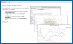
|
|
17.1 - Convert build system from ant to gradle: (For Developers) |
17.1 - Grouped Bar Charts: |
|
17.1 - Neutralizing Antibody (NAb) Assay QC Options: |
17.1 - Excluding Singlepoint Samples in Luminex Assays: |
|
Visualizations made easy with the Plot Editor: |
Take a click-through tour of a LabKey Study: |
|
|
||
Related Topics
Videos
Video Resources
- LabKey's YouTube Channel
- Webinars: Attend the next webinar, or view a recording of previous events.
- User Presentations: Learn about key features from real projects using them.
Video Archive
Project Highlight: FDA MyStudies Mobile App
Project Background
In 2017, Harvard Pilgrim Health Care Institute (HPHCI) was selected by the U.S. Food and Drug Administration (FDA) through the FDA-Catalyst program to lead the development of a mobile application, called FDA MyStudies, that would facilitate the collection of real-world data directly from patients to support clinical trials, observational studies, and registries. The effort was funded by an award to FDA scientific staff from the Patient Centered Outcomes Research Trust Fund which is administered by the Associate Secretary for Planning and Evaluation (ASPE) of the Department of Health and Human Services. Harvard Pilgrim selected the mobile application development firm Boston Technology Corporation (BTC) and LabKey as their development partners for the project. BTC was tasked with developing a user friendly mobile interface while LabKey was tasked with building a secure back-end storage environment for collected data.Why LabKey
LabKey Server was selected as the back-end data management solution for this project for a number of key reasons, one of which being the platform’s flexible, science-specific architecture. With the project’s long-term goal of expanding the use of real-world data across research programs, the application framework needed to support a broad range of potential healthcare topics through configuration as opposed to requiring development for each new project.LabKey Server also stood out as an ideal solution because of the platform’s ability to handle PHI/PII data in a manner compliant with HIPAA and FISMA regulations. Finally, one of the project requirements outlined by the FDA was that the resulting application and storage architecture would need to be made available as open source to the scientific community. LabKey Server, an open source platform licensed under Apache 2.0, was able to support this distribution model without any changes to the existing licensing model.The Implementation
The back-end storage environment is composed of three independent web applications:- Response Server: used to store data captured via the mobile application and provide secure access to these data for data analysis purposes.
- Registration Server: used to manage participant authentication, preferences, notifications, and consents.
- Web Configuration Portal: used to design study questionnaires and store study configuration information including consent forms, eligibility tests, surveys, and study resources.
 The bulk of the components used in the development of the secure data storage environment were previously existing in the LabKey Server platform. However, three key areas of custom development and extension were required to support the project’s use:
- Enrollment Tokens: A unique token that is assigned to each participant upon registration that can be used to restrict their enrollment to a specific study cohort, as well as match the collected study data to external systems (e.g., EHRs).
- Automatic Schema Creation: Automatic generation of a new database schema when a study questionnaire is created, eliminating the need for manual schema development.
- Mobile App Response Handling: Capabilities to support automated parsing of the JSON responses sent by the mobile application were implemented, enabling the storage of results in the schema, in a scalable manner.
Results
To evaluate the usability and viability of the application and data storage environments, Harvard Pilgrim contracted with Kaiser Permanente Washington Health Research Network (KPWHRN) to launch a pilot study examining the medication use and healthcare outcomes of pregnant women throughout their pregnancy. For the pilot program, the Harvard Pilgrim team utilized LabKey’s Compliant Cloud hosting services to manage the storage of study data in a secure AWS cloud environment. Participants who successfully completed the study reported high levels of usability and comfort sharing sensitive information using the app. The pilot was deemed a success, and in Fall 2018 the FDA released the open source code and documentation publicly for use in other studies. Since its release, the FDA MyStudies platform has been selected to support a clinical trial as well as a disease registry.Additional Resources
- FDA MyStudies Documentation Portal
- On May 9, 2019, subject matter experts from the FDA, HPHCI, BTC, and LabKey, presented an overview and many details about this project in a live webinar. Resources, including slides and the recording, are available here: An Introduction to the FDA MyStudies App: An Open-Source, Digital Platform to Gather Real World Data for Clinical Trials and Research Studies
LabKey Webinar Resources
To browse LabKey Webinars, Case Studies, and User Conference resources, check here:
- LabKey Webinars: Tech Talks, Feature Demonstrations, and Solution Overviews
- Case Studies: Real Examples of LabKey Solutions in Action
- LabKey User Conference Presentations
- LabKey User Conference 2022
- LabKey User Conference 2021
- LabKey User Conference 2020
- Some older user conference resource lists can be found in the documentation archives.
Tech Talk: Custom File-Based Modules
- Prerequisites
- Module Overview
- Anatomy of a File-Based Module
- Presentation Slides
- Demo Outline
- Link to Module and Source
- Video Link: Developing File-based Custom Modules for LabKey Server
Prerequisites
To get the most out of this presentation, you should have already set up your own local development machine as covered in this topic: You may also want to first complete the basic tutorial here:Module Overview
 Modules are encapsulated functionality in a standardized structure. A module can contain many features and customizations that you could also define in the user interface. Using a module instead provides many benefits:
- Version control integration
- Ease in deploying between test & prod servers
- Modularity and reusability
- Leverage built-in capabilities and features
Anatomy of a File-Based Module
The image shows the basics of how a module is structured.- Lowercase names are literal values
- Uppercase names are variable values
- Ellipses indicate more possible file types
- The module 'tree' is placed in /trunk/server/modules
Demo Outline
In the demo, you will see examples of these features:- Views and Webparts
- Queries and Reports
- Styling and Appearance
- Module Editing
Developing and Deploying
Advanced Topics
Presentation Slides
To follow along with the presentation, you can download a PDF of the slidedeck here:Link to Module and Source
The module reviewed in this presentation is part of the "LabKey/tutorialModules" repository on GitHub. You can download and extract the sourdough module content from this location:Presentation Video
Watch the presentation here:Related Topics
Collaborative DataSpace: User Guide
Create an Account
- Go to https://dataspace.cavd.org/cds/CAVD/app.view
- If you already have an account, click Sign In, agree to the terms of use, and enter your password.
- If you don't already have an account, click Register Here.
- Enter your email address and complete the verification code.
- Click Register.
- You will receive an email with a link valid only for your own email address. Click it.
- Select a strong password, enter it twice, click Submit, and wait for the page to refresh.
- Log in using your new password. On first log in you will need to complete the Member details panel.
- Click Submit.
- You will now be on the home page of the CAVD DataSpace.
Explore the DataSpace
The home page offers summary data, a variety of options for getting started, and both navigation links and filtering options in the right-hand panel. The banner menu includes: Contact us, Tools & links, Help, and Logout.
Getting Started
To get started using the DataSpace, explore these options for new users:- Watch the Getting Started Video: See the most powerful ways to explore the DataSpace
- Take a Guided Tour: Tours give you helpful popover guidance through some key features, including the following:
- Get Oriented
- Find subjects
- Plot data
- View and export data
- Learn about studies
- Explore monoclonal antibodies
- Using active filters
- Try it out:
- Learn about studies, products, assays, antibodies, and publications
- Find subjects with common characteristics
- Plot assay results across studies and years of research
- Compare Monoclonal antibodies and their neutralization curves
- Tips, Tricks, & Takeaways: Open documentation to help you - listed by title here.
- Learn about is a good place to start
- Find data of interest
- Use the filters
- Know what's in the plot
- There's more than meets the eye
- How many viruses are too many?
- Align plot by last vaccination
- Getting around the DataSpace
- More help is available using the Help menu in the top banner.
Navigation Links
The top panel of the right hand column provides navigation links to the following sections of the application:Tools and Links
Useful references are provided on the Tools & links menu in the header bar.
- DataSpaceR: R package on GitHub that allows users to programmatically access data in DataSpace
- CATNAP: Provides analysis of data associated with HIV-1 neutralizing antibodies, including neutralization panel data, sequences and structures
- CombiNAber: Predicts the neutralization of combinations of antibodies
- bNAber: Compares and analyzes bNAb data
- ImmuneSpace: A data management and analysis engine for the Human Immunology Project Consortium (HIPC) network
- CAVD DataSpace Twitter page
- CAVD website and portal
- HVTN website and portal
Maintenance
When the DataSpace site needs to be taken down for maintenance or to install an upgrade, an administrator will post a banner warning giving users notice of the timing and duration of outages.More Topics
DataSpace: Learn About
- Studies
- Assays
- Products
- MAbs
- Reports: This tab will only appear if reports are available.
- Publications
 Access to the underlying subject-level data within any given studies is controlled separately from access to metadata about the study. On the "Learn About" pages, users without data access to a given study can still see information about the study, such as the type, target area, products used, etc. When the user has access to some but not all data, they will see a green check icon with a note indicating the fraction of data visible. In this example, there are 18 studies with BAMA (Binding Antibody Multiplex Assay) data, but this user can only view 15 of them:
 All grids offer the ability to search, sort, and filter the results shown. Click a column header to toggle between ascending and descending sort. Hover over a column and click the filter icon to add a column filter. When a column filter is applied, the filter icon is shown in color.
 When you add a second column filter, the popup panel shows the values which still appear in the current selection. The values with "No data in current selection" have already been excluded by prior filtering.
 The search or filter criteria you use are preserved, so if you visit one of the results and then click "Back" in your browser, you will return to the search results.
Studies
The available studies are listed with basic information like type, PI, and status. If data is available, an icon will be shown in the Data Added column. A green check icon indicates the user has access to review some or all of that data. To learn more about a specific study, click the row to open a detail page. Colored links to helpful information are provided throughout the details page, including contact personnel, portals for the study, and data including assays available. If a user does not have access to the underlying data, they will see a gray X (as shown above for ELISpot) instead of the green check shown above for the BAMA assay.In addition to Integrated data from the assays integrated into the DataSpace, a section for Non-integrated data supports inclusion of other supplemental types of data. When the (download) icon is shown, you can download the data.Documents including the grant document can be provided in PDF or Word document format. On the Study Detail page, the documents to a given user are shown as colored links. Click the link to see or download the document. An administrator sets up the location and accessibility of study documents.Related studies, study products, reports, curated groups (if any), and publications associated with this study can also be easily found from this page. Under the Contact Information section, a set of links may include options to request support for an related study or to submit a research proposal or idea to the study group. If a specimen repository is available, you would also see a direct link to it in this section of the study details page.
Assays
The Learn About > Assays tab shows a searchable list of all the assays within the DataSpace, including the target area and number of studies using them. Click an assay for a detail page. On the Overview tab, the Integrated data section shows studies containing data for this assay. Green or gray checks or 'X' icons indicate whether this user has access to data for this assay. If the list is long, the first 10 will be shown and there will be a (show all) link to show the full list. Hover over the name of a study for a tooltip including the study description and also indicating status, such as:
- added
- being processed
- provided, but pending processing
- provided, but not included
- provided, but not machine readable
- not provided
- not included at this time
- not approved for sharing

Products
The Learn About > Products page offers a searchable list of the study products used. Clicking any product gives more information including further links to studies where the product is used. On the product details page, you can hover over study names under Integrated Data to see the study description for quick reference.
MAbs
The Learn About > Monoclonal Antibodies (MAbs) page provides an overview of all information about MAbs used in all studies. A user can filter and sort to locate studies involving MAbs of interest. Columns available for filtering include:
- MAb/Mixture
- Data Added
- Type
- Donor Species
- Isotype
- HXB2 Location
- Antibody Binding Type
- MAb Characterization Studies: Where mAbs themselves are the study subject.
- MAb Administration Studies: Where mAbs are used as a product.
Reports
R and knitr reports can be made available in the DataSpace by creating them in the DataSpace project folder outside the application UI. R Reports defined in the top level project (not the study subfolders) and made visible to all users (public) will be listed on the Reports tab of the Learn About page. If there are no such reports defined, the tab will not be shown.The thumbnail and basic information about the report is included in the searchable list. The category assigned outside the DataSpace UI is shown as the "Report Type" in this view. Clicking on any report will offer a detail page including the full report image.
Publications
The publications page lists all records from the publication tables, even if the publication is not associated with a study. You can search by any of the fields shown, including:- Publication: the title and a brief excerpt
- Data Added: a green checkmark icon is shown when data has been added for this publication. Click for more details about this data.
- Journal
- First Author
- Publication Date (Default sort): Note that this field is not a date-time, but a string representation of the Year, Month, and Date provided. "YYYY MON DD". Any elements not included are omitted.
- Studies
- Pubmed ID
 Clicking any row will show more details about the publication, including links to data availability within the DataSpace, when available.
Related Topics
DataSpace: Find Subjects

Finding Subjects
Click a link to open a filter panel for the given attribute. For example, if you click "study types" next to "by Studies" you would see something like this: For each value of the attribute, in this case "study type" or phase, the size of the bar is proportional to the number of matching subjects, with a count shown to the right. You could, for example, narrow your view of the DataSpace to show only subjects from phase IIB studies by clicking that bar as shown below. Notice the filtered counts at the bottom of the right panel are shown in green, compared with the prior "base" number of subjects shown in black. You can multi-select additional bars within this attribute using control/cmd/shift keys.Click Filter to apply the filter, which will update the "base" number of subjects. Notice that with the filter applied, the other bars disappear for this attribute. You can hide the empty rows by clicking Hide empty.
 To apply a second filter, select another pulldown option or click another filtering category. When viewing the new attribute, only bars/counts for subjects from Phase IIB trials will be shown. Click a bar and click Filter in the same way as you added the first filter.When you add a second filter (the example shown here selected "ICS" studies from "Assays"), by default only subjects related to all filters will be shown, i.e. filter1 matches "AND" filter2 matches. Click the filter box and use radio buttons to switch between AND and OR for multiple filters.
 In the update panel, you can also use the checkbox UI to change which subjects are included; checking "All" in this panel will remove the filter entirely. You may also notice when hovering over an active filter box, there is an 'X' in the corner for removing it. When you remove a filter by either means, you will be offered an "Undo" link if you made a mistake and want to reactivate it.
Available Attributes for Filtering
- by Subject Characteristics
- Race
- Sex at birth
- Age
- Hispanic or Lation origin
- Country at enrollment
- Species
- Circumcised at enrollment
- BMI category
- Gender identity
- Study cohort
- by Products
- Name
- Product Type
- Developer
- Product Class
- by Assays
- Assay Type
- Study
- Immunogenicity Type
- Labs
- by Studies
- Treatment Summary
- Treatment Arm Coded Label
- Study type (phase)
- Network
- PI (principal investigator)
- Strategy
Save and Share Groups
Once you have created a set of filters and established a subset of interest, you can click Save next to "Active filters" to save the group. Note that you are not strictly saving a "group" of participants, you are saving a named set of filters that show you that group. Click "replace an existing group" to see a list of groups you may want to replace with this new group.Check the "Shared group:" box to make the group available to others. Remember that you are sharing a set of filters that show you the population of interest. Another user viewing the shared 'group' may see different counts or members if they have different access to subject dat within studies.Administrators may choose to curate a set of shared groups for their users' convenience. When there are both shared and private groups within the application, they are shown in separate lists to make the distinction clear. The list of groups available appears in the lower left of the home page. Click on a group name to activate that set of filters.
 When you click a group name, you will see a Details page with additional information about the filters loaded. If you do not have permission to access data in all studies, you will see a note on this page. To leave the "group", i.e. remove the filters that the group consists of, click Undo on the details page.
 A saved group can also include a saved plot, making it a useful resource for sharing interesting data with others. In the same way that only data visible to the viewing user is shown, how the plot appears and what subset of data it presents may vary from user to user.
Related Topics
DataSpace: Plot Data
- Choose Variables
- Time Points and Alignment
- Use Color and Shape
- Study Axis and Tooltips
- Heatmaps
- Make Selections from the Plot
- Save a Plot

Choose Variables
Click Choose Variable for each axis to open a dialogue box for selecting what to plot. "Recommended" characteristics are listed above a full listing of all characteristics available. Here we are setting the variable for the y-axis and selected ICS. 'Magnitude - Background subtracted' is recommended, additional options are listed in the top scroll panel. The lower scroll panel shows the assay dimensions you can set. Click Set y-axis to begin your plot. Next click Choose variable for the X axis to set it.
Time Points and Alignment
You can select various sources on the x-axis panel, one of which is Time points. With time points, you can choose days (recommended), weeks, or months, and also have some advanced options:- Axis type:
- Continuous: Visits/events are shown along a continuous date-based timeline
- Categorical: Visits/events are shown an equal distance apart. Such discrete time variables focus a plot on the sequence of events, regardless of elapsed time between them.
- Aligned by:
- Aligned by Day 0: Multiple studies in the plot are aligned by start date of the study.
- Enrollment: Alignment is by enrollment date.
- First Vaccination: Alignment is by the date of first vaccination.
- Last Vaccination: Alignment is by the date of last vaccination.

Use Color and Shape
A third plotting variable is available by clicking the Color variable selector. The variable you choose will determine the color and shape of each point. Hover over the legend to see the definitions of the colors and shapes.
Study Axis and Tooltips
Below the data plot is the Study Axis showing icons on a timeline matching the X-axis for the plot. Each row represents a study with data represented. Hover over an icon on the study axis for a tooltip with more details. The relevant points on the data grid are colored green while you hover. Click to make that relevant data into an active filter. Tooltips are also available for points within the data plot and provide additional information. Click a datapoint to see the values that went into that point, for both x and y axes, including the median value for aggregated variables.
Heatmaps
When the plot contains too many dots to show interactively, the plot is shown as a heatmap. Higher data density is represented by darker tones. If you hover over a square, the number of points represented will be displayed. Clicking a square gives a tooltip about the data represented. You must reduce the amount of data plotted to see points again.
Make Selections from the Plot
Click and drag through the plot itself to highlight a subset of data. Notice the points are marked in green, the axes show the ranges you have selected and a filter panel appears on the right. Click to make that selection an active filter; you can also save as a subgroup.
Save a Plot
Once you have created the plot you can save it by clicking Save next to Active Filters. Saving the plot as part of a group will display it on the group details page. Remember that a saved 'group' is really a set of saved filters to apply to the data. Similarly a plot saved with a group will give a quick visualization of the filtered data.Related Topics
- Saved Groups: Once you've created a plot, you can save it as part of the group; it will appear on the details page.
- Integrate an R Report: R Reports are not created directly within the DataSpace application, but can be made available for browsing on the Learn About > Reports tab.
- Collaborative DataSpace: User Guide
- DataSpace: View Data Grid
DataSpace: View Data Grid
View Data Grid
Clicking View data grid takes you to a grid view of the active filtered set of data. Columns are grouped by related characteristics on different tabs. The "Study and Treatment" tab is always present; others are included through plot or column selections. Shown here, "Study and treatment", "Subject characteristics", and two assays: You can sort and filter these grids using the same methods as used on the Learn About pages.
Add/Remove Columns
Click Add/Remove columns to open the column selector. You can customize here which columns are displayed in the grid view. Choose Time Points under sources to see other column options for time: Time point columns added explicitly here are retained, even if different alignments are subsequently chosen in the plot interface.
Export
Click Export CSV/Excel above the grid to export the data. Additional metadata is included, such as announcements for the user (for example a link to the terms of use), the date and time of export, details of filters applied to the participant set, etc.In addition to the sheets (tabs) of data, the export includes additional sheets for:- Studies: A list of studies with data included in the export.
- Assays: A list of assays included in the export.
- Variable definitions: Definitions for all variables included in the export.

Related Topics
DataSpace: Monoclonal Antibodies
- Monoclonal Antibodies Tab
- Filter MAb Data
- MAb Filter Panel
- Export MAb Data
- MAb R Reports
- Plot Pharmacokinetic (PK) Data for MAbs
- View MAb Data on the Learn About Tab
Monoclonal Antibodies Tab
When the DataSpace contains MAb Assay data, click Monoclonal Antibodies to see the grid. The mAb summary grid aggregates statistics for all mAb assay records for each mAb and mixture containing a mAb. There are three categories of columns in the grid:
- Static Values: Values associated with the given mAb or mixture useful for filtering.
- Mab/Mixture: This column lists the single mAbs and mixtures containing those antibodies, making it possible to select for the various mixtures and solo preparations for a given antibody.
- Donor Species
- Isotype
- HXB2 Location
- Antibody Binding Type
- Count Columns: These columns show the count of unique values for the given mAb/mixture.
- Viruses
- Clades
- Tiers
- Studies
- Geometric Mean Columns:
- Curve IC50: The geometric mean of all IC50 values for matching mab/mixture records. Values of infinity/-infinity are excluded from the calculation. This value is computed using SQL exp(AVG(log(ic50))).
- MAbs/Mixtures: The count of unique MAb/Mixture names ('mab_mix_name_std')
- MAbs: The count of unique MAb names ('mab_name_std')
- Mixture Types: The count of unique mixture types
- Donor Species: The count of unique donor species
- Studies: The count of unique 'prot' values, showing the study label.
- MAb-Virus Pairs: The count of unique 'mab_mix_name_std' and 'virus' combinations.
 Learn more about filtering below.
Filter MAb Data
Hover over any column of data to reveal the (Filter) icon in the header. Click to set filters using checkboxes, or use the search box to narrow the list.
Filter Static Values
The static value columns (MAb/Mixture, Donor Species, Isotype, HXB2 Location, Antibody Binding Type) offer two lists when there are values both in and out of the current selection. For example, filtering the isotype column might look like this:
Filtering Count Columns
When you filter any one of the columns providing distinct count values, you see a panel for selecting among the other count column values simultaneously. For example, filtering the Viruses column looks like this:
Filtering Calculated Columns including Geometric Mean
The geometric mean Curve IC50 column filter offers a set of ranges of values as shown here:
MAb Filter Panel
After applying a few grid filters, you will notice that the filter panel on the right shows counts different from the original set of mAbs (inset on the left of this image): Click Clear in the MAb filter panel to restart filtering from the full set of mAbs available.When you have selected the subset you want, you can click Save to save this set of filters for finding this subset of mAbs. To learn more about saving groups, see the documentation for saving subject filters. Note that MAb filter groups and Subject filter groups are saved independently. You can only replace a MAb group with another MAb group.When you have saved groups, you will see them on the home page of the DataSpace above any publicly shared Curated groups.
Export MAb Data
You can export unaggregated and filtered MAb data in either CSV format or Excel workbook format. Above the MAb Data grid, click either Export CSV or Export Excel. Selecting rows prior to export is optional. If no rows are explicitly selected, all columns and rows are included in the export. If a subset of rows are selected, only data from these rows are included.The Excel export includes the following sheets.
- Study and MAbs: A list of mAbs and their studies.
- MAbs: The characteristics of the mAbs included.
- NAB MAB: The MAb assay data.
- Metadata: Terms of use, export date, selected export options, filters and selections.
- Studies: The list of studies included in the export, with detailed information.
- Assays: The list of assays included in the export, with detailed information.
- Variable Definitions: NAB MAB assay columns included in the export.
MAb R Reports
R reports for MAb data are created in LabKey (outside the DataSpace application). Up to 2 reports can be configured to show as buttons directly in above the Monoclonal antibodies grid.Create MAb R Reports
An administrator or developer creates R reports for MAb data.- The R reports can access the following parameters:
- labkey.url.params$"filteredKeysQuery" - the session query for filtered and selected unique keys
- labkey.url.params$"filteredDatasetQuery" - the session query for filtered and selected dataset
- R reports can query content directly from the queries param, or join to data from queries.
library(Rlabkey)
if (!is.null(labkey.url.params$"filteredKeysQuery")) {
labkey.keysQuery <- labkey.url.params$"filteredKeysQuery"
cat('Query name for filtered unique keys: ', labkey.keysQuery)
uniquekeys <- labkey.selectRows(baseUrl=labkey.url.base, folderPath=labkey.url.path, schemaName="cds", queryName=labkey.keysQuery)
cat('nn', 'Number of unique keys: ', nrow(uniquekeys), 'nn')
cat(length(names(uniquekeys)), 'Columns for unique keys:n')
names(uniquekeys)
} else {
print("Error: filteredKeysQuery param doesn't exist")
}
if (!is.null(labkey.url.params$"filteredDatasetQuery")) {
labkey.datasetQuery <- labkey.url.params$"filteredDatasetQuery"
cat('Query name for filtered dataset: ', labkey.datasetQuery)
filtereddataset <- labkey.selectRows(baseUrl=labkey.url.base, folderPath=labkey.url.path, schemaName="cds", queryName=labkey.datasetQuery)
cat('nn', 'Number of filtered data rows: ', nrow(filtereddataset), 'nn')
cat(length(names(filtereddataset)), 'Columns for dataset:n')
names(filtereddataset)
} else {
print("Error: filteredDatasetQuery param doesn't exist")
}
 Reports must be saved as Shared with all users to be available to DataSpace users.
Configure Displayed R Reports
Using module properties, an admin configures up to two R reports to display as buttons above the MAb grid.- Select > Folder > Management.
- Click the Module Properties tab.
- Scroll down to the MAbReport section.
- MAbReportID1 is the reportId for the first R report.
- MAbReportLabel1 is the display text for the button for the first R report. This label does not need to match the title displayed on the report itself.
- MAbReportID2 and MAbReportLabel2 identify and label the second report.

- Click Save Changes.
 Viewing the report, click the button to return to the grid. Within this report, there are multiple tabs to view.
 Another tab within the same report shows the curves for a specific MAb, with data in a grid below.
Plot Pharmacokinetic (PK) Data for MAbs
Pharmacokinetic (PK) data for mAbs can be plotted in the DataSpace using the PK MAb assay and a "Study hours" time dimension. PK data is often gathered over short intervals after infusion of a patient.To plot PK data:- On the Plot Data tab, click Choose Variable for the y-axis.
- Select PKMAb (PK MAb), then choose the recommended MAb concentration and click Set y-axis.

- Click Choose Variable for the x-axis, click Time points, then choose Study hours (PK MAb only).

- Click Set x-axis.
- The resultant plot of MAb concentrations against hours after initial infusion shows the trend lines for each subject.

- Hover over any point to isolate the trend line for that point.
- Click a point to open a tooltip of additional information about the study, timepoints, and MAbs involved in that specific trend line and point.

View MAb Data on the Learn About Tab
On the Learn About page, use the MAbs tab to see details about the monoclonal antibodies included in the DataSpace.You can also click the Assays tab and scroll to see monoclonal antibody assay data that is available.
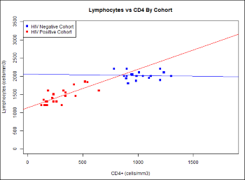
Related Topics
Documentation Archive
Documentation for Previous Releases
Biologics LIMS
Release Notes: Biologics LIMS
Release 26.6, June 2026 (Upcoming Release)
Release 26.5, May 2026
Release 26.4, April 2026
Release 26.3.14 - Extended Support Release (ESR)
|
Security Enhancements - A number of security enhancements to improve system security and reliabilty.
LK-VAL-26.3-H
SM Starter
SM Professional
LIMS Starter
LIMS Enterprise
Biologics LIMS
|
Release 26.3.8 - Extended Support Release (ESR)
Release 26.3, March 2026
Release 26.2, February 2026
Release 26.1, January 2026
Release 25.12, December 2025
Release 25.11, November 2025
Release 25.10, October 2025
Release 25.9, September 2025
Release 25.8, August 2025
Release 25.7.8 - Extended Support Release (ESR)
Release 25.7, July 2025
|
Improvements were made to address overall system reliability and performance.
SM Starter
SM Professional
LIMS Starter
LIMS Enterprise
Biologics LIMS
|
|
Continued investment in automated testing and internal quality checks to support ongoing
feature development.
SM Starter
SM Professional
LIMS Starter
LIMS Enterprise
Biologics LIMS
|
Release 25.6, June 2025
Release 25.5, May 2025
|
Several improvements were made to address overall system reliability and performance.
SM Starter
SM Professional
LIMS Starter
LIMS Enterprise
Biologics LIMS
|
|
Continued investment in automated testing and internal quality checks to support ongoing
feature development.
SM Starter
SM Professional
LIMS Starter
LIMS Enterprise
Biologics LIMS
|
Release 25.4, April 2025
|
Several improvements were made to address overall system reliability and performance.
SM Starter
SM Professional
LIMS Starter
LIMS Enterprise
Biologics LIMS
|
|
Continued investment in automated testing and internal quality checks to support ongoing
feature development.
SM Starter
SM Professional
LIMS Starter
LIMS Enterprise
Biologics LIMS
|
Release 25.3, March 2025
|
Rapidly find the plates and experiments in which samples have been used, and vice versa.
LIMS Enterprise
Biologics LIMS
|
|
Automatically generate analytics like regressions and statistics to accelerate your work
LIMS Enterprise
Biologics LIMS
|
Release 25.2, February 2025
Release 25.1, January 2025
Release 24.12, December 2024
Release 24.11, November 2024
Release 24.10, October 2024
|
Lineage relationships can now be marked as required when creating or updating samples or
sources.
SM-VAL-24.10-A
SM Starter
SM Professional
LIMS Starter
LIMS Enterprise
Biologics LIMS
|
|
Remove vs. Discard Terminology - The term "Remove" is now used instead of "Discard" when a sample is taken out of a storage
system.
SM-VAL-24.10-B
SM Starter
SM Professional
LIMS Starter
LIMS Enterprise
Biologics LIMS
|
|
Folder vs. Project Terminology - The term "Folder" is now used instead of "Project" to describe a subcontainer or partition
of data within the application. All data scoping, user access, and configuration options
are unchanged.
SM-VAL-24.10-C
SM Starter
SM Professional
LIMS Starter
LIMS Enterprise
Biologics LIMS
|
|
BarTender URL Save Requirement - When configuring BarTender, you must first save the URL prior to being able to test the
connection.
SM-VAL-24.10-D
SM Starter
SM Professional
LIMS Starter
LIMS Enterprise
Biologics LIMS
|
|
LIMS Starter is Launched!
LIMS Starter
LIMS Enterprise
Biologics LIMS
|
|
Charts are added to LIMS Starter, making them an "inherited" feature set from other
product tiers.
LIMS Enterprise
Biologics LIMS
|
Release 24.9, September 2024
Release 24.8, August 2024
Release 24.7, July 2024
|
Chart Export Menu - A new menu has been added for exporting a chart from a grid.
LIMS Enterprise
Biologics LIMS
|
Release 24.6, June 2024
Release 24.5, May 2024
Release 24.4, April 2024
|
Maintenance release 24.4.1 addresses an issue with uploading files during bulk editing of
Sample data.
SM-VAL-24.4.1-K
SM-VAL-24.4.1-K
SM Starter
SM Professional
LIMS Starter
LIMS Enterprise
Biologics LIMS
|
|
Users can better comply with regulations by entering a Reason for Update when editing
sample, source or assay data.
SM-VAL-24.4-A
SM Starter
SM Professional
LIMS Starter
LIMS Enterprise
Biologics LIMS
|
|
More quickly find the location you need when adding samples to storage (or moving them)
by searching for storage units by name or label.
SM-VAL-24.4-B
SM Starter
SM Professional
LIMS Starter
LIMS Enterprise
Biologics LIMS
|
|
Choose either an automatic (specifying box starting position and Sample ID order) or
manual fill when adding samples to storage or moving them.
SM-VAL-24.4-C
SM Starter
SM Professional
LIMS Starter
LIMS Enterprise
Biologics LIMS
|
|
More easily find samples in Sample Finder by searching with user-defined fields in sample
parent and source properties.
SM-VAL-24.4-D
SM Starter
SM Professional
LIMS Starter
LIMS Enterprise
Biologics LIMS
|
|
Lineage graphs have been updated to reflect "generations" in horizontal alignment, rather
than always showing the "terminal" level aligned at the bottom.
SM-VAL-24.4-E
SM Starter
SM Professional
LIMS Starter
LIMS Enterprise
Biologics LIMS
|
|
Hovering over a column label will show the underlying column name.
SM-VAL-24.4-F
SM Starter
SM Professional
LIMS Starter
LIMS Enterprise
Biologics LIMS
|
|
Up to 20 levels of lineage can be displayed using the grid view customizer.
SM-VAL-24.4-G
SM Starter
SM Professional
LIMS Starter
LIMS Enterprise
Biologics LIMS
|
|
Administrators of the Professional Edition can set the application to require users to
provide reasons for updates as well as other actions like deletions.
SM-VAL-24.4-H
SM Professional
LIMS Starter
LIMS Enterprise
Biologics LIMS
|
|
Moving entities between projects is easier now that you can select from multiple projects
simultaneously for moves to a new one.
SM-VAL-24.4-J
SM Professional
LIMS Starter
LIMS Enterprise
Biologics LIMS
|
|
Pagination of 400 for "Find Samples By" results. Limited to 1000 things (this is in the
modal, may not need docs, but may need them)
SM Professional
LIMS Starter
LIMS Enterprise
Biologics LIMS
|
|
Language for ELN Template is "Shared" instead of "Public"...
SM Professional
LIMS Starter
LIMS Enterprise
Biologics LIMS
|
|
List Lookups that were too long weren't showing - now they will open 'above' and show.
SM Professional
LIMS Starter
LIMS Enterprise
Biologics LIMS
|
|
Materialized sample view is now the default but we don't talk about it.
SM Professional
LIMS Starter
LIMS Enterprise
Biologics LIMS
|
|
Sample Manager User Conference 2024 - Sample Manager User Conference 2024
SM Professional
LIMS Starter
LIMS Enterprise
Biologics LIMS
|
Release 24.2, February 2024
Release 24.1, January 2024
Release 23.12, December 2023
Release 23.11, November 2023
Release 23.10, October 2023
Release 23.9, September 2023
Release 23.8, August 2023
Release 23.7, July 2023
Release 23.6, June 2023
Release 23.5, May 2023
Release 23.4, April 2023
Release 23.3, March 2023
Release 23.2, February 2023
Release 23.1, January 2023
Release 22.12, December 2022
Release 22.11, November 2022
Release 22.10, October 2022
Release 22.9, September 2022
Release 22.8, August 2022
Release 22.7, July 2022
Release 22.6, June 2022
Release 22.5, May 2022
Release 22.4, April 2022
Release 22.3, March 2022
Release 22.2, February 2022
Release 22.1, January 2022
Release 21.12, December 2021
Release 21.11, November 2021
Release 21.10, October 2021
Release 21.9, September 2021
|
Edit sources and parents of samples in bulk
SM Starter
SM Professional
LIMS Starter
LIMS Enterprise
Biologics LIMS
|
|
Customize the names of entities in the bioregistry
LIMS Enterprise
Biologics LIMS
|
Release 21.8, August 2021
Release 21.7, July 2021
|
Sample actions can be initiated from Freezer views
SM Starter
SM Professional
LIMS Starter
LIMS Enterprise
Biologics LIMS
|
|
Experiment Mechanism Removed - Removal of the previous "Experiment" mechanism. Use workflow jobs instead.
LIMS Enterprise
Biologics LIMS
|
Release 21.6, June 2021
|
Aliquots of samples singly or in bulk
SM Starter
SM Professional
LIMS Starter
LIMS Enterprise
Biologics LIMS
|
|
Picklists of samples to simplify operations on groups of samples
SM Starter
SM Professional
LIMS Starter
LIMS Enterprise
Biologics LIMS
|
|
Track movement of storage units within a freezer, or to another freezer
SM Starter
SM Professional
LIMS Starter
LIMS Enterprise
Biologics LIMS
|
|
Minor change in freezer editing behavior that the hierarchy is initially collapsed.
SM Starter
SM Professional
LIMS Starter
LIMS Enterprise
Biologics LIMS
|
Release 21.5, May 2021
Release 21.4, April 2021
Release 21.3, March 2021
|
Tube Rack type of freezer storage unit has been added
SM Starter
SM Professional
LIMS Starter
LIMS Enterprise
Biologics LIMS
|
|
Derive samples from one or more parent samples
SM Starter
SM Professional
LIMS Starter
LIMS Enterprise
Biologics LIMS
|
|
Field Editor Summary View - The field editor offers a new "Summary" view
SM Starter
SM Professional
LIMS Starter
LIMS Enterprise
Biologics LIMS
|
|
Biologics LIMS begins using the same user interface as Sample Manager.
LIMS Enterprise
Biologics LIMS
|
|
Release notes for this and other versions prior to this change can be found in the
documentation archives .
LIMS Enterprise
Biologics LIMS
|
Release 21.2, February 2021
|
Field Editor Bulk Delete and Export - The field editor now includes checkboxes to enable deletion of multiple fields and export
of subsets of fields.
SM Starter
SM Professional
LIMS Starter
LIMS Enterprise
Biologics LIMS
|
|
Background Import Enhancements - Background Import:
SM Starter
SM Professional
LIMS Starter
LIMS Enterprise
Biologics LIMS
|
Release 21.1, January 2021
|
Freezer Management - Freezer Management
SM Starter
SM Professional
LIMS Starter
LIMS Enterprise
Biologics LIMS
|
Release 20.12, December 2020
|
Detailed audit logging now shows only what has changed when data is updated.
SM Starter
SM Professional
LIMS Starter
LIMS Enterprise
Biologics LIMS
|
Release 20.11, November 2020
|
Batching of creating samples and sources, enabling selection of "just created" items.
SM Starter
SM Professional
LIMS Starter
LIMS Enterprise
Biologics LIMS
|
Release 20.10, October 2020
|
Integration with BarTender to print labels.
SM Starter
SM Professional
LIMS Starter
LIMS Enterprise
Biologics LIMS
|
Release 20.9, September 2020
|
Label colors are shown in the samples section of the main dashboard.
SM Starter
SM Professional
LIMS Starter
LIMS Enterprise
Biologics LIMS
|
|
Storage Menu Access Preview - In anticipation of future support for Freezer Management, underlying functionality like
the ability to access storage locations from the main menu have been added.
SM Starter
SM Professional
LIMS Starter
LIMS Enterprise
Biologics LIMS
|
Release 20.8, August 2020
Release 20.7, July 2020
|
Improved search experience. Filter and refine search results.
SM Starter
SM Professional
LIMS Starter
LIMS Enterprise
Biologics LIMS
|
Release 20.6, June 2020
|
Bug fixes and small improvements
SM Starter
SM Professional
LIMS Starter
LIMS Enterprise
Biologics LIMS
|
Release 20.5, May 2020
Release 20.4, April 2020
|
Unified Sample Type Creation Page - The creation interface for Sample Types has been merged to a single page showing both
properties and fields. This makes it easier to create naming expressions that use fields
in your Sample Type.
SM Starter
SM Professional
LIMS Starter
LIMS Enterprise
Biologics LIMS
|
|
Define Sources for Samples - Define Sources for your samples. The source of a sample could be an individual or a cell
line or a lab. Tracking metadata about the source of samples, both biological and
physical, can unlock new insights.
SM Starter
SM Professional
LIMS Starter
LIMS Enterprise
Biologics LIMS
|
Release 20.3, March 2020
|
Samples can be added to a workflow job during job creation. You no longer need to start a
job after selecting samples of interest, but can add or update the samples directly within
the job editing interface.
SM Starter
SM Professional
LIMS Starter
LIMS Enterprise
Biologics LIMS
|
|
Removing unnecessary fields is easier with an icon shown in the collapsed field view.
SM Starter
SM Professional
LIMS Starter
LIMS Enterprise
Biologics LIMS
|
|
LabKey Sample Manager is Launched!
SM Starter
SM Professional
LIMS Starter
LIMS Enterprise
Biologics LIMS
|
Release 17.1, March 2017
|
Biologics LIMS is Launched!
LIMS Enterprise
Biologics LIMS
|
Release Notes 25.11 (November 2025)
- LabKey Server SDMS
- Distribution Changes and Upgrade Notes
- Client APIs and Development Notes
- Other LabKey Products:
LabKey Server SDMS
Premium Edition Feature Updates
- Redshift external data sources now support write operations if the schema is designated as "Editable." (docs)
- The time-based one-time password (TOTP) entry page has been redesigned and the "remember this device" option now works more reliably. (docs)
- Sample Manager Feature Updates
- LabKey LIMS Feature Updates
- Biologics LIMS Feature Updates
Community Edition Updates
- Audit Log Improvements
- Transaction auditing has been improved by consolidating all relevant information in one location in the audit log.
- The audit log now records both the original file name and the generated file name in cases where uploaded files have been automatically renamed.
- Detailed audit logging is automatically enabled for Samples, Sources, Data Classes, and Assay Data, ensuring greater compliance and confidence that all user actions, particularly those occurring via Client APIs, are fully tracked.
- API users are now prevented from reducing the audit level below the effective default or the administrator-configured value, bolstering compliance requirements.
- Detailed logging for assay results has shifted from generating many individual Experiment Events to generating linked Query Update Events (surfaced as "Assay Result Events"). Only a single summary Experiment Event is now generated for a batch update or deletion.
- Audit log now captures the method used for insert, update, and delete operations. (docs)
- A new Postgres Table Sizes report is available in the Admin Console to help administrators provision and manage the LabKey database.
- The "Export to PNG" feature of charts and plots generates images at higher resolution (minimum 2,000 pixels high), making them more suitable for publication.
- The "Allowed External Resource Hosts" option now supports src-object and src-script, allowing administrator to further customize the Content Security Policy (CSP). (docs)
- File path validation now has additional protections by adopting FileLike instead of File or Path for referencing file resources, especially as related to file references in HTTP requests. This also has potential implications for scenarios, such as pipeline jobs, that reference files outside of the normal file root for a given container.
Distribution Changes and Upgrade Notes
- LabKey Server now supports and recommends the recently released PostgreSQL 18.x. (docs)
- Upcoming in March 2026: Upgrade to Java 25 LTS. For details see Release Notes: SDMS 26.3.
Deprecated Features
- Support for PostgreSQL 13.x has been deprecated and will be removed in 26.3. (docs)
- The Use "path first" urls setting has been removed from Site Settings and turned off, regardless of the previous setting. The "Restore controller-first URLs" deprecated feature is available to temporarily force the server to generate URLs using the old "controller-first" ("controller/path/action") format, but this option will be removed in 26.3. While the server will no longer generate URLs in the old format, it will continue to accept them for the foreseeable future. (i.e., old URLs in publications or browser favorites will continue to work.) Learn more in this topic: LabKey URLs
- Support for a legacy query that unions all the event tables together into a single query has been deprecated.
- Support for unescaping backslash characters when importing text files has been deprecated.
- The "Advanced import options" of choosing objects during import of folder archives, as well as having those imports applied to multiple folders simultaneously, have both been removed.
- Support for object-level discussions has been removed. Old discussions are still viewable via the messages feature.
- Support for resolving missing lookup values to null when lookup by alternate key is enabled has been removed. Missing lookup values will now result in an error. (docs)
Client APIs and Development Notes
- Developers can use the moveRows API to move list rows to otherfolders or projects. (docs)
- API Resources
Sample Manager
The Sample Manager Release Notes list features by monthly version and product edition.LabKey LIMS
The LabKey LIMS Release Notes list features in addition to those in the Professional Edition of LabKey Sample Manager.Biologics LIMS
The Biologics LIMS Release Notes list features in addition to those in LabKey LIMS.Panorama
- Improved QC Metrics - Users can now select any pair of metrics to include in QC plots.
Previous Release Notes: Version 25.7
Release Notes 25.7 (July 2025)
- LabKey Server SDMS
- Client APIs and Development Notes
- Other LabKey Products:
LabKey Server SDMS
Premium Edition Feature Updates
- Time-based one-time password (TOTP) two-factor authentication (2FA) can now be configured to remember trusted devices and reduce the frequency of prompts to users. (docs)
- SAML Authentication now supports passwordless-login when enabled on the SAML IdP. (docs) Also available in 25.3.10.
- Parameters can be included in the SAML IdP SSO URL if required. (docs) Also available in 25.3.6.
- A new validator will identify external images referenced from Electronic Lab Notebooks. (docs)
- A custom utility that will scan for strict CSP violations in wikis, participant views, and study descriptions is now available to LabKey Cloud and Premium Edition subscribers. (docs) Also available in 25.3.9.
- Extended metrics reporting is available to support some clients. Your account manager will work with you to set this up if needed.
- Premium Resource for EHR (Electronic Health Records): Documentation of validation trigger levels has been added to assist developers. (docs)
- Sample Manager Feature Updates
- LabKey LIMS Feature Updates
- Biologics LIMS Feature Updates
Community Edition Updates
- A new simpler method for installing the Community Edition is now available, making it easier than ever to get started. (learn more)
- LabKey SQL now supports precision and scale for NUMERIC values, as well as @format annotations. (docs | docs)
- Administrators can view content security policy reports via a new link from the admin console. (docs)
- The "Site Administrators" and "Site Developers" groups are no longer created by default or used for assigning permissions. (docs)
- Permissions for users may need to be adjusted if they previously relied on these groups. In particular, report permissions that were previously automatically granted to site administrators must now be assigned directly. (docs)
- By default, the "assigned-to" list for an issue tracker is now the "Site Users" group, where it was previously the "Site Administrators" group. (docs)
Distribution Changes and Upgrade Notes
- A strong Content Security Policy (CSP) is highly recommended for all servers. (docs)
- Our recommended strong CSP blocks all inline script and prevents browsers from accessing unvetted external resources. This means the browser blocks all cross-site script (XSS) injection and cross-origin resource sharing attacks.
- All LabKey Cloud deployments and on-premise distributions are by default configured with a strong CSP in enforce mode as of version 25.7.
- To use this default, administrators of on-premise distributions should remove any custom settings from their application.properties file.
- If any customizations you require are not supported by the new ability to substitute allowed external hosts, please contact us so that we can best support you.
- Validators, examples, and instructions are provided to assist you in clearing any reports that may be raised by your server so that your users can still access all their content. (docs)
- LabKey Server embeds a copy of Tomcat 10 as of March 2024. It no longer uses or depends on a separately installed copy of Tomcat. (installation docs)
- LabKey Cloud subscribers are installed, upgraded, and maintained by LabKey.
- If you are installing LabKey Community Edition for the first time, a new easy method is provided to help you get started. (learn more)
- Users with on-premise installations who have already upgraded to use embedded Tomcat should follow these upgrade instructions. (upgrade on linux | upgrade on windows)
- Users with on-premise installations that have not already migrated their server to use embedded Tomcat will need to follow an additional set of steps covered in the documentation archives. (migration docs)
- Tomcat v10.1.42 included changes to the defaults for max-part-count, max-part-header-size, and max-connections. LabKey automatically overrides Tomcat's defaults with appropriate values to support its use cases and provide ample concurrent requests for LabKey Server scenarios. These properties and their defaults can be overridden in the application.properties file if needed. (docs)
Deprecated Features
- The "Advanced import options" of choosing objects during import of folder archives, as well as having those imports applied to multiple folders simultaneously, have both been deprecated.
- Support for object-level discussions has been deprecated.
- Support for resolving missing lookup values to null when lookup by alternate key is enabled has been deprecated. Missing lookup values will now result in an error.
- Support for additional date, time, and datetime parsing patterns has been removed.
- "Assay Progress Reports" in studies have been removed.
- Support for Ancillary Studies has been removed.
- The Publish Study feature provides a more extensive mechanism for creating child studies. (docs)
- Generating a schema export from the query browser is no longer available.
- Support for study protocol design tools has been removed.
- Support for OpenEMPI has been removed.
- Support for SQL Server 2016 has been removed. (supported versions)
Client APIs and Development Notes
- The behavior of lookups with values that look like numbers has been improved. We will attempt to resolve by alternate key (if allowLookupByAlternateKey is true) and then by primary key. (docs)
- When lookup validation for a field is not selected, and allowLookupByAlternateKey is true, missing lookup values will result in an error. (docs)
- A deprecated feature flag is provided to restore the previous behavior of resolving to null if desired.
- Our documentation example of an assay transformation script in R has been updated to show how to enable proper encoding of strings. Use the quote=TRUE and qmethod="double" parameters for the write.table. Your code may require similar updates. (docs)
- Version 3.4.3 of Rlabkey has been released. (docs)
- An example of using the lineage API from Python has been added. (docs)
- API Resources
Sample Manager
The Sample Manager Release Notes list features by monthly version and product edition.
LabKey LIMS
The LabKey LIMS Release Notes list features in addition to those in the Professional Edition of LabKey Sample Manager.
Biologics LIMS
The Biologics LIMS Release Notes list features in addition to those in LabKey LIMS.
Previous Release Notes: Version 25.3
Release Notes 25.3 (March 2025)
- LabKey Server SDMS
- Client APIs and Development Notes
- Other LabKey Products:
LabKey Server SDMS
Premium Edition Feature Updates
- The Duo secondary authentication provider now integrates with Duo Universal Prompt. (docs) Also available in 24.11.5.
- A wide variety of trendline options have been added to the chart builder for line charts. (docs)
- Premium Resource: A new example showing how to customize your site's home page to make navigation easier for user groups. (docs)
- Sample Manager Feature Updates
- LabKey LIMS Feature Updates
- Biologics LIMS Feature Updates
Community Edition Updates
- Assay transform scripts can be configured to run when data is imported, updated, or both. (docs)
- Study participants can be deleted from all datasets at once. (docs)
- Names of data structures, including Sample Types, Source Types, and Assay Designs, may not contain certain special characters or substrings used internally. (docs)
- Administrators can use a new table to locate field names with special characters on the server. While special characters are permitted in field names, they are not recommended. (docs) Also available in 24.11.9.
- The wiki and announcements renderer for Markdown has been replaced. The new renderer is highly compatible with the previous renderer and adds several new features. (docs)
- Set a timeout for read-only HTTP requests, after which long running processes and database queries will be killed. (docs)
- When the server is configured to use only HTTPS, a Strict-Transport-Security header will be set to prevent future attempts to access the server over HTTP. (docs) Also available in 24.11.4.
- Administrators can register a list of acceptable file extensions for uploads; others will be denied. If no list is provided, any extension is allowed. (docs)
- Encoding of WebDav URLs has been made more consistent; users who have been relying on the previous behavior may need to make changes. (docs)
- A strong Content Security Policy (CSP) running in enforce mode is highly recommended for all servers. Administrators can now customize elements of the CSP through the Admin Console. (docs)
- New options to assist with troubleshooting Postgres database issues have been added to the Admin Console. (docs)
- New documentation example of using an icon on a custom grid button. (docs)
Distribution Changes and Upgrade Notes
- A strong Content Security Policy (CSP) is highly recommended for all servers. (docs)
- Our recommended strong CSP blocks all inline script and prevents browsers from accessing unvetted external resources. This means the browser blocks all cross-site script (XSS) injection and cross-origin resource sharing attacks.
- All LabKey Cloud deployments are now configured with a strong CSP in enforce mode.
- All on-premise distributions are now configured by default with a strong CSP in report-only mode. We recommend switching this to enforce mode as soon as you have tested in report mode and are comfortable with the findings.
- Important: If you are running on-premise and previously customized the CSP and are running it in enforce mode, you can continue to do so. If you have customized the CSP to run in report mode, we recommend removing the customization from your application.properties so that our default will be used instead. Once you are satisfied with the report results, you'll be able to move to enforce mode.
- If any customizations you require are not supported by the new ability to substitute allowed external hosts, please contact us so that we can best support you.
- LabKey Server embeds a copy of Tomcat 10. It no longer uses or depends on a separately installed copy of Tomcat. (installation docs)
- LabKey Cloud subscribers are installed, upgraded, and maintained by LabKey.
- Users with on-premise installations who have already upgraded to use embedded Tomcat should follow these upgrade instructions. (upgrade on linux | upgrade on windows)
- Users with on-premise installations that have not already migrated their server to use embedded Tomcat will need to follow an additional set of steps covered in the documentation archives. (migration docs)
- The default configuration for Tomcat error pages has been improved to reduce unneeded information like the version number and stack trace.
- Error logging has been improved for situations like port conflicts. (docs)
Deprecated Features
- Support for PostgreSQL 12.x has been removed. (supported versions)
- Support for bitmask (integer) permissions has been removed. Developers can learn more in the archives.
- Support for "Advanced Reports" has been removed.
- Support for the "Remote Login API" has been removed.
- The "Vaccine Study Protocol" interface has been removed.
- Support for FreezerPro integration has been removed.
- Support for SampleMinded integration has been removed.
- Support for additional date, time, and datetime parsing patterns has been deprecated.
- "Assay Progress Reports" in studies have been deprecated.
- Support for SQL Server 2016 has been deprecated and will be removed in a future release. (supported versions)
- Support for object-level discussions has been deprecated.
- Support for Ancillary Studies has been deprecated.
- The Publish Study feature provides a more extensive mechanism for creating child studies. (docs)
- Support for study protocol design tools has been deprecated.
- The "Advanced import options" of choosing objects during import of folder archives, as well as having those imports applied to multiple folders simultaneously, have both been deprecated.
Client APIs and Development Notes
- Rlabkey version 3.4.1 has been released, supporting the consistency improvements in webdav URLs. Note that this means version 3.4.1 requires LabKey version 24.12 or higher; earlier versions of LabKey must use Rlabkey version 3.4.0 or lower. (docs)
- API Resources
Sample Manager
The Sample Manager Release Notes list features by monthly version and product edition.
LabKey LIMS
The LabKey LIMS Release Notes list features in addition to those in the Professional Edition of LabKey Sample Manager.
Biologics LIMS
The Biologics LIMS Release Notes list features in addition to those in LabKey LIMS.
Previous Release Notes: Version 24.11
Release Notes 24.11 (November 2024)
- LabKey Server SDMS
- Client APIs and Development Notes
- Other LabKey Products:
LabKey Server SDMS
Premium Edition Feature Updates
- Include "Calculation" fields in lists, datasets, sample, source, and assay definitions. (docs)
- Support for using a Snowflake database as an external data source is now available. (docs)
- The "External Tool Access" page has been improved to make it easier to use ODBC and JDBC connections to LabKey. (docs)
- Administrators can generate a report of file root sizes across the site. (docs)
- Reporting usage statistics to LabKey can be enabled without also enabling upgrade banners. (docs)
- SAML authentication uses RelayState instead of a configuration parameter, and the configuration interface has been streamlined. Also available in 24.7.7 (docs)
- Administrators can save incomplete authentication configurations if they are disabled. Also available in 24.7.4 (docs)
- Sample Manager Feature Updates
- LabKey LIMS Feature Updates
- Biologics LIMS Feature Updates
Community Edition Updates
- Beginning with maintenance release 24.11.4, when the server is configured to use only HTTPS, a Strict-Transport-Security header will be set to prevent future attempts to access the server over HTTP.
- Linking Sample data to a visit-based study can now be done using the visit label instead of requiring a sequencenum value. (docs)
- Date, time, and datetime fields are now limited to a set of common display patterns, making it easier for users to choose the desired format. (docs)
- A new validator will find non-standard date and time display formats. (docs)
- Use shift-click in the grid view customizer to add all fields from a given node. (docs)
- When a pipeline job is cancelled, any queries it has initiated will also be cancelled. (docs)
- Users can include a description for future reference when generating an API key. (docs)
- Folder file root sizes are now calculated and shown to administrators. (docs)
- Administrators can provide a set of external sources of data to allow if a content security policy is configured. (docs)
- Sending of the Server HTTP header may be disabled using a site setting. (docs)
- Some "Experimental Features" have been relocated to a "Deprecated Features" page to better describe their status. (docs)
- When a user changes their database password, all current sessions associated with that login are invalidated. (docs)
Distribution Changes and Upgrade Notes
- LabKey Server embeds a copy of Tomcat 10. It no longer uses or depends on a separately installed copy of Tomcat.
- LabKey Cloud subscribers have been upgraded automatically.
- For users with on-premise installations, the process for upgrading from previous versions using a standalone Tomcat 9 has changed significantly. Administrators should be prepared to make additional changes during the first upgrade to use embedded Tomcat. (docs)
- For users with on-premise installations who already upgraded to use embedded Tomcat will follow a much simpler process upgrade to 24.11. Note that the distribution name itself has changed to drop the "-embedded" string, as all distributions are now embedded. (linux | windows)
- The process for installing a new LabKey Server has also changed significantly, making it simpler than in past releases. (docs)
- All specialty assays (ELISA, ELISpot, Microarray, MS2, NAb, Luminex, etc.) are now distributed only to clients actively using them. Administrators will see a warning about unknown modules when they upgrade and can safely remove these unused modules. Please contact your Account Manager if you have questions or concerns.
- HTTP access logging is now enabled by default and the recommended pattern has been updated. (docs)
- Users of proxies or load balancers may wish to add this to their accesslog.pattern to capture the IP address of the originating client:
%{X-Forwarded-For}i - MySQL 9.0.0 is now supported. (docs)
- LabKey Server now supports and recommends the recently released PostgreSQL 17.x. (docs)
Deprecated Features
- Support for Microsoft SQL Server 2014 has been removed. (docs | docs)
- Some older wiki macros were removed; the list of supported macros is in the documentation.
- Support for "Advanced Reports" has been deprecated.
- Support for the "Remote Login API" has been deprecated.
- Support for bitmask (integer) permissions has been deprecated. Developers can learn more below.
- The "Vaccine Study Protocol" interface has been deprecated.
- Future deprecations: These features will be deprecated in the next release. Contact your Account Manager if you have questions or concerns.
- Additional date, time, and datetime parsing patterns. Selecting a date parsing mode (Month-Day-Year or Day-Month-Year) will still be supported. (docs)
- You will no longer have the "Advanced import options" of choosing objects during import of folders, as well as having folder imports applied to multiple folders. (docs)
- "Assay Progress Reports" in studies. (docs)
Client APIs and Development Notes
- Version 3.4.0 of Rlabkey is available. (docs)
- Note: Rlabkey version 3.4.1 has also been released, supporting the consistency improvements in webdav URLs made in December 2024. Note that this means version 3.4.1 requires LabKey version 24.12 or higher; earlier versions of LabKey including 24.11 must use Rlabkey version 3.4.0 or lower. (docs)
- Client API calls that provide credentials and fail authentication will be rejected outright and immediately return a detailed error message. Previously, a call that failed authentication would proceed as an unauthenticated user which would fail (unless guests have access to the target resource) with a less informative message. This change is particularly helpful in cases where the credentials are correct but do not meet password complexity requirements or are expired.
- Version 3.0.0 of our gradlePlugin was released. It's earliest compatible LabKey release is 24.8 and it includes a few changes of note for developers. A few examples are here, and more are listed in the gradlePlugin release notes:
- The AntBuild plugin has been removed, so we no longer have a built-in way to detect modules that are built with Ant instead of Gradle.
- We removed support for picking up .jsp files from resources directories. Move any .jsp files in a resources directory under the src directory instead.
- Support for bitmask (integer) permissions has been removed. Class-based permissions replaced bitmask permissions many years ago.
- Developers who manage .view.xml files should replace <permissions> elements with <permissionClasses> elements. (docs)
- Code that inspects bitmask permissions returned by APIs should switch to inspecting permission class alternatives.
- Developers of React-based modules will need to make changes in the entryPoints.js file instead of directly in the .view.xml file.
- Documentation has been added to assist you in determining which packages and versions are installed for R and python. (R info | python info)
- API Resources
Sample Manager
The Sample Manager Release Notes list features by monthly version and product edition.
LabKey LIMS
Announcing LabKey LIMS! Learn more here:
The LabKey LIMS Release Notes list features in addition to those in the Professional Edition of LabKey Sample Manager.
Biologics LIMS
The Biologics LIMS Release Notes list features in addition to those in LabKey LIMS.
Previous Release Notes: Version 24.7
Release Notes 24.7 (July 2024)
Here are the release notes for version 24.7 (July 2024).
LabKey Server
Premium Edition Feature Updates
- The "External Analytics Connections" configuration (which provides access via ODBC/JDBC) now has the option to override the server host name if necessary. (docs)
- A new "Require Secondary Authentication" role provides administrators with the ability to selectively enable two-factor authentication for different users and groups. (docs)
- Improvements have been made to the Compliance module regarding the handling of fields marked as containing PHI in Lists, Sample Types & Data Classes. (docs)
- Support for DBeaver has been added via the Postgres JDBC driver. Also available in 24.3.9. (docs)
- Integrate with DBVisualizer via the LabKey JDBC driver. (docs)
- Beginning with maintenance release 24.7.3, a Snowflake database can be used as an external data source. (docs)
- Panorama feature updates are listed below.
- Sample Manager feature updates are listed below.
- Biologics LIMS feature updates are listed below.
Community Edition Updates
- New roles, Sample Type Designer and Source (Data Class) Designer, improve the ability to customize the actions available to individual users. (docs)
- Fields where a description is available as a tooltip now show an icon to alert users that there is more information available.
- Maintenance release 24.3.5 (May 2024) addresses an issue with importing across Sample Types in certain time zones. Date, datetime, and time fields were sometimes inconsistently translated. (resolved issue)
- Maintenance release 24.3.5 (May 2024) addresses an issue with uploading files during bulk editing of Sample data. (resolved issue)
- A new validation provider will check wikis for compliance with strict content-security-policy requirements. (docs)
- Administrators now have more options for running validation providers, including selecting which to run, over what scope, and whether to run in the background. (docs)
- Improved examples and guidance for creating trigger scripts. (docs)
- When a folder is created using another folder as a template, you now have the option to decide whether to include PHI columns. (docs)
- A new Usage Statistics view gives administrators a better way to understand site usage. (docs)
- A new audit event type is added to track Module Properties changes. (docs)
- Improvements to ensure the full text search index remains in sync with the server. (docs)
- New menu for exporting charts to PDF or PNG. (docs)
- The interface for inferring an assay design from a results file has changed. (docs)
Panorama: Targeted Mass Spectrometry
- Improved axis scaling and display of upper and lower bounds defining outliers in QC plots.
- Performance improvements for some reporting of transition-level data.
Distribution Changes and Upgrade Notes
- The upgrade to 24.7 may take longer than usual to accommodate schema updates related to sample lineage.
- LabKey Server embeds a copy of Tomcat 10. It no longer uses or depends on a separately installed copy of Tomcat.
- LabKey Cloud subscribers have been upgraded automatically.
- For users with on-premise installations, the process for upgrading from previous versions using a standalone Tomcat 9 has changed significantly. Administrators should be prepared to make additional changes during the first upgrade to use embedded Tomcat. (docs)
- For users with on-premise installations who already upgraded to use embedded Tomcat will follow a much simpler process upgrade to 24.7. (linux | windows)
- The process for installing a new LabKey Server has also changed significantly, making it simpler than in past releases. (docs)
- After upgrading to 24.7.3, administrators may see a warning about unknown modules. If so, follow the link to the Module Details page, scroll down, and delete the Redshift module.
Deprecated Features
- The "ms2" module is no longer included in most distributions. Administrators who see a warning after upgrading about this module being unknown can safely delete it. Contact your Account Manager if you have questions or concerns.
- Support for Microsoft SQL Server 2014 will be removed in version 24.8. That version reached "end of support (EOS)" on July 9, 2024, which means Microsoft has stopped providing security patches and technical support for this version. (docs)
- Support for "Advanced Reports", deprecated in 2018, will be removed in version 24.8.
- Support for the "Remote Login API", deprecated in 2020, will be removed in version 24.8.
- The "Vaccine Study Protocol" web part and editor interface, deprecated in 2015, is still available behind an experimental flag but will be removed in a future release. It has been replaced with the "Manage Study Products" interface. (docs)
- Support for bitmask (integer) permissions has been deprecated. Class-based permissions replaced bitmask permissions many years ago. Developers who manage .view.xml files should replace <permissions> elements with <permissionClasses> elements. Code that inspects bitmask permissions returned by APIs should switch to inspecting permission class alternatives. Support for bitmask permissions will be removed from the product in version 24.8.
Sample Manager
The Sample Manager Release Notes list features by monthly version.
- Workflow jobs can no longer be deleted if they are referenced from a notebook. (docs)
- Customize the certification language used during ELN signing to better align with your institution's requirements. (docs)
- Workflow templates can now be copied to make it easier to generate similar templates. (docs)
- More easily understand Notebook review history and changes including recalls, returns for changes, and more in the Review Timeline panel. (docs)
- Administrators can require a reason when a notebook is recalled. (docs)
- Add samples to any project without first having to navigate there. (docs)
- Edit samples across multiple projects, provided you have authorization. (docs)
- Administrators can set the application to require users to provide reasons for updates as well as other actions like deletions. (docs)
- Moving entities between projects is easier now that you can select from multiple projects simultaneously for moves to a new one. (docs)
- The storage dashboard now lists recently used freezers first, and load the first ten by default, making navigating large storage systems easier for users. (docs)
- New roles, Sample Type Designer and Source Designer, improve the ability to customize the actions available to individual users. (docs)
- Fields with a description, shown in a tooltip, now show an icon to alert users that there is more information available. (docs)
- Lineage across multiple Sample Types can be viewed using the "Ancestor" node on the "All Samples" tab of the grid. (docs)
- Editable grids support the locking of column headers and sample identifier details making it easier to tell which cell is being edited. (docs)
- Exporting from a grid while data is being edited is no longer supported. (docs)
- More easily identify if a file wasn't uploaded with an "Unavailable File" indicator. (docs)
- The process of adding samples to storage has been streamlined to make it clearer that the preview step is only showing current contents. (docs)
- Assign custom colors to sample statuses to more easily distinguish them at a glance. (docs)
- Easily download and print a box view of your samples to share or assist in using offline locations like some freezer "farms". (docs)
- Use any user-defined Sample properties in the Sample Finder. (docs)
- Users can better comply with regulations by entering a "Reason for Update" when editing sample, source or assay data. (docs)
- More quickly find the location you need when adding samples to storage (or moving them) by searching for storage units by name or label. (docs)
- Choose either an automatic (specifying box starting position and Sample ID order) or manual fill when adding samples to storage or moving them. (docs)
- More easily find samples in Sample Finder by searching with user-defined fields in sample parent and source properties. (docs)
- Lineage graphs have been updated to reflect "generations" in horizontal alignment, rather than always showing the "terminal" level aligned at the bottom. (docs)
- Hovering over a column label will show the underlying column name. (docs)
- Up to 20 levels of lineage can be displayed using the grid view customizer. (docs)
Biologics LIMS
The Biologics Release Notes list features by monthly version and product edition.
- The storage dashboard now lists recently used freezers first, and load the first ten by default, making navigating large storage systems easier for users. (docs)
- New roles, Sample Type Designer and Source Designer, improve the ability to customize the actions available to individual users. (docs)
- Fields with a description, shown in a tooltip, now show an icon to alert users that there is more information available. (docs)
- Lineage across multiple Sample Types can be viewed using the "Ancestor" node on the "All Samples" tab of the grid. (docs)
- Editable grids support the locking of column headers and sample identifier details making it easier to tell which cell is being edited. (docs)
- Exporting from a grid while data is being edited is no longer supported. (docs)
- A new menu has been added for exporting a chart from a grid. (docs)
- When uploading assay data, files can be uploaded with the data, instead of needing to be separately uploaded before data import. (docs)
- Workflow jobs can no longer be deleted if they are referenced from a notebook. (docs)
- More easily identify if a file wasn't uploaded with an "Unavailable File" indicator. (docs)
- The process of adding samples to storage has been streamlined to make it clearer that the preview step is only showing current contents. (docs)
- Customize the certification language used during ELN signing to better align with your institution's requirements. (docs)
- Workflow templates can now be copied to make it easier to generate similar templates. (docs)
- Assign custom colors to sample statuses to more easily distinguish them at a glance. (docs)
- Easily download and print a box view of your samples to share or assist in using offline locations like some freezer "farms". (docs)
- Use any user-defined Sample properties in the Sample Finder. (docs)
- More easily understand Notebook review history and changes including recalls, returns for changes, and more in the Review Timeline panel. (docs)
- Administrators can require a reason when a notebook is recalled. (docs)
- Add samples to any project without first having to navigate there. (docs)
- Edit samples across multiple projects, provided you have authorization. (docs)
- Users can better comply with regulations by entering a "Reason for Update" when editing sample, source or assay data. (docs)
- More quickly find the location you need when adding samples to storage (or moving them) by searching for storage units by name or label. (docs)
- Choose either an automatic (specifying box starting position and Sample ID order) or manual fill when adding samples to storage or moving them. (docs)
- More easily find samples in Sample Finder by searching with user-defined fields in sample parent and source properties. (docs)
- Lineage graphs have been updated to reflect "generations" in horizontal alignment, rather than always showing the "terminal" level aligned at the bottom. (docs)
- Hovering over a column label will show the underlying column name. (docs)
- Up to 20 levels of lineage can be displayed using the grid view customizer. (docs)
- Administrators can set the application to require users to provide reasons for updates as well as other actions like deletions. (docs)
- Moving entities between projects is easier now that you can select from multiple projects simultaneously for moves to a new one. (docs)
Client APIs and Development Notes
- As of LabKey Server 24.7.1, client API calls that provide credentials and fail authentication will be rejected outright and immediately return a detailed error message. Previously, a call that failed authentication would proceed as an unauthenticated user which would fail (unless guests have access to the target resource) with a less informative message. This change is particularly helpful in cases where the credentials are correct but do not meet password complexity requirements or are expired.
- Support for bitmask (integer) permissions has been deprecated. Class-based permissions replaced bitmask permissions many years ago. Support for bitmask permissions will be removed from the product in version 24.8.
- Developers who manage .view.xml files should replace <permissions> elements with <permissionClasses> elements.
- Code that inspects bitmask permissions returned by APIs should switch to inspecting permission class alternatives.
- Developers of React-based modules will need to make changes in the entryPoints.js file instead of directly in the .view.xml file.
- API Resources
The symbol indicates a feature available in a Premium Edition of LabKey Server, Sample Manager, or Biologics LIMS.
Previous Release Notes: Version 24.3
Release Notes 24.3 (March 2024)
Here are the full release notes for version 24.3 (March 2024).
- LabKey Server
- Distribution Changes and Important Upgrade Notes
- Sample Manager
- Biologics LIMS
- Client APIs and Development Notes
- Premium Edition clients will find their custom distribution of the new releases on their Support Portal. Contact your Account Manager if you need assistance.
- Community Edition users can download the new version here: Download Community Edition
LabKey Server
Premium Edition Feature Updates
- The LabKey JDBC driver is now bundled with the connectors module, making it easier for users accessing LabKey data from external tools to obtain. (docs)
- QC Trend Reports can be shared and updated across folders. (docs)
- Panorama feature updates are listed below.
- Sample Manager feature updates are listed below.
- Biologics LIMS feature updates are listed below.
Community Edition Updates
- Maintenance release 24.3.5 (May 2024) addresses an issue with importing across Sample Types in certain time zones. Date, datetime, and time fields were sometimes inconsistently translated. (resolved issue)
- Maintenance release 24.3.5 (May 2024) addresses an issue with uploading files during bulk editing of Sample data. (resolved issue)
- Include fields of type "Date" or "Time" in Samples, Data Classes, Lists, Datasets, and Assay Results. Customize display and parsing formats for these field types at the site or project level. (docs | docs)
- A new and improved editor for HTML format wikis has been incorporated. (docs)
- The "Weak" password strength setting has been removed. We recommend production instances use the "Strong" setting. (docs)
- LabKey Cloud instances will all be changed to use the "Strong" setting by the 24.3 release.
- Users whose passwords do not meet the criteria for login will be directed to choose a new password during login.
- Studies can be configured to require that all data inserted or updated must be part of a visit or timepoint already defined in the study, otherwise a new visit or timepoint will be created. (docs)
- Drag and drop to more easily add a transformation script to an assay design. (docs)
- The icons and are now used for expanding and collapsing sections, replacing and . (docs)
- API Keys can be set to expire in six months. (docs)
- Administrators can elect whether to prevent upload or creation of files with potentially malicious names. (docs)
- See the session timeout on the server information page. (docs)
Panorama: Targeted Mass Spectrometry
- Outlier thresholds can be customized per metric, making instrument tracking folders more relevant to specific needs. (docs)
- Improvements to Panorama dashboard and plot options. (docs)
- Support for peak shape scores, including kurtosis, skewness, and more.
- Improved Multi-Attribute Method reporting.
Premium Resources
Distribution Changes and Upgrade Notes
- Tomcat 10 is required and is also embedded in the distribution of LabKey Server starting with version 24.3.
- LabKey Cloud subscribers will be upgraded automatically.
- For users with on-premise installations, the process for upgrading from previous versions (using a standalone version Tomcat 9) has changed significantly. Administrators should be prepared to make additional changes during this upgrade. Future administration and upgrades will be much simpler. (docs)
- The process for installing a new LabKey Server has also changed significantly and is much simpler than for past releases. (docs)
- Update: Maintenance release 24.3.4 (May 2024) provides simplified defaults, making both the upgrade and installation processes easier. We recommend using this updated version rather than earlier releases the first time you install or upgrade to an embedded distribution.
- The JDBC driver is now bundled with the connectors module, making it easier for users accessing LabKey data from external tools to obtain the appropriate driver. (Premium Feature) (docs)
- Support has been removed for PostgreSQL 11.x, which reached end-of-life in November, 2023. (docs)
Sample Manager
The Sample Manager Release Notes list features by monthly version.
- Maintenance release 24.3.5 (May 2024) addresses the following:
- An issue with importing across Sample Types in certain time zones. Date, datetime, and time fields were sometimes inconsistently translated. (resolved issue)
- An issue with uploading files during bulk editing of Sample data. (resolved issue)
- Workflow templates can be edited before any jobs are created from them, including updating the tasks and attachments associated with them. (docs)
- The application can be configured to require reasons (previously called "comments") for actions like deletion and storage changes. Otherwise providing reasons is optional. (docs)
- Developers can generate an API key for accessing client APIs from scripts and other tools. (docs)
- Electronic Lab Notebook enhancements:
- All notebook signing events require authentication using both username and password. Also available in version 23.11.4. (docs | docs)
- From the notebook details panel, see how many times a given item is referenced and easily open its details or find it in the notebook. (docs)
- Workflow jobs can be referenced from Electronic Lab Notebooks. (docs)
- The table of contents for a notebook now includes headings and day markers from within document entries. (docs)
- Workflow templates can now have editable assay tasks allowing common workflow procedures to have flexibility of the actual assay data needed. (docs)
- Storing or moving samples to a single box now allows you to choose the order in which to add them as well as the starting position within the box. (docs)
- When discarding a sample, by default the status will change to "Consumed". Users can adjust this as needed. (docs)
- While browsing into and out of storage locations, the last path into the hierarchy will be retained so that the user returns to where they were previously. (docs)
- The storage location string can be copied; pasting outside the application will include the slash separators, making it easier to populate a spreadsheet for import. (docs)
- The ":withCounter" naming pattern modifier is now case-insensitive. (docs)
- In Sample Finder, use the "Equals All Of" filter to search for Samples that share up to 10 common Sample Parents or Sources. (docs)
- Include fields of type "Date" or "Time" in Samples, Sources, and Assay Results. (docs)
- Users can now sort and filter on the Storage Location columns in Sample grids. (docs)
- Sample types can be selectively hidden from the Insights panel on the dashboard, helping you focus on the samples that matter most. (docs)
- The Sample details page now clarifies that the "Source" information shown there is only one generation of Source Parents. For full lineage details, see the "Lineage" tab. (docs)
- Up to 10 levels of lineage can be displayed using the grid view customizer. (docs)
- Menu and dashboard language is more consistent about shared team resources vs. your own items. (docs)
- A banner message within the application links you directly to the release notes to help you learn what's new in the latest version. (docs)
- Search for samples by storage location. Storage unit names and labels are now indexed to make it easier to find storage in larger systems. (docs)
- Only an administrator can delete a storage system that contains samples. Non-admin users with permission to delete storage must first remove the samples from that storage in order to be able to delete it. (docs)
- Samples can be moved to multiple storage locations at once. (docs)
- New storage units can be created when samples are added to storage. (docs)
- When samples or aliquots are updated via the grid, the units will be correctly maintained at their set values. This addresses an issue in earlier releases and is also fixed in the 23.11.2 maintenance release. (learn more)
Biologics LIMS
The Biologics Release Notes list features by monthly version and product edition.
- Storing or moving samples to a single box now allows you to choose the order in which to add them as well as the starting position within the box. (docs)
- When discarding a sample, by default the status will change to "Consumed". Users can adjust this as needed. (docs)
- While browsing into and out of storage locations, the last path into the hierarchy will be retained so that the user returns to where they were previously. (docs)
- The storage location string can be copied; pasting outside the application will include the slash separators, making it easier to populate a spreadsheet for import. (docs)
- The ":withCounter" naming pattern modifier is now case-insensitive. (docs)
- Workflow templates can be edited before any jobs are created from them, including updating the tasks and attachments associated with them. (docs)
- To assist developers, API keys can be set to expire in 6 months. (docs)
- In the Sample Finder, use the "Equals All Of" filter to search for Samples that share up to 10 common Sample Parents or Registry Sources. (docs)
- Users can now sort and filter on the Storage Location columns in Sample grids. (docs)
- Sample types can be selectively hidden from the Insights panel on the dashboard, helping you focus on the samples that matter most. (docs)
- Include fields of type "Date" or "Time" in Samples, Registry Sources, and Assay Results. Customize display and parsing formats for these field types at the site or project level. (docs | docs)
- The Sample details page now clarifies that the "Parent" information shown there is only one generation. For full lineage details, see the "Lineage" tab. (docs)
- Up to 10 levels of lineage can be displayed using the grid view customizer. (docs)
- Menu and dashboard language is more consistent about shared team resources vs. your own items. (docs)
- The application can be configured to require reasons (previously called "comments") for actions like deletion and storage changes. Otherwise providing reasons is optional. (docs)
- Developers can generate an API key for accessing client APIs from scripts and other tools. (docs)
- A banner message within the application links you directly to the release notes to help you learn what's new in the latest version. (docs)
- Search for samples by storage location. Box names and labels are now indexed to make it easier to find storage in larger systems. (docs)
- Only an administrator can delete a storage system that contains samples. Non-admin users with permission to delete storage must first remove the samples from that storage in order to be able to delete it. (docs)
- Electronic Lab Notebook enhancements:
- All notebook signing events require authentication using both username and password. Also available in version 23.11.4. (docs | docs)
- From the notebook details panel, see how many times a given item is referenced and easily open its details or find it in the notebook. (docs)
- Workflow jobs can be referenced from Electronic Lab Notebooks. (docs)
- Developers can use the moveRows API to move samples, sources, assays, and notebooks between Projects. (docs)
- Samples can be moved to multiple storage locations at once. (docs)
- New storage units can be created when samples are added to storage. (docs)
- The table of contents for a notebook now includes headings and day markers from within document entries. (docs)
- The Molecule physical property calculator offers additional selection options and improved accuracy and ease of use. (docs)
- Workflow templates can now have editable assay tasks allowing common workflow procedures to have flexibility of the actual assay data needed. (docs)
- When samples or aliquots are updated via the grid, the units will be correctly maintained at their set values. This addresses an issue in earlier releases and is also fixed in the 23.11.2 maintenance release. (learn more)
Client APIs and Development Notes
- Tomcat 10 is required and will be embedded as part of the distribution of LabKey Server. Stay tuned for details about the upgrade process.
- Premium Resource: Content Security Policy Development Best Practices
- The OLAP XmlaAction has been removed.
- Improved documentation to assist you in writing transformation scripts, and more detailed examples of R scripts can make it easier to develop and debug assay transform scripts. (docs | docs)
- API Keys can now be obtained from within Sample Manager and Biologics LIMS. (docs | docs)
- API Resources
Some features listed above are only available with a Premium Edition of LabKey Server, Sample Manager, or Biologics LIMS.
Previous Release Notes: Version 23.11
What's New in 24.3
We're delighted to announce the release of LabKey Server version 24.3.
Highlights of Version 24.3
LabKey Server
- Studies can be set to require that all data added is part of an existing visit, rather than creating new visits on the fly. (docs)
- Drag and drop to more easily add a transformation script to an assay design. (docs)
- Include fields of type "Date" or "Time" in data structures when a full DateTime value is unnecessary. (docs)
Sample Manager
- Adding samples to storage is easier with new options to find spaces, choose the ordering, and place samples in multiple locations simultaneously. (docs)
- Options to require users to provide reasons for various actions and electronically identify themselves when signing off on notebooks improve the ability to comply with regulatory requirements. (docs | docs)
- Collaborative workflow improvements, including the option to edit templates and reference workflow jobs in notebooks. (docs | docs)
Biologics LIMS
- In an electronic lab notebook, see how many times each item is referenced and step through the document to each occurrence. (docs)
- The table of contents includes all day markers and headings. (docs)
- The Molecule physical property calculator offers additional selection options and improved accuracy and ease of use. (docs)
Release Notes
- See the full Release Notes 24.3 (March 2024)
Release Notes: 23.11 (November 2023)
- Premium Edition clients will find their custom distribution of the new releases on their Support Portal. Contact your Account Manager if you need assistance.
- Community Edition users can download the new version here: Download Community Edition
LabKey Server
Data and Reporting
- Individual fields in Lists, Datasets, Sample Types, and Data Classes, can be defined to require that every value in that column of that table must be unique. (docs)
- Use a newline separator for options passed to filter expressions like "equals one of", "contains one of", etc. (docs)
- QC Trend Reports offer "cascading" filters so that only valid combinations can be selected by users. (docs)
Samples
- Sample types have additional calculated fields for the total available aliquot count and amount. (docs)
- Naming patterns can now incorporate a sampleCount or rootSampleCount element. (docs)
Assays
- Standard assay designs can be renamed. (docs)
- More easily understand and upload your flow cytometry data in LabKey. (docs | docs)
Panorama
- Panorama is compatible with the Skyline 23.1 file format beginning with version 23.7.3. (learn more)
Security and Authentication
- Administrators can improve security by selecting a new, stronger, entropy-based password rule. New deployments will default to using this recommended security setting. Site administrators of production deployments will now see a warning if they use the "Weak" password option, which will be removed entirely in 24.3. (docs)
- Support for Time-based One-time Password (TOTP) 2 Factor Authentication. (docs)
Administration
- Audit log indexing has been added to improve filtering by container and user. This may result in longer upgrade times for systems with very large audit logs. To determine the upgrade time of a production system, it is best practice to first upgrade a staging server duplicate. Contact your Account Manager for guidance.
- A new role Impersonating Troubleshooter combines the existing troubleshooter role with the ability to impersonate all site roles, including site administrator. (docs)
- The encryption key provided in labkey.xml is now proactively validated at every LabKey Server startup. If LabKey determines that the encryption key has changed then a warning is shown with recommendations. (docs)
- The page for managing short URLs uses a standard grid, making it easier to use and faster to load. (docs)
- Users of the Community Edition will no longer be able to opt out of reporting usage metrics to LabKey. These metrics are used to prioritize improvements to our products and features based on actual usage. (docs)
- Detection of multiple LabKey Server instances connected to the same database has been added. A server that detects an existing instance using its database will fail to start, preventing potential damage to the database and alerting administrators to this unsupported scenario. (docs)
- The server now accepts LabKey SQL and script parameters that are encoded to avoid rejection by web application firewalls. LabKey's web UI and client libraries (Rlabkey, Java remote API, JDBC driver) have been updated to encode these parameters by default. This means the newest versions of these client libraries are incompatible with older servers (23.8 and before), unless setWafEncoding() is called to disable encoding. (learn more below)
Premium Resources
- Premium Resource: Split Large Sample Upload
- Premium Resource: Python Transformation Script: Updated to use a new helper function for transformation scripts.
- Example Code: Add a Container with the Python API
Distribution Changes and Upgrade Notes
- Advance Warning: As of v24.3, LabKey will switch to requiring and shipping with embedded Tomcat 10.1.x. LabKey clients managing their own deployments will need to migrate all server settings during this upgrade; detailed instructions will be provided at release time. (LabKey cloud clients will be migrated to Tomcat 10.1.x in a transparent manner.) This migration is dictated by the javax --> jakarta namespace change.
- RStudio is changing its name to Posit. The LabKey interface will be updated to reflect this rebranding and any necessary changes in a future release. (learn more)
Security Hotfixes
- LabKey Server 23.11.5 includes an important bug fix for a cross-site-scripting (XSS) issue. It was discovered during LabKey's regular internal testing, and ranks as a high severity issue. All deployments should upgrade to a patched version.
Note: All users are encouraged to upgrade regularly to the current release in order to take advantage of all improvements and fixes.
Our hotfix support policy is to only provide fixes to the current release. We will allow a reasonable grace period for clients to be able to upgrade after each major release. For Enterprise Edition clients, we will consider backporting hotfixes to up to two past major releases. Contact your Account Manager if you have questions. (docs)
Sample Manager
The Sample Manager Release Notes list features by monthly version.
- Moving samples between storage locations now uses the same intuitive interface as adding samples to new locations. (docs)
- Sample grids now include a direct menu option to "Move Samples in Storage". (docs)
- The pattern used to generate new ELN IDs can be selected from several options, which apply on a site-wide basis.
- Assay designs can be renamed. (docs)
- Users can share saved custom grid views with other users. (docs)
- Authorized users no longer need to navigate to the home project to add, edit, and delete data structures including Sample Types, Source Types, Assay Designs, and Storage. Changes can be made from within a subproject, but still apply to the structures in the home project. (docs)
- The interface has changed so that the 'cancel' and 'save' buttons are always visible to the user in the browser. (docs)
- Adding Samples to Storage is easier with preselection of a previously used location, and the ability to select which direction to add new samples: top to bottom or left to right, the default. (docs)
- When Samples or Sources are created manually, any import aliases that exist will be included as parent fields by default, making it easier to set up expected lineage relationships. (docs)
- Grid settings are now persistent when you leave and return to a grid, including which filters, sorts, and paging settings you were using previously. (docs)
- Header menus have been reconfigured to make it easier to find administration, settings, and help functions throughout the application. (docs)
- Panels of details for Sample Types, Sources, Storage, etc. are now collapsed and available via hover, putting the focus on the data grid itself. (docs)
- View all samples of all types from a new dashboard button. (docs)
- When adding samples to storage, users will see more information about the target storage location including a layout preview for boxes or plates. (docs)
- Longer storage location paths will be 'summarized' for clearer display in some parts of the application. (docs)
- Charts, when available, are now rendered above grids instead of within a popup window. (docs)
- Naming patterns can now incorporate a sampleCount or rootSampleCount element. (docs)
- Sources can have lineage relationships, enabling the representation of more use cases. (docs)
- Two new calculated columns provide the "Available" aliquot count and amount, based on the setting of the sample's status. (docs)
- The amount of a sample can be updated easily during discard from storage. (docs)
- Customize the display of date/time values on an application wide basis. (docs)
- The aliquot naming pattern will be shown in the UI when creating or editing a sample type. (docs)
- The allowable box size for storage units has been increased to accommodate common slide boxes with up to 50 rows. (docs)
- Options for saving a custom grid view are clearer. (docs)
Biologics LIMS
The Biologics release notes list features by monthly version.
- Coming soon: Biologics LIMS will now offer strong support for antibody discovery operations. Learn more at our upcoming webinar.
- Moving samples between storage locations now uses the same intuitive interface as adding samples to new locations. (docs)
- Sample grids now include a direct menu option to "Move Samples in Storage". (docs)
- The pattern used to generate new ELN IDs can be selected from several options, which apply on a site-wide basis. (docs)
- Standard assay designs can be renamed. (docs)
- Users can share saved custom grid views with other users. docs)
- Authorized users no longer need to navigate to the home project to add, edit, and delete data structures including Sample Types, Registry Source Types, Assay Designs, and Storage. Changes can be made from within a subproject, but still apply to the structures in the home project. (docs)
- The interface has changed so that the 'cancel' and 'save' buttons are always visible to the user in the browser. (docs)
- Update Mixtures and Batch definitions using the Recipe API. (docs | docs)
- Adding Samples to Storage is easier with preselection of a previously used location, and the ability to select which direction to add new samples: top to bottom or left to right, the default. (docs)
- When Samples or Registry Sources are created in a grid, any import aliases that exist will be included as parent fields by default, making it easier to set up expected lineage relationships. (docs)
- Grid settings are now persistent when you leave and return to a grid, including which filters, sorts, and paging settings you were using previously. (docs)
- Header menus have been reconfigured to make it easier to find administration, settings, and help functions throughout the application. (docs)
- Panels of details for Sample Types, Sources, Storage, etc. are now collapsed and available via hover, putting the focus on the data grid itself. (docs)
- Registry Sources, including Molecules, now offer rollup pages showing all Assays and/or Jobs for all Samples descended from that source. (docs)
- Naming patterns can now incorporate a sampleCount or rootSampleCount element. (docs)
- View all samples of all types from a new dashboard button. (docs)
- When adding samples to storage, users will see more information about the target storage location including a layout preview for boxes or plates. (docs)
- Longer storage location paths will be 'summarized' for clearer display in some parts of the application. (docs)
- Charts, when available, are now rendered above grids instead of within a popup window. (docs)
- Naming patterns can now incorporate a sampleCount or rootSampleCount element. (docs)
- Registry Source detail pages show all samples that are 'descended' from that source. (docs)
- Two new calculated columns provide the "Available" aliquot count and amount, based on the setting of the sample's status. (docs)
- The amount of a sample can be updated easily during discard from storage. (docs)
- Customize the display of date/time values on an application wide basis. (docs)
- The aliquot naming pattern will be shown in the UI when creating or editing a sample type. (docs)
- The allowable box size for storage units has been increased to accommodate common slide boxes with up to 50 rows. (docs)
- Options for saving a custom grid view are clearer. (docs)
Client APIs and Development Notes
- Artifactory has deprecated the use of API keys, so Premium Edition developers will need to switch to using an Identity Token instead. (learn more)
- Improvements in the SecurityPolicyManager, including to more consistently pass in a User object, may require external developers with advanced Java modules to make corresponding changes. Contact your Account Manager if you run into issues in your code related to permissions or finding a "SecurableResource" object.
- Additional lineage filtering options previously available in the JavaScript API are now available in the Java, R, and Python APIs. (learn more)
- The server now accepts LabKey SQL and script parameters that are encoded to avoid rejection by web application firewalls. LabKey's web UI and client libraries (Rlabkey, Java remote API, JDBC driver) have been updated to encode these parameters by default. This means the newest versions of these client libraries are incompatible with older servers (23.8 and before), unless setWafEncoding() is called to disable encoding. (Rlabkey notes | Python API notes)
- API Resources
The symbol indicates a feature available in a Premium Edition of LabKey Server, Sample Manager, or Biologics LIMS.
Previous Release Notes: Version 23.7
What's New in 23.11
Highlights of Version 23.11
LabKey Server
- Support for Time-based One-time Password (TOTP) 2 Factor Authentication. (docs)
- The "Strong" password strength setting supports enhanced security with stronger, entropy-based password requirements. (docs)
- Rename standard assay designs when requirements change. (docs)
Sample Manager
- Additional columns help users track sample counts, as well as available aliquot amounts. (docs | docs)
- Adding Samples to Storage is easier with an intuitive preview of potential storage options, preselection of the previously used location, and selection of placement direction. (docs)
- Sources can have lineage relationships, enabling the representation of more use cases. (docs)
Biologics LIMS
- Coming soon: Biologics LIMS will now offer strong support for antibody discovery operations. Learn more at our upcoming webinar.
- Registry Source detail pages show all samples that are 'descended' from that source as well as assay data and job assignments for those samples. (docs)
- Data structures including Sample Types, Registry Source Types, Assay Designs, and Storage can be changed without navigating first to the home project. (docs)
- The pattern used to generate new ELN IDs can be selected from several options, which apply on a site-wide basis. (docs)
Premium Resources
- Premium Resource: Split Large Sample Upload
- Premium Resource: Python Transformation Script: Updated to use a new helper function for transformation scripts.
- Example Code: Add a Container with the Python API
Release Notes
- See the full Release Notes: 23.11 (November 2023)
The symbol indicates a feature available in one or more of the following:
Release Notes: 23.7 (July 2023)
LabKey Server
Samples
- Sample types have additional default system fields including storage and aliquot information. (docs)
- Provide storage amounts and units during the addition of new samples to the system. (docs)
Studies
- Demographic datasets in continuous and date-based studies no longer require a date value to be provided. (docs)
Assays
- Assay Results grids can be modified to show who created and/or modified individual result rows and when. (docs)
- Luminex Levey-Jennings reports show an improved data grid. (docs) Also available in version 23.3.3.
Integrations
- Import study data in CDISC ODM XML files using a filewatcher. (docs)
- Integration with Oracle databases has been greatly improved with extensive testing on more recent versions (e.g., Oracle 19c and 23c), and support for more data types and features. (docs)
Panorama
- Use a Calendar View to easily visualize performance and utilization of instruments over time. (docs) Also available in version 23.3.6
- Improved outlier indicators make it easier to see the severity of an issue at a glance. (docs) Also available in version 23.3.6
Administration
- Permissions for an existing user can be updated to match those of another user account. (docs)
- Export a folder archive containing metadata-only by excluding all data. (docs)
- List archive exports can include lists from the parent or /Shared project, with sufficient permissions. (docs)
- Site administrators can test external data sources to help diagnose possible issues. (docs)
- View the estimated execution plan in the query profiler to assist in diagnosing possible inefficencies. (docs)
- Administrators can configure the retention time for audit log events. (docs)
- LDAP User/Group Synchronization now works with a larger number of LDAP server implementations, adding support for OpenLDAP, Apache Directory Server, and others. (docs)
- LDAP Authentication can now support using attributes, specifically to provide RStudio with an alternative login ID. (docs)
Premium Resources
Distribution Changes and Upgrade Notes
- RStudio is changing its name to Posit. The LabKey interface will be updated to reflect this rebranding and any necessary changes in a future release. (learn more)
Our hotfix support policy is to only provide fixes to the current release. We will allow a reasonable grace period for clients to be able to upgrade after each major release. For Enterprise Edition clients, we will consider backporting hotfixes to up to two more past major releases. Contact your Account Manager if you have questions. (docs)
Potential Backwards Compatibility Issues
- Changes to the exp.materials and inventory tables will add additional reserved fields and ensure future development in important areas.
- Users who have coincidentally using field names that become "reserved" for system purposes may need to make changes prior to upgrading. These are not commonly used names, so issues are unlikely to impact many users.
- The inventory.item.volume field was migrated to exp.materials.StoredAmount
- The inventory.item.volumeUnits field was migrated to exp.material.Units
- The inventory.item.initialVolume field was removed. Note that if you have been using a custom field by this name, any of its data will be deleted. Rename any such custom fields prior to upgrading.
Sample Manager
The Sample Manager Release Notes list features by monthly version.
- Define locations for storage systems within the app. (docs)
- Create new freezer hierarchy during sample import. (docs)
- Updated interface for adding new samples and sources to the system, supporting the ability to import samples of multiple sample types at the same time. (docs)
- Administrators have the ability to do the actions of the Storage Editor role. (docs)
- Improved options for bulk populating editable grids, including better "drag-fill" behavior and multi-cell cut and paste. (docs | docs)
- Enhanced security by removing access or identifiers to data in different projects in lineage, sample timeline and ELNs. (docs)
- ELN Improvements:
- The mechanism for referencing something from an ELN has changed to be @ instead of /. (docs)
- Autocompletion makes finding objects to reference easier. (docs)
- Move Samples, Sources, Assay Runs, and Notebooks between Projects. (docs | docs)
- See an indicator in the UI when a sample is expired. (docs)
- When only one Sample Type is included in a grid that supports multiple Sample Types, default to that tab instead of to the general "All Samples" tab. (docs)
- Track the edit history of Notebooks. (docs)
- Control which data structures and storage systems are visible in which Projects. (docs)
- Project menu includes quick links to settings and the dashboard for that Project. (docs)
- Assay Results grids can be modified to show who created and/or modified individual result rows and when. (docs)
- BarTender templates can only be defined in the home Project. (docs)
- ELN Improvements: Pagination controls are available at the bottom of the ELN dashboard. (docs)
- A new "My Tracked Jobs" option helps users follow workflow tasks of interest, even when they are not assigned tasks. (docs)
- Add the sample amount during sample registration to better align with laboratory processes. (docs | docs)
- StoredAmount, Units, RawAmount, and RawUnits field names are now reserved. (docs)
- Users with a significant number of samples in storage may see slower than usual upgrade times due to migrating these fields. Any users with existing custom fields for providing amount or units during sample registration are encouraged to migrate to the new fields prior to upgrading.
- Use the Sample Finder to find samples by sample properties, as well as by parent and source properties. (docs)
- Built in Sample Finder reports help you track expiring samples and those with low aliquot counts. (docs)
- Text search result pages are more responsive and easier to use. (docs)
- ELN Improvements: View archived notebooks. (docs)
- Sample Status values can only be defined in the home project. Existing unused custom status values in sub-projects will be deleted and if you were using projects and custom status values prior to this upgrade, you may need to contact us for assistance. (docs)
Biologics
The Biologics release notes list features by monthly version.
- Define locations for storage systems within the app. (docs)
- Create new freezer hierarchy during sample import. (docs)
- Updated interface for adding new samples and registry sources to the system, supporting the ability to import samples of multiple sample types at the same time. (docs)
- Administrators have the ability to do actions of the Storage Editor role. (docs)
- Improved options for bulk populating editable grids, including better "drag-fill" behavior and multi-cell cut and paste. (docs | docs)
- Enhanced security by removing access or identifiers to data in different projects in lineage, sample timeline and ELNs. (docs)
- ELN Improvements:
- The mechanism for referencing something from an ELN has changed to be @ instead of /. (docs)
- Autocompletion makes finding objects to reference easier. (docs)
- Move Samples, Sources, Assay Runs, and Notebooks between Projects. (docs | docs)
- See an indicator in the UI when a sample is expired. (docs)
- When only one Sample Type is included in a grid that supports multiple Sample Types, default to that tab instead of to the general "All Samples" tab. (docs)
- Track the edit history of Notebooks. (docs)
- Control which data structures are visible in which Projects. (docs)
- Project menu includes quick links to settings and the dashboard for that Project. (docs)
- Assay Results grids can be modified to show who created and/or modified individual result rows and when. (docs)
- BarTender templates can only be defined in the home Project. (docs)
- ELN Improvements: Pagination controls are available at the bottom of the ELN dashboard. (docs)
- A new "My Tracked Jobs" option helps users follow workflow tasks of interest. (docs)
- Molecular Physical Property Calculator is available for confirming and updating Molecule variations. (docs)
- Lineage relationships among custom registry sources can be represented. (docs)
- Administrators can specify a default BarTender template. (docs)
- Add the sample amount during sample registration to better align with laboratory processes. (docs | docs)
- StoredAmount, Units, RawAmount, and RawUnits field names are now reserved. (docs)
- Users with a significant number of samples in storage may see slower than usual upgrade times due to migrating these fields. Any users with existing custom fields for providing amount or units during sample registration are encouraged to migrate to the new fields prior to upgrading.
- Users of the Enterprise Edition can track amounts and units for raw materials and mixture batches. (docs | docs)
- Use the Sample Finder to find samples by sample properties, as well as by parent and source properties. (docs)
- Built in Sample Finder reports help you track expiring samples and those with low aliquot counts. (docs)
- Text search result pages are more responsive and easier to use. (docs)
- ELN Improvements: View archived notebooks. (docs)
- Sample Status values can only be defined in the home project. Existing unused custom status values in sub-projects will be deleted and if you were using projects and custom status values prior to this upgrade, you may need to contact us for migration assistance. (docs)
Client APIs and Development Notes
- Artifactory has deprecated the use of API keys, so Premium Edition developers will need to switch to using an Identity Token instead. (learn more)
- Rename folders with the JavaScript client API. (docs)
- API Resources
New Developer Resources
The symbol indicates a feature available in a Premium Edition of LabKey Server, Sample Manager, or Biologics LIMS.
Previous Release Notes: Version 23.3
What's New in 23.7
Highlights of Version 23.7
LabKey Server
- Samples have additional default system fields helping you track storage, aliquot, and the amount (with units) of the sample. (docs | docs)
- Assay Results grids can be modified to show who created and/or modified individual result rows and when. (docs)
- Administrators can configure the retention time for audit log events. (docs)
Sample Manager
- Enhancements in working with multiple Sample Manager Projects, including the ability to only show data relevant to a given Project and to move data between Projects. (docs | docs)
- Do more during Sample import from a file, such as import for several Sample Types at once and create storage on the fly for the new Samples. (docs | docs)
- Administrators are now granted the abilities of the "Storage Editor" role by default. (docs)
Biologics
- Molecular Physical Property Calculator is available for confirming and updating Molecule variations. (docs)
- Electronic Lab Notebook enhancements make references easier to use and editing more intuitive. (docs | docs)
- Lineage relationships among custom registry sources can be represented. (docs)
Premium Resources
Developer Resources
Release Notes
- See the full Release Notes: 23.7 (July 2023)
The symbol indicates a feature available in one or more of the following:
Release Notes: 23.3 (March 2023)
LabKey Server
Data Import
- Enhancements have been made to clarify the options of importing new data, updating existing data, and merging both update and new data in the same import. (docs)
Folder Archives
- File browser settings are included in folder archives. (docs)
- Custom study security settings are included in folder archives. (docs)
Electronic Data Capture
- REDCap integration now supports loading of data into a default study visit, supporting situations where there the REDCap study is either not longitudinal or only defines a single visit. (docs | docs) Also available in 22.11.5.
- REDCap reloading of studies with very wide datasets including many lookups can suppress the creation of those lookups in order to be kept under the column width limit. (docs) Also available in 22.11.5.
File Watchers
- The "Import Samples from Data File" file watcher task lets you select whether to offers merge, update, and append the incoming data. An "auditBehavior" parameter is also now available. (docs)
Samples and Data Classes
- Built-in default system fields are shown in the field editor and can be enabled and disabled to control what users see. (docs)
- Samples can have expiration dates, making it possible to track expiring inventories. (docs)
- See also new sample management features available with LabKey Sample Manager and Biologics LIMS.
Integrations
- Integration with Power BI Desktop using an ODBC connection. (docs)
- Integration with AWS Glue. (docs)
- Data managed by LabKey is pulled from AWS Glue and Spotfire via their built-in Postgres JDBC drivers.
- New "Auto" and "Local" Data Exchange options for easier and more secure configurations of RServe. (docs)
- Updated interface for connecting from external analytics tools. (docs) Also available in 22.11.4.
- The Ruminex R package is no longer supported or used in Luminex transform scripts. (docs)
Panorama
- New Panorama MAM report for early-stage post-translational modification (PTM) with improved formatting and layout. (docs)
- New QC plots let you track the trailing mean and %CV of any QC folder metric over a specified number of runs. (docs) Also available in 22.11.6.
Compliance
- PHI access control and compliance logging have been improved to provide better consistency and flexibility. For example, LabKey SQL queries using PIVOT, OUTER JOINs, and expression columns are now permitted with compliance logging enabled. (docs)
Message Boards
- Enable moderator review for all new threads started by an Author or Message Board Contributor. (docs)
Administration
- The path to the full-text search index can include substitution parameters such as the version or database name. Also available in 22.11.1. (docs)
- Administrators are now proactively warned about "unknown modules," modules that were previous installed but no longer exist in the current deployment. Administrators are encouraged to delete these modules and their schemas. (details)
- As an example, the contents of a module named "internal" were moved to other modules. This module will now be reported as "unknown" and can safely be deleted from the module details page. (docs)
- Administrators are also notified if they attempt to upgrade a server having one or more modules whose existing schema no longer supports upgrading to the new version. In this case, the entire upgrade will be prohibited to prevent schema corruption. Administrators who upgrade regularly and delete "unknown modules" & their schemas should never encounter this situation. (docs)
- In the event of a connection to a data source failing at startup, the administrator will have the option to retry the failed connection later without always having to restart LabKey Server. (docs)
Distribution Changes and Upgrade Notes
- Luminex assay integration is now supported on Premium Editions using SQL Server. (docs)
- Support for PostgreSQL 10.x has been removed. (docs)
- Support for the jTDS driver has be removed. All Microsoft SQL Server data sources must be configured to use the Microsoft SQL Server JDBC driver (included in all premium edition distributions). (docs | docs)
- You can upgrade staging and test instances to use the new driver, and upgrade production after testing is completed. Contact your Account Manager with any questions or concerns.
- Information about upgrading this driver is available here.
- RStudio is changing its name to Posit. The LabKey interface will be updated to reflect this rebranding and any necessary changes in a future release. (learn more)
Potential Backwards Compatibility Issues
- Developers extending AbstractAssayProvider should review a possible issue below.
- Changes to the exp.materials and inventory tables will add additional reserved fields and ensure future development in important areas.
- Users who have coincidentally using field names that become "reserved" for system purposes may need to make changes prior to upgrading to version 23.3 or 23.4. These are not commonly used names, so issues are unlikely to impact many users.
- For example, when we add the new column inventory.item.initialVolume, if you have been using a custom field by this name, any of its data will be deleted.
- In 23.3, we added the exp.material.materialExpDate field to support expiration dates for all samples. If you happen to have a field by that name, you should rename it prior to upgrading to avoid loss of data in that field.
- In Biologics version 23.3, the built in "expirationDate" field on Raw Materials and Batches will be renamed "MaterialExpDate". This change will be transparent to users as the new fields will still be labelled "Expiration Date".
- Stricter HTML parsing has been introduced in 23.3.3 when validating HTML-based Wiki pages. Bad HTML will show the message: "An exception occurred while generating the HTML. Please correct this content."
- For example, the new parser requires quotes around element attributes and now rejects previously tolerated HTML such as:
<div style=display:block; margin-top:10px></div>
- Quotes are now required, as shown here:
<div style="display:block; margin-top:10px"></div> - The HTML can be fixed manually, or in many cases, can be automatically corrected by switching to the Visual tab in the Wiki editor and saving.
Documentation
- Best Practices for System Security
- Improved PIVOT query performance, documentation, and examples. (docs)
- Documentation and examples of using lineage SQL to query the ancestors or descendants of objects. (docs)
- Videos can be embedded in wiki syntax pages. (docs)
Premium Resources
- Premium Resource: EHR: Lookups
- Premium Resource: Type-Ahead Entry Forms
- Premium Resource: EHR: Compliance and Training Folder
Sample Manager
The Sample Manager Release Notes list features by monthly version.
- Samples can have expiration dates, making it possible to track expiring inventories. (docs)
- If your samples already have expiration dates, contact your Account Manager for help migrating to the new fields.
- Administrators can see the which version of Sample Manager they are running. (docs)
- ELN Improvements:
- The panel of details and table of contents for the ELN is now collapsible. (docs)
- Easily copy links to attachments. (docs)
- Clearly capture why any data is deleted with user comments upon deletion. (docs | docs)
- Data update (or merge) via file has moved to the "Edit" menu of a grid. Importing from file on the "Add" menu is only for adding new data rows. (docs | docs | docs)
- Use grid customization after finding samples by ID or barcode, making it easier to use samples of interest. (docs)
- Electronic Lab Notebooks now include a full review and signing event history in the exported PDF, with a consistent footer and entries beginning on a new page. (docs)
- Projects in the Professional Edition of Sample Manager are more usable and flexible.
- Data structures like Sample Types, Source Types, Assay Designs, and Storage Systems must always be created in the top level home project. (docs)
- Lookup views allow you to customize what users will see when selecting a value for a lookup field. (Available when Sample Manager is used with a Premium Edition of LabKey Server.) (docs)
- Storage management has been generalized to clearly support non-freezer types of sample storage. (docs)
- Samples will be added to storage in the order they appear in the selection grid. (docs)
- Curate multiple BarTender label templates, so that users can easily select the appropriate format when printing. (docs)
- Electronic Lab Notebook enhancements:
- To submit a notebook for review, or to approve a notebook, the user must provide an email and password during the first signing event to verify their identity. (docs | docs)
- Set the font-size and other editing updates. (docs)
- Sort Notebooks by "Last Modified". (docs)
- Find all ELNs created from a given template. (docs)
- An updated main menu making it easier to access resources across projects. (docs)
- Easily update Assay Run-level fields in bulk instead of one run at a time. (docs)
- The Professional Edition supports multiple Sample Manager Projects. (docs)
- Improved interface for assay design and data import. (docs | docs)
- From assay results, select sample ID to examine derivatives of those samples in Sample Finder. (docs)
Biologics
The Biologics release notes list features by monthly version.
- Samples can now have expiration dates, making it possible to track expiring inventories. (docs)
- ELN Improvements:
- The panel of details and table of contents for the ELN is now collapsible. (docs)
- Easily copy links to attachments. (docs)
- Administrators may delete projects from within the application. (docs)
- User profile details will be shown when a username is clicked from grids. (docs)
- Administrators can see the which version of Biologics LIMS they are running. (docs)
- Clearly capture why any data is deleted with user comments upon deletion. (docs | docs | docs)
- Data update (or merge) via file has moved to the "Edit" menu of a grid. Importing from file on the "Add" menu is only for adding new data rows. (docs)
- Use grid customization after finding samples by ID or barcode, making it easier to use samples of interest. (docs)
- Electronic Lab Notebooks now include a full review and signing event history in the exported PDF, with a consistent footer and entries beginning on the second page of the PDF. (docs)
- Projects in Biologics are more usable and flexible.
- Data structures like Sample Types, Registry Source Types, Assay Designs, and Storage Systems must always be created in the top level home project. (docs)
- Protein Sequences can be reclassified and reannotated in cases where the original classification was incorrect or the system has evolved. (docs)
- Lookup views allow you to customize what users will see when selecting a value for a lookup field. (docs)
- Users of the Enterprise Edition may want to use this feature to enhance details shown to users in the "Raw Materials Used" dropdown for creating media batches. (docs)
- Storage management has been generalized to clearly support non-freezer types of sample storage. (docs)
- Samples will be added to storage in the order they appear in the selection grid. (docs)
- Curate multiple BarTender label templates, so that users can easily select the appropriate format when printing. (docs)
- Electronic Lab Notebook enhancements:
- To submit a notebook for review, or to approve a notebook, the user must provide an email and password during the first signing event to verify their identity. (docs | docs)
- Set the font-size and other editing updates. (docs)
- Sort Notebooks by "Last Modified". (docs)
- References to assay batches can be included in ELNs. (docs)
- Find all ELNs created from a given template. (docs)
- An updated main menu making it easier to access resources across Projects. (docs)
- Heatmap and card views of the bioregistry, sample types, and assays have been removed.
- The term "Registry Source Types" is now used for categories of entity in the Bioregistry. (docs)
- Buttons for creating and managing entities, samples, and assays are more consistently named.
- Improved interface for assay design and data import. (docs | docs)
- From assay results, select sample ID to examine derivatives of those samples in Sample Finder. (docs)
Client APIs and Development Notes
- API and session keys are now generated without an "apikey|" or "session|" prefix. Previously generated keys that include these prefixes will continue to be accepted until they expire or are revoked. (docs | docs)
- Developers extending AbstractAssayProvider who are also overriding the deleteProtocol method should be aware that the method signature has been changed. Overriding code needs to be updated to accept a nullable String as the third parameter. (details)
The symbol indicates a feature available in a Premium Edition of LabKey Server, Sample Manager, or Biologics LIMS.
Previous Release Notes: Version 22.11
What's New in 23.3
Highlights of Version 23.3
LabKey Server
- Enhancements have been made to clarify the options of importing new data, updating existing data, and merging both update and new data in the same import. (docs)
- Best practices for system security will help administrators maintain a strong security culture. (docs)
- PHI access control and compliance logging have been improved to provide better consistency and flexibility. (docs)
Sample Manager
- Using multiple Sample Manager Projects enables teams to partition data by team but share common resources. (docs)
- Samples can have expiration dates, making it possible to track expiring inventories. (docs)
- Storage management has been generalized to clearly support non-freezer types of sample storage including incubators and systems that are not temperature controlled. (docs)
Biologics
- Lookup views allow you to customize what users will see when selecting a value for a lookup field. (docs)
- Electronic Lab Notebooks now include a full review and signing event history in the exported PDF. (docs)
- Curate multiple BarTender label templates, so that users can easily select the appropriate format when printing. (docs)
Premium Resources
Release Notes
- See the full Release Notes: 23.3 (March 2023)
The symbol indicates a feature available in one or more of the following:
Release Notes: 22.11 (November 2022)
LabKey Server
Query
- Query dependency report includes any lookups to and from the given query, list, or table. (docs)
- Various query performance improvements based on findings from analysis with DataDog.
Lists
- Lists can use definitions that are shared across multiple containers, improving the ability to use them for cross-folder data consistency. (docs)
Authentication
- Control the page size used for LDAP Synchronization. (docs) Also available in version 22.7.2.
Samples and Data Classes
- Use Sample and Data Class ancestors in naming patterns, making it possible to create common name stems based on the history of a sample. (docs)
- Data Class and Sample Type grids can now be filtered by "Current folder, project, and shared project". (docs)
Studies
- Editors can access a read-only view of dataset properties and review the import history via a Details link above dataset grids. (docs)
Panorama
- Protein groups (mapping a peptide to multiple possible proteins) will be represented in Panorama folders when a Skyline document. (docs) Also available in version 22.7.2.
- Performance and plotting improvements for QC folders with many samples. (docs)
- Support for z+1 and z+2 ions. (details)
- Amino acid indices within protein sequences are based at 1 (instead of 0) for consistency with Skyline. (docs) Also available in version 22.7.2.
Integrations
- Improved interface for helping users connect via ODBC.
- JMP - Analyze LabKey Server data using JMP via an ODBC connection. (docs)
- Improved method for integrating with Jupyter Notebooks. (docs)
Administration
- New role available: Editor without Delete. Users with this role can read, insert, and update information but cannot delete it. (docs)
- URLs no longer end with question marks when there are no parameters. See below for steps developers may need to take if they were relying on this question mark in building custom URLs. (docs)
- Missing value indicator tables can be accessed via the schema browser. (docs)
- Choose whether file and attachment fields will download or be viewed in the browser when links are clicked. (docs)
- Administrators will now be proactively warned of mismatches between schema XML and database schemas. Mismatches may indicate scripts that have not been run or other issues to be addressed. These warnings will not halt startup, but should be reviewed and any inconsistency corrected. (more detail)
- Administrators can download a report of usage statistics and exceptions. (docs)
Premium Resources
- Premium Resource: Show Plotly Graph in R Report
- Premium Resource: ETL Best Practices
- Premium Resource: EHR: Connect to Sample Manager
Distribution Changes and Upgrade Notes
- LabKey has been updated to use Spring Framework 5.3.22. Developers can read about potential backwards compatibility issues below.
- The Microsoft SQL Server JDBC driver is now strongly recommended. Support for the jTDS driver will be removed in 23.3.0. (docs)
- You can upgrade staging and test instances to use the new driver, and upgrade production after testing is completed. Contact your Account Manager with any questions or concerns.
- Information about upgrading this driver is available here.
Database Compatibility Notes
- PostgreSQL 10.x has reached end of life and is no longer maintained by the PostgreSQL team. PostgreSQL 10.x installations should be upgraded to a current PostgreSQL version as soon as possible. Support for PostgreSQL 10.x will be removed in LabKey Server 22.12. (docs)
- LabKey Server now supports the recently released PostgreSQL 15.x. (docs)
- LabKey Server now supports the recently released Microsoft SQL Server 2022. (docs)
Developer Resources
Sample Manager
The Sample Manager Release Notes list features by monthly version.
- Add samples to multiple freezer storage locations in a single step. (docs)
- Improvements in the Storage Dashboard to show all samples in storage and recent batches added by date. (docs)
- View all assay results for samples in a tabbed grid displaying multiple sample types. (docs)
- ELN improvements to make editing and printing easier with a table of contents highlighting all notebook entries and fixed width entry layout. (docs)
- New role available: Workflow Editor, granting the ability to create and edit workflow jobs and picklists. (docs)
- Notebook review can be assigned to a user group, supporting team workload balancing. (docs)
- Use sample ancestors in naming patterns, making it possible to create common name stems based on the history of a sample. (docs)
- Additional entry points to Sample Finder. Select a source or parent and open all related samples in the Sample Finder. (docs | docs)
- Video Tutorial: Sample Finder: Reporting
- New role available: Editor without Delete. Users with this role can read, insert, and update information but cannot delete it. (docs)
- Group management allowing permissions to be managed at the group level instead of always individually. (docs | docs)
- With the Professional Edition, use assay results as a filter in the sample finder helping you find samples based on characteristics like cell viability. (docs)
- Assay run properties can be edited in bulk. (docs)
- Searchable, filterable, standardized user-defined fields on workflow enable teams to create structured requests for work, define important billing codes for projects and eliminate the need for untracked email communication. (docs)
- Storage grids and sample search results now show multiple tabs for different sample types. With this improvement, you can better understand and work with samples from anywhere in the application. (docs | docs | docs)
- The leftmost column of sample data, typically the Sample ID, is always shown as you examine wide datasets, making it easy to remember what sample's data you were looking at. (docs)
- By prohibiting sample deletion when they are referenced in an ELN, Sample Manager helps you further protect the integrity of your data. (docs)
- Easily capture amendments to signed Notebooks when a discrepancy is detected to ensure the highest quality entries and data capture, tracking the events for integrity. (docs)
- When exploring a Sample of interest, you can easily find and review any associated notebooks. (docs)
- Aliquots can have fields that are not inherited from the parent sample. Administrators can control which parent sample fields are inherited and which can be set independently for the sample and aliquot. (docs)
- Drag within editable grids to quickly populate fields with matching strings or number sequences. (docs)
- When exporting a multi-tabbed grid to Excel, see sample counts and which view will be used for each tab. (docs)
Biologics
The Biologics release notes list features by monthly version.
- Add samples to multiple freezer storage locations in a single step. (docs)
- Improvements in the Storage Dashboard to show all samples in storage and recent batches added by date. (docs)
- View all assay results for samples in a tabbed grid displaying multiple sample types. (docs)
- ELN improvements to make editing and printing easier with a table of contents highlighting all notebook entries and fixed width entry layout, plus new formatting symbols and undo/redo options. (docs)
- ELN Templates can have multiple authors and cannot be archived when in use for an active notebook. (docs)
- Notebook review can be assigned to a user group, supporting team workload balancing. (docs)
- New role available: Workflow Editor, granting the ability to create and edit sample picklists and workflow jobs and tasks. (docs)
- Improvements in the interface for managing projects. (docs)
- New documentation:
- How to add an AnnotationType, such as for recording Protease Cleavage Site. (docs)
- The process of assigning chain and structure formats. (docs)
- Use sample ancestors in naming patterns, making it possible to create common name stems based on the history of a sample. (docs)
- Additional entry points to Sample Finder. Select a registry entity or parent and open all related samples in the Sample Finder. (docs | docs)
- Video Tutorial: Sample Finder: Reporting
- Consistency improvements in the audit log and storage experience. (docs)
- New role available: Editor without Delete. Users with this role can read, insert, and update information but cannot delete it. (docs)
- Use assay results as a filter in the sample finder helping you find samples based on characteristics like cell viability. (docs)
- Group management allowing permissions to be managed at the group level instead of always individually. (docs)
- Assay run properties can be edited in bulk. (docs)
- Data grids may be partially populated when submitting assay data; previously if the first row was null, other values would be ignored. (docs)
- Electronic Lab Notebooks from any project can be submitted from the top-level project. (docs)
- Tables in Notebooks will be fully rendered in PDF printouts. (docs)
- Improved interface for creating and managing Projects in Biologics. (docs)
- Searchable, filterable, standardized user-defined fields on workflow enable teams to create structured requests for work, define important billing codes for projects and eliminate the need for untracked email communication. (docs)
- Storage grids and sample search results now show multiple tabs for different sample types. With this improvement, you can better understand and work with samples from anywhere in the application. (docs | docs | docs)
- The leftmost column of data grids, typically the Entity ID, is always shown as you examine wide datasets, making it easy to remember which row you were looking at. (docs)
- Send sample information directly to BarTender for easier printing and managing of sample labels. (docs)
- By prohibiting deletion of entities, media, samples, assay runs, etc. when they are referenced in an ELN, LabKey Biologics helps you further protect the integrity of your data. (docs | docs)
- Easily capture Amendments to signed Notebooks when a discrepancy is detected to ensure the highest quality entries and data capture, tracking the events for integrity. (docs)
- When exploring a Registry Entity, Sample, or Media of interest, you can easily find and review any associated Notebooks from a panel on the Overview tab. (docs | docs | docs)
- Before you had to dig through the audit tables to piece together the event history of a sample but now each sample's history can be easily viewed in an understandable way on the Timeline. (docs)
- Aliquoting of media batches and raw materials is now supported, allowing you to determine their final storage quantities and register them as such. (docs | docs)
- Aliquots can have fields that are not inherited from the parent sample. Administrators can control which parent sample fields are inherited and which can be set independently for the sample and aliquot. (docs)
- Drag within editable grids to quickly populate fields with matching strings or incrementing integers. (docs)
- When exporting a multi-tabbed grid to Excel, see the count and which view will be used for each tab. (docs)
- Use the Sample Finder to find based on any ancestor entity from the Bioregistry. The lineage backbone tracks existing entity relationships relevant to samples. (docs)
- Search for data across projects in Biologics. (docs)
Client APIs and Development Notes
- Version 4.0.0 of the Java remote API and version 2.2.0 of the LabKey JDBC driver have been released. (details)
- New Storage API available in Java, JavaScript, Python, and R for programmatically creating and updating freezers. (docs)
- LabKey has been updated to use Spring Framework 5.3.22. This version of Spring now treats HTTP requests with overlapping GET and POST parameters as if there are multiple values. For integer parameters, this fails to parse as it's treated as a delimited concatenation of the duplicate values. For string parameters, you get the concatenated version. Developers with code passing such duplicate parameters will need to delete either the GET or POST version of the parameter from the request.
- URLs no longer end with question marks when there are no parameters. If developers have code using simple string concatenation of parameters (i.e. expecting this question mark) they may need to update their code to use the more reliable addParameter() method. Through the 22.11 release, it will be possible to 'restore' the trailing question mark temporarily while developers update their code. (docs)
- Module developers can include query metadata to apply to all sample types in a container by supplying it in a queries/samples/AllSampleTypes.query.xml file. (docs)
- The Gradle build no longer supports a manually maintained jars.txt as a way to document library dependencies. To ensure that the credits page in the Admin Console is accurate for your module, use the Gradle dependency declaration that automatically includes it in the listing. (docs)
- New Premium Resource for Developers:
The symbol indicates a feature available in a Premium Edition of LabKey Server, Sample Manager, or Biologics LIMS.
Previous Release Notes: Version 22.7
What's New in 22.11
Highlights of Version 22.11
LabKey Server
- Analyze LabKey data using JMP statistical analysis software via an ODBC connection. (docs)
- Query dependency reports now include any Lookups to and from the given query, list, or table. (docs)
- Choose whether file and attachment fields will download or be viewed in the browser when links are clicked. (docs)
- Use Ancestors in sample naming patterns, making it possible to create common name stems based on the history of a sample. (docs)
- New role available: Editor without Delete. Users with this role can read, insert, and update information but cannot delete it. (docs)
Sample Manager
- Sample Finder: Reporting: Create sample reports based on lineage, sources, and assay data results. (docs | video)
- Easily capture Amendments to signed Notebooks when a discrepancy is detected to ensure the highest quality entries and data capture, tracking the events for integrity. (docs)
- Aliquots can have fields that are not inherited from the parent sample. Administrators can control which parent sample fields are inherited and which can be set independently for the sample and aliquot. (docs)
Biologics
- Searchable, filterable, standardized user-defined fields on workflow enable teams to create structured requests for work, define important billing codes for projects and eliminate the need for untracked email communication. (docs)
- Each event in the history of a sample can now be viewed with ease on the Sample Timeline. (docs)
- Manage user permissions and review assignments by group. (docs)
Premium Resources
- Premium Resource: Show Plotly Graph in R Report
- Premium Resource: ETL Best Practices
- Premium Resource: EHR: Connect to Sample Manager
Release Notes
- See the full Release Notes: 22.11 (November 2022)
The symbol indicates a feature available in a Premium Edition of LabKey Server, Sample Manager, or Biologics LIMS.
Release Notes 22.7 (July 2022)
LabKey Server
Samples and Data Classes
- Include ancestor metadata in grids for a more complete picture of your samples. (docs)
- The name of a Data Class or Sample Type can now be changed. (docs | docs)
- The name of a Sample can now be changed, provided it remains unique. (docs)
- Commas are supported in Sample and Data Class entity names. (docs)
- Sample Types, Source Types, and Data Classes defined in the Shared project are available for use in LabKey Sample Manager and LabKey Biologics projects. (docs | docs)
LabKey SQL
- The functions is_distinct_from(a,b) and is_not_distinct_from(a,b) have been added; they treat nulls as ordinary values. (docs)
Reports
- Import python reports from Jupyter Notebook for generating and sharing live LabKey data reports. (docs)
Study
- Clearer interface for defining and using custom study properties. (docs)
Wikis
- Use wiki aliases to redirect legacy links when page names change. (docs)
Issue Trackers
- Set a default folder in which to create any related issues. (docs)
REDCap Integration
- Duplicate multi-choice field lists will only be imported once for matching key/value pairs, improving performance of reloading studies from REDCap. (docs) Also available in release 22.3.3.
Panorama
- Protein Sequence Coverage maps provide a heatmap style view of peptide intensity and confidence scores. (docs)
- Include annotations, guide sets, and customized view settings when you export or copy a Panorama QC folder. (docs)
- Consistency improvements in the interface for excluding/including precursors and viewing grids. (docs)
- Option to split precursor and transition series on chromatogram plots. (docs)
- Quick links make it easier to subscribe to per-folder outlier email notifications. (docs)
- Improved and streamlined QC Plot user interface. (docs) These changes are also available in version 22.3.4.
- When showing all series in a single plot, hovering over a point highlights the selected series.
- Points in plots are no longer shown as different shapes; all points are now circles, with excluded data shown as an open circle.
- Streamlined interface for QC plots, including removal of the small/large option, adjusted spacing for better display, and rearrangement of the plot checkboxes and options.
- Always include full +/- 3 standard deviation range in QC plots.
- Support for crosslinked peptides, including improvements in multi-attribute method reporting about how and where peptides are linked. (docs) Also available in version 22.3.6.
- The Panorama Release Notes on PanoramaWeb list features by version.
Administration
- Administrators can configure a warning when the number of active users approaches a set limit. The option to prevent the creation of new users past a given number is also available. Premium Resource Available
- New options to clear all objects and reset default selections on the export folder/study objects page make it easier to select the desired content of a folder or study archive. (docs)
- Export query validation results to assist in resolving issues. (docs)
- All field designers now display lookup table references as clickable links to provide easy navigation for viewing and editing their values. (docs)
Premium Resources
Distribution Changes and Upgrade Notes
- Administrators should ensure that none of the "example webapps" shipped with Tomcat (e.g., examples, docs, manager, and host-manager) are deployed. Deploying these on a production instance creates a security risk. Beginning with version 22.6, if any are found on a production-mode server, administrators will see a warning banner. (docs)
- Premium Edition subscribers can learn more about best practices for security scans here.
- Beginning with version 22.6 (June 2022), the Oracle JDBC driver is included with all Premium Edition distributions. Our clients no longer need to download and install this driver themselves, and will need to delete any Oracle driver in the previous location (<CATALINA_HOME>/lib) to avoid a version conflict. (docs)
- The Microsoft SQL Server JDBC driver is now supported. Support for the jTDS driver will be removed in 23.3.0. (docs | docs)
- We recommend users first upgrade staging and test instances to use the new driver, and upgrade production after testing is completed. Contact your Account Manager with any questions or concerns.
- Information about upgrading this driver is available here.
Backwards Compatibility Notes
- LabKey no longer accepts the JSESSIONID in place of the CSRF token. All POST requests must include a CSRF token. (docs)
- The default container filter for viewing Data Class entities has been changed from "CurrentPlusProjectAndShared" to "Current", i.e. only the current container. This may result in seeing fewer entities than previously; you can restore the prior behavior using the grid customizer. (docs)
Dependency Changes
- Support for Java 16 has been removed. Before upgrading, Java will need to be upgraded to a supported version of JDK 17.
- Support for Microsoft SQL Server 2012 as the primary database has been removed. Before upgrading, your database will need to be upgraded to a supported version of Microsoft SQL Server.
Developer Resources
Sample Manager
The Sample Manager Release Notes list features by monthly version.
- Our user-friendly ELN (Electronic Lab Notebook) is designed to help scientists efficiently document their experiments and collaborate. This data-connected ELN is seamlessly integrated with other laboratory data in the application, including lab samples, assay data and other registered data. (docs) Available in the Professional Edition of Sample Manager and with the Enterprise Edition of LabKey Server.
- Make manifest creation and reporting easier by exporting sample types across tabs into a multi-tabbed spreadsheet. (docs)
- All users can now create their own named custom views of grids for optimal viewing of the data they care about. Administrators can customize the default view for everyone. (docs)
- Create a custom view of your data by rearranging, hiding or showing columns, adding filters or sorting data. (docs)
- With saved custom views, you can view your data in multiple ways depending on what’s useful to you or needed for standardized, exportable reports and downstream analysis. (docs)
- Customized views of the audit log can be added to give additional insight. (docs)
- Export data from an 'edit in grid' panel, particularly useful in assay data imports for partially populating a data 'template'. (docs | docs)
- Newly surfaced Picklists allow individuals and teams to create sharable sample lists for easy shipping manifest creation and capturing a daily work list of samples. (docs)
- Updated main dashboard providing quick access to notebooks in the Professional Edition of Sample Manager. (docs)
- Samples can now be renamed in the case of a mistake; all changes are recorded in the audit log and sample ID uniqueness is still required. (docs)
- The column header row is 'pinned' so that it remains visible as you scroll through your data. (docs)
- Deleting samples from the system entirely when necessary is now available from more places, including the Samples tab for a Source. (docs)
- Save time looking for samples and create standard sample reports by saving your Sample Finder searches to access later. (docs)
- Support for commas in Sample and Source names. (docs)
- Administrators will see a warning when the number of users approaches the limit for your installation. (docs)
- Updated grid menus: Sample grids now help you work smarter by highlighting actions you can perform on samples and grouping them to make them easier to discover and use. (docs)
- Revamped grid filtering and enhanced column header options for more intuitive sorting, searching, and filtering. (docs)
- Sort and filter based on 'lineage metadata', bringing ancestor information (Source and Parent details) into sample grids (docs)
- Rename Source Types and Sample Types to support flexibility as your needs evolve. (docs)
- Descriptions for workflow tasks and jobs can be multi-line when you use Shift-Enter to add a newline. (docs)
- In the Sample Finder, apply multiple filtering expressions to a given column of a parent or source type. (docs)
- Download data import templates from more places, making it easier to import samples, sources, and assay data from files. (docs)
Biologics
The Biologics release notes list features by monthly version.
- Make manifest creation and reporting easier by exporting sample types across tabs into a multi-tabbed spreadsheet. (docs)
- Export data from an 'edit in grid' panel, particularly useful in assay data imports for partially populating a data 'template'. (docs | docs)
- Biologics subfolders are now called 'Projects'; the ability to categorize notebooks now uses the term 'tags' instead of 'projects'. (docs | docs)
- Newly surfaced Picklists allow individuals and teams to create sharable sample lists for easy shipping manifest creation and capturing a daily work list of samples. (docs)
- Updated main dashboard, providing quick access to notebooks and associated tasks. (docs)
- Custom properties in notebooks are now an 'experimental feature'. You must enable them if you wish to continue using them. (docs)
- All users can now create their own named custom views of grids for optimal viewing of the data they care about. Administrators can customize the default view for everyone. (docs)
- Create a custom view of your data by rearranging, hiding or showing columns, adding filters or sorting data.
- With saved custom views, you can view your data in multiple ways depending on what’s useful to you or needed for standardized, exportable reports and downstream analysis.
- Customized views of the audit log can be added to give additional insight.
- Samples can now be renamed in the case of a mistake; all changes are recorded in the audit log and sample ID uniqueness is still required. (docs)
- The column header row is 'pinned' so that it remains visible as you scroll through your data. (docs)
- Deleting samples from the system entirely when necessary is now available from more places in the application, including Picklists. (docs)
- New Compound Bioregistry type supports Simplified Molecular Input Line Entry System (SMILES) strings, their associated 2D structures, and calculated physical properties. (docs)
- Export a signed and human-readable ELN snapshot, reliably recording your work. (docs)
- Update existing bioregistry entries with merge option on data class file import, edit data classes including lineage, in a grid or in bulk. (docs)
- Define and edit Bioregistry entity lineage. (docs)
- Support for commas in Sample and Bioregistry (Data Class) entity names. (docs)
- Images added to ELN notebooks will be automatically stored as attachments, for increased efficiency. (docs)
- ELN entries can include checkboxes for tracking tasks. (docs)
- Bioregistry entities include a "Common Name" field. (docs)
- Updated grid menus: Sample and registry grids now help you work smarter by highlighting actions you can perform and grouping them to make them easier to discover and use. (docs | docs | docs)
- Revamped grid filtering and enhanced column header options for more intuitive sorting, searching, and filtering. (docs)
- Sort and filter based on 'lineage metadata', bringing ancestor information (Source and Parent details) into sample grids. (docs)
- Rename Data Classes and Sample Types to support flexibility as your needs evolve. Names/SampleIDs of existing samples and bioregistry entities will not be changed. (docs | docs)
- Update Data Class members (i.e. Registry entities) via file import. (docs)
- Descriptions for workflow tasks and jobs can be multi-line when you use Shift-Enter to add a newline. (docs)
- Download templates from more places, making file imports easier. (docs)
- Share freezers across multiple Biologics subfolders. (docs)
- Manage user accounts and permissions assignments within the Biologics application. (docs)
- Full text search will find results across Bioregistry entities, samples, notebooks, and more. (docs)
- Use the Sample Finder to find samples based on parent properties, giving users the flexibility to locate samples based on Bioregistry details and lineage details. (docs)
Client APIs and Development Notes
- We have moved our Artifactory server from artifactory.labkey.com to labkey.jfrog.io. Learn more about this migration and steps you may need to take in this announcement on our public support forum.
- Version 2.0.0 of the LabKey Java API (labkey-client-api) has been published. LabKey Java API v2.0.0 requires Java 17. LabKey Java API v1.5.2 is available if support for Java 8 - 16 is needed. (artifactory)
- Version 2.0.0 of the LabKey JDBC driver has been released and will be included in all future Professional and Enterprise distributions. LabKey JDBC driver v2.0.0 requires Java 17. LabKey JDBC driver v1.1.2 is available if support for Java 8 - 16 is needed.
- Upgrade to version 4.2.0 of R.
- WebDAV support has been added to the Python API (docs)
- API Resources: Links to current API resources including documentation and distributions.
The symbol indicates a feature available in a Premium Edition of LabKey Server.
Previous Release Notes: Version 22.3
What's New in 22.7
Highlights of Version 22.7
LabKey Server
- Import Python reports from Jupyter Notebook for generating and sharing live LabKey data reports. (docs)
- Sample Types and Data Classes are easier to use with improved editing of table names and ids. (docs)
- Include ancestor metadata in grids for a more complete picture of your samples. (docs)
- Administrators will find it easier to export folders with options to clear all objects and reset default selections. (docs)
Sample Manager
- Electronic Lab Notebooks: Use a data-aware ELN to record and track your Sample Manager work. (docs)
- Save time looking for samples and create standard reports by saving your Sample Finder searches to access later. (docs)
- Revamped grid filtering for more intuitive sorting, searching and filtering. (docs)
Biologics
- New Compound Bioregistry type supports Simplified Molecular Input Line Entry System (SMILES) strings, their associated 2D structures, and calculated physical properties. (docs)
- Electronic Lab Notebook (ELN) Improvements:
- Export a signed and human-readable ELN snapshot, reliably recording your work. (docs)
- Entries can include checkboxes for tracking tasks. (docs)
- Images added to ELN notebooks will be automatically stored as attachments, for increased efficiency. (docs)
- Bioregistry entities can now be updated via file import, edited in the UI, and include a "Common Name" for ease of use. (docs)
Premium Resources
Release Notes
- See the full Release Notes: Version 22.7 (July 2022)
The symbol indicates a feature available in a Premium Edition of LabKey Server.
Release Notes 22.3 (March 2022)
LabKey has released updated versions (22.3.2 and 21.11.10) to address the Spring MVC security vulnerability (CVE-2022-22965). In order to minimize the impact of this vulnerability, all administrators must upgrade their installations immediately.
Premium edition users will find the latest patch release on their support portal now. Community users can download the latest version here.
Learn more in this message thread:
LabKey Server
Data Types
- The Text Choice data type lets admins define a set of expected text values for a field. (docs)
- The field editor allows more flexibility in changing the data type of a field. (docs)
Samples
- Sample naming patterns are validated during sample type definition. (docs)
- See and set the value of the "genId" counter for naming patterns. (docs)
- Sample status types and values are exported and imported with folder archives, when the sampleManagement module is present. (docs)
- Linking samples to studies has become more flexible:
Assays
- Administrators can require that users enter a comment when changing the QC state of an assay run. (docs)
Flow Cytometry
- If Samples are defined at the project level, they can be referenced from Flow subfolders without having to redefine new local copies. (docs) (Also available in version 21.11.1.)
LabKey SQL
- Support for NULLIF() has been added. (docs)
Study
- Queries can be included when you publish a study. (docs)
Folder and Study Archives
- Import and reload from "study archives" is no longer supported. (A study archive is a zip file or a collection of individual files with study.xml at the root; LabKey stopped exporting study archives 10 years ago.) Use folder archives to export/import/reload studies and other LabKey objects and data. (docs)
- The elements supported in study and dataset XML files have changed. (docs)
- In study.xml, the "<lists>", "<queries>", "<reports>", "<views>", and "<missingValueIndicators>" elements are no longer allowed. These elements belong in the folder.xml file.
- In datasets_manifest.xml, the "defaultDateFormat" and "defaultNumberFormat" attributes are no longer allowed. These were moved many years ago to the folder.xml file.
- In datasets_manifest.xml, the "<categories>" element is no longer allowed. This was replaced many years ago by a separate viewCategories.xml file.
- Categories are now exported in any folder archive; previously they were only included when exporting from study folders. (docs)
Administration
- Linked schemas now grant the Reader role only within the source container. (docs)
- View raw schema metadata for assistance in troubleshooting external data connections. (docs)
- Administrators can substitute server property values into the server name shown on page headers. (docs)
- The Project Creator role lets users without full site administrator access invoke an API to create projects. (docs)
- Set a Content-Security-Policy for your Tomcat installation using a new filter in the bootstrap jar. (docs)
- Show alert highlighting when the clock on the database and server differ by more than 10 seconds. (docs)
DataFinder
- The DataFinder module has been enhanced to support partial word searching, custom publication facets and reordering of facets, and multiple data finders on a single server. Several unused publication facets have been removed. (docs) (Also available in version 21.11.4)
Panorama
- Configure which peptide groups and small molecules are shown in plots, so that you can focus on the most relevant ones. (docs)
- Set the default view for QC plots for providing customized and consistent views to users. (docs)
- Improvements to Reproducibility Report: Select either light/heavy ratio or peak areas. (docs)
- Performance of AutoQC plots has been improved.
- Panorama is available only with Premium Editions of LabKey Server through the Panorama Partners Program.
Ontologies
- The standard insert and update forms now support type ahead filtering for quick input into ontology lookup fields. (docs)
Premium Resources
Distribution Changes and Upgrade Notes
- Panorama is available only with Premium Editions of LabKey Server through the Panorama Partners Program. It is no longer included in the Community Edition.
- Mass Spectrometry Support (protein database search workflows provided by LabKey Server's MS2 module) has been removed from the Community Edition and is available only with Premium Editions of LabKey Server.
- Redshift external datasources are now supported in all Premium Editions of LabKey Server. Previously they were only provided as an add-on or in the Professional or Enterprise Editions.
- Rotation of labkey.log and other log files now uses naming consistent with labkey-errors.log. The most recently rotated copy of labkey.log is now named labkey.log.1 instead of labkey.log.7. (docs)
- Our upgrade support policy now reflects annual schema versioning. You may need to perform an intermediate upgrade in order to upgrade to version 22.3. For details, see our LabKey Releases and Upgrade Support Policy page.
- Upgrade Performance: In order to expand the long-term capacity of audit log tables, event table rowIDs have been changed from integer to bigInt. Depending on the size of your audit logs, the audit module upgrade step can take considerable time and disk space. Be patient and alert for settings like Tomcat timeouts and available disk space that may need adjustment for this one time upgrade action to complete. (details)
Backwards Compatibility Notes
- Support for importing study archives has been removed. Use folder archives instead. Review the Folder and Study Archive section above for details about changes to elements supported in some XML metadata files.
- If a query has a syntax error or metadata problem, LABKEY.Query.validateQuery() (and its related bindings in other client API languages) now uses a 200 HTTP status code to convey the information. Previously, it used a 400 or 500 status code, so callers may need to update their success/failure handlers accordingly.
- LabKey no longer accepts the JSESSIONID in place of the CSRF token. All POST requests must include a CSRF token. (docs)
Upcoming Dependency Changes
- Beginning with version 22.4 (April 2022), support for Java 16 will be removed. Before upgrading, Java will need to be upgraded to a supported version of JDK 17.
- Beginning with version 22.6 (June 2022), support for Microsoft SQL Server 2012 as the primary database will be removed. Before upgrading, your database will need to be upgraded to a supported version of Microsoft SQL Server.
Developer Resources
Sample Manager
Sample Manager Release Notes listing features by monthly version.
- Sample Finder: Find samples based on source and parent properties, giving users the flexibility to locate samples based on relationships and lineage details. (docs)
- Redesigned main dashboard featuring storage information and prioritizing what users use most. (docs)
- Updated freezer overview panel and dashboards present storage summary details. (docs)
- Available freezer capacity is shown when navigating freezer hierarchies to store, move, and manage samples. (docs | docs)
- Storage labels and descriptions give users more ways to identify their samples and storage units. (docs)
- New Storage Editor and Storage Designer roles, allowing admins to assign different users the ability to manage freezer storage and manage sample and assay definitions. (docs)
- Note that users with the "Administrator" and "Editor" role no longer have the ability to edit storage information unless they are granted one of these new storage roles.
- Multiple permission roles can be assigned to a new user at once. (docs)
- Sample Type Insights panel summarizes storage, status, etc. for all samples of a type. (docs)
- Sample Status options are shown in a hover legend for easy reference. (docs)
- When a sample is marked as "Consumed", the user will be prompted to also change it's storage status to "Discarded" (and vice versa). (docs | docs)
- Search menu includes quick links to search by barcode or sample ID. (docs)
- A new Text Choice data type lets admins define a set of expected text values for a field. (docs)
- Naming patterns are validated during sample type definition, and example names are visible to users creating new samples or aliquots. (docs)
- Editable grids include visual indication when a field offers dropdown choices. (docs)
- Add freezer storage units in bulk. (docs)
- User-defined barcodes can be included in Sample Type definitions as text or integer fields and are scanned when searching samples by barcode. (docs | docs)
- If any of your Sample Types include samples with only strings of digits as names, these could have overlapped with the "rowIDs" of other samples, producing unintended results or lineages. With this release, such ambiguities will be resolved by assuming that a sample name has been provided. (docs)
- The "Sample Count by Status" graph on the main dashboard now shows samples by type (in bars) and status (using color coding). Click through to a grid of the samples represented by each block. (docs)
- Grids that may display multiple Sample Types, such as picklists, workflow tasks, etc. offer tabs per sample type, plus a consolidated list of all samples. This enables actions such as bulk sample editing from mixed sample-type grids. (picklists | tasks | sources)
- Improved display of color coded sample status values. (docs)
- Include a comment when updating storage amounts or freeze/thaw counts. (docs)
- Workflow tasks involving assays will prepopulate a grid with the samples assigned to the job, simplifying assay data entry. (docs)
Biologics
Biologics release notes listing features by monthly version.
- Notebook Entry Locking and Protection: Users are notified if someone else is already editing a notebook entry and prevented from accidentally overwriting their work. (docs)
- Copy and paste from Google Sheets or Excel to add a table to a notebook. (docs)
- Redesigned main dashboard featuring storage information. (docs)
- Updated freezer overview panel and dashboards present storage summary details. (docs)
- Available freezer capacity is shown when navigating freezer hierarchies to store, move, and manage samples. (docs | docs)
- Storage labels and descriptions give users more ways to identify their samples and storage units. (docs)
- Mixture import improvement: choose between replacing or appending ingredients added in bulk. (docs)
- Find notebooks easily based on a variety of filtering criteria. See your own ELN task status(es) at a glance. (docs)
- Users will see progress feedback for background imports being processed asynchronously. (docs)
- New Storage Editor and Storage Designer roles, allowing admins to assign different users the ability to manage freezer storage and manage sample and assay definitions. (docs)
- Note that users with the "Administrator" and "Editor" role no longer have the ability to edit storage information unless they are granted these new storage roles.
- Sample Type Insights panel summarizes storage, status, etc. for all samples of a type. (docs)
- Sample Status options are shown in a hover legend for easy reference. (docs)
- When a sample is marked as "Consumed", the user will be prompted to also change it's storage status to "Discarded" (and vice versa). (docs | docs)
- Search menu includes quick links to search by barcode or sample ID. (docs)
- ELN improvements:
- Tables pasted into an ELN will be reformatted to fit the page width. Users can adjust the display before exporting or finalizing the notebook. (docs)
- Printing to PDF includes formatting settings including portrait/landscape and fit-to-page. (docs)
- Comments on Notebooks will send email notifications to collaborators with more detail. (docs)
- A new Text Choice data type lets admins define a set of expected text values for a field. (docs)
- Naming patterns are validated during sample type definition, and example names are visible to users creating new samples or aliquots. (docs)
- User-defined barcodes can be included in Sample Type definitions as text or integer fields and are scanned when searching samples by barcode. (docs | docs)
- Editable grids include visual indication when a field offers dropdown choices. (docs)
- Add freezer storage units in bulk (docs)
- If any entities are named using only digits as names, these could create ambiguities if overlapped with the "rowIDs" of other entities, producing unintended results or lineages. With this release, such ambiguities will be resolved by assuming a name has been provided. (docs)
- Freezer Management for Biologics: Create a virtual match of your physical storage system, and then track sample locations, availability, freezer capacities, and more. (docs)
- Learn more in the Sample Manager documentation here: Freezer Management
- Samples can be gathered on user-curated picklists to assist in many bulk actions. (docs)
- Workflow job sample lists, and other grid views containing samples of different types, offer tabs for viewing all the samples of each individual type as well as a consolidated tab showing all samples. (docs)
- When a workflow job includes samples, tasks that import assay data will auto-populate the assigned samples. (docs)
- Additional formatting options available for electronic lab notebooks, including special characters. (docs)
The symbol indicates a feature available in a Premium Edition of LabKey Server.
The symbols indicate an additional feature available with the Panorama Partners Program
Previous Release Notes: Version 21.11
What's New in 22.3
Highlights of Version 22.3
LabKey Server
- The Text Choice data type provides an easy way to define a set of expected text values for a field. (docs)
- Sample naming patterns are validated during sample type definition. Example names are visible to users creating new samples. (docs)
- Queries can be included in published studies. (docs)
- Ontology insert and update forms now support type ahead filtering for quick input into ontology lookup fields. (docs)
Sample Manager
- Sample Finder: Find samples based on source and parent properties, giving users the flexibility to locate samples based on relationships and lineage details. (docs)
- New Storage Editor and Storage Designer roles, allowing admins to assign different users the ability to manage freezer storage and manage sample and assay definitions. (docs)
- Redesigned main dashboard featuring storage information and prioritizing what users use most. (docs)
Biologics
- ELN Improvements:
- Notebook entry locking and protection: Users are notified if someone else is already editing a notebook entry and prevented from accidentally overwriting their work. (docs)
- Find notebooks easily based on a variety of filtering criteria. (docs)
- Freezer Management for Biologics: Create a virtual match of your physical storage system, and then track sample locations, availability, freezer capacities, and more. (docs)
- User-defined barcodes can also be included in sample definitions and search-by-barcode results. (docs)
Premium Resources
- Premium Resource: Change the Encryption Key
- Premium Resource: LabKey Data Finder: The DataFinder module has been enhanced to support partial word searching, custom publication facets and reordering of facets, and multiple data finders on a single server.
Release Notes
- See the full Release Notes 22.3 (March 2022)
The symbol indicates a feature available in a Premium Edition of LabKey Server.
Release Notes 21.11 (November 2021)
- LabKey Server and Distribution/Upgrade Details
- Sample Manager
- Biologics
- Client APIs and Development Notes
LabKey has released updated versions (22.3.2 and 21.11.10) to address the Spring MVC security vulnerability (CVE-2022-22965). These versions also address the Log4J vulnerabilities discovered in December 2021. In order to minimize the impact of these vulnerabilities, all administrators must upgrade their installations immediately.
Premium edition users will find the latest patch release on their support portal now. Community users can download the latest versions here:
Learn more in these message threads:LabKey Server
Study
- Assign a dataset category when linking assay or sample data to a study. (docs)
- Sample Types and Assay Designs can also include the category as part of their definition. (docs | docs)
- Subscribe to notifications of changes to individual datasets. (docs)
- Changing the display order of datasets offers "Move to Top" and "Move to Bottom" options. (docs) Also available in release 21.7.2.
Samples
- Customize the naming pattern used for aliquots in the Biologics and Sample Manager applications. (docs)
- Sample names can incorporate field-based counters using :withCounter syntax. (docs)
- Sample Type definitions can include the dataset category to assign when linking sample data to a study. (docs)
- Incorporate lineage lookups into sample naming patterns. (docs)
- Show Shared Sample Types in Sample Manager when used in conjunction with a Premium Edition of LabKey Server. (docs)
- See the Sample Manager section for more sample management enhancements.
Assays
- Link Assay Data to Study: Users who do not have access to the original assay data may be unable to view the linked dataset in the study. This regression was fixed in release 21.11.9.
- Assay designs can specify the dataset category to assign when linking assay data to a study. (docs)
- Flow Cytometry: If Samples are defined at the project level, they can be referenced from Flow subfolders without having to redefine new local copies. (docs) Available in 21.11.1
- Flow Cytometry: Support for FlowJo version 10.8, including "NaN" in statistic values. (docs) Also available in release 21.7.3.
Data Integration
- Specify a custom date parsing pattern. (docs)
- Cloud: Import folder archives and reload studies from S3 storage. (docs)
- Cloud: Enable queue notifications on your S3 bucket to facilitate a file watcher for automatic reloading of lists from S3 storage. (docs | docs)
- ETLs: Hovertext shows the user who enabled an ETL. When deactivating a user, the admin will be warned if the deactivation will disable ETLs. (docs | docs)
Security
- Easier testing of CSRF Tokens: Testing CSRF tokens is now available on production servers. (docs)
Queries
- Improved visibility options for user-defined queries in the schema browser. (docs)
- LabKey SQL supports VALUES syntax. (docs) Also available in release 21.8.
- If your queries might include the word "Values" as a column, alias, or identifier, see the Upgrade section for a change you may need to make.
Panorama - Targeted Mass Spectrometry
- When viewing a protein or molecule list, multiple peptides and molecules chromatograms are plotted together. (docs)
- Monitor iRT metrics (slope, intercept, and r-squared correlation) to track system suitability. (docs)
- Integrate Panorama with LabKey Sample Manager (docs)
- Review the upcoming distribution changes section for important information about the future of Panorama.
Premium Resources
- Premium Resource: Download a File with Python
- Premium Resource: LabKey Data Finder
- Premium Resource: Show Calculated Columns in Other Queries
- Premium Resource: Training Materials
Logging
- Additional help for site administrators using loggers to troubleshoot server issues. (docs)
- Improvements to labkey-error.logs rotation to avoid filling the disk. (docs)
Issue Tracking
- Email notifications for issue updates now support using HTML formatting. (docs)
- If you have customized the default template, see the Upgrade section for a change you may need to make.
Distribution Changes and Upgrade Notes
- Release 21.11 of LabKey Server no longer supports Java version 14 or 15. We recommend upgrading to Java 17 for long term support. (docs)
- Release 21.11 of LabKey Server no longer supports PostgreSQL 9.6. We recommend upgrading to the latest point release of PostgreSQL 14.x. (docs)
- Premium edition users of Single Sign-On authentication will no longer see placeholder text links when no logo is provided. (docs)
- Because existing deployments might be relying on these links, the 21.11 upgrade will add placeholder logos in any place where logos have not been provided. Administrators of these deployments will likely want to replace or remove the placeholders after upgrade.
- The Luminex module no longer supports SQL Server and has been removed from standard distributions of release 21.11. If you are using a premium edition and require the Luminex module, you may see an error during startup. Please contact your Account Manager to confirm that you have received the correct distribution.
- Email notification templates for issue updates now support using HTML.
- We previously turned newlines and "\r" into HTML <br> tags, and with this update will no longer do so.
- If you customized your Issue update template(s), you will want to edit them now to explicitly add <br> tags for line breaks, otherwise issue update email notifications will have unexpected formatting.
Potential Backwards Compatibility Issues
- Support for VALUES syntax added to LabKey SQL in 21.8 means that if you currently use "Values" anywhere as an identifier (column, alias, identifier, etc), it now needs to be surrounded with double-quotes or the SQL will generate a parse error.
- You can find queries that need to be updated by running Validate Queries in each project and scanning subfolders. Look for the error message: "Syntax error near 'Values'" in the validation results.
- The core.qcstate table is renamed to core.datastates beginning in version 21.10.
- Querying the user schema tables core.qcstate and study.qcstate is still supported, but mutating queries will need to be updated to use the new core.datastates table name.
- Linked schemas now check that the user who created them still has permission to the source data. (docs)
- If the creating user's permissions have changed, the linked schema definition will need to be recreated by a new owner.
Upcoming Distribution Changes
- Beginning with version 22.3 (March 2022), Panorama will be available only with Premium Editions of LabKey Server through the Panorama Partners Program. It will no longer be included in the Community Edition.
- Beginning with version 22.3 (March 2022), Mass Spectrometry Support (protein database search workflows provided by LabKey Server's MS2 module) will be removed from the Community Edition and available only with Premium Editions of LabKey Server.
- Beginning with 22.1.0 (January 2022), our upgrade support policy will change to reflect our recently adopted annual schema versioning approach. For details, see our LabKey Releases and Upgrade Support Policy page.
Sample Manager
- Archive an assay design to hide it from Sample Manager data entry, but historic data can be viewed. (docs)
- Manage sample status, including but not limited to: available, consumed, locked. (docs)
- An additional reserved field "SampleState" has been added to support this feature. If your existing Sample Types use user defined fields for recording sample status, you will want to migrate to using the new method.
- Incorporate lineage lookups into sample naming patterns. (docs)
- Assign a prefix to be included in the names of all Samples and Sources created in a given project. (docs)
- Prevent users from creating their own IDs/Names in order to maintain consistency using defined naming patterns. (docs)
- The "User Management" dashboard shows project users, not all site users. (docs)
- Customize the aliquot naming pattern. (docs)
- Record the physical location of freezers you manage, making it easier to find samples across distributed sites. (docs)
- Manage all samples and aliquots created from a source more easily. (docs)
- Comments on workflow job tasks can be formatted in markdown and multithreaded. (docs)
- Redesigned job tasks page. (docs)
- Edit sources and parents of samples in bulk. (docs)
- View all samples (and aliquots) created from a given Source. (docs)
- Lineage graphs changed to show up to 5 generations instead of 3. (docs)
- Redesigned job overview page. (docs)
- Aliquot views available at the parent sample level. See aggregate volume and count of aliquots and sub-aliquots. (docs)
- Find samples using barcodes or sample IDs (docs)
- Import aliases for sample Sources and Parents are shown in the Sample Type details and included in downloaded templates. (docs | docs)
- Improved interface for managing workflow and templates. (docs)
Biologics
- Manage process parameters in lab workflows. Available in development mode. (docs)
- Archive an assay design to hide it from Biologics application data entry and menus, but historic data can be viewed. (docs)
- Manage sample statuses like available, consumed, and locked. (docs)
- Incorporate lineage lookups into sample naming patterns. (docs)
- Apply a container specific prefix to all bioregistry entity and sample naming patterns. (docs)
- Prevent users from creating their own IDs/Names in order to maintain consistency using defined naming patterns. (docs)
- Customize the definitions of data classes (both bioregistry and media types) within the application. (docs)
- Sample detail pages include information about aliquots and jobs. (docs)
- Customize the naming pattern used when creating aliquots. (docs)
- Comments on workflow job tasks can be formatted in markdown and multithreaded. (docs)
- Redesigned job tasks page. (docs)
- Edit lineage of selected samples in bulk. (docs)
- Customize the names of entities in the bioregistry. (docs)
- Redesigned job overview page. (docs)
- Lineage graphs changed to show up to 5 generations instead of 3. (docs)
- Aliquot views available at the parent sample level. See aggregate volume and count of aliquots and sub-aliquots. (docs)
- Find samples using barcodes or sample IDs. (docs)
- Import aliases for sample parents are shown in the Sample Type and included in downloaded templates. (docs)
- Improved options for managing workflow and templates. (docs)
Client APIs and Development Notes
- To improve troubleshooting, loggers can now display notes indicating the area logged. (docs)
- The "test.properties" file, and binaries for browser drivers (chromedriver and geckodriver) have been removed from source control. When you upgrade a development machine, you will want to follow these steps:
- 1. Back up your test.properties file (to retain any custom settings)
- 2. After syncing, run ./gradlew :server:testAutomation:initProperties to create a new test.properties file from the new test.properties.template.
- 3. Restore any custom settings you need from your saved test.properties to the new one.
- 4. Install the version of chromedriver and/or geckodriver compatible with your browser versions.
- 5. These should either be on your PATH or you can add/update the webdriver.gecko.driver and webdriver.chrome.driver properties in test.properties to point at the corresponding binaries.
- Learn more here: Run Automated Tests
The symbol indicates a feature available in a Premium Edition of LabKey Server.
Previous Release Notes: Version 21.7
What's New in 21.11
Highlights of Version 21.11
LabKey Server
- Cloud: Import folder archives and reload studies from S3 storage. (docs)
- Subscribe to notifications of changes to specific datasets (docs)
- Improved visibility options for user-defined queries in the schema browser. (docs)
Sample Manager
- Edit sources and parents of samples in bulk. (docs)
- Manage sample statuses like available, consumed, and locked. (docs)
- Record the physical location of freezers you manage, making it easier to find samples across distributed sites. (docs)
Biologics
- Sample detail pages include information about aliquots and jobs. (docs)
- Customize the names of entities in the bioregistry (docs)
Premium Resources Highlights
- Premium Resource: Download a File with Python
- Premium Resource: LabKey Data Finder
- Premium Resource: Show Calculated Columns in Other Queries
Release Notes
- See the full Release Notes 21.11 (November 2021)
The symbol indicates a feature available in a Premium Edition of LabKey Server.
Release Notes 21.7 (July 2021)
Learn more in this message thread:
LabKey Server
File Watchers
- Sample Types - Import and update Sample data using a file watcher. (docs)
- Assay Designs - Import data to a Standard assay design, including result data, run and batch properties, and plate metadata. Multi-sheet Excel files are supported, as well as TSV and CSV file formats. (docs)
- Improved User Experience - Manually entered properties have been replaced with radio button selectors, improved tooltips.
Ontology
- Ontology Field Filters - Filter field values to a specific concept, set of concepts, or area of the concept hierarchy. (docs)
- Ontology Concept Picker - Improve data entry by guiding users to a specific part of the concept hierarchy. (docs)
Security and Compliance
- Improved Browser Security - Page content will be blurred when a user session has timed out or expired. (docs)
- Project Locking - Administrators can manually lock a project, making it inaccessible to non-administrators.(doc)
- Project Review Workflow - Administrators can enforce regular review of project access permissions. (doc)
- Expanded Support for PHI Fields - Assign PHI levels to fields in SampleTypes and DataClasses. (docs)
- The project-GetContainersAction API has been updated so that it verifies that the requesting user has permissions to the given container. Available in release 21.7.5.
Study
- Study/Sample Integration - Link samples to studies and tag participant / timepoint fields in Sample Types. (docs) | (docs)
- Options for exporting study datasets have been renamed for clarity. (docs)
General Server Enhancements
- Product Navigation Menu - The product navigation menu has been streamlined to focus on navigating between LabKey Server, Biologics, and Sample Manager. The menu can be hidden from non-administrators. (docs)
- Improved Field Inference - Improved behavior when inferring fields that match system/reserved fields. When inferring fields as part of table design, any "reserved" fields present will not be shown in the preview, simplifying the creation process. (docs)
- File and Attachment Fields - Sample Types and Data Classes can include fields to reference files and attachments. (docs)
- Merge Option - Lists now support merging of data on bulk import. New rows are inserted, already existing rows are updated in the List. (docs)
Samples
- Barcode Field - A new field type generates unique id values for Samples. Useful for generating and printing barcodes for samples. (docs)
- Study/Sample Integration - Link samples to studies and tag participant / timepoint fields in Sample Types. (docs) | (docs)
- When using Sample Manager within LabKey Server, you can link Samples to Studies from within the application. (docs)
Assays
- Terminology Change - The phrase 'Copy to Study' has been changed to 'Link to Study', to better reflect the action of connecting assay data to a study. The behavior of this action has not changed. (docs)
- Specialty Assays - Specialty Assays have been removed from the Community Edition. Users will need to subscribe to a Premium Edition to use ELISA, ELISpot, NAb, Luminex, Flow, and other specialized assays. The Community Edition will continue to support the customizable Standard Assay. (docs)
- Protein Expression Assay - Due to lack of use, the Protein Expression Matrix assay has been removed. Please contact us if you need assistance.
Flow Cytometry
- Improved Troubleshooting - See the values used to join Samples and FCSFiles in the Sample Overview page. This will help troubleshoot any linking issues. (docs)
- Improved display of gating plots when exponential y-axis is used in FlowJo. Note that if plots were created previously, they must be recomputed (the run must be re-imported) in order to display correctly.
LabKey SQL
- concat_ws Function - The PostgreSQL function concat_ws has been added to LabKey SQL. Supported on PostgreSQL only. (docs)
Panorama (Targeted Mass Spectrometry)
- Reproducibility Report - Now integrated into chromatogram libraries, assess inter- and intra-day variation based on raw, normalized, or calibrated values, along with calibration curve and figures of merit data. (docs)
- Improved navigation and summarization for calibration curve and figure of merit reporting. (docs | docs)
- Pressure Traces - In QC folders, use pressure traces as sources for metrics to monitor for system suitability and identify column and other problems. (docs)
Distribution Changes
- Support for PostgreSQL 9.5.x has been removed. Before upgrading, PostgreSQL must be upgraded to a supported version.
- Support for Apache Tomcat 8.5.x has been deprecated and will be removed in 21.8.0. Please upgrade to Tomcat 9.0.x ASAP. Learn more here: Supported Technologies
- The build has been updated to use Gradle 7, which now allows building LabKey from source with JDK 16. Running under JDK 16 still requires use of a couple special JVM flags. Learn more here: Supported Technologies
Premium Integrations
- LabKey Server version 21.7 is compatible with RStudio Pro version 1.4.11.06.
- RStudio authentication using LDAP attributes. (docs)
- Improved setup of SAML authentication; the configuration parameter is provided for you. (docs)
Premium Resources
- Premium Resource: Custom Buttons for Large Grids
- Premium Resource: Plotly Dash Demo - Use Plotly Dash to visualize data in LabKey Server.
- Premium Resource: Training Materials - Videos and Slide Decks to introduce new users to LabKey Server.
Documentation
- Sample Manager Project: Best practices for using Sample Manager within a Premium Edition of LabKey Server.
Upcoming Changes
- Beginning with 22.1.0 (January 2022), our upgrade support policy will change to reflect our recently adopted annual schema versioning approach. For details, see our LabKey Releases and Upgrade Support Policy page.
Sample Manager
- Security Changes - Permissions have been updated to align Sample Manager and LabKey Server Premium Edition administrator roles. (docs)
- Study/Sample Integration - Link samples to studies and assign participant / timepoint fields in Sample Types. (docs) | (docs)
- Sample Actions - Actions, such as adding samples to a job, are available in more places throughout the application. (docs) | (docs)
- Aliquots - Create aliquots of samples singly or in bulk. (docs)
- Picklists - Create and manage picklists of samples to simplify operations on groups of samples. (docs)
- Move Storage Units - Track movement of storage units within a freezer, or to another freezer. (docs)
- Clone Freezer - Create a new freezer definition by copying an existing. (docs)
- File and Attachment fields - Samples and Sources can include images and other file attachments. (docs)
- Barcode/UniqueID Fields - A new field type, "UniqueID", generates system-wide unique values that can be encoded as Barcodes when samples are added to a Sample Type or when the barcode field is added to an existing sample type. (docs)
- Improved Field Inference - When inferring fields to create Sources, Sample Types, and Assay Designs, any "reserved" fields present will not be shown in the preview, simplifying the creation process. (docs)
- Improved Data Import - When importing data, any unrecognized fields will be ignored and a banner will be shown. (docs)
- Workflow - On the main menu, "My Assigned Work" has been renamed "My Queue". (docs)
Biologics
- Electronic Lab Notebooks have been added to LabKey Biologics. Link directly to data in the registry and collaboratively author/review notebooks. (docs)
- Experiment Menu - The "Experiment" menu has been removed from the UI. Use workflow jobs instead.
- Aliquots - Create and manage aliquots of samples. (docs)
- Parentage/Lineage - Parent details are included on the Overview tab for samples. (docs)
- Hide Sequence Fields - Nucleotide and Protein Sequence values can be hidden from users who otherwise have access to read data in the system. (docs)
- PHI Fields - Marking fields with PHI levels is now supported in Sample Types and Data Classes. (docs)
- Files and Attachment Fields - Fields to reference files and attachments are now supported. Learn more in the Sample Manager documentation here.
- Barcode/UniqueID Fields - A new field type, "UniqueID", generates values when samples are added to a Sample Type or when the barcode field is added to an existing sample type. (docs)
- Create Samples - The options to create samples is available from more places in the application. (docs)
- Pool and Derive Samples - Create pooled samples and/or derive new samples from one or more parents. (docs)
- Workflow - Workflow functionality has been added, with job templates and a personalized queues of tasks. (docs)
- Assays - Specialty Assays can now be defined and used, in addition to Standard Assays. (docs)
- Raw Materials - Creation of Raw Materials in the application uses a consistent interface with other sample type creation. (docs)
- Improved Data Import - When importing data, any unrecognized fields will be ignored; in some cases a banner will be shown. (docs)
Client APIs and Development Notes
Python API
- Updated Python Script Export - When exporting a data grid as a Python script, the generated script now targets the Python client API version 2.0.0.
- Python API version 2.1.0 has been released, including:
- Support for impersonate_user and stop_impersonating.
- ServerContext.make_request supports json kwarg and the payload is now optional.
- Support for Ontology based column filters for determining "in_subtree".
- Learn more: (docs)
The symbol indicates a feature available in a Premium Edition of LabKey Server.
Previous Release Notes: Version 21.3
What's New in 21.7
Highlights of Version 21.7
LabKey Server
- File Watchers - Use file watchers to automate the import of sample and assay data. (docs) | (docs)
- Ontology Concept Picker - Improve data entry by guiding users to a specific part of the concept hierarchy. (docs)
Sample Manager
- Study/Sample Integration - Add samples to studies and associate them with specific participants and timepoints. (docs) | (docs)
- Aliquots - Create aliquots of samples singly or in bulk. (docs)
- Picklists - Create and manage picklists of samples to simplify operations on groups of samples. (docs)
- Move Storage Units - Track movement of storage units within a freezer, or to another freezer. (docs)
- Barcode/UniqueID Fields - A new field type, "UniqueID", generates values when samples are added to a Sample Type or when the barcode field is added to an existing sample type. (docs)
Biologics
- Electronic Lab Notebooks have been added to LabKey Biologics. Link directly to data in the registry and collaboratively author/review notebooks. (docs)
- Hide Sequence Fields - Nucleotide and Protein Sequence values can be hidden from users who otherwise have access to read data in the system. (docs)
Premium Resources Highlights
- Premium Resource: Plotly Dash Demo - Use Plotly Dash to visualize data in LabKey Server.
- Premium Resource: Training Materials - Videos and Slide Decks to introduce new users to LabKey Server.
Release Notes
- See the full Release Notes 21.7 (July 2021)
The symbol indicates a feature available in a Premium Edition of LabKey Server.
Release Notes 21.3 (March 2021)
LabKey Sample Manager
- Freezer management has been added to Sample Manager. Key features let you:
- Match digital storage to physical storage in your lab. (docs)
- Easily store and locate samples. (docs)
- Track location history and chain of custody. (docs)
- Check samples in and out of storage, record amount used, and increment freeze/thaw counts. (docs)
- Easily migrate from another system by importing sample data simultaneously with location data. (docs)
- Improved sample import includes removal of previous size limits on data import, background sample imports, and in-app notifications when background imports complete. (docs | docs)
- Derive children samples from one or more parent samples. (docs)
- Pool multiple samples into a set of new samples. (docs)
- Trials of Sample Manager are available preloaded with example data. Contact us to request a free trial.
LabKey Biologics
- User experience improvements include:
- A new home page, which highlights samples and recently added assay data. (docs)
- A new navigation menu, conveniently available throughout the application. (docs)
- Sample Types and Assay Designs can now be created and managed with a Biologics-based user interface. (docs | docs)
- In-app Notifications are provided when background imports are completed. (docs)
LabKey Server
Ontology Integration
- Ontologies Integration - Control vocabularies and semantics using ontology integration. (docs)
Administration
- New menu for switching between Sample Manager, Biologics, and LabKey Server. (docs)
- LDAP Authentication can be configured to use any user property, not just uid or email. (docs)
- Smart Updates - When updating datasets and lists, LabKey performs targeted changes to existing data, deleting, inserting, and updating the minimal set of records. (docs | docs)
- Field editor improvements include:
- A summary view of current field properties. (docs)
- Export of subsets of fields. (docs)
- Deletion of multiple fields. (docs)
- Styling and layout improvements. (docs)
- Synchronous Startup option ensures that all modules are upgraded, started, and initialized before any requests can be processed. (docs)
- Option to support login by a name not matching an email address. (docs)
- Data Classes can now be added to an exported folder archive. (docs)
- Query Browser Changes - Within a schema folder, the subfolders named 'user-defined queries' and 'built-in queries' have been removed. All queries are now listed in alphabetical order. Different icons are now used to signal the difference between user-defined and built-in queries. (docs)
- Message forums that use moderator approval prior to making a posting public now respect the email subscriptions for the folder, instead of always emailing all server admins.
- Secure message boards offer both "On with email" and "On without email" settings.
Study
- Option to merge changes when importing dataset data. Also available in 20.11.3. (docs)
- Dataset audit logs provide a detailed view of what data has changed. (docs)
- Specimen functionality has been removed from the study module. If you are using a Premium Edition and need to continue using this functionality, contact your Account Manager to obtain the specimen module. Do not upgrade a Community Edition if you want to continue using specimen as part of study.
- Dataset-Level Security now correctly supports non-Editor roles. For example, those assigned the Author role are now able to insert into datasets, as intended. Study administrators should review their study security settings. (docs)
Assays
- Terminology Change - The General assay type has been renamed as the "Standard" assay type. Instrument-specific assays have been grouped together as "Specialty" assays. (docs)
- Improved Assay Type Selection - When designing new assays, the Standard assay type is presented first (the recommended and most common path), whereas the Specialty assays have been grouped together on a separate tab. (docs)
- Improved Interface for Export/Import of Assay Designs - The user interface for importing a XAR file (an assay archive file) has been relocated to a separate tab. (docs)
- Automatic Copy-to-Study Can Target "Current Folder" - Assay designs defined at the site or project level can be configured to copy assay data to the local target study upon import, rather than a fixed target study. (docs)
- ELISA Visualization Improvements - Customize the way run results are visualized with a new plot editor. Also available in 20.7.6 (docs)
- ELISA Assay enhancements include support for: 4-plex data format, additional curve fit options, high-throughput 384 well multiplates, import of plate metadata, and additional statistics calculations. (docs)
- Removal of integration with FCS Express - The FCSExpress module has been removed from the core distribution and is no longer supported. Support for Flow Cytometry is provided in the LabKey Flow module. If you would like additional information, please contact us.
Targeted Mass Spectrometry (Panorama)
- Link from Experiment data to QC folder - Panorama automatically links data in Experiment folders to the QC folder(s) that contain data from the same instrument, making it quick to see how the instrument was performing at the time of acquisition. (docs)
- Instrument summary on replicate page - Easily see which instruments acquired the data in a Skyline document. (docs)
- Always include guide set data in QC plots - When zooming in to view QC data for a specific date range, juxtapose the guide set data that's being used to identify outliers. (docs)
- MxN reproducibility reports - New reporting summarizes intra- and inter-day variability for peptides within a protein to assess its reproducibility. (docs)
- PDF and PNG plot exports - Many Panorama reports are now rendered as vector-based plots in the web browser for better clarity and offer PDF and PNG export formats. (docs | docs)
- Reduced memory usage during import - Importing large Skyline documents uses 80% or less memory, offering much better performance and scaling. (docs)
- Enhanced chromatogram library exports - Chromatogram libraries (.clib files) now include additional optimization and ion mobility information. (docs)
Development
- Run R Reports via ETL - A new RunReportTask option allows ETLs to generate R Reports. (docs)
- ETLs now support triggers on archive imports. (docs)
- Broader trigger script availability - Trigger scripts can be run in more data import scenarios, including TSV-based imports of study datasets, and folder archive imports of most table types. (docs)
- ETL Source Filters - Specify a data filter in the ETL definition. (docs)
- Transformation Script Syntax: "httpSessionId" has been deprecated in favor of the new ${apiKey} parameter for authentication. (docs)
LabKey SQL
- Ontology Functions added to LabKey SQL: Include concept, subclass, and ontology path relationships in your SQL queries. (docs)
- Support for PostgreSQL JSON and JSONB operators and functions. (docs)
- SIMILAR_TO support added to LabKey SQL. Supported for PostgreSQL only. (docs)
- Additional documentation about SQL annotations is now available. (docs)
- Queries that produce duplicate column names are now allowed via automatic alias creation. (docs)
Issues
- The Issues API now supports closing an issue and assigning to 'guest'. (docs)
Premium Resources
- Premium Resource: Custom Home Page Examples - Create home pages for your LabKey Server with custom links and buttons.
- Premium Resource: ReactJS Development Resources - Improved examples and guidance for using the @labkey/build system.
Documentation
- Query Metadata - Improved documentation about SQL annotations.
- Controlling Startup Behavior - Control server startup behavior, especially for first-time installations and upgrades.
- ETL: Extract Transform Load - Improved documentation and examples for developing ETLs.
- Integrating S3 Cloud Data Storage - Clarified setup for S3 cloud storage.
- Tutorial: Lists - Rewritten to be clearer about list features and usage.
- Manage Study Security - Revised to better guide study administrators configuring permissions.
- Release Notes - Biologics - Standalone guide to the evolution of LabKey Biologics
Client APIs
JavaScript API
- The @labkey/api JavaScript package is now the only implementation available on the client. An experimental flag that had enabled use of the prior implementation has been removed. (docs)
R API
- Rlabkey version 2.6.0 has been released. New additions include the pipeline API for getting status information and starting pipeline jobs. Available on CRAN. (docs)
Python API
- Updated examples and documentation for use with the new version. (docs)
Distribution Changes
- Changes to How Redshift JAR files are Distributed - The Redshift JDBC driver is now distributed inside the Redshift module, making it unnecessary to manually copy it to the CATALINA_HOME/lib directory during installation and upgrade. Before you upgrade to 21.3, you must delete the previous Redshift driver and its dependencies from CATALINA_HOME/lib to avoid conflicts. (docs)
- Support for running under the upcoming JDK 16 release is available with use of a special flag. You cannot yet build LabKey from source with JDK 16. Learn more here: Supported Technologies
- Microsoft SQL Server (and all other non-PostgreSQL database connections) are supported only in Premium Edition distributions. The BigIron module, which provides support for Microsoft SQL Server, Oracle, MySQL, and SAS/SHARE, has moved to Premium Edition distributions.
- Specimen Repository functionality has been removed from all standard distributions (Community, Starter, Professional, and Enterprise). We will continue to provide and support this functionality only for Premium Edition clients who currently use it. Going forward, and for all other groups, we strongly recommend the use of Sample Types and Sample Manager.
- The FCSExpress module has been removed from all distributions and is no longer supported. Support for flow cytometry is provided in the LabKey Flow module. If you would like additional information, please contact us.
- The option to evaluate LabKey using a prebuilt virtual machine trial has been removed. If you are interested in evaluating LabKey, please contact us to arrange a custom demo or hosted trial of any product. You can also manually install the Community Edition for an on-premise evaluation.
Upgrade
- Java 13 No Longer Supported - LabKey has removed support for JDK 13. Before upgrading LabKey Server, Java must be upgraded to a supported version.
- Upgrade all LabKey Dependencies - We strongly recommend that, as part of your LabKey Server upgrade, you also upgrade all major LabKey dependencies to the latest point releases: AdoptOpenJDK 15 64-bit (x64) with HotSpot JVM, Tomcat 9.0.x, and PostgreSQL 13.x.
- Upgrade Instructions - Follow the steps in this topic to upgrade to the latest release of LabKey Server: Upgrade LabKey
Upcoming Distribution Changes
- Beginning with version 21.7 (July 2021), support for PostgreSQL 9.5.x will be removed. Before upgrading, PostgreSQL must be upgraded to a supported version.
- Due to low adoption, beginning with version 21.7 (July 2021), Specialty Assays will be removed from the Community Edition. In future releases, users will need to subscribe to a Premium Edition to use ELISA, ELISpot, NAb, Luminex, and other specialized assays. The Community Edition will continue to support the customizable Standard Assay (formerly known as the General Purpose Assay, or GPAT).
The symbol indicates a feature available in a Premium Edition of LabKey Server.
Previous Release Notes: Version 20.11
What's New in 21.3
Highlights of Version 21.3
LabKey Server
- Ontologies Integration - Control vocabularies and semantics using ontology integration. (docs)
- Browse the concepts in your ontologies and add concept annotations to data. (docs)
- Use an Ontology Lookup to map entered information to preferred vocabularies. (docs)
- Additional SQL functions and annotations. (docs)
- Option to merge changes when importing dataset data. (Also available in 20.11.3) - (docs)
- Dataset audit logs provide a detailed view of what data has changed - (docs)
- New Assay Type Selection Interface - Simplified method for selecting a Standard assay (recommended and most common), vs. one of the Specialty assays. (docs)
Sample Manager
- Freezer management has been added to Sample Manager. Key features include:
- Match digital storage to physical storage in your lab with configurable freezers. (docs)
- Easily store and locate samples from anywhere in the application. (docs)
- Track locations and chain of custody of samples. (docs)
- Check in and out, record amount used, and increment freeze/thaw counts. (docs)
- Easily migrate from another system by importing sample data simultaneously with location data. (docs)
- Improved sample import includes removal of previous size limits on data import, background sample imports, and in-app notifications when background imports complete. (docs | docs)
Biologics
- A new home page highlights samples and assay data.
- A new navigation menu has been introduced and is available throughout the application. (docs)
- Improved user experience for creation and management of Sample Types and Assay Designs. (docs | docs)
- In-app Notifications are provided when background imports are completed.
Premium Resources Highlights
- Premium Resource: Custom Home Page Examples - Create home pages for your LabKey Server with custom links and buttons.
- Premium Resource: ReactJS Development Resources - Improved examples and guidance for using the @labkey/build system.
Release Notes
- See the full Release Notes 21.3 (March 2021)
The symbol indicates a feature available in a Premium Edition of LabKey Server.
Release Notes 20.11 (November 2020)
LabKey Sample Manager
- Integration with BarTender - Print BarTender labels for samples in Sample Manager.
- Label Colors - Assign colors to samples types to provide visual cues for users.
- Tutorial: Learn Sample Manager - Learn how to work with Sample Manager.
- Request a Free Trial of Sample Manager - Try Sample Manager for 30 days free.
LabKey Biologics
- Sample Management - Improved user experience for defining and importing samples, and generating sample IDs, including importing samples by drag-and-drop and directly entering sample information in the user interface.
- Assay Data Management - Improved user experience for defining, importing and managing assay data directly in the Biologics application.
- Sequence Validation - Improved validation of whitespaces and stop codons in nucleotide and protein sequences.
LabKey Server
Ontology
- Ontology Module - Import and manage standardized vocabularies. A new data type "Ontology Lookup" resolves and imports ontology concepts in your data.
Assays
- NAb Assay - Improved Curve Plotting - NAb dilution data is now exported with fit parameter data, simplifying full curve plotting
Data and Reporting
- Field Editor Export/Import - Export and import sets of fields to reuse common data columns.
- SQL Queries: Container Syntax - Control the scope of the individual tables within a query using container filtering syntax.
Electronic Data Capture (Surveys)
- Tooltips for Survey Questions - Include tooltips and hints when defining survey questions.
Targeted Mass Spectrometry (Panorama)
- Refinements to Multi-Attribute Methods Reports - Peptide reporting shows more information of interest.
- Small Molecule Chromatogram Libraries - Curate and export chromatogram libraries for small molecules in addition to proteomics data.
- Performance improvements for QC metric reporting.
- Higher resolution plots - Chromatograms and sample comparison plots leverage higher resolution displays when available. (Introduced in 20.11.1)
Abstraction/Annotation
- Abstraction Workflow Improvements - The branching logic interaction between Enabled/Disabled and Shown/Hidden fields has been improved and clarified.
Administration
- User Management - Project admins can now more easily add new users to the site.
Study Specimens
- Load External Specimens - Load specimens from an external source.
- Query-based Specimen Import - Automatically load specimens from a Query specified on the server.
- Upcoming changes - Beginning with release 21.3 (March 2021), Specimen tracking functionality will be removed from standard distributions of LabKey Server. Instead, we recommend using Sample Types and Sample Manager for managing specimen information. Clients who rely on the existing repository will still receive it with their subscriptions.
New Premium Resources
- Premium Resource: Plotly Dash Demo - Example scripts for using Plotly Dash.
- Premium Resource: Add a Custom Security Role - Developers can define a custom security role in a Java module.
- Premium Resource: Server Encoding - Ensure correct HTML encoding.
New Documentation Topics
- Tutorial: Query LabKey Server from RStudio
- Tutorial: File Based Module Resources
- Post a Site Down Message
- Restore from Backup
- R Reports: Access LabKey Data
- Cohort Blinding
Development
- Module Editor - Developers can edit module-based resources, add new resources, and edit module structure directly from the user interface.
- Completed migration of source code and history to GitHub. A read-only copy of the trunk code will remain available in subversion to assist in migration, but all new development will be on GitHub. (docs)
- The developer links menu has been reorganized to better support developer needs. (docs)
- Upgrade to the Log4j 2 API with release 20.11. A backwards-compatibility JAR will be available if you are not able to upgrade immediately. Learn more in the docs.
- Updates to module.properties file handling
- Deprecated properties removed: SvnUrl, SvnRevision, Version, LabKeyVersion, and ConsolidateScripts are no longer supported. See https://www.labkey.org/Premium/announcements-thread.view?rowId=20896 and https://github.com/LabKey/platform/pull/1568 for migration tips.
- Deprecated properties: We have deprecated the use of the ModuleDependencies property in favor of declaring the dependency within a module's build.gradle file. Support for ModuleDependencies will be completely removed for the 21.3 (March 2021) release. Learn more here.
Security Updates
- API calls like selectRows and executeSql and UI-based requests that render data grids will now return a 400 error response if the parameters have invalid values. For example, if the maxRows parameter has a non-numeric value. In the past these bogus values were ignored, and the server used the parameter's default.
Upcoming Distribution Changes
- Beginning with version 21.3.0 (March 2021), Microsoft SQL Server (and all other non-PostgreSQL database connections) will be supported only in Premium Edition distributions. The BigIron module, which provides support for Microsoft SQL Server, Oracle, MySQL, and SAS/SHARE will move to the Starter Edition and higher distributions.
- Starting in 21.3.0, Specimen Repository functionality will be removed from our standard distributions (Community, Starter, Professional, etc.). We will continue to support this functionality and provide it to clients who currently use it. But for future development, we strongly recommend the use of Sample Types and Sample Manager going forward.
- Beginning in January 2021, the FCSExpress module will be removed from all distributions and is no longer supported.
- Support for flow cytometry is provided in the LabKey Flow module.
- If you would like additional information, please contact us.
Client APIs
Python API
- Python API Release Notes
- Python API Version 2.0 - A major release of the LabKey Python API has launched and is available for upgrade. Note that you do not need to upgrade to this new API to use LabKey Server version 20.11.
- Before considering the timing of your upgrade, review the release notes and consider a migration plan for existing scripts. Several APIs have changed and scripts that used the 1.x version of the API may need changes.
- Upgrade to Python 3.x - Version 2.0 of the LabKey Python client API uses Python 3.x and drops support for Python 2.x. Until you are able to update your own usage of Python, you will not want to upgrade your LabKey Python Client API.
@labkey/components package
- @labkey/components v1.0.0: Public API docs
- Version 1.0.0 of the @labkey/components npm package has been released.
- This package contains some React based components, models, actions, and utility functions that will help with data access and display of LabKey schemas/tables in React applications.
- Module developers creating LabKey pages or applications using React can find more information, installation instructions, and usage examples in the public API docs.
Upgrade
- Upgrade all LabKey Dependencies - We strongly recommend that, as part of your LabKey Server upgrade, you also upgrade all major LabKey dependencies to the latest point releases: AdoptOpenJDK 15 64-bit (x64) with HotSpot JVM, Tomcat 9.0.x, and PostgreSQL 13.x.
- Upgrade Instructions - Follow the steps in this topic to upgrade to the latest release of LabKey Server: Manual Upgrade Checklist for Linux and OSX
The symbol indicates a feature available in a Premium Edition of LabKey Server.
Previous Release Notes: Version 20.7
What's New in 20.11
Highlights of Version 20.11
Sample Manager
- Integration with BarTender - Print BarTender labels and barcodes for samples in Sample Manager.
Biologics
- Sample Management - Improved user experience for defining, naming, and importing samples, including importing samples by drag-and-drop and directly entering sample information in the user interface.
LabKey Server
- Ontology Module - Import and manage standardized vocabularies. A new data type "Ontology Lookups" applies ontology concepts to your data.
- Module Editor - Developers can edit module-based resources, add new resources, and edit module structure directly from the user interface.
- Query-based Specimen Import - Automatically load specimens from a Query specified on the server.
- NAb Assay - Improved Curve Plotting - NAb dilution data is now exported with fit parameter data, simplifying full curve plotting
- Field Editor Export/Import - Export and import sets of fields to reuse common data columns.
Premium Resources Highlights
- Premium Resource: Plotly Dash Demo - Example scripts for using Plotly Dash.
- Premium Resource: Add a Custom Security Role - Developers can define a custom security role in a Java module.
- Premium Resource: Server Encoding - Ensure correct HTML encoding.
Release Notes
- See the full Release Notes 20.11 (November 2020)
Community Highlights
The symbol indicates a feature available in a Premium Edition of LabKey Server.
Release Notes 20.7
LabKey Sample Manager
- Sample Sources - Track the sources and provenance of your samples, such as organism or lab of origin.
- Sample Timeline - Capture all events related to a specific sample in a convenient graphical timeline for auditing purposes and chain of custody tracking. Timeline information can be exported to Excel, TSV, and CSV formats.
- Search Enhancements - Filter and refine search results by type, user, date, and more.
Sample Types and Data Classes
- Terminology Change - The term "Sample Set" has been changed to "Sample Type". There are no functionality changes implied by this name change.
- Event/Timeline Auditing - Sample timeline events, such as editing a sample or adding it to a job, are added to the audit log.
- Lineage Editing - Sample parents can be updated individually or deleted using merge during import.
- Data Class Search - Data classes are now indexed for full-text searching.
- Improved Sample Type Creation - The wizard for creating sample types has been consolidated into one page, instead of the previous two pages.
- Run/Parentage Graph Improvements - Experiment runs can be rendered using a new React-based graph. Click elements in the graph to change focus and see details.
Visualization
- Plotly Dash - Administrators can configure a proxy servlet to provide integration with Plotly Dash and other external web applications.
Specimens
- Specimen File Watcher - Configure a file watcher to import study specimens.
System Integration
- ODBC on Cloud Hosted Servers - Connect Tableau and other analysis tools to cloud hosted LabKey Servers using ODBC.
- ODBC Setup Guidance - An in-server dashboard provides easy access to the correct port, server, and TLS certificate to use when configuring an ODBC connection
Panorama
- Panorama QC Performance - Performance improvements when reporting on QC folders with high data volume.
- Skyline Audit Log - Improvements to import and display of Skyline document's audit log.
- Crosslinked-Peptides - Support for Skyline's new handling of cross-linked peptides.
- Multi Attribute Method (MAM) Folder Type - Panorama includes a new folder type intended for groups doing MAM analysis, making key reports easily available.
LabKey Biologics
- Sample Import - Expanded sample import options within the Biologics application.
- Assay Data Import and Re-import - Improved interface for importing and re-importing assay data.
User Interface / User Experience
- Field Editor Update - Datasets, Issues, and Query Metadata now use the same updated field editor UI as all other data structures.
- Responsive Logos - To support small devices, such as phones and tablets, add a responsive logo to display when the browser is too narrow for the full-sized logo.
- Admin Console Improvement - The "Settings" tab is now the default when you open the Site Admin Console.
Authentication
- SAML Identity Provider - Configure a SAML identity provider as the default authentication method.
- CAS Authentication - CAS authentication supports the /logout API.
Administration
- Expanded Query Dependency Reporting - Trace query dependencies that reside in different folders.
- Mass Spec Metadata - The "Mass Spec Metadata" built in assay type has been removed.
Rlabkey
- Rlabkey version 2.4.0 The update of the Rlabkey client library contains the following improvements:
- labkey.experiment.saveBatch includes the batchPropertyList parameter
- labkey.domain.createDesign now has a labkey.domain.createIndices helper and indices parameter
- New methods for managing projects and folders: labkey.security.getContainers, labkey.security.createContainer, labkey.security.deleteContainer, labkey.security.moveContainer
Client APIs
- Client Library Changes - Client libraries have a new versioning system, to support a release schedule decoupled from LabKey Server. To download client libraries distributions, see the topic API Resources.
- JS API - The JS API has been re-implemented using TypeScript, and is now distributed as an official NPM package release with version 1.0.0.
- Conditional Formats - Both the Python API and the R API now support conditional formats and QC states for datasets:
- Define conditional formatting for fields.
- Define QC states, and set QC states on study dataset data.
Development
- Module Loading Load file-based modules on a production server directly through the user interface without restart.
- Module Editing Edit module-based resources including SQL queries and R reports using the server user interface on a development server.
- Proxy Servlets - Configure Proxy Servlets to act as reverse proxies for external web applications.
Operations
- Changes to How JDBC Jars are Distributed - The JDBC jars (jtds.jar, postgresql.jar, mysql.jar) are now versioned and distributed inside the module directories like any other third-party jar, making it unnecessary to copy them to the CATALINA_HOME/lib directory during installation and upgrade. When you upgrade to 20.7, delete these JDBC jar files from CATALINA_HOME/lib to avoid conflicts.
- Changes to Source Directory Structure - When building from source, the /optionalModules and /externalModules directories are no longer used. Move all contents from these directories into /server/modules. Note that this change only applies to developers building the server from source; for production servers /externalModules can still be used for deploying modules.
- Changes to How Proteomics Binaries are Distributed - The proteomics binaries are now downloaded automatically without further action. This download can be skipped if desired.
- Coming soon: Upgrade to Python 3.x: Version 2.0 of the LabKey Python client API will use Python 3.x and drop support for Python 2.x. Until you are able to update your own usage of Python, you will not want to upgrade your LabKey Python Client API. Learn more in the labkey-api-python documentation on GitHub.
Upgrade
- Java, Tomcat, and PostgreSQL Versions - LabKey has removed support for JDK 12.x, Tomcat 7.0.x, and PostgreSQL 9.4.x. Before upgrading LabKey Server, these components will need to be upgraded to a supported version.
- Upgrade all LabKey Dependencies - We strongly recommend that, as part of your LabKey Server upgrade, you also upgrade all major LabKey dependencies to their latest point releases, these include: Java, Tomcat, and your database server.
- Upgrade Instructions - Follow the steps in this topic to upgrade to the latest release of LabKey Server: Manual Upgrade Checklist for Linux and OSX
Premium Resources
- Premium Resource: Enhanced Custom Participant View: Example code for a custom participant view using tabs to present categorized datasets.
- Premium Resource: Manual Index Creation: Create indices on provisioned tables like datasets and lists.
- Premium Resource: EHR: Data Entry Development: Develop custom data entry forms for LabKey Server's non-human primate electronic health record system.
The symbol indicates a feature available in a Premium Edition of LabKey Server.
Previous Release Notes: Version 20.3
What's New in 20.7
Highlights of Version 20.7
- ODBC on Cloud Hosted Servers - Connect Tableau and other analysis tools to cloud hosted LabKey Severs using ODBC.
- Specimen File Watcher - Configure a file watcher to import study specimens.
- Sample Sources - Track the sources and provenance of your samples, such as subject or lab of origin.
- Sample Timeline - Capture all events related to a specific sample in a convenient graphical timeline. Timeline information can be exported to Excel, TSV, and CSV formats for auditing purposes.
- Domain Editor Update - Datasets, Issues, and Query Metadata now use the same updated field editor UI as all other data structures.
- Responsive Logos - To support small devices, such as phones and tablets, add a responsive logo to display when the browser is too narrow for the full-sized logo.
Premium Resources Highlights
- Premium Resource: Enhanced Custom Participant View: Example code for a custom participant view using tabs to present categorized datasets.
- Premium Resource: Manual Index Creation: Create indices on provisioned tables like datasets and lists.
- Premium Resource: EHR: Data Entry Development: Develop custom data entry forms for an electronic health record system.
Release Notes
- See the full Release Notes 20.7 (July 2020)
The symbol indicates a feature available in a Premium Edition of LabKey Server.
Release Notes 20.3
Sample Manager
- LabKey Sample Manager is now available with every Premium Edition, offering easy tracking of laboratory workflows, sample lineage, and experimental data.
Assays
- Plate Support in General Assays - General assay designs can now be used with plate data and the plate designer.
User Experience
- List Designer - Create and edit Lists with an improved user interface, including: drag-and-drop reordering of fields, improved primary key selection, and responsive implementation using ReactJS.
- Specimens and File Properties - The user interface for editing file properties and specimen fields has been similarly improved.
Provenance Module
- Run Builder - Capture laboratory processes by linking samples and/files to a "run". For example, to define and characterize processes which have samples as inputs and result files as outputs.
Security Administration
- Improved Authentication Administration - User authentication administration has been updated with a modern, easy-to-use interface that supports multiple configurations per authentication protocol and drag-and-drop reordering.
- LDAP Configuration Changes - LDAP authentication is a premium feature beginning in version 20.3 (March 2020). In addition, LDAP Search configuration has been moved to the administration interface.
Reporting
- Expanded Rlabkey Authentication - Rlabkey version 2.3.4 supports username/password authentication directly in an R script via the labkey.setDefaults() helper function.
Biologics
- Sample Comparison Reports - Create assay summary reports for selected samples.
- Improved Data Grid Paging - Improvements allow you to select the number of rows to show on a given page and to jump to the first or last page directly.
File Watchers
- Prevent Domain Changes - When filewatchers are configured to update lists and datasets, set the parameter "allowDomainUpdates" to false to retain the column set of the existing list.
Panorama
- Sample File Scoped Chromatograms - Display and provide API access to chromatogram-style data contained within Skyline documents.
- Skyline Document Version Updates - Updates to Panorama to ensure full compatibility with changes to Skyline's file format.
- Multi Attribute Method (MAM) reporting - To support MAM analysis, Panorama now includes a post-translational modification (PTM) report that shows the percent of peptides that included tracked PTMs across samples, as well as a Peptide ID report that shows the identified peptides with their retention times, and expected and observed masses.
Administration
- Trace Query Dependencies - See the dependent and dependee queries within the schema browser.
- Session Expiration Management - Popup messages explain session timeout, logout, and server unavailability and prompt the user to log in to continue.
- Troubleshooters have Audit Log Access - Users with the site-wide "Troubleshooter" role can now access the audit log to assist in resolving problems.
Operations
- Important Security Update - LabKey Server 20.3 includes an important security update, which has been back-ported to version 19.3.7. We strongly recommend that you upgrade your servers to at least 19.3.7 to pick up this security update.
- Month-based Version Names - A new month-based naming pattern has been adopted for LabKey Server. This March 2020 release is named 20.3; the next production release in July 2020 will be 20.7.
- SchemaVersion Property - Modules have a new property 'SchemaVersion' used to control the running of SQL schema upgrade scripts.
- Changes to Names of Premium Editions - The names of the Premium Editions of LabKey Server have changed. The Professional edition is now called "Starter" and the Professional Plus edition is now called "Professional".
- AdoptOpenJDK 13 - Starting with LabKey Server 20.3.0, AdoptOpenJDK 13 is supported for new installations and upgrades.
Upgrade
- Upgrade all LabKey Dependencies - We strongly recommend that, as part of your LabKey Server upgrade, you also upgrade all major LabKey dependencies to their latest point releases, these include: Java, Tomcat, and your database server.
- Upgrade Instructions - Follow the steps in this topic to upgrade to the latest release of LabKey Server: Manual Upgrade Checklist
Upcoming Releases
- Mass Spec Metadata Assay Type to be Removed - The Mass Spec Metadata assay type is scheduled to be removed from distributions beginning with release 20.7 (July 2020).
- Java, Tomcat, and PostgreSQL Versions - Beginning with release 20.4 (April 2020), LabKey will no longer support JDK 12.x, Tomcat 7.0.x, and PostgreSQL 9.4.x. These components will need to be upgraded to versions supported by their vendors.
Documentation
- FDA MyStudies Documentation Portal - A new portal centralizes documentation for the FDA MyStudies platform.
- Installation Documentation - The installation documentation has been improved, including separate checklists for Linux and Windows installations, Linux command examples, clarified requirements for Tomcat configuration, and more.
New Premium Resources
- Premium Resource: EHR: Data Entry Development
- Premium Resource: Artifactory Set Up
- Premium Resource: NPMRC Authentication File
- Premium Resource: Fetching CSRF Token
- Premium Resource: Develop with Git
- Premium Resource: Issue Pull Request
- Premium Resource: EHR: Trigger Scripts
Maintenance Releases
- Version 20.3.1
- AdoptOpenJDK 14 - Starting with LabKey Server version 20.3.1, AdoptOpenJDK 14 is supported for production installations (and for developers who are compiling from source).
- Version 20.3.7
- LabKey wishes to thank community member Sushant Kumawat for alerting us to an important defect that we addressed in this release.
Release of Rlabkey Version 2.4.0
The update of the Rlabkey client library for R to version 2.4.0 brings several notable changes:
- labkey.experiment.saveBatch includes the batchPropertyList parameter
- labkey.domain.createDesign now has a labkey.domain.createIndices helper and indices parameter
- New methods for managing projects and folders: labkey.security.getContainers, labkey.security.createContainer, labkey.security.deleteContainer, labkey.security.moveContainer
The symbol indicates a feature available in a Premium Edition of LabKey Server.
Previous Release Notes: Version 19.3
What's New in 20.3
Highlights of Version 20.3
- LabKey Sample Manager is now available in all Premium Editions.
- List Designer - Create and edit Lists with an improved user interface, including: drag-and-drop reordering of fields, improved primary key selection, and responsive implementation using ReactJS.
- Include Plate Data in General Assays - Plate data, and the graphical plate designer, are supported in General assays.
- Trace Query Dependencies - See related queries and trace dependencies between queries within the schema browser.
- Sample File Scoped Chromatograms - Display and provide API access to chromatogram-style data contained within Skyline documents.
- Biologics: Sample Comparison Reports - Create assay summary reports for selected samples.
Documentation Highlights
- FDA MyStudies Documentation Portal - A new portal centralizes documentation for the FDA MyStudies platform.
- Installation Documentation - The installation documentation has been improved, including separate checklists for Linux and Windows installations, Linux command examples, clarified requirements for Tomcat configuration, and more.
Premium Resources Highlights
- Premium Resource: Develop with Git
- Premium Resource: Issue Pull Request
- Premium Resource: EHR: Trigger Scripts
Release Notes
- See the full Release Notes 20.3
The symbol indicates a feature available in a Premium Edition of LabKey Server.
Release Notes 19.3
Sample Manager
- Sample Manager is ready for preview. Designed in collaboration with laboratory researchers, LabKey Sample Manager is built to help researchers track and link together samples, sample lineage, associated experimental data, and workflows. Request a demo.
User Experience
- New Field Designer - The field designer has been improved, including:
- Drag-and-drop reordering of fields.
- A streamlined user interface that highlights the most important field properties.
- New tooltips provide improved guidance for administrators.
- Responsive implementation using ReactJS.
- Currently the new designer applies to Assay Designs, Sample Sets, and Data Classes; it will be expanded to other table types in the 20.3 (March 2020) release. (docs)
Sample Sets
- Trigger Script Support - Run trigger scripts when importing Sample Sets. (docs)
- Improved Import Options - Choose to append or merge when importing new sample rows. (docs)
- Change in Sample Deletion - Samples can no longer be deleted from sample sets if they are used as inputs to derivation runs or assay runs. (docs)
External Analytics
- Secure ODBC Connections - Support for ODBC connections over TLS (transport layer security). Originally available in version 19.2.4. (docs)
- MATLAB - Analyze LabKey Server data using MATLAB over an ODBC connection. Originally available in 19.2.1. (docs)
- JDBC Driver Supports Folder Filters - Use the containerFilter parameter to scope queries. (docs)
- Shiny Reports in RStudio - In RStudio and RStudio Pro, create Shiny reports on data stored in LabKey Server. (docs)
Biologics
- Lineage Improvements - The Lineage tab provides graphical and grid views on lineage relationships, as well as sample details. (docs)
- Reports tab - The Reports tab displays custom grids and charts added by administrators. (docs)
Security
- Multiple Authentication Configurations - Configure multiple authentication configurations for each available protocol, allowing, for example, authenticating against multiple LDAP/Active Directory servers or multiple SAML identity providers.. (docs)
Panorama
- Auto-enabling Metrics - Metrics are shown when relevant data is detected; these metrics are hidden when relevant data is not detected. (docs)
- Skyline List Support - Lists defined in Skyline are imported and available in Panorama folders. (docs)
- Isotopologue Metrics - Plot isotopologue metrics including LOD and LOQ when data is available from Skyline. (docs)
- Total Ion Chromatogram Metric - In QC folders, track the total ion chromatogram area as a metric, scoped to the entire run. (docs)
- Skyline Audit Log - Import the Skyline audit log into Panorama. (docs)
Luminex Assay Design
- Cross-plate Titrations - On data import, titrations that span multiple data files are recognized and can be used for analysis. (docs)
Survey / Electronic Data Capture
- Auto-save Customizations - The auto-save interval for surveys can be customized. Auto-save can be entirely disabled if desired. (docs)
File Watchers
- File Watchers for Script-Based Pipelines - Enable a script pipeline to be run automatically when files are detected. Originally available in 19.2.5. (docs)
- Append Data to Datasets - File watchers can replace or append data in target datasets. (docs)
- Allow/Disallow Domain Updates - Control whether List column sets are redefined when importing new data files. (docs)
Administration
- New Banner Option - Add a custom banner between the menu bar and other page content. (docs)
- Page Layout Options - Custom headers, banners, and footers can be applied site-wide or on a per-project basis using an updated interface. (docs)
- Admin Console Updates The LabKey version you are running is prominently displayed at the top of the admin console. (docs). The "Admin Console Links" tab has been renamed to "Settings". (docs)
Development
- Vocabulary Domains API - Define and store ad-hoc properties for experiments and analyses. Ad-hoc properties can be queried and surfaced in custom grid views. (docs)
- Assay Refactoring - Assays are no longer dependent on the study module.
- ReactJS Demonstration Module - Example module for getting started using ReactJS with LabKey Server. Shows how to render a React application within the LabKey framework including keeping the standard LabKey header and header menus. (demo module and docs)
Operations
- Supported Technologies - The following new versions of core technologies are supported and tested on LabKey Server 19.3:
- Microsoft SQL Server 2019
- PostgreSQL 12
- Java 13 - Build and run on Oracle OpenJDK 13.x. LabKey Server 19.3 continues to build and run on Oracle OpenJDK 12.x., however, Oracle has ended all public support for this version. For details see Supported Technologies.
Potential Backwards Compatibility Issues
- LDAP Authentication Moving to Premium Module - In the upcoming 20.3 (March 2020) release, LDAP authentication will be removed from the Community Edition and become a premium feature, available in all premium editions. Premium clients will not experience any change in functionality or interruption in service. Community Edition users should plan to migrate LDAP users to the built-in database authentication. (docs)
- Authentication Reporting - A new column on the Site User table shows administrators which users have passwords in the database authentication provider. (docs)
- Permissions for Creating Sample Sets - Administrator permissions are required for creating, updating, and deleting Sample Sets. (docs)
Upgrade
- LDAP, CAS, and SAML Authentication Not Available During Upgrade - During the upgrade process to version 19.3, only database authentication is available to administrators; LDAP, CAS, and SAML authentication will not work until the upgrade process is complete.
- Recommended Authentication Test - We encourage all clients to review and test their authentication configurations after the upgrade to 19.3, particularly if your system uses LDAP or SSO (Single Sign On) authentication.
- Upgrade all LabKey Dependencies - We strongly recommend that, as part of your LabKey Server upgrade, you also upgrade all major LabKey dependencies to their latest point releases, these include: Java, Tomcat, and your database server. For details see Supported Technologies.
Community Resources
- LabKey User Conference 2019 - Presentations and slide decks from the conference are now available. (docs)
Premium Resources
- Premium Resource: ReactJS Development Resources
- Premium Resource: Create Samples with Transformation Script
- Premium Resource: Python Transformation Script
The symbol indicates a feature available in a Premium Edition of LabKey Server.
Previous Release Notes: Version 19.2
What's New in 19.3
Feature Highlights of Version 19.3
- Sample Manager is ready for preview. Designed in collaboration with laboratory researchers, LabKey Sample Manager is built to help researchers track and link together samples, sample lineage, associated experimental data, and workflows. Request a demo.
- New Field Designer - User experience improvements when designing fields and tables. (docs)
- Biologics: Lineage Views - Improved graphical and grid views on lineage relationships, as well as sample details. (docs)
- Multiple Authentication Configurations - Configure multiple authentication configurations for each available protocol, allowing, for example, authenticating against multiple LDAP/Active Directory servers or multiple SAML identity providers.. (docs)
- Secure ODBC Connections - Support for ODBC connections over TLS (transport layer security). (docs)
Premium Resources
New resources available to users of Premium Editions of LabKey Server include:
- Premium Resource: Create Samples with Transformation Script
- Premium Resource: Python Transformation Script
- Premium Resource: ReactJS Development Resources
See the full Release Notes 19.3
The symbol indicates a feature available in a Premium Edition of LabKey Server.
Release Notes: 19.2
Assays
- Assay QC States - Configure and use custom states for quality control workflows in assays. Available in both LabKey Server and Biologics. (admin docs) and (LabKey Server user docs)
Biologics
- Expanded Characters in Sequences. DNA/RNA sequences can use expanded characters beyond A, C, G, T, and U. (docs)
- Reporting Enhancements User-created reports, charts, and custom grids are collected and displayed on the Reports tab. (docs)
- Assay QC States - Configure and use custom states for quality control workflows in assays. Available in both LabKey Server and Biologics. (admin docs) and (Biologics user docs)
LabKey SQL
- SQL Aggregate Functions - LabKey SQL now supports additional aggregating functions such as median, standard deviation, and variance. When executing against a PostgreSQL database, queries can also make use of PostgreSQL-specific aggregate functions, including: correlation coefficient, population covariance, and many others. (docs | docs)
Performance Improvements
- Performance improvements by caching virtual schema metadata - Database schema metadata has always been cached, but beginning with release 19.2.x, table and column metadata for user schemas (i.e., virtual schemas) is also cached per request. This improves performance when processing complex queries.
Sample Sets
- Parent Column Aliases - When importing sample data, indicate the column or columns that contain parentage information. (docs)
- Unique Value Counters in Name Expressions - Generate a sequential ID based on values in other columns in a sample set, such as a series per lot. (docs)
Targeted Mass Spectrometry (Panorama)
- Zip files during upload - .raw and .d directories containing raw data files from Agilent, Waters, and Bruker mass spectrometers are automatically zipped before upload to a Panorama files repository. (docs)
- Premium Features for Panorama Partners - New features available exclusively to members of the Panorama Partners Program:
- Panorama Premium: Outlier Notifications - Panorama Partners Program members can subscribe to email notifications for new QC folder data imports, or only when the number of outliers in a series of imports is over a threshold. (docs)
- Panorama Premium: Configure QC Metrics - Panorama Partners Program members can configure which QC metrics are used for analysis. (docs)
Visualizations
- Custom Chart Margins - Adjust chart margins for bar, box, line, and scatter plots. This option is useful when axis values overlap labels or for other presentation needs. (docs)
FDA MyStudies Platform
- FDA MyStudies - LabKey Server provides key components of the FDA's open source MyStudies platform, including secure data storage and user management. (docs)
Operations
- Log IP Address for Failed Logins - When a user's attempt to sign in fails, their IP address is recorded along with other details about the reason for the log-in failure. (docs)
- MS1 Module Removed - The MS1 module has reached end of life and due to lack of usage, has been removed.
- Internet Explorer - End of Support - LabKey no longer supports Internet Explorer. For details, see Supported Technologies.
- Upgrade to Java 12 - Oracle has ended public support for Java 11 and, as a result, LabKey has completely removed support for Java 11 in the 19.2.0 release. For details, see Supported Technologies.
- Upgrade all LabKey Dependencies - We strongly recommend that, as part of your LabKey Server upgrade, you also upgrade all major LabKey dependencies to their latest point releases: Java (12.0.2), Tomcat (9.0.22, 8.5.43, or 7.0.94), and PostgreSQL (11.4, 10.9, 9.6.14, 9.5.18, or 9.4.23). These are the releases that LabKey tests. Older point releases have serious security vulnerabilities, reliability issues, and known incompatibilities with LabKey. For details, see Supported Technologies.
Development
- Source Code Migration to GitHub - Core LabKey Server modules have been migrated from SVN to GitHub, as well as the central automated test code and all of the modules from server/customModules. (docs | docs)
- Removal of ApiAction base action class - Custom API actions should now extend MutatingApiAction (for actions that perform operations that mutate the database, such as insert, update, or delete) or ReadOnlyAction (for actions that require GET and only perform database reads). (docs)
- Improved Issues API - Insert and update issues using the JavaScript API. Also available in version 19.1.x. (docs)
- WebDAV Support in Rlabkey - The Rlabkey package now includes support for using WebDAV for file and folder creation, deletion, download, etc. Learn more in the Rlabkey documentation available on CRAN, beginning on page 63.
Premium Resources
- Premium Resource: Upgrade OpenJDK on AWS Ubuntu Servers
- Premium Resource: Install LabKey on Linux Systems
- Panorama Premium: Configure QC Metrics
- Panorama Premium: Outlier Notifications
- Premium Resource: LabKey Coding Standards and Practices
- Premium Resource: IntelliJ Reference
- Premium Resource: Feature Branch Workflow
Update: Version 19.2.1
- MATLAB Integration - Create MATLAB analyses and visualizations with data stored in LabKey Server using an ODBC connection. This functionality expands on LabKey ability to provide data to analytic tools such as Tableau, SSRS, Excel, and Access. (docs)
Update: Version 19.2.4
- Secure ODBC - Support for ODBC connections over TLS (transport layer security). (docs)
Update: Version 19.2.5
- File Watchers for Script Based Pipelines
The symbol indicates a feature available in a Premium Edition of LabKey Server.
What's New in 19.2
Feature Highlights of Version 19.2.x
- General Performance Improvements - We've improved performance across the server through database schema changes and optimizing caching behavior.
- Parent Column Aliases - When importing sample data, indicate one or more columns that contain parentage information. (docs)
- SQL Aggregate Functions - LabKey SQL supports new aggregating functions such as standard deviation, variance, and median. Additional PostgreSQL-specific functions include: correlation coefficient, population covariance, and many others. (docs | docs)
- Improved Issues API - Insert and update issues using the JavaScript API. (docs)
- WebDAV Support in Rlabkey - The Rlabkey package now includes support for using WebDAV for file and folder creation, deletion, download, etc. Learn more in the Rlabkey documentation available on CRAN.
- Biologics: Expanded Characters in Sequences. DNA/RNA sequences can use expanded characters beyond A, C, G, T, and U. (docs)
FDA MyStudies Platform
- FDA MyStudies - LabKey Server provides key components of the FDA's open source MyStudies platform, including secure data storage and user management. (docs)
Premium Resources
New resources available to users of Premium Editions of LabKey Server include:- Premium Resource: Upgrade JDK on AWS Ubuntu Servers
- Premium Resource: LabKey Coding Standards and Practices
- Premium Resource: IntelliJ Reference
- Premium Resource: Feature Branch Workflow
Premium Features for Panorama Partners
Members of the Panorama Partners Program have new features available to help them focus on what matters most in QC folders for tracking system suitability in mass spectrometry.See the full Release Notes: 19.2
The symbol indicates a feature available in a Premium Edition of LabKey Server.
Release Notes 19.1
Reporting
- External Reporting and Analytic Tools - Use Tableau Desktop, Microsoft Excel, and other analytic tools with data stored in LabKey Server using an ODBC connection. Supported clients also include Access and SQL Server Reporting Services. (docs)
- QC Trend Report Workflow Improvements - Create quality control trend reports based on custom views. Graph standard deviation and percent of mean. Manage guide sets directly from the plot page. (docs)
- Premium Resource: Example Code for QC Reporting - Example code for three methods for QC Trend Reporting. (docs)
- Premium Resource: Example Code for Embedding Spotfire Visualizations - Use the Spotfire JavaScript API to embed live visualizations in wiki documents. (docs)
- R Engine Configuration Options - Configure multiple R engines to handle different tasks in the same folder. For example, configure one R engine to handle reports and another to handle transform scripts and pipeline jobs. (docs)
Security
- Antivirus scanning for cloud-based file repositories - Apply virus checking to files in cloud locations. (docs)
- QC Analyst Role - Allow non-administrators to set QC states on rows in a dataset, but not manage QC configurations. (docs)
- See User and Group Details Role - Allow non-administrators to see email addresses and contact information of other users as well as information about security groups. (docs)
- Enforce CSRF Checking - All POST requests must include a CSRF token. This is no longer a configurable option. (docs)
Electronic Data Collection (Survey)
- Date and Time Selectors - Survey questions support a graphical date picker and a pulldown menu for selecting the time. (docs)
Biologics
- Custom Charts and Grids - Display charts and custom grids within Biologics. (docs)
- File Attachments - Attach files to experiments. (docs)
- Bulk Upload Ingredients and Raw Materials - Import ingredients and materials in bulk using Excel, TSV, and other tabular file formats. (docs)
- Support for 'Unknown' Ingredients - Include "unknowns" in bulk registration of mixtures and batches. (docs)
- Improved Batch Creation - Add an ingredient off recipe during the creation of a batch. (docs)
- Assay Data for Samples - When a sample has multiple associated assays, the results are displayed on different tabs on the sample's details page. (docs)
Assays
- Multiple File Upload Per Run - When importing an assay run, select multiple files for upload. Supported for GPAT and Luminex assays. (docs)
- Improved 'Copy-to-Study' Behavior - Skip the manual verification step when copying large amounts of assay data to a study. (docs)
Panorama
- Improved Replicate Views - The replicate view of a Skyline document now highlights the annotations present in that single file, as well as showing more information about the samples being used. (docs)
- QC Folder Optimizations - Page load times for QC folders with substantial amounts of data have been improved.
- Import Optimizations - The time required to import a Skyline document has been reduced, by 50% or more in many cases.
Abstraction/Annotation
- Customizable Sub-table Names - Use a module property to specify how the tables populated by abstractors are named. Instead of "SpecimenA", use "1" as the default record key. (docs)
Sample Management
- Sample Set Updates - The sample set creation and import pages have been streamlined and standardized. Performance has been improved when importing large sample sets, as well as for query and update operations. (docs).
Administration
- Move Files Using File Watcher - Automatically move files to different locations on the server using a file watcher. (docs)
- Configure Allowable External Redirects - Create a whitelist of allowable redirects to external sites. (docs)
Development
- Filtered Lookups - Filter the set of values displayed in a lookup dropdown when inserting or updating data. (docs)
- ETLs Included in Folder Archives - ETL definitions are added to .folder.zip archives on export and they are added to containers on import. (docs)
- Configure IntelliJ for XML File Editing - New documentation explains how to configure IntelliJ for code completion when editing XML files. (docs)
- Pipeline Job Serialization - Pipeline serialization is now performed using Jackson. XStream serialization is no longer supported. (docs)
Operations
- Upgrade to Java 12 - We strongly recommend upgrading your server installations to Oracle OpenJDK 12 as soon as possible. 19.1.x installations will continue to run on Java 11, but site administrators will see a warning banner. Oracle has ended public support for Java 11; as a result, LabKey will completely remove support for Java 11 in the 19.2.0 release. For details see Supported Technologies.
- Remove Support for Java 8 - Oracle ended public support for Java 8 in January 2019; as a result, LabKey Server no longer supports Java 8. For details, see Supported Technologies.
- Web Application Firewall (WAF) - We have enabled a Web Application Firewall for all cloud and trial customers to improve protection against web attacks.
Potential Backwards Compatibility Issues
- Remote API Date Format Change - The date format in JSON responses has been changed to include milliseconds: "yyyy-MM-dd HH:mm:ss.SSS". In previous releases the following format was used: "yyyy/MM/dd HH:mm:ss".
- Removal of Legacy JFree Chart Views - Existing charts of these older types are rendered as JavaScript charts. No action is needed to migrate them. (docs)
- Deprecated Chart API Removed - Instead of the LABKEY.Chart API, use the LABKEY.vis API. (docs)
- Active Sample Sets - The "active" sample set feature has been removed.
- Unique Suffixes for Sample Sets - This feature has been removed.
- Legacy MS2 Views - Options in the Grouping and Comparison views previously marked as "legacy" have been removed.
- User and Group Details Access Change - Access to contact information fields in the core.Users and core.SiteUsers queries, the core.Groups query, and the getGroupPerms API now require the Administrator or "See User and Group Details" role.
- External Redirects Change - External redirects are now restricted to the host names configured using the new Configure Allowable External Redirects administration feature. The 18.3.x experimental feature that unconditionally allowed external redirects has been removed.
- POST Method Required for Many APIs - Many LabKey APIs and actions have been migrated to require the POST method, which has security benefits over GET. The LabKey client APIs have been adjusted to call these server APIs using POST, but code that invokes LabKey actions directly using HTTP may need to switch to POST.
Upcoming Changes
- End of Support for IE 11 - Support for IE 11 will end in the upcoming LabKey Server 19.2.0 release, scheduled for July 2019. Please contact us for workaround options if this change strongly impacts you. (docs)
- Removal of MS1 and Microarray modules - Due to lack of usage, these modules will be removed from the upcoming LabKey Server 19.2.0 release. Please contact us if this change strongly impacts you.
Premium Resources
New resources available to users of premium editions of LabKey Server include:
- Premium Resource: Best Practices for Writing Automated Tests
- Premium Resource: Embed Spotfire Visualizations
- Premium Resource: Example Code for QC Reporting
- Premium Resource: Bulk Editing
- Electronic Health Records (EHR) - The data collection and management system as well as the EHR billing module are documented.
Update: Version 19.1.1
An updated version (19.1.1) is available for download which includes:
- Sample Set Export/Import - Samples sets are included in .folder.zip archive files when exporting and importing folder resources.
- Bug Fixes - Miscellaneous bug fixes and improvements.
The symbol indicates a feature available in a Premium Edition of LabKey Server.
What's New in 19.1.x
Feature Highlights of Version 19.1.x
- External Reporting and Analytic Tools - Use Tableau Desktop, Microsoft Excel, and other analytic tools with data stored in LabKey Server using an ODBC connection. Supported clients also include Access and SQL Server Reporting Services. (docs)
- QC Trend Report Workflow Improvements - Create quality control trend reports based on custom views. Graph standard deviation and percent of mean. Manage guide sets directly from the plot page. (docs)
- Antivirus scanning for cloud-based file repositories - Apply virus checking to files in cloud locations. (docs)
- QC Analyst Role - Allow non-administrators to set QC states on rows in a dataset, but not manage QC configurations. (docs)
- Date and Time Selectors - Survey questions support a graphical date picker and a pulldown menu for selecting the time. (docs)
- Multiple File Upload Per Run - When importing an assay run, select multiple files for upload. Supported for GPAT and Luminex assays. (docs)
- Filtered Lookups - Filter the set of values displayed in a lookup dropdown when inserting or updating data. (docs)
- Premium Resources - New resources available to users of premium editions of LabKey Server include:
See the full Release Notes 19.1
The symbol indicates a feature available in a Premium Edition of LabKey Server.
Release Notes 18.3
R Integration
- Integrate with RStudio Pro - Use RStudio Pro to view, edit, and export LabKey Server data. (docs)
- RStudio Data Browser - View data from the LabKey schemas within RStudio or RStudio Pro. (docs)
- Docker-based R Engines (Experimental Feature) - Connect the server to a Docker-based R engine. (docs)
- Per-Project R Engines - Configure multiple R engines. Individual projects can choose alternative R engines other than the site default engine. (docs)
- Sandboxed R Engines - Declare an R engine as sandboxed to isolate it for security purposes. (docs)
- Rlabkey Helper Functions - Two new functions have been added to the Rlabkey package: labkey.transform.getRunPropertyValue and labkey.transform.readRunPropertiesFile. Use these helper functions within an assay's R transform script to load the run data and properties. Available in Rlabkey version 2.2.4. (docs | docs)
- Rlabkey: Set and Get Module Properties - New Rlabkey functions, setModuleProperty and setModuleProperty, allow developers to set and get a module property for a specific LabKey Server project. Available in Rlabkey version 2.2.4. (docs)
Administration
- Antivirus Scanning - Automatically scan uploaded files for viruses using ClamAV. (docs)
- Analyst and Trusted Analyst Roles - New site-wide roles provide different levels of access for developers writing R scripts and other code. Analysts can write code that runs on the server under their own user account. Trusted Analysts can write code to be run by other users, including custom SQL queries. (docs)
- Platform Developer Role - A new site-wide role allows trusted users to write and deploy code. Platform developers can create and edit code and queries in folders where they have edit permission. The Platform Developer role replaces and provides the same permissions that the "Site Developers" group previously provided. (docs)
- LDAP User/Group Synchronization - Synchronize LabKey Server user accounts with an external LDAP system. (docs)
- Export Diagnostic Information - Download diagnostics to assist LabKey Client Services in resolving problems you encounter. (docs)
- Connect to Existing Amazon S3 Directories - Connect to an existing S3 directory or create a new one for each LabKey folder. (docs)
- Custom HTML Header - Add an HTML header to your site for a more custom look. Also available in 18.2. (docs)
- Improved Navigation Menu - The project menu and any custom menus you define have a more consistent interface, and each contain graphical elements signaling that they are interactive elements. You can also access the project menu from the admin console. (docs)
- Subfolder Web Part - This web part shows the subfolders of the current location; included in new collaboration folders by default. Also available in the 18.2 release. (docs)
LabKey Server Trial Instances
- Biologics Trial Servers Available - Create a web-based server instance to explore LabKey Biologics. (docs)
- Virtual Machine Trial Servers - Download a virtual machine image of LabKey Server for on-premise evaluation. (docs | download)
Biologics
- Experiment Framework - Manage experiments, associated samples and assay data. Add and remove samples from an existing experiment. View the assay data linked to samples in an experiment. (docs)
- Lineage Grid - View sample lineage in a grid format. (docs)
- Import Constructs from GenBank Files - Import Constructs using the GenBank file format (.gb, .genbank). (docs)
- Custom Views - Administrators can define and expose multiple views on Biologics grid data, allowing end users to select from the list of views. (docs)
- Tutorials - Use these tutorials as a guided tour of LabKey Biologics:
Reporting and Visualization
- Scatter and Line Plot Enhancements - Specify multiple Y axes. Show all data on a single plot or display separate plots per measure. (docs | docs)
- Time Chart Enhancements - Hide the trend line or the data points on a time chart. (docs)
- Add Charts to Participant Views - Include visualizations in participant views within a study. (docs)
- QC Trend Report Options - In addition to Levey-Jennings plots, apply Moving Range and Cumulative Sum plots to GPAT and file-based assay data. (docs)
Electronic Data Capture (Survey)
- Date & Time Question Type - An additional question type combining a date picker and time selector has been added. (docs)
Document Abstraction and Annotation
- Document Abstraction: Multiple Result Set Review - Reviewers can now simultaneously see all abstracted results for a given document and select among differing value assignments. (docs)
- Transfer Results between Servers - Batches of abstraction/annotation results can be encrypted and transferred between servers. (docs)
Adjudication
- Adjudication Improvements - Compare determinations regarding HIV-1 and HIV-2 infection separately and raise alerts to infection monitors when there is consensus about a positive diagnosis for any strain. (docs)
Panorama
- Panorama: Normalized Y-axes in QC Plots - Support for normalizing Levey-Jennings and Moving Range plots using percent of mean or standard deviation as the zero point on the Y-axis. (docs)
- Improved Figures of Merit performance - Rendering performance for the Figures of Merit report has been improved. (docs)
- Read Chromatograms Directly from SKYD files - An experimental feature allows you to read chromatograms directly from SKYD files instead of storing them in the database. (docs)
Development and APIs
- Improvements to Experiment.saveBatch - The Experiment.saveBatch action has been modified to support non-assay backed runs. This allows developers to import assay data not associated with a particular assay design. In earlier versions of the API, identifying a specific assay design was required. This change has been incorporated into both the JavaScript API and the R package Rlabkey. (JS docs | R docs)
- Modal Dialogs in JS API - A new JavaScript function in the LabKey.Utils API displays modal dialogs on the page that can have dynamic content. (docs)
- Display PNG Images in Grids - Use a displayColumnFactory to override the display properties of a column to display images and thumbnails. (docs)
- NaN and Infinity Values - LabKey SQL supports constants NaN, INF, and -INF. (docs)
- Domain APIs - The Python and R APIs have been updated to allow for the inference, creation, and update of dataset and list schemas. Also available in 18.2. (Python docs | R docs)
Potential Backwards Compatibility Issues
- Transition to Jackson Serialization - XStream serialization of pipeline jobs has been replaced with Jackson serialization. Modules that currently depend on XStream should transition to Jackson. XStream serialization has also been removed from the API. While it is always recommended to let running pipeline jobs complete prior to upgrading the server, this is especially true for the 18.3 upgrade as any jobs in progress cannot be restarted automatically. (docs)
- Redshift Driver Upgrade - If you are using Redshift with LabKey, download the latest JDBC 4.2 driver and replace the existing driver in your Tomcat lib directory. (docs)
- Changes to CSRF Setting - At 18.3 upgrade time, the CSRF checking setting on all servers will be set to "All POST requests". Site administrators will have the ability to revert back to "Admin requests" for deployments that still need to make their external modules or custom pages compatible with this setting. For release 19.1, we plan to remove the setting entirely and check CSRF tokens on every POST (except for specially annotated actions). (docs)
- ETL Functionality Shipping with Premium Editions - The ETL module is no longer be distributed with the Community Edition. This functionality is now included with Premium Editions of LabKey Server. (docs)
- returnURL Handling - By default, servers will reject returnURL values that are not identified as being to the local server, either by being a relative path, or because the hostname matches the server's configured base server URL in Site Settings. Rejected URLs will be logged to labkey.log with the message "Rejected external host redirect" along with URL details. Administrators may enable an experimental feature in the Admin Console to allow these URLs through again. This is a stopgap to allow for backwards compatibility, if required. In the future, we will either remove the experimental feature and always reject external URLs, or allow admins to whitelist the sites that should be allowed.
Operations
- Support for Java 11 - We recommend upgrading your server installation to Java 11. Oracle is expected to end public support for Java 8 in January 2019, and, as a result, LabKey Server will no longer support Java 8 for the 19.1 release. For details see Supported Technologies.
- Support for PostgreSQL 11 - PostgreSQL 11.1 and above is supported (not the initial PostgreSQL 11.0 release). For details, see Supported Technologies.
- Remove support for PostgreSQL 9.3 - PostgreSQL 9.3 reached end-of-life in November 2018. We recommend upgrading your PostgreSQL installation to version 10 or later. For details, see Supported Technologies.
Extract-Transform-Load (ETLs)
- ETL Definition Editor Enhancements - Define a new ETL using an existing one as a template. Autocomplete while entering XML. (docs)
Premium Resources
Premium Resources Available - Expanded documentation and code examples are available with premium editions of LabKey Server, including
- Premium Resource: Configuring LabKey for GDPR Compliance
- Premium Resource: Best Practices for Security Scanning
- Premium Resource: Invoke JavaScript from Custom Buttons
- Premium Resource: Python API Demo
- Premium Resource: Git Branch Naming
- Premium Resource: ETL Best Practices
- Premium Resource: Sample Management Demo
The symbol indicates a feature available in a Premium Edition of LabKey Server. Learn more here.
What's New in 18.3
Feature Highlights of Version 18.3
- Multiple R Engines - Integration with Multiple R engines allows users to select an alternative to the default R engine for individual projects as well as declare an R engine as a sandbox environment, isolating it for security purposes. (docs)
- Integration with RStudio Pro - Allows users to view, edit, and export LabKey Server data in the RStudio Pro interface. (docs)
- Antivirus scanning - Automatically check all file uploads, attachments, archives and other content for viruses during import. (docs)
- Visualization Enhancements - Enhancements to visualization tools allow users to specify multiple y axes for scatter and line plots, hide trend lines and data points on time charts, and include visualizations in study participant views. (docs)
- New QC Plot Types Additional QC Trend reports including moving range and cumulative sum plots have been made available for GPAT/file-based assays. (docs)
- ETL Enhancements - ETL definition editor enhancements provide automatic code completion and allow administrators to define a new ETL using an existing definition as a template. (docs)
- Java 11 - Support for Java 11 allows LabKey to run on both Oracle Java SE 11 and Oracle OpenJDK 11. (docs)
- Premium Resources - New topics for Premium clients include:
See the full Release Notes 18.3
The symbol indicates a feature available in a Premium Edition of LabKey Server. Learn more here.
Release Notes 18.2
System Integration
- Improved ETL Development - Develop and deploy ETLs using the web user interface. Deployment of a custom module is no longer necessary. (docs)
- Spotfire Integration - Use data stored in LabKey Server to create Spotfire visualizations. (docs)
- Enterprise Master Patient Index (EMPI) Integration - LabKey studies can use the Enterprise Master Patient Index to identify duplicate participant data. (docs)
- Improved Reload - The file watcher-based reloader for studies, folders, and lists has an updated configuration UI and an expanded set of tasks that can be performed. (docs)
- S3 Migration - New file migration options for S3 storage. (docs)
- Amazon Redshift Data Sources - Redshift has been added as a new external data source type. (docs)
- Medidata Rave - Support for Medidata Rave has been introduced as an initial beta release. Contact us for support options. (docs)
Instrument Data
- QC Trend Reporting - Track various metrics and create reports including Levey-Jennings plots for assays and other data. (docs)
- Exclude Assay Data - Exclude specific GPAT or file-based assay rows from later analysis. (docs)
- MaxQuant Module - Load, analyze, and present MaxQuant analysis data. (docs)
Natural Language Processing
- Configurable Terminology in NLP - Customize label displays in the abstraction UI. (docs)
- Slimmed Distribution for NLP - A distribution of LabKey Server with a reduced feature set is available for usage with Natural Language Processing.
Biologics
- Experiments - Build and define experiments with samples. (docs)
- Details for Related Entities - The user interface for related entities has been improved with expandable details panels. (docs)
- Editable Grid Improvements - Insert sample details or upload assay data in a grid. (docs)
- Bulk Import for Media - Quickly specify ingredients for recipes or batches. (docs)
Adjudication
- Adjudication Audit Log - Adjudication events are now audited. (docs)
LabKey SQL
- Common Table Expressions - Use a SQL "WITH" clause to simplify complex queries and create recursive queries. (docs)
Structured Narrative Datasets
- Package Dependencies - Add requirement rules to super-packages. (docs)
- Events - Events have attribute data and the API now includes save/delete/get Events. (docs) and (docs)
- Event Triggers - Define actions to be performed when specific events occur. (docs)
- Narrative Generation - Update and cache narratives using templates and entered data. (docs)
- Quality Control and Security - Customize access permissions based on the QC state of SND data. (docs)
- SND: Additional API Documentation - Enhanced API descriptions, including JSON samples. (docs)
- SND: API Testing Framework - Test SND events with a new framework. (docs)
Panorama - Targeted Proteomics
- Improved Pharmacokinetic Report - Pharmacokinetic (PK) calculations are provided per subgroup, replicate annotations are included, and non-IV routes of administration are supported. (docs)
- LOD/LOQ Skyline Compatibility - Limit of Detection (LOD) is now shown in Panorama, and there is support for additional Limit of Quantitation (LOQ) configuration as defined in Skyline. (docs)
Administration
- Moderator Review - Configure message boards to add a review step prior to posting. (docs)
- Admin Console Changes - The option to Map Network Drives (Windows only) has been moved from the "Site Settings" to the "Files" configuration area. (docs)
- Report PHI Columns - Administrators can generate a report of columns and their associated PHI Levels. (docs)
Development
- New SVN Server - The LabKey source enlistment server has moved and can now be found at svn.mgt.labkey.host (docs)
- Node Dependency Changes - Beginning with version 1.3 of the gradlePlugins, the build process will download the versions of npm and node that are specified by the properties npmVersion and nodeVersion. Remove node_modules directories from your LabKey modules' directories before doing your first build with the 1.3 version. (docs)
- Python API - Support for Domains APIs has been added. - (docs)
- Documentation - New example for creating "master-detail" pages with JavaScript. (docs)
Potential Backward Compatibility Issues
- Changes to CSRF Default Setting In 18.2, we have switched the default CSRF checking setting (affecting only new servers) to "All POST requests". We recommend that all clients run their servers with the "All POST requests" setting, ideally on production servers but at a minimum on their tests/staging servers. In the upcoming 18.3 release, we plan to force the setting (on all existing servers at upgrade time) to "All POST requests". We will retain the ability to revert back to "Admin requests" for deployments that still need to make their external modules or custom pages compatible with this setting. For release 19.1, we plan to remove the setting entirely and check CSRF tokens on every POST (except for specially annotated actions).
- Query Details Metadata Retrieval - Lookup columns in query views are no longer treated as native to the dataset. (docs)
- LabKey JDBC Driver - LabKey's JDBC Driver is only available with Premium Editions of LabKey starting in 18.2. (docs)
- Removed Unimplemented Attributes in ETL.xsd - During the initial development of LabKey's ETL framework, several options were defined but not needed and have now been removed. You will no longer see the following items and will need to remove them from any ETLs in order to pass XML validation.
- TransformType "file"
- TransformType "streaming"
- SourceOptionType "deleteRowsAfterSelect": Not needed; instead specify a truncate step against the source table if desired.
- Importing Data with 'Container' Column - File-based data imports of TSV, Excel and similar file formats that include a Container or Folder column may produce errors if the value cannot be resolved in the target server. ETLs that include a Container or Folder column in the source data may produce similar behavior. To resolve these errors, remove the Container or Folder column from the source data file or SQL query.
Important Upcoming Changes
- Windows Graphical Installer - The Windows Graphical Installer will no longer be distributed with the Community Edition starting in 18.3.
- Create Chart View - The old chart creation tool "Create Chart View" is being removed in 18.3. Existing chart views created by users will be automatically migrated to the new implementation.
- Timer-based Study Reload - Timer-based study reloads will be removed in 18.3. For premium edition clients, existing study reload configurations will automatically be upgraded to file watcher configurations, with no interruption of service or change in functionality anticipated. If necessary, premium edition clients will also receive individual assistance migrating existing scripts and reloads. Options for study reload continue to include file watcher-based reloading, manual reloading, and using a script to call the "checkForReload" API action. (docs)
Operations
- Support for MySQL 8.0 - The MySQL 8.0-compatible JDBC driver requires minor changes to data source definition settings. For details see External MySQL Data Sources.
- Tomcat 8.0.x is no longer supported - If you are using Tomcat 8.0.x, you should upgrade to 8.5.x at your earliest convenience. No configuration changes in LabKey Server are necessary as part of this upgrade. For details see Supported Technologies.
- Connection Pool Size - We recommend reviewing the connection pool size settings on your production servers. For details, see Troubleshoot Server Installation and Configuration.
- Web Application Firewall - Deploy an AWS Web Application Firewall (WAF) to protect LabKey instances from DDoS and Malicious Attacks. (docs)
- Denotes Premium Edition functionality.
What's New in 18.2
Feature Highlights of Version 18.2
For details on all the new features, see the release notes, or download the latest version of LabKey Server.
Community News
October 4-5, 2018
Pan Pacific Hotel
Seattle, WA
- Denotes Premium Edition functionality.
Release Notes 18.1
Research Studies
- Improved Study, Dataset, and List Reloading
- As part of the study reload process, you can: (1) Create new datasets from Excel spreadsheets. When reloading, columns will be added or removed from existing Datasets based on the incoming data file. (2) Load data into datasets from Excel and TSV files. (3) Load data into lists from Excel and TSV files. (docs)
- New reloading process requires much less metadata configuration. Simply place new data files in the 'datasets' or 'lists' directory as appropriate. (docs)
- Structured Narrative Datasets - The SND module allows developers to define hierarchical data structures for storing research and clinical data, including electronic health records in a "coded procedure" manner that can be easily quantified, analyzed, and billed. (docs)
Compliance
- PHI Data Handling - PHI data handling and logging has been expanded for general use. Supported data includes: study datasets and lists. (docs)
- Dataset PHI logging - When users access dataset queries, an optional setting allows the system to log (1) the SQL queried, (2) the list of participant id's accessed, and (3) the set of PHI columns accessed. (docs)
- Disable Guest Access (Experimental Feature) - Administrators can disable guest access (i.e. anonymous users). When guest access is disabled, only logged in users can access the server. (docs)
Reports
- Edit Reports in RStudio - Edit R reports in RStudio instead of LabKey's native R designer. (docs)
- QC Trend Reports (Experimental Feature) - Add quality control tracking to GPAT and file based assays. (docs)
- File Substitution Syntax - R reports now support standard syntax for substitution parameters; prior inline syntax has been deprecated. (docs)
System Integration
- Improved File Watcher
- Configure a file watcher using a graphical user interface. (docs)
- New tasks can be triggered by the file watcher, including: study reload, dataset creation, dataset data import, list data import. (docs)
- S3 Storage - Use an Amazon S3 storage bucket as the file/pipeline root. (docs)
Collaboration
- Disable File Upload - Disable file upload through the File Repository site-wide. (docs)
- Reply-To in Email Templates - Email templates include a Reply-To field. (docs)
- Files Table - All files under @files, @pipeline, and @filesets in a container can be managed using a new exp.Files table. Developers can use exp.Files to programmatically control all files at once. (docs)
- Messages Default to Markdown - Markdown is a simple markup language for formatting pages from plain text, similar to LabKey's Wiki syntax. The Messages editor window includes a Markdown syntax key and message preview tab. (docs)
- Improved Import/Export - Additional column properties are supported for export/import of Folders, Studies, and Lists, including: the 'Required' property, default value types, default values, and validators. (docs)
Panorama
- Pharmacokinetic Calculations - See the stability, longevity, and uptake of compounds of interest. (docs)
- Figures of Merit for Quantitation Data - Summary statistics show the mean, standard deviation, and %CV for the replicates, along with lower limit of detection, quantitation, etc. (docs)
Assays
- Luminex: Exclude Individual Wells - Instead of excluding the replicate group, exclude only a single well. (docs)
- Luminex: Improved Curve Comparison Adjustments - Edit the y-axis, scale, and legend directly in the curve comparison UI. (docs)
Security
- Auditing Domain Property Events - Per-property changes to any domain (list, dataset, etc.) are recorded in the audit log. (docs)
- New Role: See Absolute File Paths - A new site-level role allows users to see absolute file paths in the File Repository. (docs)
- Impersonation Auditing - Audit records are created when a user starts or stops impersonating a role or group. (docs)
- API Keys - Client code can access the server using API keys. Administrators can allow users to obtain new API keys and manage when keys expire. (docs)
- Captcha for Self Sign-up - Self-registration now includes a captcha step to prevent abuse by bots. (docs)
- Cross-Site Request Forgery (CSRF) Protection Changes - All LabKey pages have been tested and updated to protect against CSRF. We recommend that site admins change the default CSRF protection setting to "All POST requests" to enable this increased protection. This may cause issues with custom pages that are not configured to submit CSRF tokens when doing an HTTP POST. For details see the Potential Backwards Compatibility Issues section below.
Natural Language Processing
- Improved Document Metrics - New columns display the number of documents in the current batch, the number of annotated documents, and the number of reviewed documents. (docs)
- Metadata Export - Metadata is included (in JSON format) upon export. (docs)
- Schema Column - The Schema column displays a link to the metadata used by the current batch. Clicking the link downloads the metadata file. (docs)
Adjudication
- Assay Types Configuration - Folder Administrators may add, edit, and delete the available assay designs and control the assay label as it appears in the case details view. (docs)
Biologics
- Improved Navigation - Redesigned navigation bars have replaced the "breadcrumb" links. Multiple tabs have been added to select details pages in the registry. (docs)
- Bulk Import Entities - Bulk import nucleotide sequences, protein sequences, molecules, mixtures, and mixture batches using an Excel file, or other tabular file format. (docs)
- Editable Grid for Assay Data - Enter assay data directly into the data grid without the need for a file-based import. (docs)
- GenBank File Format - Import and export data using the GenBank file format. (docs)
- Multiple Sample Assay Data Upload (docs)
- Improved Media Registration - Include an expiration date for batches of media. Mark raw materials and media batches as "consumed" to track the current supply. (docs)
Documentation
- User Feedback and Comments - Documentation users can now provide feedback on individual topics using a built-in utility on every page. We welcome both positive and negative feedback on our documentation. We are especially interested if a topic contains inaccurate or incomplete information. Feedback is only used internally to improve the documentation. It will never be used in marketing and outreach campaigns, nor will it be released to the public.
Operations
- Support for Microsoft SQL Server 2017 on Windows and Linux - For details, see Supported Technologies.
- Support for Tomcat 9.0.x - For details, see Supported Technologies.
- Allow extra time for upgrade to 18.1 - The 18.1 upgrade may take longer than usual to complete depending on the type and number of experiment runs in the database. Flow cytometry runs with many FCS files are known to take a long time to upgrade. Please don't stop the server while the upgrade is running.
Potential Backwards Compatibility Issues
- Assay XAR Data Export - Prior to version 18.1, Assay data exported to XAR included the original data file imported and did not reflect any changes made to the assay data on the server. Starting in 18.1 we export the most recent data for an assay.
- Password Encoding Change - Starting in 18.1, passwords are always encoded and decoded using UTF-8 instead of following the operating system's default encoding. Some users may be required to reset their passwords. In particular users with passwords that are 5+ years old and that contain non-ASCII characters.
- New Cross-Site Request Forgery Protection (CSRF) Recommendation - We recommend that administrators begin the process of converting their servers from the current default CSRF protection setting of "Admin requests" to "All POST requests". The more stringent security setting may cause issues for custom pages that submit HTTP POST requests. If you have no custom pages or forms, we recommend that you immediately change the CSRF setting for all test, staging, and production servers running 18.1. If you have custom pages and forms, we recommend that you begin testing on your test and staging servers. In a future release, LabKey Server will enforce that all HTTP POSTs include the CSRF token, at which point all custom pages will be required to be do so. For details on configuring custom pages with CSRF protection, see Cross-Site Request Forgery (CSRF) Protection.
- Changes to Messages API - A new site-scoped role, Use SendMessage API, controls access to the LABKEY.Message API. Only users with this role can send messages via the API. Previously, read permission to a container automatically granted this level of access, so Guests or other groups might need to be added to the new role. Also, in a related change, the server no longer sends emails to users who have never logged into the server, except for the initial invitation email to set up their user account. (docs)
- Compliance: Explictly Grant PHI Access to Admins - To comply with logging and audit requirements, administrators are no longer automatically granted access to Protected Health Information (PHI). Assign the appropriate level to these users or groups to provide access to PHI data.
- Denotes Premium Edition functionality.
What's New in 18.1
Feature Highlights of Version 18.1
For details on all the new features, see the release notes, or download the latest version of LabKey Server.
Community News
October 4-5, 2018
Pan Pacific Hotel
Seattle, WA
- Denotes Premium Edition functionality.
Release Notes 17.3
User Interface
- Redesigned User Interface - Features include:
- Project Navigation - The project and folder navigation menus have been redesigned as a single-column scrollable list. A small screen version allows the dropdown to render on tablets and other small windows. For administrators, a button is shown that leads to the folder management area. (docs)
- Current Folder Link - The current folder link takes you back to the default view of the current folder or project. (docs)
- Page Admin Mode - When Page Admin Mode is turned on, administrators see the controller menus for tabs and web parts and the dropdowns for adding new web parts. These are hidden when Page Admin Mode is turned off. Page Admin Mode is turned off by default. (docs)
- Impersonation - When impersonating, administrators see a large button in the upper right that clearly indicates that they are in impersonation mode. (docs)
- Frameless Web Parts - Web parts can be rendered without the web part title, the surrounding border, and the top banner. (docs)
- Grid Interface - Improvements include: (1) a new look and feel, (2) removal of the "paperclip" icons so filters and sorts are automatically opt-ed in when saving a custom view, and (3) menu filtering when saved views exceed 10 items. (docs)
- Issues Tracker Enhancements - Search by issue id or keyword in a unified search box. Improved field layout when inserting and updating issues. The button bar has been redesigned in grid view, providing easier access to the most important functions. (docs)
- Paging Redesign - On data grids, control paging by clicking the row count information directly. This replaces the Paging menu, which has been removed. (docs)
- We are interested in your feedback on the new user interface. On your server deployment, select > Give UI Feedback, and tell us what you think.
Visualizations
- Line Plots - Line plots display a series of data points connected by lines across the X-axis. While similar to Time Charts, the X-axis does not need to be time-based. (docs)
Reporting
- Share R Reports - R reports can be shared with individual users so that they can save and modify a copy. (docs)
- Metadata for R Reports - Module-based R reports support static thumbnail images, icons, and a "created" date can be specified. (docs)
Collaboration
- Markdown - Support for Markdown syntax has been added to wiki pages and messages. (docs)
- Delete Branch of Wiki Pages - When deleting a parent wiki page, you can optionally delete all children pages (and grandchildren recursively). (docs)
- Enhanced File Root Options - Create file web parts that expose a specific subdirectory under the file root. Expose an alternative WebDav root that displays a simplified, file-sharing oriented directory tree. (docs | docs)
Compliance
- Electronic Signatures - Sign a data grid snapshot, and specify a reason for signing. Signed documents are listed in the Signed Snapshots table. (docs)
- Write Audit Logs to File System - Some or all of the audit log can be written to the filesystem. (docs)
- Exclude Columns with PHI Level - Mark individual columns with a PHI level (Not PHI, Limited PHI, Full PHI, or Restricted). Exclude columns of a particular level and higher during study publishing and folder export. This replaces the "Protected" field property; existing fields that are marked as "Protected" will be mapped to "Limited PHI".(docs)
Security
- LabKey Server as a CAS Identity Provider - Use LabKey Server as an enterprise identity provider that leverages the CAS single-sign-on authentication protocol, to which other LabKey Servers can delegate authentication. (docs)
- See Absolute File Paths Role - A new role allows granting of permission to see absolute file paths from within the file browser. (docs)
- Adjust Impersonation - When impersonating roles, you can switch between roles without exiting impersonation. Select > Adjust Impersonation. (docs)
System Integration
- File Watcher - Set up a file watcher to automatically load new files into the data processing pipeline for import and analysis into LabKey Server. (docs)
- REDCap - REDCap integration has been updated and enhanced, including:
Instrument Data
- (Flow Cytometry) Bulk Editing FCS Keywords - Edit keywords and values, either individually or in bulk. You can also add new keywords and values to the existing set of keywords. (docs)
- (Panorama) Improved View of Annotation Data - Annotation data is now parsed from Skyline documents and available for querying and visualization. (docs)
Natural Language Pipeline and Document Abstraction
- Group Cases by Identifier - Tag cases with an identifier. Useful for grouping, sorting, and assignment. (docs)
- Batch Case Assignment - Assign or reassign abstraction and review tasks to multiple documents simultaneously. (docs)
- Multiple Review Steps - Send completed abstraction batches for additional review cycles when necessary. (docs)
- Directly Import Abstraction Results - Given correctly formatted JSON and text files for documents to be abstracted, import them directly bypassing the NLP engine. (docs)
- Select Multiple Values for Fields - Fields can support the selection of multiple values from dropdowns menus, such as multiple preparation actions or diagnoses. (docs)
Biologics
- Documentation - The documentation for LabKey Biologics is now publicly available. (docs)
Development
- Gradle - See new Gradle related topics:
- ETL Transactions - Option to wrap all steps of an ETL in a single transaction. (docs)
Adjudication
- Improved Email Notifications - Administrators can manually send reminder notifications for adjudications in progress; notifications can also be configured to be sent daily automatically. (docs)
Operations
- Support for PostgreSQL 10 - For details, see Supported Technologies.
Potential Backwards Compatibility Issues
- Schema Change for QCState - The table QCState has been moved from the study schema to the core schema. While the QCState table is no longer shown in the schema browser in the study module, for backwards compatibility is will still be resolved there in custom SQL queries.
- Changes to @files Behavior - In releases 17.2 and previous, files written directly to the server's file system in the root directory for a given container were automatically moved into the @files subdirectory (this was added years ago to help installations migrate to the new file layout on disk). Beginning with release 17.3, the server does not move the files. To determine if your 17.2 or older installation is relying on the automatic copy behavior, check the log file at <CATALINA_HOME>/logs/labkey-file-copy.log. If there are no recent entries, you will be unaffected. See the related issue: Issue #32121
Error Reporting
- Error Codes - Beginning with release 17.3, when you see an error message or an exception is raised, the message and log file will include an error code. Report this error code when reporting an issue or asking a question on the support forums. (docs)
- Denotes Premium Edition functionality.
Release Notes 17.2
User Interface
- User Interface Update - This experimental feature provides a preview of the upcoming user interface update. Enhancements include:
- A responsive framework so LabKey Server can be used from cell phones and tablets
- Streamlined framing, less clutter, and new icons
- Revamped data grids
- Administrator mode turns on web part dropdowns and other administration links
- Improved impersonation UI
- See a video demonstration of the changes: (demo)
System Integration
- Improved RStudio Support - Support for Docker volumes makes RStudio set up much easier. (docs)
- Medidata / CDISC ODM - An initial version allows you to import data directly from Medidata Rave servers. A graphical user interface lets you choose which forms to import, and whether they are imported as LabKey datasets or lists. (docs)
- Retain Wiki History - Elect to retain the edit/version history when copying wikis to a new container. (docs)
- Globus File Sharing - LabKey Server provides a user interface for initiating high-performance file transfers between Globus endpoints. (docs)
- Direct Linking to Web Parts - Anchor tags can be applied to web parts so you directly link to specific content in a dashboard. (docs)
Full Text Search
- Improved Indexing - The contents of documents attached to lists can be indexed for full text search. (docs)
Security
- Shared View Editor - This new role grants users the ability to create and edit shared custom views in a folder, without granting broad Editor access. (docs)
- Application Administrators - This new role grants more permission than a project administrator but less than a site administrator. Application administrators do not have control over the server's "operational" configuration, for example, they cannot set or change file roots, authentication settings, or full-text search configuration. But they do have broad control over all project-level settings in all projects. (docs)
Instrument Data
- Automatic Linking of Assay Data to Document Files - When assay result data contains file paths, the server resolves these paths to images or documents in the file repository. (docs | demo)
- Panorama Features: (demo)
- Improved document summary header (docs)
- Support for Skyline's calibration curves for quantitation (docs)
- Improved QC dashboard (docs)
- Ability to exclude outlier data points from any or all metrics. (docs)
- Flow Cytometry: FlowJo 10.2 includes a new format for FCS files. LabKey Server v17.2 will support this new format; prior versions will not. (docs)
Study Data Management
- Time Field as Third Key: Use time (from date/time field) as an additional key in time-based or continuous studies. (docs)
Natural Language Pipeline and Document Abstraction
- Work Timer - Measure active work time on abstracting and reviewing documents. (docs)
- Improved Navigation - Header contains more helpful information, including "previous" and "next" links. (docs)
- Select Configuration - Choose a document processing configuration on import. (docs)
- Suspend Session Timeout - Keep a session alive over long delays between server access during abstraction. (docs)
- Multiple Pipelines - Define and then select among multiple abstraction pipelines. (docs)
Adjudication
- Adjudication: Case data files are stored in the database after upload. (docs)
Documentation
- New Doc CSS and Support Home Page - LabKey's Support site has been updated with:
- New home page design
- New layout for the support boards
- New CSS provides improved readability for documentation pages
- Notable documentation updates:
Biologics
- Vendor Supplied Mixtures - Add vendor supplied materials and mixtures to the registry, even when exact ingredients and/or amounts are unknown.
- Editable Registry Fields - Some fields in the registry can be directly edited by the user, such as description and flag fields.
- Media Batches - Users can create media batches using recipes and ingredients already entered into the repository.
- Improved Sample Creation - A new sample generation wizard makes it easier to enter new samples in the repository, and to link them with existing DataClasses and parent samples.
Development
- Gradle Build - In order to improve dependency tracking, the LabKey Server build has been migrated from Ant to Gradle. (docs)
- JavaScript API: Addition of tickValues to the LABKEY.vis.Plot API. (docs)
Potential Backwards Compatibility Issues
- Node.js Build Dependency - In order to build richer UI and improve theme tooling, the LabKey Server build has taken a dependency on Node.js and the node package manager (npm). (docs)
We recommend installing/upgrading to the latest LTS version (6.x) and ensuring you have both node/npm available on your path. Operating system specific installations are available on their website. If you already have a package.json declared at the root of your module, our build currently requires certain "scripts" targets be available: - build
- build-prod
- clean
- setup
- Deprecated LoginAction post handler - Two years ago, the standard login page switched from POSTing a form to using the AJAX-style LoginApiAction. This API is also used by custom login pages developed by LabKey and our clients. In 17.2, we disabled the post handler that was used by the old page. If you've developed a custom login page that still POSTs to this old action then update your code to use LoginApiAction. (docs | docs)
- CpasBootstrapClassLoader is no longer supported - Tomcat context files (typically labkey.xml or ROOT.xml) must specify a LabKey-specific WebappClassLoader. Starting in 17.2, CpasBootstrapClassLoader can no longer be specified (this class was deprecated 10 years ago). The previous class name, LabkeyServerBootstrapClassLoader, will continue to work for the time being, but we strongly recommended updating your context file to specify LabKeyBootstrapClassLoader (note the capital K in LabKey). In other words:
<Loader loaderClass="org.labkey.bootstrap.LabKeyBootstrapClassLoader" /> - Trigger script execution - Prior to 17.2, LabKey Server would choose a single trigger script to execute from the enabled modules in the target container based on reverse module dependency order. In 17.2, the server will now invoke all enabled trigger scripts, in reverse dependency order.
Operations
- Build Content Reports - LabKey Server updates provide a list of issues fixed since the previous update. (docs)
- Loading Custom Views - The flag "alwaysUseTitlesForLoadingCustomViews" will be removed in version 17.3. Beginning with version 17.2, you can use an experimental feature to disable this flag making it easier to find and fix legacy views. (docs)
- Removed ant.jar dependency - LabKey Server no longer requires a copy of ant.jar in the <tomcat>/lib directory. We've removed ant.jar from our distributions and you can safely remove this file from your Tomcat deployment. (details)