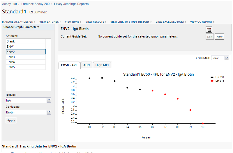
In this step, we will visualize a trend in the performance of a standard using a Levey-Jennings plot. We will investigate this trend further in the next step, when we add expected ranges (guide sets) to the plots.
Background
Levey-Jennings plots are quality control tools that help you visualize the performance of laboratory standards and quality controls over time, identifying trends and outlying data points. This can help you take corrective measures to ensure that your standards remain reliable yardsticks for your experimental data. See also:
Wikipedia article on Laboratory Quality Control.
Example usage scenarios for Levey-Jennings plots:
- If you see an outlier data point for a standard, you may investigate whether conditions were unusual on the day the data was collected (e.g., building air conditioning was not working). If the standard was not reliable on that day, other data may also be unreliable.
- If you see a trend in the standard (as we will observe below), you may investigate whether experimental conditions are changing (e.g., a reagent is gradually degrading).
- If standard performance changes with analyte lot, you may need to investigate the quality of the new analyte lot and potentially change the preparation or supplier of the lot.
The LabKey Luminex tool makes a set of Levey-Jennings plots available for standards for each trio of analyte, isotype and conjugate provided in the run data. Each set of plots for standards includes tabs for three different performance metrics (EC50 4PL, AUC and HighMFI). You can also generate
Levey-Jennings plots for single point controls to track performance over time of controls which are not titrated.
To see which reports are available for your assay:
- Click View QC Report > View Levey-Jennings Reports.

- Which reports you see here depends on which well role boxes were checked during import. See Review Well Roles for additional information.
- Click a link to open a report.
Explore Levey-Jennings Plots for a Standard
The tutorial example includes only a single titration, so we will elect to display Levey-Jennings plots and data for the standard for the
ENV2 analyte,
IgA isotype and
Biotin conjugate trio.
- In the list of available reports, click Standard1.
- In the Choose Graph Parameters box on the left side, select ENV2.
- For Isotype, choose "IgA"
- For Conjugate, choose "Biotin".
- Click Apply.
- Note: at this point in the tutorial, it is possible that you will need to add additional packages to your installation of R to support these plots. Refer to the list in Step 2: Configure R, Packages and Script, or add packages as they are requested by error messages in the UI. Retry viewing the plot after each addition until successful.
- In the graph panel, you see a Levey-Jennings plot of EC50 - 4PL for the standard (Standard1).

- Note the downward trend in the EC50 - 4PL, which becomes more pronounced over time and the change from Lot 437 and Lot 815.
The x-axis is labeled with the notebook numbers you entered for each run. The data points are ordered according to the acquisition date for each run, which came from the Excel file you imported for each run. Data points are spaced along the x-axis in a fixed increment, so the spacing does not reflect the actual time between runs. The data points are colored according to the analyte
Lot Number.
Options above the graph allow you to change the scale of the y-axis from linear to logarithmic.
Display Levey-Jennings Plots for Other Performance Metrics
Use the tabs above the Levey-Jennings plot to see charts for:
- EC50 - 4PL - the EC50 calculated using a 4-parameter logistic curve and the R transform script
- AUC - the area under the fluorescence intensity curve
- HighMFI - the highest recorded fluorescence intensity

- Click on the AUC and HighMFI tabs to see the trends in those curves as well.
Generate PDFs for Levey-Jennings Plots
If you wish, you can generate a PDF of the plot visible:
- Click on the PDF icon in the upper right.
- Depending on your browser settings, you may need to allow popups to run.
Explore the Tracking Data Table
Below the graph area, you'll find a table that lists the values of all of the data points used in the Levey-Jennings plots above.
- Scroll the screen down and to the right.
- Notice the values in the last columns.

Like other LabKey grids, you can
customize the columns shown and create named grids for viewing the data in other ways.
View Levey-Jennings Plots from QC Reports
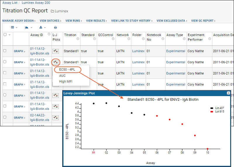
For quicker review of relevant Levey-Jennings plots without generating the full report, you can access them directly from the QC report for your titration or single point control.
- Select > Manage Assays, then click Luminex Assay 200.
- Select View QC Report > View Titration QC Report.
- Click the graph icon in the L-J Plots column of the second row (where the analyte is ENV2 we viewed earlier).
- You can select any of the performance metrics from the dropdown. Click EC50 4PL and you can quickly review that Levey-Jennings plot.

- Notice that the notebook number for the run whose row we selected (01 in this screencap) is shown in red along the x-axis.
Related Topics