Pareto Plots
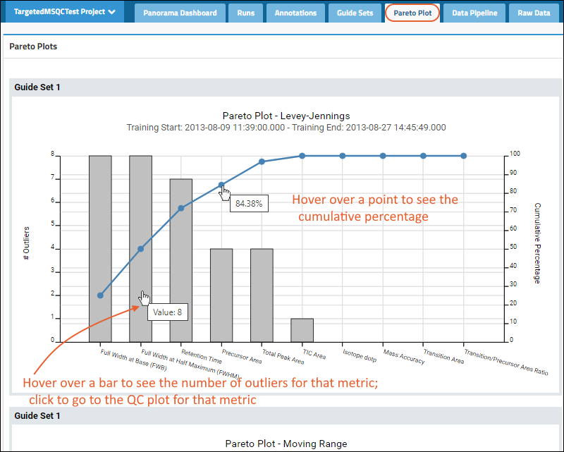
Pareto plots combine a bar plot and a line plot, and are used to quickly identify which metrics are most indicative of a quality control problem. Each bar in the plot represents a metric (see metric code below). Metric bars are ordered by decreasing incidence of outliers, where outliers are defined as the number of instances where each metric falls outside of the +/- 3 standard deviation range. The line shows the cumulative outliers by percentage.

There are separate pareto plots for each guide set and plot type (Levey-Jennings, Moving Range, CUSUMm, and CUSUMv) combination.
Other items to note in Pareto plots:
- Hover over dots in the line plot to show the cumulative %.
- Hover over a metric bar to show the number of outliers.
- Click a metric bar to see the relevant QC plot and guide set for that metric.
Print Plots
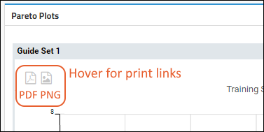
Hover over any plot to reveal PDF and PNG buttons. Click to export the Pareto plot for that guide set.

Related Topics
 There are separate pareto plots for each guide set and plot type (Levey-Jennings, Moving Range, CUSUMm, and CUSUMv) combination.Other items to note in Pareto plots: