Once you have
imported your assay data, you can analyze the results and generate visualizations of your data. This topic covers some ways to get started visualizing assay data.
Assay Results
The Results grid shows the assay data originally encoded in the Excel files, now captured by the Assay Design. In this step, we navigate to the results and create a visualization based on the data.
- On the Cell Culture Runs grid, select all rows and click Show Results.

- You are taken to the Cell Culture Results grid.
- It will show a run number filter, which you can hide by clicking the 'X'.
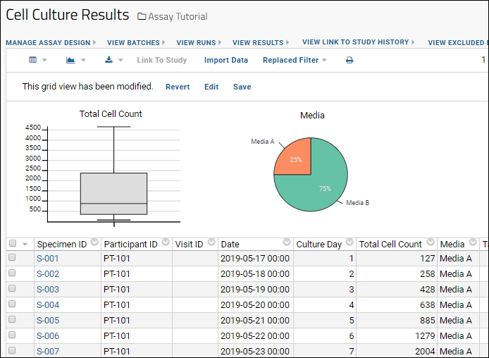
Use the data grid to create custom filtered views and visualizations. Two example visualizations are shown below.
Column Visualizations
- To add two visualizations to the top of the grid:
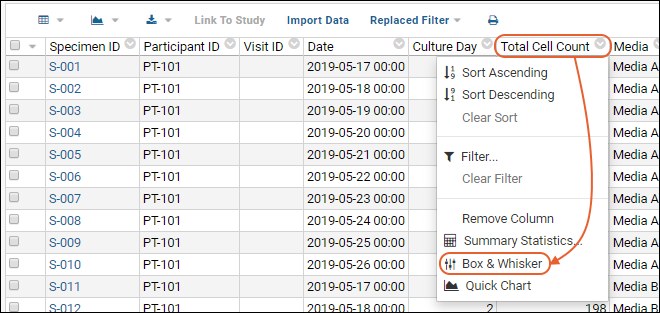
- Click the column header Total Cell Count and select Box and Whisker.

- Click the column header Media and select Pie Chart.

Media Performance Compared
To create a visualization of cell growth over time, we use a chart that combines data from several columns.
- Above the grid, click (Charts/Reports) and select Create Chart.

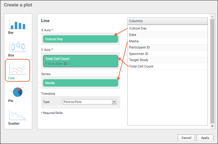
- In the popup dialog, click Line in the panel of chart types.
- Drag-and-drop columns into the form as follows:
- X Axis - Culture Day
- Y Axis - Total Cell Count
- Series - Media
- Trendline - Leave the default "Point-to-Point" selected.

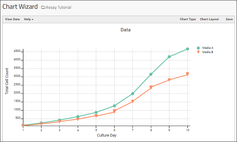
- The following line chart is created, comparing the performance of the different media.

- You can reopen the plot editor by clicking Chart Type.
- You can create various other types of plots here if you like.
- Experiment with trendline and using other fields for the axes and series if you like.
- Experiment with changing the look and labeling of the chart by clicking Chart Layout.
- When finished, you can either Save this chart for use in a dashboard
- Cancel by clicking Assay Tutorial to return to the main folder page.
In the next step, learn how to expand the assay design beyond the information in the data file itself.

