Visualizations

You can visualize, analyze and display data using a range of plotting and reporting tools. The right kind of image can illuminate scientific insights in your results far more easily than words and numbers alone. The topics in this section describe how to create different kinds of chart using the common plot editor.
Plot Editor
When viewing a
data grid, select
(Charts) > Create Chart menu to open the plot editor and create new:
Column Visualizations
To generate a quick visualization on a given column in a dataset, select an option from the column header:
Open Saved Visualizations
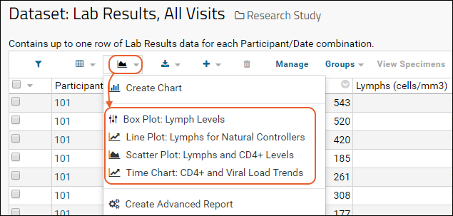
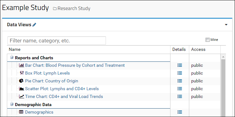
Once created and saved, visualizations will be re-generated by re-running their associated scripts on live data. You can access saved visualizations either through the
(Reports or Charts) pulldown menu on the associated data grid, or directly by clicking on the name in the
Data Views web part.


Related Topics
 You can visualize, analyze and display data using a range of plotting and reporting tools. The right kind of image can illuminate scientific insights in your results far more easily than words and numbers alone. The topics in this section describe how to create different kinds of chart using the common plot editor.