A pie chart shows the relative size of selected categories as different sized wedges of a circle or ring.
Create a Pie Chart
- Navigate to the data grid you want to visualize.
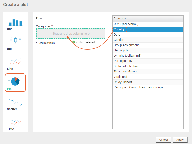
- Select (Charts) > Create Chart to open the editor. Click Pie.
- The columns eligible for charting from your current grid view are listed.
- Select the column to visualize and drag it to the Categories box.

- Click Apply. The size of the pie wedges will reflect the count of rows for each unique value in the column selected.
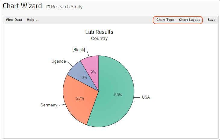
- Click View Data to see, filter, or export the underlying data.
- Click View Chart to return. If you applied any filters, you would see them immediately reflected in the chart.
Pie Chart Customizations
- Customize your visualization using the Chart Type and Chart Layout links in the upper right.
- Chart Type reopens the creation dialog allowing you to:
- Change the Categories column selection.
- Note that you can also click another chart type on the left to switch how you visualize the data using the same selected columns when practical.
- Click Apply to update the chart with the selected changes.
Change Layout
- Chart Layout offers the ability to change the look and feel of your chart.
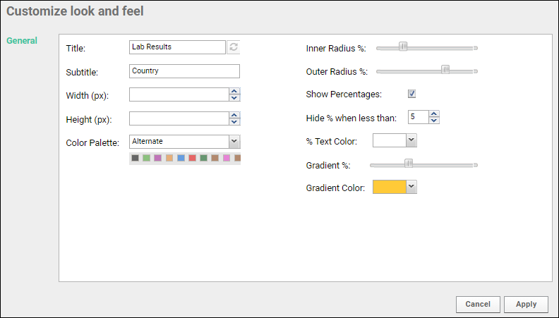
- Customize any or all of the following options:
- Provide a Title to show above your chart. By default, the dataset name is used.
- Provide a Subtitle. By default, the categories column name is used. Note that changing this label does not change which column is used for wedge categories.
- Specify the width and height.
- Select a color palette. Options include Light, Dark, and Alternate. Mini squares showing the selected palette are displayed.
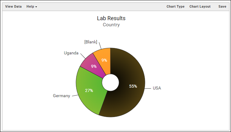
- Customizing the radii of the pie chart allows you to size the graph and if desired, include a hollow center space.
- Elect whether to show percentages within the wedges, the display color for them, and whether to hide those annotations when wedges are narrow. The default is to hide percentages when they are under 5%.
- Use the Gradient % slider and color to create a shaded look.
- Click Apply to update the chart with the selected changes.
Save and Export Charts
- When your chart is ready, click Save.
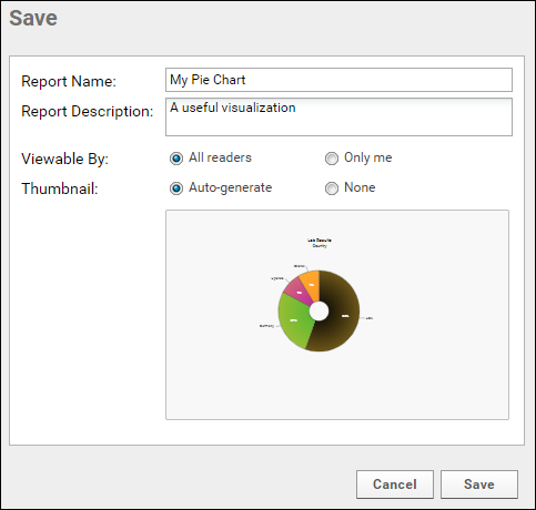
- Name the chart, enter a description (optional), and choose whether to make it viewable by others. You will also see the default thumbnail which has been auto-generated, and can choose whether to use it. As with other charts, you can later attach a custom thumbnail if desired.
Once you have created a pie chart, it will appear in the
Data Browser and on the
(charts) menu for the source dataset. You can manage metadata about it as described in
Manage Data Views.
Export Chart
Hover over the chart to reveal export option buttons in the upper right corner:

Export your completed chart by clicking an option:
- PDF: generate a PDF file.
- PNG: create a PNG image.
- Script: pop up a window displaying the JavaScript for the chart which you can then copy and paste into a wiki. See Tutorial: Visualizations in JavaScript for a tutorial on this feature.
Videos
Related Topics
